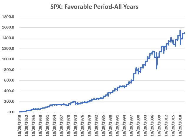
Since 1949 the stock market has
showed a strong tendency to rally towards the end of the calendar year. The period we are talking about specifically
is:
*The last 2 trading days of October
*Through the 3rd trading
day of the following January
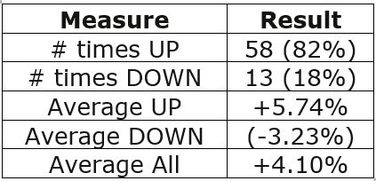
The Results
Figure 1 displays the cumulative %
price performance for the S&P 500 Index held ONLY during the period listed
above, every year starting in October 1949.
Figure 1 – S&P 500 cumulative %
+(-) ONLY during seasonally favorable period; 1949-2020
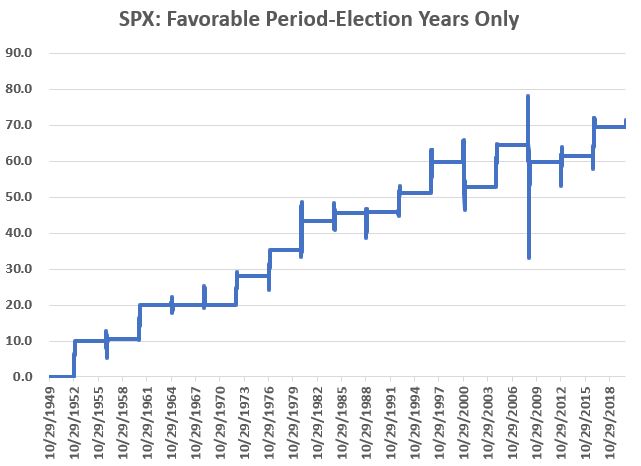
For what it’s worth, Figure 3
displays the growth during the seasonally favorable period ONLY during Election
Years (and NOT including the 3 days of January during the post-election year. The
bear market years of 2000 and 2008 are pretty obvious.
Figure 3 – S&P 500 cumulative %
+(-) ONLY during Seasonally Favorable Period in Election years
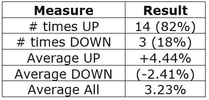
During Election Years ONLY, an upward bias still exists (up 73% of the time), but not as strongly as during all years:
Figure 4 – Election Year ONLY results
Summary
So, should we sit back, relax and enjoy the ride, safe and secure in the knowledge that “long-term market bias” will take care of us?
Don’t you know what year this is!? 2020 has been one like no other.
The best advice might be this: As
long as the major indexes hold above their long-term moving averages, the
results shown here suggest giving the bullish case the benefit of the
doubt. If price trends fail to confirm
an uptrend and you determine that defensive steps are necessary, then defensive
steps should be taken.
But given all the angst out there
these days, DO NOT give into fear based on “what could happen.” Let the market itself be your guide.
See also Jay Kaeppel Interview in July 2020 issue of Technical Analysis of Stocks and Commodities magazine
Disclaimer: The information, opinions and ideas expressed herein are for
informational and educational purposes only and are based on research conducted
and presented solely by the author. The
information presented represents the views of the author only and does not
constitute a complete description of any investment service. In addition, nothing presented herein should
be construed as investment advice, as an advertisement or offering of
investment advisory services, or as an offer to sell or a solicitation to buy
any security. The data presented herein
were obtained from various third-party sources.
While the data is believed to be reliable, no representation is made as
to, and no responsibility, warranty or liability is accepted for the accuracy
or completeness of such information.
International investments are subject to additional risks such as
currency fluctuations, political instability and the potential for illiquid
markets. Past performance is no
guarantee of future results. There is
risk of loss in all trading. Back tested
performance does not represent actual performance and should not be interpreted
as an indication of such performance.
Also, back tested performance results have certain inherent limitations
and differs from actual performance because it is achieved with the benefit of
hindsight.
The stock market sure is wickedly perverse
at times. According to the historical calendar,
October 28th is “the best day of the year” for the stock
market. Then along comes – what else –
2020. And the market tanks on 10/28 with
the Dow losing almost 950 points.
Let’s face it, the best day of 2020
is going to be December 31st.
In any event, it is pretty simple to
glance at a chart of the Dow or S&P 500 and assume that the market is
doomed to head lower. And maybe it
is.
But then again, maybe it’s not.
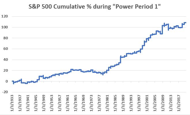
The Short-Term
Figure 1 display the cumulative %
growth achieved by holding the S&P 500 Index ONLY during the following 4
days each year since 1933:
*Last 2 trading days of October
*First 2 trading days of November
We will refer to this as “Power
Period 1:
Figure 1 – S&P 500 cumulative %
+(-) ONLY during 4-day Power Period 1
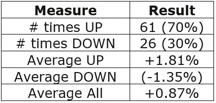
For the record:
Figure 2 – Power Period 1 Results;
1933-2019
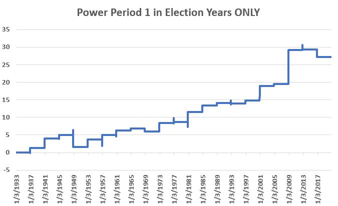
For what it’s worth, Figure 3
displays the growth during this 4-day period ONLY during Election Years.
Figure 3 – S&P 500 cumulative % +(-) ONLY during 4-day Power Period 1 in Election years
1948 saw a -3.2% decline and 2016
-1.6%. On the whole however, the market showed
a gain 16 out of 20 times (75%) with an average gain of +1.18%.
Summary
Does any of this mean the market is sure to bounce over the course of the next four days? Not at all. The market could easily continue on it’s current downward trajectory. Still, given all of the sudden gloom and doom, it offers your inner contrarian some serious food for thought.
See also Jay Kaeppel Interview in July 2020 issue of Technical Analysis of Stocks and Commodities magazine
Disclaimer: The information, opinions and ideas expressed herein are for
informational and educational purposes only and are based on research conducted
and presented solely by the author. The
information presented represents the views of the author only and does not
constitute a complete description of any investment service. In addition, nothing presented herein should
be construed as investment advice, as an advertisement or offering of
investment advisory services, or as an offer to sell or a solicitation to buy
any security. The data presented herein
were obtained from various third-party sources.
While the data is believed to be reliable, no representation is made as
to, and no responsibility, warranty or liability is accepted for the accuracy
or completeness of such information.
International investments are subject to additional risks such as
currency fluctuations, political instability and the potential for illiquid
markets. Past performance is no
guarantee of future results. There is
risk of loss in all trading. Back tested
performance does not represent actual performance and should not be interpreted
as an indication of such performance.
Also, back tested performance results have certain inherent limitations
and differs from actual performance because it is achieved with the benefit of
hindsight.
Sometimes it’s “what you hold.” Sometimes it’s “when you hold it.” And sometimes, it’s both. With the stock market about to enter the “seasonally
favorable” period of November through April – despite all of the massive doubts
that surround the market (COVD, economy, election, debt, etc., etc.) it may be
a good time for investors to put aside all of today’s “news” and to consider a
more objective approach for the months ahead.
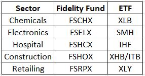
The Fab Five
Let’s consider a portfolio that holds the following sectors from November 1st through April 30th every year no matter what.
Figure 1 – The Fab 5 sectors
NOTE: Figure 1 was updated on 10/29/20. Previously it contained a misprint listing ticker XLP as the ETF choice for Retailing. The correct ticker is XLY.
The Test
For our purposes we will use monthly total
return data for the Fidelity Select Sector funds listed above (which allows us
to go back to 1986) and examine how the performed as a group during November
through April.
The Rules
*Buy the five Fidelity sector funds
(20% to each) on the last trading day of October each year
*Sell the funds on the last day of April
the following year
As a benchmark, we will compare
holding these five to holding ticker VFINX (Vanguard S&P 500 Index fund)
also ONLY during the months of November through April.
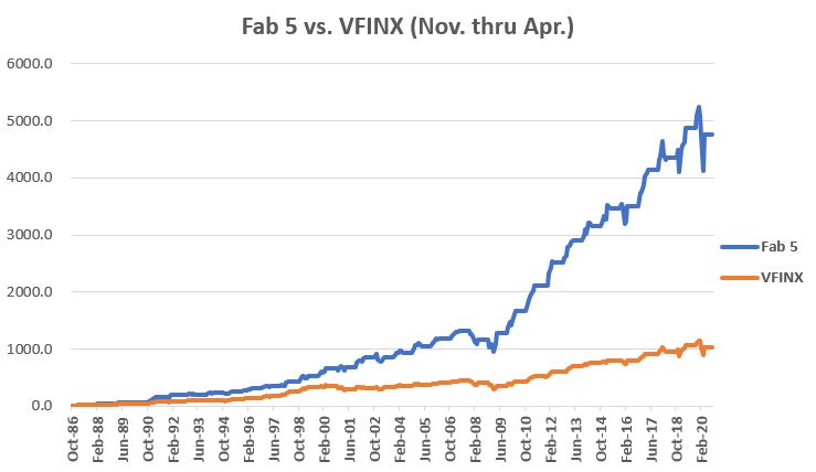
The Results
The cumulative returns for both
approaches appear in Figure 2
Figure 2 – Cumulative return for Fab
5 versus VFINX held ONLY during November through April
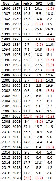
The year-by-year results appear in
Figure 3. The far-right column labeled “Diff”
displays the amount by which the Fab 5 outperformed or underperformed the VFINX
benchmark.
Figure 3 – Year-by-Year Comparison of Fab 5 versus VFINX (November through April only)
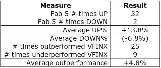
For the record:
Figure 4 – Comparative Figures
Things to note:
*The Fab Five showed a gain between November and April 94% of the time (32 out of 34 years)
*The Fab Five outperformed VFINX in 74% of the years (25 out of 34 years)
Summary
What IS NOT in question is whether or
not the Fab 5 have outperformed the S&P 500 Index historically during
November through April.
What IS very much in question is “what
happens going forward?”
Are the Fab 5 “guaranteed” to
continue to perform well in the future and outpace the broader market? Sorry folks, it doesn’t work that way. There are no guarantees.
As an investor, you analyze the data, you decide what you think will work, you place your bets and the Market Gods take it from there…
Same as it ever was.
See also Jay Kaeppel Interview in July 2020 issue of Technical Analysis of Stocks and Commodities magazine
Disclaimer: The information, opinions and ideas expressed herein are for
informational and educational purposes only and are based on research conducted
and presented solely by the author. The
information presented represents the views of the author only and does not constitute
a complete description of any investment service. In addition, nothing presented herein should
be construed as investment advice, as an advertisement or offering of
investment advisory services, or as an offer to sell or a solicitation to buy
any security. The data presented herein
were obtained from various third-party sources.
While the data is believed to be reliable, no representation is made as
to, and no responsibility, warranty or liability is accepted for the accuracy
or completeness of such information.
International investments are subject to additional risks such as
currency fluctuations, political instability and the potential for illiquid
markets. Past performance is no
guarantee of future results. There is
risk of loss in all trading. Back tested
performance does not represent actual performance and should not be interpreted
as an indication of such performance.
Also, back tested performance results have certain inherent limitations
and differs from actual performance because it is achieved with the benefit of
hindsight.
For the record, I am an avowed “trend-follower.” But I also know that no trend lasts forever. So, while I have gotten pretty good at “riding along”, I do – like most people – like to “look ahead” since I do know that the landscape will forever be changing.
So, with the caveat that none of what
follows should be considered a “call to action”, only as a “call to pay
attention”, let’s venture out “into the weeds.”
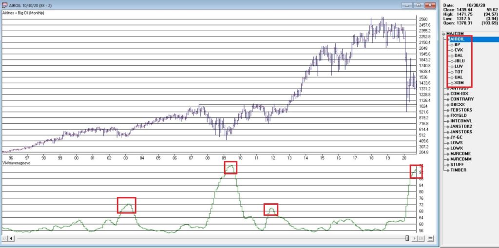
AIROIL
Here is an ugly pairing – airline stocks
and traditional energy stocks – yikes!
In Figure 1 you see an index that I created and followed call AIROIL
comprised of three airline stocks and five “Big Oil” stocks. During the pandemic meltdown this index fell
to a level not seen since 2007 before “bouncing”.
In the bottom clip you see an indicator I call VFAA. Note that when VFAA tops out and rolls over, meaningful advances in the index tend to follow. In addition, VFAA is at a high level seen only once before in 2009. Following that reversal, the index rose almost 500% over the next 9 years.
So, is now a great time to pile into
airlines and big oil? One would have to
be a pretty hard-core contrarian to pound the table on this one. The airlines are in terrible shape due to the
pandemic and vast uncertainty remains regarding when things might improve. And “Big Oil” is about as unloved as any
sector has ever been.
So, am I suggesting anyone “load up”
on airlines and oil? Nope. What I am saying is that I am watching this
closely and that if and when VFAA “rolls over” I may look to commit some money
to these sectors on a longer-term contrarian basis.
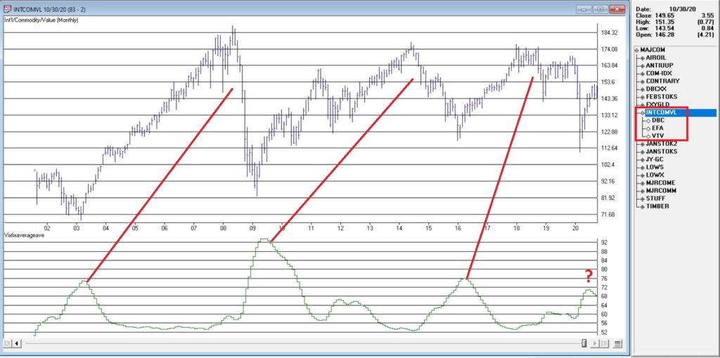
International/Commodities/Value
Also known of late as “the barking dogs”. If you have had money committed to any or all
of these asset classes in recent years you are shaking your head right about
now. These areas have VASTLY
underperformed a simple “buy-and-hold the S&P 500 Index” approach for a
number of years.
Is this state of affairs going to change anytime soon? Regarding “anytime soon” – it beats me. However, I am on the record as arguing that at some point this WILL change. History makes one thing very clear – no asset class has a permanent edge. So, given that the S&P 500 Index has beaten these above mentioned by such a wide margin for such a long time (roughly a decade or more) I am confident that one day in the next x years, the “worm will turn.”
Figure 2 displays an index that I
created and follow that tracks an international ETF, a commodity ETF and a
value ETF. The VFAA indicator appears in
the bottom clip.
Now if history is a guide, then the recent “rollover” by VFAA suggests that this particular grouping of asset classes should perform well in the coming years. Two things to note:
1. There is no guarantee
2. There is absolutely no sign yet that “the turn” – relative to the S&P 500 – is occurring
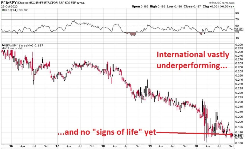
Figure 3, 4 and 5 are “relative strength” charts from www.StockCharts.com. They DO NOT display the price of any security; they display the performance of the first ETF list compared to the second ETF listed. So, Figure 3 displays the performance of ticker EFA (iShares MSCI EAFE ETF which tracks a broad index of stocks from around the globe, excluding the U.S.) relative to the S&P 500 Index.
When the bars are trending lower it
means EFA is underperforming SPY and vice versa. The trend in Figure 3 is fairly obvious –
international stocks continue to lose ground to U.S. large-cap stocks.
If your goal is to pick a bottom,
have at it. As for me, I am waiting for
some “signs of life” in international stocks relative to U.S. stocks before
doing anything.
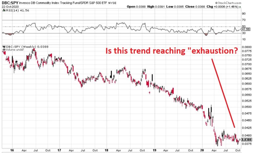
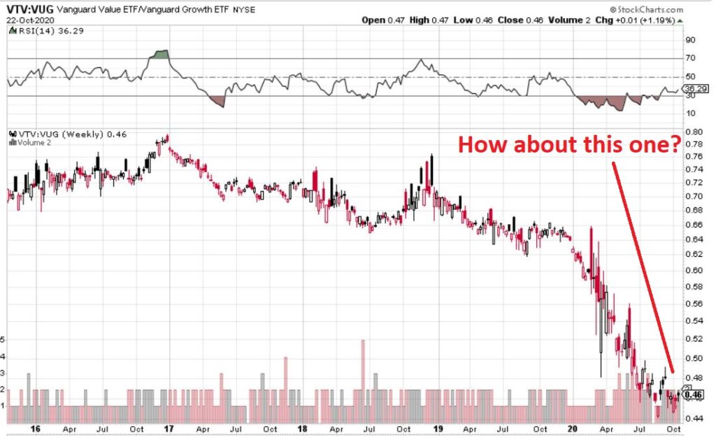
Figure 4 displays ticker DBC (a
commodity-based ETF) versus SPY and Figure 5 displays ticker VTV (Vanguard
Value ETF) versus ticker VUG (Vanguard Growth ETF). Both tell the same tale as
Figure 3 – unless you are an avowed bottom-picker there is no actionable intelligence. Still, both these trends are now extremely
overdone, so a significant opportunity may be forming.
Disclaimer: The information, opinions and ideas expressed herein are for
informational and educational purposes only and are based on research conducted
and presented solely by the author. The
information presented represents the views of the author only and does not constitute
a complete description of any investment service. In addition, nothing presented herein should
be construed as investment advice, as an advertisement or offering of
investment advisory services, or as an offer to sell or a solicitation to buy
any security. The data presented herein
were obtained from various third-party sources.
While the data is believed to be reliable, no representation is made as
to, and no responsibility, warranty or liability is accepted for the accuracy
or completeness of such information.
International investments are subject to additional risks such as
currency fluctuations, political instability and the potential for illiquid
markets. Past performance is no
guarantee of future results. There is
risk of loss in all trading. Back tested
performance does not represent actual performance and should not be interpreted
as an indication of such performance.
Also, back tested performance results have certain inherent limitations
and differs from actual performance because it is achieved with the benefit of
hindsight.
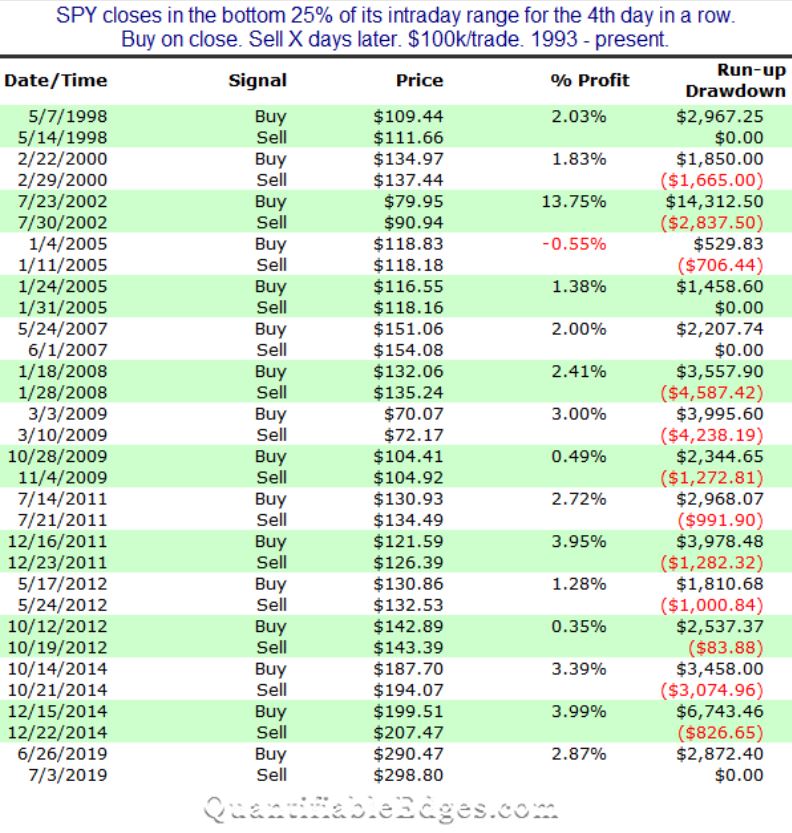
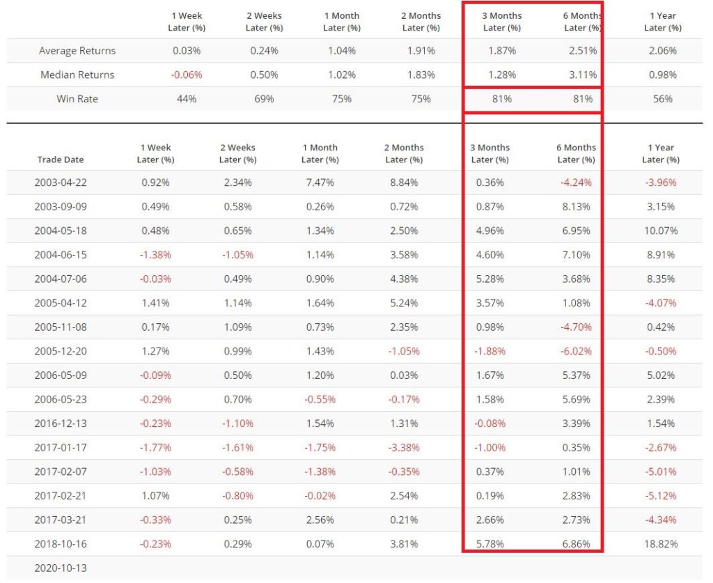
In Figure 1 below, Rob Hanna of www.QuantifiableEdges.com highlights those rare occasions when the S&P 500 Index closed within the lowest 25% of its daily range for four consecutive trading days, and how the index performed over the following 5 trading days.
The bottom line: 15 of 16 signals (94%)
saw the S&P 500 Index advance during the 5-trading day period after each signal.
Figure 1 – SPX +(-) during 5 trading days after closing in lowest 25% of daily range for 4 consecutive days (Courtesy: www.QuantifiableEdges.com)
Unfortunately, this signal does not
occur often enough to use as a standalone strategy. However, information like this can be very
helpful as “weight of the evidence” for a trader.
To wit:
*The latest signal fired at the close
on 10/21/20
*The S&P 500 is lower today as I
type
This suggests one of two things. Either:
*This signal will not pan out
*We may be looking at a very good
short-term buying opportunity
I am not offering any opinions here,
just observations. But history suggests
that the market could be higher by the close on 10/28.
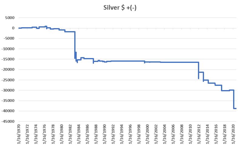
Silver
Interestingly, the exact same signal
(4 straight days closing in the lowest 25% of the daily range) applied to
silver give a very different result. Figure
2 displays the cumulative $ +(-) for holding a long position in silver futures
for 1-day after silver closes 4 straight in the lowest 25% of its daily range.
Figure 2 – Cumulative $ +(-) if Long Silver futures for 1-day after 3 straight closes in lowest 25% of daily range; 1970-2020
As you can see, the results are awful. To put it another way, a trader who sold short silver futures on the 4th straight day of closes in the lowest 25% of the daily range would have made some decent money (albeit, not very often and over a long period of time).
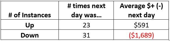
For the record:
Figure 3 – Silver futures performance
during 1 trading day after 4 straight closes in lowest 25% of daily range
Silver did show a gain 42% of the
time, however, clearly the average DOWN was significantly worse than the
average UP.
Figure 4 shows the dates.
Date
Silver $ + (-) Next Day
9/15/1970
90
8/31/1971
95
3/7/1973
330
4/10/1974
(650)
11/1/1974
685
3/29/1976
300
7/30/1976
(875)
8/2/1976
(270)
8/3/1976
485
6/10/1977
(630)
3/22/1978
180
6/26/1979
(125)
6/27/1979
(435)
11/10/1980
(900)
2/25/1983
(12,850)
2/28/1983
0
3/1/1983
2,850
6/3/1983
(2,500)
6/6/1983
(1,700)
10/3/1983
(650)
10/4/1983
1,200
7/17/1984
1,050
12/18/1984
(25)
12/19/1984
100
4/15/1985
(425)
6/19/1987
(2,250)
6/22/1987
875
7/26/1988
400
11/18/1988
(275)
8/30/1989
(225)
8/31/1989
150
12/29/1989
(100)
1/2/1990
(165)
7/24/1990
75
7/25/1990
100
7/25/1991
125
11/30/1994
50
5/26/1999
(575)
5/27/1999
(225)
5/28/1999
450
8/17/2000
(140)
8/18/2000
50
11/21/2000
(10)
2/10/2003
(150)
12/27/2011
(7,900)
12/28/2011
3,125
2/19/2013
(4,425)
2/20/2013
575
3/25/2014
(1,225)
3/26/2014
(175)
11/6/2015
(1,050)
5/2/2017
(1,825)
5/3/2017
(750)
3/4/2019
250
3/13/2020
(8,850)
Figure 4 – Silver futures $ +(-)
1-day after 4 consecutive closes in lowest 25% of daily range
Summary
Is any of this actionable? That’s not for me to say. All I said at the outset was that the markets
are “interesting”.
I rest my case.
See also Jay Kaeppel Interview in July 2020 issue of Technical Analysis of Stocks and Commodities magazine
Disclaimer: The information, opinions and ideas expressed herein are for
informational and educational purposes only and are based on research conducted
and presented solely by the author. The
information presented represents the views of the author only and does not
constitute a complete description of any investment service. In addition, nothing presented herein should
be construed as investment advice, as an advertisement or offering of
investment advisory services, or as an offer to sell or a solicitation to buy
any security. The data presented herein
were obtained from various third-party sources.
While the data is believed to be reliable, no representation is made as
to, and no responsibility, warranty or liability is accepted for the accuracy
or completeness of such information.
International investments are subject to additional risks such as
currency fluctuations, political instability and the potential for illiquid
markets. Past performance is no
guarantee of future results. There is
risk of loss in all trading. Back tested
performance does not represent actual performance and should not be interpreted
as an indication of such performance.
Also, back tested performance results have certain inherent limitations
and differs from actual performance because it is achieved with the benefit of
hindsight.
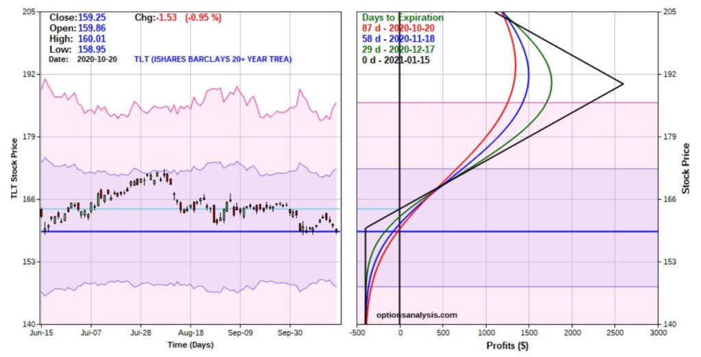
Despite all of the “pumping” by the Fed, the 30-year treasury bond is roughly 11% off of its high from back in March. The primary models that I use to track the major trend of the bond market are still bearish. So, I have no reason to – and am not – pounding the table about getting bullish on bonds.
That being said, the shorter-term
“trader” in me is sensing the potential for a “bounce” in bonds (Important
Note: the short-term trader in me is also wrong a lot. So, what follows is NOT a recommendation but
an example of one way to play a trading “hunch” but with a relatively low
dollar risk).
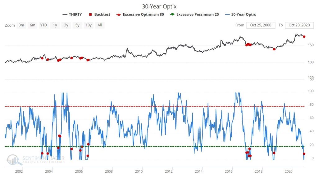
The Background
Figure 1 from www.Sentimentrader.com displays 30-year bond price action in the top clip and trader sentiment (or Optix) in the bottom clip. Note that sentiment just bounced off of 0%. Previous occurrences are noted by the red dots.
Figure 2 displays the action of
30-yr. bonds following previous bounces in sentiment from below 5% to above
5%. Note that bonds typically witnessed
an advance in the next 1 to 6 months.
Figure 2 – Bond price action
following previous “bounces” in sentiment (Courtesy Sentimentrader.com)
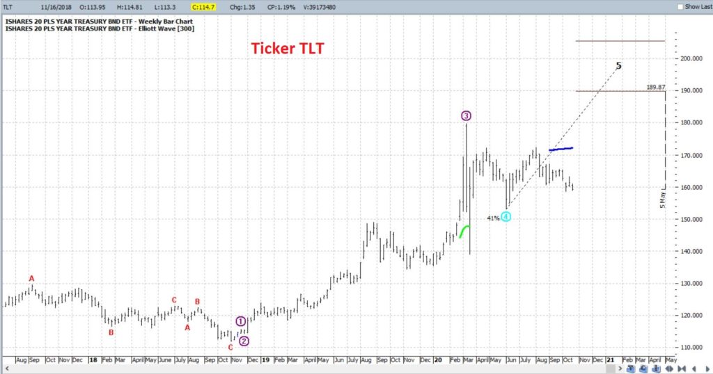
In Figure 3 from ProfitSource by HUBB
we see that the weekly Elliott Wave chart is suggesting the potential for an
advance in the months ahead. For the
record, my confidence level with a single weekly EW count in and of itself is
moderate at best. However, when
sentiment and price action appear to align, I start to pay closer
attention. Note that the EW projection
is suggesting a potential rally in the next 1 to 6 months – pretty much in line
with the sentiment history above.
Figure 3 –
Ticker TLT with bullish weekly Elliott Wave count (Courtesy ProfitSource by HUBB)
One Way to Play
In reality there are lots of ways to
play. The most straightforward would be
to buy a 30-year treasury bond futures contract or to buy 100 shares of the ETF
ticker TLT which track the long-term treasury.
Both of these positions have inherent risks. T-bond futures trade at $1,000 a point. So, if bonds go south instead of north a
fairly large dollar risk can be realized very quickly. Likewise, buying 100 shares of ticker TLT
will cost roughly $15,900. So again, not
a small commitment.
REMEMBER: What we are attempting to accomplish here is simply to provide an example of one way to play an entirely speculative situation (i.e., betting on a short-term “bounce” in bonds) without having to worry about the potential to lose a lot of money if things go the wrong way.
So, let’s consider a position using
options on ticker TLT. The first thing I
like to determine is if the options on a given security are “cheap”,
“expensive” or somewhere in between, in order to choose the proper
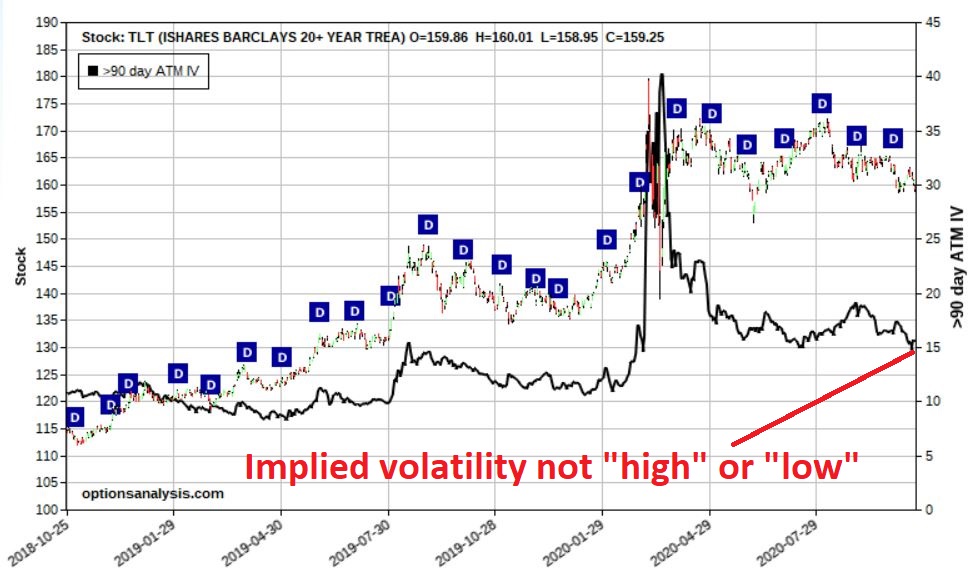
strategy. In Figure 4 we see that the
implied volatility for options on ticker TLT are not high or low, but rather
“somewhere in between.” (High implied volatility means there is a lot of time
premium built into the options – i.e., “expensive”, and vice versa).
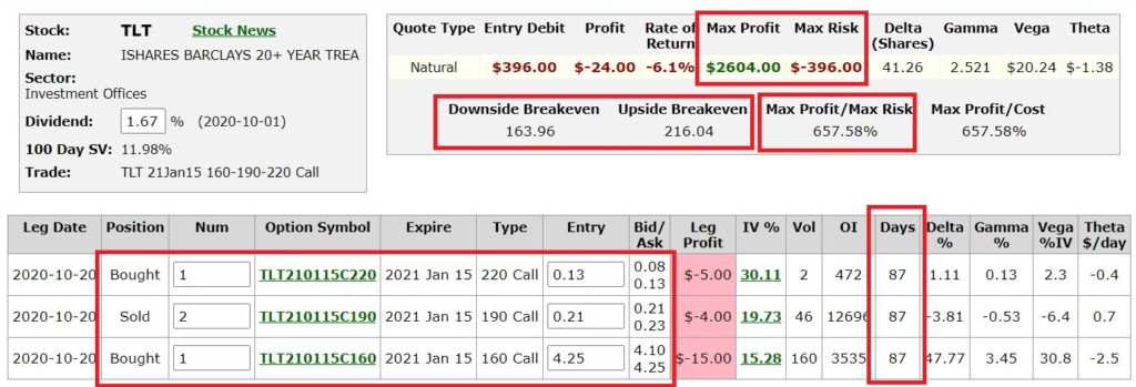
The strategy we will consider is
called the “out-of-the-money butterfly spread”, or “OTM call fly” as we hip,
happening option trader geeks like to call them.
This trade involves:
*Buying 1 Jan2021 160 call @ $4.25
*Selling 2 Jan2021 190 calls @ $0.21
*Buying 1 Jan2021 220 call @ $0.13
NOTE: This example assumes that a “market order” is used and that the order is filled by buying at the ask price for the 160 and 220 calls and selling at the bid price for the 190 call. In reality, us hip, happening option trading geeks would likely put in a limit order attempting to enter closer to the midpoint of the bid/ask spread for each option.
Figure 5 displays the particulars and Figure 6 displays the risk curves.
Remember, our goal is to make a
decent return if bonds do in fact rally in the months directly ahead while NOT
risking a lot of money.
*As you can see in Figure 6, profits
can accumulate pretty nicely if the price of TLT does in fact rise towards the
target shown in Figure 3.
*At the same time, the worst-case
scenario is a loss of -$396 on a 1x2x1 spread if it all falls apart.
Two thoughts from a position
management point-of-view:
*On the downside a trader might
either, a) resolve to hold through expiration and risk the full $396 hoping for
a bounce somewhere along the way, or, b) determine a stop-loss point at which
point they would “throw in the towel” and salvage whatever they can by exiting
the trade early.
*On the upside, note that the risk curves do “roll over” when price approaches $190 a share. In other words, above this price your profit would actually start to get smaller again. So, if the “best case” scenario did in fact unfold and TLT rallied towards the EW target of $189+ a trader MUST be prepared to take some sort of action, i.e., either a) take a profit, or, b) adjust the position.
Summary
Please remember that the proper
subtitle for this article is NOT “Pundit predicts massive rally in bonds”. The proper subtitle is more along the lines
of “Silly cheapskate speculator gets a hankering to pick a bottom in a
downtrend and doesn’t want to lose his shirt.”
The former is more succinct, but the
latter is more accurate.
See also Jay Kaeppel Interview in July 2020 issue of Technical Analysis of Stocks and Commodities magazine
Disclaimer: The information, opinions and ideas expressed herein are for
informational and educational purposes only and are based on research conducted
and presented solely by the author. The
information presented represents the views of the author only and does not
constitute a complete description of any investment service. In addition, nothing presented herein should
be construed as investment advice, as an advertisement or offering of
investment advisory services, or as an offer to sell or a solicitation to buy
any security. The data presented herein
were obtained from various third-party sources.
While the data is believed to be reliable, no representation is made as
to, and no responsibility, warranty or liability is accepted for the accuracy
or completeness of such information.
International investments are subject to additional risks such as
currency fluctuations, political instability and the potential for illiquid
markets. Past performance is no
guarantee of future results. There is
risk of loss in all trading. Back tested
performance does not represent actual performance and should not be interpreted
as an indication of such performance.
Also, back tested performance results have certain inherent limitations
and differs from actual performance because it is achieved with the benefit of
hindsight.
Buying and holding an S&P 500
Index fund is not my favorite approach to investing. While it is an approach to investing that
likely millions of investors follow to one degree or another, I refer to it as
a “drifting with the tide” strategy. As
long as the sky is blue and the waters are calm, things are swell and things
are great. But when the inevitable storm
rolls in and the wind picks up and the waves start to crash it becomes an entirely
different experience.
Sometimes our mind just needs a break
from all of the volatility, turmoil and uncertainty that surrounds the stock
market.
But “when” to take those breaks is a
question that has confounded market participants since the first time some
trader somewhere shouted “Buy” whilst another yelled “Sell”.
The unvarnished truth is that there
are no “perfect” methods. But there are
things that can “serve a purpose”. Let’s
consider one of those today.
The Indicators
We will use 4 data series, using
quarterly total return data for each:
A = 3-month t-bills
B = Bloomberg Barclays Aggregate Bond
Index
C = Bloomberg Barclays Intermediate Treasury
Index
D = S&P 500 Index
E = B – A (i.e., Aggregate bond index
minus t-bill quarterly return)
The Trading Rules
At the end of each quarter:
*If E > 0 then hold S&P 500
Index for the next quarter
*If E < 0 then hold Bloomberg Barclays
Intermediate Treasury Index
In English:
*If the Aggregate Bond index outperformed
t-bills in the most recent quarter we will hold stocks the following
quarter.
*If the Aggregate Bond index underperformed
t-bills is the most recent quarter we will avoid stocks and linger in the
relative safety of intermediate-term treasuries in the following quarter.
The Results
All results use quarterly total
return data starting at the end of 1st quarter of 1976. To make things easier:
*If Aggregate Bond Index outperforms
t-bills the next quarter is referred to as a “Favorable” quarter
*If Aggregate Bond Index underperforms
t-bills the next quarter is referred to as an “Unfavorable” quarter
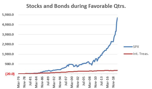
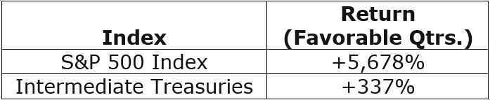
Figure 1 displays the cumulative return
for the S&P 500 (SPX) and intermediate treasuries (Int. Treas.) if held
ONLY during Favorable quarters.
Figure 1 – Stock and bond performance
during Favorable Quarters
Figure 2 – Stock and Bond performance during Favorable Quarters
Clearly stocks outperform by an order
of significant magnitude during “Favorable” quarters.
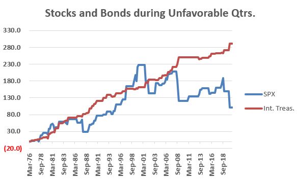
Figure 3 displays the cumulative return
for the S&P 500 (SPX) and intermediate treasuries (Int. Treas.) if held
ONLY during Unfavorable quarters.
Figure 3 – Stock and bond performance during Unfavorable Quarters
Figure 4 – Stock and bond performance
during Unfavorable Quarters
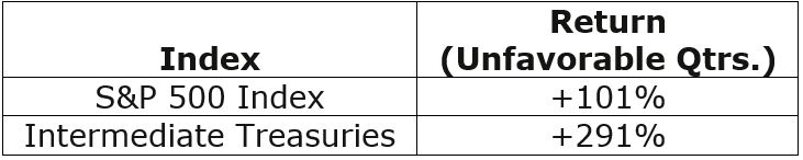
During “Unfavorable” quarters stocks
are a roller-coaster ride – often up, but also occasionally crashing lower –
while bonds appear to offer steady, low volatility returns.
The bottom line:
*Stocks have vastly outperformed during
Favorable quarters
*Bonds have returned almost 3 times
as much as stocks (with vastly lower volatility) during Unfavorable quarters
Jay’s Risk On/Risk Off Strategy
So, let’s put the pieces of the
puzzle together:
*During Favorable quarters we will
hold SPX
*During Unfavorable quarters we will
hold Intermediate Treasuries
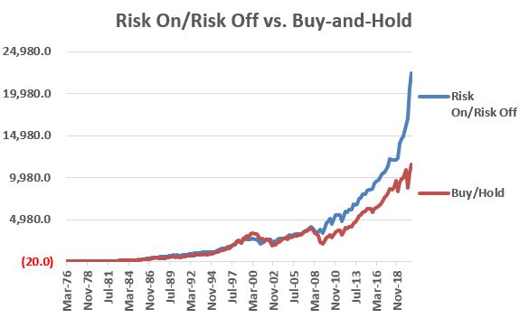
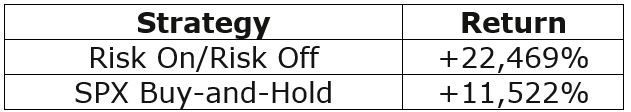
Figure 5 displays the cumulative
growth of our “Risk On/Risk Off Strategy” (these are hypothetical results using
index data)
Figure 5 – Cumulative return for Jay’s Risk On/Risk Off Strategy versus buying and holding S&P 500 Index (3/31/76-9/30/20)
Figure 6 – Cumulative return for Jay’s
Risk On/Risk Off Strategy versus buying and holding S&P 500 Index
(3/31/76-9/30/20)
Real-World Application
Here is how I follow this indicator
in real-time. Make the measurement after
the close on the 3rd to last trading day of each quarter (ex., if
the last day of a quarter is Friday the 30th, then we measure at the
close on Wednesday the 28th.
Any trading action will take place at the close on the 30th).
As of the close on the 3rd
to last trading day of each quarter:
A = Total return data for ticker BIL
as of today
B = Total return data for ticker BIL
63 trading days ago
C = Total return data for ticker
VBMFX as of today
D = Total return data for ticker
VBMFX 63 trading days ago
E = (A / B) – 1) *100
F = (C / D) – 1) *100
E is the 3-month change for t-bills
F is the 3-month change for the total
bond market
The Rules:
*If F >= E (on the 3rd
to last trading day of the quarter), then Risk On for the next 3 months
*If F < E (on the 3rd
to last trading day of the quarter), then Risk Off for the next 3 months
Ticker VBMFX: Vanguard Total Bond
Market Index Fund Investor Shares
Ticker SPY: SPDR S&P 500 ETF
Trust
Ticker IEI: iShares 3-7 Year Treasury Bond ETF
This approach was Risk Off during Q1 of 2020 and has been Risk On since.
Summary
The purpose here is not to suggest an
“All In” or “All Out” approach to investing.
When the Risk On/Risk Off indicator suggests “Risk Off”, the
implication:
*IS NOT that investors should “SELL
EVERYTHING” and run for the hills
*IS simply that investors may benefit
from “playing some defense” during the ensuing quarter
Nothing more, nothing less.
See also Jay Kaeppel Interview in July 2020 issue of Technical Analysis of Stocks and Commodities magazine
Disclaimer: The information, opinions and ideas expressed herein are for
informational and educational purposes only and are based on research conducted
and presented solely by the author. The
information presented represents the views of the author only and does not constitute
a complete description of any investment service. In addition, nothing presented herein should
be construed as investment advice, as an advertisement or offering of
investment advisory services, or as an offer to sell or a solicitation to buy
any security. The data presented herein
were obtained from various third-party sources.
While the data is believed to be reliable, no representation is made as
to, and no responsibility, warranty or liability is accepted for the accuracy
or completeness of such information.
International investments are subject to additional risks such as
currency fluctuations, political instability and the potential for illiquid
markets. Past performance is no
guarantee of future results. There is
risk of loss in all trading. Back tested
performance does not represent actual performance and should not be interpreted
as an indication of such performance.
Also, back tested performance results have certain inherent limitations
and differs from actual performance because it is achieved with the benefit of
hindsight.
The U.S. stock market has mostly vastly
outperformed the rest of the world’s stock markets in recent years. The longer this trend persists the more
investors get “used to” and “comfortable” (i.e., complacent) with this trend as
a way of life. But if there is one thing we know for sure when it comes to the
markets is that “no trend lasts forever.”
One day, the relationship will turn,
and U.S. stock indexes will lag international stock indexes. I firmly expect this change to take place and
play out sometime over the next 5 to 10 years.
That being said, there is no evidence that this change is in the works
at the moment. So, what follows IS NOT a
“call to action.” I refer to it as a “call
to pay attention.”
SPX vs. EAFE
As our measure we will use the S&P 500 Index as our measure of U.S. stock performance and the MSCI EAFE Index as our measure of international stock performance (using monthly total return data for each index).
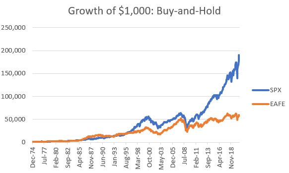
Our test data begins on 12/31/1974.
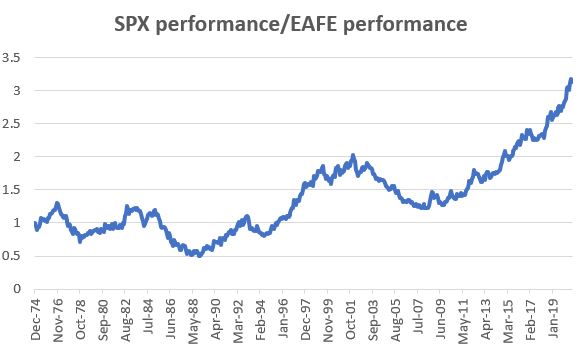
Figure 1 displays the growth of
$1,000 invested in each index on a buy-and-hold basis since that time.
Figure 1 – Growth of $1,000 in SPX
and EAFE since 12/31/1974
The knee jerk reaction more many
investors will be to say “it looks like SPX is the better investment because it
made more money.” However, Figure 2
displays the ratio between the two equity curves in Figure 1. Note that there is a definite “back and forth”
between the two. When the line in Figure
2 is rising it means that SPX is outperforming and when the line in Figure 2 is
declining it means that the EAFE is outperforming.
Figure 2 – SPX growth vs. EAFE growth
(1974-2020)
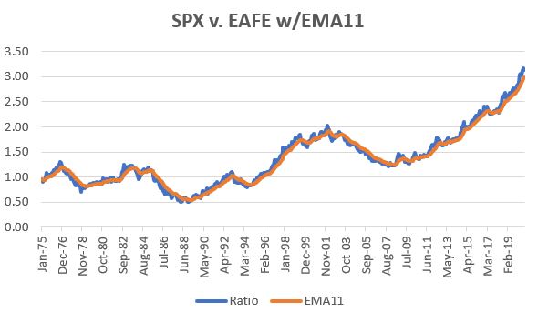
Figure 3 displays the same line as
Figure 2 but adds an 11-month exponential moving average.
Figure 3 – SPX vs. EAFE plus 11-month EMA
So far, we have:
A = $1,000 invested in SPX (cumulative
growth)
B = $1,000 invested in EAFE (cumulative
growth)
C = A/B
D = 11-month EMA
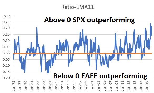
E = C – D
Figure 4 displays the difference between the 2 lines displayed in Figure 3, i.e., Value E above.
Figure 4 – SPX/EAFE Ratio minus 11-month EMA
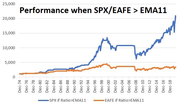
Figure 5 displays the growth of equity
for each index if held ONLY when SPX is outperforming (i.e., when the line in
Figure 4 > 0)
Figure 5 – SPX and EAFE performance
while SPX/EAFE ratio > EMA11
Figure 6 displays the growth of equity
for each index if held ONLY when EAFE is outperforming (i.e., when the line in
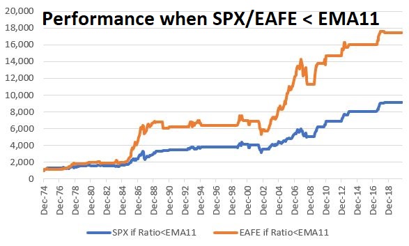
Figure 4 < 0)
Figure 6 – SPX and EAFE performance
while SPX/EAFE ratio < EMA11
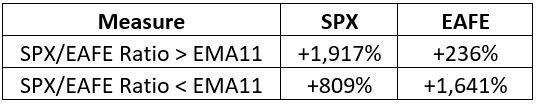
Figure 7 displays the results in numbers
Figure 7 – SPX and EAFE performance
based on SPX/EAFE ratio versus EMA11
The bottom line: SPX has vastly outperformed
when the SPX/EAFE ratio > EMA11. Likewise,
EAFE has significantly outperformed when the SPX/EAFE ratio < EMA11.
The Test
Now let’s look at actually using this
information to trade.
Trading Rules:
If E > 0* then invest in SPX
If E < 0* then invest in EAFE
*- using a 1-month lag; i.e., a
signal generated at the end of January is traded at the end of February
As a benchmark we will split 50/50
between SPX and EAFE with a rebalance to 50/50 at the start of each new year.
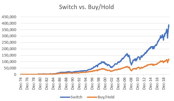
Figure 8 displays the growth of $1,000
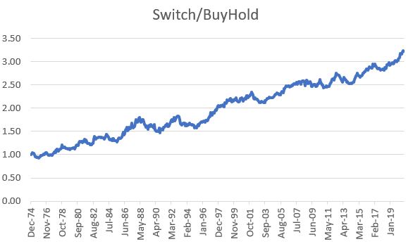
for both the switching strategy and the Buy/Hold strategy.
Figure 8 – Growth of $1,000 switching
versus buy-and-hold (1974-2020)
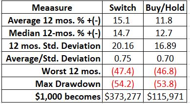
Figure 9 displays the relevant facts and figures
Figure 9 – Relevant Facts and Figures
Note that from a “risk” perspective,
the “switch system” appear slightly worse, with a higher standard deviation and
slightly worse worst 12 months and maximum drawdown figures.
But in terms of return there is no
comparison. To illustrate, Figure 10
displays the cumulative growth for the “switch strategy” divided by the
cumulative growth for the “buy/hold strategy”.
Note the steadily upward trending nature of this line.
Figure 10 – Growth of “switch strategy”
versus “buy/hold strategy”
Summary
Is this the “be all, end all” of investment strategies? With a maximum drawdown of -54% it obviously is not. But – as always – I am not actively suggesting that anyone adopt this as a trading method. The purpose is threefold:
*Food for thought (anything that outperforms buy-and-hold by a factor of 3.23-to-1 is at least worthy of a “ponder”)
*A reminder that U.S. stocks and international
stocks have an ebb and flow
*This is one objective way to keep an eye on which way the wind is blowing
This “strategy” has been in SPX since July 2018 and shows no signs of a switch anytime soon. But the point remains – the day will come. And not many investors are prepared to act when that day does come.
See also Jay Kaeppel Interview in July 2020 issue of Technical Analysis of Stocks and Commodities magazine
Disclaimer: The information, opinions and ideas expressed herein are for
informational and educational purposes only and are based on research conducted
and presented solely by the author. The
information presented represents the views of the author only and does not
constitute a complete description of any investment service. In addition, nothing presented herein should
be construed as investment advice, as an advertisement or offering of
investment advisory services, or as an offer to sell or a solicitation to buy
any security. The data presented herein
were obtained from various third-party sources.
While the data is believed to be reliable, no representation is made as
to, and no responsibility, warranty or liability is accepted for the accuracy
or completeness of such information.
International investments are subject to additional risks such as
currency fluctuations, political instability and the potential for illiquid
markets. Past performance is no
guarantee of future results. There is
risk of loss in all trading. Back tested
performance does not represent actual performance and should not be interpreted
as an indication of such performance.
Also, back tested performance results have certain inherent limitations
and differs from actual performance because it is achieved with the benefit of
hindsight.
In a yield deprived investment world,
it is getting harder and harder to generate income from one’s investments. Buying and holding a 10-year treasury note essentially
involves locking in a whopping 0.72% annual yield for the next 10 years. Not exactly the type of return most of us are
looking for. As a result, many investors
are “reaching” for yield. Not surprising. The real question is “how much risk do
you have to take in order to generate the yield you desire?”
A lot of investors are turning to the
stock market. And this too is not
surprising. It is “going up”, you can buy stocks that pay dividends and you don’t
lock yourself into a 0.72% annual return.
On the flip side, for those who can remember back about 7 months or so,
there can be, ahem, a bit of downside risk associated.
Others are looking at closed-end
funds – many of which offer tempting yields and often trade at a discount to
net-asset value. Yet, here to it is
often difficult to get a true handle on risk.
“Wait a minute, if yields on bonds are presently in the 0% to 2% range,
how exactly is this CEF yielding 8%?” is a fair question. For the record, I actually think there are opportunities
in closed-end funds. But you have to be
willing to do the hard work of understanding EXACTLY what you are buying and
more importantly, to quantify the risks involved. A number of CEFs – MORT, CEFL to name two –
had nearly 20% “yields” in early 2020.
MORT is still about 44% off of its high and CEFL is out of business. A good rule of thumb – the higher the yield,
the greater the risk.
An Alternative “Income Play”
First the caveats. Like everyone else I am trying to figure out
how to get by in a low yield world. What
I am about to discuss IS NOT the “magic bullet” nor the be all, end all of
income investing. It is NOT necessarily the
“best way” – it is simply “one way.” To
paraphrase Rod Serling, “submitted for your consideration.”
The play is selling naked put
options. REEEE!REEEE!REEEE! (que the
scary music!)! OK, how about if I call it
a “cash secured put”, then it sounds a lot less scary. Here is an example of how it works:
*Stock XYZ is trading $20 a share
*The January 2021 10 strike price put
is trading at say $1. There are 93 days
left until the option expires.
*An investor sells – or “writes” – a January
2021 10 strike price put for $1. and receives
$100 ($1 option price x 100 shares per option) in “premium” from the option buyer.
*To sell or “write” this option an
investor must have $1,000 in their account (as we will see in moment, if the
stock price drops below $10 a share the investor will need to buy 100 shares of
XYZ stock at $10, hence the need for $1,000 in the account to guarantee that
the investor can meet his or her obligation).
*As it turns out, because the
investor took in $100 of premium, he or she only needs to put up $900 of their
own money to cover the $1,000 requirement.
So, let’s do the math: If XYZ remains
above $10 a share between trade entry and option expiration in 93 days the
investor makes $100 on a $900 investment, or 11.1% in 93 days.
Quantifying Risk
11% in 3 months is something that
would get most investors attention. But
the cash secured put – like anything else – involves unique risks. An investor MUST understand the risk they are
taking BEFORE engaging in any trade. So,
let’s consider the potential scenarios:
*If XYZ stays above $10 a share for
the next 93 days (i.e., if it does not drop 50% or more in 3 months) the trader
earns 11.1%
*If XYZ does drop below $10 a share
within 93 days, the investor will wind up owning 100 shares of XYZ stock at an effective
price of $9 a share ($10 strike price minus $1 of premium received for writing
the put). If the stock rises in price from there the investor makes money and
if the stock declines in price from there the investor loses money.
*If XYZ the company goes bankrupt in
the next 93 days (our worst-case scenario), the investor loses $900.
BEFORE selling a cash-secured put an
investor MUST do some research regarding, a) the company’s fundamentals and b)
ideally identifying a support level for the stock price somewhere between the
current price of the stock and the strike price of the option sold.
If you are not willing to do these
two things prior to any trade then you can stop reading at this point. And DO NOT sell cash-secured puts.
An Important Note
Big moneyed investors may use
cash-secured puts as a method for accumulating a position in a given stock, i.e.,
they sell puts just out-of-the-money. If
the stock goes up, they keep the premium, if the stock goes down, they buy the
stock. This is NOT what I am advocating
in this piece.
What I am talking about is an
approach in which – ideally – we would never buy shares of stock. In other words,
the goal is to sell far enough out-of-the money puts so that:
*We take in an acceptable level of income
*The stock is highly unlikely to drop
to the strike price prior to expiration
This is an “income generating idea”, NOT
a “stock accumulation idea.”
The Key Questions
Question #1:
I will be blunt – the first question is harsh: “What is the likelihood that the company will go bankrupt prior to option expiration?”
To explain: Like everywhere else, in
the realm of cash-secured puts you will naturally be drawn to those offering
the highest potential returns. However,
typically the highest returns are associated with higher risk. If you start digging and learn that the
company is teetering on the edge and that there is a “major announcement”
forthcoming and so on, steer clear.
There are ALWAYS plenty more opportunities out there.
Question #2:
“In the event you are required to purchase the shares, are you comfortable holding this company’s stock?”
Analyzing any companies future prospects is of course subjective, but the primary point is this: If a stock is trading now at $20 a share and you ultimately are required to buy it at an effective price of $9 (10 strike price minus $1 premium received from example above), are you OK with that? If you absolutely, positively do not want to own this stock (even at a 50% or more discount from today’s price) then you should not sell a put against that stock.
Remember: Every once in awhile you
will end up buying shares of stock. This
will happen. But also remember that as
long as the company remains in business there is always an opportunity for the
stock price to increase after the shares are purchased.
Examples
Below are examples ONLY. I HAVE NOT looked into the answers to the questions above regarding the stocks below and I AM NOT “recommending” these positions, only using them to highlight the concept.
But a useful exercise would be to
look into the companies and see what you think.
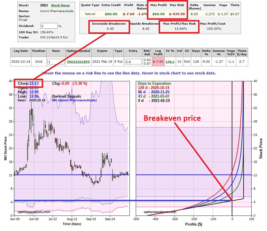
Ticker INO
*Trade: Sell the INO Feb 5 put for
$0.60
*Investor commits $440 ($5 strike x
100 shares minus $60 in premium)
*So here is a position that offers a
tempting 13.9% return in 133 days
*The stock is trading at $12.31 a
share, the strike price ($5) is 60% lower and the breakeven price is $4.39.
Remember, the question IS NOT “will the stock go up from here?” The question IS “will the stock stay above $5 until February?”
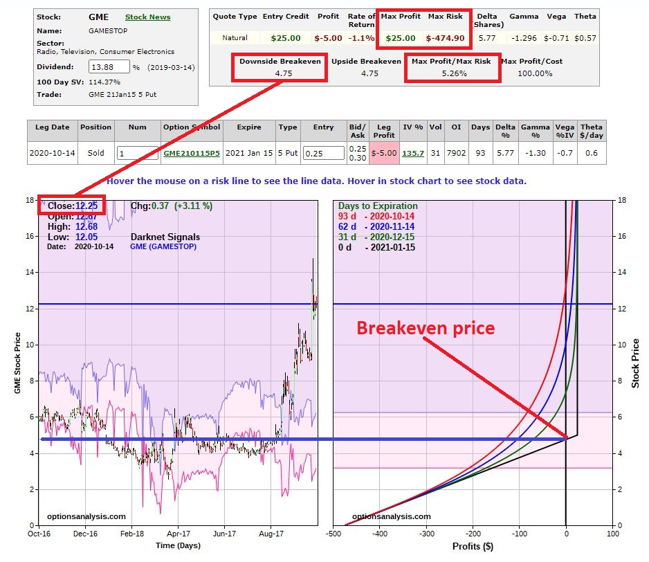
Ticker GME
Gamestop appeared to be left for dead
and traded as low as $2.57 a share in early April 2020. Then they signed a deal
with Microsoft and the shares soared.
*Trade: Sell the GME Jan 5 put for
$0.25
*Investor commits $475 ($5 strike x
100 shares minus $25 in premium)
*If GME holds above $5 a share the
return is 5.26% in 93 days
*The stock is trading at $12.25 a
share, the strike price ($5) is 59% lower and the breakeven price is $4.75.
Again, the analysis that needs to be done does not involved wondering whether GME will continue to rise in price from its current level. Rather, the only thing that matters is “will the stock stay above $5 until January?”
Summary
Selling cash-secured puts may or may
not be your “cup of tea.”
The stocks/trades highlighted here
might be “perfectly acceptable”, a “question mark”, or “way too speculative”
depending on your own view of things.
But the real point is that in a world
of little or no yield, it may be worthwhile to at least consider some
alternatives for generating income.
See also Jay Kaeppel Interview in July 2020 issue of Technical Analysis of Stocks and Commodities magazine
Disclaimer: The information, opinions and ideas expressed herein are for
informational and educational purposes only and are based on research conducted
and presented solely by the author. The
information presented represents the views of the author only and does not constitute
a complete description of any investment service. In addition, nothing presented herein should
be construed as investment advice, as an advertisement or offering of
investment advisory services, or as an offer to sell or a solicitation to buy
any security. The data presented herein
were obtained from various third-party sources.
While the data is believed to be reliable, no representation is made as
to, and no responsibility, warranty or liability is accepted for the accuracy
or completeness of such information.
International investments are subject to additional risks such as
currency fluctuations, political instability and the potential for illiquid
markets. Past performance is no
guarantee of future results. There is
risk of loss in all trading. Back tested
performance does not represent actual performance and should not be interpreted
as an indication of such performance.
Also, back tested performance results have certain inherent limitations
and differs from actual performance because it is achieved with the benefit of
hindsight.
Ticker
ZROZ is the PIMCO 25+ Year Zero Coupon U.S. Treasury Index (do not attempt to
say that 3 times fast) ETF. It tracks an
index of zero-coupon treasury securities with an effective duration of 20+ years.
Now let’s interpret that into
English.
A zero-coupon bond is a bond that
pays no interest. Instead it sells at a
discount to face value ($1,000) to create a specific rate of return if held
until maturity.
Wait, I though you said this was going
to be in English.
An example: For a standard interest
paying bond you might pay $900 to buy the bond and get paid x% of interest every
year for y number of years and then be paid $1,000 at maturity. With a zero-coupon bond of the same duration
you might pay only $800 to buy the bond. No interest is paid along the way but
you still receive the $1,000 at maturity.
Because no interest is paid along the way, zero coupon bonds are extremely sensitive to changes in interest rates. This does not technically matter if you are planning to hold it until maturity. However, there can be large price fluctuations along the way depending on much time is left until maturity and how large the interest rate swings are along the way.
The present effective yield-to-maturity for a 20-year zero-coupon treasury is somewhere around or slightly below the 2% range. So, if interest rates were to rise in the interim, the value of a 20-year zero coupon bond is likely to get hit hard (granted it will eventually work its way back to $1,000 of face value, still I am not a fan of locking in sub 2% return for 20 years).
So why am I bothering to discuss zero-coupon
bonds? Well, there is a time for
everything.
Zeroes and the Election Cycle
Many are familiar with the stock
market and the apparent impact of the 4-year election cycle. Turns out the stock market is not alone. For testing purposes, we will use the Merrill
Lynch Treasury Strips 20+ Year Index to measure the performance of zero-coupon
bonds across the 48-month election cycle.
The data starts in April 1995.
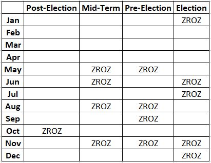
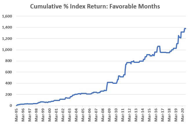
Figure 1 displays the months during
the election cycle that favor 20-year zeroes.
Figure 1 – ZROZ Election Cycle
Calendar
Figure 2 displays the cumulative %
growth for the index ONLY during the months listed in Figure 1.
Figure 2 – Cumulative % +(-) Merrill
Lynch Treasury Strips 20+ Year Index gain ONLY during Favorable Election Cycle
Months
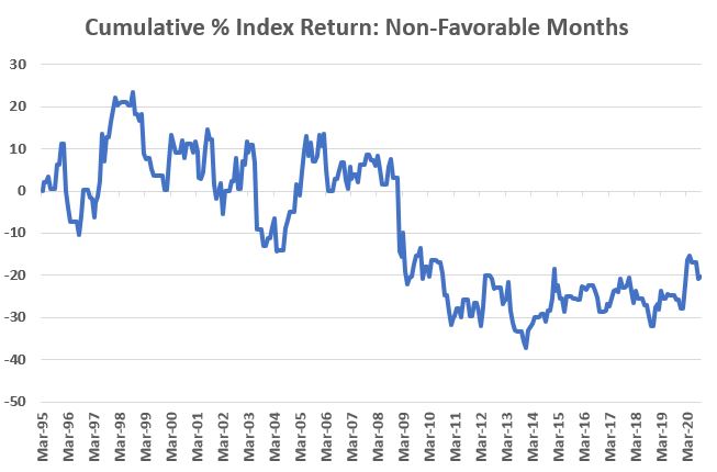
To better appreciate the performance displayed
in Figure 2, Figure 3 displays the cumulative % return for the index ONLY
during all months NOT LISTED in Figure 1.
Figure 3 – Cumulative % +(-) Merrill
Lynch Treasury Strips 20+ Year Index gain ONLY during all Non-Favorable
Election Cycle Months
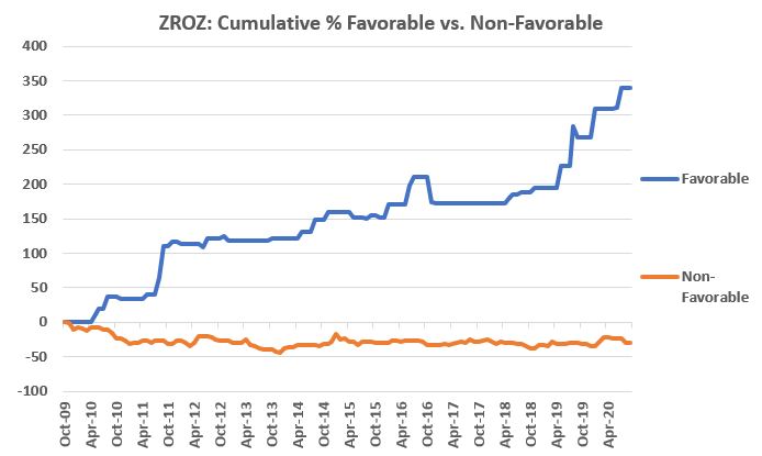
ZROZ and the Election Cycle
The first full month of total return
data for ticker ZROZ is November 2009.
*The blue line in Figure 4 displays % return for ZROZ held ONLY during the months listed in Figure 1.
*The orange line in Figure 4 displays the % return for ZROZ held only during all months NOT LISTED in Figure 1.
Figure 4 – Cumulative % +(-) for ticker
ZROZ during “Favorable” Election Cycle Months (blue) and during “Non-favorable”
Election cycle Months (orange)
The next “favorable” election cycle
months for ZROZ are November and December of 2020.
Summary
Does any of the above suggest that
ZROZ is “guaranteed” to gain ground during November and December? Not at all.
In fact, one can certainly question the entire concept of relying on “election
cycle months” to actually invest money.
But that’s up to each individual to
decide. For now, we are in the “information
is (or at least, may be) power” stage.
Now you know that some months appear to better than others for
zero-coupon bonds.
Seriously though, who knew?
See also Jay Kaeppel Interview in July 2020 issue of Technical Analysis of Stocks and Commodities magazine
Disclaimer: The information, opinions and ideas expressed herein are for
informational and educational purposes only and are based on research conducted
and presented solely by the author. The
information presented represents the views of the author only and does not constitute
a complete description of any investment service. In addition, nothing presented herein should
be construed as investment advice, as an advertisement or offering of
investment advisory services, or as an offer to sell or a solicitation to buy
any security. The data presented herein
were obtained from various third-party sources.
While the data is believed to be reliable, no representation is made as
to, and no responsibility, warranty or liability is accepted for the accuracy
or completeness of such information.
International investments are subject to additional risks such as
currency fluctuations, political instability and the potential for illiquid
markets. Past performance is no
guarantee of future results. There is
risk of loss in all trading. Back tested
performance does not represent actual performance and should not be interpreted
as an indication of such performance.
Also, back tested performance results have certain inherent limitations
and differs from actual performance because it is achieved with the benefit of
hindsight.