In recent articles (here and here) I’ve written about the historical tendency for health care stocks and long-term treasuries to rise during the middle part of the calendar year.
As with any seasonal trend, there are absolutely no “sure things” and of course, “this time may be different.” That being said, let’s look at the historical results of combining the two during May through August.
The Components
*For health care we will use Fidelity Select Health care (ticker FSPHX) as a proxy
*For long-term treasuries we use the Bloomberg Barclays Treasury Long-Term Index from January 1981 through May 1986 and then ticker VUSTX (Vanguard Long-Term Treasury) from June 1986 through March 2019 (ETF alternative: ticker TLT)
The Test
Starting on 1982, every year we put 50% into health care and 50% into long-term treasuries on May 1st and hold those position through the end of August.
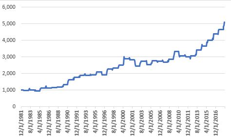
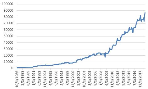
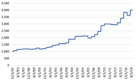
Figure 1 first displays the cumulative growth of equity achieved by holding the two components separately during May through October.
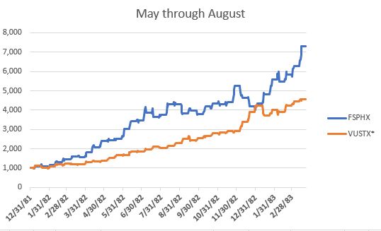
Figure 1 – Growth of $1,000 invested in ticker FSPHX (blue) and long-term treasuries (orange) held ONLY May through August; 1982-2018
*VUSTX started trading in July 1986; prior to then Bloomberg Barclays Treasury Long-Term Index is used
As you can see, both have trended higher over time, health care stocks with more volatility but also a higher return.
Lesson in Diversification #256
The age-old investment adage suggests that if you combine a more volatile security with a less volatile security you get a more consistent performance. This one example certainly seems to make that case.
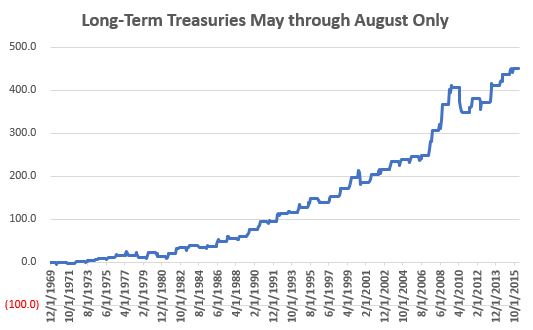
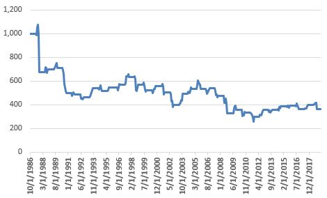
Figure 2 displays the growth of equity achieved by combining health care and long-term treasuries with a 50/50 split on May 1st and holding through August 31st.
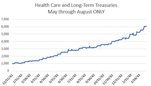
Figure 2 – Growth of $1,000 invested 50/50 in health care stocks and long-term treasuries ONLY May through August; 1982-2018
*VUSTX started trading in July 1986; prior to then Bloomberg Barclays Treasury Long-Term Index is used
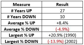
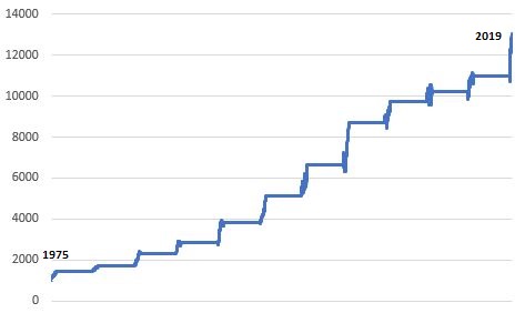
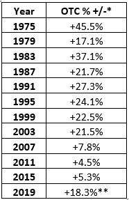
For the record, the combined portfolio showed a May through August gain 86.5% of the time (32 out of 37 years).
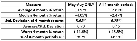
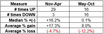
Figure 3 displays some relative performance measures. Note that the “Combined” portfolio has the:
*Lowest standard deviation of returns (i.e., the lowest volatility)
*The highest Average/Standard Deviation results (i.e., the highest risk adjusted return
*The smallest “Worst May-Aug%” result (-4.5% in 1983)
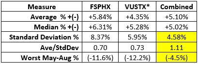
Figure 3 – Comparative Results
*VUSTX started trading in July 1986; prior to then Bloomberg Barclays Treasury Long-Term Index is used
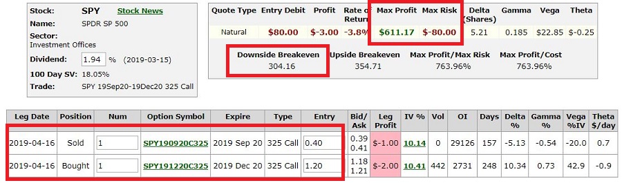
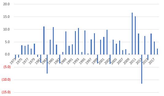
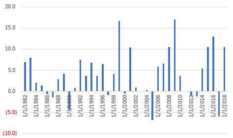
Figure 4 displays the year-by-year % +(-) for the combined portfolio.
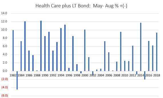 Figure 4 – Year-by-Year % +(-); Health Care stocks plus LT Treasuries – May through August; 182-2018
Summary
So, is it time to “load up” on health care stocks and long-term bonds? While history suggests “Maybe so”, as I mentioned at the outset, when it comes to seasonal trends each “go round” is its own flip of the coin.
What could go wrong in the future? Looking ahead, if a serious move to socialized medicine ever truly takes hold, health care company profits would likely be impacted for the worse (whether you consider that to be a good thing or a bad thing is not the point – the point is that the performance of health care stocks would likely be impacted). Likewise, if we enter a sustained period of higher interest rates, the risk associated with holding long-term bonds – even for only a few months at a time – will rise.
Ah the markets – never a dull moment.
Jay Kaeppel
Disclaimer: The data presented herein were obtained from various third-party sources. While I believe the data to be reliable, no representation is made as to, and no responsibility, warranty or liability is accepted for the accuracy or completeness of such information. The information, opinions and ideas expressed herein are for informational and educational purposes only and do not constitute and should not be construed as investment advice, an advertisement or offering of investment advisory services, or an offer to sell or a solicitation to buy any security.