Monthly Archives: June 2017

The Summer Rally (versus the Rest of Summer)

It is not a little known phenomenon that the stock market has demonstrated a seasonal tendency to rally during a specific time of the summer.  It is also not entirely unrecognized that the summer months are often a “snooze fest” for the stock market overall.  The catch of course is that results can vary widely from year-to-year.

Still, in looking for an “edge” wherever we can find one, it probably doesn’t hurt to know the difference between the “Summer Rally Period” and “The Rest of Summer.”

(See also The Post-Election/Year ‘7’ Bermuda Triangle)

The Summer Rally Period (SRP)

The SRP begins at the close on the fourth to last trading day of June and extends through the close on July trading day #9.  For 2017, that means buying at the close on 6/27/2017 and selling at the close on 7/14/17.

Is this really a good idea?  I’ll show you the numbers and you can make up your own mind (you know the old “We report, you decide” model, versus today’s more common journalistic model of “We decide and then we report our decision to you”). We will use the Dow Jones Industrials Average daily price data going back to 1934 for our test.

Here is the primary takeaway:

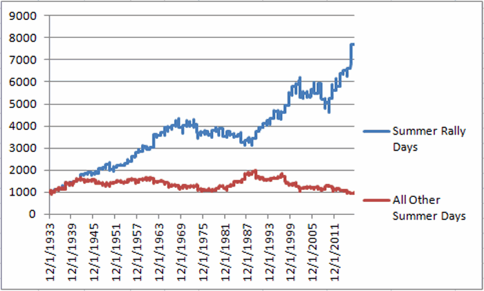
*$1,000 invested in the Dow ONLY during the 12-day SRP grew to $7,705

*$1,000 invested in the DOW ONLY during ALL OTHER trading days during the months of June, July and August declined to $962

To put it another way, during the SRP the Dow gained +671%, and during all other summer trading days lost -4%.  The difference between +671% and -4% is what we “quantitative types” refer to as “statistically significant”.

More numbers:

Measure Summer Rally Rest of Summer
Average %+(-) 2.7 0.2
Median % +(-) 2.9 0.2
Maximum Gain 21.1 22.7
Maximum Loss (12.6) (18.1)
# times UP 62 44
# time DOWN 21 39
% times UP 74.7 53.0
% time DOWN 25.3 47.0

Figure 1 – Summary Results

As you can see in Figure 1, the SRP has showed a gain roughly 3 out of 4 years, versus much closer to 50/50 for all other summer trading days.

Figure 2 displays the annual results for the Summer Rally Period and Figure 2 displays the annual result for all other trading days of summer.2Figure 2 – Summer Rally Period Yearly% +(-); 1934-20163Figure 3 – All Other Summer Trading Days (June/July/August) Yearly% +(-); 1934-2016
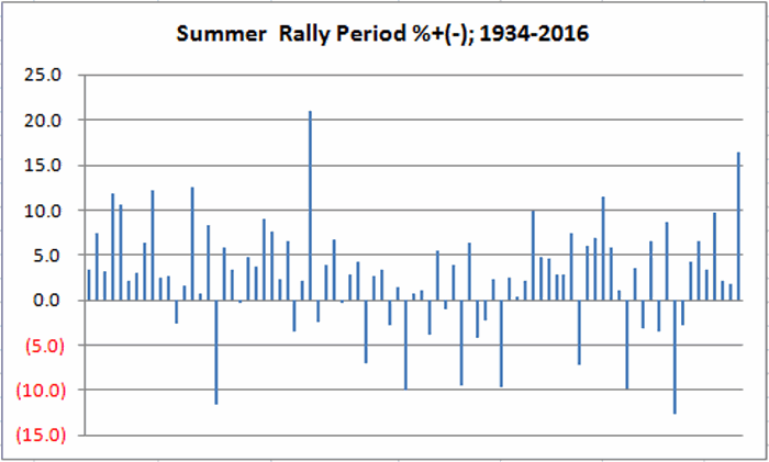
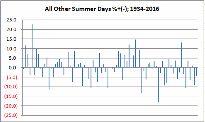
Figure 4 displays the growth of $1,000 invested in the Dow during the Summer Rally Period versus all other trading days of summer.4Figure 4 – Growth of $1,000 invested in Dow during Summer Rally  trading days ONLY (blue) versus all other trading  days for June/July/August; 1934-2016
(See also Four Things to Watch for Warning Signs)

Summary

So will the SRP in 2017 be one of 75% up years or one of the 25% down years?  Ah, there’s the rub.  There is no way to predict for sure. 75% represents good odds – but it  is no “sure thing”.  Still, the long-term results clearly seem to favor this narrow 12 day period, particularly vis a vis all other trading days of June, July and August.

Jay Kaeppel

Disclaimer:  The data presented herein were obtained from various third-party sources.  While I believe the data to be reliable, no representation is made as to, and no responsibility, warranty or liability is accepted for the accuracy or completeness of such information.  The information, opinions and ideas expressed herein are for informational and educational purposes only and do not constitute and should not be construed as investment advice, an advertisement or offering of investment advisory services, or an offer to sell or a solicitation to buy any security.
Do You Think Apple Will Bounce?

Actually it is a two part question:

Question 1) Do you Apple (ticker AAPL) will bounce back to higher ground?

Question 2) Do you have 260 bucks?

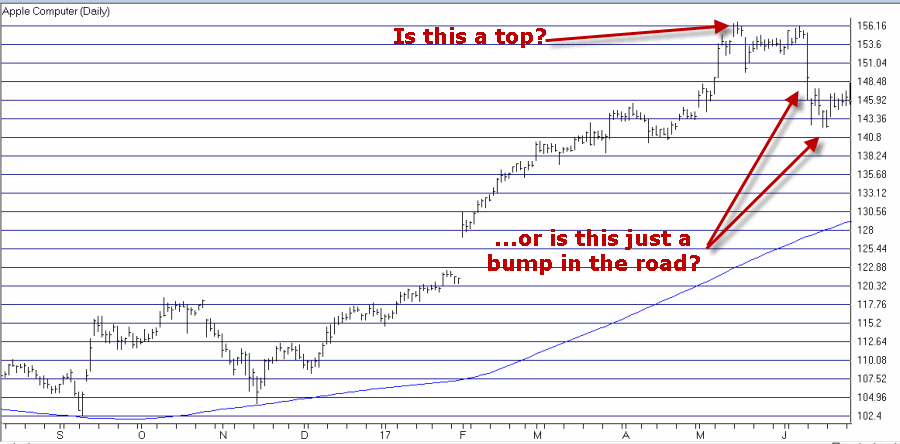
AAPL has been a high flier for some time.  But as you can see in Figure 1, it recently hit a “bump in the road”.1Figure 1 – AAPL stumbles – A top or just a temporary setback? (Courtesy AIQ TradingExpert)

(See also Even More Summer Fun with Biotech and Real Estate)

What follows is not a “recommendation” but merely an example of “one way to play” for a trader who thinks that AAPL stock may bounce back to or above its old highs – but who doesn’t want to or cannot pony up the requisite $14,568 needed to purchase a “small” position of 100 shares.

The Out–of-the-Money Call Calendar

There are many potential variations of what I am about to show.  This should NOT be considered to be the “one best and only way.”  But hey, it’s one way.

Hypothetical Position:

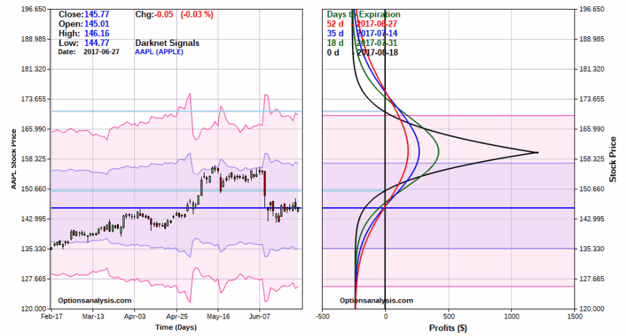
*Buy 4 AAPL Sep15 160 calls @ $1.28

*Sell 4 AAPL Aug18 160 calls @ $0.70

If entered at this price, the total cost before commissions is $260. This also represents the maximum risk if AAPL fails to advance.

The particulars are displayed in Figure 2 and the “big picture” risk curves in Figure 3

2Figure 2 – AAPL Out-of-the-money calendar spread (Courtesy www.OptionsAnalysis.com)

3Figure 3 – Risk Curves for AAPL Out-of-the-money calendar spread (Courtesy www.OptionsAnalysis.com)

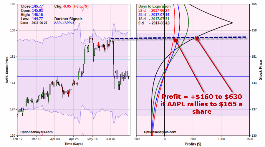
Now let’s “zoom in” a bit on “where this trade lives” (a phrase I first learned from Mitch Genser, a mentor of mine when I joined Optionetics a number of years ago).

What we are really looking for is for AAPL to (hopefully) bounce back up to its old high near $156 a share.  As you can see in Figure 4, if AAPL does get backup to this price prior to August option expiration on 8/18, the profit on this position will be somewhere between $160 and $630, depending on how soon that price is hit.  If AAPL rallies immediately the profit will be lower, if it takes its time the profit will be higher.  In this position, time decay works in the traders favor at any price above roughly $150 a share.4a

Figure 4 – Zooming in on the AAPL OTM Calendar (Courtesy www.OptionsAnalysis.com)

As with any trade a plan is essential for success.  So here is a hypothetical plan fitting a hypothetical trade:

  1. If AAPL breaks down we will simply hold on and risk the entire $260.
  2. If AAPL rallies to $156 we will either close the position and take our profit OR look to adjust the open position to lock in a profit and let the rest ride.

(See also The Sordid Past of Years Ending in ‘7’)

Summary

I have no opinion as to whether or not AAPL will rally between now and August 18.  But that’s not really the point of this example.  The point is this:

For a trader who thinks that a stock that has been in a strong uptrend before a short, sharp decline will bounce back, this example highlights one way to play without risking large amounts of capital

Jay Kaeppel

Disclaimer:  The data presented herein were obtained from various third-party sources.  While I believe the data to be reliable, no representation is made as to, and no responsibility, warranty or liability is accepted for the accuracy or completeness of such information.  The information, opinions and ideas expressed herein are for informational and educational purposes only and do not constitute and should not be construed as investment advice, an advertisement or offering of investment advisory services, or an offer to sell or a solicitation to buy any security.
Even More Summer Fun with Biotech and Real Estate

In this article I highlighted the potential benefit of focusing on biotech and real estate during a particular favorable seasonal period during June and July.  Today we are going to extend the “summer fun” out a little longer.

(Be sure to see Three Timely Articles Worth Reading)

(See also Summer Leisure = Fun (and Dead Money))

The Extended Summer Fun Strategy

The rules are pretty simple:

*Hold biotech (FBIOX) and real estate (FRESX) – split 50/50 – from the close on June trading day number 17 through the close on July trading day #21

*Also hold biotech only (100%) from the close on August trading day #7 through the close on September trading day #9.

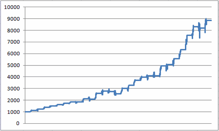
The results of this “strategy” (If one can call it that) appear in Figure 1.1Figure 1 – Growth of $1,000 invested in FBIOX and FRESX using Jay’s “Extended Summer Fun” Strategy

For the record:

Measure Result
# Years UP 24 (86%)
# Years DOWN 4 (14%)
Average All Years +8.3%
Average UP Year +10.1%
Average DOWN Year (-2.5%)
Best UP Year +22.7% (1999)
Worst DOWN Year (-7.7%) (2002)

Figure 2 – Summary Results

Year-by-Year Results Appear in Figure 3.

Year % +(-)
1989 12.4
1990 7.9
1991 15.2
1992 7.4
1993 6.3
1994 7.4
1995 8.1
1996 0.4
1997 13.5
1998 (0.8)
1999 22.7
2000 7.6
2001 (0.5)
2002 (7.7)
2003 18.1
2004 9.9
2005 12.3
2006 7.8
2007 2.4
2008 0.3
2009 21.0
2010 1.8
2011 10.5
2012 13.5
2013 19.5
2014 9.9
2015 (1.2)
2016 7.6

Figure 3 – Year-by-Year Results

(See also A Really (Really) Long-Term Perspective on Interest Rates)

Summary

So is this “Summer Fun Strategy” really a strategy?  That’s not for me to say.  As always, the stuff I write about here is presented as “information” and not as a “recommendation”.

The competing factors are:

*The long-term results have been pretty consistently good (86% winners)

*However, there is never any guarantee “this time around” AND biotech and real estate can be extremely volatile sectors.

So DO  NOT think of this as a “low risk” strategy.

Still, given that the overall stock market often does little during the summer months, we investors have to look for “fun” wherever we can find it.

Jay Kaeppel

 Disclaimer:  The data presented herein were obtained from various third-party sources.  While I believe the data to be reliable, no representation is made as to, and no responsibility, warranty or liability is accepted for the accuracy or completeness of such information.  The information, opinions and ideas expressed herein are for informational and educational purposes only and do not constitute and should not be construed as investment advice, an advertisement or offering of investment advisory services, or an offer to sell or a solicitation to buy any security.
Summer Fun with Biotech and Real Estate

Studies suggest that buying an upside breakout can be a good strategy.  It sure can be scary though.  There is always that underlying fear of looking like “the last fool in” if the security in question experiences only a false breakout and then reverses back to the downside (and I hate it when that happens).  Still, for a stock to go from $50 to $100 it first has to go to $50.01, then $50.02, etc.

(See also Live by the FAANG, Die by the FAANG)

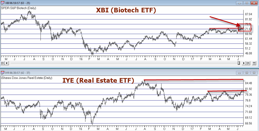
Buying into an impending breakout can be an even dicier proposition since this involves buying into what is essentially a “topping formation.”  I recently wrote about consolidation patterns in biotech and real estate.  These sectors appear to be getting closer to a resolution.  Consider tickers XBI (biotech ETF) and IYR (real estate ETF) as shown in Figure 1.

1Figure 1 – Biotech and Real Estate (Courtesy AIQ TradingExpert)

XBI appears to be breaking out to the upside – at least for now.  IYR is close to breaking out – however, one could look at it in an exactly opposite manner and claim that it is “running into resistance near the old highs and therefore may be forming a top.”

Ah, the eye of the beholder.

A Seasonal Play in Biotech and Real Estate

It is pretty widely known at this point that the summer months tend not to be very favorable for the stock market overall (although July of this year might be an exception to the rule).  But biotech and real estate often provide a summer trading opportunity.

The seasonally favorable period extends from:

*The close on June trading day #17 (6/23/2017 this year)

*Through the close on July trading day #21 (7/31/2017 this year)

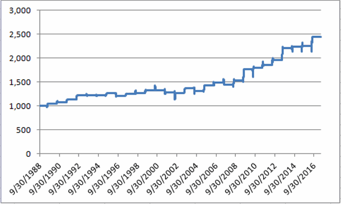
Figure 2 displays the growth of $1,000 split evenly between ticker FBIOX (Fidelity Select Biotech) and ticker FRESX (Fidleity Select Real Estate) every since 1989 during this period.

2Figure 2 – Growth of $1,000 split between FBIOX and FRESX during seasonally favorable summer period (1989-2016)

Figure 3 displays a summary of the results since 1989.

Measure Result
# Years UP 22 (79%)
# Years DOWN 6 (21%)
Average All Years +3.3%
Average UP Year +5.0%
Average DOWN Year (-2.9%)
Best UP Year +14.9% (2009)
Worst DOWN Year (-4.3%) (2004)

Figure 3 – Summary Results

(See also One Good Reason NOT to Pick a Bottom in DIS)

One thing to  note is the lack of downside volatility despite the fact that both biotech and real estate can be quite volatile (worst down period was -4.3% in 2004).

Year-by-Year Results Appear in Figure 4.  For comparisons sake the annual performance for the Dow Jones Industrials Average (DJIA) during the same period is included.

Year FBIOX/FRESX DJIA Diff
1989 4.8 5.1 (0.3)
1990 2.8 2.1 0.7
1991 5.8 3.6 2.2
1992 7.0 3.2 3.7
1993 0.8 2.1 (1.3)
1994 (0.6) 1.8 (2.4)
1995 3.5 2.7 0.8
1996 (4.1) (4.1) 0.1
1997 2.9 6.4 (3.5)
1998 1.8 2.2 (0.5)
1999 4.4 (0.1) 4.5
2000 0.3 1.1 (0.8)
2001 (3.6) 0.1 (3.8)
2002 (1.5) (4.9) 3.4
2003 8.0 1.0 7.0
2004 (4.3) (2.9) (1.4)
2005 9.6 2.1 7.5
2006 4.0 1.8 2.2
2007 (3.2) (1.0) (2.1)
2008 6.7 (1.9) 8.6
2009 14.9 10.0 4.9
2010 2.0 1.6 0.4
2011 3.0 0.8 2.2
2012 5.7 4.0 1.7
2013 12.6 5.2 7.5
2014 1.1 0.4 0.7
2015 0.6 (2.2) 2.8
2016 8.6 2.3 6.2

Figure 4 – Annual Results for FBBIOX/FRESX during seasonally favorable  summer period versus Dow Jones Industrials Average

For the record,during the seasonally favorable summer period:

*The FBIOX/FRESX combo has outperformed the Dow in 19 out of 28 years.

*$1,000 invested in FBIOX/FRESX grew to $2,440

*$1,000 invested in the Dow Industrials grew to $1,505

Summary

So is biotech and real estate the place to be in the month ahead?  Well, that’s “the thing” about seasonal trends – there’s no way to know for sure what it’s going to be “this time around.”

On a cautionary note, it should be pointed out that the FBIOX/FRESX combo has registered a gain during the seasonal summer period – and outperformed the Dow – in each of the last 9 nine years.

So is it “Away We Go” or this the year that “Murphy’s Law” exacts its revenge?  As always, time will tell.

Jay Kaeppel

Disclaimer:  The data presented herein were obtained from various third-party sources.  While I believe the data to be reliable, no representation is made as to, and no responsibility, warranty or liability is accepted for the accuracy or completeness of such information.  The information, opinions and ideas expressed herein are for informational and educational purposes only and do not constitute and should not be construed as investment advice, an advertisement or offering of investment advisory services, or an offer to sell or a solicitation to buy any security.
Live by the FAANG, Die by the FAANG

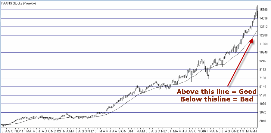
It’s been a heck of a run.  As you can see in Figure 1, if you were in the “right places at the right time” you did, um, pretty well for yourself.1Figure 1 – FAANG stocks “to the moon” (Courtesy AIQ TradingExpert)

The index in Figure 1 includes the following 9 tickers: AAPL, AMZN, FB, GOOG, MSFT, NFLX, NVDA, PCLN and TSLA

(See also The Post-Election/Year ‘7’ Bermuda Triangle)

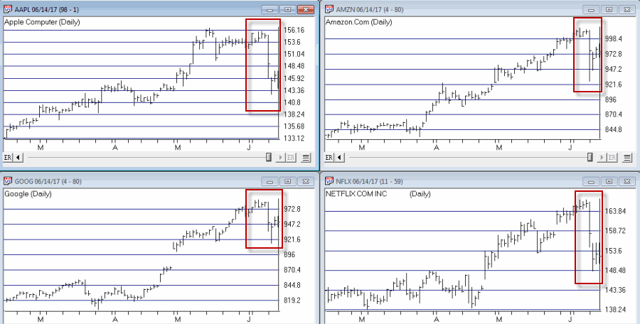
As you can see in Figure 2, this particular grouping hit a bit of an air pocket in the last week.2aFigure 2 – “Trouble in Paradise?” (Courtesy AIQ TradingExpert)

So is that the top? As I am not good at predicting things, I will defer to my standard answer of “It beats me.”  But the real point can be summed up as follows:

*These stocks have driven the overall stock market higher in recent years.

*It can be argued that these stocks have “gone parabolic” (which is fun while it lasts but….)

*When these stocks finally start to break, history suggests that this will not be a positive development for the overall stock market.

In Figure 1, I have drawn a 30-week moving average. There is nothing magic about 30-weeks and an eventual drop below the 30-week average does NOT definitively imply that a bear market is underway.

But I would keep an eye on these stocks anyway.  Because if and when they do start to break in earnest, the overall stock market may be in a whole lot of trouble.

(See also One Good Reason NOT to Pick a Bottom in DIS)

Update on Warning Signs to Watch For

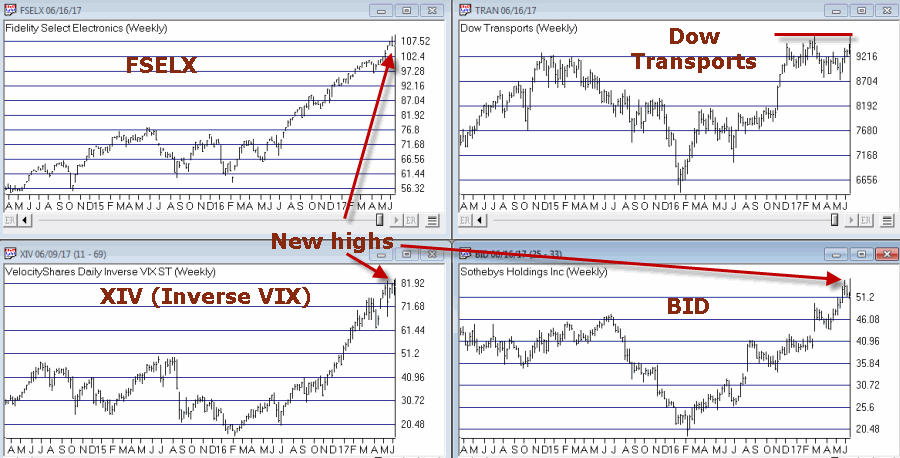
In this article I wrote about four tickers that might offer some “early warning” signs if trouble is coming in the stock market.  In general, there really are no “warning signs” yet as most of these hit new highs recently as you can see in Figure 3.3Figure 3 – Four Tickers to Watch (Courtesy AIQ TradingExpert)

I wouldn’t stop watching them though.  If these – and the FAANG stocks – falter, the time to turn defensive will be nigh.

Jay Kaeppel

Disclaimer:  The data presented herein were obtained from various third-party sources.  While I believe the data to be reliable, no representation is made as to, and no responsibility, warranty or liability is accepted for the accuracy or completeness of such information.  The information, opinions and ideas expressed herein are for informational and educational purposes only and do not constitute and should not be construed as investment advice, an advertisement or offering of investment advisory services, or an offer to sell or a solicitation to buy any security.
A ‘Cheap’ Way to Hedge the Long Bond

Concerns regarding higher interest rates continue to run deep. But you wouldn’t know it from the recent action of the long-term treasury bond which rallied 8% in 3 months since bottoming in March.

What is the likelihood that bonds will reverse and head lower from here?  It beats me.  While my primary bond model is still bearish the truth is that predictions are not my strong suit.  Still, concerns remain. So if a trader or investor has concerns about the potential for lower bond prices and wants to do something about it, it raises the obvious question of “What?”

The truth is that there are many potential answers.  What follows is simply “one of them.”

(See also Playing the GDX ‘Coil’)

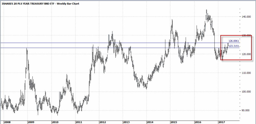
Figure 1 displays a weekly chart of ticker TLT with two admittedly arbitrary “resistance” levels drawn. There is nothing magic about these lines but they do connect a series of previous highs and suggest that we may be at a potentially critical juncture. In other words, a breakout to the upside could clear the way for a larger rally while a failure from these levels could result in another down leg for bond prices.1Figure 1 – TLT with potential resistance levels (Courtesy ProfitSource by HUBB)

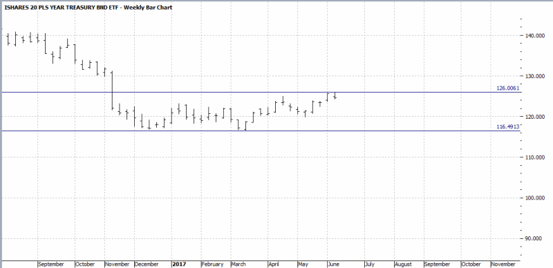
Figure 2 simply shows a “zoomed in” weekly chart with the latest support and resistance levels drawn in order to identify potential “target” levels.  The goal is simple:

*We want to make money if TLT drifts back down towards the lower line (or below it)

*Without risking a lot of money in case TLT breaks out above the upper line

2Figure 2 – TLT with potential support and resistance levels (Courtesy ProfitSource by HUBB)

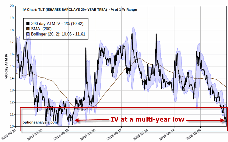
Whatever one expects regarding price direction, the fact is that – as we see in Figure 3 – the implied volatility for options on ticker TLT is at a multi-year low.  IV simply tells us whether there is a lot or a little (or somewhere in between) amount of time premium built into the options for a given security.  If IV is low it suggests that options are “cheap” and that strategies that buy option premium and/or that can benefit from a potential rise in IV are good strategy candidates.3Figure 3 – Implied volatility for TLT options at a multi-year low (Courtesy www.OptionsAnalysis.com)

Let’s look at one relatively simple example trade.

The Out-of-the-Money Put Calendar Spread

The example trade involves:

*Buying 15 August 119 puts @ $0.51

*Selling 13 July 119 puts @ $0.21

The particulars appear in Figure 4 (note this trade buys more puts than it sells.  This give the trade bearish directional bias).

4Figure 4 – TLT Out-of-the-Money Put Calendar Spread (Courtesy www.OptionsAnalysis.com)

Note that:

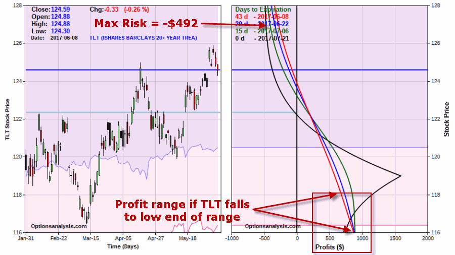
*The cost to enter this trade – and the maximum risk – is $492

*The trade has a “delta” of -103 which means it will act like a position holding short 103 shares of ticker TLT

*The IV for the option bought is 10.5% and 9.9% for the options sold

*The August options expire in 43 days, the Septembers in 71 days.  This means that in 43 days the August options will lose their entire time premium while the Septembers will still have 28 days of time premium left.

The risk curves for this trade appear in Figure 5.5Figure 5 – TLT Out-of-the-Money Put Calendar Spread

Note that because we hold more long options than short options the trade technically has unlimited profit potential.  However, the “peak” profit would occur if TLT closed at exactly $119 a share at August option expiration on July 21 (which -by the way – is NOT going to happen .

So the bottom line is simple:

*If TLT rallies this trade could lose -$492

*If TLT declines this trade can generate a profit of, of, of, well, it depends.  It depends on how far TLT falls and when the trade is exited. So there is another decision to be made somewhere down the road regarding when to get out if TLT falls.

But there is more.

The Potential Benefit of Buying “Cheap” Options  

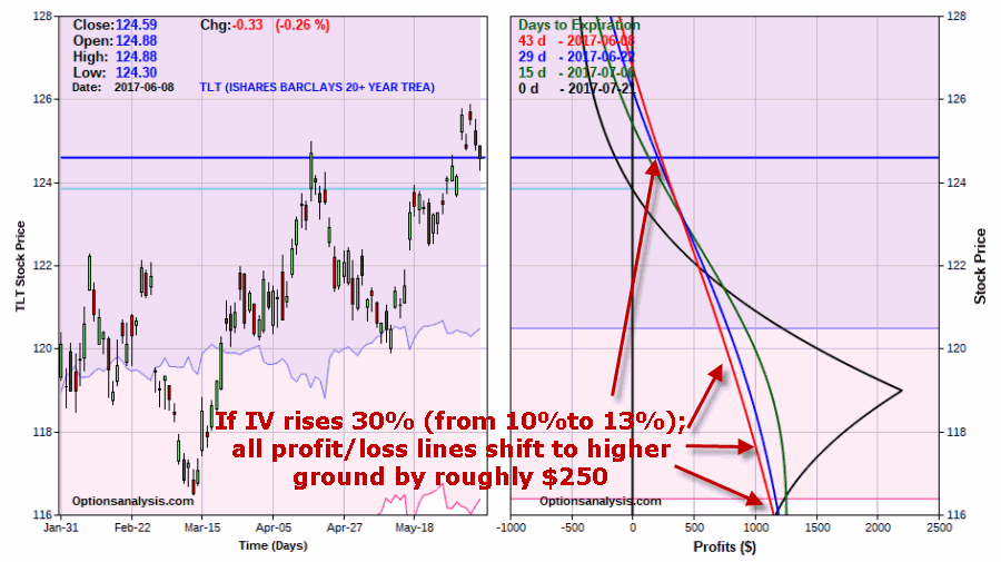
As noted above, this example trade was highlighted precisely because it can benefit if implied volatility rises after the trade is entered.  Typically IV levels rise when fear rises as speculators rush to buy options to hedge.  So let’s take a look at what might happen if TLT shares fell, triggering a not unrealistic rise of 30% in IV levels (i.e., from roughly 10% to roughly 13%) as traders rush to buy options to hedge their long bond positions.

The new, adjusted risk curves appear in Figure 6.6Figure 6 – Risk curves if implied volatility rises from 10% to 13% after trade is entered (Courtesy www.OptionsAnalysis.com)

Note the difference between the curves in Figure 6 versus Figure 5.  All of the risk curves have shifted higher – i.e., to the right on the chart.  In other words, a rise in IV can and would likely generate a higher profit for this trade if in fact TLT shares fall and that decline is accompanied by higher IV levels.

For the record, this is due to the fact that longer-term options hold more “Vega” (more on this in a moment) than shorter-term options.  The Greek term “Vega” in option trading tells you how much a given option (or combined trade) will gain if implied volatility rises 1 full percentage point.

A close review of Figure 4 reveals that the August 119 put had a Vega of 13.4 and the short July 119 put had a Vega of -7.8.  So in theory:

*If IV rises 3 full percentage points each August 119 put will gain $40.20 (13.4 x 3) while each July119 put will lose -$23.40 (-7.8 x 3). Remember also that in this example trade we are long 15 of the August 119 puts and short only 13 of the July 119 puts.

(See also It’s Soon or Never for Bonds)

Summary

Does this whole thing have a point?  The point is that if you are concerned about the risk of higher interest rates (and in turn, lower bond prices):

a) It is possible to construct a relatively low priced hedge

b) That that hedge can risk less than $500

c) That it can make that much or more if TLT sinks back to a previous support level

d) That additional profit potential is possible if implied volatility rises from its current very low level.

While the fact of the matter is that bonds could easily rally and saddle this trade with a loss from the get go – and ultimately suffer a 100% loss of the $492 spent to enter the trade – that’s still a lot for a trade to potentially offer.

As always, the information presented here is intended to be educational and not a recommendation.

Jay Kaeppel

Disclaimer:  The data presented herein were obtained from various third-party sources.  While I believe the data to be reliable, no representation is made as to, and no responsibility, warranty or liability is accepted for the accuracy or completeness of such information.  The information, opinions and ideas expressed herein are for informational and educational purposes only and do not constitute and should not be construed as investment advice, an advertisement or offering of investment advisory services, or an offer to sell or a solicitation to buy any security.
One Good Reason NOT to Pick a Bottom in DIS

A better title for this article might be “How to Avoid Losing 98% in Disney.”

The recent dip in the price of Disney stock may ultimately prove to be a buying opportunity.  But for reasons detailed below I am going to let this one pass.

If you have read my stuff in the past you know that I look a lot at seasonal trends.  This is especially true for sectors and commodities – which in some cases can be tied to recurring fundamental factors.  I have occasionally looked at individual stocks (here and here and here), but tend to think that an individual company’s fundamentals can change so drastically over time that a persistent seasonal trend is less likely.

It appears that there are exceptions to every rule.

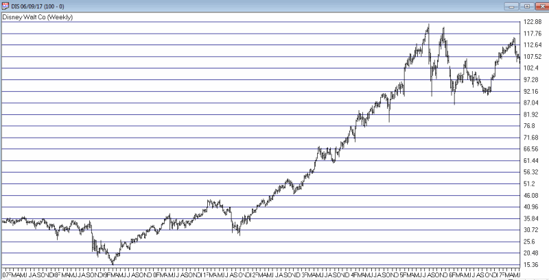
In Figure 1 below we see that after a strong run up from its 2009 low, Disney finally topped out in August of 2015. Since that time it’s been a string of large moves up and down – with the latest being down. This might prompt one to consider the latest dip as a buying opportunity.  And in fact, maybe it is. But I won’t be making that play myself based simply on a seasonal trend in DIS stock that was highlighted by Brooke Thackray in his book Thackray’s 2017 Investor’s Guide.0Figure 1 – Is latest dip in DIS a buying opportunity?  Maybe, but history suggests we look elsewhere….(Courtesy AIQ TradingExpert)

(See also The Post-Election/Year ‘7’ Bermuda Triangle)

When NOT to Own Disney Stock

In his book, Thackray highlights the period from June 5th through the end of September as an “unfavorable” period for DIS stock.  He also listed a specific “favorable” period that I’ll not mention here.  For purposes of this article I made the following changes:

*The “unfavorable” period begins at the close on the 5th trading day of June and ends at the close on the last trading day of September.

*The rest of the year – i.e., end of September until the close on the 5th trading day of June – is considered the “favorable” period.

Also, the test uses price data only.  No dividends are included nor is any interest assumed to be earned while out of DIS stock.

The results are fairly striking.  From the end of 1971 through the end of 2016:

*$1,000 invested in DIS on a buy-and-hold basis grew +8,042% to $81,422 (average annual +/- = +15.8%)

*$1,000 invested in DIS only during the “favorable” period grew +430,874% to $4,309,735 (average annual +/- = +25.0%)

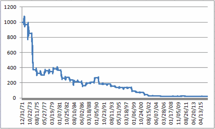
*$1,000 invested in DIS only during the “unfavorable” period declined -98% to $18.89 (average annual +/- = (-6.9%))

It’s sort of hard to ignore the difference between +430,784% and -98%.

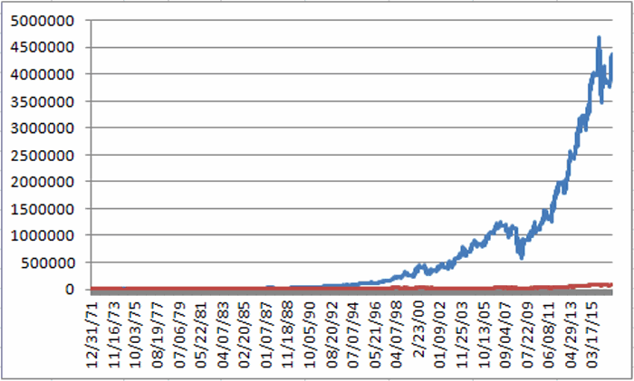
Figure 1 displays the cumulative performance during the unfavorable period from 1971 through 2016.1Figure 1 – Growth of $1,000 invested in DIS only from close of June Trading Day #5 through the end of September (1971-2016)

Figure 2 displays the growth of $1,000 during the favorable period (blue line) versus a buy-and-hold approach (red line).2Figure 2 – Growth of $1,000 invested in DIS only from the end of September through June Trading Day #5 (blue) versus Buy-and-Hold (red); 1971-2016

*The favorable period showed a net gain in 39 out of 45 years (87%)

*The unfavorable period showed a net gain in only 13 out of 45 years (29%)

*Buy-and-hold showed a net gain in 28 out of 45 years (62%)

Figure 3 displays year-by-year results.

Year Favorable Unfavorable Buy/Hold
1972 78.1 (3.5) 71.9
1973 (53.5) (12.0) (59.1)
1974 4.4 (56.4) (54.4)
1975 175.6 (12.4) 141.5
1976 5.2 (6.9) (2.0)
1977 (28.2) 19.1 (14.4)
1978 4.6 (3.3) 1.2
1979 1.2 10.5 11.9
1980 20.8 (5.8) 13.8
1981 42.8 (28.7) 1.9
1982 16.0 4.4 21.1
1983 (5.7) (11.6) (16.7)
1984 25.6 (9.6) 13.6
1985 94.4 (3.3) 88.0
1986 98.3 (23.0) 52.8
1987 14.6 20.1 37.6
1988 4.2 6.5 10.9
1989 32.7 28.3 70.3
1990 28.4 (29.4) (9.3)
1991 14.4 (1.5) 12.8
1992 51.3 (0.7) 50.2
1993 16.0 (14.5) (0.8)
1994 23.2 (12.4) 7.9
1995 27.7 0.3 28.0
1996 18.4 0.0 18.4
1997 43.3 (0.9) 41.9
1998 36.9 (33.6) (9.1)
1999 15.8 (15.8) (2.5)
2000 4.0 (4.8) (1.1)
2001 23.6 (42.1) (28.4)
2002 12.6 (30.1) (21.3)
2003 50.9 (5.2) 43.0
2004 28.9 (7.6) 19.2
2005 (2.5) (11.6) (13.8)
2006 41.8 0.8 43.0
2007 (6.2) 0.4 (5.8)
2008 (24.4) (7.0) (29.7)
2009 29.1 10.1 42.1
2010 16.1 0.2 16.3
2011 30.4 (23.4) (0.0)
2012 15.9 14.6 32.8
2013 54.3 (0.6) 53.4
2014 17.2 5.2 23.3
2015 20.4 (7.3) 11.6
2016 5.0 (5.6) (0.8)
2017 ? ? ?
# Years UP 39 13 28
# Years DOWN 6 32 17
Average % +/- 25.0 (6.9) 15.8

Figure 3 – Year-by-Year Results

(See also The Ultimate “Sell in May” Sector)

Summary

Brooke Thackray found an extremely interesting and robust “unfavorable” seasonal trend in DIS stock.  Of course none of the data above guarantees that DIS stock is doomed to languish and/or decline in the months ahead.  But I for one do not intend to “buck the odds” and play the long side of DIS for a while.

Jay Kaeppel

Disclaimer:  The data presented herein were obtained from various third-party sources.  While I believe the data to be reliable, no representation is made as to, and no responsibility, warranty or liability is accepted for the accuracy or completeness of such information.  The information, opinions and ideas expressed herein are for informational and educational purposes only and do not constitute and should not be construed as investment advice, an advertisement or offering of investment advisory services, or an offer to sell or a solicitation to buy any security.
The Post-Election/Year ‘7’ Bermuda Triangle

There are many “seasonal” tendencies that have played out often in the stock market during post-election years and also during years ending in the number “7” (no, seriously).  To review please see any or all of the following:

The Sordid Past of Years Ending in ‘7’

The Only Months That Matter in 2017

Post-Election April and May

As the second article linked above indicates the months of July and December have typically performed well during post-election years.  Beyond that though:

a) We are in BOTH a post-election year AND year ending in “7”.

b) The months of August, September and October have been particularly brutal in the past when this combination occurred.

Does this really matter and/or will it affect the market in 2017?  It beat me, but it might at least be worth knowing about if defensive action is called for in the months ahead.

The August-September-October (Post-Election/Year “7”) Bermuda Triangle

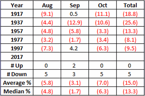
Figure 1 below displays the percentage price change (no dividend data is included, price change only) for the Dow Jones Industrials Average during the aforementioned period.

1

Figure 1 – August/September/October Dow Jones Industrials monthly price changes during Post-Election Years ending in “7”

*As you can see, the month of September has showed a gain 2 times, however, the months of August and October – and the 3 month period as a whole – are both 0-5 in the past century.  So only 2 of the 15 months in total showed a gain.

*The average 3-month performance for the “Post-Election/Year 7” Bermuda Triangle was -15.0%.

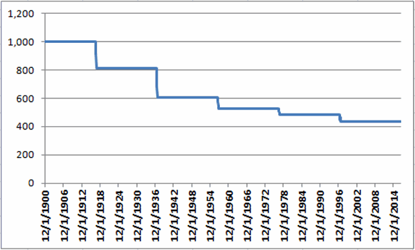
Figure 2 displays a monthly equity curve of just this period. It’s not a pretty picture.2Figure 2 – Growth of $1,000 invested in the Dow Jones Industrials Average ONLY during August, September and October of “Post-Election Years ending in “7”

Summary

Let’s face it, it’s pretty easy to dismiss this “study” as some bizarro anomaly or calendar quirk based on a ridiculously small sample size.  And do not assume that I am “predicting” anything here (as if I had the ability).

The only thing I do know is that if the market starts to breakdown anytime leading up to or within the August through October period there will be at least one market blog writer taking some serious defensive action.

Jay Kaeppel

Disclaimer:  The data presented herein were obtained from various third-party sources.  While I believe the data to be reliable, no representation is made as to, and no responsibility, warranty or liability is accepted for the accuracy or completeness of such information.  The information, opinions and ideas expressed herein are for informational and educational purposes only and do not constitute and should not be construed as investment advice, an advertisement or offering of investment advisory services, or an offer to sell or a solicitation to buy any security.
Playing the GDX ‘Coil’

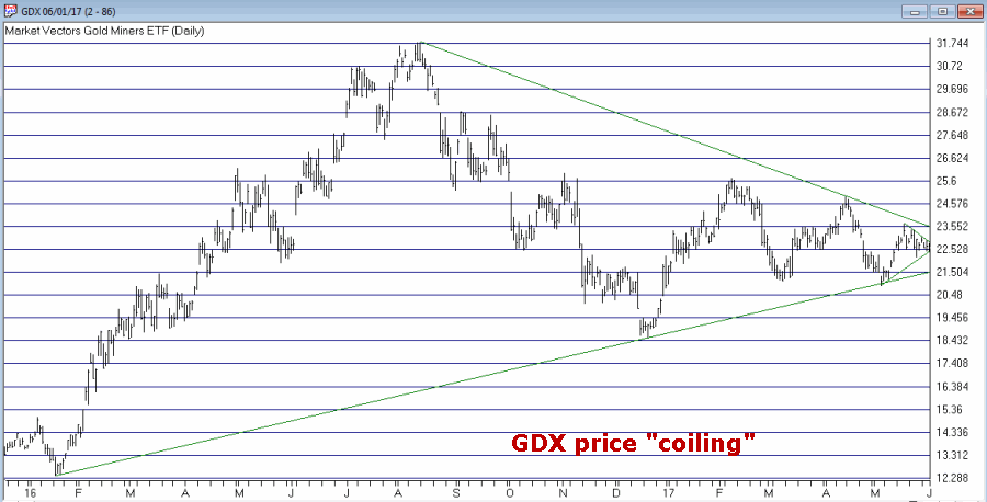
Gold stocks are known for being “volatile” – especially after they go for a while without being volatile. Figure 1 displays the recent price action for ticker GDX – an ETF that tracks an index of gold mining stocks.1Figure 1 – Ticker GDX “coiling” in an ever narrower range (Courtesy AIQ TradingExpert)

(See also Trading Bonds Using Metals)

This action suggests that GDX may be setting up for a big price move.  The problem is that if we pick an expected direction – be it up or down – and we are wrong, a loss is inevitable.  Likewise, prices can continue to “coil” so it is difficult to predict “when”  a meaningful move might take place.

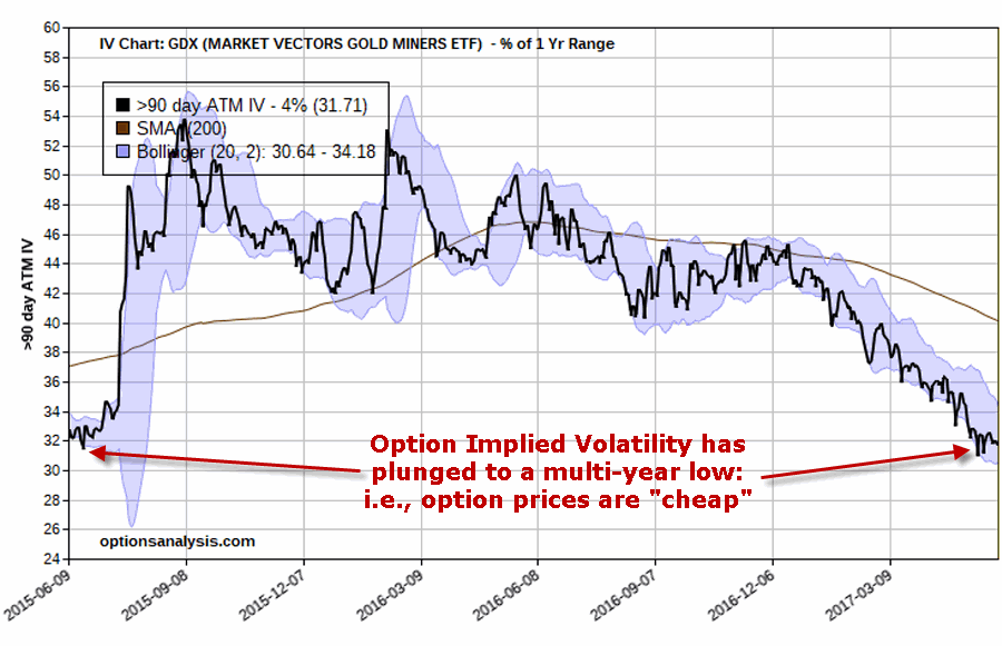
Interestingly though, the implied volatility for options on ticker GDX has declined steadily to a multi-year low (See Figure 2). This kernel of knowledge tells us that GDX options are “cheap”.  In a nutshell, the lower the IV for a given security, the less the amount of time premium built into the option prices for that security – meaning option prices are lower than they would be if IV was high.  2Figure 2 – Implied volatility on GDX options has declined to a multi-year low (Courtesy www.OptionsAnalysis.com)

(See also The World is Your Oyster – 11 Days a Month)

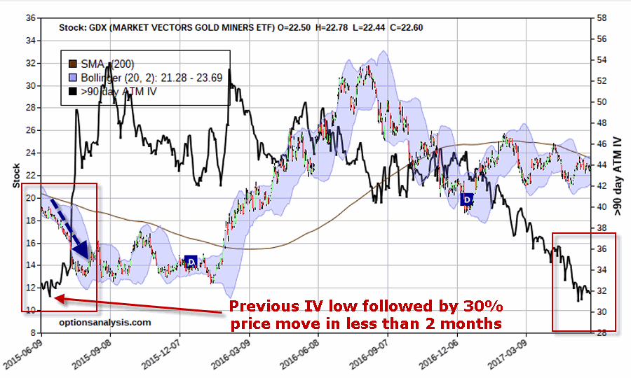
As you can see in Figure 3, the last time IV on GDX options bottomed at this low of a level, the price of GDX moved almost 30% in less than two months.  3Figure 3 – GDX price action with 90-day option IV (Courtesy www.OptionsAnalysis.com)

While there is no guarantee that such a move will occur this time around, the current setup – “coiling prices” and “cheap options” provides an excellent setup for an option trade known as a straddle.  A straddle involves buying both a call option and a put option with the same strike price.  No attempt is made to “pick direction”, instead we simply hope for a large move in one direction or the other.

Example Trade

As always this blog does not make “recommendations” and the trade that follows is highlighted simply as an example of one way to potentially take advantage of the current setup in GDX.

The example trade involves:

*Buying GDX September 22.5 call

*Buying GDX September 22.5 put

By using September options we give GDX 3 1/2 months to make some sort of meaningful price move.

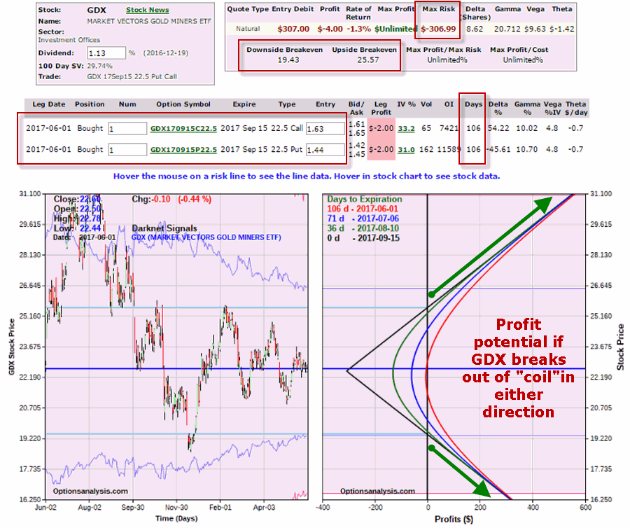
The particulars and risk curves for this hypothetical trade appear in Figure 4.

4Figure 4 – GDX September 22.5 long straddle (Courtesy www.OptionsAnalysis.com)

Things to note:

*Maximum risk is -$307 per 1-lot (this would only occur if GDX closes exactly at $22.5 a share on 9/15)

*106 days left until expiration

*Unlimited profit potential in either direction

*Breakeven prices at September expiration (9/15) are $25.57 and $19.43

Summary

Once again, this is not a “recommended” trade. It is simply one example of one way to play the current combination of “quiet and coiling” gold stock price and “cheap” options on GDX (i.e., low implied volatility).

Jay Kaeppel

Disclaimer:  The data presented herein were obtained from various third-party sources.  While I believe the data to be reliable, no representation is made as to, and no responsibility, warranty or liability is accepted for the accuracy or completeness of such information.  The information, opinions and ideas expressed herein are for informational and educational purposes only and do not constitute and should not be construed as investment advice, an advertisement or offering of investment advisory services, or an offer to sell or a solicitation to buy any security.