Monthly Archives: December 2019

Using the Earnings Yield to Guide Investments

Everything in investing is a tradeoff.  Are stocks a better investment right now than bonds? Large-cap or small-cap?  Growth versus Value?  U.S. versus International?  Making things more difficult is the fact that the relationships are forever changing.  The key then is identifying the trend “right now” and trying to ride it as long as possible.  What follows is a very long-term approach to determining whether to favor stocks or bonds based on the stock market earnings yield and the 10-year treasury yield.

The Data

A= Earnings Yield

For the “earnings yield” we divide 100 by the monthly value for the Shiller P/E Ratio (https://www.multpl.com/shiller-pe).  The higher the p/e ratio rises the lower the earnings yield and vice versa.

B= 10-Year Treasury Yield

For the 10-Year Yield we will use data downloaded from MacroTrends.net (https://www.macrotrends.net/2016/10-year-treasury-bond-rate-yield-chart)

C = (A – B)

At the end of each month we subtract the 10-year treasury yield from the Shiller earnings yield to get our Indicator value.

Deciding Where to Invest

*If the value for Indicator C 5 months ago was > 1.00 then FAVOR STOCKS

*If the value for Indicator C 5 months ago was <= 1.00 then FAVOR BONDS

So at the end of December we look at the value for Indicator C at the end of the previous July (i.e., 5 months ago) to see if it is above or below 1.00.

The 5-month lag is a nod to the fact that it takes a while for investors to recognize a change in the relative favorability of stocks versus bonds. In Figure 1 the blue line represents the earnings yield and the orange line represents the 10-year treasury yield.

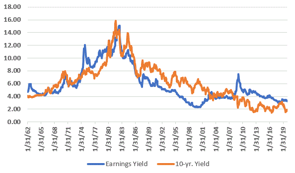
Figure 1 – Shiller earnings yield (blue) and 10-year treasury yield (orange) 1962-present

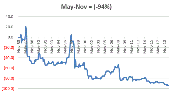
Figure 2 displays the difference between the two values with the 1.00 cutoff level.

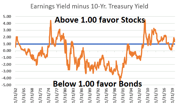
Figure 2 – Shiller earnings yield minus 10-year treasury yield; 1962-present

When the orange line in Figure 2 is above the blue line it favors stocks and when it is below the blue line it favors bonds.

Use the Model as a Strategy Guide

For the record, I am not actually touting this as a “trading model”, but rather as more of a way to determine whether to “lean stocks” or to “lean bonds.”  But just to close the loop let’s look at some hypothetical performance numbers.

If the model favors STOCKS: We will hold the S&P 500 Index*

If the model favors BONDS: We will hold the Bloomberg Barclays Long Treasury Index*

*Using monthly total return data from the PEP Database by Callan Associates

(NOTE: While the model uses intermediate-term treasuries to generate signals, for trading purposes we will focus on long-term treasuries.  Our database for both starts in January of 1973)

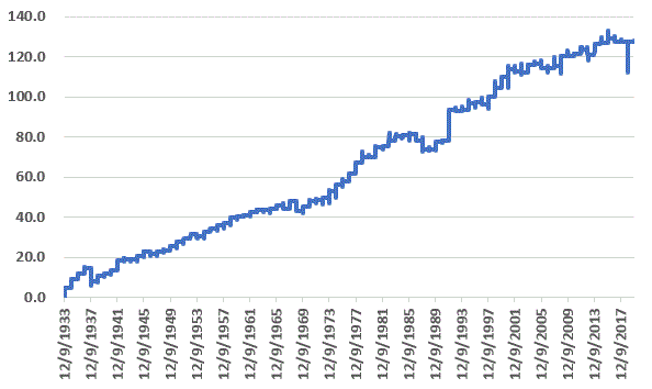
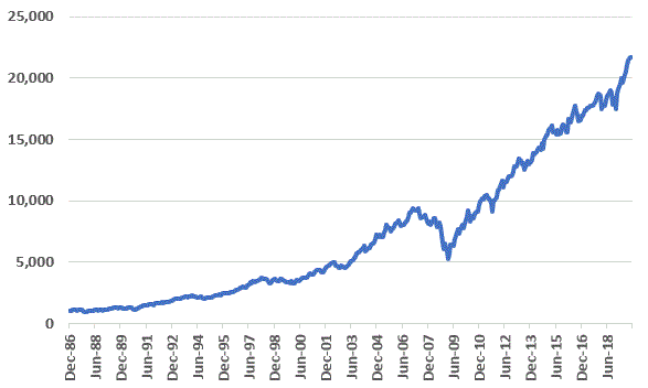
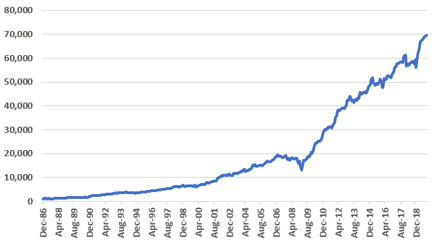
Figure 3 displays the cumulative growth of $1,000 invested using our “Earnings Yield Strategy” versus the cumulative for buying and holding the S&P 500 Index and buying and holding the Bloomberg Barclays Long Treasury Index.

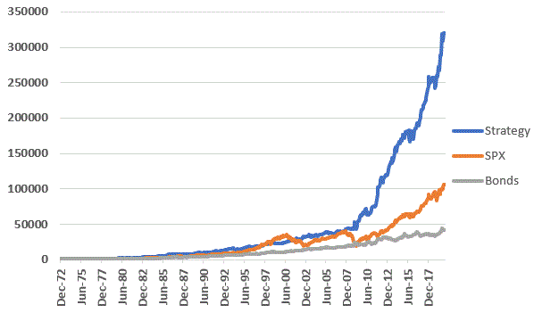
Figure 3 – Growth of $1,000 using Earnings Yield Strategy versus buying-and-holding S&P 500 Index (1973-present)

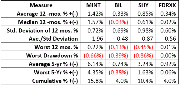
Figure 4 displays some relevant facts and figures. 

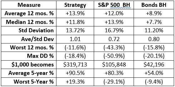
Figure 4 – Comparative Figures: Earnings Yield Strategy versus Buy-and-Hold for stocks and bonds (1973-2019)

Key things to note:

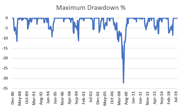
*Strategy worst 12 months = -11.6% versus in -43.3% for SPX

*Strategy Max Drawdown = -18.4% versus in -50.9% for SPX

*Strategy – 100% of all 5-year rolling periods have been positive

A Note Regarding Consistency

A few more notes regarding this method.  Once again, I am not necessarily advocating this as a trading strategy per se.  Also, if someone were using it to invest, when the day eventually comes that long-term treasury yields actually start to rise, a move from long-term bonds to intermediate-term bonds would likely be wise. 

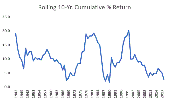
For now, let’s highlight one last thing regarding consistency.  Figure 5 displays cumulative growth for the S&P 500 Index ONLY during those times when the Earnings Yield Strategy favors stocks.

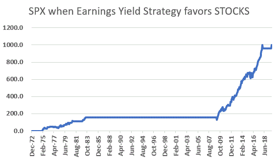
Figure 5 – S&P 500 Index cumulative % gain ONLY when Earnings Yield Strategy favors Stocks; 1973-2019

Figure 6 displays the cumulative growth for the Bloomberg Barclays Long Treasury Index ONLY during those times when the Earnings Yield Strategy favors bonds.

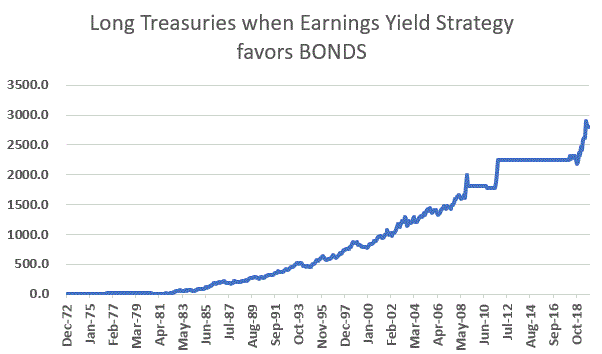
Figure 6 – Bloomberg Barclays Long Treasury Index cumulative % gain ONLY when Earnings Yield Strategy favors Bonds; 1973-2019

In terms of “avoiding trouble”, Figures 5 and 6 suggest that the Earnings Yield Strategy does a pretty good job of it. 

Jay Kaeppel

Disclaimer: The information, opinions and ideas expressed herein are for informational and educational purposes only and are based on research conducted and presented solely by the author.  The information presented does not represent the views of the author only and does not constitute a complete description of any investment service.  In addition, nothing presented herein should be construed as investment advice, as an advertisement or offering of investment advisory services, or as an offer to sell or a solicitation to buy any security.  The data presented herein were obtained from various third-party sources.  While the data is believed to be reliable, no representation is made as to, and no responsibility, warranty or liability is accepted for the accuracy or completeness of such information.  International investments are subject to additional risks such as currency fluctuations, political instability and the potential for illiquid markets.  Past performance is no guarantee of future results.  There is risk of loss in all trading.  Back tested performance does not represent actual performance and should not be interpreted as an indication of such performance.  Also, back tested performance results have certain inherent limitations and differs from actual performance because it is achieved with the benefit of hindsight.

Crude/Gold Ratio Suggests the Move in Crude May Be for Real

Crude oil has been moving higher of late. After bottoming in the low $40’s at the end of 2018, spot crude is now over $60 a barrel.  Can this continue?  One measure say’s “possibly yes”.

Figure 1 – Spot Crude Oil (Courtesy ProfitSource by HUBB)

The Gold/Crude Connection

Figure 2 displays the ratio of (the price of a barrel of) crude oil divided by (the price for an ounce of) gold.  As you can see in the lower right of Figure 2, the ratio recently bounced of a relatively low reading – i.e., crude became very undervalued relative to gold.  Does this matter?  Let’s take a closer look.

Figure 2 – Spot Crude Oil / Spot Gold ratio (Data Courtesy of ProfitSource by HUBB)

One way to quantify “extremes” is as follows:

*Take the 36-month average of the CL/GC ratio

*Create Bollinger Bands above and below the 36-month average using standard deviation * 1.25

See Figure 3

Figure 3 – Spot Crude Oil / Spot Gold ratio with 1.25x Bollinger Bands (above and below 36-month moving average; moving average not shown)

What we are looking for is:

*Times when the ratio dropped BELOW the Lower Band and then

*The distance between the ratio and the Lower Band narrows for one month

The most recent “buy signal” triggered at the end of November 2019.  Figure 4 displays the percentage gain/loss for crude oil following the 1st “buy signal” in 12 months (i.e., overlapping signals are omitted) since 1984.

Figure 4 – Spot crude oil % profit/loss performance following previous “CL/GC Ratio” buy signals (1st signal in latest 12 months)

Figure 5 displays a summary of crude oil performance following the dates shown in Figure 4.

Figure 5 – Summary of Crude Oil performance following previous “CL/GC Ratio” buy signals

For the record, the “sweet spot” appears to be 18 months after a new signal. As you can see in Figures 4 and 5, 7 of the previous 8 signals (87.5%) saw crude oil higher 18 months later, with an median gain of +42.6% . Nevertheless, it needs to be pointed out that a whole lot of downside volatility can happen along the way.

Figure 6 displays the previous signals on a chart of spot crude oil.

Figure 6 – Previous CL/GC Ratio Buy Signals (Courtesy ProfitSource by HUBB)

Summary

As you can see in Figures 4 through 6, previous signals from the Crude/Gold Ratio have witnessed some big subsequent moves in the price of crude oil.  However, do NOT make the mistake of thinking that crude is sure to move higher in the months ahead.  There are many factors that impact the price of arguably the world’s most important commodity. Likewise, crude has had a very good run since the buy signal at the end of November and may be a bit overextended to the upside. In the short-term it may be due for a pullback.

But speculators willing to assume the risks might keep an eye open for the next pullback in the price of crude as the long side of crude oil may be the place to be.

Jay Kaeppel

Disclaimer: The information, opinions and ideas expressed herein are for informational and educational purposes only and are based on research conducted and presented solely by the author.  The information presented does not represent the views of the author only and does not constitute a complete description of any investment service.  In addition, nothing presented herein should be construed as investment advice, as an advertisement or offering of investment advisory services, or as an offer to sell or a solicitation to buy any security.  The data presented herein were obtained from various third-party sources.  While the data is believed to be reliable, no representation is made as to, and no responsibility, warranty or liability is accepted for the accuracy or completeness of such information.  International investments are subject to additional risks such as currency fluctuations, political instability and the potential for illiquid markets.  Past performance is no guarantee of future results.  There is risk of loss in all trading.  Back tested performance does not represent actual performance and should not be interpreted as an indication of such performance.  Also, back tested performance results have certain inherent limitations and differs from actual performance because it is achieved with the benefit of hindsight.

It’s (Typically) the Most Wonderful 7 Days of the Year

It’s the Holiday Season and people are busy so let’s keep this one short.  Figure 1 displays the cumulative % gain/loss achieved by holding the Dow Jones Industrial Average ONLY during the last 7 trading days of each year starting in 1933.

Figure 1 – Cumulative Dow % price +/- during last 7 trading days of year ONLY; 1933-2019

The long-term trend is fairly obvious.  For the record, Figure 2 displays some relevant facts and figures.

Measure Result
# times UP 67
# time DOWN 19
% times UP 78%
% times DOWN 22%
Average UP +1.56%
Average DOWN (-1.11%)
% of 10-Yrs. UP 100%
% of 10-Yrs. DOWN 0%

Figure 2 – Relevant Facts and Figures

Last year of course was a harrowing ride as the market plunged into Christmas Eve and then reversed sharply the next trading day.  Also note that 78% winning trades is a far cry from 100% winning trades.  Nevertheless, it is also important to note that that every rolling 10-year period has showed a gain (77 and oh is the score to date).  Figure 3 displays the rolling 10-year return.

Figure 3 – Rolling 10-year Cumulative Dow % price return (last 7 days of trading year ONLY); 1942-2019

Note that the latest 10-years ranks near the bottom of all 10-year rolling periods.  This tells us one of two things.  Either:

*This little “quirk” of the market perhaps just doesn’t work anymore like it used to, OR;

*Things will improve dramatically in the years ahead   

Not making any predictions, but anything that generates consistently positive results over 80+ years get the benefit of the doubt in my book.

Jay Kaeppel

Disclaimer: The information, opinions and ideas expressed herein are for informational and educational purposes only and are based on research conducted and presented solely by the author.  The information presented does not represent the views of the author only and does not constitute a complete description of any investment service.  In addition, nothing presented herein should be construed as investment advice, as an advertisement or offering of investment advisory services, or as an offer to sell or a solicitation to buy any security.  The data presented herein were obtained from various third-party sources.  While the data is believed to be reliable, no representation is made as to, and no responsibility, warranty or liability is accepted for the accuracy or completeness of such information.  International investments are subject to additional risks such as currency fluctuations, political instability and the potential for illiquid markets.  Past performance is no guarantee of future results.  There is risk of loss in all trading.  Back tested performance does not represent actual performance and should not be interpreted as an indication of such performance.  Also, back tested performance results have certain inherent limitations and differs from actual performance because it is achieved with the benefit of hindsight.

When Volatility Goes to the Moon

Every once in awhile the implied volatility for the options on a given security goes – for lack of a better phrase – “Super Nova”.  In essence, it soars to the moon.  When this happens, the time premium in those options explodes and offer a tempting opportunity to option sellers.  But the catch is that one has to be prepared for whatever risks are entailed. 

So, in a nutshell, when implied volatility soars an option trader who wants to take advantage must craft a position that can allow them to take advantage of time decay and/or a subsequent sharp decline in volatility prior to expiration with clearly defined – and acceptable – risk parameters.

Ticker ITCI

Take for example Intra-Cellular Therapies (ITCI). As you can see in Figure 1 this is clearly a stock that can “move”, having made an endless string of huge percentage price moves over the years.

Figure 1 – Ticker ITCI (Courtesy ProfitSource by HUBB)

In recent months ITCI has almost doubled in price AND implied volatility is now over 300% for 30-60-day options.

Figure 2 – ITCI with 30-60 day option implied volatility (Courtesy www.OptionsAnalysis.com)

So, let’s consider one example of a way to potentially take advantage of this spike in volatility.  The strategy is referred to as a “Modidor” which is sort of slang for a “modified condor”.  Figure 3 displays the options used and the relevant facts and figures.

Figure 3 – ITCI Modidor details (Courtesy www.OptionsAnalysis.com)

Figure 4 displays the risk curves for the trade.

Figure 4 – ITCI Modidor risk curves (Courtesy www.OptionsAnalysis.com)

Things to Note:

*The stock is presently trading at $12.84 a share

*The breakeven price at expiration is $6.20 a share

*There are 31 days left until expiration

*If ITCI is at any price above $6.20 at expiration the trade will show a profit

*The maximum profit of $280 will result if ITCI is between the two short strikes ($9 and $20) at expiration

*Above $21 a share, the profit at expiration is capped at $180

*The worst-case loss of -$220 will result if ITCI is below $4 a share at expiration

In a nutshell:

*This position is a bet on ITCI doing something besides collapsing -51.7% (from $12.84 to $6.20) or more in the next 31 days. Under any other scenario the trade stands to make money.

*The trade has a relatively high “potential reward to potential risk” ratio

*The experience the worst-case loss would require a -69% decline in the price of the stock in the next 31 days (which it should be pointed out is a possibility for a stock like ITCI).

On the face of it this trade sounds like a decent bet.  But just remember that ITCI is extremely volatile and HAS moved for than 50% in a month before.  So, anything can happen.

As always, the trade presented here is NOT a “recommendation”, only as an example of one way to play an extremely high volatility situation.

Jay Kaeppel

Disclaimer: The information, opinions and ideas expressed herein are for informational and educational purposes only and are based on research conducted and presented solely by the author.  The information presented does not represent the views of the author only and does not constitute a complete description of any investment service.  In addition, nothing presented herein should be construed as investment advice, as an advertisement or offering of investment advisory services, or as an offer to sell or a solicitation to buy any security.  The data presented herein were obtained from various third-party sources.  While the data is believed to be reliable, no representation is made as to, and no responsibility, warranty or liability is accepted for the accuracy or completeness of such information.  International investments are subject to additional risks such as currency fluctuations, political instability and the potential for illiquid markets.  Past performance is no guarantee of future results.  There is risk of loss in all trading.  Back tested performance does not represent actual performance and should not be interpreted as an indication of such performance.  Also, back tested performance results have certain inherent limitations and differs from actual performance because it is achieved with the benefit of hindsight.

6 Charts Worth a Quick Look

I look at a lot of stuff. Which can be slightly problematic.  On one hand, it is important to be aware of one’s surroundings.  On the other hand, there is always of danger of being over reactionary to some “tidbit” of information that strikes you as “important” out of the blue.  Still, I like to collect screenshots.

A Disclaimer and Apology

I believe it is always important to give credit to the source of information.  So normally when I show a chart that is not my own it is always accompanied by “Courtesy: [Source Name Here]”

Unfortunately, I have come to realize that with several of the screen shots that appear below I failed to note the source.  So after giving it some thought here is the deal:

*Please note that NONE of the screen shots below are my own original work.  I simply found them to be of value and want to pass along the information contained.

*I sincerely apologize to the author or company that provided any unsourced screen shots below for not listed their name/web/site/company/link/etc., and I also sincerely thank you for passing along such useful/interesting information.

*For what it is worth, I believe that most (though probably not all) of the unsourced screenshots below came from articles that appear on www.SeekingAlpha.com which I find to be a terrific – and wide-ranging – source of information.  In fact, if you are a “market geek” like me you can sign up for a daily email from them which comes with a variety of article links.

OK, so with disclaimers and apologies in place, let’s proceed.

Are 10-Year Yields Headed Higher?

This screenshot is from www.Sentimentrader.com.  In the top clip we see the trend in 10-year treasury yields, and in the bottom clip we see the “Spread Between Hedger Net Position in Copper Minus Gold”.  For the sake of brevity, I am not even going to attempt to explain what all that means.  I am just going to highlight the fact that when the value in the bottom clip exceeds the upper dashed line it has in the past done so near a low in 10-year Treasury Yields. 

Figure 1 – 10-Year Treasury Yield versus Copper/Gold Net Hedgers Difference (Source: www.Sentimentrader.com)

As always, past performance does not guarantee futures results.  Still, the reading at the far right suggests that 10-year yields may be poised to rise in the months ahead.  If so, this is bearish for bonds.

Happy New Year’s, Signed “Metals”

Figure 2 is one of the charts I failed to note the source for.  But it highlights the fact that metals tend to be strong performers early in the year.  The most bullish 4-month period of the year for Copper tends to be Jan. through Apr. and Platinum has often showed significant strength during Jan. and Feb.

While I am not “recommending” trades do note that these four metals can be traded using ETF’s CPER, SLV, GLD and PPLT (note: there are other ETF’s available but these tend to be the most heavily traded for each.

Figure 2 – Metals tend to show seasonal strength early in the year (Source: ???)

Growth versus Value

Over the past 10 years growth indexes have significantly outperformed value indexes.  So of course, human nature being what it is the vast majority of investors have moved away from “value” stocks since “growth stocks are clearly better performers.”  Except of course, for when they are not. 

The most important thing to remember about the never-ending battle between growth and value is that there are no permanent winners. A close perusal of Figure 3 reveals that growth vastly outperformed from 1990 to 1999, then value vastly outperformed from 1999 to 2009, and since then growth has been the leader.

Figure 3 – Growth versus Value – No permanent advantages (Source: ???)

So, does this imply that value stocks are likely to look better relative to growth stocks in the not too distant future?  Well, yes that is what is implied.  The exact timing of when things might change is unknown.  But the primary point is this: DO NOT assume that you should focus on growth and avoid value indefinitely.  History is not on your side.

The Worm May Turn for Energies

Figure 4 comes courtesy of the venerable www.StockTradersAlmanac.com and highlights the fact that energy stocks (represented here by ETF ticker XOP) tends to be a strong performer from mid-December into late April/early May.

Figure 4 – Seasonal pattern for energy stocks (Source: www.StockTradersAlmanac.com)

Energy stocks have been the biggest “dog” in the stock market for several years now.  History suggests this won’t be the case forever, and history also suggests that if things are going to improve for energies the change may come sooner than later.

Before You Fall in Love Again with Apple…

This one comes from The Leuthold Group, a topflight analyst firm for a number of decades.  It shows the history of stocks that at one time comprised 4% or more of the S&P 500 Index.

Figure 5 – Stocks that exceeded 4% of the S&P 500 total value (Source: The Leuthold Group)

AAPL may well prove to be the exception to the rule, but the history of stocks that reach such a lofty position in terms of market cap is “cautionary.”  As long as the bull market remains intact it is hard to see AAPL losing its leadership position. But “when the worm turns” for AAPL the result may be swift and severe.  So keep a close eye.

Individual Cash Levels

Figure 6 is also courtesy of www.Sentimentrader.com and displays the cash allocation among investors in the AAII survey.  This is a “perspective” indicator and not a “timing” indicator.  In other words, we should not look to it to provide “buy and sell signals”.  Still, the historical message is pretty clear: High cash levels are “bullish” and low cash levels “not so much.”

Figure 6 – Individual Cash Levels; AAII Survey (Source: www.Sentimentrader.com)

Jay Kaeppel

Disclaimer: The information, opinions and ideas expressed herein are for informational and educational purposes only and are based on research conducted and presented solely by the author.  The information presented does not represent the views of the author only and does not constitute a complete description of any investment service.  In addition, nothing presented herein should be construed as investment advice, as an advertisement or offering of investment advisory services, or as an offer to sell or a solicitation to buy any security.  The data presented herein were obtained from various third-party sources.  While the data is believed to be reliable, no representation is made as to, and no responsibility, warranty or liability is accepted for the accuracy or completeness of such information.  International investments are subject to additional risks such as currency fluctuations, political instability and the potential for illiquid markets.  Past performance is no guarantee of future results.  There is risk of loss in all trading.  Back tested performance does not represent actual performance and should not be interpreted as an indication of such performance.  Also, back tested performance results have certain inherent limitations and differs from actual performance because it is achieved with the benefit of hindsight.

The Seasonal Split Real Estate Strategy

Let’s begin with a massive over simplification. There are essentially 3 parts to the real estate market.  There is building homes and buildings.  There is paying for homes and building.  And there is buying and selling homes and buildings (and/or holding and not selling homes and building hoping for price appreciation).

For each area, there’s a fund for that.  To wit, we will look strictly at the Fidelity family of Funds (although there are ETF alternatives listed as well).

Ticker Name ETF Alternative
FGMNX Fidelity GNMA Fund MBB
FRESX Fidelity Select Real Estate VNQ
FSHOX Fidelity Select Construction&Housing XHB or ITB

Figure 1 – Real Estate related sector funds

One alternative is to split dollars 1/3 each and rebalance once a year.  This generates the results listed in Figures 2 and 3.

Figure 2 – Equal Split Portfolio (FGMNX/FRESX/FSHOX) Growth of $1,000; 12/31/1986-11/30-2019

Measure Result
Average 12 mos. % +(-) +10.3%
Median 12 mos. % +(-) +11.6%
Std. Deviation % 12.1%
Ave/Std Dev 0.86
Worst 12 mos. % +(-) (-34.6%)
Maximum Drawdown % (-43.9%)
Average 5-Yr. % +(-) +65.8%
Worst %-Yr. % +(-) (-11.6%)
$1,000 becomes $21,731

Figure 3 – Equal Split Portfolio (FGMNX/FRESX/FSHOX) Results; 12/31/1986-11/30-2019

Adding in The Seasonal Element

What the simple 33% each approach fails to consider is the seasonal nature of these markets.  The construction sector tends to perform best between November and April, the overall real estate sector tends to perform well between March and July (also December) and the mortgage backed security sector tends to perform best between May and October.

So let’s consider an alternative that takes these tendencies into consideration. 

Months FGMNX FRESX FSHOX
November-April 20% 20% 60%
May-October 80% 20% 0%

Figure 4 – Annual Allocations

So to be clear:

*On October 31st we put 60% into construction and 20% each into Real Estate and Mortgage-Backed Securities

*On April 30th we put 80% in Mortgage-Backed Securities and 20% into Real Estate

This generates the results that appear in Figures 5 and 6

Figure 5 – Seasonal Split Real Estate Strategy (FGMNX/FRESX/FSHOX) Results; 12/31/1986-11/30-2019

Measure Result
Average 12 mos. % +(-) +14.1%
Median 12 mos. % +(-) +13.6%
Std. Deviation % 11.7%
Ave/Std Dev 1.20
Worst 12 mos. % +(-) (-23.1%)
Maximum Drawdown % (-32.2%)
Average 5-Yr. % +(-) +94.5%
Worst %-Yr. % +(-) +5.2%
$1,000 becomes $69,681

Figure 6 – Seasonal Split Real Estate Strategy (FGMNX/FRESX/FSHOX) Results; 12/31/1986-11/30-2019

This “strategy” is obviously not without risks – as highlighted by the “Worst 12-mos” of -23.1% and the “Maximum Drawdown %” of -32.2%.  However, a quick glance at Figure 7 reveals that the maximum drawdown occurred during the 2007-2009 real estate/financial panic when just about everything (except long-term treasuries endured a roughly similar fate).  Excluding that period, drawdowns have only exceeded -11% two times.

Figure 7 – Seasonal Split Real Estate Strategy Maximum Drawdown; 1986-2019

The Seasonal Split Real Estate Strategy has generated a higher annual return with lower volatility and lower drawdowns than the “split approach.” The bottom line is that seasonality is a potential “edge” that most investors never consider.

Figure 8 displays year-by-year results (2019 is through the end of November) for the Seasonal Split Real Estate Strategy

Year % +(-)
1988 +22.9%
1989 +17.9%
1990 +16.2%
1991 +35.7%
1992 +20.5%
1993 +13.7%
1994 (-4.0%)
1995 +20.3%
1996 +13.7%
1997 +13.8%
1998 +21.5%
1999 (-1.2%)
2000 +16.8%
2001 +24.0%
2002 +16.9%
2003 +11.5%
2004 +20.2%
2005 +3.7%
2006 +18.8%
2007 (-6.5%)
2008 (-3.5%)
2009 +23.4%
2010 +37.0%
2011 +16.5%
2012 +21.2%
2013 +7.8%
2014 +12.2%
2015 +3.7%
2016 +7.4%
2017 +12.7%
2018 -(8.0%)
2019 +24.1%

Figure 8 – Seasonal Split Real Estate Strategy Year-by-Year Results

Summary

Is this anyway to invest in the real estate sector?  Well, it’s one way.  As always what is presented here is for “informational purposes only” and investors are strongly encouraged to do their own homework before adopting any investment strategy

Jay Kaeppel

Disclaimer: The information, opinions and ideas expressed herein are for informational and educational purposes only and are based on research conducted and presented solely by the author.  The information presented does not represent the views of the author only and does not constitute a complete description of any investment service.  In addition, nothing presented herein should be construed as investment advice, as an advertisement or offering of investment advisory services, or as an offer to sell or a solicitation to buy any security.  The data presented herein were obtained from various third-party sources.  While the data is believed to be reliable, no representation is made as to, and no responsibility, warranty or liability is accepted for the accuracy or completeness of such information.  International investments are subject to additional risks such as currency fluctuations, political instability and the potential for illiquid markets.  Past performance is no guarantee of future results.  There is risk of loss in all trading.  Back tested performance does not represent actual performance and should not be interpreted as an indication of such performance.  Also, back tested performance results have certain inherent limitations and differs from actual performance because it is achieved with the benefit of hindsight.

Seasonal Speculation in Corn

In a recent article I wrote about a potential seasonal speculation in soybeans.  A similar potential opportunity also exists in the corn market.  Like beans, the corn market is a highly cyclical market. This is in large part due to the planting and growing season (as explained here).  This article is about a “seasonal/cyclical” speculative play using options on ticker CORN.

There are two key caveats:

*The trade highlighted is NOT a “recommendation”, only an example of how to speculate on a potential move using options in order to achieve limited risk and unlimited profit potential.

*Options on ticker CORN are very thinly traded.  So, any investor who might choose to wade in needs to be aware that they may need to consider using a limit order in order to avoid significant slippage.

The Setup

Figure 1 displays the annual seasonal trend for corn according to www.sentimentrader.com.

Figure 1 – Annual seasonal trend for Corn (Courtesy: www.sentimentrader.com)

It is critical to understand that this is the “average” for what has happened in the past and should in no way be viewed as a “roadmap”.  Still, the point is pretty clear – late in the year through the month of April tends to be the “bullish” time for corn.

Figure 2 displays that bullish sentiment for corn was recently quite low.  While this by no means guarantees a rally, historically this often a signal that downside risk may be relatively low.

Figure 2 – Bullish Sentiment for Corn (Courtesy: www.sentimentrader.com)

Figure 3 tells us that options on the ETF ticker CORN (which tracks the price of corn futures) are presently cheap – i.e., implied option volatility (the black line in Figure 4) is extremely low.  This tells us that little option premium is built into the prices of CORN options.

Figure 3 – Ticker CORN with implied option volatility (Courtesy www.OptionsAnalysis.com)

Figures 4 and 5 display the particulars for one possible speculative play designed to make money if CORN does in fact move higher sometime between now and the end of April 2020.

Figure 4 – CORN May2020 calls (Courtesy www.OptionsAnalysis.com)

Figure 5 – CORN May2020 call risk curves (Courtesy www.OptionsAnalysis.com)

So, is this really a good idea?  I am not actually saying that it is.  As always with this blog, this is not a “recommendation”, only an “example.”  Let’s hit the most important points to consider with this example.

A few things to note:

*This position qualifies as “serious bottom picking” – which is generally considered to be a loser’s bet.  However, the mitigating factor here is that we are risking only $90 (or possibly less if a limit order is used to enter) per contract.  And position sizing should be kept on the small size.  For example, a trader with $25,000 might buy a 3-lot and risk 1.1% of their trading capital. 

*If CORN does NOT advance at anytime in the next 5 months this trade is certain to lose money.

*If CORN were to rally to its it’s 2019 high of $17.55 a share, this position would roughly triple in value.

So, the bottom-line questions for a trader in considering this trade are:

*Are you OK with risking $90 per contract on the hopes that corn will rise between now and the end of April 2020?

*If you do enter the trade, how many contracts will you buy/what percentage of your trading capital will you risk?

*If CORN fails to rally will you simply hold the options or will you consider exiting early if – for example – a key support level is broken?

*If CORN does advance at what share price or option trade profit level will you, a) take a profit or b) adjust the trade?

Buying inexpensive call options is something of a siren song for a lot of traders and can lead to mistakes.  But sometimes it can make a lot of sense as long as you:

*Put as many factors in your favor

*Don’t bet the ranch

*Formulate and follow a trade plan

Jay Kaeppel

Disclaimer: The information, opinions and ideas expressed herein are for informational and educational purposes only and are based on research conducted and presented solely by the author.  The information presented does not represent the views of the author only and does not constitute a complete description of any investment service.  In addition, nothing presented herein should be construed as investment advice, as an advertisement or offering of investment advisory services, or as an offer to sell or a solicitation to buy any security.  The data presented herein were obtained from various third-party sources.  While the data is believed to be reliable, no representation is made as to, and no responsibility, warranty or liability is accepted for the accuracy or completeness of such information.  International investments are subject to additional risks such as currency fluctuations, political instability and the potential for illiquid markets.  Past performance is no guarantee of future results.  There is risk of loss in all trading.  Back tested performance does not represent actual performance and should not be interpreted as an indication of such performance.  Also, back tested performance results have certain inherent limitations and differs from actual performance because it is achieved with the benefit of hindsight.

When NOT to Own Energy

I have been keeping an eye on energy stocks for quite awhile not.  I wrote this article at the end of May wondering out loud if Halliburton (HAL) was nearing a bottom.  At the time HAL was trading at $21.29 a share. It dropped as low as $16.97 (-20%) by the end of August.  As of today, it is back up to $22.30.  Is the bottom in in energies?  No one can say for sure, but I have been reading from a lot of different sources about how much energies are loathed and beaten down and overdue for a bounce. 

Of course, the more I read people saying that the more I wonder if it is still a little early.  But to put things into perspective, Figure 1 displays Fidelity Select Energy Services with a custom indicator called “Vixfixaverageave” (I know, I know, bad name), which is basically a double smoothed version of an indicator called “VixFix” which was devised by legendary trader Larry Williams a number of years ago. 

Figure 1 – Fidelity Select Energy Services (Courtesy AIQ TradingExpert)

Note that previous extreme peaks in the indicator have marked some fairly significant low areas for energy services.  Given the current extreme reading for the indicator it would seem to make sense to be looking at now as a reasonable time to start allocating more to energy stocks.

Looking at Things on a Seasonal Basis

On a seasonal basis the month of December historically represents a very good time to be looking at energies.  As it turns out, the energy services sector (and the overall energy sector as a whole) is one of the most highly cyclical sectors around.  Figures 2 and 3 tell you pretty much everything you need to know.

Figure 2 – FSESX Cumulative % return, December through April; 1985-2019

Figure 3 – FSESX Cumulative % return, May through October; 1986-2019

In Figure 2 we see that the cumulative total return for ticker FSESX only during the months of December through Apr has been +6,624% since 1985.

In Figure 3 we see that the cumulative total return for ticker FSESX only during the months of May through November has been a stunning (-94%) since 1985.

So, when do you want to hold energy related stocks? 

Note that as divergent as these numbers are, there still are no “sure things” in the world of investing.  Note that the Dec-Apr period has showed a gain 76% of the time on a year-by-year basis.  So do not make the mistake of thinking that energy prices are sure to be higher 5 months from now. 

Likewise, note that the May-Nov period has showed a gain 44% of the time.  So, despite the massive cumulative loss over time, remember that on a year-by-year basis it is almost a coin flip.

Summary

The energy sector has been beaten down and has remained down for a number of years.  Broad based energy proxies such as ticker XLE and ticker FSENX both topped out in 2014.  Ticker XLE is presently trading at the exact same level it was at roughly 13 years ago.  So yes, the energy sector does qualify as a bullish contrarian play at this point.

The only problem is no one knows for sure when or where the bottom is.  So, what is an investor to do?  Given the seemingly “washed out” nature of the sector itself and the fact that it just entered it’s “bullish seasonal period” it may be a decent time for a long-term investor to consider establishing a position in the energy sector in anticipation that it will perform better overall in the years ahead – and more specifically in the months ahead. 

Just remember that there are no sure things and that you must likely be prepared to “ride it out” for a period of time to reap any rewards.  Given this, also remember that position sizing is of critical importance – i.e., “dip a toe, don’t bet the ranch.”

Jay Kaeppel

Disclaimer: The information, opinions and ideas expressed herein are for informational and educational purposes only and are based on research conducted and presented solely by the author.  The information presented does not represent the views of the author only and does not constitute a complete description of any investment service.  In addition, nothing presented herein should be construed as investment advice, as an advertisement or offering of investment advisory services, or as an offer to sell or a solicitation to buy any security.  The data presented herein were obtained from various third-party sources.  While the data is believed to be reliable, no representation is made as to, and no responsibility, warranty or liability is accepted for the accuracy or completeness of such information.  International investments are subject to additional risks such as currency fluctuations, political instability and the potential for illiquid markets.  Past performance is no guarantee of future results.  There is risk of loss in all trading.  Back tested performance does not represent actual performance and should not be interpreted as an indication of such performance.  Also, back tested performance results have certain inherent limitations and differs from actual performance because it is achieved with the benefit of hindsight.

Where We Are (and One Thing to Watch For)

I haven’t written a lot lately.  Mostly I guess because there doesn’t seem to be a lot new to say.  As you can see in Figure 1, the major market indexes are in an uptrend.  All 4 (Dow, S&P 500, Russell 2000 and Nasdaq 100) are above their respective 200-day MA’s and all but Russell 2000 have made new all-time highs.

Figure 1 – 4 Major Market Indexes (Courtesy AIQ TradingExpert)

As you can see in Figure 2, my market “bellwethers” are still slightly mixed.  Semiconductors are above their 200-day MA and have broken out to a new high, Transports and the Value Line Index (a broad measure of the stock market) are holding above their 200-day MA’s but are well off all-time highs, and the inverse VIX ETF ticker ZIV is in a downtrend (ideally it should trend higher with the overall stock market).

Figure 2 – Jay’s 4 Market “Bellwethers” (Courtesy AIQ TradingExpert)

As you can see in Figure 3, Gold, Bonds and the U.S. Dollar are still holding in uptrends above their respective 200-day MA’s (although all have backed off of recent highs) and crude oil is sort of “nowhere”.

Figure 3 – Gold, Bonds, U.S. Dollar and Crude Oil (Courtesy AIQ TradingExpert)

Like I said, nothing has really changed.  So, at this point the real battle is that age-old conundrum of “Patience versus Complacency”.  When the overall trend is clearly “Up” typically the best thing to do is essentially “nothing” (assuming you are already invested in the market).  At the same time, the danger of extrapolating the current “good times” ad infinitum into the future always lurks nearby. 

What we don’t want to see is:

*The major market averages breaking back down below their 200-day MA’s.

What we would like to see is:

*The Transports and the Value Line Index break out to new highs (this would be bullish confirmation rather the current potentially bearish divergence)

The Importance of New Highs in the Value Line Index

One development that would provide bullish confirmation for the stock market would be if the Value Line Geometric Index were to rally to a new 12-month high.  It tends to be a bullish sign when this index reaches a new 12-month high after not having done so for at least 12-months.

Figure 4 displays the cumulative growth for the index for all trading days within 18 months of the first 12-month new high after at least 12-months without one.

Figure 4 – Cumulative growth for Value Line Geometric Index within 18-months of a new 12-month high

Figure 5 displays the cumulative growth for the index for all other trading days.

Figure 5 – Cumulative growth for Value Line Geometric Index during all other trading days

In Figure 4 we see that a bullish development (the first 12-month new high in at least 12 months) is typically followed by more bullish developments. In Figure 5 we see that all other trading days essentially amount to nothing.

Figure 6 displays the Value Line Geometric Index with the relevant new highs highlighted.

Figure 6 – Value Line Geometric Index (Courtesy AIQ TradingExpert)

Summary

The trend at this very moment is “Up.”  So sit back, relax and enjoy the ride.  Just don’t ever forget that the ride WILL NOT last forever.  If the Value Line Geometric Index (and also the Russell 2000 and the Dow Transports) joins the party then history suggests the party will be extended.  If they don’t, the party may end sooner than expected.

So pay attention.

Jay Kaeppel

Disclaimer: The information, opinions and ideas expressed herein are for informational and educational purposes only and are based on research conducted and presented solely by the author.  The information presented does not represent the views of the author only and does not constitute a complete description of any investment service.  In addition, nothing presented herein should be construed as investment advice, as an advertisement or offering of investment advisory services, or as an offer to sell or a solicitation to buy any security.  The data presented herein were obtained from various third-party sources.  While the data is believed to be reliable, no representation is made as to, and no responsibility, warranty or liability is accepted for the accuracy or completeness of such information.  International investments are subject to additional risks such as currency fluctuations, political instability and the potential for illiquid markets.  Past performance is no guarantee of future results.  There is risk of loss in all trading.  Back tested performance does not represent actual performance and should not be interpreted as an indication of such performance.  Also, back tested performance results have certain inherent limitations and differs from actual performance because it is achieved with the benefit of hindsight.

The Boring Safe Haven

Some topics excite investors.  Others do not.  Still, the fact remains that there is a time and place (and use) for “non-exciting” investments.  When an investor decides to “raise some cash”, or to get out of the stock market entirely, the money has to go someplace. 

Where that “place” is, can make a big difference over time.  Consider several choices:  there are money-market funds, very short-term securities (maturity of less than a year) and slightly less short-term securities (maturity of 1-3 years).  

Let’s consider the following list of potential candidates:

Fund/ETF Duration Exp. Ratio SEC Yield
FDRXX 1-month 0.38% 1.34%
BIL 1-3 months 0.14% 1.48%
SHY 1-3 years 0.15% 1.51%
MINT < 1 year 0.35% 2.06%

Figure 1 – Four “Safe Haven” Candidates

This list is by no means comprehensive.  There are other funds/ETFs that fit into each category.  For the record, FDRXX is a money-market fund, BIL and SHY are ETFs that track a specific index and MINT is actively managed.

A brief description of each:

FDRXX: A money-market fund that normally invests at least 99.5% of the fund’s total assets in cash, U.S. Government securities and/or repurchase agreements that are collateralized fully (i.e., collateralized by cash or government securities). Certain issuers of U.S. Government securities are sponsored or chartered by Congress but their securities are neither issued nor guaranteed by the U.S

BIL Fund Description (1-3 months): The SPDR® Bloomberg Barclays 1-3 Month T-Bill ETF seeks to provide investment results that, before fees and expenses, correspond generally to the price and yield performance of the Bloomberg Barclays 1-3 Month U.S. Treasury Bill Index.

SHY Fund Description (1-3 years): The iShares 1-3 Year Treasury Bond ETF seeks to provide investment results that, before fees and expenses, correspond generally to the price and yield performance of the Bloomberg Barclays 1-3 Year U.S. Treasury Bond Index.

MINT FUND Description (<1 year): The PIMCO Enhanced Short Maturity Active ETF seeks greater income and total return potential than money market funds, and may be appropriate for nonimmediate cash allocations. MINT will primarily invest in short duration investment grade debt securities. The average portfolio duration of MINT will vary based on PIMCO’s economic forecasts and active investment process decisions, and will not normally exceed one year. MINT will disclose all portfolio holdings on a daily basis, and will not use options, futures, or swaps.

Comparisons

Generally speaking, when it comes to fixed-income securities, the longer the average maturity, a) the higher the expected return, and b) the greater the risk of experiencing a decline in capital.

Thus, over time we would expect BIL to fluctuate more and provide a higher return than FDRXX.  Likewise, SHY should be expected to fluctuate more and provide a higher return than BIL.  The wild card in the list above is ticker MINT, which is actively managed. 

The Results

Figure 2 displays the cumulative % growth for the four tickers listed in Figure 1 starting in December 2009 (the first full month of data for ticker MINT). 

Figure 2 – Cumulative Returns (Dec-2009 to Oct-2019)

Figure 3 puts some numbers to the results displayed in Figure 2. Note that these are calculated using monthly total return data.

Figure 3 – Comparative Results

During the period of data considered, MINT has clearly been a compelling performer relative to the others on the list.  While I typically prefer ETFs that track a specific index the folks running MINT have clearly done a good job.  Note that BIL and FDRXX (and to a lesser extent SHY) will struggle to generate significant returns in a very low interest rate environment. 

Summary

Obviously, the returns on these securities are not going to excite anyone.  But – except on rare occasions – that is not really the purpose of short-term fixed income securities.  The purpose in looking at the list above is to help identify a potential “safe haven” for “when the day comes” that one is needed.

Jay Kaeppel

Disclaimer: The information, opinions and ideas expressed herein are for informational and educational purposes only and are based on research conducted and presented solely by the author.  The information presented does not represent the views of the author only and does not constitute a complete description of any investment service.  In addition, nothing presented herein should be construed as investment advice, as an advertisement or offering of investment advisory services, or as an offer to sell or a solicitation to buy any security.  The data presented herein were obtained from various third-party sources.  While the data is believed to be reliable, no representation is made as to, and no responsibility, warranty or liability is accepted for the accuracy or completeness of such information.  International investments are subject to additional risks such as currency fluctuations, political instability and the potential for illiquid markets.  Past performance is no guarantee of future results.  There is risk of loss in all trading.  Back tested performance does not represent actual performance and should not be interpreted as an indication of such performance.  Also, back tested performance results have certain inherent limitations and differs from actual performance because it is achieved with the benefit of hindsight.