Monthly Archives: July 2020

The Next Month Will Tell Us A lot about Covid-19

I have assiduously avoided writing about Covid-19 up until now.  This is a financial website.  Covid is a medical issue.  I know little about medical issues (although I have noticed that it takes more ibuprofen then it used to to make the parts stop hurting.  But I digress).

I also believe that financial market analysts should spend a lot less time focusing on Covid and more time focusing on the markets.  If I had a dollar for every post from every analyst discussing how “cases are spiking” here or there or everywhere and how that “is going to affect the markets” I would have a lot more dollars than I would by following their opinions on how “spiking cases will affect the markets.” (Psst. There is no correlation.)

Here is a new one for the list:

Jay’s Trading Maxim #322: DO NOT attempt to use Covid-19 data to time the markets. 

All that being said, as an avowed numbers geek I have been following “the numbers” very closely, and have struggled to find a way to pull anything that might be meaningful out of the data.  Well, I finally found something that makes sense to me (although you may not be moved, which is fine). 

The problem is that the majority of people (it would seem) look at “Cases” and think “Deaths.”  Thus, the focus is on “New Cases” (the shiny object) and that a sharp increase in new cases will automatically result in a commensurate sharp increase in deaths. 

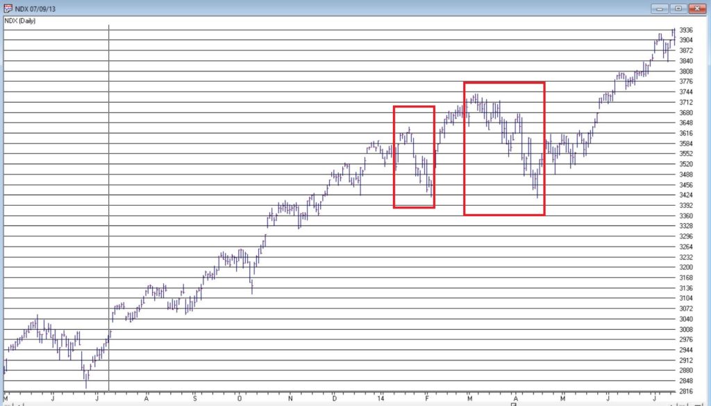
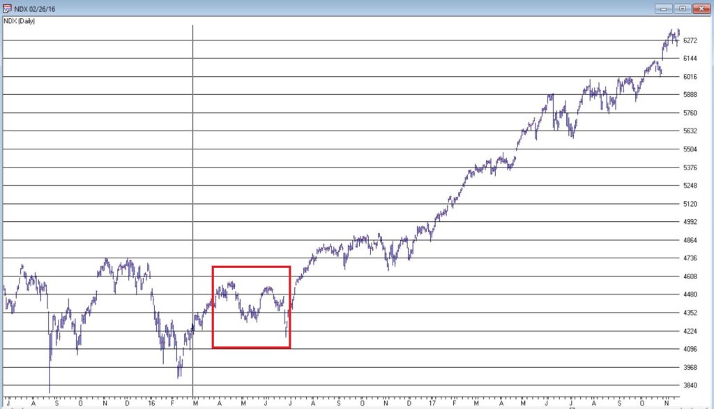
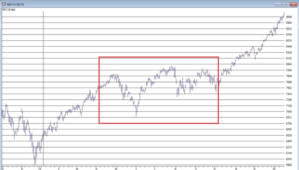
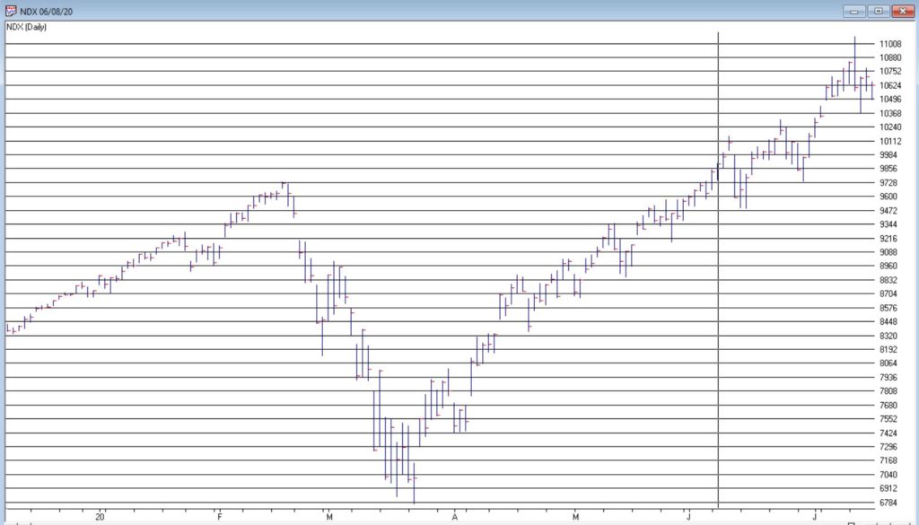
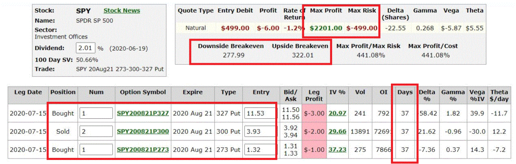
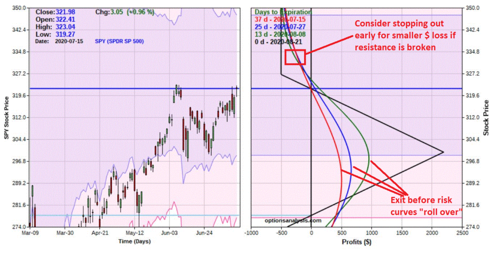
As I will attempt to illustrate in a moment, the next month will tell us a lot (I think) about how this looks going forward.

The succinct version is this:

*The majority of deaths to date are among older people

*The majority of new cases since the economy has re-opened (sort of) is among younger people

*Younger people die of Covid at an exponentially lower rate than older people

*Therefore – the theory goes – a spike in cases among younger people will not result in a commensurate spike in deaths

Here’s the slightly longer version…

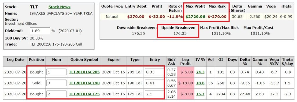
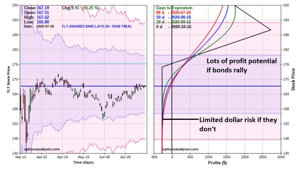
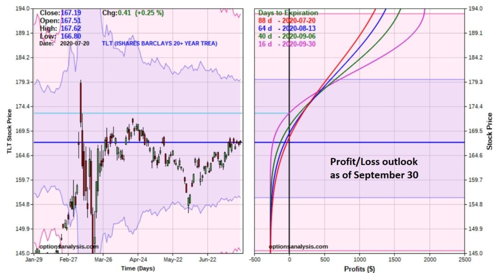
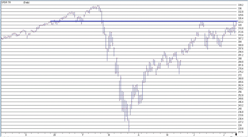
Covid 19 – Analyzing the Numbers

The next month should tell us a lot about where we are headed.

The chart below tries to make some sense of the relationship between “Cases” and “Deaths”.

*Orange line = 7-day average of New Cases per day (pushed 28 days into the future)

*Blue line = Total # of deaths in previous 28 days

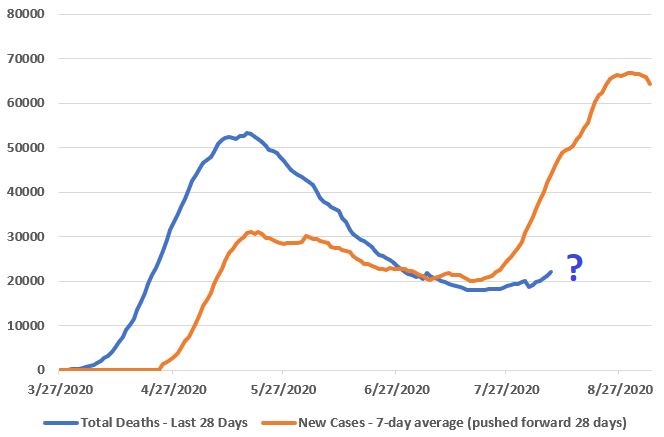
Figure 1 – Cases versus Deaths (Data source: www.CovidTracking.com)

Looking at this chart the first inclination is to expect that deaths will spike rapidly in the next month, as more cases result in more deaths. And that is obviously a possibility.

HOWEVER: I am cautiously optimistic that deaths WILL NOT spike commensurately (although they are certainly likely to rise to some degree)

This is based on the fact that the people testing positive now are younger, and the mortality rate among younger people is extremely low.

Through July 1:

*60% of deaths were people aged 75 or older

*81% of deaths were people 65 and older

*93% of deaths were people aged 55 or older

*7% of deaths were people 0 to 54

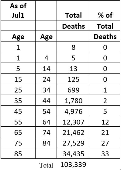
Figure 2 – Deaths by Age group (through 7/1/20)

Figure 3 is CDC data but I am unsure of the exact date of data, but it is relatively recent.  It shows the age breakdown of people who have tested positive recently.

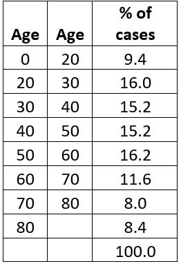
Figure 3 – Who’s testing positive?

*55% of the cases are people aged 0 to 50

*72% of the cases are people 60 or under

i.e., the majority of the new cases recently are among those less likely to die of Covid.

How likely?  Figure 4 displays the Mortality Rate of people who get infected with Covid by Age Group per the CDC

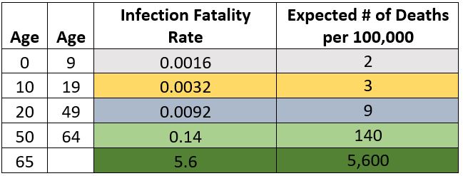
Figure 4 – Mortality rates by Age Group

People 65 or over who contract Covid have died 5.6% of the time (i.e., 94.4% of people over 65 who contract Covid DO NOT die of Covid)

The Bottom Line

The next month will tell us a lot about where we are headed. 

If in fact:

*The majority of new cases are among people in younger demographics

*Mortality rates to date hold in the same general range

*Then we can reasonably hope that the blue in Figure 1 (Deaths over the latest 28 days) will NOT “spike” to anywhere the same degree that the orange line in Figure 1 (7-day average of Cases pushed 28 days forward) has.

Here’s hoping.

So:

*If Covid deaths DO spike sharply in the next month then we have a(n even more) serious problem going forward. If re-opening the economy leads to a sharp increase in cases and if a sharp increase in cases leads to a sharp increase in deaths, then re-opening the economy becomes that much more problematic. Oh, and by the way, try also to remember that the longer we go without more fully re-opening the greater the likelihood that we end up living the rest of our lives in a serious Depression. Just so you know.

*If Covid deaths DO NOT spike in the month ahead (despite the spike in new cases that we have seen of late) we can:

a) Take even more steps to protect the more vulnerable (i.e., older and/or sicker) demographics, and

b) Allow the rest of the population to get back to some semblance of normality.

Again, here’s hoping.

See also Jay Kaeppel Interview in July 2020 issue of Technical Analysis of Stocks and Commodities magazine

See also Jay’s “A Strategy You Probably Haven’t Considered” Video

See also Video – The Long-Term…Now More Important Than Ever

Jay Kaeppel

Disclaimer: The information, opinions and ideas expressed herein are for informational and educational purposes only and are based on research conducted and presented solely by the author.  The information presented represents the views of the author only and does not constitute a complete description of any investment service.  In addition, nothing presented herein should be construed as investment advice, as an advertisement or offering of investment advisory services, or as an offer to sell or a solicitation to buy any security.  The data presented herein were obtained from various third-party sources.  While the data is believed to be reliable, no representation is made as to, and no responsibility, warranty or liability is accepted for the accuracy or completeness of such information.  International investments are subject to additional risks such as currency fluctuations, political instability and the potential for illiquid markets.  Past performance is no guarantee of future results.  There is risk of loss in all trading.  Back tested performance does not represent actual performance and should not be interpreted as an indication of such performance.  Also, back tested performance results have certain inherent limitations and differs from actual performance because it is achieved with the benefit of hindsight.

One Word of Caution About the Very Long-Term

If there is one thing we all hate it is when things are going very well in the market and the “Gloomers and Doomers” chime in with their incessant gloom and doom.  Usually it’s people who got the market wrong and don’t want to come to grips with that fact and as a result try to “bring everybody else down.”

So I don’t want to be that guy. 

I am enjoying the rally and am happy to see it go just as far as it wants to run.  For the record, back in March one indicator I follow gave a buy signal the very day after the low (see here and here).  So, I am not attempting to issue any ominous “call to action” below.  Its more of a “call to pay attention going forward.”

Looking Ahead by Looking Back

As a thought experiment, let’s look at the stock market on a very, very long-term basis.  Specifically, I am looking at Dow Jones Industrial monthly closing prices since about 1885 and look at rolling 40-year returns (price only, no dividends).  So, starting in 1925, every month we look back at the total gain or loss for the Dow over the previous 40-year period. 

Peruse Figure 1.

Figure 1 – 40-Year rolling return for Dow Industrials (1925-2020)

There is Good News and Bad News:

*The Good News is that the market has never had a losing 40-year stretch.  (Which is great news if you are in your 20’s!). 

*The (potential) Bad News is that – as noted by the red box – the last 40 years have been very, very good to me, and to you and to anyone who has invested since roughly the Reagan administration.  In essence, these are “the Good Old Days.”

The obvious question is “will this last forever?”  Based on what I know about the cyclical nature of financial markets, I have “concerns.” 

THE POINT: The correct response to the information in Figure 1 is NOT “Oh My God, the market is going to crash I should sell everything!!”  The correct response is to say “I am going to go with the trend as long as it lasts, but I also recognize that things may be much less favorable in terms of the overall trend in the years ahead, so I will remain vigilant and be prepared to act defensively.” 

OK, that was kind of wordy.  More succinctly, “I will NOT get stars in my eyes and expect that large-cap/growth/tech/momentum stocks will lead forever and ever into the future.”  Because chances are – just a personal opinion here –they won’t.

Why do I say that?  Simple, the cyclical nature of financial markets

The Cyclical Nature of Financial Markets

I should mention that I am on record as predicting that ten years from now we will look back and find that:

*International stocks

*Commodities

*Value stocks

*and possibly Energy

…will have all outperformed the S&P 500 Index.  Of course, I should probably also mention that I am also previously on record as making all kinds of other predictions that I don’t wish to discuss at this time.  In essence, I am not so much “predicting the future” as I am “analyzing the past” and recognizing the cyclical nature of markets.  To wit, history has demonstrated that:

*U.S. stocks lead for years at a time and then International stocks lead

*Stocks lead for awhile and then commodities lead

*Growth beats values for some period of time and then value leads

*Over a period of years Energy gets crushed then rallies strongly, repeat

So, given the obvious and sizeable outperformance of large U.S. growth stocks for a sustained number of years, it is actually not even really a “bold prediction” to state that “this probably will not last forever.”

Again, this is not a “call to action”.  The current trends remain pretty much strongly in force and I do not suggest trying to identify the exact turning point.  But there is a way to get a sense of when that might be occurring.  Figures 2 through 5 are from www.StockCharts.com and measure the performance of one “asset class” versus another “asset class.”

Figure 2 – U.S. Stocks outperforming International (Courtesy StockCharts.com)

Figure 3 – Stocks outperforming Commodities(Courtesy StockCharts.com)

Figure 4 – Growth outperforming Value (Courtesy StockCharts.com)

Figure 5 – S&P 500 outperforming Energy (Courtesy StockCharts.com)

I am not advocating “fighting City Hall” and trying to fade the current trends.  What I am saying is “Do not fall in love with these trends because they WILL NOT last forever.”

Nothing ever does.  Especially in the markets.

See also Jay Kaeppel Interview in July 2020 issue of Technical Analysis of Stocks and Commodities magazine

See also Jay’s “A Strategy You Probably Haven’t Considered” Video

See also Video – The Long-Term…Now More Important Than Ever

Jay Kaeppel

Disclaimer: The information, opinions and ideas expressed herein are for informational and educational purposes only and are based on research conducted and presented solely by the author.  The information presented represents the views of the author only and does not constitute a complete description of any investment service.  In addition, nothing presented herein should be construed as investment advice, as an advertisement or offering of investment advisory services, or as an offer to sell or a solicitation to buy any security.  The data presented herein were obtained from various third-party sources.  While the data is believed to be reliable, no representation is made as to, and no responsibility, warranty or liability is accepted for the accuracy or completeness of such information.  International investments are subject to additional risks such as currency fluctuations, political instability and the potential for illiquid markets.  Past performance is no guarantee of future results.  There is risk of loss in all trading.  Back tested performance does not represent actual performance and should not be interpreted as an indication of such performance.  Also, back tested performance results have certain inherent limitations and differs from actual performance because it is achieved with the benefit of hindsight.

Two Simple Momentum Indicators with 80+ Years of Success

Some things are hard to explain.  Yet, in the end we either take them at face value or we dismiss them.  Take for instance:

*If the S&P 500 Index advances in November, December and January the market tends to be strong for the next 12 months

*If the S&P 500 Index advances in April, May and June the market tends to be strong for the next 9 months

Figure 1 displays the price performance for the S&P 500 Index in the 12-months following each time November, December AND January showed a gain.  Figure 2 shows the cumulative growth.

Figure 1 – Cumulative S&P 500 gain in 12 months after UP Nov, Dec and Jan

Figure 2 – S&P 500 in 12 months after UP Nov, Dec and Jan

Figure 3 displays the price performance for the S&P 500 Index in the 9-months following each time April, May AND June showed a gain.  Figure 4 shows the cumulative growth.

Figure 3 – Cumulative S&P 500 gain in 9 months after UP Apr, May and Jun

Figure 4 – S&P 500 in 9 months after UP Apr, May and Jun

Putting the Two Together

Now just for fun, let’s put the two together and see what the results would be if we were in the market ONLY following one of the two signals above.  So for this test:

*If the S&P 500 Index shows a gain for November, December and January we will hold the S&P 500 for 12 months and if April, May and June show a gain we will hold the S&P 500 for 9 months.

Figure 5 displays the equity curve.

Figure 5 – S&P 500 cumulative % +(-) following all signals

The primary thing to note is the “Lower Left to Upper Right” nature of the equity curve.

Summary

As “Weight of the Evidence” tools, this simple momentum measures have proven to be very useful in identifying favorable times to be in the market.  So does the fact that April, May and June of 2020 all showed a gain guarantee that the stock market will be higher by the end of March 2021?

Not at all.  Every time out is its own roll of the dice.  But history clearly suggests that we should give the bullish case the benefit of the doubt for now.

See also Jay Kaeppel Interview in July 2020 issue of Technical Analysis of Stocks and Commodities magazine

See also Jay’s “A Strategy You Probably Haven’t Considered” Video

See also Video – The Long-Term…Now More Important Than Ever

Jay Kaeppel

Disclaimer: The information, opinions and ideas expressed herein are for informational and educational purposes only and are based on research conducted and presented solely by the author.  The information presented represents the views of the author only and does not constitute a complete description of any investment service.  In addition, nothing presented herein should be construed as investment advice, as an advertisement or offering of investment advisory services, or as an offer to sell or a solicitation to buy any security.  The data presented herein were obtained from various third-party sources.  While the data is believed to be reliable, no representation is made as to, and no responsibility, warranty or liability is accepted for the accuracy or completeness of such information.  International investments are subject to additional risks such as currency fluctuations, political instability and the potential for illiquid markets.  Past performance is no guarantee of future results.  There is risk of loss in all trading.  Back tested performance does not represent actual performance and should not be interpreted as an indication of such performance.  Also, back tested performance results have certain inherent limitations and differs from actual performance because it is achieved with the benefit of hindsight.

A Seasonal Idea in Bonds

As you can see in Figure 1, long-term treasuries (using ticker TLT as a proxy) have had a very good year so far in 2020 (Thank You Fed!). 

Figure 1 – Ticker TLT (Courtesy ProfitSource by HUBB)

As you can see in Figure 2, t-bonds are soon going to enter their most seasonally favorable time of the year – between early August and the end of September.

Figure 2 – T-Bond Seasonal Pattern (Courtesy Sentimentrader.com)

There are two things to note.  First, seasonality is “climate, not weather” – in other words there is never any guarantee that a particular seasonal trend will work well “the next time around.”  Secondly – and exactly to that point – for the record, it hasn’t been a great year for seasonality.  When the stock market was “supposed to” go up, it went down and when it is “supposed to be” going down it is going up, not to mention a few others. 

Finally, the “spike” top that TLT made in early March and the “Island Reversal” top it made in late April looks like some pretty formidable “resistance.”  So, I am not so sure that I would “bet the house” (Note to myself: Get back to those “Quotation Marks Anonymous” meetings after this “Covid thing” blows over) on a big seasonal bull move in bonds.

But here is the point: In the world of options one does not have to make a “big play.” 

An Example Play in TLT

First off – and as always – what follows is NOT a “recommendation”.  It is simply an example of one way to make a low dollar risk bet on something that you might not otherwise touch.  For example, remember that with TLT trading at $167.19 a share, 100 shares would require a $16,719 commitment.  A trader who might be interested in playing a bullish seasonal trend might decide to “take a pass” rather than making that large of a commitment.

Enter options.

The example trade below involves:

Buying 2 Oct16 TLT call @ $2.10

Selling 3 Oct16 TLT calls @ $0.61

Buying 1 Oct16 TLT call @ $0.33

This is an example of a Out-of-the-money butterfly spread (usually done 1 by 2 by 1, but in many cases a 2 by 3 by 1 spread offers the potential for more profit at a slightly higher cost).

The particulars are displayed din Figure 3 and the risk curves in Figure 4.

Figure 3 – TLT Butterfly details (Courtesy www.OptionsAnalysis.com)

Figure 4 – TLT risk curves (Courtesy www.OptionsAnalysis.com)

Things to note:

*This trade represents a $270 speculation that t-bonds will in fact rise between now and mid-October.  If they do not, this trade will lose 100% of its $270 cost. 

*Still, we are talking a $270 cost and maximum risk, versus committing $16,000+ to simply buy 100 shares of TLT

*While the maximum profit potential of $2,730 is enticing it is important to note that that is entirely unlikely to be realized for two reasons: 1) TLT would have to close at exactly $190 a share on 10/16 for that to happen, and, 2) we will not likely hold this trade until expiration (because the “seasonally favorable” period ends in late September).

So, to get a more “real feel” for “where this trade lives” (Wow, I really “need help”) let’s consider what the risk curves look like at the end of September, i.e., with 16 days left until options expiration.  See Figure 5.

Figure 5 – TLT risk curves as of 9/30 (Courtesy www.OptionsAnalysis.com)

We see that:

*Whatever else happens the worst-case scenario is a loss of $270

*Profits can accumulate very quickly if TLT does in fact rise

Summary

Is it a good idea to bet on TLT rising in the next several months?  That is not for me say. That up to each individual trader to decide for themselves.  But if a trader decides the answer is “Yes”, or even just “Maybe”, then the OTM butterfly offers an alternative to ponying up 16 grand to find out.

See also Jay Kaeppel Interview in July 2020 issue of Technical Analysis of Stocks and Commodities magazine

See also Jay’s “A Strategy You Probably Haven’t Considered” Video

See also Video – The Long-Term…Now More Important Than Ever

Jay Kaeppel

Disclaimer: The information, opinions and ideas expressed herein are for informational and educational purposes only and are based on research conducted and presented solely by the author.  The information presented represents the views of the author only and does not constitute a complete description of any investment service.  In addition, nothing presented herein should be construed as investment advice, as an advertisement or offering of investment advisory services, or as an offer to sell or a solicitation to buy any security.  The data presented herein were obtained from various third-party sources.  While the data is believed to be reliable, no representation is made as to, and no responsibility, warranty or liability is accepted for the accuracy or completeness of such information.  International investments are subject to additional risks such as currency fluctuations, political instability and the potential for illiquid markets.  Past performance is no guarantee of future results.  There is risk of loss in all trading.  Back tested performance does not represent actual performance and should not be interpreted as an indication of such performance.  Also, back tested performance results have certain inherent limitations and differs from actual performance because it is achieved with the benefit of hindsight.

When “Perfection” Meets “The Real World”

In this article I wrote about a signal called “Bull Market Thrust”.  The upshot is that since 1991 it has identified 8 “bullish periods”.  The start and end dates of those periods – and the price performance of several indexes during each period – appear in Figure 1.

Figure 1 – “Bull Market Thrust” bullish periods

One key thing to note is that – focusing solely on the Nasdaq 100 Index – 100% of the “bullish periods” witnessed a gain, i.e., “perfection.”  The average gain was +40%.

So that looks pretty good and pretty darned encouraging going forward since there was a new buy signal on June 8th of this year.  And indeed, if history is a guide the outlook for the Nasdaq (and the stock market as a whole) is favorable in the next year.  But there is one thing to keep in mind….

Jay’s Trading Maxim #33: When you have actual money on the line, the chasm between theory and reality can be a mile wide.

The bottom line is that even during “bullish periods” the market fluctuates.  And if one is focused on “news” there is plenty of opportunity to feel angst no matter how strong the market “should be.”  So, in an effort to “mange expectations”, the charts below display the price action of the Nasdaq 100 during each “bullish period” displayed in Figure 1.

Nasdaq 100 during “Bullish Periods” based on Bull Market Thrust signals

*All charts below are (Courtesy AIQ TradingExpert)

*Each chart displays one of the “Bullish Periods” from Figure 1. 

*Each chart contains one or more red boxes highlighting a period of “market trouble”

THE POINT: the key thing to ponder is how easily it would be to allow yourself to get “shaken out” if you were focused on what the “news of the day” is telling you, rather than what the market itself is telling you.

Figure 2 – NDX: 1/29/91 – 2/28/93

Figure 3 – NDX: 6/5/2003-6/4/2004

Figure 4 – NDX: 3/23/2009-3/1/2011

Figure 5 – NDX: 7/7/2011-7/6/2012

Figure 6 – NDX: 7/9/13-7/15/2014

Figure 7 – NDX: 2/26/2016-11/17/2017

Figure 8 – NDX: 1/8/2019-1/17/2020

Figure 9 – 6/8/2020-?

The bottom line is that:

*Sometimes the market “took off” after the signal

*Sometime the market sold off shortly after the signal (see 2011 signal)

*In every case there was a drawdown of some significant somewhere along the way

The purpose of paying attention to things like “Bull Market Thrust” buy signals is not to “pick bottoms with uncanny accuracy.” 

In the real word, the purpose is to help strengthen our resolve in riding the exceptional opportunities.

See also Jay Kaeppel Interview in July 2020 issue of Technical Analysis of Stocks and Commodities magazine

See also Jay’s “A Strategy You Probably Haven’t Considered” Video

See also Video – The Long-Term…Now More Important Than Ever

Jay Kaeppel

Disclaimer: The information, opinions and ideas expressed herein are for informational and educational purposes only and are based on research conducted and presented solely by the author.  The information presented represents the views of the author only and does not constitute a complete description of any investment service.  In addition, nothing presented herein should be construed as investment advice, as an advertisement or offering of investment advisory services, or as an offer to sell or a solicitation to buy any security.  The data presented herein were obtained from various third-party sources.  While the data is believed to be reliable, no representation is made as to, and no responsibility, warranty or liability is accepted for the accuracy or completeness of such information.  International investments are subject to additional risks such as currency fluctuations, political instability and the potential for illiquid markets.  Past performance is no guarantee of future results.  There is risk of loss in all trading.  Back tested performance does not represent actual performance and should not be interpreted as an indication of such performance.  Also, back tested performance results have certain inherent limitations and differs from actual performance because it is achieved with the benefit of hindsight.

A Counter Trend Example in SPY

In the long run, fighting “the trend” is a bad way to go about achieving investment success.  But even the strongest of trends have “moments of doubt” along the way.  And in my book, “trading” is different than “investing”.

Jay’s Trading Maxim #47: “Investing” is about putting money to work in the hope that it will grow over time.  “Trading” is about making money right now.

At least that’s one way of looking at it.

I also need to emphasize that the example trade I am going to discuss is NOT a “recommendation.”  When I write about “counter-trend” trades I have a nasty history of picking the wrong time or the wrong example.  You have been warned.

But sometimes a trader (NOT an investor) senses that something is getting “overdone” and is due to correct and wants to make a play.  The key is to make a play that:

*Offers either, a) significant profit potential, and/or, b) a high probability of success

*Involves a small, manageable risk

An Example in the Stock Market

Are we in a bull market, a bear market of a correction?  Debate that one to your hearts content, but know that there will be no consensus.  But here are a few things we can state:

*The market has been in a strong uptrend for a number of months (so for now the primary trend is “Up”)

*Some of the major indexes sorta, kinda “bumped their heads” in the past several weeks (so there is an obvious resistance level to use as a benchmark)

*August through October is the seasonally weakest 3 months of the year

*Volatility (specifically the VIX Index) often “spikes” between July and October

So, let’s “take the (hypothetical) plunge” and consider playing the short side.

Ticker SPY

In Figure 1 we see that ticker SPY (an ETF that tracks the S&P 500 Index) recently bumped up against a potential resistance level.  Is this a good reason to play the downside?  That is for each individual trader to decide.  I am not suggesting anything one way or the other. The question we are trying to answer here is, “is there a way to play the short side without risking our shirt?” 

Figure 1 – Ticker SPY (Courtesy AIQ TradingExpert)

Selling short 100 shares is always an option, but requires margin money and entails unlimited risk – for the record, I am not a fan of unlimited risk trades.  So, let’s consider an alternative using an option strategy known as the “Out-of-the-money butterfly spread” – or OTM butterfly for short.

The Hypothetical Example Trade

This trade involves:

*Buying 1 SPY Aug21 327 put @ $11.53

*Selling 2 SPY Aug21 300 puts @ $3.93

*Buying 1 SPY Aug21 273 puts @ $1.32

The particulars for this trade appear in Figure 2 and the risk curves in Figure 3

Figure 2 – SPY OTM butterfly (Courtesy www.OptionsAnalysis.com)

Figure 3 – SPY OTM butterfly risk curves (Courtesy www.OptionsAnalysis.com)

This is a play a trader might consider if they expected that SPY was going to drift lower in the next month (if one expected a “crash” or for SPY to remain essentially unchanged then a different trade would be warranted).

Let’s take a closer look at the details and potential outcomes:

*The maximum risk on this trade is $499 and would occur if this trade is held until expiration and SPY is above $327 or below $273.  So, the good news in terms of risk is that we have a lot of flexibility and can act to reduce risk and NOT experience the maximum risk if SPY plummets or soars

*For example, if SPY rallies to say $333 between now two weeks prior to expiration:

-Our reason for even considering this trade – i.e., overhead resistance – is broken so there is a good reason to “pull the plug”

-By exiting early, we may be able to limit our loss to the $200-$250 range

*On the downside, it is important to note that if SPY did by chance drop below $300 a share, the risk curves would “roll over” back to the downside.  So:

-this is NOT a “set it and forget it” type of trade

-one MUST be prepared to exit or adjust the trade if SPY approaches $300 a share

*While the maximum profit potential is $2,201, you should NOT focus on that number.  That would occur ONLY if SPY closed at exactly $300 on August 21st.  As a result, a trader must think in advance about what type of dollar profit level, and/or price level for ticker SPY would prompt them to take a profit by either exiting or adjusting the trade.

Summary

Do not interpret any of this as me “recommending” that you immediately make a bearish play in ticker SPY.  It’s price could easily already be trading above the supposed “resistance” level by the time you read this.

The trade above is simply an example of one way to make a relatively low dollar risk trade (bet?) on a counter trend situation when your “trader sense” tells you its time.

See also Jay Kaeppel Interview in July 2020 issue of Technical Analysis of Stocks and Commodities magazine

See also Jay’s “A Strategy You Probably Haven’t Considered” Video

See also Video – The Long-Term…Now More Important Than Ever

Jay Kaeppel

Disclaimer: The information, opinions and ideas expressed herein are for informational and educational purposes only and are based on research conducted and presented solely by the author.  The information presented represents the views of the author only and does not constitute a complete description of any investment service.  In addition, nothing presented herein should be construed as investment advice, as an advertisement or offering of investment advisory services, or as an offer to sell or a solicitation to buy any security.  The data presented herein were obtained from various third-party sources.  While the data is believed to be reliable, no representation is made as to, and no responsibility, warranty or liability is accepted for the accuracy or completeness of such information.  International investments are subject to additional risks such as currency fluctuations, political instability and the potential for illiquid markets.  Past performance is no guarantee of future results.  There is risk of loss in all trading.  Back tested performance does not represent actual performance and should not be interpreted as an indication of such performance.  Also, back tested performance results have certain inherent limitations and differs from actual performance because it is achieved with the benefit of hindsight.

The Power of Bull Market Thrust

It is not exactly a secret that the start of a meaningful bull market is more often than not marked by a “thrust” higher.  The best way to measure thrust historically has not been price, but advances versus declines (and also in many cases up volume versus down volume).

An Example Using OTC Stocks

I follow the daily action of advances and declines for the Nasdaq market. Here is what to look for in terms of “bull market thrusts” (WARNING: these signals don’t occur often):

A = Total # of daily advancing stocks recorded over the past 10 days

B = Total # of daily declining stock recorded over the past 10 days

C = (A / (A + B)) *100

If C is 61% or greater, you have a “Bull Market Thrust”

In English, if 61% or more of the advances plus declines over the past 10 trading days have been advances we have a “Bull Market Thrust”.

Results

*For performance measurement purposes we will use ticker FOCPX (Fidelity OTC Fund)

*When a bull market thrust occurs, we will hold FOCPX for 252 trading days (roughly a year)

*Tabular results appear in Figure 1

Figure 1 – FOCPX % +(-) 252 trading days after each Bull Market Thrust

As you can see, there are a lot of overlapping signals (i.e., a new signal that occurs within 252 trading days of a previous signal).  For trading purposes, when a subsequent overlapping signal occurs, we simply extend the “bullish period” another 252 trading days. 

Holding ticker FOCPX ONLY during trading days that are within 252 calendar days of a Bull Market Thrust signal generates the equity curve displayed in Figure 2.

Figure 2 – FOCPX cumulative % return if held 252 trading days after every Bull Market Thrust signal (1991-present)

Figure 3 displays results during each bull market period for the S&P 500 Index, the Nasdaq 100 Index and the OTC Composite Index (NOTE: A bull market period begins when a Bull Market Thrust occurs and lasts at least 252 trading days – but can be extended another 252 trading days if a new Bull Market Thrust signal occurs along the way).

Figure 3 – Index Results during Bull Market Thrust bullish periods

As you can see in Figure 3, in the past 30 years Bull Market Thrusts have marked some pretty good times for stock market investors to, well, be bullish.

Summary

The good news implied by all of this is that investors “should” be bullish on stocks for the next year.  At the very least this offers some pretty solid heft to “the weight of the evidence” on the bullish side.  The results in these tables and charts suggest investors should be looking at market dips as buying opportunities.

Alas, the bad news is that no indicator/oscillator/signal/system/etc. is ever guaranteed to be right “this time around.” So in terms of real-world trading, risk control remains the top priority.

See also Jay Kaeppel Interview in July 2020 issue of Technical Analysis of Stocks and Commodities magazine

See also Jay’s “A Strategy You Probably Haven’t Considered” Video

See also Video – The Long-Term…Now More Important Than Ever

Jay Kaeppel

Disclaimer: The information, opinions and ideas expressed herein are for informational and educational purposes only and are based on research conducted and presented solely by the author.  The information presented represents the views of the author only and does not constitute a complete description of any investment service.  In addition, nothing presented herein should be construed as investment advice, as an advertisement or offering of investment advisory services, or as an offer to sell or a solicitation to buy any security.  The data presented herein were obtained from various third-party sources.  While the data is believed to be reliable, no representation is made as to, and no responsibility, warranty or liability is accepted for the accuracy or completeness of such information.  International investments are subject to additional risks such as currency fluctuations, political instability and the potential for illiquid markets.  Past performance is no guarantee of future results.  There is risk of loss in all trading.  Back tested performance does not represent actual performance and should not be interpreted as an indication of such performance.  Also, back tested performance results have certain inherent limitations and differs from actual performance because it is achieved with the benefit of hindsight.

An Option Idea with TSLA

One of the best “rules of thumb” I know of is encapsulated in:

Jay’s Trading Maxim #25: When something goes parabolic in price, it ultimately ends badly.

Yes, there are ancillary issues like, how far will it go before it ends badly and how long will it last before it ends badly, but the point remains, ultimately it will end badly. 

Tesla anyone?

When you reach this point…

Figure 1 – The way of it at at this time…

…you can sense that things are, ahem, getting ahead of themselves. 

To put it into terms that most people can understand:

Herd immunity = Good

Herd Mentality = Bad

The argument is NOT the merits of TSLA as a company.  The future prospect for growth and earnings is NOT relevant at the moment.  What is relevant is that a whole lot of people (with a whole lot of money to invest – consider this: a person with a nice $500,000 house could sell their house and buy all of 3 shares of TSLA!) are doing a “Wal Mart at 5AM on Black Friday” thing – completely swept up.  See Figure 2.

Figure 2 – TSLA “to the moon” (Courtesy ProfitSource by HUBB)

TSLA was up 12% at one point yesterday and then closed lower.  A lot of “technical analyst” types will shout “key reversal” and suggest “that was the top.”  I for one haven’t the slightest idea. Remember that during the Feb/Mar panic TSLA lost -64%, then rallied over +400% in a matter of months. 

Repeating now, no one knows are far TSLA can run nor how long the advance might last.  The only question to ask and answer is: “Is this a game you want to play?”

An Options Play if you Own TSLA

The purpose of this article is not to convince anyone to not own TSLA.  +400% in a matter of months is a pretty, er, decent rate of return.  No, the purpose of this article is simply to remind you that every party eventually ends.  And parties that get totally out of control always end badly.

If you do own TSLA stock I believe that now is a great time to consider selling covered calls on at least a portion of your position.  As you can see in Figure 3, the implied volatility for options on TSLA is once again soaring.  This simply tells us that option premiums are very high – and that selling options may be the best play at the moment.

Figure 3 – TSLA option premiums are high (Courtesy www.OptionsAnalysis.com)

So, consider an investor who owns 200 shares of TSLA and is getting nervous but is not quite ready to sell.  Our example position involves:

*Holding 200 shares of TSLA (trading at $1,497)

*Selling 1 Aug07 2020 TSLA 1500 call @ $200

*Selling 1 Aug07 2020 TSLA 1800 call @ $115

The risk curves appear in Figure 4.

Figure 4 – Risk curves for holding 200 shares of TSLA and selling 1 Aug07 1500 call and 1 Aug07 1800 call (Courtesy www.OptionsAnalysis.com)

*For selling the two calls the investor takes in $31,500 in premium (which is nice work if you can get it) 

*The investors breakeven point between now and August 7th is now $1,339 a share

*If TSLA closes on 8/7 above $1,800 a share then all 200 shares will be called away, 100 shares at $1,500 a share and 100 shares at $1,800 a share.  In this case the investor will generate a profit of $62,088 (plus any previously accumulated profit in the shares)

*If TSLA is unchanged at $1,497 on 8/7 the investor would keep the $31,500 in premiums received  

Why sell 2 different strikes?  The 1500 call maximizes income generated if the stock stays unchanged or declines while the 1800 allows the position more upside potential in case the stock takes another run at $1,800 a share.

Summary

I understand that most people reading this do not have the good fortune of presently holding 200 shares of TSLA.  In essence, this is the investment equivalent to the old Steve Martin line about how to get rich (“OK, first get a million dollars….”, which for the record, would get you 668 shares of TSLA).

But remember that when option premiums soar on ANY stock you do hold, the potential to sell covered calls and take in a lot of premium is something to think about.

See also Jay Kaeppel Interview in July 2020 issue of Technical Analysis of Stocks and Commodities magazine

See also Jay’s “A Strategy You Probably Haven’t Considered” Video

See also Video – The Long-Term…Now More Important Than Ever

Jay Kaeppel

Disclaimer: The information, opinions and ideas expressed herein are for informational and educational purposes only and are based on research conducted and presented solely by the author.  The information presented represents the views of the author only and does not constitute a complete description of any investment service.  In addition, nothing presented herein should be construed as investment advice, as an advertisement or offering of investment advisory services, or as an offer to sell or a solicitation to buy any security.  The data presented herein were obtained from various third-party sources.  While the data is believed to be reliable, no representation is made as to, and no responsibility, warranty or liability is accepted for the accuracy or completeness of such information.  International investments are subject to additional risks such as currency fluctuations, political instability and the potential for illiquid markets.  Past performance is no guarantee of future results.  There is risk of loss in all trading.  Back tested performance does not represent actual performance and should not be interpreted as an indication of such performance.  Also, back tested performance results have certain inherent limitations and differs from actual performance because it is achieved with the benefit of hindsight.

The Stealth Bull Market in “Stuff”

Let’s face it, the human eye is naturally drawn to the “shiny object.”  Hence the reason all the focus is on the Nasdaq Index (by the way, I think there was a glitch with my price quote software yesterday, because at one point it showed that the Nasdaq 100 Index was negative for the day.  I contacted my quote service and pointed out this obvious error and apparently they fixed it because the Nasdaq – as it is supposed to be – was again showing a gain by the end of the day – while all the other indexes were down. But I digress.)

The bottom line is that the type of large-cap/technology related/growth stocks that are presently dominating the Nasdaq 100 Index are (or at least “have”) been the place to be since the market bottomed in March.  Figure 1 displays the performance of ticker QQQ (an ETF that tracks the Nasdaq 100) relative to the performance of the Vanguard Total Stock Market ETF. 

Figure 1 – Ticker QQQ versus ticker VTI (Courtesy StockCharts.com)

The message is pretty obvious, right?  Pile into Apple, Microsoft and Amazon (which account for roughly 34% of the value of the index at the moment) and forget everything else!!! 

Oh sure, if you want to toss in a little Facebook, Google, Tesla and NVIDIA just for “diversification”, that’s OK too.  But avoid “everything else”!

And it’s a great strategy…. Well, as least as long as it lasts.

The “Stuff” Index

Anyway, I created my own index dubbed “Stuff” – it would probably be more accurate to call it the “metals and material” index, but I prefer “Stuff” (sorry, it’s just my nature).  Figure 2 displays a monthly chart; Figure 3 displays a daily chart.

Figure 2 – Jay’s “Stuff” Index; Monthly (Courtesy AIQ TradingExpert)

Figure 3 – Jay’s “Stuff” Index; Daily (Courtesy AIQ TradingExpert)

This index bottomed on 3/18, since then it has climbed +44% (for the record, like everything else it has lagged the Nasdaq 100 which is up +50% over the same time, but it has outperformed all other relevant major stock market indexes).

The index is comprised of the following ETFs:

CPER (copper)

GLD (gold)

LIT (lithium)

PALL (palladium)

PPLT (platinum)

SLV (silver)

URA (uranium)

The top performer among this group since the 3/18 low is LIT which is up +84%.

OK, so this “Stuff” index has still underperformed the Nasdaq Index, so what’s the point?

The Point

Except for gold – which has rallied to a seven year high – no one it seems has the slightest idea that there is “life beyond” large-cap/tech/growth monolith presently sucking up all the sunshine. 

Where do things go from here?  Will Nasdaq keep running?  Or is this rally overdone?  And what about “Stuff”?  Is there any guarantee that it’s strong run will continue?  I don’t claim to have the answers. 

As you can see in Figures 2 and 3, the Stuff Index is presently bumping up against resistance (while the Nasdaq has broken out to the upside and running to new highs).

So here is an interesting rhetorical question to ponder;

First look at Figure 4 which displays the monthly Nasdaq 100 on the top and my Stuff Index on the bottom.

Figure 4 – Nasdaq 100 Index vs. Stuff Index (Courtesy AIQ TradingExpert)

The question to ponder: Which has more upside potential going forward?

See also Jay Kaeppel Interview in July 2020 issue of Technical Analysis of Stocks and Commodities magazine

See also Jay’s “A Strategy You Probably Haven’t Considered” Video

See also Video – The Long-Term…Now More Important Than Ever

Jay Kaeppel

Disclaimer: The information, opinions and ideas expressed herein are for informational and educational purposes only and are based on research conducted and presented solely by the author.  The information presented represents the views of the author only and does not constitute a complete description of any investment service.  In addition, nothing presented herein should be construed as investment advice, as an advertisement or offering of investment advisory services, or as an offer to sell or a solicitation to buy any security.  The data presented herein were obtained from various third-party sources.  While the data is believed to be reliable, no representation is made as to, and no responsibility, warranty or liability is accepted for the accuracy or completeness of such information.  International investments are subject to additional risks such as currency fluctuations, political instability and the potential for illiquid markets.  Past performance is no guarantee of future results.  There is risk of loss in all trading.  Back tested performance does not represent actual performance and should not be interpreted as an indication of such performance.  Also, back tested performance results have certain inherent limitations and differs from actual performance because it is achieved with the benefit of hindsight.

How to Know When to Worry About Inflation

Inflation was a big deal – back in the late 70’s and early 80’s.  Since then it has been the subject of a whole lot of “the boy crying wolf” scenarios.  Take a look at Figure 1.  The red line displays the 12-month rate-of-change in the Consumer Price Index (i.e., the annual rate of inflation) since 1913.

Figure 1 – The Consumer Price Index (1913-2020)

Things to note, focusing on 1930 forward to the present:

*In the 1930’s we had deflation (actually much worse than inflation as the economy essentially spirals lower and slower) with the CPI reaching almost -10%

*There were peaks in the 15% range in the late 1940’s and late 70’s/early 80’s

*As you can see in the black box to the right hand side, inflation has been less than 5% annually for most of the last 35 years

As a result, most investors have been conditioned to not fret too much about inflation.  And any time spent actually worrying about inflation in the past several decades has been a waste of good anxiety.

But nothing lasts forever.  Especially in the financial markets, where things tend to move in a cyclical nature over long periods of time.  To illustrate this point with a random, yet related example, consider Figure 2 which displays the yield on 30-year treasury bonds since 1942.

Figure 2 – 30-year treasury bond yield (1942-2020) (Courtesy: www.StockCharts.com)

Since the early 1980’s, investors have been nicely rewarded for holding bonds – especially long-term bonds.  But from the mid 1950’s into 1980 the experience was much different (rising yields equate to lower bond prices).  Presumably someday rates will rise again and an entire generation of bond investors will have no idea what is happening to their investments (see here, here, here and here).  But for now, we are focusing on inflation.

How to Know When to Worry About Inflation

I’ll give you three things to follow. 

#1. Gold

In a recent paper co-authored by legendary trader Paul Tudor Jones (see here) the authors laid out the case for higher inflation in the years ahead and suggested gold bullion could reach $2,400 an ounce.  Is this a possibility?  Absolutely. 

Figure 3 displays from 2005 through 2012:

*ticker GLD (an ETF that tracks the price of gold bullion)

*my own index called ANTIGLD3 (components highlighted on right) with a Front Weighted Moving Average and a 55-week exponential moving average)

The ANTIGLD3 Index is a contrarian trend-following tool, i.e., when this index is in a downtrend it is bullish for gold and vice versa.

Figure 3 – Ticker GLD versus Jay’s ANTIGLD3 Index (2005-2012) (Courtesy AIQ TradingExpert)

Figure 4 displays the same tickers from 2012 into 2020

Figure 4 – Ticker GLD versus Jay’s ANTIGLD3 Index (2012-2020) (Courtesy AIQ TradingExpert)

The key thing to note in Figure 4 is that after several years of whipsaws the two trend-following indicators applied to ANTIGLD3 are in a clear downtrend (since this is a contrarian index that means it is purportedly bullish for gold). 

So, is it off to the races for gold?  I can’t say for sure. But it appears to be trying. Also note that gold can rally significantly in price for reasons other than inflation (see 2005-2011 rally)

I have positions in gold and gold stocks but not huge ones.  For whatever reason, so far, I am “not feeling it.”  As you will see in a moment, some inflation trend-following “things” that I watch have yet to confirm that inflation is an imminent threat at this exact moment.

But I am holding my positions just in case gold itself is the actual “leading indicator” in this story.

#2. The Aussie Dollar versus its 24-month moving average

I covered this in detail here so will not get too in-depth here.  But you can get the gist of it pretty simply from Figure 5. The top chart is ticker FXA with a 24-month exponential moving average and the bottom chart is ticker GSG which tracks the Goldman Sachs Commodity Index.

Figure 5 – Ticker FXA (top) and ticker GSG (bottom) (Courtesy AIQ TradingExpert)

Long story short, commodities – or “hard assets”, are typically a good place to be during a period of sharply rising and/or high inflation – perform better when FXA is in an uptrend (i.e., above the 24-month EMA) than when below.  As of early July FXA has just moved above its 24-month EMA.  For the record, I usually only consider this at month-end.  So, check back after 7/31. 

If FXA establishes an uptrend, the likelihood of higher prices for commodities – including gold – rises. Thus, an uptrend for FXA would be another potential warning sign of impending inflation.

#3. TIPs versus Long-Term Treasuries

TIPs bonds are Treasury Inflation Protected securities, i.e., the principal can rise as inflation (based on the Consumer Price Index) rises (see here).  In other words, a TIP bond can gain value as inflation rises. Long-term treasuries on the other hand are the securities most likely to get hurt by a rise in inflation (as the rate of return is fixed once you buy the bond and a rise in inflation can reduce the future value and/or purchasing power of that fixed return). 

So, in a low inflationary period we typically see TIPs fall relative to long-term treasuries and during rising inflation we would expect to see TIPS rise relative to long-term bonds. 

Figure 6 displays the chart of ticker TIP relative to ticker TLT on a weekly basis (with a 200-wekk moving average) from www.StockCharts.com.

Figure 6 – Ticker TIP relative to ticker TLT (weekly) still trending lower (Courtesy: www.StockCharts.com)

The bottom line: While gold itself is attempting to breakout to the upside and the Aussie Dollar is trying to establish an uptrend, the TIP:TLT relationship is not presently indicating any meaningful inflationary concerns. 

Summary

Inflation has been low for about 35 years.  But as they say, “don’t go to sleep on it.” 

If you want to be objectively prepared, keep an eye on:

*Gold bullion (in an uptrend, confirmed by a downtrend in my “anti-gold index”)

*The Aussie Dollar (No trend at the moment, but trying to establish an uptrend)

*Ticker TIP versus ticker TLT (Nowhere close to an uptrend right now)

So one up, one down and one sideways.  But pay close attention going forward.

If and when all three establish uptrends, the game we’ve all been playing for several decades will likely change dramatically.

See also Jay Kaeppel Interview in July 2020 issue of Technical Analysis of Stocks and Commodities magazine

See also Jay’s “A Strategy You Probably Haven’t Considered” Video

See also Video – The Long-Term…Now More Important Than Ever

Jay Kaeppel

Disclaimer: The information, opinions and ideas expressed herein are for informational and educational purposes only and are based on research conducted and presented solely by the author.  The information presented represents the views of the author only and does not constitute a complete description of any investment service.  In addition, nothing presented herein should be construed as investment advice, as an advertisement or offering of investment advisory services, or as an offer to sell or a solicitation to buy any security.  The data presented herein were obtained from various third-party sources.  While the data is believed to be reliable, no representation is made as to, and no responsibility, warranty or liability is accepted for the accuracy or completeness of such information.  International investments are subject to additional risks such as currency fluctuations, political instability and the potential for illiquid markets.  Past performance is no guarantee of future results.  There is risk of loss in all trading.  Back tested performance does not represent actual performance and should not be interpreted as an indication of such performance.  Also, back tested performance results have certain inherent limitations and differs from actual performance because it is achieved with the benefit of hindsight.