Monthly Archives: November 2020

Happy Turkey Day(s)

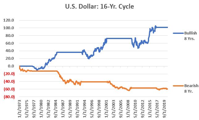
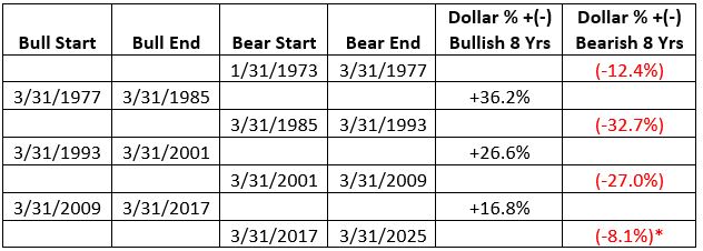
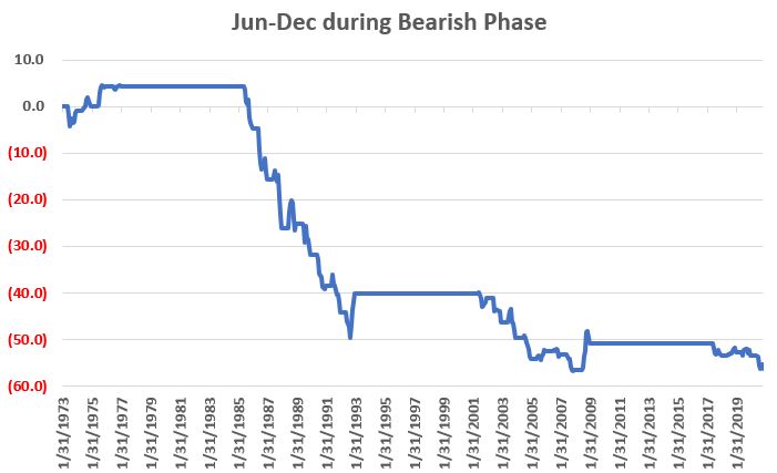
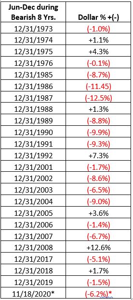
The trading days around holidays have a long-term tendency to be bullish for the stock market.  While I typically stick to the “3 trading days before and 3 trading days after” a holiday as “the bullish period”, with Thanksgiving it might make sense to cut things a little finer. 

The Big 3 Turkey Days

The best time around Thanksgiving has tended to be the two trading days before (Tuesday and Wednesday) and the day after (Friday).  The good news is that period has been consistently bullish over time.  The “bad news” is that it appears to have been slightly less effective in recent years.

For our purposes we will measure the price change for the Dow Jones Industrial Average from the close on Monday the week of Thanksgiving and the close on Friday of the same week. 

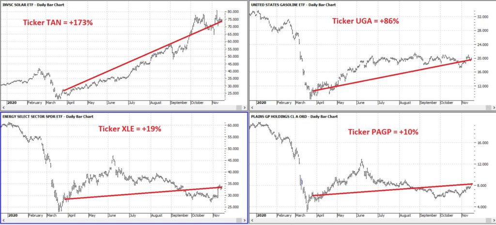
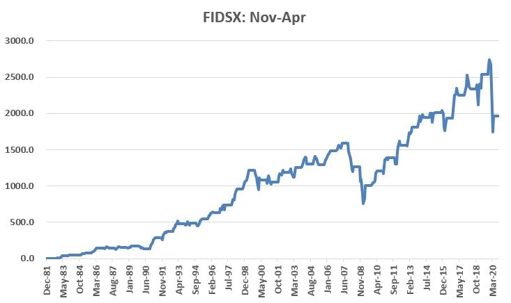
Figure 1 displays the cumulative % growth.

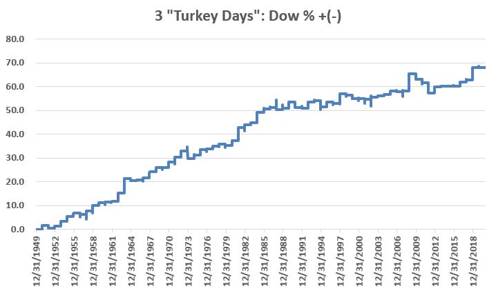
Figure 1 – Cumulative Dow % +(-) 2 days before and 1 day after Thanksgiving; 1950-2019

The cumulative growth from 1950 through 2019 was +68.0%.  If that doesn’t seem like much just remember that we are talking about just 3 trading days a year.

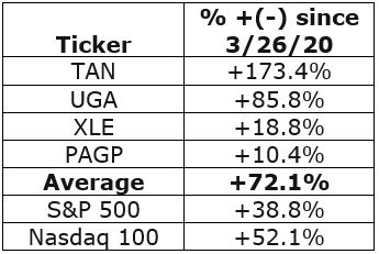
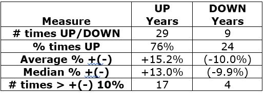
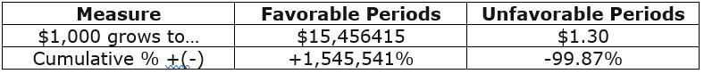
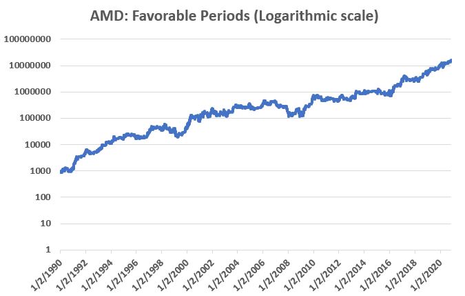
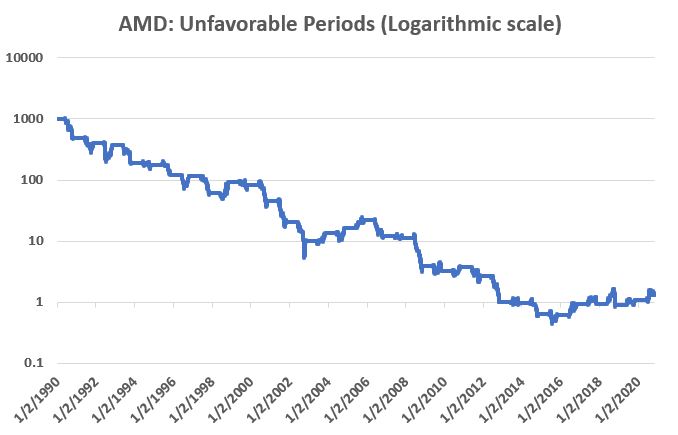
Figure 2 displays some of the relevant facts and figures

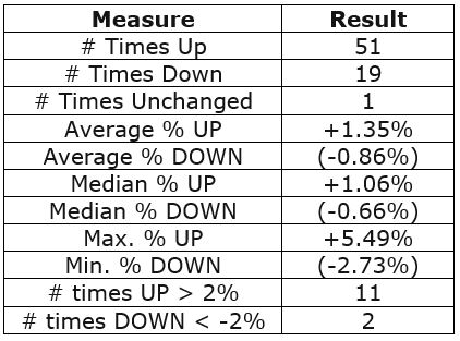
Figure 2 – Relevant Facts and Figures

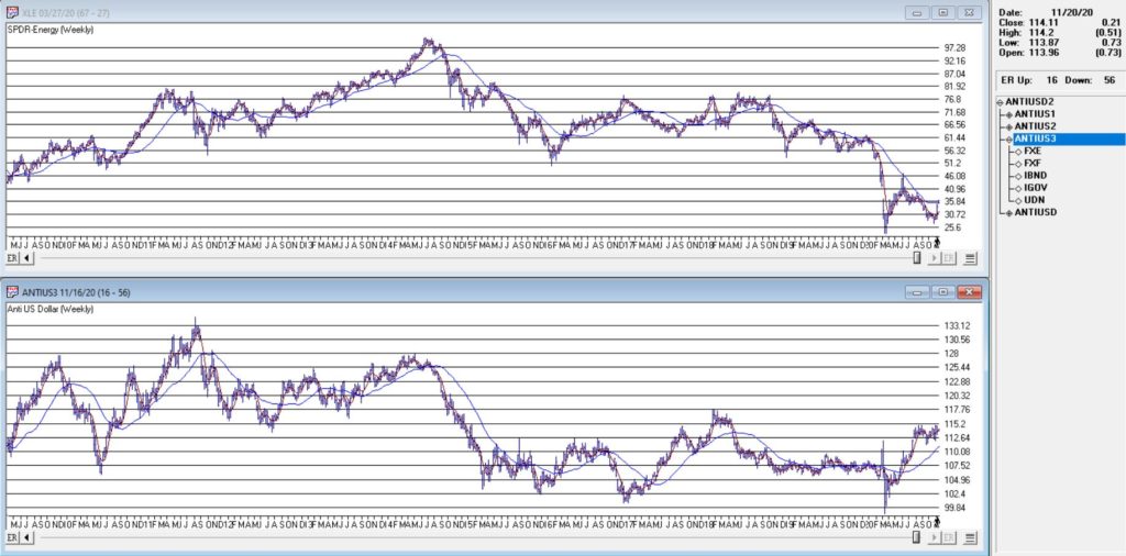
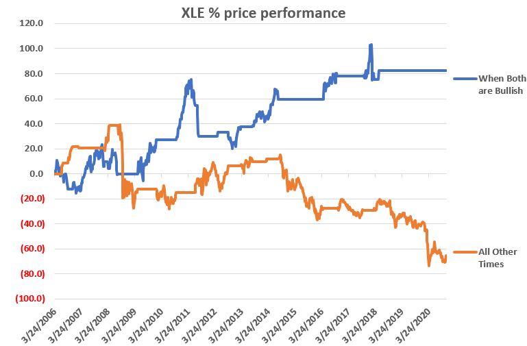
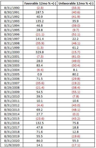
Figure 3 displays the rolling 5-year return and Figure 4 displays the rolling 10-year return. For what it is worth, returns have come down in recent years.  This may be due to more people being aware of these types of seasonal trends (thanks to blabbermouths like yours truly?).

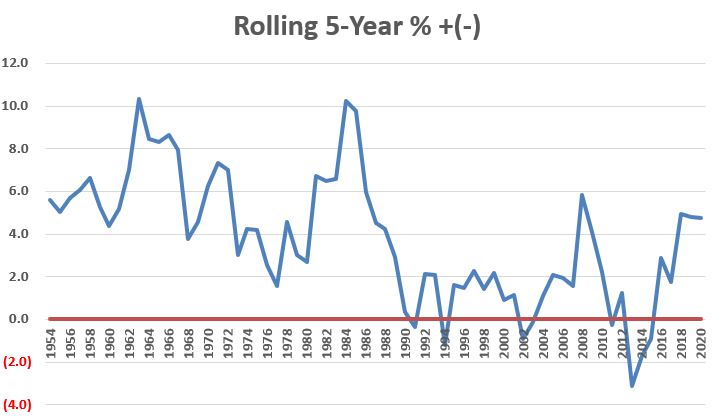
Figure 3 – Rolling 5-year returns

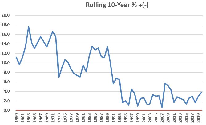
Figure 4 – Rolling 10-year returns

Figure 5 below displays the year-by-year 3-day results for the Dow.

Year 3 “Turkey” Day Dow % +(-)
1950 1.7
1951 (1.1)
1952 0.9
1953 1.7
1954 2.2
1955 1.2
1956 (0.4)
1957 1.2
1958 2.3
1959 0.9
1960 0.3
1961 0.3
1962 3.0
1963 5.5
1964 (0.8)
1965 0.2
1966 0.6
1967 2.3
1968 1.4
1969 (0.1)
1970 1.8
1971 1.7
1972 2.0
1973 (2.4)
1974 1.1
1975 1.8
1976 0.1
1977 1.0
1978 0.6
1979 (0.4)
1980 1.5
1981 4.0
1982 0.7
1983 0.7
1984 3.0
1985 1.1
1986 0.4
1987 (0.7)
1988 0.4
1989 1.7
1990 (1.5)
1991 (0.3)
1992 1.8
1993 0.4
1994 (1.6)
1995 1.3
1996 (0.4)
1997 2.6
1998 (0.4)
1999 (0.9)
2000 0.1
2001 (0.2)
2002 0.5
2003 0.4
2004 0.3
2005 1.0
2006 (0.3)
2007 0.2
2008 4.6
2009 (1.3)
2010 (0.8)
2011 (2.7)
2012 1.7
2013 0.1
2014 0.1
2015 0.0
2016 1.0
2017 0.5
2018 3.2
2019 (0.1)
2020 ?

Figure 5 – Year-by-year results

Happy Thanksgiving!

See also Jay Kaeppel Interview in July 2020 issue of Technical Analysis of Stocks and Commodities magazine

See also Jay’s “A Strategy You Probably Haven’t Considered” Video

See also Video – The Long-Term…Now More Important Than Ever

Jay Kaeppel

Disclaimer: The information, opinions and ideas expressed herein are for informational and educational purposes only and are based on research conducted and presented solely by the author.  The information presented represents the views of the author only and does not constitute a complete description of any investment service.  In addition, nothing presented herein should be construed as investment advice, as an advertisement or offering of investment advisory services, or as an offer to sell or a solicitation to buy any security.  The data presented herein were obtained from various third-party sources.  While the data is believed to be reliable, no representation is made as to, and no responsibility, warranty or liability is accepted for the accuracy or completeness of such information.  International investments are subject to additional risks such as currency fluctuations, political instability and the potential for illiquid markets.  Past performance is no guarantee of future results.  There is risk of loss in all trading.  Back tested performance does not represent actual performance and should not be interpreted as an indication of such performance.  Also, back tested performance results have certain inherent limitations and differs from actual performance because it is achieved with the benefit of hindsight.

What You Need to Know About the U.S. Dollar

The U.S. Dollar has been in a pretty prolonged slump since spiking to a top in March of this year.  Any chance for a rebound?  Sure, there is always a chance.  The buck is pretty oversold and trader sentiment – a typically contrarian indicator – is pretty darn negative.  So, a “bounce” would not be entirely unexpected.

Still, the view from where I sit is that the dollar is in the midst of a longer-term decline.

The Long-Term Cycle

I read a number of years ago about a 16-year cycle for the U.S. dollar.  Unfortunately, I can’t remember where I read it so I cannot give proper credit.  I have read about this cycle again recently.  For the record, it seems to follow the cycle with a slightly different start/end date than some sources I have seen recently.  No matter.  We are not talking about “precision market timing” here, just a basic overarching trend.  So, let’s take a closer look.

The U.S. Dollar 16-Year Cycle

The first full 16-year cycle – by my account – began on 3/31/1969 (NOTE: the first date of data I have available is 1/31/1973 – so results below start in 1973).  The “bearish” phase ran from then through 3/31/1977 and the “bullish” phase ran from 3/31/1977 through 3/31/1985.  And so on and so forth.  Figure 1 displays the cumulative % growth achieved by holding a hypothetical long position in the U.S. dollar during all bullish phases (blue line) and bearish phases (orange line).

Figure 1 – Cumulative % +(-) for U.S. dollar during Bullish 8 year phases (blue) and Bearish 8 year phases (orange)

Figure 2 displays the results by the numbers. 

Figure 2 – U.S. Dollar during bull and bear phases of 16-year cycle (NOTE: 1st Bearish Phase began 3/31/1969, HOWOEVER, the 1st day of available data is 1/31/1973)

The latest phase – a bearish phase – began on 3/31/2017 and extends through 3/31/2025.  Does that mean the dollar is doomed to decline relentlessly for another 4+ years?  Not at all.  It does tell us however, that it may be wise to favor the bearish side on any trade involving the U.S. dollar.

Digging a Little Deeper

Historically the most challenging time for the dollar is:

*During the months of June through December when the 16-year cycle is in a bearish phase

Figure 3 displays the cumulative % growth achieved by holding a hypothetical long position in the U.S. dollar ONLY during the months of June through December during those years when the 16-year cycle is bearish (the most recent such period began on June 1st of this year and extends through December 31st). 

Figure 3 – U.S. Dollar cumulative % +(-) during June through December within bearish 8-year phase

Figure 4 displays the year-by-year results (i.e., the % gain/loss for the dollar during June through December ONLY during those years when the 16-year cycle is bearish).

Figure 4 – U.S. Dollar % +(-) during June through December within bearish 8-year phase

*- thru 11/18/20

Summary

There is absolutely nothing that requires the U.S. dollar to adhere to the 16-year cycle detailed above.  But history suggests that getting bearish during the bullish 8-year phase and/or getting bullish during the bearish 8-year phase typically involves being willing to “swim upstream.”

A large part of any investment success is “identifying the flow” and “going with said flow.”  The dollar will remain in a bearish phase through March 2025.  Therefore, history suggests that June-Dec of 2021, 2022, 2023 and 2024 may be a time to consider a bearish position re the buck.

See also Jay Kaeppel Interview in July 2020 issue of Technical Analysis of Stocks and Commodities magazine

See also Jay’s “A Strategy You Probably Haven’t Considered” Video

See also Video – The Long-Term…Now More Important Than Ever

Jay Kaeppel

Disclaimer: The information, opinions and ideas expressed herein are for informational and educational purposes only and are based on research conducted and presented solely by the author.  The information presented represents the views of the author only and does not constitute a complete description of any investment service.  In addition, nothing presented herein should be construed as investment advice, as an advertisement or offering of investment advisory services, or as an offer to sell or a solicitation to buy any security.  The data presented herein were obtained from various third-party sources.  While the data is believed to be reliable, no representation is made as to, and no responsibility, warranty or liability is accepted for the accuracy or completeness of such information.  International investments are subject to additional risks such as currency fluctuations, political instability and the potential for illiquid markets.  Past performance is no guarantee of future results.  There is risk of loss in all trading.  Back tested performance does not represent actual performance and should not be interpreted as an indication of such performance.  Also, back tested performance results have certain inherent limitations and differs from actual performance because it is achieved with the benefit of hindsight.

An Energetic Opportunity Forms

Two of my favorite sayings go like this:

*”Every situation in life represents an opportunity”

*”Opportunity is where you find it”

Nowhere is this truer than in the financial markets. 

To wit, in this article dated 3/26/2020 (cue the scary music) – when things looked their absolute worst – I highlighted four tickers in the energy sector (yes, THAT energy sector, the one that has been a disaster and loathed and unloved for some time now).  Now it would have taken a true “Buy when there is blood in the streets” mentality, and/or almost foolhardy nerves of steel to actually pile into those issues at the time. 

But that is sort of the point. 

Figure 1 displays the tickers and their price action since the close on 3/26/2020.

Figure 1 – Energy stocks highlighted in 3/26/20 (Courtesy ProfitSource by HUBB)

Figure 2 displays the comparative performance versus the S&P 500 and the Nasdaq 100.

Figure 2 – “Blood in the Streets” energy stocks versus major indexes

As you can see in Figure 2 these four stocks as a whole have actually outperformed both the S&P 500 Index and the Nasdaq 100 Index. 

Now the point IS NOT that I am some great stock-picker (because I am not).  The point is that, well, see the two quotes above.

A Broader Look at Energy

For someone with less of the “buy when there is blood in the streets” mentality and more of “trend-following” mentality, a simple trend-following method may soon (at long last) swing to the bullish side.

It works like this:

*Two “tickers” see their respective 5-week average cross above their respective 30-week average

*Ticker 1 is ticker XLE (the SPDR energy ETF)

*Ticker 2 is an index (I created) of securities that have an inverse correlation to the U.S. Dollar

You can see these two – along with their respective 5-week and 30-week – in Figure 3.

Figure 3 – Ticker XLE and Jay’s ANTIUS3 index w/5-week and 30-week averages (Courtesy AIQ TradingExpert)

As you can see in Figure 3 the two have a tendency to often move together.  At other times they do not.  The key point here is that we ONLY pay attention when the two tickers are both trending in the same direction.

Why is this important? 

Figure 4 displays the cumulative price growth for ticker XLE (as a proxy for the broad energy sector) under two separate circumstance:

*When BOTH XLE and ANTIUS3 are in uptrends (i.e., 5-week average ABOVE 30-week average)

*When EITHER XLE or ANTIUS3 is NOT in an uptrend (i.e., 5-week average BELOW 30-week average)

Figure 4 – XLE cumulative %+(-) depending on trend status for XLE and ANTIUS3

To put it in numbers:

When BOTH are in Uptrends: XLE = +82.3%

When EITHER is NOT in an Uptrend: XLE = -65.5%

Summary

Another glance at Figure 1 reveals that ANTIUS3 is in an uptrend and that XLE is not quite there yet.  So, at the moment there is no bullish signal from the method described above.  However, energy does appear to be “trying” to rally.  Investors looking for “opportunity” may be wise to keep an eye on the 5-week and 30-week averages of ticker XLE in the weeks and month ahead.

See also Jay Kaeppel Interview in July 2020 issue of Technical Analysis of Stocks and Commodities magazine

See also Jay’s “A Strategy You Probably Haven’t Considered” Video

See also Video – The Long-Term…Now More Important Than Ever

Jay Kaeppel

Disclaimer: The information, opinions and ideas expressed herein are for informational and educational purposes only and are based on research conducted and presented solely by the author.  The information presented represents the views of the author only and does not constitute a complete description of any investment service.  In addition, nothing presented herein should be construed as investment advice, as an advertisement or offering of investment advisory services, or as an offer to sell or a solicitation to buy any security.  The data presented herein were obtained from various third-party sources.  While the data is believed to be reliable, no representation is made as to, and no responsibility, warranty or liability is accepted for the accuracy or completeness of such information.  International investments are subject to additional risks such as currency fluctuations, political instability and the potential for illiquid markets.  Past performance is no guarantee of future results.  There is risk of loss in all trading.  Back tested performance does not represent actual performance and should not be interpreted as an indication of such performance.  Also, back tested performance results have certain inherent limitations and differs from actual performance because it is achieved with the benefit of hindsight.

Good for Japan, Bad for US (Bonds)?

In the late 1980’s, Japan seemed destined to “rule the financial world”.  But when it comes to the financial markets – things don’t always pan out as they appear destined to.  The Nikkei Index topped out in late 1989, didn’t bottom out until February 2009 and has yet to return to its 1989 peak.

But it sure is trying.  This past week the Nikkei reached its highest level 1991.  So, hooray for the Japanese.  Back here in the US of A there may be a slightly different take.  For as we will discuss in a moment, what is good for Japanese stocks is (apparently) bad for US bonds.

Ticker EWJ

As our proxy for Japanese stocks we will use ticker EWJ (iShares Japan).  In Figure 1 you can the monthly action since the ETF started trading in 1996. 

Figure 1- Ticker EWJ monthly (Courtesy AIQ TradingExpert)

Since 1996 EWJ has broken in the $60 a share range on 5 previous occasions, only to be rebuffed.  You can see the latest upward thrust at the far right.  Will this be the time it breaks through?  It beats me and in fact that is not really the focus of this article.  The real question posed here is “what about U.S. treasury bonds?”  Huh?  Consider Figure 2. 

The top clip of Figure 2 displays a weekly chart of EWJ with a 5-week and 30-week moving average drawn.  The bottom clip displays a weekly chart of ticker TLT – the iShares ETF that tracks the long-term U.S. treasury bond. 

Note that – using highly technical terms – when one “zigs”, the other “zags.”

Figure 2 – EWJ vs. TLT (Courtesy AIQ TradingExpert)

The thing to note is the inverse correlation between the two – i.e., when Japanese stocks advance, US treasuries tend to decline and vice versa.  For the record (and for you fellow numbers geeks out there) the correlation coefficient in the last 2 years is -0.45 (1 means they trade exactly the same, -1 means they trade exactly inversely).

For my purposes:

*EWJ 5-week MA < EWJ 30-week MA = BULLISH for US treasuries

*EWJ 5-week MA > EWJ 30-week MA = BEARISH for US treasuries

Any real merit to this? 

*The blue line in Figure 3 displays the cumulative $ +(-) achieved by holding a long position in t-bond futures ($1,000 a point) when the EWJ indicator is BULLISH (for U.S. bonds)

*The orange line in Figure 3 displays the cumulative $ +(-) achieved by holding a long position in t-bond futures ($1,000 a point) when the EWJ indicator is BEARISH (for U.S. bonds)

Figure 3 – $ + (-) for Treasury Bond Futures when EWJ indicator is BULLISH for bonds (blue) or BEARISH for bonds (orange)

Summary

Bond investors might keep a close eye on Japanese stocks for a while.  If the latest thrust higher follows through and becomes the move that finally breaks out to the upside, the implication would appear to be negative for U.S. long-term treasury bonds.  On the flip side, if Japanese stocks fail once again to break through and reverse to the downside, then things might look a whole lot better for the 30-year US treasury.

See also Jay Kaeppel Interview in July 2020 issue of Technical Analysis of Stocks and Commodities magazin`

See also Jay’s “A Strategy You Probably Haven’t Considered” Video

See also Video – The Long-Term…Now More Important Than Ever

Jay Kaeppel

Disclaimer: The information, opinions and ideas expressed herein are for informational and educational purposes only and are based on research conducted and presented solely by the author.  The information presented represents the views of the author only and does not constitute a complete description of any investment service.  In addition, nothing presented herein should be construed as investment advice, as an advertisement or offering of investment advisory services, or as an offer to sell or a solicitation to buy any security.  The data presented herein were obtained from various third-party sources.  While the data is believed to be reliable, no representation is made as to, and no responsibility, warranty or liability is accepted for the accuracy or completeness of such information.  International investments are subject to additional risks such as currency fluctuations, political instability and the potential for illiquid markets.  Past performance is no guarantee of future results.  There is risk of loss in all trading.  Back tested performance does not represent actual performance and should not be interpreted as an indication of such performance.  Also, back tested performance results have certain inherent limitations and differs from actual performance because it is achieved with the benefit of hindsight.

Mining in Miners

There are few sectors more volatile – and more unpredictable – than gold miners.  Let’s face it, the business of digging gold out of mines is a tough one and is almost entirely dependent upon the price of gold.  From the high is 2011 to the low in 2016 ticker GDX lost roughly 88% of its value.  On the flip side it is presently about 200% above that 2016 low.  So, if you are looking for “action”, you’ve come to the right place.

Looking for Clues

Figure 1 displays a study from www.Sentimentrader.com.  It essentially highlights performance after a pullback in an uptrend.  While it sounds like a bearish setup (a certain percentage of stocks in the sector breaking down) it also highlights why it is important to study actual data and NOT rely on instinct and hunches.

Figure 1 – Gold Miners potentially favorable sign (Courtesy Sentimentrader.com)

The gist of Figure 1 is that the current setup has typically – though important, not always – followed by bullish price action for gold miners across virtually every timeframe in the next year – most notably 1 month and 6 months.

Let’s add a little more “fuel to the fire.”

Figure 2 highlights the fact that trader sentiment on GDX has been very low.  This often serves as a favorable contrarian (i.e., bullish) signal.

Figure 2 – GDX trader sentiment (Courtesy Sentimentrader.com)

Figure 3 highlights the fact that November through February tends to be “seasonally favorable” for gold mining stocks (it should be noted that this highlights a long-term tendency and that results from year-to-year can be extremely volatile). 

Figure 3 – GDX seasonality (Courtesy Sentimentrader.com)

So, when we add it all up, the information so far seems to signal a potentially bullish setup for gold miners.  Will this in fact be how it plays out?  It beats me.  The key questions here are:

*Will you consider a bullish trade or stand aside?

*Which trade to make?

*And most importantly – what are the risks of that trade and can I handle that level of risk?

A 1-Month Trade

The most straightforward approach would be to buy 700 shares of GDX and sell 100 shares at 1 week, 2 weeks, 1 month, 2 months, 3 months, 6 months and 1 year.

To buy 700 shares of GDX as I write would cost $26,313.  A trader would also need to establish some sort of stop-loss level, based on a break of a given support level and/or as a percentage of capital.

What follows is a cheaper alternative to playing for 1-month.  The trade highlighted IS NOT a “recommendation” but rather an example of one way to play GDX if one is willing to accept the premise that it will be higher (or at least, not likely lower) one month from now.

The trade involves:

*Selling 1 December 36.5 put @ $1.20

*Buying 1 December 34.5 put @ $0.60

Figure 4 displays the particulars and Figure 5 displays the risk curves.

Figure 4 – GDX bull put spread details (Courtesy www.OptionsAnalysis.com)

Figure 5 – GDX bull put spread risk curves (Courtesy www.OptionsAnalysis.com)

Key things to note:

*This trade costs $140 to enter a 1-lot, which is also the maximum risk

*The maximum profit is $60

*The breakeven price is $35.90 (current GDX price is $37.49)

*If GDX is trading at $36.50 a share or higher on December 11 this trade will earn 43% ($60/$140)

As long as GDX does what it is “supposed” to do (i.e., not go down) things are swell and things are great.  The real question that a trader needs to ask and answer before entering a trade such as this is “what will I do if GDX goes down instead?”

Choices include:

*Ride it out and risk the full $140

*Establish a $ amount stop-loss

*Establish a GDX share price at which you will cut a loss

The recent low of $36.01 serves as an obvious candidate as a “line in the sand”, however, it is also a fairly “tight” stop-loss level. 

What’s the proper play?  That’s not for me to say.  But note the following:

Jay’s Trading Maxim #112: Anyone can “enter” a trade.  Successful traders learn how to “manage” a trade.

A subtle – but supremely important – distinction.

See also Jay Kaeppel Interview in July 2020 issue of Technical Analysis of Stocks and Commodities magazine

See also Jay’s “A Strategy You Probably Haven’t Considered” Video

See also Video – The Long-Term…Now More Important Than Ever

Jay Kaeppel

Disclaimer: The information, opinions and ideas expressed herein are for informational and educational purposes only and are based on research conducted and presented solely by the author.  The information presented represents the views of the author only and does not constitute a complete description of any investment service.  In addition, nothing presented herein should be construed as investment advice, as an advertisement or offering of investment advisory services, or as an offer to sell or a solicitation to buy any security.  The data presented herein were obtained from various third-party sources.  While the data is believed to be reliable, no representation is made as to, and no responsibility, warranty or liability is accepted for the accuracy or completeness of such information.  International investments are subject to additional risks such as currency fluctuations, political instability and the potential for illiquid markets.  Past performance is no guarantee of future results.  There is risk of loss in all trading.  Back tested performance does not represent actual performance and should not be interpreted as an indication of such performance.  Also, back tested performance results have certain inherent limitations and differs from actual performance because it is achieved with the benefit of hindsight.

Signs of Life in Finance?

Nothing is permanent in the financial markets.  Each security – both on its own and relative to other securities – moves in waves.  Sometimes the tide is favorable and sometime it definitely is not.  Identifying the exact moment when the tide turns is a fool’s errand.  But failing to recognize a change in tide – and reacting accordingly – is equally as foolish.

Financials

The financial sector has caught my eye.  Please note that the previous sentence says “The financial sector has caught my eye” and NOT “PUT EVERYTHING YOU HAVE INTO FINANCIAL STOCKS BECAUSE THEY ARE SURE TO GO UP!!!!”  Note the subtle difference between the two sentences.

The primary thing that caught my attention was the research appearing in Figure 1 from www.Sentimentrader.com that displays action for the financial sector following previous “thrusts” such as we just saw recently.

Figure 1 – Financials performance after “thrusts” (Courtesy Sentimentrader.com)

The gist of it is that following the previous 9 signals the finance sector stood higher 12 months later 100% of the time, with an average gain of +20.8%.  Does this guarantee a gain 12 months from the 11/9/20 signal?  Not at all.  But it sure smells like a potential opportunity.

Ticker XLF – Price Action

Figure 2 displays the daily chart for ticker XLF (SPDR Financials ETF), which is a pretty choppy and – on the face of it – uninspiring affair.

Figure 2 – XLF Daily (Courtesy ProfitSource by HUBB)

Figure 3 displays a weekly chart of XLF. My eyes are immediately drawn to the previous peaks around $31 a share.  The good news is that this level serves as a good price target.  The bad news is that it represents a significant area of resistance should it actually get there.

Figure 3 – XLF Weekly (Courtesy ProfitSource by HUBB)

Ticker XLF – Relative Performance

In looking for a “change of tide”, consider Figure 4.  This chart displays the performance of XLF relative to the performance of the S&P 500 (when the bars in an uptrend it means financials are outperforming SPX and vice versa).  As you can see, financials have significantly underperformed since early 2018.  We should be watching this for an upside reversal.

Figure 4 – XLF performance relative to SPY performance (Courtesy StockCharts.com)

Financials – Seasonality

The November 1 through April 30th period is “typically” favorable for financial stocks.  As a proxy (and to obtain a longer track record) here we will use ticker FIDSX (Fidelity Select Financial Services).  Figure 5 displays the cumulative growth achieved by holding FIDSX during November through April every year since inception in 1982. 

Figure 5 – FIDSX cumulative % return during Nov-Apr; 1982-2020

When things go bad, they tend to go very bad (FIDSX lost -21.7% From Nov 1, 2019 through Apr 30, 2020).  Note that there were 4 periods (1990, 2008, 2009 and 2020) that showed a loss of -10% or more.  On the flip side, 17 of the 29 UP years showed a gain in excess of +10%.  Figure 6 displays the overall results.

Figure 6 – FIDSX during Nov-Apr

So, is this a good time to take the plunge into financial stocks?  JOTM just provides information, NOT recommendations or predictions.  But to play out the example let’s consider a hypothetical example trade.

Betting on XLF

For an investor who wants to bet on an advance in XLF over the next year the most straightforward approach is simply to buy 100 shares of XLF and “hold on tight.”  As I write XLF is trading at $27.15 a share, so buying 100 shares involves an investment of $2,715.  One question an investor would need to ask an answer is, “am I just going to ride it out for 12 months come hell or high water, or will I set a stop-loss point?”.  If the latter then the next decision is where to place a stop-loss.

As a less-costly alternative, let’s consider a “stock replacement” position using a call option in ticker XLF.  Our trade involves buying the January 2022 call option with a strike price of $21.  In real-world trading we would use a limit order to try to buy closer to the midpoint of the bid/ask range.  But for sake of example we will buy “at the market” at $7.00 (x 100 shares = $700). 

Figure 7 displays the particulars and Figure 8 the risk curves. 

Figure 7 – XLF long call (Courtesy www.OptionsAnalysis.com)

Figure 8 – XLF long call risk curves (Courtesy www.OptionsAnalysis.com)

Things to note:

*Cost to enter and maximum risk (if XLF drops below $21 a share) is $700

*The breakeven price is $28 a share.

Above $28 a share the option will move point-for-point with the stock.

If XLF rallies to $31 a share:

Figure 9 – Stock versus Call Option if XLF rallies to $31

Summary

Is XLF due to rally in the year ahead?  It beats me.  But there is some evidence to argue that way.  If so and investor has a choice, a) do nothing, b) buy stock, c) buy a call option.

The choice is yours.

See also Jay Kaeppel Interview in July 2020 issue of Technical Analysis of Stocks and Commodities magazine

See also Jay’s “A Strategy You Probably Haven’t Considered” Video

See also Video – The Long-Term…Now More Important Than Ever

Jay Kaeppel

Disclaimer: The information, opinions and ideas expressed herein are for informational and educational purposes only and are based on research conducted and presented solely by the author.  The information presented represents the views of the author only and does not constitute a complete description of any investment service.  In addition, nothing presented herein should be construed as investment advice, as an advertisement or offering of investment advisory services, or as an offer to sell or a solicitation to buy any security.  The data presented herein were obtained from various third-party sources.  While the data is believed to be reliable, no representation is made as to, and no responsibility, warranty or liability is accepted for the accuracy or completeness of such information.  International investments are subject to additional risks such as currency fluctuations, political instability and the potential for illiquid markets.  Past performance is no guarantee of future results.  There is risk of loss in all trading.  Back tested performance does not represent actual performance and should not be interpreted as an indication of such performance.  Also, back tested performance results have certain inherent limitations and differs from actual performance because it is achieved with the benefit of hindsight.

AMD Seasonality Revisited

In this article I wrote about the fairly amazing seasonality of ticker AMD.  That version “cut things a little fine” – i.e., the buy and sell dates very specific within different months.  Today – for no particular reason – I want to put out a simpler version.

Rules

Hold ticker AMD:

*During the months of November through May

*During the month of August

These are considered “favorable” months.  All other months (June, July, September and October are considered “unfavorable.”

Results

Figure 1 displays the net results using daily price data from Jan 1990 through 11/9/20.

Figure 1 – AMD Results: Favorable versus Unfavorable periods

Figure 2 displays the growth of $1,000 invested in AMD ONLY during the favorable periods (note this is a “logarithmic” scale chart – i.e., the distance between $10 and $100 is the same the distance between $100 and $1,000, etc.)

Figure 2 – Growth of $1,000 in AMD ONLY during Favorable periods

Figure 3 displays the growth of $1,000 invested in AMD ONLY during the unfavorable periods (note this also is a “logarithmic” scale chart)

Figure 3 – Growth of $1,000 in AMD ONLY during Unfavorable periods

For measuring purposes we will end AMD’s “Fiscal Year” on August 31st and look back at performance over the prior 12 months for “Favorable” and “Unfavorable” periods.  Figure 4 displays the year-by-year results.

Figure 4 – AMD Seasonality Year-by-Year

Summary

One major caveat to note.  Buying and holding AMD only during the Favorable periods would have involved riding out two drawdowns in excess of -60%(!!), including a -75% drawdown during the 2007-2009 bear market.  So there’s that.

If one can somehow get past that – or around it somehow, perhaps with some sort of stop-loss provision – the overall results are, ahem, “compelling.”

Does this mean that AMD is guaranteed to soar between now and June 2021 (up +10% so far)?  Not at all.  Is this really a viable “investment strategy?”  That’s not for me to say. 

Still, let’s just say – there appears to be “something there” that might be worth a closer look and a little independent research.

See also Jay Kaeppel Interview in July 2020 issue of Technical Analysis of Stocks and Commodities magazine

See also Jay’s “A Strategy You Probably Haven’t Considered” Video

See also Video – The Long-Term…Now More Important Than Ever

Jay Kaeppel

Disclaimer: The information, opinions and ideas expressed herein are for informational and educational purposes only and are based on research conducted and presented solely by the author.  The information presented represents the views of the author only and does not constitute a complete description of any investment service.  In addition, nothing presented herein should be construed as investment advice, as an advertisement or offering of investment advisory services, or as an offer to sell or a solicitation to buy any security.  The data presented herein were obtained from various third-party sources.  While the data is believed to be reliable, no representation is made as to, and no responsibility, warranty or liability is accepted for the accuracy or completeness of such information.  International investments are subject to additional risks such as currency fluctuations, political instability and the potential for illiquid markets.  Past performance is no guarantee of future results.  There is risk of loss in all trading.  Back tested performance does not represent actual performance and should not be interpreted as an indication of such performance.  Also, back tested performance results have certain inherent limitations and differs from actual performance because it is achieved with the benefit of hindsight.

Silver – Up is Good, Down is Bad

Nothing like a simple concept.  So, when it comes to silver, it turns out that the best forecaster of the future trend in the price of silver is, well, the price trend of silver.  Too simple?  Let’s take a look.

Silver

Figure 1 displays the monthly chart of silver futures going back to 1970.  Let’s just say, “a lot has happened”.

Figure 1 – Silver futures (Courtesy ProfitSource by HUBB)

But here is the interesting thing.  Let’s look at the hypothetical results achieved by buying and holding a silver futures contract if:

*Silver is UP over the past 52 weeks

*Silver is DOWN over the past 52 weeks

Specifically, at the end of each week we will determine whether silver is higher or lower than it was 52 weeks prior. 

*The blue line in Figure 2 displays the cumulative $ +(-) achieved if one held a silver futures contract ONLY when the prior 52 weeks shows a rise in the price of silver

*The orange line in Figure 2 displays the cumulative $ +(-) achieved if one held a silver futures contract ONLY when the prior 52 weeks shows a decline in the price of silver

Figure 2 – Holding a long position in silver if previous 52-week were UP (blue line) or down (orange line)

The blue line is by no means a “straight line” advance – there is a lot of “swooping and soaring” involved.  But the key point is the stark difference between the two lines.  To wit:

*+(-) from holding silver is 52 week ROC>0 = +$199,690

*+(-) from holding silver is 52 week ROC<=0 = (-$89,525)

Summary

This is not intended to be an “automatic” bullish or bearish signal for silver.  But in terms of “weight of the evidence” it is clearly appears to be better to “go with the trend” when it comes to silver.

When things are swell, things are great – and when they’re not, get it off your plate.

For the record, silver is up roughly 30% over the last 52 weeks.

See also Jay Kaeppel Interview in July 2020 issue of Technical Analysis of Stocks and Commodities magazine

See also Jay’s “A Strategy You Probably Haven’t Considered” Video

See also Video – The Long-Term…Now More Important Than Ever

Jay Kaeppel

Disclaimer: The information, opinions and ideas expressed herein are for informational and educational purposes only and are based on research conducted and presented solely by the author.  The information presented represents the views of the author only and does not constitute a complete description of any investment service.  In addition, nothing presented herein should be construed as investment advice, as an advertisement or offering of investment advisory services, or as an offer to sell or a solicitation to buy any security.  The data presented herein were obtained from various third-party sources.  While the data is believed to be reliable, no representation is made as to, and no responsibility, warranty or liability is accepted for the accuracy or completeness of such information.  International investments are subject to additional risks such as currency fluctuations, political instability and the potential for illiquid markets.  Past performance is no guarantee of future results.  There is risk of loss in all trading.  Back tested performance does not represent actual performance and should not be interpreted as an indication of such performance.  Also, back tested performance results have certain inherent limitations and differs from actual performance because it is achieved with the benefit of hindsight.