Monthly Archives: October 2019

A Glimpse of the Future(?) Part III

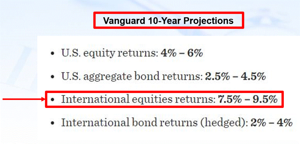
In Part I here and Part II here, I make the argument that the next 10 years or so in the stock market will likely not look a lot like the last 10 years.  I also highlighted two “areas” that are seemingly due for a “reversion to the mean” sometime in the years ahead.

This is the third and final installment.

Stocks versus Commodities

When I started in this business, commodities were all the rage.  Of course, we had inflation of about 11% and interest rates in the 15% range at the time.  So, yes, it was a very different time and very different set of circumstances.  And “no”, I am not pounding the table while ranting about “impending inflation.”  I mean, I would never rule it out, but there is no evidence at the moment that inflation is going to be a significant problem anytime soon.  The nature of my argument here is simply more of the cyclical nature of markets.

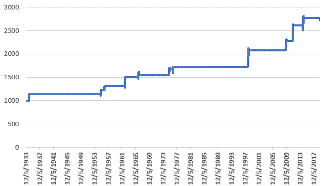
Figure 1 displays the cumulative growth for both the Goldman Sachs Commodity Index (GSCI) and the S&P 500 Index (SPX) since 1971.

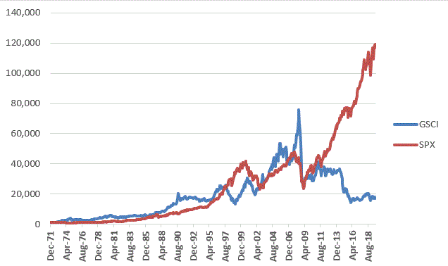
Figure 1 – Growth of $1,000 invested in the Goldman Sachs Commodity Index (blue) versus the S&P 500 Index Index (orange); Dec-1971 through Sep-2019

Here is where “statistics” can be misleading.  If we look at the raw total return, stocks are the hands down winner:

*SPX up +11,797%

*GSCI up +1,617%  

However, the reality is that in mid-2009 they were even.  So, all of the difference has occurred in the past 10 years, which have been an extraordinarily favorable time for stocks.

But the real story is the “back and forth” nature of the performance of these two asset classes.  Figure 2 displays:

*5-year return for GSCI minus 5-year return for SPX

*Positive readings indicate that commodities have outperformed stocks over prior 5 years

*Negative readings indicate that stocks have outperformed commodities over prior 5 years

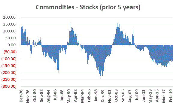
Figure 2 – Cumulative 5-year total return for Goldman Sachs Commodity Index minus cumulative 5-year total return for S&P 500 Index; Dec-1971-Sep-2019

Figure 3 displays the length of time (in months) during which commodities outperformed stocks (positive values) and the length of time (in months) during which stocks outperformed commodities (negative values)

Here is how to read Figure 3:

*If GSCI has outperformed SPX over the previous 5 years, then the value is positive and gets more positive with each month that commodities lead stocks.

*If GSCI has underperformed SPX over the previous 5 years, then the value is negative and gets more negative with each month that stocks lead commodities.

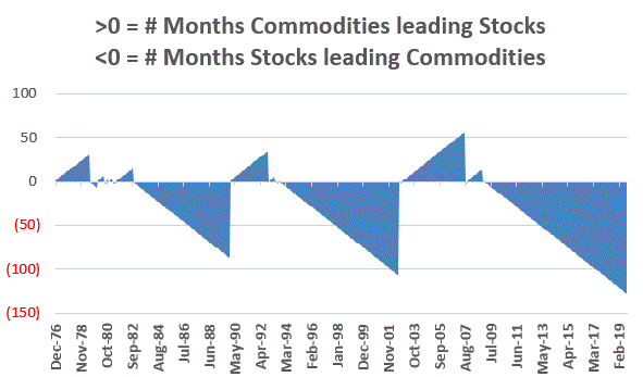
Figure 3 – # of Months commodities outperformed stocks (positive) and vice versa (negative); Dec-1971-Sep-2019

The primary point is to note an obvious “ying” and “yang” over time, i.e., commodities lead for a period of time, then stocks lead for a period of time.

Commodities have been seriously underperforming stocks for a number of years now and it is difficult to predict when that trend will change.  Given the vastly superior performance for stocks have enjoyed over the past 10 years, I can’t help but think that commodities will once again gain favor sometime in the not too distant future.

A few commodity index ETF’s (or ETN’s) appear in Figure 4.  As always, I am not “recommending” these securities or suggesting the “right now” is the time to be buying them.  All I am saying is that I think “their day will come.”

Ticker ETF Name
DBC Invesco DB Commodity Index Tracking Fund
GSG iShares S&P GSCI Commodity-Indexed Trust
DJP iPath Bloomberg Commodity Index Total Return(SM) ETN
RJI ELEMENTS Rogers International Commodity Index

Figure 4 – Commodity index tracking ETF and ETNs

Summary of Parts I, II and II

The three articles sin this series were intended solely to highlight the cyclical nature of certain segments of the financial markets.  The 3 areas I highlighted were:

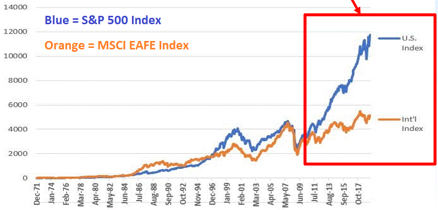
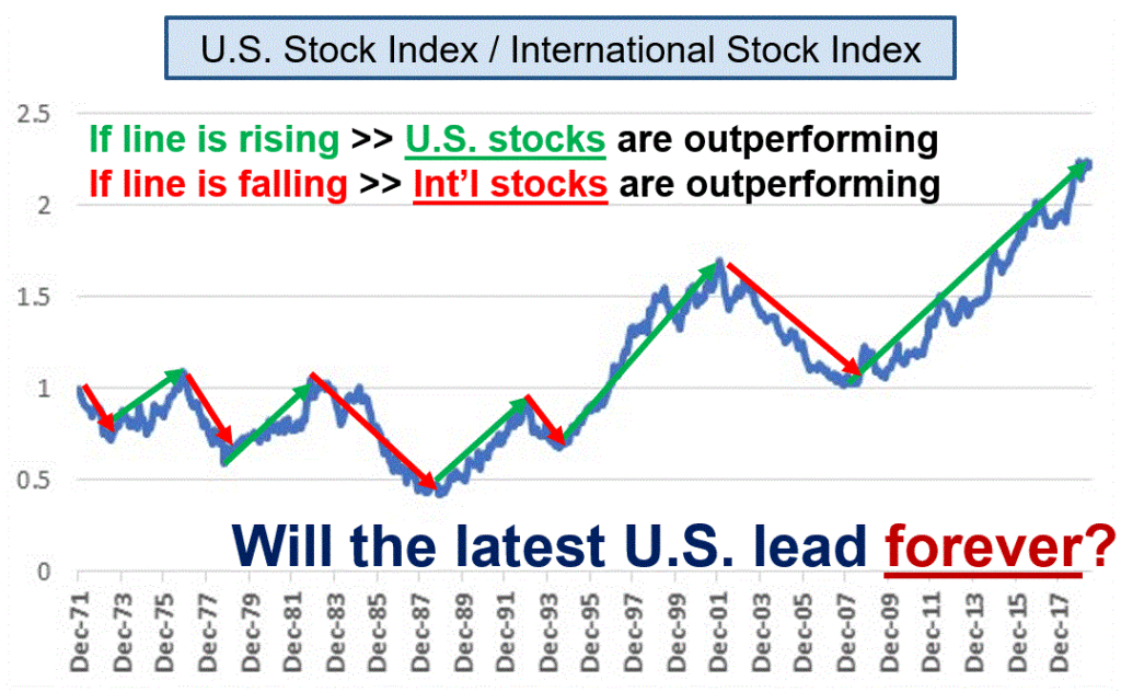
*U.S. Stock indexes versus International stock indexes

*Growth stocks versus Value stocks

*Stocks versus Commodities

For each of the pairs listed above (and as the articles attempted to highlight) have a long history of “back and forth” in terms of performance. In each of the above cases, the asset class named first has been significantly outperforming the asset class named second for some time now.

My thinking is that – if history proves an accurate guide – things will reverse sometime in the years ahead. The main purpose of these articles was to attempt to wake investors from the typical lethargy that lets in when “things are the way they are” for a long period of time and investors fall into the trap of expecting those “things” to continue indefinitely.

While I am not making any claim that now is the time for any specific action, I am making the following suggestion:

Be prepared for change.

Jay Kaeppel

Disclaimer: The information, opinions and ideas expressed herein are for informational and educational purposes only and are based on research conducted and presented solely by the author.  The information presented does not represent the views of the author only and does not constitute a complete description of any investment service.  In addition, nothing presented herein should be construed as investment advice, as an advertisement or offering of investment advisory services, or as an offer to sell or a solicitation to buy any security.  The data presented herein were obtained from various third-party sources.  While the data is believed to be reliable, no representation is made as to, and no responsibility, warranty or liability is accepted for the accuracy or completeness of such information.  International investments are subject to additional risks such as currency fluctuations, political instability and the potential for illiquid markets.  Past performance is no guarantee of future results.  There is risk of loss in all trading.  Back tested performance does not represent actual performance and should not be interpreted as an indication of such performance.  Also, back tested performance results have certain inherent limitations and differs from actual performance because it is achieved with the benefit of hindsight.

A Glimpse of the Future(?) Part II

In Part I here, I basically made the argument that nothing ever stays the same forever in the stock market, but that things do often repeat (or more accurately, alternate).  In Part I, I highlighted the “back and forth” nature of the historical performance between U.S. stock indexes and international stock indexes, and that the fact that U.S. stocks have vastly outperformed international stocks in recent years is likely NOT a permanent trend (although it could go on for some time). 

In a similar vein, we can also look at growth stocks versus value stocks.

Growth versus Value

In recent years it has not been uncommon to hear the refrain that “Value investing is dead.”  As I pointed out previously in this article, that sentiment is likely completely unfounded.  Analysis of growth versus value comes down to what time period you want to focus on.  In Figure 1 we see that since July 2007, the Russell 1000 Growth Index has gained +295% versus only +140% for the Russell 1000 Value Index.

Figure 1 – Growth of $1,000 invested in Russell 1000 Growth Index (blue) versus Russell 1000 Value Index (orange); Jul-2007 through Sep-2019

So, it is understandable to a point that some investors would conclude that growth investing is superior to value investing.  However, if we look at the full period from December 1978 through September 2019, we find that Value gained +9,601% versus +8,074% for Growth.

Figure 2 – Growth of $1,000 invested in Russell 1000 Growth Index (blue) versus Russell 1000 Value Index (orange); Dec-1978 through Sep-2019

But the real story is the “back and forth” nature of the performance of these two asset classes.  Figure 3 displays:

*3-year return for Russell 1000 Value Index minus 3-year return for Russell 1000 Growth Index

*Positive readings indicate that Value has outperformed Growth over prior 3 years

*Negative readings indicate that Growth has outperformed Value over prior 3 years

Figure 3 – Cumulative 3-year total return for Russell 1000 Value Index minus cumulative 3-year total return for Russell 1000 Growth Index; Dec-1981-Sep-2019

Figure 4 displays the length of time (in months) during which Value has outperformed Growth (positive values) and the length of time (in months) during which Growth has outperformed Value (negative values)

Here is how to read Figure 4:

*If Value has outperformed Growth over the previous 3 years, then the value is positive and gets more positive with each month that Value leads Growth. 

*If Value has underperformed Growth over the previous 3 years, then the value is negative and gets more negative with each month that Value trails Growth. 

Figure 4 – # of Months Value outperformed Growth (positive) and vice versa (negative); Dec-1981-Sep-2019

The primary point is to note an obvious “ying” and “yang” over time, i.e., growth stocks lead for a period of time, then value stocks lead for a period of time.

Given the advantage that growth stocks have enjoyed over the previous 12 years, I can’t help but think that value stocks will once again gain favor sometime in the not too distant future.

One ETF for consideration in this realm is ticker VLUE (iShares Edge MSCI USA Value Factor ETF). Remember, I am not “recommending” that anyone rush out and buy this ETF. I am merely raising the prospect – based on the historical give and take between growth and value – that value may look a lot better in the years ahead than in the years just passed.

Jay Kaeppel

Disclaimer: The information, opinions and ideas expressed herein are for informational and educational purposes only and are based on research conducted and presented solely by the author.  The information presented does not represent the views of the author only and does not constitute a complete description of any investment service.  In addition, nothing presented herein should be construed as investment advice, as an advertisement or offering of investment advisory services, or as an offer to sell or a solicitation to buy any security.  The data presented herein were obtained from various third-party sources.  While the data is believed to be reliable, no representation is made as to, and no responsibility, warranty or liability is accepted for the accuracy or completeness of such information.  International investments are subject to additional risks such as currency fluctuations, political instability and the potential for illiquid markets.  Past performance is no guarantee of future results.  There is risk of loss in all trading.  Back tested performance does not represent actual performance and should not be interpreted as an indication of such performance.  Also, back tested performance results have certain inherent limitations and differs from actual performance because it is achieved with the benefit of hindsight.

A Glimpse of the Future(?) Part I

The truth is that I am not so good at making predictions (for the record, I do take some comfort in the fact that, neither is anyone else, but I digress).  But I am pretty good at “looking back”, and I am also slightly above average at spotting trends that typically alternate from “one thing” to “another.”  I have found that this can be helpful. 

So first….

A Quick Look Back

Figure 1 displays the Shiller P/E Ratio going back into the 1800’s.  The negative numbers on Figure 1 represent the magnitude of the bear markets that followed peaks in the Shiller P/E Ratio above 21 (the -83% value marked with an asterisk represents the bear market decline of the Nasdaq 100 Index from 2000-2002; all others represent the bear market decline of the Dow Jones Industrial Average). 

Figure 1 – Shiller P/E Ratio with bear market magnitudes following peaks above 21 (Source: http://www.multpl.com/shiller-pe)

It is important to point out that valuation measures are NOT good “timing” indicators.  However, they are useful “perspective” indicators.  What the negative numbers – plus the current high reading for the P/E Ratio – tell us is that the next bear market – whenever it may come – is likely to be “one of the painful kind.”  This does NOT constitute a sell signal.  As long as the trend remains “up”, the party can and will go on indefinitely.  The current high level of valuation does, however, serve to remind us that now may be a good time to at least “locate the nearest exit” for when the time comes to use it.

Figure 2 highlights another important piece of info.  Figure 2 reminds us that the Dow Industrials (as well as ever other major average) can go sideways for painfully long periods of time. 

Figure 2 – Dow Jones Industrial Average – the stock market can go sideways for long periods of time

(Source: http://www.macrotrends.net)

Here is a question for you:

“If the stock market goes sideways for the next 13 to 22 years, how will you make money?”

Hint: Based on what we see in Figure 2 the correct answer is NOT, “Well, that probably won’t happen.”

The Last 10 Years

The last 10 years have been exceptional for stock investors.  And while one may occasional sense that the bull is getting “long in the tooth”, we should also remember that the market rallied almost 20 years from the mid-1940’s to the mid 1960’s and for 18 years from 1982 to 2000 (of course those rallies were launched when stocks were dirt cheap according to the Shiller P/E Ratio, but never mind about that right now).  My main point, is that if the market breaks out to a new high, we could easily see another significant up leg.

But with history as a guide, the chances seem good that the next 10 years will not look exactly the same as the last 10 years.  Let’s look at a the first of few “potential reversions to the mean.”

International Stocks

Figure 3 displays the cumulative total return for the S&P 500 Index (U.S. stocks) and the MSCI EAFE Index (broad, international index) since 1970.  Clearly in the last 10 years, U.S. stocks have vastly outperformed international stocks.  Will this last forever? 

Figure 3 – S&P 500 Index versus MSCI EAFE Index PEP; 1970-2019; SPX has vastly outperformed in last 10 years (Source: PEP Database from Callan Associates)

Let’s divide the S&P 500 by the EAFE Index to get the ratio that we see in Figure 4. 

Figure 4 – SPX divided by EAFE Index; there is a long history of “back and forth” (Source: PEP Database from Callan Associates)

As you can see in Figure 4, sometimes U.S. stocks lead, other times international stocks lead.  Looking at the regular “back and forth” apparent in Figure 4 it is not hard to envision international stocks outperforming U.S. at some point in the not too distant future.  It should also be noted that Vanguard Investors 10-Year projections for 4 major asset classes (U.S. and International stocks and bonds) presently favors international stocks over the ext 10 years.

Figure 5 – Vanguard Investors 10-Year Projections for 4 major asset classes (Source: https://institutional.vanguard.com/)

2 ETFs that track international indexes that exclude U.S. stocks appear in Figure 6.

Figure 6 – International index ETFs

Is any of this meant to imply that investors should sell their U.S. holdings and pile into international stocks and/or stock indexes right this very minute?

Not at all.

As long as the line in Figure 4 keeps rising (i.e., as long as U.S. stocks continue to outperform) the current trend remains intact. The only point being made here is to remember that nothing lasts forever in the stock market. And the day will come – and history suggests possibly in the not too distant future – when international stocks will once again outperform U.S. stocks.

Parts II and II to follow…

Jay Kaeppel

Disclaimer: The information, opinions and ideas expressed herein are for informational and educational purposes only and are based on research conducted and presented solely by the author.  The information presented does not represent the views of the author only and does not constitute a complete description of any investment service.  In addition, nothing presented herein should be construed as investment advice, as an advertisement or offering of investment advisory services, or as an offer to sell or a solicitation to buy any security.  The data presented herein were obtained from various third-party sources.  While the data is believed to be reliable, no representation is made as to, and no responsibility, warranty or liability is accepted for the accuracy or completeness of such information.  International investments are subject to additional risks such as currency fluctuations, political instability and the potential for illiquid markets.  Past performance is no guarantee of future results.  There is risk of loss in all trading.  Back tested performance does not represent actual performance and should not be interpreted as an indication of such performance.  Also, back tested performance results have certain inherent limitations and differs from actual performance because it is achieved with the benefit of hindsight.

Keep a Close Eye on the U.S. Dollar

As the primary currency recognized around the globe, the U.S. Dollar is pretty important.  And the trend of the dollar is pretty important also.  While a strong dollar is good in terms of attracting capital to U.S. shores, it makes it more difficult for U.S. firms that export goods.  One might argue that a “steady” dollar is generally preferable to a very strong or very weak dollar.

Speaking of the trend of the dollar, a lot of things move inversely to the dollar.  In fact, one can typically argue that as long as the dollar is strong, certain “assets” will struggle to make major advances.  These include – commodities in general, metals specifically, foreign currencies (obviously) and international bonds (strongly). 

Let’s first take a look at the state of the dollar.

Ticker UUP

For our purposes we will use the ETF ticker UUP ( Invesco DB US Dollar Index Bullish Fund) to track the U.S. Dollar.  Figure 1 displays a monthly chart and suggests that UUP just ran into – and reversed at least for now – in a significant zone of resistance.

Figure 1 – UUP Monthly (Courtesy ProfitSource by HUBB)

Figure 2 displays a weekly chart which suggests the possibility that UUP has completed a 5-wave advance.

Figure 2 – UUP Weekly (Courtesy ProfitSource by HUBB)

Figure 3 displays a daily chart and paints a more potentially bullish picture, looking for a 5th Wave up.

Figure 3 – UUP Daily (Courtesy ProfitSource by HUBB)

Which way will things go?  It beats me.  But I for one will be keeping a close eye on UUP versus the resistance levels highlighted in Figures 1 and 2.  So will traders of numerous other securities.

Inverse to the Buck

Figure 4 displays the 4-year weekly correlation for 5 ETFs to ticker UUP (a correlation of 1000 means they trade exactly the same a UUP and a correlation of -1000 means they trade exactly inversely to UUP).

Figure 4 – 4-Year Correlation to ticker UUP (Courtesy AIQ TradingExpert)

In the following charts, note the inverse relationship between the dollar (UUP on the bottom) and the security in the top chart. When the dollar goes way down they tend to go way up – and vice versa.

Note also that in the last year several of these securities went up at the same time the dollar did. This is a historical anomaly and should not be expected to continue indefinitely.

Figure 5 – Ticker DBC (Invesco DB Commodity Index Tracking Fund) vs. UUP (Courtesy AIQ TradingExpert)

Figure 6 – Ticker SLV (iShares Silver Trust) vs. UUP (Courtesy AIQ TradingExpert)

Figure 7 – Ticker GLD (SPDR Gold Shares) vs. UUP (Courtesy AIQ TradingExpert)

Figure 8 – Ticker BWX (SPDR Bloomberg Barclays International Treasury Bond) vs. UUP (Courtesy AIQ TradingExpert)

Figure 9 – Ticker IBND (SPDR Bloomberg Barclays International Corporate Bond) vs. UUP (Courtesy AIQ TradingExpert)

Figure 10 – Ticker FXE (Invesco CurrencyShares Euro Currency Trust) vs UUP (Courtesy AIQ TradingExpert)

Summary

If the dollar fails to break out of it’s recent resistance area and actually begins to decline then commodities, currencies, metals and international stocks and bonds will gain a favorable headwind. How it all actually plays out, however, remains to be seen.

So keep an eye on the buck. Alot is riding on it – whichever way it goes.

Jay Kaeppel

Disclaimer:  The data presented herein were obtained from various third-party sources.  While I believe the data to be reliable, no representation is made as to, and no responsibility, warranty or liability is accepted for the accuracy or completeness of such information.  The information, opinions and ideas expressed herein are for informational and educational purposes only and do not constitute and should not be construed as investment advice, an advertisement or offering of investment advisory services, or an offer to sell or a solicitation to buy any security.

Beating 60/40 with Momentum

I love simple. Especially when it comes to investing.  So, the standard issue “60/40’ approach holds a certain appeal.  To be clear, the 60/40 version I am speaking of rebalances each year so that at the start of the year, the portfolio holds:

*60% Standard & Poor’s 500 Index

*40% Bloomberg Barclays Treasury Long Index

There are other versions.  For example, some prefer to use a broader bond index that covers more than just long-term treasuries.  The theory behind 60/40 is simply that:

*The stock market goes up in the long run, and;

*Bonds historically tend to perform well when stocks have a down year

Some questions are being raised regarding the viability of 60/40 going forward.  And with interest rates extremely low and following close to a 40-year bull market in both stocks and bonds, the questions are reasonable. Still, many investors are OK with the returns generated utilizing a 60/40 approach.  Of course, it would be a pretty boring article if I just typed “The End” right here, don’t you think?  So, let’s examine a simple approach to improving on the standard issue 60/40 approach.

Applying Momentum

There is a fairly large body of research that highlights pretty clearly that a security that is outperforming some other security or securities, will often tend to continue to do so for some period of time.  So, here is the method we will test:

*We use total monthly return data for the S&P 500 Index and the Bloomberg Barclays treasury Long Index starting in January 1973.

*At the end of each November we determine which security has outperformed during the previous 12 months

*If the S&P 500 Index has outperformed Long Term Treasuries over the latest November to November period, then on December 31st we rebalance to:

*S&P 500 75%

*Bloomberg Barclays Long Treasury Index 25%

*If the S&P 500 Index has underperformed Long Term Treasuries over the latest November to November period, then on December 31st we rebalance to:

*S&P 500 25%

*Bloomberg Barclays Long Treasury Index 75%

(NOTE: The monthly total return data is not typically available until several days into the new month.  So, if we waited until the end of December to do our calculation we would have to wait until the December monthly total return data is available in early January before doing our rebalance.  In order to be able to rebalance exactly at the start of each new year, we use 12-month total return at the end of November to decide what action to take on December 31st)

In a nutshell:

Instead of always starting each new year 60/40 favoring stocks, we start each new year with 75% in whichever index outperformed in the previous Nov to Nov period and 25% in the other index.

Is this a good thing to do?  Let’s take a look. 

The Results

Figure 1 displays the growth of $1,000 invested using our Momentum Strategy (blue) versus the standard 60/40 approach.

Figure 1 – Growth of $1,000 using Jay’s 75/25 Strategy (blue) versus Standard 60/40; 1974 through Sep 2019

Figure 2 displays a variety of statistical measures.

Measure 75/25 60/40
Average 12-mo % +11.7% +11.3%
Median 12-mo. % +10.6% +11.3%
Std. Deviation % 10.26% 11.18%
Ave./Std Dev. 1.14 1.01
Worst 12 months % (-9.9%) (-22.2%)
Maximum Drawdown % (-12.8%) (-26.5%)
Average 5-yr% +74.4% +72.1%
Worst 5-yr% +20.1% (-1.5%)
$1,000 becomes $121,963 $97,114
Cumulative % +(-) +12,096% +9,611%

Figure 2 – Jay’s 75/25 versus Standard 60/40

*While the annual 12-month% is only slightly higher (and the median 12-month % is actually lower) using the Momentum Strategy, the net result is 26% more profit (+12,096% for the 75/25 Strategy versus +9,611% for the 60/40 approach).

*The 75/25 Strategy had a:

*lower 12-month standard deviation (10.26% versus 11.18%)

*smaller worst 12-month % loss (-9.9% versus -22.2%)

*significantly smaller maximum drawdown (-12.8% versus -26.5%)

*worst 5-year return of +20.1% versus -1.5% for 60/40

Other statistics appear in Figure 3.

Measure 75/25 60/40
% of 12-mo. Periods UP 89.6% 83.6%
% of 12-mo. Periods DOWN 10.4% 16.4%
% of 12-mo. Periods>other approach 57.2% 42.8%
% of 5-yr Periods UP 100% 98.2%
% of 5-yr Periods DOWN 0% 0.2%
% of 5-yr Periods>other approach 60.2% 39.8%

Figure 3 – Jay’s 75/25 versus Standard 60/40 

Jay Kaeppel

Disclaimer:  The data presented herein were obtained from various third-party sources.  While I believe the data to be reliable, no representation is made as to, and no responsibility, warranty or liability is accepted for the accuracy or completeness of such information.  The information, opinions and ideas expressed herein are for informational and educational purposes only and do not constitute and should not be construed as investment advice, an advertisement or offering of investment advisory services, or an offer to sell or a solicitation to buy any security.

The Big Canary in the Coal Mine…

Technology is what it’s all about these days.  Technology (primarily) runs on semiconductors.  If the semiconductor business is good, business is good.  OK, that’s about as large a degree of oversimplification as I can manage.  But while it may be overstated, there is definitely a certain amount of truth to it.

So, it can pay to keep an eye on the semiconductor sector.  The simplest way to do that is to follow ticker SMH.  Keeping with the mode of oversimplifying things, in a nutshell, if SMH is not acting terribly that’s typically a good thing.  So where do all things SMH stand now?  Let’s take a look.

Ticker SMH

As with all things market-related (among other things), beauty is in the eye of the beholder.  A quick glance at Figure 1 argues that SMH is inarguably in a strong uptrend, well above its 200-day moving average

Figure 1 – SMH in an uptrend (Courtesy AIQ TradingExpert)

A glance at Figure 2 suggests that SMH has just completed 5 waves up and may be due for a decline.

Figure 2 – SMH with potentially bearish Elliott Wave count (Courtesy ProfitSource by HUBB)

And Figure 3 highlights a very obvious bearish divergence between SMH weekly price action and the 3-period RSI indicator – i.e., SMH keeps moving incrementally higher while RSI3 reaches slightly lower highs each time.  Speaking anecdotally, this setup seems to presage at least a short-term decline maybe 70% of the time.  Of course, the degree of decline varies also.

Figure 3 – SMH with 3-period RSI bearish divergence (Courtesy AIQ TradingExpert)

So, what does it all mean?  First off, I am not going to make any predictions (if you knew my record on “predictions” you would thing that that is a good thing).  I am simply going to point out that one way or the other SMH may be about to give us some important information.

Scenario 1 – SMH breaks out to the upside and stays there: If SMH breaks through the upside and runs, the odds are very high that the overall stock market will run with it.

Course of action: Play for a bullish run by the overall market into the end of the year.

Scenario 2 -SMH breaks out briefly to the upside but then falls back below the recent highs: This would be at least a short-term bearish sign.  Failed breakouts are typically a bad sign and the security in question often behaves badly after disappointing bullish investors.  In this case, if it happens to SMH it could follow through to the overall market.

Course of action: If this happens, you might consider “playing some defense” (hedging, raising some cash, etc.) . Failed breakouts often make the market a little “cranky” (and cranky is one of my fields of expertise).

Scenario 3: SMH fails to breakout and suffers an intermediate-term decline.  If I were to fixate only on the bearish RSI3 divergence I showed earlier in Figure 3, this would seem like the most likely result. 

Course of action: If SMH sells off without breaking above recent resistance, keep an eye on SMH price via its 200-day moving average.  Simple interpretation goes like this: If SMH sells off but holds or regains it’s 200-day moving average then the bullish case can quickly be re-established; If SMH sells off and holds below its 200-day moving average, that should be considered a bearish sign for the overall market.

Jay Kaeppel

Disclaimer:  The data presented herein were obtained from various third-party sources.  While I believe the data to be reliable, no representation is made as to, and no responsibility, warranty or liability is accepted for the accuracy or completeness of such information.  The information, opinions and ideas expressed herein are for informational and educational purposes only and do not constitute and should not be construed as investment advice, an advertisement or offering of investment advisory services, or an offer to sell or a solicitation to buy any security.

If You Think AMZN Will…

…rise or fall, and you want to trade AMZN shares, first off you will need a lot of cash.  With AMZN trading at $1705 a share, buying 100 shares will require you to pony up $170,050.  Selling short 100 shares will also require a substantial margin deposit (not to mention the assumption of unlimited risk).  There are alternatives.

One trader might look at Figure 1 and see a security that is completing 5 waves down and is due for a rally.

Figure 1 – AMZN with Elliott Wave with potentially bullish Elliott Wave count (Courtesy ProfitSource by HUBB)

Another trader might look at Figure 2 and see a security that is breaking down below its 200-day moving average and is due for a decline

Figure 2 – AMZN with potentially bearish configuration vis a vis 200-day moving average (Courtesy ProfitSource by HUBB)

In any event, in Figure 3 we can see that implied volatility for AMZN options is not super low but it is also towards the lower end of the historical range.  This can afford the, ahem, less affluent trader some potential opportunities.

Figure 3 – AMZN with implied option volatility on the low end of historical range (Courtesy www.OptionsAnalysis.com)

OTM Calendar Spreads

For the bullish trader, Figures 4 and 5 highlight an out-of-the-money (heretofore, OTM) call calendar spread.

Figure 4 – AMZN OTM call calendar details (Courtesy www.OptionsAnalysis.com)

Figure 5 – AMZN OTM call calendar risk curves (Courtesy www.OptionsAnalysis.com)

This hypothetical trade (NOT a recommendation, only an example):

*Costs only $564 to enter (which represents the maximum risk)

*Has significant upside potential if AMZN moves back towards its previous high

*Max % profit to Max % risk = 1,032%

For the bearish trader, Figures 6 and 7 highlight an out-of-the-money (heretofore, OTM) call calendar spread.

Figure 6 – AMZN OTM put calendar details (Courtesy www.OptionsAnalysis.com)

Figure 7 – AMZN OTM put calendar risk curves (Courtesy www.OptionsAnalysis.com)

This hypothetical trade (NOT a recommendation, only an example):

*Costs only $700 to enter (which represents the maximum risk)

*Has significant profit potential if AMZN moves back towards its previous low

*Max % profit to Max % risk = 731%

Summary

The trades highlighted above are NOT “recommended” trades.  They are simply examples of one way to trade a high-priced stock that offer large profit potential and much less dollar risk than that associated with buying and holding shares of stock.

Jay Kaeppel

Disclaimer:  The data presented herein were obtained from various third-party sources.  While I believe the data to be reliable, no representation is made as to, and no responsibility, warranty or liability is accepted for the accuracy or completeness of such information.  The information, opinions and ideas expressed herein are for informational and educational purposes only and do not constitute and should not be construed as investment advice, an advertisement or offering of investment advisory services, or an offer to sell or a solicitation to buy any security.

A Ray of Hope in an Ugly October Start

Despite the fact that October has seen some great rallies, it’s reputation as “Crash Month” is tough to shake – especially when the first two days see the stock market sell off.  But if we look at things from a historical standpoint, it turns out that a rough October beginning has mostly been a positive sign.

Now I like to think I am all about all things “seasonal”, but the truth is this is one I didn’t know about.  At least now until I read this article by Mark DeCambre on Marketwatch.com.   In turn, he quoted an analyst from Bespoke Investment Group.  So, a lot of help on this one.

If the 1st Day of October…

…is down -1% or more, the market has showed a strong historical tendency to perform quite well between then and the end of the year.  There is of course, no guarantee that this time around things won’t be different, but before hitting the panic button consider the following data (FYI: The data I have only goes back to Jan 1, 1934 so my table and chart do not include 1931 and 1933, which also qualified).

Figure 1 displays the performance of the Dow jones Industrial Average from the close of the first trading day of October through December 31st during those years when the Dow lost -1% or more on the first trading day of October.

Year 2nd Trading Day of October through Dec 31st % +(-)
1934 +15.1%
1955 +7.2%
1956 +6.6%
1962 +14.0%
1966 +3.7%
1975 +8.7%
1976 +2.5%
1998 +20.3%
2009 +9.7%
2011 +14.7%
2014 +6.1%

Figure 1 – Performance to year-end after Dow down -1% or more on October Trading Day #1

Figure 2 displays the cumulative growth of $1,000 invested in the Dow ONLY from the close of October Trading Day #1 through December 31st IF the Dow lost -1% or more on the first trading day of October.

Figure 2 – Growth of $1,000 invested through year end if 1st trading day of October is down -1% or more

Finally, for some – possibly unneeded – perspective, Figure 3 displays the same data as Figure 2 but includes ONLY days in the market – i.e., all the intervening days between signals are left out.

Figure 3 – Growth of $1,000 invested through year end if 1st trading day of October is down -1% or more (with all days NOT in the market excluded)

Summary

The “Good News” – at least in theory anyway – is that the Dow lost more than -1% on October 1st.  The bad news is, a) it also suffered an even bigger loss on October 2nd, so not a good start, and, b) there is absolutely no guarantee that the pattern from previous years (i.e., a higher market by year end) will repeat. 

But for what it’s worth, there you have it.

Jay Kaeppel

Disclaimer:  The data presented herein were obtained from various third-party sources.  While I believe the data to be reliable, no representation is made as to, and no responsibility, warranty or liability is accepted for the accuracy or completeness of such information.  The information, opinions and ideas expressed herein are for informational and educational purposes only and do not constitute and should not be construed as investment advice, an advertisement or offering of investment advisory services, or an offer to sell or a solicitation to buy any security.

A Quick Update to ‘Slow and Steady’

In this article I wrote about a “slow and steady” approach to investing that included usage of the S&P 500 Low Volatility Index.  Reader DB inquired about what the results would look like if we used the S&P 500 Index itself rather than the Low Volatility index. 

The Results

During the test period of 12/31/1990 through 8/31/2019, the Low Volatility version, i.e., the one presented here, performed better than a version that uses the S&P 500 Index.  For the record, both versions handily outperformed buy-and-hold.

Figure 1 displays the cumulative growth of $1,000 in:

*Blue line: S&P 500 Low Volatility (held Mar,Apr,May,Nov,Dec) version

*Orange line: S&P 500 Index (held Mar,Apr,May,Nov,Dec) version

*Grey line: S&P 500 Index Buy-and-Hold

Figure 1 – Growth of $1,000 in various strategies

Figure 2 displays the comparative facts and figures

Measure LoVol
Version
SPX
Version
SPX
Buy/Hold
Average 12-mos % +(-) +13.7% +13.1% +11.1%
Median 12-mos. % +(-) +12.8% +11.8% +13.2%
Std. Deviation 12-mos. % +(-) 8.6% 8.7% 16.2%
Average/Std. Deviation 1.6 1.5 0.7
Worst 12-month % (-3.3%) (-7.6%) (-43.3%)
Maximum Dradown % (-7.4%) (-9.0%) (-50.9%)
Average 5-Yr. % +(-) +94.0% +87.9% 69.8%
Worst 5-Yr. % +(-) +38.5% +32.2% (-29.1%)
$1,000 becomes $37,369 $31,572 $16,044

Figure 2 – Comparative Results

With the eternal (and technically very appropriate) caveat that “past performance does not guarantee future results”, using the S&P 500 Low Volatility Index in my Slow and Steady system appears to add value beyond the Slow and Steady version that uses the S&P 500 Index, and particularly against a buy-and-hold approach.

As always, this is not a “recommendation” – simply a report of hypothetical back-tested results.

Jay Kaeppel

Disclaimer:  The data presented herein were obtained from various third-party sources.  While I believe the data to be reliable, no representation is made as to, and no responsibility, warranty or liability is accepted for the accuracy or completeness of such information.  The information, opinions and ideas expressed herein are for informational and educational purposes only and do not constitute and should not be construed as investment advice, an advertisement or offering of investment advisory services, or an offer to sell or a solicitation to buy any security.

When Slow and Steady is Good Enough

Everyone wants to make money.  In fact, human nature being what it is, most people would like to make as much as they can.  But when it comes to actually investing one’s money there is also the “risk” side of the equation to factor in. And that’s where the trouble typically comes in.

Human nature also being what it is, some segment of the investing population essentially ignores risk – at least right up until the point where the equity in their account experiences a harrowing decline.  Another segment (comprised in no small part from former members of the previous group) place almost all of their attention on “risk avoidance.”  And from an “I like to sleep at night” perspective that can make sense.  Unfortunately, what tends to happen is 20-30 years down the road, instead of retiring with $x, they retire with a small fraction of the wealth they might have accumulated if they had taken a little more risk now and then.  So, the bottom line leads us directly to….

Jay Trading Maxim #22: Investment success is not about maximizing return or minimizing risk.  Investment success is about maximizing the tradeoff between reward and risk – i.e., finding the balance that is right for you, and not someone else.

What follows is “one approach” to balancing reward and risk.

One Slow and Steady Approach

The following “system” is NOT a recommendation – just food for thought.  It combines a seasonal element with 3 asset classes to create an investment “calendar.”

The results use historical index data only, although there are ETF’s available to track the indexes. 

The Data

The test uses index data starting in January 1991 through August 2019 as shown below.

Index Name ETF
Bloomberg Barclays High Yield Very Liquid Index HYG
S&P 500 Low Volatility Index SPLV
Bloomberg Barclays Treasury Intermediate Index IEI

Figure 1 – The Vehicles

The Calendar

Month Index Held
Jan Bloomberg Barclays High Yield Very Liquid Index
Feb Bloomberg Barclays High Yield Very Liquid Index
Mar S&P 500 Low Volatility Index
Apr S&P 500 Low Volatility Index
May S&P 500 Low Volatility Index
Jun Bloomberg Barclays Treasury Intermediate Index
Jul Bloomberg Barclays Treasury Intermediate Index
Aug Bloomberg Barclays Treasury Intermediate Index
Sep Bloomberg Barclays Treasury Intermediate Index
Oct Bloomberg Barclays Treasury Intermediate Index
Nov S&P 500 Low Volatility Index
Dec S&P 500 Low Volatility Index

Figure 2 – Jay’s Slow and Steady Strategy Calendar

The Results

Figure 3 displays the growth of a hypothetical $1,000 invested using the calendar/indexes above.

Figure 3 – Hypothetical growth of $1,000 invested using Jay’s Slow and Steady Calendar

Figure 4 displays some relevant reward and risk numbers for the system.

Measure Value
Average 12-mos % +(-) +13.7%
Median 12-mos. % +(-) +12.8%
Std. Deviation of 12-mos. % +(-) 8.6%
Average/Std. Deviation 1.59
Worst 12-month % (-3.3%)
Maximum Drawdown % (-7.4%)
Average 5-Yr. % +(-) +94.0%
Worst 5-Yr. % +(-) +38.5%

Figure 4 – Facts and Figures

Key things to note:

*The system has a very low 12-month standard deviation – i.e., low volatility.

*The worst 12-month period was -3.3% and the worst drawdown (to date) was -7.4%.  That falls within most investors risk tolerance levels.

*100% of all 5-year rolling periods showed a gain. 

Summary

Is Jay’s Slow and Steady Calendar Strategy the “best” way to invest for an investor looking for a decent tradeoff between reward and risk?  Hardly.  But it’s one way…

Jay Kaeppel

Disclaimer:  The data presented herein were obtained from various third-party sources.  While I believe the data to be reliable, no representation is made as to, and no responsibility, warranty or liability is accepted for the accuracy or completeness of such information.  The information, opinions and ideas expressed herein are for informational and educational purposes only and do not constitute and should not be construed as investment advice, an advertisement or offering of investment advisory services, or an offer to sell or a solicitation to buy any security.