Monthly Archives: September 2019

Yes, the Stock Market is at a Critical Juncture (and What to Do About It)

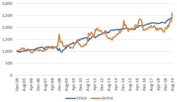
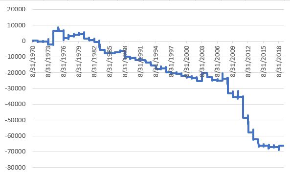
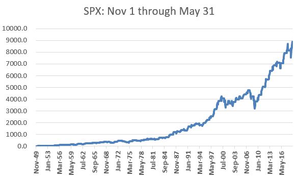
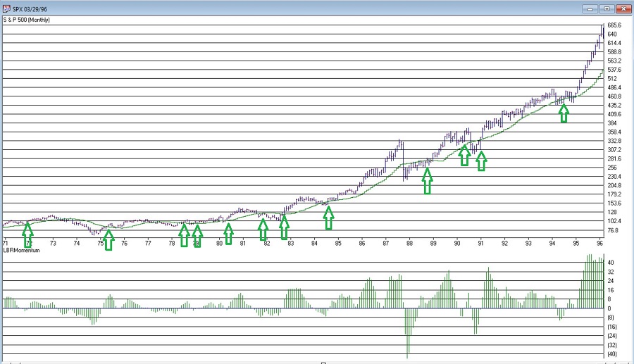
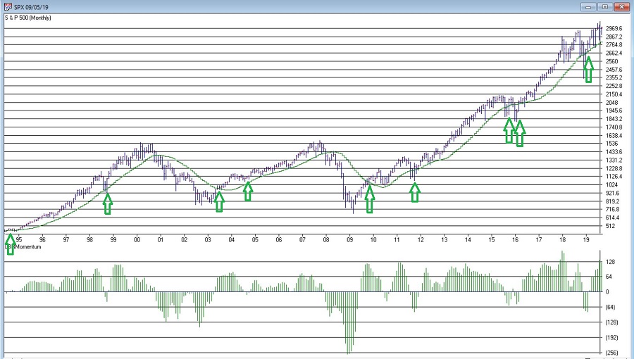
As usual, you can pretty much see whatever you want to see in today’s stock market.  Consider the major indexes in Figure 1, displayed along with their respective 200-day moving averages.

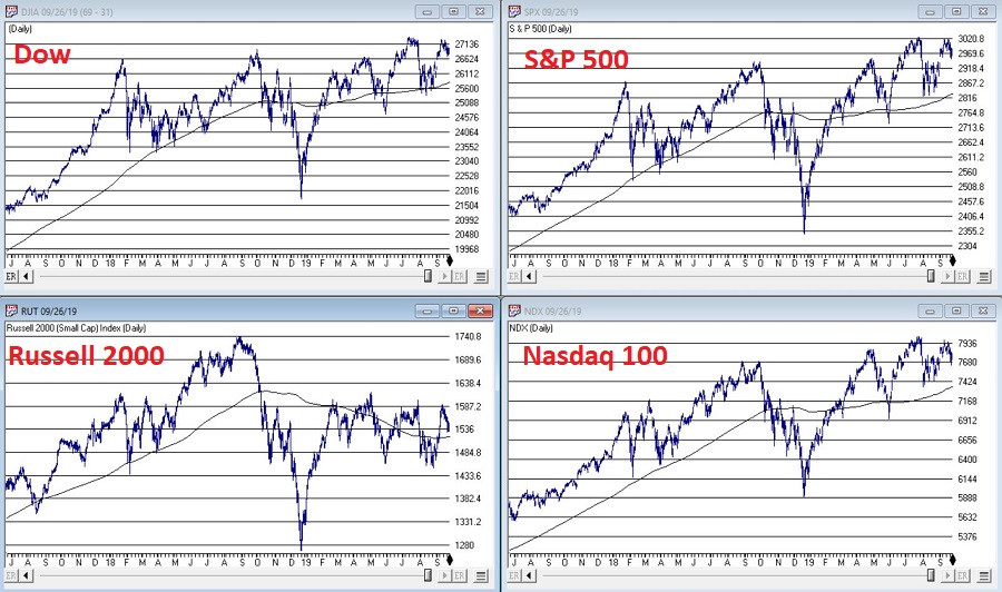
Figure 1 – Major Indexes (Courtesy AIQ TradingExpert)

If you “want to” be bullish, you can focus on the fact that all 4 of these major indexes are presently above their respective 200-day moving averages.  This essentially defines an “uptrend”; hence you can make a bullish argument.

If you want to be “bearish”, you can focus on the “choppy” nature of the market’s performance and the fact that very little headway has been made since the highs in early 2018.  This “looks like” a classic “topping pattern” (i.e., a lot of “churning”), hence you can make a bearish argument.

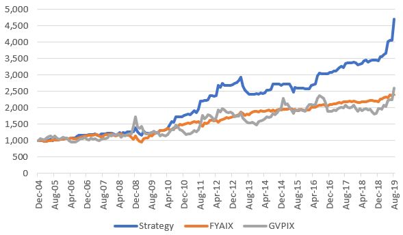
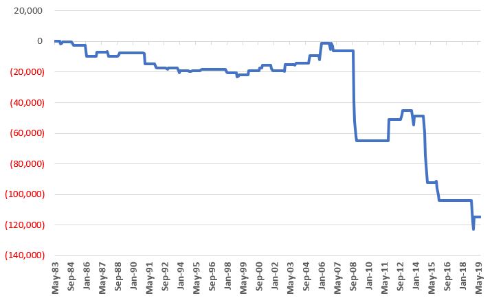
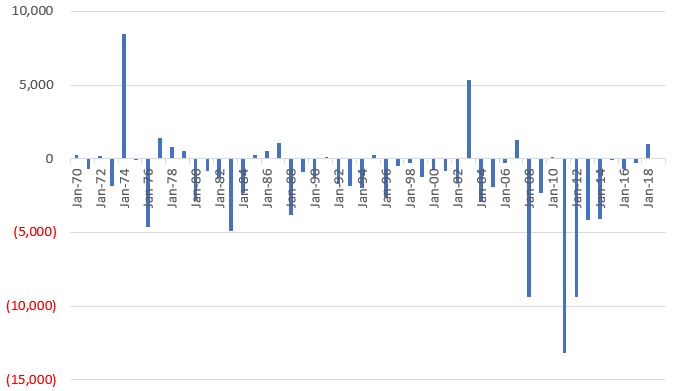
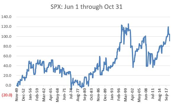
To add more intrigue, consider the 4 “market bellwethers” displayed in Figure 2.

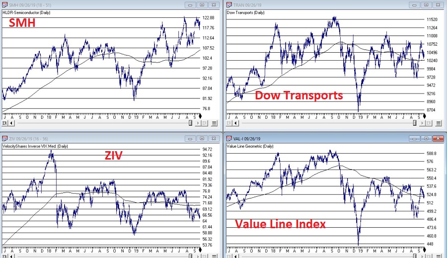
Figure 2 – Jay’s Market Bellwethers (Courtesy AIQ TradingExpert)

(NOTE: Previously I had Sotheby’s Holdings – ticker BID – as one my bellwethers.  As they are being bought out, I have replaced it with the Value Line Arithmetic Index, which has a history of topping and bottoming prior to the major indexes)

The action here is much more mixed and muddled.

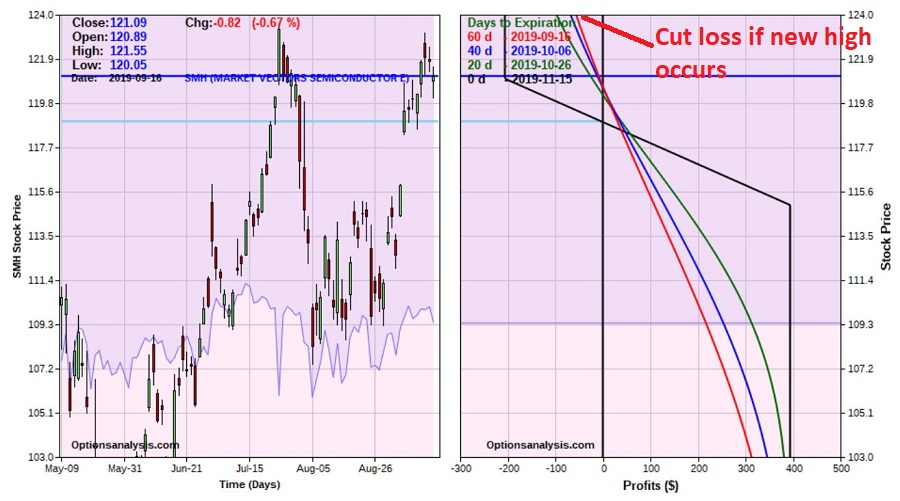
*SMH – for any “early warning” sign keep a close eye on the semiconductors.  If they breakout to a new high they could lead the overall market higher. If they breakdown from a double top the market will likely be spooked.

*TRAN – The Dow Transports topped out over a year ago and have been flopping around aimlessly in a narrowing range.  Not exactly a bullish sign, but deemed OK as long as price holds above the 200-day moving average.

*ZIV – Inverse VIX is presently below it’s 200-day moving average, so this one qualifies as “bearish” at the moment.

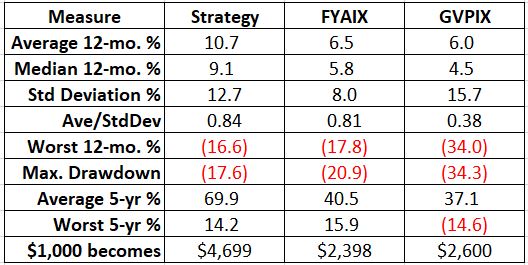
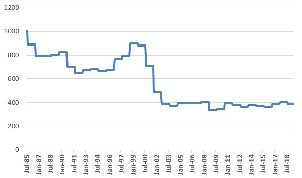
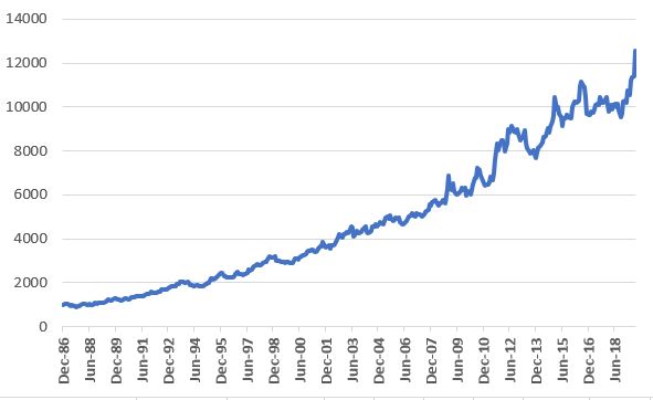
*VAL-I – The Value Line Index is comprised of 1,675 stocks and gives each stock equal weight, so is a good measure of the “overall” market.  It presently sits right at its 200-day moving average, however – as you can see in Figure 3 – it is presently telling a different story than the S&P 500 Index.

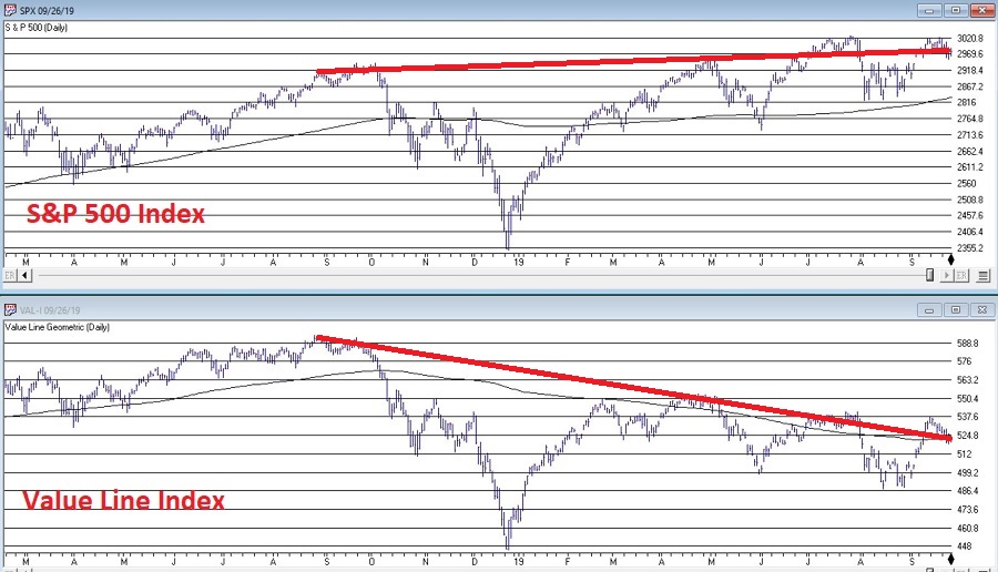
Figure 3 – S&P 500 trending slightly higher, Value Line unweighted index trending lower (Courtesy AIQ TradingExpert)

The Bottom Line

OK, now here is where a skilled market analyst would launch into an argument regarding which side will actually “win”, accompanied by roughly 5 to 50 “compelling charts” that “clearly show” why the analysts’ said opinion was sure to work out correctly.  Alas, there is no one here like that. 

If the question is, “will the stock market break out to the upside and run to sharply higher new highs or will it break down without breaking out to new highs?”, I sadly must default to my standard answer of, “It beats me.”

Here is what I can tell you though.  Instead of relying on “somebody’s opinion or prediction” a much better bet is to formulate and follow an investment plan that spells out:

*What you will (and will not) invest in?

*How much capital you will allocate to each position?

*How much risk you are willing to take with each position?

*What will cause you to exit with a profit?

*What will cause you to exit with a loss?

*Will you have some overarching “trigger” to cause you to reduce overall exposure?

*And so on and so forth

If you have specific answers for the questions above (you DO have specific answers, don’t you?) then the correct thing to do is to go ahead and follow your plan and ignore the myriad prognostications that attempt to sway you one way or the other.

Jay Kaeppel

Disclaimer:  The data presented herein were obtained from various third-party sources.  While I believe the data to be reliable, no representation is made as to, and no responsibility, warranty or liability is accepted for the accuracy or completeness of such information.  The information, opinions and ideas expressed herein are for informational and educational purposes only and do not constitute and should not be construed as investment advice, an advertisement or offering of investment advisory services, or an offer to sell or a solicitation to buy any security.

Bonds, the Calendar (and a little bit of Leverage) – A Love Story

In a series of recent articles (here, here and here) I wrote about seasonality in the bond market.  In this piece we will look at a “practical application”.

The Caveats

*Everything that I write here should be considered “food for thought” and NOT “an immediate call to action.”

*Trading a leveraged fund has inherent risks that an investor should carefully consider BEFORE entering a position.

The Strategy

This strategy uses funds available at Profunds, as follows:

*FYAIX (Access Flex High Yield) – High yield bonds

*GVPIX (U.S. Government Plus – 20+ year treasuries leveraged 1.25 to 1)

*MPIXX – Government Money Market fund

The Baseline

Figure 1 displays the growth of $1,000 invested in FYAIX and GVPIX on a buy-and-hold basis starting 12/31/2004 through 8/31/2019

Figure 1 – Growth of $1,000 invested in High Yield Bonds (FYAIX; blue) and Long-Term Treasuries (GVPIX – orange); 12/31/2004-8/31/2019

*$1,000 in FYAIX grew to $2,398

*$1,000 in GVPIX grew to $2,600

Jay’s Profunds Bond Calendar

Now let’s use the following calendar:

Jan FYAIX
Feb FYAIX
Mar FYAIX
Apr FYAIX
May GVPIX
Jun GVPIX
Jul GVPIX
Aug GVPIX
Sep MPIXX
Oct MPIXX
Nov MPIXX
Dec FYAIX

Figure 2 – Jay’s Profunds Bond Calendar

Results

Figure 3 displays the growth $1,000 invested using the calendar in Figure 2 versus buying and holding either FYAIX or GVPIX

Figure 3 – Growth of $1,000 invested using Jay’s Profunds Bond Calendar (blue line) versus buying and holding FYAIX or GVPIX; 12/31/1994-8/31/2019

Figure 4 displays the relevant facts and figures. 

Figure 4 – Jay’s Profunds Bond Calendar System versus buy-and-hold

The key things to note is that the Calendar System:

*Generated significantly more return

*Had a lower drawdown

*Generated more consistent returns

Summary

Is this anyway to trade the bond market?

Well it’s one way.

Jay Kaeppel

Disclaimer:  The data presented herein were obtained from various third-party sources.  While I believe the data to be reliable, no representation is made as to, and no responsibility, warranty or liability is accepted for the accuracy or completeness of such information.  The information, opinions and ideas expressed herein are for informational and educational purposes only and do not constitute and should not be construed as investment advice, an advertisement or offering of investment advisory services, or an offer to sell or a solicitation to buy any security.

When NOT to Hold Crude Oil

Crude oil has gotten great deal of attention of late with the bombing of a major oil field in Saudi Arabia – and the resultant volatility in the price of crude.  Forgetting all of the hubbub for the moment, history suggests that there is a time to NOT hold long crude oil. 

The time to be wary of a long position in crude oil is when the two following factors are in place:

  1. The current month is October, November, December or January
  2. The price of crude oil is below its 4-month moving average*

*- For the record, this uses monthly closing prices and is updated only at the end of each month.  Another alternative is to use monthly closing prices for ticker DBO – the Invesco DB Oil Fund

Figure 1 displays a monthly chart of spot crude oil along with its 4-month moving average

Figure 1 – Spot crude oil futures with 4-month moving average (Courtesy ProfitSource by HUBB)

Figure 2 displays the, ahem, “growth” of equity if a trader held a long position in crude oil futures ONLY when the two factors listed above are both in force. 

Figure 2 – Long 1-lot of crude oil when “When NOT to hold crude oil” factors are both active

One thing to note is that crude oil actually did increase in value roughly 40% of the time when the 2 negative factors were both active.  However, clearly some bad things have happened when these factors were flashing red. 

According to this “method”, if crude oil (or ticker DBO) closes September (or October, November and December) below it’s 4-month average, traders might be wise to “fight the urge” to play the long side of crude oil.

Jay Kaeppel

Disclaimer:  The data presented herein were obtained from various third-party sources.  While I believe the data to be reliable, no representation is made as to, and no responsibility, warranty or liability is accepted for the accuracy or completeness of such information.  The information, opinions and ideas expressed herein are for informational and educational purposes only and do not constitute and should not be construed as investment advice, an advertisement or offering of investment advisory services, or an offer to sell or a solicitation to buy any security.

Just in Case for SMH

The month of September has a history of being unkind to electronics and semiconductor stocks.  Figure 1 displays the “growth” of $1,000 invested in ticker FSELX (Fidelity Select Electronics) ONLY during the month of September since 1985.

Figure 1 – Growth of $1,000 invested in ticker FSELX ONLY during September (1985-2018)

In a way, Figure 1 is somewhat misleading.  The first reaction in most people’s mind is “Wow, this sector is a disaster in September.”  And in a way it is.  But that is due mostly to the fact that there have been some disastrous September’s along the way (most notably 2000 to 2002).  In reality, FSELX has been “up” 47% of the time during the month of September, so it is only slightly worse than a coin flip.  And it is “so far, so good” for September of 2019, with FSELX up almost +8% so far for the month.  But will it last?

For the Skeptics

Figure 2 displays a chart of ticker SMH (VanEck Vectors Semiconductors).

Figure 2 – Ticker SMH (Courtesy AIQ TradingExpert)

Some traders will look at this chart and see a ticker on the verge of breaking out to a new high.  Others will look at the same chart and see a double or triple top – or possibly a head-and-shoulders formation forming.  The discussion that follows is targeted to the latter group.

One of the great paradoxes of trading is that trying to pick “the top” in anything is, a) typically a mistake, and b) potentially lucrative.  So, doing so is only for people who:

*Are smart enough to risk a little for the chance to make a lot

*Have the discipline to follow a plan

*Aren’t going to carry a lot of baggage around with them if they are wrong

These qualifiers reduce the target group even more.  But for those “still standing”, a hypothetical trade (not a recommendation, just an example of “one way to play”)

*Buy SMH Nov15 121 put

*Sell SMH Nov15 115 put

The particulars appear in Figure 3 and the risk curves in Figure 4

Figure 3 – SMH bear put spread

Figure 4 – Risk curves for SMH bear put spread

Mathematically speaking, this trade risks $206 for the chance to make $394.  But here is the twist.  This trade is a bet on SMH NOT breaking out to the upside.  Ipso facto if it DOES break out to a new high, the basis for the trade evaporates and a trader (at least in my little world of hypothetical trades) MUST exit and cut his or her loss.

A closer look at Figure 4 reveals that if SMH hits $124 a share sooner than later (looking at the green, blue and red risk curves lines at the top of Figure 4) the expected loss is roughly -$100 or less.  So, risk management for this trade might go something like this:

As long as price is below $124 the trader can “let it ride”.  If SMH happens to decline and becomes oversold (using whatever method an individual trader might use to make that determination) the trade can either sell and tale his or her profit, or potentially adjust the trade to lock in a profit and let it ride a little longer.

Summary

For the record, I am not advocating a bearish position in SMH.  I have simply highlighted that:

*The shares could be forming a multiple top

*Seasonally, September can be rough for electronics/semiconductors

*For a trader with discipline it is possible to enter a low dollar risk trade to take advantage if in fact SMH does go south from here.

*There is also a built-in “Uncle” point (i.e., some point above the recent high of $123.56)

The main thing to remember about a trade like this is the need for vigilance.  If SMH breaks out to a new high, our hypothetical trader:

*MUST cut his or her loss, and

*MUST NOT arbitrarily say “well, maybe I’ll give it just a little more room. 

And remember, this could happen 5 minutes after the trade is entered.

Jay Kaeppel

Disclaimer:  The data presented herein were obtained from various third-party sources.  While I believe the data to be reliable, no representation is made as to, and no responsibility, warranty or liability is accepted for the accuracy or completeness of such information.  The information, opinions and ideas expressed herein are for informational and educational purposes only and do not constitute and should not be construed as investment advice, an advertisement or offering of investment advisory services, or an offer to sell or a solicitation to buy any security.

Beating the Bond Market (Part III)

In Part I here, I highlighted a 4-bond index portfolio (convertible bonds, high yield corporate bonds, long-term treasury and intermediate-term treasury) that:

*Gained almost as well as long-term treasuries

*Did so with a lot less volatility

*Has the potential to outperform long-term bonds if rates ever do rise again

In Part II here, I added seasonality to the mix, which:

*Involved holding only 2 of the 4 indexes each month

*Increased total return by roughly 3.5 times. 

In Part III, we will go “out there” even further and – once again using seasonality – will hold only one index per month.

In the simplest terms possible, going from a buy/hold/rebalance approach using four bonds indexes to a hold one fund per month based on seasonality approach, moves one significantly higher up the “potential risks” and “potential rewards” spectrum.  

The Indexes

The four indexes included in our testing are:

*Bloomberg Barclay’s Convertible Bond Index

*Bloomberg Barclays High Yield Very Liquid Index

*Bloomberg Barclays Treasury Long Index

*Bloomberg Barclay’s Intermediate Index

ETFs that either track these indexes (or something very similar) are:

Convertibles: CWB – SPDR Barclays Capital Convertible Bond ETF (tracks the Barclays Capital U.S. Convertible Bond >$500MM Index)

High Yield: JNK – SPDR Barclays High Yield Bond ETF (tracks the Barclays Capital High Yield Very Liquid Index) OR HYG – iShares iBoxx $ High Yield Corporate Bond ETF (tracks the iBoxx $ Liquid High Yield Index)

Long-Term Treasury: TLT – iShares 20+ Year Treasury Bond ETF (tracks the Barclays Capital U.S. 20+ Year Treasury Bond Index)

Intermediate-Term Treasury: IEI – iShares 3-7 Year Treasury Bond ETF (tracks the Barclays Capital U.S. 3-7 Year Treasury Bond Index)

For testing purposes, we are going to use the four Bloomberg Indexes listed as they provide a longer period of test data.

The Calendar

Month Index ETF
Jan Bloomberg Barclay’s Convertible Bond Index CWB
Feb Bloomberg Barclay’s Convertible Bond Index CWB
Mar Bloomberg Barclay’s Convertible Bond Index CWB
Apr Bloomberg Barclays High Yield Very Liquid Index JNK (or HYG)
May Bloomberg Barclays Treasury Long Index TLT
Jun Bloomberg Barclays Treasury Long Index TLT
Jul Bloomberg Barclays Treasury Long Index TLT
Aug Bloomberg Barclays Treasury Long Index TLT
Sep Bloomberg Barclay’s Treasury Intermediate Index IEI
Oct Bloomberg Barclay’s Treasury Intermediate Index IEI
Nov Bloomberg Barclay’s Treasury Intermediate Index IEI
Dec Bloomberg Barclay’s Convertible Bond Index CWB

Figure 1 – Jay’s 1-Bond Index per Month Calendar

As you can see, this “strategy” involves 4 trades a year.

The Results

Figure 2 displays the hypothetical growth of $1,000 invested using the “One index at a time System” versus buying and holding (and rebalancing once a year) all four indexes.

Figure 2 – Growth of $1,000 invested using Jay’s 1-Bond Index per Month Strategy versus Buy/Hold/Rebalance All 4 Indexes; 1986-2019

Figure 3 displays the relevant comparative figures.

Measure 1-Bond Index per month Seasonal System 4 Indexes Buy/Hold/Rebalance
Average 12 month % +(-) 13.9% 8.0
Std. Deviation % 10.00% 6.77
Ave/StdDev 1.39 1.18
Max Drawdown% (-11.6%) (14.8)
$1,000 becomes $71,052 $11,774

Figure 3 – Jay’s 1-Bond Index per Month Strategy versus Buy/Hold/ Rebalance; 1986-2019

From 12/31/1986 through 8/31/2019 the 1 Index per month Seasonal System gained +7,005% versus +1,077% (6.50 times as much) as the buy/hold and rebalance method.

Summary

So, is this 1 -Bond Index per month Seasonal Bond System the “be all, end all” of bond investing?  Probably not.  Anytime you go from trading a diversified portfolio of anything, to just one security at a time you introduce a potential level of risk that can clobber a portfolio when things go wrong “that one time.”

At the same time, a return that is 6.5 times a simple buy-and-hold approach may warrant some consideration as long as one comprehends the potential risks involved.

Jay Kaeppel

Disclaimer:  The data presented herein were obtained from various third-party sources.  While I believe the data to be reliable, no representation is made as to, and no responsibility, warranty or liability is accepted for the accuracy or completeness of such information.  The information, opinions and ideas expressed herein are for informational and educational purposes only and do not constitute and should not be construed as investment advice, an advertisement or offering of investment advisory services, or an offer to sell or a solicitation to buy any security.

Buy Beans? Or Bye Beans?

Heading off the beaten path just a bit today, into the exciting world of commodities.  Specifically, soybeans.  As a result of trade wars and tariffs, etc., more people are conscious of the fact that soybeans exist and are a tradable commodity than at most times in the past. 

In a nutshell, the common perception is “if trade war news is good that is good for beans and vice versa.”  And that is probably true.  But many commodities have a personality of their own.  With a commodity like soybeans it has a lot to do with the growing cycle in the U.S.  Generally speaking, it goes like this:

*Early in the year: no beans are in the ground, uncertainty is high, prices tend to rise

*Spring: planting goes well, prices cool off OR planting does NOT go well and prices continue to rise

*Summer: By now it is apparent whether or not it is a good year or a bad year for beans, price tends to decline

*Late summer/harvest season: The game is over for this year; prices tend to decline (often sharply)

Today we will focus on “Late summer/harvest season”.

But first let’s take a look at the ‘Big Picture”.

As we can see in Figure 1, soybeans have support in the 790 to 850 range (technically this means $7.90 a bushel to $8.50 a bushel). 

Figure 1 – Soybean spot month showing support (Courtesy ProfitSource by HUBB)

As we can see in Figure 2, this range was previously something of a “DMZ” for beans.  Beans would spike up quickly through this range to the ultimate top and then collapse just as quickly back down through this range.  Then after about 2007 beans spent most of their time north of this range, and several times it served as support – just as it is trying to do now. 

Figure 2 – Soybean spot month since 1970 (Courtesy ProfitSource by HUBB)

So like I said, if any perceived “good news” pops up regarding trade with China, beans would likely be expected to “pop” higher.

Um, but in the meantime….

Late Summer/Harvest Season

We will define this period as the end of September trading day #5 through the end of October Trading Day #2.

Now let’s consider the performance of soybean futures during this period from year-to-year.  Each full $1 movement in the price of soybean futures contract (which entails 5,000 bushels of soybeans) is worth $5,000.  Therefore, each 1-cent movement in the price of a soybean futures contract is worth $50.

Now let’s suppose that each and every year we bought one soybean futures contract at the close of the 5th trading day of September each year, and sold it at the close of the 2nd trading day of October. 

Figure 3 displays the cumulative performance of this particular(ly unfortunate) strategy.

Figure 3 – Cumulative +(-) from holding long 1 soybean futures contract from Sep Trading Day #5 through Oct Trading Day #2; 1970-2018

Figure 4 displays the year-by-year results

Figure 4 – $ +(-) for Soybean futures, long Sep Trading Day 5 through Oct Trading Day 2; 1970-2018

Finally, some fact and Figures:

*# times UP = 15 (30% of the time)

*# time DOWN = 34 (68% of the time)

*# times unchanged = 1

*Largest Gain = +$8,475 in 1974

*Largest Loss = (-$13,200 in 2011)

*Average Gain = +$1,436

*Average Loss = (-$2,582)

Here are the wrong things and the right things to take away from all of this:

*Most people look at Figure 1 and immediately think “there is no way beans are going up.”  This is incorrect.  Soybeans actually went up 30% of the time. 

*Still, historically there has been roughly a 7 in 10 change of beans declining during this period

*Making matters worse is that the average loss was almost 1.8 time greater than the average win.

The Bottom Line

There is every chance that beans could advance between now and the close on 10/2. 

But history suggests it is a bad bet.

Jay Kaeppel

Disclaimer:  The data presented herein were obtained from various third-party sources.  While I believe the data to be reliable, no representation is made as to, and no responsibility, warranty or liability is accepted for the accuracy or completeness of such information.  The information, opinions and ideas expressed herein are for informational and educational purposes only and do not constitute and should not be construed as investment advice, an advertisement or offering of investment advisory services, or an offer to sell or a solicitation to buy any security.

Beating the Bond Market (Part II)

In Part I here, I highlighted the fact that long-term treasuries have performed very well overall for over three+ decades.  I also noted the fact that they are a pure play on interest rates and that if interest rates ever do rise again (the current consensus seems to be that that is never going to happen and that interest rates will inexorably move into negative territory), long-term treasuries would be expected to perform quite poorly.

In Part I, I also highlighted a 4-bond index portfolio (convertible bonds, high yield corporate bonds, long-term treasury and intermediate-term treasury) that:

*Gained almost as well as long-term treasuries

*Did so with a lot less volatility

*Has the potential to outperform long-term bonds if rates ever do rise again

So, all-in-all the 4-bond index seems like a “nice alternative” to holding long-term treasuries.  But the title of these articles says “Beating the Bond Market” and not “Interesting Alternatives that do Just about as Well as Long-Term Treasuries” (which – let’s face it – would NOT be a very compelling title).  So, let’s dig a little deeper.  In order to dig a little deeper, we must first “go off on a little tangent.”

Bonds versus Stocks

In a nutshell, individual convertible bonds and high yield corporate bonds are tied to the fortunes of the companies that issue them.  This also means that as an asset class, their performance is tied to the economy and the business environment in general.  If times are tough for corporations it only makes sense that convertible bonds and high yield bonds will also have a tougher time of it.  As such it is important to note that convertible bonds and high yield corporates have a much higher correlation to the stock market than they do to the long-term treasury.

In Figures 1 and 2 we use the following ETF tickers:

CWB – as a proxy for convertible bonds

HYG – As a proxy for high-yield corporates

TLT – As a proxy for long-term treasuries

IEI – As a proxy for short-term treasuries

SPX – As a proxy for the overall stock market

BND – As a proxy for the overall bond market

As you can see in Figure 1, convertible bonds (CWB) and high-yield corporates (HYG) have a much higher correlation to the stock market (SPX) than to the bond market (BND).

Figure 1 – 4-Bond Index Components correlation to the S&P 500 Index (Courtesy AIQ TradingExpert)

As you can see in Figure 2, long-term treasuries (TLT) and intermediate-term treasuries (IEI) have a much higher correlation to the bond market (BND) than to the stock market (SPX).

Figure 2 – 4-Bond Index Components correlation to Vanguard Total Bond Market ETF (Courtesy AIQ TradingExpert)

A Slight Detour

Figure 3 displays the cumulative price change for the S&P 500 Index during the months of November through April starting in 1949 (+8,881%)

Figure 3 – Cumulative % price gain for S&P 500 Index during November through April (+8,881%); 1949-2019

Figure 4 displays the cumulative price change for the S&P 500 Index during the months of June through October starting in 1949 (+91%)

Figure 4 – Cumulative % price gain for S&P 500 Index during June through October (+91%); 1949-2019

The Theory: Parts 1 and 2

Part 1: The stock market performs better during November through April than during May through October

Part 2: Convertible bonds and high-grade corporate bonds are more highly correlated to stocks than long and intermediate-term treasuries

Therefore, we can hypothesize that over time convertible and high-yield bonds will perform better during November through April and that long and intermediate-term treasuries will perform better during May through October. 

Jay’s Seasonal Bond System

During the months of November through April we will hold:

*Bloomberg Barclay’s Convertible Bond Index

*Bloomberg Barclays High Yield Very Liquid Index

During the months of May through October we will hold:

*Bloomberg Barclays Treasury Long Index

*Bloomberg Barclay’s Intermediate Index

(NOTE: While this article constitutes a “hypothetical test” and not a trading recommendation, just to cover the bases, an investor could emulate this strategy by holding tickers CWB and HYG (or ticker JNK) November through April and tickers TLT and IEI May through October.)

Figure 5 displays the growth of $1,000 invested using this Seasonal System (blue line) versus simply splitting money 25% into each index and then rebalancing on January 1st of each year (orange line).

Figure 5 – Growth of $1,000 invested using Jay’s Seasonal System versus Buying-and-Holding and rebalancing (1986-2019)

Figure 6 displays some comparative performance figures.

Measure Seasonal System 4 Indexes
Buy/Hold/Rebalance
Average 12 month % +(-) +11.9% +8.0%
Std. Deviation % 8.7% 6.8%
Ave/StdDev 1.37 1.18
Max Drawdown% (-9.2%) (-14.8%)
$1,000 becomes $38,289 $11,774

Figure 6 – Seasonal Strategy versus Buy/Hold/Rebalance

From 12/31/1986 through 8/31/2019 the Seasonal System gained +3,729% versus +1,077% (3.46 times as much) as the buy/hold and rebalance method.

Summary

The Seasonal Bond System has certain unique risks.  Most notably if the stock market tanks between November 1 and April 30, this system has no “standard” bond positions to potentially offset some of the stock market related decline that convertible and high yield bonds would likely experience. Likewise, if interest rates rise between April 30 and October 31st, this strategy is almost certain to lose value during that period as it holds only interest-rate sensitive treasuries during that time.

The caveats above aside, the fact remains that over the past 3+ decades this hypothetical portfolio gained almost 3.5 times that of a buy-and-hold approach.

Question: Is this any way to trade the bond market?

Answer: Well, it’s one way….

Jay Kaeppel

Disclaimer:  The data presented herein were obtained from various third-party sources.  While I believe the data to be reliable, no representation is made as to, and no responsibility, warranty or liability is accepted for the accuracy or completeness of such information.  The information, opinions and ideas expressed herein are for informational and educational purposes only and do not constitute and should not be construed as investment advice, an advertisement or offering of investment advisory services, or an offer to sell or a solicitation to buy any security.

Beating the Bond Market (Part I)

Suddenly everyone is once again singing the praises of long-term treasuries.  And on the face of it, why not?  With interest rates seemingly headed to negative whatever, a pure play on interest rates (with “no credit risk” – which I still find ironic since t-bonds are issued by essentially the most heavily indebted entity in history – the U.S. government) stands to perform pretty darn well. 

But is it really the best play?

Long-Term Treasuries vs. “Others”

Because a later test will use the Bloomberg Barclays Convertible Bond Index, and because that index starts in 1986 and because I want to compare “apples” to “apples”, Figure 1 displays the growth of $1,000 since 1986 using monthly total return data for the Bloomberg Barclays Treasury Long Index.

Figure 1 – Growth of $1,000 in Long-Term Treasuries (1987-2019)

For the record:

Ave. 12 mo % +8.2%
Std. Deviation +9.0%
Max Drawdown (-15.9%)
$1,000 becomes $12,583

Figure 2 – Bloomberg Barclays Treasury Long Index (Jan 1987-Jul 2019)

Not bad, apparently – if your focus is return and you don’t mind some volatility and you have no fear of interest rates ever rising again.

A Broader Approach

Now let’s consider an approach that puts 25% into the four bond indexes below and rebalances every Jan. 1:

*Bloomberg Barclay’s Convertible Bond Index

*Bloomberg Barclays High Yield Very Liquid Index

*Bloomberg Barclays Treasury Long Index

*Bloomberg Barclay’s Intermediate Index

Figure 3 displays the growth of this “index” versus buying and holding long-term treasuries.

Figure 3 – Growth of $1,000 invested in 4-Bond Indexes and rebalanced annually; 1987-2019

Ave. 12 mo % +8.0%
Std. Deviation +6.8%
Max Drawdown (-14.8%)
$1,000 becomes $11,774

Figure 4 – 4-Bond Index Results; 1987-2019

As you can see, the 4-index approach:

*Is less volatile in nature (6.8% standard deviation versus 9.0% for long bonds)

*Had a slightly lower maximum drawdown

*And has generated almost as much gain as long-term treasuries alone (it actually had a slight lead over long-term treasuries prior to the rare +10% spurt in long treasuries in August 2019)

To get a better sense of the comparison, Figure 5 overlays Figures 1 and 3.

Figure 5 – Long Treasuries vs. 4-Bond Index

As you can see in Figure 5, in light of a long-term bull market for bonds, at times long-term treasuries have led and at other times they have trailed our 4-Bond Index.  After the huge August 2019 spike for long-term treasuries, they are back in the lead.  But for now, the point is that the 4-Bond Index performs roughly as well with a great deal less volatility.

To emphasize this (in a possibly slightly confusing kind of way), Figure 6 shows the drawdowns for long treasuries in blue and drawdowns for the 4-Bond Index in orange.  While the orange line did have one severe “spike” down (during the financial panic of 2008), clearly when trouble hits the bond market, long-term treasuries tend to decline more than the 4-Bond Index.

Figure 6 – % Drawdowns for Long-term treasuries (blue) versus 4-Bond Index (orange); 1987-2019

Summary

Long-term treasuries are the “purest interest rate play” available.  If rates fall then long-term treasuries will typically outperform most other types of bonds.  On the flip side, if interest rates rise long-term treasuries will typically underperform most other types of bonds.

Is this 4-index approach the “be all, end all” of bond investing?  Is it even superior to the simpler approach of just holding long-term bonds?

Not necessarily.  But there appears to be a better way to use these four indexes – which I will get to in Part II.  So stay tuned.

Jay Kaeppel

Disclaimer:  The data presented herein were obtained from various third-party sources.  While I believe the data to be reliable, no representation is made as to, and no responsibility, warranty or liability is accepted for the accuracy or completeness of such information.  The information, opinions and ideas expressed herein are for informational and educational purposes only and do not constitute and should not be construed as investment advice, an advertisement or offering of investment advisory services, or an offer to sell or a solicitation to buy any security.

A Simple Alternative to Buy-and-Hold

The Good News regarding the stock market is that in the long run it goes “Up”.  The Bad News is that along the way there are harrowing declines (think -40% or more) as well as long stretches of 0% returns (From Dec-2000 through Sep 2011 the S&P 500 Index registered a total return of -4%. The stock market also went sideways from 1927 to 1949 and from 1965 to 1982). 

Large declines and long flat periods can shatter investors financial goals and/or affect an investor’s thinking for years to come.  Given the rip-roaring bull market we have seen in the last 10 years it may be wise to reiterate that “trees don’t grow to the sky.”  Don’t misunderstood, I am not attempting to “call the top” (as if I could), it’s just that I have been in this business a while and – paraphrasing here – I’ve seen some “stuff.”

What follows is NOT intended to be the “be all, end all” of trading systems.  In fact, since 1971 this “system” has beaten the S&P 500 Index by just a fraction.  So, one might argue in the end that it is not worth the trouble.  But here is the thing to consider: If you would like to earn market returns WITHOUT riding out all of the harrowing declines and the long sideways stretches – it is at least food for thought.

The Monthly LBRMomentum Strategy

There are two indicators involved: a 21-month moving average of the closing price of the S&P 500 Index and a momentum indicator that I call LBRMomentum.  The calculations for LBRMomentum appear at the end of the article.  LBR is an acronym for Linda Bradford Raschke as it uses a calculation that I first learned about from something written by, well – who else – Linda Bradford Raschke (If you want to learn what the life of a professional trader is all about, I highly recommend you read her book, Trading Sardines). 

A Buy Signal occurs:

*When LBRMomentum drops to negative territory then turns higher for one month, AND

*SPX currently or subsequently closes above its own 21-month moving average (in other words, if LBRMomentum rise from below to above 0 while SPX is below it’s 21-month MA, then the buy signal does not occur until SPX closes above its 21-month MA)

*A Buy signal remains in effect for 18 months (if a new buy signal occurs during those 18 months then the 18-month bullish period is extended from the time of the new buy signal)

*After 18-months with no new buy signal sell stocks and move to intermediate-term treasuries until the next buy signal

See Figures 1 and 2 for charts with “Buy Signals” displayed

Figure 1 – LBRMomentum Buy Signals

Figure 2 – LBRMomentum Buy Signals

Figure 3 displays the cumulative total return for both the “System” and buying-and-holding SPX.  As I mentioned earlier, following the huge bull market of the past 10 years the next results are roughly the same (Strategy = +11,769, buy-and-hold = +11,578%).

Figure 3 – Growth of $1,000 invested using LBRMomentum System (blue line) versus S&P 500 Index buy-and-hold; 1971-2019

But to get a sense of the potential “Let’s Get Some Sleep at Night” benefits of the System, Figure 4 displays the growth of $1,000 invested in the S&P 500 ONLY when the System is bullish. 

Figure 4 – Growth of $1,000 invested in SPX ONLY while LBRMometnum System is Bullish

Figure 5 displays the growth of $1,000 invested in the Bloomberg Barclays Treasury Intermediate Index ONLY when the LBRMomentum System is NOT bullish.

Figure 5 – Growth of $1,000 invested in SPX ONLY while LBRMometnum System is NOT Bullish

The things to notice about Figures 4 and 5 are:

a) the lack of significant drawdowns and,

b) the lack of long periods with no net gain. 

In other words, this approach represents the Tortoise and not the Hare. The intent is not so much to “Beaten the Market” but rather to avoid being “Beaten Up by the Market.”

Figure 6 displays some relevant comparative performance figures.

Measure System Buy/Hold
CAGR % 10.06% 10.03%
Std. Deviation% 10.2% 16.7%
CAGR/StdDev 0.98 0.60
Worst 12 mo. % (-15.5%) (-43.3%)
Maximum Drawdown % (-17.6%) (-50.9%)
% 12-month periods UP 93% 80%
% 5-Yr. periods UP 100% 89%

Figure 6 – Performance Figures

Note that the Compounded Annual Growth Rate is virtually the same.  However, the System clearly experienced a great deal less volatility along the way with a significantly lower standard deviation as well as far lower drawdowns (-17.6% for the System versus -50.9% for buy-and-hold).  Note also that the System showed a 12-month gain 93% of the time versus 80% of the time for buy-and-hold. The System also showed a gain 100% of the time over 5-year periods (versus 89% of the time for buy-and-hold).

The last “Buy Signal” occurred on 3/31/2019 and will remain in effect until 9/30/2020.

For the record, this “System” has significantly underperformed buy-and-hold over the past 10 years.  Still, if earning a market return over the long-term – without worrying as much about massive declines and long, flat stretches is appealing – it is food for thought.

LBR Momentum

LBRMomentum simply subtracts the 10-period moving average from the 3-month moving average as shown in the code below

LBRMomentum is simpleavg([close], 3) – simpleavg([close], 10).

Jay Kaeppel

Disclaimer:  The data presented herein were obtained from various third-party sources.  While I believe the data to be reliable, no representation is made as to, and no responsibility, warranty or liability is accepted for the accuracy or completeness of such information.  The information, opinions and ideas expressed herein are for informational and educational purposes only and do not constitute and should not be construed as investment advice, an advertisement or offering of investment advisory services, or an offer to sell or a solicitation to buy any security.