Monthly Archives: January 2020

It’s the Biggest Day of the Year! (Well, Theoretically)

3,230.78

That’s the number that should be on investors minds today. Why? Simple. If the S&P 500 Index closes above that level today (it closed at 3,283,66 on Jan. 30th, so anything better than a daily decline of -52.88 SPX points will do the trick), the Stock Traders Almanac venerable “January Trifecta” will generate a bullish signal for the rest of 2020 (i.e., in theory the signal would be bullish for the stock market from the end of January 2020 through the end of December 2020).

The January Trifecta

Because STA is a paid service, and because I am a paying member, I would prefer not to explain all of the details of what comprises the January Trifecta.  Instead I will focus simply on historical results.

The Measurements

For testing purposes, we will be excluding the month of January entirely from our results since any new signal begins at the end of January and any existing buy signal expires at the end of December.

So, we will look at results in two ways:

*S&P 500 price performance from the end of January through the end of December if the January Trifecta DOES give a bullish signal

*S&P 500 price performance from the end of January through the end of December if the January Trifecta DOES NOT give a bullish signal

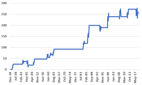
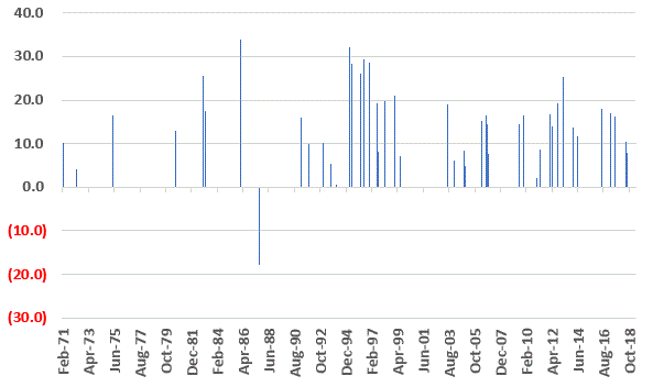
Figure 1 displays the price performance (growth of $1,000) for the S&P 500 Index for the months of February through December ONLY in those years when the January Trifecta was bullish.

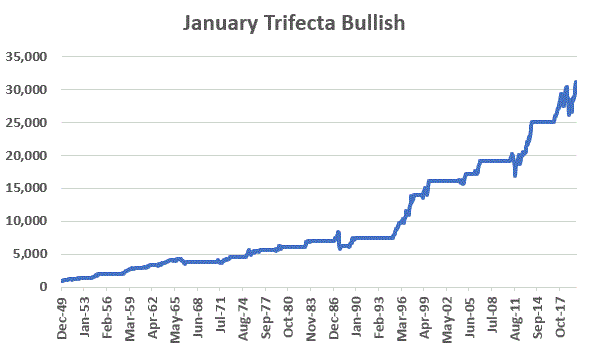
Figure 1 – Growth of $1,000 in S&P (price only) Jan 31st through Dec 31st if STA January Trifecta IS BULLISH (1950-2019)

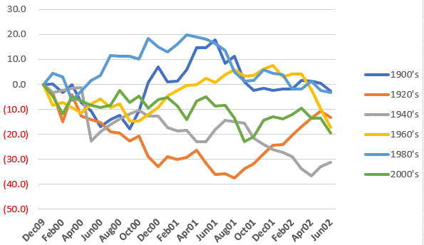
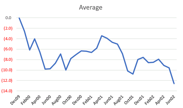
Figure 2 displays the price performance (growth of $1,000) for the S&P 500 Index for the months of February through December ONLY in those years when the January Trifecta was NOT bullish.

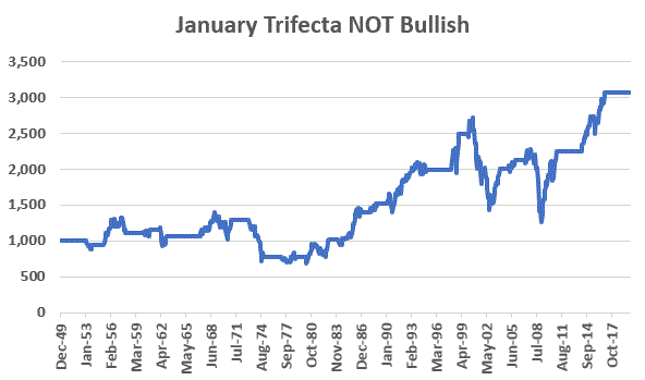
Figure 2 – Growth of $1,000 in S&P (price only) Jan 31st through Dec 31st if STA January Trifecta IS NOT BULLISH (1950-2019)

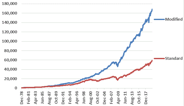
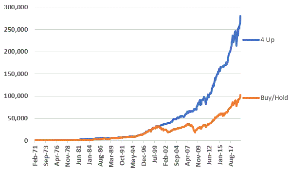
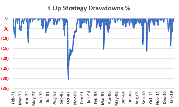
To better appreciate the implications, Figure 3 displays the two equity curves on the same chart.

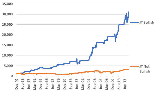
Figure 3 – Comparison (1950-2019)

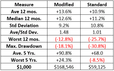
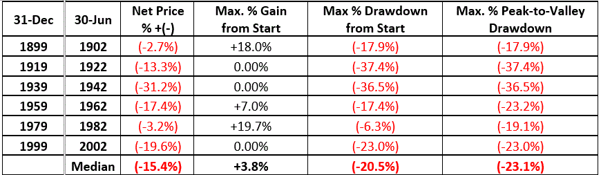
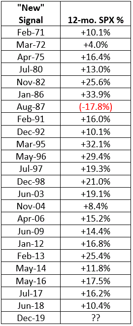
Figure 4 displays the relevant facts and figures.

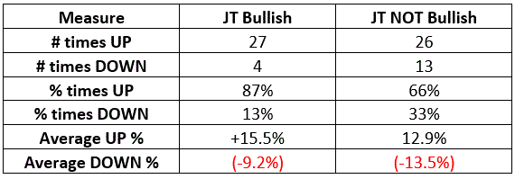
Figure 4 – Comparison of bullish Jan. Trifecta years performance versus NOT bullish Jan. Trifecta years

Summary

Is the stock market “guaranteed” to rally between January 31, 2020 and December 31, 2020 if the S&P 500 Index closes above 3,320.78 on Jan. 31st?

No.  An 87% historical win rate is NOT a 100% historical win rate.

But history suggests that giving the bullish case the benefit of the doubt would be the proper course of action.

Jay Kaeppel

Disclaimer: The information, opinions and ideas expressed herein are for informational and educational purposes only and are based on research conducted and presented solely by the author.  The information presented does not represent the views of the author only and does not constitute a complete description of any investment service.  In addition, nothing presented herein should be construed as investment advice, as an advertisement or offering of investment advisory services, or as an offer to sell or a solicitation to buy any security.  The data presented herein were obtained from various third-party sources.  While the data is believed to be reliable, no representation is made as to, and no responsibility, warranty or liability is accepted for the accuracy or completeness of such information.  International investments are subject to additional risks such as currency fluctuations, political instability and the potential for illiquid markets.  Past performance is no guarantee of future results.  There is risk of loss in all trading.  Back tested performance does not represent actual performance and should not be interpreted as an indication of such performance.  Also, back tested performance results have certain inherent limitations and differs from actual performance because it is achieved with the benefit of hindsight.

A Useful Alternative to the Standard 60/40 Approach

The 60% stock/40% bond model portfolio has been a popular (not to mention “simple”) investment approach for investors for many years.  But with the stock market at a high level of valuation (Shiller P/E, price-to-sales, etc.) it is fair to raise the question of how much upside exists in the years immediately ahead.  Likewise, with interest rates so low it is fair to question the potential for meaningful returns from bonds in the years ahead. 

So, let’s consider an alternative to the traditional 60/40 approach that seeks to take advantage of the seasonal/cyclical nature of the stock and bond markets.

The Test

Our test will run from Dec 31, 1978 through Dec 31, 2019

As a baseline, our Standard 60/40 Strategy will operate as follows:

*On Jan 1 60% goes into the S&P 500 Index

*On Jan 1 40% goes into the Bloomberg Barclays Aggregate Bond Index

Our Modified 60/40 Strategy will operate as follows:

On November 1:

*40% goes into the S&P Midcap 400 Index

*40% goes into the S&P 500 Low Volatility Index

*10% goes into the Bloomberg Barclays Intermediate Treasury Index

*10% goes into Gold

On June 1:

*40% goes into the S&P 500 Low Volatility Index

*50% goes into the Bloomberg Barclays Intermediate Treasury Index

*10% goes into Gold

In other words:

*The Modified Strategy always holds 40% in the S&P 500 Low Volatility Index and 10% in Gold

*The Modified Strategy holds 40% in Midcap stocks and 10% in intermediate treasuries from November through May and holds 50% in intermediate-term treasuries (and 0% in MidCap stocks) from June through October

*To achieve this, on Nov. 1 we move 40% of the portfolio out of intermediate term treasuries and into Midcap stocks.  On Jun. 1 we exit Midcap stocks completely and move that money into intermediate-term treasuries. So two trades/rebalances a year instead of one as with the Standard 60/40.

Table 1 – Modified 60/40 Strategy Investment Calendar

For the test we use monthly total return data for the indexes listed above.

The Results

Figure 1 displays the growth of $1,000 invested in both the Modified Strategy and Standard Strategy.

Figure 1 – Growth of $1,000 invested in each strategy; 1979-2019

Figure 2 displays some relevant facts and figures

Figure 2 – Comparative Results; 1979-2019

Figure 3 below displays the year-by-year results for both strategies.  A few key things to note

*The Modified Strategy was UP 38 out of 41 years with the worst year being 2008 with a loss of -6.1%

*The Standard Strategy was up 34 out of 41 years with the worst year being 2008 with a loss of -20.1%

*It should also be noted that the Modified Strategy showed a gain in the bear market years of 2000, 2001 and 2002 (the Standard Strategy was down modestly in each of those years).

  Modified Standard
1979 23.7 11.9
1980 9.0 20.6
1981 9.4 (0.4)
1982 20.9 26.0
1983 19.1 16.9
1984 6.6 9.8
1985 30.1 27.9
1986 23.3 17.3
1987 14.4 4.3
1988 16.9 13.1
1989 30.9 24.8
1990 13.5 1.7
1991 28.0 24.7
1992 9.1 7.5
1993 11.7 9.9
1994 (4.1) (0.4)
1995 25.0 29.9
1996 15.7 15.2
1997 18.7 23.9
1998 17.4 20.6
1999 2.9 12.3
2000 15.3 (0.8)
2001 11.9 (3.8)
2002 5.4 (9.2)
2003 17.5 18.9
2004 14.8 8.3
2005 5.5 3.9
2006 15.2 11.2
2007 9.5 6.1
2008 (6.1) (20.1)
2009 18.6 18.3
2010 17.1 11.7
2011 13.2 4.4
2012 9.5 11.3
2013 14.8 18.6
2014 9.6 10.6
2015 2.0 1.1
2016 12.9 8.2
2017 11.6 14.5
2018 (2.1) (2.6)
2019 20.3 22.4

Figure 3 – Year-by-Year Results

Summary

The Modified 60/40 seeks to take advantage of the historical tendency for the stock market in general (and midcap stocks in particular) to perform better during the Nov-May period that during the Jun-Oct period.  Historically speaking, the results appear favorably.  As always, I am not “recommending” the Modified 60/40 Strategy, just pointing out the comparative results of a hypothetical test.

So, is the “Modified 60/40” better than the “Standard 60/40”?  And is the “Modified 60/40” sure to outperform the “Standard 60/40” in the years ahead?  The answer to both of these questions (sadly) is “not necessarily”. 

Still, it is important to consider the possibility that simple modifications to a simple strategy may allow an investor to outperform the masses. 

Jay Kaeppel

Disclaimer: The information, opinions and ideas expressed herein are for informational and educational purposes only and are based on research conducted and presented solely by the author.  The information presented does not represent the views of the author only and does not constitute a complete description of any investment service.  In addition, nothing presented herein should be construed as investment advice, as an advertisement or offering of investment advisory services, or as an offer to sell or a solicitation to buy any security.  The data presented herein were obtained from various third-party sources.  While the data is believed to be reliable, no representation is made as to, and no responsibility, warranty or liability is accepted for the accuracy or completeness of such information.  International investments are subject to additional risks such as currency fluctuations, political instability and the potential for illiquid markets.  Past performance is no guarantee of future results.  There is risk of loss in all trading.  Back tested performance does not represent actual performance and should not be interpreted as an indication of such performance.  Also, back tested performance results have certain inherent limitations and differs from actual performance because it is achieved with the benefit of hindsight.

Presidential Elections and the “Early Decade Lull”

The potential for stock market “trouble” between now and the middle of 2022 is “high.”  That is NOT a “call to action” or intended to be an “ominous warning that the sky is about to fall”. 

It IS intended to be an alert to investors who have gotten used to stock prices going higher year after year that NOW is the time to prepare – both mentally and portfolio-wise for some downside volatility.

The Overview

As I discussed in a chapter in my book “Seasonal Stock Market Trends”, the U.S. stock market has demonstrated certain cyclical patterns across the course of the “average” decade. 

They include:

The “Early Lull”: Roughly the first 2.5 years of the decade witness some downside volatility, particularly when a decade begins with a Presidential Election year (1900, 1920, 1940, 1960, 1980, 2000, 2020 – more in moment)

The “Mid-Decade Bulge”: Particularly between October Year “4” and .March Year “6”

The “Year 7-8 Decline”: Years “7” and/or “8” of the decade often witness some meaningful downside volatility

The “Late Rally”: Decades tend to see the stock market finish strong

For examples see Figures 3 and 4 in this article.

We will focus on “The Early Lull”.  But first let me tell you why I am dwelling on this right now.

The World According to Jay

First, I don’t dispense advise/recommendations/predictions etc.  What follows is just “my current thoughts” on the market – nothing more, nothing less:

* The “trend” of the stock market is bullish

* ”Momentum” is bullish

* The stock market is extremely “overvalued”

* “Seasonality” suggests a significant decline is quite possible/likely between now and the middle of 2022

A little more info:

*Trend: All the major averages are above their respective long-term moving averages.  This is the definition of an uptrend

*Momentum: See this article

*Overvalued: See the Shiller PE ratio in Figure 1 compared to historic readings.  While valuation is NOT a good timing indicator it DOES alert us to the fact that the next bear market will likely be one of the painful kind

Figure 1 – Shiller PE Ratio (Courtesy: https://www.multpl.com/shiller-pe )

Seasonality: Let’s take a closer look at “The Early Lull” in previous decades that started with a presidential election year.  This article is essentially a follow-up to this article

The Early Lull

The four-year election cycle typically (though obviously not always) sees weakness in the first two years after an election and strength in the pre-election and election years.  For this reason, it appears to make a difference if a decade starts with a presidential election year (1920, 1940, 1960, 1980, 2000, 2020) versus a mid-tern election year (1910, 1930, 1950, 1970, 1990, 2010).  Since 2020 is a presidential election year we will focus on the former.

From December 31st of Year “9” of the previous decade through June 30 of Year “2” of the current decade we will measure:

*Net price % +(-): The next price gain or loss over the full 30 months

*Maximum % Gain from Start: Measures the highest gain achieved from Dec. 31 of Year “9”

*Maximum % Drawdown from Start: Measures the largest decline from Dec. 31 of Year “9”

*Maximum % Peak-to-Valley Drawdown from any peak: Measures the largest decline from any peak during the 2.5-year period

Figure 2 – Dow during 1st 2.5 years of decades starting with a presidential election year

NOTE: Remember that the numbers in Figure 2 are generated using month-end closing prices only, so the actual maximum gains and losses may be larger than what is indicated using only month-end measurements.

Here is the key takeaway from Figure 2: A drawdown of some proportion well beyond what investors have been conditioned to deal with recently may well unfold between now and the middle of 2020.

Figure 3 displays the Dec 31 Year 9 through Jun 30 Year 2 for the periods shown in Table 6.  As you can see there is no “typical” performance.  Sometimes things are just bad from start to finish, and other times the market does reasonably well for awhile (3 of the 6 showed a 12-month gain at the end of Year “0”) before trouble kicks in.

Figure 3 – Dow % +(-) during first 2.5 years of decades starting with a presidential election year

For what it is worth, Figure 4 displays the “Average” performance of the 6 periods displayed in Figure 2.

Figure 4` – Average Dow % +(-) during first 2.5 years of decades starting with a presidential election year

Summary

The danger at the moment is that investors are so used to “easy money” that the next 5% drawdown may well “feel” like a 20% drawdown and a 20% may throw a lot of investors completely for a loop. 

The relevant question is “how will you mitigate this risk”?  The time to start contemplating and planning is now.

Jay Kaeppel

Disclaimer: The information, opinions and ideas expressed herein are for informational and educational purposes only and are based on research conducted and presented solely by the author.  The information presented does not represent the views of the author only and does not constitute a complete description of any investment service.  In addition, nothing presented herein should be construed as investment advice, as an advertisement or offering of investment advisory services, or as an offer to sell or a solicitation to buy any security.  The data presented herein were obtained from various third-party sources.  While the data is believed to be reliable, no representation is made as to, and no responsibility, warranty or liability is accepted for the accuracy or completeness of such information.  International investments are subject to additional risks such as currency fluctuations, political instability and the potential for illiquid markets.  Past performance is no guarantee of future results.  There is risk of loss in all trading.  Back tested performance does not represent actual performance and should not be interpreted as an indication of such performance.  Also, back tested performance results have certain inherent limitations and differs from actual performance because it is achieved with the benefit of hindsight.

Hang On January, January Hang On

In this article I wrote about what happens after one of the 3 major indexes (Dow Industrials, S&P 500, Russell 2000) registers four consecutive “Up” months (Summary: It’s good).  Unless something dramatic happens between now and January 31st, all 3 of the indexes will be recording their 5th straight up month (which extends the “bullish 12-month period” I wrote about in the linked article for another 12 months, through January 2021).

This will also trigger a similar “bullish momentum” type of signal from the “November through January Indicator”, which states that if the market:

*Is “up” in November AND December AND January

*It should be higher 12 months later

The Historical Record

For testing we will use just the Dow Industrial Average starting in 1935 using the following rules:

*If the price of the Dow closes higher in November, December and January

*We will buy the Dow at the end of January and hold for 12 months

Figure 1 displays the cumulative % growth for this strategy as a standalone

Figure 1 – Cumulative Dow price % +(-) if held for 12 months after Dow is “UP” in November, December and January

Figure 2 displays the 12-month returns in numerical form

Figure 2 – 12-month Dow price % +(-) if held for 12 months after Dow is “UP” in November, December and January

Figure 3 – 12-month Dow price performance after Nov-Dec-Jan Buy Signals, versus all other 12-month periods

Summary

If the Dow closes higher for January 2020, does that “guarantee” a continuation of the bull market?  No, not at all.  But it does offer one more reason to continue to give the bullish case the benefit of the doubt.

Jay Kaeppel

Disclaimer: The information, opinions and ideas expressed herein are for informational and educational purposes only and are based on research conducted and presented solely by the author.  The information presented does not represent the views of the author only and does not constitute a complete description of any investment service.  In addition, nothing presented herein should be construed as investment advice, as an advertisement or offering of investment advisory services, or as an offer to sell or a solicitation to buy any security.  The data presented herein were obtained from various third-party sources.  While the data is believed to be reliable, no representation is made as to, and no responsibility, warranty or liability is accepted for the accuracy or completeness of such information.  International investments are subject to additional risks such as currency fluctuations, political instability and the potential for illiquid markets.  Past performance is no guarantee of future results.  There is risk of loss in all trading.  Back tested performance does not represent actual performance and should not be interpreted as an indication of such performance.  Also, back tested performance results have certain inherent limitations and differs from actual performance because it is achieved with the benefit of hindsight.

Going Boeing Calendar Crazy

As I mentioned in this article, understanding what you are getting into is half the battle in option trading.  Let’s extend that by taking a look at some example hypothetical trades using options on Boeing (ticker BA).

Ticker BA

As you can see in Figure 1, in the long run BA has been a stellar performer.

Figure 1 – BA Monthly (Courtesy AIQ TradingExpert)

In Figure 2 however, we see what makes markets interesting.  One person might look at this chart and see a stock forming a head-and-shoulders top and which may be due to break down.  Another person might look at this chart and see a stock trying to hold at support in the $300-$320 a share range and which is due for a bounce back up towards $400.

Figure 2 – BA Daily (Courtesy AIQ TradingExpert)

The example trades below are for the person who wants to bet on the latter.  Remember that the first alternative would be to buy 100 shares of BA, however, that comes at a cost of $33,200.

Calendar Spread 1

The first example is an out-of-the-money call calendar spread which involves:

*Buying 1 May15 350 call @ $13.55

*Selling 1 Mar20 350 call @ $7.75

Figure 3 displays the risk curves for this trade.

Figure 3 – BA May/Mar 350 call calendar spread (Courtesy www.OptionsAnalysis.com)

Key things to note:

*The trade costs $616 to enter

*The profit range is roughly $326.59 to $376.11

The key things to be aware of are:

*If BA rallies sharply right away this trade will not participate (see the red risk curve line in Figure 3 which represents the risk curve as of the current day).  As you can see by looking at the risk curves in Figure 3 this trade takes time for profits to develop.

*If BA declines in price some sort of stop-loss action may be required, so a trader would need to have a stop-loss point in mind when he or she enters the trade.

Calendar Spread 2

The second example is a further out-of-the-money call calendar spread which involves:

*Buying 1 May15 380 call @ $5.45

*Selling 1 Mar20 380 call @ $2.21

Figure 4 displays the risk curves for this trade.

Figure 4 – BA May/Mar 380 call calendar spread (Courtesy www.OptionsAnalysis.com)

Key things to note:

*The trade costs $353 to enter

*The profit range is roughly $343.18 to $421.84

The key things to be aware of are:

*Despite the higher breakeven point at option expiration in March, if BA rallies sharply right away this trade WILL participate.  As you can see by looking at the red risk curve line in Figure 4, if BA somehow managed to hit $380 a share today (not likely, but for illustrative purposes), this trade would have an open profit of roughly $215 (or roughly 60%).

*If BA declines in price some sort of stop-loss action may be required, so a trader would need to have a stop-loss point in mind when he or she enters the trade.

For what it’s worth, just below the recent low of $320.61 looks like a viable stop-loss candidate.  These trades are essentially a bet that the recent low would hold, if it does not and the basis for the trade evaporates, it makes sense to “cut bait”.

A 3rd Choice

By now, an avid options trader has in his or her own mind, likely developed a “preference” between the two choices above.  But consider one more alternative – i.e., taking BOTH trades simultaneously.

The particulars for this combined trade appear in Figure 5 and the risk curves in Figure 6.

Figure 5 – Combined Calendar Spread particulars (Courtesy www.OptionsAnalysis.com)

Figure 6 – Combined Calendar Spread risk curves (Courtesy www.OptionsAnalysis.com)

Key things to note:

*The trade costs $969 to enter

*The profit range is roughly $331.80 to $402.06

Assuming:

*That BA continues to hold above recent support near $320, and;

*That the trader is patient and willing to let time work in his or her favor

Then:

*Between $332 and $400+ a share for BA, this trade essentially gains value every day thanks to its positive Theta Greek value)

The Final Iteration

For the record, the final example below (in the case of a high-priced stock like BA) requires a much greater $ commitment, but it is for illustrative purposes only.  This iteration involves:

*Buying 5 BA May 350 calls

*Buying 5 BA May 380 calls

*Selling 5 BA March 350 calls

*Selling (ONLY) 4 BA 380 March calls

In other words, we trade a 5 lot (which obviously increases the financial commitment and $’s at risk) BUT we only sell 4 of the $380 March calls.

Why?  To “open-end” the upside.  In Figure 7 we see that:

*Cost to enter is $4,741 (again, this is due to the high-priced nature of BA stock and option prices)

*The KEY THING to note is that this trade is profitable at any price above $332.80 a share at March option expiration.

Figure 7 – BA Combined Calendar Spread (selling one less OTM call to “open-end” profit potential) (Courtesy www.OptionsAnalysis.com)

Summary

Is any of this worth doing or even knowing about?  That’s for each option trader to decide.

Jay Kaeppel

Disclaimer: The information, opinions and ideas expressed herein are for informational and educational purposes only and are based on research conducted and presented solely by the author.  The information presented does not represent the views of the author only and does not constitute a complete description of any investment service.  In addition, nothing presented herein should be construed as investment advice, as an advertisement or offering of investment advisory services, or as an offer to sell or a solicitation to buy any security.  The data presented herein were obtained from various third-party sources.  While the data is believed to be reliable, no representation is made as to, and no responsibility, warranty or liability is accepted for the accuracy or completeness of such information.  International investments are subject to additional risks such as currency fluctuations, political instability and the potential for illiquid markets.  Past performance is no guarantee of future results.  There is risk of loss in all trading.  Back tested performance does not represent actual performance and should not be interpreted as an indication of such performance.  Also, back tested performance results have certain inherent limitations and differs from actual performance because it is achieved with the benefit of hindsight.

An IBM Buy/Write Alternative

The covered call writing strategy – i.e., writing a covered call against a stock you currently own in hopes of generating additional income – is a viable, as highly utilized strategy.

The “Buy/Write” strategy – i.e., where a trader buys shares of stock for the purpose of simultaneously selling a call option against it, is not one of my favorites.

IBM

In Figure 1 we see a recent low near $130 a share for IBM.  So, we will look at two alternative trades with the idea that IBM will hold above this recent low (i.e., if price breaks below this level, loss cutting action will be required).

Figure 1 – IBM (Courtesy ProfitSource by HUBB)

What follows are two alternative positions.  As always, please note that these ARE NOT recommendations, only examples.

An IBM Buy/Write

Figures 2 and 3 display the particulars and the risk curves for a standard issue “Buy/Write” that involves:

*Buying 100 shares of IBM at $135.82

*Selling 1 Jan31 135 strike price call.

Figure 2 – IBM Buy/Write details (Courtesy www.OptionsAnalysis.com)

Figure 3 – IBM risk curves (Courtesy www.OptionsAnalysis.com)

The problem with this position (as with any covered call position that writes 1 call option per every 100 shares of stock held) is that upside potential is limited while downside potential is not (which is why I always recommend that if you own 1,000 shares of stocks, sell 5 calls, or 7 calls, or 2 calls, or whatever, but NOT 10 calls, as selling 10 calls limits upside potential to strike price + call premium).

With IBM trading on 1/14 at $135.82 a share:

*This position costs $13,205 to enter

*Maximum profit potential is $295 (2.23%)

*If IBM shares are unchanged as of Jan31 option expiration the trade will gain $295

*The breakeven price is $132.05

*If IBM falls to $130 a share the position loses between -$347 and -$205, depending on whether $130 is hit sooner or later

So, you commit $13,205 to make $295 while essentially risking -$347 if you commit to exiting the trade if IBM drops to $130 a share.

An Alternative

As an alternative we will:

*Buy a lower strike price call option as an alternative to buying shares of stock

*We will buy one additional call option than we sell

Our position is as follows:

*Buy 3 Apr17 130 calls @ $8.38

*Sell 2 Jan31 135 calls @ $3.77

Figures 4 and 5 display the particulars for this position:

Figure 4 – IBM alternative details (Courtesy www.OptionsAnalysis.com)

Figure 5 – IBM alternative risk curves (Courtesy www.OptionsAnalysis.com)

This position costs $1,760 to enter (versus $13,205)

Maximum profit potential is theoretically unlimited as we hold one additional long call (versus a hard cap of $295 for the trade above)

If IBM shares are unchanged as of Jan31 option expiration the trade will gain roughly $343 (NOTE: this value could be higher or lower depending on whether the implied volatility of the long April calls rises or falls between now and Jan31)

The breakeven price is $132.31

If IBM falls to $130 a share the position loses between -$560 and -$435, depending on whether $130 is hit sooner or later

So, you commit $1,760 to make $343 (or more if IBM shares rise) while essentially risking -$560 (again, if you commit to exiting the position if IBM drops to $130 a share)

Assessing Risk and Planning Ahead

Measure Buy/Write Alternative
Cost to Enter $13,205 $1,760
Max Profit $295 Unlimited
Profit if IBM unchanged $295 $343
Breakeven price $132.05 $132.31
Loss if $130 hit today (-$205) (-$347)
Loss if $130 hit Jan31 (-$435) (-$560)

Figure 6 – Comparison

Probably the best way to appreciate the trade off is to overlay the risk curves for both positions. See Figure 7 below.

Figure 7 – Risk curves for IBM Buy/Write vs. Alternative (Courtesy www.OptionsAnalysis.com)

Understanding what you are getting into is half the battle in option trading.  We can sum up this comparison as follows:

If you are confident that IBM will hold above $130 a share between now and 1/31, the “Alternative” trade offers a lower cost of entry ($1,760 versus $13,205) and a higher profit potential than the Buy/Write. 

HOWEVER, the “Alternative” trade – despite its lower cost of entry – entails a higher actual dollar risk if we are planning to use $130 as a stop-loss level.

Summary

Which is the better alternative?  That’s not for me to say.  Part of option trading success is developing the ability to assess alternatives based on one’s own personal reward/risk preferences.

Jay Kaeppel

Disclaimer: The information, opinions and ideas expressed herein are for informational and educational purposes only and are based on research conducted and presented solely by the author.  The information presented does not represent the views of the author only and does not constitute a complete description of any investment service.  In addition, nothing presented herein should be construed as investment advice, as an advertisement or offering of investment advisory services, or as an offer to sell or a solicitation to buy any security.  The data presented herein were obtained from various third-party sources.  While the data is believed to be reliable, no representation is made as to, and no responsibility, warranty or liability is accepted for the accuracy or completeness of such information.  International investments are subject to additional risks such as currency fluctuations, political instability and the potential for illiquid markets.  Past performance is no guarantee of future results.  There is risk of loss in all trading.  Back tested performance does not represent actual performance and should not be interpreted as an indication of such performance.  Also, back tested performance results have certain inherent limitations and differs from actual performance because it is achieved with the benefit of hindsight.

Big Mo’ and the Up 4 Strategy

The standard mantra for investing historically has been “buy low, sell high.”  Yet many who have been in the markets for some time come to learn the value of the far less intuitive – but much easier to actually implement – “buy high, sell higher.” 

Essentially this approach involves waiting for “a show of strength” and then piling in.  At first blush, it sounds like a risky idea.  Maybe that’s why investing is so vexing to so many – because the intuitive take is wrong.

Four is Fine

The Dow, the S&P 500 Index and the Russell 2000 Index all registered their fourth consecutive higher monthly close on 12/31/2019.  Does this matter?

To answer that question let’s consider the following strategy – we will call it the Up 4 Strategy – using 1/3/1971 as a start date:

*If either the Dow Jones Industrial Average OR the S&P 500 Index OR the Russell 2000 Index registers four consecutive higher monthly closes, we will buy and hold the S&P 500 Index for the next 12 months

*If a subsequent signal occurs (i.e., if the index registers subsequent higher months or if another index subsequently registers four straight up months) we start the 12 months count again (see further explanation below)

*If no index has register four consecutive up months in the previous 12 months then we will hold 3-7 year intermediate-term treasuries

Further explanation of Buy Rule: Let’s say the Dow registers four straight up months at the end of December 2020.  We would now buy and hold the S&P 500 Index at least through the end of December 2021.  If the Dow is up again in January 2021, we would extend the holding period to the end of January 12 months later (i.e., January 2022).  Now let’s say that the Russell 2000 registers four straight up months at the end of June 2021.  We would then extend the holding period another 12 months to June of 2022. If none of the 3 indexes registers four straight up months through the end of June 2022 then we would sell the S&P 500 Index at the end of June 2022 and hold intermediate-term treasuries until a new buy signal.

OK, not sure if that helped or complicated things, but there you have it.

Results

So, our strategy is to hold the S&P 500 Index for 12 months after each “Up 4” signal and to hold intermediate-term treasuries if no new signal has occurred in that past 12 months.

Figure 1 displays the growth of $1,000 invested using our “Up 4 Strategy” versus buying and holding the S&P 500 Index from Feb 1971 through Dec 2019.

Figure 1 – Cumulative growth of $1,000 using Up 4 Strategy (blue) versus buying-and-holding S&P 500 Index (orange)

For the record:

*$1,000 invested using the System grew to $280,377

*$1,000 invested buying-and-holding the S&P 500 grew to $102,542

Looking at 12-month returns

Figure 2 displays the 12-month % return for the S&P 500 Index after every “Up 4” buy signal (including overlaps).

Figure 2 – S&P 500 12-month % +(-) following ALL Up 4 buy signals

*The “average” 12-month S&P 500 total return following all Up 4 buy signals was +14.8%

*47 of 48 of “all” signals witnessed a gain for the S&P 500 Index 12 months later

Figure 3 takes out all the overlaps and shows the return for the S&P 500 in the 12-months following each Up 4 signal that was the first signal in the prior 12 months.

Figure 3 – S&P 500 12-month % +(-) following all NEW Up 4 buy signals (i.e., 1st signal in previous 12 months)

*The “average” 12-month S&P 500 total return following each “New” Up 4 buy signal was +16.0%

*22 of 23 “new” signals witnessed a gain for the S&P 500 Index 12 months later

A Word on Risk

From all appearances buying after a Up 4 buy signal looks like a pretty good bet.  But just to cover all the bases, I should remind you that (the current bull market notwithstanding) “nothing is ever easy.”  Figure 4 displays the drawdowns for the Up 4 Strategy.  The biggest drop came in 1987 when the market crashed in the month of October.  Overall, there were 3 different drawdowns in excess of -15% and 2018 witnessed a drawdown of -13.5% as the market broke hard in October and December.

Figure 4 – Up 4 Strategy Maximum Drawdowns

Summary

For the record, the Up 4 Strategy has been bullish non-stop since the end of April 2016.  Another new buy signal occurred at the end of 2019 as all 3 indexes registered their fourth consecutive “Up” close.

Does this guarantee another up year for the stock market in 2020?  As 1987 proved, nothing is ever guaranteed in the financial markets.  But the historical results of this particular trend suggest we should continue to give the bullish case the benefit of the doubt.   

Jay Kaeppel

Disclaimer: The information, opinions and ideas expressed herein are for informational and educational purposes only and are based on research conducted and presented solely by the author.  The information presented does not represent the views of the author only and does not constitute a complete description of any investment service.  In addition, nothing presented herein should be construed as investment advice, as an advertisement or offering of investment advisory services, or as an offer to sell or a solicitation to buy any security.  The data presented herein were obtained from various third-party sources.  While the data is believed to be reliable, no representation is made as to, and no responsibility, warranty or liability is accepted for the accuracy or completeness of such information.  International investments are subject to additional risks such as currency fluctuations, political instability and the potential for illiquid markets.  Past performance is no guarantee of future results.  There is risk of loss in all trading.  Back tested performance does not represent actual performance and should not be interpreted as an indication of such performance.  Also, back tested performance results have certain inherent limitations and differs from actual performance because it is achieved with the benefit of hindsight.

Staying on the Right Side of T-Bonds with the EWJ/Bond Model

I have written on several occasions about using the Japanese stock market to time U.S. treasury bonds.  Which I admit sounds somewhat absurd when you first mention it.  But let’s take another look and also add a second indicator to the mix and you can decide for yourself.

Ticker EWJ

Ticker EWJ is the iShares MSCI Japan ETF, which started trading in 1996 and which tracks the MCSI Japan Index.  For our purposes, what matters is that its price action has historically been inversely correlated to the price action of U.S. treasury bonds.  Using weekly data for EWJ and ticker TLT (the iShares 20+ Yr. treasury bond ETF) has a correlation of -0.26 (1.00 = perfectly correlated, -1.00 = perfectly inversely correlated).

Figure 1 displays a weekly chart of TLT on the top and EWJ on the bottom.  There are two indicators overlaid the EWJ chart.  On the price chart is the 5-week and 30-week moving averages.  In the lower click is something I call MACD4010501 (which is simply the standard MACD indicator but using parameters of 40/105/1 on a weekly chart).

Figure 1 – Top: Ticker TLT; Bottom: Ticker EWJ with 5-week and 30-week moving averages and MACD40501 indicator (Courtesy AIQ TradingExpert)

Here is what you need to know about what we will call the EWJ/Bond Model:

A) If 5-wk MA < 30-wk MA that is bullish for bonds

B) If MACD4010501 is trending lower that is bullish for bonds

C) If 5-wk MA > 30-wk MA that is bearish for bonds

D) If MACD4010501 is trending higher that is bearish for bonds

Trading Rules:

If EITHER A or B is bullish then the EWJ/Bond Model is BULLISH for bonds; Hold Ticker TLT

If BOTH C and D are bearish then the EWJ/Bond Model is BEARISH for Bonds; Sell ticker TLT

Figures 2 and 3 give an idea of the potential usefulness of all of this.  Figure 2 displays the cumulative price % +(-) for TLT when the EWJ/Bond Model is bullish.

Figure 2 – TLT cumulative price % +(-) when EWJ/Bond Model is bullish (2002-present)

Figure 3 displays the cumulative price % +(-) for TLT when the EWJ/Bond Model is bearish.

Figure 3 – TLT cumulative price % +(-) when EWJ/Bond Model is bearish (2002-present)

For the record:

*TLT gained +170% when the EWJ/Bond Model was bullish

*TLT lost -39% when the EWJ/Bond Model was bearish

NOTE: The results shown do not include any dividends paid while holding TLT nor any interest while out of TLT.

Summary

So, is this the be all, end all of bond trading?  Not likely.  It does however appear to do a pretty good job keeping investors on the right side of the bond market.  For the record, the last signal was a “Sell” (i.e., both EWJ indicator were bearish) on 9/20/19. 

Jay Kaeppel

Disclaimer: The information, opinions and ideas expressed herein are for informational and educational purposes only and are based on research conducted and presented solely by the author.  The information presented does not represent the views of the author only and does not constitute a complete description of any investment service.  In addition, nothing presented herein should be construed as investment advice, as an advertisement or offering of investment advisory services, or as an offer to sell or a solicitation to buy any security.  The data presented herein were obtained from various third-party sources.  While the data is believed to be reliable, no representation is made as to, and no responsibility, warranty or liability is accepted for the accuracy or completeness of such information.  International investments are subject to additional risks such as currency fluctuations, political instability and the potential for illiquid markets.  Past performance is no guarantee of future results.  There is risk of loss in all trading.  Back tested performance does not represent actual performance and should not be interpreted as an indication of such performance.  Also, back tested performance results have certain inherent limitations and differs from actual performance because it is achieved with the benefit of hindsight.

How Do You Handle a Problem Like October?

OK, so this particular piece clearly does NOT qualify as “timely”.  Hey, they can’t all be “time critical, table-pounding, you must act now” missives.  In any event, as part of a larger project regarding trends and seasonality in the market, I figured something out – we “quantitative analyst types” refer to this as “progress.”

So here goes.

The Month of October in the Stock Market

The month of October in the stock market is something of a paradox.  Many investors refer to it as “Crash Month” – which is understandable given the action in 1929, 1978, 1979, 1987, 1997, 2008 and 2018.  Yet others refer to it as the “Bear Killer” month since a number of bear market declines have bottomed out and/r reversed during October.  Further complicating matters is that October has showed:

*A gain 61% of the time

*An average monthly gain of +0.95%

*A median monthly gain of +1.18%

Figure 1 displays the monthly price return for the S&P 500 Index during every October starting in 1945.

Figure 1 – S&P 500 Index October Monthly % +(-)

Figure 2 displays the cumulative % price gain achieved by holding the S&P 500 Index ONLY during the month of October every year starting in 1945.

Figure 2 – S&P 500 Index Cumulative October % +(-)

So, you see the paradox.  To simply sit out the market every October means giving up a fair amount of return over time (not to mention the logistical and tax implications of “selling everything” on Sep 30 and buying back in on Oct 31).  At the same time, October can be a helluva scary place to be from time to time. 

One Possible Solution – The Decennial Pattern

In my book “Seasonal Stock Market Trends” I have a section that talks about the action of the stock market across the average decade. The first year (ex., 2010) is Year “0”, the second year (ex., 2011) is Year “1”, etc.

In a nutshell, there tends to be:

The Early Lull: Often there is weakness starting in Year “0” into mid Year “2”

The Mid-Decade Rally: Particularly strong during late Year “4” into early Year “6”

The 7-8-9 Decline: Often there is a significant pullback somewhere in the during Years “7” or “8” or “9”

The Late Rally: Decades often end with great strength

Figures 3 and 4 display this pattern over the past two decades.

Figure 3 – Decennial Pattern: 2010-2019

Figure 4 – Decennial Pattern: 2000-2009

Focusing on October 

So now let’s look at October performance based on the Year of the Decade.  The results appear in Figure 5.  To be clear, Year 0 cumulates the October % +(-) for the S&P 500 Index during 1950, 1960, 1970, etc.  Year 9 cumulates the October % +(-) for the S&P 500 index during 1949, 1959, 1969, 1979, etc.

Figure 5 – October S&P 500 Index cumulative % +(-) by Year of Decade

What we see is that – apparently – much of the “7-8-9 Decline” takes place in October, as Years “7” and “8” of the decade are the only ones that show a net loss for October.

Let’s highlight this another way.  Figure 6 displays the cumulative % return for the S&P 500 Index during October during all years EXCEPT those ending “7” or “8” versus the cumulative % return for the S&P 500 Index during October during ONLY years ending in “7” or “8”.

Figure 6 – S&P 500 cumulative October % +(-); Years 7 and 8 of decade versus All Other Years of Decade

For the record:

*October during Years “7” and “8” lost -39%

*October during all other Years gained +196%

Summary

So, does this mean that October is now “green-lighted” as bullish until 2027?  Not necessarily.  As always, that pesky “past performance is no guarantee of future results” phrase looms large. 

But for an investor looking to maximize long-term profits while also attempting to avoid potential pain along the way, the October 7-8 pattern is something to file away for future reference.

Jay Kaeppel

Disclaimer: The information, opinions and ideas expressed herein are for informational and educational purposes only and are based on research conducted and presented solely by the author.  The information presented does not represent the views of the author only and does not constitute a complete description of any investment service.  In addition, nothing presented herein should be construed as investment advice, as an advertisement or offering of investment advisory services, or as an offer to sell or a solicitation to buy any security.  The data presented herein were obtained from various third-party sources.  While the data is believed to be reliable, no representation is made as to, and no responsibility, warranty or liability is accepted for the accuracy or completeness of such information.  International investments are subject to additional risks such as currency fluctuations, political instability and the potential for illiquid markets.  Past performance is no guarantee of future results.  There is risk of loss in all trading.  Back tested performance does not represent actual performance and should not be interpreted as an indication of such performance.  Also, back tested performance results have certain inherent limitations and differs from actual performance because it is achieved with the benefit of hindsight.

Now More Than Ever – All Eyes on Semis

In this article I discussed the importance of keeping an eye on the semiconductor industry as a “canary in the coal mine” for the overall market.  A broader discussion of trends and “warnings” can be found here.

But for now, let’s focus once again the semis.  For the record, I am agnostic, so don’t misread anything as “table pounding bullish” or “the sky is falling” bearish.  The purpose here is just to attempt to make an honest assessment of “where things stand.”

The primary thing that prompted this piece is the chart found in Figure 1. The chart was contained in this article on www.SeekingAlpha.com (which I highly recommend, BTW) and points out the fact that Advanced Micro Devices (AMD) is trading at an extremely high valuation level.  For the record, this IS NOT intended to imply that a bubble is imminent this time around.  But it does give one pause.  As the semis are a “leading” sector, it would be a fairly ominous sign “if” they ran into serious trouble.

Figure 1 – AMD (Courtesy: www.SeekingAlpha.com)

The fundamental backdrop for semis in general and AMD in particular may be significantly improved from the 2000 and 2005 price spikes noted in Figure 1.  So, let’s be clear:

*The message here IS NOT “Oh My God, we are in a bubble, sell everything and run for the hills.”

*The message here IS keep an eye on the semis.  As long as they keep trending higher life is good.  But if they start to roll over – let that serve as a warning sign.

Figure 2 – VanEck Vectors Semiconductor ETF (ticker SMH)

Jay Kaeppel

Disclaimer: The information, opinions and ideas expressed herein are for informational and educational purposes only and are based on research conducted and presented solely by the author.  The information presented does not represent the views of the author only and does not constitute a complete description of any investment service.  In addition, nothing presented herein should be construed as investment advice, as an advertisement or offering of investment advisory services, or as an offer to sell or a solicitation to buy any security.  The data presented herein were obtained from various third-party sources.  While the data is believed to be reliable, no representation is made as to, and no responsibility, warranty or liability is accepted for the accuracy or completeness of such information.  International investments are subject to additional risks such as currency fluctuations, political instability and the potential for illiquid markets.  Past performance is no guarantee of future results.  There is risk of loss in all trading.  Back tested performance does not represent actual performance and should not be interpreted as an indication of such performance.  Also, back tested performance results have certain inherent limitations and