Monthly Archives: August 2020

What You Really Must Know about Your Bond Market Investments (Part I)

As it applies to the stock market, the rule is simple: Don’t Fight the Fed!  When the Federal Reserve is pumping money, the stock market goes up.  That’s pretty much all you need to know on that topic as far as the stock market is concerned.

With the bond market, things are a little different.

Ostensibly, an accommodative Fed is beneficial for the bond market as the goal is to force interest rates lower.  Lower interest rates = higher bond prices.  Simple.  But not quite so simple 100% of the time.  Because here is the “dirty little secret.”  While the Fed exerts overwhelming influence over short-term interest rates, the same is not true of long-term interest rates.

Wait, what?

Yes, that’s the reality.  It makes perfect sense that the Fed flooding the financial system with an ocean of cash (supply) would force the short-term cost of borrowing (demand) lower.  But 30-years (as in, a 30-year bond) is a long time.  A lot can happen along the way – rates may rise eventually, inflation may rise thereby decreasing the long-term value of fixed income investments, and so on.  Did I mention that excessive Fed pumping can be inflationary in the long run?

The Big Picture…

I want to avoid making this into one of those “ominous doom and gloom about the future” pieces that are, quite frankly, pretty easy to write.  I just want to highlight a few realities of the bond market that investors should put and keep in the back of their heads.

To boil it all down as succinctly as possible, bond prices move primarily based on:

*Current liquidity

*Perceptions regarding future liquidity

*Current inflation

*Perceptions regarding future inflation

(Note: Non-treasury issued bonds fluctuate based on creditworthiness)

The State of “Things” Today

So where do “things” stand at the moment?  As near as I can tell, thusly:

*Current liquidity (“Things are swell!  The Fed is pumping like crazy!”)

*Perceptions regarding future liquidity (“Things are swell!  The Fed has stated that they will keep pumping like crazy!”)

*Current inflation (“Inflation?  Inflation? What’s inflation?”)

*Perceptions regarding future inflation (“What, me worry?”)

Now let’s take a closer look at other “things”.

In Figure 1 we see the rate of inflation (measured using the 12-month change in the Consumer Price Index) since 1914.  As you can see, in the past 30+ years inflation has not really been much of an issue.  But do take a glimpse at the left 2/3’s of the chart and note the, um, “fluctuations”.

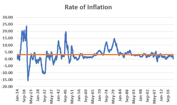
Figure 1 – Rate of Inflation 1914-present; inflation has not been a concern in over 30 years

In Figure 2 from www.QCharts.com we see the general correlation between interest rates and inflation.  At the moment – and essentially for the past 40 years – no problem. 

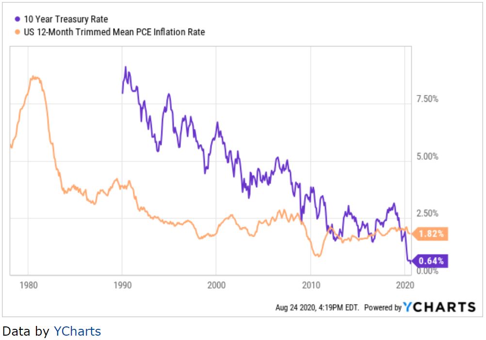
Figure 2 – 10-Year Treasury Yield versus Inflation; Bond Yields are highly correlated to the trend in inflation (Source: www.QCharts.com)

…The Lesson for Today

There is no “call to action” in today’s piece.  I am not even issuing any “stark warnings”.  The purpose is merely to alert you to a fact of life that roughly 99.99% of all investors have completely forgotten in the past 30-40 years.

The thing I would ask you to put into the back of your head is this:

*Low inflation WILL NOT last forever!

More to follow.

See also Jay Kaeppel Interview in July 2020 issue of Technical Analysis of Stocks and Commodities magazine

See also Jay’s “A Strategy You Probably Haven’t Considered” Video

See also Video – The Long-Term…Now More Important Than Ever

Jay Kaeppel

Disclaimer: The information, opinions and ideas expressed herein are for informational and educational purposes only and are based on research conducted and presented solely by the author.  The information presented represents the views of the author only and does not constitute a complete description of any investment service.  In addition, nothing presented herein should be construed as investment advice, as an advertisement or offering of investment advisory services, or as an offer to sell or a solicitation to buy any security.  The data presented herein were obtained from various third-party sources.  While the data is believed to be reliable, no representation is made as to, and no responsibility, warranty or liability is accepted for the accuracy or completeness of such information.  International investments are subject to additional risks such as currency fluctuations, political instability and the potential for illiquid markets.  Past performance is no guarantee of future results.  There is risk of loss in all trading.  Back tested performance does not represent actual performance and should not be interpreted as an indication of such performance.  Also, back tested performance results have certain inherent limitations and differs from actual performance because it is achieved with the benefit of hindsight.

The Next 9 Months

2020 has been “quite a year” (That’s my “Understatement of the Year”, hope you enjoyed it).  A shocking sell-off early in the year, followed by an equally shocking (for most people, but not everyone) rally ever since.  I haven’t been writing much lately because, well, what’s to say?  The stock market goes up…and up…and up… and, well, you get the picture.  It has mostly just been “sit back and enjoy the ride” time.

But of course, questions arise.  Questions like “will this last forever?”  And “if not, then how much longer.”  My answers are “No”, and “It beats me.”  But we can look to the past for a couple of potential clues.

The Next Two Months

Over the years, the September-October period has witnessed a great deal of volatility – and more than its fair share of downside price action. That is not to imply that that will necessarily be the case this time around. Still, to get a better picture, we will trace the S&P 500 Index back to 1928, in order to get a longer perspective. 

Figure 1 tracks the price gain or loss (not total return) for the S&P 500 Index ONLY during September and October of every presidential election year starting in 1928.

  Year S&P 500 Sep-Oct % during Election Years
1928 +3.9%
1932 (-17.0%)
1936 +7.6%
1940 +4.9%
1944 (-0.3%)
1948 +3.6%
1952 (-2.0%)
1956 (-4.1%)
1960 (-6.3%)
1964 +3.7%
1968 +4.6%
1972 +0.4%
1976 (-0.0%)
1980 +4.2%
1984 (-0.4%)
1988 +6.7%
1992 +1.1%
1996 +8.2%
2000 (-5.8%)
2004 +2.4%
2008 (-24.5%)
2012 +0.4%
2016 (-2.1%)

Figure 1 – % price return for S&P 500 Index held only during September-October of each election year since 1928 (Source: www.Macretrends.com)

The key things to note regarding the 23 September-October election year periods measured:

*13 showed a gain, 10 showed a loss

*The average performance was a loss of (-0.47%)

*The best performance was a gain was +8.2 (1996)

*The worst performance was loss of -24.5% (2008)

Figure 2 displays the cumulative % price gain or loss for the S&P 500 Index ONLY during Sep-Oct of election years.

Figure 2 – Cumulative price % gain/loss for S&P 500 Index held only during September and October of each presidential election year since 1928

As you can see, there’s been some hits, there’s been some misses, and there has been a couple of “major whacks” (1932 and 2008). The bottom line? Anything can happen in the next two months. If you are the type to “hedge”, now would probably be about as good a time as any. But remember, I am talking about “hedging” and NOT “Oh My God Sell Everything The Sky is Falling!” (although as you can see in Figure 2, that is technically one of the possibilities).

The Next Seven Months

One of the best kept secrets in the market is the long-term outperformance by the S&P 400 MidCap Index during the months of November through May versus other major indexes (sssshhhh!!!).  The 2019-2020 was clearly a painful exception to the rule as the MidCap Index took a significant hit during the Covid-19 selloff in February and March.  But investors need to recognize that nothing is “perfect” in the stock market and that even the most persistent trends can deviate greatly (and painfully) from time to time.  The next bullish “Sell in May” period begins on November 1st.  Let’s take a closer look at the performance of the S&P 400 MidCap Index for November through May Power Zone periods that begin during a presidential election year.

The S&P 400 Index first came into existence in early 1981, which was a post-election year.  So, for that year we will use only January 1981 through May 1981 to measure performance.  Starting with the next election year -1984 – and for each subsequent four-year election cycle, we will measure performance for the full November (election year) through May (post-election year) period.  Figure 3 displays the total return for the S&P 400 MidCap Index for each election year/post-election year Power Zone since 1981. 

November thru May
Election Yr/Post-Election Yr
  S&P 400 MidCap Total Return %
1980-1981 +12.7%
1984-1985 +20.5%
1988-1989 +23.5%
1992-1993 +14.8%
1996-1997 +16.2%
2000-2001 +0.9%
2004-2005 +12.0%
2008-2009 +2.5%
2012-2013 +21.9%
2016-2017 +15.1%
2020-2021 ?

Figure 3 – % total return for S&P 400 MidCap Index held only during November of each election year through the end of May of the subsequent post-election year; 1981-2020

The key things to note regarding the 10 Power Zone periods measured:

*All 10 instances (100%) showed a gain

*The average gain was +14.0%

*The largest gain was +23.5% (1988-1989)

*The smallest gain was +0.9% (2000-2001)

Figure 4 displays the cumulative % total return for the S&P 400 MidCap Index ONLY during Nov-May periods that start during an election year.

Figure 4 – Cumulative % total return for S&P 400 MidCap Index held only during November of each election year through May of the subsequent post-election year; 1981-2020

Summary

The next two months are anyone’s guess.  But following that, history suggest that we should probably not be surprised if the market continues to show strength in the 1st half of 2021.

See also Jay Kaeppel Interview in July 2020 issue of Technical Analysis of Stocks and Commodities magazine

See also Jay’s “A Strategy You Probably Haven’t Considered” Video

See also Video – The Long-Term…Now More Important Than Ever

Jay Kaeppel

Disclaimer: The information, opinions and ideas expressed herein are for informational and educational purposes only and are based on research conducted and presented solely by the author.  The information presented represents the views of the author only and does not constitute a complete description of any investment service.  In addition, nothing presented herein should be construed as investment advice, as an advertisement or offering of investment advisory services, or as an offer to sell or a solicitation to buy any security.  The data presented herein were obtained from various third-party sources.  While the data is believed to be reliable, no representation is made as to, and no responsibility, warranty or liability is accepted for the accuracy or completeness of such information.  International investments are subject to additional risks such as currency fluctuations, political instability and the potential for illiquid markets.  Past performance is no guarantee of future results.  There is risk of loss in all trading.  Back tested performance does not represent actual performance and should not be interpreted as an indication of such performance.  Also, back tested performance results have certain inherent limitations and differs from actual performance because it is achieved with the benefit of hindsight.

Yet Another Look “Down the Road”

I have written lately (also here) about my belief that the investment landscape in the next 10 years will look very different from the last 10 years.  This article (“A Sharp Market Selloff Looms Amidst A Historic Capital Rotation”) from KCI Research Ltd. is of the same vein.  While I am not necessarily issuing any warnings about an imminent sharp market selloff, I do agree with a lot of the future possibilities highlighted in the article.

Most notably:

#1. Commodities are loathed, despised, hated and seriously undervalued relative to the S&P 500 Index.  This is unlikely to last forever. Figure 1 displays the performance of the CRB Commodity Index by an ETF that tracks the S&P 500 Index.

Figure 1 – Commodities seriously undervalued relative to S&P 500 (Source: StockCharts.com)

#2. The Shiller P/E Ratio is at 31.78, one of its highest readings ever.  This suggests much lower longer-term returns going forward (i.e., low P/E’s tend to be followed by higher long-term returns and vice versa)

Figure 2 – Current Valuations as a predictor of future long-term results (Source: Robert Shiller)

#3. Large-Cap/Growth/Tech/Momentum is presently all the rage.  If there is one things we should have learned from the markets by now, it is that no trend last forever.  This one WILL NOT be an exception.

While the projections in Figure 3 are just that – someone’s projections, and may or may not come true, they highlight the potential for a very different market environment in the years ahead than the one that investors have grown very accustomed to of late.

Figure 3 – A serious rotation in relative returns (Source: GMO)

As I have stated in the past, I still see a lot of this stuff NOT as “a call to action”, but rather as “a call to pay attention.”

So, um, pay attention.

See also Jay Kaeppel Interview in July 2020 issue of Technical Analysis of Stocks and Commodities magazine

See also Jay’s “A Strategy You Probably Haven’t Considered” Video

See also Video – The Long-Term…Now More Important Than Ever

Jay Kaeppel

Disclaimer: The information, opinions and ideas expressed herein are for informational and educational purposes only and are based on research conducted and presented solely by the author.  The information presented represents the views of the author only and does not constitute a complete description of any investment service.  In addition, nothing presented herein should be construed as investment advice, as an advertisement or offering of investment advisory services, or as an offer to sell or a solicitation to buy any security.  The data presented herein were obtained from various third-party sources.  While the data is believed to be reliable, no representation is made as to, and no responsibility, warranty or liability is accepted for the accuracy or completeness of such information.  International investments are subject to additional risks such as currency fluctuations, political instability and the potential for illiquid markets.  Past performance is no guarantee of future results.  There is risk of loss in all trading.  Back tested performance does not represent actual performance and should not be interpreted as an indication of such performance.  Also, back tested performance results have certain inherent limitations and differs from actual performance because it is achieved with the benefit of hindsight.

One Way to Play SLV

Silver has been a hot, well, commodity of late.  Although it did get pummeled the other day (just to get everyone’s attention). A lot of pundits are writing about “$50 silver!!” and a lot of investors and traders are struggling with the decision of whether or not to “take the plunge.”  The potential rewards – and risks – are great.  Figure 1 displays a monthly chart of ticker SLV, an ETF that tracks silver.   

Figure 1 – Ticker SLV (Courtesy AIQ TradingExpert)

Buying 100 shares of SLV as I write would cost $2,342.  If SLV were to ultimately advance to its previous high north of $48 a share an investor could double his or her money.  But if the rally fizzles out and SLV tanks a loss of 50% is possible.  What to do, what to do? 

Another possibility is to buy a long-term call option.  The problem here is captured in Figure 2.  As you can see, implied volatility for SLV options is extremely high.  What that implies (har), is that the amount of time premium built into SLV option is exceptionally high, and that a decline in IV levels could lead to a significant decline in the value of a call option as lower IV translates to lower time premium.

Figure 2 – Implied volatility for SLV option is very high, i.e., SLV options are “expensive”

Is there an alternative?  Would I ask the question if the answer was “No?”

A Long-Term Out-of-the-Money Butterfly

I’m going to keep this short.  As always, the trade that follows is an “example” of one way to play given an extremely volatility underlying security and extremely high implied volatility, and NOT a “recommendation.”  It also is sized to serve as a replacement for simply buying 100 shares of SLV (cost and total risk = $2,342)

The trade goes as follows:

*Buy 8 SLV Jan 2022 24 calls @ $5.65

*Sell 12 SLV Jan 2022 39 calls @ $2.68

*Buy 4 SLV Jan 2022 54 calls @ $1.73

The details appear in Figure 3 and the risk curves in Figure 4.

Figure 3 – SLV OTM butterfly details (Courtesy www.OptionsAnalysis.com)

Figure 4 – SLV OTM butterfly risk curves (Courtesy www.OptionsAnalysis.com)

Things to note:

*This trade costs $1,996 to enter

*Clearly, a rise in SLV price will generate a profit and a decline will generate a loss

*The primary advantage to this trade is, a) SLV has almost a year and half to make a meaningful up move, and b) if SLV does rise in price, time decay begins to work in the trades favor (note that the risk curve lines move to higher ground as time goes by as long as SLV is above the breakeven price

Finally, let’s compare this position to buying and holding 100 shares of SLV.  Figure 5 adds the risk curve (actually a straight line) for holding 100 shares of SLV to Figure 4.

Figure 5 – SLV OTM Butterfly versus long 100 shares of SLV (Courtesy www.OptionsAnalysis.com)

Note that:

*The black line in Figure 5 represent the profit potential for the long 100 shares of SLV position

*The colored lines in Figure 5 represent the expected profit/loss for the OTM butterfly as of various dates leading up to breakeven

*Above the breakeven price the OTM butterfly enjoys a great deal more profit potential

*Below the breakeven price the OTM butterfly has more downside dollar risk (until SLV reaches about $5 a share (not shown)

Summary

Once again, this is an example and not a recommendation.  But the relevant question is “does the OTM butterfly trade make sense?”  Possibly – for a trader who wants to play potential for a further up move in SLV.

See also Jay Kaeppel Interview in July 2020 issue of Technical Analysis of Stocks and Commodities magazine

See also Jay’s “A Strategy You Probably Haven’t Considered” Video

See also Video – The Long-Term…Now More Important Than Ever

Jay Kaeppel

Disclaimer: The information, opinions and ideas expressed herein are for informational and educational purposes only and are based on research conducted and presented solely by the author.  The information presented represents the views of the author only and does not constitute a complete description of any investment service.  In addition, nothing presented herein should be construed as investment advice, as an advertisement or offering of investment advisory services, or as an offer to sell or a solicitation to buy any security.  The data presented herein were obtained from various third-party sources.  While the data is believed to be reliable, no representation is made as to, and no responsibility, warranty or liability is accepted for the accuracy or completeness of such information.  International investments are subject to additional risks such as currency fluctuations, political instability and the potential for illiquid markets.  Past performance is no guarantee of future results.  There is risk of loss in all trading.  Back tested performance does not represent actual performance and should not be interpreted as an indication of such performance.  Also, back tested performance results have certain inherent limitations and differs from actual performance because it is achieved with the benefit of hindsight.

Whither Apple?

OK, first off a true confession.  I hate it when some wise acre analyst acts like they are so smart and that everyone else is an idiot.  Its offensive and off-putting – not to mention arrogant.  And still in this case, all I can say is “Hi, my name is Jay.”

A lot of attention has been paid lately to the fact that AAPL is essentially swallowing up the whole world in terms of market capitalization.  As you can see in Figure 1, no single S&P 500 Index stock has ever had a higher market cap relative to the market cap of the entire Russell 2000 small-cap index. 

Figure 1 – Largest S&P 500 Index stock as a % of entire Russell 200 Index (Courtesy Sentimentrader.com)

So of course, the easiest thing in the world to do is to be an offensive, off-putting and arrogant wise acre and say “Well, this can’t last.”  There, I said it.  With the caveat that I have no idea how far AAPL can run “before the deluge”, as a student of (more) market history (than I care to admit) I cannot ignore this gnawing feeling that this eventually “ends badly.”  Of course, I have been wrong plenty of times before and maybe things (Offensive, Off-Putting and Arrogant Trigger Warning!) “really will be different this time around.”  To get a sense of why I bring this all up, please keep reading.

In Figure 1 we also see some previous instances of a stock becoming “really large” in terms of market cap.  Let’s take a closer look at these instances.

IBM – 1979

Figure 2 – IBM (Courtesy AIQ TradingExpert)

MSFT – 1999

Figure 3 – MSFT (Courtesy AIQ TradingExpert)

XOM – 2008

Figure 4 – XOM (Courtesy AIQ TradingExpert)

AAPL – 2012

Figure 5 – AAPL (Courtesy AIQ TradingExpert)

AAPL – 2020

Figure 6 – AAPL (Courtesy AIQ TradingExpert)

Summary

Small sample size? Yes.

Could AAPL continue to run to much higher levels? Absolutely

Do I still have that offensive, off-putting and slightly arrogant gut feeling that somewhere along the way AAPL takes a huge whack?

Sorry.  It’s just my nature.

See also Jay Kaeppel Interview in July 2020 issue of Technical Analysis of Stocks and Commodities magazine

See also Jay’s “A Strategy You Probably Haven’t Considered” Video

See also Video – The Long-Term…Now More Important Than Ever

Jay Kaeppel

Disclaimer: The information, opinions and ideas expressed herein are for informational and educational purposes only and are based on research conducted and presented solely by the author.  The information presented represents the views of the author only and does not constitute a complete description of any investment service.  In addition, nothing presented herein should be construed as investment advice, as an advertisement or offering of investment advisory services, or as an offer to sell or a solicitation to buy any security.  The data presented herein were obtained from various third-party sources.  While the data is believed to be reliable, no representation is made as to, and no responsibility, warranty or liability is accepted for the accuracy or completeness of such information.  International investments are subject to additional risks such as currency fluctuations, political instability and the potential for illiquid markets.  Past performance is no guarantee of future results.  There is risk of loss in all trading.  Back tested performance does not represent actual performance and should not be interpreted as an indication of such performance.  Also, back tested performance results have certain inherent limitations and differs from actual performance because it is achieved with the benefit of hindsight.

TSLA Covered Call Update

In this article dated 7/14/20, I noted that:

*TSLA stock had “gone parabolic”

And

*That implied volatility on TSLA options was extremely high

This seemed to offer a (lucky – and already fairly well to do) stiff a good opportunity to sell covered calls against 200 shares of TSLA.  The original trade involved:

*Holding 200 shares of TSLA (trading at $1,497)

*Selling 1 Aug07 2020 TSLA 1500 call @ $200

*Selling 1 Aug07 2020 TSLA 1800 call @ $115

Figure 1 displays the risk curves on the original position.

Figure 1 – Original risk curves for TSLA covered call example  (Courtesy www.OptionsAnalysis.com)

Expiration for the options involved was last Friday 8/7.  So how did things work out?  For a person holding only stock shares, not so great.  For a person holding stocks shares having sold two covered calls, better.

*TSLA declined roughly 3% from $1,497.06 to $1,452.17.  A 200-share position lost -$8,870 in value

*The August07 1500 call sold at $200, generated a profit of +$20,000

*The August07 1800 call sold at $115, generated a profit of +$11,500

The net result (near the close on 8/7 with the options still show a penny or two of value) appears in Figure 2.

Figure 2 – TSLA covered call example as of (technically just before) option expiration (Courtesy www.OptionsAnalysis.com)

*An investor who only held 200 shares of stock say his or her value decline by -$8,870.

*An investor who held 200 shares of stock but sold the two calls, lost $-8,870 on the stock but made +$31,500 on the short options, for a net profit of +$22,630, or +8.4% (in 24 calendar days while the underlying stock lost 3%).

Now you see why it may be/can be beneficial to sell covered calls on stocks you hold when implied volatility is extremely high.

See also Jay Kaeppel Interview in July 2020 issue of Technical Analysis of Stocks and Commodities magazine

See also Jay’s “A Strategy You Probably Haven’t Considered” Video

See also Video – The Long-Term…Now More Important Than Ever

Jay Kaeppel

Disclaimer: The information, opinions and ideas expressed herein are for informational and educational purposes only and are based on research conducted and presented solely by the author.  The information presented represents the views of the author only and does not constitute a complete description of any investment service.  In addition, nothing presented herein should be construed as investment advice, as an advertisement or offering of investment advisory services, or as an offer to sell or a solicitation to buy any security.  The data presented herein were obtained from various third-party sources.  While the data is believed to be reliable, no representation is made as to, and no responsibility, warranty or liability is accepted for the accuracy or completeness of such information.  International investments are subject to additional risks such as currency fluctuations, political instability and the potential for illiquid markets.  Past performance is no guarantee of future results.  There is risk of loss in all trading.  Back tested performance does not represent actual performance and should not be interpreted as an indication of such performance.  Also, back tested performance results have certain inherent limitations and differs from actual performance because it is achieved with the benefit of hindsight.

Growth v Value, Gold v Silver, Commodities v Stocks, Dumb Money v Stocks

This should be called “The Conflict Edition.”  Because there is a lot of conflict within the financial markets, and several trends that, a) are firmly in place and need to be respected, but, b) we should absolutely be looking for changes to in the future.  I do want to point out this following important (well, at least according to me) point:

*Identifying the exact turning point in most of what follows is NOT the objective.  Because when the change comes (again, at least in my opinion) the new trend will likely last for a long period of time.

Growth vs. Value

There is much love for growth stocks these days, and much disdain for value stocks.  This WILL NOT last forever.  If you doubt this (granted, opinion), please peruse Figure 1 and read the explanation below.

Figure 1 – 10-year Total Return for Value stocks minus 10-Year Total Return for Growth stocks (Source RIA Pro)

This chart takes the 10-year total return for growth stocks and subtracts that from the 10-year total return for value stocks. 

*Positive values (in blue) indicate that value stocks outperformed growth stocks over the previous 10 years

*Negative values (in red) indicate the growth stocks outperformed value stocks over the previous 10 years

*Anyone making the argument that “Value is Dead” is essentially predicting that the line in Figure 1 will never turn blue again.

*Trying to catch the exact bottom in this relationship is not what matters.  What matters is to recognize that that once this relationship does change, value stocks are likely to vastly outperform growth stocks.

For now, when that begins is anyone’s guess.

Gold vs. Silver

Silver is one of the “hottest” markets at the moment.  And while it is overbought on a technical basis, there is no way I would fight the trend.  That being said, Figure 2 is from Nautilus Research and the results suggest that gold will outperform silver over the next several years. 

Figure 2 – Gold vs. Silver after the Gold/Silver Ratio drops 40% (Source; Nautilus Investment Research)

While a little tough to read, it basically shows that when the Gold/Silver ratio drops by 40% from a peak:

*Gold/Silver Ratio higher 1 year later 7 times and lower 1 year later 0 times

*Gold higher 1 year later 5 times and lower 1 year later 2 times

*Silver higher 1 year later 3 times and lower 1 year later 4 times

Commodities vs. Stocks

Commodities have been the dogs of the investment world essentially since they peaked in mid-2008.  Figure 3 (from Bloomberg) displays a Commodity Stock Index performance relative to the Dow Jones Industrials going back to the 1930’s.

Figure 3 – Commodity Stock Index vs. Down Jones Industrial Average (Source: Bloomberg)

Note the following:

*By this measure commodities HAVE NEVER been cheaper relative to the broader stock market

*Commodities have been undervalued for several years already, which explains why it is fruitless to try to “pick the bottom”

*The current relationship WILL NOT last forever (in my opinion)

*When the change in trend finally does occur, it will likely represent a significant opportunity for those who are paying attention

Dumb Money versus Stocks

The excellent www.Sentimentrader.com website calculates a “Smart Money Index” and a “Dumb Money Index”.  Figure 4 displays the current status of the Dumb Money Index (red dot at the far right), highlights previous peaks (red dots), and subsequent average performance (below the chart).

Figure 4 – Previous peaks in Sentimentrader.com Dumb Money Index (Courtesy Sentimentrader.com)

Bottom line:

*Stock market returns tended to be weaker than average going forward

*Average 3-month return -8.22%

Summary

None of the above necessarily amount to a “Call to Action.” But all constitute a “Call to Pay Attention.”

See also Jay Kaeppel Interview in July 2020 issue of Technical Analysis of Stocks and Commodities magazine

See also Jay’s “A Strategy You Probably Haven’t Considered” Video

See also Video – The Long-Term…Now More Important Than Ever

Jay Kaeppel

Disclaimer: The information, opinions and ideas expressed herein are for informational and educational purposes only and are based on research conducted and presented solely by the author.  The information presented represents the views of the author only and does not constitute a complete description of any investment service.  In addition, nothing presented herein should be construed as investment advice, as an advertisement or offering of investment advisory services, or as an offer to sell or a solicitation to buy any security.  The data presented herein were obtained from various third-party sources.  While the data is believed to be reliable, no representation is made as to, and no responsibility, warranty or liability is accepted for the accuracy or completeness of such information.  International investments are subject to additional risks such as currency fluctuations, political instability and the potential for illiquid markets.  Past performance is no guarantee of future results.  There is risk of loss in all trading.  Back tested performance does not represent actual performance and should not be interpreted as an indication of such performance.  Also, back tested performance results have certain inherent limitations and differs from actual performance because it is achieved with the benefit of hindsight.

The Rally in “Stuff” Rolls On

In this article, dated 7/10/2020, I noted that my “Stuff” Index was coming on strong and that its performance may be a “shot across the bow” that some changes may be coming to the financial markets.  Since then, the trend has accelerated.

STUFF vs. FANG vs. QQQ

Figure 1 displays the performance of STUFF components since 7/10

Figure 2 displays the performance of FANG components since 7/10

Figure 1 – Price performance of Jay’s STUFF Index components since 7/10

Figure 2 – Price performance of FANG stocks since 7/10

For the record, the “high-flying” Nasdaq 100 Index (using ticker QQQ as a proxy investment) is up +4.0% during the same time.

Is this a trend – or a blip?  Unfortunately, I can’t answer that question. But it certainly appears that there is something afoot in “Stuff”, particularly the metals.  Figure 3 displays the weekly charts for ETFs tracking Silver, Gold, Palladium and Platinum (clockwise from upper left). 

Figure 3 – The metals components of the Stuff Index (Courtesy AIQ TradingExpert)

When it comes bull markets in metals, the typical pattern historically goes something like this:

*Gold leads the way (check)

*Eventually silver comes on strong and often ends up outperforming gold (check)

*The other metals rise significantly “under the radar” as everyone focus on – literally in this case, ironically – the “shiny objects” (gold and silver)

Again, while I had inklings that a bull market in metals was forming (and have held positions in them for several years, and still hold them), I certainly did not “predict” the recent explosion in gold and silver prices. 

Two things to note:

*Gold and silver are obviously very “overbought”, so buying a large position here entails significant risk

*Still it should be noted that both SLV and PPLT would have to double in price from their current levels just to get back to their previous all-time highs of 2011

So, don’t be surprised if “Stuff” enjoys a continued resurgence.  Note in Figure 4 that a number of commodity related ETFs are way, way beaten down and could have a lot of upside potential if a resurgence actually does unfold.

Figure 4 – Four commodity ETFs weekly (Courtesy AIQ TradingExpert)

What is interesting – and almost not visible to the naked eye – is the action in the lower right hand corner of these four charts. To highlight what is “hiding in plain sight”, Figure 5 “zooms in” on the recent action of same four tickers as Figure 4, but in a daily price format rather than a monthly price format.

Figure 5 – Four commodity ETFs daily (Courtesy AIQ TradingExpert)

Despite the ugly pictures painted in Figure 4, it is interesting to note in Figure 5 that all four of these commodity related ETFs have rallied sharply of late.  There is of course, no guarantee this will continue.  But if the rally in “Stuff” – currently led by metals – spreads to the commodity sector as a whole, another glance in Figures 3 and 4 reveals a lot of potential upside opportunity.

Time will tell.  In the meantime, keep an eye on the “shiny objects” (gold and silver) for clues as to whether or not the rally in “Stuff” has staying power.

See also Jay Kaeppel Interview in July 2020 issue of Technical Analysis of Stocks and Commodities magazine

See also Jay’s “A Strategy You Probably Haven’t Considered” Video

See also Video – The Long-Term…Now More Important Than Ever

Jay Kaeppel

Disclaimer: The information, opinions and ideas expressed herein are for informational and educational purposes only and are based on research conducted and presented solely by the author.  The information presented represents the views of the author only and does not constitute a complete description of any investment service.  In addition, nothing presented herein should be construed as investment advice, as an advertisement or offering of investment advisory services, or as an offer to sell or a solicitation to buy any security.  The data presented herein were obtained from various third-party sources.  While the data is believed to be reliable, no representation is made as to, and no responsibility, warranty or liability is accepted for the accuracy or completeness of such information.  International investments are subject to additional risks such as currency fluctuations, political instability and the potential for illiquid markets.  Past performance is no guarantee of future results.  There is risk of loss in all trading.  Back tested performance does not represent actual performance and should not be interpreted as an indication of such performance.  Also, back tested performance results have certain inherent limitations and differs from actual performance because it is achieved with the benefit of hindsight.

Buck Bounce?

I haven’t written much lately. That is partly a function of “What’s to say? Stock market goes up every day, metals go up every day, bonds go up most days, everything else, who cares?” 

Simple.

The one major one casualty in all of this is the U.S. Dollar.  Seems the markets sense that having the money-printing machine whirring at top speed all day every day might somehow make the buck less valuable.  Hmmm.  Interesting concept that.  The trend-following investor in me is clearly inclined to play the short side.  However, the contrarian short-term trader in me is looking to play the long side for a bounce higher.

This is partly a function of, a) an oversold market, and b) the fact that sentiment has reached an extremely bearish extreme (which as a contrarian indicator is potentially bullish).  At the far right of Figure 1 you see the current plight of the dollar.  A sharp decline accompanied by bullish sentiment that is essentially at a 9-year low. 

Figure 1 – U.S. Dollar falling hard, bullish sentiment at a 9-year low (Courtesy Sentimentrader.com)

Does this mean the U.S. Dollar has to bounce higher?  Not at all.  Which is why what follows is for short-term speculative traders only.

Playing for Bounce in the Buck

Let’s start with the usual caveat that what follows is NOT a “recommendation”, only an example of one (of many) way(s) that a trader might choose to bet on a short-term bounce in the dollar.  In Figure 2 we see a projected Elliott Wave count for ticker UUP (an ETF that tracks the U.S. Dollar).  It suggests a potential bounce in the next month or so (interestingly, followed by a further decline).  For the record, this is not an “exact prediction” on the part of ProfitSource, it is merely a suggestion of how UUP might be expected to act in the months ahead.  But for our purposes, let’s use this to consider a short-term bullish trade.

As such, we will attempt to answer the following question: “How can I make money if UUP rallies to roughly $26.50+ a share by mid-September?”  All the while we must also understand that this will be an extremely risky (got that?) counter-trend trade – the implication being that we should, a) not bet the ranch, and b) look to limit our risk as much as possible.

Figure 2 – Ticker UUP (Courtesy ProfitSource by HUBB)

A Long Call on UUP

In order to enter a bullish trade with limited risk we will look to buy a call option on UUP.  There is a September option series for UUP that expires on September 18, which might seem perfect at first blush.  However, buying a call option that expires September 18th would mean that we would experience maximum time decay working against us (remember, options lose all of their time premium by expiration, with the bulk of that decay coming in the month leading up to expiration day). 

So instead we will look at December 2020 call options.  We are not playing for a “massive rally”, just for a short-term bounce of a reasonable amount (hopefully toward the $26.50 range).  So, let’s consider that at-the-money December 25 strike price call.  If we are able to buy it at the midpoint of the bid/ask spread, we can buy one call option for $66. 

(Additional Math: If a trader has a $25,000 and wants to risk roughly 1% on this trade, he or she can buy 4 call options – $25,000 * 0.01 = $250.  $250/$66 = 3.8 so we will round up to 4.  Risking 2% of capital allows a trader to buy 7 or 8 calls, etc.)

Figure 3 displays the particulars and the risk curves for this trade between now and December option expiration (the curves change over time due to time decay).

Figure 3 – UUP December 2020 25 call details and risk curves (Courtesy www.OptionsAnalysis.com)

This Trade in Reality

A couple things to note:

A trader entering this position must be prepared to sustain a 100% loss of capital invested – which is why we are using a relatively low percent of capital paired with a limited risk vehicle (a call option).  However, remember that we are initially looking for a bounce by mid-September.  So, let’s redraw the risk curves through the date of 9/14.  These appear in Figure 4.

Figure 4 – UUP December 2020 25 call risk curves between now and 9/14 (Courtesy www.OptionsAnalysis.com)

The bottom line:

*If UUP does in fact rally to our target of $26.74 this call option would generate an expected profit of $109 per contract, or 165% of capital invested ($66). 

*Above roughly $25.30 a share for UUP this trade will show some profit

*If UUP fails to rally this trade loses money, plain and simple.  As of 9/14, if UUP is at $24.00 a share this trade would be down roughly -$50. 

Summary

Make no mistake, in this environment of strongly trending markets and with the federal government seeming to be actively weakening the dollar, this is should be considered a high risk, low probability trade.  This position makes money only if UUP rallies in price from its current level.  Under any other scenario this trade is a loser.

Still, for a speculative trader willing to make a contrarian bet, this example position offers the potential to generate a nice return on capital for a relatively low dollar risk.

See also Jay Kaeppel Interview in July 2020 issue of Technical Analysis of Stocks and Commodities magazine

See also Jay’s “A Strategy You Probably Haven’t Considered” Video

See also Video – The Long-Term…Now More Important Than Ever

Jay Kaeppel

Disclaimer: The information, opinions and ideas expressed herein are for informational and educational purposes only and are based on research conducted and presented solely by the author.  The information presented represents the views of the author only and does not constitute a complete description of any investment service.  In addition, nothing presented herein should be construed as investment advice, as an advertisement or offering of investment advisory services, or as an offer to sell or a solicitation to buy any security.  The data presented herein were obtained from various third-party sources.  While the data is believed to be reliable, no representation is made as to, and no responsibility, warranty or liability is accepted for the accuracy or completeness of such information.  International investments are subject to additional risks such as currency fluctuations, political instability and the potential for illiquid markets.  Past performance is no guarantee of future results.  There is risk of loss in all trading.  Back tested performance does not represent actual performance and should not be interpreted as an indication of such performance.  Also, back tested performance results have certain inherent limitations and differs from actual performance because it is achieved with the benefit of hindsight.