The U.S. stock market has in recent years enjoyed an incredible bull run. In the process it has left the rest of the world(‘s stock markets) in the dust. And as usual, the longer any trend persists the more investors en masse take it for granted that it will go on forever. As a result, it is pretty hard for investors to get excited about international stock market exposure.
Given the trend over the past decade, this is perfectly understandable. And probably a mistake. Because nothing lasts forever in the financial markets (except of course for the aforementioned tendency for investors to extrapolate a trend).
Figure 1 displays the cumulative growth of a $1,000 investment in the S&P 500 stock index (SPX) and the MSCI EAFE Index (EAFE) since the end of 1972. Through 1990 the EAFE outperformed, then the SPX charged into the lead. By the bottom of the 2008-2009 bear market the gap had narrowed. Since then the SPX has vastly outperformed.

Figure 1 – Growth of $1,000 in SPX vs. EAFE; 12/31/1972-5/31/2019
Most investors look at Figure 1 and immediately conclude that U.S. stocks are “better”, despite the “ying” and “yang” that actually took place. Figure 2 displays the rolling 5-year return for both indexes. 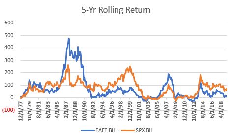
Figure 2 – Rolling 5-yr. returns for SPX and EAFE
Figure 3 displays the net difference between the two. When Figure 3 is positive, EAFE outperformed over the previous 5 years and when it is negative SPX outperformed.
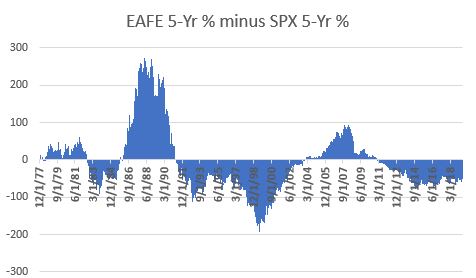
Figure 3 – EAFE 5-yr return minus SPX 5-year return
The only real useful conclusion one can reach from Figures 2 and 3 is that sometimes EAFE leads and sometimes SPX leads. There is no permanent advantage in one over the other.
Figure 4 displays the ratio of EAFE divided by SPX along with a 10-month exponential moving average (technical note: the ratio tracked is the ratio of the cumulative growth of $1,000 in EAFE divided by the cumulative growth of $1,000 in SPX and NOT the price of EAFE/the price of SPX).
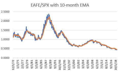
Figure 4 – EAFE cumulative return divided by SPX cumulative return; 1972-May-2019
Figure 5 displays the ratio in Figure 4 minus the moving average in Figure 4. Positive readings favor EAFE, negative readings favor SPX.
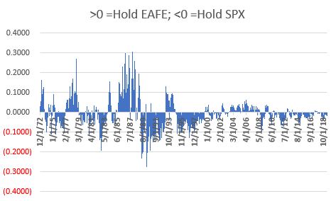
Figure 5 – EAFE/SPX ratio minus 10-month EMA of the ratio; 1972-May-2019
Trading Rules
Because we are using total monthly return data, and because that data is typically not available until sometime during the next month, we will use a one-month lag in terms of generating signals. So here are the rules:
*Indicator = Latest EAFE/SPX ratio minus 10-month EMA of EAFE/SPX ratio
We start with $1,000 on 12/31/1972
*If Indicator rises above 0, sell SPX and buy EAFE
*If Indicator falls below 0, sell EAFE and buy SPX
Example: So let’s say we get total return data for May on the 5th of June. And let’s say that when we do the update for May we find that the Indicator went from negative to positive. Then at the end of June we will sell SPX and buy EAFE.
SPX/EAFE “Switch” Index is traded using the rules above
As a benchmark we will use the following:
*SPX vs. EAFE “Split” Index = Start with $1,000 on 12/31/1972. At the start of each year, the portfolio is rebalanced to a 50/50 split between SPX and EAFE.
Figure 6 displays the cumulative growth of both the “Switch” Index and the “Split” Index.
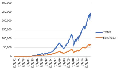
Figure 6 – Cumulative growth of $1,000 invested using “Switch” strategy (blue) versus the “Split” strategy (orange)
For the record:
*The “Switch” strategy grew +22,719%
*The “Split” strategy grew +6,350%
As with anything in the financial markets, it is not like the “Switch” strategy always outperformed the “Split” strategy. But the long-term trend is pretty clear. Figure 7 displays the cumulative “Switch” strategy divided by the cumulative “Split” strategy.
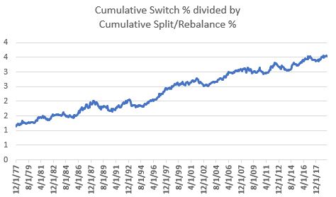
Figure 7 – “Switch” strategy cumulative return divided by “Split” strategy cumulative return
When the line in Figure 7 is rising it means the “Switch” strategy is outperforming the “Split” strategy. As you can see, there are times when the line dips or moves sideways. But again, the long-term trend is unmistakable – over time, switching makes more than splitting.
The Long-Term Picture
Figure 8 displays the rolling-5 yr. return for the “Switch” strategy (blue) and the “Split” strategy (orange).
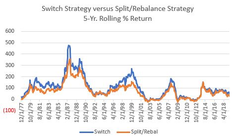
Figure 8 – “Switch” strategy 5-yr return (blue) versus “Split” strategy 5-yr return (orange)
Figure 9 displays the difference between the two. Above 0 means the “Switch” strategy has outperformed over the past 5 years and vice versa.
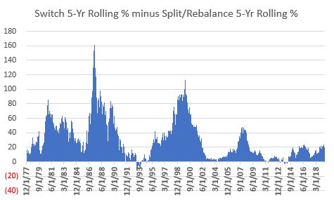
Figure 9 – “Switch” strategy 5-yr return (blue) minus “Split” strategy 5-yr return (orange)
Now let’s talk about the realities of investing. As you can see, the “Switch” strategy usually outperforms the “Split” strategy – BUT NOT ALWAYS. Now consider you were using the “Switch” strategy – which requires you to update data and monitor results each and every single month, and also requires you to make a trade whenever a switch is needed, versus the “Split” strategy which requires you only to make one trade a year.
Now let’s say you go to the trouble of using the “Switch” strategy and after 5 long years of dutifully following your “system”, the “Switch” strategy has actually underperformed the “Split” strategy. What will be your reaction?
Will you:
*Say “well, I knew that this can and will happen from time to time but the long-term odds still favor the “Switch” strategy, so I am going to stick to it
OR
*(like the vast majority of investors) Say “this strategy sucks, I need to move on”
One’s answer to this question is important because the need to persevere in light of underperformance is pretty much one of the requirements of long-term success.
Figure 10 displays the relevant comparative facts and figures.
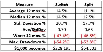
Figure 10 – “Switch” versus “Split”; 12/31/1972-5/31/2019
It is extremely important to note that while the “Switch” strategy vastly outperformed in terms of return, it still entailed alot of volatility and risk. It also had a higher annual standard deviation (i.e., it is more volatile) and experienced a drawdown of -54%, which was slightly greater than that of the “Split” strategy.
Bottom line: do NOT make the mistake of thinking of this strategy as “easy money”.
Summary
As always, this is not a “recommended” strategy. It is presented merely as “food for thought”. The article is simply intended to highlight that:
*Sometimes U.S. stocks outperform the rest of the world and – absolutely, positively sometimes vice versa
*It may be possible to take advantage of switching between U.S. and international stocks
*No strategy outperforms all the time.
Jay Kaeppel
Disclaimer: The data presented herein were obtained from various third-party sources. While I believe the data to be reliable, no representation is made as to, and no responsibility, warranty or liability is accepted for the accuracy or completeness of such information. The information, opinions and ideas expressed herein are for informational and educational purposes only and do not constitute and should not be construed as investment advice, an advertisement or offering of investment advisory services, or an offer to sell or a solicitation to buy any security.
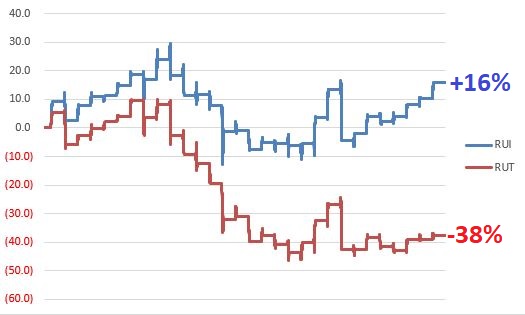
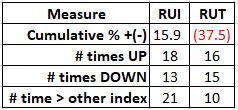
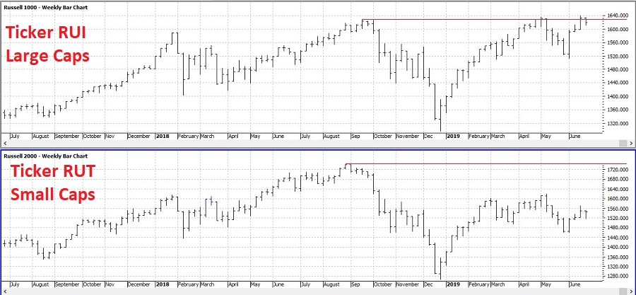 Figure 1 – Large-cap stocks (RUI, top clip) versus small-cap stocks (RUT, bottom clip); 1989-2019 (Courtesy ProfitSource by HUBB)