Monthly Archives: July 2017

Respect the Trend, But Beware

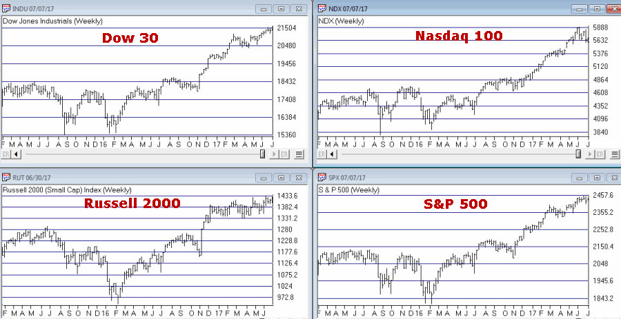
It is hard to look at Figure 1 and argue that the trend of the stock market is anything but bullish.  Major averages making new all-time highs is essentially the very definition of a bull market.  And indeed the market may continue to push higher indefinitely.1
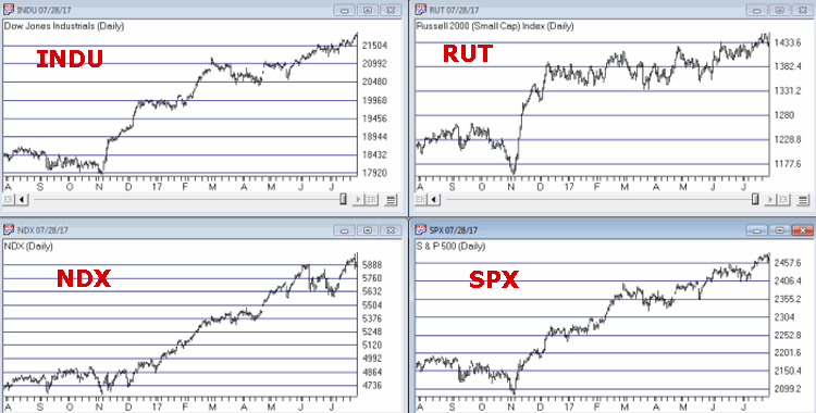
Figure 1 – Four Major Averages all at or near all-time highs (Courtesy AIQ TradingExpert)

Trying to “pick a top” usually ends with an embarrassed prognosticator.  Particularly when the major market averages are posting new highs.  Still, there comes a time when it can pay to pay close attention for signs of “Trouble in Paradise”.  That time may be now.

Four Bellwethers

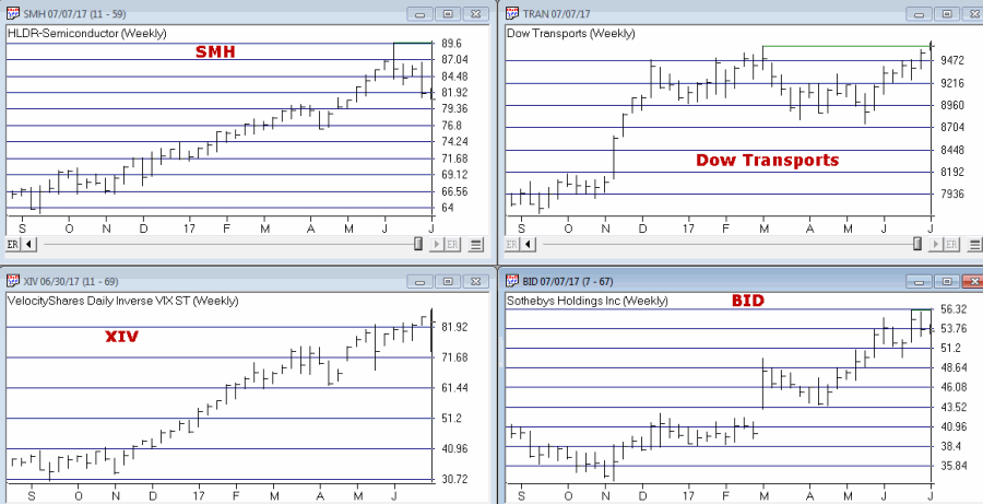
In this article I wrote about 4 “bellwethers” that I follow for potential “early warning signals”.  So far no “run for cover” signals have appeared.  Two of the four have confirmed the new highs in the market averages and the other two have not.  If and when 3 or 4 of them fail to confirm that may signal trouble ahead.2
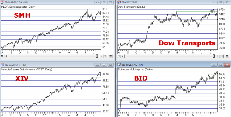
Figure 2 – XIV and BID confirm news highs; SMH and TRAN so far have not (Courtesy AIQ TradingExpert)

XIV and BID have confirmed new highs in the major averages (although the parabolic nature of XIV’s run is somewhat troubling to me) while SMH and the Dow Transports have not.

Post-Election/Year “7” Bermuda Triangle

have written about this a few times but it bears repeating here.  Post-Election Years and Years ending in “7” (1907, 1917, etc.) have typically witnessed “trouble” in the second half of the year.  Figures 3 and 4 are posted courtesy of a Twitter post from Larry McMillan of the Option Strategist.

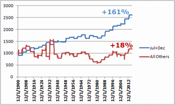
Figure 3 highlights the fact that the 2nd half of “Years 7” have often witnessed “trouble.”

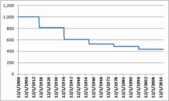
Figure 4 show that each “7” year posted a high during the 2nd half of the year (or in June) and then suffered a decline.  This does not guarantee a repeat this year but it is a warning sign.

Year 7 1

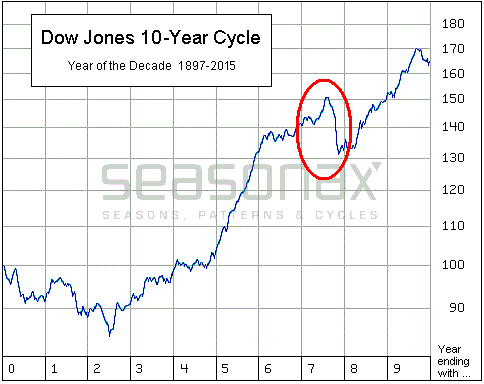
Figure 3 – Decade Pattern for the Dow Jones Industrials Average (Courtesy: Options Strategist)

Year 7 2

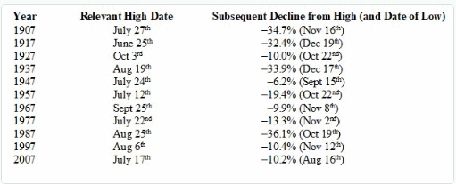
Figure 4 – Years “7” (Courtesy: Options Strategist)

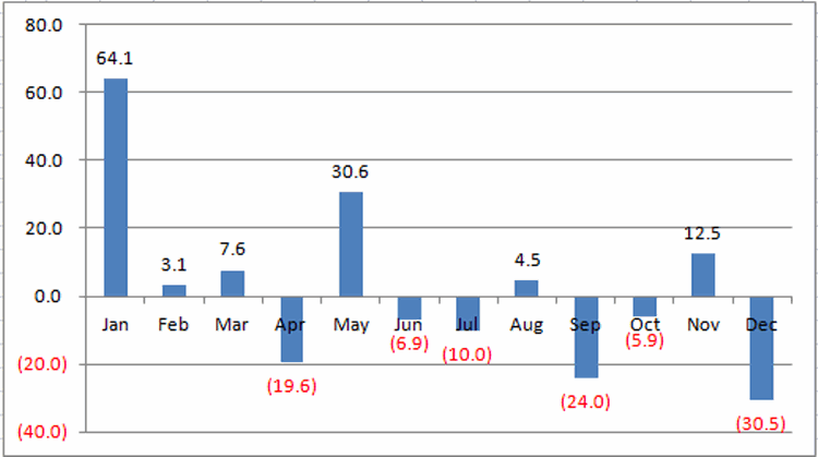
Also, during years that are both “post-election” years AND “Years ending in 7”, the August through October results have been brutal- as depicted in Figure 5 – with an average 3-month decline of -15%.2

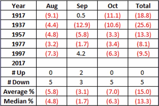
Figure 5 – August/September/October of Post-Election Years that also End in “7”

Nothing in Figures 3 through 5 “guarantee” an imminent market decline.  They do however, constitute the reason the word “Beware” appears in the headline.

Valuation

Last week I witnessed a presentation where a quite knowledgeable gentleman posted a chart of the Schiller PE Ratio.  He made note of the fact that the Schiller PE Ratio has only been higher twice in modern history – 1929 and 2000.  The 1929 peak was followed by an 89% decline by the Dow and the 2000 peak was followed by an 83% decline by the Nasdaq.  So are we doomed to experience a devastating decline?  Not necessarily.  At least not necessarily anytime soon.  The stock market became “overvalued” in 1995 and then continued to  rally sharply higher for another 4+ years.  Likewise, the market as theoretically been “overvalued” since 2013 – and so far so good.

Figure 6 shows the price action of the Dow Jones Industrials Average since 1901 in blue and the movements of the Schiller PE Ratio in green.

The peaks in the Schiller PE ratio in:

1901

1929

1937

1965

1995-2000

2003-2008

Were all followed by “something bad”.

While the exact timing is unknowable, as you can see in Figure 6, history does suggest that ultimately a “happy ending” is unlikely.

PE Ratio chart
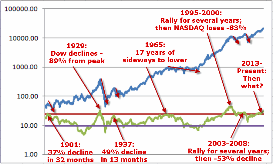
Figure 6 – A History Lesson in High Shiller PE Ratio Readings: Dow Jones Industrials Average (blue line) and Schiller PE Ratio (green line); 1901-present

Summary

I absolutely, positively DO NOT possess the ability to “predict” what is going to happen in the financial markets.  I have gotten pretty good however, at identifying when risk is unusually high or low.

Current Status: Risk High

Because I don’t offer investment advice on this blog – and because my track record of “market calls” is so bad, no one should interpret anything in this article as a call to “Sell Everything”, especially since I  haven’t even done that myself  – us “trend-followers” usually take awhile to give up the ghost.  In reality, I hope that stocks continue to rally and that this article ends up making me looking stupid, er, I mean “overly cautious”.

But the real point is simply that having plans, mechanisms, etc. to reduce risk in your portfolio makes sense.

Jay Kaeppel

Disclaimer:  The data presented herein were obtained from various third-party sources.  While I believe the data to be reliable, no representation is made as to, and no responsibility, warranty or liability is accepted for the accuracy or completeness of such information.  The information, opinions and ideas expressed herein are for informational and educational purposes only and do not constitute and should not be construed as investment advice, an advertisement or offering of investment advisory services, or an offer to sell or a solicitation to buy any security.

Stock Market Breaks Out in July – Not Everyone is Surprised

In this article – dated March 15, 2017 – I pointed out that in post-election years since 1901, the market has made most of its money in only two of the twelve calendar months.  One of those months is July.

Figure 1 is taken from the original article and displays:

a) The cumulative percentage price gain for the Dow Jones Industrials Average only during July and December of post-election years

versus

b) The cumulative percentage gain for the Dow Jones Industrials Average during all other 10 months of post-election years.1Figure 1 – Growth of $1,000 invested in Dow ONLY during July and December of post-election years (blue line) versus the “Other” 10 months of the year (red line); 1901-2016

(See also Live by the FAANG, Die by the FAANG)

So while the percentage gains for the month for most of the major stock market indexes aren’t huge, the fact that most of them managed to  breakout to new highs did not come as a surprise to “some of us.”

But Before Popping any Corks….

Please also review the ugly details in this article which discusses the stock market performance only during:

August, September and October of Post-Election Years that also end in “7” (1917, 1937, 1957, 1977, and 1997)

The results are neatly summarized in Figures 2 and 3 below.2

Figure 2 – August/September/October Dow Jones Industrials monthly price changes during Post-Election Years ending in “7”

3

Figure 3 – Growth of $1,000 invested in the Dow Jones Industrials Average ONLY during August, September and October of “Post-Election Years ending in “7”

(See also Four Things to Watch for Warning Signs)

Summary

So like I said, given the history of post-election years we should not be surprised that stocks followed through to new highs during July.

At the same time we should also not be too surprised if something “ugly” happens in the stock market in the months ahead.

Not a “prediction” per se, but more a reminder to “locate the exit nearest you.”

Jay Kaeppel

Disclaimer:  The data presented herein were obtained from various third-party sources.  While I believe the data to be reliable, no representation is made as to, and no responsibility, warranty or liability is accepted for the accuracy or completeness of such information.  The information, opinions and ideas expressed herein are for informational and educational purposes only and do not constitute and should not be construed as investment advice, an advertisement or offering of investment advisory services, or an offer to sell or a solicitation to buy any security.

AAPL Update – Decisions, Decisions

In this article I wrote about the potential for AAPL to “bounce” higher following a short, sharp decline in June.  That article included a hypothetical option trade that might allow a trader to take advantage if AAPL did in fact bounce.

Well, it bounced.

Now comes the hard part.

The Original Position

The original example trade involved:

*Buying 4 Sep 160 calls @ 1.28

*Selling 4 Aug 160 calls @ 0.69

The total cost and total risk was roughly $260.   The original risk curves appear in Figure 1.1Figure 1 – The Original AAPL position 6/27 (Courtesy www.OptionsAnalysis.com)

The “idea” was that if AAPL merely managed to bounce back up to its old high a decent percentage gain was possible.

The Update

As of roughly 9:40 CST on 7/25 AAPL had bounced back up from $143.74 to $153.59 and the option trade has an open profit of $256 – or roughly 100% on the initial cost and risk of entering the trade.2Figure 2 – The Updated AAPL Position as of 7/25 (Courtesy www.OptionsAnalysis.com)

The Decision

From here a trader could:

a) Let it ride and hope that AAPL gets closer to the peak profit price of $160 a share – which could generate a great deal of additional profit.

b) Exit the trade and take a 100% profit – i.e., ring the cash register before the profit vanishes.

c) Adjust the trade in some way to lock in some sort of profit while still letting the position ride.

Summary

As I have limited time at the moment I will not attempt to answer the question nor make any suggestions beyond the following:

*Note the potential to use options to enter into inexpensive speculative trades with limited risk

*Note that there is no right or wrong answers among a, b and c above.

*If you want to be a trader you’d better get used to making decisions like this on a regular basis.

Jay Kaeppel

Disclaimer:  The data presented herein were obtained from various third-party sources.  While I believe the data to be reliable, no representation is made as to, and no responsibility, warranty or liability is accepted for the accuracy or completeness of such information.  The information, opinions and ideas expressed herein are for informational and educational purposes only and do not constitute and should not be construed as investment advice, an advertisement or offering of investment advisory services, or an offer to sell or a solicitation to buy any security.

Making Money by Writing Puts (Sort of)

There is a strategy that involves writing out-of-the-money put options on stocks that you would be willing to buy.  The problem (in my market addled mind) is that it is what I would call a “high maintenance strategy”.  There is a lot of ongoing monitoring and a lot of “hands on” actions involved.

But there may be a way to have someone else do the legwork which doesn’t involve you actually having to be the one to make the trades.

Selling Naked Puts

The basic strategy works like this: if a stock is trading at $31 a share a trader might sell a put option with a strike price of $30. Let’s say the investor sells the put for $1 a contract.  If the stock drops below 30 at option expiration the investor could take delivery of the stock at an effective price of $29 a share ($30 strike price minus $1 of option premium received).  If the stock stays above $30 at expiration then the investor keeps the $1 of premium received and can write another put option if he or she desires.

The problems with this strategy is, a) you really have to pay attention to what’s going on with each position, and, b) you still have to be a reasonably decent stock picker.  It’s great to buy a stock at $29 instead of $31 but if it subsequently drops to $25 then it’s not so great.

As I mentioned earlier, there may be a less “high maintenance” approach.

The CBOE Put/Write Index

The CBOE created an index call the Put/Write Index.  For details see here.  There is now an ETF that tracks this index– the ticker symbol is PUTW.  What follows is a simple strategy using this index.

Jay’s Put/Write System

*Buy and hold the CBOE Put/Write Index November through July

*Buy and hold GNMA bonds August through October

The Test

For testing purposes we use:

*CBOE Put/Write Index month total return data from July 1986 through February 2016

*Ticker PUTW monthly total return data from March 2016 (when PUTW started trading) through June 2017

*Ticker VFIIX (Vanguard GNMA fund) total return data as a proxy for GNMA bonds

So the “system” (such as it is) holds PUTW November through July and VFIIX August through October.

Results

The equity curve for this test appears in Figure 1 along with the equity curve for the S&P 500 index on a buy-and-hold basis over the same time

1Figure 1 – Jay’s Put/Write Systems versus SPX (July1986-June 2017)

Some relevant performance comparisons appear in Figure 2

Measure Put/Write System S&P 500
Ave. 12 mo % +(-) 12.0 11.3%
Median 12 mo % +(-) 12.2 13.1%
Std. Deviation % 7.6 16.6%
Ave % +(-)/Std. Dev. 1.59 0.68
Worst 12 months % (-11.6%) (-43.3%)
Max Drawdown % (-16.1%) (-50.9%)
$1,000 becomes $30,614 $19,572

Figure 2 – System Results versus SPX

Summary

So is this a turnkey, ready-to-go, you can’t lose approach to investing?  As always, there is no such thing.  Still the long term results – particularly vis a vis the S&P 500 Index might make it an interesting place to start looking.

Jay Kaeppel

Disclaimer:  The data presented herein were obtained from various third-party sources.  While I believe the data to be reliable, no representation is made as to, and no responsibility, warranty or liability is accepted for the accuracy or completeness of such information.  The information, opinions and ideas expressed herein are for informational and educational purposes only and do not constitute and should not be construed as investment advice, an advertisement or offering of investment advisory services, or an offer to sell or a solicitation to buy any security.

Energy Good News and Bad News

I read a piece this morning where some analyst was calling for a rally in energy stocks.  It’s a guts call. And he may be right.  But for some reason, whether it is producing/consuming it or simply investing in it, it seems like nothing is ever easy when it comes to energy.

Energy versus Jay’s Anti U.S. Dollar Index

I follow an index I made up using ETFs that are inversely correlated to the US dollar.  Turns out it is not the worst energy stock barometer in the world.

The index is referred to as ANTIUS3 and is comprised of the following tickers:

FXE – Euro Currency Trust

FXF – Currency Shares Swiss Franc

IBND – SPDR Bloomberg Barclays International Corporate Bonds

IGOV – iShares International Treasury Bonds

UDN – PowerShares U.S. Dollar Index Bearish

Figure 1 displays my ANTIUS3 index in the bottom clip with a 5-week and 30-week moving average added and Fidelity Select Energy (FSENX) in the bottom clip.  Just a cursory glance reveals that ANTIUS3 typically (though far from always) serves as a leading indicator for energy stocks.  In other words, when the 5-week MA in the top clip is above the 30-week MA in the top clip FSENX (in the bottom clip) tends to rise and vice versa.1Figure 1 – Jay’s Anti U.S. Dollar Index versus ticker FSENX (Courtesy AIQ TradingExpert)

Figure 2 displays the growth of $1,000 invested in FSENX only when:

a) The ANTIUS3 5-week MA > 30wk MA

b) The ANTIUS3 5-week MA < 30wk MA

2Figure 2 – Growth of $1,000 invested in FSENX when system is “bullish” (blue) versus “bearish” (red); 3/1/2007-7/14/2017

As you can see in Figure 2 the ANITUS3 5wk/30wk “system” does not exactly qualify as “precision market timing.”  Still, consider the overall results:

*When the ANTIUS3 5wkMA > 30wkMA FSENX gained +187% (i.e. system is “bullish”)

*When the ANTIUS3 5wkMA < 30wkMA FSENX lost -66% (i.e. system is “bearish”)

That’s not terribly shabby for an admittedly very crude approach.

The most recent “signal” was a “Buy” on 4/28/17 but FSENX slid another 10% into June before “sorta, kinda” bouncing since then (See right hand side of Figure 2).

So where to from here?  Per usual, I have to go with my stock answer of “it beats me.” (Sorry folks, but predictions are not my strong suit).  Some thoughts:

*Energy stocks may well bounce higher in the near term, however, you have to be comfortable with (and preferably experienced at) being a countertrend trader in order to take a bullish position at this moment.

*From a seasonal standpoint this is typically not the ideal time to pile into energies.

During the month of August ticker FENX has generated a cumulative gain of +47% since it started trading in 1981.  However, as shown in Figure 3 – during September, October and November FSENX has lost a cumulative -42%.  At the same time, Figure 3 shows that FSENX “can” rally sharply during these months.  But the long-term odds are not favorable.3aFigure 3 – Growth of $1,000 invested in ticker FSENX ONLY during September, October and November; 6/1/1981-present

In sum:

*If you think that energy stocks are oversold and due for a bounce, you may be right and a trade on the long side might pay off (I suggest options on ticker XLE).

*If you are not so gung ho you might consider waiting to see what things look like closer to the end of November.

 Jay Kaeppel

Disclaimer:  The data presented herein were obtained from various third-party sources.  While I believe the data to be reliable, no representation is made as to, and no responsibility, warranty or liability is accepted for the accuracy or completeness of such information.  The information, opinions and ideas expressed herein are for informational and educational purposes only and do not constitute and should not be construed as investment advice, an advertisement or offering of investment advisory services, or an offer to sell or a solicitation to buy any security.

Another Viewpoint on Year ‘7’

I have written on several occassions about the harrowing goings on in previous “Years ending in 7” (here and here).

Overall at the moment I am:

1) Still content to ride the bullish wave

2) Keeping a close eye on the exits

Today I read another interesting take on “Year 7” by Dana Lyons as reported on The McVerry Report.  If you would like to remain “well grounded” with all of the hoopla beginning to build regarding “new all-time highs” I strongly suggest you give it a read.

For the record I am not the type who is personally included to fight new all-time highs and in no way am I “calling for a top.”  As high as the market wants to run – A OK by me.  But I also try to keep in mind two old adages that I adapted (and adopted) as follows:

Jay’s Trading Maxim #135: You are far more likely to trip and fall if you moving forward while staring at the sky.  So always be aware of the terrain around you.

Jay’s Trading Maxim #136: If you trip and fall walking down the street that is one thing.  But if you trip and fall at the top of a mountain that is something different.  And if you don’t even realize you are at the top of a mountain when you trip and fell then, well, the only words that apply are ”Look Out Below.”

The bottom line:

*Don’t fight the trend.

*But never allow yourself to believe that the trend can’t end.

Jay Kaeppel

 Disclaimer:  The data presented herein were obtained from various third-party sources.  While I believe the data to be reliable, no representation is made as to, and no responsibility, warranty or liability is accepted for the accuracy or completeness of such information.  The information, opinions and ideas expressed herein are for informational and educational purposes only and do not constitute and should not be construed as investment advice, an advertisement or offering of investment advisory services, or an offer to sell or a solicitation to buy any security.

Beans Beware Below

There are no “sure things” in the financial markets.  There are however, certain “high probability” things. Like for instance, a summer sell off in soybeans (and corn for that matter, but let’s keep it simple and look at beans).

The “typical” pattern for soybeans is that during the winter and early spring months – when there are no actual soybeans planted in the ground in the Midwest and therefore uncertainty is high regarding the current year’s crop – bean prices rise. Then after the expected state of the current year’s crop becomes known in late spring and into summer, bean price fall.

That didn’t happen this year.  Like I said, there are no “sure things”.

(See also A Focus on the Trends in Stocks, Bonds and Gold)

As you can see in Figure 1 November soybean futures went sideways from December into March and then declined steadily into June, before staging a massive rally in the past two weeks to end up where we would typically expect them to be by early July – i.e., at or near a high or the year.1Figure 1 – November Soybeans (Courtesy ProfitSource by HUBB)

Where to from here?  Historically the early July into early August period has been extremely rough for soybeans.

Specifically the seasonally unfavorable period extends from:

*The close on July Trading Day #9 (7/14/2017 this year)

*To the close on August Trading Day #6 (8/8/2017)

The History

Figure 2 displays the cumulative dollar gain/loss achieved by holding long one soybean futures contract from the close on July TDM #9 through August TDM#6 every year since 1978.  As you can see it is not a pretty picture.

2Figure 2 – Cumulative $ +/- holding long 1 soybean futures contract during unfavorable summer seasonal period (1978-2016)

Figure 3 shows the year-by-year gain/loss.3Figure 3 – Yearly $ +/- holding long 1 soybean futures contract during unfavorable summer seasonal period (1978-2016)

For the record:

*6 times (15% of the time) this period has showed a gain for beans

*33 times (85% of the time) this period has showed a loss for beans

As always, note that 15% is NOT 0% which means there is absolutely a chance that beans will advance in the month ahead after the close on 7/14.

But history seems to suggest that that is not the way to bet.

Jay Kaeppel

Disclaimer:  The data presented herein were obtained from various third-party sources.  While I believe the data to be reliable, no representation is made as to, and no responsibility, warranty or liability is accepted for the accuracy or completeness of such information.  The information, opinions and ideas expressed herein are for informational and educational purposes only and do not constitute and should not be construed as investment advice, an advertisement or offering of investment advisory services, or an offer to sell or a solicitation to buy any security.

A Seasonal Look at the U.S. Dollar

Seasonal trends can be found in many markets and stocks – the U.S. Dollar is no exception.  For our purposes today we will keep it very simple and look at which months have typically been “good, bad or indifferent” for USD.

The Test

For testing purposes we will use ticker DXY from ProfitSource by HUBB as shown in Figure 11

Figure 1 – Ticker DXY (U.S. Dollar 1977-2017) Courtesy ProfitSource by HUBB

In Figure 2 we find the following:

*3 Best Months = January, May and November

*3 Worst Months = April, September and December

*“Other” Months = February, March, June, July, August and October

2Figure 2 – Cumulative DXY % Gain Month-by-Month (1977-present)

Figure 3 displays the growth of $1,000 invested in ticker DXY during each of the three periods listed above.3
Figure 3 – Growth of $1,000 invested in DXY Good Months (blue), Bad Months (red) and Other Months (green); 1977-present

From Theory to Practice

Traders looking to actually use this information should:

*Determine whether or not they believe there is enough here to really go on.

*Focus on US dollar and inverse US dollar funds and/or ETFs including RYSDX, RYWDX, RDPIX, FDPIX and UUP and UDN.

RYSDX and RYWDX are open-end mutual funds that trade the dollar long (or short) using leverage of 2-to-1.  RDPIX and FDPIX do the same without using leverage and UUP and UDN are ETFs that trade the dollar long and short with no leverage.

Figure 4 displays the growth of $1,000 using monthly total return data for tickers RYSDX and RYWDX since they starts trading in May 2005, using the following method:

*Long RYSDX (i.e., long the U.S. Dollar) during Jan, May and Nov

*Long RYWDX (i.e., short the U.S. Dollar) during Apr, Sep and Dec

*In Cash (earning 1% annually) during all other months

4Figure 4 – Growth of $1,000 trading “Good” and “Bad” Months using tickers RYSDX and RYWDX (blue) versus buying-and-holding RYSDX (red); 2005-present

The bottom line:

*$1,000 invested as described grew to $2,656 (+166%)

*$1,000 invested in RYSDX using buy-and-hold declined to $883 (-12%)

*The average annual % gain using our trading model was +10.4%

*The average annual % loss holding RYSDX was (-0.1%)

*The trading method showed a 12-month gain 84% of the time

*Buying and holding RYSDX showed a 12-month gain 43% of the time

Summary

Is this actually a tradable model?  That’s not for me to say.  I am just putting the idea out there.  Still, given the consistent outperformance versus simply buying and holding the U.S. Dollar, it might at least be a good place to start looking.

Jay Kaeppel

Disclaimer:  The data presented herein were obtained from various third-party sources.  While I believe the data to be reliable, no representation is made as to, and no responsibility, warranty or liability is accepted for the accuracy or completeness of such information.  The information, opinions and ideas expressed herein are for informational and educational purposes only and do not constitute and should not be construed as investment advice, an advertisement or offering of investment advisory services, or an offer to sell or a solicitation to buy any security.

A Focus on the Trends in Stocks, Bonds and Gold

In the end it is not so much about “predicting” what will happen next in the financial markets, but rather recognizing – and being prepared for – the potential risks, that makes the most difference in the long run.  So let’s start by looking at current trends.

Stocks

Let’s start with a most simple trend-following model that works like this:

-A sell signal occurs when the S&P 500 Index (SPX) registers two consecutive monthly closes below its 21-month moving average

-After a sell signal, a buy signal occurs when SPX register a single monthly close above its 10-month moving average.

Figure 1 displays recent activity.1Figure 1 – SPX Trend-Following signals (Courtesy AIQ TradingExpert)

The good news is that this model does a good job of being out of stocks during long bear markets (1973-74, 2000-2002, 2008-2009).  The bad news is that – like any trend-following model – it gets “whipsawed” from time to time.  In fact the two most recent signals resulted in missing out on the October 2015 and March 2016 rallies.

But note the use of the phrase “simple trend-following model” and the lack of phrases such as “precision market timing” and “you can’t lose trading the stock market”, etc.

For now the trend is up.  A few things to keep an eye on appear in Figures 2 and 3.  Figure 2 displays four major averages.  Keep an eye to see if these averages break out to the upside (see here) or if they move sideways to lower.2Figure 2 – Four Major Market Averages (Courtesy AIQ TradingExpert)

In addition, I suggest following the 4 tickers in Figure 3 for potential “early warnings” – i.e., if the major averages hit new highs that are not confirmed by the majority of the tickers in Figure 3.3Figure 3 – Four potential “Early Warning” tickers  (Courtesy AIQ TradingExpert)

Bonds

My main “simple bond trend-following model” remains bearish.  As you can see in Figure 4, a buy signal for bonds occurs when the 5-week moving average for ticker EWJ (Japanese stocks) drops below its 30-week moving average and vice versa.4Figure 4 – Ticker EWJ 5-week and 30-week moving average versus ticker TLT (Courtesy AIQ TradingExpert)

A 2nd model using metals to trade bonds has been bullish of late but is close to dropping back into bearish territory.  Figure 5 displays the P/L from holding a long position of 1 t-bond futures contract ONLY when both the EWJ AND Metals models are bearish (red line) versus when EITHER model is bullish (blue line)5Figure 5 – T-bond futures $ gain/loss when EWJ OR Metals Models are Bullish (blue line) versus when EWJ AND Metals Models are both Bearish (red line); August 1990-present

Gold

My most basic gold trend-following model is still bearish.  This model uses my “Anti-Gold Index” (comprised of tickers GLL, SPX, UUP and YCS).  It is bullish for gold when a Front-Weighted Moving Average (detailed here) is below the 55-week exponential moving average and vice versa.6Figure 6 – Jay’s “Anti-Gold Index” versus ticker GLD (Courtesy AIQ TradingExpert)

Summary

So at the moment the stock model is bullish and the bond and gold models are bearish.  Are these trends certain to persist ad infinitum into the future?  Definitely not.  Will the models detailed here provide timely signals regarding when to get in or out the next time around?  Sorry, but it doesn’t always work that way with trend-following.

But as for me I prefer “riding the trend” to “predicting the future.”

Some painful lessons just stick with you I guess.

Jay Kaeppel

Disclaimer:  The data presented herein were obtained from various third-party sources.  While I believe the data to be reliable, no representation is made as to, and no responsibility, warranty or liability is accepted for the accuracy or completeness of such information.  The information, opinions and ideas expressed herein are for informational and educational purposes only and do not constitute and should not be construed as investment advice, an advertisement or offering of investment advisory services, or an offer to sell or a solicitation to buy any security.