Monthly Archives: May 2020

U.S. versus International Using Momentum – Part II

Part I highlighted a simple way to decide whether to favor U.S. stocks or international stocks based on a simple momentum measure.  In Part II we will add another factor – seasonality – and see what impact that has on results.

(NOTE: Please keep your eyes peeled for the July 2020 issue of Technical Analysis of Stocks & Commodities – due out around June 11 – which will feature an interview with yours truly).

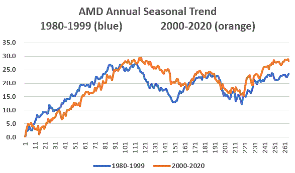
Seasonality – The Power Zone

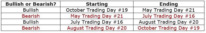
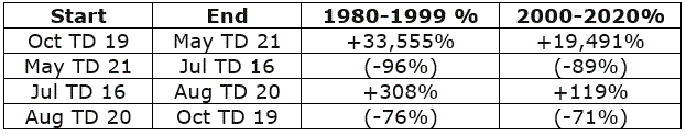
As I wrote about in this article (and as based on the original work of Yale Hirsch, founder of The Stock Trader’s Almanac nearly 50 years ago) the stock market has showed a long history of performing better between November and April (we will refer to it as the “Power Zone”) than between May through October (the “Dead Zone”). 

The Updated U.S./International Strategy

Data Used

*S&P 500 Index monthly total return

*MSCI EAFE Index monthly total return

*Bloomberg Barclay’s Intermediate Treasury Index

*January 1975 through April 2020

If the month is between November and April:

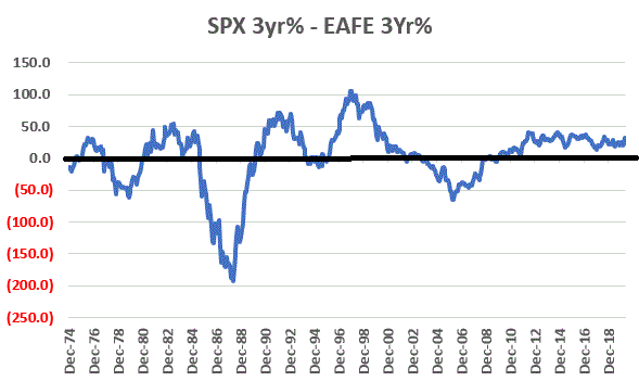
*If the latest 36-month period return for SPX is greater than the 36-month period return for EAFE then hold SPX next month

*If the latest 36-month period return for EAFE is greater than the 36-month period return for SPX then hold EAFE next month

NOTE: I am using monthly total return data, which is not compiled until early in the next month.  So, for strategy performance results I use a 1-month lag as follows – the calculation for the end of January actually takes place sometime in early February, so if a switch from one index to the other is indicated based on data through January then that trade is made at the close of the last trading day of February.

If the month is between May and October:

*Hold the Bloomberg Barclay’s Intermediate Treasury Index

Results

As a benchmark we will using a “Split” strategy that allocated 50% to SPX and 50% to EAFE at the first of every year. 

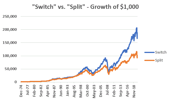
Figure 1 displays the comparative growth of $1,000 using the:

*“Seasonality/Switch” strategy detailed above (blue line)

*”Switch” strategy detailed in Part I (orange line)

*“Split” approach (buying and holding SPX and EAFE with an annual rebalance-grey line)

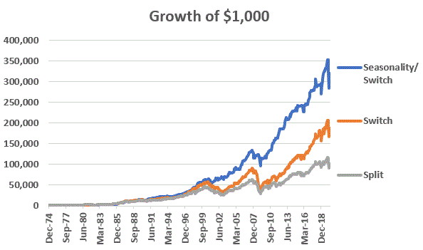
Figure 1 – Growth of $1,000 using “Seasonality+Switch” strategy versus “Switch” strategy and “Split” strategy (1975-2020)

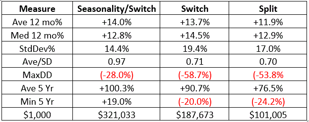
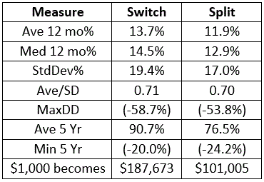
Figure 2 – Comparative Facts and Figures (1975-2020)

Analysis

The Seasonality/Switch strategy:

*Gained +32,003% versus +18,667% for the Switch Strategy and +10,001% for Split

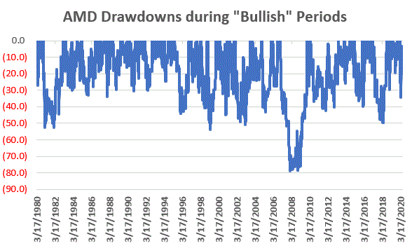
*Witnessed a maximum drawdown of -28.0% versus more than -50% for the other two strategies

*Showed a minimum 5-year cumulative % return of +19.0% versus more than 02-% for the other two strategies

Summary

Is the Seasonality/Switch Strategy the “Be all, end all” of investment strategies? Certainly not.  But in terms of simplicity and performance – in the immortal words of my friend from New Jersey:

“I seen woise.”

See also Jay’s “A Strategy You Probably Haven’t Considered” Video

See also Video – The Long-Term…Now More Important Than Ever

Jay Kaeppel

Disclaimer: The information, opinions and ideas expressed herein are for informational and educational purposes only and are based on research conducted and presented solely by the author.  The information presented represents the views of the author only and does not constitute a complete description of any investment service.  In addition, nothing presented herein should be construed as investment advice, as an advertisement or offering of investment advisory services, or as an offer to sell or a solicitation to buy any security.  The data presented herein were obtained from various third-party sources.  While the data is believed to be reliable, no representation is made as to, and no responsibility, warranty or liability is accepted for the accuracy or completeness of such information.  International investments are subject to additional risks such as currency fluctuations, political instability and the potential for illiquid markets.  Past performance is no guarantee of future results.  There is risk of loss in all trading.  Back tested performance does not represent actual performance and should not be interpreted as an indication of such performance.  Also, back tested performance results have certain inherent limitations and differs from actual performance because it is achieved with the benefit of hindsight.

U.S. versus International Using Momentum – Part I

Thanks for the genesis of the idea contained in this piece goes to alert reader “James”, who included a comment (“International and emerging has tended to outperform U.S.  S&P 500, and vice versa, when 3 year annual rolling returns were “greater” than.”) at the end of this article.

The idea is that momentum can be useful in deciding whether to invest in the domestic U.S. or internationally (for the record, it does NOT necessarily need to be an either/or proposition, but we will make it so for the purposes of this piece).

(NOTE: Please keep your eyes peeled for the July 2020 issue of Technical Analysis of Stocks & Commodities – due out around June 11 – which will feature an interview with yours truly).

Data Used

*S&P 500 Index monthly total return

*MSCI EAFE Index monthly total return

*January 1975 through April 2020

Part 1: Measuring Momentum

For our momentum measure we will use the 36-month % gain or loss for the S&P 500 Index (SPX) and the MSCI EAFE Index (EAFE).  In a nutshell:

*If the latest 36-month period has showed a bigger gain for SPX then hold SPX next month

*If the latest 36-month period has showed a bigger gain for EAFE then hold EAFE next month

Figure 1 displays the SPX 36-month change and EAFE 36-month change. Readings above 0 favor U.S. stocks, readings below 0 favor international stocks.

Figure 1 – U.S. Stocks (SPX) 36-month return minus International Stocks (EAFE) 36-month return; 1974-2020

NOTE: I am using monthly total return data, which is not compiled until early in the next month.  So, for strategy performance results I use a 1-month lag as follows – the calculation for the end of January actually takes place sometime in early February, so if a switch from one index to the other is indicated based on data through January then that trade is made at the close of the last trading day of February.

Initial results

As a benchmark we will using a “split” strategy that allocated 50% to SPX and 50% to EAFE at the first of every year.  We will refer to this as “Split”.

Figure 2 displays the comparative growth of $1,000.  Figure 3 displays comparative facts and figures.

Figure 2 – Growth of $1,000 using “Switch” strategy versus “Split” strategy (1975-2020)

Figure 3 – Comparative Facts and Figures: Switch versus split (1975-2020)

Good News and Bad News

The good news is that the Switch strategy significantly outperformed the Split strategy over time (+18,667% versus +10,001%)

The bad news is that the Switch strategy is extremely volatile (a 12-month standard deviation of 19.4% versus 17.0% for the Split strategy) and suffered a substantial drawdown of -58.7% (during the 2007-2009 bear market), which was even larger than the -53.8% drawdown suffered by the Split strategy.

Summary

For the not too faint of heart there does appear to be a potentially significant long-term benefit to switching between U.S. and international stocks based on a 3-year rate-of-change momentum.  Still, the volatility and drawdowns may give some investors pause (justifiably so).

Is there a way to improve upon the initial results?  Would I ask the question if the answer was “No?”

Stay tuned for Part II.

See also Jay’s “A Strategy You Probably Haven’t Considered” Video

See also Video – The Long-Term…Now More Important Than Ever

Jay Kaeppel

Disclaimer: The information, opinions and ideas expressed herein are for informational and educational purposes only and are based on research conducted and presented solely by the author.  The information presented represents the views of the author only and does not constitute a complete description of any investment service.  In addition, nothing presented herein should be construed as investment advice, as an advertisement or offering of investment advisory services, or as an offer to sell or a solicitation to buy any security.  The data presented herein were obtained from various third-party sources.  While the data is believed to be reliable, no representation is made as to, and no responsibility, warranty or liability is accepted for the accuracy or completeness of such information.  International investments are subject to additional risks such as currency fluctuations, political instability and the potential for illiquid markets.  Past performance is no guarantee of future results.  There is risk of loss in all trading.  Back tested performance does not represent actual performance and should not be interpreted as an indication of such performance.  Also, back tested performance results have certain inherent limitations and differs from actual performance because it is achieved with the benefit of hindsight.

The Ridiculous Seasonality of AMD

Don’t you hate it when some analyst analyzes historical data and then purports to find some “order” in the historical chaos?  Hi, my name is Jay.  And…it’s just kind of what I do.  Sorry, it’s just my nature.  Take for instance the ridiculous case of AMD.

Advanced Micro Devices – Ticker AMD

According to “Adjusted Close” price data from www.finance.yahoo.com ticker AMD advanced from $3.15 a share in March of 1980 to $56.39 by May 20, 2020.  Given that the stock has risen +1,693% on a buy-and-hold basis, it is not exactly a revelation that – particularly with the huge benefit of perfect hindsight – there was some money to be made by holding the stock.

But that is only part of the story.  For as it turns out, AMD is one of the most consistently “cyclical” stocks you may ever find.  Figure 1 displays the average annual price trend for AMD from 3/17/1980 through 12/31/1999.  In other words, period 1 along the bottom of the chart is January Trading Day #1, and so on, through the last trading day of December.

Figure 1 – Annual Seasonal Price Trend for AMD (1980-1999)

As you can see, the stock tended to rally sharply through the end of May, from mid-July through about late August, and from late October through the end of the year (or more accurately, through the end of the next May).

Declines typically occurred between about June 1st and late July and again during September into late October.

Ah, sweet hindsight.

But what are the odds that any of this was meaningful after 1999?  I’m glad you asked.  Because that’s where the ridiculous part comes in. 

2000-2020

Figure 2 plots the same 1980-1999 annual seasonal price trend for AMD along with the annual seasonal trend for AMD from 2000-2019.  Notice any similarities? 

Figure 2 – Annual Seasonal Price Trend for AMD; 1980-1999 and 2000-2020

So, let’s make the ridiculous (there’s that word again) assumption that some (lucky) investor had started trading in and out of AMD on an annual basis the following seasonal calendar

Figure 3 – Annual Seasonal Bullish and Bearish Periods

Some how did the “walk forward” period of 2000 into late May-2020 compare to the “hindsight” period of 1980-1999?  Well there is good news and bad news.

The bad news is that results for each period was not quite as good during 2000-2020 as they were during 1980-1999.  The good news is that the 2000-2020 results were still pretty darn compelling.

Figure 4 – AMD performance during Bullish and Bearish Periods

The bottom line: The “bullish” periods have to continued to be quite bullish and the “bearish” periods continue to be quite bearish.

For the record, between March 1980 and May 2020:

*$1,000 in AMD on a buy-and-hold basis grew to $17,925

*$1,000 in AMD ONLY during the two “bullish” period discussed grew to $587,558,351

Let’s face it, these are – here I go again – ridiculous numbers.  And it should be pointed out that an investor holding AMD only during the “Bullish” periods would have suffered 4 separate drawdowns in excess of -50%, including a -79%(!) drawdown in 2008-2009.  See Figure 5.  So, don’t anybody get “stars in their eyes.”

Figure 5 – Drawdowns during Bullish Periods

At the same time, it is still better than the drawdown racked up during the “bearish” periods, which checks in at a cool -99.9867%.  See Figure 6.

Figure 6 – Drawdowns during Bearish Periods

Where We Are

AMD has been in a “bullish” period since the 19th trading day of October 2019, and this period will last until the close on 5/29/2020.  Through 5/20/2020 AMD is up +73% during the current bullish period (i.e., pandemic, schmandemic).  See Figure 7.

Figure 7 – AMD during recent “Bullish” period (Courtesy AIQ TradingExpert)

The next “bearish” period will last from the close on 5/29/2020 through the close on 7/23/2020.

Summary

So, in hindsight, the annual seasonal pattern for AMD tracked very closely with the annual seasonal pattern for the previous 20 years.  But what about the next 20 years?  Ah, there’s the rub. Despite the fact that the annual seasonal trend for the past 20 years very closely mirrored the annual seasonal trend for the prior 20 years, it is not possible to state with any certainty what the next 20 years hold. 

Still, if I decide to trade AMD I will probably consult my calendar first.

See also Jay’s “A Strategy You Probably Haven’t Considered” Video

Jay Kaeppel

Disclaimer: The information, opinions and ideas expressed herein are for informational and educational purposes only and are based on research conducted and presented solely by the author.  The information presented represents the views of the author only and does not constitute a complete description of any investment service.  In addition, nothing presented herein should be construed as investment advice, as an advertisement or offering of investment advisory services, or as an offer to sell or a solicitation to buy any security.  The data presented herein were obtained from various third-party sources.  While the data is believed to be reliable, no representation is made as to, and no responsibility, warranty or liability is accepted for the accuracy or completeness of such information.  International investments are subject to additional risks such as currency fluctuations, political instability and the potential for illiquid markets.  Past performance is no guarantee of future results.  There is risk of loss in all trading.  Back tested performance does not represent actual performance and should not be interpreted as an indication of such performance.  Also, back tested performance results have certain inherent limitations and differs from actual performance because it is achieved with the benefit of hindsight.

Watch These Ratios for Important Clues to the Future

The most well-worn phrase in all of investing is “The Trend is Your Friend”.  And yes, trends are great.  Well, at least for as long as they last.  Unfortunately, when a given trend ends things can get pretty dicey for a while.  Unbeknownst to a lot of investors there are a variety of very strong trends in place right now.  That’s the good news.  The bad news is that many strong trends appear to be reaching the “overdone” phase.  The tricky part here is understanding that this proclamation is NOT a “call to action.”  It is more of a “call to pay close attention.”  Some investors have the patience for that, but likely the majority do not.  Here’s hoping that you are not one of former.

Measuring a Trend

For a variety of assets, here are the steps we will use to follow the “trend.”

A = Cumulative growth of $1,000 for Asset A using monthly total return data

B = Cumulative growth of $1,000 for Asset B using monthly total return data

C = A / B (i.e. the ratio of $1,000 investment in both assets)

D = 15-month exponential moving average of C (more on this calc below)

E = (C – D)

By looking at E when can get a handle on when a given trend may have “gone too far”

*15-month exponential average = (last month value for D * 0.875) + (this month’s value for C * 0.125)

Trend #1. Nasdaq versus MSCI EAFE Index

For the Nasdaq we use the Nasdaq Composite from January 1976 through March 1996 and then the Nasdaq 100 Index from April 1996 through April 2000.  The MSCI EAFE Index is a broad international index of over 900 companies from a variety of developed countries excluding the US and Canada. 

The blue line in Figure 1 displays Variable C (the growth of $1,000 invested in Nasdaq stocks divided by $1,000 invested in international stocks). The orange line is the 15-month exponential average. When the blue line is rising it means Nasdaq stocks are outperforming international stocks and vice versa.

Figure 1 – Nasdaq / EAFE with 15-month exponential average

There are two things to take away from Figure 1:

*Nasdaq stocks have been outperforming EAFE stocks for quite awhile and by an ever increasing margin of late.

*The ratio has gone parabolic.  The last time this happened was 1999-2000 before the dot com bubble burst.

*The implications: On a trend-following basis Nasdaq has been and remains the place to be.  However, when this relationship changes (and rest assured it WILL change at some point), Nasdaq stocks will almost certainly NOT be the place to be.

Figure 2 displays value E from above (the difference between the two lines in Figure 1). 

Figure 2 – Nasdaq/EAFE Ratio minus 15-month EMA

Figure 2 essentially serves as a warning sign that enthusiasm for Nasdaq stocks may be reaching a crescendo.

Trend #2. Large-Cap Growth versus Small-Cap Value

Large-caps and growth stocks are quite popular at the moment.  Small-cap stocks and especially value stocks have not been for some time.  For large-cap growth we use the Russell 1000 Growth Index and for small-cap value we use the Russell 2000 Value index. Our test period for this pair is from January 1979 through April 2020.

The blue line in Figure 3 displays Variable C (the growth of $1,000 invested in large-cap growth stocks divided by $1,000 invested in small-cap value stocks).

Figure 3 – Russell 1000 Growth / Russell 2000 Value with 15-month exponential average

Figure 4 displays Value E from above (the difference between the two lines in Figure 3)

Figure 4 – Russell 1000 Growth/Russell 2000 Value Ratio minus 15-month EMA

There are two things to take away from Figures 3 and 4:

*In Figure 3 we can see that the absolute ratio has risen to higher levels in the past, so further outperformance for large-cap growth is possible;

*In Figure 4 we see the potentially “overdone” nature of the relationship.

*The implications: On a trend-following basis large-cap growth has been and remains the place to be relative to small-cap growth.  However, when this relationship changes, investors should watch closely for a resurgence of small-cap value stocks

Trend #3. Stocks versus Commodities

In the long disinflationary period that we have enjoyed, commodities have become the real “dogs” of the investment world. 

The blue line in Figure 5 displays Variable C (the growth of $1,000 invested in the S&P 500 Index divided by $1,000 invested in the Goldman Sachs Commodity Index, or GSCI) from January 1972 through April 2020.

Figure 5 – S&P 500 Index / Goldman Sachs Commodity Index with 15-month exponential average

To fully appreciate the information conveyed in Figure 5 consider this: an investment in stocks has grown over 10 ten times as much as an investment in commodities over the past 48 years (and 22 times as much since June 2008!).

Figure 6 displays displays Value E from above (the difference between the two lines in Figure 5).

Figure 6 – S&P 500 / Goldman Sach Commodity Index Ratio minus 15-month EMA

To better appreciate the disparity between the performance of stocks and commodities consider the charts in Figure 7.  The top clip is ticker SPY (and ETF that tracks the S&P 500 Index) and the bottom clip is ticker DBC (an ETF that tracks a basket of commodity futures).  When this disparity will end is anyone’s guess – and I am not “predicting” that that change is necessarily imminent.  But commodity prices are not going to “0”. 

Figure 7 – Ticker SPY versus ticker DBC (Courtesy ProfitSource by HUBB)

The implications of Figures 5 through 7: Investors have been conditioned to love stocks and hate commodities for about 4 decades.  But the reality is that “stocks are better than commodities” is NOT a permanent state of affairs, and alert investors should be watching closely for a reversal in favor of commodities.  For the record, this may not occur for some time.  HOWEVER, when it does occur commodities and NOT stocks will be the place to be.

Summary

Please understand what this piece is – and is NOT – trying to convey.  The takeaway is NOT that you should sell U.S. large-cap growth stocks and pile into internationals, small-caps, value stocks or commodities. 

At least not yet.  Because these current trends could persist for quite some time and become even more extreme.

But the point is that given the cyclical nature of markets – and the recent extreme outperformance on the former versus the latter – simply remember that no trend lasts forever.  I have no idea when the trends detailed above will change.  But I am pretty confident that at some point they WILL change.  And when they do, the investors who are prepared to “roll with the changes” will have a great opportunity to prosper. And the simple act of tracking and observing certain ratios over time can be very useful in identifying when those changes are starting to take place.

So put the relationships discussed in the back of your head.  When they ultimately change, how you react may have a profound impact on your long-term investment results.

See also Jay’s “A Strategy You Probably Haven’t Considered” Video

See also Video – The Long-Term…Now More Important Than Ever

Jay Kaeppel

Disclaimer: The information, opinions and ideas expressed herein are for informational and educational purposes only and are based on research conducted and presented solely by the author.  The information presented represents the views of the author only and does not constitute a complete description of any investment service.  In addition, nothing presented herein should be construed as investment advice, as an advertisement or offering of investment advisory services, or as an offer to sell or a solicitation to buy any security.  The data presented herein were obtained from various third-party sources.  While the data is believed to be reliable, no representation is made as to, and no responsibility, warranty or liability is accepted for the accuracy or completeness of such information.  International investments are subject to additional risks such as currency fluctuations, political instability and the potential for illiquid markets.  Past performance is no guarantee of future results.  There is risk of loss in all trading.  Back tested performance does not represent actual performance and should not be interpreted as an indication of such performance.  Also, back tested performance results have certain inherent limitations and differs from actual performance because it is achieved with the benefit of hindsight.

Calendar + Trend = A Handy Guide

In this article I pointed out the fact that market analysis does not necessarily need to be complicated.  With that theme in mind, this time out let’s highlight a simple way to combine the calendar with the trend to help assess the current level of risk in the market.

The Calendar/Trend Model

Let’s make it as simple as possible:

*If the current month is November through May add +2 to the Calendar/Trend Model

*If the S&P 500 is above it’s 200-day moving average add +1 to the Calendar/Trend Model

So, for any given day the Model can read 0, 1, 2 or 3. 

3 = Both parts are bullish

2 = Calendar is bullish but trend is not

1 = Trend is bullish but calendar is not

0 = Both parts are bearish

Does any of this matter?  Figure 1 displays the cumulative price performance for the S&P 500 Index starting November 1, 1949 depending on the Calendar/Trend Model reading for each day.

Figure 1 – S&P 500 Performance at different Calendar/Trend Model readings (1949-2020)

The differences in the right-hand column are fairly stark.  The key things to note:

*The vast majority of gains are achieved when BOTH parts of the model are bullish

*The market actually lost money during those periods when both parts of the model are bearish

It should be noted however, that when the model = 0 it is NOT like the market is sure to decline.  Figure 2 displays the growth of equity when the Calendar/Trend Model = 0.  What we see are plenty of periods where the market gained ground and also periods when the market suffered significant declines.

Figure 2 – S&P 500 cumulative price % +(-) when Calendar/Trend Model = 0

So, the proper response to a 0 reading is NOT necessarily to “sell everything” and head for the hills.  The proper response is to pay very close attention and to be prepared to act defensively at the first sign of serious trouble – because declines that occur when the model is 0 can be swift and severe.

Where We Are

*At the moment the Calendar/Trend Model stands at +2 as we are in the month of May BUT the S&P 500 Index is below its 200-day moving average

*On June 1 the calendar part of the model falls to 0 

*Meanwhile the S&P 500 Index (as I write) is back within about 45 points of getting back above its 200-day moving average.

What to Watch For

If the S&P 500 Index fails to climb back above and holds above it’s 200-day moving average in the months ahead we will be in a 0-reading situation for the Calendar/Trend Model after May 31st.  Does that mean the market will go down?  Not necessarily. 

But what it would mean is that if the S&P 500 Index remains below its 200-day moving average between June 1, 2020 and October 31, 2020 there is an elevated risk of downside activity and as a result, investors should have a heightened sense of caution.

See also Jay’s “A Strategy You Probably Haven’t Considered” Video

See also Video – The Long-Term…Now More Important Than Ever

Jay Kaeppel

Disclaimer: The information, opinions and ideas expressed herein are for informational and educational purposes only and are based on research conducted and presented solely by the author.  The information presented represents the views of the author only and does not constitute a complete description of any investment service.  In addition, nothing presented herein should be construed as investment advice, as an advertisement or offering of investment advisory services, or as an offer to sell or a solicitation to buy any security.  The data presented herein were obtained from various third-party sources.  While the data is believed to be reliable, no representation is made as to, and no responsibility, warranty or liability is accepted for the accuracy or completeness of such information.  International investments are subject to additional risks such as currency fluctuations, political instability and the potential for illiquid markets.  Past performance is no guarantee of future results.  There is risk of loss in all trading.  Back tested performance does not represent actual performance and should not be interpreted as an indication of such performance.  Also, back tested performance results have certain inherent limitations and differs from actual performance because it is achieved with the benefit of hindsight.

It Still Doesn’t Have to Be Rocket Science

The old saying that “It Doesn’t Have to be Rocket Science” when it comes to the markets got to be an old saying by being true for all these years.  Despite all of the increases in technology and computer speed, in the end it mostly comes down to “Is price rising or falling?”  Let’s consider one the simpler approaches.

The Trend

Figure 1 displays four major indexes – The Dow, the S&P 500, the Nasdaq 100 and the Russell 2000. 

Figure 1 – 4 Major Indexes and their 200-day moving averages (Courtesy AIQ TradingExpert)

There is a great deal of useful information contained in these four charts.  To wit:

*3 of the 4 are presently below their respective 200-day moving averages, i.e., in “downtrends”

*The 200-day moving average for all but the Nasdaq has now “rolled over” and is declining

Interpretation can be fairly simple:

*If these trends do not change, more trouble lies ahead

That wasn’t so difficult, was it? 

Of course, for most people that’s “not good enough.”  We want to know in advance IF these trends will or will not persist.  My candid reply is “Good luck with that.”

My other response is “be patient, and keep a close eye on these indexes and these moving averages”:

*If the indexes fail to get back above these moving average, more pain is likely to unfold (see here and here)

*If the Nasdaq fails to hold above its moving average and joins the others, chances are serious defensive action (i.e., raise cash, hedge, etc.) is in order

*If the 3 down trending indexes follow the Nasdaq higher (and also this) then the worst is likely over and a much more aggressive investment stance would be warranted.

In the immortal words of Tom Petty: “The waiting is the hardest part.”

See also Jay’s “A Strategy You Probably Haven’t Considered” Video

Jay Kaeppel

Disclaimer: The information, opinions and ideas expressed herein are for informational and educational purposes only and are based on research conducted and presented solely by the author.  The information presented represents the views of the author only and does not constitute a complete description of any investment service.  In addition, nothing presented herein should be construed as investment advice, as an advertisement or offering of investment advisory services, or as an offer to sell or a solicitation to buy any security.  The data presented herein were obtained from various third-party sources.  While the data is believed to be reliable, no representation is made as to, and no responsibility, warranty or liability is accepted for the accuracy or completeness of such information.  International investments are subject to additional risks such as currency fluctuations, political instability and the potential for illiquid markets.  Past performance is no guarantee of future results.  There is risk of loss in all trading.  Back tested performance does not represent actual performance and should not be interpreted as an indication of such performance.  Also, back tested performance results have certain inherent limitations and differs from actual performance because it is achieved with the benefit of hindsight.

Video – A Strategy You Probably Haven’t Considered

Time to invoke one of the best sayings I’ve ever heard (and subsequently stolen):

Jay’s Trading Maxim #46: Opportunity is where you find it.

The video linked below highlights one example (please note the use of the word “example” and lack of the word “recommendation”) of a strategy that you probably have not considered.  But it can be useful for long-term investors, for shorter-term traders, for investors seeking income and for option traders.

Food for thought regarding one way to either:

*Accumulate shares at below market prices

*Buy stocks at bargain basement prices

*Generate good income in a high volatility, low-yield world

Enjoy!

Jay’s “A Strategy You Probably Haven’t Considered” Video

Jay Kaeppel

Disclaimer: The information, opinions and ideas expressed herein are for informational and educational purposes only and are based on research conducted and presented solely by the author.  The information presented represents the views of the author only and does not constitute a complete description of any investment service.  In addition, nothing presented herein should be construed as investment advice, as an advertisement or offering of investment advisory services, or as an offer to sell or a solicitation to buy any security.  The data presented herein were obtained from various third-party sources.  While the data is believed to be reliable, no representation is made as to, and no responsibility, warranty or liability is accepted for the accuracy or completeness of such information.  International investments are subject to additional risks such as currency fluctuations, political instability and the potential for illiquid markets.  Past performance is no guarantee of future results.  There is risk of loss in all trading.  Back tested performance does not represent actual performance and should not be interpreted as an indication of such performance.  Also, back tested performance results have certain inherent limitations and differs from actual performance because it is achieved with the benefit of hindsight.

The Financial Sector Meets the Election Cycle

In this article I highlighted the fact that – on a historical basis – the financial sector is in “oversold” territory.  In this article I highlighted the fact that we are approaching a typically seasonally favorable period for financial stocks (i.e., the 2nd half of election years).  In this piece we will look at the full election cycle and how it impacts financial stocks.

Financials in the Election Cycle

As our proxy for the financial sector we will use ticker FSRBX (Fidelity Select Banking).  Figure 1 displays the “election cycle calendar” for financial stocks. 

Figure 1 – Favorable Election Cycle Periods

There are essentially four “favorable” periods:

Period 1: March through July Post-Election year

Period 2: November Post-Election year through April Mid-Term year

Period 3: October Mid-Term year through July Pre-Election year

Period 4: July through December Election year

Figure 2 displays the cumulative total return for FSRBX if held only during the months indicated in Figure 1 starting with fund inception in 1986.

Figure 2 – FSRBX total % return during favorable election cycle periods (1986-2020)

Through March 2020 the cumulative gain is +8,020%.

For contrast, Figure 3 displays the cumulative return for FSRBX if held during all “non-favorable” months (the blank squares in Figure 1).

Figure 3 – FSRBX total % return during non-favorable election cycle periods (1986-2020)

Through March 2020 the cumulative loss was -70%.

Figure 4 displays results across each 4-year election cycle.

Figure 4 – FSRBX across the election cycle

As you can see in Figure 4, on a period by period basis there are no “sure things”.  There is no guarantee that a “favorable period” will see a gain nor that a “non-favorable period” will see a loss. And with seasonal trends the reality is that there are no guarantees that they will continue ad infinitum into the future.  But for now, the long-term results using ticker FSRBX as a proxy for financial stocks are fairly compelling. 

With financial stocks currently flirting with a potential oversold buy alert, and with a seasonally favorable period set to begin July 1st, I for one will be keeping a close eye on the financial sector.

Jay Kaeppel

Disclaimer: The information, opinions and ideas expressed herein are for informational and educational purposes only and are based on research conducted and presented solely by the author.  The information presented represents the views of the author only and does not constitute a complete description of any investment service.  In addition, nothing presented herein should be construed as investment advice, as an advertisement or offering of investment advisory services, or as an offer to sell or a solicitation to buy any security.  The data presented herein were obtained from various third-party sources.  While the data is believed to be reliable, no representation is made as to, and no responsibility, warranty or liability is accepted for the accuracy or completeness of such information.  International investments are subject to additional risks such as currency fluctuations, political instability and the potential for illiquid markets.  Past performance is no guarantee of future results.  There is risk of loss in all trading.  Back tested performance does not represent actual performance and should not be interpreted as an indication of such performance.  Also, back tested performance results have certain inherent limitations and differs from actual performance because it is achieved with the benefit of hindsight.

The Financials – Part II: Watching and Waiting

In this article I highlighted the fact that – on a historical basis – the financial sector is in “oversold” territory.  As I also mentioned, this fact does NOT mean that a bottom and/or immediate reversal to significantly higher ground is necessarily imminent.  But it does suggest we should be paying attention.

I also highlighted an indicator that has done a reasonably good job of identifying buying opportunities for the financial sector in the past, and that a new “bullish” signal will occur once this (monthly) indicator reverses (which again, does NOT mean that financial stocks are guaranteed to rally once that occurs, only that it has displayed a tendency to do so in the past). 

Financial Stocks and the Election Year

I will be paying particularly close attention if the indicator in the linked article gives a bullish signal sometime in the next several months because we will be entering the second part of an election year, which has historically been favorable for financial stocks.

Figure 1 displays the cumulative total return for ticker FSRBX (Fidelity Banking Sector) ONLY during the months of July through December of each election year since 1988 (the fund started trading in 1986). 

Figure 1 – Cumulative % return for ticker FSRBX ONLY during Jul-Dec of Election Years (1986-2020)

Figure 2 displays the results in table format.

Figure 2 – FSRBX total return July-December of election years (1988-2020)

The median gain during this five-month period was +14.7%.  The one losing period was 2008 when the fund lost -12.0%.

Summary

So if the indicator detailed in the linked article – and displayed at the bottom of Figure 3 below peaks and closes a month lower than the previous month it could offer a bullish alert for investors in the financial sector.

Figure 3 – Ticker FSRBX (Courtesy AIQ TradingExpert)

Jay Kaeppel

Disclaimer: The information, opinions and ideas expressed herein are for informational and educational purposes only and are based on research conducted and presented solely by the author.  The information presented represents the views of the author only and does not constitute a complete description of any investment service.  In addition, nothing presented herein should be construed as investment advice, as an advertisement or offering of investment advisory services, or as an offer to sell or a solicitation to buy any security.  The data presented herein were obtained from various third-party sources.  While the data is believed to be reliable, no representation is made as to, and no responsibility, warranty or liability is accepted for the accuracy or completeness of such information.  International investments are subject to additional risks such as currency fluctuations, political instability and the potential for illiquid markets.  Past performance is no guarantee of future results.  There is risk of loss in all trading.  Back tested performance does not represent actual performance and should not be interpreted as an indication of such performance.  Also, back tested performance results have certain inherent limitations and differs from actual performance because it is achieved with the benefit of hindsight.

Financials – Danger or Opportunity? Or Both?

To say that there is has been and remains a great deal of angst in the financial markets is a bit of an understatement. This is especially true when it comes to the financial sector.  The financial sector has a fairly high correlation to treasury yields (ticker FSRBX – Fidelity Select Banking Portfolio has a 0.52 correlation to ticker TNX – which tracks 10-year treasury yields).  As yields have plummeted so has the financial sector.  During the recent decline, FSRBX plunged -51% from its December 2019 peak.  With little expectation of higher rates anytime soon a lot of investors are understandably wary of diving into this sector.

But much like with the energy sector, the old adage that the time to buy is when there is “blood in the streets”, should give one pause before they turn their back completely on the financial sector.  For the time being I am keeping my eye on a little-known indicator called “Vixfixaverageave” (yes, I agree it is a really bad name).  The calculations for this indicator appear at the end of this article.  The reason I am watching it right now is that it recently reached a very oversold level that has helped to highlight some useful buying opportunities for financials in the past.

Ticker FSRBX

Figure 1 displays a monthly chart for FSRBX in the top clip and the Vixfixaverageave indicator in the bottom clip.  Note that the indicator rose above 72 at the end of April 2020.  As you can see there have been four previous occasions when this indicator, a) exceeded 72 and then b) reversed lower for one month.  For arguments sake we will call that a buy signal.

Figure 1 – Ticker FSRBX with indicator Vixfixaverageave (Courtesy AIQ TradingExpert)

Figure 2 displays the 1 to 5 year % + (-) for FSRBX following the four previous signals.  As you can see, they all proved to be exceptional buying opportunities.

Figure 2 – FSRBX returns 1 to 5 years after signal

Now for the disappointing news: if you are thinking that all we have to do is wait for this indicator to finally top out and that big profits are “guaranteed” to roll in, you are making a mistake.  As they say, “past performance is no guarantee of future results.”  (Sorry, I don’t make the rules).  So, when the Vixfixaverageave monthly reading for FSRBX does finally roll over, the proper course of action would be to:

*Decide if you really want to act based on the signal

*Decide how much capital you are willing to commit

*Decide how much of that capital you are actually willing to risk – i.e. will you stop out if a loss exceeds x%, or do you plan to simply hold it for 1 to 5 years regardless?

Summary

There are a million and one ways to trigger an entry signal.  The one discussed herein is just one more.  What really separates the winners from the losers is the answers to the three questions just posed.

Vixfixaverageave Calculations

This indicator is based on another indicator called VixFix which was developed many years ago by Larry Williams.

hivalclose is hival([close],22).  <<<<<The high closing price in that last 22 periods

vixfix is (((hivalclose-[low])/hivalclose)*100)+50. <<<(highest closing price in last 22 periods minus current period low) divided by highest closing price in last 22 periods (then multiplied by 100 and 50 added to arrive at vixfix value)

vixfixaverage is Expavg(vixfix,3). <<< 3-period exponential average of vixfix

vixfixaverageave is Expavg(vixfixaverage,7). <<<7-period exponential average of vixfixaverage

Jay Kaeppel

Disclaimer: The information, opinions and ideas expressed herein are for informational and educational purposes only and are based on research conducted and presented solely by the author.  The information presented represents the views of the author only and does not constitute a complete description of any investment service.  In addition, nothing presented herein should be construed as investment advice, as an advertisement or offering of investment advisory services, or as an offer to sell or a solicitation to buy any security.  The data presented herein were obtained from various third-party sources.  While the data is believed to be reliable, no representation is made as to, and no responsibility, warranty or liability is accepted for the accuracy or completeness of such information.  International investments are subject to additional risks such as currency fluctuations, political instability and the potential for illiquid markets.  Past performance is no guarantee of future results.  There is risk of loss in all trading.  Back tested performance does not represent actual performance and should not be interpreted as an indication of such performance.  Also, back tested performance results have certain inherent limitations and differs from actual performance because it is achieved with the benefit of hindsight.