The trend is your friend. At least until it is not a trend anymore. Then it becomes more like an ex who keeps trying to “lure you back in” with memories of “the good times”, even though the relationship has unquestionably run its course. In both cases the end is pretty similar.
Investors have been blessed with a variety of strong and persistent trends in recent years. By getting onboard and staying onboard many investors have been able to accumulate a great deal of wealth.
But nothing – particularly a trend in the financial markets – lasts forever. I (nor anyone else) cannot predict when any particular trend or relationship in the markets will end. But the one thing we can do is recognize when a trend or relationship is “getting a little long in the tooth” and prepare ourselves mentally for the day when we need to walk (or run, as the case may be) away.
5 Relationships to Watch
I am on the record as believing that the next 5-10 years in the markets will look much different than the last 10 years. For example, I expect:
*Foreign stocks to outperform U.S. stocks
*Value to outperform growth
*Commodities to outperform stocks
*Technology to suffer a severe bear market
*Energy stocks to some day rise from the dead
Interestingly, I have very little money committed to most of these ideas at the moment. Lacking “courage of conviction?” OK, I don’t claim to be immune. But in this case, it is more a function of the belief that “it’s not so much what you buy but when you buy it that matters.”
And long ago I gave up trying to pick tops and bottoms. So, for the moment I am watching and waiting for “signs.” Let me show you some charts you can use to make your own determination.
Each of the charts below are “relative strength” charts, NOT price charts. In other words, the chart displays how one asset is performing relative to another.
*If the bars in the chart are rising it means the 1st asset listed is outperforming
*If the bars in the chart are declining it means the 1st asset listed in underperforming
#1. Foreign stocks versus U.S. stocks
Figure 1 displays a weekly chart of the performance of ticker EFA (iShares MSCI EAFE Index ETF) relative to ticker VTI (Vanguard Total U.S. Stock Market ETF).
The downward slope illustrates the fact that U.S. stocks have consistently outperformed in recent years. In addition, there is little sign of a turnaround yet.
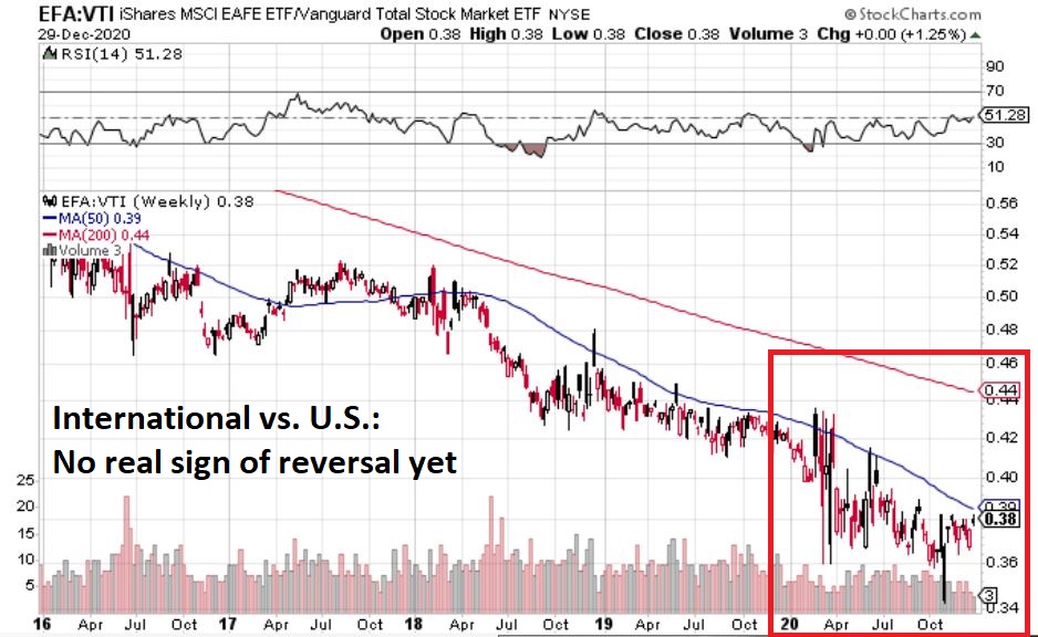
Figure 1 – EFA vs. VTI (Foreign vs. U.S)
#2. Value vs. Growth
Figure 2 displays a weekly chart of the performance of ticker VTV (Vanguard Value ETF) relative to ticker VUG (Vanguard Growth ETF).
The downward slope illustrates the fact that growth stocks have vastly outperformed value stocks in recent years. My “opinion” is that value will almost certainly outperform growth in the decade ahead – and yet I have not committed any money to value funds or ETFs yet. Why? There is little sign of a turnaround in Figure 2 yet.
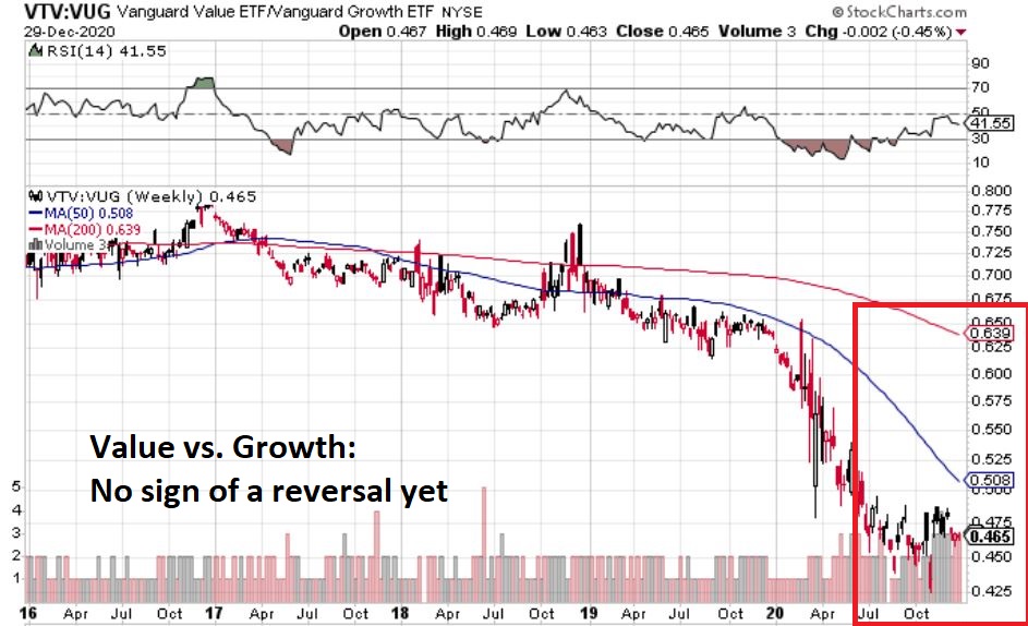
Figure 2 – VTV vs. VUG (Value vs. Growth)
#3. Commodities vs. Stocks
Figure 3 displays a weekly chart of the performance of ticker GSG (Goldman Sachs Commodity Index ETF) relative to ticker VTI (Vanguard Total U.S. Market ETF).
My “opinion” here is that commodities likely represent generational opportunity to “buy cheap”. A number of commodities (Gold, soybeans, lithium, lumber, copper) have already started to rally, but commodities as an asset class have not realty outperformed the stock market following the stock market low in March.
But keep a close eye on Figure 3 for some sign of a turnaround.
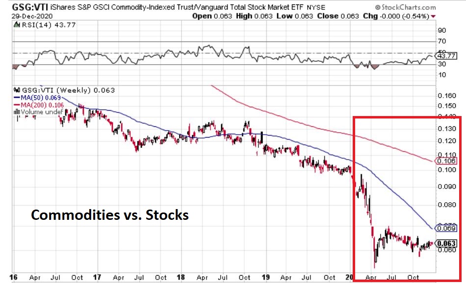
Figure 3 – GSG vs. VTI (Commodities vs. Stocks)
#4. Technology Sector vs. The Total Stock Market
It is no secret that the tech sector has been the strongest performing sector in each of the last two years. Jason Goepfert at www.Sentimentrader.com wrote a Members Only piece the other day that:
*Identified prior instances when one sector led everything 2 years in a row
*Highlighted how that sector performed going forward.
Summarizing as succinctly as possible without violating any copyrights, “it’s not good.” Which raises an interesting reminder of “how investor’s minds work.” At this moment in time, it is pretty much accepted wisdom that “tech is where it’s at” and that that’s how it is going to be ad infinitum into the future. And yes, technology will continue to evolve at a rapid pace. But must I remind everyone that “stock prices fluctuate” (or than AAPL lost -91% in 2000-2002 and AMZN lost -95% and GOOG lost -97%)? I am not “predicting” a repeat, but I am very alert to the fact that tech stocks are “due” for a whack.
Will that happen in 2021? It beats me. But I will be keeping a close eye on Figure 4 that displays ticker XLK (SPDR Technology) vs. ticker VTI (Vanguard Total U.S. Market ETF). Enjoy the ride for now because it could develop into a blowoff top kind of rally. But whenever this relationship starts to breakdown, run, don’t walk to the nearest exit.
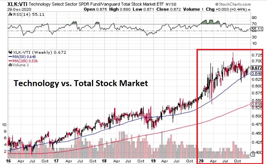
Figure 4 – XLK vs. VTI (Technology vs. Total U.S. Stock Market)
#5. Energy Stocks vs. Technology Stocks
Figure 5 displays a weekly chart of the performance of ticker XLE (SPDR Energy) relative to ticker XLK (SPDR Technology).
The relative performance between two sectors has rarely if ever been more one sided. While technology led the universe in recent years, traditional energy stocks have cratered. There is a part of me that things that traditional energy stocks also represent a generational opportunity. But there is some doubt:
*On one hand, by and large the world (particularly transportation and particularly flight) still runs on fossil fuels. And roughly 10 bazillion products that we use every day are produced using petroleum. So, one can argue that this sector has been overdone to the downside and now represents great value.
*On the other hand, the drive to move to “green energy” is not likely to abate.
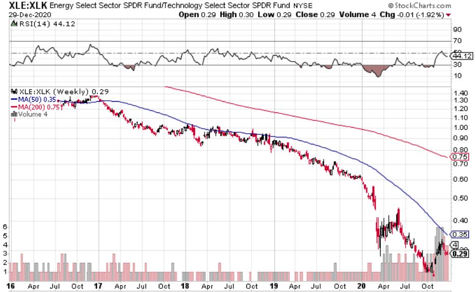
Figure 5 – XLE vs. XLK (Energy vs. Technology)
You may never see a more one-sided relative performance than this one. While technology led the universe by far in recent years, traditional energy stocks have cratered. There is a part of me that things that traditional energy stocks also represent a generational opportunity. But there is some doubt:
*On one hand, by and large the world (particularly transportation and particularly flight) still runs on fossil fuels. And roughly 10 bazillion products that we use every day are produced using petroleum. So, one can argue that this sector has been overdone to the downside and now represents great value.
*On the other hand, the drive to move to “green energy” is not likely to abate.
One possibility might be to focus on green energy companies instead of fossil fuel related. Ironically, stocks in the “green energy” sector have performed so well in recent months that they seem a little “overdone” at the moment.
Bonus Chart: “Alternative Energy” Index versus XLE
Figure 6 displays my own “Alternative Energy” Index in the top clip and ticker XLE (which is comprised of more traditional fossil fuel-based companies).
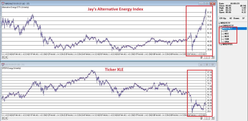
Figure 6 – Alternative Energy Index vs. Ticker XLE
The differences in recent months are fairly obvious. So, should one seek “value” in traditional energy? Or chase performance with alternative energy?
Just one more thing to keep an eye on as 2021 dawns.
See also Jay Kaeppel Interview in July 2020 issue of Technical Analysis of Stocks and Commodities magazine
See also Jay’s “A Strategy You Probably Haven’t Considered” Video
See also Video – The Long-Term…Now More Important Than Ever
Jay KaeppelDisclaimer: The information, opinions and ideas expressed herein are for informational and educational purposes only and are based on research conducted and presented solely by the author. The information presented represents the views of the author only and does not constitute a complete description of any investment service. In addition, nothing presented herein should be construed as investment advice, as an advertisement or offering of investment advisory services, or as an offer to sell or a solicitation to buy any security. The data presented herein were obtained from various third-party sources. While the data is believed to be reliable, no representation is made as to, and no responsibility, warranty or liability is accepted for the accuracy or completeness of such information. International investments are subject to additional risks such as currency fluctuations, political instability and the potential for illiquid markets. Past performance is no guarantee of future results. There is risk of loss in all trading. Back tested performance does not represent actual performance and should not be interpreted as an indication of such performance. Also, back tested performance results have certain inherent limitations and


nice work!
but do u think XLK is shitty representation of tech? like AMZN is in XLY and GOOG FB NFLX is in XLC