The recent panic in the financial markets witnessed a very unusual – though not unprecedented – phenomenon. U.S. treasury securities performed well while virtually all other forms of debt – municipal, corporate, mortgage-back, leveraged loan, etc. – got clobbered. This spasm reminds us that for all things there is a season.
One
Approach to Risk-On/Risk-Off in Bonds
I
detail several other caveats below but a couple things to mention at the
outset. First off, I do not actively use
the model I am about to present.
Likewise, I am not telling you that you should use it. It is presented here as “food for thought”,
based on the fact that using the strategy presented (hypothetically) has vastly
outperformed buying and holding the securities involved. The securities used in the test are:
Long-Term
U.S. Treasuries:
For
indicator calculations we use monthly total return data for the Bloomberg
Barclay’s Treasury Long Index. For
trading result purposes, we use the Bloomberg Barclay’s Treasury Long Index from
July 1980 through May 1986, then we use monthly total return data for ticker VUSTX
(Vanguard Long-Term Treasury).
High
Yield Corporate:
For
indicator calculations we use monthly total return data for ticker VWEHX
(Vanguard High-Yield Corporate Fund) starting in July 1980.
IMPORTANT: For actual real-world trading purposes these funds may not be viable choices as Vanguard imposes certain switching restrictions. An ETF-based alternative would be to use tickers TLT for treasuries and ticker HYG for high yield corporates.
The
Calculations/Rules
A = 50-month cumulative % return for Bloomberg Barclays Treasury Long Index
B
= 50-month cumulative % return for VWEHX
IF:
A
< B then hold VUSTX for the next 7 months
A
> B for 7 consecutive months then hold VWEHX
In
actual English:
*If
long-term treasuries have underperformed high-yield corporates over the
previous 50-months, buy and hold long-term treasuries until they outperform high-yield
corporate for 7 consecutive months – then sell long-term treasuries and buy
high-yield corporates.
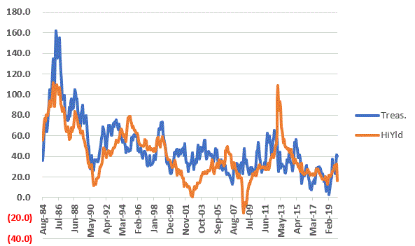
Figure
1 displays the 50-month cumulative % return for both long-term treasuries (blue
line) and high-yield corporates (orange line). As you can see it goes back and forth.
Figure 1 – 50-month cumulative % total return for Long-Term treasuries (blue) and High-Yield corporate (orange)
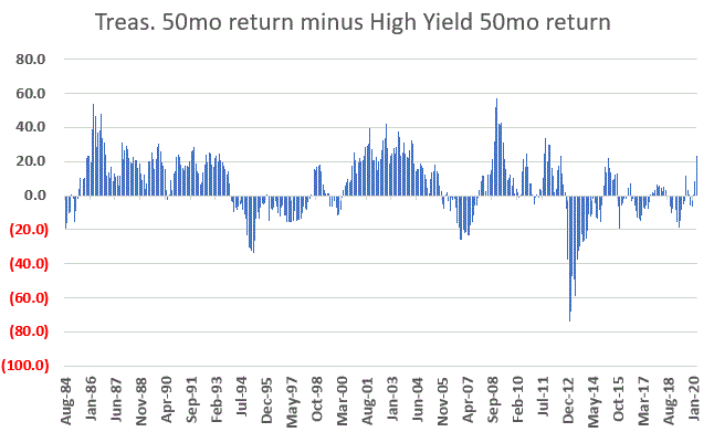
Figure
2 subtracts the orange line from Figure 1 from the blue line in Figure 1. When the result is positive it means
long-term treasuries have outperformed and when it is negative it means high-yield
corporates have outperformed.
So, when the value in Figure 2 is negative it means we will hold long-term treasuries for at least the next 7 months. And when the value in Figure 2 turns positive for 7 consecutive months it means we will sell long-term treasuries and hold high-yield corporates until the value in Figure 2 falls to negative once again.
IMPORTANT NOTE: The total return data source that I use reports results for the prior month early in the next month. In other words, I can’t make a calculation using January total return data on January 31st because January total return data does not get updated until early February. As a result, I follow this with a 1-month lag.
To spell it out: A trading decision at the end of February is based on data from the end of January. In other words, when the total return data for say January is updated in early February, we can do the “end of January” calculations and determine if a trade is to be made. If so, that trade gets made on the last trading day of February.
Results
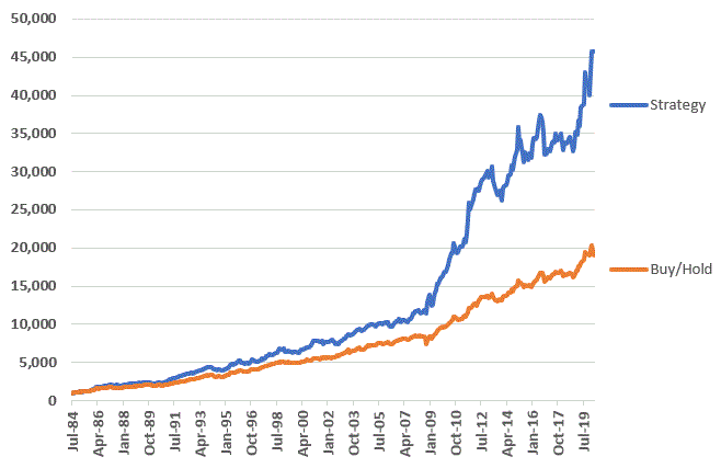
Figure
3 displays the growth of $1,000 invested using the Strategy versus
buying-and-holding VUSTX and VWEHX, with an annual 50/50 rebalance at the end
of December.
Figure
3 – Growth of $1,000 using Risk-On/Risk-Off Strategy (blue) versus
Buy/Hold/Rebalance (orange); 1984-2020
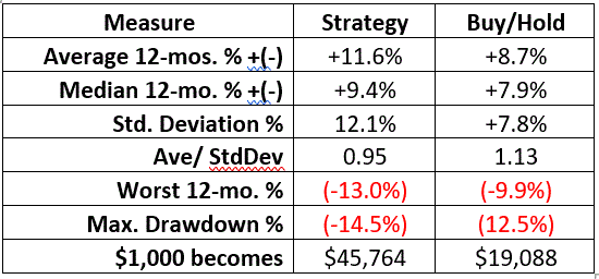
Figure 4 displays some relevant comparative performance data.
Figure 4 – Comparative Results
On the negative side, the Strategy does have a significantly higher standard deviation, a slightly higher maximum drawdown and a lower risk-adjusted return (Average 12mo. % divided by standard deviation).
On the plus side, the Strategy achieved a cumulative gain of +4,406% versus +1,809% for the buy/hold/rebalance approach (NOTE: March 2020 data is through 3/30 using price performance ONLY).
The Latest
The Strategy has been in long-term treasuries since the end of August 2018 and will continue to hold them through at least the end of August 2020. Since the end of August 2018 through 3/30/20 long-term treasuries have gained roughly +38% while high-yield corporates have lost about -4%.
Summary
So,
is this the be all, end all of bond investing?
Not likely. Given that interest
rates have been in a downtrend since about 1981, it is fair to assume that at
some point this trend will reverse. And when
it does, it is more than fair to wonder how well long-term treasuries will
perform.
But
for now – and repeating – this Strategy is presented as food for thought and
for further analysis by those so inclined, not as something that anyone should rush
out and employ without some additional thought.
Disclaimer: The information, opinions and ideas
expressed herein are for informational and educational purposes only and are
based on research conducted and presented solely by the author. The information presented does not represent
the views of the author only and does not constitute a complete description of
any investment service. In addition,
nothing presented herein should be construed as investment advice, as an
advertisement or offering of investment advisory services, or as an offer to
sell or a solicitation to buy any security.
The data presented herein were obtained from various third-party
sources. While the data is believed to
be reliable, no representation is made as to, and no responsibility, warranty
or liability is accepted for the accuracy or completeness of such
information. International investments
are subject to additional risks such as currency fluctuations, political
instability and the potential for illiquid markets. Past performance is no guarantee of future
results. There is risk of loss in all
trading. Back tested performance does
not represent actual performance and should not be interpreted as an indication
of such performance. Also, back tested
performance results have certain inherent limitations and differs from actual
performance because it is achieved with the benefit of hindsight.
The example trade discussed herein is something I started following a few days ago. Please note for the record that it is not presented as a “live trade” or as a “recommended” trade. It serves strictly as a vehicle for teaching some of the finer points of option trading.
By
the way, if you have no interest whatsoever in option trading then its “Class
dismissed early” for you. But thank you
for checking in and please come back again soon.
A Bear Call Spread with GLD
GLD
is an ETF that tracks the price of gold bullion. A bear call spread is an option strategy that
can allow a trader to:
*speculate
that a security will remain below a given price for a specific period of time
*take
advantage of a high implied volatility situation.
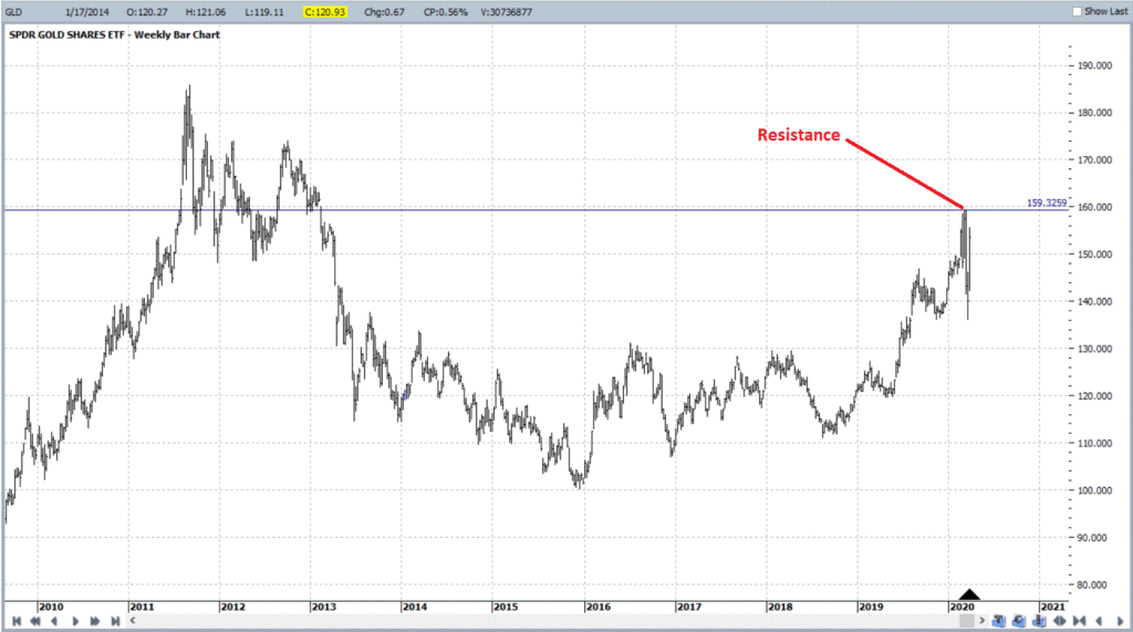
Regarding the selection of GLD based on price action
In this article I wrote about an 8-year cycle for gold and noted that it was in the early stages of what is typically a bearish period. Proving once again that I actually “move markets” (unfortunately though, not in the way I intended), in the next several trading days GLD advanced almost 10% in a straight-line advance. Nevertheless, as you can see in Figure 1, GLD remained (as of 3/24 when this example trade was initiated) below the significant resistance level of 159.37.
Figure 1 – Ticker GLD; will it break out or not? (Courtesy ProfitSource by HUBB)
So, a trader might be inclined to say “can I make a trade that makes money if GLD does NOT take out that resistance level within a certain period of time?
*That is the genesis of this example – crafting a position to exploit that scenario.
*At the same time I AM NOT offering any opinion as to whether or not GLD WILL or WILL NOT take out recent resistance (besides – based on recent results – what would my opinion matter?).
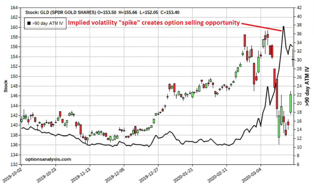
Regarding the selection of GLD based on implied volatility action
In Figure 2 we can see that the implied volatility for options on GLD “spiked” during the recent price decline and relented only very slightly during the snap back rally.
IMPORTANT POINT: This high level of IV tells us that the amount of time premium built into GLD options is very high – and that it is a good time to consider selling premium rather than buying premium.
So,
based on this combination of price and volatility action we are going to
consider a bear call spread that may allow us to take advantage as long as GLD
does not advance significantly from here.
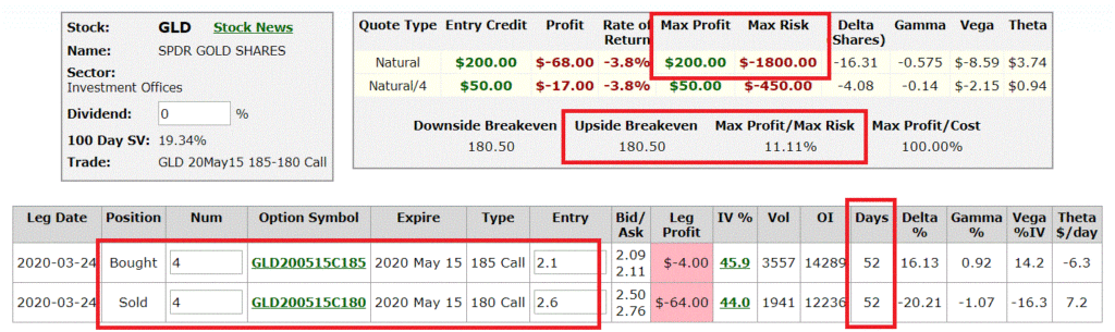
The Example Trade
First
let’s introduce the position, then we can talk about why this position was
selected and what the risk control considerations are.
The
trade involves:
*Selling
4 May15 2020 180 calls @ $2.60
*Buying
4 May15 2020 185 call @ $2.10
The particulars appear in Figure 3 and the risk curves leading up to (colored lines) and at expiration (black line) appear in Figure 3a.
*At
the time the trade is entered GLD is trading at $153.40
*The
breakeven price at option expiration is $180.50
In
other words, if GLD DOES NOT advance +15% between now and the middle of May,
this trade will generate a profit. From
a “probability” standpoint this looks like a pretty good trade. However:
*As
we will discuss next, there is a big position risk management decision to be
made in terms of where we would consider cutting a loss if the market goes
against us.
*From
a reward to risk standpoint remember that this trade ostensibly risks $1,800 in
hopes of making $200 (for the record, most bear call credit and bull put
credits involve taking on more risk than potential reward). But let’s address this risk first.
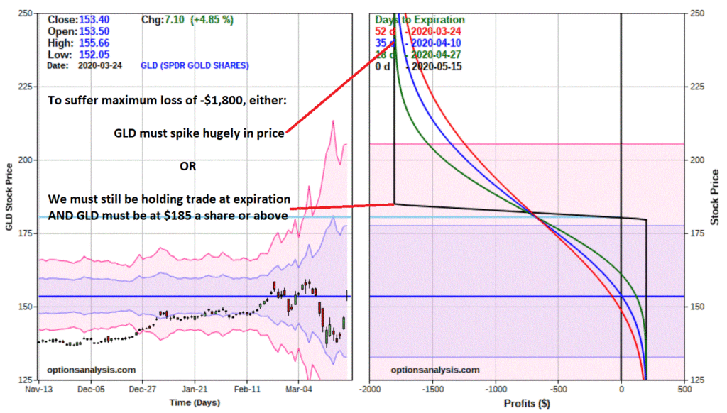
Regarding the Maximum Risk of -$1,800
At
first blush, the idea of risking $1,800 to make $200 may not seem very
appealing. But remember that option trading is primarily all about playing the
probabilities AND managing risk. To
illustrate, please take a close look at Figure 4 and note what has to happen in
order for this trade to actually experience a loss of -$1,800.
*We
MUST commit $1,800 of cash in our trading account in order to establish the
trade
*We
MUST acknowledge that it is possible that the maximum loss COULD happen and as
a result we must trade in a lot-size that precludes the possibility of “catastrophic
loss” (in other words, if we have a $20,000 trading account, it might be OK to
trade a 4-lot but it would not be OK to trade a 40-lot)
Now,
in order for us to actually lose -$1,800, either:
*Prior
to expiration, GLD would have to rally from $153.40 a share to somewhere
between $230 and $290 (depending on how quickly such a thing would
happen). Absolutely possible, but highly
unlikely.
*At
expiration, a) GLD would need to be trading at $185 a share or higher, AND, b)
we would still have to be holding the position.
In
other words, either:
*GLD
would have to essentially gap higher 50% to 90% (again, unlikely but this is
why we size our trade conservatively, just in case)
*We
would have to be foolish enough to still be holding the position at the time of
expiration while GLD was at $180 a share or higher (in other words, we have
control and the ability to NOT allow this to happen)
Position Sizing
There are no “correct” answers. Probably the most useful question is “what percentage of our capital our we willing to risk?” Let’s assume we have a $20,000 account. If we trade a 4-lot and risk $1,800, that means our worst-case loss is -9% ($1,800 divided by $20,000).
IMPORTANT
POINT: For the record, if you are buying calls
and puts – which can lose 100% of their value just by having the underlying remain
unchanged in price – risking 9% of your trading capital on one trade is
probably a little “steep” (consider that 3 losing trading in a row leaves you
-27% in the hole). However, if you are
selling premium and your worst case loss is very far away from the current
price (like this trade), it can be OK to commit that much as long as you have
some sort of plan in place to cut that loss long before it reaches the maximum
level.
So, by entering a 4-lot with a $20,000 account:
*Maximum
profit = $200 (11.1% of capital at risk, 1% of total account value)
*Maximum
risk = $1,800 (9% of total account)
As
you can see, selling premium often involves “hitting singles” rather than going
for home runs as you might when buying calls and puts)
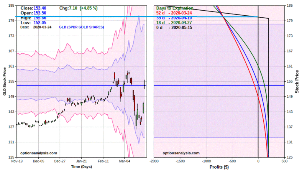
Risk Management
Now
comes a crucial decision – when to actually cut a loss. And again, there are no “correct” answers,
only “choices”. So here is the conundrum
and the choices.
Risk Management Choice #1: Hold the trade until expiration OR until GLD hits the breakeven price of $180.50 a share, whichever comes first. This is 17.6% higher than the current price of $153.40, so from a probability standpoint the odds favor both options expiring worthless and a full $200 profit being earned.
The
tradeoff is this – if GLD DOES rally to $180.50 prior to expiration the open
loss is likely to be in the -$675 range.
*With this approach we are risking $675 in order to make $200 based on the hope that GLD will not rally +17.6% in the next 52 days.
Risk Management Choice #2: Exit the trade if GLD breaks out above the resistance high price of $159.37. If we set an arbitrary “trigger price” of $160 for GLD shares, our loss would be roughly anywhere from $0 to -$200, depending on how soon GLD hits $160.
The
tradeoff is that there is a much greater likelihood that GLD will reach $160
than there is that GLD will reach $180.50.
*With this approach we could end up stopping ourselves out prematurely when we still had $20+ of cushion between $160 and $180.50.
Risk Management Choice #3: Something else
Figure
5 zooms in a bit on Figure 4 to better highlight the potential stop-loss
points.
As
I mentioned before, probability is a big part of option trading. According to
the Probability Calculator at www.Optionsanalysis.com:
*The
Probability of GLD EVER Touching $160 during the life of this trade is 77.0%
(in other words, there is a high probability of getting stopped out – albeit
for a very small loss – with a stop-loss at $160)
*The
Probability of GLD EVER Touching $180.5 during the life of this trade is 28.5%
Bottom Line Considerations:
*The
“odds” favor a stop-loss at $180.50, but this also entails greater dollar risk.
*If you are entering the trade based primarily on the belief that the resistance level will hold, it makes sense to exit the trade if that level is pierced, but you face a fairly high probability that that will be your outcome.
Decisions, decisions……
Summary
Clearly
there are many factors to consider, even for a relatively simple trade. In many cases there are no clear-cut answers
– you simply have to make your choices, make sure that you:
*Put
the probabilities in your favor to whatever degree you can
*Utiliize
intelligent position sizing (i.e., never bet the ranch)
*Utilize a thought out risk management plan and stick to it
*Do these things trade after trade after trade
Jay
Kaeppel
Disclaimer: The information, opinions and ideas
expressed herein are for informational and educational purposes only and are
based on research conducted and presented solely by the author. The information presented does not represent
the views of the author only and does not constitute a complete description of
any investment service. In addition,
nothing presented herein should be construed as investment advice, as an
advertisement or offering of investment advisory services, or as an offer to
sell or a solicitation to buy any security.
The data presented herein were obtained from various third-party
sources. While the data is believed to
be reliable, no representation is made as to, and no responsibility, warranty
or liability is accepted for the accuracy or completeness of such
information. International investments
are subject to additional risks such as currency fluctuations, political
instability and the potential for illiquid markets. Past performance is no guarantee of future
results. There is risk of loss in all
trading. Back tested performance does
not represent actual performance and should not be interpreted as an indication
of such performance. Also, back tested
performance results have certain inherent limitations and differs from actual
performance because it is achieved with the benefit of hindsight.
In a few recent articles (for example here) I suggested that one day we would look back on this period as a terrific buying opportunity for energy related issues. At the same time, I still have yet to become comfortable “pulling the trigger”. Thank goodness for small favors.
Anyway, the overall sentiment still holds. Energy is dirt cheap as are shares of most energy related stocks/ETFs etc. Again, that doesn’t necessarily mean that now is the exact moment to “load up”. To say that there is a wee bit of uncertainty regarding the future would be about the greatest understatement one could presently make. Still, it is important to plan ahead and to be prepared when the time comes. So, what follows should be considered “food for thought” and not “an immediate call to action.”
A
Few Things Energy
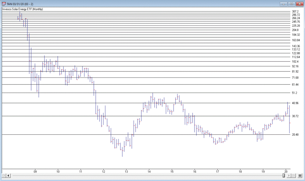
Ticker
TAN
According
to conventional wisdom, the future is “green”.
I’ll be candid – I am all for green energy, as long as when I flip the
switch the lights come on AND when I look at my energy bill I don’t faint. So, let’s start with a “green” play.
Turth be told, ticker TAN (Invesco Solar Energy ETF) has never been much of a performer. Still, its in the solar business which people keep telling me is “the future.” In reality the primary thing it has going for it is that it hasn’t completely cratered to the same degree as just about every other stock in the energy sector. As you can see in Figure 1, TAN actually bottomed out at $12.60 in 2012 and – despite a near 50% decline during the recent panic – is presently trading around $26 a share. Not necessarily a screaming buy signal, but a nice relative performance as we will see in a moment.
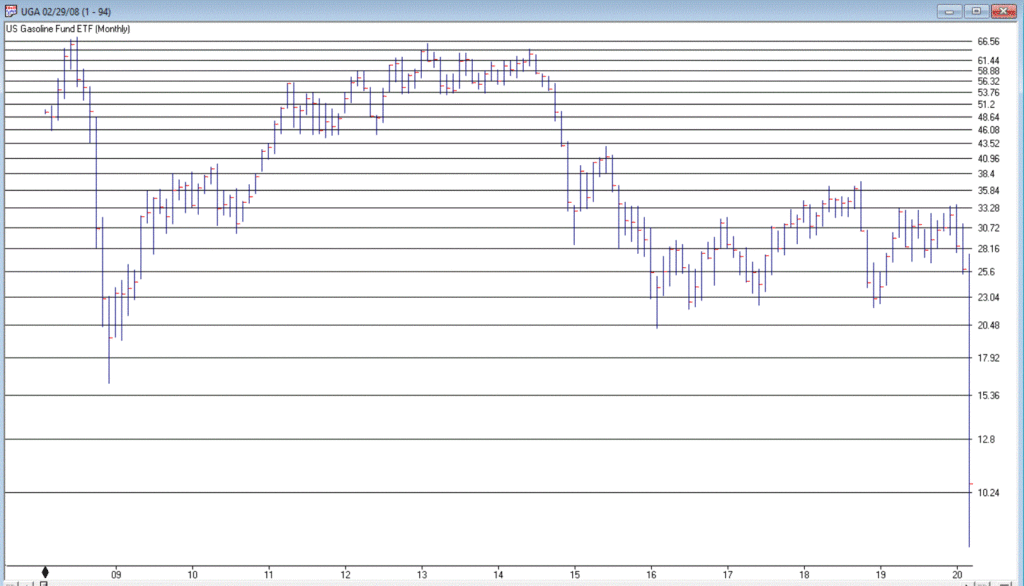
In
a sure “Sign of the Times”, the Good News is that gasoline prices are at their
lowest levels in year, while the Bad News is that we don’t have anywhere to
drive to except the grocery store.
Figure 2 displays the chart for ticker UGA – the United States Gasoline
Fund, and ETF that tracks the price of gasoline.
While attempting to “pick a bottom” is a fool’s errand, the primary point is that it is not that hard to envision the price of this ETF being significantly higher at some point in the years ahead. Whether an investor has the fortitude to weather whatever the short-term uncertainty and the patience to see how the long-term plays out are the primary issues associated with contemplating this ticker at the moment.
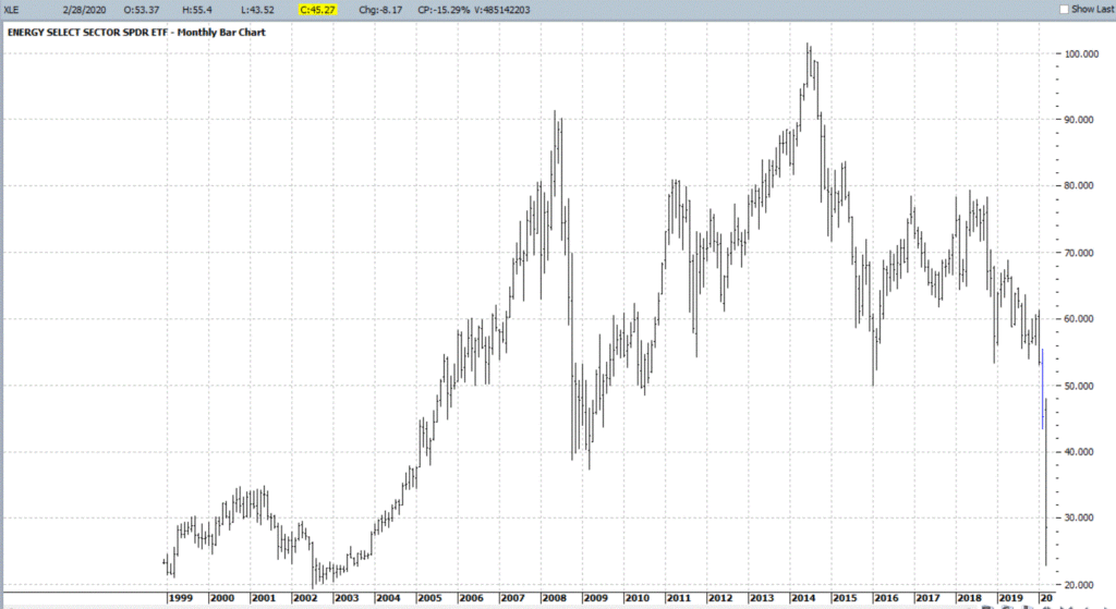
Ticker
XLE is a play on the broad (mostly fossil fuel related) energy sector. As you can see in Figure 3, XLE has plunged
to price levels not since 2004. In addition, it presently yields roughly 8.8%. That being said, an investor has to realistically
expect that dividend payments in the hard-hit energy sector will see some
significant cuts as things play out in the months ahead.
With
an oil price war in full swing, not to mention a sharp decline in demand for
the foreseeable future due to the coronavirus pandemic, the fundamentals for
this sector are unlikely to improve soon.
Nevertheless, the reality is that – at least for the time being – the world
runs on crude oil. As a result, the
current price range may one day be looked back upon as a once-in-a-generation
buying opportunity.
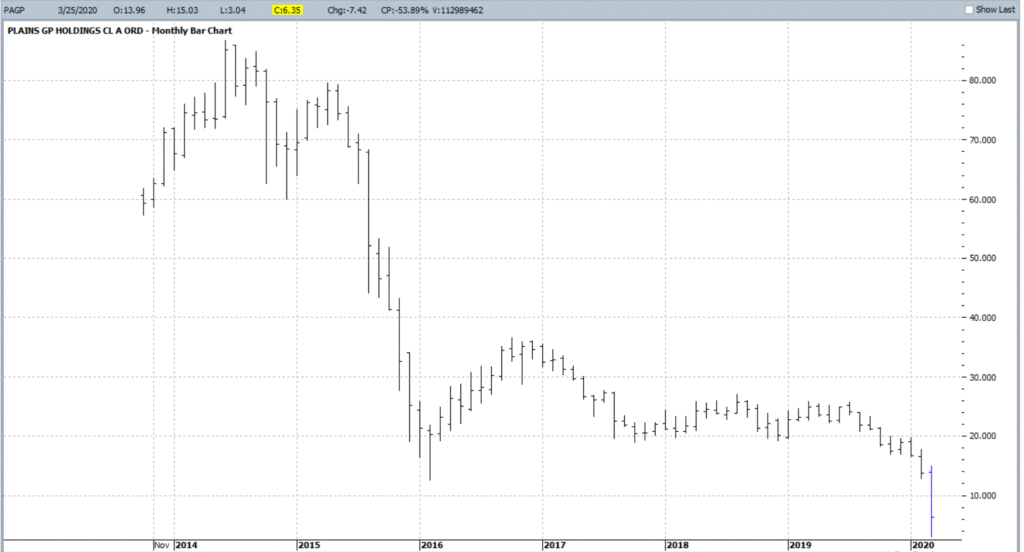
OK,
let’s throw in one obscure, totally speculative – yet fundamentally intriguing –
thought for consideration. Ticker PAGP (Plains
GP Holdings, L.P.). Here is what they do
(straight from their website):
“Plains
engages in the transportation, storage, terminalling, and marketing of crude
oil and refined products, as well as in the storage of natural gas, and the
processing, transportation, fractionation, storage, and marketing of natural
gas liquids.
Assets
include:
*17,965 miles of active crude oil and NGL pipelines and gathering systems (emphasis mine as these things will continue to function as long as crude and NG need to be moved – which they do)
*50
barges and 20 transport tugs
*109
million barrels of storage capacity
*1,600+
trucks and trailers
*9,100
rail cars”
The bottom line is that as long as crude oil and natural gas needs to be moved, PAGP has a niche in which to operate. For the record, at $6.35 a share the stock’s present dividend comes to a yield of 22.7%. Certainly, the prospect of a significant dividend cut is a Signiant risk associated with this stock. But for the moment anyway the price is near an all-time low and the dividend yield is attractive.
As
allows, DO NOT look upon what I have written as “recommendations.” Particularly in the current environment. They are simply “food for thought.”
Given current fundamentals:
*An
ongoing oil price war (making drilling and refining unprofitable for many
companies)
*An
economy on shutdown (which cripples demand)
*An existential struggle between “green” energy and “traditional” fossil fuel-based sources (which creates uncertainty about future expectations)
All
combine to make the energy sector a giant question mark at the present
time. But if the old adage that the time
to buy is when there is “blood in the streets”, than investors might be well
served in the long run to start thinking now about how much capital they might
be willing to commit to energy, and what type of catalyst might prompt them to
actually “take the plunge.”
Jay
Kaeppel
Disclaimer: The information, opinions and ideas
expressed herein are for informational and educational purposes only and are
based on research conducted and presented solely by the author. The information presented does not represent
the views of the author only and does not constitute a complete description of
any investment service. In addition,
nothing presented herein should be construed as investment advice, as an
advertisement or offering of investment advisory services, or as an offer to
sell or a solicitation to buy any security.
The data presented herein were obtained from various third-party
sources. While the data is believed to
be reliable, no representation is made as to, and no responsibility, warranty
or liability is accepted for the accuracy or completeness of such
information. International investments
are subject to additional risks such as currency fluctuations, political
instability and the potential for illiquid markets. Past performance is no guarantee of future
results. There is risk of loss in all
trading. Back tested performance does
not represent actual performance and should not be interpreted as an indication
of such performance. Also, back tested
performance results have certain inherent limitations and differs from actual
performance because it is achieved with the benefit of hindsight.
The indicator that I wrote about in this article flashed a “12-Month Buy Signal” as of the close on 3/24/20.
Here
is what that means and does not mean:
*Each
of the previous 7 signals since 1990 has seen the market:
-Decline further (ranging from -0.5% to
-31.3%)
-Stand higher 12 months after the buy
signal (average gain +23.6%)
*While historical results are encouraging, investors should NOT view this as an “All Clear, it’s time to load up on stocks and ride the next big wave up” signal. If anything, this should be considered as a “Weight of the Evidence” type of indicator. In other words, it provides one potentially positive sign. Nothing more, nothing less.
*For the record, I am not attempting to “call the bottom” and this is NOT me “issuing a buy signal.” This is me reporting on what has happened in the past following previous occurrences. The old adage, “Past performance is no guarantee of future results” is entirely applicable.
*We are still very much living in “perilous times” and just a quick reminder that the market fell another excruciatingly painful -31.3% in 3 months after the 2008 buy signal before reaching the ultimate bottom.
Disclaimer: The information, opinions and ideas
expressed herein are for informational and educational purposes only and are
based on research conducted and presented solely by the author. The information presented does not represent
the views of the author only and does not constitute a complete description of
any investment service. In addition,
nothing presented herein should be construed as investment advice, as an
advertisement or offering of investment advisory services, or as an offer to
sell or a solicitation to buy any security.
The data presented herein were obtained from various third-party
sources. While the data is believed to
be reliable, no representation is made as to, and no responsibility, warranty
or liability is accepted for the accuracy or completeness of such information. International investments are subject to
additional risks such as currency fluctuations, political instability and the
potential for illiquid markets. Past
performance is no guarantee of future results.
There is risk of loss in all trading.
Back tested performance does not represent actual performance and should
not be interpreted as an indication of such performance. Also, back tested performance results have
certain inherent limitations and differs from actual performance because it is
achieved with the benefit of hindsight.
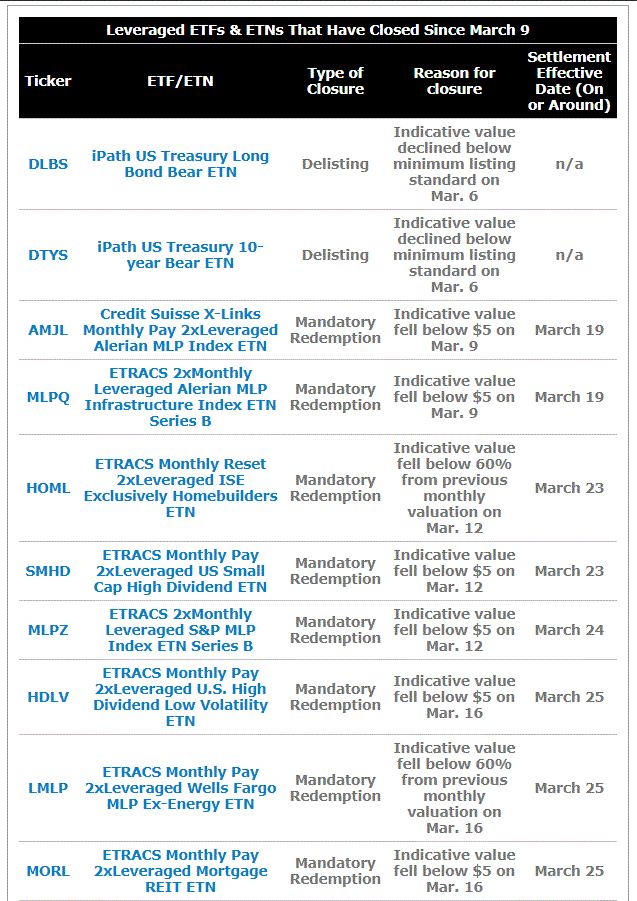
An entire host of leveraged ETFs collapsed during the recent decline and are either being delisted or are facing mandatory redemption.
See the details in this article by Lara Crigger at www.ETF.com. Figure 1 displays a partial list from her article.
Figure 1 – Leveraged ETFs that are ceasing trading (Courtesy: www.ETF.com)
In reality, this should not come as a surprise and additionally can serve as an important lesson going forward.
Many
of these funds were designed to offer extremely high yields. I won’t even get into the mechanics since
they are mostly moot now. But for example,
a month or two ago tickers like CEFL and MORL were purportedly offering yields
close to 20%, which made them fairly intriguing to investors seeking income. But in a world of low interest rates it
seemed almost too good to be true. Or in
this case, too good to be true, period.
I
have to admit that as a trader always “looking for an edge” I was long
intrigued by many of the tickers on the list in Crigger’s linked article and
spent a fair amount of time trying to quantify the risks.
But
I never quite pulled the trigger. The
only reason being – I just could never wrap my head around what the true risk
was with these things, i.e., “what’s the worst thing that can happen?”
Well
now we know.
The
Lesson
At times, extremely unique and potentially lucrative opportunities exist (for example, see Here, here, here and here) and a trader may feel both intrigued and wary all at once. Here is the key:
Before
acting you MUST ask and answer the following questions:
“How
much am I willing to risk?”
“What
is my worst-case scenario?”
“Can
I live with it, if the worst-case scenario unfolds?”
Until
you can satisfactorily answer those questions, DO NOT CLICK “TRADE”!
Jay
Kaeppel
Disclaimer: The information, opinions and ideas
expressed herein are for informational and educational purposes only and are
based on research conducted and presented solely by the author. The information presented does not represent
the views of the author only and does not constitute a complete description of
any investment service. In addition,
nothing presented herein should be construed as investment advice, as an
advertisement or offering of investment advisory services, or as an offer to
sell or a solicitation to buy any security.
The data presented herein were obtained from various third-party
sources. While the data is believed to
be reliable, no representation is made as to, and no responsibility, warranty
or liability is accepted for the accuracy or completeness of such information. International investments are subject to
additional risks such as currency fluctuations, political instability and the
potential for illiquid markets. Past
performance is no guarantee of future results.
There is risk of loss in all trading.
Back tested performance does not represent actual performance and should
not be interpreted as an indication of such performance. Also, back tested performance results have
certain inherent limitations and differs from actual performance because it is
achieved with the benefit of hindsight.
The old adage is that we should “buy when there is blood in the streets.” It basically means to buy when things look their worst. Well, for the record I am not actually a fan of this intonation. While it is probably a fair statement, I for one prefer to see some sign of hope – some sign of a trend reversal at the very least – before taking the plunge.
One historically useful indicator suggests we may be nearing that point.
I refer to this indicator as JKHiLo. I included my initials in the acronym because I “developed” it. OK, all I really did was take one guy’s useful indicator and multiply it by another guy’s useful indicator and voila.
In a nutshell JKHilo multiplies Norman Fosback’s HiLo Logic Index by Gerald Appel’s High/Low Indicator.
The
Fosback HiLo Logic Index (FHLLI)
I wrote two articles here and here about this indicator. In short, a very low number of stocks making new lows is bullish for the stock market – it indicates that stocks overall are going up and is bullish. At the same time, a very low number of stocks making new highs is also (typically) ultimately bullish going forward, as it tends to signal a “washed out” market.
So
this indicator:
*takes the lower of new highs and new lows each day
*divides
that number by the total number of issues trades
*takes
a 10-day moving average of daily readings
Specifically, the Fosback HiLo Logic Index (HLLI) is calculated as follows:
A=Daily
Nasdaq New Highs
B=Daily
Nasdaq New Lows
C=The
lower of A and B
D=The
total number of Nasdaq issues traded
E
= (C / D) * 100
FHLLI
= 10-day average of E
Readings above 2.15% are considered a sign of “churning”,
i.e., a lot of new highs AND new lows.
Reading below 0.40% are considered “bullish” because either new highs OR
new lows is very low.
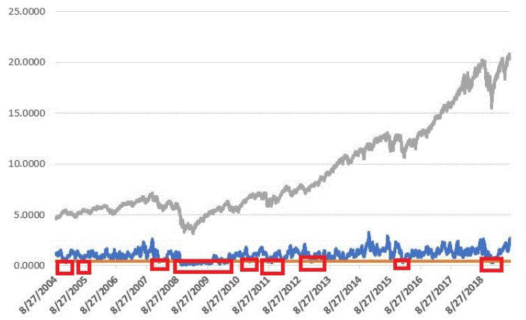
The Fosback HiLo Logic Index finally dropped below 0.40% on 3/23/20. Figure 1 displays the OTC Composite Index with this indicator through 12/31/2019.
Figure 1 – Fosback HiLo Logic Index
The Appel High/Low Indicator
This indicator (heretofore AHLI) is more of a trend-following indicator. It simply divides the number of new highs each day by the total of new highs AND new lows, then takes a 10-day average.
The AHLI is calculated as follows:
A=Daily
Nasdaq New Highs
B=Daily
Nasdaq New Lows
C = A / (A+B)
AHLI = 10-day average of C
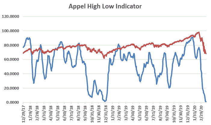
Figure 2 displays this indicator versus the OTC Composite
from 12/29/17 through 3/23/20.
Figure 2 – Appel High/Low Indicator (x100; blue line)
with OTC Composite (/100; red line); Dec17 through 3/23/20
Extremely low readings tend to highlight oversold market conditions. For the record, an actual “buy signal” for this indicator occurs when it drops below 0.20 (or 20 in Figure 3 since the blue line is the indicator x 100) and then rises back above that level.
The JK Hilo Index (JKHiLo)
So then one day some young punk comes along and multiplies the Fosback indicator by the Appel indicator and has the audacity to add his own initials. Some people. Anyway:
JKHiLo = (FHLLI x AHLI) x 500
A “12-month Buy Signal” occurs when this indicator:
*drops below 5.00
*then turns higher for one day
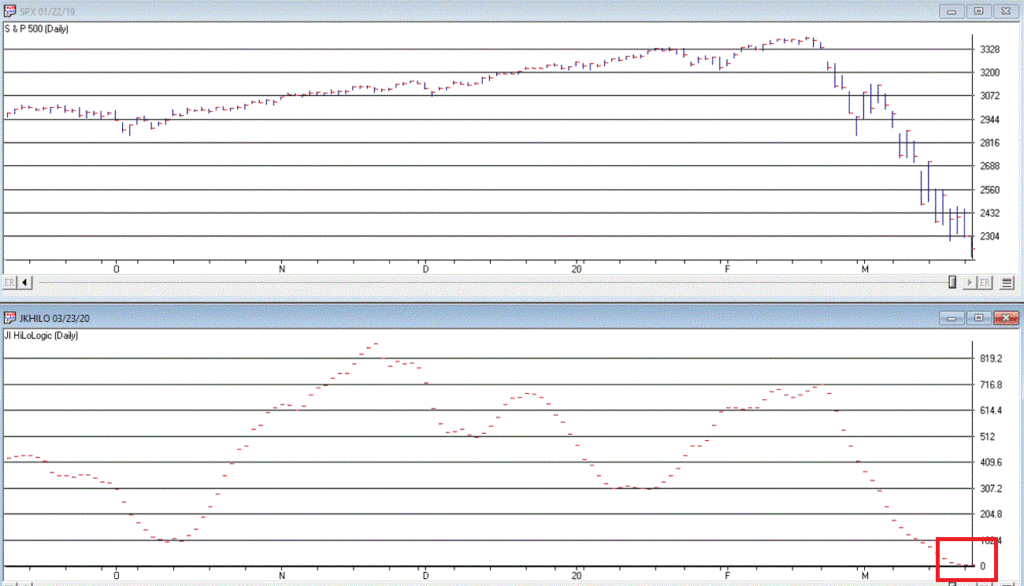
The first part of this signal has happened. As of the close on 3/23/20 JKHL has plunged
to 1.8.
Let’s look at previous instances when JKHL fell below 5.00
and then ticked higher for one day.
IMPORTANT: This upside reversal
technically constitutes a “12-month buy signal”. What does that mean? It means:
*We expect the market to be higher 12-months later
*HOWEVER, it is NOT an “All Clear, Everything is Great,
You Can’t Lose” signal
The bottom line is that it typically does NOT mark the
actually bottom. In most cases, another
new low or at least a retest of the low follows within a few months. But not always.
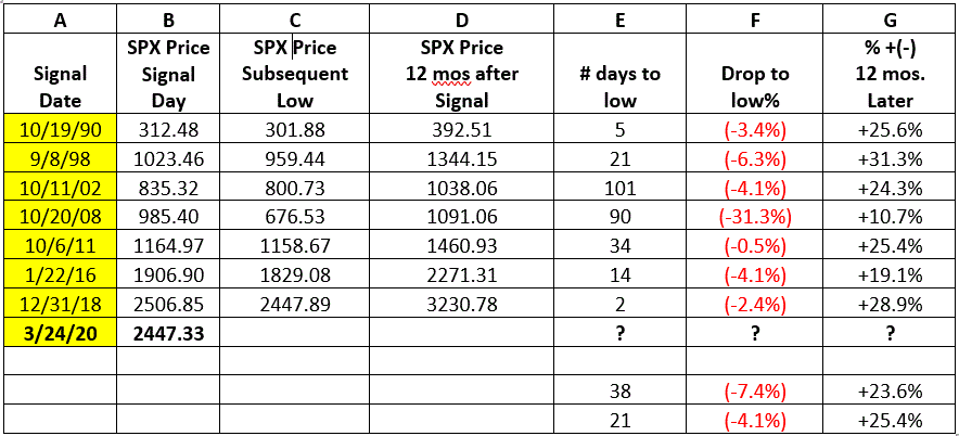
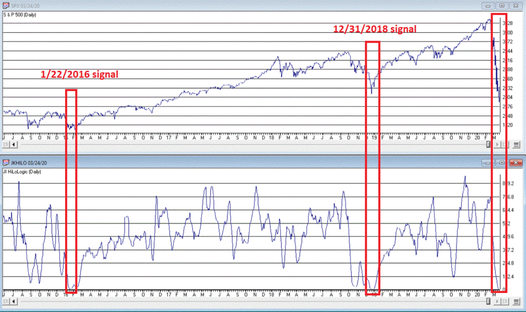
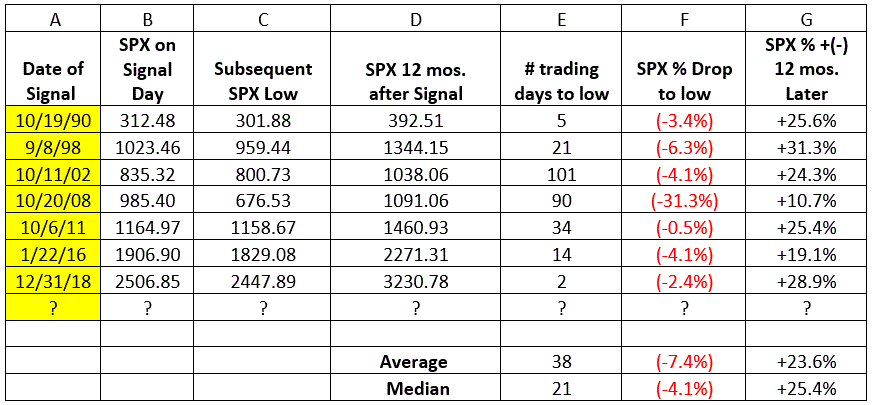
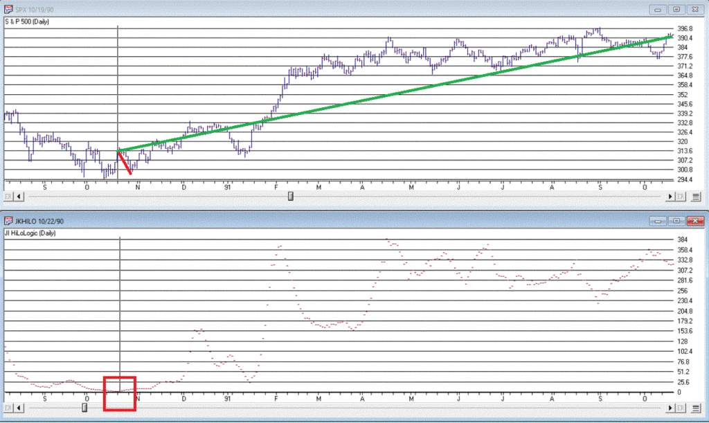
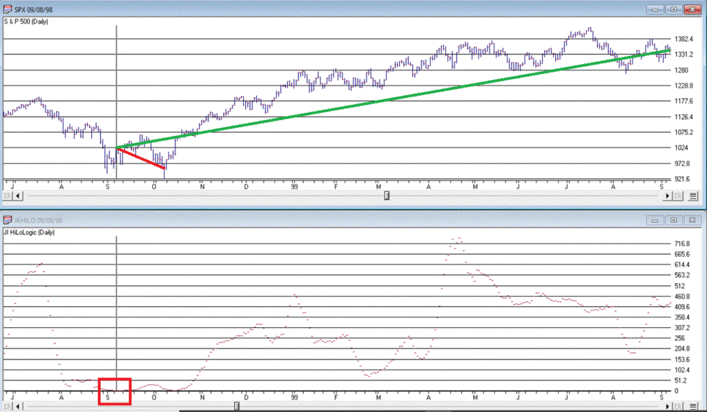
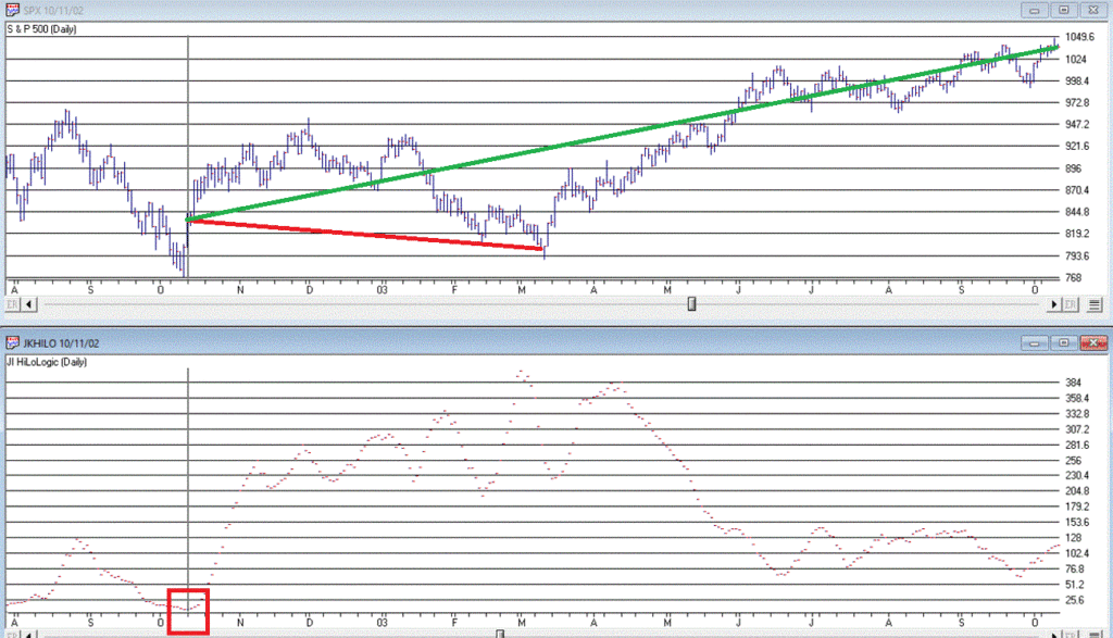
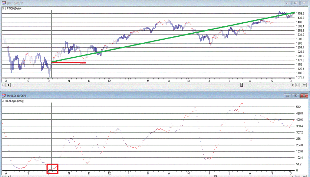
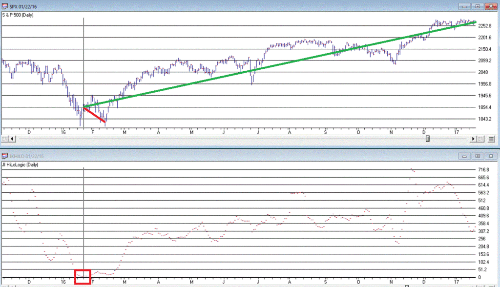
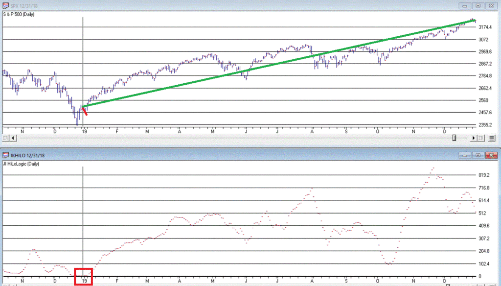
Figure 3 displays the 7 buy signals that have occurred
since 1990.
A = Date of signal – i.e., date the JKHL indicator ticked
up one day after dropping below 5
B = SPX closing price on date of signal
C = Subsequent low closing price for SPX
D = SPX closing price 12 months after signal date
E = # of trading days between date of signal and ultimate
low
F = % decline by SPX from date of signal to ultimate low
G = % change in SPX closing price 1 year after date of signal
Figure 3 – JKHL 12-month buy signals
It is important to note that each previous “buy signal”
was followed by further downside price movement prior to the ultimate low. It ranged from 2 trading days in 2018 to 101
trading days in 2008. 6 of the 7 signals
saw a further decline of no more than -6.3%.
But the 2008 signal saw the market continue to plunge another -31% of
the following 3+ months.
So, like I said earlier, even when this indicator does
turn up and generate a new signal, that DOES NOT mean “All Clear”. Still, to get an idea of what we might
expect, each of the previous signals are displayed in the Figures below.
Figure 4 – 1990 signal (-3.4% to low, +25.6% 12 months later)
Figure 5 – 1998 signal (-6.3% to low, +31.3% 12 months later)
Figure 6 – 2002 signal (-4.1% to low, +24.3% 12 months later)
Figure 7 – 2008 signal (-31.3% to low, +10.7% 12 months later)
Figure 8 – 2011 signal (-0.5% to low, +25.4% 12 months later)
Figure 9 – 2016 signal (-4.1% to low, +19.1% 12 months later)
Figure 10 – 2018 signal (-2.4% to low, +28.9% 12 months later)
We DO NOT have a new signal yet, but JKHiLo is below 5, so it is just a matter of waiting for the daily value to tick higher for one day (and then – if history is a guide – waiting for the ultimate low to be put in before a subsequent rally).
Figure 11 – As of 3/23/20
Summary
Are we on the cusp of a new opportunity? Or on the edge of a cliff? In this time of unprecedented uncertainty, I
can’t pretend to know the answer. So, I
rely on objective indicators to guide me.
At this moment in time the “trend-following” indicators
are bearish and so caution is undoubtedly in order. But other indicators such as the one
discussed here remind us to remain alert to new opportunities.
Jay
Kaeppel
Disclaimer: The information, opinions and ideas
expressed herein are for informational and educational purposes only and are
based on research conducted and presented solely by the author. The information presented does not represent
the views of the author only and does not constitute a complete description of
any investment service. In addition,
nothing presented herein should be construed as investment advice, as an
advertisement or offering of investment advisory services, or as an offer to
sell or a solicitation to buy any security.
The data presented herein were obtained from various third-party
sources. While the data is believed to
be reliable, no representation is made as to, and no responsibility, warranty
or liability is accepted for the accuracy or completeness of such
information. International investments
are subject to additional risks such as currency fluctuations, political
instability and the potential for illiquid markets. Past performance is no guarantee of future
results. There is risk of loss in all
trading. Back tested performance does
not represent actual performance and should not be interpreted as an indication
of such performance. Also, back tested performance
results have certain inherent limitations and differs from actual performance
because it is achieved with the benefit of hindsight.
The
two questions on most investor’s minds (OK, beyond “What’s on Netflix” and “How
is my stock of toilet paper holding up”?) are “what happens from here” and “how
bad does this get”?
Sadly, the correct answer to both questions is “nobody knows.” Still, we can look at the history of bear markets and at least get a sense of the possibilities. Not to give anything away, but the short answer is “probably not good in the near term” but we should be optimistic for the long-term.
History
of Bear Markets
For
this exercise we will purposely avoid any subjective prognostication. In other words, I will avoid phrases like “expect
a global depression” on the pessimistic side and “we should be near a bottom”
on the optimistic side.
We
will simply look at previous bear market:
*How
long they lasted
*How
far they fell
*How
they did after the bottom
*And
finally, how the current situation would play out if it followed each previous example
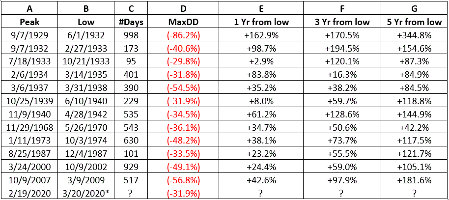
First
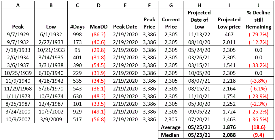
the historical record. Figure 1 displays
previous bear markets:
A
= Bull market peak date
B
= Bear market bottom date
C
= # of calendar days from peak to bottom
D
= % decline from Peak date to bottom date
E
= % gain 1 year after low
F
= % gain 3 years after low
G = % gain 5 years after low
Figure
1 – Major Historical Bear Markets
*The
“smallest” bear market on this list was the 1933 sell off that lasted only 3
months and fell -29.8%
*The
“worst” bear market was the 1929-1932 decline that lasted 2.75 years and saw
the Dow plummet -86.2%
*3 of the 12 bear markets listed declined no more than -31.9%, which is how far the S&P 500 Index has fallen so far since the February 2020 high
If
History Repeats
Now let’s use history to hypothetically project forward. Each row of Figure 2 below assumes that the current bear market plays out exactly like the bear market listed in that line (based on the close of 2,305 for the S&P 500 Index on 3/20/20).
A
= Bull market peak date
B
= Bear market bottom date
C
= # of calendar days from peak to bottom
D
= % decline from Peak date to bottom date
E
= Peak date for recent bull market
F
= Peak closing price for recent market
G
= 3/20/20 closing price for S&P 500 Index
H
= Projected date of low based on Column C
I
= Projected low price based on Column D
J = Projected further price decline for S&P 500 Index from Column G to Column I
Figure
2 – Project forward from here, using each previous bear market as a template
*The first line in the table – i.e., the 1929-1932 Crash is pretty unsettling. If the market plays out from here exactly like it did then the S&P 500 will decline another -79.7% (from 2305 to 467!) before bottoming out. Scary stuff, indeed.
*At
the same time, note that 6 of the 12 bear markets listed bottomed out no more
than -6.1% from the current level of decline.
*If
the current decline followed the “Average” decline, the market will bottom out May
25th of next year, at 1,876, or -18.6% below the current price level
*If
the current decline followed the “Median” decline, the market will bottom out May
23rd of next year, at 2.088, or -9.4% below the current price level
HOWEVER,
remember these are not “forecasts” or predictions. These are meant merely to help investors get
a handle on some historical perspective.
Now
for the Brighter Side
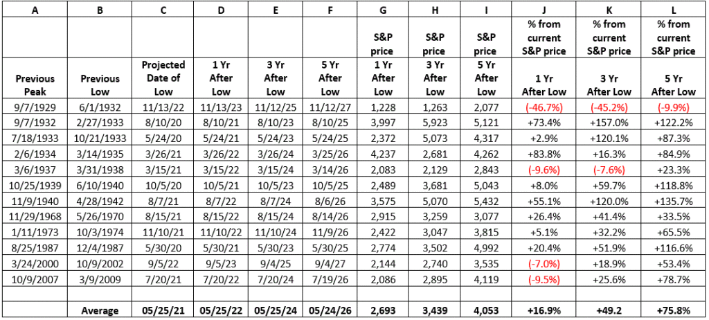
Columns E, F and G in Figure 1 above displayed how much the S&P 500 rallied in the 1, 3 and 5-year periods following each previous bear market bottom. So, let’s do one more round of “What If”, as follows:
What
will happen to the S&P 500 Index going forward if the course of the current
bear market follows each given previous bear market?
Each
“projection” appears in Figure 3.
How
to read Figure 3:
A
and B listed the previous historical bear market
C
listed the projected low date for the current bear market if it follows exactly
the one in A and B
D,
E, F listed the dates one, three and five years after projected low date
G,
H and I listed the projected S&P 500 Index price level 1, 3, 5 years after
projected low
Most
importantly:
J
displays the expected % price gain for the S&P 500 Index from the current
level (2,305) as of the date listed in Column G (i.e., 1 year after the projected
bear market low)
K
displays the expected % price gain for the S&P 500 Index from the current
level (2,305) as of the date listed in Column G (i.e., 3 years after the projected
bear market low)
L displays the expected % price gain for the S&P 500 Index from the current level (2,305) as of the date listed in Column G (i.e., 5 years after the projected bear market low)
Figure
3 – Looking out across the abyss; projections going forward using previous bear
markets as a template
So
just to play this out, if the current bear market matches the “average” of all previous
bear markets:
*The
S&P 500 Index would bottom at 1,876 on 5/25/2021, -18.9% below the 3/20/2020
close
*By
May 25th, 2022 the S&P 500 would be at 2,693, +17% above the
3/20/2020 close
*By
May 25th, 2024 the S&P 500 would be at 3,439, +49% above the
3/20/2020 close
*By
May 25th, 2026 the S&P 500 would be at 4,053, +76% above the
3/20/2020 close
For
the record, if the current bear market matches the “Worst” of all previous bear
markets:
*By
November 13, 2022 the S&P 500 would be at 1,228, -47% the 3/20/2020 close
*By November 13, 1924 the S&P 500 would be at 1,263, -45% above the 3/20/2020 close
*By November 13, 1926 the S&P 500 would be at 2,077, -10% above the 3/20/2020 close
For
the record, if the current bear market matches the “Best” of all previous bear markets:
*By
August 7, 2022 the S&P 500 would be at 3,575, +55% above the 3/20/2020
close
*By
August 7, 2024 the S&P 500 would be at 5,070, +120% above 3/20/2020 close
*By
August 7, 2026 the S&P 500 would be at 5,432, +136% the 3/20/2020 close
Summary
Nobody
knows what happens from here. If you
want to go entirely “gloom and doom”, then the 1929-1932 experience argues that:
*There
is a great deal of downside risk remaining
*Roughly
seven and a half years from now the market will be about where it is now
If
you are an optimist:
*We
are at or near a bottom now
*By
August of 2024, the S&P 500 Index will be 120% than it is right now
It
is easy to give in to a “worst case scenario” mindset in this period of
unprecedented uncertainty. And the idea
of “playing defense” in the financial markets is not a bad one.
But
as I said before, no one knows how this will all actually play out. And it is important to be mindful that one
day – maybe relatively soon(?) – this crisis will peak. When that day comes there will A LOT of people
ready to get back to living life AND with a much more purposeful – and possibly
– much more grateful attitude.
Here’s
hoping for the latter.
Jay
Kaeppel
Disclaimer: The information, opinions and ideas
expressed herein are for informational and educational purposes only and are
based on research conducted and presented solely by the author. The information presented does not represent
the views of the author only and does not constitute a complete description of
any investment service. In addition,
nothing presented herein should be construed as investment advice, as an
advertisement or offering of investment advisory services, or as an offer to
sell or a solicitation to buy any security.
The data presented herein were obtained from various third-party
sources. While the data is believed to
be reliable, no representation is made as to, and no responsibility, warranty
or liability is accepted for the accuracy or completeness of such information. International investments are subject to
additional risks such as currency fluctuations, political instability and the
potential for illiquid markets. Past
performance is no guarantee of future results.
There is risk of loss in all trading. Back tested performance does not represent
actual performance and should not be interpreted as an indication of such
performance. Also, back tested
performance results have certain inherent limitations and differs from actual
performance because it is achieved with the benefit of hindsight.
Gold. Ah yes, gold.
The “ultimate store of value”. Yeah,
sort of, I suppose. But when it all
comes down the fact remains that it may be a bit unwieldy to go to the grocery
store and buy bread with a bar of gold bullion (I would have said toilet paper,
but everyone knows that can’t be had even with a bar of gold these days).
It’s
been said that the three most important commodities in the world are crude oil,
gold and copper (although I personally think coffee and sugar should be in the
discussion somewhere). But once again –
and as I have stated at times in the past – when it all hits the fan, the three
most important commodities in the world remain canned food, shotgun shells and
cabins in the woods. But I digress.
Gold
held up reasonably well in the early part of the coronavirus panic, but took a
very nasty spill in the 7 trading days after topping out. What to make of it all? Should we be looking for gold to be a leading
performer? Anything is possible in this
uncertain time, but one analyst’s findings suggest otherwise.
The
8-Year Gold Cycle
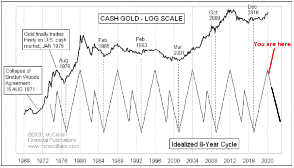
Tom
McClellan is the Editor of The McClellan Oscillator, and has long been one of
my favorite analysts. In 2003 he
recognized that gold tends to move in an 8-year cycle, 3 years up and then 5
years down in a “down-up-down” fashion. See
McClellan’s article here. The chart of this cycle from his article appears
in Figure 1.
I
don’t know for sure if Tom uses this cycle on a strict 8-year calendar basis or
not. But for our purposes, that’s what
we will do here. As such, starting on
12/31/1976 through 3/18/2020, we will test the following cycle:
*Phase 1 (Bullish) for 37 months (this Phase ended 1/31/2020)
*Phase 2 (Bearish) for 41 months (this Phase began 1/31/2020 and extends through 6/30/2023)
*Phase 3 (Bullish) for 8 months
*Phase
4 (Bearish) for 10 months
This
totals 96 months, or 8 years. The expectation
is that McClellan’s cycle – as applied here – will see gold showing gains
during Phases 1 and 3 and losses during Phases 2 and 4.
How
did this work out? Read on.
Results
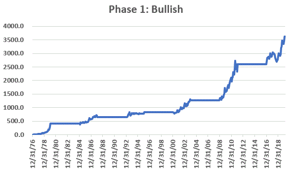
Figure
2 displays the cumulative % return for gold during the 37-month Bullish Phase
1.
Figure
2 – Cumulative % gold return during Phase 1
The
net return was +3,615%.
Figure
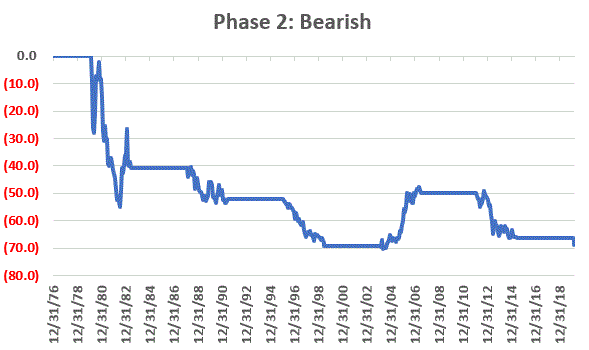
3 displays the cumulative % return for gold during the 41-month Bearish Phase 2.
Figure
3 – Cumulative % gold return during Phase 2
The
net return was -69%.
Figure
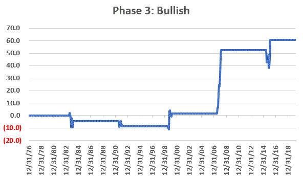
4 displays the cumulative % return for gold during the 8-month Bullish Phase 3.
Figure
4 – Cumulative % gold return during Phase 3
The
net return was +61%.
Figure
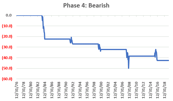
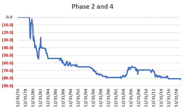
5 displays the cumulative % return for gold during the 10-month Bullish Phase 5.
Figure
5 – Cumulative % gold return during Phase 4
The
net return was -43%.
Figure
6 displays the cumulative gain/loss per Phase per cycle.
Figure
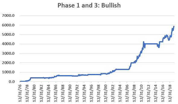
7 displays the cumulative return for gold during Phase 1 months AND Phase 3
months. The cumulative gain was +5,869%
Figure
7 – Gold cumulative % return Phase 1 and 3
Combining
Bearish Phases
Figure
8 displays the cumulative return for gold during Phase 2 months AND Phase 4
month. The cumulative loss (through
3/18/20) was -82%
Figure
8 – Gold cumulative % return Phase 2 and 4
The
Latest
The
latest Bullish Phase 1 extended from 12/31/16 through 1/31/20 during which time
gold gained +37.9%
The current Bearish Phase 2 began on 1/31/20 and will extend through 6/30/2023. Through 3/18/20 gold has lost -7.5% during this latest Phase 2. As you can see in Figure 6, Phase 2 has showed a loss during 4 of the previous 5 completed Phases. Hence the reason the title of this article suggests that investors not expect a great deal from gold. That being said, the one “Up” Phase 2 period saw gold rally +61.6%, so anything is possible.
Summary
In
light of the coronavirus panic a lot of people are looking for alternative
investments in order to get away from the carnage taking place in the stock market. Because of its reputation as a “store of value
in times of trouble”, a lot of people are looking at gold. The history of McClellan’s 8-year gold cycle
suggests that that might be a mistake.
On the flip side, the one thing you always have to keep in mind about seasonal/cyclical trends is that there is no way to know if they will work as expected “this time around.”
In sum, I am NOT pounding the table telling you to avoid gold completely. I am merely pointing out that history suggests that gold may not be your “savior” as some people seem to expect.
But forgetting all that, the bottom line is that McClellan’s 8-year gold cycle has done a darn good job of keeping an investor on the right side of the gold market.
Thanks
Tom.
Jay
Kaeppel
Disclaimer: The information, opinions and ideas
expressed herein are for informational and educational purposes only and are
based on research conducted and presented solely by the author. The information presented does not represent
the views of the author only and does not constitute a complete description of
any investment service. In addition,
nothing presented herein should be construed as investment advice, as an
advertisement or offering of investment advisory services, or as an offer to
sell or a solicitation to buy any security.
The data presented herein were obtained from various third-party
sources. While the data is believed to
be reliable, no representation is made as to, and no responsibility, warranty
or liability is accepted for the accuracy or completeness of such
information. International investments
are subject to additional risks such as currency fluctuations, political
instability and the potential for illiquid markets. Past performance is no guarantee of future
results. There is risk of loss in all
trading. Back tested performance does
not represent actual performance and should not be interpreted as an indication
of such performance. Also, back tested
performance results have certain inherent limitations and differs from actual
performance because it is achieved with the benefit of hindsight.
Here, here, here and here I have highlighted situations where exorbitantly high implied volatility levels have created opportunities to sell very far out-of-the-money cash secured put options. The underlying stocks that I have written about have continued to get crushed as the potential economic fallout from coronavirus hits home.
The
good news is that either:
*at
some point the carnage may actually let up and the options will collapse in
price as implied volatility falls, OR
*the
positions will end up buying the underlying shares at levels far below even
today’s bombed out prices.
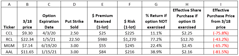
The
status of each example position at the close on 3/18/20 appears in Figure 1
A
= ticker symbol
B
= Closing stock price on 3/18/20
C
= Date the put option expires
D
= Strike price of put option sold
E
= Total $ premium received for writing 1 put option
F
= Maximum $ risk per 1-lot (if stock price goes to $0)
G
= % gain if option is NOT exercised ($ premium received / $ risk)
H
= Effective price you would pay for stock if option is exercised
I = Difference between current stock price and effective purchase price
Figure 1 – Cash secured put trades
NOTES:
*Each of the stocks listed is presently in a freefall. Under no circumstances would I advise buying shares of these stocks at current prices in this environment. But the trades listed in Figure 1 would not buy these stocks unless they fell another 40% to 80% – i.e., rock bottom prices
*For
each ticker, either a) the stock price will fall below the strike price or b)
it won’t
*If the stock price DOES drop below the strike price, we may ultimately be required to buy 100 shares of stock at the strike price. However, our effective buy price (Column H) will equal the strike price minus the premium received.
*Column I tells us how far the stock has to fall to reach our effective purchase price. For example, if we ultimately buy, for example, ticker CCL, we will pay an effective price of $2.25 a share, which is -75.8% below the current stock price of $9.30 a share
*If the stock price DOES NOT drop below the strike price, the option will expire worthless and we will keep the entire premium received when we sold the put option (Column E). Our percentage return (Column G) will be the premium received (Colum E) divided by the maximum $ risk (Column F).
*The maximum dollar risk (Column F) is the amount of cash we needed to put up to sell the cash secured put in the first place.
*The % return achieved if the option expires worthless appears in Column G.
*For each of these positions, one of three things will happen. Let’s look at AAL as an example:
*If the airline industry collapses and AAL goes bankrupt prior to 1/15/21, we will buy the shares at an effective price of $2.16 a share ($216 for 100 shares), the shares will become worthless and we will lose $216 (per option 1-lot)
*If AAL DOES NOT drop from its current price of $11.65 to the strike price of $3 a share then the option will expire worthless and we will keep the $84 premium as our profit. This represents a return of 38.9% (Column G), which is $84 divided by our maximum risk of $216.
*If AAL DOES drop from its current strike price to the strike price of 3 then we will purchase 100 shares of AAL at $3.00 a share, less the premium received. Our effective buy price will be $2.16 a share.
Now
on to today’s idea.
Ticker
APRN
Blue
Apron Holdings ships food kits to homes – sounds like a winner when no one can
go to a restaurant, right? Well in the
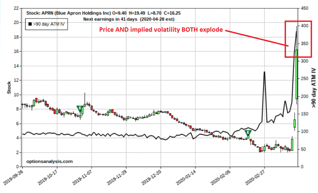
past 3 trading days a lot of people had that same thought and ticker APRN shot
up from roughly $3 a share to $16 a share as you can see at the far right of
Figure 1. You will also note that the
implied volatility for 90-day options on APRN recently went form its typical
range between 80% and 100% to over 300%.
This
tells use that there is a ton of time premium in these options, which make them
an excellent candidate for the cash secured put strategy.
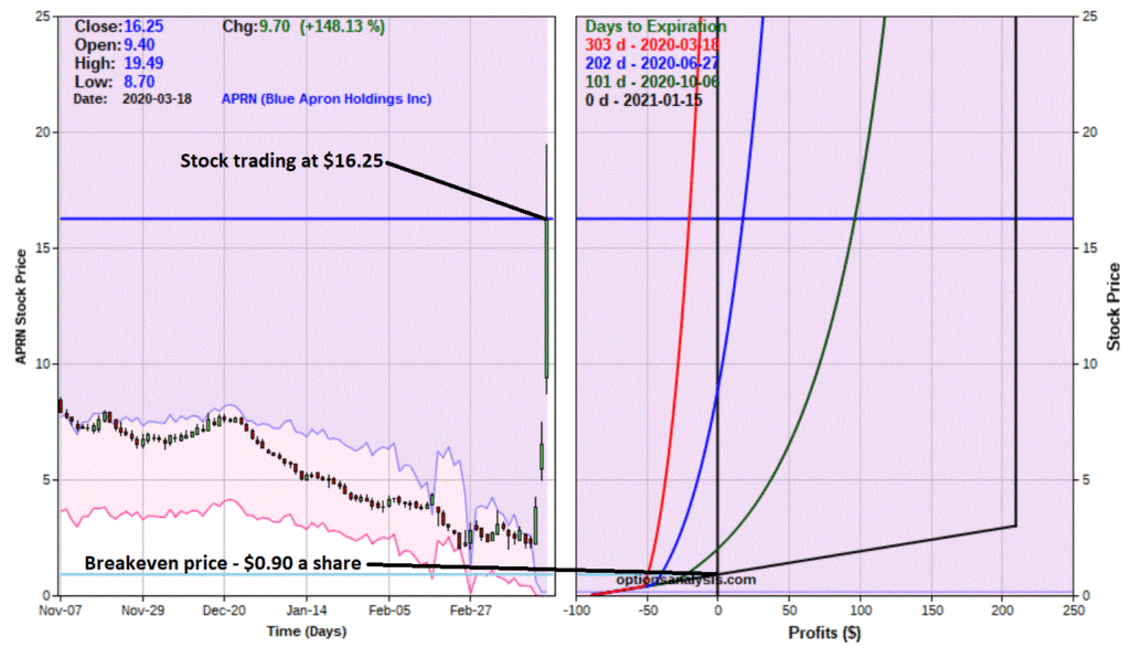
The difference between this stock and the ones in the previous example is that the stock price is soaring instead of plummeting. Now it is possible that APRN stock will flame out and drop like a stone. But remember, we ARE NOT buying the stock here. We are essentially going to make a bet that if it falls it will only fall so much.
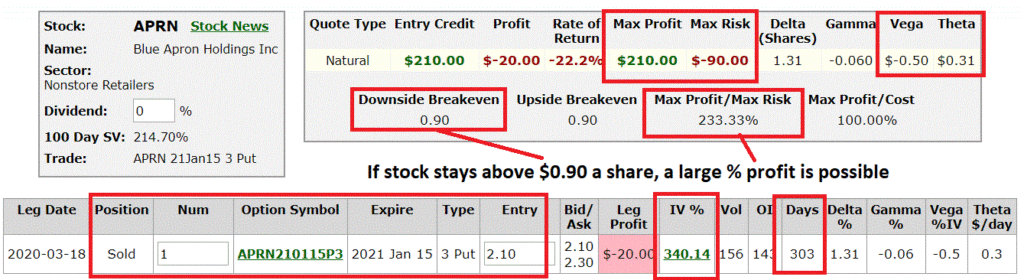
*For
sake of example we are simply selling at the bid price of $2.10. A trader might consider using a limit order
and trying to get something in the middle of the $2.10 bid/$2.30 ask range
*To
enter this trade, we need to have $300 in our account in case the stock falls
below the strike price and we have to buy 100 shares of stock at the strike
price of $3
*However,
we can use the $210 of premium we receive for selling the option as part of
this $300. As a result, we only need to
put up $90 in cash per 1-lot.
*This
$90 represents our maximum risk on the trade
*The
implied volatility for this option is an astronomical 340.14%. The hope is that implied volatility will at
some point plummet and a great deal of time premium will dissipate.
*The
stock trading at $16.25 a share, but our breakeven price this trade is just
$0.90 a share
Let’s
look at the possibilities:
*If APRN completely collapses, we could end up buying 100 shares at $3.00 apiece. But remember, since we took in $2.10 for each option, we sold our effective buy price is $0.90 a share ($3.00 – $2.10 = $0.90)
*Worst case scenario, APRN goes bankrupt, the shares go to $0 and we lose the full $90 (per 1-lot) at risk
*The most likely outcome(hopefully) is that, either:
a)
in 303 days, the options expire worthless and we keep the $210 in premium. This works out to a cool 233.3% return ($210
return / $90 cash held to secure the put options) in roughly 10 months’ time
b)
Somewhere along the way implied volatility – and thus the price of the option –
plummets, and we can buy back the option early and a price below $2.10 per
option.
The
bottom line? If APRN does ANYTHING
better than collapsing 94% in the next 10 months this trade stands to make a
decent return.
Now
comes the real question: Is this actually a good idea? As with the previous examples, that’s not for
me to say.
Jay
Kaeppel
Disclaimer: The information, opinions and ideas
expressed herein are for informational and educational purposes only and are
based on research conducted and presented solely by the author. The information presented does not represent
the views of the author only and does not constitute a complete description of
any investment service. In addition,
nothing presented herein should be construed as investment advice, as an
advertisement or offering of investment advisory services, or as an offer to
sell or a solicitation to buy any security.
The data presented herein were obtained from various third-party
sources. While the data is believed to
be reliable, no representation is made as to, and no responsibility, warranty
or liability is accepted for the accuracy or completeness of such
information. International investments
are subject to additional risks such as currency fluctuations, political
instability and the potential for illiquid markets. Past performance is no guarantee of future
results. There is risk of loss in all
trading. Back tested performance does
not represent actual performance and should not be interpreted as an indication
of such performance. Also, back tested
performance results have certain inherent limitations and differs from actual
performance because it is achieved with the benefit of hindsight.
The
good news is that either:
*at
some point the carnage may actually let up and the options will collapse in
price as implied volatility falls, OR
*the
positions will end up buying the underlying shares at levels far below even
today’s bombed out prices.
The
status of each example position at the close on 3/18/20 appears in Figure 1
A
= ticker symbol
B
= Closing stock price on 3/18/20
C
= Date the put option expires
D
= Strike price of put option sold
E
= Total $ premium received for writing 1 put option
F
= Maximum $ risk per 1-lot (if stock price goes to $0)
G
= % gain if option is NOT exercised ($ premium received / $ risk)
H
= Effective price you would pay for stock if option is exercised
I
= Difference between current stock price and effective purchase price
A
B
C
D
E
F
G
H
I
Ticker
3/18 price
Option Expiration Date
Put Strike Sold
$ Premium Received(1-lot)
$ Risk(1-lot)
% Return if option NOT exercised
Effective Share Purchase if option IS
exercised
Effective Purchase Price from 3/18
price
CCL
$9.30
4/3/20
2.50
$25
$225
11.1%
$2.25
(-75.8%)
RCL
$22.34
1/5/21
22.50
$980
$1,270
77.2%
$12.70
(-43.2%)
MGM
$7.14
6/19/20
3.00
$55
$245
22.4%
$2.45
(-65.7%)
AAL
$11.65
1/15/21
3.00
$84
$216
38.9%
$2.16
(-81.5%)
Figure
1
NOTES:
*Each
of the stocks listed is presently in a freefall. Under no circumstances would I advise buying
shares of these stocks in this environment
*For
each ticker, either a) the stock price will fall below the strike price or b)
it won’t
*If
the stock price DOES drop below the strike price, we may ultimately be required
to buy 100 shares of stock at the strike price.
However, our effective buy price (Column H) will equal the strike price
minus the premium received
*Column
I tells us how far the stock has to fall to reach our effective purchase
price. For example, if we ultimately
buy, for example, ticker CCL, we will pay an effective price of $2.25 a share,
which is -75.8% below the current stock price of $9.30 a share
*If
the stock price DOES NOT drop below the strike price, the option will expire
worthless and we will keep the entire premium received when we sold the put
option (Column E). Our percentage return
will be the premium received (Colum E) divided by the maximum $ risk (Column
F). The maximum dollar risk is the
amount of cash we needed to put up to sell the cash secured put in the first
place.
*The
% return achieved if the option expired worthless appears in Column G.
*For
each of these positions, one of three things will happen. Let’s look at AAL as an example:
*If
the airline industry never recovers and AAL goes bankrupt prior to 1/14/21, we
will buy the shares at an effective price of $2.16 a share ($216 for 100
shares), the shares will become worthless and we will lose $216 (per option
1-lot)
*If
AAL DOES NOT drop from its current price of $11.65 to the strike price of $3 a
share then the option will expire worthless and we will keep the $84 premium as
our profit. This represents a return of
38.9% (Column G), which is $84 divided by our maximum risk of $216.
*If
AAL DOES drop from its current strike price to the strike price of 3 then we
will purchase 100 shares of AAL at $3.00 a share, less the premium
received. Our effective buy price will
be $2.16 a share.
Now
on to today’s idea.
Ticker
APRN
Blue
Apron Holdings ships food kits to homes – sounds like a winner when no one can
go to a restaurant, right? Well in the
past 3 trading days a lot of people had that same thought and ticker APRN shot
up from roughly $3 a share to $16 a share as you can see at the far right of
Figure 1. You will also note that the
implied volatility for 90-day options on APRN recently went form its typical
range between 80% and 100% to over 300%.
This
tells use that there is a ton of time premium in these options, which make them
an excellent candidate for the cash secured put strategy.
The
difference between this stock and the ones in the previous example is that the
stock price is soaring instead of plummeting.
Now it is possible that APRN stock will flame out and drop like a stone. But remember, we ARE NORT buying the stock
here. We are essentially going to make a
bet that if it falls it will only fall so much.
Our
example trade here is:
*Sell
1 APRN Jan2021 3 strike price put @ $2.10
Figure
1 display the details, Figure 2 the risk curves
Figure
2 – APRN secured put details
Figure
3 – APRN secured put risk curves
Things
to Note:
*For
sake of example we are simply selling at the bid price of $2.10. A trader might consider using a limit order
and trying to get something in the middle of the $2.10 bid/$2.30 ask range
*To
enter this trade, we need to have $300 in our account in case the stock falls
below the strike price and we have to buy 100 shares of stock at the strike
price of $3
*However,
we can use the $210 of premium we receive for selling the option as part of
this $300. As a result, we only need to
put up $90 in cash per 1-lot.
*This
$90 represents our maximum risk on the trade
*The
implied volatility for this option is an astronomical 340.14%. The hope is that implied volatility will at
some point plummet and a great deal of time premium will dissipate.
*The
stock trading at $16.25 a share, but our breakeven price this trade is just
$0.90 a share
Let’s
look at the possibilities:
*If
APRN completely collapses, we could end up buying 100 shares at $3.00 apiece. But remember, since we took in $2.10 for each
option, we sold our effective buy price is $0.90 a share ($3.00 – $2.10 = $0.90)
*Worst
case scenario, APRN goes bankrupt, the shares go to $0 and we lose the
full $90 (per 1-lot) at risk
*The
most likely outcome (hopefully) is that, either:
a)
in 303 days, the options expire worthless and we keep the $210 in premium. This works out to a cool 233.3% return ($210
return / $90 cash held to secure the put options) in roughly 10 months’ time
b)
Somewhere along the way implied volatility – and thus the price of the option –
plummets, and we can buy back the option early and a price below $2.10 per
option.
The
bottom line? If APRN does ANYTHING
better than collapsing 94% in the next 10 months this trade stands to make a
decent return.
Now
comes the real question: Is this actually a good idea? As with the previous examples, that’s not for
me to say.
Jay
Kaeppel
Disclaimer: The information, opinions and ideas
expressed herein are for informational and educational purposes only and are
based on research conducted and presented solely by the author. The information presented does not represent
the views of the author only and does not constitute a complete description of
any investment service. In addition,
nothing presented herein should be construed as investment advice, as an
advertisement or offering of investment advisory services, or as an offer to
sell or a solicitation to buy any security.
The data presented herein were obtained from various third-party
sources. While the data is believed to
be reliable, no representation is made as to, and no responsibility, warranty
or liability is accepted for the accuracy or completeness of such
information. International investments
are subject to additional risks such as currency fluctuations, political
instability and the potential for illiquid markets. Past performance is no guarantee of future
results. There is risk of loss in all
trading. Back tested performance does
not represent actual performance and should not be interpreted as an indication
of such performance. Also, back tested
performance results have certain inherent limitations and differs from actual
performance because it is achieved with the benefit of hindsight.
Everybody likes it when an asset that they hold goes up in price. In fact, the more the better. But only to a point as it turns out. When price gets carried away to the upside – we trader types typically refer to it as a “going parabolic”, i.e., a situation when prices are essentially rising straight up – it almost invariably ends very badly. We have seen a couple of examples recently.
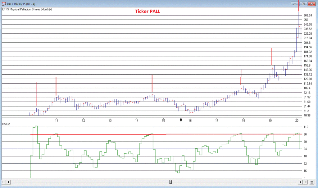
Palladium
Palladium
is a metal that according to Bloomberg’s “About 85% of palladium ends up in the
exhaust systems in cars, where it helps turn toxic pollutants into less-harmful
carbon dioxide and water vapor. It is also used in electronics, dentistry, medicine,
hydrogen purification, chemical applications, groundwater treatment, and
jewelry. Palladium is a key component of fuel cells, which react hydrogen with
oxygen to produce electricity, heat, and water.”
And
it was pretty hot stuff for some time.
At least until it wasn’t. As a
proxy we will look at the ETF ticker symbol PALL, which attempts to track the
price of palladium.
*From
January 2016 into January 2018, PALL rose +139%
*In
the next 7 months it declined by -26%
*And then the fun really began – Between August 2018 and February 2020 PALL rose +245%, with a +110% gain occurring in the final 5+ months of the advance
What
a time it was. Until it wasn’t anymore.
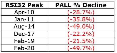
Since peaking at $273.16 a share on 2/27/2020, PALL plunged -50% in just 12 trading days. To put it another way, it gave back an entire year’s worth of gains in just 12 trading days.
Was
there any way to see this coming? Maybe.
In Figure 1 we see a monthly chart with an indicator called “RSI32” in the
bottom clip. This indicator is derived
by taking the 2-month average of the standard 3-month Relative Strength Index
(RSI).
Notice
that historically when the RSI32 indicator gets above 96, trouble tends to
follow pretty quickly. See Figure 2
Figure 2 – PALL: Peaks
in RSI32 and the subsequent maximum drawdown (Courtesy AIQ TradingExpert)
T-Bonds
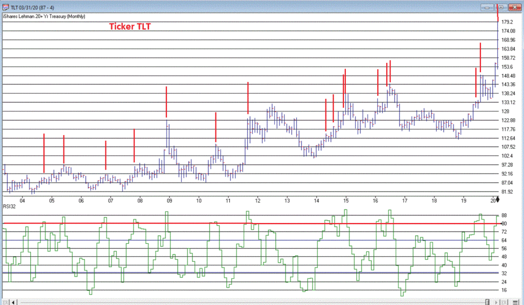
During the panic sell-off in the stock market in recent weeks, treasury bonds became very popular as a “safe haven” as investors piled out of stocks and into the “safety” of U.S. Treasuries. What too many investors appeared to forget in their haste was that long-term treasury can be extremely volatile (for the record, short and intermediate term treasuries are much less volatile than long-term bonds and are much better suited to act as a safe haven). Likewise – just an opinion – buying a 30-year bond paying 1% per year is not entirely unlike buying a stock index fund when the market P/E Ratio is over 30 – there just isn’t a lot of underlying value there. So you are essentially betting on a continuation of the current trend and NOT on the ultimate realization of the underlying value – because there really isn’t any.
Anyway, Figure 3 displays a monthly chart of ticker TLT – an ETF that tracks the long-term treasury – with the RSI32 indicator in the bottom clip.
Bond
price movement is typically not as extreme and volatile as Palladium, so for
bonds a RSI32 reading above 80 typically indicates that potential trouble may
lie ahead.
As of the close of 3/17/20, TLT was almost -15% off of its high in just 6 trading days. We’ll see where it goes from here.
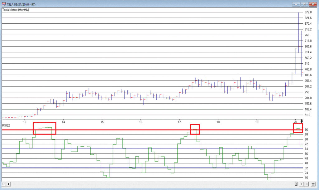
Tesla
(Ticker TSLA)
Anytime you see what is essentially a manufacturing company – no matter how “hot”, “hip”, or “cool” the product they build – go up 200% in 2 months’ time, the proper response is NOT giddy delight. The proper response is:
*If you DO own the stock, either set a trailing stop or take some profits immediately and set a trailing stop for the rest
*If
you DO NOT own the stock, DO NOT allow yourself to get sucked in
Take
TSLA in Figure 4 for instance. By February 2020 TSLA was up almost 200% in 2
months and almost 450% in 8 months. The
RSI32 indicator was above 96 – a stark warning sign.
19
trading days after making its closing high, TSLA is down -59%.
Typically,
the security in question gives back months – or in some case, years – worth of
gains in a shockingly short period of time.
Beware
the parabola.
Jay
Kaeppel
Disclaimer: The information, opinions and ideas
expressed herein are for informational and educational purposes only and are
based on research conducted and presented solely by the author. The information presented does not represent
the views of the author only and does not constitute a complete description of
any investment service. In addition,
nothing presented herein should be construed as investment advice, as an
advertisement or offering of investment advisory services, or as an offer to
sell or a solicitation to buy any security.
The data presented herein were obtained from various third-party
sources. While the data is believed to
be reliable, no representation is made as to, and no responsibility, warranty
or liability is accepted for the accuracy or completeness of such
information. International investments
are subject to additional risks such as currency fluctuations, political
instability and the potential for illiquid markets. Past performance is no guarantee of future
results. There is risk of loss in all
trading. Back tested performance does
not represent actual performance and should not be interpreted as an indication
of such performance. Also, back tested
performance results have certain inherent limitations and differs from actual
performance because it is achieved with the benefit of hindsight.