Good for Japan, Bad for US (Bonds)?

In the late 1980’s, Japan seemed destined to “rule the financial world”.  But when it comes to the financial markets – things don’t always pan out as they appear destined to.  The Nikkei Index topped out in late 1989, didn’t bottom out until February 2009 and has yet to return to its 1989 peak.

But it sure is trying.  This past week the Nikkei reached its highest level 1991.  So, hooray for the Japanese.  Back here in the US of A there may be a slightly different take.  For as we will discuss in a moment, what is good for Japanese stocks is (apparently) bad for US bonds.

Ticker EWJ

As our proxy for Japanese stocks we will use ticker EWJ (iShares Japan).  In Figure 1 you can the monthly action since the ETF started trading in 1996. 
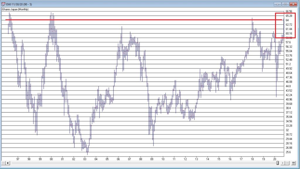
Figure 1- Ticker EWJ monthly (Courtesy AIQ TradingExpert)

Since 1996 EWJ has broken in the $60 a share range on 5 previous occasions, only to be rebuffed.  You can see the latest upward thrust at the far right.  Will this be the time it breaks through?  It beats me and in fact that is not really the focus of this article.  The real question posed here is “what about U.S. treasury bonds?”  Huh?  Consider Figure 2. 

The top clip of Figure 2 displays a weekly chart of EWJ with a 5-week and 30-week moving average drawn.  The bottom clip displays a weekly chart of ticker TLT – the iShares ETF that tracks the long-term U.S. treasury bond. 

Note that – using highly technical terms – when one “zigs”, the other “zags.”
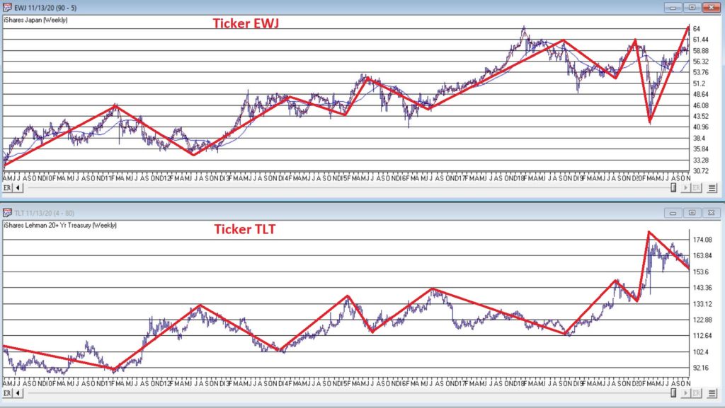
Figure 2 – EWJ vs. TLT (Courtesy AIQ TradingExpert)

The thing to note is the inverse correlation between the two – i.e., when Japanese stocks advance, US treasuries tend to decline and vice versa.  For the record (and for you fellow numbers geeks out there) the correlation coefficient in the last 2 years is -0.45 (1 means they trade exactly the same, -1 means they trade exactly inversely).

For my purposes:

*EWJ 5-week MA < EWJ 30-week MA = BULLISH for US treasuries

*EWJ 5-week MA > EWJ 30-week MA = BEARISH for US treasuries

Any real merit to this? 

*The blue line in Figure 3 displays the cumulative $ +(-) achieved by holding a long position in t-bond futures ($1,000 a point) when the EWJ indicator is BULLISH (for U.S. bonds)

*The orange line in Figure 3 displays the cumulative $ +(-) achieved by holding a long position in t-bond futures ($1,000 a point) when the EWJ indicator is BEARISH (for U.S. bonds)
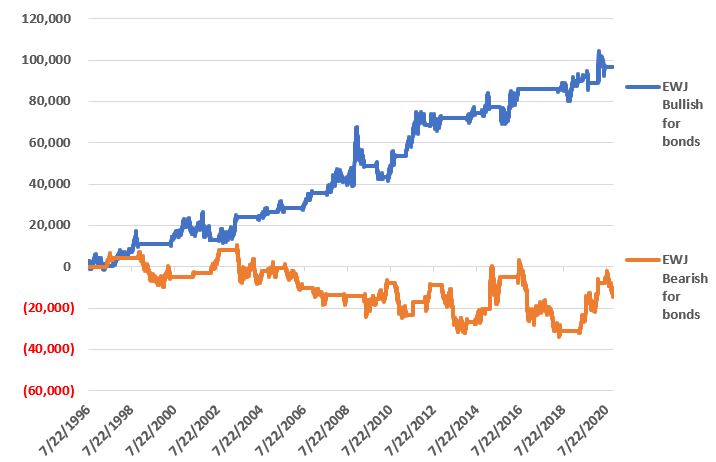
Figure 3 – $ + (-) for Treasury Bond Futures when EWJ indicator is BULLISH for bonds (blue) or BEARISH for bonds (orange)

Summary

Bond investors might keep a close eye on Japanese stocks for a while.  If the latest thrust higher follows through and becomes the move that finally breaks out to the upside, the implication would appear to be negative for U.S. long-term treasury bonds.  On the flip side, if Japanese stocks fail once again to break through and reverse to the downside, then things might look a whole lot better for the 30-year US treasury.

See also Jay Kaeppel Interview in July 2020 issue of Technical Analysis of Stocks and Commodities magazin`

See also Jay’s “A Strategy You Probably Haven’t Considered” Video

See also Video – The Long-Term…Now More Important Than Ever

Jay Kaeppel

Disclaimer: The information, opinions and ideas expressed herein are for informational and educational purposes only and are based on research conducted and presented solely by the author.  The information presented represents the views of the author only and does not constitute a complete description of any investment service.  In addition, nothing presented herein should be construed as investment advice, as an advertisement or offering of investment advisory services, or as an offer to sell or a solicitation to buy any security.  The data presented herein were obtained from various third-party sources.  While the data is believed to be reliable, no representation is made as to, and no responsibility, warranty or liability is accepted for the accuracy or completeness of such information.  International investments are subject to additional risks such as currency fluctuations, political instability and the potential for illiquid markets.  Past performance is no guarantee of future results.  There is risk of loss in all trading.  Back tested performance does not represent actual performance and should not be interpreted as an indication of such performance.  Also, back tested performance results have certain inherent limitations and differs from actual performance because it is achieved with the benefit of hindsight.
Mining in Miners

There are few sectors more volatile – and more unpredictable – than gold miners.  Let’s face it, the business of digging gold out of mines is a tough one and is almost entirely dependent upon the price of gold.  From the high is 2011 to the low in 2016 ticker GDX lost roughly 88% of its value.  On the flip side it is presently about 200% above that 2016 low.  So, if you are looking for “action”, you’ve come to the right place.

Looking for Clues

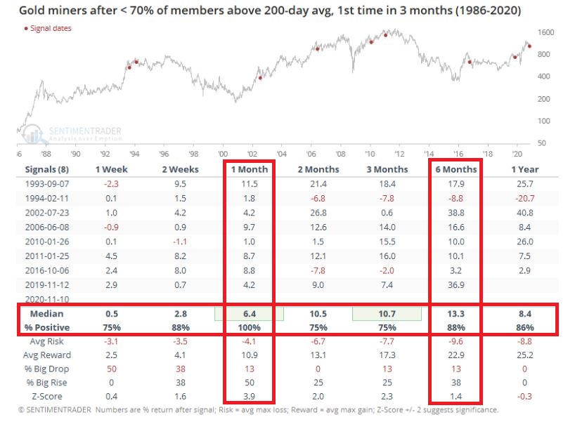
Figure 1 displays a study from www.Sentimentrader.com.  It essentially highlights performance after a pullback in an uptrend.  While it sounds like a bearish setup (a certain percentage of stocks in the sector breaking down) it also highlights why it is important to study actual data and NOT rely on instinct and hunches.

Figure 1 – Gold Miners potentially favorable sign (Courtesy Sentimentrader.com)

The gist of Figure 1 is that the current setup has typically – though important, not always – followed by bullish price action for gold miners across virtually every timeframe in the next year – most notably 1 month and 6 months.

Let’s add a little more “fuel to the fire.”

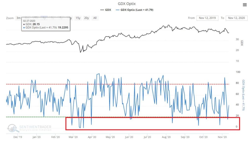
Figure 2 highlights the fact that trader sentiment on GDX has been very low.  This often serves as a favorable contrarian (i.e., bullish) signal.

Figure 2 – GDX trader sentiment (Courtesy Sentimentrader.com)

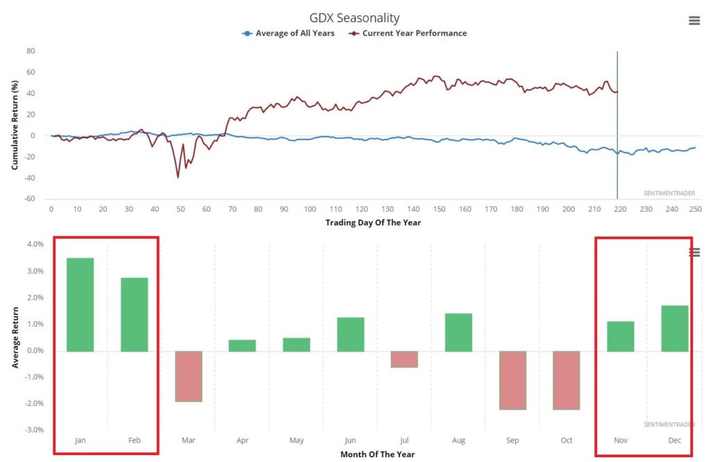
Figure 3 highlights the fact that November through February tends to be “seasonally favorable” for gold mining stocks (it should be noted that this highlights a long-term tendency and that results from year-to-year can be extremely volatile). 

Figure 3 – GDX seasonality (Courtesy Sentimentrader.com)

So, when we add it all up, the information so far seems to signal a potentially bullish setup for gold miners.  Will this in fact be how it plays out?  It beats me.  The key questions here are:

*Will you consider a bullish trade or stand aside?

*Which trade to make?

*And most importantly – what are the risks of that trade and can I handle that level of risk?

A 1-Month Trade

The most straightforward approach would be to buy 700 shares of GDX and sell 100 shares at 1 week, 2 weeks, 1 month, 2 months, 3 months, 6 months and 1 year.

To buy 700 shares of GDX as I write would cost $26,313.  A trader would also need to establish some sort of stop-loss level, based on a break of a given support level and/or as a percentage of capital.

What follows is a cheaper alternative to playing for 1-month.  The trade highlighted IS NOT a “recommendation” but rather an example of one way to play GDX if one is willing to accept the premise that it will be higher (or at least, not likely lower) one month from now.

The trade involves:

*Selling 1 December 36.5 put @ $1.20

*Buying 1 December 34.5 put @ $0.60

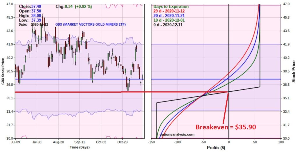
Figure 4 displays the particulars and Figure 5 displays the risk curves.

Figure 4 – GDX bull put spread details (Courtesy www.OptionsAnalysis.com)

Figure 5 – GDX bull put spread risk curves (Courtesy www.OptionsAnalysis.com)

Key things to note:

*This trade costs $140 to enter a 1-lot, which is also the maximum risk

*The maximum profit is $60

*The breakeven price is $35.90 (current GDX price is $37.49)

*If GDX is trading at $36.50 a share or higher on December 11 this trade will earn 43% ($60/$140)

As long as GDX does what it is “supposed” to do (i.e., not go down) things are swell and things are great.  The real question that a trader needs to ask and answer before entering a trade such as this is “what will I do if GDX goes down instead?”

Choices include:

*Ride it out and risk the full $140

*Establish a $ amount stop-loss

*Establish a GDX share price at which you will cut a loss

The recent low of $36.01 serves as an obvious candidate as a “line in the sand”, however, it is also a fairly “tight” stop-loss level. 

What’s the proper play?  That’s not for me to say.  But note the following:

Jay’s Trading Maxim #112: Anyone can “enter” a trade.  Successful traders learn how to “manage” a trade.

A subtle – but supremely important – distinction.

See also Jay Kaeppel Interview in July 2020 issue of Technical Analysis of Stocks and Commodities magazine

See also Jay’s “A Strategy You Probably Haven’t Considered” Video

See also Video – The Long-Term…Now More Important Than Ever

Jay Kaeppel

Disclaimer: The information, opinions and ideas expressed herein are for informational and educational purposes only and are based on research conducted and presented solely by the author.  The information presented represents the views of the author only and does not constitute a complete description of any investment service.  In addition, nothing presented herein should be construed as investment advice, as an advertisement or offering of investment advisory services, or as an offer to sell or a solicitation to buy any security.  The data presented herein were obtained from various third-party sources.  While the data is believed to be reliable, no representation is made as to, and no responsibility, warranty or liability is accepted for the accuracy or completeness of such information.  International investments are subject to additional risks such as currency fluctuations, political instability and the potential for illiquid markets.  Past performance is no guarantee of future results.  There is risk of loss in all trading.  Back tested performance does not represent actual performance and should not be interpreted as an indication of such performance.  Also, back tested performance results have certain inherent limitations and differs from actual performance because it is achieved with the benefit of hindsight.
Signs of Life in Finance?

Nothing is permanent in the financial markets.  Each security – both on its own and relative to other securities – moves in waves.  Sometimes the tide is favorable and sometime it definitely is not.  Identifying the exact moment when the tide turns is a fool’s errand.  But failing to recognize a change in tide – and reacting accordingly – is equally as foolish.

Financials

The financial sector has caught my eye.  Please note that the previous sentence says “The financial sector has caught my eye” and NOT “PUT EVERYTHING YOU HAVE INTO FINANCIAL STOCKS BECAUSE THEY ARE SURE TO GO UP!!!!”  Note the subtle difference between the two sentences.

The primary thing that caught my attention was the research appearing in Figure 1 from www.Sentimentrader.com that displays action for the financial sector following previous “thrusts” such as we just saw recently.

Figure 1 – Financials performance after “thrusts” (Courtesy Sentimentrader.com)

The gist of it is that following the previous 9 signals the finance sector stood higher 12 months later 100% of the time, with an average gain of +20.8%.  Does this guarantee a gain 12 months from the 11/9/20 signal?  Not at all.  But it sure smells like a potential opportunity.

Ticker XLF – Price Action

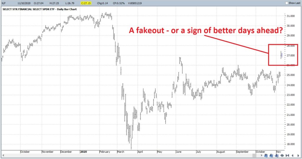
Figure 2 displays the daily chart for ticker XLF (SPDR Financials ETF), which is a pretty choppy and – on the face of it – uninspiring affair.

Figure 2 – XLF Daily (Courtesy ProfitSource by HUBB)

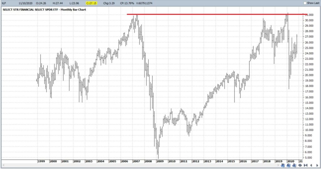
Figure 3 displays a weekly chart of XLF. My eyes are immediately drawn to the previous peaks around $31 a share.  The good news is that this level serves as a good price target.  The bad news is that it represents a significant area of resistance should it actually get there.

Figure 3 – XLF Weekly (Courtesy ProfitSource by HUBB)

Ticker XLF – Relative Performance

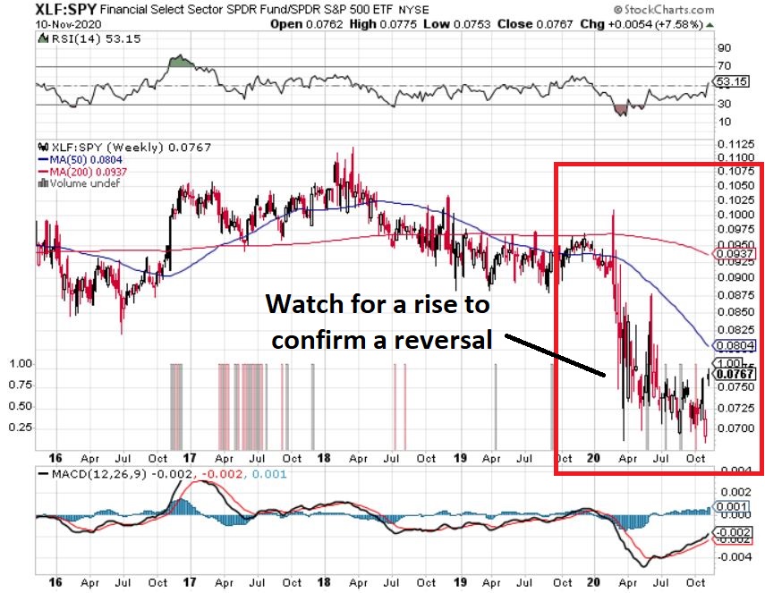
In looking for a “change of tide”, consider Figure 4.  This chart displays the performance of XLF relative to the performance of the S&P 500 (when the bars in an uptrend it means financials are outperforming SPX and vice versa).  As you can see, financials have significantly underperformed since early 2018.  We should be watching this for an upside reversal.

Figure 4 – XLF performance relative to SPY performance (Courtesy StockCharts.com)

Financials – Seasonality

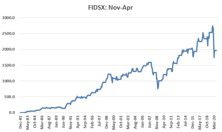
The November 1 through April 30th period is “typically” favorable for financial stocks.  As a proxy (and to obtain a longer track record) here we will use ticker FIDSX (Fidelity Select Financial Services).  Figure 5 displays the cumulative growth achieved by holding FIDSX during November through April every year since inception in 1982. 

Figure 5 – FIDSX cumulative % return during Nov-Apr; 1982-2020

When things go bad, they tend to go very bad (FIDSX lost -21.7% From Nov 1, 2019 through Apr 30, 2020).  Note that there were 4 periods (1990, 2008, 2009 and 2020) that showed a loss of -10% or more.  On the flip side, 17 of the 29 UP years showed a gain in excess of +10%.  Figure 6 displays the overall results.

Figure 6 – FIDSX during Nov-Apr

So, is this a good time to take the plunge into financial stocks?  JOTM just provides information, NOT recommendations or predictions.  But to play out the example let’s consider a hypothetical example trade.

Betting on XLF

For an investor who wants to bet on an advance in XLF over the next year the most straightforward approach is simply to buy 100 shares of XLF and “hold on tight.”  As I write XLF is trading at $27.15 a share, so buying 100 shares involves an investment of $2,715.  One question an investor would need to ask an answer is, “am I just going to ride it out for 12 months come hell or high water, or will I set a stop-loss point?”.  If the latter then the next decision is where to place a stop-loss.

As a less-costly alternative, let’s consider a “stock replacement” position using a call option in ticker XLF.  Our trade involves buying the January 2022 call option with a strike price of $21.  In real-world trading we would use a limit order to try to buy closer to the midpoint of the bid/ask range.  But for sake of example we will buy “at the market” at $7.00 (x 100 shares = $700). 

Figure 7 displays the particulars and Figure 8 the risk curves. 

Figure 7 – XLF long call (Courtesy www.OptionsAnalysis.com)

Figure 8 – XLF long call risk curves (Courtesy www.OptionsAnalysis.com)

Things to note:

*Cost to enter and maximum risk (if XLF drops below $21 a share) is $700

*The breakeven price is $28 a share.

Above $28 a share the option will move point-for-point with the stock.

If XLF rallies to $31 a share:

Figure 9 – Stock versus Call Option if XLF rallies to $31

Summary

Is XLF due to rally in the year ahead?  It beats me.  But there is some evidence to argue that way.  If so and investor has a choice, a) do nothing, b) buy stock, c) buy a call option.

The choice is yours.

See also Jay Kaeppel Interview in July 2020 issue of Technical Analysis of Stocks and Commodities magazine

See also Jay’s “A Strategy You Probably Haven’t Considered” Video

See also Video – The Long-Term…Now More Important Than Ever

Jay Kaeppel

Disclaimer: The information, opinions and ideas expressed herein are for informational and educational purposes only and are based on research conducted and presented solely by the author.  The information presented represents the views of the author only and does not constitute a complete description of any investment service.  In addition, nothing presented herein should be construed as investment advice, as an advertisement or offering of investment advisory services, or as an offer to sell or a solicitation to buy any security.  The data presented herein were obtained from various third-party sources.  While the data is believed to be reliable, no representation is made as to, and no responsibility, warranty or liability is accepted for the accuracy or completeness of such information.  International investments are subject to additional risks such as currency fluctuations, political instability and the potential for illiquid markets.  Past performance is no guarantee of future results.  There is risk of loss in all trading.  Back tested performance does not represent actual performance and should not be interpreted as an indication of such performance.  Also, back tested performance results have certain inherent limitations and differs from actual performance because it is achieved with the benefit of hindsight.

AMD Seasonality Revisited

In this article I wrote about the fairly amazing seasonality of ticker AMD.  That version “cut things a little fine” – i.e., the buy and sell dates very specific within different months.  Today – for no particular reason – I want to put out a simpler version.

Rules

Hold ticker AMD:

*During the months of November through May

*During the month of August

These are considered “favorable” months.  All other months (June, July, September and October are considered “unfavorable.”

Results

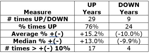
Figure 1 displays the net results using daily price data from Jan 1990 through 11/9/20.

Figure 1 – AMD Results: Favorable versus Unfavorable periods

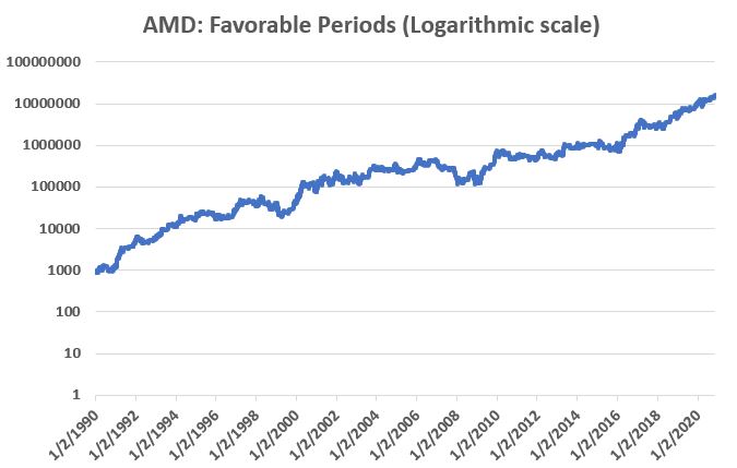
Figure 2 displays the growth of $1,000 invested in AMD ONLY during the favorable periods (note this is a “logarithmic” scale chart – i.e., the distance between $10 and $100 is the same the distance between $100 and $1,000, etc.)

Figure 2 – Growth of $1,000 in AMD ONLY during Favorable periods

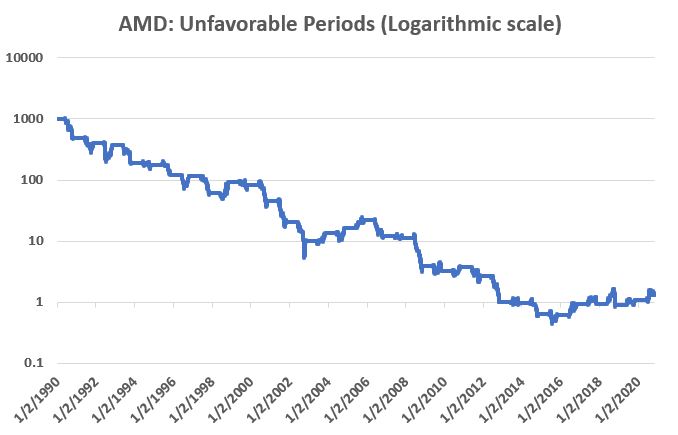
Figure 3 displays the growth of $1,000 invested in AMD ONLY during the unfavorable periods (note this also is a “logarithmic” scale chart)

Figure 3 – Growth of $1,000 in AMD ONLY during Unfavorable periods

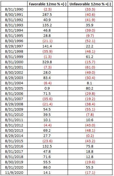
For measuring purposes we will end AMD’s “Fiscal Year” on August 31st and look back at performance over the prior 12 months for “Favorable” and “Unfavorable” periods.  Figure 4 displays the year-by-year results.

Figure 4 – AMD Seasonality Year-by-Year

Summary

One major caveat to note.  Buying and holding AMD only during the Favorable periods would have involved riding out two drawdowns in excess of -60%(!!), including a -75% drawdown during the 2007-2009 bear market.  So there’s that.

If one can somehow get past that – or around it somehow, perhaps with some sort of stop-loss provision – the overall results are, ahem, “compelling.”

Does this mean that AMD is guaranteed to soar between now and June 2021 (up +10% so far)?  Not at all.  Is this really a viable “investment strategy?”  That’s not for me to say. 

Still, let’s just say – there appears to be “something there” that might be worth a closer look and a little independent research.

See also Jay Kaeppel Interview in July 2020 issue of Technical Analysis of Stocks and Commodities magazine

See also Jay’s “A Strategy You Probably Haven’t Considered” Video

See also Video – The Long-Term…Now More Important Than Ever

Jay Kaeppel

Disclaimer: The information, opinions and ideas expressed herein are for informational and educational purposes only and are based on research conducted and presented solely by the author.  The information presented represents the views of the author only and does not constitute a complete description of any investment service.  In addition, nothing presented herein should be construed as investment advice, as an advertisement or offering of investment advisory services, or as an offer to sell or a solicitation to buy any security.  The data presented herein were obtained from various third-party sources.  While the data is believed to be reliable, no representation is made as to, and no responsibility, warranty or liability is accepted for the accuracy or completeness of such information.  International investments are subject to additional risks such as currency fluctuations, political instability and the potential for illiquid markets.  Past performance is no guarantee of future results.  There is risk of loss in all trading.  Back tested performance does not represent actual performance and should not be interpreted as an indication of such performance.  Also, back tested performance results have certain inherent limitations and differs from actual performance because it is achieved with the benefit of hindsight.
Silver – Up is Good, Down is Bad

Nothing like a simple concept.  So, when it comes to silver, it turns out that the best forecaster of the future trend in the price of silver is, well, the price trend of silver.  Too simple?  Let’s take a look.

Silver

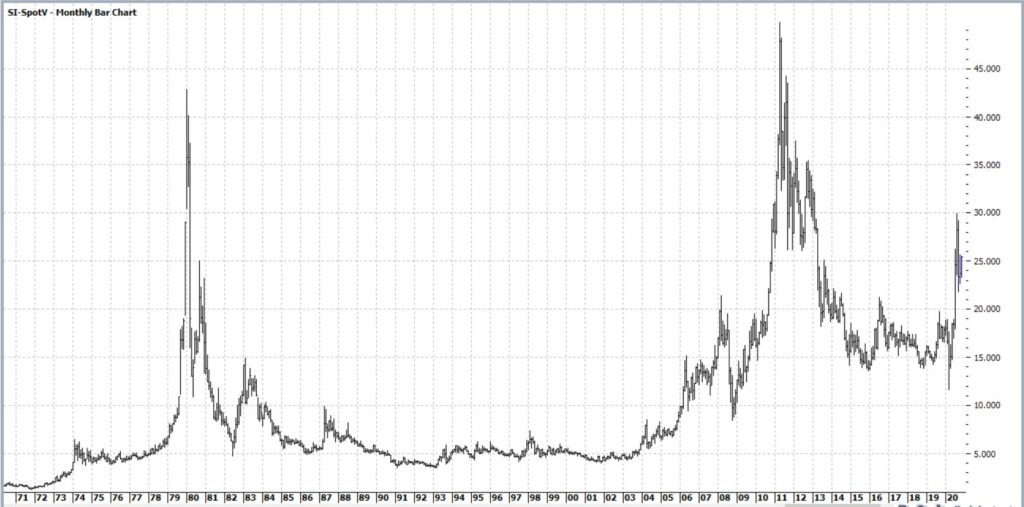
Figure 1 displays the monthly chart of silver futures going back to 1970.  Let’s just say, “a lot has happened”.

Figure 1 – Silver futures (Courtesy ProfitSource by HUBB)

But here is the interesting thing.  Let’s look at the hypothetical results achieved by buying and holding a silver futures contract if:

*Silver is UP over the past 52 weeks

*Silver is DOWN over the past 52 weeks

Specifically, at the end of each week we will determine whether silver is higher or lower than it was 52 weeks prior. 

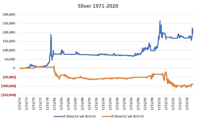
*The blue line in Figure 2 displays the cumulative $ +(-) achieved if one held a silver futures contract ONLY when the prior 52 weeks shows a rise in the price of silver

*The orange line in Figure 2 displays the cumulative $ +(-) achieved if one held a silver futures contract ONLY when the prior 52 weeks shows a decline in the price of silver

Figure 2 – Holding a long position in silver if previous 52-week were UP (blue line) or down (orange line)

The blue line is by no means a “straight line” advance – there is a lot of “swooping and soaring” involved.  But the key point is the stark difference between the two lines.  To wit:

*+(-) from holding silver is 52 week ROC>0 = +$199,690

*+(-) from holding silver is 52 week ROC<=0 = (-$89,525)

Summary

This is not intended to be an “automatic” bullish or bearish signal for silver.  But in terms of “weight of the evidence” it is clearly appears to be better to “go with the trend” when it comes to silver.

When things are swell, things are great – and when they’re not, get it off your plate.

For the record, silver is up roughly 30% over the last 52 weeks.

See also Jay Kaeppel Interview in July 2020 issue of Technical Analysis of Stocks and Commodities magazine

See also Jay’s “A Strategy You Probably Haven’t Considered” Video

See also Video – The Long-Term…Now More Important Than Ever

Jay Kaeppel

Disclaimer: The information, opinions and ideas expressed herein are for informational and educational purposes only and are based on research conducted and presented solely by the author.  The information presented represents the views of the author only and does not constitute a complete description of any investment service.  In addition, nothing presented herein should be construed as investment advice, as an advertisement or offering of investment advisory services, or as an offer to sell or a solicitation to buy any security.  The data presented herein were obtained from various third-party sources.  While the data is believed to be reliable, no representation is made as to, and no responsibility, warranty or liability is accepted for the accuracy or completeness of such information.  International investments are subject to additional risks such as currency fluctuations, political instability and the potential for illiquid markets.  Past performance is no guarantee of future results.  There is risk of loss in all trading.  Back tested performance does not represent actual performance and should not be interpreted as an indication of such performance.  Also, back tested performance results have certain inherent limitations and differs from actual performance because it is achieved with the benefit of hindsight.

Bounce, Medium-term?

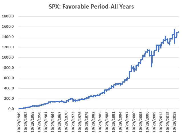
Since 1949 the stock market has showed a strong tendency to rally towards the end of the calendar year.  The period we are talking about specifically is:

*The last 2 trading days of October

*Through the 3rd trading day of the following January

The Results

Figure 1 displays the cumulative % price performance for the S&P 500 Index held ONLY during the period listed above, every year starting in October 1949.

Figure 1 – S&P 500 cumulative % +(-) ONLY during seasonally favorable period; 1949-2020

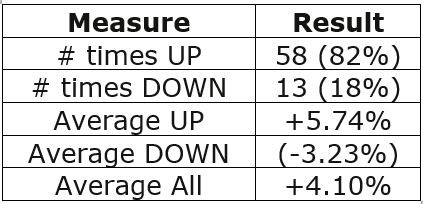
For the record:

Figure 2 – S&P 500 Results – Seasonally Favorable Period; 1949-2020

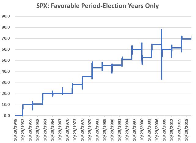
For what it’s worth, Figure 3 displays the growth during the seasonally favorable period ONLY during Election Years (and NOT including the 3 days of January during the post-election year. The bear market years of 2000 and 2008 are pretty obvious.

Figure 3 – S&P 500 cumulative % +(-) ONLY during Seasonally Favorable Period in Election years

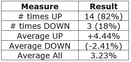
During Election Years ONLY, an upward bias still exists (up 73% of the time), but not as strongly as during all years:

Figure 4 – Election Year ONLY results

Summary

So, should we sit back, relax and enjoy the ride, safe and secure in the knowledge that “long-term market bias” will take care of us? 

Don’t you know what year this is!?  2020 has been one like no other.

The best advice might be this: As long as the major indexes hold above their long-term moving averages, the results shown here suggest giving the bullish case the benefit of the doubt.  If price trends fail to confirm an uptrend and you determine that defensive steps are necessary, then defensive steps should be taken.

But given all the angst out there these days, DO NOT give into fear based on “what could happen.”  Let the market itself be your guide. 

See also Jay Kaeppel Interview in July 2020 issue of Technical Analysis of Stocks and Commodities magazine

See also Jay’s “A Strategy You Probably Haven’t Considered” Video

See also Video – The Long-Term…Now More Important Than Ever

Jay Kaeppel

Disclaimer: The information, opinions and ideas expressed herein are for informational and educational purposes only and are based on research conducted and presented solely by the author.  The information presented represents the views of the author only and does not constitute a complete description of any investment service.  In addition, nothing presented herein should be construed as investment advice, as an advertisement or offering of investment advisory services, or as an offer to sell or a solicitation to buy any security.  The data presented herein were obtained from various third-party sources.  While the data is believed to be reliable, no representation is made as to, and no responsibility, warranty or liability is accepted for the accuracy or completeness of such information.  International investments are subject to additional risks such as currency fluctuations, political instability and the potential for illiquid markets.  Past performance is no guarantee of future results.  There is risk of loss in all trading.  Back tested performance does not represent actual performance and should not be interpreted as an indication of such performance.  Also, back tested performance results have certain inherent limitations and differs from actual performance because it is achieved with the benefit of hindsight.
Bounce, Short-term?

The stock market sure is wickedly perverse at times.  According to the historical calendar, October 28th is “the best day of the year” for the stock market.  Then along comes – what else – 2020.  And the market tanks on 10/28 with the Dow losing almost 950 points.

Let’s face it, the best day of 2020 is going to be December 31st.

In any event, it is pretty simple to glance at a chart of the Dow or S&P 500 and assume that the market is doomed to head lower.  And maybe it is. 

But then again, maybe it’s not. 

The Short-Term

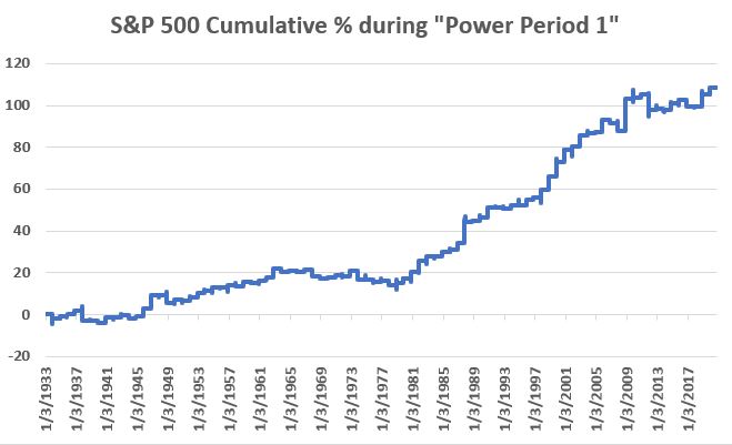
Figure 1 display the cumulative % growth achieved by holding the S&P 500 Index ONLY during the following 4 days each year since 1933:

*Last 2 trading days of October

*First 2 trading days of November

We will refer to this as “Power Period 1:

Figure 1 – S&P 500 cumulative % +(-) ONLY during 4-day Power Period 1

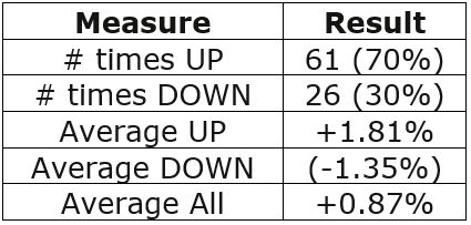
For the record:

Figure 2 – Power Period 1 Results; 1933-2019

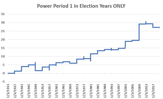
For what it’s worth, Figure 3 displays the growth during this 4-day period ONLY during Election Years.

Figure 3 – S&P 500 cumulative % +(-) ONLY during 4-day Power Period 1 in Election years

1948 saw a -3.2% decline and 2016 -1.6%.  On the whole however, the market showed a gain 16 out of 20 times (75%) with an average gain of +1.18%.

Summary

Does any of this mean the market is sure to bounce over the course of the next four days?  Not at all.  The market could easily continue on it’s current downward trajectory. Still, given all of the sudden gloom and doom, it offers your inner contrarian some serious food for thought.

See also Jay Kaeppel Interview in July 2020 issue of Technical Analysis of Stocks and Commodities magazine

See also Jay’s “A Strategy You Probably Haven’t Considered” Video

See also Video – The Long-Term…Now More Important Than Ever

Jay Kaeppel

Disclaimer: The information, opinions and ideas expressed herein are for informational and educational purposes only and are based on research conducted and presented solely by the author.  The information presented represents the views of the author only and does not constitute a complete description of any investment service.  In addition, nothing presented herein should be construed as investment advice, as an advertisement or offering of investment advisory services, or as an offer to sell or a solicitation to buy any security.  The data presented herein were obtained from various third-party sources.  While the data is believed to be reliable, no representation is made as to, and no responsibility, warranty or liability is accepted for the accuracy or completeness of such information.  International investments are subject to additional risks such as currency fluctuations, political instability and the potential for illiquid markets.  Past performance is no guarantee of future results.  There is risk of loss in all trading.  Back tested performance does not represent actual performance and should not be interpreted as an indication of such performance.  Also, back tested performance results have certain inherent limitations and differs from actual performance because it is achieved with the benefit of hindsight.
The Fab Five – Ready to Ride?

Sometimes it’s “what you hold.”  Sometimes it’s “when you hold it.”  And sometimes, it’s both.  With the stock market about to enter the “seasonally favorable” period of November through April – despite all of the massive doubts that surround the market (COVD, economy, election, debt, etc., etc.) it may be a good time for investors to put aside all of today’s “news” and to consider a more objective approach for the months ahead.

The Fab Five

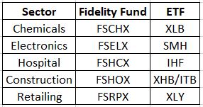
Let’s consider a portfolio that holds the following sectors from November 1st through April 30th every year no matter what.

Figure 1 – The Fab 5 sectors

NOTE: Figure 1 was updated on 10/29/20. Previously it contained a misprint listing ticker XLP as the ETF choice for Retailing. The correct ticker is XLY.

The Test

For our purposes we will use monthly total return data for the Fidelity Select Sector funds listed above (which allows us to go back to 1986) and examine how the performed as a group during November through April. 

The Rules

*Buy the five Fidelity sector funds (20% to each) on the last trading day of October each year

*Sell the funds on the last day of April the following year

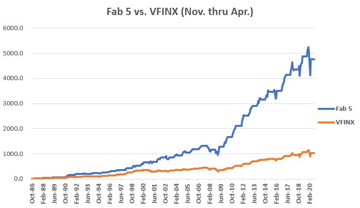
As a benchmark, we will compare holding these five to holding ticker VFINX (Vanguard S&P 500 Index fund) also ONLY during the months of November through April.

The Results

The cumulative returns for both approaches appear in Figure 2

Figure 2 – Cumulative return for Fab 5 versus VFINX held ONLY during November through April

The year-by-year results appear in Figure 3.  The far-right column labeled “Diff” displays the amount by which the Fab 5 outperformed or underperformed the VFINX benchmark.

Figure 3 – Year-by-Year Comparison of Fab 5 versus VFINX (November through April only)

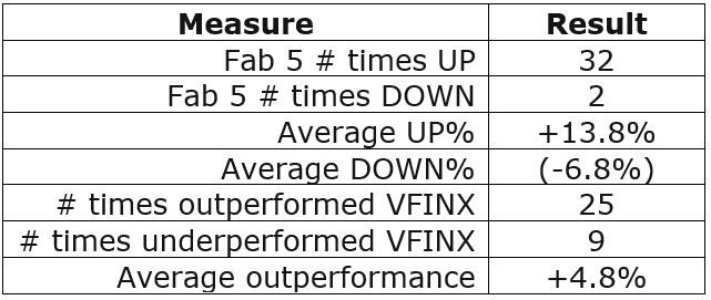
For the record:

Figure 4 – Comparative Figures

Things to note:

*The Fab Five showed a gain between November and April 94% of the time (32 out of 34 years)

*The Fab Five outperformed VFINX in 74% of the years (25 out of 34 years)

Summary

What IS NOT in question is whether or not the Fab 5 have outperformed the S&P 500 Index historically during November through April.

What IS very much in question is “what happens going forward?”

Are the Fab 5 “guaranteed” to continue to perform well in the future and outpace the broader market?  Sorry folks, it doesn’t work that way.  There are no guarantees.

As an investor, you analyze the data, you decide what you think will work, you place your bets and the Market Gods take it from there…

Same as it ever was.

See also Jay Kaeppel Interview in July 2020 issue of Technical Analysis of Stocks and Commodities magazine

See also Jay’s “A Strategy You Probably Haven’t Considered” Video

See also Video – The Long-Term…Now More Important Than Ever

Jay Kaeppel

Disclaimer: The information, opinions and ideas expressed herein are for informational and educational purposes only and are based on research conducted and presented solely by the author.  The information presented represents the views of the author only and does not constitute a complete description of any investment service.  In addition, nothing presented herein should be construed as investment advice, as an advertisement or offering of investment advisory services, or as an offer to sell or a solicitation to buy any security.  The data presented herein were obtained from various third-party sources.  While the data is believed to be reliable, no representation is made as to, and no responsibility, warranty or liability is accepted for the accuracy or completeness of such information.  International investments are subject to additional risks such as currency fluctuations, political instability and the potential for illiquid markets.  Past performance is no guarantee of future results.  There is risk of loss in all trading.  Back tested performance does not represent actual performance and should not be interpreted as an indication of such performance.  Also, back tested performance results have certain inherent limitations and differs from actual performance because it is achieved with the benefit of hindsight.
Looking for Ideas “Off the Beaten Path”

For the record, I am an avowed “trend-follower.”  But I also know that no trend lasts forever.  So, while I have gotten pretty good at “riding along”, I do – like most people – like to “look ahead” since I do know that the landscape will forever be changing.

So, with the caveat that none of what follows should be considered a “call to action”, only as a “call to pay attention”, let’s venture out “into the weeds.”

AIROIL

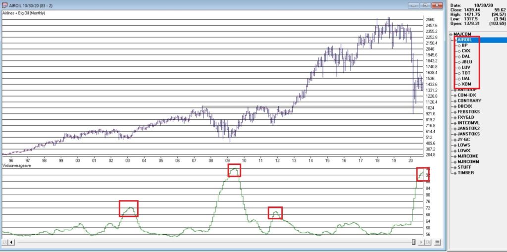
Here is an ugly pairing – airline stocks and traditional energy stocks – yikes!  In Figure 1 you see an index that I created and followed call AIROIL comprised of three airline stocks and five “Big Oil” stocks.  During the pandemic meltdown this index fell to a level not seen since 2007 before “bouncing”. 

Figure 1 – Jay’s AIROIL Index (Courtesy AIQ TradingExpert)

In the bottom clip you see an indicator I call VFAA.  Note that when VFAA tops out and rolls over, meaningful advances in the index tend to follow.  In addition, VFAA is at a high level seen only once before in 2009. Following that reversal, the index rose almost 500% over the next 9 years.

So, is now a great time to pile into airlines and big oil?  One would have to be a pretty hard-core contrarian to pound the table on this one.  The airlines are in terrible shape due to the pandemic and vast uncertainty remains regarding when things might improve.  And “Big Oil” is about as unloved as any sector has ever been. 

So, am I suggesting anyone “load up” on airlines and oil?  Nope.  What I am saying is that I am watching this closely and that if and when VFAA “rolls over” I may look to commit some money to these sectors on a longer-term contrarian basis.

International/Commodities/Value

Also known of late as “the barking dogs”.  If you have had money committed to any or all of these asset classes in recent years you are shaking your head right about now.  These areas have VASTLY underperformed a simple “buy-and-hold the S&P 500 Index” approach for a number of years.

Is this state of affairs going to change anytime soon?  Regarding “anytime soon” – it beats me.  However, I am on the record as arguing that at some point this WILL change.  History makes one thing very clear – no asset class has a permanent edge.  So, given that the S&P 500 Index has beaten these above mentioned by such a wide margin for such a long time (roughly a decade or more) I am confident that one day in the next x years, the “worm will turn.”

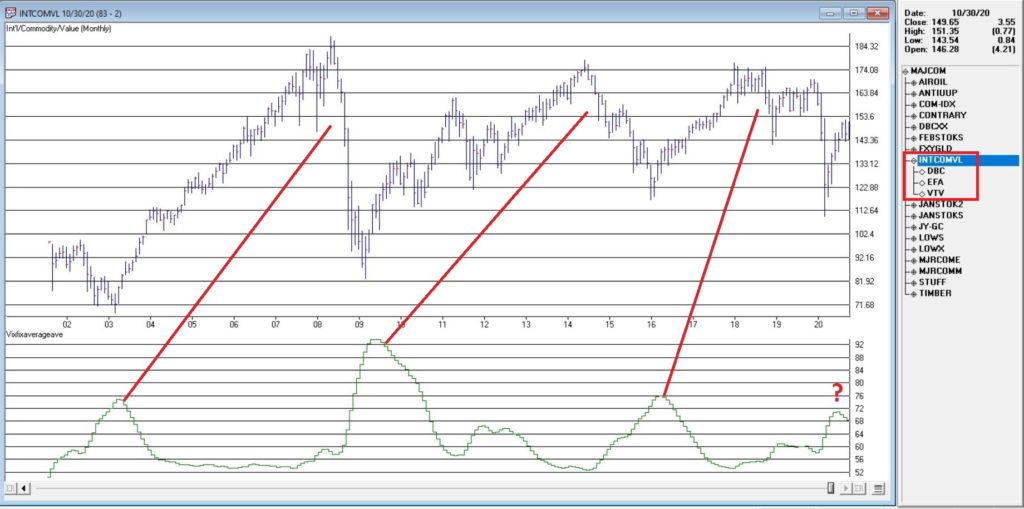
Figure 2 displays an index that I created and follow that tracks an international ETF, a commodity ETF and a value ETF.  The VFAA indicator appears in the bottom clip. 

Figure 2 – Jay’s INTCOMVAL Index (Courtesy AIQ TradingExpert)

Now if history is a guide, then the recent “rollover” by VFAA suggests that this particular grouping of asset classes should perform well in the coming years.  Two things to note:

1. There is no guarantee

2. There is absolutely no sign yet that “the turn” – relative to the S&P 500 – is occurring

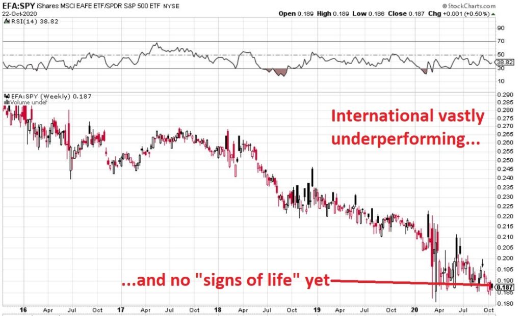
Figure 3, 4 and 5 are “relative strength” charts from www.StockCharts.com.  They DO NOT display the price of any security; they display the performance of the first ETF list compared to the second ETF listed.  So, Figure 3 displays the performance of ticker EFA (iShares MSCI EAFE ETF which tracks a broad index of stocks from around the globe, excluding the U.S.) relative to the S&P 500 Index.

When the bars are trending lower it means EFA is underperforming SPY and vice versa.  The trend in Figure 3 is fairly obvious – international stocks continue to lose ground to U.S. large-cap stocks. 

Figure 3 – Ticker EFA relative to ticker SPY (Courtesy: www.StockCharts.com)

If your goal is to pick a bottom, have at it.  As for me, I am waiting for some “signs of life” in international stocks relative to U.S. stocks before doing anything.

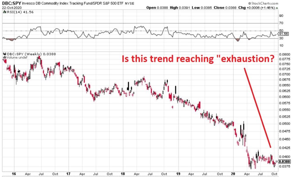
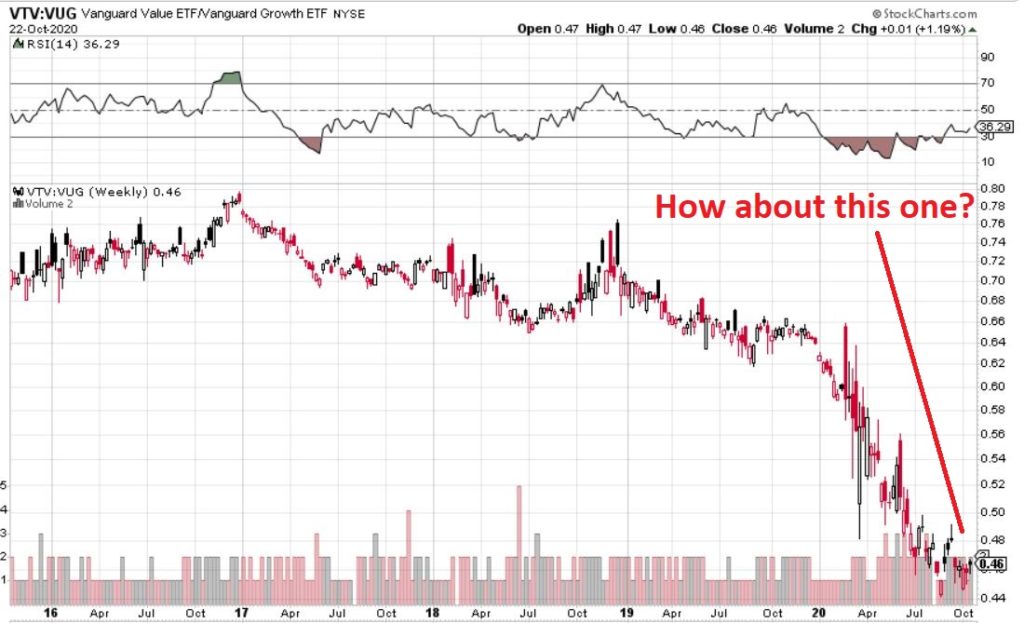
Figure 4 displays ticker DBC (a commodity-based ETF) versus SPY and Figure 5 displays ticker VTV (Vanguard Value ETF) versus ticker VUG (Vanguard Growth ETF). Both tell the same tale as Figure 3 – unless you are an avowed bottom-picker there is no actionable intelligence.  Still, both these trends are now extremely overdone, so a significant opportunity may be forming. 

Figure 4 – Ticker DBC relative to ticker SPY (Courtesy: www.StockCharts.com)

Figure 5 – Ticker VTV relative to ticker VUG (Courtesy: www.StockCharts.com)

Summary

Two key points as succinctly as possible:

*Nothing is happening at the moment with everything displayed above…

*…But something will (at least in my market-addled opinion) – so pay close attention.

See also Jay Kaeppel Interview in July 2020 issue of Technical Analysis of Stocks and Commodities magazine

See also Jay’s “A Strategy You Probably Haven’t Considered” Video

See also Video – The Long-Term…Now More Important Than Ever

Jay Kaeppel

Disclaimer: The information, opinions and ideas expressed herein are for informational and educational purposes only and are based on research conducted and presented solely by the author.  The information presented represents the views of the author only and does not constitute a complete description of any investment service.  In addition, nothing presented herein should be construed as investment advice, as an advertisement or offering of investment advisory services, or as an offer to sell or a solicitation to buy any security.  The data presented herein were obtained from various third-party sources.  While the data is believed to be reliable, no representation is made as to, and no responsibility, warranty or liability is accepted for the accuracy or completeness of such information.  International investments are subject to additional risks such as currency fluctuations, political instability and the potential for illiquid markets.  Past performance is no guarantee of future results.  There is risk of loss in all trading.  Back tested performance does not represent actual performance and should not be interpreted as an indication of such performance.  Also, back tested performance results have certain inherent limitations and differs from actual performance because it is achieved with the benefit of hindsight.
What’s Good for Stocks and Bad for Silver?

If nothing else the markets sure are interesting.

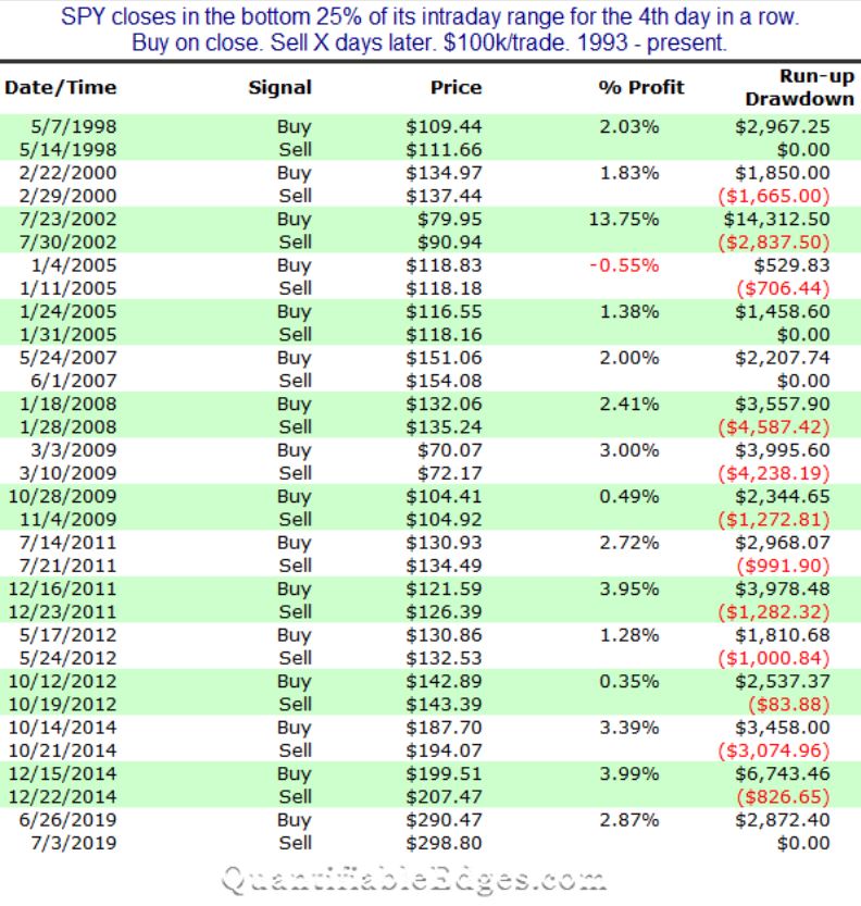
In Figure 1 below, Rob Hanna of www.QuantifiableEdges.com highlights those rare occasions when the S&P 500 Index closed within the lowest 25% of its daily range for four consecutive trading days, and how the index performed over the following 5 trading days.

The bottom line: 15 of 16 signals (94%) saw the S&P 500 Index advance during the 5-trading day period after each signal.

Figure 1 – SPX +(-) during 5 trading days after closing in lowest 25% of daily range for 4 consecutive days (Courtesy: www.QuantifiableEdges.com)

Unfortunately, this signal does not occur often enough to use as a standalone strategy.  However, information like this can be very helpful as “weight of the evidence” for a trader. 

To wit:

*The latest signal fired at the close on 10/21/20

*The S&P 500 is lower today as I type

This suggests one of two things.  Either:

*This signal will not pan out

*We may be looking at a very good short-term buying opportunity

I am not offering any opinions here, just observations.  But history suggests that the market could be higher by the close on 10/28.

Silver

Interestingly, the exact same signal (4 straight days closing in the lowest 25% of the daily range) applied to silver give a very different result.  Figure 2 displays the cumulative $ +(-) for holding a long position in silver futures for 1-day after silver closes 4 straight in the lowest 25% of its daily range.
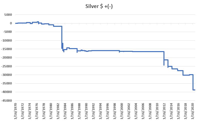
Figure 2 – Cumulative $ +(-) if Long Silver futures for 1-day after 3 straight closes in lowest 25% of daily range; 1970-2020

As you can see, the results are awful.  To put it another way, a trader who sold short silver futures on the 4th straight day of closes in the lowest 25% of the daily range would have made some decent money (albeit, not very often and over a long period of time).

For the record:

Figure 3 – Silver futures performance during 1 trading day after 4 straight closes in lowest 25% of daily range

Silver did show a gain 42% of the time, however, clearly the average DOWN was significantly worse than the average UP.

Figure 4 shows the dates.

Date Silver $ + (-) Next Day
9/15/1970 90
8/31/1971 95
3/7/1973 330
4/10/1974 (650)
11/1/1974 685
3/29/1976 300
7/30/1976 (875)
8/2/1976 (270)
8/3/1976 485
6/10/1977 (630)
3/22/1978 180
6/26/1979 (125)
6/27/1979 (435)
11/10/1980 (900)
2/25/1983 (12,850)
2/28/1983 0
3/1/1983 2,850
6/3/1983 (2,500)
6/6/1983 (1,700)
10/3/1983 (650)
10/4/1983 1,200
7/17/1984 1,050
12/18/1984 (25)
12/19/1984 100
4/15/1985 (425)
6/19/1987 (2,250)
6/22/1987 875
7/26/1988 400
11/18/1988 (275)
8/30/1989 (225)
8/31/1989 150
12/29/1989 (100)
1/2/1990 (165)
7/24/1990 75
7/25/1990 100
7/25/1991 125
11/30/1994 50
5/26/1999 (575)
5/27/1999 (225)
5/28/1999 450
8/17/2000 (140)
8/18/2000 50
11/21/2000 (10)
2/10/2003 (150)
12/27/2011 (7,900)
12/28/2011 3,125
2/19/2013 (4,425)
2/20/2013 575
3/25/2014 (1,225)
3/26/2014 (175)
11/6/2015 (1,050)
5/2/2017 (1,825)
5/3/2017 (750)
3/4/2019 250
3/13/2020 (8,850)

Figure 4 – Silver futures $ +(-) 1-day after 4 consecutive closes in lowest 25% of daily range

Summary

Is any of this actionable?  That’s not for me to say.  All I said at the outset was that the markets are “interesting”.

I rest my case.

See also Jay Kaeppel Interview in July 2020 issue of Technical Analysis of Stocks and Commodities magazine

See also Jay’s “A Strategy You Probably Haven’t Considered” Video

See also Video – The Long-Term…Now More Important Than Ever

Jay Kaeppel

Disclaimer: The information, opinions and ideas expressed herein are for informational and educational purposes only and are based on research conducted and presented solely by the author.  The information presented represents the views of the author only and does not constitute a complete description of any investment service.  In addition, nothing presented herein should be construed as investment advice, as an advertisement or offering of investment advisory services, or as an offer to sell or a solicitation to buy any security.  The data presented herein were obtained from various third-party sources.  While the data is believed to be reliable, no representation is made as to, and no responsibility, warranty or liability is accepted for the accuracy or completeness of such information.  International investments are subject to additional risks such as currency fluctuations, political instability and the potential for illiquid markets.  Past performance is no guarantee of future results.  There is risk of loss in all trading.  Back tested performance does not represent actual performance and should not be interpreted as an indication of such performance.  Also, back tested performance results have certain inherent limitations and differs from actual performance because it is achieved with the benefit of hindsight.