Monthly Archives: February 2019

Five Sectors for March

In this article I highlighted four sector funds that tend to perform well during the month of February.  As of the close on 2/27 the average of these four for February 2019 was a gain of roughly 4.7% versus 3.5% for the S&P 500 Index.

With the phrase “past performance is no guarantee of future results” firmly in mind, for March we will expand the list slightly to include 5 sectors.

The March 5

FDLSX – Fidelity Select Leisure

FRESX – Fidelity Select Real Estate

FSESX – Fidelity Select Energy Services

FSRFX – Fidelity Select Transportation

FSRPX – Fidelity Select Retailing

The History

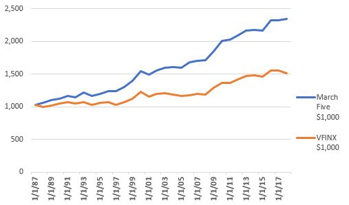
Figure 1 displays the growth of $1,000 invested in these 5 funds ONLY during the month of March every year starting in 1987.  For comparison sake it also displays the growth of $1,000 invested in an S&P 500 Index fund (VFINX) ONLY during March during the same period.

1

Figure 1 – Growth of $1,000 invested in Jay’s March 5 sector funds (blue) versus ticker VFINX ONLY during the month of March; 1987-2018

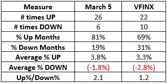
Figure 2 displays some relevant fact and figures regarding the March 5 performance versus that of an S&P 500 index fund.

2

Figure 2 – Comparative Figures – Jay’s March 5 vs. VFINX; 1987-2018

Figure 3 displays year-by-year results

Year March Five VFINX
1987 2.9 2.9
1988 2.8 (3.0)
1989 3.8 2.3
1990 2.5 2.6
1991 3.5 2.4
1992 (2.0) (1.9)
1993 6.4 2.1
1994 (3.8) (4.4)
1995 2.2 3.0
1996 3.4 1.0
1997 0.7 (4.1)
1998 5.0 5.1
1999 6.9 4.0
2000 10.9 9.8
2001 (3.5) (6.4)
2002 4.5 3.7
2003 2.1 1.0
2004 1.1 (1.5)
2005 (0.6) (1.8)
2006 5.0 1.2
2007 1.0 1.1
2008 0.8 (0.4)
2009 8.1 8.8
2010 8.5 6.0
2011 1.2 0.0
2012 2.9 3.3
2013 3.6 3.7
2014 0.3 0.8
2015 (0.5) (1.6)
2016 7.7 6.8
2017 (0.2) 0.1
2018 1.0 (2.6)

Figure 3 – Year-by-Year March % return

Summary

Repeating now, “past performance is no guarantee of future results” and as always I am not “recommending” that anyone rush out and trade anything.  My purpose here is simply highlighting a potential long-term “edge” in the market.

The reality is that the performance of the 5 sector funds highlighted above will vary greatly from year to year.  Some years will be great, some years will be down, and some years will be (in the words of all the kids these days) “Meh”.  Likewise, some years the March 5 will outperform the S&P 500 and some years it won’t.

Still, a lot of investing success hinges on

*Finding an “Edge”

*Exploiting that edge over and over

Have a Nice Month.

Jay Kaeppel

Disclaimer:  The data presented herein were obtained from various third-party sources.  While I believe the data to be reliable, no representation is made as to, and no responsibility, warranty or liability is accepted for the accuracy or completeness of such information.  The information, opinions and ideas expressed herein are for informational and educational purposes only and do not constitute and should not be construed as investment advice, an advertisement or offering of investment advisory services, or an offer to sell or a solicitation to buy any security.

Understanding Reward-vs-Risk in TSLA

Everybody likes to talk about buying and selling and what their trading and so on and so forth.  But when you boil it all down all that really matters are the following three values:

*% of winning trades

*Average gain in $

*Average loss in $

You can make money with a low % of winning trades if your average winner far exceeds your average loser.  Likewise you can make money with a small average $ gain if you have a high percentage of winning trades.  What all of this means is that in the end it all comes down to reward versus risk and this means understanding just exactly what you are getting into with any trade.

Example: TSLA

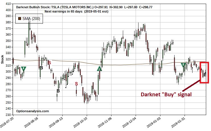
I use www.OptionsAnalysis.com for a variety of functions.  One function is referred to as Darknet Signals, which generates buy signals for stocks and ETFs based on an algorithm developed by a gentleman named John Broussard (one of the smartest people I have met in this business).  I’ll not get into specifics here as I am using a signal simply to set up an example.  As you can see in Figure 1, Darknet generated a buy signal for TSLA on 2/25.

1Figure 1 – TSLA with Darknet Signals (Courtesy www.OptionsAnalysis.com)

To illustrate the concept of understanding reward vs risk let’s look at four potential bullish trades for TSLA as of the close on 2/25.

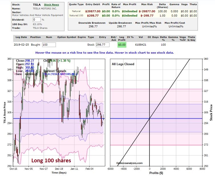
Trade #1: Buy 100 Shares of TSLA stocks

This position requires an investor to put of $29,877 to buy 100 shares of TSLA stock.  Each point that TSLA rises or falls will equate to a $100 gain or loss for the position.  Details and risk curves appear in Figure 2.

2Figure 2 – Details and risk curves for Buy 100 shares (Courtesy www.OptionsAnalysis.com)

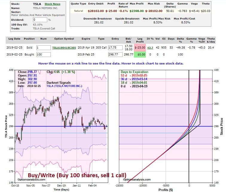
Trade #2: Buy/Write (Buy 100 Shares of TSLA stock, sell one call option)

For example’s sake this position buys 100 shares of TSLA at $298.77  a share and sells an Apr2019 305 call option for $17.75.  This trade costs $28,102 to enter.  Details appear in Figure 3.3Figure 3 – Details and risk curves for Buy/Write 100 shares, sell 1 305 call (Courtesy www.OptionsAnalysis.com)

Trade #3: Buy 100 Shares of TSLA stocks

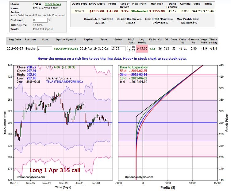
This position buys 1 Apr 315 call option at a cost of $1,335.  Details and risk curves appear in Figure 4.4Figure 4 – Details and risk curves for Buy 100 shares (Courtesy www.OptionsAnalysis.com)

The Tradeoffs

Figure 5 displays the $ gain or loss for each trade based on a given price for TSLA shares as of April option expiration.5Figure 5 – Dollar gain(loss) based on TSLA share price at April option expiration (Courtesy www.OptionsAnalysis.com)

Figure 6 displays the % gain or loss for each trade based on a given price for TSLA shares as of April option expiration.6Figure 6 – % gain(loss) based on TSLA share price at April option expiration (Courtesy www.OptionsAnalysis.com)

On the positive side:

*The long stock position offers point-for-point movement

*The covered call affords $17.75 a share ($1,775) of downside protection

*The long call requires roughly 95% less capital ($1,355 vs. $28,000+) to enter

On the negative side:

*The long stock and covered call positions require a lot of capital

*The long call has a breakeven price of $328.55 (current stock price $288.77)

So in a nutshell, it comes down to:

*How confident you are that TSLA will rally between now and mid-April

*How much capital you have (and are willing) to commit

Note in Figures 5 and 6 what happens if TSLA remains unchanged:

*The stock position has no gain or loss

*The covered call has a gain of +6%

*The long call suffers a 100% loss of the $1,335 premium (on the other hand if TSLA tanks this is the maximum loss the long call position can incur)

Summary

So which is the “best” trade.  But now you understand the relative potential rewards and risk for several different positions.

The ability to assess and compare competing opportunities and to choose the position that fits your objectives and temperament (and account size) best, is one of the most useful abilities you can develop.

Jay Kaeppel

Disclaimer:  The data presented herein were obtained from various third-party sources.  While I believe the data to be reliable, no representation is made as to, and no responsibility, warranty or liability is accepted for the accuracy or completeness of such information.  The information, opinions and ideas expressed herein are for informational and educational purposes only and do not constitute and should not be construed as investment advice, an advertisement or offering of investment advisory services,

It Doesn’t Have to be Rocket Science, #242 – Focus on Income

As a person who has crunched a lot of numbers I concur that there is something appealing about dividing one financial market related number by another financial market related number and then analyzing the fluctuations over time in hopes of proclaiming that “it means something!”  (Note to myself: work on those run-on sentences).

But sometimes simple can be pretty useful.  Consider the following

Strategy:

*Hold High Income vehicle November through May

*Hold Intermediate-term treasuries during June through October

Benchmark:

*Buy and Hold High Income vehicle AND intermediate-term treasuries (rebalancing once a year)

Vehicles:

*FAGIX – Fidelity Capital and Income

*FGOVX – Fidelity Government Income

Test Period:

*Oct 31st, 1979 through January 31st, 2019

Strategy:

*Buy FAGIX on 10/31 each year; switch to FGOVX on 5/31 each year

That’s it – buy FAGIX on October 31st each year, then sell it on May 31st of the following year and switch to FGOVX.

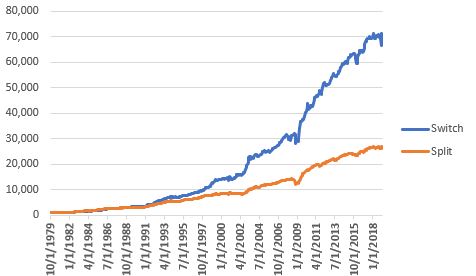
Figure 1 displays the growth of $1,000 starting in 1979 using “the strategy” versus buying-and-holding both funds (with an annual rebalance to 50/50)

1

Figure 1 – Growth of $1,000; Strategy (Switch) versus Buy-and-Hold (Split); 0% fees

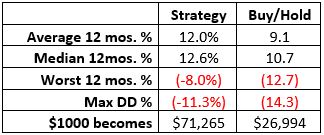
Figure 2 displays some relevant facts and figures2

Figure 2 – Results; 10/31/1979-1/31/2019

A Few Things to Note

The “System” has had:

*An average annual return of 12%

*A worst 12 months of -8%

*A maximum drawdown of -11.3%

This might qualify as reasonably “low risk” for a lot of investors.

Still, please remember that I am not “recommending” this strategy, only highlighting it as an example of one that does not involve any “rocket science.

In addition, remember that the “big question” is “what happens in a full-blown bond bear market?”.  FAGIX has about an 80% correlation to the S&P 500 and a slightly inverse correlation to 3-7 year treasuries notes.  FGOVX has a roughly 86% correlation to 3-7 year treasury notes and a slightly negative correlation to the S&P 500 Index.

In addition, intermediate-term treasuries (which is what FGOVX holds) tend to perrom much better than longer-term bonds when rates are rising.

So there is a chance that the strategy holds up well.  But we won’t know for sure until the time actually comes.  Please note that since 10-yr yields bottomed in 2011, the median annual return for the “System” is +6.3% (versus 5.8% for buy-and-hold).

Figure 3 displays the annual results

Year Strategy Buy/Hold
1980 (1.0) 5.5
1981 10.8 8.8
1982 26.8 30.9
1983 14.0 12.3
1984 6.7 10.9
1985 25.0 21.6
1986 19.3 16.3
1987 8.5 1.2
1988 11.8 9.5
1989 8.1 4.7
1990 4.5 2.8
1991 25.1 22.9
1992 29.6 18.0
1993 23.2 18.6
1994 (4.0) (4.9)
1995 14.7 17.4
1996 12.7 6.7
1997 12.9 11.8
1998 23.7 6.7
1999 14.1 5.5
2000 (1.9) 1.6
2001 14.6 1.0
2002 17.7 5.3
2003 24.6 20.7
2004 7.2 8.1
2005 1.5 3.7
2006 11.9 8.3
2007 8.4 5.8
2008 (6.1) (10.4)
2009 39.7 36.7
2010 8.6 11.1
2011 9.4 3.0
2012 9.6 9.5
2013 7.0 3.6
2014 5.8 5.8
2015 3.0 (0.2)
2016 6.3 5.9
2017 6.9 6.9
2018 (4.5) (2.6)

Figure 3 – Year-by-Year Results; 1980-2018

Summary

So is the “System” detailed herein of value?  That’s not for me to say.  But the real point is – it has done reasonably well – and it sure is simple.  And that is the main point – just because some approach to investing is “complex” or “complicated” doesn’t mean it’s better.

Jay Kaeppel

Disclaimer:  The data presented herein were obtained from various third-party sources.  While I believe the data to be reliable, no representation is made as to, and no responsibility, warranty or liability is accepted for the accuracy or completeness of such information.  The information, opinions and ideas expressed herein are for informational and educational purposes only and do not constitute and should not be construed as investment advice, an advertisement or offering of investment advisory services, or an offer to sell or a solicitation to buy any security.

Speculation in Natural Gas

In this article I laid out an “approach” to investing.  Including in that approach was “10% whatever you want”.  In other words, you allocate 10% of your investment capital to whatever idea(s) strike your fancy.  In this manner:

*You are not constrained from acting based on your own knowledge/whims/ideas/etc.

*You can only do so much damage to your portfolio

The idea that follows falls squarely into that 10% – i.e., it represents random speculation.

Ticker UNG

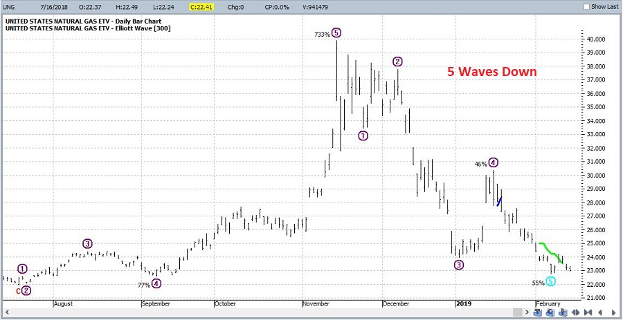
Ticker UNG is an ETF that is intended to track the price of natural gas.  In Figure 1 we see that the Elliott Wave count generated by ProfitSource by HUBB is suggesting that the current downtrend “may” be running its course, i.e., 5 waves down.  To my mind this isn’t something that as a single piece of information would not prompt me to immediately jump into a bullish trade – there could be more downside left to play out, there may be a consolidation and/or a trading range before anything actually “bullish” happens, and so on.1Figure 1 – UNG with Elliot Wave count (Courtesy ProfitSource by HUBB)

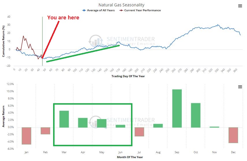
In Figure 2 we see that from a seasonal standpoint we are entering what is often a favorable time of year for natural gas.  This adds a little more fuel to the “potentially bullish” fire.3Figure 2 – UNG annual seasonal trend (Courtesy Sentimentrader.com)

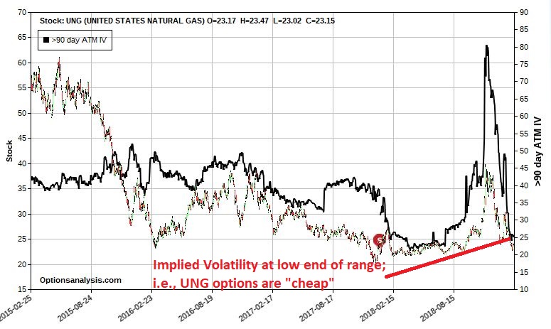
If we were to look at establishing a bullish position using options on UNG we can see in Figure 3 that option implied volatility (the black line) is extremely low.  This tells us that there is not a lot of time premium built into UNG options at the moment, i.e., they are “cheap.”  So it might make sense to take a position that can benefit from an increase in volatility.2Figure 3 – UNG with implied volatility at the low end of the range (Courtesy www.OptionsAnalysis.com)

Looking to Trade

First let’s acknowledge the fact that anyone getting bullish on UNG here is clearly fighting the trend, which is bearish.  This type of activity is generally discouraged because, well, it can make you look really stupid to try to pick a bottom in anything.  However, if you allocate a small portion of your capital to “whatever strikes your fancy” then it can make sense.

So let’s consider the following scenario:

*We think UNG’s latest plunge “may” be running its course and that a seasonal rebound is possible (i.e., we’ve got a hankering to pick a bottom)

*We have no idea when this bounce may occur (so we want to have a lot of time for any bullish move to play out)

*We know that option implied volatility is low (so we want to enter a position that can benefit from an increase in volatility)

*We recognize that we are contemplating a trade (going long natural gas in the face of a clearly established downtrend) that can easily blow up in our face, and rather quickly (so we don’t want to risk much)

*UNG is trading at $23.00 a share, and the most significant support level is down at $20.40.

Allocating Capital

Let’s say for sake of example that we have $25,000 in trading capital and we are willing to risk no more than 2% of our capital on “whatever strikes my fancy” trades.  That means that we can risk no more than $500 on this position.  The possibilities are endless.  So let’s just pick one as follows:

*Buy 6 Jan2020 30 UNG calls @ $0.86

*Sell 5 Jul2019 30 UNG calls @ $0.13

What we have is sort of a mutant calendar spread (by virtue of the fact that we are buying one more of the Jan2020 30 calls than we are selling of the Jul2019 30 calls -buying 6, selling 5).

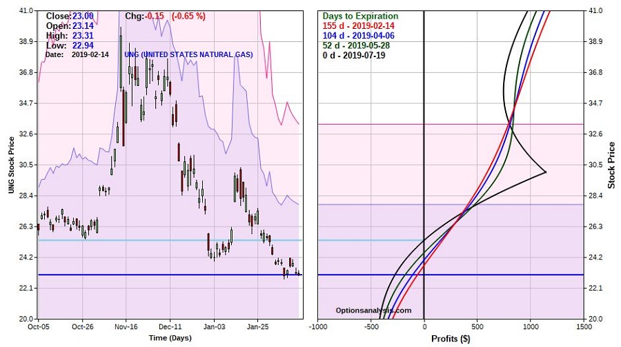
The reason I like this “mutant” approach is that it creates the potential for unlimited profit, unlike a straight calendar spread where the risk curve “rollover” once price reaches the strike price.  Figure 4 displays the and Figure 5 displays the risk curves.4Figure 4 – UNG trade particulars (Courtesy www.OptionsAnalysis.com)

5Figure 5 – UNG trade risk curves (Courtesy www.OptionsAnalysis.com)

Things to note:

*The cost and maximum risk is $451, so less than our allowed 2% risk on $25K.

*The trade will make money if UNG advances enough between now and July 19th expiration (155 days away, so we have some time for things to play out)

*If UNG fails to advance this trade will lose money, plain and simple.  But no more than the $451 we allocated to begin with.  Bottom line, if we aren’t willing to risk $451 then we don’t make the trade in the first place.

The Volatility Factor

Obviously we want – in fact, need – UNG to advance in price sometime between now and mid-July in order to profit.  But there is another factor at play – implied volatility.  As we saw in Figure 3, implied volatility is at the low end of the historical range.  This DOES NOT mean that it is about to spike higher, nor even that it can’t continue to fall even lower.  This has “implications”.

First the short lesson on volatility: An option’s “vega” tells you how much it will rise of fall in price if implied volatility rises by one full percentage point.  Our combined position as shown in Figure 4 has a “vega” of $28.11.  This tells us that if implied volatility:

*Rises by one full percentage point this trade will gain $28.11

*Falls by one full percentage point this trade will lose $28.11

(NOTE: vega values are not static and do change over time)

*Also, the longer the time until expiration the higher the vega.  In other words, the January 2020 call that we bought has a higher vega ($6.80) than the July 2019 call (-$2.60) that we sold.  So, if IV rises one full point, in theory, we will gain $6.80 on the long call and lose $2.60 on the short call.

*A decline in implied volatility from here will reduce the value of our position, however, ultimately our maximum risk is still -$451.

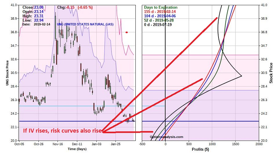
*What we are hoping for is an increase in implied volatility between now and July expiration.  If IV rises 33% (from roughly 30% to roughly 40% – see Figure 3 for the historical IV range) the value of the trade will increase significantly as shown in Figures 6 and 7.6Figure 6 – UNG trade if IV rises 33% (Courtesy www.OptionsAnalysis.com)

In Figure 7 we see that if IV rises the risk curves also rise (on the chart that means they move further to the right, i.e., into higher territory).7Figure 7 – Risk curves if IV rises 33% (Courtesy www.OptionsAnalysis.com)

Summary

Is a bullish calendar spread on UNG a good idea?  It beats me.  In fact, given the typical degree of success enjoyed from “picking bottoms”, I might go as far as to say “probably not.”

Still, am I pounding the table and recommending that you go out and make this trade or a similar one?  Not all all.  The example above is NOT a “recommendation”, it is meant merely to illustrate “one way to play”, assuming a given scenario and a willingness to risk a certain amount of capital on a completely speculative position.

Jay Kaeppel

Disclaimer:  The data presented herein were obtained from various third-party sources.  While I believe the data to be reliable, no representation is made as to, and no responsibility, warranty or liability is accepted for the accuracy or completeness of such information.  The information, opinions and ideas expressed herein are for informational and educational purposes only and do not constitute and should not be construed as investment advice, an advertisement or offering of investment advisory services, or an offer to sell or a solicitation to buy any security.

A Lesson in Setting Priorities (Crude Oil Style)

This piece involves a look at crude oil, including a specific “forecast.”  However, the purpose of the article is to help traders to focus on making the right trading choice by identifying exactly what it is they want to achieve and their own priorities.

For the record, I am not endorsing (nor disavowing) the price forecast contained in Figure 1 below, nor am I “recommending” a bearish trade in crude oil.  The real purpose of this piece is to help teach option traders to understand exactly what they are getting into (and NOT getting into) with certain actions.

Ticker USO

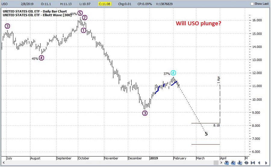
Ticker USO is an ETF that ostensibly tracks the price of crude oil futures.  ProfitSource is software that I have used for many years (and yes do recommend).  One built-in feature is an Elliott Wave count that can be used on a daily, weekly, monthly, etc. chart.1Figure 1 – Ticker USO with ProfitSource Elliott Wave count (Courtesy ProfitSource by HUBB)
Two things to note:

1) I am not a true “Elliott Head” (i.e., I don’t qualify as a “true believer” that everything in the universe moves in 5 wave patterns), and,

2) I feel zero confidence in my own personal ability to manually “count the waves.”

That being said, when the ProfitSource daily and weekly EW counts both point to a potential Wave 5 decline, I pay attention because I have seen some nice moves follow often enough to, well, get my attention.

For the record, USO is showing a potential Wave 5 decline on the daily chart that appears in Figure 1 but NOT on the weekly chart.  So again, this example is more of a “teaching aide” and not a table-pounding call to action.

Anyway, as you can see in Figure 1, the ProfitSource daily EW count (which for better or worse, is calculated using an objective, built in algorithm) is currently pointing to a significant price decline in the very near term (i.e., a decline to roughly $8.20 down to as low as $6.60 a share sometime between now and the 1st of April).

One last time, let me point out that I am not agreeing nor disagreeing with this forecast.  So, let’s move on to “the point”.

What to Do with This Forecast

Granted, the easiest thing to do is to hit Return and go on to the next article.  But, let’s assume a trader wants to play the bearish side of crude oil.  What to do then?

One choice is to sell short shares of USO. This involves opening a margin account, meeting margin requirements, and assuming (essentially) unlimited risk if USO decides to soar instead of swoon.

So let’s assume two traders are considering buying put options on USO in an effort to profit if USO does indeed tank within the expected timeframe.

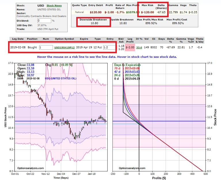
Trader A buys the in-the-money Apr2019 12 strike price put as shown in Figure 2.2Figure 2 – Long 1 April 2019 12 strike price put (Courtesy www.OptionsAnalysis.com)
As you can see in Figure 2:

*The 1-lot costs $120, the trade has a “delta” of -67 and the breakeven price is $10.80 a share at April expiration

*This is essentially a “(short) stock replacement” approach as below $10.80 a share, the option price will move point for point with the share price.  In other words, if USO declines in price by $1.00 per share, the April 19 put will increase in price by $1.00 per option).

Trader B is more aggressive and buys 3 of the out-of-the-money Apr2019 10 strike price put as shown in Figure 3.
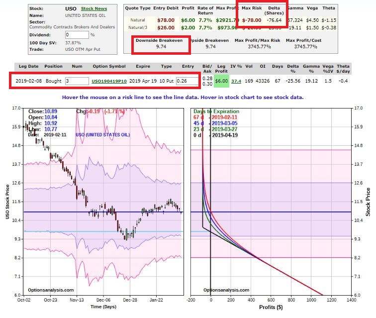
3Figure 3 – Long 3 April 2019 10 strike price puts (Courtesy www.OptionsAnalysis.com)

As you can see in Figure 3:

*The 3-lot costs $78, the trade has (also) a “delta” of -67 and the breakeven price is $9.74 a share at April expiration

In essence, Trader B is more interested in the return “on” my money and Trader A is more interested in the return “of” my money.  The key difference in deciding whether to emulate Trader A or Trader B comes down to this question:

*Is your primary goal to maximize your return if USO falls hard

OR

*Is your primary goal to make some money even if USO only falls a bit?

To understand this tradeoff better, consider Figure 4 which overlays the two trades together on one chart.
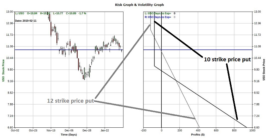
4Figure 4 – Risk curves at April expiration for April 10 put and April 12 put (Courtesy www.OptionsAnalysis.com)

Note the following.  Assuming the trade is held until expiration:

If USO closes at $10.00 a share:

*The 12-strike price put will be worth $2.00.  Since a 1-lot was bought @ $1.20, Trader A will have a profit of $80 on his $120 investment

*The 10-strike price put will expire worthless and Trader B will experience a loss of $78 on his $78 investment.

If USO closes at the first EW target of (roughly) $8.20 a share:

*The 12-strike price put will be worth $3.80.  Trader A will have a profit of $260 on his $120 investment (($3.80 – $1.20) x 100 shares)

*The 10-strike price put be worth $1.80 and Trader B will have a profit of $522 on his $78 investment  (($1.80 – $0.26) x 100 shares x 3 options)

If USO closes at the second EW target of (roughly) $6.60 a share:

*The 12-strike price put will be worth $5.40.  Trader A will have a profit of $460 on his $120 investment (($5.40 – $1.20) x 100 shares)

*The 10-strike price put be worth $3.40 and Trader B will have a profit of $942 on his $78 investment (($3.80 – $0.26) x 100 shares x 3 options)

Summary

Anytime you make a trade, it is essential that you understand what you are getting into.  In our example above:

*Buying the out-of-the-money put gives a trader the best opportunity to maximize profitability if things go as hoped.

*Buying the in-the-money put gives a trader the best opportunity to make some money if USO decline some but not by as much as one would hope.

*Keep in mind:  There are no “right or wrong” answers.

*You have to decide your priorities and then deal with the consequences.

*After you make your choice, never look back.  If USO only goes down a little Trader B can easily lament “oh, I should have been less aggressive”.  If USO goes down, Trader A can easily lament “Oh, I should have been more aggressive.”

*This kind of negative baggage can mess with your decision making for many trades to come.

So fight the urge to second guess yourself after the fact .  Make your choice and deal with the outcome unemotionally.

Jay Kaeppel

Disclaimer:  The data presented herein were obtained from various third-party sources.  While I believe the data to be reliable, no representation is made as to, and no responsibility, warranty or liability is accepted for the accuracy or completeness of such information.  The information, opinions and ideas expressed herein are for informational and educational purposes only and do not constitute and should not be construed as investment advice, an advertisement or offering of investment advisory services, or an offer to sell or a solicitation to buy any security.
January Barometer as a Replacement for Buy-and-Hold

In a recent piece I wrote some thoughts regarding the January Barometer, first advanced by Yale Hirsch of The Stock Trader’s Almanac back in 1972.  STA under Yale’s son Jeffrey Hirsch has detailed an updated version of JB titled the January Barometer Trifecta.

On a totally separate topic, many investors eschew any sort of market timing and simply invest by buying-and-holding index funds.  One of the most popular indexes is the S&P 500 Index.  As you might guess I am not a fan of a strictly buy-and-hold approach as I refer to it as a “drift with the tide” strategy.  When things are swell, things are great (the S&P 500 shows a 10-year rolling profit roughly 89% of the time historically), however this requires an investor to ride out every storm along the way.  Many investors “think” they are prepared to ride out these storms, but very often about the time the decline hits -30% or more, there is a not uncommon tendency  to “abandon ship” at exactly the wrong time.

So, this piece will consider the January Barometer Trifecta (henceforth JBT) as an alternative to buying-and-holding.

The January Barometer Trifecta (JBT)

As detailed by Jeffrey Hirsch the JBT has 3 parts (hence the use of the word “Trifecta”).  They are:

*The period including the last 5 trading days of the previous year and the first two trading days of January this year shows a net gain

*The first 5 trading days of January this year shows a net gain

*The month of January as a whole shows a net gain

*When all 3 of these occur then the JBT is “bullish” for the February through December period.

The Data

For testing purposes, we will use:

*S&P 500 monthly total return index data when in the stock market

*Treasury 1-3 monthly total return index data when out of the stock market

*Data is from the PEP database by Callan Associates

*We start our test in January of 1972

Trading Strategy

*If a January Barometer Trifecta is triggered we will buy and hold the S&P 500 Index for 12 months – i.e., from the end of January that year through the end of January next year (to, a) attain a 12-month long-term gains holding period and b) to avoid holding an S&P 500 Index fund only during the month of January

*If a January Barometer is NOT triggered then we will hold 1-3-year treasuries for the next 12 months (i.e., until the end of January next year when we will evaluate JBT again)

The Initial Results

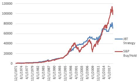
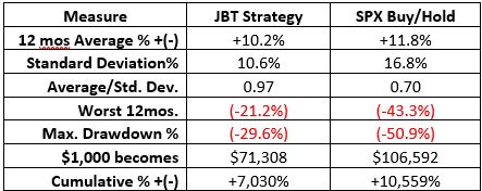
The good news is that the JBT results are much less volatile and entail less risk than buy-and-hold.  The bad news is that in terms of total return, it under performs by quite a bit.  Figure 1 displays the growth of $1,000 and Figure 2 displays some numerical data.

1

Figure 1 – Growth of $1,000 using JBT Strategy versus SPX buy-and-Hold; 12/31/1972-1/31/2018

2

Figure 2 – JBT Strategy versus SPX buy-and-Hold; 12/31/1972-1/31/2018

Reduced volatility is a good thing, but significantly less return is typically a turnoff for most investors.  As a result, a person considering a simple buy-and-hold of the S&P 500 Index approach might not be swayed.

But Wait…

Before giving up and settling for “drifting with the tide”, let’s consider one more option.  As you can see in Figure 2 the maximum drawdown for the S&P 500 Index was -50.9%.  So consider this:

*In order to adopt a buy-and-hold approach you must be OK with sitting through that size of a drawdown.

*If you are willing to sit through that size of a drawdown, then certainly you would be willing to sit through a drawdown of “only” -42.6%, right?

*So for arguments sake, let’s consider the following:

*If a January Barometer Trifecta is triggered we will buy and hold the S&P 500 Index for 12 months using leverage of 1.5-to-1

*If a January Barometer is NOT triggered then we will hold 1-3-year treasuries for the next 12 months (i.e., until the end of January next year when we will evaluate again)

Leveraged Results

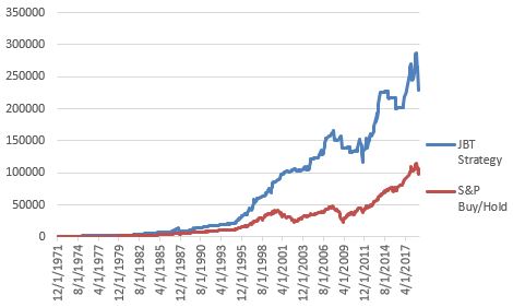
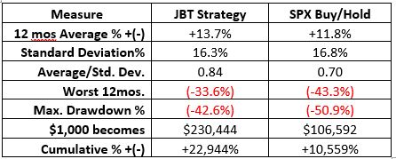
Figure 3 displays the growth of $1,000 and Figure 4 displays some numerical data.

3

Figure 3 – Growth of $1,000 JBT x 1.5 Leverage Strategy versus SPX buy-and-Hold; 12/31/1972-1/31/2018

4

Figure 4 – JBT x 1.5 Leverage Strategy versus SPX buy-and-Hold; 12/31/1972-1/31/2018

Using this approach shows a gain of +22,944% versus +10,559% for buy-and-hold.

The drawdown is a not inconsequential -42.6%, BUT if the alternative is simply buying-and-holding the S&P 500 Index this number is an improvement AND the return is 2.3 times higher than buy-and-hold.

Ways to Trade

As always, I am not “recommending” this strategy, just highlighting numbers.  But just to cover all the bases, two ways to play would be:

If JBT is bullish:

*Ticker SSO 75% / ticker SHY 25%

OR

*Ticker UPRO 50% / ticker SHY 50%

If JBT is NOT bullish:

*Ticker SHY 100%

SSO is a 2x leveraged S&P 500 Index ETF.  So to get leverage of 1.5-to-1 an investor would put only 75% of their devoted capital into that ETF (2.0 times 75% = 1.5)

UPRO is a 3x leveraged S&P 500 Index ETF.  So to get leverage of 1.5-to-1 an investor would put only 50% of their devoted capital into that ETF (3.0 times 50% = 1.5)

Summary

Again, I am not “recommending” this strategy, just highlighting numbers.  Still, the question is “does this qualify as a great standalone strategy?”  By most standards, possibly not.  A 42%+ drawdown is a deal-breaker for most strategic approaches.

But again, in this case the real question is directed at investors who put money into index funds and leave it there.  Is it better to trade once in a while and make twice as much with a lower drawdown, or to drift with the tide?

Food for thought…

Jay Kaeppel

Disclaimer:  The data presented herein were obtained from various third-party sources.  While I believe the data to be reliable, no representation is made as to, and no responsibility, warranty or liability is accepted for the accuracy or completeness of such information.  The information, opinions and ideas expressed herein are for informational and educational purposes only and do not constitute and should not be construed as investment advice, an advertisement or offering of investment advisory services, or an offer to sell or a solicitation to buy any security.
Gold Stocks, Meet Election Cycle

The “Election Cycle” is a widely acknowledged “thing” stock market.  As it turns out there may be uses elsewhere.  Take gold mining stocks for instance.

The Calendar

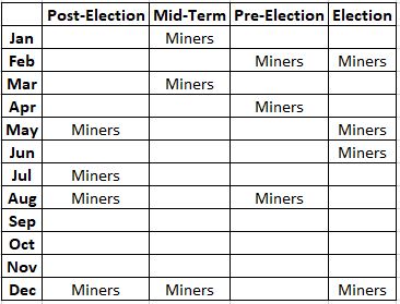
After the election cycle ending in 2008, I developed the calendar below.

1

Figure 1 – Jay’s Gold Stock Calendar

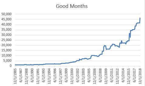
Figure 2 displays the growth of $1,000 invested in FSAGX only during the months labeled “Miners” in Figure 1.

2

Figure 2 – Growth of $1,000 invested in ticker FSAGX only during “Good Months” (those labeled “Miners” in Figure 1); 12/31/1985-12/31/2018

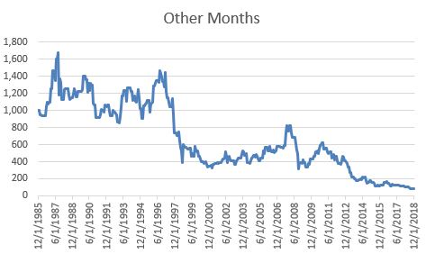
Figure 3 displays the growth of $1,000 invested in FSAGX only during the months NOT labeled “Miners” in Figure 1.

3

Figure 3 – Growth of $1,000 invested in ticker FSAGX only during “Other Months” (those NOT labeled “Miners” in Figure 1); 12/31/1985-12/31/2018

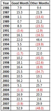
Figure 4 displays the annual results for the “Good Months” versus the “Other Months” through the end of the initial 1986-2008 testing period.

4

Figure 4 – Annual Results during Testing Period; 12/31/1985-12/31/2008

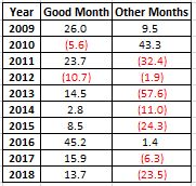
Figure 5 displays the annual results since 2009.

5

Figure 5 – Annual Results starting in 2009

Important Note

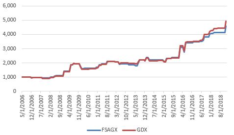
First off, as always, I am not recommending the above as a trading system that you should go out and risk money on.  That being said, it should be noted that the results shown here are generated using Fidelity Select Gold (FSAGX).  Traders should be aware that Fidelity has certain switching restrictions that could impact one’s ability to use the schedule shown in Figure 1.  A likely alternative is ticker GDX (Market Vectors Gold Miners ETF).

For the record, since GDX started trading in 2006, the results generated using the calendar in Figure 1 have been slightly higher with GDX, as show in Figure 6.

6

Figure 6 – Growth of $1,000 in FSAGX versus GDX since 2006

Summary

So, is this the “Holy Grail of Gold Stock Trading”?  Let me be very clear here – “Absolutely NOT”.  Gold stocks are extremely volatile and as sure as you are reading this article, “Good Months” will experience some significant declines and “Other Months” will experience significant rallies.

With that warning firmly in place, still, the results might merit a closer look.

Jay Kaeppel

Disclaimer:  The data presented herein were obtained from various third-party sources.  While I believe the data to be reliable, no representation is made as to, and no responsibility, warranty or liability is accepted for the accuracy or completeness of such information.  The information, opinions and ideas expressed herein are for informational and educational purposes only and do not constitute and should not be construed as investment advice, an advertisement or offering of investment advisory services, or an offer to sell or a solicitation to buy any security.
A Persistently Consistent Market Trend

Consistency matters – a lot – when it comes to investing.  We all want to make as much as we can but at the end of the day Will Rogers famous quote (“I’m more interested in the return of my money than I am the return on my money”) still rings true for a lot of investors.  Which leads us to…

Jay’s Trading Maxim #4: The volatility of the fluctuations of the equity in your account will have a greater impact on your success or failure as a trader than any other factor.

In “chicken and egg” terms, the more things keep “moving in the right direction” the more likely an investor is to “follow the plan” and the more likely things are to keep “moving in the right direction.”

A Persistently Consistent Trend

Many investors are familiar with the phrase “Sell in May and Go Away”.  The phrase is based on the tendency of the U.S. stock market to perform better during the months of November through May than through the months of June through October.  Of course, as with any trend there is a lot of variability along the way.  While it is correct to refer to the November through May period as “the bullish months”, it is not necessarily accurate to call June through October “the bearish months”.  June through October is more like the “Sometimes good for years at a time, sometimes very, extremely bad and long-term in sum mostly a whole lot of nothing months” (which doesn’t roll of the tongue quite like “Sell in May”).

Some of the most significant bearish declines (1973, 1974, 1987, 2000-2002, 2008) have experienced their worst between June and October.  At the same time, 6 of the past 7 years and 8 of the last 10 have seen stocks show a gain during the so-called “unfavorable” months.

But let’s forget about all of that for a moment and go back to the importance of persistent consistency.  The bottom line is this: For most investors,

*The more consistently a strategy shows a gain

*The more likely the investor will stick with the strategy, and;

*The more likely they will be successful over the long-term

Consistency in the Broader U.S. Stock Market

For our purposes we will use The Wilshire 5000 Total Market Index to measure results.  The Wilshire 5000 is widely accepted as the definitive benchmark for the U.S. equity market, and measures performance of all U.S. equity securities with readily available price data.  We will use monthly total return data form the PEP database from Callan Associates.

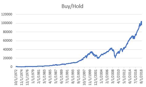
Figure 1 displays the growth of $1,000 invested in WILSHIRE starting October 1972 and held through October 2018.

1

Figure 1 – Growth of $1,000 invested in WILSHIRE using buy-and-hold; Oct-1972 through Oct-2018

As you can see in Figure 1, there was significant growth of capital over time.  However, there was also a much volatility along the way, including two separate drawdowns in excess of -30% and another in excess of -23%.

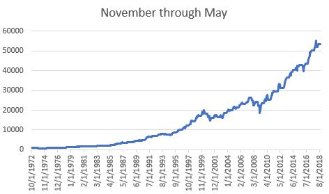
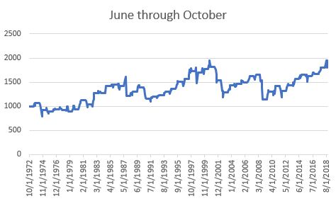
Figure 2 displays the growth of $1,000 invested in WILSHIRE ONLY during the months of November through May every year versus June through October every starting in 1972 through October 2018.

2

Figure 2 – Growth of $1,000 invested in WILSHIRE during November 1st through May 31st each year; Oct-72 through Oct-18

Figure 3 displays the growth of $1,000 invested in WILSHIRE ONLY during the months of June through October every year versus June through October every starting in 1973 through October 2018.

3

Figure 3 – Growth of $1,000 invested in WILSHIRE during June 1st through October 31st each year; Oct-72 through Oct-18

In Figures 2 and 3, note the relatively smooth and consistent growth of capital during the Nov-May period and the much more volatile and less consistent returns during the Jun-Oct period.

The Results

Figure 4 displays a wealth of comparative performance information for WILSHIRE performance during the “favorable” months of November through May versus performance during the “unfavorable” months of June through October.

4

Figure 4 – WILSHIRE performance

Here is the key thing to note:

*Looking at performance during the Power Zone months over any 5-year period has witnessed a positive return for the Wilshire 5000 Index 100% of the time.

To put it another way, if an investor had followed a strategy of holding a broad index of U.S. stocks during November-May every year for any 5 year period since 1972, they would have showed a gain at the end of the 5 year (one can also assume that additional interest would have been earned by holding cash or bonds or whatever during June through October)

Does this mean that all 5-year periods in the future will also witness positive results.  Absolutely not.  As the saying goes, “past performance is no guarantee of future results”.  That being said, the rhetorical question for today is “How many (simple, 100% objective) strategies can you name that showed positive rolling 5-year returns 100% of the time over the past 46 years?”

If nothing else, it is an interesting question/

Jay Kaeppel

Disclaimer:  The data presented herein were obtained from various third-party sources.  While I believe the data to be reliable, no representation is made as to, and no responsibility, warranty or liability is accepted for the accuracy or completeness of such information.  The information, opinions and ideas expressed herein are for informational and educational purposes only and do not constitute and should not be construed as investment advice, an advertisement or offering of investment advisory services, or an offer to sell or a solicitation to buy any security.
The February ‘Feb Four’

A well-known old adage states that “Every Dog Has It’s Day”.  The much lesser known stock market corollary is “Every Sector has it’s Month (or two, or three, or sometimes more)”.  Take February for example.

(See also When to Buy Energy Stocks)

Sectors for February

Before I blurt out my favorite sectors for February let’s add a dose of reality.  Here is what you need to know:
*These sectors (using Fidelity Select Sector funds as proxy’s) have performed well during the month of February over time (Hint: that’s the Good News)

*At the same time, no one should make the false assumption that any or all of them are destined to perform well THIS February (2019)

*There have been some serious “clunker” months of February along the way

The thought is captured nicely in:

Jay’s Trading Maxim #177: Investing is about playing the odds and managing risk, NOT about finding “sure things” (although sure things would be nice).
The “Feb Four” are:

FSCHX – Chemicals (ETF alternative ticker XLB)

FSELX – Electronics (ETF alternative – ticker SMH)

FSESX – Energy Services (ETF alternative – ticker OIH)

FSRPX – Retailing (ETF alternative – ticker XLY)

The Results

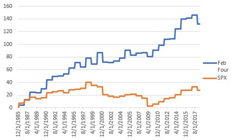
The following results assume one bought all four Fidelity sector funds and held during February each year starting in 1986 (when all four funds were first available).  Figure 1 displays the cumulative % growth for the “Feb Four” versus the cumulative % growth for the S&P 500 Index during the month of February during the same time.  The results use monthly total return data from the PEP database from Callan Associates.

1

Figure 1 – % cumulative growth for “Feb Four” versus cumulative % growth for the S&P 500 Index (Data source: monthly total return data from PEP database from Callan Associates)

Please note in Figure 1 that the blue line is not a straight line advance and that from year-to-year

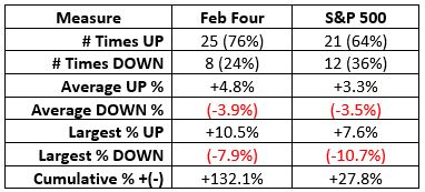
Figure 2 displays a few comparative “facts and figures”

2

Figure 2 – Comparative results for “Feb Four” versus S&P 500 Index during February; 1986-2018 (Data source: monthly total return data from PEP database from Callan Associates)

Summary

So, is the “Feb Four” fabulous?  And are they sure to turn in a sizzling performance in February 2019?  Uh, the answers are “occasionally” and “not at all.”  Remember the four sectors combined lost -7.9% in the month of February 2001 and lost -5.6% in February 2018.

As always, I don’t make “recommendations”.  Still, for an investor looking for a possible “edge” the material above may be food for thought.

Jay Kaeppel

Disclaimer:  The data presented herein were obtained from various third-party sources.  While I believe the data to be reliable, no representation is made as to, and no responsibility, warranty or liability is accepted for the accuracy or completeness of such information.  The information, opinions and ideas expressed herein are for informational and educational purposes only and do not constitute and should not be construed as investment advice, an advertisement or offering of investment advisory services, or an offer to sell or a solicitation to buy any security.