Monthly Archives: June 2018

Here Are The Warning Signs to Watch For

Here’s a number for you – 88%.  Since 1948, over any 10-year period the Dow has showed a gain 88% of the time.  That’s a pretty good number.  It also explains why we should give bull markets the benefit of the doubt (for the record, if you only hold the Dow between the end of October and the end of May every year you would have a showed a 10-year gain 98% of the time!  But this article is not about seasonality per se, so that’s a topic for another day).

Of course, there is a lot of variability along the way, and if you Google “current signs of a bear market” you come up with 4,280,000 articles to peruse.  So, few investors ever feel “contented”.  We’re always waiting for the “other shoe to drop.”

Some Warning Signs to Look For

#1. Major Indexes

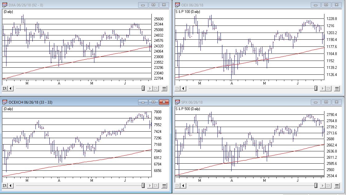
Figure 1 displays the four major average – Dow, S&P 500, Nasdaq 100 and Russell 2000 with their respective 200-day moving averages.  In the last few days the Dow slipped a little below its 200-day average, the other three remain above.

(click to enlarge)1aFigure 1 – Four major market averages with 200-day moving averages (Courtesy AIQ TradingExpert)
Warning Sign to Watch For: If 3 or more of these averages drop below their 200-day moving average.

#2. Market Bellwethers

Figure 2 displays my four market “bellwhethers” – tickers SMH (semiconductors), TRAN (Dow Transports), ZIV (inverse VIX) and BID (Sotheby’s Holdings) with their respective 200-day moving averages.  At the moment only ZIV is below it’s 200-day moving average but some of the others are close

(click to enlarge)2Figure 2 – Four market bellwethers with 200-dqy moving averages (Courtesy AIQ TradingExpert)
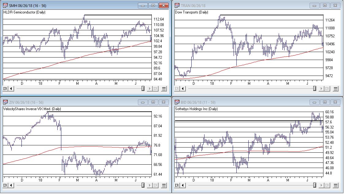
Warning Sign to Watch For: If 3 or more of these averages drop below their 200-day moving average.

#3. S&P 500 Monthly Method

In this article I detailed a simple timing method using S&P 500 Index monthly closing prices.  Figure 3 show the S&P 500 Index with it’s “trigger warning” price of 2,532.69 highlighted.

(click to enlarge)3Figure 3 – S&P 500 Index Monthly Method Trigger Points (Courtesy AIQ TradingExpert)
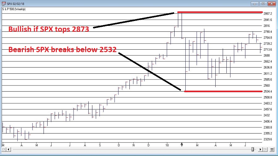
Warning Sign to Watch For: If SPX closes below 2532.69 without first taking out the January high of 2872.87

#4. International Growth Stocks

When growth stocks around the world are performing well, things are good.  When they top out, try to rebound and then fail, things are (typically) not so good.  The last two major U.S. bear markets were presaged by a break in ticker VWIGX (Vanguard International Growth) as seen in Figure 4.

(click to enlarge)4Figure 4 – Dow Jones Industrials Average (top) and previous warnings from ticker VWIGX (bottom)(Courtesy AIQ TradingExpert)
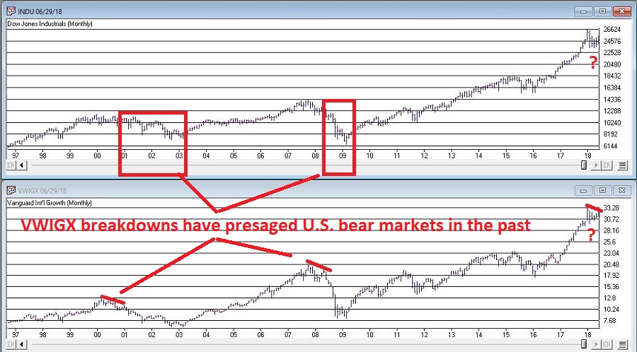
Warning Sign to Watch For: Technically this one is currently flashing a warning sign.  That warning will remain active unless and until VWIGX takes out the January high of 33.19.

#5. The 10-Year minus 2-Year Yield Spread

This is one of the most misrepresented indicators, so I will state it as plainly as possible:

*A narrowing yield curve IS NOT a bearish sign for the stock market

*An actual inverted yield curve IS a bearish sign for the stock market

Figure 5 displays the latest 10-year minus 2-year spread.  Yes, it has narrowed quite a bit.  This has launched a bazillion and one erroneously frightening articles.  But remember the rules above.

(click to enlarge)5Figure 5 – 10-year treasury yield minus 2-year treasury yield (Courtesy: www.StockCharts.com)
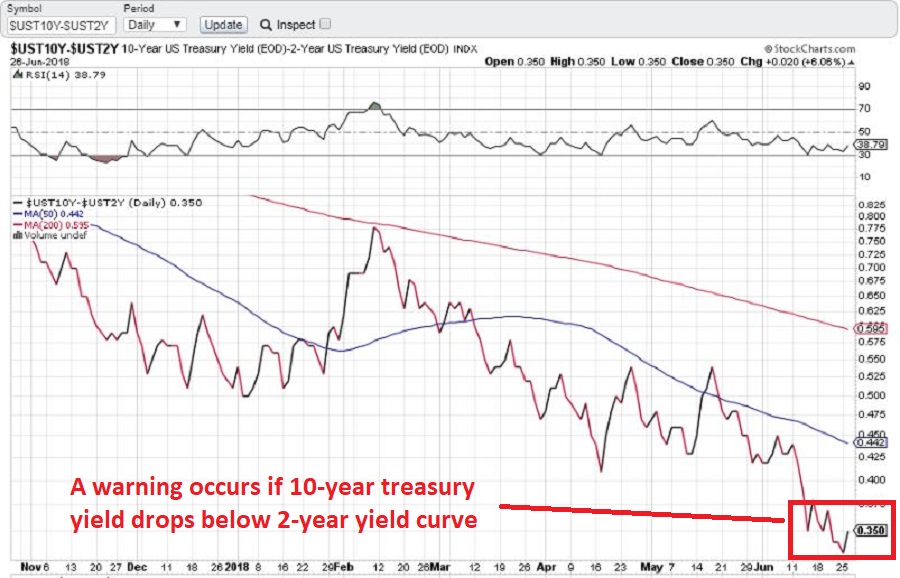
Warning Sign to Watch For: If the 10-year yield minus the 2-year yield falls into negative territory it will flash a powerful warning sign for the stock market and the overall economy.  Until then ignore all the hand-wringing about a “flattening” yield curve.

Summary

We are in a seasonally unfavorable period for the stock market and – as always – we are bombarded daily with a thousand and one reasons why the next bear market is imminent.

So my advice is to do the following:

1. Ignore it all and keep track of the items listed above

2. The more warning signs that appear – if any – the more defensive you should become

In the meantime, try to go ahead and enjoy your summer.

Jay Kaeppel

Disclaimer:  The data presented herein were obtained from various third-party sources.  While I believe the data to be reliable, no representation is made as to, and no responsibility, warranty or liability is accepted for the accuracy or completeness of such information.  The information, opinions and ideas expressed herein are for informational and educational purposes only and do not constitute and should not be construed as investment advice, an advertisement or offering of investment advisory services, or an offer to sell or a solicitation to buy any security.


Oh Yes We Need ‘The Summer Rally’ (Right This Very Minute)

Market “legend” makes reference to “The Summer Rally”.  There is also a lot of talk about the “Summer Doldrums” historically.  Any truth to any of this?  As it turns out, “Yes” and “Yes”.

The Test

We will look solely at the summer months of June, July and August.  We will further separate those months into two periods:

*The Summer Rally Period: includes the last 3 trading days of June and the first 9 trading days of July

*All Other Days: Which simply include all other trading days during June, July and August*

(*for the record, “All Other Days” includes all the trading days in June prior to the last 3 trading days, all the trading days after the first 9 trading days of the month, plus all trading days in August)

For our test we will use S&P 500 daily price data starting in 1942.

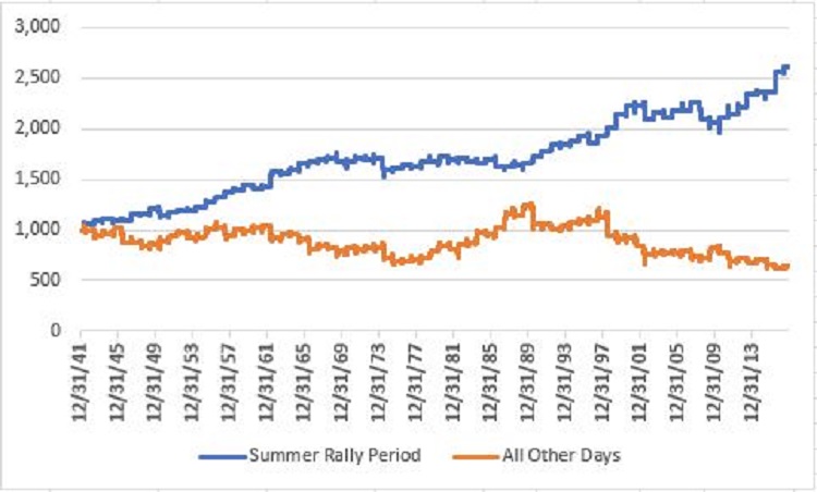
Figure 1 the blue line displays the growth of $1,000 invested ONLY during the 12 day Summer Rally Period every year versus the growth of $1,000 invested during “all other days” (yellow line) during June, July and August every year.1Figure 1 – Growth of $1,000 invested in the S&P 500 Index during the Summer Rally Period (blue) versus All Other Summer Days (orange); 1942-2017

Figure 2 displays the fairly stark differences in performance during these two periods.

Measure Summer Rally Period All Other Summer Days
Cumulative % +(-) +160% (-37%)
Average % +(-) +1.31% (-0.40%)
Worst %- (-7.1%) (-15.8%)
# Times UP 55 40
# Times DOWN 21 36
% Time UP 72.4% 52.6%
% Time DOWN 27.6% 47.4%

Figure 2 – Summer Rally Days versus All Other Summer Days; 1942-2017

Summary

This year’s Summer Rally Period extends from the close on 6/26 through the close on 7/13.

Two words of caution:

*No one should mistakenly assume that the stock market is “sure to rally.”  With a 72.4% winning percentage, the “Summer Rally” is clearly never a “sure thing”.  But it is also a lot better of a bet than the “All Other Days” period which have been up 52.6% of the time and have netted a cumulative loss of -37% over the past 76 years.

*”The Summer Rally” Period has seen the S&P 500 Index generate a gain in each of the last 8 years, so an “off year” is quite possible.

Still, the bottom like is the we could sure use a “Summer Rally” (or any kind of a rally for that matter) right about now.

For the “numbers people”, the year-by-year S&P 500 Index summer results appear in Figure 3.

Year All of June/July/August Summer Rally Period All Other Days
1942 5.8 6.6 (0.7)
1943 (2.6) 2.0 (4.4)
1944 3.8 1.9 1.9
1945 3.3 (2.0) 5.4
1946 (13.2) 0.7 (13.8)
1947 6.0 6.0 0.0
1948 (4.3) (0.2) (4.1)
1949 7.3 4.7 2.4
1950 (1.9) (5.8) 4.1
1951 8.2 3.2 4.8
1952 4.9 1.5 3.4
1953 (5.0) (0.1) (4.9)
1954 2.2 3.0 (0.8)
1955 13.9 3.1 10.5
1956 5.1 4.3 0.8
1957 (4.7) 4.1 (8.4)
1958 8.3 1.1 7.1
1959 1.6 3.2 (1.5)
1960 2.0 (2.1) 4.2
1961 2.3 1.3 1.0
1962 (0.9) 10.5 (10.3)
1963 2.4 (0.6) 3.0
1964 1.8 2.3 (0.5)
1965 (1.4) 3.4 (4.6)
1966 (10.5) 0.9 (11.2)
1967 5.1 1.6 3.5
1968 0.2 1.3 (1.1)
1969 (7.7) (2.5) (5.3)
1970 6.5 0.5 5.9
1971 (0.6) 1.3 (1.8)
1972 1.4 (0.5) 2.0
1973 (0.7) 0.8 (1.4)
1974 (17.3) (6.6) (11.5)
1975 (4.7) 0.6 (5.3)
1976 2.7 2.2 0.6
1977 0.7 (0.8) 1.5
1978 6.2 2.7 3.4
1979 10.3 0.6 9.6
1980 10.0 2.8 7.0
1981 (7.4) (2.4) (5.1)
1982 6.8 1.2 5.6
1983 1.2 (1.5) 2.7
1984 10.7 (1.2) 12.1
1985 (0.5) 1.9 (2.3)
1986 2.3 (4.3) 6.9
1987 13.7 0.6 13.1
1988 (0.2) 0.4 (0.7)
1989 9.6 1.0 8.5
1990 (10.7) 4.3 (14.4)
1991 1.4 2.6 (1.1)
1992 (0.3) 3.6 (3.8)
1993 3.0 0.6 2.4
1994 4.2 1.4 2.8
1995 5.3 3.2 2.1
1996 (2.6) (3.3) 0.8
1997 6.0 3.3 2.6
1998 (12.2) 4.3 (15.8)
1999 1.4 6.3 (4.6)
2000 6.8 4.1 2.6
2001 (9.7) (0.1) (9.7)
2002 (14.2) (5.6) (9.1)
2003 4.6 2.9 1.6
2004 (1.5) (2.0) 0.6
2005 2.4 3.0 (0.6)
2006 2.7 (0.2) 2.9
2007 (3.7) 4.0 (7.4)
2008 (8.4) (7.1) (1.4)
2009 11.0 (1.6) 12.8
2010 (3.7) 1.7 (5.3)
2011 (9.4) 2.2 (11.4)
2012 7.3 2.8 4.4
2013 0.1 5.8 (5.4)
2014 4.1 0.9 3.2
2015 (6.4) 0.3 (6.7)
2016 3.5 8.2 (4.3)
2017 2.5 1.6 0.8
Average %+(-) 0.9 1.3 (0.4)
Worst %- (17.3) (7.1) (15.8)
# Times UP 47 55 40
# Times DOWN 29 21 36
% Times UP 61.8 72.4 52.6
% Times DOWN 38.2 27.6 47.4

Figure 3 – Year-by-Year

Jay Kaeppel

Disclaimer:  The data presented herein were obtained from various third-party sources.  While I believe the data to be reliable, no representation is made as to, and no responsibility, warranty or liability is accepted for the accuracy or completeness of such information.  The information, opinions and ideas expressed herein are for informational and educational purposes only and do not constitute and should not be construed as investment advice, an advertisement or offering of investment advisory services, or an offer to sell or a solicitation to buy any security.9

The U.S. Dollar vs. Brazil

Correlations between markets and one market influencing another is by no means a new concept.  But it is one that a lot of investors never really bother to think about.  Turns out those people may be missing out on some useful intel.

Consider ticker EWZ – an ETF that tracks the Brazilian stock market – and its love/hate relationship with the U.S. dollar.

Ticker EWZ vs. Ticker UUP

The U.S. soccer team may have missed the World Cup while Brazil is one of the favorites – but when it comes to the stock market, the U.S. dollar appears to have a not insignificant influence on the Brazilian stock market.

The basic theory we will test is this:

*Dollar Strong = Bad for EWZ

*Dollar Weak = Good for EWZ

EWZ started trading in 2001.  For testing purposes, I used the U.S. dollar futures data from 2001 through 2013 as a proxy for – what else? – the U.S. dollar.  In 2014 I started using ticker UUP – an ETF that tracks – you guessed it – the U.S. dollar.

The Test

*If the 5-week average of closing prices for the U.S. dollar is below the 30-week average of closing price for the dollar, we are long EWZ

*If the 5-week average of closing prices for the U.S. dollar is above the 30-week average of closing price for the dollar, we are out of EWZ

For the record, this is not intended to be a standalone trading “system” because it takes no account of the actual trend in the price of EWZ.  This “method” simply measures EWZ performance based on whether the U.S. dollar is trending higher or lower.

The Results

In Figure 1:

*The blue line displays the growth of $1,000 invested in EWZ ONLY when the U.S. dollar is in a downtrend

*The orange line displays the growth of $1,000 invested in EWZ on a buy-and-hold basis

1

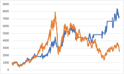
Figure 1 – Growth of $1,000 invested in EWZ ONLY when U.S. dollar 5wk. ma< 30wk ma (blue line) versus $1,000 invested in EWZ on a buy-and-hold basis (orange); 7/31/2001-6/21/2018

The results in Figure 1 or of the “Tortoise and the Hare” variety.  The “method” underperformed significantly during the huge bull run leading up to 2008, but fared much better during the significant bear markets.

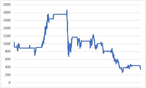
Figure 2 is also enlightening as it displays the growth of $1,000 invested in EWZ ONLY when the U.S. dollar is in an uptrend (i.e., 5-week average above 30-week average).

2

Figure 2 – Growth of $1,000 invested in EWZ ONLY when U.S. dollar 5wk. ma> 30wk ma (blue line); 7/31/2001-6/21/2018

For the record, from 7/31/2001 through 6/21/2018:

*$1,000 invested in EWZ buy-and-hold grew to $2,510

*$1,000 invested in EWZ ONLY when the U.S. dollar was in a downtrend grew to $7,261

*$1,000 invested in EWZ ONLY when the U.S. dollar was in an uptrend shrank to $346

To put it another way:

*Dollar trending down = EWZ up +626%

*Dollar trending up = EWZ down (-65%)

Summary

There are many factors besides the U.S. dollar that can affect the Brazilian stock market.  So like I said, this one factor “method” should not be considered a standalone system.

Still, the results strongly suggest that anyone looking at ticker EWZ might want to take a glance at ticker UUP first.

Jay Kaeppel

Disclaimer:  The data presented herein were obtained from various third-party sources.  While I believe the data to be reliable, no representation is made as to, and no responsibility, warranty or liability is accepted for the accuracy or completeness of such information.  The information, opinions and ideas expressed herein are for informational and educational purposes only and do not constitute and should not be construed as investment advice, an advertisement or offering of investment advisory services, or an offer to sell or a solicitation to buy any security.
Which Way Soybeans?

As I discussed here, the advent of ETF’s has opened a vast array of opportunities to investors that was previously hard to reach.  In the linked article I discussed the current “state of things” for the euro – which a non-commodity trader can trade using the ETF ticker FXE.

In this piece we will discuss the current state of the soybean market – which can be traded via ETF ticker SOYB.

Ticker SOYB

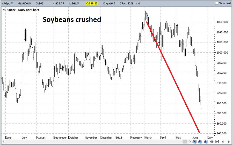
To examine beans, we will look at the spot soybean futures contract.  In Figure 1 we see a precipitous decline in the price of soybeans recently.  This is due in large part to uncertainty relating to the potential for a trade war which might impact the amount of soybeans getting traded internationally.  It is also a function of the mild winter and good planting season this year, which is expected to result in a bumper crop – i.e., a large supply – for soybeans this year.

(click to enlarge)5Figure 1 – Soybeans sell off hard (Courtesy ProfitSource by HUBB)

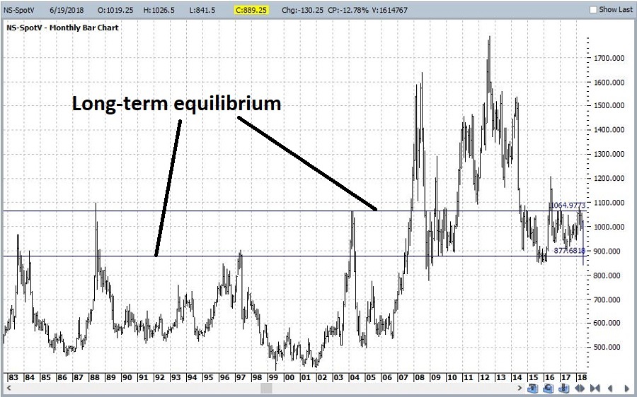
Figure 2 displays a long-term monthly chart for soybeans.  The chart includes two arbitrarily drawn “equilibrium” lines to help give a sense of where support and resistance may arise from a very long-term perspective.

(click to enlarge)6Figure 2 – Weekly Soybeans (Courtesy ProfitSource by HUBB)

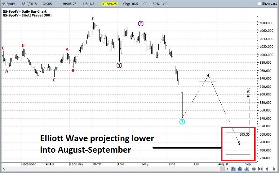
Figure 3 goes back to a daily chart and shows the latest Elliott Wave count generated from ProfitSource by HUBB.  It is presently projecting another leg lower into July or August.

(click to enlarge)7Figure 3 – Daily Soybeans with Elliott Wave (Courtesy ProfitSource by HUBB)

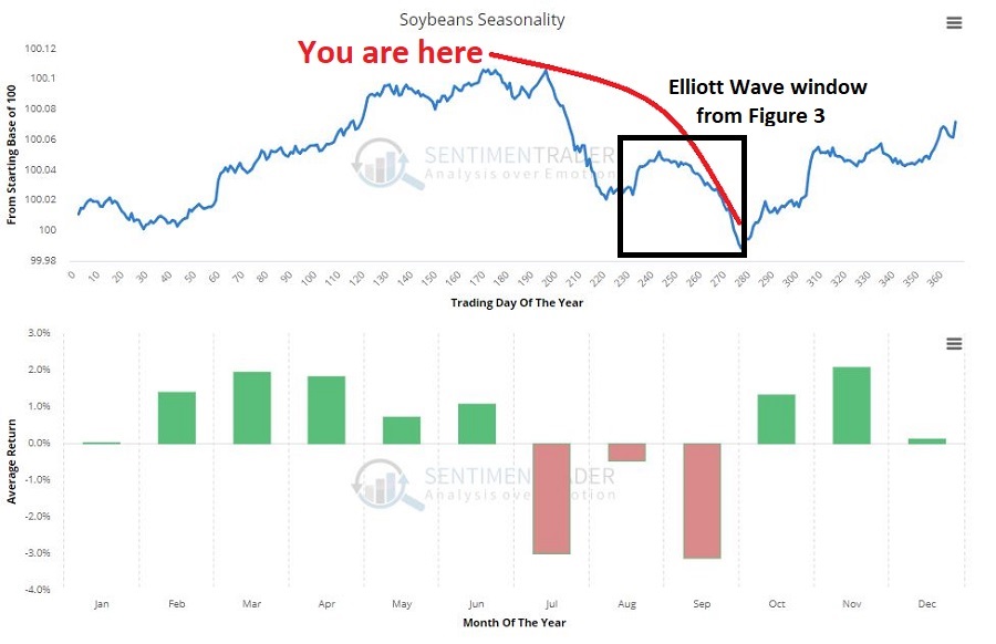
Finally, Figure 4 shows the annual seasonal trend for soybeans from one of my favorite websites, www.sentimentrader.com.  As you can see in Figure 4, July and September are the typical “weak spots” for beans.  The projected low in Figure 4 coincides pretty closely with the start of a strong second half seasonal upward bias.

(click to enlarge)8Figure 4 – Soybeans Annual Seasonality (Courtesy www.sentimentrader.com)

So is now a great time to jump in?  Perhaps not.  But here is my off-the-cuff thinking: If soybeans are still very beaten down in the late-September timeframe it might present an excellent buying opportunity for ticker SOYB.

Jay Kaeppel

Disclaimer:  The data presented herein were obtained from various third-party sources.  While I believe the data to be reliable, no representation is made as to, and no responsibility, warranty or liability is accepted for the accuracy or completeness of such information.  The information, opinions and ideas expressed herein are for informational and educational purposes only and do not constitute and should not be construed as investment advice, an advertisement or offering of investment advisory services, or an offer to sell or a solicitation to buy any security.
Which Way the Euro?

The advent of ETF’s has opened a vast array of opportunities to investors that was previously hard to reach.  One category that applies is the commodities markets.  Most investors are not built emotionally and/or financially to endure the rigors associated with trading commodity futures. Not that I have any problem with commodity futures in general.  Traders who understand the leverage and who manage risk properly can achieve great things.  But the fact remains, that they are not “right” for a lot of individuals.

As always, opportunity is where you find it.  Ticker FXE tracks the euro and ticker SOYB tracks soybeans.  Investors can trade these ETFs just like they trade shares of stock.  While these vehicles do not offer the leverage of futures contracts, they do offer exposure.  Both the euro and soybeans have gotten crushed lately.  Is there an opportunity there?  Let’s take a closer look.

Ticker FXE

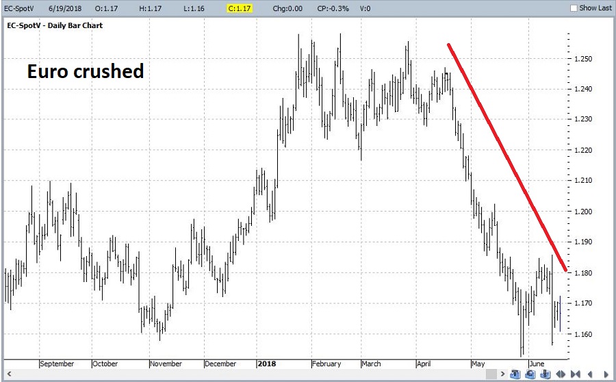
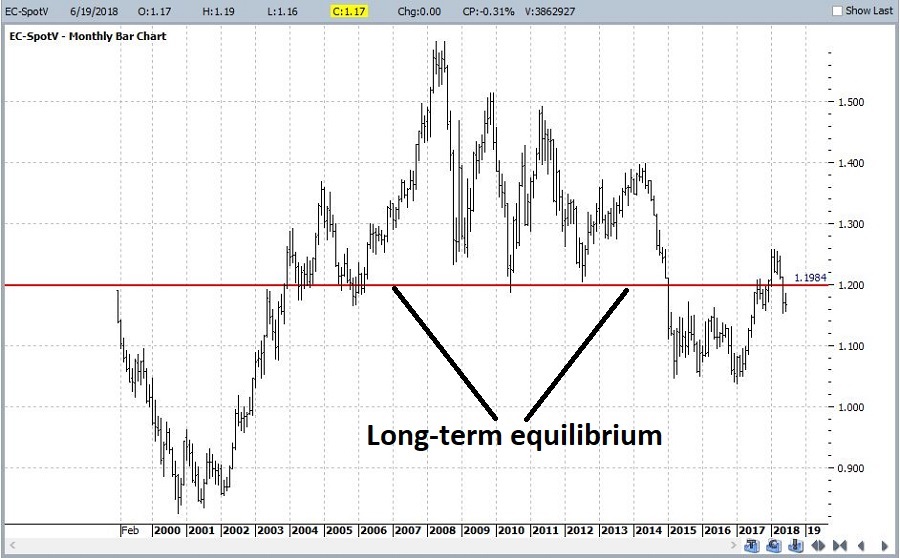
To examine the euro we will look at the spot euro futures contract.  In Figure 1 we see the recent decline – a direct result of a strong U.S. Dollar.

1Figure 1 – Euro sells off hard (Courtesy ProfitSource by HUBB)

Figure 2 displays a monthly chart of the euro since trading inception.  The chart includes a fairly arbitrarily drawn “equilibrium” line to help give a sense of where we are from a very long-term perspective.

2Figure 2 – Weekly Euro (Courtesy ProfitSource by HUBB)

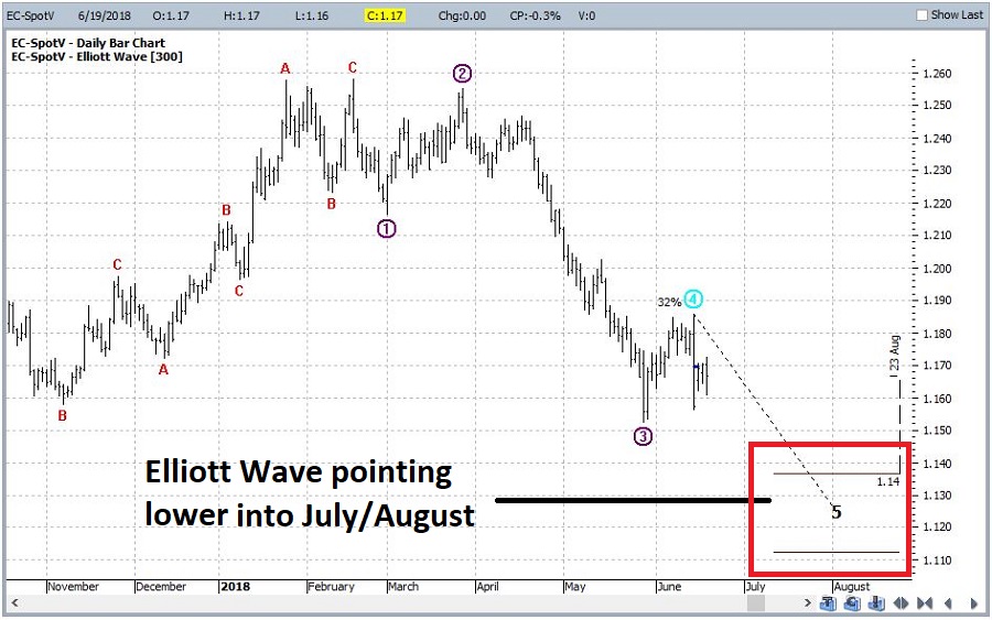
Figure 3 goes back to a daily chart and shows the latest Elliott Wave count generated from ProfitSource by HUBB.  It is presently projecting another leg lower into July or August.

3Figure 3 – Daily Euro with Elliott Wave (Courtesy ProfitSource by HUBB)

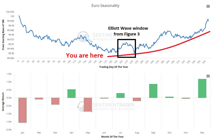
Finally, Figure 4 shows the annual seasonal trend for the Euro from one of my favorite websites, www.sentimentrader.com.  As you can see in Figure 4, the projected low in Figure 4 coincides pretty closely with the start of a strong second half seasonal upward bias.

4Figure 4 – Euro Annual Seasonality (Courtesy www.sentimentrader.com)

So is now a great time to jump in?  Perhaps not.  But here is my off-the-cuff thinking:  If the euro looks really lousy in late July into August it might present an excellent buying opportunity for ticker FXE.

Next: Ticker SOYB (Soybeans)

Jay Kaeppel

Disclaimer:  The data presented herein were obtained from various third-party sources.  While I believe the data to be reliable, no representation is made as to, and no responsibility, warranty or liability is accepted for the accuracy or completeness of such information.  The information, opinions and ideas expressed herein are for informational and educational purposes only and do not constitute and should not be construed as investment advice, an advertisement or offering of investment advisory services, or an offer to sell or a solicitation to buy any security.
The Mid-Term Election Year Danger Zone

I typically try as hard as possible to focus on the “trend right now.”  In fact, I wrote an article recently essentially averring that “the U.S. stock market trend is bullish right now, so try to enjoy the ride.”  With this piece I want to offer a slight clarification.

Recognizing that the trend is bullish “right now” and focusing on that primarily, DOES NOT mean it is OK to stick your head in the sand and forget about the potential need to “play defense.”

The Mid-Term Election Year Danger Zone

Just for the record, what has happened in the stock market since the end of January is not at all unusual given the fact that this is a mid-term election year.

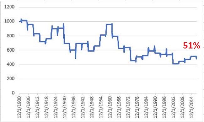
Figure 1 below displays the growth of $1,000 invested in the Dow Jones Industrials Average (using monthly closing price data only) ONLY from the end of January through the end of October during every mid-term election year starting in 1902.

1Figure 1 – Growth of $1,000 invested in Dow Jones Industrials Average ONLY during February through September during mid-term election years; 1900-2018

The net result to date (including Feb through May of this year) is -51%.  To put this into perspective, note that buy-and-hold has generated a gain of over +47,000% during the same time.

Summary

Bottom line: The trend of the major U.S. averages is presently still bullish.  But risk is ever present in the financial markets, which is why your investment plan should have some contingencies built in – “just in case.”

Which reminds me to invoke:

Jay’s Trading Maxim #29: The purpose of a stop-loss order (or a trailing stop) is NOT to maximize profitability.  The purpose of a stop-loss order (or a trailing stop) is to save your sorry assets.

Jay Kaeppel

Disclaimer:  The data presented herein were obtained from various third-party sources.  While I believe the data to be reliable, no representation is made as to, and no responsibility, warranty or liability is accepted for the accuracy or completeness of such information.  The information, opinions and ideas expressed herein are for informational and educational purposes only and do not constitute and should not be construed as investment advice, an advertisement or offering of investment advisory services, or an offer to sell or a solicitation to buy any security.
World, Interrupted

I suppose a more accurate title would be, “A Bunch of Single Country ETFs, Interrupted”, but, well, that just doesn’t have quite the same succinct simplicity.

I always (always, always) try to make an effort to focus on “the current trend” and to avoid focusing on things that “maybe might prove to be ominous signs in retrospect” or to imply that a certain tidbit of information is predictive when in reality it is mostly just anecdotal.  Still, human nature is – unfortunately, in this case – a powerful force.  Which reminds me to invoke:

Jay’s Trading Maxim #17: Human nature is a detriment to trading and investment success, and should be avoided as much as, well, humanly possible.

The bottom line is that despite my very own warnings and admonitions, sometimes that pesky human nature gets the best of me.

What Has My Attention

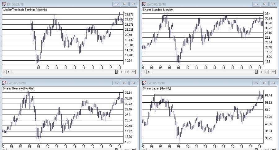
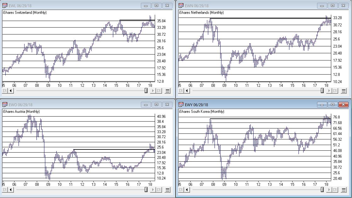
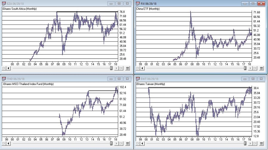
OK, rather than me telling you what I think, please simply peruse the charts in Figures 1, 2 and 3 and see if anything jumps out at you.

(click to enlarge)1Figure 1 – India, Sweden, Japan, Germany (clockwise); (Courtesy AIQ TradingExpert)

(click to enlarge)2Figure 2 – Switzerland, Netherlands, South Korea, Austria (clockwise); (Courtesy AIQ TradingExpert)

(click to enlarge)3aFigure 3 – South Africa, China, Taiwan, Thailand (clockwise); (Courtesy AIQ TradingExpert)

Perhaps you noticed the same thing I did, i.e., a whole bunch of single country ETF’s hitting new highs or testing old resistance and getting rejected. In a number of cases, after appearing to break out to new highs for a period of weeks or month only to fall back below the “line in the sand.”

It’s sort of like the World Cup of Failed Breakouts.

Summary

Now here’s the thing.  I have displayed a bunch of charts that anecdotally seem to imply something bearish.  To spell it out, failed breakouts are often – though definitely not always – followed by something much worse.

So the line of reasoning goes like this, “If the stock market in umpteen countries is failing to advance then this must be a bad thing.”

But the reality is that all these markets have to do is rally and this whole sort of made up area of concern goes away.

Still, until that actually happens I think I will:

a) Enjoy the rally here in the U.S.

b) Remain vigilant

It seems like a reasonable plan.

Jay Kaeppel

Disclaimer:  The data presented herein were obtained from various third-party sources.  While I believe the data to be reliable, no representation is made as to, and no responsibility, warranty or liability is accepted for the accuracy or completeness of such information.  The information, opinions and ideas expressed herein are for informational and educational purposes only and do not constitute and should not be construed as investment advice, an advertisement or offering of investment advisory services, or an offer to sell or a solicitation to buy any security.
Gold and Silver Rebuffed Again

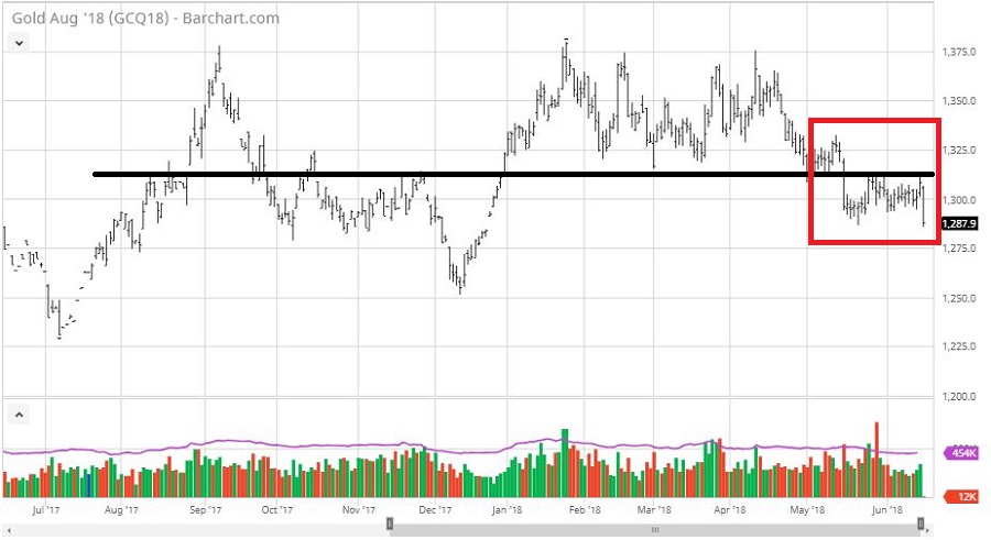
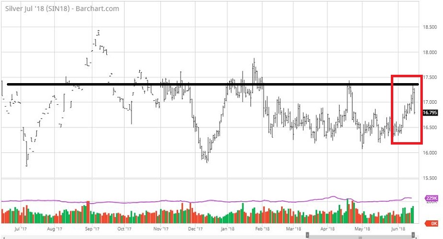
Gold and silver have both been trading in ever tightening ranges for almost a couple of years now.  A lot of pundits – myself included – see this type of action and recognize that historically this type of “coiling” action is almost invariably ultimately followed by a significant breakout to a sharply higher or lower price level.

I got all excited at several points in the last year pointing this out.  And then one day it hit me that this could go on for some time.  So I wrote about some ways (here and here) to set a position using options and just wait and see if anything ever happens.

Well something tried to happen as gold and (especially) silver tried to rally.  And – no surprise really – they appear to have been rebuffed again today as you can see in Figures 1 and 2.

1Figure 1 – Gold futures (Courtesy www.Barchart.com)

2Figure 2 – Silver futures (Courtesy www.Barchart.com)

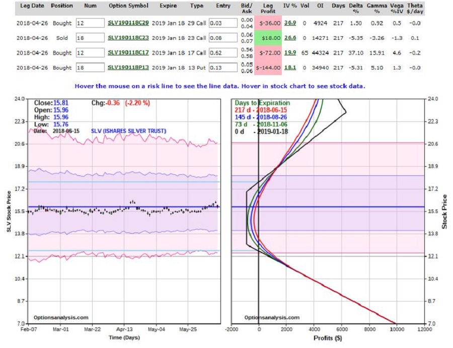
Sigh.  So back into “the range” for a while.  Figure 3 displays the latest status of the (“Crazy”) SLV option trade I highlighted back in April.  This trade involves January 2019 options so there is still plenty of time for SLV to decide to actually do something.

3Figure 3 – SLV Jan2019 “In case anything ever happens” option trade (Courtesy www.OptionsAnalysis.com)

Which reminds me of:

Jay’s Trading Maxim #162: Long-term option trades are great because they give the underlying security a lot of time to move.  Long-term option trades are also awful because they will drive you crazy in the meantime.

Welcome to “the meantime.”

Jay Kaeppel

Disclaimer:  The data presented herein were obtained from various third-party sources.  While I believe the data to be reliable, no representation is made as to, and no responsibility, warranty or liability is accepted for the accuracy or completeness of such information.  The information, opinions and ideas expressed herein are for informational and educational purposes only and do not constitute and should not be construed as investment advice, an advertisement or offering of investment advisory services, or an offer to sell or a solicitation to buy any security.
What in the World to Watch

If an investor were to sit down and peruse the Web looking for guidance regarding the stock market, there is a good chance they would come away bewildered and confused.

So, let’s try to simplify things a bit.

The Current Trend

Here I will defer to:

Jay’s Trading Maxim #14: When in doubt, usually the best question to ask is “What is the trend right now?”

There are always a million and one reasons why an investor may feel doubt.  But answering that simple question can often lead to a much greater deal of clarity.  Like now for instance.

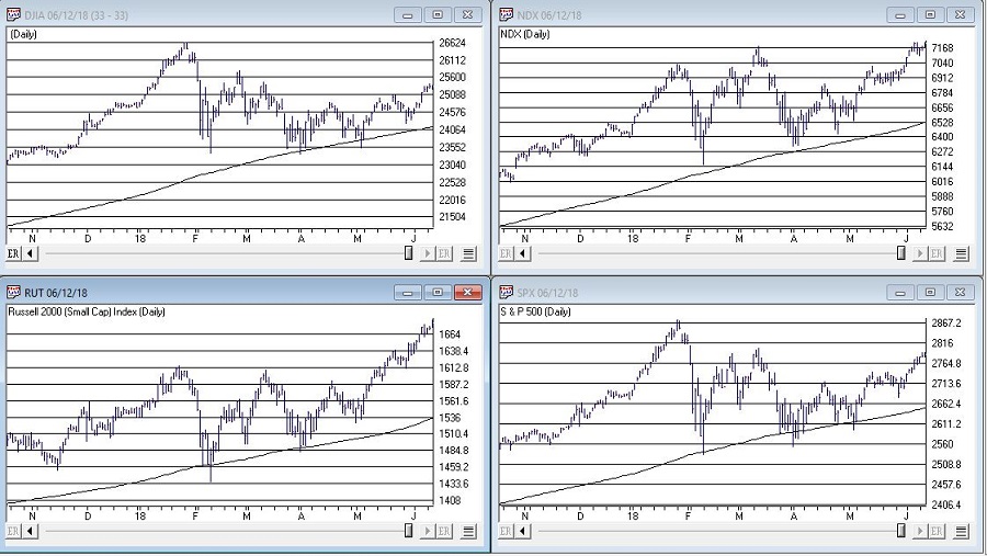
In Figure 1 we see the Dow, Nasdaq 100, Russell 200 small-cap index and the S&P 500.  The key thing to note is that all 4 of them are above their respective 200-day moving average, i.e., “right now” the trend is up.

Which leads to:

Jay’s Trading Maxim #14a: If the trend right now is “Up”, act accordingly.  At least until the answer changes.

1Figure 1 – Major U.S. Indexes in Up Trends (Courtesy AIQ TradingExpert)

SPX Monthly Trend-Following

I wrote here and here about a simple monthly trend-following method using the S&P 500 Index.

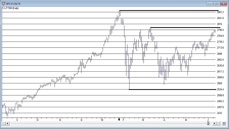
This method gave an “alert” when the S&P 500 went 3 calendar months (Feb, March and April) without making a new high.

The “line in the sand” is the low during this period of 2532,69.  As long as price holds above this level, this method deems the trend as still “Up”.

It will take a move above the January high 2872.87 to eliminate this line in the sand.  Between here and there there is resistance at 2801.90.

4Figure 2 – S&P 500 Index key support and resistance (Courtesy AIQ TradingExpert)

The (Problematic) World

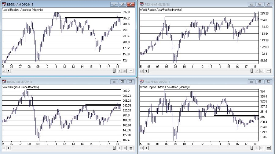
I am not speaking in any geopolitical sense here.  And I don’t want to sound like the Ugly American.  But while the U.S. stock market is “taking care of business” and moving higher, the stock markets of much of the rest of the world are not.  And I am not sure if I should worry about this or not.

But for what it is worth, all 4 regional single country ETF indexes that I created (Americas, Asia/Pacific, Europe and Middle East) and follow are not looking terribly inspiring at the moment.

(click to enlarge)

3Figure 3 – The Rest of the World Lags (Courtesy AIQ TradingExpert)

Summary

The trend “right now” is “Up”.  So enjoy.

But maybe check back again soon.  Just in case.

Jay Kaeppel


Disclaimer:  The data presented herein were obtained from various third-party sources.  While I believe the data to be reliable, no representation is made as to, and no responsibility, warranty or liability is accepted for the accuracy or completeness of such information.  The information, opinions and ideas expressed herein are for informational and educational purposes only and do not constitute and should not be construed as investment advice, an advertisement or offering of investment advisory services, or an offer to sell or a solicitation to buy any security.


Long Bonds Face A Key Test

I am in the camp that believes that the great interest rate decline that started in the early 1980’s has run its course and that the long-term trend in rates is now to the upside.  I also think it could be a long slow process and that bonds can stage some good rallies along the way.  I also recognize that I could be wrong.

A Buy Signal for Long Bonds?

A useful indicator I learned a long time ago from Tom McClellan is one that I refer to as “UpDays20”.  It involves simply counting the number of times the long bond has experienced a higher close over the past 20 days.  I have made a few minor changes in the way I look at it, as follows:

*With the long bond I look at weekly data instead of daily data (i.e., the number of weeks that have seen a weekly gain over the past 20 weeks)

*I also use a 30-week version (i.e., the number of weeks that have seen a weekly gain over the past 30 weeks)

Also, for calculation purposes I like to have 0 as the neutral line, so

Updays20 = Total # of up closes over latest 20 periods minus 10

Updays30 = Total # of up closes over 30 latest periods minus 15

For signal purposes, a “Buy Alert” occurs when:

Step 1: Both Updays20 and Updays30 drop to -2 or lower and then rise by 2 (more explanation in a moment)

Step 2: After Step 1 look for a high this week that is above the high of the previous week

Explanation:

If Updays20 drops to -2 and then later moves back up to 0, then that indicator gives an alert.  IF it drops to -3 and then moves up to -1, that is also an alert.  Same for a reading of -4 and a subsequent move to -2.  Same for Updays30.

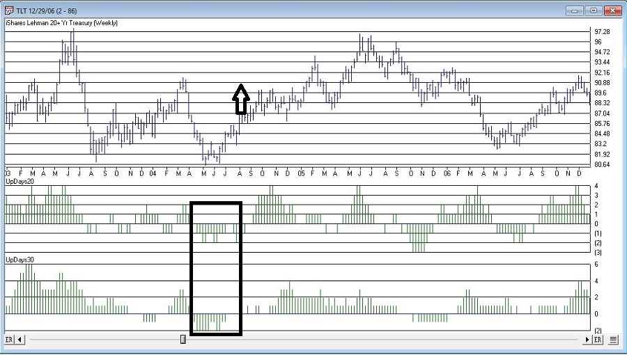
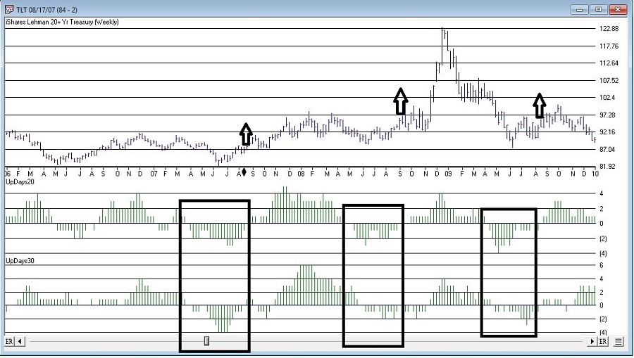
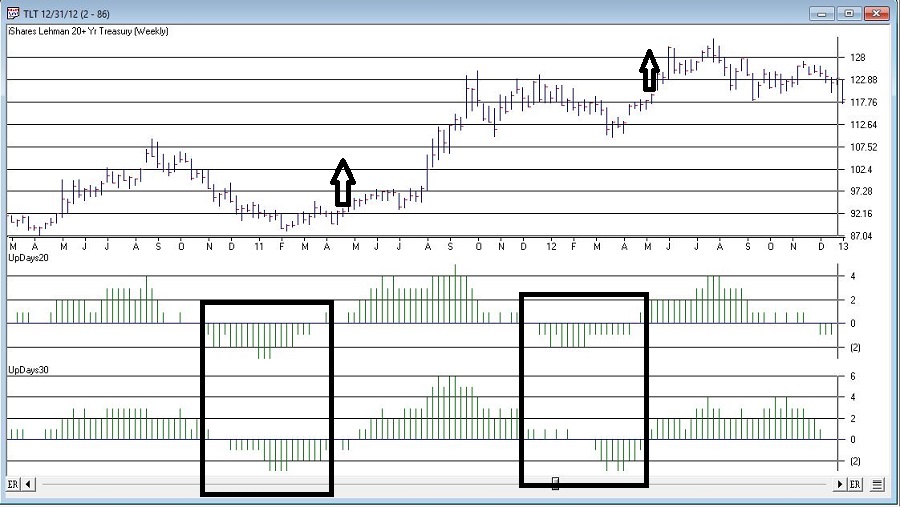
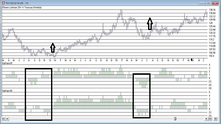
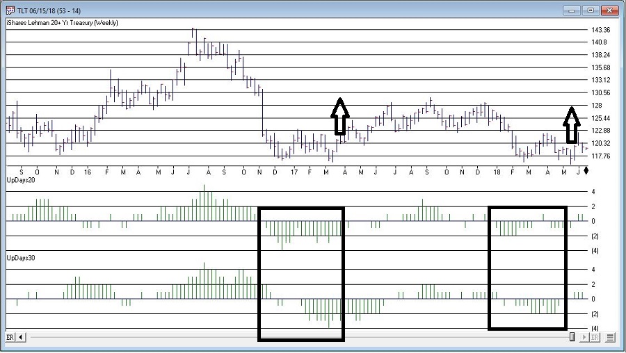
Clear as mud, right?  That’s why charts were invented.  Figures 1 through 5 display the signals for this method since ticker TLT (an ETF that tracks the long-term treasury bond) started trading.

(click to enlarge)

tlt1Figure 1 – TLT w/Buy Alert Signals (Courtesy AIQ TradingExpert)

tlt2Figure 2 – TLT w/Buy Alert Signals (Courtesy AIQ TradingExpert)

tlt3Figure 3 – TLT w/Buy Alert Signals (Courtesy AIQ TradingExpert)

tlt4Figure 4 – TLT w/Buy Alert Signals (Courtesy AIQ TradingExpert)

tlt5Figure 5 – TLT w/Buy Alert Signals (Courtesy AIQ TradingExpert)

The latest buy alert occurred on 5/24/2018 when TLT hit 119.00.  Does this signal mean that long-term treasuries are due to rally?  Not necessarily.  As you can see in Figures 1 through 5, like a lot of “methods” this one has generated some terrific buy signals, some OK buy signals and some not so useful buy signals.

If history is a guide there is a chance for a surprisingly good rally in the long bond in the weeks/months ahead.  But here is the point: If bonds DO NOT rally here it may be another ominous warning sign that the long-term trend for bonds is not so bright.

So, pay close attention in the weeks ahead

Jay Kaeppel

Disclaimer:  The data presented herein were obtained from various third-party sources.  While I believe the data to be reliable, no representation is made as to, and no responsibility, warranty or liability is accepted for the accuracy or completeness of such information.  The information, opinions and ideas expressed herein are for informational and educational purposes only and do not constitute and should not be construed as investment advice, an advertisement or offering of investment advisory services, or an offer to sell or a solicitation to buy any security.