Monthly Archives: January 2019

What You Need To Know About the January Barometer

When it comes to investing, if you stick around long enough you come to realize that success is not based on certainties or “sure things”, but rather on playing the odds (and reducing risk when the odds are against you).

The January Barometer was first popularized by Yale Hirsch of The Stock Trader’s Almanac and first mentioned in 1972.  If posits that a price gain for the S&P 500 Index during the month of January is bullish for stocks for the rest of the year, and vice versa.

Now like a lot of things related to the market if you Google “January Barometer” you get roughly 16.5 million related links.  Let me save you some time.  At one end of the spectrum are articles that say “Yes, you should pay attention to the January Barometer”.  At the other end are articles that basically say, “this is the dumbest thing I’ve ever heard of”.  And then of course there are the 16.49999 million articles that fall somewhere in between.  So, who should you believe?  How about “you”?  I’ll show you some numbers and you decide for yourself.  Fair enough?

The Post-Discovery History

Since Mr. Hirsch first mentioned it in 1972 we will start in 1973 and look at results in real-time.  A few notes:

*For testing purposes, we are completely ignoring the month of January

*JB Bull Years encompass February through December S&P 500 Index price performance when the S&P 500 Index January shows a gain

*JB Bear Years encompass February through December S&P 500 Index price performance when the S&P 500 Index January shows a gain

Figure 1 shows the relevant facts and figures

1

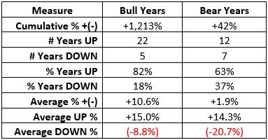
Figure 1 – JB Bull Years versus JB Bear Years; 1973-2018

A few things to note:

*The numbers demonstrate that the stock market “tends” to perform much better during JB “Bull Years” than during JB “Bear Years” – with a cumulative gain that is 29 time higher (+1,213% versus +42%), a higher percentage of UP years (82% vs. 63%), and a much lower Average DOWN years (-8.8% versus -20.7%).

*The bear market years of 1973, 1974, 2002 and 2008 were all presaged by a down January

*However, one key thing to note is this: A bullish January Barometer DOES NOT insulate you from risk, as was clearly demonstrated in 2018.

The Main Point

*A bullish or bearish January Barometer reading DOES NOT guarantee a bullish or bearish February through December going forward…..

*….BUT, if you are playing the odds you clearly want to give the bullish case the benefit of the doubt during JB Bull Years, and you need to pay particular attention to downtrends that begin to unfold during JB Bear Years.

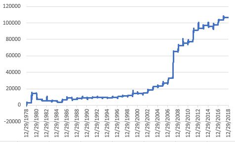
Figure 2 displays the growth of $1,000 invested in the S&P 500 Index (price performance only, not total return) Feb-Dec during JB Bull Years (blue) versus JB Bear Years.

2

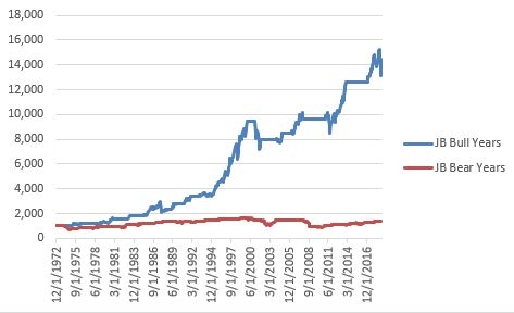
Figure 2 – Growth of $1,000 invested in S&P 500 Index Feb-Dec during JB Bull Years (blue) versus JB Bear Years (red); 1973-2018

Figure 3 displays year-by-year results

Year January Bull Year UP Bull Year DOWN Bear Year UP Bear Year DOWN
1973 (1.7) (15.9)
1974 (1.0) (29.0)
1975 12.3 17.2
1976 11.8 6.5
1977 (5.1) (6.8)
1978 (6.2) 7.7
1979 4.0 8.0
1980 5.8 18.9
1981 (4.6) (5.4)
1982 (1.8) 16.8
1983 3.3 13.5
1984 (0.9) 2.3
1985 7.4 17.6
1986 0.2 14.3
1987 13.2 (9.9)
1988 4.0 8.0
1989 7.1 18.8
1990 (6.9) 0.3
1991 4.2 21.3
1992 (2.0) 6.6
1993 0.7 6.3
1994 3.3 (4.6)
1995 2.4 30.9
1996 3.3 16.5
1997 6.1 23.4
1998 1.0 25.4
1999 4.1 14.8
2000 (5.1) (5.3)
2001 3.5 (16.0)
2002 (1.6) (22.2)
2003 (2.7) 29.9
2004 1.7 7.1
2005 (2.5) 5.7
2006 2.5 10.8
2007 1.4 2.1
2008 (6.1) (34.5)
2009 (8.6) 35.0
2010 (3.7) 17.1
2011 2.3 (2.2)
2012 4.4 8.7
2013 5.0 23.4
2014 (3.6) 15.5
2015 (3.1) 2.5
2016 (5.1) 15.4
2017 1.8 17.3
2018 5.6 (11.2)

Figure 3 – Year-by-Year Results for January Barometer using S&P 500 Index price performance; 1973-2018

Summary

If you are expecting the January Barometer to act as a flawless timing system, then you will be disappointed.  If you are looking for something to help you stay on the right side of the market the majority of the time, then the January Barometer is a useful tool (in my opinion).

Yale Hirsch made the January Barometer public knowledge in 1972.  Based on results since that time, it looks like he was on to something.

Jay Kaeppel

Disclaimer:  The data presented herein were obtained from various third-party sources.  While I believe the data to be reliable, no representation is made as to, and no responsibility, warranty or liability is accepted for the accuracy or completeness of such information.  The information, opinions and ideas expressed herein are for informational and educational purposes only and do not constitute and should not be construed as investment advice, an advertisement or offering of investment advisory services, or an offer to sell or a solicitation to buy any security.

Bean There, Done That

In this piece I wrote about a strong seasonal tendency in corn based on the planting cycle.  Turns out soybeans are in the same boat.  This can be a good thing for traders who are, a) willing to speculate, b) not dumb enough to the bet the ranch.

(See also Jay’s Trading Maxim’s (Part 1))

The Trend

Figure 1 displays the annual seasonal trend for soybeans (from www.sentimentrader.com).  Just as with corn, the months of February through April tend to see positive results.  Please note the use of the word “tend” and the lack of the words “sure” or “thing”.

bean seasonalityFigure 1- Soybean Annual Seasonal Trend (Courtesy Sentimentrader.com)

The History

Figure 2 displays a monthly chart for soybeans going back 4 decades.

2Figure 2 – Monthly chart for Soybeans (Courtesy ProfitSource by HUBB)

Here are the two things to note (using some pretty technical terms):

*Soybeans (like most commodities)  spend a lot of time “churning”, “grinding”, “consolidating” and generally going “nowhere”

*HOWEVER, “when beans go they really go!” (hopefully that wasn’t “too technical”)

*The primary thing to remember is that when soybeans get going to the upside, typically the best thing to do is to banish the word from “overbought” from your trading lexicon.  See Figure 3.3Figure 3 – Big moves in Beans (Courtesy ProfitSource by HUBB)

Now let’s focus on the months of February, March and April.  Figure 4 displays the hypothetical $ growth (no slippage or commissions) from holding long a 1-lot of soybean futures during February, March and April every year starting in 1976.

4

Figure 4 – Long 1 soybean futures contract during Feb-Mar-Apr every year since 1976

The Results

Some things to note regarding Feb-Apr in soybeans:

*# of times UP = 33

*# of times DOWN = 10

*Average $ gain = +$3,808

*Average $ loss = (-$1,788)

*Largest gain = +$15,025

*Largest loss = (-$3,775)

In sum, a winners to losers ratio of 3.3 (or 76% winners), an average win to average loss ratio of 2.13-to-1

Bottom line: these are great numbers for traders BUT they entail the assumption of significant risk (2017 saw a loss of over -$3,400)

An Alternative Way to Play

Ticker SOYB is the Teucrium ETF designed to track the price of soybeans.  SOYB allows traders to buy soybeans just as they would buy shares of stock.  Just remember that you don’t get the same leverage buying SOYB as you would buying a futures contract.

Figure 5 displays a monthly chart for SOYB and Figure 6 displays a daily chart.  Note the significant resistance level at around $16.96 a share.  If SOYB takes out that level sooner than later it might be a bullish sign.

5Figure 5 – SOYB Monthly (Courtesy AIQ TradingExpert)

6Figure 6 – SOYB Daily (Courtesy AIQ TradingExpert)

Summary

Soybeans have been beaten down a bit over the last several years.  If (and “yes”, that is a big “If”) beans are going to make a move higher, history suggests that the Feb through April period is a likely time for that to happen.

Am I “recommending” or even “merely suggesting” that you should buy soybean futures or ticker SOYB?  Not at all.  I adhere to that old media adage of “We (I) report, you decide.”

Which is better I think than the current motto of major media which appears to be “We decide, then we report our decision.”


Jay Kaeppel


Disclaimer:  The data presented herein were obtained from various third-party sources.  While I believe the data to be reliable, no representation is made as to, and no responsibility, warranty or liability is accepted for the accuracy or completeness of such information.  The information, opinions and ideas expressed herein are for informational and educational purposes only and do not constitute and should not be construed as investment advice, an advertisement or offering of investment advisory services, or an offer to sell or a solicitation to buy any security.

Can Corn?

It’s January.  It’s cold.  And the ground in the Midwest is frozen (and getting more frozen by the moment I might #$%^ add).  So of course, it is time to thinking about planting corn!

Wait, what!?

Well, yes as it turns out just about everyone involved in the agricultural industry has questions (doubts?) about corn planting in the spring and the eventual crop harvested in fall.  And the big questions are, “How will planting go?” and “how much corn will be produced?”  As it relates to corm the whole supply/demand thing you learned about way back when hinges on the ultimate answers to those two questions.

In a nutshell, there is “doubt.”  No surprise really as there is absolutely not a single corn seed planted anywhere in the Midwest at this moment.  So, who knows for sure?

One thing we do know for sure is that a lot of people are aware of this phenomenon in corn and feel compelled to “hedge their bets”, typically on an annual basis.  Figure 1 displays an annual seasonal chart for corn futures from www.sentimentrader.com.1Figure 1 – Annual Seasonal trend for Corn (Courtesy Sentimentrader.com)

As you can see, price strength is typical in the first 4 to 5 months of the year.  This should not be surprising because – as I described above – doubt about supply causes buying pressure (typically).

So for traders the real question is “should I be buying corn in anticipation of buying pressure?”  The answer is “definitely, maybe!”  Let’s take a closer look.

Figure 2 displays spot corn prices since 2001.2Figure 2 – Spot Corn prices (Courtesy ProfitSource by HUBB)

We can notice two things:

*Corn is presently in a fairly prolonged consolidation/compression range

*Previous consolidation/compression ranges have been followed by some significant advances

Despite this, one should not necessarily assume that corn is about to burst higher in price.  So let’s look at things from a more technical/tactical trading point of view.

How to Play Corn

*The “purest’ play is corn futures.  However, corn futures are not for most people.  In Figure 2, corn is trading at “350”, which equates to $3.50 a bushel in corn futures parlance.  Here is what you need to know:

If one were to buy a corn futures contract at $3.50 a bushel, a move to $4.50 a bushel would generate a gain of +$5,000 and a move to $2.50 a bushel would generate a loss of -$5,000.

In sum, a great way to make a lot of money if you are right and a great way to lose a lot of money if you are wrong.  There is an alternative for the “average” investor.

*Ticker CORN is the Teucrium Corn ETF which allows investors to trade corn like they would trade shares of stock.  Figure 3 displays a daily chart for ticker CORN.3Figure 3 – Ticker CORN with a significant resistance level around $16.53 (Courtesy AIQ TradingExpert)

Note that I have drawn a horizontal line $16.53, which connect the January 2018 low and the December 2018 high.  As with any line that one might arbitrarily draw on a bar chart, there is nothing “magic” about this price level.  But it does represent a potential line in the sand that be utilized in the following “highly complex” manner:

*CORN above $16.53 = (Possibly) Good

*CORN below $16.53 = Bad

The Choices

So what’s an investor to do?  As always, there are choices.

Choice #1 is flush this idea and forget all about corn.

Choice #2 is to buy now in hopes of an upside breakout, possibly with a stop-loss under the September 2018 low of $15.39.

Choice #3 is to wait for an upside breakout above $16.53 as confirmation that an actual bullish trend is forming.

Summary

I don’t make “recommendations” here at JOTM, so whether you prefer #1, #2 or #3 above is entirely up to you.  The key points though are:

It appears that there may be an opportunity forming (higher seasonal corn prices based on perceptions of problematic weather for planting and a long consolidation/compression in price).

A trader considering this idea needs to make decisions regarding what to trade (futures or CORN ETF), when to actually get in (before the breakout or after) and where to place a stop-loss.

Jay Kaeppel

Disclaimer:  The data presented herein were obtained from various third-party sources.  While I believe the data to be reliable, no representation is made as to, and no responsibility, warranty or liability is accepted for the accuracy or completeness of such information.  The information, opinions and ideas expressed herein are for informational and educational purposes only and do not constitute and should not be construed as investment advice, an advertisement or offering of investment advisory services, or an offer to sell or a solicitation to buy any security.

When to Hold Junk Bonds

Nobody really calls them “junk bonds” so much anymore.  Most people in refined circles refer to them as “high yield” bonds now.  Sounds way more classy.  But the fact remains they are bonds issued by companies with questionable finances.  Because their creditworthiness is lower than treasuries junk bonds pay a higher rate of interest than treasuries.  The theory is that junk bonds are a “higher risk, higher reward” proposition versus more staid intermediate-term treasuries.

There are two things to note about junk bonds:

*They are typically more correlated to the stock market than to the bond market.  To put it another way, as an asset class junk bonds tend to have a higher correlation to the S&P 500 Index than to the long-term treasury bond (likely because the fate of an individual junk bond is tied more closely to the likelihood that the issuing company will survive long enough to make all the payments than to interest rate fluctuations).

*Junk bonds have a slightly favorable seasonal tendency during December and January

We will use these two factors to create a trading “System”,such as it is.  But first let’s look at two benchmarks.

Junk Bond benchmark: To track junk bond returns we use monthly total return data for Vanguard High-Yield (ticker VWEHX) starting in January 1979

Intermediate-term treasury benchmark: For January through April 1979 we use the Bloomberg Barclays Intermediate-term treasury monthly total return.  Starting in May 1979 we use Fidelity Government Income Fund (ticker FGOVX)

Figure 1 displays the cumulative growth of $1,000 invested in our benchmarks on a buy-and-hold basis.

1

Figure 1 – Growth of $1,000 buying-and-holding junk bonds (blue) or intermediate-term treasuries (orange)

Junk bonds grew +2,192%, with an average 12-month gain of +8.7% and a maximum drawdown of -28.9%

Intermediate-term treasuries grew +1,331%, with an average 12-month gain of +7.1% and a maximum drawdown of -7.3%

So it would appear that the line about junk bonds being “higher risk, higher reward” appears to be based in fact.

Jay’s “Junky System”

We will hold junk bonds if:

*The S&P 500 Index closed the previous month above it’s 10-month moving average (i.e., if stocks are in an uptrend then hold junk bonds)

*If the current month is December or January

*If neither of the above is true then hold intermediate-term treasuries (i.e., if it is February through November AND the S&P 500 Index closed the previous month below its 10-month moving average)

Figure 2 displays the growth of $1,000 using our “System” versus simply buying and holding junk bonds.

2

Figure 2  – Jay’s Junky System versus buying and holding junk bonds

The System grew +2,855%, with an average 12-month gain of +9.2% and a maximum drawdown of -9.5%.

3Figure 3 – Comparative Results

Summary

So, is the “World-Beater, You Can’t Lose Trading Bonds” approach to trading bonds?  Probably not.  Is it a potential improvement on buying-and-holding junk bonds and/or intermediate-term treasuries?

That’s for you the reader to decide.

Jay Kaeppel

Disclaimer:  The data presented herein were obtained from various third-party sources.  While I believe the data to be reliable, no representation is made as to, and no responsibility, warranty or liability is accepted for the accuracy or completeness of such information.  The information, opinions and ideas expressed herein are for informational and educational purposes only and do not constitute and should not be construed as investment advice, an advertisement or offering of investment advisory services, or an offer to sell or a solicitation to buy any security.

It’s Almost Time to Look at Gold

In this article I detailed a fairly simple model for deciding whether to favor stocks or gold (at least with a portion of one’s investment capital).  This model will turn bullish for gold (though not necessarily bearish for stocks) at the end of January.  First a quick recap.  The model as presented in the original article:

*tracks the cumulative performance for gold and SPX using monthly total return data from the PEP database by Callan Associates for gold bullion and the S&P 500 Index (although just using price data would likely produce about the same results)

*tracks the ratio of SPX performance relative to gold performance

*tracks a 21-month exponential moving average of the relationship between the two

*When the ratio is above the moving average the model favors stocks and when the ratio is below the moving average the model favors gold (FYI, I use a 1-month lag.  So if a signal occurs at the end of March then the actual trade takes place at the end of April)

Simple enough.

For the record, I have made two changes since the original article:

*I now use a 22-month exponential moving average (instead of 21)

*Instead of using a cutoff of 0.00 (i.e., long SPX if > 0 or long gold if <= 0) I use a cutoff of -0.1 (i.e., long SPX if >-0.1 or long gold if <= -0.1).

Go ahead and accuse of me of curve-fitting, I am probably guilty as charged.  But for the record, the tweaks caused cumulative hypothetical profits to jump by a factor of 1.53-to-1.  So, I’ve decided to take my chances with the new rules as follows:

Jay’s SPX/Gold Ratio Indicator

A = monthly total return for SPX

B = monthly return for gold bullion

C = Growth of $1,000 invested in SPX

D = Growth of $1,000 invested in Gold

E = C / D (i.e., our SPX/Gold Ratio)

F = 22-month exponential moving average of E

If F > -0.1 then hold SPX

IF F<= -0.1 then hold gold

Figure 1 displays the SPX/Gold Ratio and the 22-month EMA.

1a

Figure 1 – Model’s SPX/Gold Ratio and the 22-month EMA

The (Updated) Results

Note at the far right of Figure 1 that the ratio dropped below the 22-month EMA (by more than the requisite amount of -0.1) at the end of December 2018.  This means that a signal has been generated and that this particular system will exit SPY and buy GLD at the end of January 2019.

Using the method just described, Figure 2 displays the following:

*The blue line represents the growth of $1,000 invested in SPX when the model favors stocks and in gold bullion when the model favors gold.

*The orange line represents the growth of $1,000 split 50/50 between SPX and gold bullion and rebalanced to a 50/50 split at the end of each calendar year

2a

Figure 2 – Growth of $1,000 invested by switching between gold and the S&P 500 Index using the model rules (blue) versus splitting 50/50 and rebalancing each year (orange)

Figure 3 displays the growth of $1,000 invested in SPX when the model favors stocks (blue line) versus $1,000 invested in SPX when the model favors gold.

3a

Figure 3 – SPX performance when model is bullish for stocks (blue) versus SPX performance when model is bullish for gold (orange)

Figure 4 displays the growth of $1,000 invested in gold when the model favors stocks (blue line) versus $1,000 invested in gold when the model favors gold.

4a

Figure 4 – Gold performance when model is bullish for gold (blue) versus gold performance when model is bullish for SPX (orange)

Figure 5 displays the cumulative results of holding either SPX or gold depending on the status of the model.

5a

Figure 5

The Latest

As mentioned above, this particular “system” will switch to gold at the end of January 2019.  Figure 6 displays the price action for ticker GLD, an ETF designed to track the price of gold bullion.  Note that price is over 20% above its late 2015 low and has rallied recently.  However, there is some significant resistance above.6aFigure 6 – Ticker GLD with support and resistance (Courtesy ProfitSource by HUBB)

Summary

As always, I don’t make “recommendations.”  So, please do not take this as me urging you to pile into gold on January 31st.  The purpose of this article is merely to point out that this particular system has generated a switch signal out of stocks and into gold to be executed at the end of January.  Does this mean that gold is sure to rally?  Does it mean that the end of the bull market is nigh for stocks?

In reality the answers to these questions are, “No” and “not necessarily”.  All it really means is that a system that has done a decent job in the past of timing switches between stocks and gold has generated a new signal.

Only time will tell if this latest signal is useful or not.

Jay Kaeppel

Disclaimer:  The data presented herein were obtained from various third-party sources.  While I believe the data to be reliable, no representation is made as to, and no responsibility, warranty or liability is accepted for the accuracy or completeness of such information.  The information, opinions and ideas expressed herein are for informational and educational purposes only and do not constitute and should not be construed as investment advice, an advertisement or offering of investment advisory services, or an offer to sell or a solicitation to buy any security.

A Long and Short-Term Bond Market Perspective, Part II

In Part I here I laid out my main thoughts regarding the bond market.  The final point mentioned that two trading models for bonds that I follow are presently bullish.  So in Part II let’s bring those up-to-date.

#1. Japanese Stocks (EWJ) vs. Long-Term Treasuries (TLT)

I have written about this model on several occasions in the past (here, here and here).  But in a nutshell:

*The Japanese stock market (using ETF ticker EWJ as a proxy) and long-term U.S. treasury bonds (using ETF ticker TLT as a proxy) tend to have an inverse relationship over time.

Therefore:

*A bearish trend for EWJ (5-week moving average below 30-week moving average) tends to be bullish for bonds.

*A bullish trend for EWJ (5-week moving average above 30-week moving average) tends to be bearish for bonds.

Figure 1 displays the EWJ on top with TLT on the bottom.  Note the general inverse correlation in price movement.

1Figure 1 – T-Bonds (ticker TLT in bottom clip) tend to move inversely to Japanese stocks (ticker EWJ with 5-weel and 30-week moving averages in top clip) (Courtesy AIQ TradingExpert)

#2. Gold/Copper Ratio versus Bonds

I have written about this before here.  In a nutshell:

*The gold/copper ratio has a relatively high correlation to the price of t-bonds (current correlation coefficient = 0.73; a reading of 1.00 means they mirror each other, a reading of -1 means there are trade exactly inversely).

Figure 2 displays treasury bond futures prices (blue) versus the Gold/Copper Ratio (x10) since 2001.  The correlation is fairly obvious to the naked eye.

2

Figure 2 – T-bond futures price (blue) versus Gold/Copper ratio (x10); 12/31/01-1/11/2019

*When the gold/copper ratio is in an uptrend (see here for how that designation is made) this indicator is considered bullish for bonds

*When the gold/copper ratio is in a downtrend this indicator is considered bearish for bonds

Putting the Two Together

*If either of the models is bullish that is considered bullish for bonds

*If both models are bearish that is considered very bearish for bonds

Figure 3 displays the gain or loss from holding a long position in a treasury bond futures contract depending on whether, a) neither model is bullish (red), or, b) one or more of the models is bullish (blue)

3

Figure 3 – Cumulative $ gain (loss) from holding long t-bond futures if 1 or more model is bullish (blue) versus if neither model is bullish (red); 7/22/96-1/11/19

As you can see, a bullish reading in no way guarantees higher bond price and a bearish reading in no way guarantees lower bond price.  Still, given the stark differences between the performance of the blue line and the red line, that would seem to be the way to bet.

For what it is worth, both models detailed above are bullish at the moment.

Summary

*In Part I, I basically inferred a preference for short to intermediate term bonds for people who buy and hold bonds (or bond funds) as part of a longer-term investment strategy (if rates rise 1 percentage point, a 30-year bond paying 4% a year, will lose -15% in principal – too much risk from my perspective).

*At the same time, as highlighted here in Part II, long-term bonds can still offer outstanding trading opportunities both on the long side and the short side – for those inclined to play.

Jay Kaeppel

Disclaimer:  The data presented herein were obtained from various third-party sources.  While I believe the data to be reliable, no representation is made as to, and no responsibility, warranty or liability is accepted for the accuracy or completeness of such information.  The information, opinions and ideas expressed herein are for informational and educational purposes only and do not constitute and should not be construed as investment advice, an advertisement or offering of investment advisory services, or an offer to sell or a solicitation to buy any security.

A Long and Short-Term Bond Market Perspective, Part I

Meanwhile, back in the bond market.  Yes, the stock market has been the place for “action” recently.  First a massive decline in short order followed immediately by a stunning advance.  But many investors also look to the bond market in order to achieve their long-term goals.  So, let’s try to put things in perspective a bit.

The Main Points

*Point A: Rates will likely work their way higher over time

There has historically been a roughly 60-year cycle in interest rates (See Figure 1).  If this holds to form, odds are the next 30 years will not look anything like the last 30 years in the bond market, i.e., rates will likely work their way higher over time.

1Figure 1 – 60-year cycle in rates suggest higher yields in years ahead (Source: mcoscillator.com)

*Point B: Investors should be wary of buying and holding long-term bonds

Figure 1 does not mean that rates will rise in a straight-line advance.  But again, odds are that rates will rise over time, so as a result, investors should be wary of buying and holding long-term bonds (as they stand to get hurt the most if rates rise).  That being said, in the short-term anything can happen, and long-term bonds may still be useful to shorter-term traders, BUT…

…Short to intermediate term bond funds are better now for investors than long-term bonds (if rates rise over time investors in short/intermediate term bonds can reinvest more quickly at higher rates, while long-term bond holders just lose principal).

4Figure 2 – Affect of rising rates on bonds of various maturities (Source: AAII.com)

*Point C: It appears to be too soon to declare a confirmed “Bond Bear Market!!!”

Bond yields looked in 2018 like they were staging a major upside breakout – and then reversed back to the downside.  So – Point A above not withstanding – it appears to be too soon to declare confirmed “Bond Bear Market!!!”

2Figure 3 – 10-year treasury yield “breakout fake out” (Source: AIQ TradingExpert)

3Figure 4 – 30-year treasury yield tested 120-month moving average, then failed  (Source: AIQ TradingExpert)

*Point D: Corporate bonds as a whole carry more risk than in years past

The risk associated with corporate bonds as an asset class are higher than in the past due to A) a higher rate of debt, and B) a large segment of the corporate bond market is now in the BBB or BBB- rating category.  If they drop one grade they are no longer considered “investment grade” and many institutional holders will have no choice but to sell those bonds en masse.  Which raises the age-old question, “too whom?”

For more on this topic see here, here and here.5Figure 5 – Rising corporate debt (Source: Real Investment Advice)

*Point E:

On the brighter side, two bond market models that I follow are presently bullish.  More about these in Part II.

Jay Kaeppel

Disclaimer:  The data presented herein were obtained from various third-party sources.  While I believe the data to be reliable, no representation is made as to, and no responsibility, warranty or liability is accepted for the accuracy or completeness of such information.  The information, opinions and ideas expressed herein are for informational and educational purposes only and do not constitute and should not be construed as investment advice, an advertisement or offering of investment advisory services, or an offer to sell or a solicitation to buy any security.

All Eyes on Key Bellwether Support Levels

First the reality.  Nobody knows what the market is going to do.  Yes, I am aware that there are roughly a bazillion people out there “prognosticating” (myself included) about the stock market.  And yes, if one makes enough “predictions”, the law of averages dictates that one will be correct a certain percentage of the time.

Still, the market does offer clues.  Sometimes those clues turn out to be false leads.  But sometimes they do offer important information.  For example, Figure 1 displays four major market indexes.  As you can see, in the Aug-Sep-Oct time frame all four of these averages “broke out” to new all-time highs (i.e., The Good News) and then broke back down below the previous resistance line drawn on each chart (i.e., The Bad News).

1Figure 1 – Four major indexes breakout then fail (Courtesy AIQ TradingExpert)

False breakouts happen all the time.  And the reality here is that sometimes they mean something and sometimes they don’t.  But when all four major average do the same thing, a warning sign has been issued to those who are interested in seeing it.  That’s why it can be useful to seek “confirmation”.  For my purposes I look to what I refer to as my 4 “bellwethers”, which are:

SMH – Semiconductors

TRAN – Dow Transportation Average

ZIV – Velocity Shares Inverse VIX Index

BID – Sotheby Holdings

These tickers appear in Figure 2 (click to enlarge).

2Figure 2 – Jay’s Market Bellwethers (Courtesy AIQ TradingExpert)

While the major indexes were testing new highs in Aug/Sep and then breaking down in October:

SMH – Never really came close to breaking out above its March high

TRAN – Followed the major indexes by hitting new highs in Aug/SP and then breaking down in October

ZIV – Never came anywhere close to its Jan-2018 high

BID – Broke to a new high in Jun/Jul, then failed badly.

In a nutshell, the failed major index breakouts were accompanied by absolutely no positive signs from the 4 bellwethers. So, the warning signs were there if one wished to see them.

So where are the bellwethers now?  Another close look at Figure 2 reveals that:

SMH – the key support level at 80.92

TRAN – the key level for the Dow Transports is 8744.36

ZIV – the key support level is 60.60

BID – a potential support level is 32.95 (the Apr 2013 low)

Summary

*Given the washed-out/oversold level that many indicators and sentiment surveys have reached…

*…Combined with the fact that we are in the seasonally favorable pre-election year (no down pre-election years since the 1930’s)

*There is a chance that 2019 could be surprisingly bullish, and shell-shocked investors should not stick their heads in the sand to the possibility.

At the same time:

*Based solely on trend-following indicators ALL of the major market indexes are technically in confirmed bear markets.  As a result, there is absolutely nothing wrong with having some portion of one’s capital in defensive positions at the moment (30% cash or short-term bonds?).

*Keep a close eye on January performance.  A bullish January would be a positive sign just as a negative January could – in this case – signal a continued market decline.

*Keep a close eye on the 4 Bellwethers relative to their respective support levels.

In a nutshell:

*Up January + Bellwethers holding above support = GOOD

*Down January + Bellwether breaking down below support = BAD

Those are all the “clues” I can offer at the moment.

Jay Kaeppel

Disclaimer:  The data presented herein were obtained from various third-party sources.  While I believe the data to be reliable, no representation is made as to, and no responsibility, warranty or liability is accepted for the accuracy or completeness of such information.  The information, opinions and ideas expressed herein are for informational and educational purposes only and do not constitute and should not be construed as investment advice, an advertisement or offering of investment advisory services, or an offer to sell or a solicitation to buy any security.

The 90% January Portfolio

What the title of this article attempts to say (in its own tortured way) is that this article details a “portfolio” that has made money during the month of January in 36 of the 40 previous years, i.e., 90% of the time.  It does not imply that you will make a return of 90% on your investment.  Also – and here comes the part I hate – just because “something” has been 90% correct in the past does NOT imply that there is a 90% probability that it will make money this time around.  I view every investment or trading proposition as a 50/50 deal.

Still, the history is compelling, so please consider the evidence.

The 90% January Portfolio

The “portfolio” is really just a combination of two securities – a municipal bond ETF or fund and a high-yield corporate bond ETF or fund – with each getting a 50% allocation.

For historical testing purposes I used:

VWITX – Vanguard Intermediate-Term Municipal Bond

VWEHX – Vanguard High Yield Corporate

Unfortunately, due to switching restrictions buying and holding these funds for one month is problematic.  So for trading purposes I look to:

MUB – iShares National Muni Bond ETF

JNK – SPDR Bloomberg Barclays High Yield Bd ETF

OR

HYG – iShares iBoxx $ High Yield Corp Bd ETF

Figure 1 displays the cumulative % growth of equity holding the 2 Vanguard funds ONLY during the month of January every year starting in 1979.

1

Figure 1 – Cumulative growth achieved by holding VWITX and VWEHX ONLY during January; 1979-2018

Figure 2 displays several relevant performance numbers.

January Result
# times UP 36 (90%)
# times DOWN 4 (10%)
Average UP% +1.55%
Average DOWN % (-0.75%)
Largest UP +4.72%
Largest DOWN (-1.30%)

Figure 2 – VWITX and VWEHX in January; 1979-2018

Figure 3 displays the year-by-year January results for VWITX and VWEHX.

Year VWITX VWEHX Average
Jan-79 2.59 3.30 2.95
Jan-80 (0.78) (0.47) (0.62)
Jan-81 1.89 0.52 1.21
Jan-82 1.74 (0.80) 0.47
Jan-83 0.58 3.56 2.07
Jan-84 3.76 2.41 3.09
Jan-85 4.53 3.54 4.04
Jan-86 4.19 0.85 2.52
Jan-87 2.76 3.66 3.21
Jan-88 3.59 3.55 3.57
Jan-89 1.76 1.62 1.69
Jan-90 (0.50) (2.10) (1.30)
Jan-91 1.54 0.65 1.09
Jan-92 0.02 2.41 1.22
Jan-93 1.16 2.81 1.99
Jan-94 0.93 2.20 1.57
Jan-95 2.17 1.36 1.77
Jan-96 1.02 1.24 1.13
Jan-97 0.21 0.75 0.48
Jan-98 0.79 1.86 1.32
Jan-99 1.23 1.59 1.41
Jan-00 (0.51) (0.77) (0.64)
Jan-01 1.32 4.82 3.07
Jan-02 1.53 0.75 1.14
Jan-03 (0.59) 1.56 0.48
Jan-04 0.27 0.93 0.60
Jan-05 0.57 (0.17) 0.20
Jan-06 0.28 0.92 0.60
Jan-07 (0.24) 0.60 0.18
Jan-08 1.63 (0.72) 0.45
Jan-09 3.73 5.71 4.72
Jan-10 0.54 0.83 0.69
Jan-11 (0.66) 2.01 0.67
Jan-12 2.20 2.87 2.54
Jan-13 0.39 0.67 0.53
Jan-14 1.67 0.66 1.17
Jan-15 1.51 0.64 1.07
Jan-16 1.29 (0.99) 0.15
Jan-17 0.53 1.00 0.76
Jan-18 (1.04) 0.21 (0.42)

Figure 3 – Yearly Results

Again, for trading purposes ETFs such as MUB and JNK (or HYG) are more viable.

Summary

So, is the “dynamic duo” of MUB and JNK (or HYG) going to generate a gain during January 2019?  Unfortunately, only time will tell.  And even if it does, as you can see in Figure 2, we are not talking about “riches beyond the dreams of avarice” here.  But the main point is that anything that has been 90% correct over four decades is at least worthy of some contemplation.

Jay Kaeppel

Disclaimer:  The data presented herein were obtained from various third-party sources.  While I believe the data to be reliable, no representation is made as to, and no responsibility, warranty or liability is accepted for the accuracy or completeness of such information.  The information, opinions and ideas expressed herein are for informational and educational purposes only and do not constitute and should not be construed as investment advice, an advertisement or offering of investment advisory services, or an offer to sell or a solicitation to buy any security.

It’s the Most Platinum Time of the Year

Well it’s not an investment idea that many people know – or even care – about.  Nevertheless, opportunity is where you find it. Anyway, history suggests that January and February are a good time (in fact, the only good time really) to hold a long position in platinum.

The purest way to play platinum is via platinum futures – which is something that the vast majority of investors have no interest in doing (and given the risks involved – wisely so).  Fortunately, there are alternatives.  But more about that in a moment.  First let’s highlight the facts.

Platinum by the Month

Platinum futures trade at a value of $50 per point.  Figure 1 displays the cumulative gain by month achieved by holding a long position in platinum futures during each individual month starting in 1979.

1

Figure 1 – Platinum month-by-month (1979-2018)

As you can see in Figure 1 the only months that show any kind of significance on the long side are January and February.  Figure 2 shows the cumulative dollar gain achieved by holding a long position in platinum futures during Jan and Feb starting in 1979.

2

Figure 2 – Cumulative $ gain holding long platinum futures during January and February ONLY (1979-2018)

Some relevant facts:

*# times up = 32 (75%)

*# times down = 8 (35%)

*Average % +- = +8.0%

For what its worth, platinum has showed a gain during Jan-Feb in 22 of the past 23 years.

An Investment Alternative

As I intimated earlier, trading platinum futures is not for most investors (In fact if one of your New Years Resolutions was “I need to trade more platinum futures” I strongly suggest you review the rest of your list carefully).  One viable alternative is an ETF ticker symbol PPLT (Aberdeen Standard Physical Platinum Shares ETF), which is intended to track the price of platinum bullion.  It started trading in 2010.

Figure 3 displays the cumulative % gain for PPLT only during Jan and Feb each year starting in 2011.

3

Figure 3 – PPLT cumulative Jan-FEb % +(-); 2011-2018

Figure 4 displays the year-by-year results for PPLT during Jan-Feb.

4

Figure 4 – PPLT Jan-Feb % +(-); 2011-2018

Summary

So, is platinum sure to rise between now and the end of February?  Not at all.  In fact, given that 22 of the last 23 years have seen a gain, some would argue that the law of averages suggests it is due for a down year.

But like I said, opportunity is wherever you find it.

Jay Kaeppel

Disclaimer:  The data presented herein were obtained from various third-party sources.  While I believe the data to be reliable, no representation is made as to, and no responsibility, warranty or liability is accepted for the accuracy or completeness of such information.  The information, opinions and ideas expressed herein are for informational and educational purposes only and do not constitute and should not be construed as investment advice, an advertisement or offering of investment advisory services, or an offer to sell or a solicitation to buy any security.