All posts by admin

A Seasonal Play in Crude Oil

A number of physical commodities have demonstrated some fairly persistent seasonal tendencies.  That’s the Good News.  The Bad News is that there is no way to know whether or not a given trend will work “this time around”.  Makes life interesting I guess.

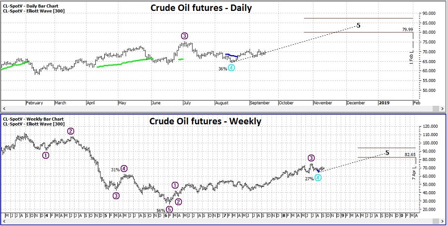
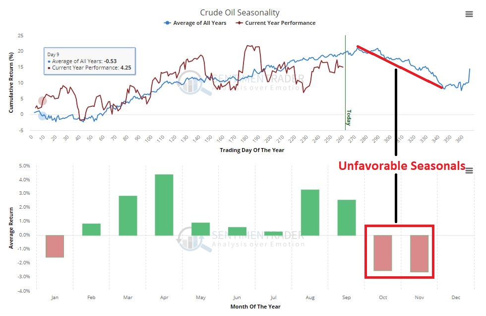
Anyway, one of those “fairly persistent seasonal trends” involves crude oil showing weakness late in the calendar year.  To wit, consider Figure 1 (from Sentimentrader.com) which displays the annual seasonal trend for crude oil (the blue line is the annual seasonal trend, the red line is the action of crude oil so far this year).

2
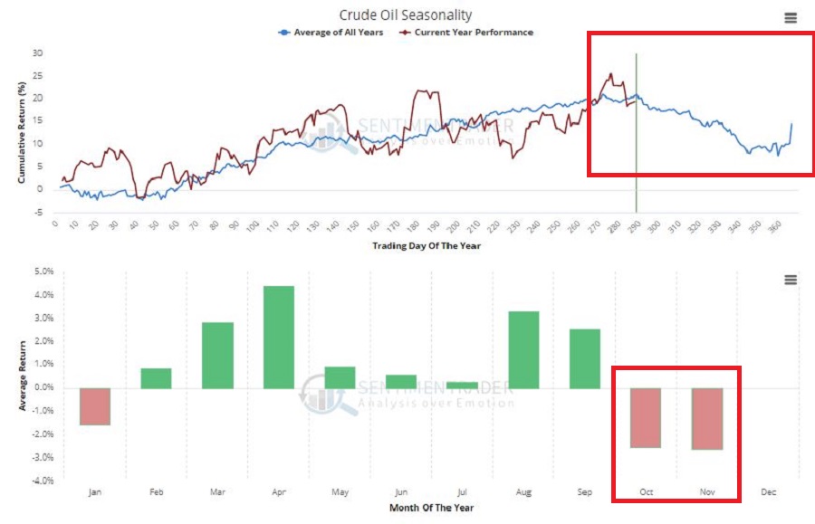
Figure 1 – Crude Oil annual seasonality (Courtesy Sentimentrader.com)

If – and as I intimated, it is always a big “if” – this bearish seasonal trend exerts itself this year, then now would appear to be a good time to enter a bearish position in crude oil.

DISCLAIMER: For the record I am not “predicting” that crude oil will decline in the months ahead, nor am I “recommending” that anyone go out and play the short side of crude based solely on what I write there – including the “example” trade that appears below.  JayOnTheMarkets.com is not an advisory service (it’s basically just the ramblings of a market-addled mind.  I write about what I see – or think I see – and you take it from there – or not).  The purpose of all of this is simply to highlight one potential way to take advantage of a particular seasonal trend.

Crude Oil Futures

The purest play would be simply to sell short crude oil futures and get point-for-point profit if crude oil declines in price.  As you can see in Figure 2 crude oil futures recently hit a key resistance price and failed (at least so far) to break through.

1
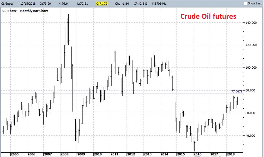
Figure 2 – Crude Oil futures (Courtesy ProfitSource by HUBB)

While selling short crude oil futures is fine for well capitalized speculators, the reality remains that each $1 move in the price of crude oil results in a $1,000 change in contract value.  So, if you sell short crude oil futures at $71.72 and instead of going down crude rallies back up to its previous high of $76.90, you lose over $5,000.  Which is a little rich for the average investors’ blood.
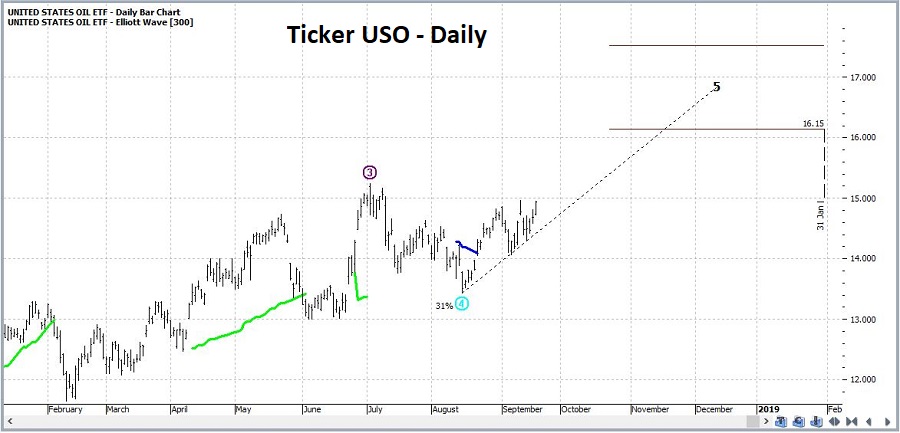
Ticker USO

Ticker USO is an ETF that ostensibly tracks the price of crude oil.  You can see its price action in Figure 3. It hit a resistance point and reversed recently.

3
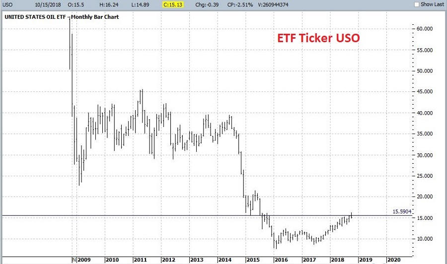
Figure 3 – ETF ticker USO (Courtesy ProfitSource by HUBB)

Playing the Short Side

So, let’s say:

*We want to play the short side of crude oil

*We want as close to point-for-point movement as possible

*We don’t want the unlimited risk associated with selling short crude oil futures

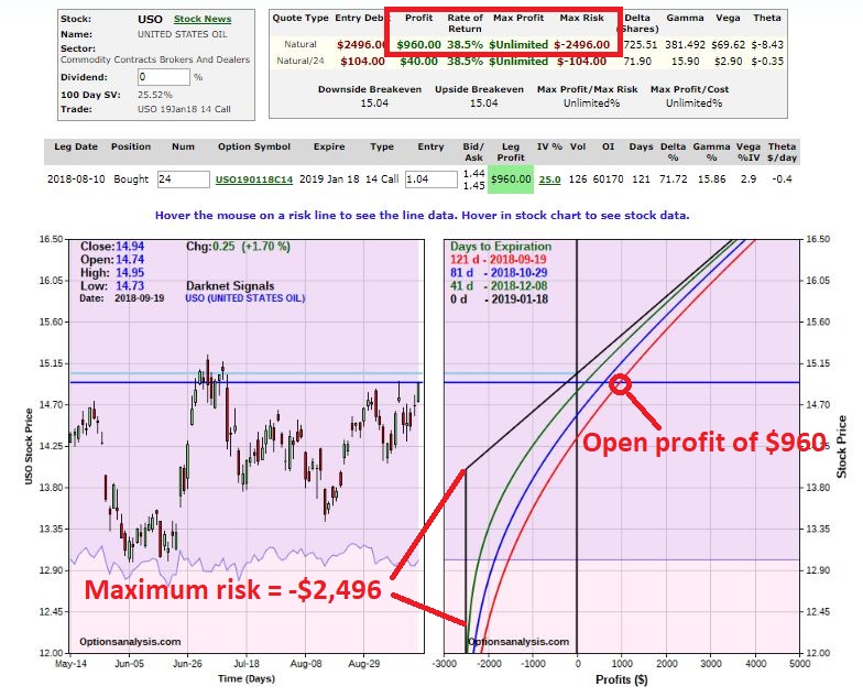
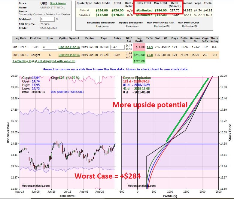
What’s a trader to do?  One possibility is to buy a deep-in-the-money put option on ticker USO.  Figure 4 displays the particulars and Figure 5 displays the risk curves.

4
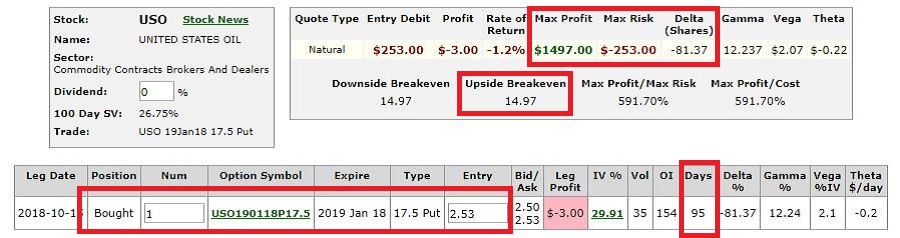
Figure 4 – USO put trade (Courtesy www.OptionsAnalysis.com)

5
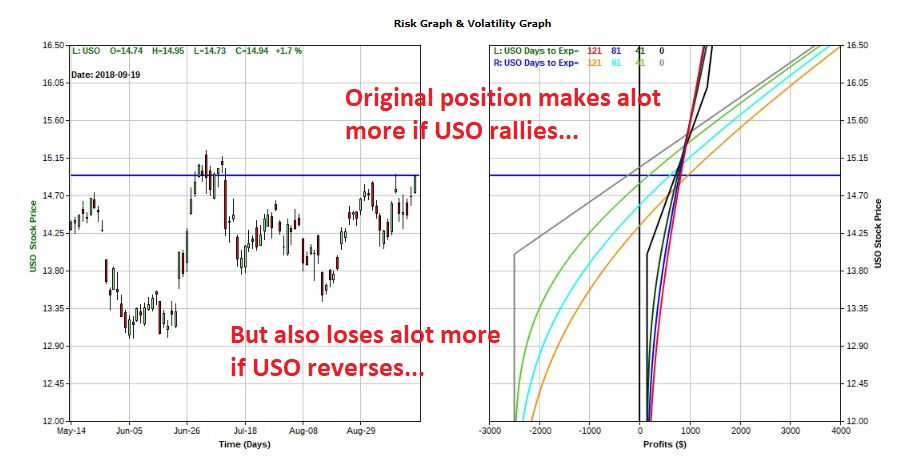
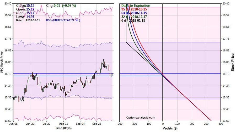
Figure 5 – USO put trade risk curves (Courtesy www.OptionsAnalysis.com)

A few things to note:

*The maximum risk is $253 per 1-lot

*If USO drops from $15.13 to below $14.97 the put option gains value point-for-point for each lower tick in USO.

Let’s take a slightly closer look at this example trade. Figure 6 “zooms in” a bit – i.e., the lowest price on the chart is $13.20, which represents a 1-standard deviation move to the downside and the highest price is $16.40 which is above the recent high of $16.24.  If USO takes out the recent resistance level the basis for the trade is sort of blown and it would likely be a good time to cut a loss.

*A move down to $13.20 would result in a profit of roughly +$176

*A move up to $16.40 would result in a profit of roughly -$97 to -$147, depending on how soon that price is hit.6
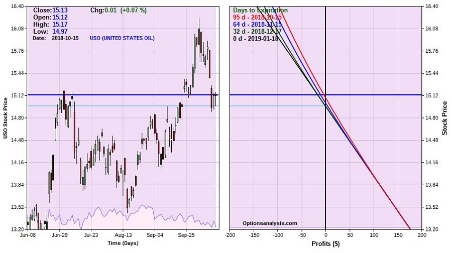
Figure 6 – USO example trade (Courtesy www.OptionsAnalysis.com)

Summary

Will crude oil decline in the months ahead?  I have to go with my stock answer of “it beats me,”.  But seasonality and a failed upside breakout offers some basis for considering playing the short side.

While an in-the-money put option on USO offers far less profit potential than a short position in crude oil futures, it also entails a fair smaller degree of risk.

The key factors are:

a) Do you think there is a chance crude oil will decline in the months ahead?

b) Are you willing to enter a speculative position which could result in a 100% loss (if USO is above $17.50 at expiration)?

c) Do you have $253 bucks?

Jay Kaeppel

Disclaimer:  The data presented herein were obtained from various third-party sources.  While I believe the data to be reliable, no representation is made as to, and no responsibility, warranty or liability is accepted for the accuracy or completeness of such information.  The information, opinions and ideas expressed herein are for informational and educational purposes only and do not constitute and should not be construed as investment advice, an advertisement or offering of investment advisory services, or an offer to sell or a solicitation to buy any security.

The SPX/Gold Ratio

“Intermarket Analysis” was a phrase first popularized by the legendary investor and author John Murphy.  Turns out he was on to something.  To give you the idea, in this piece we will look at the interplay between the S&P 500 Index and the price of gold.

The correlation of monthly returns between SPX and Gold since 1975 is a measly 0.0132.  To put if another way, there is no positive or negative correlation whatsoever between these two markets. The fundamentals that drive the prices of these two “assets” are completely different.

The SPX/Gold Ratio Indicator

A = monthly total return for SPX

B = monthly return for gold bullion

C = Growth of $1,000 invested in SPX

D = Growth of $1,000 invested in Gold

E = C / D (i.e., our SPX/Gold Ratio)

F = 21-month exponential moving average of E

Figure 1 displays the SPX/Gold Ratio and the 21-month EMA (Variables E and F above).  In a nutshell, when the lines are rising it means stocks are outperforming and when the lines are falling it means gold is outperforming.

1

Figure 1 – SPX/Gold Ratio (blue) versus 21-month EMA (red); 12/31/1974-9/30-2018

Interpretation is simple:

*If the blue line is above the red line hold SPX (call this “Bullish”)

*If the blue line is below the red line hold Gold (call this “Bearish”)

*For my own purposes I use a 1-month lag (i.e., if the blue line crosses above the red line after the close of trading in January, buy SPX at the close of trading in February.  If the blue line crosses below the red line at the end of March, buy Gold at the close of trading in April.)

Performance

Figure 2 displays the performance of buying and holding SPX when the indicator is bullish versus bearish.

2

Figure 2 – Growth of $1,000 invested in SPX when SGR is Bullish (blue) versus when SGR is Bearish (red); 12/31/1974-9/30/2018

As you can see, stock market is overall pretty good when the SGR is bullish.

Figure 3 displays the growth of $1,000 invested in gold bullion when the SGR is “Bearish” (i.e., favors gold).

3

Figure 3 – Growth of $1,000 invested in Gold when SGR is Bearish; 12/31/1974-9/30/2018

Figure 4 displays the growth of $1,000 invested in gold bullion when the SGR is “Bullish” (i.e., favors SPX).

4

Figure 4 – Growth of $1,000 invested in Gold when SGR is Bullish; 12/31/1974-9/30/2018

Results from 12/31/1974 through 9/30/20180a

So clearly there appears to be an advantage to switching when the ratio changes from Bullish to Bearish and vice versa.

“System” Results

The rules are simple:

*When the SGR rises above the 21ema (wait one month) then buy SPX

*When the SGR falls below the 21ema (wait one month) then buy Gold

*For our benchmark, we will assume that money is split evenly between SPX and Gold on December 31st of each year.

The results appear in Figure 55

Figure 5 – Growth of $1,000 invested using “System” (blue) versus “Buy/Hold/Rebalance” (red); 12/31/1974-9/3/2018

For the record:

6

Figure 6 – Performance Results; System versus Buy/Hold/Rebalance

The Good News regarding the System:

*It made a lot more money than buy-and-hold

*It was profitable over 12 months 84% of the time

*It outperformed buy-and-hold 74% of the time

The Bad News regarding the System:

*It was much more volatile than buy and hold  (21% average 12-month standard deviation versus 14% for buy-and-hold)

*It had larger drawdowns than buy-and-hold (Worst 12-month return = -36%, worst Maximum Drawdown = -39%)

Summary

Our SPX/Gold Ratio System made 12 times as much money as buy-and-hold (and rebalance annually) over almost a 44-year period.  Yet, it did so in a very volatile manner.  The real question is “can an investor” stick with it through the large drawdowns long enough to enjoy the benefits?”

That’s a question each investor needs to answer for themselves.

Jay Kaeppel

Disclaimer:  The data presented herein were obtained from various third-party sources.  While I believe the data to be reliable, no representation is made as to, and no responsibility, warranty or liability is accepted for the accuracy or completeness of such information.  The information, opinions and ideas expressed herein are for informational and educational purposes only and do not constitute and should not be construed as investment advice, an advertisement or offering of investment advisory services, or an offer to sell or a solicitation to buy any security.


Bond Bombshell

Just last week I wrote a piece title “The (Potential) Bullish Case for Bonds”.  And as always, there’s nothing I enjoy more than when I publish something intimating a possible bullish move only to see the bottom drop out.  But I digress.

Anyway, if you read the original article carefully (you did, right?) then you may recall that the gist of it was as follows:

*The long-term trend in interest rates is almost certainly higher and as a result bond “investors” (“investors” defined as people who buy and hold bonds or bond funds as long-term holdings) should eschew long-term bonds and stick to short-to-intermediates and/or floating rate bonds.

*In the short-term, a) the long-term bond was oversold and near potential support, b) trader sentiment was/still is about as overwhelmingly bearish as it can get, and c) we are entering a seasonally favorable time of year for long-term bonds.

*If long-term bonds took out recent support, then all bullish bets were off.

So, the real point was that if bonds could hold above support there appeared to be a chance for a decent “counter bearish sentiment” rally.

As of yesterday, all bullish bets are off.

As you can see in Figures 1 (TLT as of the close on 10/3) and Figure 2 (30-year treasury bond futures in the early morning hours of 10/4) the long-term bond plummeted through short-term support like a hot knife through butter (i.e., breaking down through support on 10/3 and following through to the downside overnight on 10/4).

(click to enlarge)1Figure 1 – Ticker TLT breaking support on 10/3 (Courtesy ProfitSource by HUBB)

(click to enlarge)2Figure 2 – 30-year treasury bond futures following through to downside on 10/4  (Courtesy ProfitSource by HUBB)

Sometimes price breaks down through support and then immediately reverses, forming a bear trap.  And sometimes it breaks down through support and just keeps going.  Figures 1 and 2 look like the latter.

To full appreciate the potential significance of this move consider Figure 3 which displays the yield (times 10 for some reason) for the 10-year treasury note.

(click to enlarge)3Figure 3 – 10-year treasury note yields appear to be breaking out to the upside (Courtesy ProfitSource by HUBB)

Note that the 10-year yield has moved above the down trending trendline connecting previous peaks as well as a key resistance level.  These are not good signs.

Summary

The trend in bonds is clearly “down.”  As mentioned above (and in the original article) this has profound impacts for bond “investors” – most notably that holders of long-term bonds stand to get hurt badly if rates continue to rise.

On a shorter-term basis, with sentiment so overwhelmingly bearish do not be surprised to see a surprisingly strong counter rally once the current line runs its course.  But that kind of thing is for aggressive traders only.

In the meantime, just remember that trying to catch a falling knife can be painful.

Jay Kaeppel

Disclaimer:  The data presented herein were obtained from various third-party sources.  While I believe the data to be reliable, no representation is made as to, and no responsibility, warranty or liability is accepted for the accuracy or completeness of such information.  The information, opinions and ideas expressed herein are for informational and educational purposes only and do not constitute and should not be construed as investment advice, an advertisement or offering of investment advisory services, or an offer to sell or a solicitation to buy any security.

Bellwethers Looking a Bit Weathered

One of the benefits of being an avowed trend-follower is that it can allow you to avoid a lot of the “angst” that many investors suffer with each new twist and turn in the economic/financial/political/price of tea in China arena.  Let’s face it, if you scan the internet, watch cable news or read the financial press you will always have at least – roughly – 10,000 “things” that you could be worried about that will kick the legs out from whatever bullish thing might be happening at the moment.

I have a friend (no, seriously) and his comment recently was “The next person that mentions the Hindenburg Omen gets punched in the face”.  The bottom line: someone is always crying “Wolf”, and living in perpetual fear is – let’s be honest – kind of a crappy way to go through life.  Which is why I typically advocate focusing on the major trends and not sweating all the small stuff along the way.

Yes, things can go wrong and yes it would be nice to have at least some sort of a heads up in advance.  So, in an effort to not be completely ignorant of the goings on around me I do have a few “things” I follow in hopes of getting some “early warning” if trouble is brewing.  I call them my 4 bellwethers.

The main thing I look for is “divergence” between the action for the major stock market indexes and the action of these bellwethers.  Even the existence of divergences does NOT guarantee trouble.  But more often than not, major market tops are presaged by some “signs of trouble”.  So, let’s take a look.

The Major Indexes

Figure 1 displays the Dow, Nasdaq 100, S&P 500 and Russell 2000 indexes.  As you can see, they are all in up trends, well above their respective 200-day moving averages and 3 of the 4 are at or near all-time highs.  In other words, from a solely trend-following perspective, “Thing are swell, things are great.”

(click to enlarge)1Figure 1 – Four major indexes all in bullish trends (Courtesy AIQ TradingExpert)

The Bellwethers

Figure 2 displays my 4 bellwethers – they are:

Ticker SMH: an ETF that tracks the semiconductor sector. The world runs on technology and technology runs on semiconductors.

Dow Transportation Index: Whether the Transports confirm or diverge from the Dow Industrials has long been used as a gauge of market health by investors.

Ticker ZIV: An ETF that is designed to track the inverse of the VIX Index.  Long story, but bottom line, it should go up when the market goes up and vice versa.  Any deviation from that standard can be a warning sign.

Ticker BID: Sotheby’s Holdings which run high-end auctions.  Bottom line, if rich people are comfortable buying expensive stuff that is a good sign for the economy (and should be reflected in a rising trend in BID) and if rich people are NOT comfortable buying expensive stuff, well, vice versa.

(click to enlarge)2Figure 2 – Jay’s Market Bellwether (Courtesy AIQ TradingExpert)

As you can see, the Bellwethers are mostly not confirming the major average at the moment.  This is not a reason to panic or fell angst.  It is simply something to keep an eye on.  The longer these divergences continue the more troublesome, so let’s focus on a couple of key things to watch to decide if maybe you should go ahead and start feeling angst.

Dow Transports

As you can see in Figure 3, double-tops in the Dow Transports have in the past signaled trouble for the overall stock market.

(click to enlarge)3Figure 3 – Dow Transport double tops often a sign of impending trouble (Courtesy AIQ TradingExpert)

The Good News and Bad News for the Transport Index is reflected in the daily chart shown in Figure 4.  The Good News is that the Transports recently made a new all-time high.  The Bad News is that price has subsequently fallen back below the important support/resistance level marked in Figure 4.

(click to enlarge)4Figure 4 – Daily Dow Transports – up or down? (Courtesy AIQ TradingExpert)

Interpretation going forward is relatively simple:

Good = Dow Transports above 11,424

Bad = Dow Transports below 11,424

Ticker BID

As you can see in Figure 5, weakness in the overall market averages is often presaged well in advance by a major breakdown in the price of BID.

(click to enlarge)5Figure 5 – Breakdowns in BID often an early warning sign (Courtesy AIQ TradingExpert)

As you can see in Figure 6, BID recently tanked 25% before rebounding slightly.  Is this a “Look Out Below” warning sign for the stock market?  Dunno, but gonna keep a close eye on BID to see if it rebounds…or falls further.

(click to enlarge)6Figure 6 – Ticker BID – which way from here? (Courtesy AIQ TradingExpert)

Summary

The major market averages are (mostly) rallying to new highs while Jay’s 4 Market Bellwethers are, well, it’s too soon to say exactly what they are.  But for the moment at least they are mostly not confirming the new highs in the major averages.  Please try to remain calm.  The proper response is Not fell angst and doubt, but rather to simply keep an eye on how things progress from here.  If the Bellwethers start to move higher then “the crisis will have passed.”  If not, then it will be very important to keep an eye open for – and to take seriously – signs of weakness in the major averages.

Jay Kaeppel

Disclaimer:  The data presented herein were obtained from various third-party sources.  While I believe the data to be reliable, no representation is made as to, and no responsibility, warranty or liability is accepted for the accuracy or completeness of such information.  The information, opinions and ideas expressed herein are for informational and educational purposes only and do not constitute and should not be construed as investment advice, an advertisement or offering of investment advisory services, or an offer to sell or a solicitation to buy any security.


The (Potential) Bullish Case for Bonds

OK, first the bad news.  In terms of the long-term, we are probably in the midst of a rising interest rate environment.  Consider the information contained in Figure 1 from McClellan Financial Publications.

(click to enlarge)0aFigure 1 – The 60-year cycle in interest rates (Courtesy: www.mscoscillator.com)

Though no cycle is ever perfect, it is only logical to look at Figure 1 and come away thinking that rates will rise in the years (and possibly decades) ahead.  And one should plan accordingly, i.e.:

*Eschew large holdings of long-term bonds. Remember that a bond with a “duration” -Google that term as it relates to bonds please – of 15 implies that if interest rates rise 1 full percentage point then that bond will lose roughly 15% of principal.  Ouch.

*Stick to short to intermediate term bonds (which will reinvest at higher rates more quickly than long-term bonds as rates rise) and possibly some exposure to floating rate bonds.

That is “The Big Picture”.

In the meantime, there is a potential bullish case to be for bonds in the shorter-term.  The “quick and dirty” guide to “where are bonds headed next” appears in the monthly and weekly charts of ticker TLT (iShares 20+ years treasury bond ETF).  Note the key support and resistance levels drawn on these charts.

(click to enlarge)1Figure 2 – Monthly TLT with support and resistance (Courtesy ProfitSource by HUBB)

(click to enlarge)2Figure 3 – Weekly TLT with support and resistance (Courtesy ProfitSource by HUBB)

There is nothing magic about these lines, but a break above resistance suggests a bull move, a break below support suggests a bear move, and anything in between suggests a trading range affair.

Now let’s look at some potentially positive influences.  Figure 4 displays a screen from the excellent site www.sentimentrader.com that shows that sentiment regarding the long treasury bond is rock bottom low.  As a contrarian sign this is typically considered to be bullish.

(click to enlarge)3Figure 4 – 30-year treasury investor sentiment is extremely low (Courtesy Sentimentrader.com)

Figure 5 – also from www.sentimentrader.com – suggests that bonds may be entering a “bullish” seasonal period between now and at least late-November (and possibly as long as late January 2019).

(click to enlarge)4Figure 5 – 30-year treasury seasonality (Courtesy Sentimentrader.com)

Figure 6 displays the 30-year treasury bond yield (multiplied by 10 for some reason).  While rates have risen 27% from the low (from 2.51% to 3.18%), they still remain below the long-term 120-month exponential moving average.

(click to enlarge)5Figure 6 – Long-term treasury bond yields versus 120-month moving average (Courtesy AIQ TradingExpert)

Finally, two systems that I developed that deems the bond trend bullish or bearish based on the movements of 1) metals, and 2) Japanese stocks turned bullish recently.  The bond market has fallen since these bullish signal were flashed – possibly as a result of the anticipated rate hike from the Fed.  Now that that hike is out of the way we should keep a close eye on bonds for a potential advance in the months ahead.

(click to enlarge)6aFigure 7 – Bonds tend to move inversely to Japanese stocks; Ticker EWJ 5-week average is below 30-week average, i.e., potentially bullish for bonds (Courtesy AIQ TradingExpert)

Summary

It’s a little confusing here.

a)  The “long-term” outlook for bonds is very “iffy”, so bond “investors” should continue to be cautious – as detailed above.

b) On the other hand, there appears to be a chance that bonds are setting up for a rally in the near-term.

c) But, in one final twist, remember that if TLT takes out its recent support level, all bullish bets are off.

Are we having fun yet?

Jay Kaeppel

Disclaimer:  The data presented herein were obtained from various third-party sources.  While I believe the data to be reliable, no representation is made as to, and no responsibility, warranty or liability is accepted for the accuracy or completeness of such information.  The information, opinions and ideas expressed herein are for informational and educational purposes only and do not constitute and should not be construed as investment advice, an advertisement or offering of investment advisory services, or an offer to sell or a solicitation to buy any security.


When the U.S. Stock Market Leads, It Really Leads

The U.S. stock market has been leading the rest of the world’s stock markets.  Turns out that’s a good thing.  As least for U.S. stocks.  To illustrate this let’s look at the results achieved from holding the S&P 500 Index only when U.S. stocks are “leading”.

The Test

The indexes used are:

*S&P 500 Index – measures U.S. stock performance

*MSCI World ex US Index – measures the rest of the world

The Calculations

Using monthly total return data from the PEP Database from Callan Associates from 12/31/1971 through 8/31/2018:

A1 and A2;

A1 = The cumulative total return for the S&P 500 over the latest 10 years;

A2 = The cumulative total return for the MSCI over the latest 10 years

B = The difference between A1 and A2 (i.e., SPX total 10-year return minus MSCI total 10-year return)

C = a 36-month exponential moving average of B*

D = Subtracts C from B (i.e., if B above the 36-month EMA or below it)

*If the S&P 500 Index performed better over the previous 10 years then D is positive

*If the MSCI World ex US Index performed better of the previous 10 years then D is negative.

Figure 1 displays Variable B and C above.

1

Figure 1 – B (blue line) = difference between SPX 10-year total return and MSCI 10-year total return; C (red line) = 36-month EMA; 12/31/1981-8/31/2018

Figure 2 displays the month-end difference between Variables B and C (i.e. Variable D).  When the value is positive SPX is “leading”; when the value is negative MSCI is “leading”.

2

Figure 2 – the month-end difference between Variables B and C (i.e. Variable D); 12/31/1981- 8/31/2018

The Test

For the purposes of this test our only concern is the performance of the S&P 500 Index when Variable D is positive.

Figure 3 displays the growth of $1,000 invested in the S&P 500 Index ONLY when Variable D is positive at the end of the previous month.

3

Figure 3 – Growth of $1,000 invested in SPX ONLY when Variable D is positive; 12/31/1981-8/31/2018

As you can see in Figure 3, holding the S&P 500 Index when it is “leading” the MSCI World ex US Index has generated some consistently positive results.

At the moment, Variable D remains firmly in positive territory.  Does this mean that the U.S. stock market is impervious to decline?  Not at all.  Still, the long-term results displayed in Figure 3 represent a fairly compelling piece of evidence for the bullish case.

Lastly, so how did SPX perform when MSCI was leading?  Interestingly, it made money.  For reference:

*When SPX leads MSCI (when Variable D is positive): SPX gained +1,799%

*When SPX leads MSCI (when Variable D is negative): SPX gained +222%

In sum:

*The SPX did make money (+222%) during those times when MSCI was leading

*However, SPX made 8.1 times as much when SPX was leading than when MSCI was leading

*Also, while MSCI was leading, SPX endured, a) the Crash of 1987, b) the 2000-2002 bear market, and, c) the 2007-2009 bear market (see Figure 4), i.e., all good things to avoid.

4

Figure 4 – Growth of $1,000 invested in SPX ONLY when Variable D is negative; 12/31/1981-8/31/2018

To put it as succinctly as possible: U-S-A,  U-S-A!!

Jay Kaeppel

 Disclaimer:  The data presented herein were obtained from various third-party sources.  While I believe the data to be reliable, no representation is made as to, and no responsibility, warranty or liability is accepted for the accuracy or completeness of such information.  The information, opinions and ideas expressed herein are for informational and educational purposes only and do not constitute and should not be construed as investment advice, an advertisement or offering of investment advisory services, or an offer to sell or a solicitation to buy any security.

New Highs, Check…Now What?

Let’s open with Jay’s Trading Maxim #7.

Jay’s Trading Maxim #7: Being able to identify the trend today is worth more than 1,000 predictions of what the trend will be in the future.

Yes trend-following is boring.  And no, trend-following never does get you in near the bottom nor out at the top.  But the reality is that if you remain long when the trend appears to be up (for our purposes here let’s define this roughly as the majority of major market averages holding above their long-term moving averages) and play defense (i.e., raise cash, hedge, etc.) when the trend appears to be down (i.e., the majority of major market averages are below their long-term moving averages), chances are you will do pretty well for yourself.  And you may find yourself sleeping pretty well at night as well along the way.

To put it more succinctly:

*THE FOREST = Long-term trend

*THE TREES = All the crap that everyone tells you “may” affect the long-term trend at some point in the future

Human nature is a tricky thing.  While we should clearly be focused on THE FOREST the reality is that most investors focus that majority of their attention on all those pesky trees.  Part of the reason for this is that some trees can offer clues.  It’s a question of identifying a few “key trees” and then ignoring the rest of the noise.

A New High

With the Dow Industrials rallying to a new high virtually all the major averages have now reached a new high at least within the last month.  And as you can see in Figure 1 all are well above their respective 200-day moving average.  Long story short the trend is “UP”.

(click to enlarge)1Figure 1 – U.S. Major Market Indexes in Uptrends (Courtesy AIQ TradingExpert)

Now What? The Good News

As strong as the market has been of late it should be noted that we are about to enter the most favorable seasonal portion of the 48-month election cycle.  This period begins at the close of September 2018 and extends through the end of December 2019.

Figure 2 displays the growth of $1,000 invested in the Dow Industrials only during this 15-month period every 4 years.  Figure 3 displays the actual % +(-) for each of these periods.  Note that since 1934-35, the Dow has showed a gain 20 out of 21 times during this period.

2a

Figure 2 – Growth of $1,000 invested in Dow Industrials ONLY during 15 bullish months (mid-term through pre-election year) within 48-month election cycle.

Start Date End Date Dow % +(-)
9/30/1934 12/31/1935 +55.6%
9/30/1938 12/31/1939 +6.2%
9/30/1942 12/31/1943 +24.5%
9/30/1946 12/31/1947 +5.1%
9/30/1950 12/31/1951 +18.9%
9/30/1954 12/31/1955 +35.5%
9/30/1958 12/31/1959 +27.7%
9/30/1962 12/31/1963 +31.8%
9/30/1966 12/31/1967 +16.9%
9/30/1970 12/31/1971 +17.0%
9/30/1974 12/31/1975 +40.2%
9/30/1978 12/31/1979 (-3.1%)
9/30/1982 12/31/1983 +40.4%
9/30/1986 12/31/1987 +9.7%
9/30/1990 12/31/1991 +29.2%
9/30/1994 12/31/1995 +33.1%
9/30/1998 12/31/1999 +46.6%
9/30/2002 12/31/2003 +37.7%
9/30/2006 12/31/2007 +13.6%
9/30/2010 12/31/2011 +13.0%
9/30/2014 12/31/2015 +2.2%

Figure 3 – 15 bullish months (mid-term through pre-election year) within 48-month election cycle

Now What? The Worrisome Trees

While the major averages are setting records a lot of other “things” are not.  My own cluster of “market bellwethers” appear in Figure 4.  Among them the Dow Transportation Index is the only one remotely close to a new high, having broken out to the upside last week.  In the meantime, the semiconductors (ticker SMH), the inverse VIX index ETF (ticker ZIV) and Sotheby’s (ticker BID) continue to meander/flounder. This is by no means a “run for the hills” signal.  But the point is that at some point I would like to see some confirmation from these tickers that often (though obviously not always) presage trouble in the stock market when they fail to confirm bullish action in the major averages.

(click to enlarge)4Figure 4 – Jay’s 4 Bellwethers (SMH/TRAN/ZIV/BID) (Courtesy AIQ TradingExpert)

Another source of potential concern is the action of, well, the rest of the darn World.  Figure 5 displays my own regional indexes – Americas, Europe, Asia/Pacific and Middle East.  They all look awful.

(click to enlarge)3Figure 5 – 4 World Regional Indexes (Courtesy AIQ TradingExpert)

Now the big question is “will the rest of the world’s stock markets start acting better, or will the U.S. market start acting worse?”  Sadly, I can’t answer that question.  The key point I do want to make though is that this dichotomy of performance – i.e., U.S market soaring, rest of the world sinking – is unlikely to be sustainable for very long.

Summary

It is hard to envision the market relentlessly higher with no serious corrections over the next 15 months.  And “yes”, those bellwether and world region indexes trees are “troublesome”.

Still the trend at the moment is inarguably “Up” and we about to enter one of the most seasonally favorable periods for the stock market.

So, my advice is simple:

1) Decide now what defensive actions you will take if the market does start to breakdown

2) Resolve to actually take those actions if the need arises

3) Enjoy the ride as long as it lasts.

Jay Kaeppel

Disclaimer:  The data presented herein were obtained from various third-party sources.  While I believe the data to be reliable, no representation is made as to, and no responsibility, warranty or liability is accepted for the accuracy or completeness of such information.  The information, opinions and ideas expressed herein are for informational and educational purposes only and do not constitute and should not be construed as investment advice, an advertisement or offering of investment advisory services, or an offer to sell or a solicitation to buy any security.


To Lock in a Winner…or Let it Ride?

In this article in early August I highlighted the possibility for a bullish move in crude oil as well as an example trade using options on ticker USO – an ETF intended to track the price of crude oil.

At the time the daily and weekly Elliott Wave counts  (generated using the EW algorithm in  ProfitSource by HUBB software) for crude oil futures – and the daily Elliott Wave count for ticker USO – were all pointing to a potential Wave 5 advance.  Since that time USO has advanced roughly 7%, from $14.01 a share to $14.94 a share.  As you can see in Figure 1, the example USO option trade is now showing an open profit of of 38% ($960 on an original cost of $2,496).

(click to enlarge)1Figure 1 – Original example USO trade as of 9/19 (Courtesy www.OptionsAnalysis.com)

Looking forward there is – what else? – Good News and Bad News.  As you can see in Figures 2 and 3, the Elliott Wave count for both daily and weekly crude oil futures and daily USO continue to suggest that more upside potential may lie ahead.

(click to enlarge)2Figure 2 – Crude oil futures – daily and weekly both with bullish Elliott Wave projections (Courtesy ProfitSource by HUBB)

(click to enlarge)3Figure 3 – Ticker USO daily with bullish Elliott Wave projection (Courtesy ProfitSource by HUBB)

That’s the Good News.  The Bad News is that we are 10 calendar days from the beginning of the least fabvorable seasonal period for crude oil – from late September into early December – as you can see in the chart from www.sentimentrader.com in Figure 4.

(click to enlarge)4Figure 4 – Annual Seasonbal Trend for crude oil is nearing the unfavorable time of year (Courtesy Sentimentrader.com)

So, Elliott Waves counts say “bullish” and seasonal trends say “bearish”.  Which one will be right in the months ahead.  Sorry folks, gotta go with my standard response of “It beats me.”  Predictions aren’t something I am too good at.

But for a person holding our hypothetical (and bullish) option position, some determination needs to be made.  So, let’s consider two possibilities.

Course of Action #1: Damn the Torpedoes, Full Speed Ahead!

If a trader is expecting crude to break out above resistance and rally ahead strongly just like the Elliott Wave counts suggests, there is no real need to take any action  Just hold the position, wait for the big advance and cash in a big winner.  Or – just to cover all the bases – give it all back and lose all or part of your initial $2,496 investment.   Maximum reward, maximum risk, Hoo Ha!

Course of Action #2: Lock in a Profit and Let the Rest Ride

Another course of action might be to hedge one’s bet by adjusting the trade to lock in a profit while still allowing for more upside profit potential if the bullish scenario does in fact play out.  Often this type of action comes at the cost of reduced upside potential.

In the example below a trader gives up a substantial amount of upside profit potential as a trade off for locking in a profit while still allowing for further upside potential.

The example adjustment:

*Sell 18 USO Jan2019 14 calls (reducing long position from 24 to 6 contracts)

*Sell 4 USO Jan2019 16 calls (a new position)

The net result of this adjustment appears in Figure 5.

(click to enlarge)

5Figure 5 – Adjusted USO trade (Courtesy www.OptionsAnalysis.com)

This adjusted position:

*Locks in a minimum profit of $284 if crude oil reverses and heads lower

*Also retains unlimited profit potential

*The bad news is that this new position has a delta of 288 versus the original position which has a delta of 1,726.  This means that for each full $1 USO might advance in price the original trade will gain roughly $1,726 in new profits while the new adjusted position will gain only $288 in new profits.

The stark difference between these two positions is obvious in Figure 6

(click to enlarge)6Figure 6 – Original USO trade (higher reward, higher risk) versus adjusted USO trade (lower reward, lower risk) (Courtesy www.OptionsAnalysis.com)

Clearly the original position is an all-or-nothing bet on higher prices, while the adjusted position is designed to keep the position from turning into a loss while still allowing for additional profit potential if USO rallies – but far less upside potential than the original trade.

Which one is better?  Please see my “standard response” above…

Jay Kaeppel

Disclaimer:  The data presented herein were obtained from various third-party sources.  While I believe the data to be reliable, no representation is made as to, and no responsibility, warranty or liability is accepted for the accuracy or completeness of such information.  The information, opinions and ideas expressed herein are for informational and educational purposes only and do not constitute and should not be construed as investment advice, an advertisement or offering of investment advisory services, or an offer to sell or a solicitation to buy any security.


Repairing a Losing Trade

In this article in early August I highlighted the potential for the VIX Index to “bounce” and highlighted a hypothetical bullish trade using options on ticker VXX – an ETF intended to track the VIX Index.  The original trade looked like what you see in Figures 1 and 2.

1Figure 1 – Original VXX position (Courtesy www.OptionsAnalysis.com)

2Figure 2 – Original VXX risk curves (Courtesy www.OptionsAnalysis.com)

Interestingly, 3 trading days later this position showed an open gain of 46% as displayed in Figure 3, as VXX rallied from $28.14 a share to $31.80.

(click to enlarge)3Figure 3 – Original position 3 days later; as of 8/13 (Courtesy www.OptionsAnalysis.com)

The 1st (unwritten) rule of trading bullish positions in VXX is “Take your profits while you have them”.  To understand this viewpoint simply glance at the long-term chart of ticker VXX in Figure 4.4Figure 4 – VXX daily bar chart (Courtesy AIQ TradingExpert)

While there can and will be sharp rallies along the way, the long-term trajectory is inexorably long (this is due to “contango” in the futures market – which I AM NOT going to explain here.  If you want to know more just do an internet search).

But let’s assume for a moment that our hypothetical trader did not take a profit in our hypothetical VXX position, hoping for a bigger up move. Bottom line, it hasn’t worked out well at all.  The stock market has rallied and VXX has once again slumped.  The current status appears in Figure 5.

(click to enlarge)5Figure 5 – Original VXX position as of 9/19 (Courtesy www.OptionsAnalysis.com)

As you can see in Figure 5 this trade is in “some trouble”.  With VXX trading at $28.07 the breakeven price is $32.28, and the maximum risk is -$642.

HERE COMES THE POINT…..

A trader who bought shares of VXX would have two choices:

a) Hold the shares

b) Sell the shares

A trader who put on our hypothetical trade has three choices:

a) Hold the position

b) Close the position

c) Adjust the position

It is this third option that makes option trading appealing, i.e., the potential opportunity to improve the odds of an existing trade “on the fly”.  How, you might ask.  Let’s walk through one example.

First, the goals of adjusting an existing position are typically one or more of the following:

*Improve profit potential

*Reduce dollar risk

*Improve probability of profit

Typically (though not always) attempting to improve the profit potential of an existing trade that is showing a loss involves assume more risk.  In this instance we are going to de-emphasize profit potential and focus on reducing our risk and improving our odds of making any profit.

Here are the hypothetical adjustments to our hypothetical trade:

*Sell 5 Oct 19 VXX 31 calls (exit existing long calls)

*Buy 2 Oct 19 VXX 29 calls (buy fewer closer to the money calls)

*Buy 2 Oct 19 VXX 36 calls (reduce existing short call position)

What does all of this accomplish?  Consider Figure 6.

(click to enlarge)6Figure 6 – Adjusted VXX position (Courtesy www.OptionsAnalysis.com)

First the Bad News:

*VXX still MUST rally sometime between now and 10/19 in order for this trade to show a profit.

*This adjustment caps our maximum profit potential at $900.

The Good News:

*We have reduced our dollar risk from -$642 to -$500.  So, if the worst-case scenario plays out at least we save about a hundred and forty bucks.

*We have reduced the breakeven price (at expiration) from $32.28 to $31.50.

Summary

As always please remember this is all hypothetical and I am not suggesting that everyone rush out and put on bullish trade in ticker VXX.  The real point of this piece is to highlight the potential to, a) make trade with limited dollar risk using options, and, b) the potential to adjust an existing option position “on the fly” to make it a more attractive position.

It’s a pretty good arrow to have in one’s quiver.

Jay Kaeppel

Disclaimer:  The data presented herein were obtained from various third-party sources.  While I believe the data to be reliable, no representation is made as to, and no responsibility, warranty or liability is accepted for the accuracy or completeness of such information.  The information, opinions and ideas expressed herein are for informational and educational purposes only and do not constitute and should not be construed as investment advice, an advertisement or offering of investment advisory services, or an offer to sell or a solicitation to buy any security.

The ‘Soybean 3-Step’

Some markets are prone to following seasonal trends and some markets are really prone to following seasonal trends.  The soybean market falls into the latter category.

Why It Works

Soybeans are grown in other places around the world, however, the primary growing spot is the U.S. Midwest.  Seeds are planted in the spring and harvested in the early fall.  There is no real way around this schedule since farmers in the U.S. Midwest cannot go ahead and plant soybeans, a) early, since the ground is frozen until early spring, nor, b) late, since the seeds would die in the ground in the winter and even if they didn’t they wouldn’t grow nor could the farmer really get out and “harvest” anything due to the snow on the ground.

So, the planting, growing and harvesting schedule is pretty much set in stone in the Heartland.

This has certain implications.  For one thing it means that between late fall and early spring there literally are NO soybeans growing.  Likewise, bad weather (or exceptionally good weather) can impact how early the seeds can be planted and the likelihood of a good or bad crop year.

To put it another way – more related to supply and demand, which drives prices – between the time this year’s beans are harvested (fall) and the time that anyone can truly figure out how the next year’s crop will look (typically late spring to early summer), there is a lot of “doubt” about soybeans.  This doubt tends to push prices higher as there are questions about potential future supply.

On the other hand, once it becomes pretty clear that this year’s crop is going to be, a) fantastic, b) awful, or c) somewhere in between, the doubts are eased and the “pressure” comes off of soybean prices.

That in a nutshell is everything you probably ever didn’t really want to know about soybeans.  Certainly not as “exciting” as some new technology company or other revolutionary product.  Still, as we will see, “predictability of supply and demand” can be a pretty exciting thing itself.

The Soybean 3-Step

As always let me first point out that what follows is for “Educational” purposes only and I am NOT encouraging anyone to start trading soybeans (either in the futures market by trading soybean futures or in the stock market by trading ETF ticker SOYB).  I am just passing on some information that I found interesting and am hoping that you may as well (for the record, if you are still reading at this point after all the mundane gibberish about “the planting cycle” I think we’re doing pretty well).

Step 1 is BULLISH:

Long beans from close on the last trading day of January through the close on 2nd trading day of May (when there is doubt about this year’s planting, crop, etc.)

Step 2 is BEARISH:

Short beans from close on the 14th trading day of June through the close on 2nd trading day of October (after the state of this year’s crop becomes apparent)

Step 3 is BULLISH:

Long beans from the close on 2nd trading day of October through the close on 5th trading day of November (when there are new doubts about next year’s crop)

The Results

Figure 1 displays the hypothetical results (assumes no commission and no slippage) of holding a long position of 1 soybean futures contract during the 3 periods listed above (for soybean futures, each full $1 in price movement in the price of 5,000 bushels of soybeans is worth $5,000).

1

Figure 1 – $ gain or loss from holding long 1 soybean futures contract during Step 1 (blue); Step 3 (gray) and Step 2 (orange); 12/31/1975-9/7/2018

For the record:

*Step 1 (blue line) gained +$111,288

*Step 2 (orange) lost -$165,338

*Step 3 (grey) gained +$64,575

So, a strategy of:

*Holding a long position in soybeans during Step 1 and Step 3

*Holding a short position during Step 2

*Resulted in a (again, hypothetical) gain of $341,200 (See Figure 2)

*versus buying and holding a long position in soybean futures

2

Figure 2 – Long beans Step 1 and Step 2, short beans Step 3 (blue) versus buying and holding long one soybeans contract (orange); 12/31/1975-9/7/2018)

Note in Figure 3 that the maximum drawdown exceeded -$18,000 on four separate occasions.  So, DO NOT mistake this for some sort of “you can’t lose trading soybeans” contrivance. Trust me when I say that “the accumulation over time of slippage, commissions and $18,000 drawdowns will at some point test your will to go on.”

3

Figure 3 – Drawdowns using the Soybean 3 Step Method; 12/31/1975-9/7/2018

Still, the point is that all in all the results are fairly consistent.

Ticker SOYB

For those not inclined to wade into the exciting world of commodity futures there is a potential alternative – albeit one with less upside potential (i.e., lacking the leverage of commodity futures).  Ticker SOYB is an ETF that tracks the price of soybean futures but trades like shares of stock in a stock account.  SOYB started trading in September 2011.  Figure 4 displays the growth of $1,000 invested in SOYB ONLY DURING step 1 and Step 3 each year since inception of trading versus buying and holding SOYB (it is possible to sell short shares of SOYB during Step 2 but that is not included in this test since – let’s be honest – very few traders are ever going to actually sell short shares of SOYB).

4

Figure 4 – Growth of $1,000 invested in SOYB during Step 1 and Step 3 (blue line) versus $1,000 invested in SOYB using buy-and-hold (orange); 9/19/2011-9/7/2018

For the record:

*$1,000 invested in SOYB only during Step 1 and Step 3 grew to $1,439 (+43.0%)

*$1,000 invested in SOYB using a buy-and-hold approach declined to $643 (-35.7%)

*The maximum drawdown so far holding SOYB during Step 1 and Step 3 has been -12.5%

Summary

Are soybeans for everyone?  Certainly not.

But if you are going to consider trading them it might be wise to consult your calendar first.

Jay Kaeppel

Disclaimer:  The data presented herein were obtained from various third-party sources.  While I believe the data to be reliable, no representation is made as to, and no responsibility, warranty or liability is accepted for the accuracy or completeness of such information.  The information, opinions and ideas expressed herein are for informational and educational purposes only and do not constitute and should not be construed as investment advice, an advertisement or offering of investment advisory services, or an offer to sell or a solicitation to buy any security.