In the interest of full disclosure, the reality is that I am not great at “predicting” things. Especially when it involves the future. That being said, I am pretty good at:
*Identifying the trend “right now”
*Understanding that no trend lasts forever
*Being aware of when things are getting a bit “extended”
So, I am going to highlight a few “thoughts” regarding how one might best be served in the markets in the years ahead.
Where We Have Been
*After 17 years of sideways action (1965-1982) the stock market has overall been in a bullish trend since about 1982 – albeit with some major declines (1987, 2000-2002 and 2007-2009) when the market got significantly overvalued.
*Bond yields experienced a long-term decline starting in 1981 and bottomed out in recent years.
*Commodities have mostly been a “dog” for many years.
The way the majority of investors approach these goings on is to:
*Remain bullish on the stock market (“Because it just keeps going up”)
*Continue to hold bonds (“Because I have to earn a yield somewhere”)
*Avoid commodities (“Because they suck – and they’re scary”)
And as an avowed trend-follower I don’t necessarily disapprove. But as a market observer I can’t help but think that things will be “different” in the not too distant future.
Considerations Going Forward
Stocks
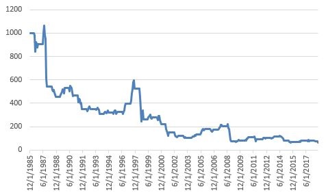
Figure 1 displays the Shiller P/E ratio. For the record, valuation measures are NOT good “timing” tools. They don’t tell you “When” the market will top or bottom out. But they do give a good indication of relative risk going forward (i.e., the higher the P/E the more the risk and vice versa).
Note:
*The magnitude of market declines following previous peaks in the P/E ratio
*That we are presently at (or near) the 2nd highest reading in history
(click on any chart below to enlarge it)
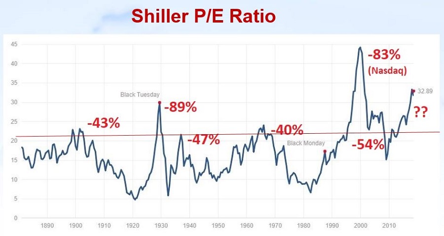 Figure 1 – Shiller P/E Ratio (and market action after previous overvalued peaks) (Courtesy: www.multpl.com/shiller-pe/)
The bottom line on stocks: While the trend presently remains bullish, valuation levels remind us that the next bear market – whenever that may be – is quite likely to be “one of the painful kind”.
Bonds
Figure 2 displays the 60-year cycle in interest rates.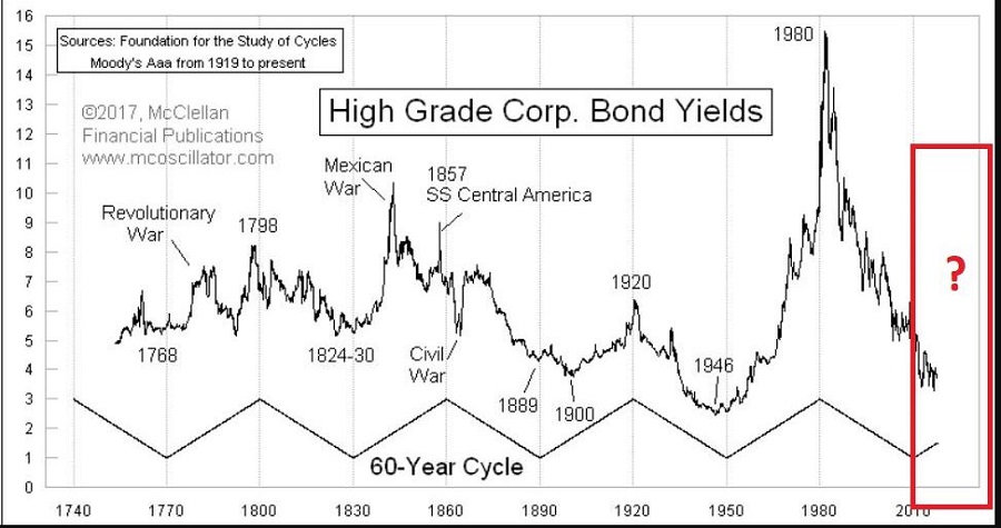 Figure 2 – 60 -year cycle in interest rates (Courtesy: www.mcoscillator.com)
Given the historical nature of rates – and the Fed’s clear propensity for raising rates – it seems quite reasonable to expect higher interest rates in the years ahead.
Commodities
As you can see in Figure 3 – which compares the action of the Goldman Sachs Commodity Index to that of the S&P 500 Index) – commodities are presently quite undervalued relative to stocks. While there is no way to predict when this trend might change, the main point is that history strongly suggests that when it does change, commodities will vastly outperform stocks.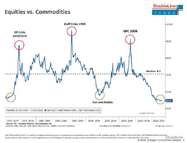 Figure 3 – Commodities extremely undervalued relative to stocks (Courtesy: Double Line Funds)
The Bottom Line – and How to Prepare for the Years Ahead
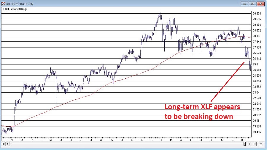
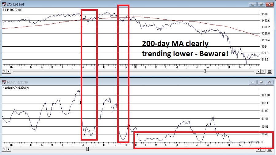
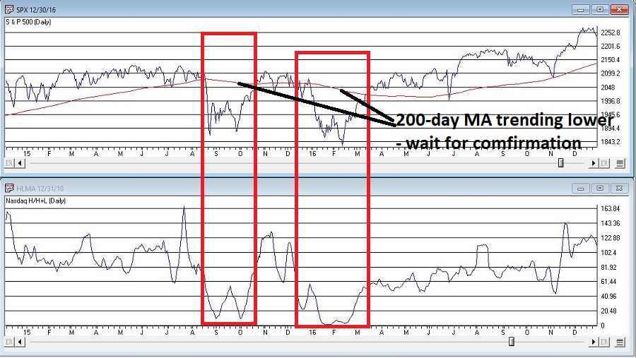
*No need to panic in stocks. But keep an eye on the major averages. If they start to drop below their 200-day averages and those moving average start to “roll over” (see example in Figure 4), it will absolutely, positively be time to “play defense.”
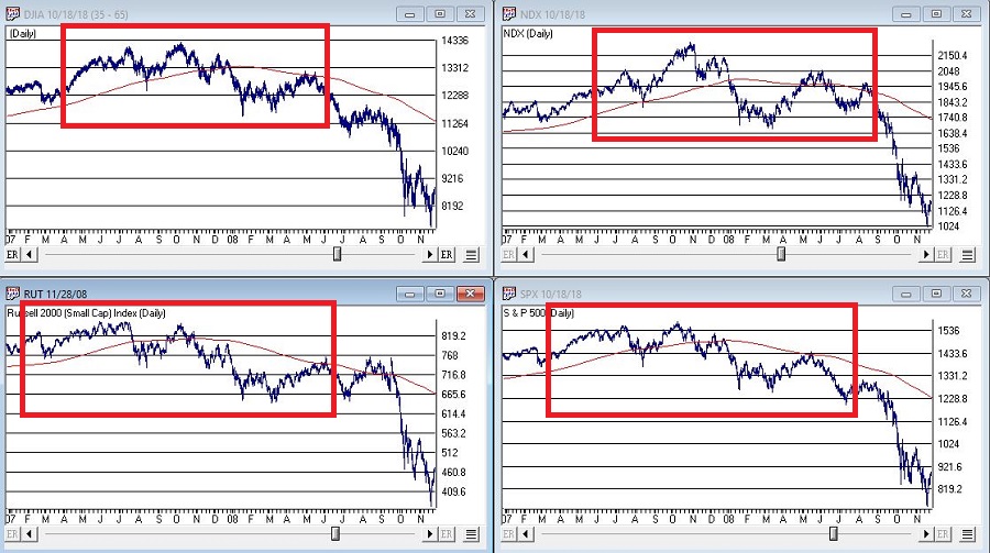 Figure 4 – Major stock average rolling over prior to 2008 collapse (Courtesy AIQ TradingExpert)
*Avoid long-term bonds. If you hold a long-term bond with a duration of 15 years that tells you that if interest rates rise one full percentage point, then that bond will lose roughly 15% in value. If it is paying say 3.5% in yield, there is basically no way to make up that loss (except to wait about 4 years and hope rates don’t rise any more in the interim – which doesn’t sound like a great investment strategy).
*Short-term to intermediate-term bonds allow you to reinvest more frequently at higher rates as rates rise. Historical returns have been low recently so many investors avoid these. But remember, recent returns mean nothing going forward if rates rise in the years ahead.
*Consider floating rate bonds. Figure 5 displays ticker OOSYX performance in recent years versus 10-year t-note yields. While I am not specifically “recommending” this fund, it illustrates how floating rate bonds may afford bond investors the opportunity to make money in bonds even as rates rise.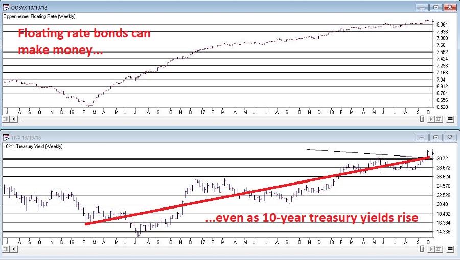 Figure 5 – Ticker OOSYX (floating rate fund) versus 10-year treasury yields)
*Figure 6 display 4 ETFs that hold varying “baskets” of commodities (DBC, RJI, DJP and GSG clockwise from upper left). When the trend in Figure 3 finally does reverse, these ETFs stand to perform exceptionally well.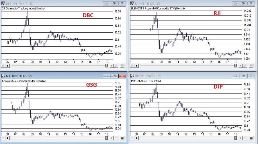 Figure 6 – Commodities performance relative to stock performance (GSCI versus SPX)
Finally, the truth is that I don’t know “when” any of this will play out. But the bottom line is that I can’t help but think that the investment landscape is going to change dramatically in the years ahead.
So:
a) Pay attention, and
b) Be prepared to adapt
Jay Kaeppel
Disclaimer: The data presented herein were obtained from various third-party sources. While I believe the data to be reliable, no representation is made as to, and no responsibility, warranty or liability is accepted for the accuracy or completeness of such information. The information, opinions and ideas expressed herein are for informational and educational purposes only and do not constitute and should not be construed as investment advice, an advertisement or offering of investment advisory services, or an offer to sell or a solicitation to buy any security.
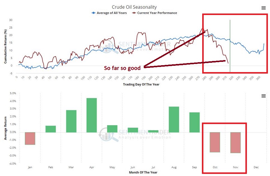 Figure 1 – Crude Oil following annual seasonal trend (Courtesy Sentimentrader.com)
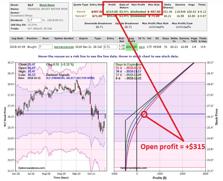
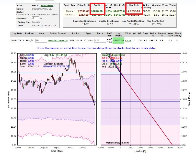 Figure 2 – USO example trade with an open profit (Courtesy www.OptionsAnalysis.com)
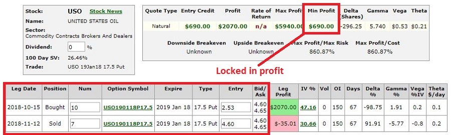 Figure 3 – Adjusted USO trade details (Courtesy www.OptionsAnalysis.com)
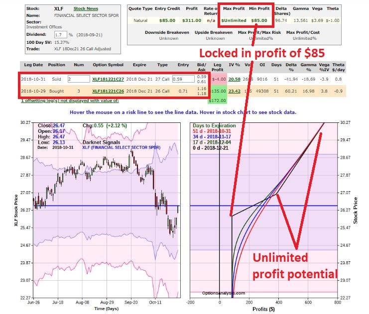
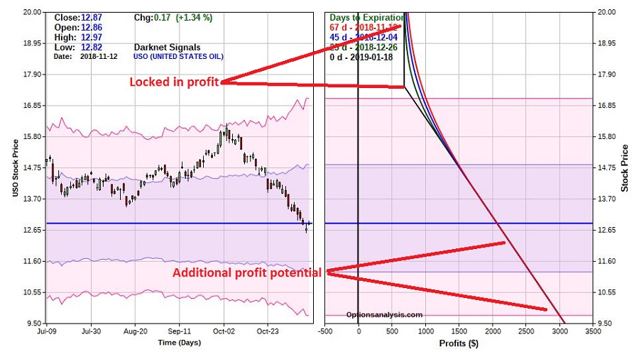 Figure 4 – Adjusted USO trade risk curves (Courtesy www.OptionsAnalysis.com)
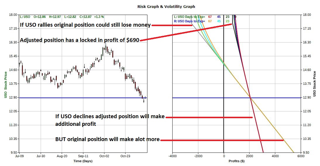 Figure 5 – The “Original” USO trade versus the “Adjusted” USO trade (Courtesy www.OptionsAnalysis.com)