All posts by admin

The Agony and Ecstasy of Trend-Following

Let’s face it, many investors have a problem with riding a trend.  When things are going well they fret and worry about every blip in interest rates, housing starts, earnings estimates and the price of tea in China, which often keeps them from maximizing their profitability.  Alternatively, when things really do fall apart they suddenly become “long-term investors” (in this case “long-term” is defined roughly as the time between the current time and the time they “puke” their portfolio – just before the bottom).

Which reminds me to invoke:

Jay’s Trading Maxim #6: Human nature is a detriment to investment success and should be avoided as much as, well, humanly possible.

So, it can help to have a few “go to” indicators, to help one objectively tilt to the bullish or bearish side.  And we are NOT talking about “pinpoint precision timing” types of things here. Just simple, objective clues.  Like this one.

Monthly MACD

Figure 1 displays the S&P 500 index monthly chart with the monthly MACD Indicator at the bottom.1Figure 1 – Monthly S&P 500 Index with MACD (Courtesy AIQ TradingExpert)
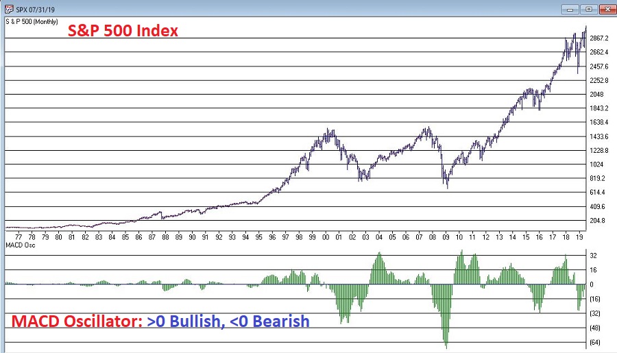
The “trading rules” we will use are pretty simple:

*If the Monthly MACD closes a month above 0, then hold the S&P 500 Index the next month

*If the Monthly MACD closes a month below 0, then hold the Barclays Treasury Intermediate Index the next month

*We start our test on 11/30/1970.

*For the record, data for the Barclays Treasury Intermediate Index begins in January 1973 so prior to that we simply used an annual interest rate of 1% as a proxy.

Figure 2 displays the equity curves for:

*The strategy just explained (blue line)

*Buying and holding the S&P 500 Index (orange) line
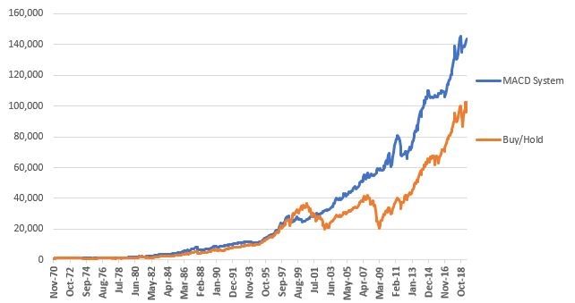
2Figure 2 – Growth of $1,000 using MACD System versus Buy-and-Hold

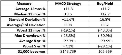
Figure 3 displays some “Facts and Figure” regarding relative performance.

3

Figures 3 – Comparative Results

For the record:

*$1,000 invested using the “System” grew to $143,739 by 6/30/2019

*$1,000 invested using buy-and-hold grew to $102,569 by 6/30/2019

*The “System” experienced a maximum drawdown (month-end) of -23.3% and the Worst 5-year % return was +7.3% (versus a maximum drawdown of -50.9% and a Worst 5-year % return of -29.1% for Buy-and-Hold)

So, from the chart in Figure 2 and the data in Figure 3 it is “obvious” that using MACD to decide when to be in or out of the market is clearly “better” than buy-and-hold.  Right?  Here is where it “gets interesting” for a couple of reasons.

First off, the MACD Method outperforms in the long run by virtue of missing a large part of severe bear markets every now and then.  It also gets “whipsawed” more often than it “saves your sorry assets” during a big bear market.  So, in reality it requires ALOT of discipline (and self-awareness) to actually follow over time.

Consider this: if you were actually using just this one method to decide when to be in or out of the market (which is NOT what I am recommending by the way) you would have gotten out at the end of October 2018 with the S&P 500 Index at 2,711.74.  Now nine months later you would be sitting here with the S&P 500 Index flirting with 3,000 going “what the heck was I thinking about!?!?!?”  In other words, while you would have missed the December 2018 meltdown, you also would have been sitting in treasuries throughout the entire 2019 rally to date.

Like I said, human nature, it’s a pain.

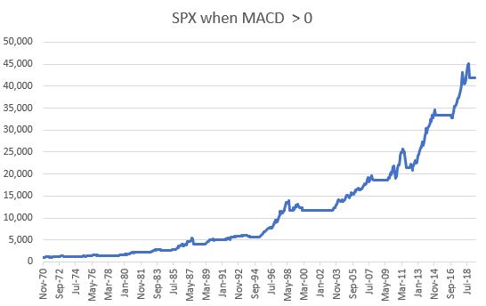
To fully appreciate what makes this strategy “tick”, consider Figures 4 and 5. Figure 4 displays the growth of equity when MACD is > 0 (during these times the S&P 500 Index is held).

4

Figure 4 – Growth of $1,000 invested in S&P 500 Index when MACD > 0.

Sort of the “When things are swell, things are great” scenario.

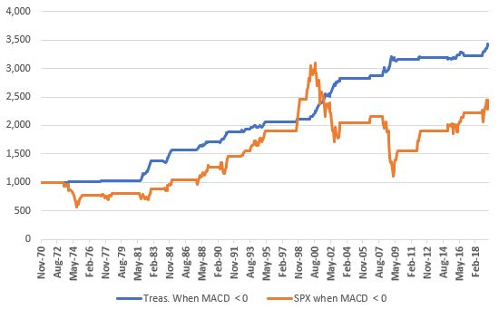
Figure 5 displays the growth of $1,000 for both intermediate-term treasuries AND the S&P 500 Index during those times when MACD > 0.

5

Figure 5 – Growth of $1,000 invested in Intermediate-term treasuries (blue) and the S&P 500 (orange) when MACD < 0.

Essentially a “Tortoise and the Hare” type of scenario.

Summary

Simple trend-following methods – whether they involve moving average using price, trend lines drawn on charts or the MACD type of approach detailed herein – can be very useful over time.

*They can help an investor to reduce that “Is this the top?” angst and sort of force them to just go with the flowing while the flowing is good.

*They can also help an investor avoid riding a major bear market all the way to the bottom – which is a good thing both financially and emotionally.

But everything comes with a cost.  Trend-following methods will never get you in at the bottom nor out at the top, and you WILL experience whipsaws – i.e., times when you sell at one price and then are later forced to buy back at a higher price.

Consider it a “cost of doing business.”

Jay Kaeppel

Disclaimer:  The data presented herein were obtained from various third-party sources.  While I believe the data to be reliable, no representation is made as to, and no responsibility, warranty or liability is accepted for the accuracy or completeness of such information.  The information, opinions and ideas expressed herein are for informational and educational purposes only and do not constitute and should not be construed as investment advice, an advertisement or offering of investment advisory services, or an offer to sell or a solicitation to buy any security.
Treasury Bonds Meet the Election Cycle (Part II)

In this article, I wrote about the connection between long-term treasury bonds and the four-year presidential election cycle.  In this piece we will look at one way to turn that information into a trading method.

The Calendar

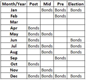
Figure 1 displays my own “calendar” for long-term treasuries as it relates to the 4-year cycle.

1

Figure 1 – Jay’s Election Cycle Bond Calendar

The Test

For testing purposes (though not necessarily for trading purposes) we will use:

*Ticker VWESX (Vanguard Long-Term Treasury Fund) which has data going back to 1973

*The Bloomberg Barclay’s Treasury 1-3 Index which has data starting in January 1976

We will “trade” as follows:

*During the months listed “Bonds” in Figure 1 we will hold ticker VWESX

*During all other months we will hold the Bloomberg Barclay’s Treasury 1-3 Index

*We will also track an investment using VWESX on a buy-and-hold basis as our benchmark.

In a nutshell, we will hold long-term treasuries during the “favorable” months and retreat to the relative safety of short-term treasuries during all other months.

IMPORTANT NOTE: For actual trading purposes ticker VWESX is likely NOT a viable candidate as Vanguard has certain switching restrictions which may limit the ability of a trader to move in and out as often as dictated by the schedule in Figure 1.  An alternative fund might be long-term treasury funds offered by ProFunds or Rydex and another viable alternative might be the ETF ticker TLT – the iShares ETF that track’s long-term treasuries.  On the short-term side one alternative is ticker SHY – an ETF that tracks short-term treasuries.

The Results

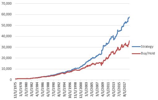
Figure 2 displays the cumulative growth of $1,000 invested using the rules above (blue line) versus buying and holding VWESX (red line) starting in January 1976.

3

Figure 2 – Growth of $1,000 using the Election Cycle strategy versus buying-and-holding VWESX

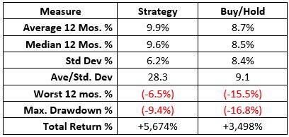
Figure 3 displays the relative performance figures.

2

Figure 2 – Election Cycle Strategy versus Buy/Hold

In a nutshell, the Strategy generated more profit with less volatility and risk than simply buying-and-holding long-term treasuries.

Summary

So, is the strategy detailed above a viable approach to investing?  That’s up to the reader to decide.  There are many potential caveats, including the fact that there is no guarantee that anybody’s “seasonal calendar” will prove accurate ad infinitum into the future.  Also, the past four decades have been very favorable for bonds overall.  If and when interest rates actually rise once again, profits in bonds may be harder to come by.

Jay Kaeppel

Disclaimer:  The data presented herein were obtained from various third-party sources.  While I believe the data to be reliable, no representation is made as to, and no responsibility, warranty or liability is accepted for the accuracy or completeness of such information.  The information, opinions and ideas expressed herein are for informational and educational purposes only and do not constitute and should not be construed as investment advice, an advertisement or offering of investment advisory services, or an offer to sell or a solicitation to buy any security.
Treasury Bonds Meet the Election Cycle

Many traders are aware of the connection between the stock market and the 4-year presidential election cycle.  Not many are aware of the connection between long-term treasury bonds and the same election cycle.

The Calendar

Figure 1 displays my own “calendar” for long-term treasuries as it relates to the 4-year cycle.

1

Figure 1 – Jay’s Election Cycle Bond Calendar

So how do bonds perform relative to this calendar?

The Test

For testing purposes (though not necessarily for trading purposes) we will use ticker VWESX (Vanguard Long-Term Treasury Fund) which has data going back to 1973.  For testing purposes, we will refer to those months labeled “”Bonds” in Figure 1 as “Good Months” and all other months as “Other Months.”

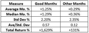
Figure 2 displays the relative performance between “Good Months” and “Other Months”.

2

Figure 2 – Good Months versus Other Months

Notes:

*The “average” Good Month gained four times the “average” Other Month

*The “median” Good Month gained over three times the “median” Other Month

*Good Months had a slightly lower standard deviation than Other Months

*In 242 “Good Months” since 1973 VWESX gained +1,620%

*In 309 “Other Months” since 1973 VWESX gained +131%

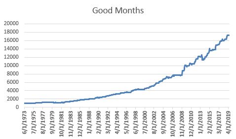
Figure 3 displays the cumulative growth of $1,000 invested in VWESX ONLY during “Good Months”.

3

Figure 3 – Growth of $1,000 in VWESX ONLY during Good Months

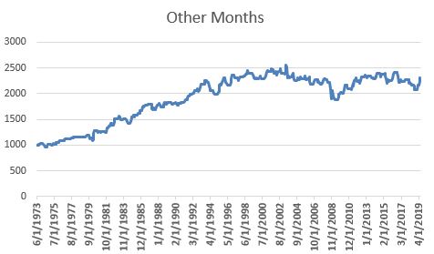
Figure 4 displays the cumulative growth of $1,000 invested in VWESX ONLY during “Other Months”.

4

Figure 4 – Growth of $1,000 in VWESX ONLY during Other Months

Summary

Is any of this actually useful?  Hey, I just report what I see, you take it from there.

In Part II we will look at an actual trading application.

Jay Kaeppel

Disclaimer:  The data presented herein were obtained from various third-party sources.  While I believe the data to be reliable, no representation is made as to, and no responsibility, warranty or liability is accepted for the accuracy or completeness of such information.  The information, opinions and ideas expressed herein are for informational and educational purposes only and do not constitute and should not be construed as investment advice, an advertisement or offering of investment advisory services, or an offer to sell or a solicitation to buy any security.

A Bet Against the Buck

Speculation comes down to a (seemingly) simple two-step process:

Step 1. Spot opportunity

Step 2. Exploit opportunity

Sure, there are a lot of potential “details” built into those two steps.  And there are other ancillary considerations, like for example, “don’t lose your shirt” in the process.  And then of course there is the fascination with “predictions”.  While “spotting opportunity” and “making a prediction” may seem like the same thing, in reality they are not.

Making a prediction means discerning today what will happen tomorrow (or on some subsequent day after that).  Predictions also tend to involve a fair amount of “ego.”  “I think [your prediction here]” pretty much puts your ego on the line.  If your prediction fails to pan out you can and typically do look and feel kind of stupid.

“Spotting opportunity” simply means you believe that there is a chance that things may go a certain way and wanting to take advantage of that occurrence should it pan out.  “Exploiting opportunity” simply means figuring out a way to give yourself, a) a chance to make good money if things work out, while ALSO, b) taking steps to limit the amount of risk you expose yourself to since – let’s be brutally candid here – any trade you might enter has a chance of failing.

Spotting Opportunity: The U.S. Dollar

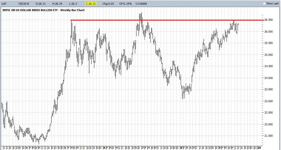
Take for instance, the U.S. Dollar.  I have no real mechanism for “predicting” what will happen next to the dollar.  I do know that it has been in a pretty strong uptrend since January of 2018.  So on one hand, as a pretty avid “trend-follower”, I would normally be looking at the bullish side of things for an opportunity.  However, I also know that:

a) it is looking at a significant resistance level at slightly higher prices, and

b) it is about to enter its seasonally unfavorable time of year.

So, have I spotted an opportunity?  Well, that the other thing about opportunity.  Each potential one is “in the eye of the beholder.”

In Figure 1 we see that ticker UUP – an ETF that tracks the U.S. Dollar versus a basket of foreign currencies has an obvious resistance level that it needs to take out in order to remain in an established uptrend.  Will it do so?  The truth is I haven’t the slightest idea.2Figure 1 – Ticker UUP with overhead resistance (Courtesy ProfitSource by HUBB)

In Figure 2 we see the annual seasonal trend for U.S. Dollar futures courtesy of www.Sentimentader.com.  As you can see we are about to enter the “typical” period of weakness.

1Figure 2 – Annual seasonal trend for U.S. Dollar (Courtesy Sentimentrader.com)

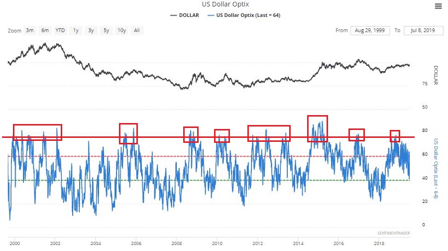
Figure 3 displays trade sentiment for the U.S. Dollar (also from www.Sentimentrader.com).  Note that it recently exceeded the horizontal red line that I drew in the range of about 75% or so.  Note the action of the dollar following previous readings in this area.3Figure 3 – Trader optimism for the U.S. Dollar (Courtesy Sentimentrader.com)

Does any of this guarantee that the dollar – and ticker UUP – are going to decline anytime soon.  Not at all.  But it does highlight a potential opportunity.  The next question then is, “is there a way to exploit this potential opportunity that gives us good profit potential without a lot of risk?”

Exploiting Opportunity using options on UUP

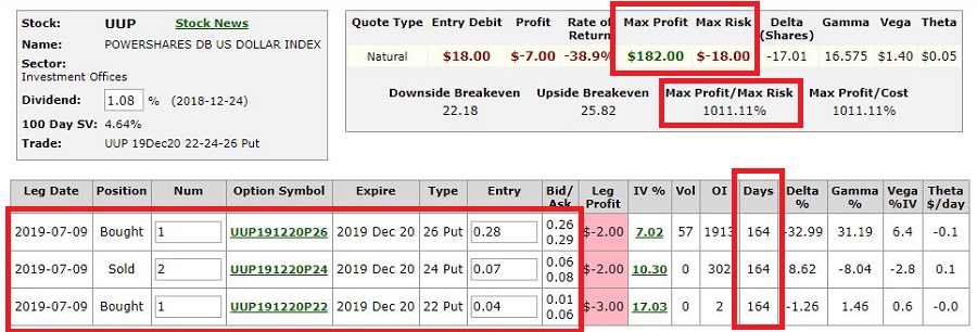
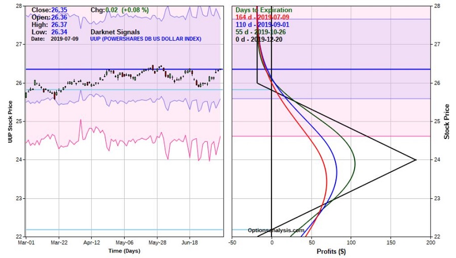
Figures 4 and 5 display the particulars and risk curves for an “out-of-the-money put butterfly” spread (OTM put fly for short) using put options on UUP.

4Figure 4 – OTM butterfly using UUP put options (Courtesy www.OptionsAnalysis.com)

5Figure 5 – Risk curves for OTM butterfly using UUP put options (Courtesy www.OptionsAnalysis.com)

A few things to note:

*This trade is using December options which are NOT very actively traded.  Still, via the use of a limit order this trade might be able to be entered for a cost of just $18 for a 1 by 2 by 1 butterfly spread.

*In addition to a low dollar risk the position also has plenty of profit potential and roughly 5 months of time for things to pan out.

*From a risk management position, a trader must decide what they will do if price does breakout to the upside.  The most obvious choices are, a) exit the trade and cut one’s loss, or b) due to the low initial dollar risk, just let it ride for awhile and see if there is a failure after the breakout.

*On the profit side, I have no reason to believe that UUP will decline sharply in the months ahead.  However, it does, I also know that this trade will make a large percentage return.  If UUP drops to its March low of $25.56 a share, the trade will likely show an open profit in the $14 to $38 range depending on how soon that price is reached.

Summary

As always, I don’t make “recommendations” and the trade highlighted here is intended to serve only as an example of a way to spot opportunity and to exploit said opportunity.  So note what is and is not happening here:

I am not shouting (i.e., predicting) that “the dollar is headed lower!”  I am merely noting that if a person is willing to risk $18 (per a 1 x 2 x 1-lot) on the possibility that it might be, there is a way to do it.

Jay Kaeppel

Disclaimer:  The data presented herein were obtained from various third-party sources.  While I believe the data to be reliable, no representation is made as to, and no responsibility, warranty or liability is accepted for the accuracy or completeness of such information.  The information, opinions and ideas expressed herein are for informational and educational purposes only and do not constitute and should not be construed as investment advice, an advertisement or offering of investment advisory services, or an offer to sell or a solicitation to buy any security.
Happy Holiday Day(s)

Human nature sure is a weird thing.  There is nothing like the prospect of a “day off” to lift the spirits.  And for us working stiffs one thing we count on are “Holidays”.  And in the immortal words of Jim Lang, “Heeeere they are”:

*New Year’s Day

*Martin Luther King Day

*President’s Day

*Good Friday

*Memorial Day

*July 4th

*Labor Day

*Thanksgiving

*Christmas

For the record, holidays have changed a bit over the years.  Martin Luther King Day is relatively new as is President’s Day (which replaced Lincoln’s Birthday and Washington’s Birthday).  But the idea is the same.  There seems to be a “sense of euphoria” among investors around holidays.

The Test

Much has been written about stock market behavior around holidays.  Certain days are better than others.  But for our purposes we will keep it simple and uniform:  We will look at price performance of the Dow Jones Industrial Average during:

*the 3 trading days before and

*the 3 trading days after each holiday

Our test will start at the close on 12/31/1948.

The Results

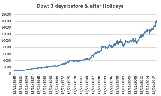
Figure 1 displays the growth of $1,000 invested in the Dow ONLY during the 3 days before and the 3 days after every stock market holidays since 12/21/1948.

1

Figure 1 – Growth of $1,000 in Dow Industrials 3 days before and 3 days after each holiday; 12/31/1948-7/1/2019

As you can see:

*Holiday days are no sure thing

*Holidays days display a clearly bullish long-term trend

A few facts and figures:2

Figure 2 – Facts and Figures; Holiday Days versus all other trading days

As you can see:

*Holiday days have displayed roughly a 6% higher likelihood of being profitable (54.9% versus 51.8%) than all other trading days

*Holiday days have generated an average daily return (+0.0847%) that is roughly 4.2 times greater than the average daily return (+0.0203%) for all other trading days.

Summary

The bottom line is that “Yes”, the stock market does tend to perform better around stock market holidays.  Given this incontrovertiable evidence I think our course of action is clear:

We MUST contact our elected representatives and DEMAND MORE HOLIDAYS!!!

Speaking of which….Happy 4th of July.

Jay Kaeppel

Disclaimer:  The data presented herein were obtained from various third-party sources.  While I believe the data to be reliable, no representation is made as to, and no responsibility, warranty or liability is accepted for the accuracy or completeness of such information.  The information, opinions and ideas expressed herein are for informational and educational purposes only and do not constitute and should not be construed as investment advice, an advertisement or offering of investment advisory services, or an offer to sell or a solicitation to buy any security.
Before Betting on Small-Caps…

There is a lot of speculation about the future course of small-cap stocks.  Of late, small-cap stocks have been lagging large-cap stocks and the broad market overall.

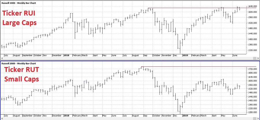
As you can see in Figure 1 below, while large-cap stocks (Top clip: Russell 1000, ticker RUI) recently touched a new all-time high, small-cap stocks (Bottom clip: Russell 2000, ticker RUT) have come nowhere close.  In fact, small-cap stocks have only retraced about 50% of the Aug-Dec 2018 decline.

1Figure 1 – Large-cap stocks (RUI, top clip) versus small-cap stocks (RUT, bottom clip); 1989-2019 (Courtesy ProfitSource by HUBB)

This of course leads to a lot of prognosticating about “what’s next” for small-cap stocks.  One school of thought thinks small-cap stocks offer the best bargain right now, while the other school of thought claims that the weakness in small-caps is a sign of something worse for the overall market.

My “forecast”?  I don’t really claim to have one.  But I do follow a bit of market history.  And while history is by no means always an accurate guide, it can give clues.  These clues can be useful since a big part of investing success is putting the odds on your side as much as possible.

For what it is worth, history presently suggests that the odds may not favor an emphasis on small-cap stocks at the moment.

SSSSS

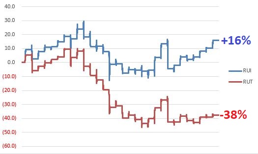
SSSSS is a little known (primarily because I just made it up) acronym for Smallcaps Seasonally Suck in Summer Syndrome.  To wit:  Figure 2 displays the cumulative % price gain for RUI (blue line) and RUT (red line) ONLY from the end of June through the close of the 6th trading day of August every year since 1989

2

Figure 2 – Cumulative price % +(-) for Large-cap (blue) and Small-Cap (red) indexes from end of June through August Trading Day #6, 1989-2018

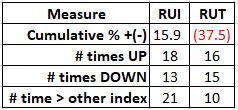
Figure 3 contains a few key pieces of info.

3

Figure 3 – Relevant Data; End of June through August Trading Day #6; 1989-2018

One thing that is important to note is that the implication is NOT that small-cap stocks are doomed to decline between now and early August.  For the record, RUT has showed a gain 52% of the time and a loss only 48% of the time during this period.  However, the average gain was +7.4% while the average loss was -9.5%.

The other key point to note is that large-caps have outperformed small-caps 68% of the time during (21 out of 31 years) this period since 1989.

Summary

The reality is that none of the above information should be construed to imply that large-cap stocks will do well and/or better than small-cap stocks and that small-cap stocks will lose between now and early August.

But, if one had to bet based on the historical odds, small-cap enthusiasts might consider containing their enthusiasm for just a bit longer.

Jay Kaeppel

Disclaimer:  The data presented herein were obtained from various third-party sources.  While I believe the data to be reliable, no representation is made as to, and no responsibility, warranty or liability is accepted for the accuracy or completeness of such information.  The information, opinions and ideas expressed herein are for informational and educational purposes only and do not constitute and should not be construed as investment advice, an advertisement or offering of investment advisory services, or an offer to sell or a solicitation to buy any security.
Putting it All Together in Biotech

Sometimes “all the pieces fall in place.”  Of course – and unfortunately – even then a profit is never guaranteed.  That is why the keys to long-term success are:

*Putting the odds in your favor on a regular basis

*Managing risk

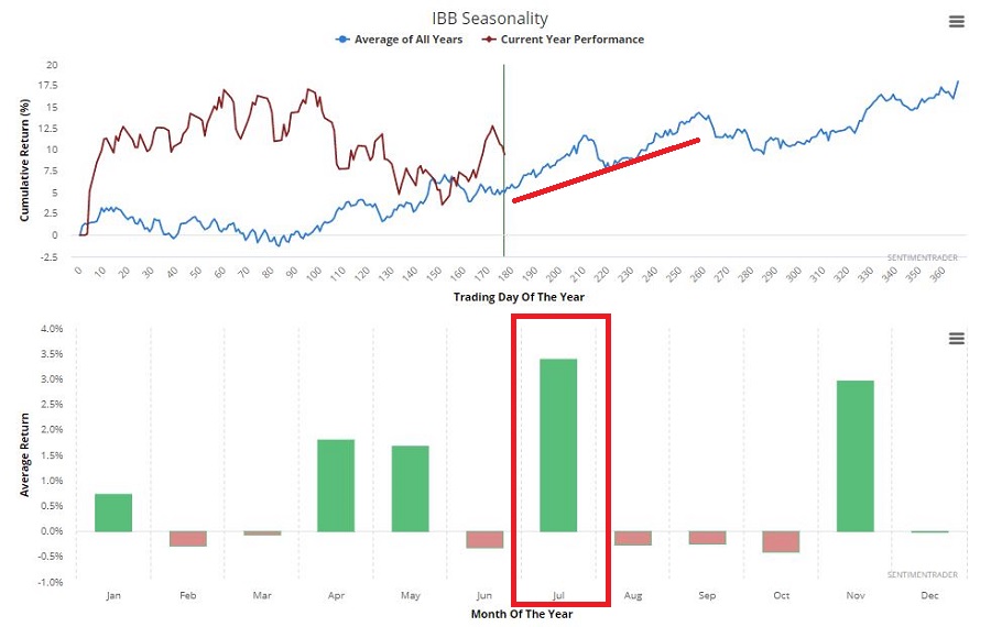
Consider the biotech sector.  As you can see in Figure 1, the Elliott Wave count for ticker XBI is bullish.1Figure 1 – Biotech seasonality is favorable (Courtesy Sentimentrader.com)

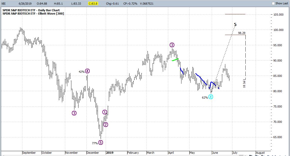
As you can see in Figure 2, right now is the beginning of a seasonally favorable time of year for the biotech sector. 2Figure 2 – XBI with bullish Elliott Wave count (Courtesy ProfitSource by HUBB)

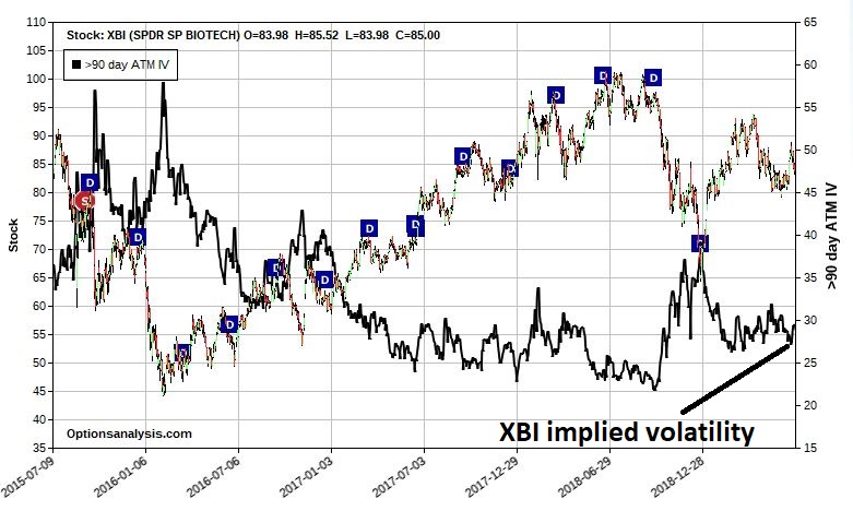
In Figure 3, we see that the implied volatility on options for XBI are neither extremely high nor extremely low.3Figure 3 – XBI with implied options volatility (Courtesy www.OptionsAnalysis.com)

When we put all of this together, we can make a case for a bullish trade in XBI.

Given the bullish Elliott Wave count, one possibility would be to buy a call option in hopes of maximizing profitability if the ETF does in fact soar to higher ground.  However, given, a) that options are not “cheap” (i.e., implied volatility is not extremely low) and, b) that Elliott Wave projections that call for large gains in a short period of time tend to be less reliable than projections that call for decent gains over a longer period of time, we will opt for a different approach.

A Bull Put Spread

What follows is NOT a “recommendation”, only an “example”.

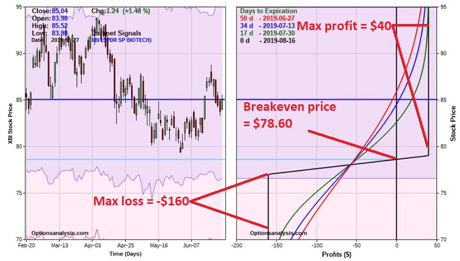
The trade in Figures 4 and 5 is referred to as a “Bull Put Spread” because it is a position that profits from a bullish move (or at least NOT a bearish move by XBI) and uses put options.

The trade involves:

*Selling 1 XBI Aug16 79 put @ $1.50

*Buying 1 XBI Aug 16 77 put @ $1.10

4Figure 4 – XBI bull put spread details (Courtesy www.OptionsAnalysis.com)

5Figure 5 – XBI bull put spread risk curves (Courtesy www.OptionsAnalysis.com)

Note:

*The maximum profit on a 1-lot is $40

*The maximum risk is -$160

*The breakeven price at expiration is $78.60

*XBI is presently trading at $85.04

*The most recent low for XBI was $79.31

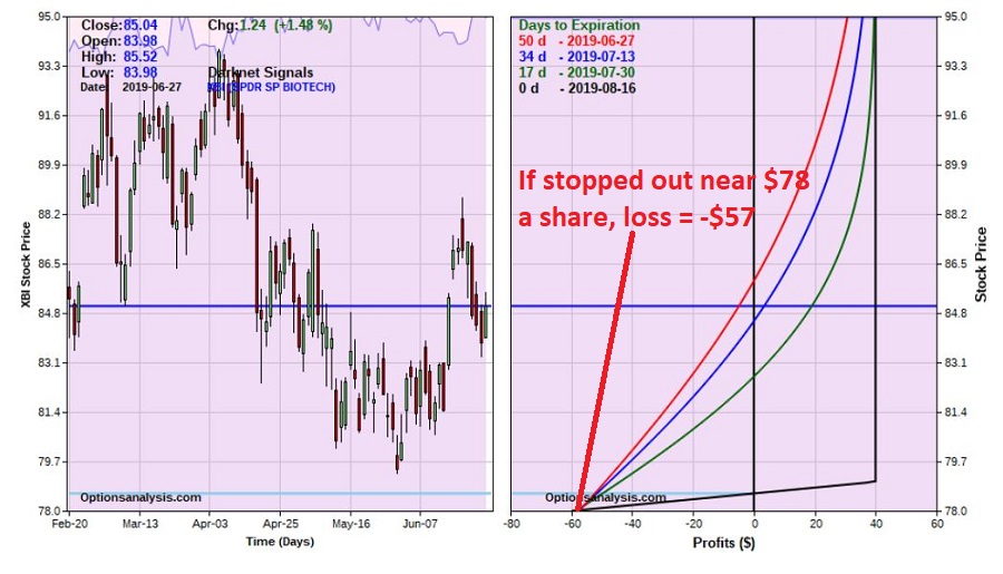
In a nutshell, the breakeven price for this trade is below the recent low of $79.31.  This means we don’t need to worry about stopping ourselves out if XBI merely comes down and tests support at $79.31.  We can set a stop-loss point somewhere near the breakeven price of $78.60 lower.

A trader might consider exiting the trade with a profit, if 80% of the premium is captured prior to expiration (i.e., if the spread can be bought back at $0.08 or less).

In Figure 6 we zoom in to find that if we place a stop-loss around $78 a share for XBI, the expected loss on our trade would be -$57.

6Figure 6 – If XBI declines below support, stop-loss action may be necessary and may be able to limit loss to a reasonable amount (Courtesy www.OptionsAnalysis.com)

Summary

As always, I am not “recommending” the trade highlighted here.  It is presented simply as an “example” of a situation where all the pieces come together to create a potential trading opportunity.  In this example:

*Seasonal trends are favorable

*Price trends (based on Elliott Wave) may be favorable

*An option trade can be entered that may be profitable if XBI does anything besides drop a little over 8% in the next 50 days.

*The position has the “odds in its favor” and we have a plan to manage risk.

The reality is that XBI could fall apart quickly and this trade could turn into a quick loss (and the trader MUST be prepared to act to cut their loss in that event).  But under any other circumstance, a profit is a possibility.

Jay Kaeppel

Disclaimer:  The data presented herein were obtained from various third-party sources.  While I believe the data to be reliable, no representation is made as to, and no responsibility, warranty or liability is accepted for the accuracy or completeness of such information.  The information, opinions and ideas expressed herein are for informational and educational purposes only and do not constitute and should not be construed as investment advice, an advertisement or offering of investment advisory services, or an offer to sell or a solicitation to buy any security.
Take a Ride into the Summer Rally Zone

Right off the bat, please notice that the headline reads “Summer Rally Zone” and NOT “Summer Rally”.  I don’t have crystal ball (I used to, or so I thought.  And believe me, in my youth I spent a lot of time staring into that da#$ thing before I realized it was broken) and cannot predict how things will work out “this time around.”  But I can state categorically that we are about to enter in “the zone”.

The Summer Rally Zone

Historically, the SRZ (at least as I see it) encompasses:

*the last 3 trading days of June and

*the first 9 trading days of July.

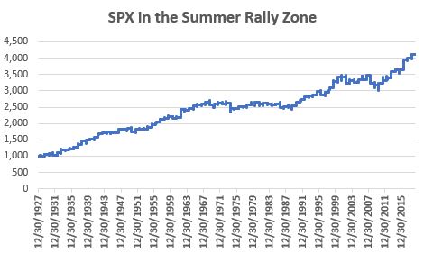
Figure 1 displays the growth of $1,000 invested in the S&P 500 Index ONLY during these 12 days every year starting in 1928.

1a

Figure 1 – Growth of $!,000 in SPX during the Summer Rally Zone

The good news is that there is a clear long-term upside bias.  The bad news is that there is no real way to know if the Summer Rally Zone will see SPX post a gain “this time.”

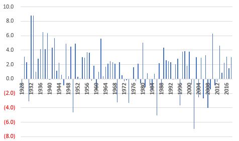
Figure 2 displays the year-by-year % +(-) in column form.

2

Figure 2 – SPX in the Summer Rally Zone year-by-year (1928-2018)

For the record:

*# times SRZ UP = 62 (68%)

*# times SRZ DOWN = 28 (31%)

*# times unchanged = 1

*Average UP SRZ% = +3.0%

*Average DOWN SRZ % = (-1.9%)

*Largest UP = +8.8% (1932 and 1933)

*Largest DOWN = (-6.9%) (2002)

So statistically speaking, we have a win/loss ratio of 2.21-to-1 and a winner to loser ratio of 1.57.

Statistically these are good numbers.  But they certainly do NOT represent any kind of sure thing.

Summary

In 2019, the SRZ begins at the close on 6/25 and extends through the close on Friday 7/12.

If you are otherwise bullish on the market, this history suggests that now may be a good time to press your advantage.  Just don’t construe that as some sort of “prediction” on my part.

Jay Kaeppel

Disclaimer:  The data presented herein were obtained from various third-party sources.  While I believe the data to be reliable, no representation is made as to, and no responsibility, warranty or liability is accepted for the accuracy or completeness of such information.  The information, opinions and ideas expressed herein are for informational and educational purposes only and do not constitute and should not be construed as investment advice, an advertisement or offering of investment advisory services, or an offer to sell or a solicitation to buy any security.
How Do You Handle a Problem Like…a Quick Profit?

In this article I wrote about a simple trade using options on ticker GDX to alleviate “gold angst”.  For just a “few dollars” a trader could guarantee participation in the much anticipated “gold is about to soar” prognostications that seemed to be prevalent at the time.  And with over a year and half for things to work out.

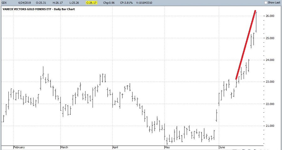
Well, lo and behold, things worked out!  As you can see in Figure 1, GDX burst higher – rising 14% in just 8 trading days.1Figure 1 – GDX shots higher (Courtesy ProfitSource by HUBB)

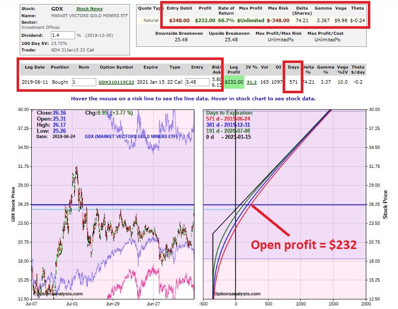
In Figure 2 we can see that the initial trade now has an open profit of +66.7%.

2Figure 2 – Initial GDX call options position (Courtesy www.OptionsAnalysis.com)

This is great!  Except, now we have a new kind of “angst”.  Does one “let it ride”?  Or is it time to “take some chips off the table?”

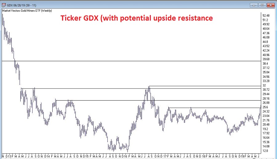
In Figure 3 we are hit with the sober reality that – despite the nice rally – there is a lot of potential overhead resistance, so the idea of “ringing the cash register” is tempting.

3Figure 3 – Potential overhead resistance for GDX (Courtesy AIQ TradingExpert)

The good news is that option trading offers a lot of possibilities.  The bad news is that there are no “right” or “wrong” answers.  A trader must simply decide where their priorities lie and craft a position to fit those priorities.

#1. Let it Ride

This one is simple.  It involves doing nothing.  The option doesn’t expire until January of 2021 so there is plenty of time for “the big move” to unfold.  Assuming of course that your priority is making as much money as possible from the big move.  In Figure 2 note that this position has

Delta=74.21

Gamma=3.367

Vega=$9.98

This means that if GDX keeps rising, this position – which is currently roughly equivalent to holding 74 shares of GDX – will gain $74.21 for each $1 GDX rises AND that delta value will increase by 3.367 for each $1 GDX rises in price. Likewise, if implied volatility rises by 1 percentage point this trade will tack on another $9.98 in profit.

Bottom line: this trade exudes profit potential.  The bad new is that the option could also still expire worthless resulting in a 100% loss of investment.

#2. Take the Money and Move On

This involves simply selling the call, taking the profit and moving on to something else.  The good news is you will have made money and there is no chance of giving it back.  The bad news is that you may once again experience the “gold angst” the prompted this trade in the first place – if gold and gold stocks continue to rally.

#3. Play for a Pause

For a trader who:

a) wants to retain a bullish position

b) doesn’t want to end up with a loss after registering such a quick profit and/or

c) is concerned about all that overhead resistance

…one possibility might be to “adjust” the trade by selling an out-of-the-money call.

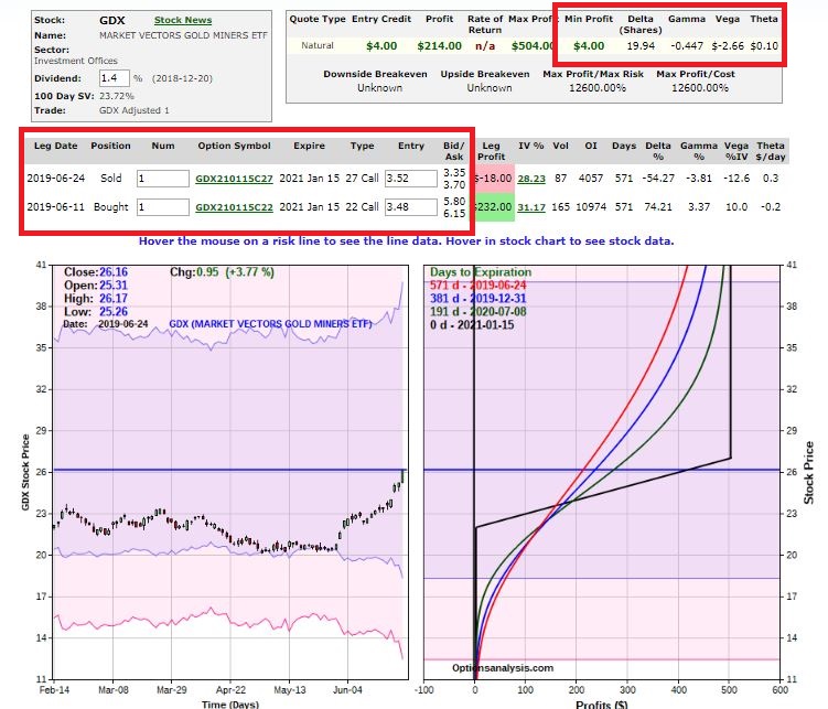
Such a trade appears in Figure 4.  This trade involves selling one Jan2021 27 strike price call for $3.52 (the midpoint of the bid/ask spread).4Figure 4 – Adjusted position in GDX (Courtesy www.OptionsAnalysis.com)

As you can see in Figure 4 there is good news and bad news.  The good news is that this adjusted position cannot turn into a losing trade if GDX subsequently falls apart.  The bad news is that it has a lot less upside potential than the original position (Delta=20, Gamma=-.45, Vega=-$2.66).

A trader choosing this approach might be looking for a pullback in GDX and for an opportunity to buy back the 27-strike price call at a lower price in order to generate an interim profit and to re-establish the naked long call position.

Another possibility is “rolling up”, which means selling the 22-strike price call and buying one at a higher strike price at a lower cost.  The purpose of this adjustment is to “lock in a profit” while still retaining a bullish position.  Unfortunately, at the moment, with GDX at $26.16 a share , a trader who sold the 22 call with a profit of $232 would have to go up to about the 31 strike using the Jan 2021 calls (currently at $2.16 bid/$2.42 ask) in order to lock in a net profit.  One can do this, but it involves buying a call option that is presently 18% out-of-the-money.

Summary

Jay’s Trading Maxim #45: The good news about option trading is the same as the bad news about option trading.  The good news is that there are so many choices.  The bad news is that there are so many choices.  This is why traders who are successful using options are those who:

*Decide what their priorities are

*Craft a position that plays to their priorities

*Simply “deal with it” when things don’t work out (i.e., they don’t kick themselves or second guess)

Jay Kaeppel

Disclaimer:  The data presented herein were obtained from various third-party sources.  While I believe the data to be reliable, no representation is made as to, and no responsibility, warranty or liability is accepted for the accuracy or completeness of such information.  The information, opinions and ideas expressed herein are for informational and educational purposes only and do not constitute and should not be construed as investment advice, an advertisement or offering of investment advisory services, or an offer to sell or a solicitation to buy any security.
US vs. Them

The U.S. stock market has in recent years enjoyed an incredible bull run.  In the process it has left the rest of the world(‘s stock markets) in the dust.  And as usual, the longer any trend persists the more investors en masse take it for granted that it will go on forever.  As a result, it is pretty hard for investors to get excited about international stock market exposure.

Given the trend over the past decade, this is perfectly understandable.  And probably a mistake.  Because nothing lasts forever in the financial markets (except of course for the aforementioned tendency for investors to extrapolate a trend).

Figure 1 displays the cumulative growth of a $1,000 investment in the S&P 500 stock index (SPX) and the MSCI EAFE Index (EAFE) since the end of 1972.  Through 1990 the EAFE outperformed, then the SPX charged into the lead.  By the bottom of the 2008-2009 bear market the gap had narrowed.  Since then the SPX has vastly outperformed.

1

Figure 1 – Growth of $1,000 in SPX vs. EAFE; 12/31/1972-5/31/2019

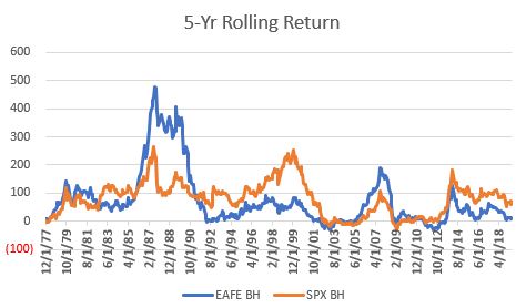
Most investors look at Figure 1 and immediately conclude that U.S. stocks are “better”, despite the “ying” and “yang” that actually took place.  Figure 2 displays the rolling 5-year return for both indexes.  2

Figure 2 – Rolling 5-yr. returns for SPX and EAFE

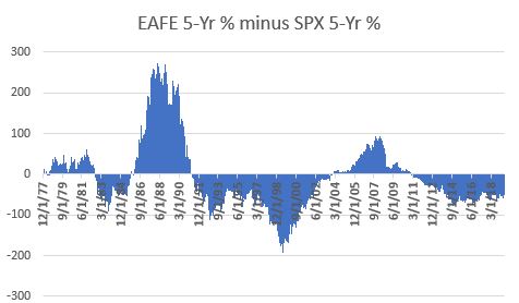
Figure 3 displays the net difference between the two.  When Figure 3 is positive, EAFE outperformed over the previous 5 years and when it is negative SPX outperformed.

3

Figure 3 – EAFE 5-yr return minus SPX 5-year return

The only real useful conclusion one can reach from Figures 2 and 3 is that sometimes EAFE leads and sometimes SPX leads.  There is no permanent advantage in one over the other.

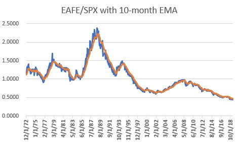
Figure 4 displays the ratio of EAFE divided by SPX along with a 10-month exponential moving average (technical note: the ratio tracked is the ratio of the cumulative growth of $1,000 in EAFE divided by the cumulative growth of $1,000 in SPX and NOT the price of EAFE/the price of SPX).

4

Figure 4 – EAFE cumulative return divided by SPX cumulative return; 1972-May-2019

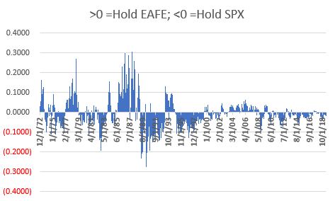
Figure 5 displays the ratio in Figure 4 minus the moving average in Figure 4.  Positive readings favor EAFE, negative readings favor SPX.

5

Figure 5 – EAFE/SPX ratio minus 10-month EMA of the ratio; 1972-May-2019

Trading Rules

Because we are using total monthly return data, and because that data is typically not available until sometime during the next month, we will use a one-month lag in terms of generating signals.  So here are the rules:

*Indicator = Latest EAFE/SPX ratio minus 10-month EMA of EAFE/SPX ratio

We start with $1,000 on 12/31/1972

*If Indicator rises above 0, sell SPX and buy EAFE

*If Indicator falls below 0, sell EAFE and buy SPX

Example: So let’s say we get total return data for May on the 5th of June.  And let’s say that when we do the update for May we find that the Indicator went from negative to positive. Then at the end of June we will sell SPX and buy EAFE.

SPX/EAFE “Switch” Index is traded using the rules above

As a benchmark we will use the following:

*SPX vs. EAFE “Split” Index = Start with $1,000 on 12/31/1972.  At the start of each year, the portfolio is rebalanced to a 50/50 split between SPX and EAFE.

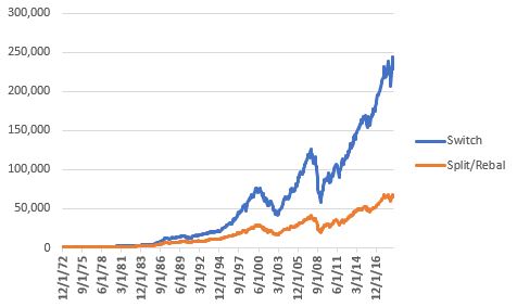
Figure 6 displays the cumulative growth of both the “Switch” Index and the “Split” Index.

6

Figure 6 – Cumulative growth of $1,000 invested using “Switch” strategy (blue) versus the “Split” strategy (orange)

For the record:

*The “Switch” strategy grew +22,719%

*The “Split” strategy grew +6,350%

As with anything in the financial markets, it is not like the “Switch” strategy always outperformed the “Split” strategy.  But the long-term trend is pretty clear.  Figure 7 displays the cumulative “Switch” strategy divided by the cumulative “Split” strategy.
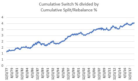
7

Figure 7 – “Switch” strategy cumulative return divided by “Split” strategy cumulative return

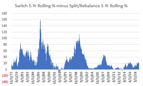
When the line in Figure 7 is rising it means the “Switch” strategy is outperforming the “Split” strategy.  As you can see, there are times when the line dips or moves sideways.  But again, the long-term trend is unmistakable – over time, switching makes more than splitting.

The Long-Term Picture

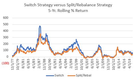
Figure 8 displays the rolling-5 yr. return for the “Switch” strategy (blue) and the “Split” strategy (orange).

8

Figure 8 – “Switch” strategy 5-yr return (blue) versus “Split” strategy 5-yr return (orange)

Figure 9 displays the difference between the two.  Above 0 means the “Switch” strategy has outperformed over the past 5 years and vice versa.

9

Figure 9 – “Switch” strategy 5-yr return (blue) minus “Split” strategy 5-yr return (orange)

Now let’s talk about the realities of investing.  As you can see, the “Switch” strategy usually outperforms the “Split” strategy – BUT NOT ALWAYS.  Now consider you were using the “Switch” strategy – which requires you to update data and monitor results each and every single month, and also requires you to make a trade whenever a switch is needed, versus the “Split” strategy which requires you only to make one trade a year.

Now let’s say you go to the trouble of using the “Switch” strategy and after 5 long years of dutifully following your “system”, the “Switch” strategy has actually underperformed the “Split” strategy.  What will be your reaction?

Will you:

*Say “well, I knew that this can and will happen from time to time but the long-term odds still favor the “Switch” strategy, so I am going to stick to it

OR

*(like the vast majority of investors) Say “this strategy sucks, I need to move on”

One’s answer to this question is important because the need to persevere in light of underperformance is pretty much one of the requirements of long-term success.

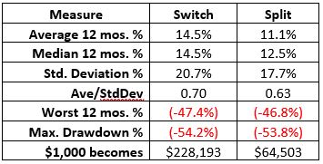
Figure 10 displays the relevant comparative facts and figures.

10

Figure 10 – “Switch” versus “Split”; 12/31/1972-5/31/2019

It is extremely important to note that while the “Switch” strategy vastly outperformed in terms of return, it still entailed alot of volatility and risk.  It also had a higher annual standard deviation (i.e., it is more volatile) and experienced a drawdown of -54%, which was slightly greater than that of the “Split” strategy.

Bottom line: do NOT make the mistake of thinking of this strategy as “easy money”.

Summary

As always, this is not a “recommended” strategy.  It is presented merely as “food for thought”.  The article is simply intended to highlight that:

*Sometimes U.S. stocks outperform the rest of the world and – absolutely, positively sometimes vice versa

*It may be possible to take advantage of switching between U.S. and international stocks

*No strategy outperforms all the time.

Jay Kaeppel

Disclaimer:  The data presented herein were obtained from various third-party sources.  While I believe the data to be reliable, no representation is made as to, and no responsibility, warranty or liability is accepted for the accuracy or completeness of such information.  The information, opinions and ideas expressed herein are for informational and educational purposes only and do not constitute and should not be construed as investment advice, an advertisement or offering of investment advisory services, or an offer to sell or a solicitation to buy any security.