The Dow “number
to beat” at the moment is 27,046.23.
Why? Because that’s where it
closed October of 2019 (you remember, back in the “Good Old Days”). If the Dow closes the month of April below
27,046.23 it presents a negative signal for the next six months, generally
speaking.
The Track
Record
So, for the purposes of this test we will break the year into two 6-month periods:
*November through April (the “Power Zone”) and May through October (“the Dead Zone”)
Then we will:
*look at how the Dow performs during the “6-month Dead Zone” in those years where the Dow finishes the “6-month Power Zone” with a loss
In other
words, how does the Dow perform May through October after November through April
registers a loss?
First the Good
News
The Good News
is that 44% of the time a loss during the 6-month Power Zone was followed by a
gain during the subsequent 6-monht Dead Zone.
So, it is not like a November through April decline is a sure-fire sign
of impending trouble.
Still, it is
a warning sign as we will see next.
Now the
Bad News
When the 6-month
Power Zone showed a loss, the Dow during the subsequent 6-month Dead Zone:
*Lost ground
56% of the time
*The average
loss for all periods was -3%
*The average
gain during up periods was +11.1%
*The average
loss during down periods -14.3%
In a
nutshell, the percentage of winning trades was less than 50%, and the average
loser was bigger than the average winner.
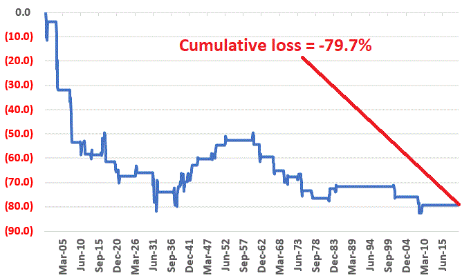
Figure 1 displays
the cumulative price return for the Dow if held only during May through October
after November through April showed a loss, starting in 1900.
Figure 1 – Cumulative
Dow % +(-) during 6-month Dead Zone after 6-month Power Zone shows a loss (1900-2019)
In sum, the
Dow lost -79.2% during these periods. It
is interesting to note that from 1941 through 1952 there were six consecutive times
when a down Nov. through Apr. was followed by an up May through Oct. (see
Figure 3).
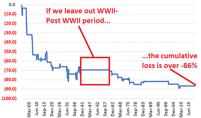
If we take out this WWII-post WWII period the cumulative loss was -90.2% as shown in Figure 2 and the percentage of winning trades drops from 44% to 33%.
Figure 2 – Cumulative
Dow % +(-) during 6-month Dead Zone after 6-month Power Zone shows a loss – excluding
WWII-Post WWII years of 1941-1952 (1900-2019)
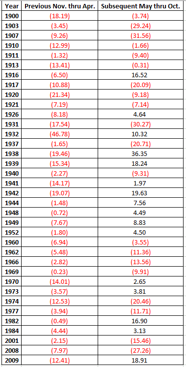
Figure 3
displays the year-by-year results, i.e., column 2 shows the Nov. through Apr.
decline and column 3 displays the Dow % + (-) over the next six months.
Figure 3 –
Year-by-year results
Summary
If the Dow
ends April 2020 with a 6-month loss does that mean that the market is “doomed”
to decline in the following 6 months.
Obviously not, as historically gains have followed 44% of the time.
However, it also would be another sign that caution would be in order.
Jay
Kaeppel
Disclaimer: The information, opinions and ideas expressed herein are for
informational and educational purposes only and are based on research conducted
and presented solely by the author. The
information presented does not represent the views of the author only and does
not constitute a complete description of any investment service. In addition, nothing presented herein should
be construed as investment advice, as an advertisement or offering of
investment advisory services, or as an offer to sell or a solicitation to buy
any security. The data presented herein
were obtained from various third-party sources.
While the data is believed to be reliable, no representation is made as
to, and no responsibility, warranty or liability is accepted for the accuracy
or completeness of such information.
International investments are subject to additional risks such as
currency fluctuations, political instability and the potential for illiquid
markets. Past performance is no
guarantee of future results. There is
risk of loss in all trading. Back tested
performance does not represent actual performance and should not be interpreted
as an indication of such performance.
Also, back tested performance results have certain inherent limitations
and differs from actual performance because it is achieved with the benefit of
hindsight.
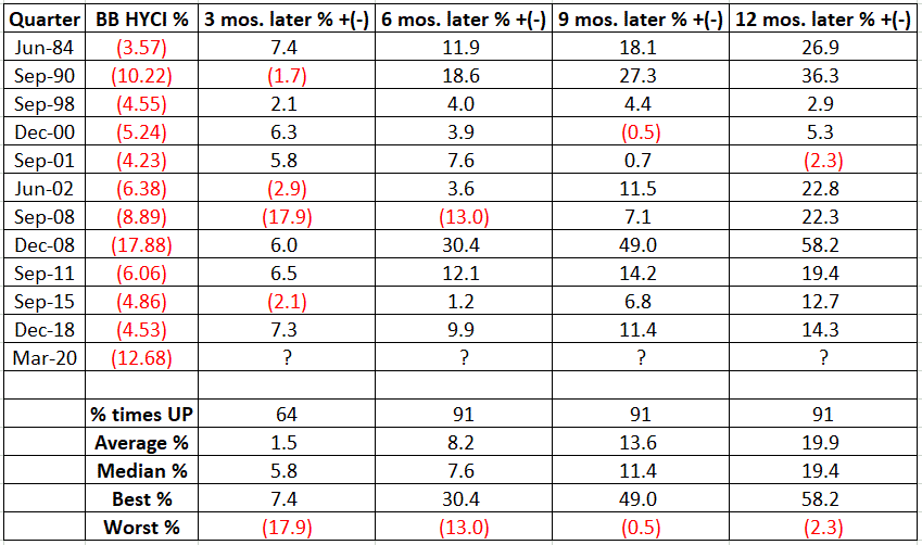
High-yield corporate bonds suffered – no surprise – a terrible 1st quarter of 2020. The Bloomberg Barclays High Yield Corporate Index (heretofore HYCI) experienced its 2nd worst quarter ever, losing -12.68%. This is obviously bad news. Or is it? Well if you were invested then, the answer is “yes”. But going forward, the answer is not so clear cut. First the potential Good News.
Figure 1
displays 11 previous instances when the HYCI lost -3.5% or more during a given
quarter, and the performance of the index in the subsequent 3, 6, 9- and
12-month periods.
Figure 1 –
Bloomberg Barclays High Yield Corporate Index performance after a quarter lost
-3.5% or more; 1983-2020
Figure 2
displays the cumulative growth of the HYCI if held for 12 months after each of
the worst quarters displayed in Figure 1.
Figure 2 –
Cumulative % +(-) for Bloomberg Barclays in 12 months after quarter than saw a
decline of -3.5% or more; 1983-2020
Clearly, the results displayed in Figures 1 and 2 are favorable and the implication is that junk bonds “should” do well in the next 6 to 12 months. This seems like an optimal time to invoke the “past performance does not guarantee future results” mantra.
The Potential
Bad News
The outlook for corporate bonds – especially bonds of companies that were already on less than investment grade ground – going forward is more than just “murky”, it is essentially unknown and entirely unpredictable.
On one hand a
person can easily construct a “best case” outlook and project that the economy
will rebound quickly once things are opened up again. At the same time, it is just as easy to envision
a pretty harrowing “worst case” scenario, one which involves a lot of companies
defaulting/going bankrupt/etc. in light of the recent economic shutdown.
Anyone who tries
to tell you with great certainty that it will be one of these scenarios – or somewhere
in between – is merely guessing.
Summary
The bottom
line: For an investor willing to assume the risk, high yield bonds appear to be
offering a decent “contrarian” bullish opportunity. As always, I am not making a “recommendation”,
just alerting you to, a) history, and b) the unique risks going forward.
An investor interesting
in making this play could buy a mututal fund such as VWEHX, or an ETF such as
HYG or JNK.
But whatever
you do…. don’t bet the ranch.
Jay
Kaeppel
Disclaimer: The information, opinions and ideas expressed herein are for
informational and educational purposes only and are based on research conducted
and presented solely by the author. The
information presented does not represent the views of the author only and does
not constitute a complete description of any investment service. In addition, nothing presented herein should
be construed as investment advice, as an advertisement or offering of
investment advisory services, or as an offer to sell or a solicitation to buy
any security. The data presented herein
were obtained from various third-party sources.
While the data is believed to be reliable, no representation is made as
to, and no responsibility, warranty or liability is accepted for the accuracy
or completeness of such information.
International investments are subject to additional risks such as
currency fluctuations, political instability and the potential for illiquid
markets. Past performance is no
guarantee of future results. There is
risk of loss in all trading. Back tested
performance does not represent actual performance and should not be interpreted
as an indication of such performance.
Also, back tested performance results have certain inherent limitations
and differs from actual performance because it is achieved with the benefit of
hindsight.
Generally speaking,
when it comes to investment portfolios, the 3 key questions are:
*How much
does it make?
*How much
does it normally fluctuate along the way?
*How bad does
it get hit when things go wrong?
The first question
is important because of the obvious fact that people want to make money. The other two matter a lot because different people
have different levels of risk tolerance.
If an individual invests in a manner that is “too volatile” for their
own risk tolerance there is a danger that they won’t “stick to the plan” when
things get rough.
In any event,
the real point for the purposes of this piece is that for the last 5 to 10
years the only question that most people focused on was “how much does it make?” Because there really wasn’t a whole lot of
volatility – particularly downside volatility to deal with. Sure, there were downdrafts (2012, 2015, 2018),
but for the most part they were very short-lived. So, by the time an investor realized that maybe
they should be worried, the market had already turned back to the upside.
Ah, for the “good
old days”.
In 2020
investors were abruptly reminded that – uh, paraphrasing here – “stuff happens”,
and that being prepared to deal with downside volatility is still very much a
part of the equation. So, this piece will
look at one “portfolio approach”, and then attempt to “dial it up” just a bit.
The “Permanent
Portfolio”
The impetus for this piece comes from this article on www.SeekingAlpha.com from an author who goes by “Greybeard Retirement.” His piece grew from work originally done by Harry Browne in the 1980’s. The portfolio consists of:
*25% stocks
*25%
long-term U.S. bonds
*25% money
market
*25% gold
The only change that I will make to this lineup is to replace money-markets with 1-3 year treasuries.
Data Used
In order to
generate the longest test possible, I am using index monthly total return data
rather than actual mutual fund data, as follows starting in January 1976:
Stocks: S&P 500 Index
Long-term treasuries: Bloomberg Barclays Long Treasury Index
Short-term treasuries: Bloomberg Barclays 1-3 Year Treasury Index
Gold: S&P Gold Spot Price Index
The Method
I rebalance
the portfolio on January 1 each year so that each of the 4 categories starts
the year as 25% of the portfolio.
Then we just
hold the portfolio for the rest of the year.
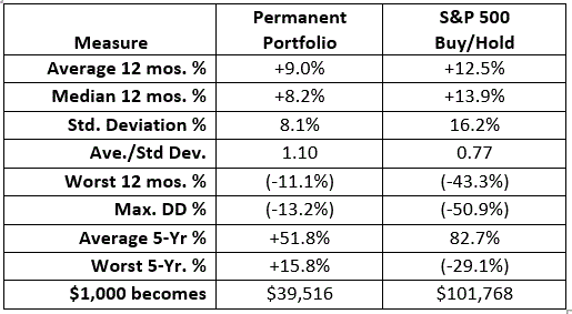
The Results
Figure 1 displays
the equity curve and Figure 2 the summary results.
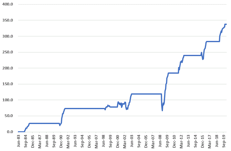
Figure 1 – Growth of $1,000 for Permanent Portfolio (1976-2020)
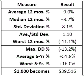
If you are
looking for “steady growth” the results look pretty appealing. At least until you consider an alternative
such as the one that gain great popularity in the last 5 years – just buying
and holding an S&P 500 Index fund.
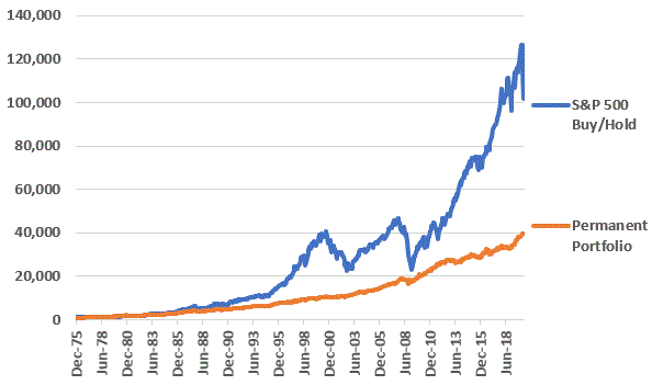
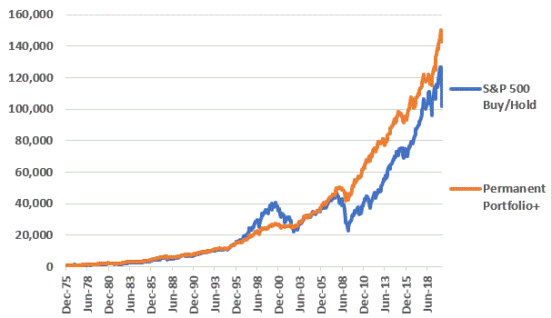
Figures 3 and
4 compare the Permanent Portfolio to buying and holding the S&P 500 Index.
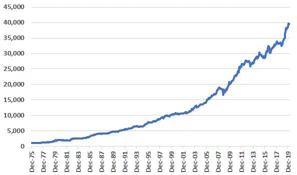
Figure 3 – Growth of $1,000 for Permanent Portfolio versus S&P 500 Buy/Hold (1976-2020)
Beauty is in
the eye of the beholder, so I am not going to try to tell you what you are
supposed to take away from this. I will simply point out the tradeoff:
*Buying and
holding the S&P 500 Index will generally be expected to generate for gross
return over time, with:
-a much
higher degree of downside volatility
-a higher
instance of extended periods of sideways activity (ex., 2000 to 2012 no net
gain)
So is there a
way to:
*Use the
Permanent Portfolio
*Generate
comparable gains to buying-and-holding the S&P 500 Index
The Slightly
More Aggressive Permanent Portfolio (Permanent Portfolio+)
We will refer to this approach as Permanent Portfolio+. For this test we will use the exact same data with one exception:
*For the
S&P 500 Index portion of the portfolio we will use leverage of 2-to-1 (in
real-world investing this would be accomplished by holding a 2x mutual fund or ETF)
Does this
make a difference? You be the
judge. Figures and 5 and 6 display the
results for the Permanent Portfolio+ versus buying and holding the S&P 500
Index.
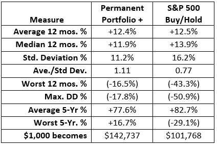
Figure 5 – Growth of $1,000 for Permanent Portfolio+ versus S&P 500 Buy/Hold (1976-2020)
The two key
things to note regarding the Permanent Portfolio+ are:
*It gained
40% more than S&P Buy/Hold
*Had a
standard deviation of 11.2% versus 16.2% versus S&P Buy/Hold
*Had a Worst
12 months of -16.5% versus -43.3% versus S&P Buy/Hold
*Had a Maximum
Drawdown of -17.8% versus -50.9% versus S&P Buy/Hold
*Had a Worst
5-years of +16.7% versus -29.1% versus S&P Buy/Hold
Summary
So, in the Permanent Portfolio+ the “be all, end all” of investing. Probably not. For the record, it lags buying-and-holding the S&P 500 much of the time and mostly outperforms by holding up well during bear markets.
Of course, that’s kind of the point, isn’t it?
In any event, as always I am not “recommending” that anyone adopt this as their approach to investing. But it is food for thought. As a potentially lower volatility alternative to just buying and holding the stock market, the Permanent Portfolio and the Permanent Portfolio+ seems to show some promise.
Jay
Kaeppel
Disclaimer: The information, opinions and ideas expressed herein are for
informational and educational purposes only and are based on research conducted
and presented solely by the author. The
information presented does not represent the views of the author only and does
not constitute a complete description of any investment service. In addition, nothing presented herein should
be construed as investment advice, as an advertisement or offering of
investment advisory services, or as an offer to sell or a solicitation to buy
any security. The data presented herein
were obtained from various third-party sources.
While the data is believed to be reliable, no representation is made as
to, and no responsibility, warranty or liability is accepted for the accuracy
or completeness of such information.
International investments are subject to additional risks such as
currency fluctuations, political instability and the potential for illiquid
markets. Past performance is no
guarantee of future results. There is
risk of loss in all trading. Back tested
performance does not represent actual performance and should not be interpreted
as an indication of such performance.
Also, back tested performance results have certain inherent limitations
and differs from actual performance because it is achieved with the benefit of
hindsight.
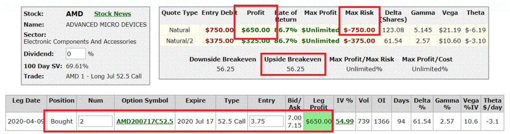
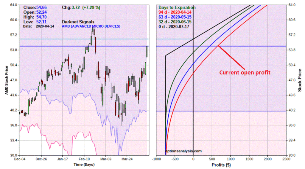
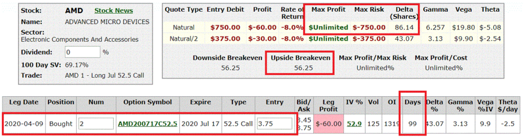
In this article I wrote about an example intended to highlight a speculative trade designed to play the bullish side of the market for ticker AMD. The position involved simply buying a 2-lot of an out-of-the-money July call option.
Well, lo and
behold AMD has jumped from $48.38 to $54.66 and the trade now looks like what
you see in Figures 1 and 2.
Now here is
where things can get interesting for an alert options trader. Recall form the original article that the
tentative price target (generated by the Elliott Wave count using ProfitSource
by HUBB) was $64 a share. So, there is a
ways left to go before that happens.
However, an
option trader does NOT necessarily have to “sit around and wait.” Rather than going into a long discussion of “could
do this” or “might do that”, let’s look at one simple adjustment and see how
the adjusted trade compares to the original position.
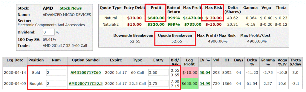
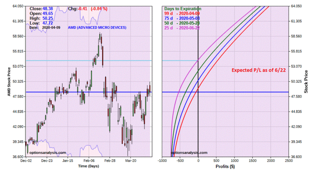
The
Adjustment
To adjust
this trade, we will simply sell 2 July 60 calls @ $3.60 apiece. For the record, this may be premature – ideally,
we would want to sell them for $3.75, which is what we paid for the call
options we bought. Selling the 60 calls
at $3.75 or higher (maybe via a limit order?) would completely eliminate the
risk of loss. But for the sake of
completing the example, let’s continue.
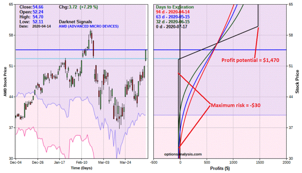
New adjusted
trade would look like what appears in Figures 3 and 4.
*The
reduction of risk (the original trade can still lose -$750, the adjusted trade
-$30 at most)
*You retain
most of the upside potential up to AMD at $64 (at expiration, if AMD is at $64
a share the original trade shows a profit of roughly +$1,550, the adjusted
trade would show a profit of $1,470)
If you DO make
the adjustment:
*You retain much of the upside potential while eliminating most of the downside risk.
On the
other hand:
*If AMD really does take off and soar the original position enjoys unlimited profit potential, while the adjusted trade has a maximum profit of +$1,470.
One other possibility:
*A little patience might allow AMD to rise even more, which could allow us to sell the July 60 call at a price higher than $3.75, which would completely eliminate the risk of loss.
Decisions,
decisions….
Jay
Kaeppel
Disclaimer: The information, opinions and ideas expressed herein are for
informational and educational purposes only and are based on research conducted
and presented solely by the author. The
information presented does not represent the views of the author only and does
not constitute a complete description of any investment service. In addition, nothing presented herein should
be construed as investment advice, as an advertisement or offering of
investment advisory services, or as an offer to sell or a solicitation to buy
any security. The data presented herein
were obtained from various third-party sources.
While the data is believed to be reliable, no representation is made as
to, and no responsibility, warranty or liability is accepted for the accuracy
or completeness of such information.
International investments are subject to additional risks such as
currency fluctuations, political instability and the potential for illiquid
markets. Past performance is no
guarantee of future results. There is
risk of loss in all trading. Back tested
performance does not represent actual performance and should not be interpreted
as an indication of such performance.
Also, back tested performance results have certain inherent limitations
and differs from actual performance because it is achieved with the benefit of
hindsight.
Before
proceeding, lets quickly review the title of this piece and its
implications. First off, please note
that it is NOT titled “A Solid Long-Term Low Risk-Investing Plan for
Semis”. Which is good, because there
really isn’t any of that in what follows.
What in fact follows is a discussion of an extremely speculative
approach to trading.
Are we
clear? Great, let’s proceed.
The Keys
to Successful Speculation
The first key
to successful speculation is money management.
In as few words as possible the phrase to remember is “bet small.’
Too often an
individual gets bit by the “I want to make a lot of money, so I guess I’ll risk
a lot of money in order to make a lot of money” bug. And that is the downfall. So remember, bet small. Risking a little to make a lot is better than
risking a lot to make a lot.
The next two
things are:
*Spotting
opportunity
*Finding a
trade to take advantage of the opportunity
Spotting
opportunity can come from anywhere, but generally speaking you want the odds to
be in your favor as much as possible.
Finding a
trade – for most traders – involves buying shares of a stock or ETF. In this article we will use options as an
alternative.
Ticker AMD
For this
piece we will focus on ticker AMD. As
always, the example trades highlighted on JOTM are just that, examples. I am not making any “predictions” nor “recommendations”. In fact, AMD is a tad “overbought” (if one
looks at the 3-day RSI for AMD), so in a perfect world I might even consider waiting
for at least a slight pullback before acting on the example idea below. But I am getting ahead of myself.
For the record, I am not a huge Elliott Wave guy, however, I do pay attention on those occasions when the daily AND weekly wave counts align to either the bullish or bearish side.
For Elliott Wave counts I rely on ProfitSource by HUBB. The reality is that it is hard to get two “Elliott Heads” to agree on the correct current wave count for much of anything, and I personally have no ability whatsoever to “count waves” in any objective or useful manner. Which is why I like the fact that ProfitSource – for better or worst – has an objective built in algorithm for doing so.
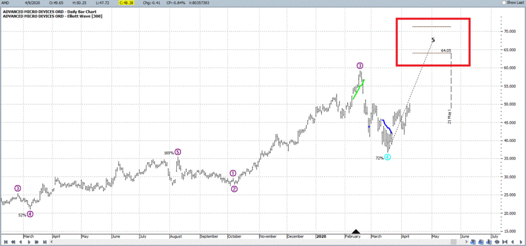
Figure 1
displays the daily Elliott Wave count for ticker AMD, which is projecting a
Wave 5 advance to the $64-$71 a share range sometime between late April and
late May. Sounds optimistic to me, but
there you have it.
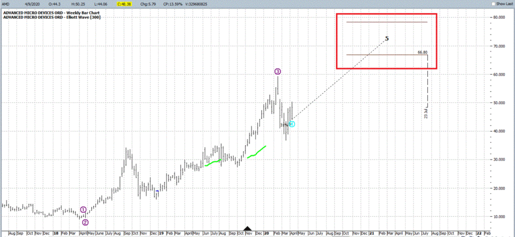
Figure 2
displays the weekly Elliott Wave count for ticker AMD, which is projecting a
Wave 5 advance to the $66-$78 a share range sometime between mid-October and
July 2021.
Will either
of these counts prove prescient? It
beats me. What does get my attention is
that both the daily and weekly are projecting Wave 5 advances at the same time.
As I
mentioned earlier, one of the keys is putting the odds on your side. So, let’s look at a few more potential
“pieces of the puzzle.”
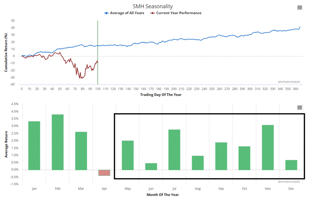
Figure 3
displays the annual seasonal trend for ticker SMH – which is an ETF that tracks
the semiconductor industry. Note that we
are now past the typical period of weakness and that the seasonal trend going
forward is positive. At the very least,
we are not sailing into any seasonal headwinds.
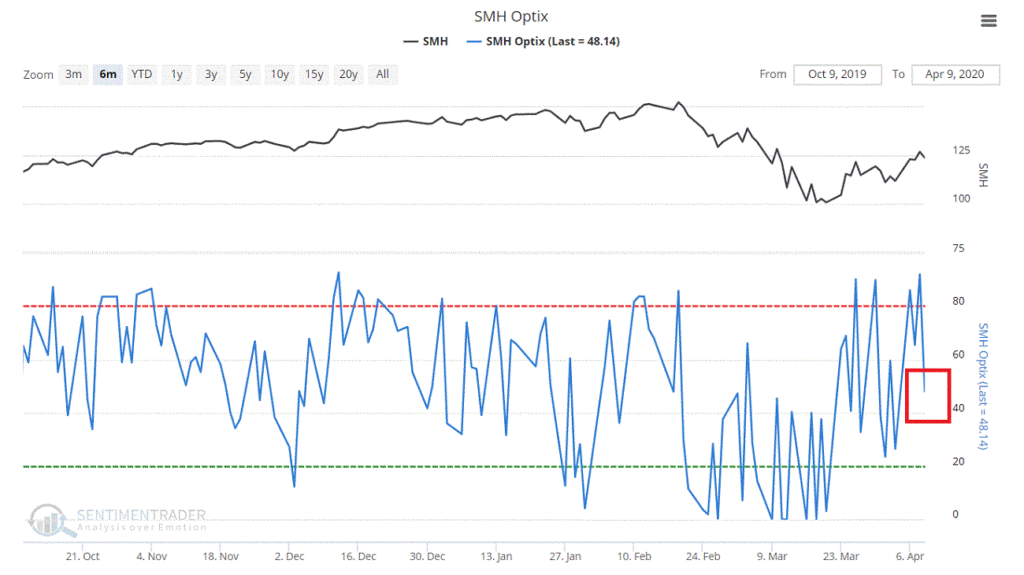
Figure 4
displays trader sentiment towards the semiconductor industry. Note that this is generally a contrary
indicator – i.e., low readings suggest bearish sentiment is overdone and high
readings suggest bullish sentiment is overdone.
Note that sentiment WAS overly bullish buy is now neutral. While this is not necessarily a positive, the
point is that at the moment it is NOT a negative working against semiconductor
stocks.
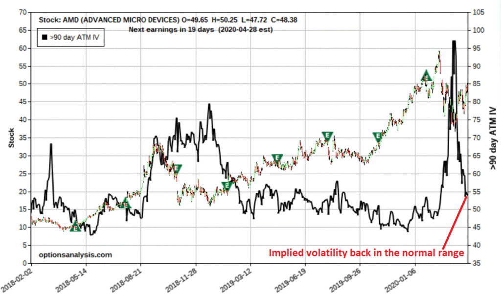
Figure 5
displays the price chart for AMD with the 90-day option implied volatility
(black line). Note that after the big
“spike”, IV has now declined back down to the normal range. In other words, while AMD options may not
necessarily be “cheap”, they also are NOT “expensive.”
If one is
bullish on AMD the most straightforward play is simply to buy shares of
AMD. For sake of example, we will make
the following assumptions:
*The daily
wave count will prove accurate and AMD will rally towards 64 sometime in the
next several months (this is NOT a prediction I am making, just an example
assumption that a trader must either make – or not make, when deciding, a)
whether or not to trade in the first place, and if so, b) which trade to make
*We are
willing to risk a maximum of 3% of our capital.
For sake of example we will assume of $25K trading account, so 25K x 3%
= $750 maximum risk we will take
Given all of
the this a trader might consider buying 2 July2020 52.5 AMD calls at $3.75 as
shown in Figures 6 and 7
The good news
is that this trade gives us unlimited upside potential for a cost of $750 for a
2-lot. The bad news is that with the
stock presently trading at $48.38, the stock MUST advance 16% in price between
now and mid-July in order to even breakeven.
Hence the use
of the word “speculation.” In other
words, AMD MUST rally sharply in the next 3+ months or this trade will lose
money.
Remember though that the catalyst for the trade is the belief that the Elliott Wave count will prove accurate and that AMD will in fact rally strongly. If you don’t believe that then there is no reason to make this trade in the first place.
A Closer
Look
*The daily EW
count suggested that AMD would reach $64.05.
*We also know
that the recent low is AMD was $36.75.
*So, let’s
zoom in and take a closer look at “where this trade lives” – which is between
$36.75 and $64.05 between now and 6/22 (which is 25 days prior to option
expiration – most time decay would occur between that day and July expiration).
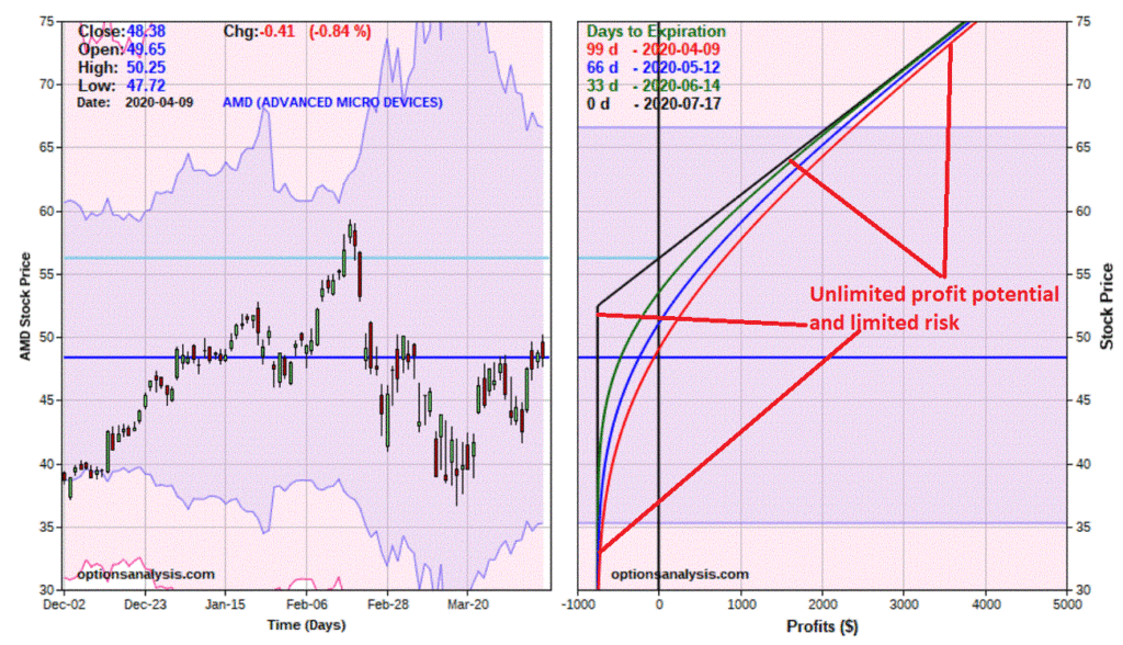
*Figure 8
displays the risk curves for this trade as of 6/22, which is 25 days prior to
option expiration (and before most of the time decay will occur as the option
gets closer to expiration).
Figure 8 –
AMD call risk curves as of 25 prior to option expiration (Courtesy www.OptionsAnalysis.com)
*If AMD DOES
reach $64.05 a share this trade will show an open profit of roughly $1600 to
$1950, depending on whether that price level is reach later or sooner.
*If AMD is
below $54.32 on June 22nd chances are this trade will be showing a
loss
*If AMD sinks in price, this trade will absolutely, positively lose most of its value.
The bottom line: If you are not willing to bet on a sharp advance in AMD shares in the next several months, and/or if you are unwilling or unable to risk $750, then this trade is to be avoided.
Summary
Is making a
bullish bet on AMD a good idea? I am not
saying that it is or is not. Please
remember, this is NOT a “recommendation.”
I am merely highlighting several factors that a trader “might” consider
to be favorable signs (bullish daily and weekly EW counts, positive
seasonality, no negative sentiment headwind, option volatility back in a normal
range (i.e., option premiums are not “expensive”, etc.).
Does any of
this mean that the example trade will end up profitable? Not at all.
Hence the reason:
a) only 3% of
total capital is committed to the trade, and
b) it is
clearly labeled as “speculation.”
One last
note: A trader might also consider buying a longer-term option to give AMD more
time to “move.” The upside is that you
may have more time for AMD to stage an advance.
The potential negatives are:
a)
longer-term options are more expensive that shorter-term options,
b) bid/ask
spreads tend to be wider,
c)
longer-term options are affected more by changes in implied volatility (if AMD
does rally, chances are IV will decline more, thus a longer-term option may lose
more time premium due solely to a change in IV than a shorter-term option)
A
lot to chew on for a silly little speculative trade, no? But remember, if you want to succeed in
speculating in the long run, remember these words:
“Nothing
worth doing is ever easy”
(Sorry,
but I don’t make the rules…)
Jay
Kaeppel
Disclaimer: The information, opinions and ideas expressed herein are for
informational and educational purposes only and are based on research conducted
and presented solely by the author. The
information presented does not represent the views of the author only and does
not constitute a complete description of any investment service. In addition, nothing presented herein should
be construed as investment advice, as an advertisement or offering of
investment advisory services, or as an offer to sell or a solicitation to buy
any security. The data presented herein
were obtained from various third-party sources.
While the data is believed to be reliable, no representation is made as
to, and no responsibility, warranty or liability is accepted for the accuracy
or completeness of such information.
International investments are subject to additional risks such as
currency fluctuations, political instability and the potential for illiquid
markets. Past performance is no
guarantee of future results. There is
risk of loss in all trading. Back tested
performance does not represent actual performance and should not be interpreted
as an indication of such performance.
Also, back tested performance results have certain inherent limitations
and differs from actual performance because it is achieved with the benefit of
hindsight.
Leveraged funds hold a certain allure to traders and investors. “Gee, if I can make 10% with a standard fund or ETF, I can make 20% – or even 30% – with a 2x or 3x leveraged fund.” Uh, yeah, about that….
First off most leveraged funds reset on a daily basis, which – without going into the full explanation – means that if you hold a 2x fund for 3 months and the underlying index goes up 20% it does NOT necessarily mean that you are going to make 40% (sorry, I don’t make the rules, nor did I invent math).
In addition, when things go wrong with a leveraged fund, they often go really wrong! See this article about an entire slew of leveraged ETFs that in some circles garnered a fair amount of interest – right up until March 2020 when they ceased to exist!
I actually
have a few more caveats, but they are more directly related to the “strategy” that
I am about to show you, so I will get to those a little later.
How To Use
Leveraged Funds
In a word,
the answer is “conservatively.” “But
wait, I am using a leveraged fund because I want to be aggressive.” You are, just by using a leveraged fund. The problem is simple:
“If you focus
too much on the reward side of the equation you ignore the risk side of the
equation”
And ignoring
the risk side of the equation is what gets you killed. So let’s consider an alternative.
A “Diversified
Leveraged Strategy”
As always, I
am NOT “recommending” that anyone rush out and adopt the strategy that
follows. It is presented as “food for thought”
and to highlight the gist of (at least in my market-addled mind) the proper
mindset to have when using leveraged funds.
This strategy
splits capital between 3 securities:
*The S&P
500 Index
*Long-term
treasury bonds
*Intermediate-term
treasury bonds
But it’s a
little more involved than that.
Specifically:
*25% in a 3x
leveraged S&P 500 Index ETF
*25% in a 3x leveraged
long-term treasury ETF
*50% in a non-leveraged
intermediate-term treasury ETF
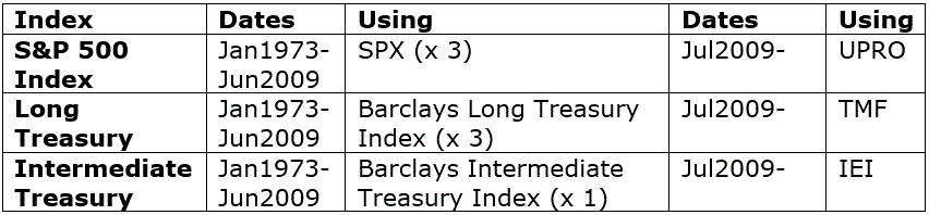
The Data Used
We will use
ticker UPRO to trade the S&P 500 Index, ticker TMF to trade long-term
treasuries and ticker IEI to trade intermediate-term treasuries. Both UPRO and TMF are triple-leveraged ETFs.
NOTE: All 3 of these funds existed by July 2009, so we will start using actual monthly total return for those ETFs then. However, in order to generate a longer test we will use index data starting in January 1973. So, the actual data used is as follows:
Figure 1
– Data Used
Portfolio
Construction
On January 1st
every year we will rebalance the portfolio to hold:
S&P 500 Index (x3): 25%
Long-Treasuries (x3): 25%
Intermediate Treasuries (x1): 50%
For
comparison’s sake we will compare the performance to that of a fully
non-leveraged portfolio (using index data only)
The
Results
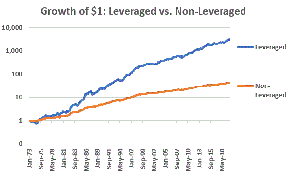
Figure 2 displays
the growth of $1 using both a leveraged approach and a non-leveraged approach.
Figure 2 – Growth of $1 Leveraged approach versus non-leveraged approach (Logarithmic scale)
Figure 3 displays
the comparative numbers
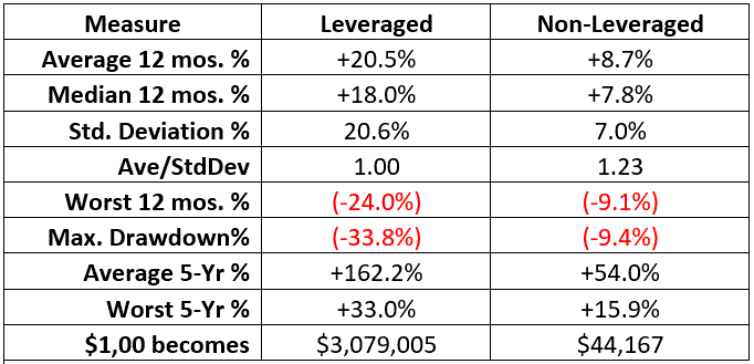
Figure 3 – Comparative Facts and Figures (Jan1973-Mar2020)
The bottom
line, if you want low risk and low volatility, the non-leveraged approach generated
an 8.7% average annual return with a maximum drawdown of -9.4%. $1,000 grew to $44,167 over roughly 47+
years.
Willing to “roll
the dice” (and able to stomach much bigger swings in equity)? The leveraged approach generated a 20.5%%
average annual return with a maximum drawdown of -33.8%. $1,000 grew to over $3 million dollars over
roughly 47+ years.
Looking for
something in between? A 10% leveraged
SPX, 15% leveraged long treasury and 75% non-leveraged intermediate-term
treasury approach (NOT SHOWN) generated a 13.4%% average annual return with a
maximum drawdown of -14.7%. $1,000 grew
to over $288,000 over roughly 47+ years.
Discussion
of Results
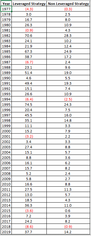
Figure 4
displays the hypothetical annual results for both the leveraged and
non-leveraged versions.
Figure 4 – Year-by-Year Hypothetical Results
In theory,
and investor using the originally leveraged strategy detailed above would have accumulated
a great deal of wealth over the past 47 years.
This is an illustration of the potential usefulness of leverage – AS LONG
AS the leverage is “managed” (i.e., in this case, we had a large allocation to
low volatility intermediate-term treasuries).
Now for some
caveats for anyone thinking “hmm, maybe I should do this.”
*The last 47
years have been most extraordinarily bullish for both stocks and bonds, particularly
long-term bonds, as interest rates have gone from 15%+ to less than 1% since the
early 1980’s.
*There is no
guarantee that the stock market will perform anywhere near as well in the years
ahead as it did since 1973.
*And we can
be certain that bond performance will look different in the future as there is
only so much further that interest rates can fall.
*Of
particular note is that both the leveraged and non-leveraged versions show a
GAIN through the first three months of 2020.
The leveraged version showed a drawdown of just -3.8% in March.
Summary
The real lesson is
this: Leveraged funds used aggressively will more than likely end in
disaster. So don’t do that.
Jay
Kaeppel
Disclaimer: The information, opinions and ideas expressed herein are for
informational and educational purposes only and are based on research conducted
and presented solely by the author. The
information presented does not represent the views of the author only and does
not constitute a complete description of any investment service. In addition, nothing presented herein should
be construed as investment advice, as an advertisement or offering of
investment advisory services, or as an offer to sell or a solicitation to buy
any security. The data presented herein
were obtained from various third-party sources.
While the data is believed to be reliable, no representation is made as
to, and no responsibility, warranty or liability is accepted for the accuracy
or completeness of such information.
International investments are subject to additional risks such as
currency fluctuations, political instability and the potential for illiquid
markets. Past performance is no
guarantee of future results. There is
risk of loss in all trading. Back tested
performance does not represent actual performance and should not be interpreted
as an indication of such performance.
Also, back tested performance results have certain inherent limitations
and differs from actual performance because it is achieved with the benefit of
hindsight.
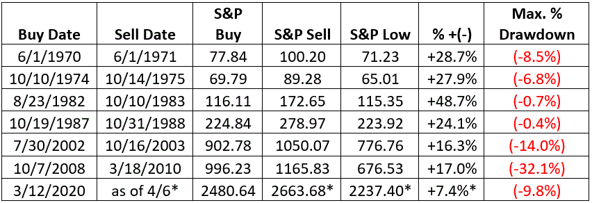
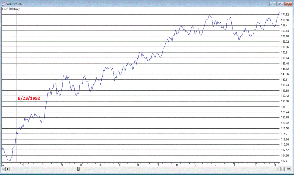
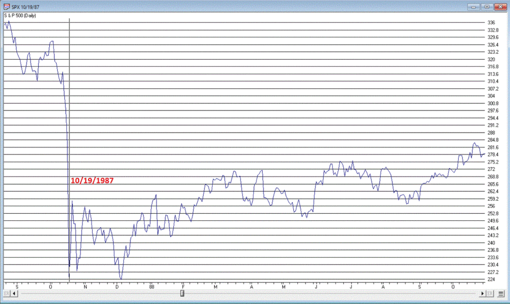
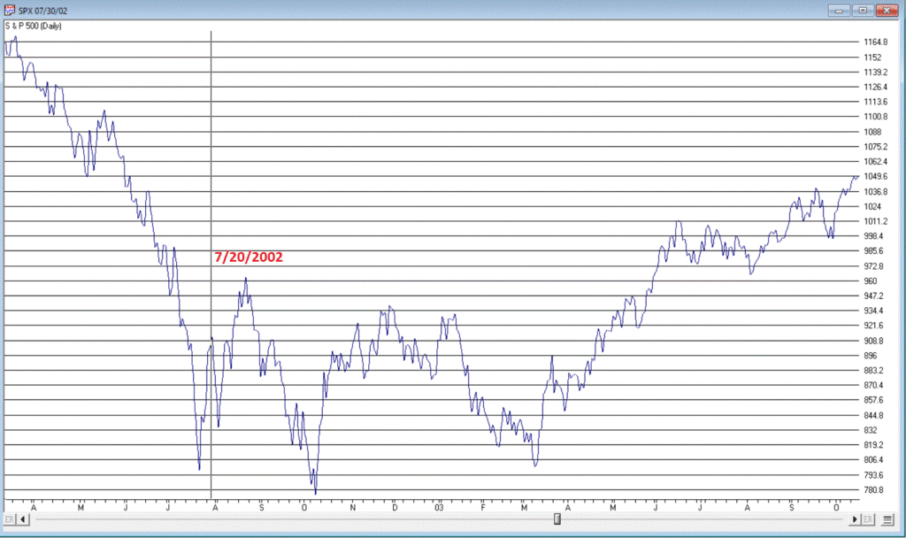
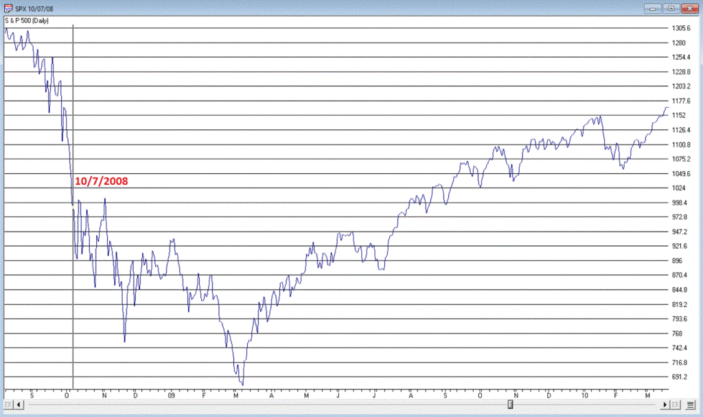
In this article I highlighted the fact that a big number of new highs OR new lows can be bullish for the stock market. As it turns out, a big price movement – either up or down – can also have the same effect.
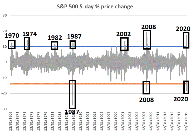
The kernel of knowledge for today comes from the work of Wayne Whaley, who last I knew worked at Witter & Lester. The truth is I kind of lost touch with Wayne in recent years, but the relevant fact is that he does a lot of very unique market analysis. Like this for instance:
*A = 5 day % change in price for the S&P 500 Index
*If A is >= +10.00% OR A is <= -13.85% it appears to be bullish for the stock market
To quantify a little bit let’s add the following rules:
*If A is >= +10.00% OR A is <= -13.85% then hold the S&P 500 Index for 252 trading days (ostensibly 1-year)
*If a buy signal is already in force and another signal occurs then extend the holding period for another 252 trading days
For lack of a better name we will refer to this “indicator” as WW (in Wayne’s honor). Figure 1 displays the 5-day% change in price for the S&P 500 Index starting in 1970.
One cannot
discount the potential for more downside in the market. Remember that following the October 2008 WW signal
the market worked its way 32% lower over the next 4.5 months.
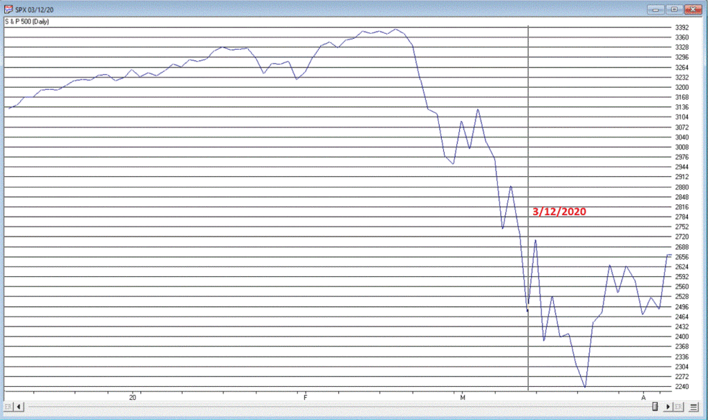
Still, if
history is an accurate guide, we may look back on March 2020 as an opportunity
on a par with 1970, 1974, 1982, 1987, 2002 and 2008.
Here’s
hoping.
Jay
Kaeppel
Disclaimer: The information, opinions and ideas expressed herein are for
informational and educational purposes only and are based on research conducted
and presented solely by the author. The
information presented does not represent the views of the author only and does
not constitute a complete description of any investment service. In addition, nothing presented herein should
be construed as investment advice, as an advertisement or offering of
investment advisory services, or as an offer to sell or a solicitation to buy
any security. The data presented herein
were obtained from various third-party sources.
While the data is believed to be reliable, no representation is made as
to, and no responsibility, warranty or liability is accepted for the accuracy
or completeness of such information.
International investments are subject to additional risks such as
currency fluctuations, political instability and the potential for illiquid
markets. Past performance is no
guarantee of future results. There is risk
of loss in all trading. Back tested
performance does not represent actual performance and should not be interpreted
as an indication of such performance.
Also, back tested performance results have certain inherent limitations
and differs from actual performance because it is achieved with the benefit of
hindsight.
History suggests (see data below) that now is the time to be looking to increase exposure in the mid-cap space. Ironically, now is the time when investors are most likely to look away. Same as it ever was when it comes to investor psychology.
In the 1st quarter of 2020, the S&P 400 Midcap Index suffered its worst quarterly loss since it was first created in 1981. While this was a painful gut punch and may naturally cause reactive investors to turn away from mid-caps, if history is a guide mid-caps may be setting up to perform exceptionally well on a relative and absolute basis in the short-term as well as over the next 5 years.
Chances are good we will look back at the current period as a good time to increase exposure to the Mid-cap sector. Consider the following…
The
Historical Record
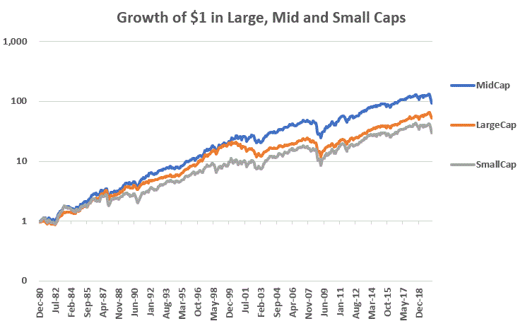
The S&P 400 Midcap Index has been a stellar performer over time, handily outpacing large-cap and small-cap stocks. Figure 1 displays a logarithmic chart displaying the growth of $1 invested since January 1981 on a buy-and-hold basis for:
*Mid-Caps – S&P 400 Index (blue): +9,246%
*Large-Caps – S&P 400 Index (orange): +5,171%
*Small-Caps: Russell 2000 (grey): +2,853%
Figure 1 –
Mid-cap, Large-cap and Small-cap; Growth of $1, 1981-2020
As you can
see, since the S&P 400 Midcap Index was created in 1981, mid-caps have
outperformed large-caps by a factor of 1.79-to-1 and small-caps by a factor of
3.24-to-1.
Surprisingly,
very few investors are aware of this.
Most investors tend to be lured to the “growth potential” of small-caps and/or the “steady nature” of “established” large-caps (i.e., this is often code for “companies whose name I recognize”). But the long-term record clearly points to the fact that the mid-cap space is “where the growth is.”
The simplest explanation backing this theory states that “mid-caps are former small cap on their way to becoming large caps”, i.e., it’s where the growth is.
What the
Historical Record Says About Potential Future Performance
While the
performance of mid-caps has been abysmal in early 2020, history suggests that
this dismal performance may be setting the stage for a significant bounce back. To wit:
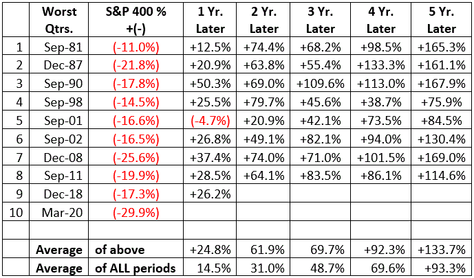
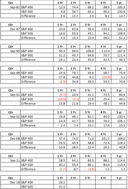
Figure 2 displays S&P 400 performance 1 to 5 years after the worst quarterly performances for the index since it was first calculated in 1981.
Figure 2 – Worst Quarters for S&P 400 MidCap Index and subsequent forward performance
Note that the average 1, 2, 3, 4 and 5 year forward performance handily outperformed the average performance for ALL 1, 2, 3, 4- and 5-year periods.
Regarding the
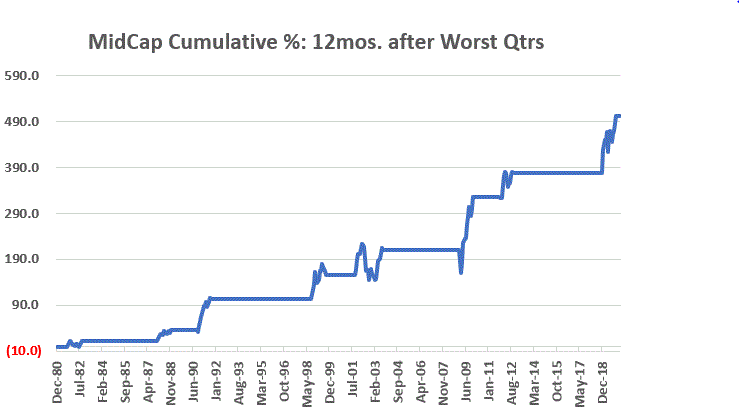
next 12 months, Figure 3 displays the cumulative growth for the S&P 400
Index during the 12 months following each of the dates listed in Figure 2.
Figure 3 – Cumulative performance Mid-caps held ONLY during the 12-months following each of the worst quarters for S&P 400 Index listed in Figure 2
Mid-Caps
vs. Large-Caps after Mid-Caps experience exceptionally bad quarter
The tables below display the returns for mid-caps AND large-caps over 1 to 5-year periods directly AFTER Mid-Caps experience a quarterly decline of -11% or more, and the difference in performance between the two.
NOTE: Except for the 1-year performance after the Dec-2018 signal, Mid-Caps have outperformed Large-Caps over every time frame with rare exceptions.
Figure 4 –
Mid-Caps invariably outperform S&P 500 after experiencing a large quarterly
loss
Summary
Emotion has a strong impact on investors. When a security suffers a large loss, human nature tends to make investors believe that that security should be avoided. But quite often this is exactly the time that investors should be flocking to a given security as the back-and-forth nature of markets sets the stage for a strong rebound.
Large-cap stocks have been the “go to” segment during much of the recent bull market and in the early stages of the current decline. History strongly suggests that this trend will not last forever, and that a powerful reversion to the mean will soon favor the mid-cap space once again.
Well I’ve been meaning to make a video, so since I am trapped here at home I figured “why not now?” Please click the link below to see my video discussing all kinds of things related to the big picture, long-term outlook as well as the current trend, and prospects for the market for the next 12 months.
Disclaimer: The information, opinions and ideas expressed herein are for
informational and educational purposes only and are based on research conducted
and presented solely by the author. The
information presented does not represent the views of the author only and does
not constitute a complete description of any investment service. In addition, nothing presented herein should
be construed as investment advice, as an advertisement or offering of
investment advisory services, or as an offer to sell or a solicitation to buy
any security. The data presented herein
were obtained from various third-party sources.
While the data is believed to be reliable, no representation is made as
to, and no responsibility, warranty or liability is accepted for the accuracy
or completeness of such information.
International investments are subject to additional risks such as
currency fluctuations, political instability and the potential for illiquid
markets. Past performance is no
guarantee of future results. There is
risk of loss in all trading. Back tested
performance does not represent actual performance and should not be interpreted
as an indication of such performance.
Also, back tested performance results have certain inherent limitations
and differs from actual performance because it is achieved with the benefit of
hindsight.
They
always say you should buy when there is “blood in the street.” They also say, “buy them when nobody wants
them.” So, let’s consider today what
could be the most unloved, bombed out, everybody hates it “thing” in the world
– coal.
Ugh,
just the mention of the word coal elicits a recoiling response. “Dirty energy!” “Climate change inducing filth!” “Ban
coal!”. And so and so forth. And maybe they have a point. But “they” also say “facts are stubborn
things” (OK, for the record, I think it’s a different “they” who says that but
never mind about that right now).
So here is a stubborn fact: coal supplies about a quarter of the world’s primary energy and two-fifths of its electricity. As I write, two of the fastest growing economies (at least they were as of a few months ago) – China and India – are not only heavily reliant upon coal for energy, but are still building more and more coal-fired plants. Now I am making no comment on whether this is a good thing or a bad thing but the point is, it most definitely is a “thing.”
So however one feels about coal, the reality is that it is not going to go away anytime soon. Does this mean it will “soar in value” anytime soon – or even ever for that matter? Not necessarily. But as an unloved commodity it’s sure is hard to beat coal. And as “they” (they sure are a bunch of know it all’s they?) say, “opportunity is where you find it.”
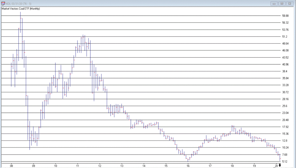
Ticker KOL is an ETF that invests in coal industry related companies. And what a dog it has been. Figure 1 displays a monthly chart of price action. Since peaking in June 2008 at $60.80 a share, it now stands at a measly $6.29 a share, a cool -89.6% below its peak. And like a lot of things it has been in a freefall of late.
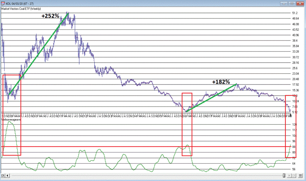
So, is this a great time to buy KOL? That’s not for me to say. But for argument’s sake, Figure 2 displays a weekly chart of KOL with an indicator I call Vixfixaverageave (I know, I know), which is a version of an indicator developed a number of years ago by Larry Williams (Indicator code is at the end of the article).
Figure
2 – KOL weekly chart with Vixfixaverageave indicator (Courtesy AIQ TradingExpert)
Note that Vixfixaverageave is presently above 90 on the weekly chart. This level has been reached twice before – once in 2008 and once in 2016. Following these two previous instances, once the indicator actually peaked and ticked lower for one week, KOL enjoyed some pretty spectacular moves.
To wit:
*Following
the 12/19/08 Vixfixaverageave peak and reversal KOL advanced +252% over the
next 27.5 months
*Following
the 2/19/16 Vixfixaverageave peak and reversal KOL advanced +182% over the next
23.5 months
When will Vixfixaverageave peak and reverse on the weekly KOL chart? There is no way to know. One must just wait for it to happen. And will it be time to buy KOL when this happens? Again, that is not for me to say. None of this is meant to imply that the bottom for KOL is an hand nor that a massive rally is imminent.
Still, if there is anything at all to contrarian investing, its hard to envision anything more contrarian that KOL.
Vixfixaverageave
Calculations
hivalclose is hival([close],22). <<<<<The high closing price
in that last 22 periods
vixfix is (((hivalclose-[low])/hivalclose)*100)+50. <<<(highest closing price in last 22 periods minus current period low) divided by highest closing price in last 22 periods (then multiplied by 100 and 50 added to arrive at vixfix value)
vixfixaverage is Expavg(vixfix,3). <<< 3-period
exponential average of vixfix
vixfixaverageave is Expavg(vixfixaverage,7). <<<7-period
exponential average of vixfixaverage
Jay
Kaeppel
Disclaimer: The information, opinions and ideas expressed herein are for
informational and educational purposes only and are based on research conducted
and presented solely by the author. The
information presented does not represent the views of the author only and does
not constitute a complete description of any investment service. In addition, nothing presented herein should
be construed as investment advice, as an advertisement or offering of
investment advisory services, or as an offer to sell or a solicitation to buy
any security. The data presented herein
were obtained from various third-party sources.
While the data is believed to be reliable, no representation is made as
to, and no responsibility, warranty or liability is accepted for the accuracy
or completeness of such information.
International investments are subject to additional risks such as
currency fluctuations, political instability and the potential for illiquid
markets. Past performance is no
guarantee of future results. There is
risk of loss in all trading. Back tested
performance does not represent actual performance and should not be interpreted
as an indication of such performance.
Also, back tested performance results have certain inherent limitations
and differs from actual performance because it is achieved with the benefit of
hindsight.