I look at a lot of stuff. Which can be slightly problematic. On one hand, it is important to be aware of one’s surroundings. On the other hand, there is always of danger of being over reactionary to some “tidbit” of information that strikes you as “important” out of the blue. Still, I like to collect screenshots.
A Disclaimer and Apology
I believe it is always important to give credit to the source of information. So normally when I show a chart that is not my own it is always accompanied by “Courtesy: [Source Name Here]”
Unfortunately, I have come to realize that with several of the screen shots that appear below I failed to note the source. So after giving it some thought here is the deal:
*Please note that NONE of the screen shots below are my own original work. I simply found them to be of value and want to pass along the information contained.
*I sincerely apologize to the author or company that provided any unsourced screen shots below for not listed their name/web/site/company/link/etc., and I also sincerely thank you for passing along such useful/interesting information.
*For what it is worth, I believe that most (though probably not all) of the unsourced screenshots below came from articles that appear on www.SeekingAlpha.com which I find to be a terrific – and wide-ranging – source of information. In fact, if you are a “market geek” like me you can sign up for a daily email from them which comes with a variety of article links.
OK, so with disclaimers and apologies in place, let’s proceed.
Are 10-Year Yields Headed Higher?
This screenshot is from www.Sentimentrader.com. In the top clip we see the trend in 10-year treasury yields, and in the bottom clip we see the “Spread Between Hedger Net Position in Copper Minus Gold”. For the sake of brevity, I am not even going to attempt to explain what all that means. I am just going to highlight the fact that when the value in the bottom clip exceeds the upper dashed line it has in the past done so near a low in 10-year Treasury Yields.
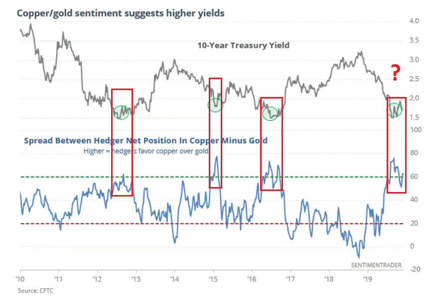
Figure 1 – 10-Year Treasury Yield versus Copper/Gold Net Hedgers Difference (Source: www.Sentimentrader.com)
As always, past performance does not guarantee futures results. Still, the reading at the far right suggests that 10-year yields may be poised to rise in the months ahead. If so, this is bearish for bonds.
Happy New Year’s, Signed “Metals”
Figure 2 is one of the charts I failed to note the source for. But it highlights the fact that metals tend to be strong performers early in the year. The most bullish 4-month period of the year for Copper tends to be Jan. through Apr. and Platinum has often showed significant strength during Jan. and Feb.
While I am not “recommending” trades do note that these four metals can be traded using ETF’s CPER, SLV, GLD and PPLT (note: there are other ETF’s available but these tend to be the most heavily traded for each.
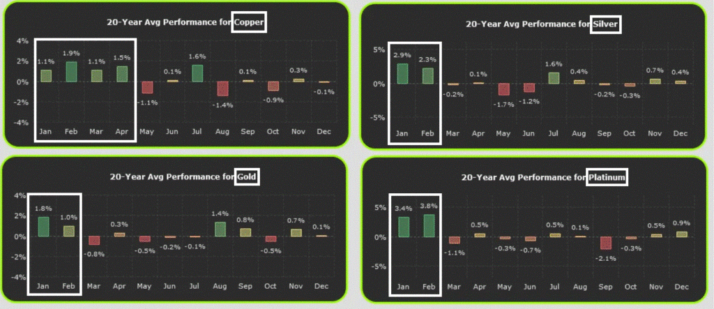
Figure 2 – Metals tend to show seasonal strength early in the year (Source: ???)
Growth versus Value
Over the past 10 years growth indexes have significantly outperformed value indexes. So of course, human nature being what it is the vast majority of investors have moved away from “value” stocks since “growth stocks are clearly better performers.” Except of course, for when they are not.
The most important thing to remember about the never-ending battle between growth and value is that there are no permanent winners. A close perusal of Figure 3 reveals that growth vastly outperformed from 1990 to 1999, then value vastly outperformed from 1999 to 2009, and since then growth has been the leader.
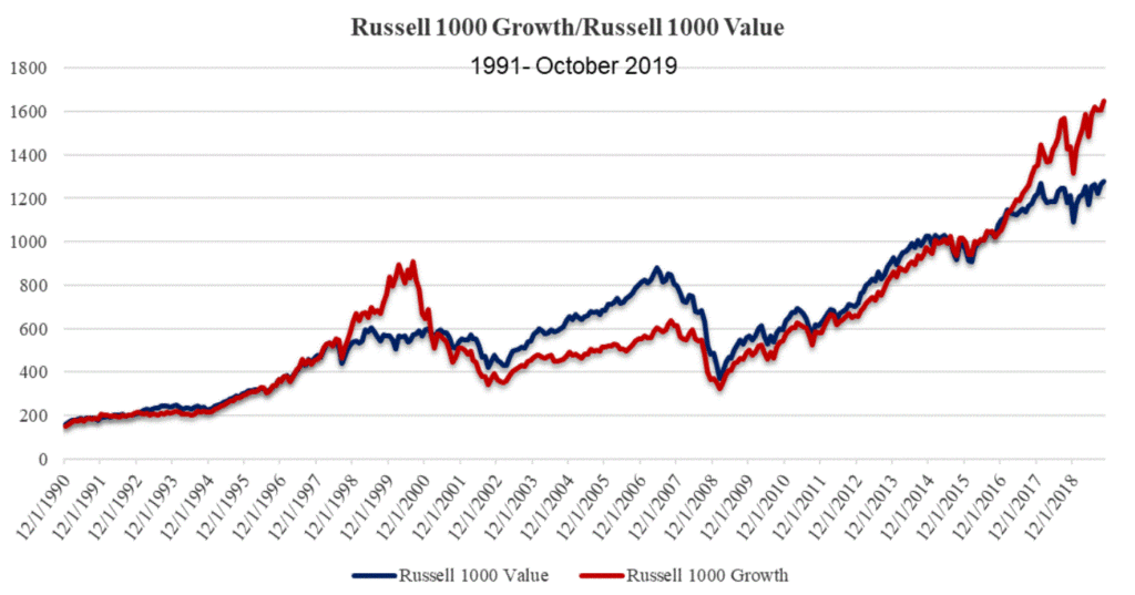
Figure 3 – Growth versus Value – No permanent advantages (Source: ???)
So, does this imply that value stocks are likely to look better relative to growth stocks in the not too distant future? Well, yes that is what is implied. The exact timing of when things might change is unknown. But the primary point is this: DO NOT assume that you should focus on growth and avoid value indefinitely. History is not on your side.
The Worm May Turn for Energies
Figure 4 comes courtesy of the venerable www.StockTradersAlmanac.com and highlights the fact that energy stocks (represented here by ETF ticker XOP) tends to be a strong performer from mid-December into late April/early May.
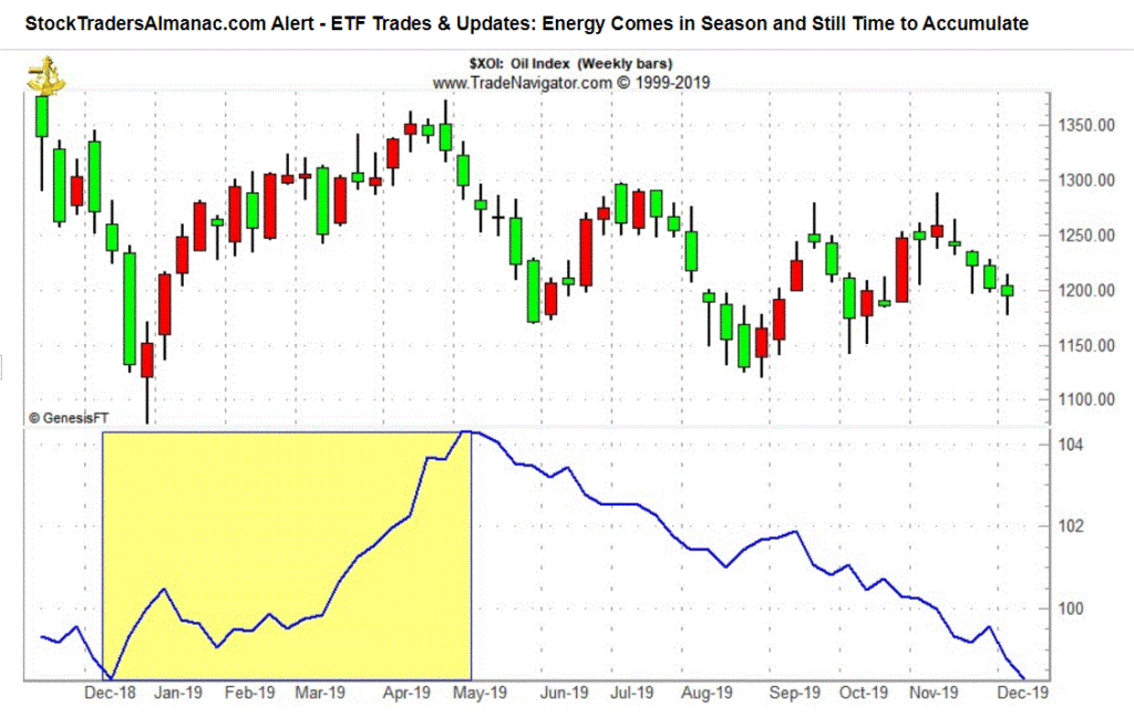
Figure 4 – Seasonal pattern for energy stocks (Source: www.StockTradersAlmanac.com)
Energy stocks have been the biggest “dog” in the stock market for several years now. History suggests this won’t be the case forever, and history also suggests that if things are going to improve for energies the change may come sooner than later.
Before You Fall in Love Again with Apple…
This one comes from The Leuthold Group, a topflight analyst firm for a number of decades. It shows the history of stocks that at one time comprised 4% or more of the S&P 500 Index.
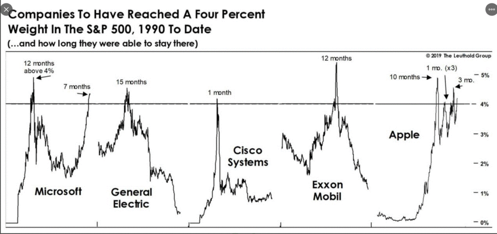
Figure 5 – Stocks that exceeded 4% of the S&P 500 total value (Source: The Leuthold Group)
AAPL may well prove to be the exception to the rule, but the history of stocks that reach such a lofty position in terms of market cap is “cautionary.” As long as the bull market remains intact it is hard to see AAPL losing its leadership position. But “when the worm turns” for AAPL the result may be swift and severe. So keep a close eye.
Individual Cash Levels
Figure 6 is also courtesy of www.Sentimentrader.com and displays the cash allocation among investors in the AAII survey. This is a “perspective” indicator and not a “timing” indicator. In other words, we should not look to it to provide “buy and sell signals”. Still, the historical message is pretty clear: High cash levels are “bullish” and low cash levels “not so much.”
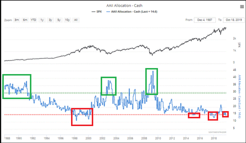
Figure 6 – Individual Cash Levels; AAII Survey (Source: www.Sentimentrader.com)
Jay Kaeppel
Disclaimer: The information, opinions and ideas expressed herein are for informational and educational purposes only and are based on research conducted and presented solely by the author. The information presented does not represent the views of the author only and does not constitute a complete description of any investment service. In addition, nothing presented herein should be construed as investment advice, as an advertisement or offering of investment advisory services, or as an offer to sell or a solicitation to buy any security. The data presented herein were obtained from various third-party sources. While the data is believed to be reliable, no representation is made as to, and no responsibility, warranty or liability is accepted for the accuracy or completeness of such information. International investments are subject to additional risks such as currency fluctuations, political instability and the potential for illiquid markets. Past performance is no guarantee of future results. There is risk of loss in all trading. Back tested performance does not represent actual performance and should not be interpreted as an indication of such performance. Also, back tested performance results have certain inherent limitations and differs from actual performance because it is achieved with the benefit of hindsight.


Absolutely fantastic stuff!!
Thank you very much Jay!
Another wonderful article, Jay. Enjoyed so many of them this year. Thanks for sharing your knowledge and thoughts on this site. Seasons greetings to you.