I’m going to be candid. If you are not into options there is a possibility that what follows may leave you a bit overwhelmed. On the other hand, there is also a possibility that you may learn something. So there’s that. In any event, what follows is a fairly lengthy (at least by my standards) dissertation on one way to screen for options to trade. So if you have no interest whatsoever in options trading – Class Dismissed, Thank You for checking in, and please check back soon.
The “Best” Approach to Trading Options
Based on many years of experience I believe that the “best” approach to trading options is to devise a timing mechanism that does a terrific job of identifying stocks that are about to rally strongly over the next 5 trading days and to buy call options on those stocks to maximize your gains (Sadly, I have yet to devise such a timing mechanism myself. If you have had more success with that I would love to hear from you). Barring that, you will likely have to throw in with the rest of us “option schlubs” and try to develop a method to help pull some type of order from the chaos of fear and greed.
“Another” Approach to Options
IMPORTANT: What follows is NOT intended to represent the “definitive” approach to trading options. In fact, to make matters worse, I can make no guarantees that the steps that follow will generate profits on any given trade or set of trades. The purpose is simply to attempt to remove some of the emotion from the decision-making process by using a common sense approach to screening for factors that might help lead to potentially favorable opportunities.
Step #1: Identify a broad market buying opportunity.
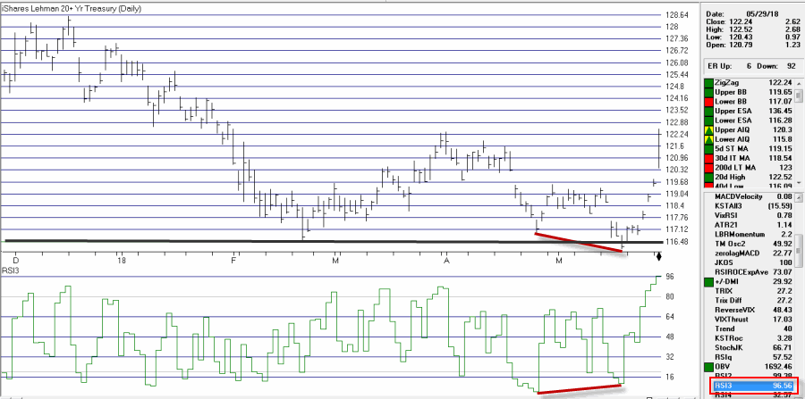
We are not talking “precision market timing” here. For this step we will simply look for a pullback in an uptrend by the broader market. For our example we will use an indicator I refer to as TMOsc2 (“TM” because I think either picked this up from Tom McClellan of The McClellan Oscillator or I developed it based on something else he wrote about – I can’t remember which). Looking at the S&P 500 Index, a “buy” signal occurs when TMOsc2 drops to 48 or below and then reverses up for one day while SPX is above its 200-day moving average.
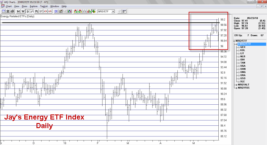
For the record, alot of other overbought/oversold type of indicators could be substituted.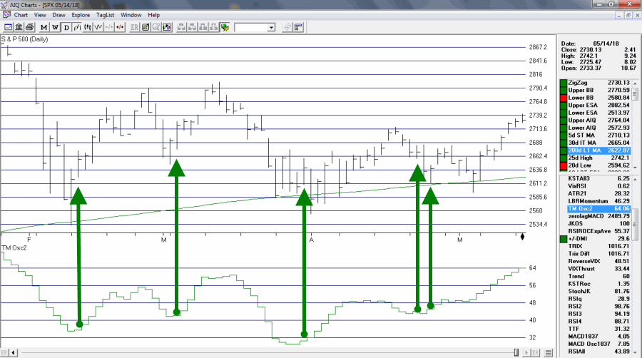 Figure 1 – TMOsc2 buy signals for SPX (Courtesy AIQ TradingExpert)
Step #2: Screen for stocks with active options trading and tight bid/ask spreads.
From here on we will use www.OptionsAnalysis.com. Figure 2 displays an input screen that will generate a scan of all optionable stocks and ETFs with:
a) 1,000 options traded per day and,
b) option bid/ask spreads of 1% of the stock price or less.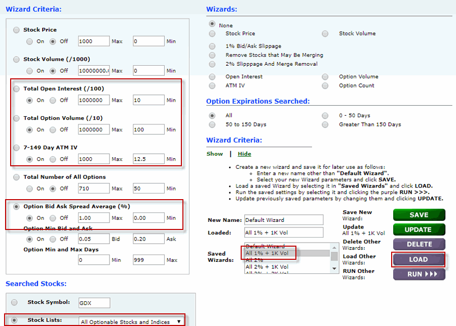 Figure 2 – Screening for minimum 1K options traded and maximum 1% bid/ask spread (Courtesy www.OptionsAnalysis.com)
Figure 3 displays the output. This screen found 72 stocks that meet our criteria. We save these 72 tickers to a list called My Stock List.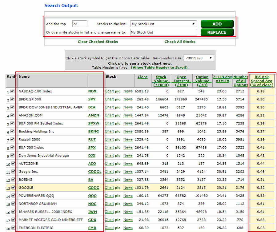 Figure 3 – 72 stocks meet the initial volume and bid/ask screen (Courtesy www.OptionsAnalysis.com)
Step#3: Screen the remaining list for stocks in an uptrend.
Figure 4 displays an input screen for a routine that will screen for stocks that are trading above their 200-day moving average.
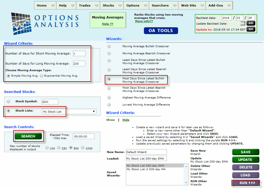 Figure 4 – Looking only for stocks that are trading above their 200-day moving average (Courtesy www.OptionsAnalysis.com)
Figure 5 displays the output. As you can see 51 of the original 72 stocks are above their 200-day moving average. We save those 51 remaining stocks to My Stock List.
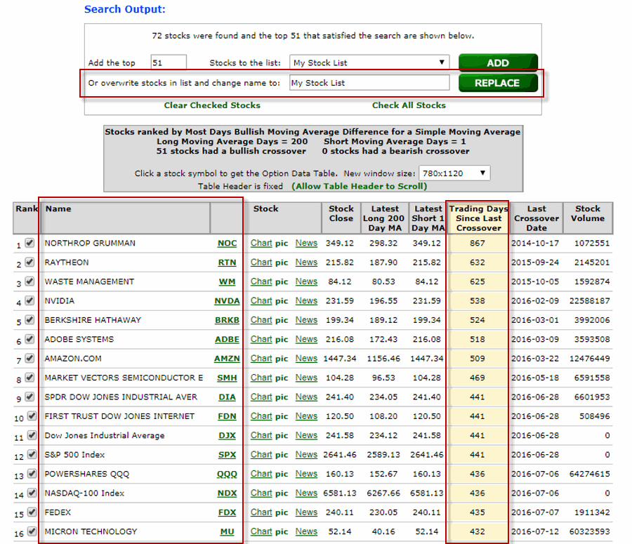 Figure 5 – List of stocks above 200-day moving average (Courtesy www.OptionsAnalysis.com)
Step #4: Look for stocks with relatively low implied volatility.
We want to limit the amount of time premium we pay to buy options. Implied volatility can help to tell us if IV is high or low for a given security. In Figure 6 we see a Saved routine to scan a list of stocks for Low IV.
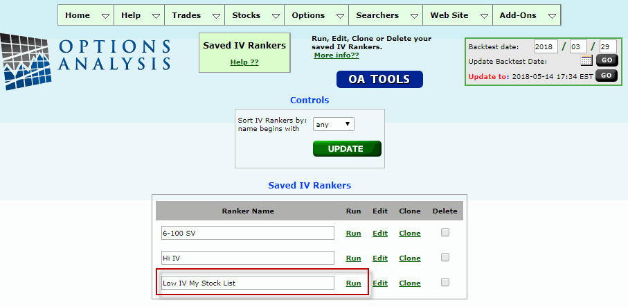 Figure 6 – Screening for stocks with low implied volatility (Courtesy www.OptionsAnalysis.com)
For our purposes, a reading of 0 means implied volatility is at the low end of its recent range and a reading of 100 means implied volatility is at the high end of its recent range. Figure 7 displays the output. For our purposes we want to find those stocks with an IV rank of 25 (technically I use 25.99 as an upper limit) or less. As you can see in Figure 7, in this case only 5 stocks pass the screen (the number of securities that pass this screen can vary greatly depending on whether overall market volatility is high or low). We once again overwrite My Stock List with just these 5 tickers.
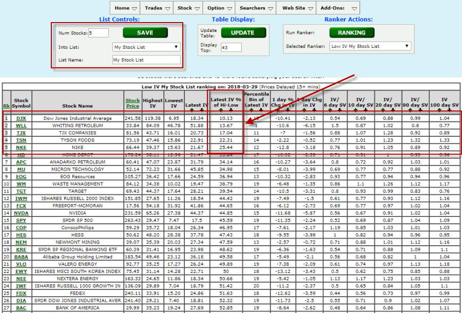 Figure 7 – List of stocks with low IV (Courtesy www.OptionsAnalysis.com)
So now we have a very short list of stocks with:
a) Price in an uptrend
b) Reasonably active option trading
c) Relatively “cheap” options, i.e., low implied volatility
From here an ambitious/skilled trader might apply their own methodology (chart reading, trend-following techniques, etc.) to identify which of the remaining stocks they think are more likely to rally. For our purposes, let’s continue with a more “agnostic” approach.
Step #5: Look for option positions with certain favorable characteristics.
Figures 8 and 9 display input screens for buying call options on the 5 remaining stocks.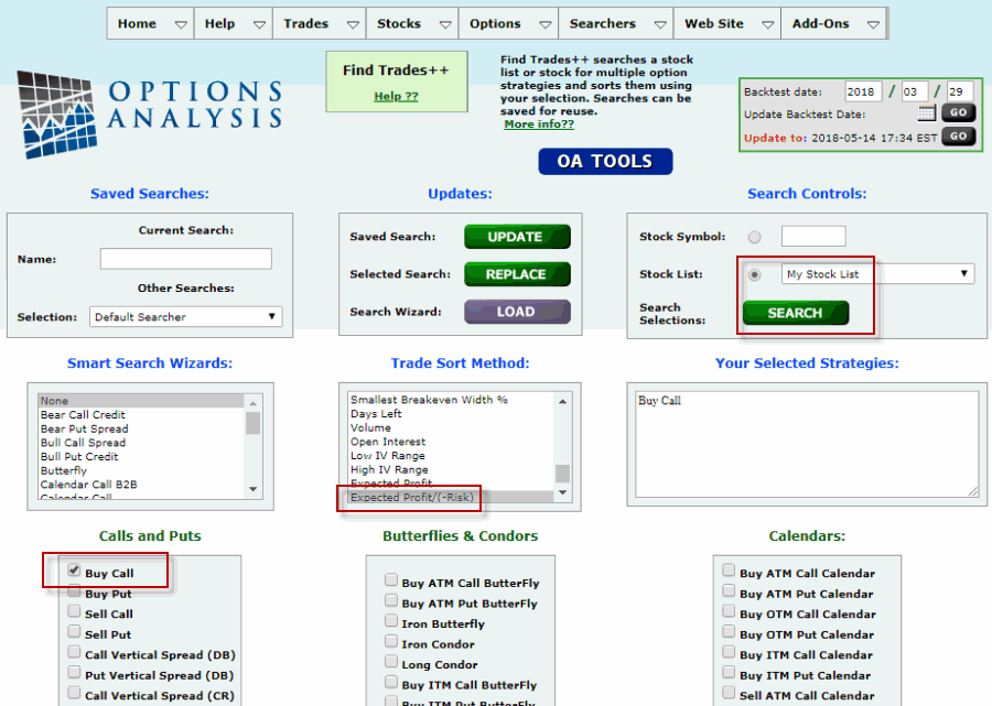 Figure 8 – Buy Call option inputs (Courtesy www.OptionsAnalysis.com)
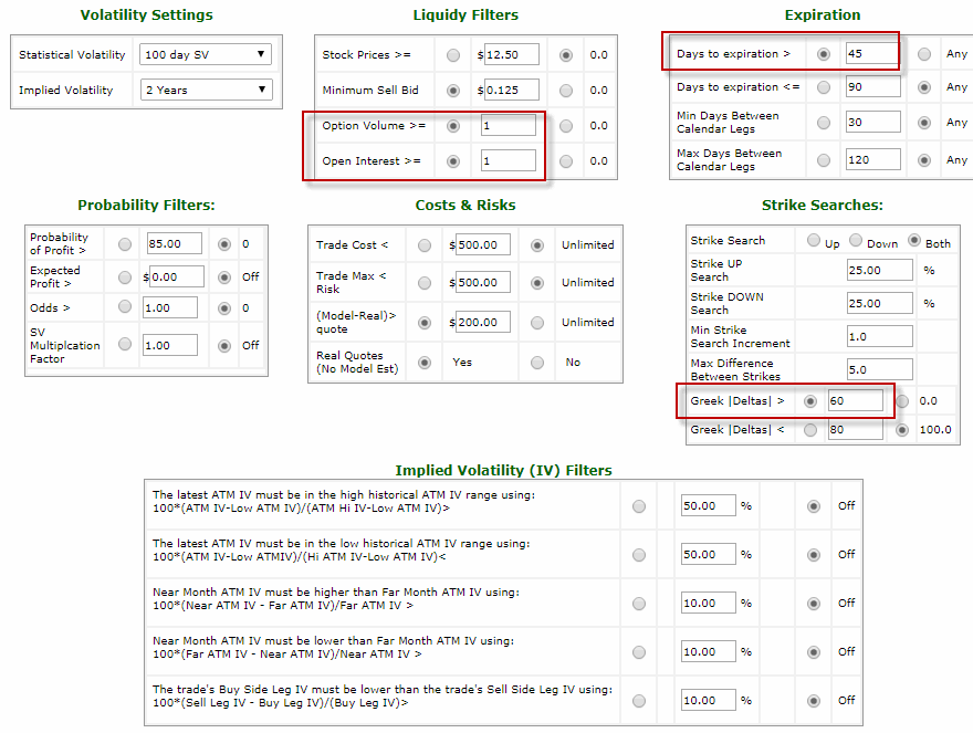 Figure 9 – Buy Call option inputs (Courtesy www.OptionsAnalysis.com)
There is nothing “sacred”, “magic” or “guaranteed” about the criteria that appear here. They serve merely as “common sense examples.” Note that we are looking for options with:
a) At least 45 days left until expiration
b) Option volume and open interest greater than 0
c) A “Delta” of 60 or higher (this may seem “high” to some traders, however, in this example we are looking at using more a stock replacement strategy – i.e., the option price moves closely with the stock price – rather than trying to maximize leverage by buying out-of-the-money calls.
(NOTE: If the option prices for the output trade are exceptionally high, a trader might also consider scanning for vertical bull call spreads that buy a lower strike price call and sell a higher strike price call.)
Ultimately, we will sort the output trades by:
a) Identifying the Top 10 trades ranked by Expected profit/(-Risk)
b) Among the Top 10 trades we will look for the highest Gamma
Figure 10 displays the output screen.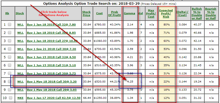 Figure 10 – Buy calls output screen (Courtesy www.OptionsAnalysis.com)
The list that appears in Figure 10 displays the Top 10 trades sorted by Expected Profit/(-Risk). Among these trades, the one with the highest Gamma is highlighted.
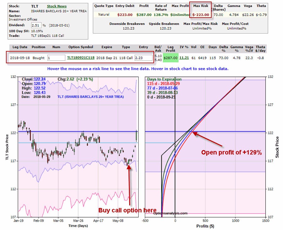
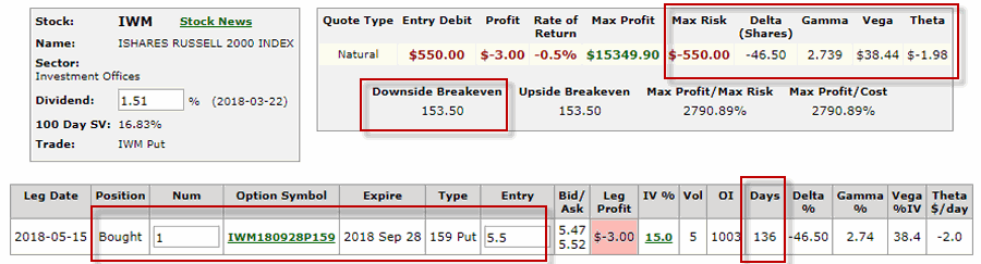
Figure 11 displays the trade details and risk curves for the highlighted trade.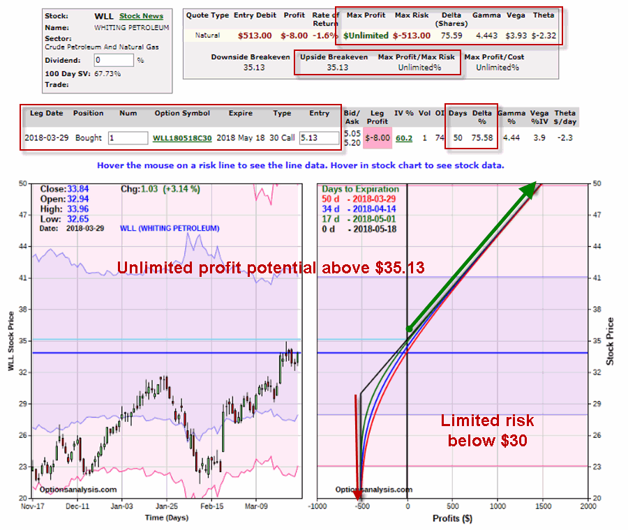 Figure 11 – WLL May30 call (Courtesy www.OptionsAnalysis.com)
With WLL trading at $33.84 a share, this trade involves buying the in-the-money May 30 call for $5.13.
*The maximum risk is $513 per contract
*The breakeven price is $35.13
*Profit potential is unlimited above $35.13
Step #6. Develop a Trade Plan.
This plan will answer the following questions:
a) How much $ to commit to the trade
b) When to exit with a loss
c) When to exit with a profit, or adjust the trade to lock in a profit
Figure 12 displays the subsequent price action for WLL. In this example, WLL rallied from $33.84 to over $48 a share.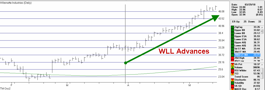 Figure 12 – Price action for WLL after call trade initiated (Courtesy www.OptionsAnalysis.com)
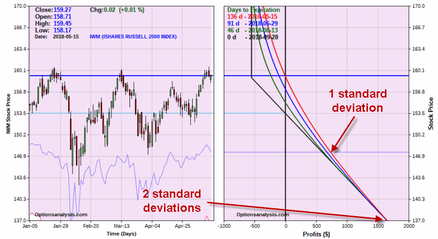
Figure 13 displays the updated risk curves for the WLL option trade.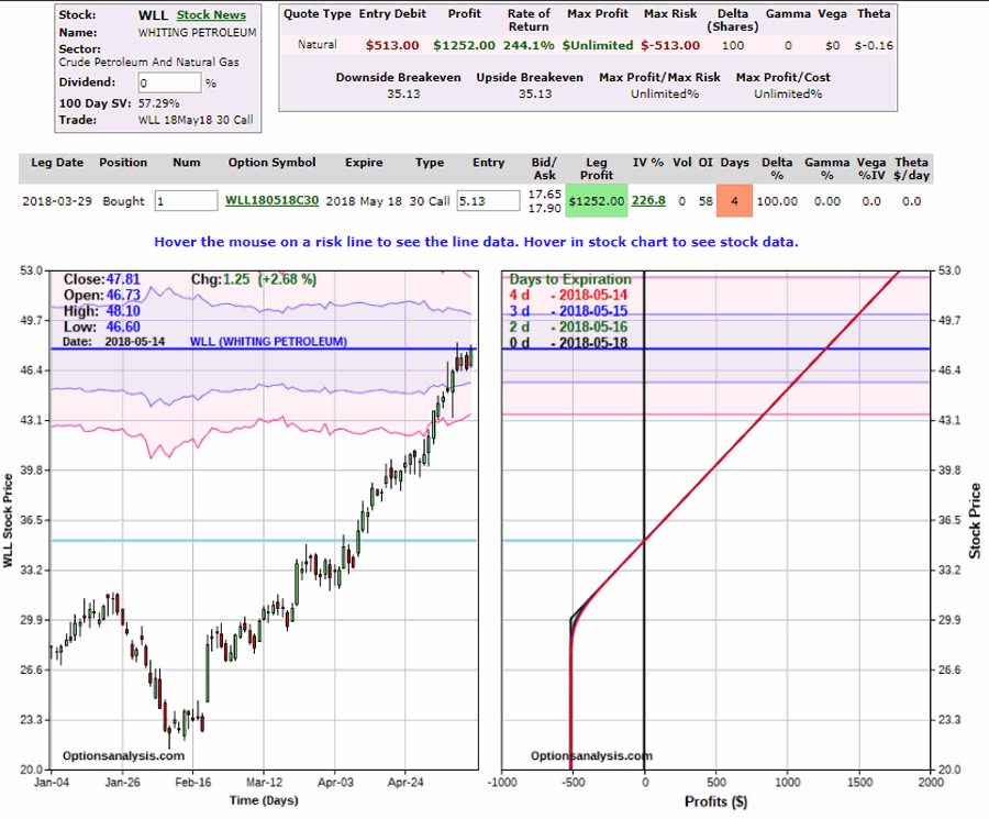 Figure 13 – Updated risk curves for WLL trade (Courtesy www.OptionsAnalysis.com)
For the record, NO not every trade works out nearly as well as this one.
Summary
What you have just seen is NOT the “best” way to trade options. It is merely an example of “one way” to trade options. Hopefully this review of one “objectively subjective” approach will help you to focus your own trading.
Jay Kaeppel
Disclaimer: The data presented herein were obtained from various third-party sources. While I believe the data to be reliable, no representation is made as to, and no responsibility, warranty or liability is accepted for the accuracy or completeness of such information. The information, opinions and ideas expressed herein are for informational and educational purposes only and do not constitute and should not be construed as investment advice, an advertisement or offering of investment advisory services, or an offer to sell or a solicitation to buy any security.
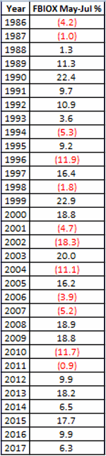
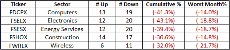 Figure 1 – 5 Funds to Avoid in June
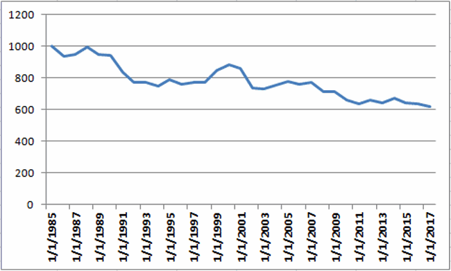 Figure 3 – Growth of $1,000 invested in 5 Sector funds from Figure 1 ONLY during the month of July