Monthly Archives: May 2018

This Chart Pattern is Positively Glowing (and Boring)

I used to be a pretty fun guy.  No, seriously. Then, I don’t know if it was a function of age (at the very least it was clearly not a function of maturity) or what but I became less “fun” to be around over the years.  So I am not sure if it is coincidence or not, but as a technical analyst my “taste” in chart patterns has changed also.

I used to be a “strong trend line”, “continuation pattern” kind of guy.  Like I said, fun. Now?  My favorite seems to be the most boring thing around – give me something that has gone nowhere (example to follow).

This was reaffirmed somewhat last year when I attended a conference and listened to  esteemed Charles Kirkpatrick list stock after stock that fit the mold.  So what am I talking about?  The best example I have found right now is uranium.  No, seriously.

Figure 1 and 2 display monthly charts for ticker URA – the Global X Uranium ETF.  This ETF invests in companies involved in the uranium business. 1
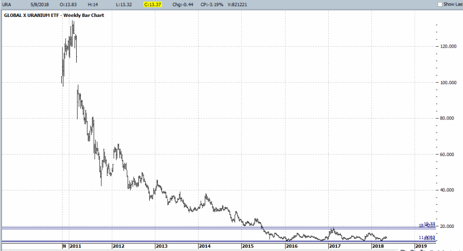
Figure 1 – URA Monthly; 2011-2018 (Courtesy ProfitSource by HUBB)

2
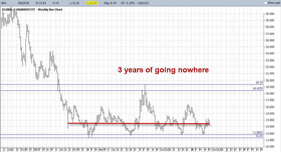
Figure 2 – URA Monthly; 2014-2018 (Courtesy ProfitSource by HUBB)

A couple things to note.  I know absolutely nothing about the fundamentals of the uranium business.  Nor quite frankly do I really want to.  Truth be told it would probably just confuse me.

But one thing I have seen – estimating here – roughly a bazillion times is a security that falls hard and then gets locked into a sideways range for what seems like forever.  In many, many cases price eventually breaks out significantly to the upside out of that range.  I most certainly cannot guarantee that that will happen with URA.  In fact, please understand that I am not “recommending” URA.  I am simply pointing out that it “fits the profile.”

It plummeted from a high of $133+ to about $11 a share.  It first dropped to its current price of $13.37 in August of 2015.  In other words, it s been “going nowhere” for almost 3 years.  This will not last forever.

What To Do (if anything)

First off, again, I am not recommending URA, simply pointing out its present status and noting that the pattern it has formed often proves to be bullish longer-term.  So the choices are:

a. Forget I mentioned it

b. Buy now with a stop under $11.31 (roughly -15.5% of risk)

c. Wait for a further dip before buying

d. Wait for a breakout to the upside before buying

Summary

Do NOT go out and buy URA because of what you have read here.  Whether or not this one example security works out or not is not actually the point.  But maybe keep an eye on it as history suggests that this pattern has a way of working out to the upside.  And more importantly, keep  an eye open for other “going nowhere” situations, as they often are followed by meaningful price moves

Jay Kaeppel

Disclaimer:  The data presented herein were obtained from various third-party sources.  While I believe the data to be reliable, no representation is made as to, and no responsibility, warranty or liability is accepted for the accuracy or completeness of such information.  The information, opinions and ideas expressed herein are for informational and educational purposes only and do not constitute and should not be construed as investment advice, an advertisement or offering of investment advisory services, or an offer to sell or a solicitation to buy any security.

Strategy Civil War – Sell in May vs. 60/40

Let’s start this time out by establishing the premise:

Jay’s Trading Maxim #15a: The purpose of using an objective strategy is to remove emotion from trading decisions.

Which is important because of:

Jay’s Trading Maxim #25: Human nature is a detriment to trading and investment success and should be avoided as much as, well, humanly possible.

And let’s not forget:

Jay’s Trading Maxim #15b: The other purpose of using an objective strategy is NOT “to make money” (contrary to popular belief), but to “maximize the tradeoff between reward and risk”.

Which stems from:

Jay’s Trading Maxim #14: If you take on more risk than you can handle you will ultimately fail (sorry, I couldn’t figure out how to be any more blunt than that).

OK, I think that covers it.

The Indexes

So from here I am going to look at two strategies that require exactly zero thought to implement (other than of course remembering to make the requisite trades at the appropriate time which I’m pretty sure is why we now have alarms that we can set on our phones, but enough about me).

For our tests we will use index data.  Since I am trying to make broad representations of the overall stock and bond markets – and because I want to go as far back with the data as possible – we will use

*Stocks = Wilshire 5000 Index

*Bonds = Barclays Bloomberg Treasury Index

I have monthly total return data for these two indexes going back to January 1973.  So roughly 45 years of history.

NOTE: Different indexes can easily be substituted including S&P 500 Index and a bond index that is more of an aggregate index including corporate bonds, etc.  My guess is the results would be similar.

ANOTHER NOTE: The results that follow are based on a hypothetical test using index data and do not represent real-time, real world results.  Also, note  that no deductions are made for any fees,commissions, taxes, etc.  The sole purpose is to compare the hypothetical raw results of one strategy versus another.

CYA complete, moving on.

The 60/40 Method

One of the simplest and most straightforward approaches to investing that many investors have adopted over the years is to simply allocate a certain amount of capital to stocks and a certain amount to bonds, maybe readjust the allocation say once a year and let the markets do what they will.

And the bottom line is that this is not a bad strategy.  It’s also maybe not a great strategy, but let’s not get ahead of ourselves.  So for 60/40 we will do the following:

On December 31st of every calendar we will allocate:

*60% of the portfolio to the Wilshire 5000 Index

*40% of the portfolio to the Bloomberg Barclays Treasury Index

The equity curve from 12/31/1972 through 3/31/2018 appears in Figure 1.

1Figure 1 – Growth of $1,000 using 60/40 Method; 12/31/1972-3/31/2018

The Sell in May Method

This strategy works as follows:

*On May 31st sell the Wilshire 5000 Index and buy the Barclays Bloomberg Treasury Index

*On October 31st sell the Barclays Bloomberg Treasury Index and buy the Wilshire 5000 Index

Figure 2 displays the equity curve for “Sell in May” in red and the equity curve for “60/40” (copied from Figure 1) in blue.2Figure 2 – Growth of $1,000 Sell in May (red line) versus 60/40 Method (blue line); 12/31/1972-3/31/2018

Anything jump out at you?

Clearly the “Sell in May” approach made more money than the “60/40” approach.  But remember, our objective is NOT “to make money” but to “maximize the tradeoff between reward and risk”. In other words, if the volatility of the equity swings of “Sell in May” are so great that one cannot maintain the discipline to continue trading it, then the higher returns may only be illusory.  So let’s “go to the numbers.”3Figure 3 – Relative Performance Figures: Sell in May vs. 60/40; 12/31/1972-3/31/2018

A few things to note in Figure 3 – The 60/40 approach:

*Made money in 83% of all 12-month periods and 99% of all 5-year periods

*It has a respectable 12-month average and median gain (+10.4% and +11.1%, respectively)

*It also has a lower annual standard deviation (10.9%) and lower maximum drawdown (-28.0%) than the Sell in May Method.

*For the record, 60/40 performance and Sell in May performance was roughly equal through about 1982.

So all in all a very respectable performance and decent strategy.

The Sell in May Method on the other hand clearly made more money on a more consistent basis (at least since 1982):

*An average gain of +14.2% and an average gain/standard deviation above 1.00 (1.09)

*A Maximum Drawdown of -31.8% is nothing to slough off, but in this test it is not that much greater than the maximum drawdown for the 60/40 Method

*It made money in 88% of all 12-month periods and 100% of all 5-year periods

*Sell in May outperformed 60/40 during 2/3rds of all 12-month periods and during 85% of all 5-year periods.

Summary

So can I state categorically that Sell in May is superior to 60/40?  That’s not my job here.  The information presented on this blog is for “educational purposes only”.

Hence, I leave you the reader to draw your own conclusions.

Jay Kaeppel

Disclaimer:  The data presented herein were obtained from various third-party sources.  While I believe the data to be reliable, no representation is made as to, and no responsibility, warranty or liability is accepted for the accuracy or completeness of such information.  The information, opinions and ideas expressed herein are for informational and educational purposes only and do not constitute and should not be construed as investment advice, an advertisement or offering of investment advisory services, or an offer to sell or a solicitation to buy any security.

Dollar or Miners? It’s One or the Other

Gold, gold stocks and commodities in general are starting to get a lot of notice lately.  And not without good reason.  Consider the bullish implications for all things precious metal in the articles below – one from Tom McClellan of the McClellan Report and one from the Felder Report.

*BANG: Why the Gold Miners Could Soon Make FANG Look Tame The Felder Report

*Gold/Silver Ratio Tom McClellan

I have also previously touched on these themes time or two (or four) of late.

*JayOnTheMarkets.com: The Siren Song of Gold Stocks

*JayOnTheMarkets.com: Yes, Gold is at a Critical Juncture

*JayOnTheMarkets.com: Commodities at the Crossroads

*JayOnTheMarkets.com: What to Watch in Energies

Where We Are Now

So on the one hand, it can be argued that gold, mining stocks and commodities in general are poised for a significant move to the upside.

Consider the “coiling” action displayed in Figure 1, which is a monthly chart for a mining index that I track that I’ve labeled GLDSLVJK.1aFigure 1 – Jay’s Gold Stock (GLDSLV) Index (Courtesy AIQ TradingExpert)

I look at the coiling action displayed in Figure 1 – in conjunction with the information contained in the articles linked above – and I can’t help but to think that a big upside breakout in gold stocks is imminent.

The “Fly in the Ointment”

When it comes to all of this metals/miners/commodities bullishness there’s just one “fly in the ointment” – the U.S. Dollar. Let’s be succinct here and invoke:

Jay’s Trading Maxim #102: Whichever way the dollar goes, a lot of things go the other way.

To wit, see Figure 2, which highlights the inverse nature of, well, a lot of things to the U.S. Dollar (a value of 1000 means 100% correlation and a value of -1000 means a 100% inverse correlation.1Figure 2 – Things that trade inversely to the U.S. Dollar (Courtesy AIQ TradingExpert)

In other words, when the U.S. dollar goes up, the things listed on the right hand side of Figure 2

Now consider Figure 3 – which appears to be showing a potential upside breakout for the U.S. dollar.3Figure 3 – U.S. Dollar; breaking out to the upside? (Courtesy ProfitSource by HUBB)

Which brings us back to the title – Dollar or Miners, it’s One or the Other.

If the U.S. Dollar is truly staging an upside breakout, chances are gold miners will not.

Stay tuned….and keep a close on the buck.

Jay Kaeppel

Disclaimer:  The data presented herein were obtained from various third-party sources.  While I believe the data to be reliable, no representation is made as to, and no responsibility, warranty or liability is accepted for the accuracy or completeness of such information.  The information, opinions and ideas expressed herein are for informational and educational purposes only and do not constitute and should not be construed as investment advice, an advertisement or offering of investment advisory services, or an offer to sell or a solicitation to buy any security.

The (Semi) Official S&P 500 Index ‘Line in the Sand’

In an article dated 2/15/2018, titled “Trend Following in One Minute a Month”, I wrote about one of the simplest trend-following methods I’ve ever discovered.  The original idea was based on work by investor and Forbes columnist Kenneth Fisher (his original idea is discussed in this article – How to Tell a Bull Market from a Bear Market Blip).

For full details plus facts and figures please see the original article of mine linked above. For now:

Jay’s Monthly SPX Bar Chart Trend-Following System

a) When the S&P 500 Index goes three calendar months without making a new high, then

b) Draw a horizontal line at the low price for those three calendar months.

c) An actual sell trigger occurs at the end of a month during which SPX registers a low that is below the “sell trigger price” (i.e., the trade takes place at the month regardless of when the signal occurs during the month), HOWEVER,

d) If SPX makes a new monthly high above the previous “swing high” BEFORE it registers a low below the “sell trigger price” the sell signal alert is aborted.

For the record, sell signals since 1970 have been right roughly 50% of the time, so this is NOT a “sure thing, you can’t lose” strategy by any stretch. Still the average losing trade witnessed a decline of roghly-16%, with 3 generating a loss of 20% or more, and two of those were in excess of -30%.

The latest status appears in Figure 1 below. As you can, 3 of the last 5 “sell” signals ended in whipsaws which resulted in buying back in 6%, 9% and 8% higher, respectively.  However, the key point is that the other two sell signals would have allowed an investor to miss the crushing -33% and -31% declines.1aFigure 1 – Jay’s “One Minute a Month” Trend Following Method

(For more signs of potential trouble see also  Two Charts Worth Watching)

The Bottom Line

If the S&P 500 Index closes below 2,532.69 without first making a new 6 month high, it could be a significant warning sign of trouble ahead (Or – in the interest of full disclosure – it could just be setting up whipsaw; sorry folks, that’s how the market works sometimes).

Welcome to the exciting – and occasionally frustrating – World of Trend-Following!

Jay Kaeppel

Disclaimer:  The data presented herein were obtained from various third-party sources.  While I believe the data to be reliable, no representation is made as to, and no responsibility, warranty or liability is accepted for the accuracy or completeness of such information.  The information, opinions and ideas expressed herein are for informational and educational purposes only and do not constitute and should not be construed as investment advice, an advertisement or offering of investment advisory services, or an offer to sell or a solicitation to buy any security.

Two Charts Worth Watching

The chart below is courtesy of www.KimbleChartingSolutions.com.  The link to the actual chart is here.

According to their analysis two key areas – semiconductors and Nasdaq stocks – may be forming an inverse head and shoulder pattern.  You can see Kimble’s “line in the sand” for SMH and NDX in Figure 1 below.

kimble smhndxFigure 1 – Semiconductors and Nasdaq stocks potential warning signs (Courtesy: www.KimbleChartingSolutions.com)

(See also The (Semi) Official S&P 500 Index ‘Line in the Sand’)

The implication is pretty clear.  If these two key sectors “give up the ghost” and drop below the necklines drawn in Figure 1, it could well serve as a major warning sign for the overall stock markets.

So stay focused.

Jay Kaeppel

Disclaimer:  The data presented herein were obtained from various third-party sources.  While I believe the data to be reliable, no representation is made as to, and no responsibility, warranty or liability is accepted for the accuracy or completeness of such information.  The information, opinions and ideas expressed herein are for informational and educational purposes only and do not constitute and should not be construed as investment advice, an advertisement or offering of investment advisory services, or an offer to sell or a solicitation to buy any security.