For the record, I am not good with predictions – particularly when they involve the future. That being said, I am pretty good at identifying trends. There are a couple of “new (old)” trends that most investors have trained themselves to ignore during the great bull markets in stocks and bonds over the past several decades.
From the looks of things, it might be a good time to at least reacquaint oneself with these “new (old)” trends. Because – at least hypothetically – if these play out as it looks they might there may be a singular investment opportunity.
Part 1 – Commodities versus Stocks
Figure 1 display a chart of the Goldman Sachs Commodity Index (GSCI) divided by the S&P 500 Index (SPX).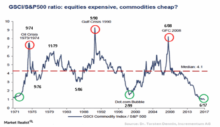 Figure 1 – Goldman Sachs Commodities Index (GSCI) divided by S&P 500 Index (SPX); (Source: Dr. Torsten Dennin, Incrementum AG)
As you can see, the ratio makes some big swings. When the ratio is rising commodities are outperforming stocks and vice versa. To get a sense of the magnitude of the price movements of commodities and stocks during the course of these swings, peruse Figure 2 which displays the performance of both indexes from extreme to extreme displayed in Figure 1.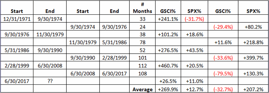 Figure 2 – GSCI Performance vs. SPX Performance between GSCI/SPX Ratio peaks and valleys
During rising GSCI/SPX ratio:
The average gain for the GSCI Index was +269.9%
The average gain for the S&P 500 Index was +12.7%
During declining GSCI/SPX ratio:
The average loss for the GSCI Index was (-32.7%)
The average gain for the S&P 500 Index was +207.2%
The price swings tend to be very big and very different – i.e., typically stocks go up a lot and commodities do not or vice versa. Note that the GSCI/SPX ratio appears to have bottomed in June of 2017. Does this guarantee that commodities are “In” and stocks are “Out”? Not necessarily. Still, the numbers displayed in Figure 2 suggest that that might be the way to bet in the years just ahead.
So the implication of Part 1 of my hypothesis is that commodities will outperform stocks over the next 3-8 years.
Part 2 – A Rising Interest Rate Environment
Figure 3 displays a chart from www.McClellanOscillator.com that highlights the trend in High Grade Corporate Bond Yields since 1740 (Yes, 1740).
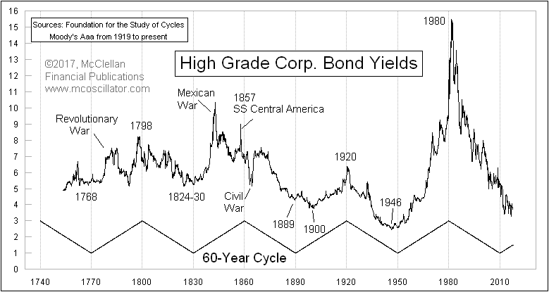 Figure 3 – 60-Year Interest Rate Cycle (Source: www.McClellanOscillator.com)
Notice the trend? Roughly 30 years of declining interest rates followed by roughly 30 years of rising interest rates. The most recent completed (apparently) move was a 30 year downtrend in rates from 1981 into 2011. Since then rates have drifted sideways and of late have moved higher. Clearly history strongly suggests that we have now entered the next rising rate trend.
So the implication of Part 2 of my hypothesis is that interest rates will trend higher in the years ahead.
The Hypothesis
So the information above argues in favor of rising commodity prices and rising interest rates. Most investors will dismiss the possibility – based primarily on their experience over the past 30+ year (i.e., rising stock prices and falling interest rates). But nothing lasts forever, especially in the financial markets. For the record, we saw rising commodity prices and rising interest rates in the late 1970’s, early 1980’s (and also for the record, at the time virtually nobody could envision those trends ending and reversing the way they did over the ensuing decades).
So let’s for a moment assume that this hypothesis is correct: Rising commodity prices and rising rates. So where is the place to be?
I almost hate to blurt it out because the answer is one of the most sleep-inducing phrases in all of investing. But here goes:
The Case for Base Metals
Few phrases in the investment world lexicon can make an investor’s eyelids as heavy, or more quickly prompt an individual to click “Exit” than the phrase “Base Metals.” (DO NOT STOP READING!). We’re not even talking the “sexy” stuff like gold and silver. We’re talking instead about unspeakably boring stuff like Zinc, Copper and Aluminum.
Base Metals in a Rising Rate Environment
I recently was fortunate enough to witness a presentation by Mark Eicker, Chief Investment Officer for Sterling Global Strategies, titled “Commodities Shine When the Fed Hikes Rates”. In this extremely enlightening presentation Mark highlighted the performance of a number of different investment categories during periods when the Fed is actively raising rates. Figure 4 displays those periods tested.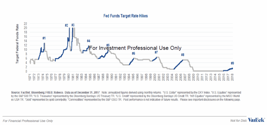 Figure 4 – Periods of Rising Interest Rates (Source: Mark Eicker, Sterling Global Strategies)
Figure 5 displays the performance of 7 different asset classes during these rising rate periods. Commodities are the largest, most consistent gainer during these periods. The asset classes include:
*U.S. Dollar
*U.S. Equities
*U.S. Treasuries
*U.S. Credit (corporate bonds)
*International Equities
* Gold
*Commodities
(click to enlarge)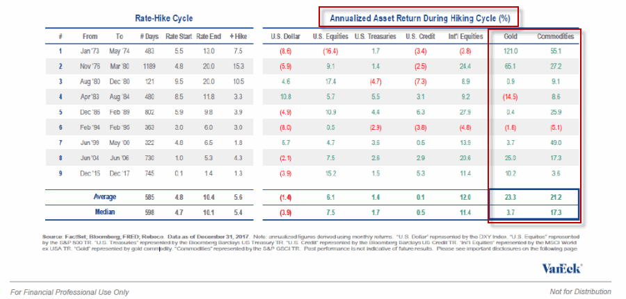 Figure 5 – Asset class performance during rising rate environments (Source: Mark Eicker, Sterling Global Strategies)
A close look at Figure 5 reveals that “Commodities” as an asset class was by far the best performer (median gain = +17.3%).
Now let’s look closer at “Commodities” and break them into different groups. Figure 6 displays the average annualized daily returns during a rising rate environment for 5 different commodity “categories”, including:
*Base Metals
*Energy
*Precious Metals
*Livestock
*Agriculture
(click to enlarge)
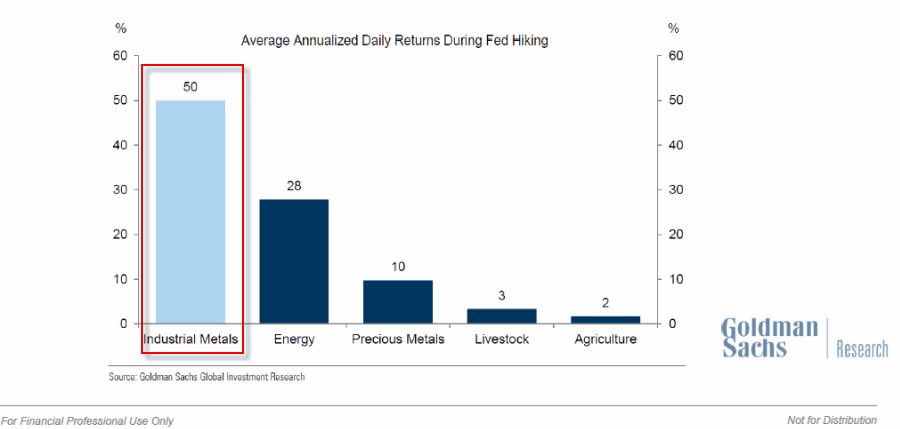 Figure 6 – Annualized Returns for commodity “categories” during rising rate environment (Source: Mark Eicker, Sterling Global Strategies)
As you can see in Figure 6, in a rising rate environment, base metals have gained at an annualized rate of 50%. This is significantly higher than the “darling” of the commodity world – Energy – which came in at 28%.
Summary
Are commodities guaranteed to rise in the years ahead as suggested in Figure 1? Not necessarily. Figure 1 suggests only that commodities will outperform stocks over the next several years. However, the figures in Figure 2 DO seem to suggest that higher commodity prices are a decent bet.
Are interest rates sure to rise in the years ahead – as suggested in Figure 3? Nothing is ever guaranteed in the financial markets. Still, the information displayed in Figure 3 suggests that that is the way to bet.
So if commodities are going to rise and if interest rates are going to rise, can we be sure that base metals will be a top performer? Again, there are no sure things in investing. Nevertheless, the information in Figures 4 through 6 suggest that base metals might be a good place to look.
I not make recommendations here at JayOnTheMarkets.com. I just comment on what (I think) I see (and you can never be too sure about the ramblings of a market-addled mind). But just to finish the though process here, ticker DBB is an ETF that holds a portfolio of zinc, copper and aluminum. As you can see in the bottom clip in Figure 7 below, DBB appears to have put in a double bottom in 2016 and has been mostly rising ever since. The top clip in Figure 7 displays ticker TNX, an index that tracks the yield on the 10-year treasury (x 10). You can see the correlation between the two. This suggests that if rates continue to rise in the years ahead, DBB will as well.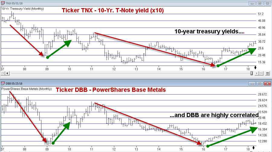 Figure 7 – 10-Yr. treasury yields (Ticker TNX; top clip) and Base Metals (Ticker DBB; bottom clip)
But like I said earlier, I am not too good at making predictions. Still, what we’ve really done here is put together the astute analysis of Dr. Torsten Dennin, Tom McClellan and Mark Eicker.
Pssst, I think they may (each) be onto something.
Jay Kaeppel
Disclaimer: The data presented herein were obtained from various third-party sources. While I believe the data to be reliable, no representation is made as to, and no responsibility, warranty or liability is accepted for the accuracy or completeness of such information. The information, opinions and ideas expressed herein are for informational and educational purposes only and do not constitute and should not be construed as investment advice, an advertisement or offering of investment advisory services, or an offer to sell or a solicitation to buy any security.


Thanks for the heads-up, Jay. Something to keep an eye on going forward.
The Figure 1 has been touted for the last six months as “proof” that commodities are due for a recovery … what people conveniently ignore is that is a RELATIVE graph meaning that commodities could down LESS than the equity market, generating the RELATIVE out-performance. This observation of course does not besmirch the analysis which follows which is as interesting as usual. Thank you for all what you do!
Thanks for the comments. And for the record I agree that the chart does not offer “proof” of an imminent rise in commodities. In fact, in the Summary I did state “Figure 1 suggests only that commodities will outperform stocks over the next several years.” At the same time the results shown in Figure 2 do suggest that a decent rise could be in the offing. Guess we’ll just have to wait around and see. Take Care, Jay