All posts by admin

The Post-Election/Year ‘7’ Bermuda Triangle

There are many “seasonal” tendencies that have played out often in the stock market during post-election years and also during years ending in the number “7” (no, seriously).  To review please see any or all of the following:

The Sordid Past of Years Ending in ‘7’

The Only Months That Matter in 2017

Post-Election April and May

As the second article linked above indicates the months of July and December have typically performed well during post-election years.  Beyond that though:

a) We are in BOTH a post-election year AND year ending in “7”.

b) The months of August, September and October have been particularly brutal in the past when this combination occurred.

Does this really matter and/or will it affect the market in 2017?  It beat me, but it might at least be worth knowing about if defensive action is called for in the months ahead.

The August-September-October (Post-Election/Year “7”) Bermuda Triangle

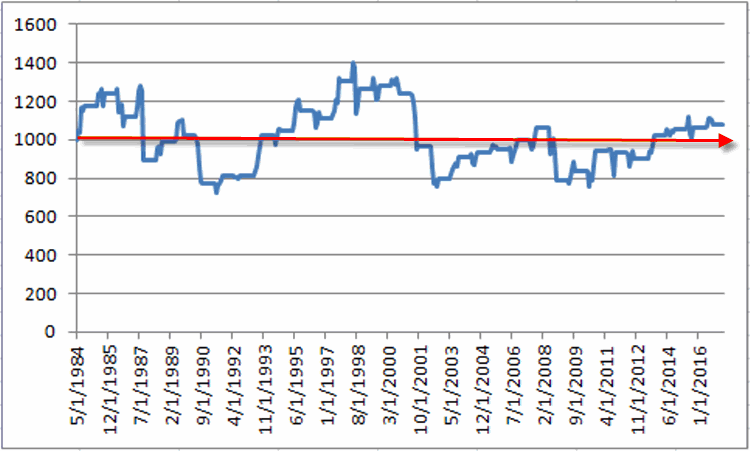
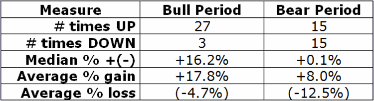
Figure 1 below displays the percentage price change (no dividend data is included, price change only) for the Dow Jones Industrials Average during the aforementioned period.

1

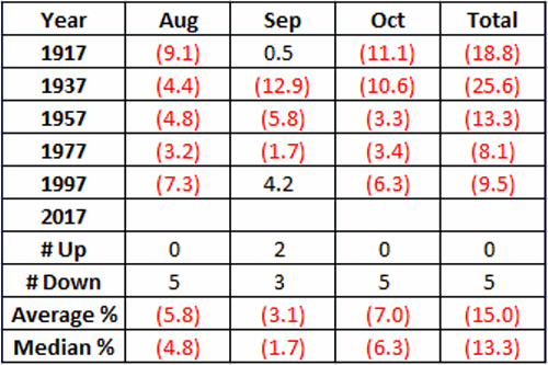
Figure 1 – August/September/October Dow Jones Industrials monthly price changes during Post-Election Years ending in “7”

*As you can see, the month of September has showed a gain 2 times, however, the months of August and October – and the 3 month period as a whole – are both 0-5 in the past century.  So only 2 of the 15 months in total showed a gain.

*The average 3-month performance for the “Post-Election/Year 7” Bermuda Triangle was -15.0%.

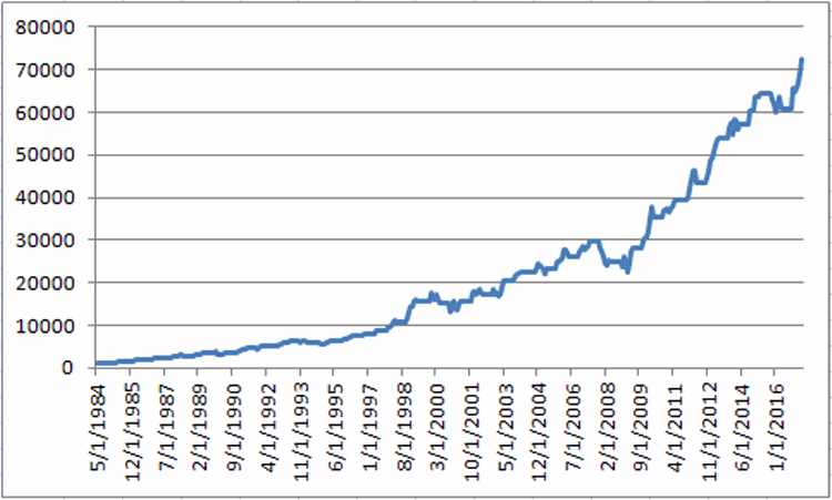
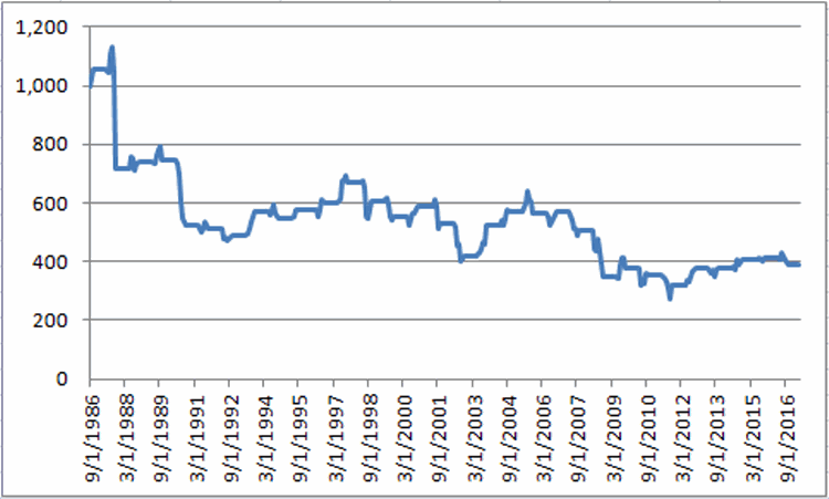
Figure 2 displays a monthly equity curve of just this period. It’s not a pretty picture.2
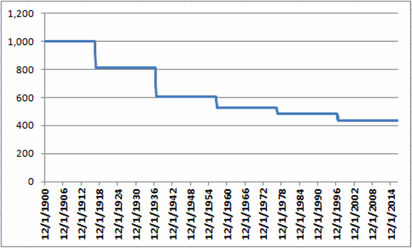
Figure 2 – Growth of $1,000 invested in the Dow Jones Industrials Average ONLY during August, September and October of “Post-Election Years ending in “7”

Summary

Let’s face it, it’s pretty easy to dismiss this “study” as some bizarro anomaly or calendar quirk based on a ridiculously small sample size.  And do not assume that I am “predicting” anything here (as if I had the ability).

The only thing I do know is that if the market starts to breakdown anytime leading up to or within the August through October period there will be at least one market blog writer taking some serious defensive action.

Jay Kaeppel

Disclaimer:  The data presented herein were obtained from various third-party sources.  While I believe the data to be reliable, no representation is made as to, and no responsibility, warranty or liability is accepted for the accuracy or completeness of such information.  The information, opinions and ideas expressed herein are for informational and educational purposes only and do not constitute and should not be construed as investment advice, an advertisement or offering of investment advisory services, or an offer to sell or a solicitation to buy any security.

Playing the GDX ‘Coil’

Gold stocks are known for being “volatile” – especially after they go for a while without being volatile. Figure 1 displays the recent price action for ticker GDX – an ETF that tracks an index of gold mining stocks.1Figure 1 – Ticker GDX “coiling” in an ever narrower range (Courtesy AIQ TradingExpert)

(See also Trading Bonds Using Metals)

This action suggests that GDX may be setting up for a big price move.  The problem is that if we pick an expected direction – be it up or down – and we are wrong, a loss is inevitable.  Likewise, prices can continue to “coil” so it is difficult to predict “when”  a meaningful move might take place.

Interestingly though, the implied volatility for options on ticker GDX has declined steadily to a multi-year low (See Figure 2). This kernel of knowledge tells us that GDX options are “cheap”.  In a nutshell, the lower the IV for a given security, the less the amount of time premium built into the option prices for that security – meaning option prices are lower than they would be if IV was high.  2Figure 2 – Implied volatility on GDX options has declined to a multi-year low (Courtesy www.OptionsAnalysis.com)

(See also The World is Your Oyster – 11 Days a Month)

As you can see in Figure 3, the last time IV on GDX options bottomed at this low of a level, the price of GDX moved almost 30% in less than two months.  3Figure 3 – GDX price action with 90-day option IV (Courtesy www.OptionsAnalysis.com)

While there is no guarantee that such a move will occur this time around, the current setup – “coiling prices” and “cheap options” provides an excellent setup for an option trade known as a straddle.  A straddle involves buying both a call option and a put option with the same strike price.  No attempt is made to “pick direction”, instead we simply hope for a large move in one direction or the other.

Example Trade

As always this blog does not make “recommendations” and the trade that follows is highlighted simply as an example of one way to potentially take advantage of the current setup in GDX.

The example trade involves:

*Buying GDX September 22.5 call

*Buying GDX September 22.5 put

By using September options we give GDX 3 1/2 months to make some sort of meaningful price move.

The particulars and risk curves for this hypothetical trade appear in Figure 4.

4Figure 4 – GDX September 22.5 long straddle (Courtesy www.OptionsAnalysis.com)

Things to note:

*Maximum risk is -$307 per 1-lot (this would only occur if GDX closes exactly at $22.5 a share on 9/15)

*106 days left until expiration

*Unlimited profit potential in either direction

*Breakeven prices at September expiration (9/15) are $25.57 and $19.43

Summary

Once again, this is not a “recommended” trade. It is simply one example of one way to play the current combination of “quiet and coiling” gold stock price and “cheap” options on GDX (i.e., low implied volatility).

Jay Kaeppel

Disclaimer:  The data presented herein were obtained from various third-party sources.  While I believe the data to be reliable, no representation is made as to, and no responsibility, warranty or liability is accepted for the accuracy or completeness of such information.  The information, opinions and ideas expressed herein are for informational and educational purposes only and do not constitute and should not be construed as investment advice, an advertisement or offering of investment advisory services, or an offer to sell or a solicitation to buy any security.

Which Way Out for Biotech and Real Estate?

In the interest of full disclosure the sad truth is that I presently have no answers to the headline question.  No predictions, no advice, no recommendations, no example trades, no nothing.  Sorry.

In fact this may be the shortest piece I’ve ever written.  But for whatever its worth, from a perusal of various sectors this weekend the two charts below caught my eye as “things to keep an eye on.”

My hunch is that a positive move for biotech and real estate would be a very positive influence on the overall market and vice versa.

For now, though – still in the “watching stage.”1Figure 1 – Ticker XBI (Biotech ETF) (Courtesy ProfitSource by HUBB)

2Figure 2 – Ticker IYR (Real Estate ETF) (Courtesy ProfitSource by HUBB)

(See also JayOnTheMarkets.com: Biotech at the Crossroads)

Jay Kaeppel

Disclaimer:  The data presented herein were obtained from various third-party sources.  While I believe the data to be reliable, no representation is made as to, and no responsibility, warranty or liability is accepted for the accuracy or completeness of such information.  The information, opinions and ideas expressed herein are for informational and educational purposes only and do not constitute and should not be construed as investment advice, an advertisement or offering of investment advisory services, or an offer to sell or a solicitation to buy any security.

Into Soft Seasonal Sector Season

The “Sell in May” seasonal trend is pretty well documented.  As stocks tend to perform less well over the long run between the end of May and the end of October it should come as no surprise that this also impact various stock market sectors.

For the purposes of this test we will use the Fidelity Select Sector lineup of sector funds and look at the total monthly return for each fund on a month-by-month basis.

Figure 1 displays the following

Average% = the average monthly % total return for all Select funds for that month

Median% = the median monthly % total return for all Select funds for that month

Std Dev % = the standard deviation of monthly % total return for all Select funds for that month

Top Ave % Fund = Displays the fund that has had the highest average % total return for that month

Top Ave % = Displays the average % monthly total return for the top fund

1Figure 1 – Fidelity Select Sectors by month using total return data

*Note that the top 7 individual months in terms of average monthly % +/- are November through May.  The 5 worst performing individual months are June through October.

*For the record, it should not be assumed that simply buying and holding the “Top Ave% Fund” is necessarily the best way to go.  Some of the funds such as Electronics (FSELX), Biotech (FBIOX) and especially Gold (FSAGX) can be extremely volatile.

*Also note that the top performer in the long-term for February, March and April is Energy Services (FSESX).  In 2017, FSESX lost -3.6% in February, -2.5% in March and -7.9% in April. So there is no such thing as a “sure thing.”

Figure 2 displays the average trailing 4-month return for all Select Sector funds combined at the end of each month.  The trailing return peaks at the end of May at +1.72% and then declines steadily into September.

2

Figure 2 – Average 4-month rolling return at the end of each month

Note also that the “Average” sector fund lost money overall during June, August and September.

Summary

The data contained herein serve to confirm that it is typically – though not always – tougher to make money in the stock market after the end of May.

Jay Kaeppel

Disclaimer:  The data presented herein were obtained from various third-party sources.  While I believe the data to be reliable, no representation is made as to, and no responsibility, warranty or liability is accepted for the accuracy or completeness of such information.  The information, opinions and ideas expressed herein are for informational and educational purposes only and do not constitute and should not be construed as investment advice, an advertisement or offering of investment advisory services, or an offer to sell or a solicitation to buy any security.

Lessons in Locking In TLT and SLV Profits

In this article on 2/27, I wrote about a potential bear put spread in ticker TLT (Figure 1), betting on a decline in bonds prices.  Then in this article on 3/9, I wrote about adjusting the original position in order to lock in a profit.  It turned out to be fortuitous as the open profit – left unadjusted – would have eventually ended up as a loss (See Figure 3).  By making the adjustment displayed in Figure 4 the trade ended with a profit (Figure 5).

Figure 1 displays the risk curves for the initial position.1xFigure 1 – Risk curves for initial TLT bear put spread (Courtesy www.OptionsAnalysis.com)

TLT fell from $121.29 on 2/27 to $117.78 by 3/8.

Figure 2 displays the open profit for the original position as of 3/8.2Figure 2 – TLT position showing a profit of $742 as of 3/8 (Courtesy www.OptionsAnalysis.com)

By April option expiration on 4/21 TLT was back up to $123.54.

Figure 3 displays the end result if no adjustment had been made and the original position had been held until expiration.  The trade gave back the$742 profit and lost the entire $973 initial investment.3Figure 3 – Original TLT position if held until expiration (Courtesy www.OptionsAnalysis.com)

Now lets assume that on 3/8 we had adjusted by “rolling down” from a 7-lot of the Apr 120-115 bear put  spread into a 4-lot of the 117-112 bear put spread.

Figure 4 shows the adjusted position as of the date of the adjustment (3/8) and the locked in profit of $210.4Figure 4 – Risk curves for adjusted TLT position (Courtesy www.OptionsAnalysis.com)

Figure 5 displays the end result if the adjusted position was held until expiration on 4/21 (a profit of $210).5Figure 5 – End result of adjusted TLT trade (Courtesy www.OptionsAnalysis.com)

Silver (Ticker SLV)

In this article on 4/11, I wrote about a potential straddle position (Figure 6) in ticker SLV.  Then in this article on 5/3, I wrote about 3 different potential adjustments to the original position based on ones outlook for SLV going forward.  Turns about doing any one of the three would have been a good idea.

The original trade left unadjusted (Figure 8) would have so far given back all of the open profit and would now be sitting with a sizable loss.  By making the adjustment displayed in Figure 9 the trade would have added some profit from the recent bounce in SLV (Figure 10).

Figure 6 displays the risk curves for the initial position.1bFigure 6 – Risk curves for initial SLV straddle (Courtesy www.OptionsAnalysis.com)

Between 4/10 and 5/3, SLV fell from $17.00 to $15.59 and the straddle accrued an open profit of $700.

Figure 7 displays the open profit for the original position as of 5/3.2aFigure 7 – SLV position showing a profit of $700 as of 5/3 (Courtesy www.OptionsAnalysis.com)

Since 5/3, SLV has rallied back from $15.59 to $16.23.  

Figure 8 displays the result if no adjustment had been made and the original position had been held through 5/22. The original unadjusted position has given back the $700 open profit and is presently showing a loss of $-460. 3aFigure 8 – Original SLV position with no adjustment (Courtesy www.OptionsAnalysis.com)

Now let’s assume that on 5/3 we had adjusted the original position into a bullish position by closing the original straddle and buying 2 June 15 strike price calls.

Figure 9 shows the adjusted position as of the date of the adjustment (5/3) and the locked in profit of $530.4aFigure 9 – Risk curves for adjusted SLV position (Courtesy www.OptionsAnalysis.com)

Figure 10 displays the result if the adjusted position was held through the close on 5/22 (an open profit of $780).5aFigure 10 – 5/22 status of adjusted SLV position (Courtesy www.OptionsAnalysis.com)

Summary

One primary advantage of trading options is the potential to “lock in a profit” and “let a position ride” while “playing with the house money.”  Of course, if you’ve made it this far through this article then you already known that.

Jay Kaeppel

Disclaimer:  The data presented herein were obtained from various third-party sources.  While I believe the data to be reliable, no representation is made as to, and no responsibility, warranty or liability is accepted for the accuracy or completeness of such information.  The information, opinions and ideas expressed herein are for informational and educational purposes only and do not constitute and should not be construed as investment advice, an advertisement or offering of investment advisory services, or an offer to sell or a solicitation to buy any security.

Feel the Churn

As a semi-mindless trend-follower blithely riding a bull market I hate to sound like the “boy who cried wolf”.  I’d rather just enjoy the ride.  But in the spirit of the “If you see something, say something” age one “potential” warning sign has appeared recently.  In fact I wish I had written about it before the market plunge the other day.

(See also The Ultimate “Sell in May” Sector)

The JK HiLoIndex (JKHLI)

The indicator I am referring to – the JK HiLo Index is one I developed myself simply by combining one indicator I learned from Norman Fosback and the other from Gerald Appel.

The theory underlying JKHLI is this:

*Low readings signal “fear” and are bullish

*High readings signal “churning” in the market and are bearish

For the record I use this indicator as a “perspective” indicator and not as an actual “buy/sell” trigger.  In order to (hopefully) avoid people getting bored and stopping reading before we get to the “meat”, the calculations appear at the end of the article.  Figure 1 displays the daily indicator values in blue and the Nasdaq Composite Index in red, since January 1988.1Figure 1 – JK HiLo Index (blue) versus Nasdaq Composite Index (red); 1988-present

*JKHLI readings under 20 tend to mark at least short-term bottoms in the stock market.

*JKHLI readings above 100 are considered a “warning” (but not a “sell signal”) and readings above 150 are rare and have typically suggested some trouble ahead for the markets.

Figure 2 displays the JKHLI and Nasdaq Composite since 12/31/2013.  Note there have been 3 periods of <20 readings and 3 periods of >150 readings.  The <20 reading occurred near lows.  The first >150 reading occurred in December 2014.  From there the Nasdaq traded sideways for 19 months.  The 2nd >150 reading occurred in July 2015. 7 months later the Nasdaq bottomed out 17% lower.  The 3rd >150 reading occurred on 5/10/17 just prior to the 5/17 selloff.  Is there more sideways to lower action in the months ahead?

2Figure 2 – JK HiLo Index (blue) versus Nasdaq Composite Index (red); 12/31/2013-present

Previous >150 readings occurred in late 1999 and early 2000 just prior to the great bear market that ultimately saw the Nasdaq lose -75% of its value, and in May 2002 just prior to the final -34% plunge to the bear market low.3Figure 3 – JK HiLo Index (blue) versus Nasdaq Composite Index (red); 12/31/1998-12/31/2002)

Note in Figure 3 that there were a number of <20 readings during the 2000-2002 bear market.  While the ensuing rallies were often short-lived, most of these readings did coincide with  at least short-term market lows.

So does the May 2017 JK HiLo Index reading above 150 mean the market is in trouble?  Not necessarily.  But it does suggest that a little bit of caution may be in order in the months ahead.

(See also The Sordid Past of Years Ending in ‘7’)

JK HiLo Index Calculations:

A = Daily Nasdaq Issues Traded

B = Daily Nasdaq New Highs

C = Daily Nasdaq New Lows

D = Lower of B and C

E = (D / A) * 100 (the lower of new highs and new lows divided by total number of issues traded)

NOTE: Value E is Norman Fosback’s Hi/Lo Logic Index applied to Nasdaq

F = 10-day simple moving average of E

G = B / (B + C) (i.e., new highs divided by total of news highs plus new lows)

H = 10-day simple moving average of G

NOTE: From Gerald Appel, value H ranges from 0 to 1.  0 would mean there were 0 new highs and 1 would mean no new lows.

JK HiLo Index = (E * H)

In other words, JK HiLo Index is derived by multiplying Fosback’s HiLo Logic Index times Appel’s HiLo percent indicator.

Jay Kaeppel

Disclaimer:  The data presented herein were obtained from various third-party sources.  While I believe the data to be reliable, no representation is made as to, and no responsibility, warranty or liability is accepted for the accuracy or completeness of such information.  The information, opinions and ideas expressed herein are for informational and educational purposes only and do not constitute and should not be construed as investment advice, an advertisement or offering of investment advisory services, or an offer to sell or a solicitation to buy any security.

Summer Leisure = Fun (and Dead Money)

There are few things in life better than “summer leisure”.  Unless you are trying to make from it.  Then you may be barking up the wrong tree.

(See also Biotech at the Crossroads)

Ticker FDLSX

Ticker FDLSX is the Fidelity Select Leisure Portfolio sector fund.  This fund presently holds roughly 55% of its portfolio in restaurant stocks, 16% in hotels, resorts and cruise lines and 11% in casino and gaming stocks.

Like FSHOX, which I wrote about here, the months of November and May are “where the action is” and the months of June through October are where “a whole lot of nothing is”.

Let’s compare the November through May performance to the June through October performance since inception in 1984.

Measure Bull Period Bear Period
# times UP 28 22
# times DOWN 5 11
Median % +(-) +12.7% +3.0%
Average % gain +18.7% +7.5%
Average % loss (-7.3%) (-12.1%)
Total % Gain +7,141% +8.0%

Figure 1 – FDLSX November thru May Bull Period versus June thru October Bear Period

At first blush it can be argued that the June through October bear period “isn’t that bad.”  This period has seen leisure stocks register a gain fully 66% of the time and a median gain of +3% over a 5-month period is certainly not the worst performance anyone has ever seen.

But the key piece of information is contained in the last row of Figure 1:

*The “bull period” has seen FDLSX gain over +7,100%. 

*The “bear period” has witnessed a net gain of all of +8%. That’s over 165 months (5 months a year times 33 years). 

For the record, June through October has seen FDLSX register gains of +24.9% (1994), +17.5% in 1998 and +17.2% in 1985.  So understand that there is no “prediction” being made here about 2017. A sharply higher price for FDLSX is absolutely a possibility.  But note also that the June through October period has also seen FDLSX register losses of -26.1% in 2009, -24.5% in 1991, -22.4% in 2002 and -20.1% in 1988.  These are the kinds of hits that can take a long time to recover from – both financially and psychologically.

The equity curves make the performance differences quite clear.  Figure 2 displays the growth of $1,000 invested in FDLSX only during the months of November through May starting in 1984.2Figure 2 – Growth of $1,000 invested in ticker FDLSX November through May (1984-present)

Figure 3 displays the growth of $1,000 invested in FDLSX only during the months of June through October.3aFigure 3 – Growth of $1,000 invested in ticker FDLSX June through October (1984-present)

A long look at Figure 3 renders the fact that 66% of the years showed a gain a lot less significant than it sounds.  Essentially just a roller coaster ride that ends up about where it started.

(See also The ‘Range Bound Consolidation Pattern’)

Summary

All things considered it can be argued that leisure stocks are not the worst possible investment someone could choose for the summer months.  But with a net gain of +8% over the past 33 “summers” the phrase “Dead Money” doesn’t seem out of line.

So are leisure related stocks guaranteed to fall – or even underperform – between 5/31/2017 and 10/31/2017? Not at all.  But the bottom line is this: eat at all the restaurants you want, gamble, go on a cruise, and relax on the beach, whatever.

But if you are looking to make money, you might do well to look elsewhere.

Jay Kaeppel


Disclaimer:  The data presented herein were obtained from various third-party sources.  While I believe the data to be reliable, no representation is made as to, and no responsibility, warranty or liability is accepted for the accuracy or completeness of such information.  The information, opinions and ideas expressed herein are for informational and educational purposes only and do not constitute and should not be construed as investment advice, an advertisement or offering of investment advisory services, or an offer to sell or a solicitation to buy any security.

The Ultimate “Sell in May” Sector

Summer time is a great time to build a house, do some remodeling or engage in some other home related improvements.  It’s just not a great time to invest in the stocks related to any of this.

First off, let’s make an important point: I am NOT “predicting” that housing stocks etc. are “at the edge of the precipice”, “set up for a crash”, “doomed to failure”, or any such thing.  I am simply stating that the time to hold housing related stocks is from November through May and NOT from June through October.

Let’s examine the cold, hard facts.

(See also Shining Speculation Example in Gold Stocks)

Ticker FSHOX

Ticker FSHOX is the Fidelity Select Construction and Housing Portfolio sector fund.  Let’s compare the November through May performance to the June through October performance since inception in 1986.

First note this “statistically significant” difference:

*Between November and May FSHOX has gained +7,488%

*Between June and October FSHOX has lost -61%

Need I say more?  Well just to cover all the bases let’s take a closer look at some of the numbers “behind the curtain.”

0Figure 1 – FSHOX: November thru May Bull Period versus June thru October Bear Period

As you can see in Figure 1:

*The November-May bull period has seen FSHOX register a gain 90% of the time (as of 5/12/17 the current bull period – which is not included in Figure 1 shows FSHOX up +18%)

*The June-October bear period has seen FSHOX register a gain only 50% of the time

*The average November-May performance = +16.2%

*The average June-October performance = +0.1%

*Do NOT think that FSHOX cannot rise between May and November. FSHOX gained +24.3% in 2003, +18.6% in 2012 and +16.6% in 1993 during the so-called “bear period”.  But also note the losses of -32.4% in 1987, -31.3% in 2008, -29.7% in 1990 and -21.0% in 2002.

*On the other hand the worst losses experienced during the November-May bull period was -5.7% in 2008 and -4.7% in 2000.

The equity curves make the performance differences quite clear.  Figure 2 displays the growth of $1,000 invested in FSHOX only during the months of November through May starting in 1986.1Figure 2 – Growth of $1,000 invested in ticker FSHOX November through May (1986-present)

Figure 3 displays the growth of $1,000 invested in FSHOX only during the months of June through October.2Figure 3 – Growth of $1,000 invested in ticker FSHOX June through October (1986-present)

See also This is What a Lack of Fear Looks Like (I Think))

Summary

So are housing related stocks guaranteed to fall – or even underperform – between 5/31/2017 and 10/31/2017?  Not at all.  Simply note that history suggests that this may not be the best place to be during that time.

Jay Kaeppel

Disclaimer:  The data presented herein were obtained from various third-party sources.  While I believe the data to be reliable, no representation is made as to, and no responsibility, warranty or liability is accepted for the accuracy or completeness of such information.  The information, opinions and ideas expressed herein are for informational and educational purposes only and do not constitute and should not be construed as investment advice, an advertisement or offering of investment advisory services, or an offer to sell or a solicitation to buy any security.

Shining Speculation Example in Gold Stocks

In the minds of most “investors”, the word “speculation” is sort of a dirty word.  It seems to represent something that we secretly “want to do” but somehow “know we shouldn’t”.  “Investing” is smart.  “Speculation” is foolish.  To which I reply “Balderdash” (actually I had another word in mind that also has a “B” and an “S” in it, but let’s just never mind about that).

In my opinion every portfolio should include some sort of speculation.  But it has to be done in the right way.

A Framework for Speculating

There are two effects regarding any position in the financial markets:

*Financial

*Psychological

The worst case scenario is to make a “crazy bet” and lose your shirt.  Not only is the financial effect potentially devastating to your longer-term finances but the psychological fallout can result in second-guessing every investment decision for years to come.

Therefore, one of the keys to speculating successfully is keeping position sizes small.

If you are investing for the long-term and/or implementing a strategy, it is important to have some identifiable reason why you believe it will work (fundamentals are solid, high profit loss ratio in the past, etc., etc.).

For speculative positions you can bet on any old thing no matter how flimsy (“I think this trend line that I have arbitrarily drawn in this chart might hold”, “this sucker sure looks oversold to me”, etc., etc.) – as long as you are not risking a large sum of money.

The other key to speculating successfully is to enter positions that risk only a little but have the potential to make a lot.

Let’s look at one hypothetical example.

(See also This is What a Lack of Fear Looks Like (I Think))

Gold Stocks (using ETF ticker GDX)

For the record, I am not “predicting” that gold stocks are about to rally.  But if you look at Figure 1 you can see a horizontal trend line that I have arbitrarily drawn which I think “may hold” (nothing more, nothing less).1Figure 1 – Ticker GDX with a “potential” support line (Courtesy AIQ TradingExpert)

In Figure 2 we see a daily chart of ticker GDX that shows this ETF bouncing off of an oversold level that has highlighted at least short-term bottoms in the past.2Figure 2 – Ticker GDX with 4-day RSI (Courtesy AIQ TradingExpert)

Anybody feeling super confident about a bullish position in GDX?  Probably not.  But remember we are talking about “speculating” in gold stocks, not about the prospects for buying and holding them for the long-term.  When it comes to speculation the relevant questions are:

1) Do you think there is a reasonable chance that this thing will bounce?

2) And if “Yes” to the previous question, are you willing to risk a couple of bucks on that possibility?

A “No” answer to either question means it’s time to forget this silly idea and move on.

Two “Yes” answers lead us to try to find a way to take advantage of a potential bounce without “betting the house.”

(See also Biotech at the Crossroads)

Using Options to Speculate on Gold Stocks

As I stated above, one of the keys to speculating is to risk a little to (hopefully) make a lot.  One of the best ways to achieve this tradeoff is via the use of options.

The position displayed in Figures 3 and 4 is referred to as a “directional butterfly spread” and involves

*Buying 3 July 22 calls

*Selling 4 July 25 calls

*Buying 2 July 28 calls

3Figure 3 – GDX Directional call butterfly (Courtesy www.OptionsAnalysis.com)4Figure 4 – Risk curves for GDX Directional call butterfly (Courtesy www.OptionsAnalysis.com)

Key things to note about this position:

*The cost is $257.  For a $10,000 account this represent 2.6% of capital.  This also represents the maximum risk for this position if GDX goes south.

*The original profit target level is the recent highs at $24.88 and $25.71. If this range is hit the trade could generate a profit of between $260 to $630 (i.e., roughly 100% to 235% of risk)

*This position has unlimited profit potential if GDX rallies.

Also note in Figure 5 below that time decay can work in this position’s favor if GDX rises to the $23.40 to $27 a share range (i.e., profit increases as time goes by).6Figure 5 – Time decay can work in our favor if GDX rises (Courtesy www.OptionsAnalysis.com)

Summary

So is this trade a good idea?  It beats me.  It mostly depends on one’s answers to the questions posed above – i.e., do you think there is a chance GDX will bounce and are you willing to bet $257 on that possibility?

But it is a pretty good example of how to play the “game of speculation” (should the urge strike)

Jay Kaeppel


Disclaimer:  The data presented herein were obtained from various third-party sources.  While I believe the data to be reliable, no representation is made as to, and no responsibility, warranty or liability is accepted for the accuracy or completeness of such information.  The information, opinions and ideas expressed herein are for informational and educational purposes only and do not constitute and should not be construed as investment advice, an advertisement or offering of investment advisory services, or an offer to sell or a solicitation to buy any security.

This is What a Lack of Fear Looks Like (I Think)

I keep hearing that investors are “skittish” and “concerned” about the markets and the economy and so forth.  But the recent action in a relatively obscure ETF jumped out at me and seems to suggest that this is not necessarily the case – at least not among those who are active in the markets.  From what I can tell these people don’t have a care in the world.  See what you think.

(See also JayOnTheMarkets.com: Biotech at the Crossroads)

What is Ticker SVXY?

A few key concepts:

*Implied volatility (IV) essentially measures the level of time premium built into the price of a given option or series of options on a given security.  In anxious times implied volatility will rise – sometimes sharply – as an increase in demand by speculators rushing to buy options to protect / hedge / speculate / etc in a given security, causes time premium to inflate.  When traders are less worried or more complacent then implied volatility will typically fall as decreased option buying pressure results in lower time premiums.

In sum, high and/or sharply rising IV typically signals fear, low and or declining IV typically signals a lack thereof.

*The VIX Index (see Figure 1) measures the implied volatility of options for the S&P 500 Index traded at the CBOE.  Typically when the stock market declines – especially when it declines sharply – the VIX index tends to “spike” as fearful traders rush in and bid up S&P 500 Index option prices.1Figure 1 – VIX Index (trading inversely to S&P 500 Index)

*In essence, the VIX Index is “inversely correlated” to the stock market.

*Ticker SVXY is an ETF that is designed to track the “inverse” of the VIX Index.  In other words, when VIX rises, SVXY falls and vice versa.  This also means the following:

*Ticker SVXY is highly correlated to the SP 500 Index.  In other words, as the stock market moves higher SVXY typically also moves higher and vice versa.2Figure 2 – SVXY (movements are correlated to the S&P 500 index)

In sum, a declining trend in the price of SVXY shares typically signals fear, while a rising trend in the price of SXVY typically signals a lack thereof.

Now to My Concern

Hopefully some of that made sense.  In a nutshell, the key takeaways are that when fear is low:

*SVXY rises

*Implied volatility declines

But what if both go to extremes?  Is that a bad thing?  The reason I ask appears in Figure 3. 3Figure 3 – Ticker SVXY at an all-time high with implied volatility for options on ticker SVXY plunging (both pointing to a lack of fear)

As far as I can tell, this is what a lack of fear looks like:

*Ticker SVXY is rising dramatically

*Implied volatility (SVXY options) is plunging

In the last 4 years there has never been a bigger disparity between these two measures of “fear” – and they are both pointing to “no fear.”

(See also Four Things to Watch for Warning Signs)

Summary

So the obvious question now is – does any of this matter?  I mean this is more of a “perspective” indicator (“where we are now”) than a “timing’  indicator (“where we are headed next”).  I cannot presently point out a way to use this to generate specific buy and sell signals.

In addition, as a trend-follower I am not the type to make any “Aha, the End is Near” type pronouncements.  As long as the market wants to keep running higher I am happy to “go along for the ride.”

But the less I see my fellow riders being concerned about the market, the more concerned I become.

In the long run that instinct has served me well.

(Here’s hoping that my instinct is wrong this time)

Jay Kaeppel

Disclaimer:  The data presented herein were obtained from various third-party sources.  While I believe the data to be reliable, no representation is made as to, and no responsibility, warranty or liability is accepted for the accuracy or completeness of such information.  The information, opinions and ideas expressed herein are for informational and educational purposes only and do not constitute and should not be construed as investment advice, an advertisement or offering of investment advisory services, or an offer to sell or a solicitation to buy any security.