Category Archives: Uncategorized

The Financial Sector Meets the Election Cycle

In this article I highlighted the fact that – on a historical basis – the financial sector is in “oversold” territory.  In this article I highlighted the fact that we are approaching a typically seasonally favorable period for financial stocks (i.e., the 2nd half of election years).  In this piece we will look at the full election cycle and how it impacts financial stocks.

Financials in the Election Cycle

As our proxy for the financial sector we will use ticker FSRBX (Fidelity Select Banking).  Figure 1 displays the “election cycle calendar” for financial stocks. 
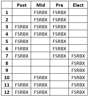
Figure 1 – Favorable Election Cycle Periods

There are essentially four “favorable” periods:

Period 1: March through July Post-Election year

Period 2: November Post-Election year through April Mid-Term year

Period 3: October Mid-Term year through July Pre-Election year

Period 4: July through December Election year

Figure 2 displays the cumulative total return for FSRBX if held only during the months indicated in Figure 1 starting with fund inception in 1986.
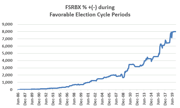
Figure 2 – FSRBX total % return during favorable election cycle periods (1986-2020)

Through March 2020 the cumulative gain is +8,020%.

For contrast, Figure 3 displays the cumulative return for FSRBX if held during all “non-favorable” months (the blank squares in Figure 1).
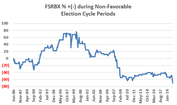
Figure 3 – FSRBX total % return during non-favorable election cycle periods (1986-2020)

Through March 2020 the cumulative loss was -70%.

Figure 4 displays results across each 4-year election cycle.
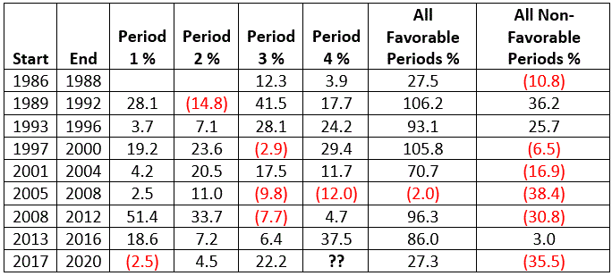
Figure 4 – FSRBX across the election cycle

As you can see in Figure 4, on a period by period basis there are no “sure things”.  There is no guarantee that a “favorable period” will see a gain nor that a “non-favorable period” will see a loss. And with seasonal trends the reality is that there are no guarantees that they will continue ad infinitum into the future.  But for now, the long-term results using ticker FSRBX as a proxy for financial stocks are fairly compelling. 

With financial stocks currently flirting with a potential oversold buy alert, and with a seasonally favorable period set to begin July 1st, I for one will be keeping a close eye on the financial sector.

Jay Kaeppel

Disclaimer: The information, opinions and ideas expressed herein are for informational and educational purposes only and are based on research conducted and presented solely by the author.  The information presented represents the views of the author only and does not constitute a complete description of any investment service.  In addition, nothing presented herein should be construed as investment advice, as an advertisement or offering of investment advisory services, or as an offer to sell or a solicitation to buy any security.  The data presented herein were obtained from various third-party sources.  While the data is believed to be reliable, no representation is made as to, and no responsibility, warranty or liability is accepted for the accuracy or completeness of such information.  International investments are subject to additional risks such as currency fluctuations, political instability and the potential for illiquid markets.  Past performance is no guarantee of future results.  There is risk of loss in all trading.  Back tested performance does not represent actual performance and should not be interpreted as an indication of such performance.  Also, back tested performance results have certain inherent limitations and differs from actual performance because it is achieved with the benefit of hindsight.
The Financials – Part II: Watching and Waiting

In this article I highlighted the fact that – on a historical basis – the financial sector is in “oversold” territory.  As I also mentioned, this fact does NOT mean that a bottom and/or immediate reversal to significantly higher ground is necessarily imminent.  But it does suggest we should be paying attention.

I also highlighted an indicator that has done a reasonably good job of identifying buying opportunities for the financial sector in the past, and that a new “bullish” signal will occur once this (monthly) indicator reverses (which again, does NOT mean that financial stocks are guaranteed to rally once that occurs, only that it has displayed a tendency to do so in the past). 

Financial Stocks and the Election Year

I will be paying particularly close attention if the indicator in the linked article gives a bullish signal sometime in the next several months because we will be entering the second part of an election year, which has historically been favorable for financial stocks.

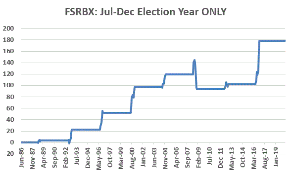
Figure 1 displays the cumulative total return for ticker FSRBX (Fidelity Banking Sector) ONLY during the months of July through December of each election year since 1988 (the fund started trading in 1986). 

Figure 1 – Cumulative % return for ticker FSRBX ONLY during Jul-Dec of Election Years (1986-2020)

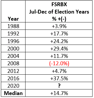
Figure 2 displays the results in table format.

Figure 2 – FSRBX total return July-December of election years (1988-2020)

The median gain during this five-month period was +14.7%.  The one losing period was 2008 when the fund lost -12.0%.

Summary

So if the indicator detailed in the linked article – and displayed at the bottom of Figure 3 below peaks and closes a month lower than the previous month it could offer a bullish alert for investors in the financial sector.

Figure 3 – Ticker FSRBX (Courtesy AIQ TradingExpert)

Jay Kaeppel

Disclaimer: The information, opinions and ideas expressed herein are for informational and educational purposes only and are based on research conducted and presented solely by the author.  The information presented represents the views of the author only and does not constitute a complete description of any investment service.  In addition, nothing presented herein should be construed as investment advice, as an advertisement or offering of investment advisory services, or as an offer to sell or a solicitation to buy any security.  The data presented herein were obtained from various third-party sources.  While the data is believed to be reliable, no representation is made as to, and no responsibility, warranty or liability is accepted for the accuracy or completeness of such information.  International investments are subject to additional risks such as currency fluctuations, political instability and the potential for illiquid markets.  Past performance is no guarantee of future results.  There is risk of loss in all trading.  Back tested performance does not represent actual performance and should not be interpreted as an indication of such performance.  Also, back tested performance results have certain inherent limitations and differs from actual performance because it is achieved with the benefit of hindsight.
Financials – Danger or Opportunity? Or Both?

To say that there is has been and remains a great deal of angst in the financial markets is a bit of an understatement. This is especially true when it comes to the financial sector.  The financial sector has a fairly high correlation to treasury yields (ticker FSRBX – Fidelity Select Banking Portfolio has a 0.52 correlation to ticker TNX – which tracks 10-year treasury yields).  As yields have plummeted so has the financial sector.  During the recent decline, FSRBX plunged -51% from its December 2019 peak.  With little expectation of higher rates anytime soon a lot of investors are understandably wary of diving into this sector.

But much like with the energy sector, the old adage that the time to buy is when there is “blood in the streets”, should give one pause before they turn their back completely on the financial sector.  For the time being I am keeping my eye on a little-known indicator called “Vixfixaverageave” (yes, I agree it is a really bad name).  The calculations for this indicator appear at the end of this article.  The reason I am watching it right now is that it recently reached a very oversold level that has helped to highlight some useful buying opportunities for financials in the past.

Ticker FSRBX

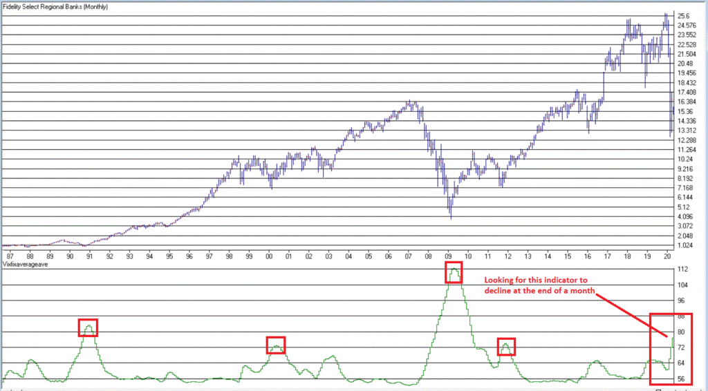
Figure 1 displays a monthly chart for FSRBX in the top clip and the Vixfixaverageave indicator in the bottom clip.  Note that the indicator rose above 72 at the end of April 2020.  As you can see there have been four previous occasions when this indicator, a) exceeded 72 and then b) reversed lower for one month.  For arguments sake we will call that a buy signal.

Figure 1 – Ticker FSRBX with indicator Vixfixaverageave (Courtesy AIQ TradingExpert)

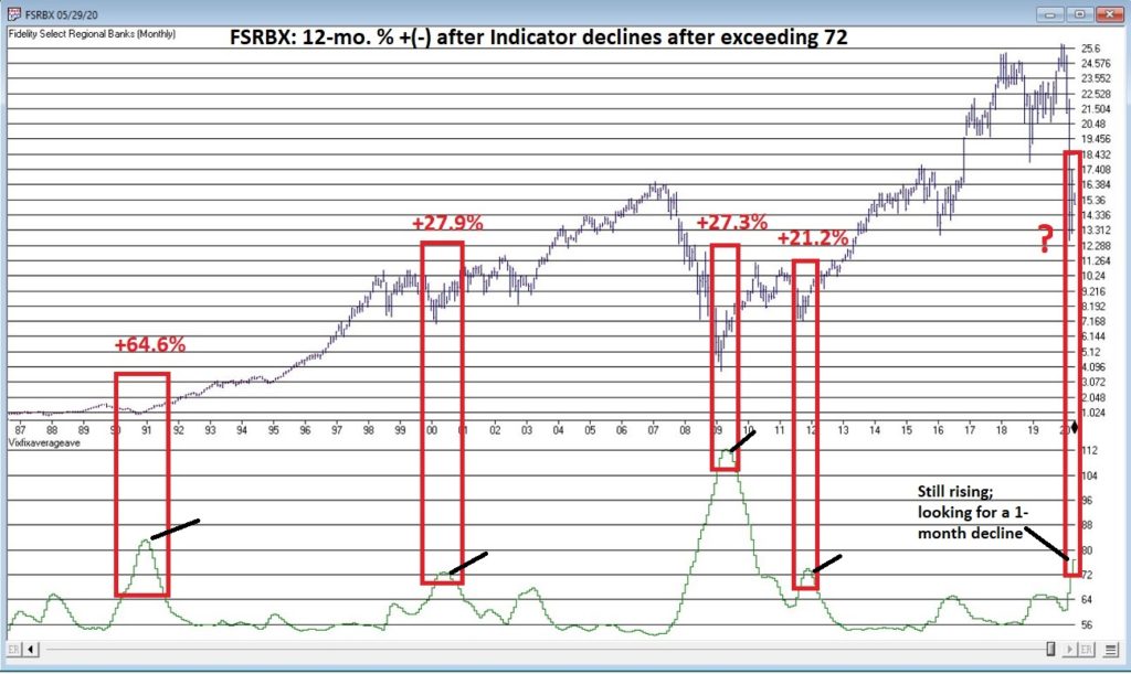
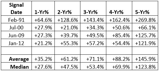
Figure 2 displays the 1 to 5 year % + (-) for FSRBX following the four previous signals.  As you can see, they all proved to be exceptional buying opportunities.

Figure 2 – FSRBX returns 1 to 5 years after signal

Now for the disappointing news: if you are thinking that all we have to do is wait for this indicator to finally top out and that big profits are “guaranteed” to roll in, you are making a mistake.  As they say, “past performance is no guarantee of future results.”  (Sorry, I don’t make the rules).  So, when the Vixfixaverageave monthly reading for FSRBX does finally roll over, the proper course of action would be to:

*Decide if you really want to act based on the signal

*Decide how much capital you are willing to commit

*Decide how much of that capital you are actually willing to risk – i.e. will you stop out if a loss exceeds x%, or do you plan to simply hold it for 1 to 5 years regardless?

Summary

There are a million and one ways to trigger an entry signal.  The one discussed herein is just one more.  What really separates the winners from the losers is the answers to the three questions just posed.

Vixfixaverageave Calculations

This indicator is based on another indicator called VixFix which was developed many years ago by Larry Williams.

hivalclose is hival([close],22).  <<<<<The high closing price in that last 22 periods

vixfix is (((hivalclose-[low])/hivalclose)*100)+50. <<<(highest closing price in last 22 periods minus current period low) divided by highest closing price in last 22 periods (then multiplied by 100 and 50 added to arrive at vixfix value)

vixfixaverage is Expavg(vixfix,3). <<< 3-period exponential average of vixfix

vixfixaverageave is Expavg(vixfixaverage,7). <<<7-period exponential average of vixfixaverage

Jay Kaeppel

Disclaimer: The information, opinions and ideas expressed herein are for informational and educational purposes only and are based on research conducted and presented solely by the author.  The information presented represents the views of the author only and does not constitute a complete description of any investment service.  In addition, nothing presented herein should be construed as investment advice, as an advertisement or offering of investment advisory services, or as an offer to sell or a solicitation to buy any security.  The data presented herein were obtained from various third-party sources.  While the data is believed to be reliable, no representation is made as to, and no responsibility, warranty or liability is accepted for the accuracy or completeness of such information.  International investments are subject to additional risks such as currency fluctuations, political instability and the potential for illiquid markets.  Past performance is no guarantee of future results.  There is risk of loss in all trading.  Back tested performance does not represent actual performance and should not be interpreted as an indication of such performance.  Also, back tested performance results have certain inherent limitations and differs from actual performance because it is achieved with the benefit of hindsight.
BTW, -$37 a Barrel was Probably the Low for Crude Oil

First off, let’s be clear.  I do think that we will look back on this time period as an outstanding buying opportunity in the energy sector.  What exactly to buy and when exactly to buy it is a whole other question (although I have shared some thoughts on the topic here, here, here and here.  That being said, I don’t know that the energy sector is poised to go “to the moon” anytime soon.  There is a lot of turmoil:

*The March 2020 futures contract incredibly fell to -$37 a barrel

*The U.S. shale oil industry is in grave danger of mass bankruptcies

*Russia and Saudi Arabia have demonstrated that they are willing to create/absorb some instability in the oil market

*Will alternative energy sources become viable replacements for fossil fuels and what will that do to the overall industry

And so on and so forth.  Basically, a thousand and one reasons to steer clear of the energy sector.  Which of course is the number one reason to actually start looking more closely – the old adage of “buying when there is blood in the streets” does seem to be “ringing a bell”. 

One Other Signpost to Consider

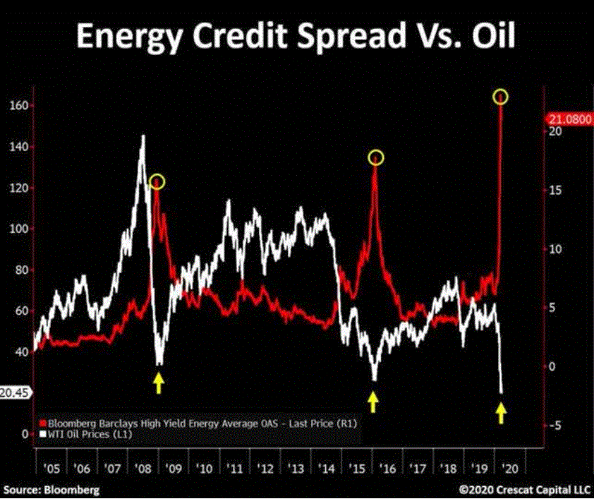
Figure 1 below is from this article posted on www.SeekingAlpha.com authored by Rida Morwa.  I am going to be candid and say that I am not exactly sure what the red line in Figure 1 is measuring (more in a moment) – but the message appears to be pretty clear.  Anyway, as I understand it, the red line in Figure 1 measures the current yield on high yield energy stocks minus….something – maybe higher grade energy stocks or a broader index of high grade corporate bonds – I found something similar at Morningstar.

Figure 1 – Energy Credit Spread vs. Oil (Source: Bloomberg and Crescat Capital LLC, courtesy www.SeekingAlpha.com)

In any event, it is hard to ignore the obvious “potential alert” that appears in Figure 1.  In both 2008-2009 and 2015-2016 the credit spread soared and marked the bottom in crude oil.  The red line in Figure 1 soared to an even higher new high in 2020 just as the price of crude oil cratered.

I don’t offer investment advice nor make specific recommendations.  And I am not entirely convinced that crude oil and/or the broader energy sector is destined to rally significantly anytime soon.  All that being said, now does have the earmarks of being a good time to stop hating the energy sector.

Ticker DBO (an ETF that tracks the price of crude oil future but DOES NOT focus entirely on the front month – which can help to mitigate the risks of contango that troubled the more actively traded ticker USO) may not do a thing. But trading under $6 bucks a share, it might look pretty good a few years from now.

Jay Kaeppel

Disclaimer: The information, opinions and ideas expressed herein are for informational and educational purposes only and are based on research conducted and presented solely by the author.  The information presented represents the views of the author only and does not constitute a complete description of any investment service.  In addition, nothing presented herein should be construed as investment advice, as an advertisement or offering of investment advisory services, or as an offer to sell or a solicitation to buy any security.  The data presented herein were obtained from various third-party sources.  While the data is believed to be reliable, no representation is made as to, and no responsibility, warranty or liability is accepted for the accuracy or completeness of such information.  International investments are subject to additional risks such as currency fluctuations, political instability and the potential for illiquid markets.  Past performance is no guarantee of future results.  There is risk of loss in all trading.  Back tested performance does not represent actual performance and should not be interpreted as an indication of such performance.  Also, back tested performance results have certain inherent limitations and differs from actual performance because it is achieved with the benefit of hindsight.
How to Know When It’s Time to Get Back In

A lot of investors “bailed out” during the 2020 coronavirus market panic.  Whether that will ultimately prove to be the right move or the wrong move only time will tell.  But it is understandable.  The one thing that never changes is human nature, and when a person is watching their net worth evaporate at a shocking pace human nature often intervenes shouting “STOP!”

Same as it ever was.

Since the bottom in late March the major indexes (if not necessarily the majority of stocks) have staged a strong rally.  The question on most investor’s mind now is “When can we sound the “All Clear?” The truth is that there is no sure-fire, fool-proof method for doing so.  But there are some things that can help.

The VIX/SPX “Everyone Back into the Pool” Signal

Every once in awhile the stock market gets clobbered.  That is just a fact of life.  When this occurs two things invariably happen

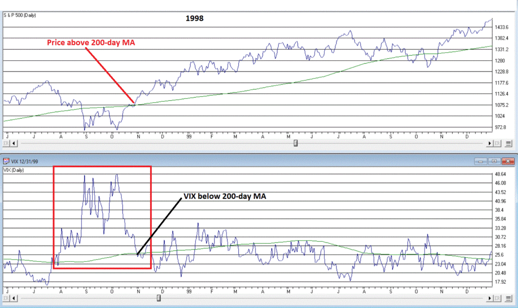
*The S&P 500 Index drops below its 200-day moving average

*The VIX Index soars

So how do we know when the worst is over?  Well, one approach is to look for a reversal of the two things I just mentioned.  So, we can look for:

*The VIX Index to drop back down below its own 200-day moving average

*The S&P 500 Index to rise back above its own 200-day moving average

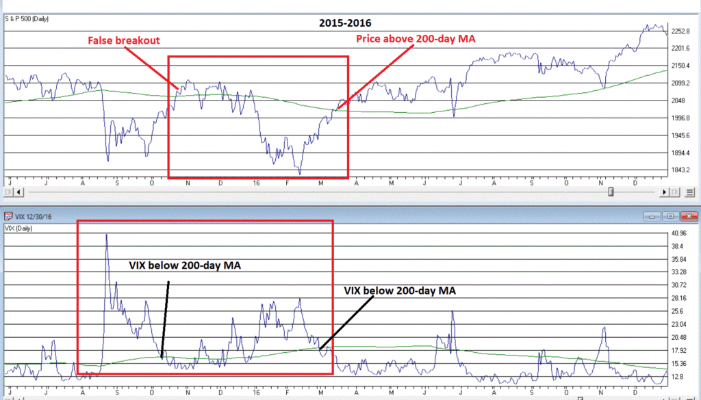
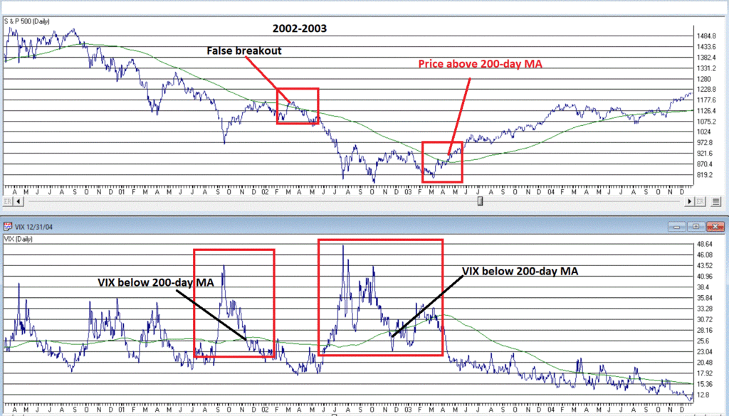
First the bad news.  This method will occasionally highlight a false breakout.  In other words, VIX will fall below its MA, SPX will rise above its MA, and then – the S&P 500 Index goes south again (see Figures 2 and 5) .  

NOTE: As a result, after a signal it is very important to keep a close eye on the S&P 500 Index to see if it continues to hold above its 200-day moving average or not.  If it does not, you may need to “play defense” again.

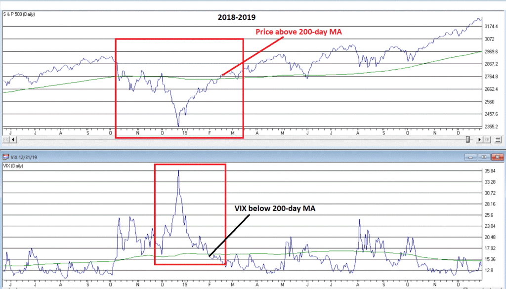
The bottom line is that this is by no means an “automatic, you can’t lose” systematic strategy. Still, the “good news” is that more often than not this signal has proven to be a useful confirmation that it is safe to “get back in the pool.”

See the charts below.

Figure 1 – 1998 (Courtesy AIQ TradingExpert)

Figure 2 – 2002-2003 (Courtesy AIQ TradingExpert)

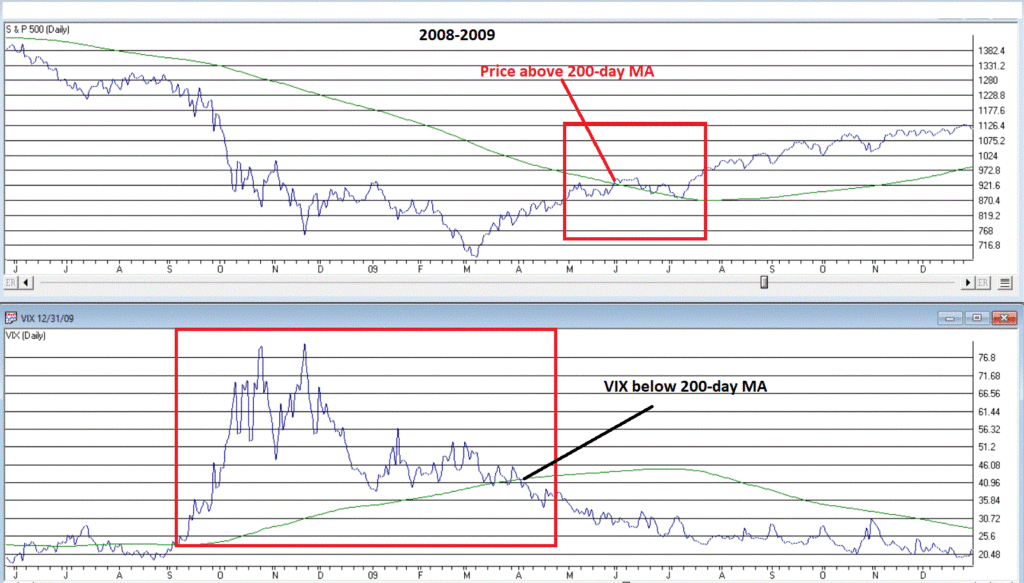
Figure 3 – 2009 (Courtesy AIQ TradingExpert)

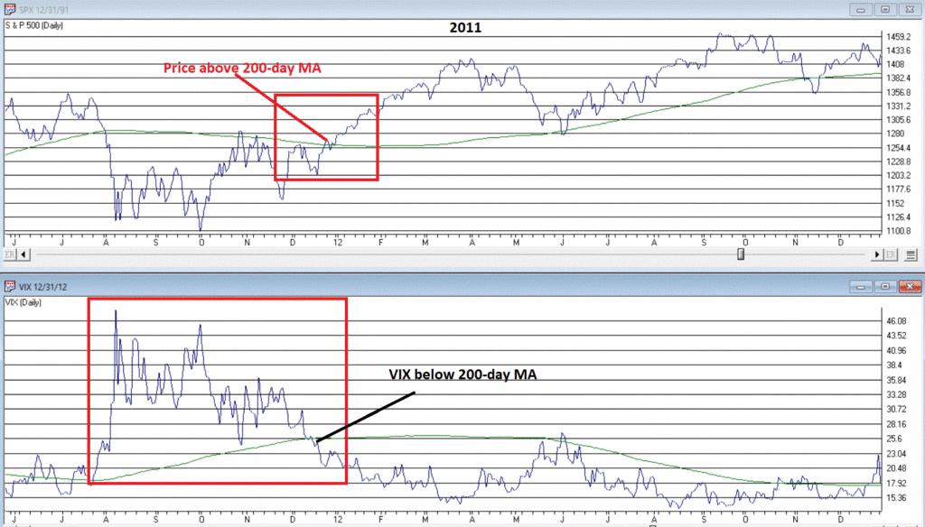
Figure 4 – 2011 (Courtesy AIQ TradingExpert)

Figure 5 – 2015-2016 (Courtesy AIQ TradingExpert)

Figure 6 – 2018-2019 (Courtesy AIQ TradingExpert)

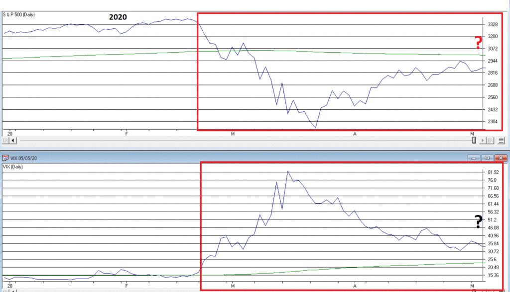
Figure 7 – 2020 (Courtesy AIQ TradingExpert)

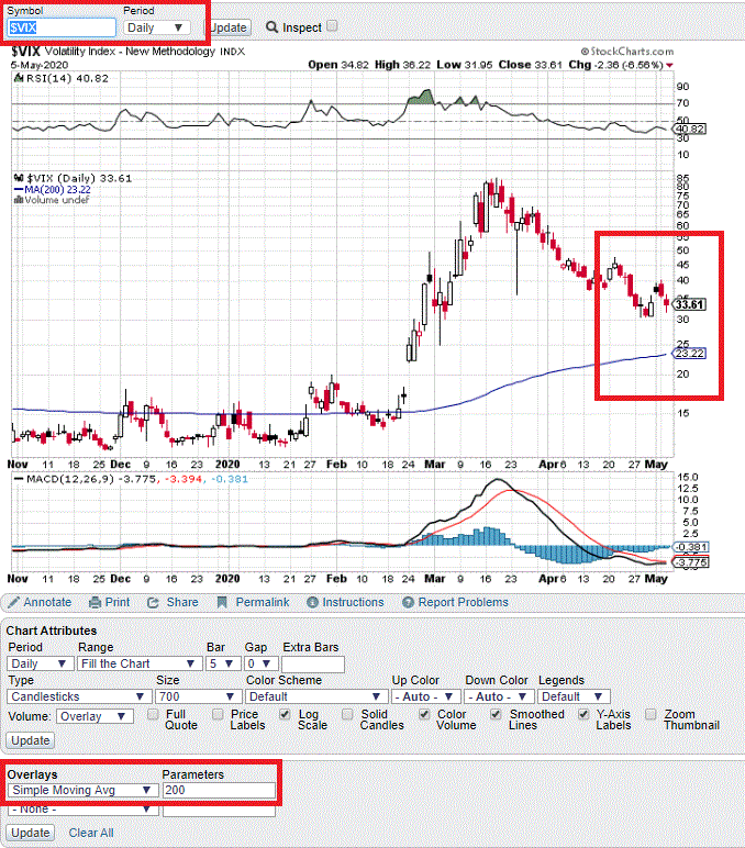
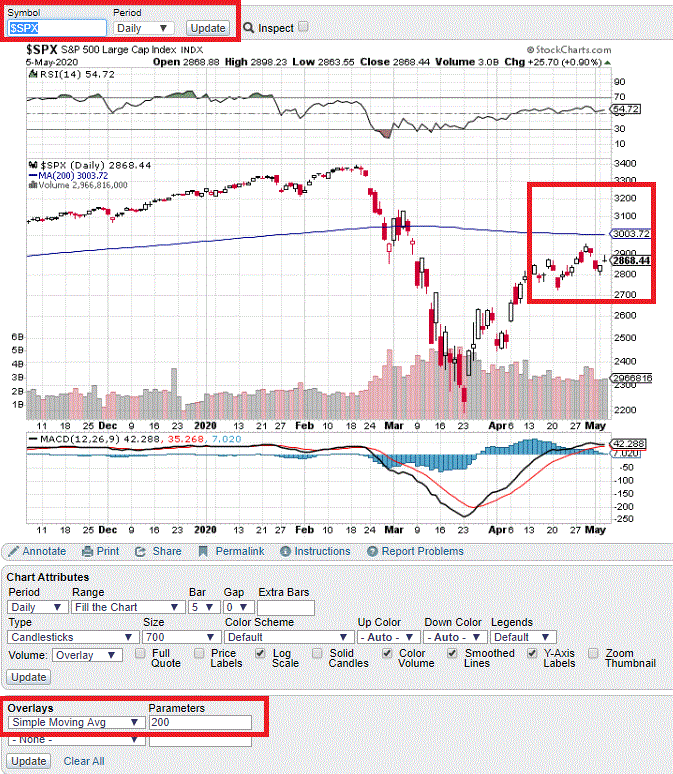
Investors who want to track VIX and the S&P 500 Index can do so simply at www.StockCharts.com. Enter ticker $VIX and set the “simple moving average” to 200 then Update. then do the same for ticker $SPX.

Figure 8 – Ticker $VIX at www.StockCharts.com

Figure 9 – Ticker $SPX at www.StockCharts.com

Summary

Technically speaking, one can argue that the stock market is in a “downtrend” as long as the S&P 500 Index is below its 200-day moving average – as it is now.  So, a cautious approach to the stock market (i.e., something less than 100% full invested) is warranted.

At the moment, neither part of the “Everyone Back in the Pool” method has been triggered.  So, investors should be keeping a close eye on the VIX Index and the S&P 500 Index for these simple clues that better days might be ahead. 

Jay Kaeppel

Disclaimer: The information, opinions and ideas expressed herein are for informational and educational purposes only and are based on research conducted and presented solely by the author.  The information presented represents the views of the author only and does not constitute a complete description of any investment service.  In addition, nothing presented herein should be construed as investment advice, as an advertisement or offering of investment advisory services, or as an offer to sell or a solicitation to buy any security.  The data presented herein were obtained from various third-party sources.  While the data is believed to be reliable, no representation is made as to, and no responsibility, warranty or liability is accepted for the accuracy or completeness of such information.  International investments are subject to additional risks such as currency fluctuations, political instability and the potential for illiquid markets.  Past performance is no guarantee of future results.  There is risk of loss in all trading.  Back tested performance does not represent actual performance and should not be interpreted as an indication of such performance.  Also, back tested performance results have certain inherent limitations and differs from actual performance because it is achieved with the benefit of hindsight.
The Gold/Silver Ratio as a Bond Market Indicator

Intermarket analysis can be an interesting source of ideas.  For example, who would guess that there is a relationship between the metals markets and the bond market?  At first blush it doesn’t make sense.  On one side you have hard, physical metals that have to be dug out of the ground via the use of heavy machinery and mining equipment and on the other side you have pieces of paper issued by governments or companies promising to pay interest over a set period of time and principal at the end.  Not exactly apples and apples.

So why would there be any connection?  The one thing that connects metals and bonds is inflation/deflation, as this can impact both. 

In the simplest terms possible:

*In inflationary times, hard assets such as metals tend to gain ground and paper assets paying a fixed amount of interest tend to lose ground

*In disinflationary and/or deflationary times, hard assets such as metals tend to gain ground and paper assets paying a fixed amount of interest tend to lose ground

Using the Gold/Silver Ratio to Time the Bond Market

The Gold/Silver Ratio (GSR) is exactly as it sounds – the price of gold divided by the price of silver.  For our purposes we will measure this on a weekly basis. We will then use treasury bond futures to measure bond performance.

A = Gold/Silver

B = 2-week exponential moving average of A

C = 28-week exponential moving average of A

D = B-C

So D is the difference between the 2-week and the 28-week exponential average

If D is > 0 it tells use that the gold/silver ratio is trending higher

If D is < 0 it tells us that the gold/silver ratio is trending lower

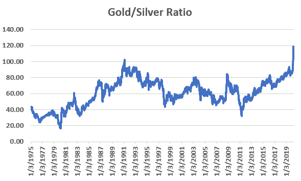
Figure 1 displays the raw Gold/Silver Ratio since 1975 on a weekly basis.

Figure 1 – Gold/Silver Ratio (1975-2020)

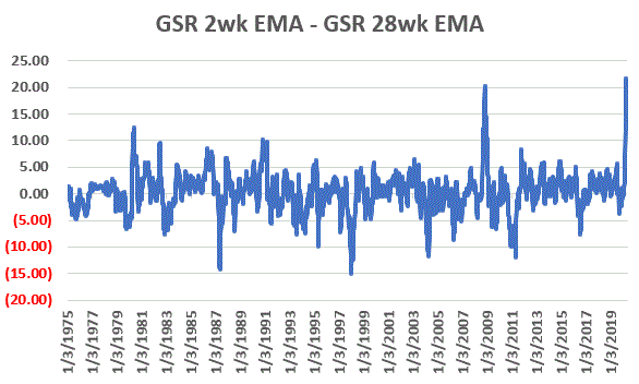
Figure 2 displays the GSR 2-week EMA minus the GSR 28-week EMA (i.e., Value “D” above)

Figure 2 – Gold/Silver Ratio 2-week EMA – Gold/Silver Ratio 28-week MA

Now let’s see if the fluctuations in Figure 2 offer any information about the bond market.

Results

For testing purposes, we will compare the results of holding a long position in t-bond futures when D > 0 versus when D < 0.

T-bond futures are worth $1,000 a point.  So, if t-bond futures gain one full point they value increases by $1,000 and if t-bond futures lose one full point the value decreases by $1,000.

Test Period: 9/9/1977 through 5/1/2020

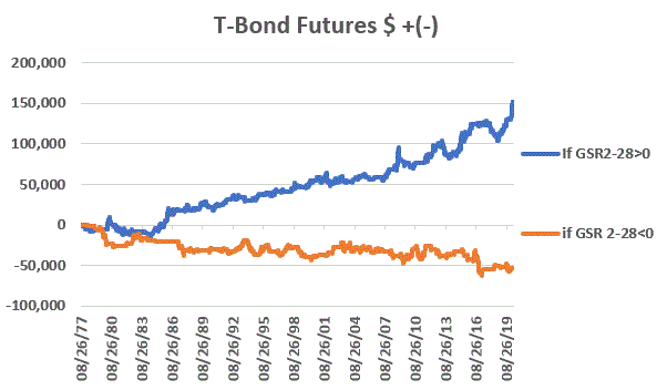
Figure 3 displays the results of our test.

Figure 3 – +(-) from a long one t-bond futures contract position depending on whether GSR 2wk EMA is above or below 28wk EMA (1977-2020)

Figure 4 shows the results in table form.

Gold/Silver Ratio Measure T-Bond $ +(-)
GSR 2-week EMA – 28-week EMA > 0 +$150,759
GSR 2-week EMA – 28-week EMA < 0 (-$53,224)

Figure 4 – +(-) from a long one t-bond futures contract position depending on whether GSR 2wk EMA is above or below 28wk EMA (1977-2020)

Summary

The bottom line is that:

*The blue equity line in Figure 1 (performance of t-bonds when GSR 2ema-28ema > 0) slopes lower left to upper right

*The orange equity line in Figure 1 (performance of t-bonds when GSR 2ema-28ema < 0) slopes upper left to lower right

This tells us that the Gold/Silver ratio may be useful in identifying the overall trend of the bond market.

The trend has been bullish for bonds since 1/24/20 and remains so at the present time. This will remain the case until silver gains enough ground on gold to flip Value “D” discussed above back into negative territory.

Notes on Calculations

*For the record I use the weekly reading for ticker GC-SPOTV and ticker SI-SPOTV in ProfitSource by HUBB software to make the weekly Gold/silver Ratio calculation. 

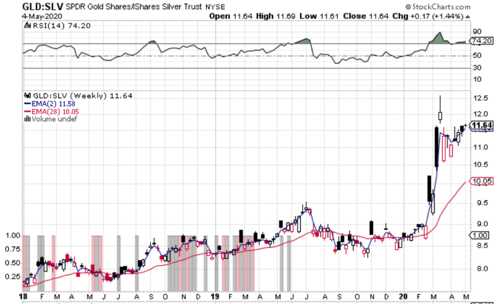
*A simple approach for many investors would be to look at ticker “GLD:SLV” at www.StockCharts.com. This divides the weekly closing price for ticker GLD (a gold bullion ETF) by ticker SLV (a silver bullion ETF).

*You can add 2-week and 28-week exponential moving averages to a weekly chart and note whether the 2-week EMA is above or below the 28-week EMA. 

*It should be noted that different signals may be generated from time-to-time compared to GC-SPOTV and SI-SPOTV (which use spot closing prices for actual gold and silver). 

Figure 5 displays the latest GLD:SLV chart.

Figure 5 – GLD:SLV with 2-week and 28-week EMA’s (Courtesy: www.StockCharts.com)

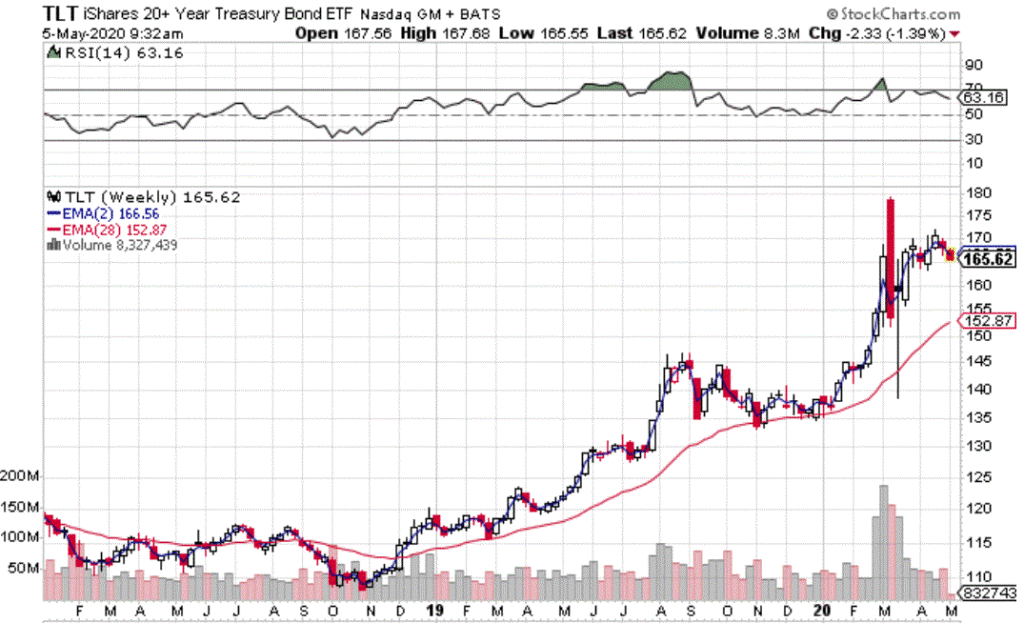
In Figure 6 you can see the relatively high degree of correlation between the long-term treasury (using ticker TLT as a proxy) versus the chart displayed in Figure 5.

Figure 6 – Long-term treasury ETF ticker TLT (Courtesy: www.StockCharts.com)

Jay Kaeppel

Disclaimer: The information, opinions and ideas expressed herein are for informational and educational purposes only and are based on research conducted and presented solely by the author.  The information presented represents the views of the author only and does not constitute a complete description of any investment service.  In addition, nothing presented herein should be construed as investment advice, as an advertisement or offering of investment advisory services, or as an offer to sell or a solicitation to buy any security.  The data presented herein were obtained from various third-party sources.  While the data is believed to be reliable, no representation is made as to, and no responsibility, warranty or liability is accepted for the accuracy or completeness of such information.  International investments are subject to additional risks such as currency fluctuations, political instability and the potential for illiquid markets.  Past performance is no guarantee of future results.  There is risk of loss in all trading.  Back tested performance does not represent actual performance and should not be interpreted as an indication of such performance.  Also, back tested performance results have certain inherent limitations and differs from actual performance because it is achieved with the benefit of hindsight.
Market Timing for Buy-and-Hold Investors (Part III)-The Combined Model

In this article I wrote about the propensity for the month of October to be more problematic in the late part of a decade. 

In this article I highlighted the fact that September tends to be weak when August ends with the Dow in a downtrend.

In this final installment we will put the two together.

The Purpose

I am no fan of just buying-and-holding forever in the stock market. While the market has advanced in the long run, a lot of a buy-and-hold investors success depends on when they start.  If you start just prior to a major bear market or at the outset of a long sideways period (1927-1949, 1965-1982, 2000-2012) your results will not likely be what you had expected or hoped for.

Still, a lot of investors are not interested in the difficult game of timing the market.  So, this short series is designed to give long-term investors some tools for helping increase long-term returns while still primarily remaining fully invested.

The Components

We will create a model that can read either -1 or 0

*If the current month is October AND the current year ends in “7”, “8” or “9” the Model = -1

*If the current month is September and if the Dow Jones Industrial Average closed August below its 10-month moving average of monthly closing prices the Model = -1

*Otherwise the Model = 0

Investment Rules

*If the Model = 0 we will hold the Dow Jones Industrial Average

*If the Model = -1 we will be out of the stock market (presumably in cash, money market or very short-term treasuries)

The Test

*When the Model = 0 we will assume the strategy gained or lost the amount (price only for these calculations, no dividends) the percentage gain or loss for the Dow that month

*When the Model = -1 we will assume no gain or loss for the month, just a flat result

NOTE: Theoretically dividends earned while in the market and interest earned while out of the market would inflate the results that follow.  But I am not recommending an investment strategy per se, just providing food for thought.  So, for the purposes of this test we are just measuring the effect of price movement for the Dow.

The Results

*We are running this test using month-end Dow price data from 12/31/1899 through 4/30/2020, a total of 1,444 months

*During this 120.33 year period the Model was -1 only 74 times, or 5% of the time

*In other words, we would be in the market 95% of the time and out only 5% of the time. 

What do we gain for being out that 5% of the time?

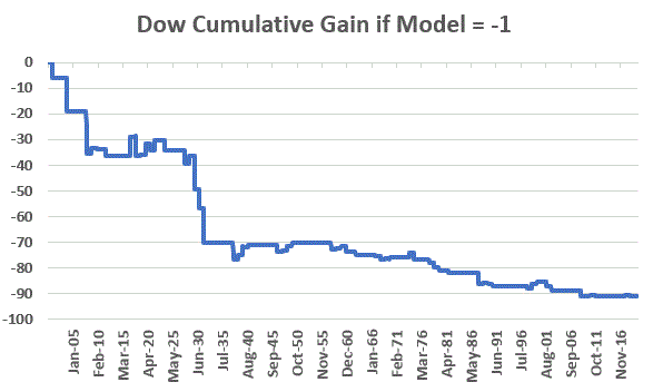
It’s actually more about what we miss.  Figure 1 displays the cumulative growth of equity achieved by holding the Dow Jones Industrial Average ONLY during those months when the Model as -1.

Figure 1 – Cumulative Dow price performance during months when Model = -1

*The net result was a loss of -91.2%. 

Cumulative Growth of Equity:

*During Months when Model = 0: +568,172%

*During Months when Model = -1: (-91%)

*On a buy-and-hold basis: +50,191%

By sitting out 74 of 1,444 months we improve buy-and-hold results by a factor of 11.3-to-1.

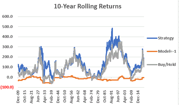
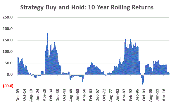
Figure 2 displays the 10-year cumulative return for each approach.

Figure 2 – 10-Year Rolling % Return for Strategy, inverse strategy and Buy-and-Hold

Figure 3 displays the 10-year cumulative return for the Strategy versus buy-and-hold.  Note that during the 1920’s. 1950’s, 1970’s and 1990’s there were time when buy-and-hold outperformed the Strategy.

Still, looking at 10-year rolling returns the Strategy outperformed buy-and-hold 82% of the time. 

Figure 3 – Strategy 10-year return minus buy-and-hold 10-year return

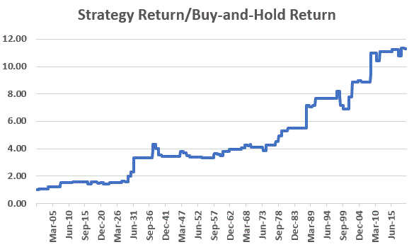
Finally, Figure 4 divides the growth of $1,000 invested using the Strategy by $1,000 invested using buy-and-hold.  Notice that over time this ratio slopes upper left to lower right.  This tells us that getting out of the market every once in awhile using the rules listed above is resulting in a higher return

Figure 4 – Growth of $1,000 invested using Strategy divided by Growth of $1,000 invested using Buy-and-Hold

Summary

So, is this “World Beater, You Can’t Lose” investing?  Not at all.  Still it does point out that there may be simple ways to improve upon a simple buy-and-hold approach without trying to time every twist and turn in the market.

For the record, the strategy will remain fully invested until at least October of 2027 UNLESS the Dow closes a month of August below its own 10-month moving average of monthly closing prices (which it is presently in danger of doing in 2020), in which case the Strategy would get out of the stock market for the entire month of September before getting back in at the end of September.

Jay Kaeppel

Disclaimer: The information, opinions and ideas expressed herein are for informational and educational purposes only and are based on research conducted and presented solely by the author.  The information presented represents the views of the author only and does not constitute a complete description of any investment service.  In addition, nothing presented herein should be construed as investment advice, as an advertisement or offering of investment advisory services, or as an offer to sell or a solicitation to buy any security.  The data presented herein were obtained from various third-party sources.  While the data is believed to be reliable, no representation is made as to, and no responsibility, warranty or liability is accepted for the accuracy or completeness of such information.  International investments are subject to additional risks such as currency fluctuations, political instability and the potential for illiquid markets.  Past performance is no guarantee of future results.  There is risk of loss in all trading.  Back tested performance does not represent actual performance and should not be interpreted as an indication of such performance.  Also, back tested performance results have certain inherent limitations and differs from actual performance because it is achieved with the benefit of hindsight.
Market Timing for Buy-and-Hold Investors (Part II)-Sordid September

In this short series I am attempting to highlight that there may be opportunities for long-term investors to occasionally and successfully hedge their stock market bets (by whatever means – raising cash temporarily, inverse funds, put options, etc.) without attempting to time every twist and turn in the market.

In this article I wrote about the propensity for the month of October to be more problematic in the late part of a decade.  In this missive we will look at the “worst” month of the year – the month of September.

Sordid September

Since 1900 the Dow in September has showed:

*a gain 52 times

*a loss 67 times

*no change 1 time

*an average return of -0.95%

Not pretty. 

But a closer look reveals a slightly different picture. 

September with a 10-month Dow Moving Average

In this test we will determine at the end of each August the Dow Jones Industrial Average is above it’s 10-month moving average (using monthly closing price) or below. 

*If the August Dow close is above the 10-month average we will call it Sep MA UP

*If the August Dow close is below the 10-month average we will call it Sep MA DOWN

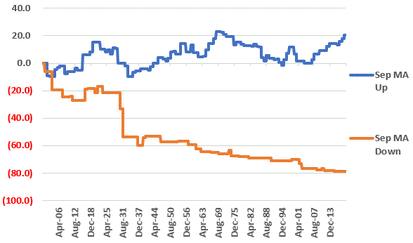
Figure 1 displays the cumulative gain for the Dow during the month of September depending on whether its Sep MA UP or Sep MA DOWN

Figure 1 – Dow cumulative September +(-) depending on whether August close was above or below 10-month moving average; 1900-2019

For the record:

*The cumulative price gain for September if Sep MA UP was +20.4%

*The cumulative price loss for September if Sep MA DOWN was -78.5%

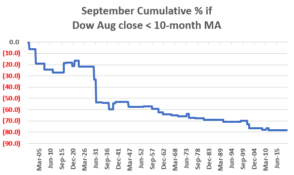
Just to make the distinction clear, Figure 2 displays the cumulative price loss for September if Sep MA DOWN.

Figure 2 – Dow cumulative September % if Dow August close was below its 10-month moving average; 1900-2019

The bottom line: the 38 Septembers that followed the Dow closing August below it’s 10-month moving average registered a cumulative decline of -78.5%.

Rhetorical question: What’s the point of “buying-and-holding” through that?

When the Dow closed August ABOVE its 10-month MA:

*the Dow had 41 up Septembers

*the Dow had 41 down Septembers 

*The average result was a gain of +0.29%

When the Dow closed August BELOW its 10-month MA:

*the Dow had 11 up Septembers

*the Dow had 26 down Septembers 

*the Dow had 1 unchanged September

*The average result was a loss of -3.62%

The Net Result

Using monthly closing price data (not total return data including dividends), a buy-and-hold approach using the Dow starting in 1900 gained +45,714%.

Had an investor sat out the market during the 38 Septembers that were preceded by the Dow closing below its 10-month moving average, the gain would be +210,046%.

Jay Kaeppel

Disclaimer: The information, opinions and ideas expressed herein are for informational and educational purposes only and are based on research conducted and presented solely by the author.  The information presented represents the views of the author only and does not constitute a complete description of any investment service.  In addition, nothing presented herein should be construed as investment advice, as an advertisement or offering of investment advisory services, or as an offer to sell or a solicitation to buy any security.  The data presented herein were obtained from various third-party sources.  While the data is believed to be reliable, no representation is made as to, and no responsibility, warranty or liability is accepted for the accuracy or completeness of such information.  International investments are subject to additional risks such as currency fluctuations, political instability and the potential for illiquid markets.  Past performance is no guarantee of future results.  There is risk of loss in all trading.  Back tested performance does not represent actual performance and should not be interpreted as an indication of such performance.  Also, back tested performance results have certain inherent limitations and differs from actual performance because it is achieved with the benefit of hindsight.
IWM – In Case it All Falls Apart

I always try to remind people that “speculating” is different than “investing”, at least in my market-addled mind.  Investing means putting money to work to hopefully make more money over time.  Speculating means trying to make more money right freaking now.  At least that’s one way to look at it.

As always, I do not make “recommendations” and try very hard to avoid making “predictions” (because I’m not very good at making them.  Actually, for the record, I am very good at making them, just not so good at making them come true).

What follows is nothing more than an example of how to pull together different “things” to form a reasonably informed opinion, and then an example trade to attempt to play that opinion.  Nothing more, nothing less.

Ticker IWM

IWM is an ETF that tracks the Russell 2000 Index.  How are “things” for IWM?  The reality is that you can see whatever you want to see.  If you want to be bullish you can certainly find reasons to be bullish.  But this example is going the other way.

Item #1: Sentiment

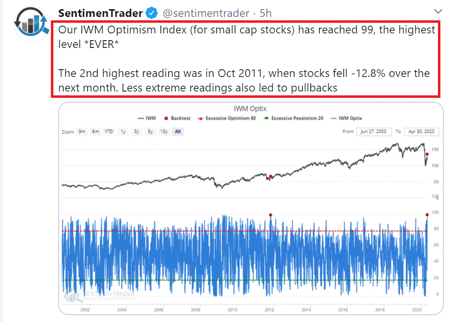
Figure 1 displays a tweet from www.Sentimentrader.com noting that trader sentiment is overwhelmingly bullish on IWM.  While this in no way, shape or form guarantees a reversal, typically overwhelmingly bullish sentiment tends to be a bearish contrarian sign.

Figure 1 – Trader sentiment on IWM (Courtesy Sentimentrader.com)

Item #2: One pundit’s alarmingly bearish stance

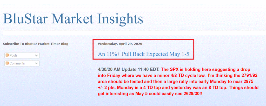
https://blustarmkt.blogspot.com/ is regularly featured at www.McVerryReport.com.  For what it’s worth, this blog is projecting an 11% decline for the overall stock market during the May 1-5 timeframe.  For the record I am not agreeing or disagreeing, just noting that somebody is calling for the bottom to drop out shortly, which dovetails with the contrarian signal from Sentimentrader.com.

Figure 2 – BluStar Market Insight calling for a sharp decline soon

Item #3: A bearish Elliott Wave count from www.ProfitSource.com

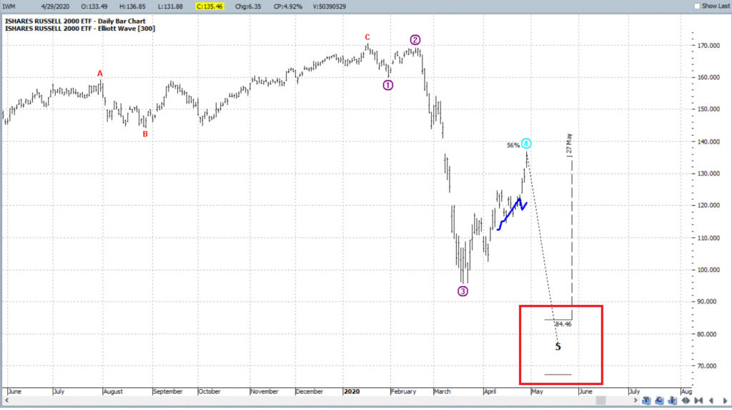
In Figure 3 we see that ProfitSource software (which uses an objective built in algorithm to generate wave counts) is projecting a Bearish Wave 4 decline for IWM. 

Figure 3 – Bearish Elliott Wave Projection (Courtesy ProfitSource by HUBB)

What to Do?

The simplest choice is to ignore all of the above and do nothing.  Another choice is to speculate on a decline by IWM in the weeks/months ahead.  And of course, there are any number of ways to do so.  For our purposes, we will pick a fairly straightforward approach.  The example trade below:

*Buys the IWM June2020 127 put @ $5.82

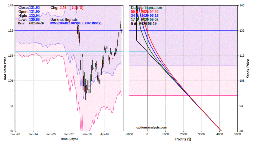
Figure 4 displays the details and Figure 5 displays the risk curves.

Figure 4 – IWM example trade details (Courtesy www.OptionsAnalysis.com)

Figure 5 – IWM example trade (Courtesy www.OptionsAnalysis.com)

To look at this from a “trader’s perspective” let’s “zoom in a bit” on where this trade really lives, based on the following assumptions:

*If IWM gets up to $145 a share or so, our idea is pretty much shot and we should probably cut our loss

*The Elliott Wave projection has May 27th as the last date in the projected decline.  This is 26 days prior to expiration, so we will consider the projected returns for this trade as of that date

*IF IWM really does plummet in the days/week ahead, we can assume that implied volatility will also “spike” once again.  So using the “IV Multiplier” feature built into www.Optionsanalysis.com we (OK, I) will (arbitrarily) project returns based on IV being 33% higher than current levels (An increase in IV would serve to increase the amount of time premium in the option and would increase its value and in turn, our profit.

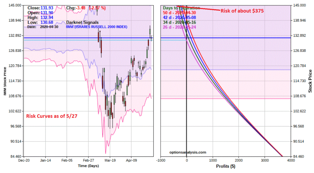
Figure 6 shows the “zoomed in” risk curves.

Figure 6 – IWM risk curves as of 5/26 (Courtesy www.OptionsAnalysis.com)

Trade Management

*From a risk standpoint, the maximum risk on a 1-lot is $582.  However, if we resolve to exit the trade if IWM hits $145 a share by May 27th, our projected worst-case loss is in the -$375 range.

*On the downside, the key question to ask and answer is, a) am I really playing for a massive down move, or b) will I look to adjust the trade/take profits/etc. if a sizeable profit develops.

There are no “correct” answers to that second part but it is important to think about it ahead of time and not just “react” to developments – when emotion is running high. 

Remember, this is intended strictly as food for thought.

Jay Kaeppel

Disclaimer: The information, opinions and ideas expressed herein are for informational and educational purposes only and are based on research conducted and presented solely by the author.  The information presented represents the views of the author only and does not constitute a complete description of any investment service.  In addition, nothing presented herein should be construed as investment advice, as an advertisement or offering of investment advisory services, or as an offer to sell or a solicitation to buy any security.  The data presented herein were obtained from various third-party sources.  While the data is believed to be reliable, no representation is made as to, and no responsibility, warranty or liability is accepted for the accuracy or completeness of such information.  International investments are subject to additional risks such as currency fluctuations, political instability and the potential for illiquid markets.  Past performance is no guarantee of future results.  There is risk of loss in all trading.  Back tested performance does not represent actual performance and should not be interpreted as an indication of such performance.  Also, back tested performance results have certain inherent limitations and differs from actual performance because it is achieved with the benefit of hindsight.
Market Timing for Buy-and-Hold Investors (Part I)

Yes, I understand that “market timing” and “buy-and-hold” are considered to be mutually exclusive.  But as with most things in life there is always a little “wiggle room” if a person is willing to be just a little bit flexible. 

Defining the Terms

Market Timing is actually a fairly broad phrase that can mean different things to different people.  Unfortunately, a lot of people interpret the phrase to mean attempting to “pick tops and bottoms with uncanny accuracy”, which is – in my opinion – impossible.  What IS NOT impossible is to identify situations, patterns and/or times when risk is elevated.  During these times it can make a great deal of sense NOT to be fully exposed in the stock market.

Buy and Hold is in most cases exactly as it sounds.  An investor puts money into the stock market via either a stock, a group of stocks, a mutual fund or an ETF with the intention of leaving it there for an extended period of time.  The goal is essentially to take advantage of the fact that “in the long run, the market goes up” by exercising an unending amount of patience.

The Problems

*The problem with market timing is that it simply is extremely difficult – if not impossible – to identify the right time to buy and sell on any kind of a consistent basis.

*The problem with buy-and-hold is that you are guaranteed to have to endure extremely painful declines from time to time, and you can go a long time (12 years to 22 years historically) without making any new money. 

The Solution?

Let’s suppose an investor resolves to put money in the market for the long-term, but was willing to be a little flexible, i.e., maybe willing to raise some cash, or hedge with an inverse fund or a put option at times long the way.  In this situation there are a few incredibly simple market timing ideas that can be useful.  Not necessarily “World-Beater, You Can’t Lose” useful, but useful nevertheless.

We will discuss the first one in this article and the others in subsequent articles.

The “Dreaded” Month of October

The month of October has a bad reputation in the stock market, often getting referred to as “Crash Month”.  But there is an interesting phenomenon based on the Decennial Pattern which looks at market performance across a decade, starting with Year “0” (1900, 1910, etc.) and ending with Year “9” (1909, 1919, etc.).

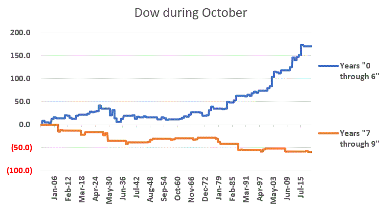
In Figure 1 the blue line displays the cumulative gain for the Dow during the month of October ONLY during the first 7 years of each decade (i.e., the Year ending in “0” through the Year ending in “6”) and the orange line displays the cumulative gain for the Dow during the month of October ONLY during the last 3 years of each decade (starting with Year “7”, i.e., 1907, 1917, etc.). 

Figure 1 – Dow Jones Industrial Average cumulative price performance during October

For the record, the month of October showed:

*A gain of +170.6% during Year’s “0” through “6”

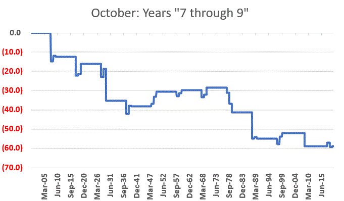
*A loss of -58.9% during Year’s “7” through “9”

Just to drive home the point, Figure 2 displays just the orange line from Figure 1, i.e., the performance of the Dow during October ONLY during Years “7”, “8” and “9”. 

Figure 2 – Dow during October of Years “7”, “8” and “9”

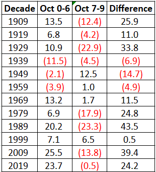
Figure 3 breaks things down decade-by-decade. 

Figure 3 – Decade-by-Decade

*The column labeled “Oct 0-6” displays the cumulative price gain for the Dow in that decade during the month of October in Years “0” through “6”.

*The column labeled “Oct 7-9” displays the cumulative price gain for the Dow in that decade during the month of October in Years “7” through “9”.

*The column labeled “Difference” displays the difference between the two previous columns.  Positive numbers indicate that Years 0-6 outperformed and negative numbers indicate that Years 7-9 outperformed.

As you can see, during the 30’s, 40’s and 50’s October in Years 0-6 suffered a net loss and underperformed Years 7-9.  During all other decades October in Years 0-6 registered a net gain and outperformed Years 7-9.

The Net Result

Using monthly closing price data (not total return data including dividends), a buy-and-hold approach using the Dow starting in 1900 gained +45,714%.

Had an investor sat out the same 3 months every decade – the month of October during Year’s “7”, “8” and “9” – the cumulative gain would be +110,116%, or 2.43 times as much return as buy-and-hold.

Proving once again, it doesn’t have to be rocket science….

Jay Kaeppel

Disclaimer: The information, opinions and ideas expressed herein are for informational and educational purposes only and are based on research conducted and presented solely by the author.  The information presented represents the views of the author only and does not constitute a complete description of any investment service.  In addition, nothing presented herein should be construed as investment advice, as an advertisement or offering of investment advisory services, or as an offer to sell or a solicitation to buy any security.  The data presented herein were obtained from various third-party sources.  While the data is believed to be reliable, no representation is made as to, and no responsibility, warranty or liability is accepted for the accuracy or completeness of such information.  International investments are subject to additional risks such as currency fluctuations, political instability and the potential for illiquid markets.  Past performance is no guarantee of future results.  There is risk of loss in all trading.  Back tested performance does not represent actual performance and should not be interpreted as an indication of such performance.  Also, back tested performance results have certain inherent limitations and differs from actual performance because it is achieved with the benefit of hindsight.