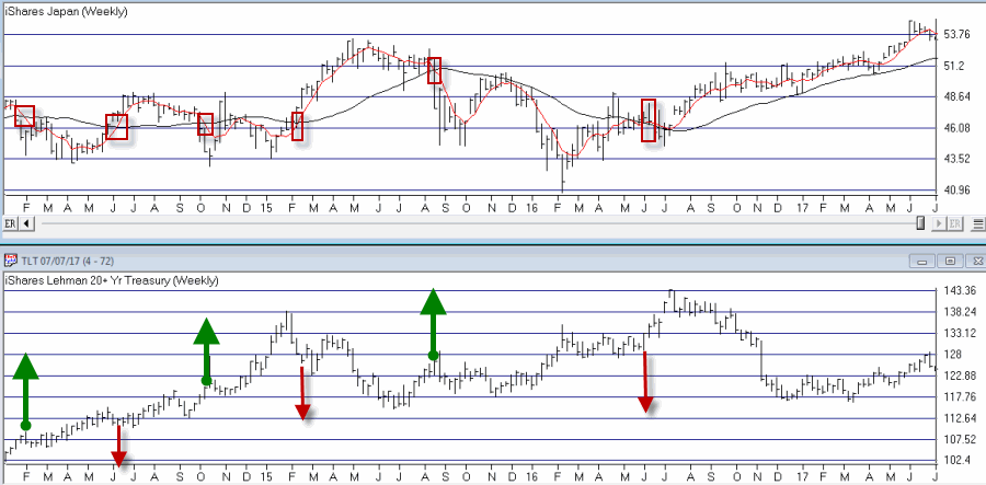
Concerns regarding higher interest rates continue to run deep. But you wouldn’t know it from the recent action of the long-term treasury bond which rallied 8% in 3 months since bottoming in March.
What is the likelihood that bonds will reverse and head lower from here? It beats me. While my primary bond model is still bearish the truth is that predictions are not my strong suit. Still, concerns remain. So if a trader or investor has concerns about the potential for lower bond prices and wants to do something about it, it raises the obvious question of “What?”
The truth is that there are many potential answers. What follows is simply “one of them.”
(See also Playing the GDX ‘Coil’)
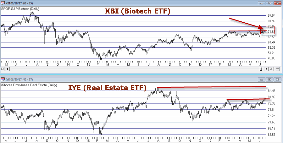
Figure 1 displays a weekly chart of ticker TLT with two admittedly arbitrary “resistance” levels drawn. There is nothing magic about these lines but they do connect a series of previous highs and suggest that we may be at a potentially critical juncture. In other words, a breakout to the upside could clear the way for a larger rally while a failure from these levels could result in another down leg for bond prices.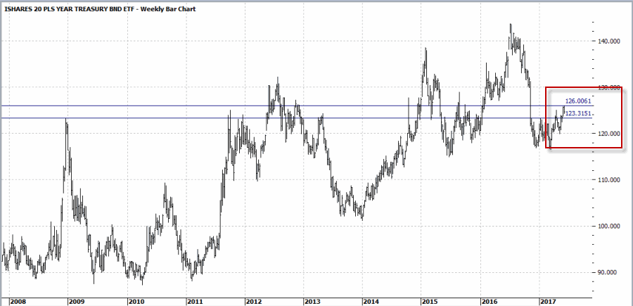 Figure 1 – TLT with potential resistance levels (Courtesy ProfitSource by HUBB)
Figure 2 simply shows a “zoomed in” weekly chart with the latest support and resistance levels drawn in order to identify potential “target” levels. The goal is simple:
*We want to make money if TLT drifts back down towards the lower line (or below it)
*Without risking a lot of money in case TLT breaks out above the upper line
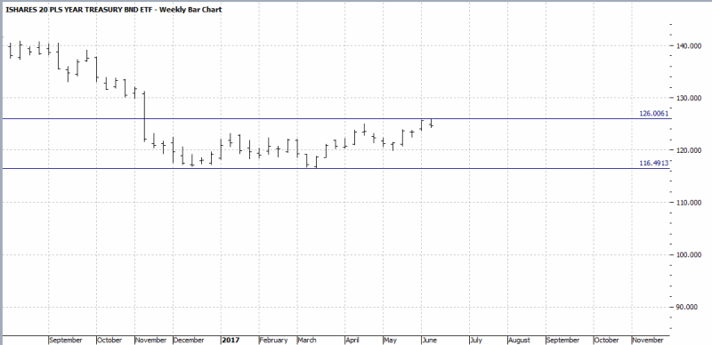 Figure 2 – TLT with potential support and resistance levels (Courtesy ProfitSource by HUBB)
Whatever one expects regarding price direction, the fact is that – as we see in Figure 3 – the implied volatility for options on ticker TLT is at a multi-year low. IV simply tells us whether there is a lot or a little (or somewhere in between) amount of time premium built into the options for a given security. If IV is low it suggests that options are “cheap” and that strategies that buy option premium and/or that can benefit from a potential rise in IV are good strategy candidates.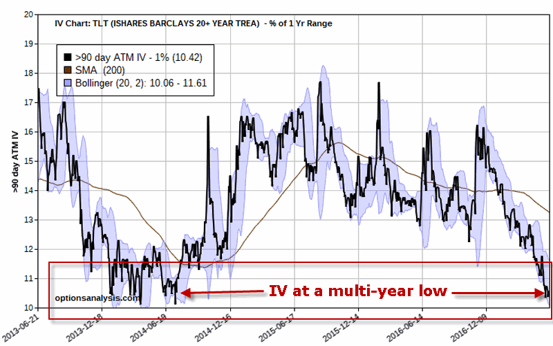 Figure 3 – Implied volatility for TLT options at a multi-year low (Courtesy www.OptionsAnalysis.com)
Let’s look at one relatively simple example trade.
The Out-of-the-Money Put Calendar Spread
The example trade involves:
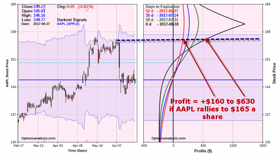
*Buying 15 August 119 puts @ $0.51
*Selling 13 July 119 puts @ $0.21
The particulars appear in Figure 4 (note this trade buys more puts than it sells. This give the trade bearish directional bias).
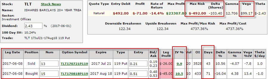 Figure 4 – TLT Out-of-the-Money Put Calendar Spread (Courtesy www.OptionsAnalysis.com)
Note that:
*The cost to enter this trade – and the maximum risk – is $492
*The trade has a “delta” of -103 which means it will act like a position holding short 103 shares of ticker TLT
*The IV for the option bought is 10.5% and 9.9% for the options sold
*The August options expire in 43 days, the Septembers in 71 days. This means that in 43 days the August options will lose their entire time premium while the Septembers will still have 28 days of time premium left.
The risk curves for this trade appear in Figure 5.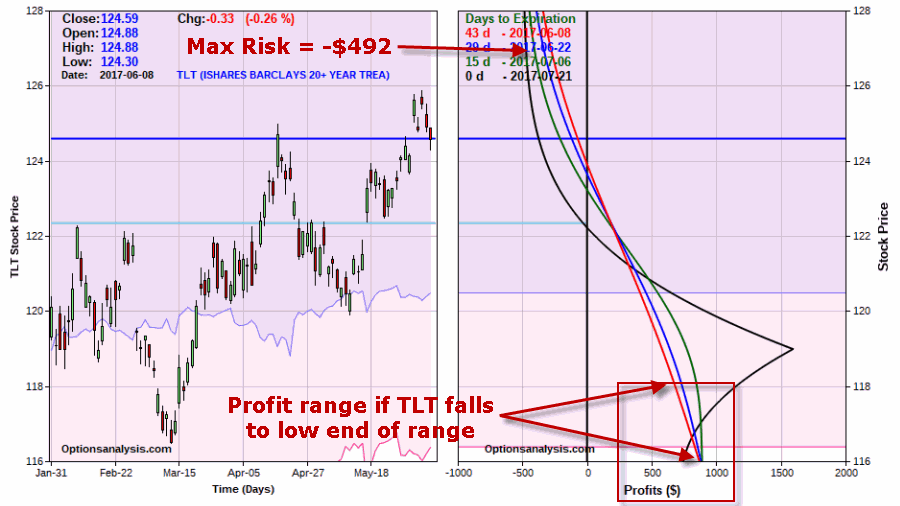 Figure 5 – TLT Out-of-the-Money Put Calendar Spread
Note that because we hold more long options than short options the trade technically has unlimited profit potential. However, the “peak” profit would occur if TLT closed at exactly $119 a share at August option expiration on July 21 (which -by the way – is NOT going to happen .
So the bottom line is simple:
*If TLT rallies this trade could lose -$492
*If TLT declines this trade can generate a profit of, of, of, well, it depends. It depends on how far TLT falls and when the trade is exited. So there is another decision to be made somewhere down the road regarding when to get out if TLT falls.
But there is more.
The Potential Benefit of Buying “Cheap” Options
As noted above, this example trade was highlighted precisely because it can benefit if implied volatility rises after the trade is entered. Typically IV levels rise when fear rises as speculators rush to buy options to hedge. So let’s take a look at what might happen if TLT shares fell, triggering a not unrealistic rise of 30% in IV levels (i.e., from roughly 10% to roughly 13%) as traders rush to buy options to hedge their long bond positions.
The new, adjusted risk curves appear in Figure 6.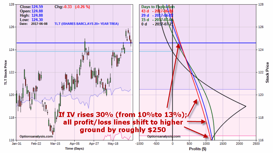 Figure 6 – Risk curves if implied volatility rises from 10% to 13% after trade is entered (Courtesy www.OptionsAnalysis.com)
Note the difference between the curves in Figure 6 versus Figure 5. All of the risk curves have shifted higher – i.e., to the right on the chart. In other words, a rise in IV can and would likely generate a higher profit for this trade if in fact TLT shares fall and that decline is accompanied by higher IV levels.
For the record, this is due to the fact that longer-term options hold more “Vega” (more on this in a moment) than shorter-term options. The Greek term “Vega” in option trading tells you how much a given option (or combined trade) will gain if implied volatility rises 1 full percentage point.
A close review of Figure 4 reveals that the August 119 put had a Vega of 13.4 and the short July 119 put had a Vega of -7.8. So in theory:
*If IV rises 3 full percentage points each August 119 put will gain $40.20 (13.4 x 3) while each July119 put will lose -$23.40 (-7.8 x 3). Remember also that in this example trade we are long 15 of the August 119 puts and short only 13 of the July 119 puts.
(See also It’s Soon or Never for Bonds)
Summary
Does this whole thing have a point? The point is that if you are concerned about the risk of higher interest rates (and in turn, lower bond prices):
a) It is possible to construct a relatively low priced hedge
b) That that hedge can risk less than $500
c) That it can make that much or more if TLT sinks back to a previous support level
d) That additional profit potential is possible if implied volatility rises from its current very low level.
While the fact of the matter is that bonds could easily rally and saddle this trade with a loss from the get go – and ultimately suffer a 100% loss of the $492 spent to enter the trade – that’s still a lot for a trade to potentially offer.
As always, the information presented here is intended to be educational and not a recommendation.
Jay Kaeppel
Disclaimer: The data presented herein were obtained from various third-party sources. While I believe the data to be reliable, no representation is made as to, and no responsibility, warranty or liability is accepted for the accuracy or completeness of such information. The information, opinions and ideas expressed herein are for informational and educational purposes only and do not constitute and should not be construed as investment advice, an advertisement or offering of investment advisory services, or an offer to sell or a solicitation to buy any security.
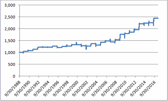
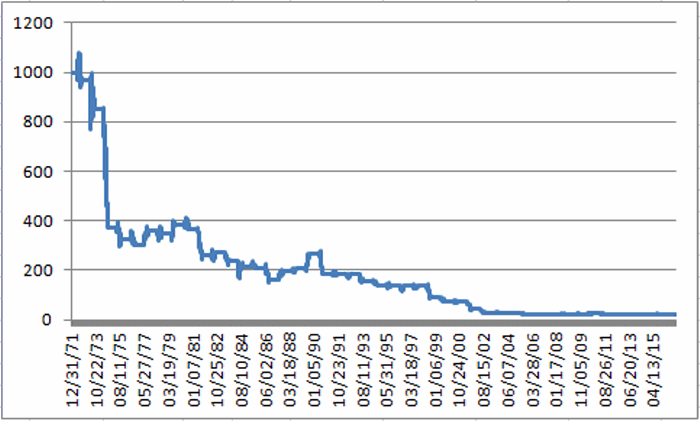
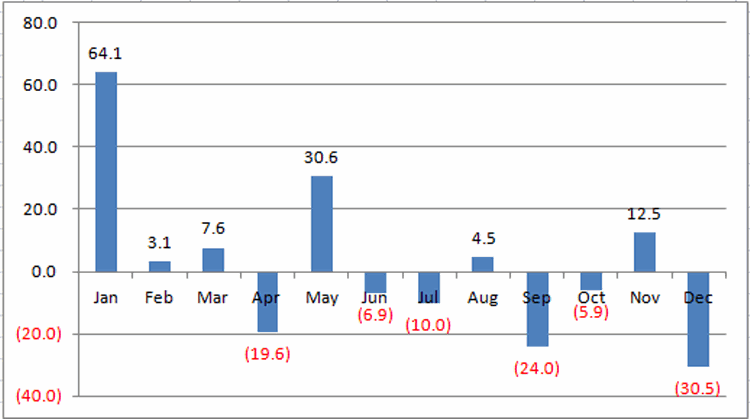 Figure 2 – Cumulative DXY % Gain Month-by-Month (1977-present)
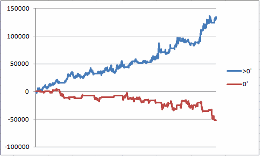
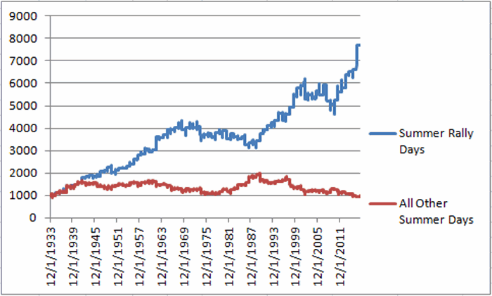
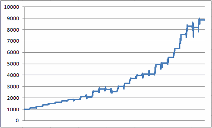
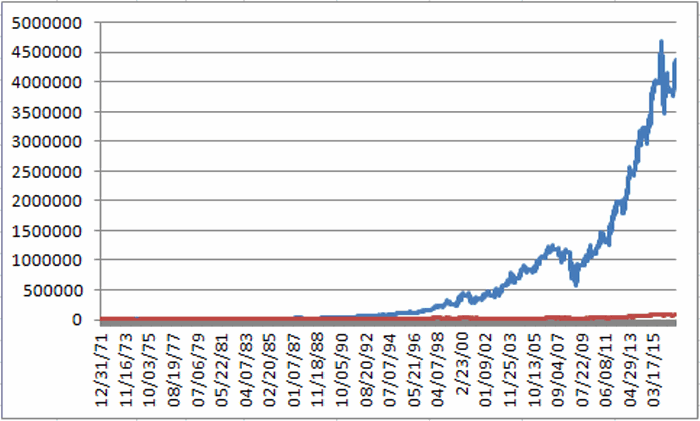
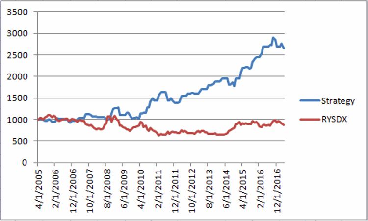 Figure 4 – Growth of $1,000 trading “Good” and “Bad” Months using tickers RYSDX and RYWDX (blue) versus buying-and-holding RYSDX (red); 2005-present