All posts by admin

Triple Top Insurance (Just in Case)

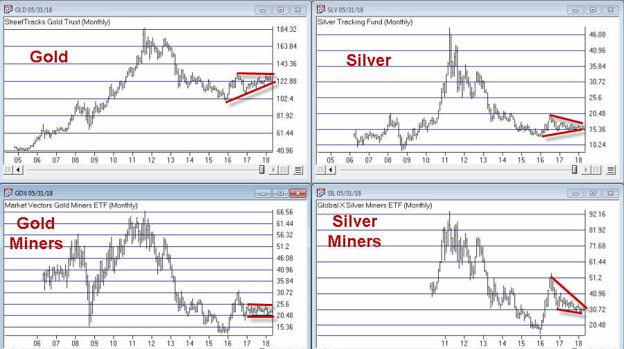
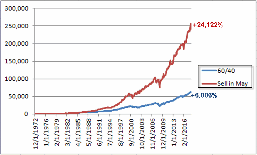
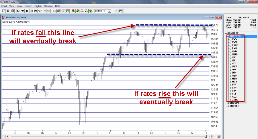
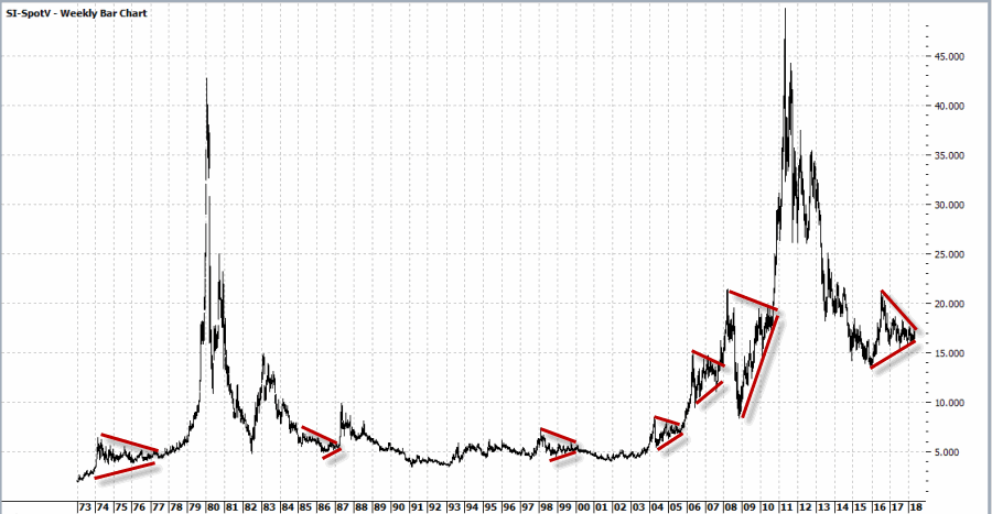
If there is one thing that I am not very good at, it is “picking tops and bottoms with uncanny accuracy.”  While I feel bad about this at times I do take some comfort in the knowledge that no one else is either (regardless of what you might be told).  Still, there can be times when it can make sense to try.  Like now for instance.

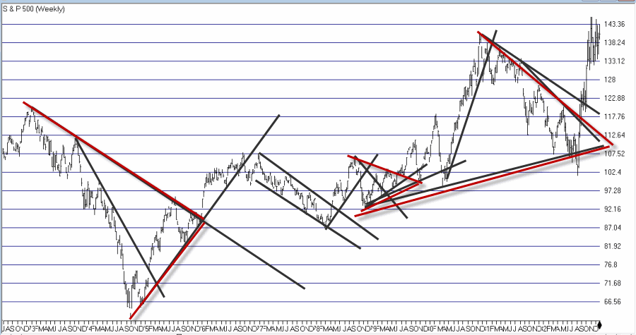
Figure 1 displays ticker IWM – an ETF that tracks the Russell 2000 small-cap index.

1a
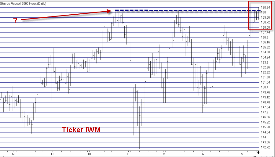
Figure 1 – Ticker IWM (Courtesy AIQ TradingExpert)

Because I am not good at ”predicting” things I cannot tell you if this will turn out to be an actual triple top or not (for the record, most of the stuff I follow is still bullish on the stock market overall).  But I do know one thing – this is what a triple top looks like.

I also know:

*The “Best Six Months” period of the year is over and this part of a mid-term year has been “dicey” in the past

*The best part of the election cycle starts on 10/1/18

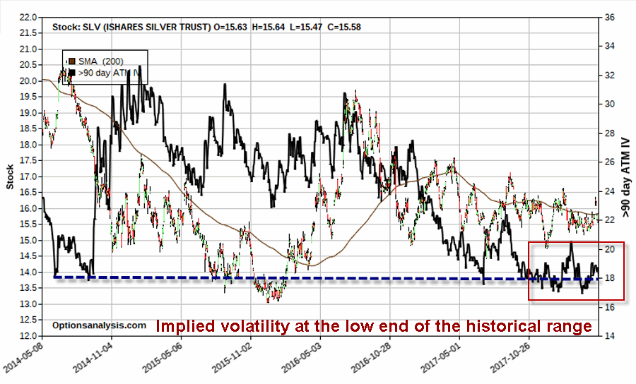
So what if an investor was concerned that the market is topping out right here and fears that something “nasty” might happen between now and the end of September?  What can be done?

IMPORTANT:  What follows is NOT a “recommendation”. It is simply one example of one way to play given the criteria discussed above.

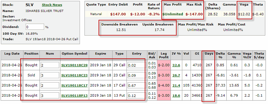
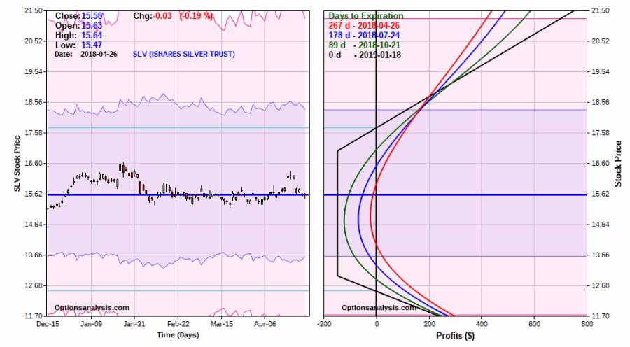
One simple approach might be to buy the IWM September 28 159 put.  The particulars appear in Figure 2 and the risk curves appear in Figure 3.2a
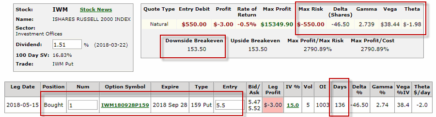
Figure 2 – IWM Sep 159 put (Courtesy www.OptionsAnalysis.com)

3a
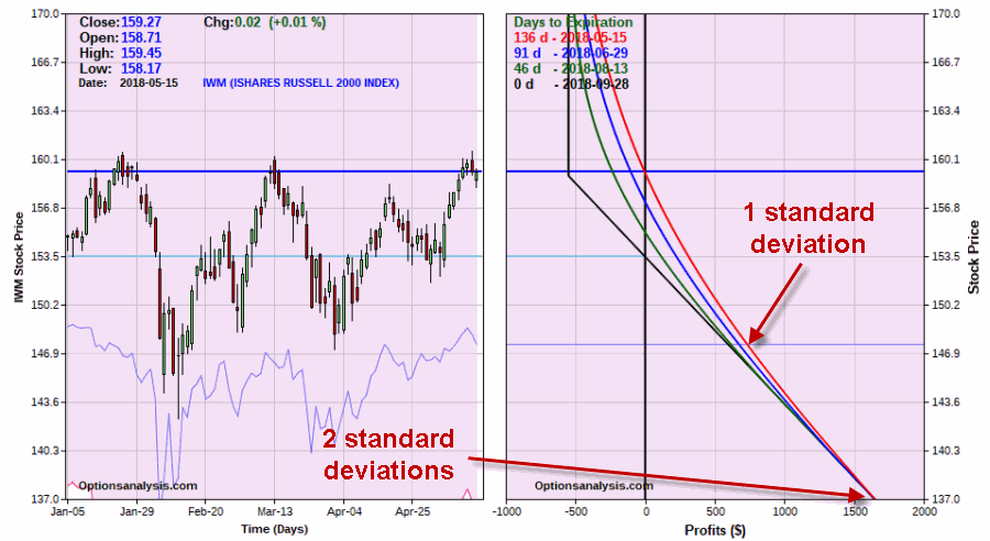
Figure 3 – IWM Sep 159 put risk curves (Courtesy www.OptionsAnalysis.com)

*The option costs $550 to buy, which represents the maximum risk if IWM rallies instead of declines.

*The breakeven price is $153.50 per IWM shares

*If IWM declines 1 standard deviation to roughly $147.82 a share the option will generate a profit of $590 to $710 depending on how soon that price is hit.

*If IWM declines 2 standard deviations to roughly $137.00 a share then the option will generate a profit of roughly $1,640.

Summary

Is IWM forming a triple top?  Will betting on the downside payoff?  Sorry folks, I have to go with my standard answer here of “It beats me.”  Besides, the odds of me picking the top or bottom in anything to the day are pretty long, so please do not consider this a prediction.

Still the point is that if one is concerned about such a possibility and wanted to hedge against it, options offer a pretty simple way to do it.

Jay Kaeppel

Disclaimer:  The data presented herein were obtained from various third-party sources.  While I believe the data to be reliable, no representation is made as to, and no responsibility, warranty or liability is accepted for the accuracy or completeness of such information.  The information, opinions and ideas expressed herein are for informational and educational purposes only and do not constitute and should not be construed as investment advice, an advertisement or offering of investment advisory services, or an offer to sell or a solicitation to buy any security.

Regarding URA Fundamentals

On 5/9/18 I wrote this article  regarding ticker URA – an ETF that tracks the price of uranium.  For the record that article was more about the particular type of price action (almost 3 years of sideways range bound price action) than URA itself.

2

I mentioned in that article that what attracted my attention was the form of the price action and the observed tendency for that pattern to  be followed ultimately by an upside breakout and often a significant price move.

I also mentioned that I knew nothing about the fundamentals regarding uranium the actual commodity.  Well for the record, now I do thanks to the article linked below.  The author of that article () also seems to expect an ultimate advance in price based on the fundamentals of supply and demand that he spells out in his article.

Please see URA – The Nuclear Option for a discussion of the fundamentals of uranium.

Summary

So in a nutshell, one author likes URA based solely on technical factors and one author likes URA based solely on technical factors.

Does that mean URA is a “Buy” and that a huge move is sure to  follow?  Not at all.

But it might be one to keep an eye on.

Jay Kaeppel

Disclaimer:  The data presented herein were obtained from various third-party sources.  While I believe the data to be reliable, no representation is made as to, and no responsibility, warranty or liability is accepted for the accuracy or completeness of such information.  The information, opinions and ideas expressed herein are for informational and educational purposes only and do not constitute and should not be construed as investment advice, an advertisement or offering of investment advisory services, or an offer to sell or a solicitation to buy any security.


Still Too Soon For Silver?

In the last year I became very drawn to some of the metals markets, as well as mining stocks (See here, here and here.  What caught my eye was a narrowing, consolidating trend in gold, silver, gold stocks, silver stocks, etc.  Of course, it also (finally) dawned on me that this kind of action can go on for quite a while (and it has).

In Figure 1 you can see this “narrowing” for yourself.  As I wrote about here, extended “going nowhere” activity is often (though not always) followed by a significant breakout to the upside.

1Figure 1 – Metals and Miners “coiling” (Courtesy AIQ TradingExpert)

Looking at Silver

For better or worse I can’t seem to get the idea out of my head that silver is going to break out in a big way to the upside at some point.  However, at this moment I am trying to remain patient.  To understand why consider Figure 2 below, which displays the results generated by holding long one silver futures contract every year starting in 1973 ONLY during the months of May and June.

2Figure 2 – Long silver futures during May and June (1973-2017)

Figure 2 is clearly not a “pretty picture”.  That being said it should be noted that silver in May and June combined:

*Actually made money 23 times

*Lost money 22 times

*But the average gain was +$3,878

*While the average loss was a whopping (-$9,061)

So one could accurately state that silver goes up more often than it goes down during May and June.  That would be the Good News.  The Bad News is clearly visible in Figure 2.

Summary

Bottom line: Silver could very well explode to the upside at some point soon.  And it is not like silver can’t rally during May/June.

Just remember that when it’s good, it’s OK, and when it’s bad, it’s very bad.

Jay Kaeppel

Disclaimer:  The data presented herein were obtained from various third-party sources.  While I believe the data to be reliable, no representation is made as to, and no responsibility, warranty or liability is accepted for the accuracy or completeness of such information.  The information, opinions and ideas expressed herein are for informational and educational purposes only and do not constitute and should not be construed as investment advice, an advertisement or offering of investment advisory services, or an offer to sell or a solicitation to buy any security.

This Chart Pattern is Positively Glowing (and Boring)

I used to be a pretty fun guy.  No, seriously. Then, I don’t know if it was a function of age (at the very least it was clearly not a function of maturity) or what but I became less “fun” to be around over the years.  So I am not sure if it is coincidence or not, but as a technical analyst my “taste” in chart patterns has changed also.

I used to be a “strong trend line”, “continuation pattern” kind of guy.  Like I said, fun. Now?  My favorite seems to be the most boring thing around – give me something that has gone nowhere (example to follow).

This was reaffirmed somewhat last year when I attended a conference and listened to  esteemed Charles Kirkpatrick list stock after stock that fit the mold.  So what am I talking about?  The best example I have found right now is uranium.  No, seriously.

Figure 1 and 2 display monthly charts for ticker URA – the Global X Uranium ETF.  This ETF invests in companies involved in the uranium business. 1Figure 1 – URA Monthly; 2011-2018 (Courtesy ProfitSource by HUBB)

2Figure 2 – URA Monthly; 2014-2018 (Courtesy ProfitSource by HUBB)

A couple things to note.  I know absolutely nothing about the fundamentals of the uranium business.  Nor quite frankly do I really want to.  Truth be told it would probably just confuse me.

But one thing I have seen – estimating here – roughly a bazillion times is a security that falls hard and then gets locked into a sideways range for what seems like forever.  In many, many cases price eventually breaks out significantly to the upside out of that range.  I most certainly cannot guarantee that that will happen with URA.  In fact, please understand that I am not “recommending” URA.  I am simply pointing out that it “fits the profile.”

It plummeted from a high of $133+ to about $11 a share.  It first dropped to its current price of $13.37 in August of 2015.  In other words, it s been “going nowhere” for almost 3 years.  This will not last forever.

What To Do (if anything)

First off, again, I am not recommending URA, simply pointing out its present status and noting that the pattern it has formed often proves to be bullish longer-term.  So the choices are:

a. Forget I mentioned it

b. Buy now with a stop under $11.31 (roughly -15.5% of risk)

c. Wait for a further dip before buying

d. Wait for a breakout to the upside before buying

Summary

Do NOT go out and buy URA because of what you have read here.  Whether or not this one example security works out or not is not actually the point.  But maybe keep an eye on it as history suggests that this pattern has a way of working out to the upside.  And more importantly, keep  an eye open for other “going nowhere” situations, as they often are followed by meaningful price moves

Jay Kaeppel

Disclaimer:  The data presented herein were obtained from various third-party sources.  While I believe the data to be reliable, no representation is made as to, and no responsibility, warranty or liability is accepted for the accuracy or completeness of such information.  The information, opinions and ideas expressed herein are for informational and educational purposes only and do not constitute and should not be construed as investment advice, an advertisement or offering of investment advisory services, or an offer to sell or a solicitation to buy any security.

Strategy Civil War – Sell in May vs. 60/40

Let’s start this time out by establishing the premise:

Jay’s Trading Maxim #15a: The purpose of using an objective strategy is to remove emotion from trading decisions.

Which is important because of:

Jay’s Trading Maxim #25: Human nature is a detriment to trading and investment success and should be avoided as much as, well, humanly possible.

And let’s not forget:

Jay’s Trading Maxim #15b: The other purpose of using an objective strategy is NOT “to make money” (contrary to popular belief), but to “maximize the tradeoff between reward and risk”.

Which stems from:

Jay’s Trading Maxim #14: If you take on more risk than you can handle you will ultimately fail (sorry, I couldn’t figure out how to be any more blunt than that).

OK, I think that covers it.

The Indexes

So from here I am going to look at two strategies that require exactly zero thought to implement (other than of course remembering to make the requisite trades at the appropriate time which I’m pretty sure is why we now have alarms that we can set on our phones, but enough about me).

For our tests we will use index data.  Since I am trying to make broad representations of the overall stock and bond markets – and because I want to go as far back with the data as possible – we will use

*Stocks = Wilshire 5000 Index

*Bonds = Barclays Bloomberg Treasury Index

I have monthly total return data for these two indexes going back to January 1973.  So roughly 45 years of history.

NOTE: Different indexes can easily be substituted including S&P 500 Index and a bond index that is more of an aggregate index including corporate bonds, etc.  My guess is the results would be similar.

ANOTHER NOTE: The results that follow are based on a hypothetical test using index data and do not represent real-time, real world results.  Also, note  that no deductions are made for any fees,commissions, taxes, etc.  The sole purpose is to compare the hypothetical raw results of one strategy versus another.

CYA complete, moving on.

The 60/40 Method

One of the simplest and most straightforward approaches to investing that many investors have adopted over the years is to simply allocate a certain amount of capital to stocks and a certain amount to bonds, maybe readjust the allocation say once a year and let the markets do what they will.

And the bottom line is that this is not a bad strategy.  It’s also maybe not a great strategy, but let’s not get ahead of ourselves.  So for 60/40 we will do the following:

On December 31st of every calendar we will allocate:

*60% of the portfolio to the Wilshire 5000 Index

*40% of the portfolio to the Bloomberg Barclays Treasury Index

The equity curve from 12/31/1972 through 3/31/2018 appears in Figure 1.

1Figure 1 – Growth of $1,000 using 60/40 Method; 12/31/1972-3/31/2018

The Sell in May Method

This strategy works as follows:

*On May 31st sell the Wilshire 5000 Index and buy the Barclays Bloomberg Treasury Index

*On October 31st sell the Barclays Bloomberg Treasury Index and buy the Wilshire 5000 Index

Figure 2 displays the equity curve for “Sell in May” in red and the equity curve for “60/40” (copied from Figure 1) in blue.2Figure 2 – Growth of $1,000 Sell in May (red line) versus 60/40 Method (blue line); 12/31/1972-3/31/2018

Anything jump out at you?

Clearly the “Sell in May” approach made more money than the “60/40” approach.  But remember, our objective is NOT “to make money” but to “maximize the tradeoff between reward and risk”. In other words, if the volatility of the equity swings of “Sell in May” are so great that one cannot maintain the discipline to continue trading it, then the higher returns may only be illusory.  So let’s “go to the numbers.”3Figure 3 – Relative Performance Figures: Sell in May vs. 60/40; 12/31/1972-3/31/2018

A few things to note in Figure 3 – The 60/40 approach:

*Made money in 83% of all 12-month periods and 99% of all 5-year periods

*It has a respectable 12-month average and median gain (+10.4% and +11.1%, respectively)

*It also has a lower annual standard deviation (10.9%) and lower maximum drawdown (-28.0%) than the Sell in May Method.

*For the record, 60/40 performance and Sell in May performance was roughly equal through about 1982.

So all in all a very respectable performance and decent strategy.

The Sell in May Method on the other hand clearly made more money on a more consistent basis (at least since 1982):

*An average gain of +14.2% and an average gain/standard deviation above 1.00 (1.09)

*A Maximum Drawdown of -31.8% is nothing to slough off, but in this test it is not that much greater than the maximum drawdown for the 60/40 Method

*It made money in 88% of all 12-month periods and 100% of all 5-year periods

*Sell in May outperformed 60/40 during 2/3rds of all 12-month periods and during 85% of all 5-year periods.

Summary

So can I state categorically that Sell in May is superior to 60/40?  That’s not my job here.  The information presented on this blog is for “educational purposes only”.

Hence, I leave you the reader to draw your own conclusions.

Jay Kaeppel

Disclaimer:  The data presented herein were obtained from various third-party sources.  While I believe the data to be reliable, no representation is made as to, and no responsibility, warranty or liability is accepted for the accuracy or completeness of such information.  The information, opinions and ideas expressed herein are for informational and educational purposes only and do not constitute and should not be construed as investment advice, an advertisement or offering of investment advisory services, or an offer to sell or a solicitation to buy any security.

Dollar or Miners? It’s One or the Other

Gold, gold stocks and commodities in general are starting to get a lot of notice lately.  And not without good reason.  Consider the bullish implications for all things precious metal in the articles below – one from Tom McClellan of the McClellan Report and one from the Felder Report.

*BANG: Why the Gold Miners Could Soon Make FANG Look Tame The Felder Report

*Gold/Silver Ratio Tom McClellan

I have also previously touched on these themes time or two (or four) of late.

*JayOnTheMarkets.com: The Siren Song of Gold Stocks

*JayOnTheMarkets.com: Yes, Gold is at a Critical Juncture

*JayOnTheMarkets.com: Commodities at the Crossroads

*JayOnTheMarkets.com: What to Watch in Energies

Where We Are Now

So on the one hand, it can be argued that gold, mining stocks and commodities in general are poised for a significant move to the upside.

Consider the “coiling” action displayed in Figure 1, which is a monthly chart for a mining index that I track that I’ve labeled GLDSLVJK.1aFigure 1 – Jay’s Gold Stock (GLDSLV) Index (Courtesy AIQ TradingExpert)

I look at the coiling action displayed in Figure 1 – in conjunction with the information contained in the articles linked above – and I can’t help but to think that a big upside breakout in gold stocks is imminent.

The “Fly in the Ointment”

When it comes to all of this metals/miners/commodities bullishness there’s just one “fly in the ointment” – the U.S. Dollar. Let’s be succinct here and invoke:

Jay’s Trading Maxim #102: Whichever way the dollar goes, a lot of things go the other way.

To wit, see Figure 2, which highlights the inverse nature of, well, a lot of things to the U.S. Dollar (a value of 1000 means 100% correlation and a value of -1000 means a 100% inverse correlation.1Figure 2 – Things that trade inversely to the U.S. Dollar (Courtesy AIQ TradingExpert)

In other words, when the U.S. dollar goes up, the things listed on the right hand side of Figure 2

Now consider Figure 3 – which appears to be showing a potential upside breakout for the U.S. dollar.3Figure 3 – U.S. Dollar; breaking out to the upside? (Courtesy ProfitSource by HUBB)

Which brings us back to the title – Dollar or Miners, it’s One or the Other.

If the U.S. Dollar is truly staging an upside breakout, chances are gold miners will not.

Stay tuned….and keep a close on the buck.

Jay Kaeppel

Disclaimer:  The data presented herein were obtained from various third-party sources.  While I believe the data to be reliable, no representation is made as to, and no responsibility, warranty or liability is accepted for the accuracy or completeness of such information.  The information, opinions and ideas expressed herein are for informational and educational purposes only and do not constitute and should not be construed as investment advice, an advertisement or offering of investment advisory services, or an offer to sell or a solicitation to buy any security.

The (Semi) Official S&P 500 Index ‘Line in the Sand’

In an article dated 2/15/2018, titled “Trend Following in One Minute a Month”, I wrote about one of the simplest trend-following methods I’ve ever discovered.  The original idea was based on work by investor and Forbes columnist Kenneth Fisher (his original idea is discussed in this article – How to Tell a Bull Market from a Bear Market Blip).

For full details plus facts and figures please see the original article of mine linked above. For now:

Jay’s Monthly SPX Bar Chart Trend-Following System

a) When the S&P 500 Index goes three calendar months without making a new high, then

b) Draw a horizontal line at the low price for those three calendar months.

c) An actual sell trigger occurs at the end of a month during which SPX registers a low that is below the “sell trigger price” (i.e., the trade takes place at the month regardless of when the signal occurs during the month), HOWEVER,

d) If SPX makes a new monthly high above the previous “swing high” BEFORE it registers a low below the “sell trigger price” the sell signal alert is aborted.

For the record, sell signals since 1970 have been right roughly 50% of the time, so this is NOT a “sure thing, you can’t lose” strategy by any stretch. Still the average losing trade witnessed a decline of roghly-16%, with 3 generating a loss of 20% or more, and two of those were in excess of -30%.

The latest status appears in Figure 1 below. As you can, 3 of the last 5 “sell” signals ended in whipsaws which resulted in buying back in 6%, 9% and 8% higher, respectively.  However, the key point is that the other two sell signals would have allowed an investor to miss the crushing -33% and -31% declines.1aFigure 1 – Jay’s “One Minute a Month” Trend Following Method

(For more signs of potential trouble see also  Two Charts Worth Watching)

The Bottom Line

If the S&P 500 Index closes below 2,532.69 without first making a new 6 month high, it could be a significant warning sign of trouble ahead (Or – in the interest of full disclosure – it could just be setting up whipsaw; sorry folks, that’s how the market works sometimes).

Welcome to the exciting – and occasionally frustrating – World of Trend-Following!

Jay Kaeppel

Disclaimer:  The data presented herein were obtained from various third-party sources.  While I believe the data to be reliable, no representation is made as to, and no responsibility, warranty or liability is accepted for the accuracy or completeness of such information.  The information, opinions and ideas expressed herein are for informational and educational purposes only and do not constitute and should not be construed as investment advice, an advertisement or offering of investment advisory services, or an offer to sell or a solicitation to buy any security.

Two Charts Worth Watching

The chart below is courtesy of www.KimbleChartingSolutions.com.  The link to the actual chart is here.

According to their analysis two key areas – semiconductors and Nasdaq stocks – may be forming an inverse head and shoulder pattern.  You can see Kimble’s “line in the sand” for SMH and NDX in Figure 1 below.

kimble smhndxFigure 1 – Semiconductors and Nasdaq stocks potential warning signs (Courtesy: www.KimbleChartingSolutions.com)

(See also The (Semi) Official S&P 500 Index ‘Line in the Sand’)

The implication is pretty clear.  If these two key sectors “give up the ghost” and drop below the necklines drawn in Figure 1, it could well serve as a major warning sign for the overall stock markets.

So stay focused.

Jay Kaeppel

Disclaimer:  The data presented herein were obtained from various third-party sources.  While I believe the data to be reliable, no representation is made as to, and no responsibility, warranty or liability is accepted for the accuracy or completeness of such information.  The information, opinions and ideas expressed herein are for informational and educational purposes only and do not constitute and should not be construed as investment advice, an advertisement or offering of investment advisory services, or an offer to sell or a solicitation to buy any security.

More Lines in the Sand; The Bonds, REIT and MLP Edition

Last week I wrote an article purporting to highlight significant levels of support and resistance across a variety of financial markets.  Well, it turns out there are more.

More Notes on “Lines”

I certainly look at the markets more from the “technical” side than the “fundamental” side (not even a conscious choice really – I just never really had much success buying things based on fundamentals. That doesn’t mean I think fundamentals are useless or that they don’t “work” – they just didn’t work for me).

Once I settled on the technical side of things, I started reading books about technical analysis.  All the classics.  I learned about chart patterns and trend lines.  By definition, a trend line is a line drawn on a price chart that connects two or more successive lows or highs.

And then I got to work looking through charts and applying everything that I thought I had learned. And like a lot of “newbie” technicians – and a surprising number of seasoned ones – I typically ended up drawing “lines on charts” that would resemble something like what you see in Figure 1.1Figure 1 – “Important” trend lines (or not?) (Courtesy AIQ TradingExpert)

For a technical analyst this is sort of the equivalent of “throwing up” on a chart (and the real pisser was that back  in the day a fresh updated booklet of charts would show up in the mail each week – so you had to “throw up’ all over all the charts again and redraw every #$^& “important” line!!).

At some point I realized that perhaps every “important” line that I was drawing on a multitude of charts was perhaps maybe not so “important” after all. This revelation led me to establish the following maxim (as much to force me to “fight the urge” as anything:

Jay’s Trading Maxim #18: If you draw enough lines on a bar chart, price will eventually hit one or more of them.

(See also JayOnTheMarkets.com: The Line(s) in the Sand for Everything)     

True Confession Time

There are certain dirty little secrets that no respectable technician should ever utter. But just to “get a little crazy” (OK, at last by my standards – which are quite low, apparently) I’m going to put it down in print:

I hate trend lines

There, I said it.  Now for the record, up sloping and down sloping trend lines are a perfectly viable trading tool if used properly.  I personally know plenty of people trading successfully using trend lines drawn on a price chart.  Sadly, I’m just not one of them.

So remember the lesson I learned the hard way – “There is no defense for user error.”

The full truth is that I have nothing against trend lines, and yes I understand that there are “objective” methods out there detailing the “correct” method for choosing which two points to connect to draw a proper trend line (DeMark, Magee, I think Pring to name a few).  But I somehow seem to have failed that lesson.

One Line I Do Like

I still draw slanting trend lines from time to time. But the only lines I really like are lines that are drawn horizontally across a bar chart – i.e., “support” and “resistance” lines.  A multiple top or a multiple bottom marks a level where the bulls or the bears made a run and could not break through. Now that’s an “important” price level.  If that price level ultimately holds it means the charge failed and that a significant reversal is imminent.  If it ultimately fails to hold it means a breakout and a possible new charge to ever further new highs or lows as the case may be (for the record, it could also mean that a false breakout followed by a whipsaw is about to occur.  But, hey, that’s the price of admission).

I also like horizontal lines because even if very single horizontal line does not prove to be useful as a trading tool, it can still serve a purpose as a “perspective tool”.  Rather than explaining that theory let’s just “go to the charts.”

More “Lines in the Sand”

Figure 2 displays an index of bond and income related ETFs that I created.  Roughly half of the ETFs have a higher correlation to treasury bonds and the other half to the S&P 500 Index (i.e., CWB – convertible bonds, JNK – high yield corporate, PFF – preferred stock and XLU – utilities all react to interest rates but are more correlated to the stock market than to treasury bonds).aiq bonds1Figure 2 – Bond and Income Related ETF Index (Courtesy AIQ TradingExpert)

This monthly chart clearly illustrates the struggle going on in the interest rate related sector.  Interest rates mostly bottomed out in 2013 and have been grinding sideways to higher since.  As you can see, interest rate related securities have been trapped in a sort of large trading range for years.  Eventually, if the long-term trend in rates turns higher this chart should be expected to break through the lower (support) line Figure 2.

Still focusing on interest rate related sectors, Figure 3 displays a monthly index comprised of 3 REITs.  Talk about a market sector trapped in a range.

aiq reitFigure 3 – REIT Index; Monthly (Courtesy AIQ TradingExpert)

For what it is worth, Figure 4 displays a weekly chart of the same index with an indicator I call Vixfixaverage (code for this indicator appears at the end of the article).  Typically, when this indicator exceeds 60 and then tops out, a decent rally often ensues (one word of warning, there is also often some further downside before that rally ensues to caution is in order).

reit 2Figure 4 – REIT Index; Weekly (Courtesy AIQ TradingExpert)

Speaking of oversold “things”, Figure 5 displays an index of Master Limited Partnerships (MLP’s).  As you can see in Figure 5, a) divergences between price and the 4-month RSI are often followed by significant rallies, and b) a new such divergence has just been established.  Does this mean that MLP’s are destined to rally higher?  Not necessarily, but given the information in Figure 5 and the fact that everybody hates MLP’s right now, it’s something to think about.aiq mlpFigure 5 – MLP Index (Courtesy AIQ TradingExpert)

AIQ TradingExpert Code for Vixfixaverage

hivalclose is hival([close],22).

vixfix is (((hivalclose-[low])/hivalclose)*100)+50.

vixfixaverage is Expavg(vixfix,3).

Jay Kaeppel

Disclaimer:  The data presented herein were obtained from various third-party sources.  While I believe the data to be reliable, no representation is made as to, and no responsibility, warranty or liability is accepted for the accuracy or completeness of such information.  The information, opinions and ideas expressed herein are for informational and educational purposes only and do not constitute and should not be construed as investment advice, an advertisement or offering of investment advisory services, or an offer to sell or a solicitation to buy any security.

A Crazy Play in SLV (in case anything ever happens)

The silver market has been driving traders, well, crazy lately, as it refuses to go anywhere.  As you can see in Figure 1, silver prices have been narrowing into an ever and ever tighter range for quite some time now.  Despite all of the (incorrect) prognostications (including my own) that silver is “due” to break out into a major trend, nothing, zilch, nada.  The price range just coils tighter and tighter.1Figure 1 – Silver “coiling” (Courtesy ProfitSource by HUBB)

As you can see in Figure 2, silver has a “history” of this kind of thing happening, followed by “something crazy” (usually, though not always.)

2Figure 2 – Silver’s history of “coiling”, and what comes after (Courtesy ProfitSource by HUBB)

Despite the fact that silver has so far refused to cooperate, there are a few things we can say at this point.  Among them:

1) Silver is much closer to forging the next major trend than it was several months (or years ago).

2) The type of “coiling” action we have seen for at least the better part of a year and a half is often followed by an explosive move in one direction or another (a word of warning: often preceded by a fake out in the other direction).

3) As you can see in Figure 3, the implied volatility for options on ticker SLV (an ETF that tracks the price of silver) has collapsed to a very low level.  This tells us that there is relatively little time premium built into the price of the options, i.e., that SLV options are “cheap.”3Figure 3 – SLV options are “cheap” as implied option volatility is extremely low on a historical basis (Courtesy www.OptionsAnalysis.com)

A Crazy Play in Case Things Get Crazy

What follows is NOT a trading recommendation.  In fact, it’s not even a strategy that most traders would ever employ.  However, it:

1) Is an excellent illustration of the flexibility that option traders have in crafting a position

2) Affords profit potential if SLV breaks out significantly in either direction

3) Can accumulate even more value if and when implied volatility ever perks up again (the more the better)

4) And my personal favorite, it only costs $147 to enter

In technical options parlance this trade might be referred to as “an out-of-the-money call butterfly spread paired with a long put” (Do NOT attempt to say that three times fast).  The position involves:

*Buying 2 SLV Jan2019 17 calls @ $0.67

*Selling 3 SLV Jan2019 23 calls @ $0.09

*Buying 2 SLV Jan2019 29 calls @ $0.02

*Buying 3 SLV Jan2019 13 puts @ $0.12

The particulars are shown in Figure 4 and the risk curves in Figure 5.4Figure 4 – SLV example trade particulars(Courtesy www.OptionsAnalysis.com)

5Figure 5 – SLV example risk curves (Courtesy www.OptionsAnalysis.com)

Here is what you need to kow:

*This trade is nothing more than a wildly aggressive speculation that SLV will break out of the current “coil” (at the far right of Figure 2) in a meaningful way sometime between now and mid January 2019.

*Clearly if SLV does NOT make some kind of a significant price move between now and mid January 2019, this trade will lose money.  Hence the reason we are taking a small dollar risk and not “betting the farm.”

*If SLV soars or collapses this trade has significant profit potential.

*Finally, if implied volatility perks up from its current slumber and spikes to higher levels, that can inflate the profit potential (at least prior to expiration) of this trade. Remember, that a rise in IV would inflate the amount of time premium built into the options.

Summary

Is SLV going to make a significant move (finally!!) between now and mid January?  It beats me.  Remember, this trade is NOT a recommendation, only an illustration of a possibility available to option traders who answer in the affirmative to the following three questions:

1) Do you think there is a chance that SLV will make a significant price move between now and mid-January 2019?

2) Do you think there is a chance that the implied volatility for options on SLV will rise from their current low levels between now and mid-January 2019?

3) Do you have $147 bucks?

Jay Kaeppel

Disclaimer:  The data presented herein were obtained from various third-party sources.  While I believe the data to be reliable, no representation is made as to, and no responsibility, warranty or liability is accepted for the accuracy or completeness of such information.  The information, opinions and ideas expressed herein are for informational and educational purposes only and do not constitute and should not be construed as investment advice, an advertisement or offering of investment advisory services, or an offer to sell or a solicitation to buy any security.