All posts by admin

The Boring Safe Haven

Some topics excite investors.  Others do not.  Still, the fact remains that there is a time and place (and use) for “non-exciting” investments.  When an investor decides to “raise some cash”, or to get out of the stock market entirely, the money has to go someplace. 

Where that “place” is, can make a big difference over time.  Consider several choices:  there are money-market funds, very short-term securities (maturity of less than a year) and slightly less short-term securities (maturity of 1-3 years).  

Let’s consider the following list of potential candidates:

Fund/ETF Duration Exp. Ratio SEC Yield
FDRXX 1-month 0.38% 1.34%
BIL 1-3 months 0.14% 1.48%
SHY 1-3 years 0.15% 1.51%
MINT < 1 year 0.35% 2.06%

Figure 1 – Four “Safe Haven” Candidates

This list is by no means comprehensive.  There are other funds/ETFs that fit into each category.  For the record, FDRXX is a money-market fund, BIL and SHY are ETFs that track a specific index and MINT is actively managed.

A brief description of each:

FDRXX: A money-market fund that normally invests at least 99.5% of the fund’s total assets in cash, U.S. Government securities and/or repurchase agreements that are collateralized fully (i.e., collateralized by cash or government securities). Certain issuers of U.S. Government securities are sponsored or chartered by Congress but their securities are neither issued nor guaranteed by the U.S

BIL Fund Description (1-3 months): The SPDR® Bloomberg Barclays 1-3 Month T-Bill ETF seeks to provide investment results that, before fees and expenses, correspond generally to the price and yield performance of the Bloomberg Barclays 1-3 Month U.S. Treasury Bill Index.

SHY Fund Description (1-3 years): The iShares 1-3 Year Treasury Bond ETF seeks to provide investment results that, before fees and expenses, correspond generally to the price and yield performance of the Bloomberg Barclays 1-3 Year U.S. Treasury Bond Index.

MINT FUND Description (<1 year): The PIMCO Enhanced Short Maturity Active ETF seeks greater income and total return potential than money market funds, and may be appropriate for nonimmediate cash allocations. MINT will primarily invest in short duration investment grade debt securities. The average portfolio duration of MINT will vary based on PIMCO’s economic forecasts and active investment process decisions, and will not normally exceed one year. MINT will disclose all portfolio holdings on a daily basis, and will not use options, futures, or swaps.

Comparisons

Generally speaking, when it comes to fixed-income securities, the longer the average maturity, a) the higher the expected return, and b) the greater the risk of experiencing a decline in capital.

Thus, over time we would expect BIL to fluctuate more and provide a higher return than FDRXX.  Likewise, SHY should be expected to fluctuate more and provide a higher return than BIL.  The wild card in the list above is ticker MINT, which is actively managed. 

The Results

Figure 2 displays the cumulative % growth for the four tickers listed in Figure 1 starting in December 2009 (the first full month of data for ticker MINT). 
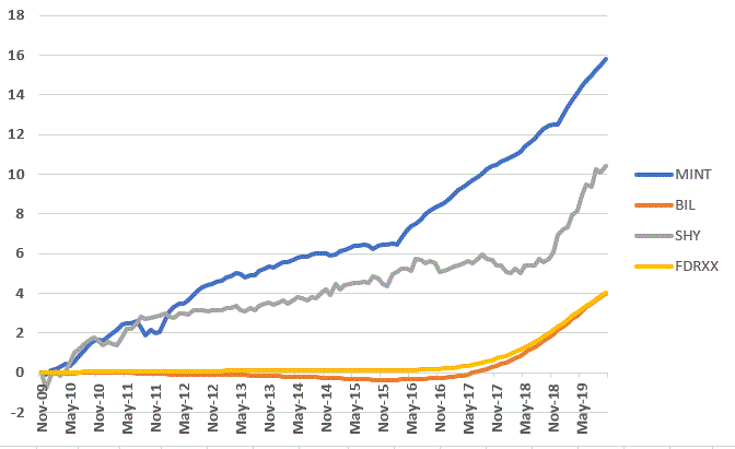
Figure 2 – Cumulative Returns (Dec-2009 to Oct-2019)

Figure 3 puts some numbers to the results displayed in Figure 2. Note that these are calculated using monthly total return data.
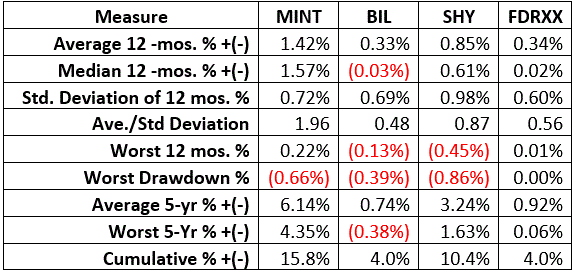
Figure 3 – Comparative Results

During the period of data considered, MINT has clearly been a compelling performer relative to the others on the list.  While I typically prefer ETFs that track a specific index the folks running MINT have clearly done a good job.  Note that BIL and FDRXX (and to a lesser extent SHY) will struggle to generate significant returns in a very low interest rate environment. 

Summary

Obviously, the returns on these securities are not going to excite anyone.  But – except on rare occasions – that is not really the purpose of short-term fixed income securities.  The purpose in looking at the list above is to help identify a potential “safe haven” for “when the day comes” that one is needed.

Jay Kaeppel

Disclaimer: The information, opinions and ideas expressed herein are for informational and educational purposes only and are based on research conducted and presented solely by the author.  The information presented does not represent the views of the author only and does not constitute a complete description of any investment service.  In addition, nothing presented herein should be construed as investment advice, as an advertisement or offering of investment advisory services, or as an offer to sell or a solicitation to buy any security.  The data presented herein were obtained from various third-party sources.  While the data is believed to be reliable, no representation is made as to, and no responsibility, warranty or liability is accepted for the accuracy or completeness of such information.  International investments are subject to additional risks such as currency fluctuations, political instability and the potential for illiquid markets.  Past performance is no guarantee of future results.  There is risk of loss in all trading.  Back tested performance does not represent actual performance and should not be interpreted as an indication of such performance.  Also, back tested performance results have certain inherent limitations and differs from actual performance because it is achieved with the benefit of hindsight.
Happy Holiday Days Revisited (Again)

In this article I wrote about the performance of the stock market around market holidays.  I refer to these days as “Happy Holiday Days”, and for good reason.  Today we will bring a few things up to date.

The Happy Holiday Days

Much analysis has been done about trading days around market holidays.  In some cases, the day before seems to perform best, in other cases it’s the day after the holiday, etc.  While it is all very interesting (at least to a market geek such as myself), for our purposes we won’t try to cut it too finely.   So, here is how we will define things:

Happy Holiday Days = the 3 trading days before AND the 3 trading days after each and every official U.S. stock market holiday

At present these include:

*Martin Luther King Day

*Presidents Day

*Easter

*Memorial Day

*Independence Day

*Labor Day

*Thanksgiving

*Christmas

*New Years

Nine holidays times 6 days apiece – but not exactly as there is always some overlap between Christmas and New Year’s.  So, it’s usually somewhere between 50 and 52 holidays days per year, out of approximately 250-253 total trading days per year.

Since December 1933, 18.9% of all trading days have qualified as “Happy Holiday Days”.  Now if the stock market were truly “efficient” we would expect the gains achieved during these holiday days to amount to roughly 19% of all stock market returns. 

The Test

We start our test on 12/1/1933 and track the following:

*The growth of $1,000 invested in the Dow Jones Industrial Average ONLY during the 3 trading days before and the 3 trading days after each stock market holiday

*The growth of $1,000 invested in the Dow Jones Industrial Average ONLY during ALL OTHER trading days

The Results

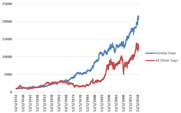
The results appear in graphic form in Figure 1.

Figure 1 – Growth of $1,000 invested in Dow ONLY during Happy Holiday Days (blue line) versus all other trading days (red line); 1933-2019

As you can see in Figure 1, Happy Holiday Days clearly outperformed all other trading days combined.

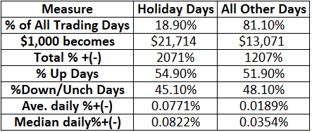
Figure 2 displays the relevant comparative figures.

Figure 2 – Happy Holiday Trading Days versus All Other Trading Days; 1933-2019

Not that the average holiday day gain (+0.0771%) is almost 4.1 time greater than the average non-holiday day gain (+0.0189%)

Summary

The lesson appears to be that in the long run it pays to be bullish around the holidays.

So once again the course of action is clear:  Please join my annual Holiday Season Drive by contacting your elected representatives and demanding more holidays!

Jay Kaeppel

Disclaimer: The information, opinions and ideas expressed herein are for informational and educational purposes only and are based on research conducted and presented solely by the author.  The information presented does not represent the views of the author only and does not constitute a complete description of any investment service.  In addition, nothing presented herein should be construed as investment advice, as an advertisement or offering of investment advisory services, or as an offer to sell or a solicitation to buy any security.  The data presented herein were obtained from various third-party sources.  While the data is believed to be reliable, no representation is made as to, and no responsibility, warranty or liability is accepted for the accuracy or completeness of such information.  International investments are subject to additional risks such as currency fluctuations, political instability and the potential for illiquid markets.  Past performance is no guarantee of future results.  There is risk of loss in all trading.  Back tested performance does not represent actual performance and should not be interpreted as an indication of such performance.  Also, back tested performance results have certain inherent limitations and differs from actual performance because it is achieved with the benefit of hindsight.
Seasonal Speculation in Soybeans

The soybean market one of the most cyclical markets there is.  This is in large part due to the planting and growing season (as explained here).  This article is about a “seasonal/cyclical” speculative play using options on ticker SOYB.

There are two key caveats:

*The trade highlighted is NOT a “recommendation”, only an example of how to speculate on a potential move using options in order to achieve limited risk and unlimited profit potential.

*Options on ticker SOYB are very thinly traded.  So, any investor who might choose to wade in needs to be aware that they may need to consider using a limit order in order to avoid significant slippage.

The Setup

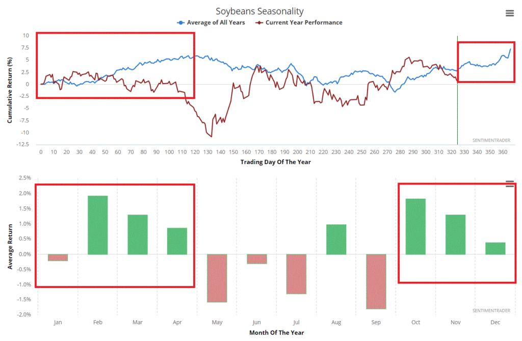
Figure 1 displays the annual seasonal trend for soybeans according to www.sentimentrader.com

Figure 1 – Annual seasonal trend for Soybeans www.sentimentrader.com

It is critical to understand that this is the “average” for what has happened in the past and should in no way be viewed as a “roadmap”.  Still, the point is pretty clear – late in the year through the month of April tends to be the “bullish” time for beans

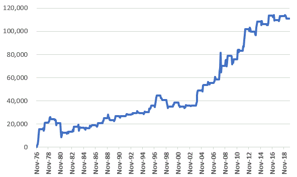
Figure 2 displays the cumulative dollar gain from holding a long position in a soybean futures contract from the end of November to the end of April every year starting in 1976.  On one hand the trend is favorable, on the other hand it is clearly no “sure thing”, and anything can happen on a year to year basis.

But just to be clear: the trade we will look at in a moment is a bet that the “next” such period WILL be a bullish one.

Figure 2 – $ growth for long position in soybean futures Dec-Apr; 1976-2019

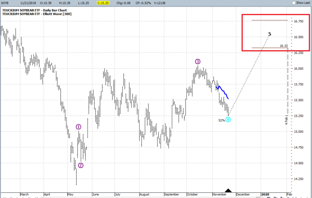
Figure 3 displays the ETF ticker SOYB (which tracks soybean futures) with a potentially bullish Elliott Wave count generate by ProfitSource from HUBB.

Figure 3 – ETF ticker SOYB (Source www.ProfitSource.com)

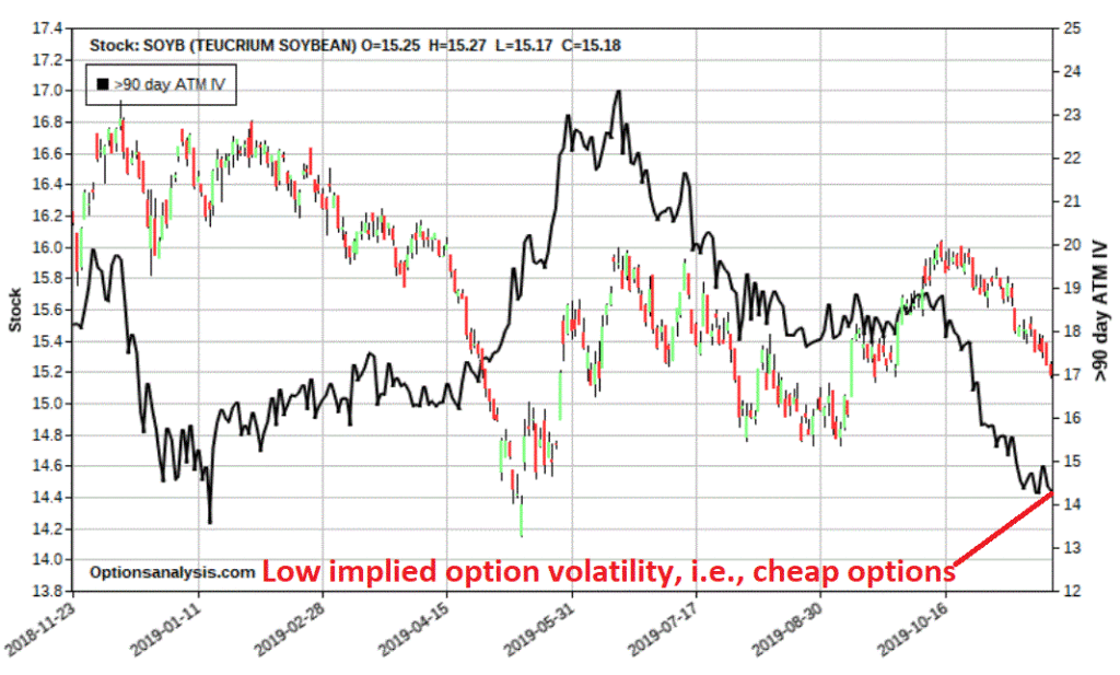
Finally, Figure 4 tells us that options on ticker SOYB are presently cheap – i.e., implied option volatility (the black line in Figure 4) is extremely low.  This tells us that little option premium is built into the prices of SOYB options.

Figure 4 – Ticker SOYB with implied option volatility (Courtesy www.OptionsAnalysis.com)

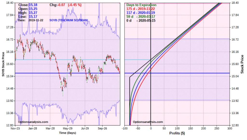
Figures 5 and 6 display the particulars for one possible speculative play designed to make money if SOYB does in fact move higher sometime between now and the end of April. 2020.

Figure 5 – SOYB May2020 calls (Courtesy www.OptionsAnalysis.com)

Figure 6 – SOYB May2020 call risk curves (Courtesy www.OptionsAnalysis.com)

The Elliott Wave projections in Figure 2 target $16.33 and $16.77 a share for SOYB.  With SOYB at $15.18 a share this equates to a move of +8.6% and +10.5%.

For the record, between the end of November and the end of April, soybeans futures have advanced in 32 of the past 49 years (65% of the time).  This trade is a bet on higher prices and a trader must accept the fact that if SOYB does not rally in some meaningful way the trade will lose money.  So, looking only at the 32 up years, we find the average percentage gain for the price of soybeans was +16.1% and the standard deviation was 17.9%.  So, this gives is another potential target of $17.65 a share and an “extreme” target (average plus standard deviation = +34%) of $20.38.

It is important to note that these target prices (in my mind) are NOT “predictions”.  They are possibilities to be considered when assessing whether the upside potential justifies even taking the trade in the first place versus the downside risk.

Downside risk

We are assuming the May2020 15 call is purchased at a price of $0.80 per contract, or $80 per contract.  This is the maximum risk on the trade. 

Upside potential

The approximate expected profit at expiration at our target prices are as follows:

SOYB price Approximate option profit
$16.33 +$50
$16.77 +$99
$17.65 +$190
$20.38 +$462

So, the bottom-line questions for a trader in considering this trade are:

*Are you OK with risking $80 per contract on the hopes that soybeans will rise between now and the end of April 2020?

*If you do enter the trade, how many contracts will you buy/what percentage of your trading capital will you risk?

*If SOYB fails to rally will you simply hold the options or will you consider exiting early if – for example – a key support level is broken?

*If SOYB does advance at what share price or option trade profit level will you, a) take a profit or b) adjust the trade?

Buying inexpensive call options is something of a siren song for a lot of traders and can lead to mistakes.  But sometimes it can make a lot of sense as long as you:

*Put as many factors in your favor

*Don’t bet the ranch

*Formulate and follow a trade plan

Jay Kaeppel

Disclaimer: The information, opinions and ideas expressed herein are for informational and educational purposes only and are based on research conducted and presented solely by the author.  The information presented does not represent the views of the author only and does not constitute a complete description of any investment service.  In addition, nothing presented herein should be construed as investment advice, as an advertisement or offering of investment advisory services, or as an offer to sell or a solicitation to buy any security.  The data presented herein were obtained from various third-party sources.  While the data is believed to be reliable, no representation is made as to, and no responsibility, warranty or liability is accepted for the accuracy or completeness of such information.  International investments are subject to additional risks such as currency fluctuations, political instability and the potential for illiquid markets.  Past performance is no guarantee of future results.  There is risk of loss in all trading.  Back tested performance does not represent actual performance and should not be interpreted as an indication of such performance.  Also, back tested performance results have certain inherent limitations and differs from actual performance because it is achieved with the benefit of hindsight.
A Year-End Speculation in the Euro

Foreign currencies are rarely top of mind for the average investor.  This is not entirely surprising given some of the complexities involved.  In all candor, currency conversions still kind of make my head spin at times.

Still, it is interesting to note that while the stock market trades roughly $200 billion dollars per day, the FOREX market trades roughly $5 trillion dollars per day (data source: www.dailyfx.com).  So, there must be something going on there.

In any event, this article is not intended to get you excited or interested in FOREX trading.  We are going to go much narrower in our focus.

The Euro End-of-Year Seasonal Tendency

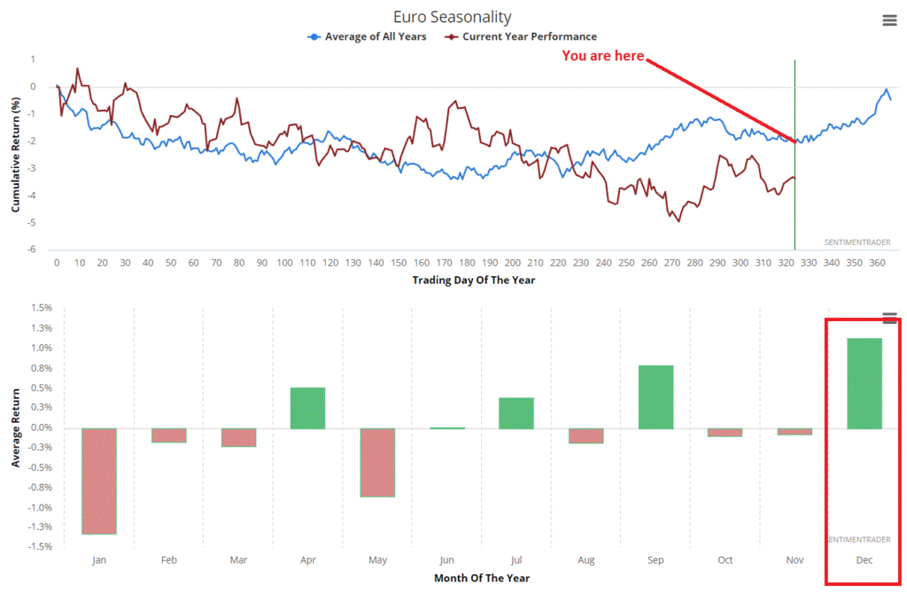
Figure 1 displays the annual seasonal trend for the Euro according to www.sentimentrader.com

Figure 1 – Euro Annual Seasonal Trend (Courtesy Sentimentrader.com)

It is critical to understand that this is the “average” for what has happened in the past and should in no way be viewed as a “roadmap”.  Still, the point is pretty clear – if history proves and accurate guide this time around then the Euro may perform well between now and the end of the year.

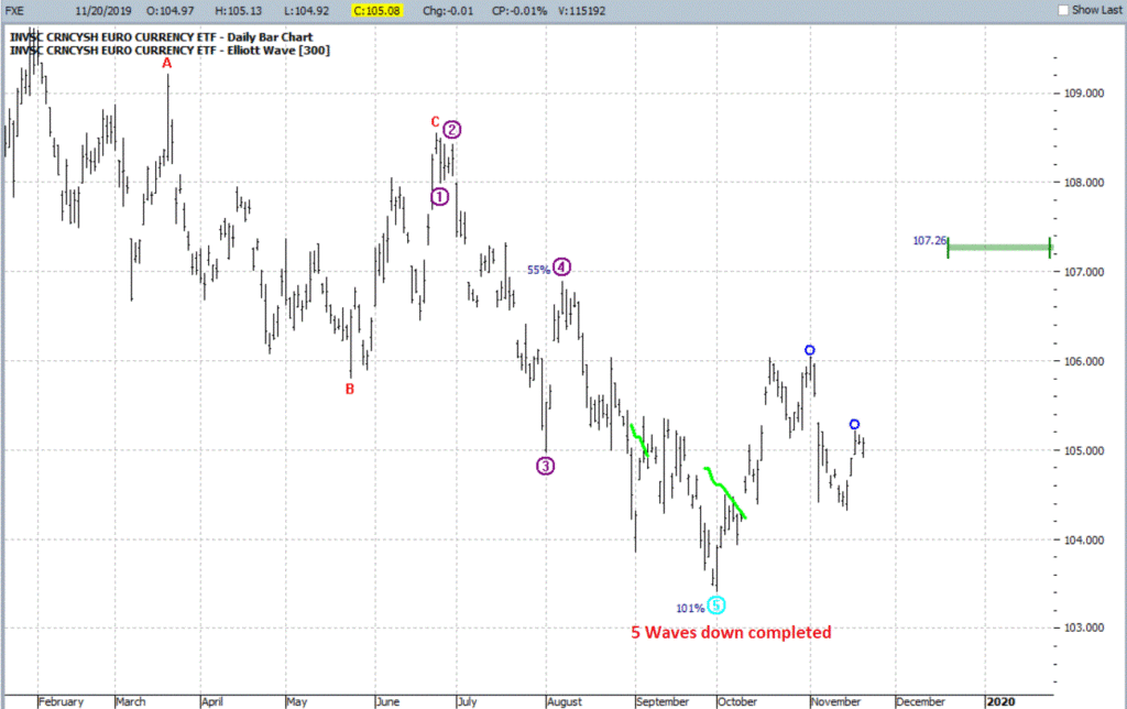
Figure 2 displays the ETF ticker FXE (which tracks the Euro) with a completed 5 waves down Elliott Wave count (and a potential price target generated using the Range Projection tool from www.ProfitSource.com).

Figure 2 – FXE with Elliott Wave and Price Projection Tool (Courtesy ProfitSource by HUBB)

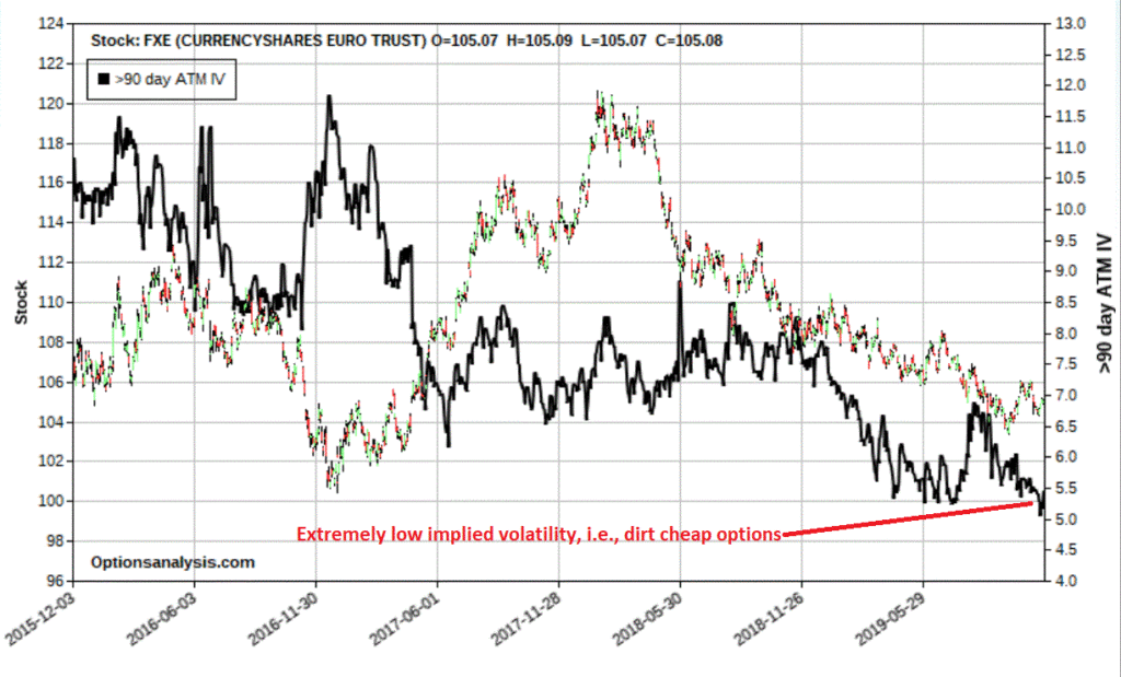
Finally, Figure 3 tells us that options on ticker FXE are presently dirt cheap – i.e., implied option volatility (the black line in Figure 3) is extremely low.  This tells us that little option premium is built into the prices of FXE options.

Figure 3 – FXE with implied volatility(Courtesy www.OptionsAnalysis.com)

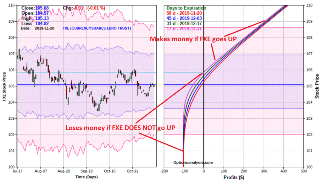
Figures 4 and 5 display the particulars for one possible speculative play designed to make money IF FXE does in fact move higher by December 31st.

Figure 4 – FXE Jan calls(Courtesy www.OptionsAnalysis.com)

Figure 5 – FXE Jan call risk curves (Courtesy www.OptionsAnalysis.com)

One word of caution: Options on FXE are presently very thinly traded.  Note that the bid/ask spreads are fairly wide and that a trader may wish to use a limit order and try to split the difference.  For purposes of this illustration we will assume that we simply “buy at the ask” price.

A few things to note:

*The risk curves are drawn through December 31st since that is when the “seasonally favorable” period ends (and we will not likely want to hold the position beyond that time)

*The cost to enter the trade – and the maximum risk is $102 per contract

*If FXE does in fact rally this trade can make money above the approximate Dec 31st breakeven price of $105.85 for FXE shares (current price = $105.08).

*If FXE remains unchanged or declines this trade will absolutely lose money

A pretty straightforward “speculative bet” – be right, make money, be wrong, lose money.

Summary

As always, this example trade is not a “recommendation.”  It is intended to serve simply as an example of an opportunity that tries to put as many factors in its favor as possible:

*Favorable seasonal trend

*Potentially bullish Elliott Wave count

*Potentially bullish price projection

*Opportunity to buy cheap options

*Low dollar risk

*Limited risk and unlimited profit potential

Will this trade work out favorably?  It beats me.  But that is the nature of speculation – which also highlights the importance of “position sizing”, i.e., what percentage of one’s capital will one risk on a given trade.  In this example, maybe risking 1% to 5% of one’s trading capital might make sense.  But “betting the ranch” – i.e., risking a high percentage of one’s capital on a random speculative bet – is an invitation to catastrophe.

So, let’s wrap up with:

Jay’s Trading Maxim #212: If a potential position equates to receiving an invitation to catastrophe, decline the invitation.

Jay Kaeppel

Disclaimer: The information, opinions and ideas expressed herein are for informational and educational purposes only and are based on research conducted and presented solely by the author.  The information presented does not represent the views of the author only and does not constitute a complete description of any investment service.  In addition, nothing presented herein should be construed as investment advice, as an advertisement or offering of investment advisory services, or as an offer to sell or a solicitation to buy any security.  The data presented herein were obtained from various third-party sources.  While the data is believed to be reliable, no representation is made as to, and no responsibility, warranty or liability is accepted for the accuracy or completeness of such information.  International investments are subject to additional risks such as currency fluctuations, political instability and the potential for illiquid markets.  Past performance is no guarantee of future results.  There is risk of loss in all trading.  Back tested performance does not represent actual performance and should not be interpreted as an indication of such performance.  Also, back tested performance results have certain inherent limitations and differs from actual performance because it is achieved with the benefit of hindsight.
The September Barometer Updated

In this article I wrote about a method using Fidelity Select Sector funds and in this article about using single-country ETFs.

The method was about as simple as it gets:

*Whichever security among the given list (sector funds or single-country ETFs) performed the best during the month of September is bought on October 31st and held, a) until the end of May for sector funds) or, b) until the end of April for single-country ETFs.

As always, I pointed out that actually utilizing the “idea” was not a “recommendation” but rather, well, an idea. 

In this article, let’s combine the two into one strategy and bring things up-to-date.

The Combined September Barometer Approach (CSBA)

At the end of each September, using monthly total return data (which is typically not available until sometime in early October):

Buy Rules:

*Identify the Fidelity Select Sector fund that had the highest total return during September and buy it on October 31st.

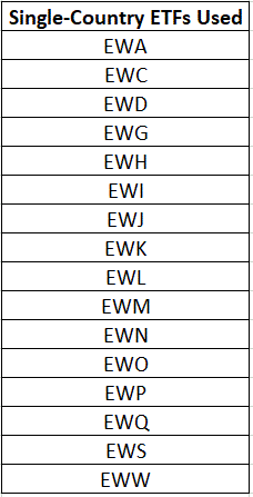
*Among the 16 iShares single-country ETFs that launched in 1996 (list below) identify the ETF that had the highest total return during September and buy it on October 31st.

Sell Rules:

*Sell the single-country ETF on the last trading day of the following April

*Sell the sector fund on the last trading day of the following May

*For testing purposes, all proceed go into intermediate-term treasuries.  For this we will use ticker FGOVX as a proxy (so for the record, the sector fund portion of the portfolio holds FGOVX from Jun 1 through Oct 31 and the single-coutry ETF portion hold FGOVX form May 1 through Oct 31).

As a benchmark we will use 50% in the S&P 500 Index and 50% in the MSCI EAFE Index, rebalanced at the start of every year.

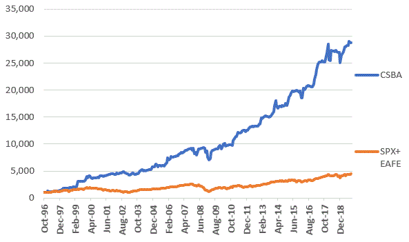
Figure 1 displays the cumulative hypothetical growth for CSBA versus the benchmark.

Figure 1 – Growth of $1,000 invested in CSBA (blue) versus the benchmark SPX/EAFE Index (red); 1996-2019

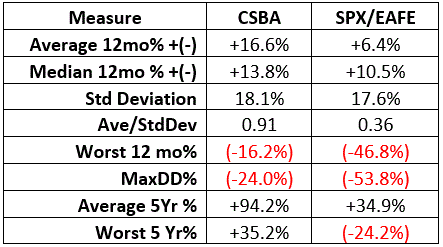
Figure 2 displays some relevant facts and figures.

Figure 2 – Facts and Figures (FGOVX held when not in sector funds/single country ETFs)

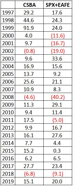
Figure 3 displays calendar year results.

Figure 3 – Calendar Year Results (FGOVX held when not in sector funds/single country ETFs)

*For the record, CSBA showed a calendar year gain in 20 out of 23 years, versus 17 out of 20 for the benchmark.  CSBA outperformed the benchmark in 16 out of 23 years.

*One other interesting thing to note is that during the 6 calendar years when the benchmark showed a loss (2000,2001,2002,2008,2011,2018), the CSBA outperformed the benchmark – usually by a significant amount, and actually showed a gain during 3 of those years.

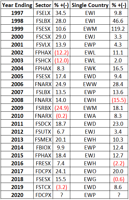
Figure 4 displays the funds/ETFs held each year and the amount gained or lost during that fund/ETFs holding period (7 months for sector funds, 6 months for single country ETFs)

Figure 4 – Annual sector fund/single-country holdings/Results

Summary

So, is the Combined September Barometer Approach a viable approach to investing?  That’s not for me to say.  Again – and as always – what is presented here is not a recommendation to “do a certain thing.”  The purpose is simply to highlight that there may be ways to do better in the markets than just buying and holding an index fund.

Original single-country ETF list (traded since 1996)

Figure 5

Jay Kaeppel

Disclaimer: The information, opinions and ideas expressed herein are for informational and educational purposes only and are based on research conducted and presented solely by the author.  The information presented does not represent the views of the author only and does not constitute a complete description of any investment service.  In addition, nothing presented herein should be construed as investment advice, as an advertisement or offering of investment advisory services, or as an offer to sell or a solicitation to buy any security.  The data presented herein were obtained from various third-party sources.  While the data is believed to be reliable, no representation is made as to, and no responsibility, warranty or liability is accepted for the accuracy or completeness of such information.  International investments are subject to additional risks such as currency fluctuations, political instability and the potential for illiquid markets.  Past performance is no guarantee of future results.  There is risk of loss in all trading.  Back tested performance does not represent actual performance and should not be interpreted as an indication of such performance.  Also, back tested performance results have certain inherent limitations and differs from actual performance because it is achieved with the benefit of hindsight.
Combining Two Seasonal Strategies into One (Better One?)

In this article I wrote about a group of Fidelity sector funds that – as a group – tends to perform well between Nov 1 and Apr 30th

In this article I wrote about two funds that tend to perform well between May 1 and Aug 31st.

So, what happens if we put the two together?

Jay’s Seasonal Combined Portfolio

From Nov 1 through Apr 30 the portfolio holds:

*Chemicals

*Electronics

*Health Care Services

*Construction and Housing

*Retailing

From May 1 through Aug 31 the portfolio holds:

*Health Care

*Long-Term Treasury Bonds

From Sep 1 through Oct 31 the portfolio holds:

*Intermediate-Term Treasuries

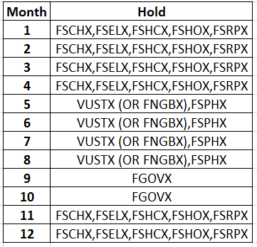
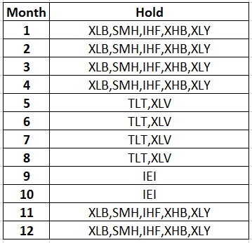
Figure 1 displays the funds that were held each month during testing.  FYI, for September and October we simply hold intermediate-term treasuries.

Figure 1 – Jay’s Seasonal Combined Portfolio (Fidelity version)

*For the record, an actual investor at Fidelity would likely use FNGBX (Fidelity Long-Term Treasury) rather than VUSTX (Vanguard Long-Term Treasury).  But VUSTX has a longer track record so I used it in the original test.

Figure 2 displays an “ETF Version” of the Seasonal Combined Portfolio

Figure 2 – Jay’s Seasonal Combined Portfolio (ETF version)

Results

The test period extends from 10/31/1986 through 10/31/2019, or 33 years.

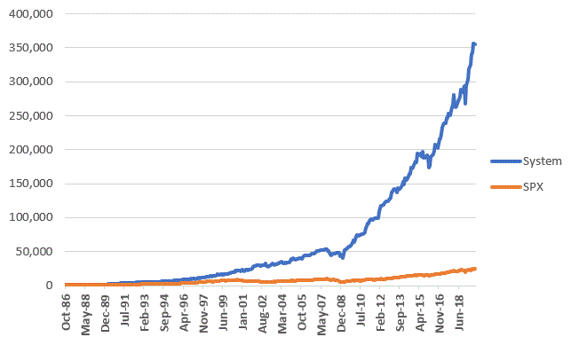
Figure 3 displays the growth of $1,000 invested using Jay’s Seasonal Combined Portfolio versus buying and holding the S&P 500 Index.

Figure 3 – Growth of $1,000 invested in Seasonal Combined Portfolio (blue) versions S&P 500 Index buy-and-hold (orange); 10/31/86-10/31/19

For the record, $1,000 using the strategy grew to $354,641 versus $24,972 for the S&P 500 Index.

Figure 4 displays some relevant facts and figures.

Measure System SPX
Average 12 mos. %+(-) +20.0% +11.0%
Median 12 mos. % +(-) +19.7% +13.2%
Std Dev. % 13.6% 16.0%
Average/StdDev 1.47 0.69
Worst 12 mos. % (-15.6%) (-43.3%)
MaxDrawdown % (-25.2%) (-51.0%)
Average 5-Yr % +(-) +145.8% +70.7%
Worst 5-Tr. % +(-) +15.3% (-29.4%)

Figure 4 – Results

Figure 5 displays the hypothetical year-by-year results.

Year System SPX
1987 33.3 4.7
1988 20.6 16.2
1989 34.9 31.4
1990 32.4 (3.3)
1991 57.8 30.2
1992 16.3 7.4
1993 10.9 9.9
1994 8.1 1.2
1995 31.9 37.4
1996 23.0 22.9
1997 17.7 33.2
1998 39.8 28.6
1999 15.3 21.1
2000 22.2 (9.1)
2001 24.9 (12.0)
2002 2.7 (22.1)
2003 13.6 28.5
2004 16.1 10.7
2005 9.8 4.8
2006 15.6 15.6
2007 3.2 5.4
2008 (10.5) (37.0)
2009 46.5 26.5
2010 27.6 14.9
2011 16.3 2.0
2012 31.4 15.8
2013 17.4 32.2
2014 20.4 13.5
2015 3.2 1.2
2016 14.6 11.8
2017 21.9 21.7
2018 1.4 (4.5)
2019 32.3 23.0

Figure 5 – Hypothetical Yearly Results

Summary

So, is the Seasonal Combined Portfolio the “be all, end all” of investment strategies?  Probably not.  As always, I am not “recommending” that anyone rush off and start using this particular strategy because – as the saying goes – past performance is no guarantee of future results. 

Strictly some (hopefully interesting) food for thought.

Jay Kaeppel

Disclaimer: The information, opinions and ideas expressed herein are for informational and educational purposes only and are based on research conducted and presented solely by the author.  The information presented does not represent the views of the author only and does not constitute a complete description of any investment service.  In addition, nothing presented herein should be construed as investment advice, as an advertisement or offering of investment advisory services, or as an offer to sell or a solicitation to buy any security.  The data presented herein were obtained from various third-party sources.  While the data is believed to be reliable, no representation is made as to, and no responsibility, warranty or liability is accepted for the accuracy or completeness of such information.  International investments are subject to additional risks such as currency fluctuations, political instability and the potential for illiquid markets.  Past performance is no guarantee of future results.  There is risk of loss in all trading.  Back tested performance does not represent actual performance and should not be interpreted as an indication of such performance.  Also, back tested performance results have certain inherent limitations and differs from actual performance because it is achieved with the benefit of hindsight.

One Idea in Gold Stocks

I recently wrote a piece discussing a super inexpensive way to play for a huge move in silver (in either direction) over the next year or so (I also highlighted the fact that it was super inexpensive because it was something of a long shot).  This piece is very similar except that the play is much shorter-term in nature.

Gold Miners

As I intimated in the silver article, I grow a little weary of all the “hype” surrounding gold, gold stocks, precious metals, and so on and so forth.  The bottom line is that:

a) There is a time to be in metals and/or miners

b) There is a time to NOT be in metals and/or miners

c) Like anything else, its often hard tell which time is which

d) But there is ALWAYS a loud contingent shouting “Now is the time to be in metals and/or miners!”

So, a few key points before we get to, eh, the point:

*I am not claiming A or B above – consider me agnostic.  But please DO NOT consider me part of D above.

So, what’s the point?  The point is that there is absolutely nothing wrong with making small plays in speculative situations.

Remember this:

*If you never get into a situation where you can make a lot of money (relatively) fast, then you will never make a lot of money relatively fast.

*HOWEVER, at the same time you MUST avoid the temptation to make this your primary form of investment.  Bottom line: invest wisely with the bulk of your capital, but don’t be afraid to “take a shot” with a small amount of your capital if you think an opportunity exists.

If You Think an Opportunity Exists in Gold Miners….

So again, I am not telling you that I think gold miners are going to rally and that I think you should take action.  What I am saying is that if you think gold miners are going to rally there are ways to profit handsomely.  To wit:

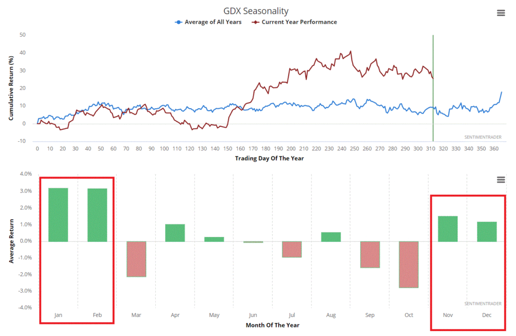
Figure 1 displays the annual seasonal trend for ticker GDX as calculated by www.Sentimentrader.com.  Note that Nov-Feb tends to be a bullish period.

Figure 1 – GDX entering a potentially favorable seasonal period (Courtesy Sentimentrader.com)

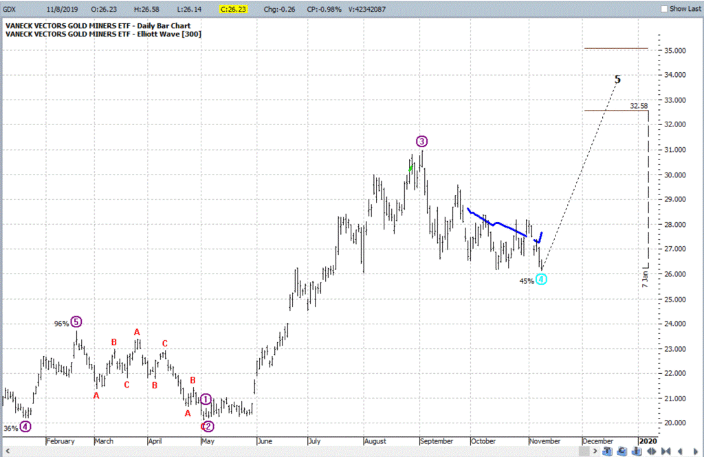
Figure 2 displays the Elliott Wave count for ticker GDX as calculated by ProfitSource by HUBB software. 

Figure 2 – GDX with potentially bullish Elliott Wave count forming (Courtesy ProfitSource by HUBB)

Does the fact that GDX is in a favorable seasonal period AND has a potentially bullish Elliott Wave count forming guarantee that GDX is headed higher between now and sometime early next year?  Not at all. 

In fact if GDX drops much below $26 a share chances are the Elliott Wave count will fall apart.

But here is the point: If you are going to bet on miner stocks, this information “suggests” that that may be the way to bet. 

The Play

There are a lot of ways to play.  The most straightforward is simply to buy shares of GLD.  100 shares as I wrote would cost $2,623.  However, I am going to highlight an alternative.  It involves:

*Buying 2 GDX2020 26 calls @ $1.62

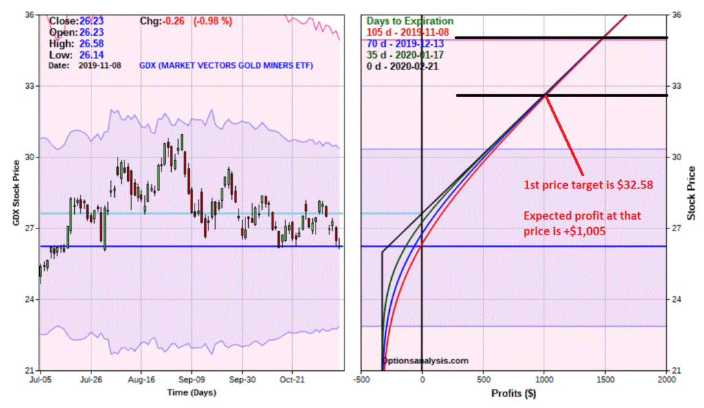
As you can see in Figure 3, this position costs $324 to enter (which is also the maximum risk on the position. 

It also has a “delta” of 110 – this means that it will behave like a position of holding 110 shares of GDX, i.e., the profit or loss in dollars will be similar to holding 100 shares of GDX, but at a cost of only $324.

Figure 3 – GDX Jan26 calls (Courtesy www.OptionsAnalysis.com)

Figure 4 – GDX 26 calls risk curves (Courtesy www.OptionsAnalysis.com)

As you can see in Figure 4, the equation is pretty simple:

*If GDX does in fact rise in price then this position can make a large percentage return

*If GDX does NOT rise in price the trader could easily lose the full $324 spent to enter the trade.

From a “positions management” point of view the key questions for a trader are:

*Will you cut bait if recent support is broken – or will you just size the position so as to risk the full $324?

*If price does go up will you “let it ride” until GDX hits the 1st target of $32.58? Or will you consider adjusting or selling half if GDX pops up in the short run?

Also remember that “speculation” is a different game mentally than “investing.” Investing takes a longer-term mindset, speculation deals with the “here and now”. To wit, this trade could completely fall apart between the time I click “Publish” and the time you read this post. All GDX has to do is keep heading south as it has been doing pretty much non stop since the 1st week of September.

The lesson here is this: A speculator needs to be able to absorb a loss – mentally and financially – and not let it affect his or her thinking on the next opportunity (HINT: This is much easier said than done).

Summary

Is buying a call option on a gold miner stock index a good idea or a bad idea?  That’s not for me to say.

But it’s one idea.

Jay Kaeppel

Disclaimer: The information, opinions and ideas expressed herein are for informational and educational purposes only and are based on research conducted and presented solely by the author.  The information presented does not represent the views of the author only and does not constitute a complete description of any investment service.  In addition, nothing presented herein should be construed as investment advice, as an advertisement or offering of investment advisory services, or as an offer to sell or a solicitation to buy any security.  The data presented herein were obtained from various third-party sources.  While the data is believed to be reliable, no representation is made as to, and no responsibility, warranty or liability is accepted for the accuracy or completeness of such information.  International investments are subject to additional risks such as currency fluctuations, political instability and the potential for illiquid markets.  Past performance is no guarantee of future results.  There is risk of loss in all trading.  Back tested performance does not represent actual performance and should not be interpreted as an indication of such performance.  Also, back tested performance results have certain inherent limitations and differs from actual performance because it is achieved with the benefit of hindsight.
The November-April Five

Nothing last forever.  And there are no permanent advantages in the stock market.  But history is a pesky thing.  And yes, some things do seem to work better than others.

Take the “November-April Five Portfolio” listed below for example (with potential ETF substitutes).

Sector Fidelity ETF
Electronics FSELX SMH or XSD
Construction FSHOX ITB or XHB
Chemicals FSCHX XLB
Hospitals FSHCX IHF
Retailing FSRPX XLY

Figure 1 – The November-April Five

Figure 2 shows some performance numbers for each of the Fidelity funds listed in Figure 1 if held ONLY from the close on Oct 31 through the close on Apr 30th every year starting in October 1986

Sector Fidelity Ave % +(-) % times UP
Electronics FSELX +15.3% 88%
Construction FSHOX +14.1% 88%
Chemicals FSCHX +13.3% 94%
Hospitals FSHCX +10.2% 73%
Retailing FSRPX +12.3% 85%

Figure 2 – The November-April Five individual Results (Nov-Apr, 1986-2019) (Source: Calculated using Monthly Total Return data from PEP Database by Callan Associates)

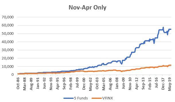
The blue line in Figure 3 displays the growth of $1,000 split equally between the 5 funds listed in Figure 1 each November 1st and held through the following April 30th.  The orange line represents the growth of an investment in ticker VFINX (Vanguard S&P 500 Index fund) during the same 6-month period each year.

Figure 3 – Growth of $1,000 invested in 5 Fidelity Funds versus VFINX – Nov 1 through Apr 30 ONLY ; 1986-2019

Figure 4 displays a few comparative numbers between the Fidelity 5 and VFINX only during November through May.

Measure Fidelity VFINX
Average % +13.0% +8.1%
% times UP 94% 85%

Figure 4 – Fidelity November-April Five annual results versus S&P 500 Index (VFINX); November through April ONLY; 1986-2019

Finally, Figure 5 displays the year-by-year results (for just the months of November through April – no gain or loss is added or subtracted during May through October).

StartEndFidelity 5VFINXDifference
1986198718.8 19.7 (1.0)
1987198819.3 5.4 13.9
1988198915.2 12.9 2.3
198919903.7 (1.3)5.0
1990199152.5 25.4 27.1
1991199211.7 7.2 4.4
199219935.7 6.5 (0.8)
199319948.7 (2.4)11.1
199419957.1 10.4 (3.3)
1995199616.9 13.7 3.1
199619979.3 14.7 (5.4)
1997199816.6 22.4 (5.8)
1998199919.3 22.4 (3.1)
1999200019.8 7.2 12.5
200020012.7 (12.1)14.8
2001200222.2 2.2 19.9
200220030.6 4.4 (3.8)
200320047.3 6.2 1.1
2004200511.3 3.2 8.1
2005200612.9 9.6 3.3
2006200711.1 8.5 2.6
20072008(11.4)(9.7)(1.7)
200820099.4 (8.5)17.9
2009201027.1 15.6 11.5
2010201125.7 16.3 9.4
2011201218.4 12.7 5.7
2012201314.8 14.3 0.5
201320148.0 8.3 (0.2)
201420159.8 4.3 5.5
201520161.0 0.4 0.7
2016201717.7 13.2 4.5
201720185.0 3.8 1.2
2018201911.8 9.7 2.1

Figure 5 – Year-by-Year Results (Source: Monthly Total Return data from PEP Database by Callan Associates)

Summary

The results above are (at least in my market-addled mind) fairly compelling. 

Nevertheless, do not make the mistake of thinking that “you can’t lose” by trading the funds listed above during the times listed above.  Finally, as always, I am NOT “recommending” the funds above – just highlighting some interesting market history.

Jay Kaeppel

Disclaimer: The information, opinions and ideas expressed herein are for informational and educational purposes only and are based on research conducted and presented solely by the author.  The information presented does not represent the views of the author only and does not constitute a complete description of any investment service.  In addition, nothing presented herein should be construed as investment advice, as an advertisement or offering of investment advisory services, or as an offer to sell or a solicitation to buy any security.  The data presented herein were obtained from various third-party sources.  While the data is believed to be reliable, no representation is made as to, and no responsibility, warranty or liability is accepted for the accuracy or completeness of such information.  International investments are subject to additional risks such as currency fluctuations, political instability and the potential for illiquid markets.  Past performance is no guarantee of future results.  There is risk of loss in all trading.  Back tested performance does not represent actual performance and should not be interpreted as an indication of such performance.  Also, back tested performance results have certain inherent limitations and differs from actual performance because it is achieved with the benefit of hindsight.
A Minuscule Bet on a Massive Move (in Silver)

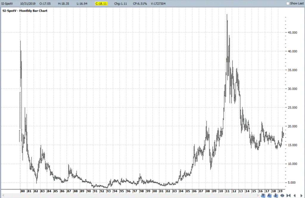
It is impossible to be in this business and avoid the hype about how silver is “poised” to “explode” to “massive new highs”, ala the great spikes in 1980 or 2011 when silver rallied to, well, massive new highs.

And it all sounds exactly like hype and pretty far-fetched at times. Still – it has happened twice before. So anything is possible. The next question then is “what to do about it, if anything?”

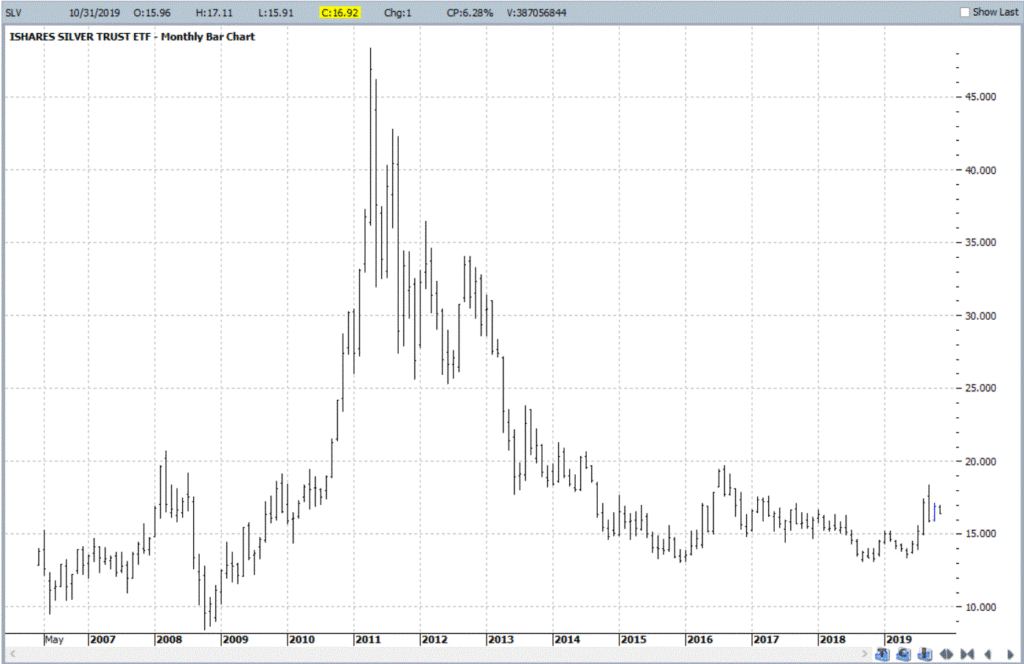
Figure 1 displays a monthly chart for silver futures going back to the 1980’s and Figure 2 displays a monthly chart for ticker SLV – an ETF that tracks the price of silver bullion. 

Figure 1 – Silver futures monthly (Courtesy ProfitSource by HUBB)

Figure 2 – ETF ticker SLV (Courtesy ProfitSource by HUBB)

Sounds like a sucker bet, right?  And besides, what if I place a big bet on silver soaring and it tanks instead?  Yeah, on the face it, it all seems like a pretty silly idea.

But here’s a question to ponder: What if you could risk $56 just on the off chance that silver makes a seriously large move – either up OR down – between now and January of 2021?  Is that worth considering?

Well, that’s not for me to say.  But let me show you what I am talking about.

SLV Example

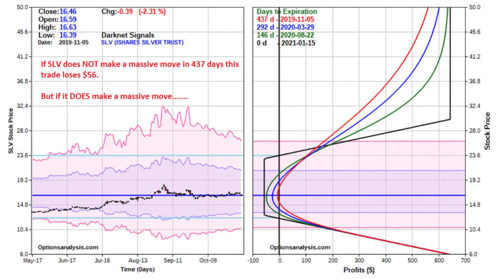
Figures 3 and 4 displays the particulars and risk curves for a trade using options on ticker SLV as follows:

*Buy 1 Jan2021 SLV 23 call @ $0.62

*Sell 1 Jan2021 SLV 30 call @ $0.30

*Buy 1 Jan2021 SLV 13 put @ $0.24

Figure 3 – SLV option trade details (Courtesy www.OptionsAnalysis.com)

Figure 4 – SLV option trade risk curves (Courtesy www.OptionsAnalysis.com)

The total cost to enter this position is a whopping $56.  So, what do you get for your $56? 

*If SLV makes a 2-standard deviation price move sometime in the next 437 calendar days and rises to $26.40, the position will show an open profit of between roughly $175 (+212%) and $260 (+364%), depending on how soon it gets there and implied volatility at the time.

*If SLV rises all the way to its old high of $48.35 the profit would be somewhere between $550 (+882%) and $644 +(1,086%).

On the downside:

*If SLV falls 2 standard deviations to $10.82 the position will show an open profit of between roughly $170 (+206%) and $190 (+239%) – again, depending on how soon it gets there.

*And if SLV falls all the way to its 2008 low of $8.45, the position will show a profit of roughly $400 (+614%).

REMINDER: I am NOT “recommending” this trade. The purpose of this example is simply to highlight the fact that options can allow a trader to “risk a little for the potential to make alot.” Nothing more, nothing less.

Summary

So, is silver likely to make an astronomical move – up or down – between now and January 2021?  It beats me.  The only question a trader can answer with any certainty is – are you willing to risk $56 while you wait to find out?

Jay Kaeppel

Disclaimer: The information, opinions and ideas expressed herein are for informational and educational purposes only and are based on research conducted and presented solely by the author.  The information presented does not represent the views of the author only and does not constitute a complete description of any investment service.  In addition, nothing presented herein should be construed as investment advice, as an advertisement or offering of investment advisory services, or as an offer to sell or a solicitation to buy any security.  The data presented herein were obtained from various third-party sources.  While the data is believed to be reliable, no representation is made as to, and no responsibility, warranty or liability is accepted for the accuracy or completeness of such information.  International investments are subject to additional risks such as currency fluctuations, political instability and the potential for illiquid markets.  Past performance is no guarantee of future results.  There is risk of loss in all trading.  Back tested performance does not represent actual performance and should not be interpreted as an indication of such performance.  Also, back tested performance results have certain inherent limitations and differs from actual performance because it is achieved with the benefit of hindsight.
What it Will Take to Get Commodities Moving

I keep seeing headlines about the “imminent” re-emergence of commodities as a viable investment as an asset class.  And as I wrote about here, I mostly agree wholeheartedly that “the worn will turn” at some point in the years ahead, as commodities are historically far undervalued relative to stocks.

The timing of all of this is another story.  Fortunately, it is a fairly short and simple story.  In a nutshell, it goes like this:

*As long as the U.S. Dollar remains strong, don’t bet heavy on commodities.

The End

Well not exactly. 

The 2019 Anomaly

The Year 2019 was something of an anomaly as both the U.S. Dollar and precious metals such as gold and silver rallied.  This type of action is most unusual.  Historically gold and silver have had a highly inverse correlation to the dollar.  So, the idea that both the U.S. Dollar AND commodities (including those beyond just precious metals) will continue to rise is not likely correct.

Commodities as an Asset Class

When we are talking “commodities as an asset class” we are talking about more than just metals.  We are also talking about more than just energy products. 

The most popular commodity ETFs are DBC and GSG as they are more heavily traded than most others.  And they are fine trading vehicles.  One thing to note is that both (and most other “me too” commodity ETFs) have a heavy concentration in energies.  This is not inappropriate given the reality that most of the industrialized world (despite all the talk of climate change) still runs on traditional fossil fuel-based energy.

But to get a broader picture of “commodities as an asset class” I focus on ticker RJI (ELEMENTS Linked to the Rogers International Commodity Index – Total Return) which diversifies roughly as follows:

Agriculture          40.90%

Energy               24.36%

Industrial Metals 16.67%

Precious Metals    14.23%

Livestock               3.85%

Note that these allocations can change over time, but the point is that RJI has much more exposure beyond the energy class of assets than alot of other commodity ETFs.

RJI vs. the Dollar

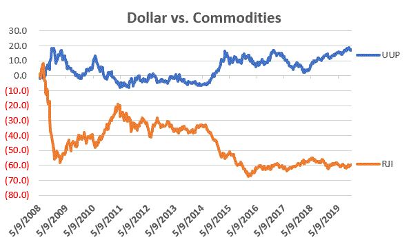
As a proxy for the U.S. Dollar we will use ticker UUP (Invesco DB US Dollar Index Bullish Fund).  Figure 1 displays the % gain/loss for UUP (blue line) versus RJI (orange line) since mid-2008.

Figure 1 – UUP versus RJI; Cumulative Return using weekly closing prices; May-2008-Sep-2019

*Since May of 2008 UUP has gained +17.2%

*Since May of 2008 RJI has lost -60%

The correlation in price action between these two ETFs since 2008 is -0.76 (a correlation of -1.00 means they are perfectly inverse), so clearly there is (typically) a high degree of inverse correlation between the U.S. dollar and “commodities”.

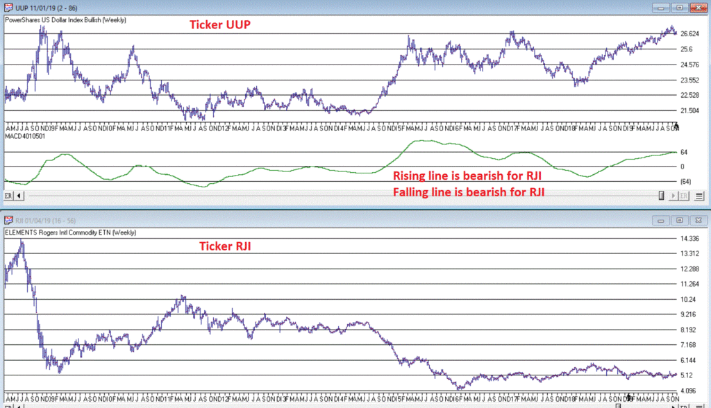
Next, we will apply an indicator that I have dubbed “MACD4010501” (Note to myself: come up with a better name).  The calculations for this indicator will appear at the end of the article (but it is basically a 40-period exponential average minus a 105-period exponential average).  In Figure 2 we see a weekly chart of ticker UUP with this MACD indicator in the top clip and a weekly chart of ticker RJI in the bottom clip.

Figure 2 – UUP with Jay’s MACD Indicator versus ticker RJI

Interpretation is simple:

*when the MACD indicator applied to UUP is declining, this is bullish for RJI

*when the MACD indicator applied to UUP is rising, this is bearish for RJI.

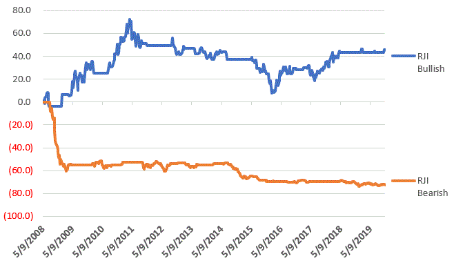
Figure 3 displays the growth of equity achieved by holding RJI (using weekly closing price data) when the UUP MACD Indicator is declining (i.e., RJI is bullish blue line in Figure 3) versus when the UUP MACD Indicator is rising (i.e., RJI is bearish orange line in Figure 3).

Figure 3 – RJI cumulative performance based on whether MACD indicator for ticker UUP is falling (bullish for RJI) of rising (bearish for RJI)

In sum:

*RJI gained +45.8% when the UUP MACD indicator was falling

*RJI lost -72.3% when the UUP MACD indicator was rising

The bottom line is that RJI rarely makes much upside headway when the UUP MACD Indicator is rising (i.e., is bearish for RJI).

Summary

Commodities as an asset class are extremely undervalued on a historical basis compared to stocks.  However, the important thing to remember is that “the worm is unlikely to turn” as long as the U.S. Dollar remains strong.

So, keep an eye on the U.S. Dollar for signs of weakness.  That will be your sign that the time may be coming for commodities.

FYI: Code for Jay’s MACD4010501 Indicator

The indicator is essentially a 40-period exponential average minus a 105-period exponential average as shown below:

Define ss3 40.

Define L3 105.

ShortMACDMA3 is expavg([Close],ss3)*100.

LongMACDMA3 is expavg([Close],L3)*100.

MACD4010501 is ShortMACDMA3-LongMACDMA3.

Jay Kaeppel

Disclaimer: The information, opinions and ideas expressed herein are for informational and educational purposes only and are based on research conducted and presented solely by the author.  The information presented does not represent the views of the author only and does not constitute a complete description of any investment service.  In addition, nothing presented herein should be construed as investment advice, as an advertisement or offering of investment advisory services, or as an offer to sell or a solicitation to buy any security.  The data presented herein were obtained from various third-party sources.  While the data is believed to be reliable, no representation is made as to, and no responsibility, warranty or liability is accepted for the accuracy or completeness of such information.  International investments are subject to additional risks such as currency fluctuations, political instability and the potential for illiquid markets.  Past performance is no guarantee of future results.  There is risk of loss in all trading.  Back tested performance does not represent actual performance and should not be interpreted as an indication of such performance.  Also, back tested performance results have certain inherent limitations and differs from actual performance because it is achieved with the benefit of hindsight.