Monthly Archives: February 2017

Speculating in T-Bonds

Several potentially negative influences may weigh on bonds in the near-term.  And then again they may not.  Hence the reason the title of this piece is “Speculating in Bonds” and NOT “SELL BONDS NOW OH MY GOD!!!!!!!”

What we are talking about is a speculative trade that might make a few bucks if bonds do decline but won’t break the bank if bonds rally instead.

Two more important notes:

1) I am not “predicting” that bonds are about to decline.  I will simply be highlighting several factors that suggest they might

2) I am not “recommending” the example trade that follows below.  It is presented simply as an “example” of one low dollar risk way to bet on lower bond prices

Potential Negative Influences

#1. Seasonality

Figure 1 displays the annual seasonal pattern for t-bond futures.  As you can see we are at the start of a period which typically (though not always) experiences weakness.us1Figure 1 – Annual Seasonal Trend for T-Bonds
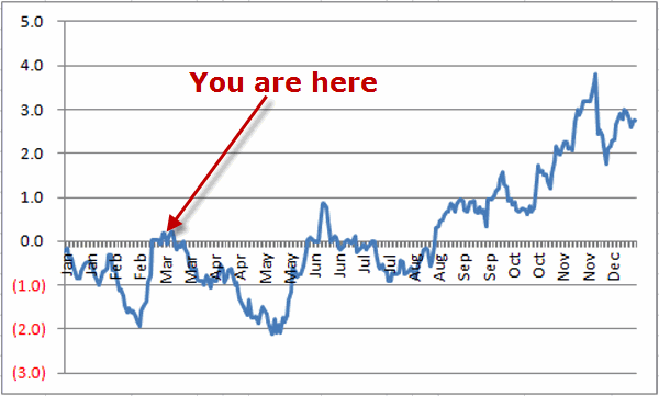
Just remember that the chart in Figure 1 displays “tendencies” and not a roadmap that bonds follow year  in and year out/

#2. Elliott Wave

As you can see in Figure 2 the daily Elliott Wave pattern (as calculated by ProfitSource by HUBB) is projecting lower prices for t-bonds.us2Figure 2  – Ticker TLT with Daily Elliott Wave count (Courtesy ProfitSource by HUBB)
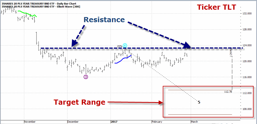
For the record, Elliott Wave counts don’t always pan out.  But for now it still counts as a negative influence (at least in my market addled mind)

#3. Price Trend is still Negative

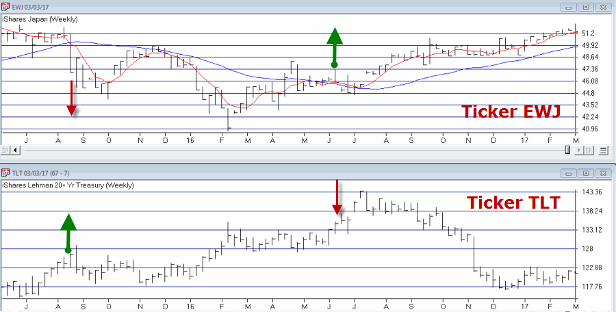
Figure 3 displays the weekly chart of ticker EWJ (Japan ETF) and a weekly chart of TLT.  TLT tends to perform poorly when the 5-week moving average for EWJ is above the 30-week moving average for EWJ – which has been the case since June of 2016 and remains the case today.us3aFigure 3 – Ticker EWJ in an uptrend (which tends to accompany t-bonds downtrend)(Courtesy AIQ TradingExpert)
Hypothetical Example Trade

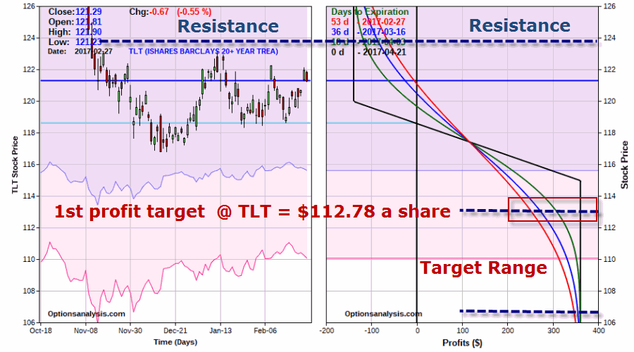
The position displayed in Figures 4 and 5 is referred to as a “bear put spread” and involves:

*Buying 1 Apr2017  TLT 120 Put

*Selling 1 Apr2017  TLT 115 Put

us3Figure 4 – TLT April 120/15 bear put spread (Courtesy www.OptionsAnalysis.com)
us4Figure 5 – Risk curves for  – TLT April 120/15 bear put spread (Courtesy www.OptionsAnalysis.com)

A 1-lot costs $139, which represents the maximum risk on the trade.  The maximum profit potential is $361.  From a trading perspective here is the more relevant way to look at this position:

1) If the “resistance” level is taken out, this trade will lose somewhere between -$60 and -$139, depending on how soon it happens

2) If TLT does decline to the upper Elliott Wave target of $112.78, this trade will show a profit of +$258 and +$363, again depending  on how soon that price level is hit.

So the relevant questions for a trader in this hypothetical example are:

1) Do you think there is a chance that t-bond prices will decline between now and April 21st?

2) Do you have $139 bucks you are willing to risk in order to find out?

Here is another “real world” way to look at this hypothetical position:

The Good News is that it appears to have a lot going for it in terms of bearish catalysts / influences, a positive  risk to reward ratio and a low dollar  risk

The Bad News is that all bonds have to do is rally a little bit and the whole darn thing ends up looking pretty darn stupid in hindsight.

Hence the reason it is called “speculation” and hence the reason for risking a low dollar amount.

Summary

Is this any way to trade t-bonds?  Well, it’s one way.  Nothing more, nothing less.  A simple example of one way to speculate on lower bond prices without betting the ranch.

Jay Kaeppel

Disclaimer:  The data presented herein were obtained from various third-party sources.  While I believe the data to be reliable, no representation is made as to, and no responsibility, warranty or liability is accepted for the accuracy or completeness of such information.  The information, opinions and ideas expressed herein are for informational and educational purposes only and do not constitute and should not be construed as investment advice, an advertisement or offering of investment advisory services, or an offer to sell or a solicitation to buy any security.
 

March and April (and the Train Rolls On)

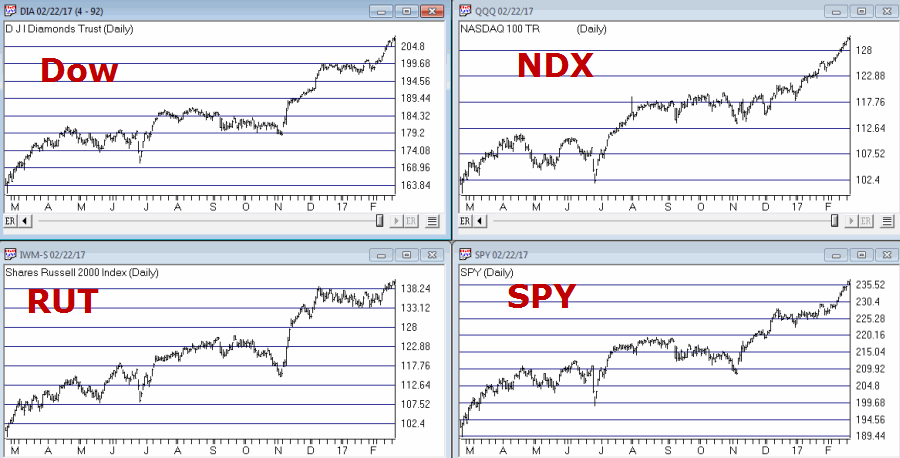
The stock market is off to a flying start in 2017.  We have a buy signal from the January Barometer, the 40-Week Cycle just turned bullish  and most of the major U.S. indexes soaring to new all-time highs.  See Figure 1.1aFigure 1 – Major U.S. Average hitting new highs

(See also This May Be a Good Time to Get Crude)

With the turn of the month near, what lies ahead for March and April?  Well, it’s the stock market, so of course no one really knows for sure.  Still, if history is an accurate guide (and unfortunately it isn’t always – and I hate that part), the odds for a continuation of the advance in the months just ahead may be pretty good.

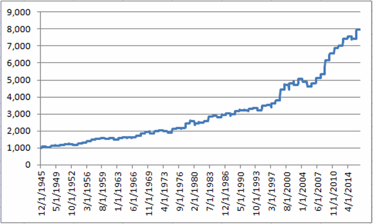
Figure 2 displays the growth of $1,000 invested in the Dow Jones Industrials Average ONLY during the months of March and April starting in 1946.2aFigure 2 – Growth of $1,000 invested in the Dow Jones Industrials Average ONLY during the months of March and April (1946-2016)

(See also It’s Bean a Very Good Time of Year (Typically))

For the record, the months of March and April combined:

*Showed a gain 53 times (75% of the time)

*Showed a loss 18 times (25% of the time)

*The average UP year showed a gain of +5.2%

*The average DOWN year showed a loss of (-3.3%)

*The largest Mar/Apr gain was +15.9% (1999)

*The largest Mar/Apr loss was (-6.0%) (1962)

Summary

So is the stock market train sure to “roll on” during the March/April timeframe?  Not at all.  But with “all systems Go” at the moment and with a historically favorable period approaching – and despite a lot of overly bullish sentiment beginning to bubble up – I feel compelled to stay on board at least until the next stop..

Jay Kaeppel

Disclaimer:  The data presented herein were obtained from various third-party sources.  While I believe the data to be reliable, no representation is made as to, and no responsibility, warranty or liability is accepted for the accuracy or completeness of such information.  The information, opinions and ideas expressed herein are for informational and educational purposes only and do not constitute and should not be construed as investment advice, an advertisement or offering of investment advisory services, or an offer to sell or a solicitation to buy any security.
 

It’s Not Yet Time to Come Around to the Pound

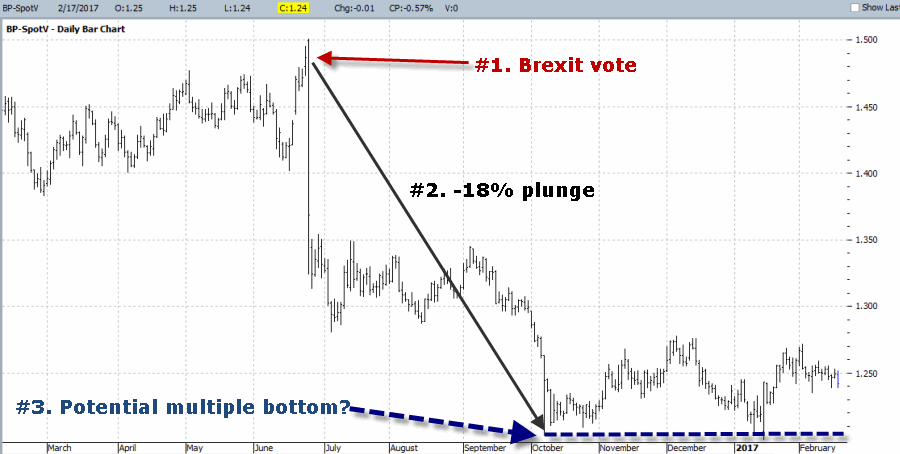
Well I am generally a “trend-follower” by nature, I have to admit that I am a bit of a sucker for a good contrarian play (See here , here and here).  On a purely subjective basis, what could be more of a contrarian play than to be bullish on the British Pound?  The Brexit vote back in June 2016 triggered a -18% plunge in the pound in less than four months time.  Since that time the pound has been bouncing along sideways and (again from a subjective perspective) could be forming a multiple bottom.1Figure 1 – British Pound futures (Courtesy ProfitSource by HUBB)

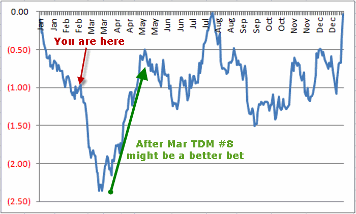
From a contrarian point of view I find myself with a hankering’ to speculate on the long side in the pound.  But I am holding off for now.  Why?  Take a look at Figure 2 which displays the annual seasonal trend for British Pound futures going back to 1977.

2Figure 2 – Annual Seasonal Trend for British Pound futures (1977-2016)

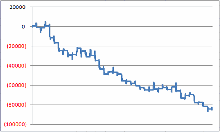
As you can see, the period between roughly now and March Trading Day of the Month (TDM) #8 is arguably the weakest time of year.  Figure 3 displays the results achieved by holding a long position in British Pound futures from the close on December 31st the prior year through the close on March TDM #8 every year since 1978.3Figure 3 – Cumulative $ Gain/Loss for British Pound futures Dec 31st through Mar TDM 8 (1978-2016)

Figure 4 displays the year-by-year results4Figure 4 – Year-by-Year $ Gain/Loss for British Pound futures Dec 31st through Mar TDM #8 (1978-2016)

For the record:

*# times BP showed a gain = 13 (33%)

*# times BP showed a loss = 26 times (67%)

*Average $ gain = +$1,604

*Average $ loss = (-$4,075)

On the other hand, Figure 5 displays the results achieved by holding a long position in British Pound futures between March TDM #8 and May TDM #4.5Figure 5 – Cumulative $ Gain/Loss for British Pound futures Mar TDM #8 through May TDM #4 (1978-2016)

For the record, between Mar TDM #8 and May TDM #4:

*# times BP showed a gain = 27 (68%)

*# times BP showed a loss = 13 times (32%)

*Average $ gain = +$3,513

*Average $ loss = (-$2,601)

Summary

For the record, the Pound has witnessed a decline 70% of the time between Feb TDM #13 (i.e., Feb 17, 2017) and Mar TDM #8.  This also means that 30% of the time this period has seen the Pound advance.  So there is no reason to assume that the BP “is certain” to decline in the month ahead.

Still, while no market follows a set seasonal trend every year, the results displayed in Figures 2 through 5 suggest that for those with a hankering to be a wise guy and speculate on the long side (“Hi, my name is Jay”), waiting until after Mar TDM 8 to enter a long position in the Pound might be a good idea.

For traders not interested in futures, the ETF ticker FXB allows traders to buy and hold the British Pound just as they would shares of stock.

In the meantime, if you need to find me, I’ll be over in the corner fighting the urge to be a wise guy.

Jay Kaeppel

Disclaimer:  The data presented herein were obtained from various third-party sources.  While I believe the data to be reliable, no representation is made as to, and no responsibility, warranty or liability is accepted for the accuracy or completeness of such information.  The information, opinions and ideas expressed herein are for informational and educational purposes only and do not constitute and should not be construed as investment advice, an advertisement or offering of investment advisory services, or an offer to sell or a solicitation to buy any security.
 

It’s Bean a Very Good Time of Year (Typically)

OK, I understand that the grain markets are not exactly everyone’s “cup of tea.”  Still, as someone much smarter than me once said, “Opportunity is where you find it” (in fact, I’m so stupid I don’t even remember who said it).

So you might want to at least be aware that this is the time of year when soybeans typically start performing well.  Um, but not always.  Also, for the record, I am a few days late with this one but so far beans haven’t really gone anywhere so no harm. No foul.

(See also The Long and Short of Strangling Small Caps)

Seasonal Beans

Figure 1 displays the annual seasonal trend for soybean futures.1Figure 1 – Soybeans Annual Seasonal Trend

One “typically” favorable period extends from the close on February Trading Day of the Month (TDM) #8 (which was February 10th of 2016) through the close of May TDM #1.

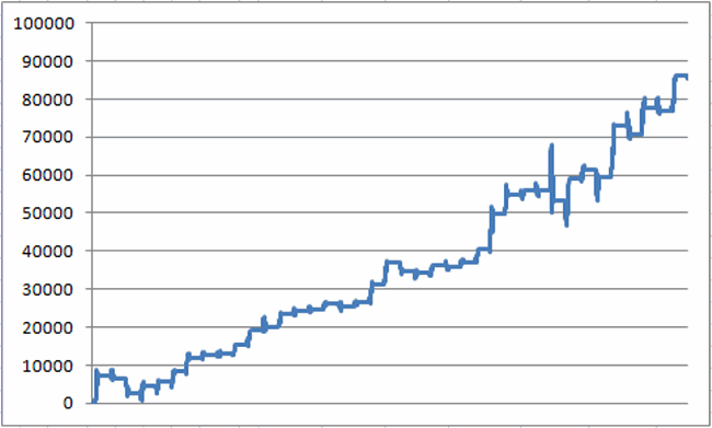
Figure 2 displays the annual gain/loss from holding a long position is soybean futures during this period each year starting in 1978.2Figure 2 – Annual gain/loss from holding long 1 soybean futures contract from Feb TDM 8 through May TDM 1 (1978-2016)

Figure 3 displays the cumulative gain/loss.3Figure 3 – Cumulative growth of equity from holding long 1 soybean futures contract from Feb TDM 8 through May TDM 1 (1978-2016)

For the record:

*# years showing a gain = 29 (74%)

*# years showing a loss = 10 (26%)

*Average gain =+$3,523

*Average loss = -$1,597

Please note that there is a difference between 74% accurate and “You Can’t Lose Trading Beans!”

The majority of investors will never even consider trading soybean futures (which truth be told is probably a good thing).  But there are alternatives.  The ETF ticker symbol SOYB is designed to track soybean futures but trade like shares of stock.

Figure 4 displays the year-by-year percentage gain or loss achieved by holding ticker SOYB form the end of Feb TDM 8 through May TDM 1 since SOYB started trading (in November of 2011).

Year SOYB % +(-)
2012 12.3
2013 (3.2)
2014 10.1
2015 (2.3)
2016 14.5

Figure 4 – % +(-) for ETF ticker SOYB between Feb TDM 8 and May TDM 1 (2012-2016)

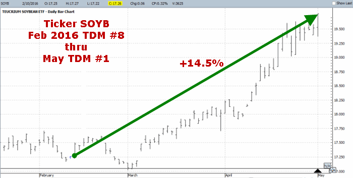
Figure 5 displays a chart of ticker SOYB during the Feb to May period in 2016 (Just remember it does always go this well).5Figure 5 – ETF ticker SOYB in 2016

(See also This May Be a Good Time to Get Crude)

Summary

As always, this blog DOES NOT offer investment advice, only ideas.  So to be clear, I have no idea if soybeans will perform well during the Feb to May period this time around and I am not recommending that you buy soybeans futures contract or shares of ticker SOYB.

That being said, at least now you may be aware of a potential opportunity that you probably were not aware of before.

Jay Kaeppel

Disclaimer:  The data presented herein were obtained from various third-party sources.  While I believe the data to be reliable, no representation is made as to, and no responsibility, warranty or liability is accepted for the accuracy or completeness of such information.  The information, opinions and ideas expressed herein are for informational and educational purposes only and do not constitute and should not be construed as investment advice, an advertisement or offering of investment advisory services, or an offer to sell or a solicitation to buy any security.
This May Be a Good Time to Get Crude

The good news is that crude oil is about to enter a “seasonally favorable” period.  The bad news is that this in absolutely no way guarantees that crude oil is certain to rise during this period this year.  I hate that part.

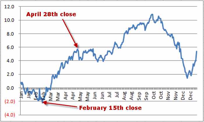
Figure 1 displays an annual seasonal chart for crude oil.

cl1Figure 1 – Annual Seasonal Trend Chart for Crude Oil futures

(See also  Is This the Greatest Buying Opportunity Ever in Crude Oil?)

If history is a guide (although unfortunately it isn’t always – more in a moment) then the outlook for crude “should” be favorable between the close on February 15th and the close on April 28th.  As you can see in Figure 1 crude oil “typically”:

1) Bottoms out in mid February

2) Rallies into late April

3) Muddles along for a while

4) Then rallies into late September and then

5) The bottom drops out

Except of course that it does not always play out exactly this way every year. In fact in some years it doesn’t follow anything even remotely close to this script.  Ah, there’s the rub.  Actually, the most appropriate quote is this one:

“Seasonality is climate, not weather”, Michael Santoli CNBC Commentator

Exactly.

(See also One Way to Play Crude Oil Volatility and Soybeans, Crude Oil and Gold, Oh My)

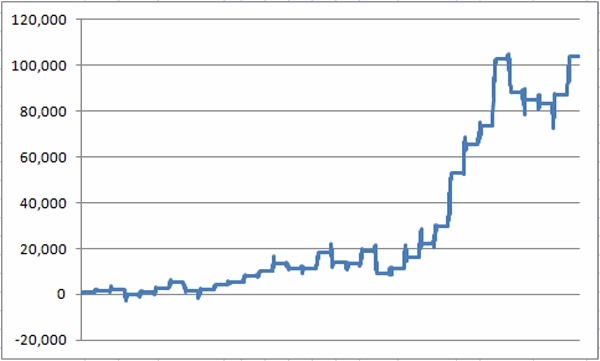
To illustrate this let’s look at the time period that extends from the end of February Trading Day of the Month (TDM) #11 through April TDM #20. The equity curve achieved by holding long one crude oil futures contract during this period every year since 1984 appears in Figure 2.cl2Figure 2 – $ gain for crude oil futures between Feb TDM 11 and Apr TDM 20 (1984-2016)

For the record:

*# times crude oil UP = 23 (70% of the time)

*# times crude oil down = 10 (30% of the time)

*Average gain during UP years = +$6,333

*Average loss during DOWN years = (-$4,286)

Not perfect, but remember we are looking at a “tendency” and not a “trading system.”

Here is what I take away from this type of analysis: During this time period I would rather look for ways to play the long side of crude than the short side.  Nothing more, nothing less.

In other words, it is better to swim with the tide than against it.

(See also Blood in the Energy Streets and Blood in the Energy Streets (Part II))

Extending Seasonal Trends Even Longer

To illustrate just how “seasonal” crude oil’s performance is, let’s extend things a little further.  Based on the results in Figure 1, let’s run the following test:

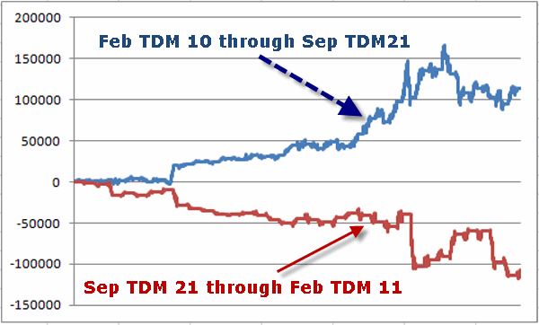
Test A) Hold long 1 crude oil futures contract from the close on February Trading Day #11 through the close on September Trading Day #21

Test B) Hold long 1 crude oil futures contract from the close on September Trading Day #21 through the close on February Trading Day #11

The results for these two tests appear in Figure 3.cl3Figure 3 – Gain/loss for crude oil futures during two separate time periods each year (from 4/5/1983 through 12/31/2016)

As you can see in Figure 3 there are some big drops during the supposedly “bullish” period (blue line) and some big rallies during the supposedly “bearish” periods (red line).  Still, in the  long run the difference is pretty stark.

For the record:

*Between Feb TDM 11 and Sep TDM 21 crude oil futures have gained +$113,600.

*Between Sep TDM 21 and Feb TDM 11 crude oil futures have lost -$107,470.

Summary

I don’t mean to be crude (OK, sorry I couldn’t resist) but the purpose of this article is NOT to suggest that you buy crude oil futures on Feb TDM 11 and go short on Sep TDM 21.  Again, we are not talking about a “systematic” approach to trading crude oil.

What we are talking about is using seasonal trend bias to help guide one’s approach to trading by putting as many factors as possible in one’s favor.

Jay Kaeppel

Disclaimer:  The data presented herein were obtained from various third-party sources.  While I believe the data to be reliable, no representation is made as to, and no responsibility, warranty or liability is accepted for the accuracy or completeness of such information.  The information, opinions and ideas expressed herein are for informational and educational purposes only and do not constitute and should not be construed as investment advice, an advertisement or offering of investment advisory services, or an offer to sell or a solicitation to buy any security.
The Long and Short of Strangling Small Caps

When it comes to trading there are a seemingly endless number of ways to play any security and/or any situation. In this piece we will look at small-cap stocks using ticker IWM – an ETF that tracks the Russell 2000 Small-Cap Index.

Two things to note: First, we will look at two potential positions – both involving the use of options.  Therefore, if you do not now – and never intend to – trade options, then……hey, class dismissed.  But please check back again soon.

Secondly, it is very important to stress that neither of the trades discussed below should be considered as “recommendations”.  I have no idea if they will actually pan out and am not suggesting that you use your hard earned money to find out.  The purpose of these illustrations is hopefully to help you in learning to analyze situations on your own.

(See also It’s Hard With ‘Oil’ These Choices)

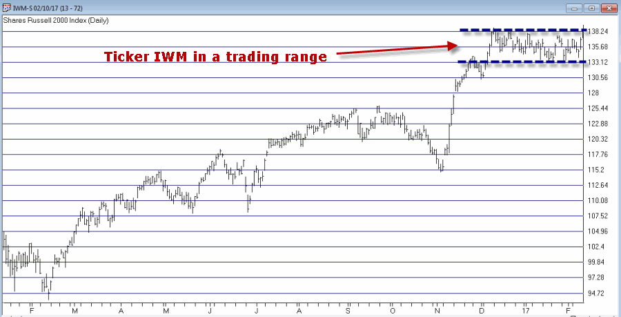
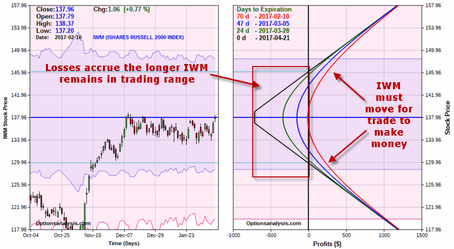
To set the stage, as you can see in Figure 1, ticker IWM has been trading in a very narrow range for a little while now.  1Figure 1 – Ticker IWM range bound  (Courtesy AIQ TradingExpert)

Different option traders will look at this situation and see completely different opportunities.  Some traders will see “range bound” and think in terms of using a neutral option strategy that will make money as long as IWM remains in the range.  Other traders will see “due to breakout” and think in terms of a strategy that will make money when that breakout occurs.  So let’s address both possibilities.

Idea #1: A Short-Term Iron Condor

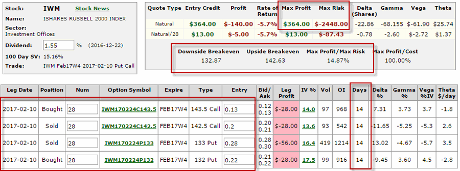
For the trader who thinks (hopes?) IWM will remain range-bound; Figures 2 and 3 display the particulars for the following position – one typically referred to as an “iron condor”

*Buy 28 Feb Week 4 IWM 143.5 Calls

*Sell 28 Feb Week4 IWM 142.3 Calls

*Sell 28 Feb Week 4 IWM 133 Puts

*Buy 28 Feb Week 4 IWM 132 Puts

2Figure 2 – IWM Iron Condor (Courtesy www.OptionsAnalysis.com)

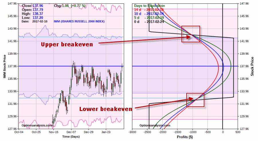
3Figure 3 – Risk curves for IWM Iron Condor (Courtesy www.OptionsAnalysis.com)

As you can see, this trade has 14 days left until option expiration.  As long as IWM remains between the breakeven prices of $132.89 and $143.11 this trade will make money.  For a trader in this position, IWM will hopefully remain quiet and in the trading range and a quick, albeit relatively small profit will accrue in the days ahead.

Maximum Profit Potential = $364 (or 14.87% of capital risked)

Maximum Risk = $2,448

Upside breakeven price for IWM = $142.63

Downside breakeven price for IWM = $132.87

The maximum risk would only be realized if the trade is held until expiration and IWM is either above $142.5 or below $133 a share.  A stop-loss executed just above the upper breakeven or below the lower breakeven would result in a loss of approximately -$900 to -$1000 (see red boxes in Figure 3).

In other words, a trader holding this position is risking $900 to $1000 that IWM will remain in the trading range with the hopes of making $364 in profit.  This would represent a +14.57% gain (on the $2,448 of capital required to enter the trade) in 14 days.

(See also Out With the Old (Part 1))

The key thing to note is that this trader MUST have some sort of contingency plan in place – cut a loss, adjust the position, etc. – in case IWM does breakout above or below the breakeven prices prior to option expiration on 2/24/17.

Idea #2: Long Strangle

For the trader who thinks (hopes?) IWM will breakout soon, Figures 4 and 5 display the particulars for the following position – one typically referred to as a “long strangle.”4Figure 4 – IWM Long Strangle (Courtesy www.OptionsAnalysis.com)

5Figure 5 – Risk curves for IWM Long Strangle (Courtesy www.OptionsAnalysis.com)

As you can see, this trade has several months left until option expiration.  In order for this trade to make money ticker IWM absolutely, positively has to make a movement of some size either up or down.  Because a trader in this position is buying two out-of-the-money options this trade will begin to experience “time decay” as part of the time premium built into the price of the options will evaporate with each passing day.  Note also that time decay accelerates in the final weeks prior to expiration.

A trader in this position has to make two decisions – preferably in advance:

*What will he or she do if IWM does NOT move?  Ride it to expiration and risk a maximum of $ per 1-lot?  Or cut a loss early?

*What will cause him or her to take a profit?  A set profit target of say 15% or 20% of the amount spent to enter the trade?  Something more?  Or a specific price target for IWM itself?

There are no “right” or “wrong” answers to these questions (except I suppose after the fact).  What is most important is that there is plan and that that plan is followed.

Summary

If IWM remains quiet or another few weeks and then make a big up or down move, it is possible that both of these hypothetical positions could make money.  On the other hand, if IWM moves sharply this week and then quiets back down it is possible that both positions could lose money.

Once again, these trades are not “recommendations” but rather simple examples of just two “ways to play” depending on a traders outlook for a given security.

Jay Kaeppel

Disclaimer:  The data presented herein were obtained from various third-party sources.  While I believe the data to be reliable, no representation is made as to, and no responsibility, warranty or liability is accepted for the accuracy or completeness of such information.  The information, opinions and ideas expressed herein are for informational and educational purposes only and do not constitute and should not be construed as investment advice, an advertisement or offering of investment advisory services, or an offer to sell or a solicitation to buy any security.
The 40-Week Cycle ‘ReSectored’

In my last piece I got “down in the weeds” a bit and detailed something known as the 40-Week Cycle in the stock market.  This follow-up fits under the category of “there’s more than one way to skin a cat” (which is one of those old sayings that is actually kind off disgusting if you stop and think about it for any length of time – so my advice is to just keep reading).

(See also The One Asset Class Per Month Strategy)

Using Sectors instead of an Index

The original article implied that an investor would have done much better holding an S&P 500 Index fund only during the 1st 20-weeks of each 40-week cycle.  In this piece we will look at one alternative using sectors funds.

First off – and as always – this blog does NOT offer investment advice, only trading and investment ideas. So nothing that follows should be construed as something you should rush right out and act upon.  This is especially true of the sector based idea I will discuss next.  The method should be thought of more as “food for thought” or even a “good starting point” than as a “system.”  With that in mind, it goes like this:

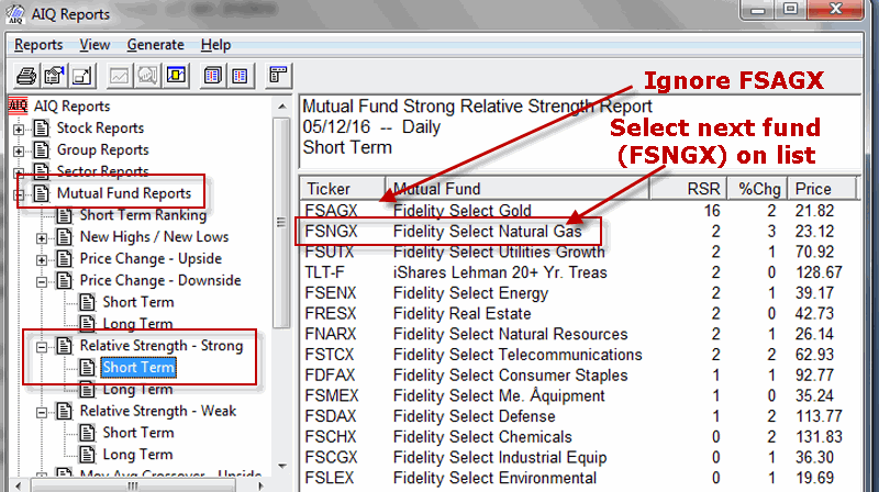
*After the close of the day before a new 40-week cycle starts, I run the AIQ TradingExpert Relative Strength – Strong Short Term Report (See Figure 1).

*I ignore gold (ticker FSAGX) and real estate (FRESX) as these sectors are typically affected by factors not closely related to the action of the S&P 500.

*The top-ranked sector (excluding FSAGX and FRESX) is bought and held at the close the next day.

*The fund is held until the end of the first 20 weeks of the 40-week cycle, OR until the Dow Jones Industrials Average registers a close that is 12.5% or more below its price on the day the new 40-week cycle began.

1Figure 1 – AIQ Relative Strength – Strong Report (Courtesy AIQ TradingExpert)

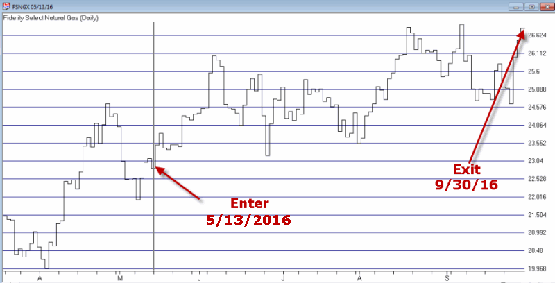
One more ancillary rule: In a stock market decline, it is possible to have no sector funds show up in the Relative Strength – Strong report.  In that case, I go to the AIQ Relative Strength – Week Short Term Report and select the sector fund at the very bottom of the list (i.e., the “least weak” performer) – once again FSAGX and FRESX are excluded.3bFigure 2 – 40-week cycle sector trade (FSNGX); 5/13/2016-9/30/2016 (Courtesy AIQ TradingExpert)

Caveat: Remember, this “method” is NOT a recommendation. Any system or method that says I am going to buy and hold one single sector fund for roughly four and a half months regardless, is inarguably fraught with peril.  So why do I bother to bring it up?  Well, see the results in Figure 3.

(See also With Retailers, it’s ‘When’ Not ‘What)

Entry Date Exit Date Fund Sector % +(-) SPX

%+(-)

Difference $1,000 in sectors becomes $1,000 in SPX becomes
12/31/87 05/20/88 FIDSX* 16.9 0.7 16.2 1,169 1,007
10/07/88 02/24/89 FSHOX 10.2 4.4 5.8 1,288 1,052
07/14/89 12/01/89 FSHCX 14.5 7.5 7.0 1,475 1,130
04/20/90 09/07/90 FSELX (6.8) (2.8) (4.0) 1,374 1,098
01/25/91 06/14/91 FSPTX 14.3 12.8 1.5 1,570 1,239
11/01/91 03/20/92 FBIOX (8.9) 7.2 (16.1) 1,430 1,328
08/07/92 12/24/92 FSVLX 15.0 (0.2) 15.2 1,646 1,326
05/14/93 10/01/93 FSESX 15.1 4.0 11.1 1,894 1,379
02/18/94 07/07/94 FSHCX (3.4) (5.1) 1.8 1,830 1,308
11/25/94 04/13/95 FSDCX 7.9 13.5 (5.6) 1,974 1,485
09/01/95 01/19/96 FSELX (10.4) 11.6 (22.0) 1,768 1,657
06/07/96 10/26/96 FSRPX (1.4) 5.4 (6.9) 1,743 1,747
03/14/97 08/01/97 FSLBX 25.7 18.1 7.6 2,191 2,064
12/19/97 05/08/98 FSLBX 21.3 16.7 4.5 2,658 2,409
09/25/98 02/12/99 FDCPX 45.2 15.5 29.7 3,859 2,783
07/02/99 11/22/99 FSESX 8.0 (0.4) 8.4 4,166 2,771
04/07/00 08/25/00 FSELX 19.7 0.7 19.0 4,989 2,791
01/12/01 06/01/01 FSHCX 6.6 4.4 2.2 5,317 2,914
10/19/01 03/08/02 FSMEX 1.9 14.9 (12.9) 5,420 3,347
07/26/02 12/13/02 FSCHX* (2.6) 2.0 (4.6) 5,279 3,416
05/02/03 09/19/03 FSUTX 8.1 12.4 (4.3) 5,708 3,839
02/06/04 06/25/04 FSDCX (10.1) (2.1) (8.1) 5,129 3,759
11/12/04 04/01/05 FSRFX 1.0 (1.3) 2.3 5,180 3,711
08/19/05 01/06/06 FSESX 23.3 3.8 19.5 6,388 3,851
05/26/06 10/13/06 FSHCX 6.0 6.0 (0.0) 6,773 4,084
03/02/07 07/20/07 FSNGX 25.1 14.3 10.8 8,474 4,670
12/07/07 04/25/08 FDFAX (3.9) (5.4) 1.5 8,144 4,418
09/12/08 10/6/2008** FSRPX** (19.6) (30.0) 10.4 6,549 3,095
06/19/09 11/06/09 FSAVX 36.4 17.4 19.0 8,929 3,632
03/26/10 08/13/10 FSAIX (5.0) (5.0) 0.0 8,480 3,449
12/31/10 05/20/11 FSESX 7.4 8.1 (0.7) 9,106 3,728
10/07/11 02/24/12 FSRPX 11.7 16.9 (5.3) 10,167 4,359
07/13/12 11/30/12 FBIOX 4.4 1.9 2.5 10,617 4,444
04/19/13 09/06/13 FBIOX 17.9 2.6 15.4 12,521 4,558
01/24/14 06/13/14 FBIOX (5.0) 5.6 (10.7) 11,894 4,815
10/31/14 03/20/15 FBIOX 29.5 4.2 25.2 15,398 5,020
08/07/15 12/25/15 FSRPX 5.9 1.0 4.9 16,312 5,071
05/13/16 09/30/16 FSNGX 17.5 4.4 13.1 19,170 5,295

Figure 3 – 40-Week Sector Method versus SPX

*- Sector fund chosen from bottom of Relative Strength – Weak Report

**- Stopped out early following Dow Industrials 12.5% stop-loss

Note: The results presented in Table 3 are calculated using closing price data from eSignal and/or Finance.Yahoo.com and do not represent total return data.

For the record:

-The Sector Method outperformed SPX 25 times (66%)

-The Sector Method underperformed SPX 13 times (34%)

-The average gain for the Sector Method was +8.9%

-The average gain for SPX was +4.9%

-$1,000 invested using the Sector Method grew to $19,170 (+1,817%)

-$1,000 invested using the Sector Method grew to $5,295 (+429%)

The bottom line: So far the selected fund has outperformed SPX 2 out of every 3 trades and every once in awhile  you get an outsized big winner.  As always, past results do not guarantee future results,so be forewarned.

Summary

So is the 40-Week Cycle Sector Method the key to riches beyond the dreams of avarice?  Hardly.  In fact it ranks more closely as “High Risk/High (Potential) Reward”, or even better as “a good place to start for someone looking for new and unique ways to attach the market.”

Jay Kaeppel

Disclaimer:  The data presented herein were obtained from various third-party sources.  While I believe the data to be reliable, no representation is made as to, and no responsibility, warranty or liability is accepted for the accuracy or completeness of such information.  The information, opinions and ideas expressed herein are for informational and educational purposes only and do not constitute and should not be construed as investment advice, an advertisement or offering of investment advisory services, or an offer to sell or a solicitation to buy any security.
 

The 40-Week Cycle Recycles

As a proud graduate of “The School of Whatever Works” I for one am not afraid to “get down in the weeds” when it comes to finding ways to get an edge in the stock market.  Take for example the 40-week cycle in the stock market.

I have written about this cycle several times in the past (here and here) so I won’t go into a long-winded explanation here.  To make a long story short, it goes like this:

Our test starts on 9/8/1967.

*A new 40-week cycle starts exactly every 280 days after that

*The 1st 20 weeks of the cycle is considered “bullish”

*The 2nd 20 week of the cycle is considered “bearish”

(DO NOT STOP READING – I know, I know.  It sounds ridiculous, right?  But at least consider the results detailed below)

For testing and actual trading purposes:

*During the “bullish phase” we will hold a long position in the Dow Jones Industrials Average

For actual trading purposes:

*A 12.5% stop is used as follows: If the Dow Jones Industrials Average declines 12.5% or more on a closing basis from its price at the start of the latest 40-week cycle, the “bullish” phase of the cycle ends (to put it mildly) and the “bearish phase” begins at the close of the next trading day (this has happened twice – in 1974 and in 2008).

*We will assume that interest is earned at an annual rate of 1% while out of the stock market.

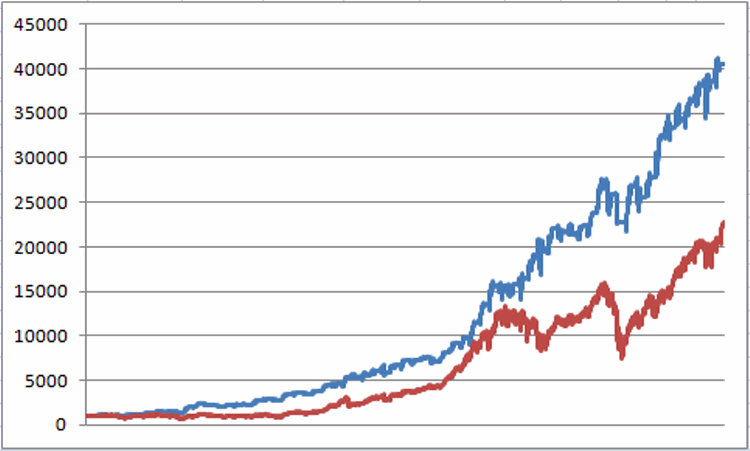
Figure 1 displays the growth of $1,000 invested since 1967using the “system” detailed above versus buying and holding the Dow.1Figure 1 – Growth of $1,000 using the 40-Week Cycle System described above (blue line) versus buying and holding the Dow Jones Industrials Average(red line); 9/8/1967-2/7/2017

To put things in perspective, Figure 2 displays the growth of $1,000 invested in the Dow ONLY during every “bearish phase” since 1967.2Figure 2 – Growth of $1,000 invested in Dow Jones Industrials Average only during “bearish phases”;  9/8/1967-2/7/2017

For the record, since 1967:

*There have been 65 completed 40-week cycles

*The “bullish phase” has showed a gain 49 times (75%)

*The “bearish phase” has showed a gain 36 times (55%)

*The “bullish phase” has generated a net gain of +3,957%

*The “bearish phase” has generated a net loss of (-27%)

*Buying and holding the Dow has generated a net gain of +2,175%

The next 40-week cycle begins at the close on 2/17/2017. The “bullish phase” extends through the close on 7/7/2017.

Welcome to “the weeds”.

Jay Kaeppel

Disclaimer:  The data presented herein were obtained from various third-party sources.  While I believe the data to be reliable, no representation is made as to, and no responsibility, warranty or liability is accepted for the accuracy or completeness of such information.  The information, opinions and ideas expressed herein are for informational and educational purposes only and do not constitute and should not be construed as investment advice, an advertisement or offering of investment advisory services, or an offer to sell or a solicitation to buy any security.
January Barometer Flashes a ‘Buy’. Now What?

Three cheers – for the first time since 2013, the January Barometer is bullish. The January Barometer was devised by Yale Hirsch of The Stock Trader’s Almanac in the early 1970’s and is still tracked today at STA by his son Jeffrey Hirsch.  The simple theory is that “as January goes, so goes the rest of the year”, if January shows a gain then the 11 months from end of January through the end of December should also show a gain.

(See also A Two-Fund Portfolio for the Next Three Months)

For the record, since 1943 following a gain for the Dow Industrials during January, February through December shows:

  • # times up = 39 (83% of the time)
  • #times down = 8 (17% of the time)
  • Average Gain = +13.9%
  • Average Loss = (-12.3%)


Other Useful January Studies

The January Barometer – Myth or Statistically Relevant? By Eric Hein

What A Strong January Means For Stocks Historically by Dana Lyons

How to Use AND How NOT To Use This Information

The proper way to use this information is as “weight of the evidence” – i.e., as a reminder to be patient in giving the bullish case the benefit of the doubt between now and December 31st, 2017.

The improper way to use this information is to assume that things are “All Clear” between now and the end of the year and that you can simply forget all about your stock market investments – because there can be countervailing influences.  To wit:

(See also Months to Beware of in 2017)

(See also Out With the Old, In With the, Uh-Oh)

(See also The Sordid Past of Years Ending in ‘7’)

Jay Kaeppel