Monthly Archives: December 2018

When to Buy Energy Stocks

Crude oil and pretty much the entire energy sector has been crushed in recent months. This type of action sometimes causes investors to wonder if a buying opportunity may be forming.

The answer may well be, “Yes, but not just yet.”

Seasonality and Energy

Historically the energy sector shows strength during the February into May period.  This is especially true if the November through January period is negative.  Let’s take a closer look.

The Test

If Fidelity Select Energy (ticker FSENX) shows a loss during November through January then we will buy and hold FSENX from the end of January through the end of May.  The cumulative growth of $1,000 appears in Figure 1 and the yearly results in Figure 2.

1Figure 1 – Growth of $1,000 invested in FSENX ONLY during Feb-May ONLY IF Nov-Jan shows a loss

2

Figure 2 – % + (-) from holding FSENX during Feb-May ONLY IF Nov-Jan shows a loss

Figure 3 displays ticker XLE (an energy ETF that tracks loosely with FSENX).  As you can see, at the moment the Nov-Jan return is down roughly -15%.3Figure 3 – Ticker XLE (Courtesy AIQ TradingExpert)

All of this suggests remaining patient and not trying to pick a bottom in the fickle energy sector. If, however, the energy sector shows a 3-month loss at the end of January, history suggests a buying opportunity may then be at end.

Summary

Paraphrasing here – “Patience, ah, people, patience”.

Jay Kaeppel

Disclaimer:  The data presented herein were obtained from various third-party sources.  While I believe the data to be reliable, no representation is made as to, and no responsibility, warranty or liability is accepted for the accuracy or completeness of such information.  The information, opinions and ideas expressed herein are for informational and educational purposes only and do not constitute and should not be construed as investment advice, an advertisement or offering of investment advisory services, or an offer to sell or a solicitation to buy any security.

The Two Most Important Bond Market Charts

A funny thing happened on the way that bond bear market.  But first the promised charts:

*Figure 1 strongly suggests that the next major move in bond yields is higher (as yields tend to move in roughly 30-year up and 30-year down waves).

1Figure 1 – 60-year bond yield cycle (Courtesy: www.mcoscillator.com)

*Figure 2 displays the 10-year treasury note yield – with a long, long downtrend followed by an advance to a potential “fake out breakout” to the upside.  More to follow.

2Figure 2 – 10-year treasury yields (x10); ticker TNX (Courtesy AIQ TradingExpert)

Now for the recap:

*The 10-year treasury yield (TNX) topped out in the early 1980’s and declined to a low in July 2012.

*TNX then moved higher for about a year, then drifted lower to its ultimate low around 1.35 three years later in 2016.

*From there rates rose to roughly 3.25% by October 2018.  Along the way it took out its 120-month moving average, a horizontal resistance line at about 3.04% and finally a downward sloping trend line in October 2018.

*With “final resistance” pierced many bond market prognosticators assumed that yields were off to the races.

*And then that “funny thing” happened.  10-year yields fell from 3.25% in October to a recent level of roughly 2.90%.

At this point “predicting” where TNX is headed in the short run from here is pure conjecture.  There is a chance that rates will not rally anytime soon and that they may even continue to drift back lower.  Take your pick.  Flip a coin.  Whatever.  The bottom line is that what you see in Figure 2 is entirely in “the eye of the beholder.”

So let’s circle back to Figure 1.  The bottom line is this:

*The odds appear very good that the next 30 years in in bond yield will look a lot different than the last 30 years, when high grade bond yield fell from 15% to roughly 3% (which is OK, because if rates ever go negative and I have to pay the government just to hold my money I am going to be really pissed….but I digress).

*Short-term “traders” can trade long-term bonds to their hearts content.  However, “investors” may be wise to avoid long-term bonds.  Consider ticker TLT, the iShares 20+ year treasury bond ETF.  It presently has a 30-day SEC yield of 3.06% and an “average duration” of 17.42 years.  Here is how to understand that:

Regarding yield, if price remained completely unchanged, and investor would theoretically earn roughly 3.06% in interest over the next 12 months

Regarding duration, if interest rates rose one full percentage point, ticker TLT would theoretically lose -17.42% in value

Long-term bonds may rally from time to time.  However, for long-term investors holding bonds, this is NOT a favorable reward-to-risk tradeoff.

Summary

In the “big picture” we probably are in a long-term bear market for bonds.  But it may not look like it for a while.  So trade in and out as much as you’d like.  But for bond investment purposes I am keeping duration short.

Jay Kaeppel

Disclaimer:  The data presented herein were obtained from various third-party sources.  While I believe the data to be reliable, no representation is made as to, and no responsibility, warranty or liability is accepted for the accuracy or completeness of such information.  The information, opinions and ideas expressed herein are for informational and educational purposes only and do not constitute and should not be construed as investment advice, an advertisement or offering of investment advisory services, or an offer to sell or a solicitation to buy any security.

Focus on “Investing” (not “the Market”)

I don’t offer “investment advice” here at JOTM so I have not commented much on the recent action of the market lest someone thinks I am “predicting” what will happen next.  Like most people, predicting the future is not one of my strengths.  I do have some thoughts though (which my doctor says is a good thing).

The Big Picture

Instead of talking about “the markets”, let’s talk first about “investing”, since that is really the heart of the matter.  “The markets” are simply a means to an end (i.e., accumulating wealth) which is accomplished by “investing”.  So, let me just run this one past you and you can think about it for a moment and see if it makes sense.

Macro Suggestion

*30% invested on a buy-and-hold basis

*30% invested using trend-following methods

*30% invested using tactical strategies

*10% whatever

30% Buy-and-Hold: Avoid the mistake that I made way back when – of thinking that you should always be 100% in or 100% out of the market.  No one gets timing right all the time.  And being 100% on the wrong side is pretty awful.  Put some portion of money into the market and leave it there.  You know, for all those times the market goes up when you think it shouldn’t.

30% using trend-following methods:  Let me just put this thought out there – one of the biggest keys to achieving long-term investment success in the stock market is avoiding some portion of those grueling 30% to 89% (1929-1932) declines that rip your investment soul from you body and make you never want to invest again.  Adopt some sort of trend-following method (or methods) so that when it all hits the fan you have some portion of your money “not getting killed”.

30% invested using (several) tactical strategies: For some examples of tactical strategies see here, here, here and here.  Not recommending these per se, but they do serve as decent examples.

10% whatever:  Got a hankering to buy a speculative stock?  Go ahead.  Want to trade options?  OK.  Want to buy commodity ETFs or closed-end funds or day-trade QQQ?  No problem.  Just make sure you don’t devote more than 10% of your capital to your “wild side.”

When the market is soaring you will likely have at a minimum 60% to 90% of your capital invested in the market.  And when it all goes south you will have at least 30% and probably more out of the market ready to reinvest when the worm turns.

Think about it.

The Current State of Affairs  

What follows are strictly (highly conflicted) opinions.  Overall sentiment seems to me to be very bearish – typically a bullish contrarian sign.  However, a lot of people whose opinions I respect are among those that are bearish.  So, it is not so easy to just “go the other way.”  But here is how I see the current “conflict”.

From a “technical” standpoint, things look awful.  Figures 1 and 2 show 4 major market averages and my 4 “bellwethers”.  They all look terrible.  Price breaking down below moving averages, moving average rolling over, and so on and so forth.  From a trend-following perspective this is bearish, so it makes sense to be “playing defense” with a portion of your capital as discussed above.

(click any Figure to enlarge)

1Figure 1 – Major market averages with 50-day and 200-day moving averages (Courtesy AIQ TradingExpert)

2Figure 2 – Jay’s Market Bellwethers with 50-day and 200-day moving averages (Courtesy AIQ TradingExpert)

On the flip side, the market is getting extremely oversold by some measure and we are on the cusp of a pre-election year – which has been by far the best historical performing year within the election cycle.

Figure 3 displays a post by the esteemed Walter Murphy regarding an old Marty Zweig indicator.  It looks at the 60-day average of the ratio of NYSE new highs to New Lows.  Low readings typically have marked good buying opportunities.

3Figure 3 – Marty Zweig Oversold Indicator (Source: Walter Murphy on Twitter)

Figure 4 displays the growth of $1,000 invested in the S&P 500 Index ONLY during pre-election years starting in 1927.  Make no mistake, pre-election year gains are no “sure thing.”  But the long-term track record is pretty good.4

Figure 4 – Growth of $1,00 invested in S&P 500 Index ONLY during pre-election years (1927-present)

There is no guarantee that an oversold market won’t continue to decline.  And seasonal trends are not guaranteed to work “the next time.”  But when you get an oversold market heading into a favorable seasonal period, don’t close your eyes to the bullish potential.

Summary

Too many investors seem to think in absolute terms – i.e., I must be fully invested OR I must be out.  This is (in my opinion) a mistake.   It makes perfect sense to be playing some defense given the current price action.  But try not to buy into the “doomsday” scenarios you might read about.  And don’t be surprised (and remember to get back in) if the market surprises in 2019.

Jay Kaeppel

Disclaimer:  The data presented herein were obtained from various third-party sources.  While I believe the data to be reliable, no representation is made as to, and no responsibility, warranty or liability is accepted for the accuracy or completeness of such information.  The information, opinions and ideas expressed herein are for informational and educational purposes only and do not constitute and should not be construed as investment advice, an advertisement or offering of investment advisory services,

The Seasonal Guide to Large-Cap vs. Small-Cap

In the immortal words of Steve Martin, sometimes it pays to “Get Small.”  Still, other times not so much.  So, it’s not just getting small that matters but more importantly, when you get small.  Or large as the case may be.

OK, I am pretty sure Steve Martin was not talking about small-cap stocks (or small-cap stocks versus large-cap stocks for that matter), but maybe he should have been.  Over the years some distinct seasonal trends or patterns have emerged within the endless “large-cap stocks versus small-cap stocks” debate.

Let’s keep this one succinct.  Figure 1 displays our “Seasonal Table” for the calendar year.  As you can see each month lists one and only one security – either large-cap stocks, small-cap stocks or intermediate-term treasuries.

1

Figure 1 – Large-Cap/Small-Cap/Int. Treasuries Calendar

To test this, we will use monthly total return data starting in January 1979 for the Russell 1000 Index (large-cap stocks), the Russell 2000 Index (small-cap stocks) and the Barclays Treasury Intermediate Index (intermediate-term treasuries)

Figure 2 displays the growth of $1,000 invested using this calendar starting 12/31/1978 versus simply splitting the original $1,000 between large-cap and small-cap stocks.2Figure 2 – Growth of $1,000 invested using “System” versus “Splitting” between large-cap and small-cap.

3

Figure 3 – System versus Split facts and figures

Summary

A few key things to note:

*There is nothing “set in stone” about which index performs best during which month and these relationships may change over time

*The “System” showed a gain in 36 of 40 calendar year while “Splitting” showed a gain in 29 out of 40 years

*Year to year can vary greatly.  The “System” outperformed “Splitting” in only 23 of 40 calendar years (NOTE: this kind of “hit or miss” year-to-year result often leads investors to abandon a method after a few years of “misses”).

Jay Kaeppel

Disclaimer:  The data presented herein were obtained from various third-party sources.  While I believe the data to be reliable, no representation is made as to, and no responsibility, warranty or liability is accepted for the accuracy or completeness of such information.  The information, opinions and ideas expressed herein are for informational and educational purposes only and do not constitute and should not be construed as investment advice, an advertisement or offering of investment advisory services, or an offer to sell or a solicitation to buy any security.

The Inverted Hindenburg Yield Death Curve Cross Omen

OK, it’s possible I may have mixed a few things up here.  It’s hard not to these days what with all of our electronics blaring information at us 24/7.  The main point is that we MUST be extremely fearful at this moment.  At least that is what I gather from all of the scary headlines shouting that the bull market is clearly over.

As a technical analyst who looks at charts I am quite concerned at the moment.  A lot of stocks, indexes, sectors, etc. are showing signs of breaking down – i.e., below moving averages, taking out important support levels and so on.  So, I do think it is important for investors to be 100% prepared to “play defense” with their portfolios.

Also, as a technical analyst I recognize that after long uptrends there is often a correction that involves A LOT of volatility and a lot of big price swings and that each and every swing MUST be accompanied by A LOT of “news” telling us that THIS SWING is the one that matters…right up until the very moment that it reverses again and no longer matters.

As a seasonal analyst I recognize that we are in what “should” be a very favorable period for the stock markets (more to follow).

So, let’s consider some “information”.

The Hindenburg Omen

This was a popular indicator at one time – until it gave one too many false signals and a lot of people tuned it out.  Interestingly, it gave a decent signal this year of impending trouble – but only after about the 47th signal (so does that make it a “good” indicator or not?)

The Yield Curve

On any given day of late, roughly 8 bazillion articles are written about the “yield curve” – which measures the difference between interest rates of various lengths (i.e., 30-yr. versus 3-month T-bill, 10-year yield versus 2-year, etc.).  Here is everything you need to know:

*An inverted yield curve – when short-term rates are higher than long-term rates – is a serious situation that can warning of impending economic and market trouble (which is pretty much what the 8 bazillion articles focus on).

But here is one other part that most people don’t seem to recognize:

*An inversion of the yield curve DOES NOT necessarily mean that Armageddon is immediately imminent.  In fact, history suggests quite the opposite.

Rather than recreate the wheel I will simply refer you to a piece by www.BullMarket.co which includes the following table.

1Figure 1 – 5-year-2-year yield curve inversions (Source: www.BullMarket.co)

Here is the important paradox – a situation where the 2-year yield is above the 5-year yield IS a potential warning sign and signal an impending economic downturn.  HOWEVER, as you can see in Figure 1, the stock market typically has some upside left before the party is over.

Keep these numbers in mind each time you see a headline blaring gloom and doom about the yield curve (also make a note to prepare to play defense about a year later).

The Death Cross

The other scary headline we see all the (freaking!) time now involves a stock index about to experience a “Death Cross”.  A Death Cross is a really cool and scary name for a cross by the 50-day moving average below the 200-day moving average – which is intended to portend impending doom for that index.

Here is what you need to know:

*Sometimes a Death Cross is followed by a major – and I mean MAJOR – bear market.  So it is important to be alert.

*Still, the reality is that more often than not selling at the time of “Death Cross” leads to buying back later at a higher price.

Once again I will defer to someone who has already done the work – in this case it’s Rob Hanna of www.QuantifableEdges.com.  Figure 2 shows what’s happened to the S&P 500 Index after a “Death Cross” by the Russell 2000.2

Figure 2 – S&P 500 performance after a Russell 2000 Death Cross (Source: www.QuantifableEdges.com)

Also see this link for a very interesting piece (which also has a great title) titled “90 years of Death Crosses” which details the history of Death Crosses by the S&P 500 Index.  My advice is to read this piece and eschew the other roughly 4 bazillion articles on the topic.

One Last Item: The Mid-Term Election

Don’t worry I am not going to delve into politics (for the record, prior to the mid-term I went to www.iSideWith.com to figure out my favored candidates.  It told me that I hate all politicians).  No matter your political affiliation, for most people there is nothing scarier these days than an election.

Now serious analysts can reasonably argue causality and correlation but based strictly on the numbers it would appear that one of the most consistently bullish “indicators” for the stock market is – the occurrence of a mid-term election.

Once again I defer to www.BullMarkets.co and the table they produced that appears in Figure 3.

3Figure 3 – S&P 500 performance after Mid-Term Elections (Source: www.BullMarket.co)

Summary

Given all of the scary stuff going on right now it is absolutely possible that the market will decline in the year ahead.  But for now, history suggests otherwise.

So, repeating now:

*An inverted yield curve IS a bad sign.  Just not necessarily right away for the stock market.

*A Death Cross MIGHT be followed by a horrible bear market so it is OK to play defense or at least prepare to play defense when the major averages roll over.  But don’t stick your head in the sand – and be prepared to jump back in if things improve.

 Jay Kaeppel

Disclaimer:  The data presented herein were obtained from various third-party sources.  While I believe the data to be reliable, no representation is made as to, and no responsibility, warranty or liability is accepted for the accuracy or completeness of such information.  The information, opinions and ideas expressed herein are for informational and educational purposes only and do not constitute and should not be construed as investment advice, an advertisement or offering of investment advisory services, or an offer to sell or a solicitation to buy any security.

A Speculative Play in SLV

This article is not for conservative, long-term buy and hold investors.  Nevertheless, they should read this anyway.  Because the steps that lead to profitable speculation are the same steps that lead to any kind of investment success.

The Big Picture

The keys to investment/trading success are fairly well know and can be summed up in two steps:

*Spot opportunity

*Exploit opportunity

To flesh it out a little more we might break it down further as follows:

*Identify an asset and develop an opinion about where the price of that asset might be headed (or not headed as the case may be with certain option strategies).

*Figure out which vehicle you want to use to exploit the opportunity (stock or ETF shares, futures contracts, options)

*Determine how much capital you can reasonably commit to said opportunity

*Also determine how much of that capital you are actually willing to risk

*Develop a risk control plan for the trade you are considering (ex., stop-loss point)

*Also consider what actions or events will lead you to close a trade with a profit (i.e., a trend reversal, a sharply overbought or oversold move in your direction) and think about whether you will exit the trade all at once, in stages, or in the case of options if you might adjust the position to lock in a profit and let the remaining position ride

The Reality

The reality is that most people don’t want to bother with all of these pesky steps.  What they want is an indicator that says “Buy” and/or “Sell” that assures them of making money even if they aren’t mindful of “boring” things like position sizing, entry and exit techniques and so on.

Putting the Odds in Your Favor

One of the keys to exploiting good opportunities is to put as many “factors” in your favor as possible, to increase your likelihood of success.  Rather than blathering on in generalities, let’s look at an actual example.

Focus on: Silver

Let’s face it, precious metals have a lot of sex appeal.  On any given day you can easily find someone touting gold and/or silver and maybe platinum as “about to explode”.  And the truth is that they have done so often enough in the past that it is always a possibility.  Getting the timing right is a whole other matter.

IMPORTANT: I am NOT recommending silver and am not “predicting” that it is about to soar in price.  However, as you will see, the current setup “fits the M.O.” of the type of setup that bullish speculators should look for.  Whether or not this particular play pans out will only be known in the fullness of time.

In Figure 1 we see that silver has a long history of “coiling” and then “exploding”.  If one considers the recent market action to be “coiling” (but remember it is one of those “in the eye of the beholder” situations) then it is not unreasonable to believe that a big up move is in the offing.

1
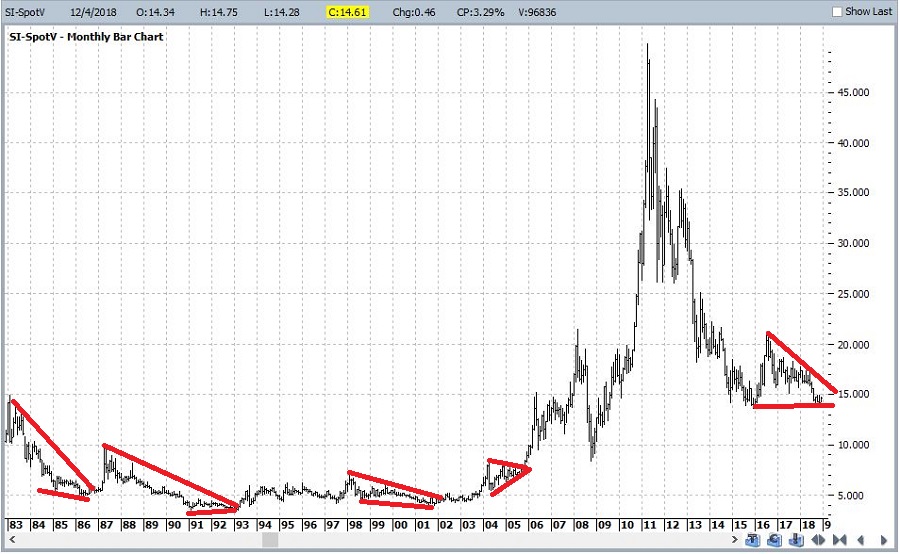
Figure 1 – Silver futures “coiling” (Courtesy ProfitSource by HUBB)

In Figure 2 we see a weekly chart of silver futures with a clear “line in the sand”.  This type of horizontal line drawn objectively from a recent low serves an important purpose to a speculator.  It represents an “uncle” point.  As long as price remains above the red line it can make sense for a speculator to speculate on the bullish side.  However, if that price is taken out the trader must be willing to admit “I’m wrong” and cut a loss (Hint: that is often harder to do than most people care to admit).2
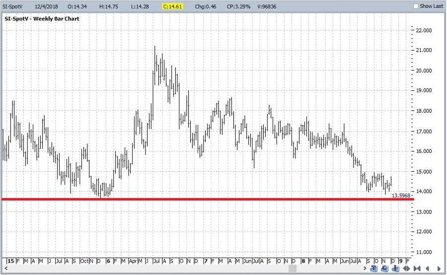
Figure 2 – Silver futures with a “support/line in the sand/uncle point” line (Courtesy ProfitSource by HUBB)

Figures 3 and 4 display the Weekly and daily Eilliot Wave counts for silver futures from ProfitSource by HUBB.  Note that both are suggesting a potential Wave 5 bottom.

3
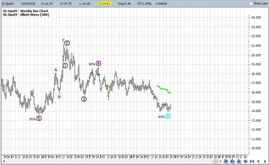
Figure 3 – Weekly Silver futures with Elliott Wave count (Courtesy ProfitSource by HUBB)

4
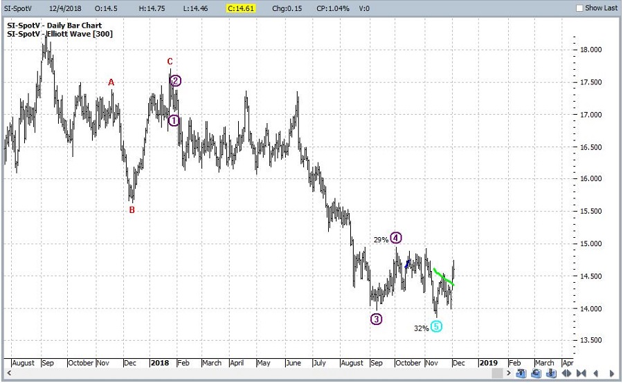
Figure 4 – Daily Silver futures with Elliot Wave count (Courtesy ProfitSource by HUBB)

Figure 5 is from www.sentimentrader.com and displays the action of hedgers in silver futures.  Note that “spikes” above the upper band often (though – importantly – not always) identify useful buying points.5
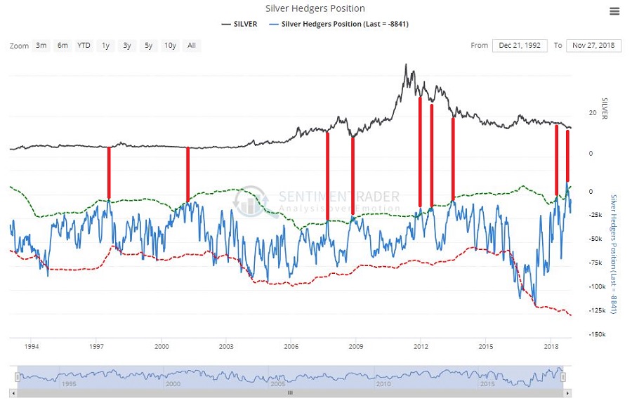
Figure 5 – Silver futures and Silver Hedgers Position (Courtesy Sentimentrader.com)

Figure 6 displays silver futures with trader sentiment.  Note that extended periods below the lower cutoff (i.e., bearish traders) tend to highlight lower risk buying opportunities (Courtesy Sentimentrader.com).6
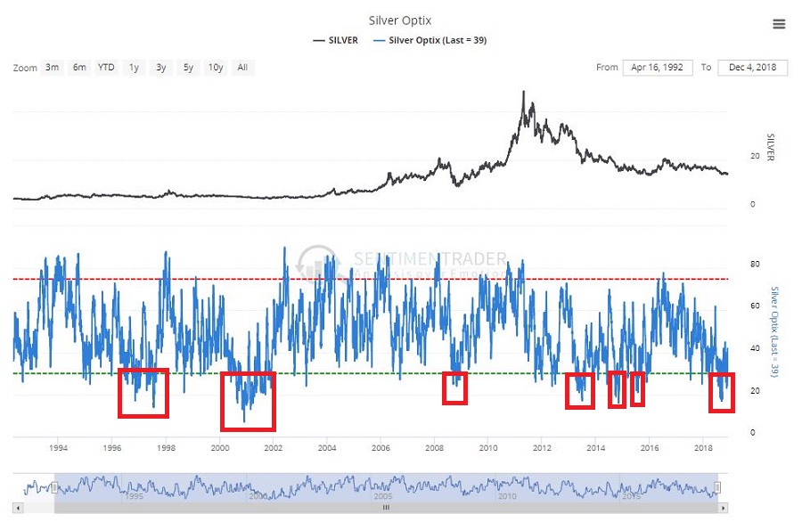
Figure 6 – Silver futures and Silver trader sentiment (Courtesy Sentimentrader.com)

Finally Figure 7 displays annual seasonality for silver.  One concern is that silver tends to show weakness in December.  On the plus side January is historically the best month of the year overall and the 1st four months of the year tend to perform well.7
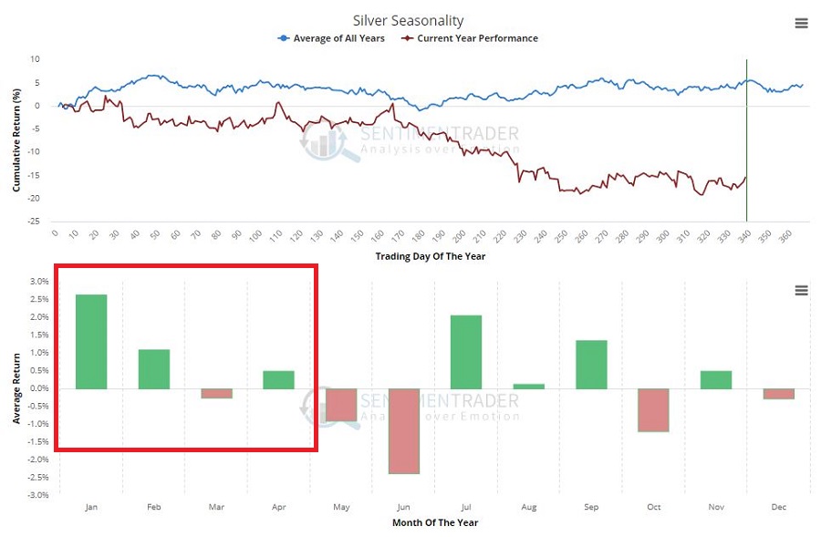
Figure 7 – Silver futures and Silver seasonality (Courtesy Sentimentrader.com)

The bottom line is that a lot of factors appear to be lining up on “the bullish side of the street” for silver.  Does that mean it is about to “explode” higher?  Or even go up at all?  The correct answer is “Maybe, maybe not. ”  The relevant questions are, a) do you want to play?, and 2) if “Yes”, then “how”?

What to do, what to do?

For a person willing to speculate there are number of potential courses of action.

*The first decision might be to decide whether to take the plunge now or to wait until closer to mid-December when the annual seasonal trend bottoms out.

*If one decides to act the next question to answer is “how” – or more accurately – “using which vehicle”.  The purest speculative play is to buy silver futures. However, this entails a significant degree of risk as a $1 move in the price of silver represents a $5,000 change in the value of the futures contract.  Another possibility is to buy shares of ETF ticker SLV which tracks the price of silver bullion.  Trading at $13.48 a share, 100 shares would cost $1,348.  One other choice might be to buy call options on ticker SLV in order to limit the capital commitment and dollar risk.  Let’s consider one example.

*A trader with a $25,000 account might decide he or she is willing to risk 2% of their capital on a bullish play in silver.  The April 2019 14 call option is trading at a quoted price of $0.58 (or $58 per contract).  $25000 times 2% = $500.  $500 divided by $58 per contract tells us that the trade can buy 8 call options for $464.  The details for this trade appear in Figures 8 and 9.8
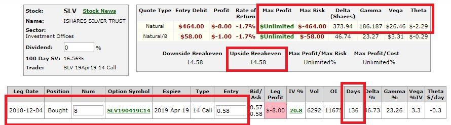
Figure 8 – SLV call option details (Courtesy www.OptionsAnalysis.com)

9
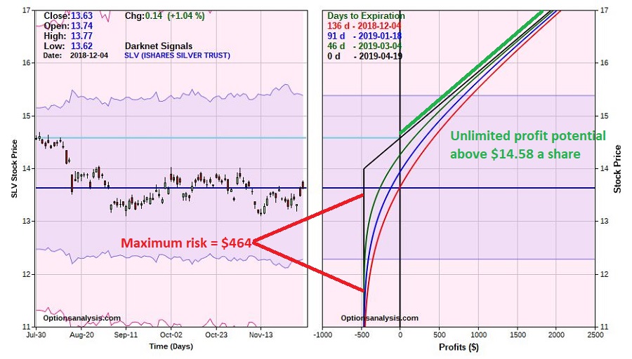
Figure 9 – SLV call option risk curves (Courtesy www.OptionsAnalysis.com)

Again, the trade above is NOT a recommendation, only an example.  And for the record, one other concern (besides the potential for seasonal weakness) is that implied volatility on SLV options jumped in the last week (see Figure 10).  If SLV drifts sideways to slightly lower into mid-December (and assuming the “line in the sand” is not taken out, there is a chance that IV will drift lower also, thus deflating the about of time premium built into SLV options.

10
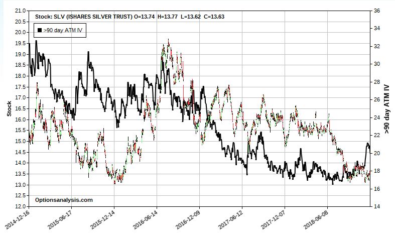
Figure 10 – Ticker SLV with 90+ day implied volatility (black line) (Courtesy www.OptionsAnalysis.com)

From a tactical standpoint it might make sense to  be patient and a) see if IV settles down, b) silver futures and SLV hold above the recent low, and c) the period of seasonal weakness passes.

Summary

The purpose of this article is NOT to convince you to speculate in SLV.  The purpose is simply to highlight a potential “process” for spotting and exploiting opportunity.

Jay Kaeppel

Disclaimer:  The data presented herein were obtained from various third-party sources.  While I believe the data to be reliable, no representation is made as to, and no responsibility, warranty or liability is accepted for the accuracy or completeness of such information.  The information, opinions and ideas expressed herein are for informational and educational purposes only and do not constitute and should not be construed as investment advice, an advertisement or offering of investment advisory services, or an offer to sell or a solicitation to buy any security.