Monthly Archives: March 2018

The Pause That $@%! Refreshes?

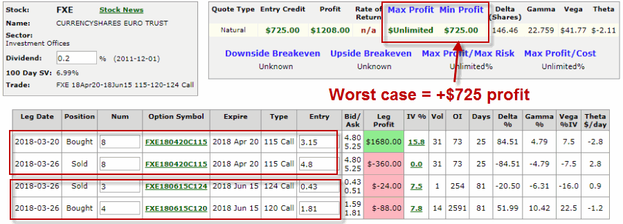
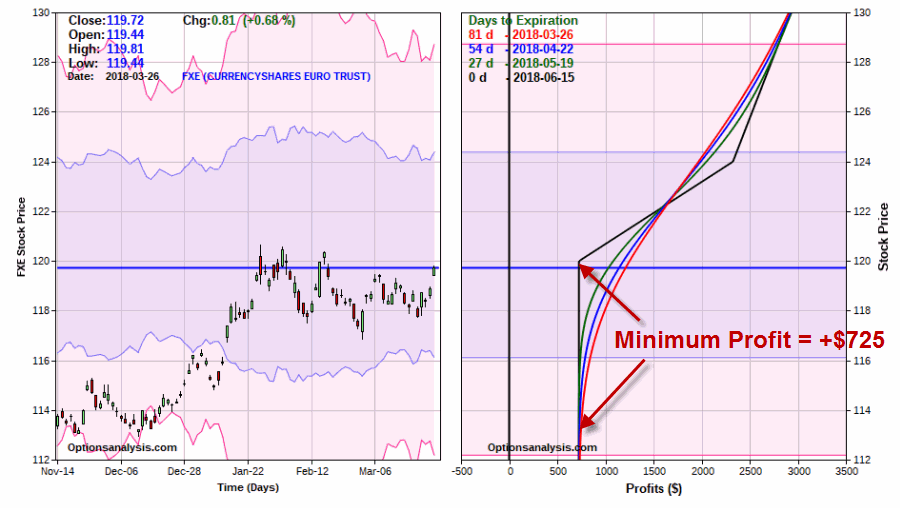
A glance at the history of the Presidential Election Cycle in the stock market suggests that we should:

*Not be surprised that the stock market is foundering a bit at the moment

*Not be terribly surprised if things get worse – particularly during the months of June through September of this year

*Anticipate that if the market does take a bigger hit in the months ahead that it may well set the stage for another significant advance into the middle of the mid-term election year.

A Little Presidential Election Cycle History

For our purposes we will start the test on 12/31/1932 and define the cycle as containing the following four years:

*Post-Election

*Mid-Term

*Pre-Election

*Election

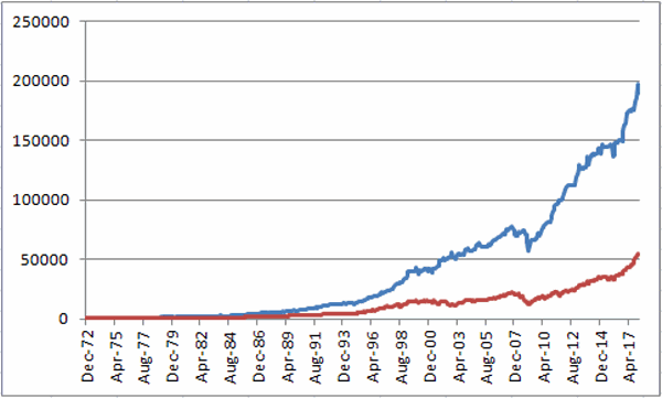
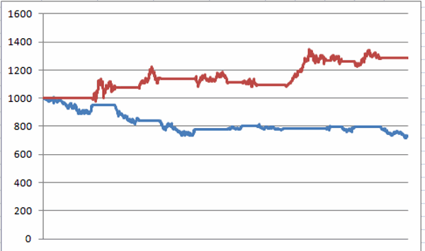
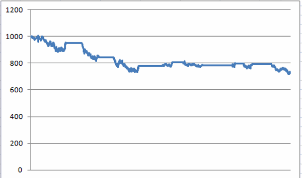
First the Bad News: Figure 1 displays the growth of $1,000 invested in the S&P 500 Index (using monthly closing price data) ONLY from the end of January of each Mid-Term Election Year through the end of September of each Mid-Term Election Year (i.e., the latest iteration began on 1/31/2018 and will extend through 9/30/2018).1
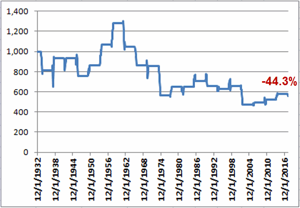
Figure 1 – Growth of $1,000 invested in S&P 500 Index ONLY from Jan31 through Sep30 of each Mid-Term Election Year (1932-2018)

As you can see, the cumulative performance for the S&P 500 Index during the Mid-Term February through September period is a fairly painful -44.3% (for the record, the cumulative gain from buying and holding the S&P 500 from 12/31/1932 through 2/28/2018 was +39,288%, so yes, this qualifies as a period of some serious under performance).

That being said, it should be noted that this Mid-Term Feb through Sep period showed a gain 12 times and a loss only 9 times.  So a “rough patch” is no sure thing. The problem is that when this period is bad, it is “very bad”.  As you can see in Figure 3 later, this period experienced 6 losses in excess of -17.5% (FYI, a -17.5% decline from the 1/31/2018 close of 2823.81 would see the S&P 500 Index hit 2330).

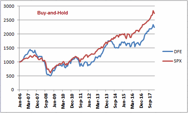
Then the Good News: On the brighter side, Figure 2 displays the growth of $1,000 invested in the S&P 500 Index (using monthly closing price data) ONLY from the end of September of each Mid-Term Election Year through the end of July of each Pre-Election Year (i.e., the latest iteration begins on 9/30/2018 and will extend through 7/31/2019).2Figure 2 – Growth of $1,000 invested in S&P 500 Index ONLY from Sep30 of each Mid-Term Election Year through Jul31 of each Pre-Election Year (1932-2018)

Notice any difference between Figures 1 and 2?  This favorable period saw the S&P 500 register a gain during 20 of the past 21 completed election cycles (i.e., 95% of the time), with an average gain of +21.6%, and a cumulative gain of +3,730%.

Figure 3 displays the numerical results for each cycle.

Mid-Term Pre-Election Mid-Term Feb through Sep Mid-Term Oct thru Pre-Election July
1934 1935 (18.5) 21.8
1938 1939 14.5 (1.6)
1942 1943 0.5 32.0
1946 1947 (19.4) 5.3
1950 1951 14.1 15.2
1954 1955 23.9 34.7
1958 1959 20.0 20.9
1962 1963 (18.3) 22.9
1966 1967 (17.6) 23.8
1970 1971 (0.8) 13.4
1974 1975 (34.2) 39.7
1978 1979 14.9 1.2
1982 1983 0.0 35.0
1986 1987 9.2 37.8
1990 1991 (7.0) 26.7
1994 1995 (3.9) 21.5
1998 1999 3.7 30.6
2002 2003 (27.9) 21.5
2006 2007 4.4 8.9
2010 2011 6.3 13.2
2014 2015 10.6 6.7

Figure 3 – Unfavorable versus Favorable portions of Election Cycle

Summary

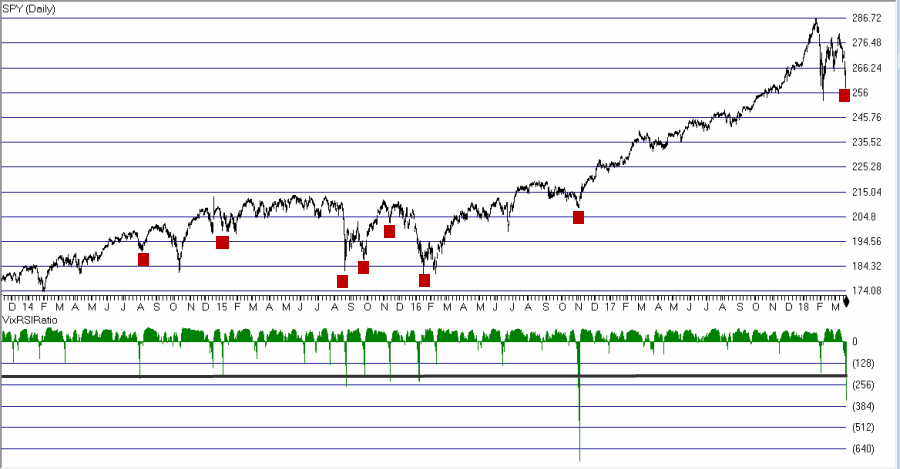
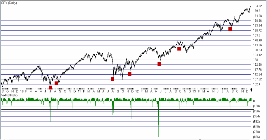
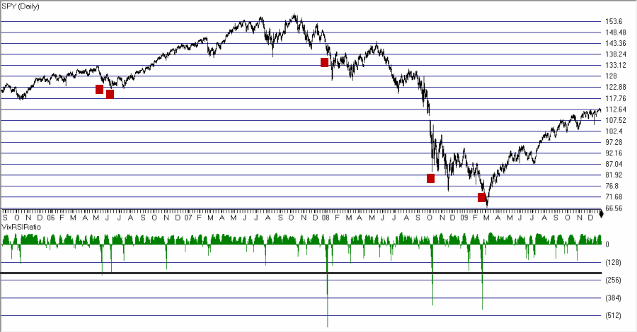
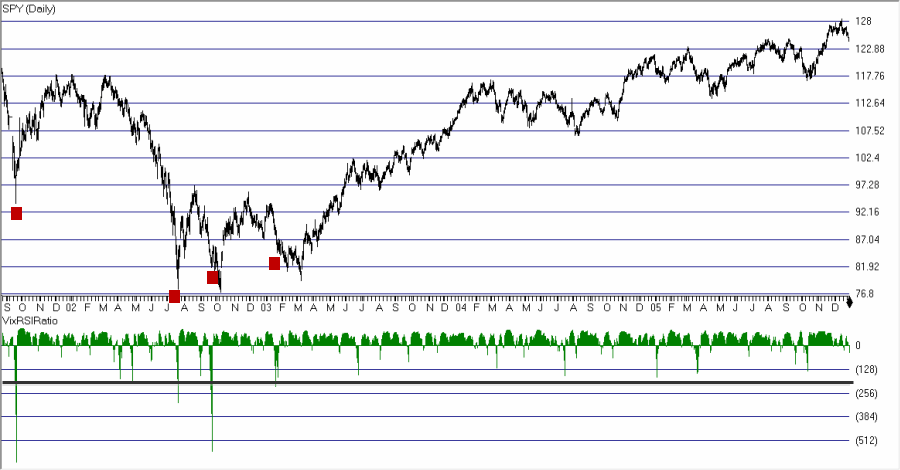
So what does it all mean?  Well, it means a few things. By my objective measurements the overall trend is still “bullish” and a number of “oversold” indicators are suggesting that a bounce of some significance may be at hand.  That being said, if the major market indexes do start to break down below their respective 200-day moving averages investors may be wise to take some defensive action.  If the market does experience a further break between now and the end of September, it may well be “one of the painful kind.”  So if you haven’t already, make your contingency plans now.4
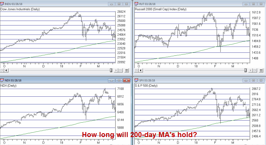
Figure 4 – Major Market Indexes with 200-day moving averages (Courtesy AIQ TradingExpert)

At the same time, as the end of September of 2018 nears – especially if the stock market has experienced or is experiencing at the time, a significant break – remember that history suggests that that will be a good time to “think bullish.”

Call me a cynic, but my guess is that alot of investors will do exactly the opposite on both counts (i.e., hang on if the market breaks down and then sell as the next bottom forms – Same it as ever was….)

Jay Kaeppel

Disclaimer:  The data presented herein were obtained from various third-party sources.  While I believe the data to be reliable, no representation is made as to, and no responsibility, warranty or liability is accepted for the accuracy or completeness of such information.  The information, opinions and ideas expressed herein are for informational and educational purposes only and do not constitute and should not be construed as investment advice, an advertisement or offering of investment advisory services, or an offer to sell or a solicitation to buy any security.

Taking What the Euro Gives You (or Not); Part 2

Actually just a quick update here to highlight the power of an “adjustment” in an option position.

In this article I highlighted an example trade in the Euro.

Then in this article I highlighted an example of one way to adjust the original position after a quick profit had accumulated.

Now let’s bring it up to date. 2 days later:

*The original option position has gone from an open profit of +$1,320 (or+52%) to a profit of $240 (or+9.5%). In addition, this trade still has a maximum risk of -$2,520 (See Figure 1).

2aFigure 1 – FXE original position after 2 days of decline from 3/26 short-term top (Courtesy www.OptionsAnalysis.com)

The adjusted option position has an open profit of +$1,070 and the worst case is a minimum profit of +$725 (See Figure 2).2Figure 2 – FXE adjusted position (Courtesy www.OptionsAnalysis.com)

Summary

These examples are not intended to highlight any timing ability on my part, especially since they are all entirely hypothetical trades. Also, nothing has been decided yet – i.e., if FXE rallies from here the original trade might well end up outperforming the adjusted trade.

However, the point of these examples is to highlight:

*The potential advantages of trading options instead of the underlying shares

*The potential benefits of adjusting an existing option position

With the original trade the pressure is still on the trader.  First the trader had a 50%+ profit in less than a week and now much of that open profit has evaporated. This is challenging psychologically (albeit part and parcel to trading in general).  Also, there is still a lot of risk associated with this trade – i.e., a loss of $-2,520 is still a possibility if FXE declines in price.

On the other hand, with the adjusted position the pressure mostly “off.” In essence, the trader holding the adjusted position is now playing with the “house money.”  While the adjusted position retains unlimited profit potential, the worst thing that can happen is that the position loses -$345 from here and ends up generating a locked in profit of +$725.

Taking the pressure off, letting a profit run, and enjoying a locked in profit “ain’t bad work if you can get it.”  Fortunately for option traders, quite often, you can.  Which leads me to invoke:

Jay’s Trading Maxim #96: Being able to sleep at night is NOT overrated.

Jay Kaeppel

Disclaimer:  The data presented herein were obtained from various third-party sources.  While I believe the data to be reliable, no representation is made as to, and no responsibility, warranty or liability is accepted for the accuracy or completeness of such information.  The information, opinions and ideas expressed herein are for informational and educational purposes only and do not constitute and should not be construed as investment advice, an advertisement or offering of investment advisory services, or an offer to sell or a solicitation to buy any security.

Taking What the Euro Gives You (or Not)

In this article on 3/20 I highlighted an example trade in the Euro.  More specifically, I highlighted a hypothetical trade using options on ticker FXE that was designed to take advantage of a bullish Elliott Wave count generated by ProfitSource by HUBB (which has a built in algorithm for making such calculations – for better or worse, it is better than what I would come up with on my own).

1Figure 1 – FXE with Elliott Wave Count (Courtesy ProfitSource by HUBB)

If you have traded at all then you know that sometimes “ideas” work out great and sometimes they crash and burn, and then of course there is every possibility in between. The real key to long-term success is to have a plan to cover every contingency, i.e., a profit-taking plan for when things work out and a stop-loss plan for when they don’t.

When Things Go Right

The hardest part in achieving trading success is often maintaining the discipline to follow your plan.  I didn’t really list out a full “plan” for the trade in the original article.  The general goal was for FXE to rise to the projected price of $122 a share or higher as projected by ProfitSource.

The original trade setup involved buying the FXE Apr20 115 calls at $3.15.  For the purposes of this trade we will assume that we bought 8 calls for $2,520 ($315 x 8).

As of 3/26/18 FXE had risen from 117.78 to $119.72 and the option position had a profit of $1,320, or 52.4%.  See Figure 2.

2Figure 2 – FXE Apr20 115 calls w/open profit (www.OptionsAnalysis.com)

So the current situation raises the interesting question of “what to do when things go right”?  There are several potential courses of action:

1) Do nothing and hope that FXE continues higher to the target price of $122

2) Take the profit and move on

3) Adjust the existing position

In a perfect world, this decision would already be spelled out in a trading plan.  But since we are where we are let’s look at one possibility in terms of “adjusting” this position.

Adjusting FXE Call Position

For the purposes of this example, we will set the two following priorities:

*Locking in a profit

*Adding more time for FXE to move higher

So we will make the following adjustment:

*Sell 8 FXE Apr20 115 calls @ $4.80

*Buy 4 FXE Jun15 120 calls @ $1.81

*Sell 3 FXE Jun15 124 calls @ $0.43

The particulars appear in Figure 3 and the adjusted risk curves appear in Figure 4.

3Figure 3 – FXE Adjusted Trade (Courtesy www.OptionsAnalysis.com)

4Figure 4 – FXE Adjusted Risk Curves (Courtesy www.OptionsAnalysis.com)

This adjustment:

*Gives us 56 more calendar days for FXE to move (now long June options instead of April

*Locks in a minimum profit of $725

*Retains unlimited profit potential

An important note for traders: If you entered this trade with the idea of playing for a move to $122 by FXE then the proper course of action might well be to “let it ride”, as the original trade has more profit potential.  The key tradeoff in the adjustment above is giving up some upside potential in order to eliminate the risk of loss (and to extend the trade to a longer time frame).

Whether or not this is the proper move to make is in the eye of the beholder.

Jay Kaeppel

Disclaimer:  The data presented herein were obtained from various third-party sources.  While I believe the data to be reliable, no representation is made as to, and no responsibility, warranty or liability is accepted for the accuracy or completeness of such information.  The information, opinions and ideas expressed herein are for informational and educational purposes only and do not constitute and should not be construed as investment advice, an advertisement or offering of investment advisory services, or an offer to sell or a solicitation to buy any security.

In this article I highlighted an example trade in the Euro.  More specifically, I highlighted a hypothetical trade using options on ticker FXE that was designed to take advantage of a bullish Elliott Wave count generated by ProfitSource by HUBB (which has a built in algorithm for making such calculations – for better or worse, it is better than what I would come up with on my own).


Figure 1 – FXE with Elliott Wave Count (Courtesy ProfitSource by HUBB)


If you have traded at all then you know that sometimes “ideas” work out great and sometimes they crash and burn, and then of course there is every possibility in between. The real key to long-term success is to have a plan to cover every contingency, i.e., a profit-taking plan for when things work out and a stop-loss plan for when they don’t.


When Things Go Right


The hardest part in achieving trading success is often maintaining the discipline to follow your plan.  I didn’t really list out a full “plan” for the trade in the original article.  The general goal was for FXE to rise to the projected price of $122 a share or higher as projected by ProfitSource.


The original trade setup involved buying the FXE Apr20 115 calls at $3.15.  For the purposes of this trade we will assume that we bought 8 calls for $2,520 ($315 x 8).


As of 3/26/18 FXE had risen from 117.78 to $119.72 and the option position had a profit of $1,320, or 52.4%.


So the current situation raises the interesting question of “what to do when things go right”?  There are several potential courses of action:


Do nothing and hope that FXE continues higher to the target price of $122


Take the profit and move on


Adjust the existing position


In a perfect world, this decision would already be spelled out in a trading plan.  But since we are where we are let’s look at one possibility in terms of “adjusting” this position.


Adjusting FXE Call Position


For the purposes of this example, we will set the two following priorities:


Locking in a profit


Adding more time for FXE to move higher


So we will make the following adjustment:


Sell 8 FXE Apr20 115 calls @ $4.80

Buy 4 FXE Jun15 120 calls @ $1.81

Sell 3 FXE Jun15 124 calls @ $0.43


The particulars appear in Figure 2 and the adjusted risk curves appear in Figure 3.


Figure 2 – FXE Adjusted Trade (Courtesy www.OptionsAnalysis.com)


Figure 3 – FXE Adjusted Risk Curves (Courtesy www.OptionsAnalysis.com)


This adjustment:


Gives us 56 more calendar days for FXE to move

Locks in a minimum profit of $725

Retains unlimited profit potential


An important note for traders: If you entered this trade with the idea of playing for a move to $122 by FXE then the proper course of action might well be to “let it rise”, as the original trade has more profit potential.  The key tradeoff in the adjustment above is giving up some upside potential in order to eliminate the risk of loss (and to extend the trade to a longer time frame).


Jay Kaeppel


Disclaimer:  The data presented herein were obtained from various third-party sources.  While I believe the data to be reliable, no representation is made as to, and no responsibility, warranty or liability is accepted for the accuracy or completeness of such information.  The information, opinions and ideas expressed herein are for informational and educational purposes only and do not constitute and should not be construed as investment advice, an advertisement or offering of investment advisory services, or an offer to sell or a solicitation to buy any security.

Prepare to Bounce

2018 sure was a great year for the stock market.  For almost a month anyway.  Since then, not so much.  And on the heels of last week’s selloff a lot of pundits and prognosticators are suggesting more loudly that the Great Bull Run is dead. And maybe they are right.  But maybe not.

It is almost always a mistake to hang your hat on one indicator to guide your actions going forward.  But at the same time, sometimes one indicator generates a signal so clear it perhaps should grab your attention.  Let’s look at one that is on the verge of sending an important signal.

The VixRSIRatio Indicator

This is an indicator that I developed a number of years ago by basically – I am going to use some highly technical terms here to describe the process I followed so please try to stay with me – mashing together several other indicators from other people.  If you are interested in the actual calculations they appear at the end of the article.  For now, just know that I refer to it as VixRSIRatio.  As I follow it, it gives meaningful signals very infrequently.  But that is OK as the signals it does give often prove to be useful.

For our purposes we will apply it to ticker SPY – an ETF that tracks the S&P 500 Index. The rule is simple:

*A “Bullish Alert” occurs when VixRSIRatio drops to -210 or below and then turns up.

That’s it. Now please note the use of the phrase “Bullish Alert” and the lack of the words “You”, “Can’t” and “Lose”, as well as the lack of the phrase “by putting all of your money in the market at the exact moment a signal occurs.”

This is key.  Also note that there is nothing “magic” about the value -210. Nothing scientific about it. It just seems like a useful cutoff.  Now let’s look at the “Bullish Alert” signals in recent years.  They appear in Figures 1 through 4.1Figure 1 – Jay’s VixRSIRatio; 2014-2018 (Courtesy AIQ TradingExpert)

2Figure 2 – Jay’s VixRSIRatio; 2010-2013(Courtesy AIQ TradingExpert)

3Figure 3 – Jay’s VixRSIRatio; 2006-2009 (Courtesy AIQ TradingExpert)

4Figure 4 – Jay’s VixRSIRatio; 2001-2005 (Courtesy AIQ TradingExpert)

As you can see in Figures 1 through 4:

a) Readings below -210 tend to be followed by – at the least – decent trading opportunities.

b) Often these readings presage significant market advances

c) And alas, sometimes the signals come too soon and/or are not followed by much of an advance.

The Here and Now

As of 3/23/18 the VixRSIRatio for ticker SPY stood -354.  So clearly “Buy Alert” is at hand.  So the obvious question is “What comes next”?  Will it be a, b, or c above?

As always, time will tell.

Calculations

In a nutshell, VixRSIRatio combines Larry Williams’ Vixfix indicator with Welles Wilder’s 3-day and 14-day RSI indicators to create two more indicators – VixRSI3 and VixRSI14.  We then divide VixRSI3 by VixRSI14 and invert the whole thing (so that we get an indicator that gives negative readings when the market goes down).

Now you see why I put this at the end….

Below is the code for AIQ Expert Design Studio

############## Larry Williams Vixfix #################

xx is 15.

hivalclose is hival([close],22).

vixfix is (((hivalclose-[low])/hivalclose)*100)+50.


############ Welles Wilder RSI 3-day ##############

Define days3 5.

U3 is [close]-val([close],1).

D3 is val([close],1)-[close].

AvgU3 is ExpAvg(iff(U3>0,U3,0),days3).

AvgD3 is ExpAvg(iff(D3>=0,D3,0),days3).

RSI3 is 100-(100/(1+(AvgU3/AvgD3))).


############ Welles Wilder RSI 14-day ##############

Define days14 27.

U14 is [close]-val([close],1).

D14 is val([close],1)-[close].

AvgU14 is ExpAvg(iff(U14>0,U14,0),days14).

AvgD14 is ExpAvg(iff(D14>=0,D14,0),days14).

RSI14 is 100-(100/(1+(AvgU14/AvgD14))).

############Jay’s VixRSIRatio ##############

VixRSI3 is expavg(vixfix,3)/expavg(RSI3,3).

VixRSI14 is expavg(vixfix,3)/expavg(RSI14,3).

VixRSIRatio is -((((VixRSI3/VixRSI14)-1)*100)-50).

Jay Kaeppel

Disclaimer:  The data presented herein were obtained from various third-party sources.  While I believe the data to be reliable, no representation is made as to, and no responsibility, warranty or liability is accepted for the accuracy or completeness of such information.  The information, opinions and ideas expressed herein are for informational and educational purposes only and do not constitute and should not be construed as investment advice, an advertisement or offering of investment advisory services, or an offer to sell or a solicitation to buy any security.

Now or Never For Currencies?

A huge question mark these days is “Which way the dollar”?  Figure 1 displays ticker UUP – an ETF that tracks the U.S. Dollar.  The top clip shows the weekly bar chart and the bottom clip shows the daily bar chart.  Both charts also show the current Elliott Wave count as calculated by ProfitSource by HUBB.1Figure 1 – Ticker UUP (Courtesy ProfitSource by HUBB)

As you can see in the top clip, the weekly count appears to be close to completing 5 waves down with the daily count suggesting there is a little further to go on the downside.

Now here is one important thing to note: Elliott Wave counts don’t always work out as drawn (even if using an objective mathematical methodology like HUBB’s that I personally like a lot). Shocking, right?  So let’s take a look across “currency land” and see where things stand at the moment.2Figure 2 – FXA (Courtesy ProfitSource by HUBB)

3Figure 3 – FXB (Courtesy ProfitSource by HUBB)

4Figure 4 – FXC (Courtesy ProfitSource by HUBB)

5Figure 5 – FXE (Courtesy ProfitSource by HUBB)

6Figure 6 – FXY (Courtesy ProfitSource by HUBB)

The Euro (ticker FXE)

Because it is the most heavily traded, let’s focus on the Euro. In Figure 5 we see that the EW count is projecting a move to at least 122 for ticker FXE by Apr 6.  With the caveat that this is NOT a recommendation, let’s look at two ways to play such a move.

Play #1 – Buy 100 shares of FXE

As I write, FXE is trading at $117.78, so to buy 100 shares would cost $11,778. A rise to $122 a share would produce a gain of $422, or +3.6%.

Play #2 – Buy a Call option on FXE

There are a lot of options to choose from, and there is NOT one best choice. Buying out of the money costs less and gives you more leverage but also has the highest likelihood of expiring worthless.  So we will consider an in-the-money call options as something of a “stock replacement” strategy.

Buy 1 Apr20 FXE 115 call @ $3.15

This trade costs $315 to enter (versus $11,778 to buy the share).  The particulars appear in Figure 7 and the risk curves in Figure 8.

7Figure 7 – FXE call (Courtesy www.OptionsAnalysis.com)

8Figure 8 – FXE Call (Courtesy www.OptionsAnalysis.com)

This trade has a “delta” of 92.83, which means that it will emulate a position of long 93 shares of FXE.  The breakeven price is $118.15.  If FXE is at any price below that at option expiration this trade loses money.

If FXE reaches $122 this call will be worth at least $700, a profit of 122% on an investment of $315.  Of course, if FXE falls apart instead the entire $315 could be lost.

Summary

Does the U.S. Dollar have another down leg in the offing?  And if so, will currencies such as the Euro rally?  It beats me.  As such, remember that I am not “recommending” this trade nor suggesting that it will generate a profit.

But if he U.S. Dollar experiences one more down leg there is an opportunity for traders. The key – as always – is to consider the trade off between reward and risk.

Jay Kaeppel

Disclaimer:  The data presented herein were obtained from various third-party sources.  While I believe the data to be reliable, no representation is made as to, and no responsibility, warranty or liability is accepted for the accuracy or completeness of such information.  The information, opinions and ideas expressed herein are for informational and educational purposes only and do not constitute and should not be construed as investment advice, an advertisement or offering of investment advisory services, or an offer to sell or a solicitation to buy any security.

The ‘Alpha Dow’ Sell in May Method

“Sell in May” was first popularized by Yale Hirsch of The Stock Trader’s Almanac over four decades ago. At this point there are several versions of this method – Sell at the end of April, sell after the 3rd day of May, sell at the end of May, sell after April 1st when the MACD indicator turns negative, and so on.

The Alpha Dow Method

In this piece we will focus on one of the simplest versions – six months in the market, six months out, no exceptions to the rule.  This particular version of “Sell in May” – which I will refer to as the “Alpha Dow Method (or ADM for short) – was introduced to me by Dr. Jerry Minton of Alpha Investment Management, Inc. and it doesn’t get much simpler.  The rules are:

*Buy and hold the Dow Jones Industrial Average from November 1st through April 30th.

*Buy and hold the Barclay’s Intermediate Treasuries Index (which hold treasuries of the 3-yr. to 7-yr. variety) from May 1st through October 31st.

The Data Used

The first month for which I have data available for both indexes is January 1973, so we will start our test there.  Please note that from January 1973 through September 1987 we use price only data for the Dow and total return data for the Barlcay’s Index.  Starting in October 1987 we use total return data for both the Dow and Barclay’s.  As such, it should be noted that all returns presented are strictly hypothetical and not based on any actual trading.

The Results

Let’s start with the picture then look at the numbers.

Figure 1 displays growth of $1,000 invested using the Alpha Dow Method (blue line) versus simply buying-and-holding the Dow Jones Industrial Average (red line).1Figure 1 – Growth of $1,000 using the Alpha Dow Method (blue) versus buying-and-holding the Dow Jones Industrial Average (red); 12/1972-2/2018

In sum, cumulative gains from 12/31/72 through 2/28/18 were:

*The Alpha Dow Method = +18,819%

*Dow Jones Industrial Average = +5,229%

*Barclays Treasury Intermediate Index = +1,725%

Again, please note that these are hypothetical numbers based on index data and not on real trading.

While cumulative gains are important, from a trading standpoint it is also essential to have an understanding the ebb and flow of returns over different periods of time. So let’s look separately at 1-yr, 5-year and 10-year returns.

Figure 2 displays the data from look at all rolling 12-month returns.

12-months AlphaDow Dow Int Treas
Average 13.3% 10.7% 6.9%
Median 13.0% 11.1% 6.3%
Std.Dev. 11.8% 16.6% 5.3%
Ave/StdDev 1.12 0.64 1.30
Worst 12 mos. (-17.5%) (-40.6%) (-1.8%)
% time > 0 88% 76% 93%
% time < 0 12% 24% 7%
% of time > Dow 54%
% of time <Dow 46%

Figure 2 – Rolling 12 month returns

Key things to note: Average annual gain of 13.3%, a 12-month gain 88%of the time (versus only 76% for buy-and-hold) and outperformed buy-and-hold 54% of the time.

Figure 3 displays the data from look at all rolling 5-Year returns.

5-Years AlphaDow Dow Int Treas
Average 90.1% 68.9% 42.6%
Median 83.5% 64.2% 37.5%
Std.Dev. 46.6% 57.8% 23.2%
Ave/StdDev 1.93 1.19 1.84
Worst 5-Years (-2.8%) (-24.6%) 3.3%
% time > 0 >99% 92% 100%
% time < 0 <1% 8% 0%
% of time > Dow 77%
% of time <Dow 23%

Figure 3 – Rolling 5-year returns

Key things to note: Average 5-year gain 30% higher than buy-and-hold (90.1% versus 68.9%), a 5-year gain 99.8% of the time (versus only 92% for buy-and-hold) and outperformed buy-and-hold 77% of the time.

Figure 4 displays the data from look at all rolling 5-Year returns.

10-Years AlphaDow Dow Int Treas
Average 277.4% 192.5% 112.0%
Median 282.8% 166.2% 100.0%
Std.Dev. 130.3% 126.0% 53.7%
Ave/StdDev 2.13 1.53 2.09
Worst 12 mos. 66.9% (-5.9%) 24.6%
% time > 0 100% 99% 100%
% time < 0 0 1% 0%
% of time > Dow 96%
% of time <Dow 4%

Figure 4 – Rolling 10-year returns

Key things to note: Average 10-year gain 44% higher than buy-and-hold (277.4% versus 192.5%), a 10-year gain 100% of the time (versus only 92% for buy-and-hold) and outperformed buy-and-hold 96% of the time.

Summary

This blog does not make “recommendations” so I am not suggesting that you adopt this particular strategy.  As always, past performance does not guarantee future results. The stock market gained over 5,000% during the past 45 years and the bond market was in the thrall of declining interest rates for most of the past 30 years. A different environment in future years could lead to very different results.

Still it is interesting to note the impressive trade off between performance and simplicity.

Jay Kaeppel

Disclaimer:  The data presented herein were obtained from various third-party sources.  While I believe the data to be reliable, no representation is made as to, and no responsibility, warranty or liability is accepted for the accuracy or completeness of such information.  The information, opinions and ideas expressed herein are for informational and educational purposes only and do not constitute and should not be construed as investment advice, an advertisement or offering of investment advisory services, or an offer to sell or a solicitation to buy any security.

An Opportunity in Small-Cap Dividends?

Sometimes an idea sounds very sensible but doesn’t end up looking so great in practice.  And some ideas work out great in practice (caveat: at least for awhile) but don’t necessarily make a lot of sense.

Today, let’s consider one in the latter category.

First off, did you know that there is an investment “category” known as “European Small-Cap Dividend”?  Neither did I.  But there is.  That might just be because the marketing people stay up late thinking up new “investment categories”, but no matter.  There is an ETF by the ticker symbol of DFE.  It is the WisdomTree Europe Small-Cap Dividend ETF.

This ETF holds a portfolio that tracks an index known – not coincidentally – as the WisdomTree Europe SmallCap Dividend Index.  According to www.ETFDB.com (a terrific website by the way for ETF investors), “The WisdomTree Europe SmallCap Dividend Index is a fundamentally weighted index that measures the performance of the small-capitalization segment of the European dividend-paying market. The Index is comprised of the companies that compose the bottom 25% of the market capitalization of the WisdomTree Europe Dividend Index after the 300 largest companies have been removed. Companies are weighted in the Index based on annual cash dividends paid.”

Got that?

Overall Performance

Ticker DFE started trading in July 2006 and overall results have been, um, “meh.”  Figure 1 displays the growth of $1,000 invested in DGE on a buy and hold basis versus the S&P 500 Index.1Figure 1 – Buy-and-Hold DFE versus SPX (7/2006-2/2018)

For the record, (using monthly total return data) buying and holding since July 2006:

*DFE gained +124% versus +174% for SPX

*DFE median 12 months = +9.2% versus median 12 months = +14.4% for SPX

*DFE maximum drawdown = -65.7% (ouch!) versus -50.9% for SPX

So no great shakes right?  But a weird thing happens if we break out certain months.

Seasonally Favorable Months for DFE

First the caveats: The results that follow are derived with the benefit of hindsight so no assumption should be made that they will hold true ad infinitum into the future. Also – as always – I am not “recommending” that anyone adopt what follows as a strategy. It is presented simply as “information” regarding an interesting (and quite frankly – unexplainable) trend.

*Favorable months for DFE = Feb/Mar/Apr/Jul/Dec (i.e., hold DFE only during same 5 months every year)

*All other months are considered “Unfavorable” (i.e., do NOT hold DFE during these months)

Figure 2 displays the growth of $1,000 invested in DFE ONLY during the “Favorable Months” of February, March, April, July and December (blue line), versus holding the S&P 500 Index during those same months (red months).2Figure 2 – Growth of $1,000 invested during “Favorable Month” ONLY; DFE versus SPX (7/2006-2/2018)

For the record, during the “Favorable Months”:

*DFE gained +379% versus +221% for SPX

*DFE median 12 months = +17.1% versus median 12 months = +7.5% for SPX

*DFE maximum drawdown = -6.7% versus -13.4% for SPX

What about the “unfavorable” periods?  DFE has lost over -50% during those months since 2006 as shown in Figure 3.

3Figure 3 – Unfavorable months for DFE (7/2006-2/2018)

Summary

So is there a viable strategy here?  The answer to that question would appear to be “it’s in the eye of the beholder.”  The results to date of investing in “Europe Small-Cap Dividend” stocks during 5 favorable months look pretty good.

But does it make sense?  I leave it to you the reader to decide for yourself.

Jay Kaeppel

Disclaimer:  The data presented herein were obtained from various third-party sources.  While I believe the data to be reliable, no representation is made as to, and no responsibility, warranty or liability is accepted for the accuracy or completeness of such information.  The information, opinions and ideas expressed herein are for informational and educational purposes only and do not constitute and should not be construed as investment advice, an advertisement or offering of investment advisory services, or an offer to sell or a solicitation to buy any security.

Ride the Semi Wave a Little Longer?

When semiconductors go, they really ”go.”  Unfortunately, when they tank, they really “tank”.  Even a quick glimpse of Figure 1 makes this quite obvious.  Figure 1 displays ticker SMH – an ETF that tracks and index of semiconductor stocks.  It displays a lot of “swooping” and “soaring” – with a distinct emphasis on (searing?) “soaring” in recent years.1Figure 1 – Ticker SMH

So the obvious questions are:

a) “Are things a bit overdone on the upside?”

b) “What comes next?”

Unfortunately, because I am not very good at “predicting” things, I personally can provide only my stock answers of:

a) Maybe (OK, probably)

b) It beats me

But let’s not stop right there.  Let’s consider the seasonality of semi stocks.

FSELX Bull/Bear Months

For testing purposes we will use ticker FSELX (Fidelity Select Electronics) which started trading in 1986.

We will refer to the November 1st through May 31st period as the “bullish” months, and;

To the June 1st through October 31st period as the “bearish” months.

Figure 2 displays the growth of $1,000 invested in ticker FSELX only during the “bearish” months since the fund started trading in 1986.2Figure 2 – Growth of $1,000 invested in FSELX June through October (1986-2017)

$1,000 invested in ticker FSELX only during June through October declined -64% to $363.

Figure 3 displays the growth of $1,000 invested in FSELX only during the Nov. 1 through May 31st period every year (blue line) versus simply buying and holding FSELX.3Figure 3 – Growth of $1,000 invested in FSELX only during November through May (blue) versus buy and hold (red); (1986-present)

For the record:

*$1,000 invested in FSELX only during Nov 1 through May 31 grew +12,951% to $130,514 by the end of February 2018 (the gains to date during March 2018 are not included here).

*$1,000 invested in FSELX on a buy-and-hold basis grew by +4,638% to $47,383 during the same period.

Will semiconductor stocks (and correlated funds and ETFs) continue to rally through the end of May?  Stock answer time again: it beats me.  For the record, the March/Apr/May period combined has seen FSELX post a net gain 26 times in 32 years (81% of the time).

Jay Kaeppel

Disclaimer:  The data presented herein were obtained from various third-party sources.  While I believe the data to be reliable, no representation is made as to, and no responsibility, warranty or liability is accepted for the accuracy or completeness of such information.  The information, opinions and ideas expressed herein are for informational and educational purposes only and do not constitute and should not be construed as investment advice, an advertisement or offering of investment advisory services, or an offer to sell or a solicitation to buy any security.

4 Charts That Have My Attention

Let’s cut to the chase.  Objective reality is dead.  This is obviously true in politics as two sides will furiously spin the exact same event in two entirely different manners.  But it has already long been true in the financial markets.

Here’s the reality: if you “want” to be bullish you can find 1,001 things that will “justify” your outlook. But at that exact same moment, if someone else “wants” to be bearish they can easily trot out 1,001 other things to justify their outlook.

And then we wait around for the markets to tell us who was right.  And so on and so forth, same as it ever was.

I mention all of this because the charts I am about to show you are kind of “all over the place.”  Please note that the purpose of these charts is not to sway you into being bullish or bearish on anything.  Each Figure stands on its own and you can see whatever you “want” to see.

#1. After a Big UP January

January saw the S&P 500 gain +5.6%. Things haven’t gone too well since. Still, as you can see in Figure 1 history suggest that there is good news and bad news.  The good news is that 11 of the previous 12 such years since 1951 have seen the S&P tack on additional gains between the end of January and the end of December.  The average end of Jan. to end of Dec. gain following an S&P 500 gain of 5% or more in January has been +15.8%.  The bad news is that the average intra year drawdown was -10.7%.  And of course, don’t forget that 1987 (and the October crash) is on this list.

So the message is clearly “Hope for the best, prepare for the worst.”

JanBaromFigure 1 – February through December Performance following 5% S&P 500 gain (Source: um, I made a note somewhere regarding where I found this table.  Now if I could just find that note…..if you are reading this and you are the person who published this table please let me know and I promise I will give you full credit)

#2. Seasonally Favorable Period for Junk Bonds

Everybody hates bonds at the moment, especially junk bonds that are far more highly correlated to the S&P 500 Index than to long-term treasuries.  Is there a better time to be a contrarian?  Figure 2 from sentimentrader.com highlights the fact that we are entering the seasonally best time of year for ticker JNK (an ETF holding a portfolio of high yield bonds).  As with all things related to seasonality there is no guarantee that this year will follow the long term trend.  But if junk bonds rally in the near-term about 90% of investors would be surprised.  Again, is there a better time to be a contrarian?

JNK SeasonalityFigure 2 – Seasonality for ticker JNK (Source: www.sentimentrader.com)

#3. 10-Yr Treasury/2-Year Treasury Spread

More often than not, economic recessions in the U.S. are preceded by an “inversion” of the yield curve.  In a nutshell, 10-year yields are normally above 2-yr yields, but when that relationship inverts it signals “something not quite right” in the economy.  As you can see in Figure 3 it is by no means time to panic.  But it is time to start paying attention.10yr2yr Mar2018Figure 3 – 10-Yr. Treasury/2-Year Treasury Spread (Source: RealInvestmentAdvice)

#4. Are We Drowning (in Debt) Yet?

Let’s be brutally candid. No one cares about the national debt.  Oh, I mean sure a lot of people care and are disturbed and wonder how this ends well. But the point is that no one (whether an “elected” or an “elector”) has this as a top priority or is doing anything about it.  Maybe because no one can figure out what to do about it.  Still, Figure 4 is a bit sobering.  Again, “how does this end well?”

Also, as I mentioned before about objective reality, please note that the average Republican will look at Figure 4 and say “look at all debt those $%^& Democrats created!”  And the average Democrat will look at Figure 4 and say “look at all the debt those $%^& Republicans created!”

Sorry folks, but this is truly a “bipartisan” creation.

debtFigure 4 – Drowning in Debt Yet? (Source: Jon Gabriel)

Jay Kaeppel

Disclaimer:  The data presented herein were obtained from various third-party sources.  While I believe the data to be reliable, no representation is made as to, and no responsibility, warranty or liability is accepted for the accuracy or completeness of such information.  The information, opinions and ideas expressed herein are for informational and educational purposes only and do not constitute and should not be construed as investment advice, an advertisement or offering of investment advisory services, or an offer to sell or a solicitation to buy any security.

Dollar Trend-Following 101

Keep it Simple Stupid. Ah, the KISS Method. Such valuable and absolutely timeless advice.  And so annoying too.  Maybe it’s an age thing. You reach a certain age and there are things that you have heard so many times (“Keep it Simple Stupid”, “Hard work is its own reward”, “Wow, our government sure spends a lot of money”) that even though their wisdom is obvious, you find yourself more irritated than enlightened.

So if you’re cranky like me please forgive my invocation of KISS. The U.S. Dollar is the world’s benchmark currency – the movements of its price has a lot of implications, for trade, commodity prices, and interest rates and so on. So it can be useful to have some idea of where it is headed.

The bad news is that “predicting” where the dollar (or any other tradable security for that matter, but I digress) is headed next is difficult at best.  The good news is that simply knowing the current trend is typically just as useful.  So this piece will look at a simple trend-following method for the U.S. Dollar.

The (Simple) Indicators

Our benchmark is ticker UUP (See top clip in Figure 1) – an ETF that tracks the price of the U.S. Dollar against a basket of currencies.

*Indicator #1: Ticker UDN (See middle clip in Figure 1) – Ticker UDN is an ETF that tracks the inverse of the U.S. Dollar.

*Indicator #2: Jay’s ANTIUS3 Index (See bottom clip in Figure 1) – This index is comprised is comprised of tickers FXE, FXF,IBND, IGOV and UDN – all of which trade (somewhat) inversely to the U.S. Dollar (typically).

*We will apply a simple 5-week and 30-week moving average to both indicators.

1Figure 1 – U.S. Dollar (ticker UUP); Inverse U.S. Dollar (ticker UDN); Jay’s ANTIUS3 Index

*For UDN when the 5-week average is BELOW the 30-week average that is considered BULLISH for the U.S. Dollar and vice versa.

*For ANTIUS3 when the 5-week average is BELOW the 30-week average that is considered BULLISH for the U.S. Dollar and vice versa.

Gauging the Dollar Trend

*If the 5-week average is below the 30-week average for EITHER ticker UDN or ANTIUS3 then the trend for the U.S. Dollar is designated as BULLISH.

*If the 5-week average is above the 30-week average for BOTH ticker UDN or ANTIUS3 then the trend for the U.S. Dollar is designated as BEARISH.

Figure 2 displays the growth of $1,000 invested in ticker UUP when the trend is deemed BULLISH (red line) versus when the trend is deemed BEARISH (blue line).

2Figure 2 – Growth of $1,000 invested in UUP when trend is BULLISH (red line) versus when trend is BEARISH (blue line); Feb2007-present

Figure 3 displays a closer look at the blue line in Figure 2.  As you can see, when BOTH UDN and ANTIUS3 are BULLISH (i.e., the 5-week average is above the 30-week average for both), the dollar rarely makes much headway.3Figure 3 – Not much good happens for the dollar when UDN AND ANTIUS3 are trending higher; Growth of $1,000 invested in ticker UUP when BOTH UDN and ANTIUS3 5-week average is above 30-week average (Feb2007-present)

At the moment the 5-week average for BOTH UDN and ANITUS3 are above their respective 30-week averages so by this measure the trend for the U.S. Dollar is presently “Bearish.” So does this mean the U.S. Dollar is doomed to fall precipitously from here?  Nope.  It just means that at the moment the major trend of the dollar is bearish

Summary

Please note that this “method” is not presented as a way to trade the U.S. Dollar, per se.  It is simply intended as a way to filter all of the noise.  i.e., when you hear something along the lines of, “and in today’s news the U.S. Dollar was down sharply even despite [some highly regarded analysts’ name here] insistence that the trend is due to change at any moment and rally sharply for at least 3 to 6 months before resuming the next leg down following [said analysts prediction of something that will happen in the future that is certain to impact the dollar at that time].”

Instead of trying to decipher all of that.  Just ask, “What’s the trend right now.”

Trust me – You won’t always be right, but you’ll be a lot less cranky.

Jay Kaeppel

Disclaimer:  The data presented herein were obtained from various third-party sources.  While I believe the data to be reliable, no representation is made as to, and no responsibility, warranty or liability is accepted for the accuracy or completeness of such information.  The information, opinions and ideas expressed herein are for informational and educational purposes only and do not constitute and should not be construed as investment advice, an advertisement or offering of investment advisory services, or an offer to sell or a solicitation to buy any security.