Monthly Archives: May 2015

Updating My Seasonal Trends Strategy (Part 2)

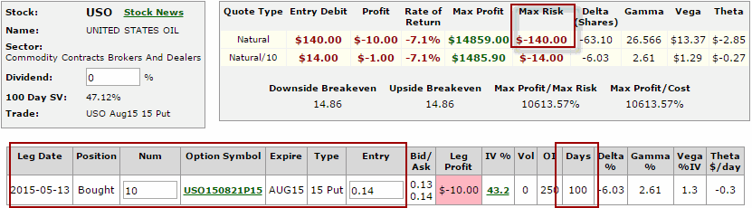
In Part 1, I introduced the Know Trends Index (or KTI) that I wrote about in my book “Seasonal Stock Market Trends.  I also noted that stock market performance:

*Tends to be very good when the KTI is greater than or equal to +5.

*Tends to be very bad when the KTI is +1 or less

*Is mostly very good when the KTI is at +2, +3 or +4 – except of course for when it is horrifically bad (-38% drawdown in 1938 and -57% drawdown in 2008).

So the goal this time out is to create a trading strategy that takes all of this into account.

A Seasonal Stock Market Trends Trading Strategy

The KTI for this test will be calculated exactly as spelled out in “Seasonal Stock Market Trends” and has historically ranged from -1 to +8.  Because all of the time periods are know in advance (hence the “Known Trends” moniker) the KTI reading for each given day can be calculated ad infinitum into the future.

Trading Rules:

A) If KTI <= +1 – Hold cash (test assumes 1% of interest annually)

B) If KTI >= +5 – Hold Dow Industrials using leverage of 2-to-1

C) If KTI >=+2 and <=+4 AND the Dow Jones Industrials Average is above its 200-day moving average(*) then hold Dow Industrials using no leverage.

D) If KTI >=+2 and <=+4 AND the Dow Jones Industrials Average is below its 200-day moving average(*) then hold cash (test assumes 1% of interest annually).

(*) – There is a one-day lag in measuring Dow versus its 200-day moving average.  Allow me to explain:

-Let’s say that it is Tuesday and we know that the KTI reading for Wednesday will be +3.  If the Dow closes on Monday above its 200-day moving average (calculated as of the close on Monday) then we will buy (or continue to hold) at the close on Tuesday. If the Dow had closed on Monday below its 200-day moving average we would not have entered a new position on Tuesday (or if we were already in a position we would sell it on Tuesday because the Dow was below its 200-day moving average and the KTI was less than +5).

We will start our test on 12/31/1934.  When a long position is held we will assume that we gain or lose the daily percentage change for the Dow Jones Industrials Average

Random Notes regarding Results:

*This is a “long-term” method.  When I say “long-term” I am not referring to holding period as much as I am referring to the fact that an investor needs to let this method work over an extended period of time in order to derive the benefits.

*This method makes money by “grinding it out” – i.e., by making an above average return when using leverage, by tracking the market when long but not using leverage, and missing a lot of the “pain” by being out of the market during certain unfavorable periods.

*Year-to-year results should not be focus.  In other words, some years the ystem will outperform buy and hold and other years it will not.  What really matters is long-term rolling rates of return.

OK, with all that out of the way, let’s look t the actual results.

Results

The short version is this:

*The average annual return for the Seasonal System is +15.8%

*The average annual return for Buy-and-Hold is +8.0%

(these results reflect price only plus interest earned while in cash, no dividends)

Now a funny thing happens when you compound returns over a long period of time.  So for the record:

*$1,000 invested in the Dow using buy and hold since 12/31/1934 grew to $175,240

*$1,000 invested using the seasonal system since 12/31/1934 grew to $40,402,501

Like I said, compounding at a higher rate of return really adds up over long periods of time.

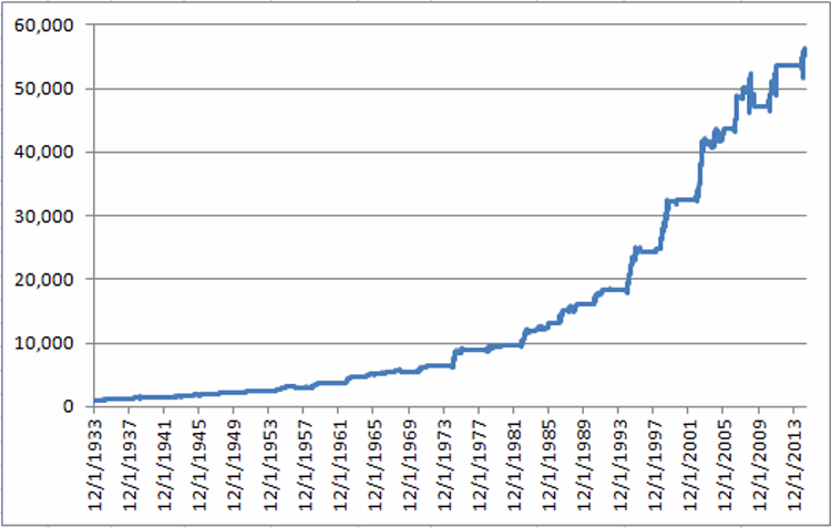
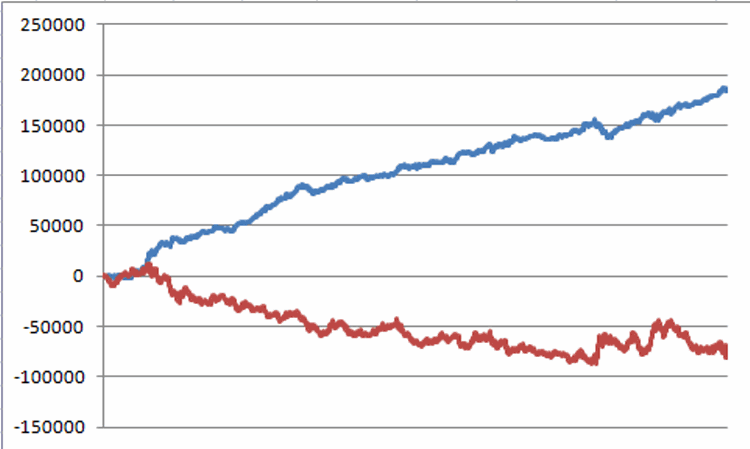
To better illustrate the results over time let’s look at two separate roughly 40 year periods. Figure 1 shows the growth of $1,000 for the Seasonal System versus Buy and Hold from 12/31/1934 through 12/1/1974.1
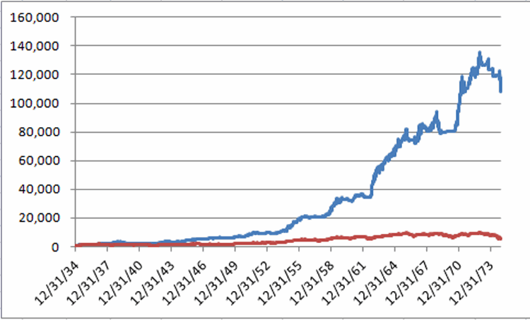
Figure 1 – Growth of $1,000 invested using Seasonal System(blue line) versus Buy-and-Hold (red line); 12/31/1933-12/31/1974

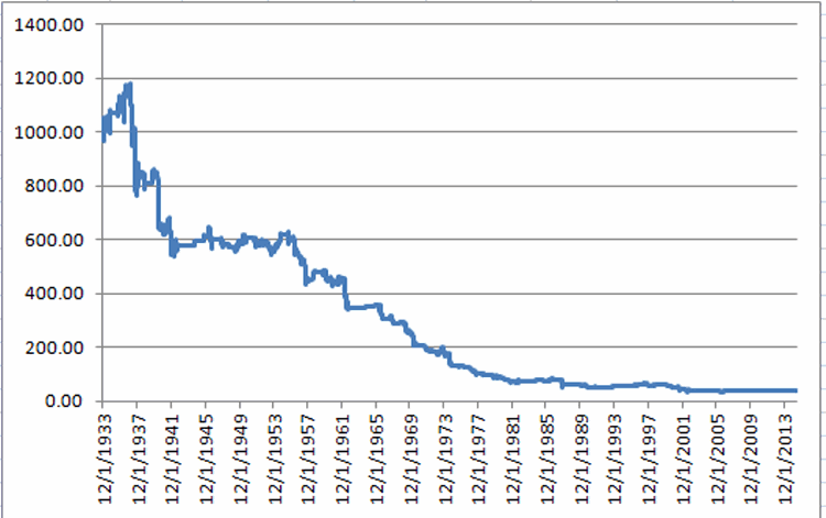
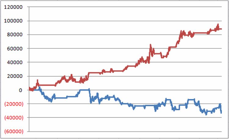
Figure 2 shows the growth of $1,000 for the Seasonal System versus Buy-and-Hold from 12/31/1974 through 5/22/2015.2
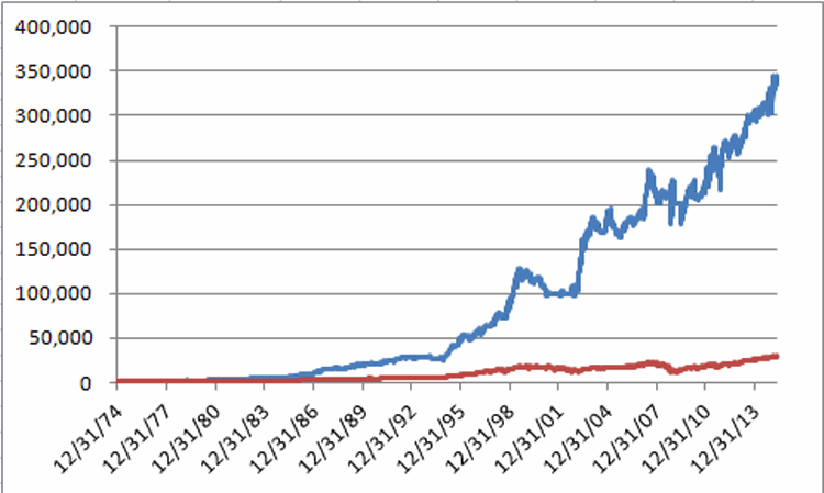
Figure 2 – Growth of $1,000 invested using Seasonal System(blue line) versus Buy-and-Hold (red line); 12/31/1974-5/22/2015

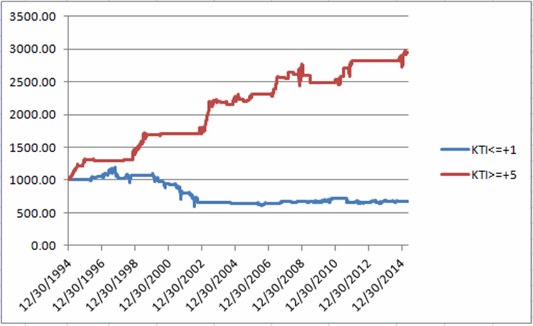
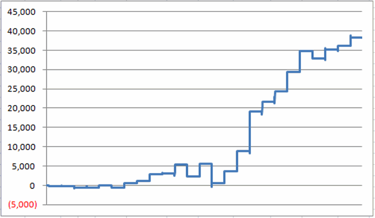
Figure 3 shows the rolling 10-year returns for the System versus buy and hold.3
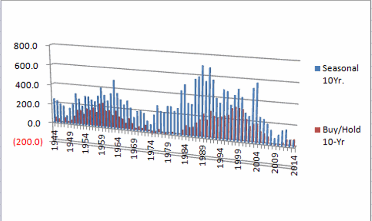
Figure 3 – Rolling 10-Year returns for Seasonal System (blue bars) versus Buy-and-Hold

The bottom line is this: Rolling 10-year returns for the Seasonal System have outperformed Buy-and-hold 70 out of 71 times. In other words, starting at the end of 1944, if you looked back at the performance over the prior 10 years, the  Seasonal System outperformed Buy-and-Hold 70 times.  Buy-and-Hold outperformed the Seasonal System one time.

As I am wont to say, ratios like 70-to-1 are something we quantitative analyst types refer to as “statistically significant.”

Finally, Figure 4 shows the year-by-comparative results. 

Year Seasonal Buy/Hold Difference
1935 46.4 38.5 7.9
1936 22.9 24.8 (1.9)
1937 13.0 (32.8) 45.8
1938 67.4 28.1 39.3
1939 (26.2) (2.9) (23.3)
1940 (7.3) (12.7) 5.4
1941 (1.5) (15.4) 13.9
1942 17.8 7.6 10.2
1943 19.9 13.8 6.0
1944 8.0 12.1 (4.1)
1945 39.2 26.6 12.6
1946 11.6 (8.1) 19.7
1947 6.6 2.2 4.3
1948 8.4 (2.1) 10.6
1949 6.5 12.9 (6.4)
1950 10.6 17.6 (7.0)
1951 30.8 14.4 16.5
1952 3.5 8.4 (4.9)
1953 (2.7) (3.8) 1.0
1954 44.9 44.0 1.0
1955 38.6 20.8 17.9
1956 3.4 2.3 1.1
1957 2.7 (12.8) 15.5
1958 26.7 34.0 (7.3)
1959 28.3 16.4 11.9
1960 (5.2) (9.3) 4.2
1961 14.5 18.7 (4.3)
1962 24.4 (10.8) 35.2
1963 26.6 17.0 9.6
1964 13.4 14.6 (1.1)
1965 20.2 10.9 9.3
1966 (8.9) (18.9) 10.0
1967 15.0 15.2 (0.2)
1968 4.8 4.3 0.5
1969 (7.2) (15.2) 8.0
1970 20.0 4.8 15.2
1971 18.1 6.1 12.0
1972 15.7 14.6 1.1
1973 (6.1) (16.6) 10.5
1974 (4.6) (27.6) 23.0
1975 87.9 38.3 49.5
1976 22.3 17.9 4.5
1977 (1.5) (17.3) 15.8
1978 1.9 (3.1) 5.1
1979 12.1 4.2 7.9
1980 20.2 14.9 5.3
1981 5.0 (9.2) 14.3
1982 26.1 19.6 6.5
1983 39.3 20.3 19.0
1984 6.2 (3.7) 9.9
1985 32.8 27.7 5.2
1986 19.7 22.6 (2.9)
1987 56.3 2.3 54.0
1988 6.0 11.8 (5.9)
1989 29.5 27.0 2.6
1990 (1.8) (4.3) 2.5
1991 26.2 20.3 5.9
1992 7.8 4.2 3.7
1993 3.8 13.7 (10.0)
1994 (3.0) 2.1 (5.1)
1995 71.0 33.5 37.6
1996 16.9 26.0 (9.1)
1997 21.5 22.6 (1.2)
1998 28.9 16.1 12.8
1999 43.9 25.2 18.7
2000 (13.7) (6.2) (7.5)
2001 (8.6) (7.1) (1.5)
2002 (0.4) (16.8) 16.4
2003 82.8 25.3 57.5
2004 5.2 3.1 2.0
2005 (9.9) (0.6) (9.3)
2006 11.7 16.3 (4.6)
2007 6.6 6.4 0.1
2008 5.5 (33.8) 39.3
2009 0.1 18.8 (18.7)
2010 3.6 11.0 (7.5)
2011 11.6 5.5 6.1
2012 4.4 7.3 (2.9)
2013 17.8 26.5 (8.7)
2014 4.9 7.5 (2.7)
Average 15.8 8.0

Figure 4 – Year-by-Year Results for Seasonal System versus Buy-and-Hold


Summary

See Part 3 to follow….

Jay Kaeppel

Updating My Seasonal Trends Trading Strategy (Part 1)

See also Good News Bonds, Bad News Bonds

In my book “Seasonal Stock Market Trends” I pulled a variety of well known (and not so well known) seasonal stock market trends (what else?) into a composite index referred to as the Known Trends Index”, or KTI for short.  Sure, if I was a marketing guy I would’ve opted for something more along the lines of “Jay’s Hidden Order in the Stock Market Revealed” Index.  Alas, the marketing gene apparently skips a generation in the Kaeppel Family.

No matter. The gist is this:

The KTI is comprised of 13 indicators (including The Election Cycle, Trading Days of The Month, Sell In May and Go Away, the Summer Rally, the 40-Week Cycle, the 212-Week Cycle, Trading around Holidays and 6 others, each with specific bullish, bearish or neutral criteria) and has historically ranged from a high reading of +8 to a low reading of -1.

Using the KTI to Trade

The more seasonal trends that are favorable at a given point in time the higher the KTI and vice versa.  The theory is that higher KTI readings suggest more favorable conditions for the stock market than do lower KTI readings.

Does this theory hold true in reality?  Take a look at Figures 1 and 2 and decide for yourself.

Figure 1 displays the growth of $1,000 invested in the Dow Jones Industrials Average (price only, no dividends included) only on those days when the KTI reads +5 or higher, starting on December 1st, 1933.1Figure 1 – Growth of $1,000 invested in Dow Industrials only when KTI >= +5; 12/1/1933 through 5/22/2015

Compare and contrast the results displayed in Figure 1 to the results that appear in Figure 2.  Figure 2 displays the growth of $1,000 invested in the Dow Jones Industrials Average (price only, no dividends included) only on those days when the KTI reads +1 or less, starting on December 1st, 1933.2Figure 2 – Growth of $1,000 invested in Dow Industrials only when KTI <= +1; 12/1/1933 through 5/22/2015

For the record:

*$1,000 invested in the Dow only when the KTI >= +5 grew +5,470%

*$1,000 invested in the Dow only when the KTI <= +1 declined (-96.1%)

This dichotomy in performance is what we quantitative analyst types refer to in our highly technical terms as “statistically significant.”

Under the category of “What have you done for me lately”, Figure 3 displays the results generated from holding the Dow Industrials when KTI >= +5 versus KTI <= +1 since 12/31/1994.1aFigure 4 – Growth of $1,000 invested in Dow  Industrials when KTI>= +5 (red line) versus $1,000 invested in Dow Industrials when KTI<= +1 (blue line); 12/31/1994-5/22/2015

One problem with all of this information (going back to 1934) is that:

*The days for which the KTI >=5 represents only 14.65% of all trading days

*The days for which the KTI <=1 represents only 21.56% of all trading days

So what about all the other days?  Figure 3 displays the performance of the Dow during all days since 12/1/1933 when the KTI was between +2 and +4.3Figure 3 – Growth of $1,000 invested in Dow Industrials only when KTI = +2 or +3 or +4; 12/1/1933 through 5/22/2015

*The good news is that the net gain was +8,500%. Which is what we quantitative analyst types refer to in our highly technical terms as “not too shabby.”

*The bad news is that investing only on days when the KTI read +2, +3 or +4 witnessed a drawdown of -38% in 1938 and a massive drawdown of -57% in 2008 (i.e., “Shabby”).

So how to put it altogether and actually trade?

Simple. Stay tuned for Part 2.

Jay Kaeppel

Good News Bonds, Bad News Bonds

See also Crude versus Bond Yields (from One of My Favorite Sites)

First the (potential) good news.  The (potential) good news is that one trend in bonds that I wrote about a while back here and here may finally (potentially) be playing out the “right way.”  Although, as there are still three more trading days left in the month of May, it is clearly a little early to declare “victory.”

In any event, the trend I am referring to is the historical propensity for t-bonds to advance in price during the last five trading days of the month.  Figure 1 displays the growth of equity achieved by holding a long position in t-bond futures during the last five trading days of every month since 12/31/1983 versus the performance for t-bond futures during all other trading days.1Figure 1 – Gain from holding long t-bond futures last 5 trading days of every month (blue line) versus gain(loss) from holding long t-bond futures all other trading days of the month (red line); 12/31/1983-present

The long-term trend is fairly clear.  Ah, there’s the rub.  While the long-term is all well and good, the short-term can be a real pain in the you know what.  T-bonds lost -$3,800 during the last 5 trading days of March and April combined.  Of course, I did point out in a subsequent article that both of these months have been something of “weak sisters” compared to the majority of other months.  So what’s the latest buzz?  Well on 5/22 – the 5th to last trading day of the month of May – t-bonds futures lost another -$625.  However, on 5/26 bonds soared in value by $2,219 per contract, so the “last five trading days of the month” period has something of a bullish leg up at the moment.  We will just have to wait and see what transpires between now and the close on Friday.

In any event, this constitutes “the Good News” presently in t-bonds.  Which leaves us with – what else  – the “Bad News”.

The Japanese Stock Market and T-bonds

As I wrote about here the U.S. t-bond market has demonstrated a strong tendency to perform inversely to the Japanese stock market.  Now for the record, I have heard theories from market analysts whom I consider to be smarter and/or more enlightened than I when it comes to explaining relationships between various – seemingly unrelated – markets regarding “why” this Japanese stocks/U.S. t-bond relationship has been so persistent.  However, as a proud graduate of the “School of Whatever Works” I will be candid – I personally don’t care about “why” as much as I do “for how much longer.”

Figure 2 displays ticker TLT – an ETF that tracks the 20+ Yr. U.S. t-bond in the top clip and ticker EWJ – an ETF that tracks the MSCI Japan Index – in the bottom clip.  Using very simplistic analysis:

*The trend is considered bullish for bonds when the 5-week average for EWJ is below the 30-week average for EWJ, and;

*The trend is considered bearish for bonds when the 5-week average for EWJ is above the 30-week average for EWJ

2Figure 2 – T-bonds (ticker TLT) tend to trade inversely to Japanese Stocks (ticker EWJ)

Figure 3 displays the gain achieved by holding a long position in t-bond futures ($1,000 per point) since December 1997 as follows:

*Holding a long position in t-bond futures when the trend is bullish (red line) and;

*Holding a long position in t-bond futures when the trend is bearish (blue line).3Figure 3 – Amount gained or lost being long t-bond futures when EWJ is bullish for bonds (red line) versus bearish for bonds (blue line)

The difference in performance pretty well speaks for itself.  So the “bad news” for bonds is that the 5-week average for EWJ remains well above the 30-week average, i.e., this indicator is still “bearish.”

 Summary

From a trading perspective I am looking to scratch out some sort of gain from a long position in bonds through the end of May.  But from there, the bearish configuration for EWJ as it relates to bonds suggests that a switch either to the short side of bonds, or to simply hold no position at all, might be the way to go.

As always these are not “recommendations”, merely “observations.”

Jay Kaeppel

Will Natural Gas Soar With the Wind in June?

See Jay’s recent post: Will Natural Gas Break Wind in June?

OK, my last article (Will Natural Gas Break Wind in June?) did sound a little apocalyptic regarding the prospects for natural gas in June. But maybe that did not present the full picture. While that previous article did detail a bearish seasonal period for natural gas starting at the close of trading on June Trading Day #11, very often there is a brief “pop” prior to things taking a turn for the worse.

The Brief Respite

The brief favorable period we will look at now:

*Starts at the end of June Trading Day #8 and;

*Lasts for 3 trading days before things flip to “unfavorable”.

Figure 1 displays the results generated by holding a long position in natural gas futures during this 3-day period since the inception of trading in 1990.1Figure 1 – Long Natural Gas futures June Trading Days #9, 10 and 11

For the record:

*There have been 17 up years and 8 down. 5 of the first 6 years showed a loss. Since then 16 out of 19 years and 10 out of the last 11 have seen a gain registered during this three day trading period.

*The average gain was $2,914

*The average loss was -$1,413

*The largest gain was over $10,000 (2006)

*The largest loss was over -$5,000 (2003)

*13 of the 25 years witnessed a 3-day gain of at least $1,800.

So clearly not for the “faint of heart” nor the “small of trading account.”

Figure 2 displays the year-by-year results

2

Figure 2 – Year-by-Year Results long natural gas futures during “favorable” June period

Combining Bullish and Bearish June Periods for Natural Gas

Now let’s assume a trader held a:

*Long position in natural gas futurse during June Trading Days 9, 10 and 11

*Short position in natural gas futures from the close of June Trading Day #11 through the close of the 14th trading day of July

The cumulative gain for this “long then short” strategy appears in Figure 3.3Figure 3 – Long and Short Periods for Natural Gas combined

The year-by-year results appear in Figure 4.

4

Figure 4 – Yearly results for Long and Short periods for Natural Gas combined

For the record:

*21 years showed a gain (84%)

*4 years showed a loss (16%)

*The average gain was over $7,576

*The average loss was -$1,573

*The largest gain was over $27,000 (2008)

*The largest loss was -$3,790 (2012)

Also for the record, these results include no deductions for slippage, commissions, taxes, etc. and use futures data that I have had sitting on my computer which are assumed to be accurate.

Note too that these results do not take into account the sheer terror that can be associated with holding any position in natural gas futures – even if things are going your way at the moment (trust me on this one) – because this market can be incredibly volatile and can turn on a dime.

Summary

A few notes:

*There clearly seems to be “something anomalous going on” in natural gas in the month of June.

*There is (sadly) no guarantee that these anomolies will play out in June 2015 as they have in the past.

*The last time I wrote about natural gas tendencies in the month of June it ended up being the worst year ever to follow these trends (Still think I am just paranoid when I say “Murphy hate me”?).  So I think we all know what that means.

*Trading natural gas futures is absolutely, positively “not for everyone.”

Thanks to the advent of ETFs and options on ETFs there are ways to play these trends without ever trading a futures contract.

I’ll plan on revisiting this topic as the June seasonal time frame draws closer.

Jay Kaeppel

Will Natural Gas Break Wind in June?

See Jay’s recent post: Will Natural Gas Soar With the Wind in June?

If you are an ardent believer in the phrase “if something looks too good to be true it probably is”, then you’d better brace yourself.  Because a “sure-fire, can’t miss, you can’t lose” thing is on the horizon in natural gas.  Well OK, at least that’s the theory.

A Bearish Seasonal Trend in Natural Gas

The bearish time period in question extends:

a) From the close of trading on the 11th trading day of June (Friday, June 15 in this case)

b) Through the close of the 14th trading day of July (Tuesday, July 21th).

Here is the chronology of natural gas performance during this time period:

*Natural gas futures started trading back in April 1990.  During that year, natural gas lost $790.

*During 1991 and 1992 however, natural gas gained $200 and $1,850, respectively.  Things got “a little worse from there”.

*During the next 19 years, natural gas futures declined during the bearish period described above.  Yes, you read that right – 19 consecutive years.

*Then like I fool I wrote about this trend in early June of 2012. See if you can guess what happened that year? Can you say, “A sharp advance (over $6,000 per futures contract) in the price of natural gas”?  Sure, I knew you could.

*After that humiliation, everyone forgot I mentioned it and things went back to form with natural gas declining in 2013 and getting clobbered in 2014.  So in a nutshell, this period has seen natural gas decline in 21 of the last 22 years.

So for the record, since 1990, natural gas futures during the June TD 11 through the July TD 14 period showed:

-A decline 22 times (88.0% of the time)

-A gain 3 times (12.0% of the time)

-The average declining period was -$5,580

-The average gaining period was +$2,730

The cumulative equity curve generated by holding a long position in natural gas futures only during this time period from 1990 through 2014 appears in Figure 1.2Figure 1 – Cumulative gain from holding a short position in Natural Gas futures during bearish time period (1990-2014)

Figure 2 displays the year-by-year results.

1

Figure 2 – Yearly results from holding a short position in Natural gas futures during bearish period (1990-2014)

Ticker UNG is an ETF that ostensibly tracks the price of natural gas.  UNG started trading in 2007.  Figure 3 displays the net change in price for UNG during the aforementioned bearish period each year.

3

Figure 3 – Percentage gain or loss for ticker UNG during bearish period

Now let’s be honest, that’s a pretty good track record no matter how you cut it.  Of course, that’s the good news.  The bad news is twofold:

1) These historical results in no way “guarantee” that a short position in natural gas during this bearish period this time around will actually make money.

2) I mentioned this trend again.  And of course, you can see in Figure 1 what happened the last time I mentioned this trend…………In the immortal words of Crosby, Stills, Nash & Young – “Paranoia, it strikes deep.”

How to Play This Trend

I will visit this topic when we get a little closer to June 15th.

Jay Kaeppel


An Update on ‘An Option Strategy to Put the Odds on Your Side’

         See also One More Plunge for Crude Oil?

A short while back I wrote a piece detailing an option strategy that can improve your odds of profit.  This strategy is typically referred to as a “Directional Calendar Spread”.  The trade in the original article involved buying 18 July CSCO 29 calls and selling 12 May CSCO 29 calls.  The details appear in Figures 1 and 2 below.5Figure 1 – Original CSCO Directional Calendar Spread (Courtesty OptionsAnalysis.com)

6Figure 2 – Original CSCO Direction Calendar Spread risk curves  (Courtesty OptionsAnalysis.com)

Well its expiration day for the May calls and as of the close the day before the original trade now looks like this:3

Figure 3 – CSCO trade as of 5/14/15 (Courtesty OptionsAnalysis.com)

4Figure 4 – CSCO trade risk curves as of 5/14/15 (Courtesty OptionsAnalysis.com)

There are two key things to note about this position:

1) As of the close on 5/14, CSCO stock was trading at $29.05 and the short May call was trading at $0.13 bid/$0.17 ask.  If CSCO closes at $29 or below on expiration day this option will expire worthless and the entire premium will be kept.  So basically there is still roughly $204 of time premium ($0.17 times 12 short option contract) to potentially be captured today (i.e., $204 of additional profit) IF the stock trades lower.

2) On the other hand, if CSCO closes today (May option expiration day) above $29 a share, the May 29 call will be “in-the-money” and the calls that I sold (hypothetically speaking FYI) will be “exercised”, which means that unless I also contact my broker and exercise 12 of my 18 July 29 calls to offset this, come Monday morning my position will be:

a) Long 18 July CSCO 29 calls

b) Short 1,200 shares of CSCO stock (Yikes!)

Did we enter this trade because we want to hold a short position in CSCO stock?  H%^& No!!

So what’s a trader to do!?

Because – in the interest of full disclosure – I don’t want to spend all day writing, rather than discussing all of the possible actions that a trader holding this position could take, I am simply going to choose one and use that as an example (Sorry, it’s just my nature).

One Example Adjustment

For argument’s sake, let’s say:

a) I am still bullish on CSCO

b) No way do I want to wake up Monday morning short 1,200 shares of CSCO stock

c) I am a greedy pig who wants to suck out all of the profit potential I can (again, sorry, it’s just my nature)

I can watch CSCO during the day.  My goal is to capture as much of the potential time decay from the short May option as possible.  Still, I don’t want to take a chance of having the short May calls exercised against me.  So let’s say CSCO stock is still trading at $29.05 towards the end of the day. I can take the following action before the end of the day:

*Buy 12 May CSCO calls (which closes entire position in May calls)

*Sell 15 July CSCO calls (which leaves a position of long 3 July calls)

The net effect of these actions leaves me with the reward-to-risk trade off that appears in Figures 5 and 6 (actually, it would look a little better since I would likely buy back  the May calls at a lower price as the May 29 call drops from $0.17 to $0.05 as time premium vanishes).

5Figure 5 – Adjusted CSCO position  (Courtesty OptionsAnalysis.com)6Figure 6 – Adjusted CSCO position  (Courtesty OptionsAnalysis.com)

The Net Effect

At this point, the position has locked in a profit.  In other words, if this position is held until July expiration and CSCO stock is at $29 a share or less this position will expire with a net profit of $81.  OK, granted $81 isn’t much, but the point is that for the next two months I have a “free trade” with unlimited profit potential.

If you have never found yourself in a trade in which you cannot possibly suffer a  loss no matter how badly things go wrong – and you have unlimited profit potential to boot if things go well – then please take my word for it when I say, “it’s a good feeling.”

Summary

There are many other adjustments that a trader could make instead of the one I’ve highlighted here.  But the main point(s) of this article are:

a) Always be aware of the fact that if an option that you sell expires “in-the-money” you could wake up the next Monday short shares of stock (if you have never learned this lesson the hard way – then please take my word for it when I say, “it’s NOT a good feeling”).

b) If you learn a few basics about options you can put the odds in your favor.

Jay Kaeppel

An Update/Clarification to a ‘Simple Pattern’ for Trading

See Jay’s latest post: One More Plunge for Crude Oil?

It’s been (alas, correctly) brought to my attention that my description of the “Simple Pattern” I wrote about was, um, not so simple.  To wit, the author writes:

“Not every Day 1 signal generates an entry signal. If the 2nd trading day after the “close below previous low” (Day 3) does not trade above the high of the day after the “close below previous low” day (Day 2), then no further entry signal exists and the pattern is voided.”

Huh?

OK, so under the category of “A picture is worth a whole bunch of words”, please consider the examples below.

Example #1

simple pattern example 1

Day 1 – the close is below the previous day’s low

Day 2 – the day after Trading Day 1

Day 3 – price breaks above Day 2 high triggering a long trade

1st profitable close occurs on day after Day 3

Example #2

Simple pattern example 2

Day 1 (1st red arrow) – the close is below the previous day’s low

Day 2 (1st blue arrow) – the day after Trading Day 1

Day 3 (not marked) – price DOES NOT exceed Day 2 high, so signal is voided

Day 1 (2nd red arrow) – the close is below the previous day’s low

Day 2 (2nd blue arrow) – the day after Trading Day 1

Day 3 (green arrow) – price DOES exceed Day 2 high, trade is entered above Day 2 high

1st profitable close – Price closes above entry price on Day 3 so trade closed there

Hopefully these examples help.

Jay Kaeppel

One More Plunge for Crude Oil?

I wrote recently that in order to overcome my obsession with Elliot Wave Theory I had to join a five step program (three steps in the right direction with two minor setbacks in between).  I’m feeling much better now.  But I am not entirely cured.  One thing that still attracts my attention is when the daily and weekly wave counts agree.  Don’t tell my sponsor.  To wit:

Elliott Wave meets Crude Oil

The charts shown in Figures 1 and 2 show the weekly and daily charts for ticker USO (an ETF which is designed to track the price of crude oil).  Figure 1 displays the weekly chart with the weekly Elliott Wave count as calculated by ProfitSource by HUBB. Figure 2 displays the daily chart with the daily Elliott Wave count, also as calculated by ProfitSource by HUBB.

1Figure 1 – Weekly USO with Elliott Wave count from ProfitSource by HUBB

2Figure 2 – Daily USO with Elliott Wave count from ProfitSource by HUBB

A few things to note:

1. I use ProfitSource to analyze Elliott Wave because it has a built in formula for determining the current wave count at any given point in time.  For better or worse, I much prefer this to my previous method of determining the current wave count which basically involved staring at a chart until either:

a) the “wave” would appear to me, or;

b) my head started to hurt.

In either case I would draw numbers (or letters) and lines on the chart in a fashion that had to be at least 150% subjective (hence the five wave program).

2. As I mentioned earlier the only time I really pay attention to Elliott Wave counts these days is when the weekly and daily counts for a given security match up and are point to a Wave 5 advance or decline.

3. For the record, just because the two counts match up there is absolutely no guarantee that the expected move will play out.  Still, I have seen enough times when it has that this setup still draws my attention.

4. In Figures 1 and 2 you can see that both the weekly and daily wave counts are threatening to break to the downside in a Wave 5 decline and if that happens both are projecting sharply lower prices for USO (assuming the breakdown does occur).

5. Finally, for the record, price needs to break down below the daily and weekly “blue line” shown in Figures 1 and 2 to fully suggest the beginning of a Wave 5 down move.  So the trade shown below in Figures 3 and 4 is a hypothetical example and not a “recommendation.”

What to Do With This Information

What to do with this information depends on a few factors:

1. If you are a true “Elliott Head” then you start looking for a way to make a lot of money playing the short side of crude oil.

2. If you are not a true “Elliott Head” or (and I’m not naming any names here) if you are a “recovering Elliott Head” then you may be more inclined to consider a trade that could make a lot of money if crude does in fact plunge. But no way in heck are you going to “bet the ranch.”

If you fall into the former category then in all candor your best play is probably to sell short crude oil futures contracts as they offer the most direct play on a bearish scenario for crude oil.  At $1,000 per a $1 move in the price of crude futures contract offer the most “bang for the buck” for a trader looking to play a particular trend in crude.

Of course, at $1,000 per a $1 move in the price of crude they also offer a lot of “bang” to the level of capital in your trading account if you get my drift if you get the trend wrong.

If you fall into the latter category then you may not be quite so interested in “playing the trend”, but you might be interested in “taking a shot” that the extremely bearish scenario suggested in Figures 1 and 2 might actually play out.

So let’s be clear:

What appears in Figures 3 and 4 is not a “trend trade”, but rather a (slightly premature) “pure, out and out speculative play” based on nothing but the possibility (hope?) that crude oil will experience another plunge between now and August option expiration.  Any other scenario – an up move, a sideways move, a slight down move – will result in a total loss of the premium paid.  So the key here is to put a maximum of about 1% of your trading capital into a trade like this and no more.

This trade involves buying 10 USO August 15 puts at $14 apiece.3Figure 3 – Long USO Aug 15 puts (Courtesy www.OptionsAnalysis.com)4Figure 4 – Long USO Aug 15 puts (Courtesy www.OptionsAnalysis.com)

In a nutshell this trade requires a capital outlay of $140.  This also amounts to the maximum risk on this trade.  So in terms of dollar risk, we are not exactly breaking the bank.

On the downside, ProfitSource is essentially projecting USO to fall to somewhere between $10 and $12.  Please remember that this is simply a mathematical calculation – there are no crystal balls involved.  And in general, one is usually best served to assume that the extreme case will not play out.  Hence the reason we are risking $140.

Still, if by chance USO does fall to $12 or $10 a share prior to August option expiration, this position will generate a profit of somewhere between $3,000 and $4,800.  Which – to put it into technical terms – “ain’t too shabby” for risking all of $140.

Summary

As always I am not “recommending” that you make this very speculative trade.  Especially given the fact that:

a) As I write USO has technically not entered into a Wave 5 decline, and;

b) While the reward-to-risk ratio is high, this is what is known as a “low probability” trade, i.e., mathematically speaking, the probability of USO being at or below the breakeven price of $14.86 by August option expiration is about 6% (note that we are not relying on “probability” to trigger this trade.  At least for the sake of this example, “We are all Elliott Heads now.”)

The example covered  here merely illustrates the potential for using Elliott Wave to identify possible areas for speculation and how to use options to get the most bang for you buck.

In considering the hypothetical position highlighted here, a trader must ask and answer three key questions:

 1. Are you comfortable speculating on crude oil using options?

2. Do you think it is at least possible that crude oil will plunge between now and August option expiration?

3. Do you have $140 bucks?

If you answered “Yes” to all three – you should still stop and think long and hard before potentially wasting your hard earned money on rank speculation.  But if USO does fall to $12 a share……..

Jay Kaeppel