Santa Claus Is Coming to Town

OK I’ll admit I am a little early with this one.  But maybe not as early as you might think.  In fact, as I was out driving I saw the first house in my neighborhood to have Christmas lights up…and lit.  Hey, desperate times I guess.

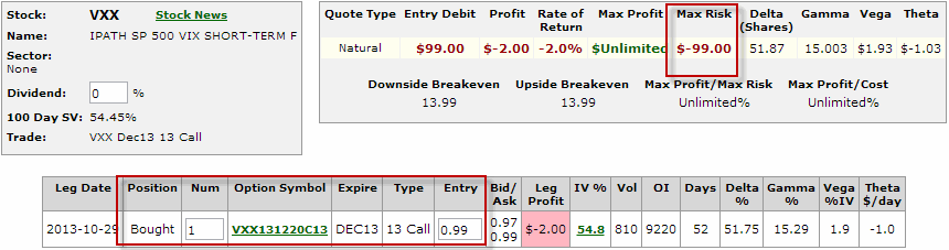
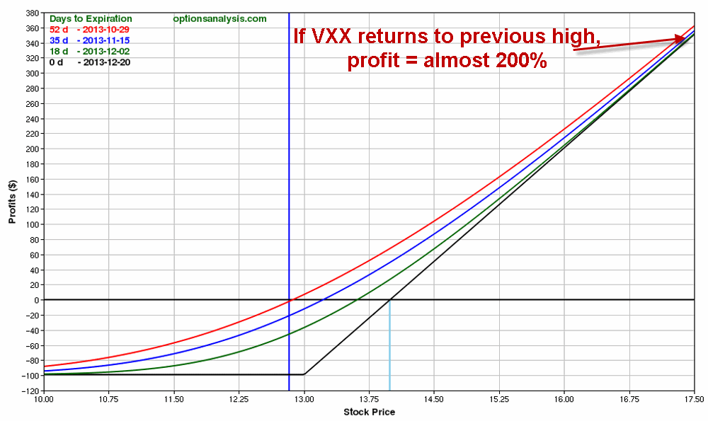
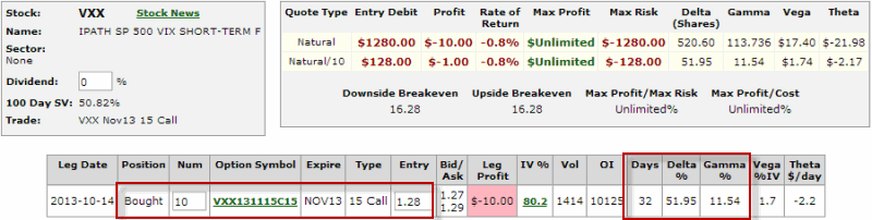
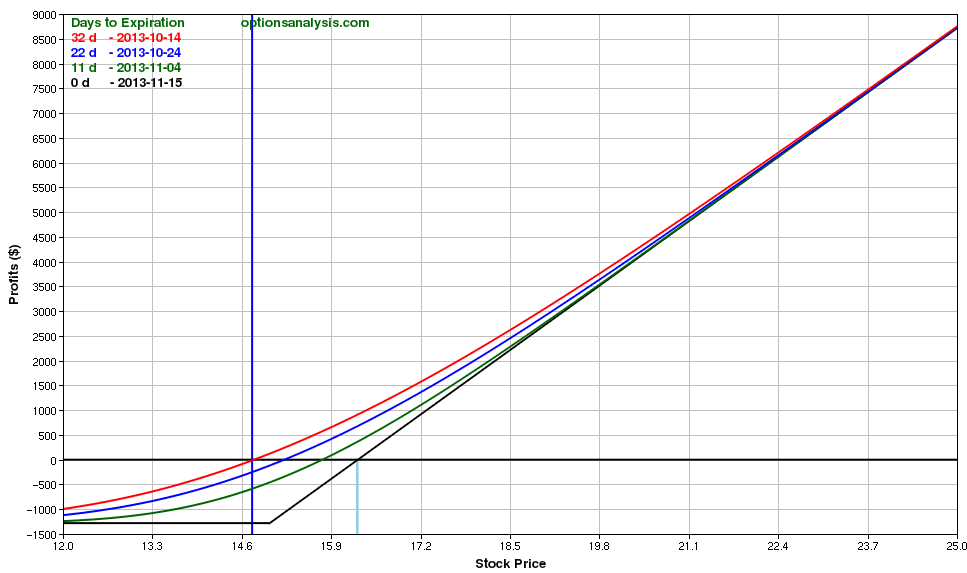
While the stock market continues to push to new highs, “morale” is not quite what one might expect.  This may be due in part to the fact that it is near impossible to peruse the financial media these days and not come away with a sense of foreboding, given all of the warnings and admonitions and liberal use of word like “frothy” and “bubble.”  And make no mistake, I have voiced a few concerns recently myself and have gone so far as to suggest that investors consider hedging with VXX call options (http://jayonthemarkets.com/2013/10/30/is-vxx-issuing-a-warning/) from time to time.

Still, as a person who has been involved in the financial markets for a while I understand the power of the trend.  So despite all of my personal concerns about the economy, debt, etc., etc., 2013 has been good to “go with the flow” kind of people.   In the short-term, the stock market does appear to be a bit “overbought” and perhaps “due for a correction.”  But while anything can happen, history suggests that people who are looking for a stock market collapse before the end of the year may be disappointed.  Cue the Christmas music.

The Santa Claus Rally

As I define it, the Santa Claus rally time period:

-Begins at the close of trading on the Friday before Thanksgiving.

-Extends through the close of the third trading day of January.

And that’s all there is to it.

So how has the stock market performed during this period in the past?  I am so glad you asked.

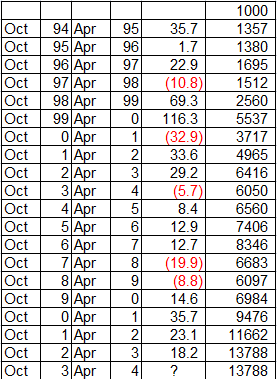
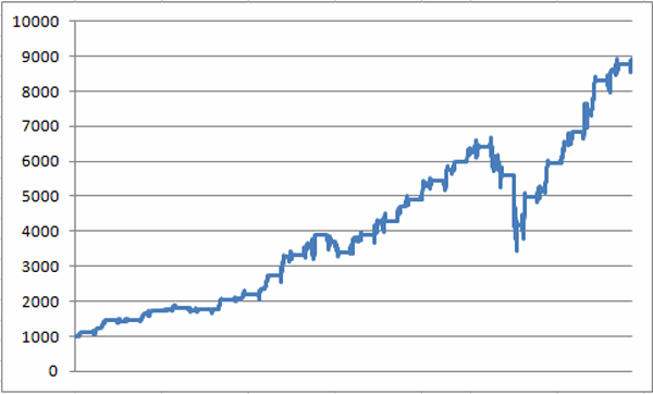
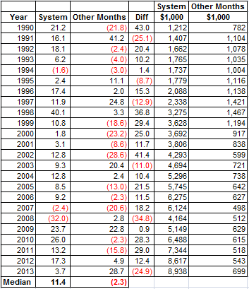
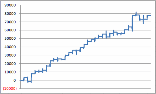
Figure 1 displays the growth of $1,000 invested in the Dow Jones Industrials Average only during the pre-Thanksgiving through post-New Year’s period I just described, starting in November 1949. jotm20131104-01
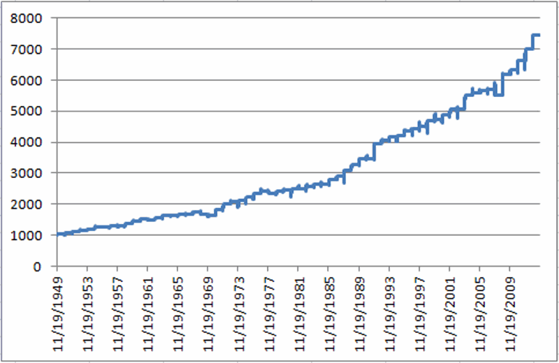
Figure 1 – Growth of $1,000 invested in Dow Jones Industrials during Santa Claus Rally period (1949-2012)

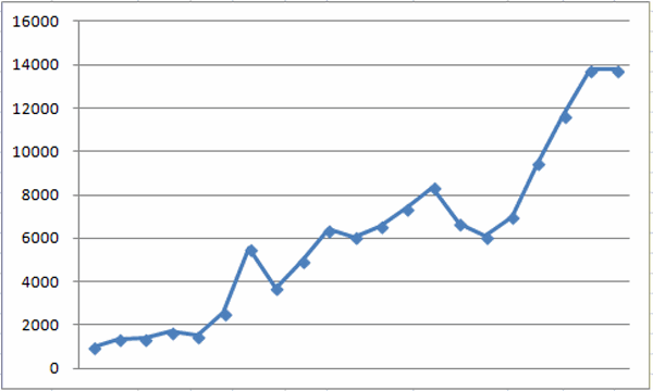
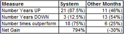
Figure 2 displays some important figures regarding this performance.jotm20131104-02

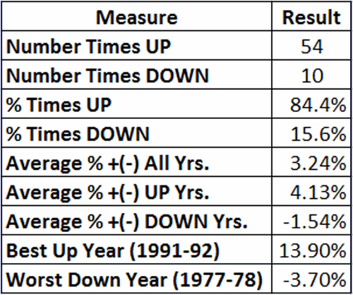
Figure 2 – Stock Market Performance during Santa Claus Rally Time Period

One other thing to note is that this Santa Claus Rally time period has witnessed an advance by the Dow during 26 of the last 28 and 32 of the last 35 years.   It’s tough to the beat that kind of consistency.

 Summary

So does all of this mean that “you can’t lose” trading stocks during this “sure thing” time period guaranteed to generate “above average, risk free” returns?  Ah, if only.  All any of this really means is that stocks have performed well during this time period in the past.  What will happen this year remains to be seen.

Still, the real point is that investors may be wise to give the bullish case every benefit of the doubt starting in late November.

Jay Kaeppel

P.S.  For all of you “numbers geeks” out there, the annual performance during the Santa Claus Rally Time period appears below

Period Ending DJIA % +(-)

1/5/50

3.6

1/4/51

4.0

1/4/52

3.9

1/6/53

4.6

1/6/54

2.9

1/5/55

5.1

1/5/56

0.2

1/4/57

3.7

1/6/58

(0.0)

1/6/59

5.7

1/6/60

5.8

1/5/61

3.2

1/4/62

(1.0)

1/4/63

5.0

1/6/64

5.0

1/6/65

(1.2)

1/5/66

3.0

1/5/67

(0.5)

1/4/68

4.3

1/6/69

(3.1)

1/6/70

(2.4)

1/6/71

10.0

1/5/72

11.6

1/4/73

3.4

1/4/74

2.0

1/6/75

3.6

1/6/76

6.0

1/5/77

3.1

1/5/78

(3.7)

1/4/79

3.6

1/4/80

1.6

1/6/81

1.5

1/6/82

0.9

1/5/83

2.3

1/5/84

2.5

1/4/85

(0.3)

1/6/86

5.7

1/6/87

4.3

1/6/88

6.5

1/5/89

6.2

1/4/90

5.4

1/4/91

0.6

1/6/92

13.9

1/6/93

2.4

1/5/94

2.8

1/5/95

0.9

1/4/96

3.7

1/6/97

1.5

1/6/98

1.8

1/6/99

4.2

1/5/00

1.1

1/4/01

2.7

1/4/02

4.0

1/6/03

(0.4)

1/6/04

9.5

1/5/05

1.3

1/5/06

1.1

1/5/07

0.4

1/4/08

(2.9)

1/6/09

12.0

1/6/10

2.5

1/5/11

4.6

1/5/12

5.3

1/4/13

6.7


Feel the Electricity

This post is more of an FYI than a specific call to action, still a reasonably good trend is a reasonably good trend.

As many investors know by now the November 1st into May time period has historically been very good for the stock market.  One of the better performing sectors during this time period has tended to be the semiconductor/electronics sectors.  Among tickers worthy of analysis are:

-FSELX (Fidelity Select Electronics mutual fund)

-SMH (HOLDRs Semiconductor ETF)

In a nutshell, the semiconductor/electronics sectors tend to perform well between October 31st and April 30th.  The results for FSELX since October 1994 appear in Figure 1.jotm20131101-01

Figure 1 – FSELX Performance October 31 to April 30

A chart of the annual growth of $1,000 appears in Figure 2.20131101-x

Figure 2 – $1,000 invested in FSELX 10/31 through 4.30 since 10/1994

In a nutshell:

-FSELX has been up 14 times (74%) and down 5 times (26%).

-The average gain was +18.7% and the median gain was +13.7%.

-The worst declines were -32.9% during 2000 to 2001 and -19.9% during 2007 to 2008, so remember that there is definitely risk involved. jotm20131101-02Figure 3 – Fidelity Select Electronics (Ticker FSELX)

Summary

Please do not read this post and think “Aha, semiconductor/electronic stocks are sure to rally.”  That is not the implication I am trying to make.  Simply remember that the “trend is your friend” and that this sector tends to perform well during this time period.  As long as these stocks act well it may be wise to give the bullish case the benefit of the doubt.

Jay Kaeppel

Is VXX Issuing a Warning?

They say that complacency is the enemy of the stock market.  If so, the action of ticker VXX – the exchange-traded fund designed to track the VIX Index – may be of interest. 

The indicator known as “Narrow Range 7”, or NR7 for short was first introduced by Toby Crabel some time back in the 19080’s or 1990’s.  The theory is that when the difference between today’s high price and low price for a given security is the smallest it’s been over the past 7 trading days, that security is said to be “contracting” or “compressing.”  The theory goes that – just as ying follows yang – once the compression is over there should be an “expansion”, – i.e., a meaningful price movement.

Now this is not always necessarily the case – i.e., a security can remain mired in a range for a good long while.  In addition, a simple NR7 gives no indication on its own as to whether the ensuing price expansion will be to the upside or to the downside.    Still, please note the chart in Figure 1.  This extreme compression DOES NOT guarantee or even imply that the stock market is about to decline.  But it sure does seem to signal a whole lot of complacency among investors. NR7

Figure 1 – Ticker VXX has registered seven consecutive days of narrower and narrower ranges (Courtesy: AIQ TradingExpert)

In all candor I am not entirely sure what this means.  My gut tells me that following the whole “shutdown/debt limit” crisis, and with QE2IB (Quantitative Easing to Infinity and Beyond) set to feed liquidity to the market until the end of time, it is pretty much assumed that the stock market has nowhere to go but higher.

Complicating this for me personally is that most of my indicators are bullish, so I am not inclined to pound the table and shout “the end is near!” (although it is kind of fun to see the looks on people’s faces when I do it just for fun.)

Still, it is not a stretch to think that we could be setting up for a nasty surprise in the near-term (i.e., sometime in the next several weeks) which would certainly surprise the heck out of most investors.   People who are inclined to hedge might consider buying VXX December 13 strike price call options (as I write, it is $99 for a 1-lot, with the futures suggesting that stock indexes will open higher, i.e., that VXX will open lower).    vxx-1Figure 2 – VXX December 13 call (Courtesy: ww.OptionsAnalysis.com)vxx-2Figure 3 – VXX December 13 Call (Courtesy: ww.OptionsAnalysis.com)

Summary

Everything – trend-following, seasonal, liquidity – seems to point to a bullish trend in the stock market.  And I am not one to stand in the way.  But historically when everything “looks good” for the stock market, one of two things happens:  Either the stock market:

a)  trends higher based on the bullish confluence of indicators, or,

b) the market surprises the daylights out of the majority with a nasty surprise.

$99 to insure against b seems like a reasonable price to pay.

Jay Kaeppel

Another BRIC in the Wall

A lot of U.S investors have come to realize in recent years that there are many trading opportunities outside the USA.  This creates something of a bad news, good news, bad news, good news situation.

-The bad news is that picking individual stocks is never an easy thing even if you focus only on domestic U.S. companies.  For the average investor to successfully pick and choose among individual stocks around the globe is simply too much to expect.

-The good news is that the proliferation of international ETFs – Single country funds, regional funds, global funds, etc. – has made it much easier for investors to diversify across the globe than it used to be.

-The bad news is that the proliferation of ETFs has also reached a point where choosing an international ETF is getting to be almost as confusing as choosing a phone plan.

-The good news is that there are ways to simplify and systematize things.

So let’s take a look at “one way” to play the international stocks game.

BRIC vs. SPX

BRIC refers to an index comprised of stocks from Brazil, Russia, India and China.  For the purposes of this article I will demonstrate a simple method for switching between BRIC and the S&P 500 Index.

The Vehicles:

For calculating switches I will use:

1) An index I created using AIQ TradingExpert.  I refer to it as BRICINDX and it is comprised of single-country ETF tickers EWZ (Brazil), RSX (Russia), INP (India) and FXI (China). jotm20131028-01Figure 1 – Jay’s BRICINDEX

2) Ticker SPX (i.e., the S&P 50 Index)

For actual trading purposes there are a few choices that I will discuss a little later.

The Method:

I will use a method I learned a long time ago from David Vomund, President of Vomund Investment Management, LLC and the author of “ETF Strategies Revealed.”  The measure calculates the relative strength between two assets on a weekly basis.  When the trend of relative strength reverses in a particular direction for two consecutive weeks it signals a switch into the stronger index.

The Test:

We start our test on 10/26/01 simple because that is the first time we can get a good reading using back data.  Each week we look at the relative strength of my BRICINDX versus the S&P 500 Index (ticker SPX).  If the RSMD rises for two consecutive weeks we want to switch into the BRICINDX and if the RSMD declines for two consecutive weeks we want to switch into the S&P 500 Index.  Figure 2 displays the switches over the past several years.jotm20131028-x

Figure 2 – BRICINDEX (vs. SPX; lower clip)

When an “Up” arrow occurs in Figure 2, the system switches into BRICINDX, hen a “Down” arrow occurs in Figure 2 the system switches into ticker SPY.  The results of this “System” are displayed in Figure 3.  Note the two columns at the far right:

Switch: The growth of $1,000 using the system

Split: The growth of $1,000 split evenly between BRICINDX and SPY.

BRIC SPY Switch Split Switch Split
Date Date Index %+(-) %+(-) %+(-) %+(-) $1,000 $1,000
10/26/01 2/8/02 BRIC 20.9 3.7 20.9 12.3 1,209 1,123
2/8/02 2/22/02 SPY 13.9 0.0 0.0 7.0 1,209 1,201
2/22/02 5/10/02 BRIC (12.6) (3.2) (12.6) (7.9) 1,057 1,106
5/10/02 7/19/02 SPY (25.0) (23.8) (23.8) (24.4) 806 837
7/19/02 8/2/02 BRIC (14.1) 1.9 (14.1) (6.1) 692 786
8/2/02 11/1/02 SPY (0.8) 8.8 8.8 4.0 753 817
11/1/02 6/27/03 BRIC 45.0 7.1 45.0 26.0 1,091 1,030
6/27/03 8/29/03 SPY 18.3 5.3 5.3 11.8 1,000 1,000
8/29/03 11/14/03 BRIC 10.9 2.1 10.9 6.5 1,109 1,065
11/14/03 12/12/03 SPY 11.9 2.5 2.5 7.2 1,137 1,142
12/12/03 1/23/04 BRIC 16.4 7.7 16.4 12.1 1,324 1,280
1/23/04 7/2/04 SPY (18.5) (3.4) (3.4) (10.9) 1,279 1,140
7/2/04 11/5/04 BRIC 29.0 4.7 29.0 16.8 1,650 1,331
11/5/04 12/3/04 SPY 9.0 1.8 1.8 5.4 1,679 1,403
12/3/04 12/31/04 BRIC (0.2) 0.9 (0.2) 0.3 1,675 1,408
12/31/04 2/11/05 SPY 5.4 0.3 0.3 2.9 1,681 1,449
2/11/05 3/25/05 BRIC (4.3) (2.8) (4.3) (3.5) 1,609 1,398
3/25/05 7/1/05 SPY 8.1 2.7 2.7 5.4 1,653 1,473
7/1/05 10/21/05 BRIC 13.9 (0.4) 13.9 6.7 1,882 1,572
10/21/05 1/13/06 SPY 18.3 7.6 7.6 12.9 2,024 1,776
1/13/06 3/17/06 BRIC 9.6 1.6 9.6 5.6 2,219 1,876
3/17/06 4/28/06 SPY 9.0 (0.0) (0.0) 4.5 2,219 1,961
4/28/06 5/26/06 BRIC (13.5) (3.3) (13.5) (8.4) 1,920 1,796
5/26/06 8/4/06 SPY 9.2 1.5 1.5 5.4 1,948 1,892
8/4/06 9/1/06 BRIC 2.1 2.9 2.1 2.5 1,988 1,939
9/1/06 10/20/06 SPY 4.2 4.4 4.4 4.3 2,076 2,023
10/20/06 2/16/07 BRIC 23.4 6.2 23.4 14.8 2,561 2,322
2/16/07 4/13/07 SPY 5.2 0.5 0.5 2.8 2,573 2,387
4/13/07 8/17/07 BRIC 5.0 (1.4) 5.0 1.8 2,700 2,430
8/17/07 9/7/07 SPY 11.2 0.8 0.8 6.0 2,722 2,576
9/7/07 12/21/07 BRIC 35.8 2.4 35.8 19.1 3,696 3,067
12/21/07 4/25/08 SPY (9.3) (6.4) (6.4) (7.9) 3,458 2,826
4/25/08 6/13/08 BRIC (3.0) (2.4) (3.0) (2.7) 3,353 2,749
6/13/08 12/5/08 SPY (57.0) (35.5) (35.5) (46.2) 2,164 1,478
12/5/08 6/26/09 BRIC 53.1 5.4 53.1 29.3 3,314 1,911
6/26/09 10/2/09 SPY 20.4 12.2 12.2 16.3 3,719 2,223
10/2/09 11/6/09 BRIC 9.6 5.3 9.6 7.5 4,076 2,388
11/6/09 4/9/10 SPY 5.6 9.3 9.3 7.5 4,454 2,567
4/9/10 4/23/10 BRIC (2.0) 1.3 (2.0) (0.3) 4,365 2,558
4/23/10 6/18/10 SPY (6.2) (8.2) (8.2) (7.2) 4,008 2,374
6/18/10 11/19/10 BRIC 11.7 7.9 11.7 9.8 4,475 2,606
11/19/10 3/11/11 SPY (0.1) 8.2 8.2 4.0 4,843 2,712
3/11/11 5/6/11 BRIC (0.4) 3.6 (0.4) 1.6 4,823 2,755
5/6/11 6/10/11 SPY (1.9) (5.2) (5.2) (3.6) 4,571 2,656
6/10/11 7/15/11 BRIC (1.7) 2.3 (1.7) 0.3 4,494 2,664
7/15/11 11/4/11 SPY (11.7) (3.3) (3.3) (7.5) 4,344 2,463
11/4/11 12/16/11 BRIC (15.3) (4.7) (15.3) (10.0) 3,678 2,216
12/16/11 1/20/12 SPY 16.0 9.4 9.4 12.7 4,024 2,497
1/20/12 3/23/12 BRIC 2.4 7.6 2.4 5.0 4,121 2,623
3/23/12 7/6/12 SPY (15.3) (4.4) (4.4) (9.9) 3,938 2,363
7/6/12 2/1/13 BRIC 17.5 10.5 17.5 14.0 4,628 2,694
2/1/13 7/26/13 SPY (15.2) 12.7 12.7 (1.3) 5,216 2,660
7/26/13 BRIC 13.1 4.4 13.1 8.8 5,900 2,893

Figure 3 – BRICINDX vs. SPY

Figure 4 displays the trade-by-trade result in graphical form. 20131028-04Figure 4 – Jay’s BRIC/SPY System (blue line) versus Split/Buy-and-Hold

A Few Performance Notes

-An investor who had split $1,000 between BRICINDX and SPY in 2001 would now have $2,893, a gain of 189.3%

-An investor who had utilized this switching system starting with $1000 in 2001 would now have $5,900, a gain of 490%.  So you clearly see the potential long-term benefit.

-Long-term is the key phrase.  While the system clearly outperformed over time, over any trade or series of trades there is no guarantee that that will be the case.

-One other thing to note is that this particular system is allows long the stock market, either foreign or domestic.  This means that if there is a global bear market (such as 2008) this system will get suffer.  Therefore, aggressive investors might consider building in some sort of market timing in order to avoid some of the downside.

 A Few Trading Notes

For actual trading purposes a trader can emulate my BRICINDEX by splitting money between the four ETFs that comprise the index.  There are other, easier alternatives including:

-Ticker VWO: Vanguard Emerging Markets ETF does not track these four funds exactly but has a correlation of roughly 97% with the BRICINDX and enjoys active trading volume.

-Ticker BKF: iShares BRIC Index Fund is the fund most closely correlated to my BRICINDX, however, trading is very thin.

-Ticker DXELX: This is the Direxion 2x leveraged Emerging Markets open end mutual fund.  The leverage creates more profit potential (with commensurate downside risk) and this is a good choice for someone who would rather trade a standard mutual fund than an ETF.

-Ticker EDC: I am leery of 3x leveraged ETFs, but someone looking to “go for the gusto”, -Direxion Emerging Markets 3x ETF offers a lot of upside potential (but also a great deal of downside risk)

 Summary

The “system” I’ve detailed here isn’t necessarily something that you should rush out and start trading right this very minute.  Still, it does illustrate a few things:

-It is possible to “beat the market” (in this case, the “market” is defined as a portfolio evenly split between foreign and domestic stock indexes) over time using a mechanical approach.

-It is possible to profit from global stock market trends without becoming an expert in Chinese stocks or Russian stocks (or whatever country’s stocks).

-Demonstrating the discipline to follow an objective approach to investing is one of the keys to long-term success.

All in all it’s just another, well, you can sing the rest of it yourself……

Jay Kaeppel

When to Own Retailing Stocks

I am a fan of “simple” strategies.  For the record, yes, I have multiplied the standard deviation of the regression line times the implied volatility of the 90+ day options in order to, in order to, um, well, I seem to recall that there was a really important reason why I did it at the time.  Or so it seemed.  Still, I am reminded of:

Jay’s Trading Maxim #316: When it comes to analyzing markets and indicators, multiplying (or dividing) two numbers just “because you can”, is not necessarily helpful.

So again, I generally try to keep things simple.  Which is great, because the idea in this piece is something I first discovered in the 1990’s, and “trading systems” (such as it is, in this case) don’t get much simpler.  So here goes.

When to Own Retailing Stocks

The “system” I discovered in the 1990’s for retailing stocks works like this:

-Buy and hold retailing stocks during the months of February, March, October and November.

That’s it.  As with most things in life there is some good news and some bad news.  Let’s start with the bad news.  Like a lot of things, this “system” got crushed during the 2008 meltdown, suffering a -48% drawdown.   For those of you who are about to stop reading because of that last figure, just let me say DO NOT STOP READING!

The good news is that despite being fully invested in retailing stocks during the worst meltdown in modern history, the system has since soared to much higher new highs and has outperformed a buy and hold approach by 40% (+791% for the system vs. +562% for buy and hold) since December 1989.

What this means in a nutshell is that if you held retailing stocks only during all eight of the other months every year since 1990, you would actually have lost about -26%.  This dichotomy of performance would not seem evident from a cursory glance at Figure 1.

jotm20131023-05

Figure 1 – FSRPX Monthly Bar Chart (Courtesy AIQ TradingExpert)

Figure 2 displays the growth of $1,000 invested in Fidelity Select Retailing fund (ticker FRSPX) only during the months of February, March, October and November, starting in December 1989. jotm20131023-01

Figure 2 – Growth of $1,000 invested in FSRPX during “bullish” four months (since December 1989)

Again, the good news and bad news is fairly obvious.  For the most part the system was a model of equity growth consistency – OK, except of course for the 2007-2008 “Express Elevator to Hell” period.  Still, it is instructive to consider what would have happened had you simply skipped these four month every year and invested in retailing stocks only during all of the other eight months of the year.   These results appear in Figure 3. jotm20131023-02Figure 3 – Growth of $1,000 invested in FSRPX during all other months (since December 1989)

Figure 4 displays the performance of FSRPX during the four “favorable” months (i.e., the “system”) versus the performance of FSRPX during all other months (i.e., the “Anti System”) on an annual basis.  The results are fairly striking. jotm2013-03

Figure 4 – Systems results versus “Anti System” Resultsjotm20131023-04

Figure 5 – Systems results versus “Anti System” Results

A few things to note:

-The System has showed a gain 21 out of 24 years.

-The Anti System showed a gain in only 11 years.

-The System outperformed the Anti System 75% of the time.

-The System showed a net gain of +794%.

-The Anti System showed a net loss of -30%.

Summary

Obviously during some years retailing stocks will rally outside of our four “favorable” months (for example, this year).  But the long-term results suggest that investors would do well to focus on retailing stocks during February, March, October and November.

A Note for Option Traders

One less expensive way to make this play is to buy a deep-in-the-money call option on ticker XRT (SPDR Retail ETF).  Here is an example:

-On 9/30/2013 a trader could have purchased 400 shares of XRT at $82.01 a share.  The cost of this trade would be $32,804.  The net delta of this position is 400.

-An option trader could have bought 5 December XRT 76 call option at $6.90.  The cost of this trade would be $3,450.  This option has a delta of 81.29, so buying 5 contracts yields a net delta of 401.26.  In other words, this position will behave just like the stock position, but at a fraction of the cost ($3,450 versus $32,804). jotm20131023-06

Figure 6 –XRT December 76 call option as a replacement for stock shares (Courtesy: www.OptionsAnalysis.com)

As this is written:

-400 XRT shares are up 2% on an investment of $32,804 since 9/30.

-5 XRT December 76 calls options are up 13% on an investment of $3,450 since 9/30.

Jay Kaeppel

NEW!  Video Course: How to Find Longer-Term Bull Call Spreads

http://jayonthemarkets.com/new-video-course/


A Seasonal Sector Trading System

The Stock Trader’s Almanac, put out each year by the Hirsch Organization, is one of my favorite publications.  Interesting ideas are one thing.  Interesting ideas that actually work are entirely something else.  And the Almanac is chock full of just that.

Of course, some of us are not content to leave well enough alone (Hi, my name is Jay).  One system that I follow involves using the Almanac’s “Nasdaq’s Best Eight Months Strategy” with MACD Timing.  However, instead of buying a stock index I focus on the top performing Fidelity Select Sector Funds.

The method works like this:

-Starting on October first, track the action of the MACD indicator for the Nasdaq Composite Index using MACD parameter values of 8/17/9.

-When the fast line crosses above the slow line – or if the fast line is already above the slow line on 10/1, a buy signal occurs. Figure 1 displays the most recent buy signal which occurred at the close on 10/15/13. jotm20131021-01

Figure 1 – MACD Buy Signal (Chart courtesy of AIQ TradingExpert)

-Then find the five top Fidelity Select sector funds.  There are a number of different ways to do this.  The method I use is to run AIQ TradingExpert Relative Strength report over the past 240 trading days.  This routine looks at the performance off each fund over 240 trading days but gives extra weight to the most recent 120 days.  You can use different variables, or you can simply look at raw price change over the previous 6 months to come up with a list of “Top Select Sector Performers.”  The list for 10/15/13 appears in Figure 2.

jotm20131021-02

Figure 2 – High Relative Fidelity Select Sector Funds (Courtesy AIQ TradingExpert)

-Buy the top five Select Sector funds the next day.

-Starting on June 1st of the next year, track the action off the MACD indicator for the Nasdaq Composite Index using MACD parameter values of 12/25/9.

When the fast line crosses below the slow line – or if the fast line is already above the slow line on 6/1, then sell the Fidelity Select sector funds on the next trading day.

Repeat.

Results

The test period used here starts in October of 1998.  The year-by-year results of this system during the Favorable eight month period versus the performance of the S&P 500 Index during the same time appears in Figure 3.20131021-04

Figure 3 – Year-By-Year Bullish Eight Months (System vs. SPX)


Measure

System

S&P 500 Index

Number of times UP

14 (93%)

11 (73%)

Number Times Down

1(7%)

4 (27%)

Number time better performer

11

4

Average % +(-)

+14.1%

+6.2%

Worst %+(-)

(-0.8%)

(-10.9%)

Figure 4 – System versus S&P 500 during “Bullish Eight Months”

Summary

As you can see, this relatively simple system has registered a gain in 14 of the past 15 “bullish” eight month periods.  On average it has outperformed the S&P 500 by a factor of 2.27-to-1.

So does any of this mean that a portfolio of FSAVX/FBIOX/FBSOX/FSCSX/FSESX is sure to make money and outperform the S&P 500 between now and June of 2014?  Sadly, no.

I guess I’ll just have to take my chances.

Jay Kaeppel

NEW!  Video Course: How to Find Longer-Term Bull Call Spreads

http://jayonthemarkets.com/new-video-course/

The Sweet Spot for T-Bonds Approaches

Well now that we know that the U.S. government will remain solvent (assuming that your definition of “solvent” involves at least 17 trillion dollars of debt) is it time to take another look at T-bonds?  Well I can’t comment so much on the fundamentals but I can read a calendar.  And we are closing in on one of the “sweet spots” on the seasonal calendar for bonds.

How’s that?  T-bonds have displayed a tendency to advance between the close of trading on the 17th trading day of October through the fourth trading day in December.  Since 1979 t-bonds have gained ground 82% of the time during this time period.  Does this mean that we can absolutely, positively expect t-bonds to rise in price between late October and early December?  Not necessarily.  But for a speculator willing to risk a few dollars on a trend with a good track record it may be something to consider.  Let’s take a closer look.

A Strong Seasonal Period for T-Bonds

As I mentioned, the favorable seasonal period we will be looking at extends from the close of trading on the 17th trading day of October and extends through the close of the 4th trading day of December.  So for this year, the period extends from:

-The close on 10/23/2013

Through the close on 12/5/2013

-The history of this trend appears in Figure 1

Column 1 displays the year

Column 2 displays the raw dollars gained by buying and holding one t-bond futures contract (a 1 point movement in t-bond futures prices equals $1,000)

Column 3 displays the % change in the price for t-bonds

Year

T-Bond $

T-Bond %

1979

$3,250

5.3%

1980

($5,031)

-9.5%

1981

$9,313

24.1%

1982

$3,000

5.3%

1983

$313

0.6%

1984

$1,094

2.0%

1985

$5,031

8.3%

1986

$6,156

7.8%

1987

$1,688

2.4%

1988

$531

0.7%

1989

($313)

-0.4%

1990

$4,531

6.2%

1991

$3,844

4.8%

1992

$2,688

3.1%

1993

($250)

-0.2%

1994

$3,219

4.0%

1995

$3,469

3.5%

1996

$4,031

4.3%

1997

$2,406

2.4%

1998

$1,406

1.3%

1999

$1,625

1.7%

2000

$3,125

3.1%

2001

($3,281)

-3.0%

2002

$3,688

3.4%

2003

$2,031

1.9%

2004

($1,656)

-1.4%

2005

$94

0.1%

2006

$4,406

4.0%

2007

$3,282

2.9%

2008

$14,150

11.8%

2009

$188

0.1%

2010

($5,727)

-4.0%

2011

$906

0.6%

2012

$4,095

2.5%

Average

$2,274

2.9%

Median

$2,547

2.5%

Figure 1 – Annual Results of Seasonally Favorable Period

Relevant Figures:

# Times UP: 28 (82.4%)

# Times DOWN: 6 (17.6%)

Average $ Gain: $3,341

Average % Loss: (-$2,710)

Average % Gain: +4.2%

Average % Loss: (-3.1%)

Average Median Result of all trades: +$2,547

The key numbers to note are 82.4% winning trades and a median gain of +$2,547.

Figure 2 displays the equity growth from holding a long position in t-bond futures every year during this seasonally favorable period starting in October 1979.  jotm20131017-02

Figure 2 – Equity growth: Long 1 t-bond futures contract from October TD 17 through December TD 4 (1979-2012)

Figure 3 displays the action of ticker TLT – the exchange-traded fund that tracks the long-term t-bond during the relevant period during 2012.jotm20131017-03

Figure 3 – Ticker TLT in 2012 (Courtesy: AIQ TradingExpert)


Summary

To things to note:

-Nothing presented here is intended to imply that bonds are sure to rally during the favorable period this time around.

-For the “average” trader, the best way to play this trend may be a deep-in-the-money call option on ticker TLT.

We will take another look at this as October 23rd draws closer.

Jay Kaeppel

NEW!  Video Course: How to Find Longer-Term Bull Call Spreads

http://jayonthemarkets.com/new-video-course/

An Important Lesson about Being Wrong

Today I present an important lesson in “being wrong.”  Very recently I wrote that the debt limit “crisis” would likely go down to the wire and that investors might consider buying call options on ticker VXX (which tends to rally sharply when the stock market falls) to hedge their stock portfolios if things got “dicey.”  Well, as it turned out the Republicans caved sooner than expected and a bill was passed and as far as anyone can tell, “Happy Day are here again.”

And by the way, VXX call options fell precipitously as fear left the marketplace.  So am I sitting here with egg on my face?  Hardly.  Here comes the important lesson, which I think is nicely summed up in:

Jay Trading Maxim #106: It is OK to be wrong in the markets.  It is not OK to be wrong AND to allow yourself to lose a lot of money in the process.

So in this instance notice what I “did not” do.  I did not “sell everything!”  I did not “sell everything and then sell short in order to profit from the coming collapse…..”, etc.

The purpose of a hedge is to insure against some sort of adverse event.  It can be equated to insuring your home.  For the price of a relatively small premium you have the comfort of knowing that if your house burns to the ground you will be able to have it rebuilt.  Buying call options on VXX (or put options on a stock index such as SPY or QQQ) is intended to serve the same purpose.  Spend a small amount of money to insure against a larger loss.

So when danger looms an investor can – by spending a few dollars on an option – insure his or her “financial house.”  If the feared adverse event does not play out, the investor will be out the “insurance” money spent to buy the hedge.  Ironically, this is a good thing.

“Here ends the lesson.”

-Sean Connery as Malone in The Untouchables

Jay Kaeppel

Debt Limit Doubts

OK, for the record I despise politics (almost as much as I despise politicians) and so I am not really interested in writing an op-ed piece regarding the debt limit showdown.   So whichever side of the debate you are on – fine by me.  My interest is in how all of the recent DC shenanigans will affect the financial markets.  Here is my observation – presented solely as one man’s opinion:

The democrats see this as a golden opportunity to really hurt the Republican Party.  Any and all proposals that have come from the GOP are being dismissed out of hand.  It seems that the Dems figure that if they push this thing up to the 11th hour the GOP will ultimately have no choice but to cave in or risk being blamed for a possible U.S. default.  And they are probably right in either case – i.e., either the GOP caves or they don’t and we default and the GOP gets the blame.  So don’t expect the Dems to give in unless they somehow feel they have no choice.

Now if it sounds like I am blaming [your preferred political party here], the cold hard truth is, I don’t care.  Whatever your political reaction is to my statement makes no difference to me because I am not attempting to offer a political opinion  You can love or hate Democrats all you want, or you can love or hate Republicans all you want, whatever.

Here is what does matter to me:  All of the actions taking place in Washington point to this thing dragging out the very last moment – and maybe beyond.  So prepare for a lot more fear and loathing in the next several days.

My advice to investors:

1) As I have been highlighting a lot recently, considering buying VXX call options.  As fear rises so does the VIX Index and so does the price of call options in ticker VXX (an exchange-trade fund that tracks the VIX Index).  Don’t “bet the ranch”, just buy enough to make some money if everything in fact goes to heck in a hand basket.

2) If things do get scary and if the call options spike, consider taking some profits prior to the debt limit deadline, and the rest of the position “ride”.

3) If there is a favorable outcome (i.e., the U.S. does not default on its debt), the VXX call options could easily collapse in price, hence the reason for taking some early profits if they become available.  If there is not a favorable outcome, a long position in VXX call options stands to be one of the biggest winners around.

In recent articles I have highlighted the VXX Nov2013 14 strike price call.  At this moment, for investors looking to establish new positions I would look at the 15 strike price call which appears to offer a little more “bag for the buck.”jotm20131014-01 Figure 1 – VXX Nov 15 Call option (courtesy www.OptionsAnalysis.com) jotm20131014-02Figure 2 – VXX Nov 15 Call option (courtesy www.OptionsAnalysis.com)jotm20131014-03

Figure 3 – VXX (courtesy www.OptionsAnalysis.com)

Jay Kaeppel


An Option Strategy I Have Known and Loved

Sometimes it pays to look at old ideas in new ways.  This article details a unique approach to a simple option trading.  I refer to it as a longer-term bull call spread.  The basic idea is this:

-Find a bull call spread (i.e., buy a lower strike price call and sell a higher strike price call) with a lot of upside potential and a lot of time left until option expiration.

-If and when the trade shows an open profit of +30% or more, then adjust the position in order to lock in profits/reduce risk.

-Ideally you will have some criteria for picking a stock in the first place that you think has the potential to advance in price at some point in the months ahead.

Here is one example of such a trade using options on Exxon (XOM).  For the record, this is not a “recommendation”, but rather a useful example of what to look for.

As this is written XOM is trading at about $86 a share.  The trade – as displayed in Figures 1, 2 and 3 – involves buying the April 2014 90 call and selling the April 2014 95 call.  In this case I am using a quantity of 12, i.e., buying 12 of the 90 calls and selling 12 of the 95 calls. 20131010-01Figure 1 – XOM Bull Call Spread; 317% profit potential, 7.28% to Double (courtesy: www.OptionsAnalysis.com)

20131010-02

Figure 2 – XOM Bull Call Spread; 190 days until option expiration (courtesy: www.OptionsAnalysis.com)

In Figure 1 we see the trade has profit potential of +317%, and the Bullish % to Double is 7.28%.  This implies that if the stock rises from $86.04 to $92.30, this position will double in value (i.e., show an open gain of 100%).  But as I mentioned earlier, I am looking only for a profit of 30% before making some sort of adjustment.  A 12-lot cost $1,440 so our first profit target is $360.   

20131010-03 Figure 3 – XOM needs to rise only to about $88 a share to trigger 30% profit (and adjustment) target (courtesy: www.OptionsAnalysis.com)

In order to net a +30% open profit XOM needs only to rise to roughly $87.90 a share.  This target price may rise over time due to time decay, but the other thing to note is that this trade has 190 days left until expiration.  So time decay is not a serious consideration at the moment.  Now is it possible that XOM will suffer a near-term decline and never get to a price that will trigger an adjustment?  Of course!  Hey, wlecome to the exciting world of trading.

But a close look at Figure 4 suggests that it just would not take much of a “pop” in the price of XOM to generate a 30% open profit, which one can then adjust into a position with lower risk.20131010-04Figure 4 – Not much of a move up required to trigger 30% profit (and adjustment target) (courtesy: www.OptionsAnalysis.com)

Summary

Again, this trade is not a “recommendation”, merely an example of a trade that has:

-Good upside potential

-A relatively close profit target (i.e., to trigger a +30% open profit)

-A lot of time for a profit to accrue

If you are interested in more information on this type of trade, please read about my new video entitled “How to Find Longer-Term Bull Call Spreads”, for sale now on www.JayOnTheMarkets.com.

The 60-minute video (found here http://tinyurl.com/k5o4lex) goes into a great deal more detail and spells out a step-by-step approach to finding trades just like the XOM example shown here.

Jay Kaeppel