Coke – One Way to Play the Fizz – and Limit the Fizzle

Even the best companies have their struggle sometimes.  Coca-Cola and McDonalds are arguably the two most recognized brands in the world.  But a quick glance at Figure 1 – which displays monthly charts for both of these iconic stocks – highlights the fact that both of these companies recently “bumped their head”, and despite a rip-roaring bull market, both have drifted sideways to lower of late. jotm20140220-01

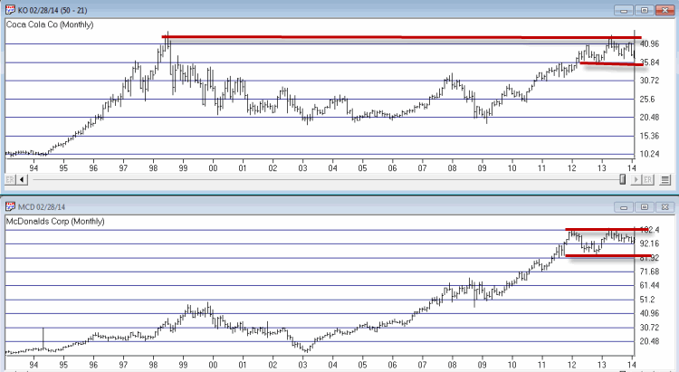
Figure 1 – KO and MCD Monthly (Courtesy: AIQTradingExpert)

Now if I were your typical “market analyst” I would next insert my opinions and arguments as to whether these stocks are destined to rise because [insert Analyst’s Bullish BS here] or to fall because [insert Analyst’s Bearish BS here].  And I’ll bet I could write something pretty compelling if I put my mind to it.   

Alas, the truth is that I haven’t a clue whether these stocks will rise or fall in the months ahead.  However, I do know that millions of investors will buy and sell shares of these stocks based on their own opinions.  I also know that for someone who is “on the fence” as to whether or not to buy shares, has [insert Analyst’s stupid pun here] “options.”

One Way to Play the Long Side of Coke

The obvious most straightforward play is to simply buy shares of stock.  Figure displays the “risk curve” for a position that involves buying 723 shares of KO at $37.10 a share.  Why 723 shares?  We’ll get to that in a moment.  

jotm20140220-02
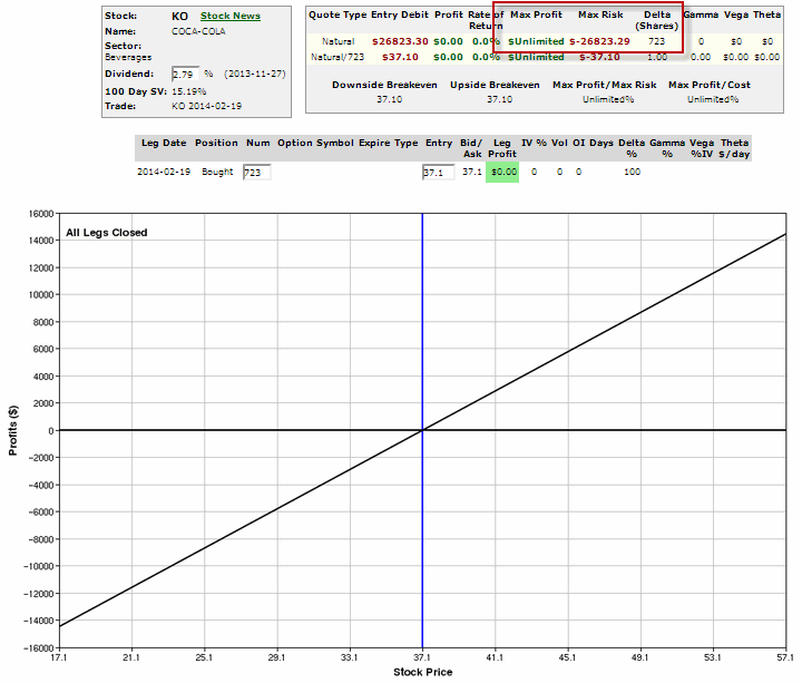
Figure 2 – Risk Curve for Long 723 shares of KO (Courtesy: www.OptionsAnalysis.com)

As you can see the math is pretty straightforward.  If the stock rise $1 in price this position makes $723 and vice versa.  Now let’s consider……

…A Less Expensive Way to Do Essentially the Same Thing

An alternative to buying 723 shares of KO and laying out $26,823 is to buy 10 January 2016 30 strike price LEAPS for $7.60 each.  This position costs only $7,600 (or about 28% as much as the stock position).  The risk curves for this position appear in Figure 3.jotm20140220-03
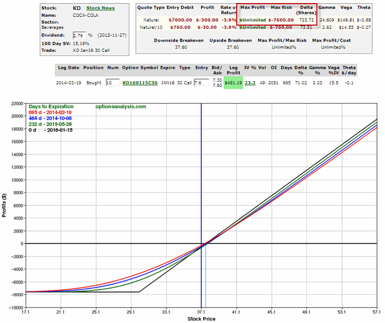
Figure 3 – Risk Curves for KO Jan 2016 30 LEAPS (10-lot) (Courtesy: www.OptionsAnalysis.com)

So What’s the Difference?

Basically what we have are two positions that will each rise or fall (roughly) $723 in value each time KO rises or falls by $1 a share.jotm20140220-04
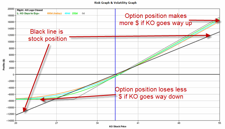
Figure 4 – Comparing the two positions

The Differences are:

*The option position costs $7,600 versus $26,823 for the stock position.

*In this case, if KO rises above about $40 a share, the option position will make more money (FYI, this is not always the case when using this “stock replacement strategy”)

*The option position cannot lose more than the $7,600 premium paid.  So if KO were to completely fall apart and drop precipitously the stock position could lose far more.

*On the plus side for the stock holder, KO currently pays a dividend of roughly 2.9%.

Summary

So am I arguing:

a. That you should be bullish on KO and that the best way to play is with an in-the-money LEAP option?

b. That KO is likely fall therefore you should limit your risk by buying call options instead of shares?

c. That options can offer numerous advantages relative to holding stock shares, particularly in cases where you do not have a strong opinion about the likely direction of a given security and even if you did you would probably not say anything because you write a blog that is intended to be strictly educational in nature?

I’ll let you ponder that one as homework.  In any event, now you know that there are alternative – often with significant potential benefits – to simply buying and holding shares of stock.    

Jay Kaeppel

Attention Speculators – It’s (G)Rainy Season

Sure everyone is focused on the weather.  Snow, sleet, freezing rain, brutal cold, etc.  What’s coming next?  How soon?  How much more can I take!?

But all of this drama simply distracts us from the really important question – to speculators anyway –  that being “How will all of this affect planting season?”

How soon will the snow melt?  How long before the fields thaw?  Will planting be hindered by any of this?  Is this exciting stuff or what!?  Well, in a way it is.  Because it is when there are no soybeans (or corn for that matter) in the ground in the Midwest that the doubts are greatest about the crop for a given year.  This often (typically?) has the effect of driving grain prices higher during late winter and into spring.

To wit, Figure 1 below displays an Annual Seasonal Trend Chart for soybeans since 1978.  In a nutshell it displays the average performance for soybean prices over the course of an average year.jotm20140218-01Figure 1 – Annual Seasonal Trend Chart for soybeans

Anything jump out at you?  Anything at all?

Well just off the cuff it seems reasonable to state that bean prices have displayed a tendency to rise between early February and late July as well as from early October through year end.

On the flip side, early July into early August and late August into early October look like a pretty good time to consider the short side of the bean market.

Of course, this chart represents a composite of many years of price action, and the reality is that during any given year, soybean price fluctuations can vary significantly from what appears in Figure 1.  So the idea of just buying soybean futures during the winter and holding on for months and waiting for the profits to roll in is not necessarily a wise game to play.  Especially considering the leverage involved in futures trading (http://tinyurl.com/leeveb3).


A Trading Approach to Soybeans

What follows should not be considered a “system”, but rather just an “idea” of one way to consider playing soybeans during the typically favorable winter/spring/early summer seasonal period.  Essentially, this method highlights a potential “entry method”, nothing more, nothing less.  Before a trader could consider using something like this in real trading there are other questions to be asked and answered, such as:

*How much capital will I commit to futures trading?

*How much capital will I commit to one trade?

*How much risk am I willing to take on any one trade?

*How will I exit a trade with a profit?

*How will I exit a trade with a loss?

You know, all the “boring” stuff that too many traders don’t like to think too much about because its not as “sexy” as a “cool” market timing technique.

Anyway, the “entry rules” are essentially as follows:

-If today is between January 1st and May 15th

-If the CCI Indicator (Commodity Channel Index) drops below -120 and then ticks higher for one day

-Then buy the next time July soybeans exceed the previous trading day’s high.

-Place a stop-loss x points below the entry price (or the recent low or whatever – sorry folks, you need to do your own homework and figure out what your comfortable with on this one).

The other part of the equation is deciding when to close a trade with a profit.  You can take a quick profit if it occurs, you can take a partial profit (if you are trading more than a 1-lot) and let the rest ride, you can take a partial profit and employ a trailing stop on the rest, and so on and so forth.  (Like I said, I am just highlighting a potential entry technique, not spelling out a “soup to nuts” trading “system.”)

In Figure 2 we see July 2013 soybeans.  The lower clip displays the occasions where the CCI ticked up after dropping below -120.  The upper clip displays the days when beans took out the previous day’s high after a red arrow in the lower clip. jotm20140218-02Figure 2 – July 2013 Soybean futures

As you can see, a lot of things can happen after an “entry” signal:

-The market may just run higher and all you have to do is figure out when to take your profit.

-The market may move higher for a few days and then fall back, which argues for some sort of “selling into strength” profit-taking.

-The market may not move higher at all (so where exactly should that stop-loss be placed?)

Hence the reason it is essential to determine specific answers to the questions posed above before engaging in any actual trading.

Summary

Whether the “method” I have described here will lead to anyone generating trading profits depends on a number of variables.  But remember the real point:

*We are in a seasonally favorable period for soybeans

*So we should be looking for buying opportunities

*A plan that includes money management and risk management is essential.

Jay Kaeppel

The Short Lesson in Leverage in Futures

While I have not written about them much lately, for the record, my belief is that commodity futures remain in many cases the best tool available for traders looking to speculate on price movements in many markets.

While I am obviously a huge fan of options and ETF’s, the fact remains that futures contracts offer the purest way to maximize profitability in many cases.  The problem is that far too many traders are “afraid” of futures, due to their reputation as being “risky” and the perception that price action in futures are more “volatile” that the price action in stocks or ETFs.

However, price volatility is not really the key factor.  I debunked this theory in my (WARNING! Shameless self-serving author plugging his book to follow) book “The Four Biggest Mistakes in Futures Trading” (http://tinyurl.com/lsnzhyw not be confused with http://tinyurl.com/lr85xd2) and displayed that in terms of shear price volatility, stocks are actually more volatile than futures. 

The double-edged sword in futures trading is the leverage involved.  A quick example to illustrate: Let’s assume Trader A wants to buy $100,000 worth of IBM stock and Trader B want to buy $100,000 worth of t-bond futures.

For example sake we will assume that IBM is trading at $100 a share and that the current price of a t-bond futures contract is 100.  Trader A would put up $100,000 and buy 1,000 shares of IBM stock.  For Trader B the calculation is a little different.  To buy or sell short one t-bond futures contract a trader must have a minimum of $2,700 of “margin” in his or her trading account.  So let’s review:

-Trader A puts up $100,000 and buys $100,000 worth of IBM stock

-Trader B put up $2,700 and buy 1 t-bond futures contract worth $100,000

Notice the difference?  Let me spell it out.  If both IBM and t-bonds decline 2.7% in value then:

-Trader A will lose $2,700, or 2.7% of his invested capital

-Trader B will lose $2,700, or 100% of his invested capital

Of course of IBM and t-bonds both rally 5% in value then:

-Trader A will gain $5,000, or 5% of his invested capital

-Trader B will gain $5,000, or 185% of his invested capital

Therein lies the difference.  As a result, futures trading is really as much a game of money management and risk management as it is a game of price movement

In the immortal words of Sean Connery as Malone in The Untouchables – “here ends the lesson.”

Jay Kaeppel

A Good Old Fashioned Trading Setup

My definition of the phrase “trading setup” is something along the lines of “a sequence or series of events which may signal a potentially profitable trading opportunity (or not).”

OK, perhaps that is not the most inspiring definition, but at least it is factually accurate.

In any event, let’s look at an example “setup” using the way old fashioned Welles Wilder 14-day RSI.

(My recent MTA webinar: “Finding Exceptional Opportunities”  http://go.mta.org/watch112013)

(My recent video: “How to Find Longer-Term Bull Call Spreads” http://jayonthemarkets.com/?p=303)

 Long Entry Rules

1. A security falls, sending its RSI below 40. This alerts you to potential bottoming action.

2. Next, within say the next 20 trading days, the security rallies, the RSI rises back above 40 and then the security declines again. Whether the security makes a new low or not is not relevant.

3. During this second decline the RSI must once again fall from above 40 to below 40.

4. Once the RSI moves back above 40 again, look to buy when the security makes a high that is higher than the high of the previous trading day.

Short Entry Rules

1. A security rises, sending its RSI above 60. This alerts you to potential topping action.

2. Next, within say the next 20 trading days, the security falls, the RSI declines back below 60 and then the security rises again. Whether the security makes a new high or not is not relevant.

3. During this second advance the RSI must once again rise from below 60 to above 60.

4. Once the RSI moves back below 60 again, look to sell short when the security makes a low that is lower than the low of the previous trading day.

An Important Note: For the record, a useful filter is to only consider Long Entry Rules when the security closes above it’s 250-day moving average and Short Entry Rules when the security closes below it’s 250-day moving average (i.e., trade pullbacks within a larger trend).

The advantage of not using a moving average price filter is that it can allow you at times to get in very close to an actual top or bottom. The disadvantage of not using the filter is that in a sustained price move you can end up trying to “catch a falling safe” or “stop a runaway train.” So a little bit of experimentation and “eyes wide open” analysis is required before actual implementation.

Another Important Note: There are a lot of important related topics that are not covered in this piece that would need to be addressed before anyone actually tried to make a trade sing the information contained here. For example:

-Position sizing (i.e., Money Management): What % of capital would you commit to a single trade? All trades combined?

-Risk Control (i.e., Risk Management): What % of capital commited to a trade are you willing to risk? Where will you place a stop-loss? Etc.

So remember, this is just an example of a “setup”, not an actual fully functioning trading system or method.

Example

CYA out of the way, let’s highlight a recent example using Nasdaq eMini Futures. In Figures 1 through 5 below you can see the sequence I described above:

Figure 1 – RSI drops below 40
Figure 2 – RSI rises back above 40
Figure 3 – RSI falls back below 40 a second time
Figure 4 – RSI rises back above 40 again
Figure 5 – NQ breaks above its previous day’s high and a rally ensures.

jotm20140214-01Figure 1 – RSI drops below 40

jotm20140214-02Figure 2 – RSI rises back above 40

jotm20140214-03Figure 3 – RSI falls back below 40 a second time

jotm20140214-04Figure 4 – RSI rises back above 40 again

jotm20140214-05Figure 5 – NQ breaks above its previous day’s high and a 150 point rally ensures.

So in a perfect world that’s the way it works. Some recent example of setups for the inquisitive to review are JPM, MSFT, YHOO and the Euro (futures symbol EC) on the upside and TLT, IBM and CSCO and Japanese Yen (futures symbol Y) on the downside.

Summary

Can it really be this simple?  Well, sometimes, yah.  But remember, a trading setup is not the same thing as a trading system. A setup simply alerts you to a potential opportunity. Actual entries, exits, capital allocation, etc. must be addressed in advance.

Still, the real point of this piece is simply to highlight how sometimes good old-fashioned setups can still be extremely useful.

Jay Kaeppel

JayOnTheMarkets.com: The Only (Two) Indicators You Will Ever Need(?)

Alright, last time out I wrote about the Coppock Guide (http://tinyurl.com/ndnvfbo), a long-term indicator invented by a guy named, well, Coppock, what else?  I soon received several missives informing me that the proper name was Coppock Curve or Coppock Indicator or – as this Coppock character himself called it initially – Trendex, or, just for fun – the Very Long Term Momentum Index.

So in the interest of all-important diversity I considered referring to it heretofore as the Coppock Trendex Very Long Term Momentum Guide Curve.  Fortunately, I let the urge pass.

This time out we will combine this indicator with another and examine the results.

The “Other” Indicator

The “other” indicator in this story is none other than that age old relic of an indicator, most commonly known as the “Golden Cross.”  Although I’d be willing to bet that there is at least one person out there who will insist that I refer to it as the “Golden Average of Two Averages of Prices Moving Independently but Occasionally Intersecting Thereby Triggering Lots of Market Followers to Feel Compelled to Do Something.”    Sorry to disappoint but I am already a little tired so we will simply proceed using the “Golden Cross” moniker.

For the benefit of the approximately four people out there who have never heard of this well worn indicator, it simply involves noting the position of the 50-day moving average of closing prices relative to the 200-day moving average of closing prices.  If the 50-day crosses above the 200-day average this is a “bullish golden cross”, and if the 50-day crosses below the 200-day average this is a “bearish golden cross.”  Figure 1 displays the Dow Jones Industrials Average from 2007 through 2010. 

As you can see, the idea is that the Golden Cross will typically do a good job of keeping an investor in gear with the major trend of the market (except of course for when it doesn’t.  We “trader types” typically refer to these periods as “whipsaws.”  Come to think of it, we “trader types” more often refer to them as “#$%^ whipsaws” – but I digress).jotm20140211-01 Figure 1 – Dow Jones Industrials Average with 50-day and 200-day moving averages (Courtesy: AIQ TradingExpert)

 Rather than comparing the performance of Coppock versus Golden Cross, what I want to do is combine them.

Combining Coppock Guide and Golden Cross

Using monthly data for the Coppock Guide and daily data for the Golden Cross, I examined the results since August of 1900 (Do I know how to have a good time or what?).

-I designated the Coppock Guide to be bullish if the latest monthly reading was above its monthly reading two months ago and bearish if the latest monthly reading was below its monthly reading of two months ago. 

-I designated the Golden Cross to be bullish if the 50-day moving average was above the 200-day moving average and vice versa.

From there each day was given a daily rating designated as:

0 = if neither indicator was rated as “bullish”

1 = If one indicator was rated as “bullish” but the other was not

2 = If both indicators were rated as “bullish.”

The results were “interesting.”

(“Interesting”) Results

Figure 2 displays the growth of $1,000 invested in the Dow Jones Industrials Average since 1900 only on those days when the daily rating was 0 or +1.jotm20140211-02

Figure 2 – Growth of $1,000 invested in Dow Jones Industrials Average only when daily rating is 0 or +1 (8/30/1900 to 2/7/14)

As you can see, the market had some great runs and some horrific declines during 0 and +1 periods.  It does not seem like a good idea to just say you are out and out bearish if the reading is 0 or +1, still, an original investment of $1,000 starting in 1900 would now be worth $737.  This represents a 114 year return of -26%.  I am going to go out on a limb and assume that you are looking for something a tad higher.

To that end, note that Figure 3 displays the growth of $1,000 when the bullish daily rating was +2.  In other words, the portfolio is invested in the Dow only when both the Coppock Guide and the Golden Cross are bullish.  This test assumes that no interest is earned while in cash.jotm20140211-03Figure 3 – Growth of $1,000 invested in Dow Jones Industrials Average only when daily rating is +2 (8/30/1900 to 2/7/14)

As you can see, these results are – what we “quantitative” types refer to as – “better.”

For the record, $1,000 invested in the Dow only on days with a +2 reading grew to $366,993, or +36,599%.

It is interesting to note that this “system” spent just 39.2% of the time in the stock market.  Given that it spends a lot of time in cash, it might make sense to do something besides stick the money in a mattress.

Adding Interest

If we assume that the system earns interest at a rate of 1% per year while out of the stock market, the growth of $1,000 balloons to $774,895, or +77,390%.

So we have a return of +77,390% when the daily rating is +2, versus -26% for all other days.

This is what we “quantitative” types refer to as “statistically significant.”

Summary

Now I hate to rain on my own parade but for the record, this blog offers “education”, not “recommendations.”  As such, the real purpose of the model presented here is not to convince you to use it to trade.  The real purpose is to get you to think in terms of starting with the simplest ideas and using them as building blocks to create a useful trading method of your own.

But whatever you do, don’t call it the “Very Long Term Momentum Index.”  Because apparently, that one is already taken….

Jay Kaeppel

Followup to ‘Only Indicator You Will Ever Need(?) Article

The last piece I wrote – about the Coppock Guide – generated a lot of interest.  It is always a comfort to be reminded that I am not the only “indicator junkie” out there.

A few notes which will hopefully answer a lot of questions that have been raised:

-Please note that I was not attempting to imply that yes, the Coppock Guide really is the only indicator you will ever need.  Hence the inclusion of these two sentences “So is the original Coppock Guide or my simple adaptation really the only indicator you will ever need?  In all candor the answer is certainly “no.”

-Please note the inclusion of the (?) in the title of the article, which was intended to make it more of a question than a statement.

-The headline was admittedly a cheap trick on my part to try to get people to read the article – which I apologized for in the opening sentence.

-Lastly, and most importantly, the version of the Coppock Guide that I presented, when used as a standalone indicator can underperform a buy and hold approach for very long periods of time.  This is particularly true when the overall market is extremely bullish.  This is not surprising given that the method I described is only in the market about 45% of the time.

So the bottom line is this:

*No, the Coppock Guide is NOT the only indicator you will ever need

*The method I described is only in the market 45% of the time

*I use the method that I described in the article as a “Weight of the Evidence” indicator rather than as a specific timing tool.

In my next piece I will combine the method I described in the last piece with another simple indicator to create a “composite model” (if in fact a two indicator model can be considered a composite).  The interesting thing about it is this:

From August 1900 through 2/7/14:

-$1,000 invested in the Dow Jones Industrials Average if both indicators are bullish grew +36,599% (if you factor in 1% of annual interest when out of the market, that figure more than doubles to +77,390%).

-$1,000 invested in the Dow Jones Industrials Average when neither or only one of the indicators is bullish lost -26%.

So that’s +36,599% (or +77,390% if interest is added) versus -26%.

That’s what we “quantitative” types refer to as “statistically significant.”

So stay tuned (I still need to think up a headline that will trick people into reading it…..)

Jay Kaeppel

The Only Indicator You Will Ever Need(?)

OK, I should probably apologize right off the bat.  For the record, I typically hate attention-grabbing titles like “The Only Indicator You Will Ever Need” and other stupid things like “What All Investors/Traders Should Do Right, er, well, you get the idea.  Let’s just chalk it up as a tough week for writing headlines.  Still, sometimes even an article with a self-serving, attention-bragging headline can hold at least a small kernel of knowledge that can make a difference for you over time.

At least, here’s hoping.

So how about a single stock market indicator that has over a 110-year track record and that has beaten the Dow Jones Industrials Average over that time by a factor of 1.4-to-1?  Let’s take a closer look. 

(Also for the record, and as long as I am apologizing for things, I should also point out that I do not actually advocate that you abandon all other forms of market analysis in favor of just the one I am about to describe.  But it sure might make a useful addition to whatever you are using now).

The Coppock Guide

The Coppock Guide is a technical analysis indicator created by E.S.C. Coppock, first published in Barron’s Magazine on October 15, 1962 (As an aside, I don’t recall coming across a lot of people with three initials for their first name.  Based on his work – as you will see in a moment – I am guessing its stands for “Exceptionally Superlong Calculations”. ) 

The indicator attempts to identify major buying opportunities in the stock market based on a shift in momentum. The indicator is only updated once a month using the monthly closing low for the Dow Jones Industrials Average. 

In “Formula” form it is: Coppock=Weighted Moving Average[10 ] of (ROC[14]+ROC[11])

In “short form” it is:  The sum of a 14-month rate of change and 11-month rate of change, smoothed by a 10-period weighted moving average.

In “Exceptionally Superlong Calculations” form it is:

A=Calculate the percentage gained or lost by the Dow over the past 11 months.

B=Calculate the percentage gained or lost by the Dow over the past 14 months.

C=Calculate the average of these two readings

D=Calculate a 10-month front-weighted moving average of C*

* Multiply this month’s average *10, last month’s * 9, the month before that by 8, etc. Then add together all of the values and divide by 55.

The resulting value for D is this month’s Coppock Guide value.

(Given these calculations is anyone surprised to learn that Coppock was an economist? (although given the usefulness of his indicator we won’t hold that against him).

The Guide Itself

Figure 1 displays the Coppock Guide with the Dow Jones Industrials Average since 1969.jotm20140207-01 Figure 1 – Coppock Guide (blue line) and Dow Jones Industrials Average (divided by 20) since January 1969

The standard interpretation is to wait for the Coppock Guide to drop into negative territory and then turn up as a sign of a buy signal.  And there is some value to that interpretation. But I have found that there is another way.

Jay’s Coppock Trend System

To put is as succinctly as possible:

*Up is good

*Down is bad

(OK, clearly I am never gonna make it as an economist)

But how do we define up and down? Here goes:

*The trend is UP if the Coppock Guide closes this month above its level of 3 months ago.

*The trend is DOWN if the Coppock Guide closes this month below its level of 3 months ago.

How good is up? And how bad is down? Figure 2 displays the growth of $1,000 starting in 1902 through today using this method (and assuming that 1% of interest is earned annually while out of the stock market) versus a buy-and-hold approach. jotm20140207-02Figure 2 – Jay’s Coppock Trend System versus Buy and Hold (December 1902 through January 2014)

My version most recently turned bullish at the end of October 2012 and (for better or worse) remains so as of the end of January 2014.

So how does this simple method compare to buying and holding the Dow?

For the record, as of 1/31/2014:

*$1,000 invested at the starting point of this test at the end of 1902 using a buy-and-hold approach would be worth $333,309.

*$1,000 invested using my Coppock Trend System would be worth $466,911.

*My Coppock Trend System was only in the stock market about for 606 out of 1,333 months, or 45.6% of the time and in cash 54.4% of the time. 

One other thing to note:

*When my Coppock Trend System was bullish, the Dow gained +25,382%.

*When my Coppock Trend System was bearish, the Dow gained only +31%.

You don’t need to be an economist to recognize that the difference between those last two numbers is “statistically significant”.

Summary

So is the original Coppock Guide or my simple adaptation really the only indicator you will ever need?  In all candor the answer is certainly “no.”  So I apologize again if you got sucked in by the headline.  But perhaps not all that profusely.  For given the indicator’s apparent usefulness over such a long period of time, you might be wise to take note at the end of each month whether it is presently bullish or bearish.

 Jay Kaeppel

Follow me on Twitter @jaykaeppel

What All Investors/Traders Should Do Right Now!

Boy it doesn’t take long any more does it?  The Dow Jones Industrials Average is down about 7.25% from a peak and suddenly we are staring into the abyss of a 1929 repeat? 1929

Now for the record, I am not saying that it is not possible.  My own personal opinion is that I am not thrilled with the world economy and that very bad things are quite possible, particularly between now and October.

But now that the stock market is “selling off” and “panic appears to be setting in”, many investors and traders are asking the question, “what should I do now?”

The answer is – or at least it should be – very simple:

Continue to follow your well thought out investment/trading plan that incorporates acceptable position sizing and strict risk controls.

Now that wasn’t so difficult was it?  If you have been investing/trading without this, please note:

Jay’s Trading Maxim #3: There are two keys to investing/trading success: 1) Adopting a method that has a realistic probability of making money in real-time (i.e., you must have a plan), and, 2) Having the emotional and financial wherewithal to follow the plan.

And while we’re at it, also remember:

Jay’s Trading Maxim #3a: If you are going to go to the trouble of creating an investment/trading plan, you might as well make it a good one.    And if you have a good trading plan, you might as well go ahead and follow it.

Summary

So upon further review, perhaps this piece would more accurately be titled, “What All Investors/Traders Should Do Right Now…and again tomorrow…and the day after that… and so on and so forth…..”

Jay Kaeppel

A ‘Seasonal/Technical Setup’ in T-Bonds

Sometimes trading ideas result from putting a “few pieces of the puzzle together”.  So here’s an “idea” that does just that (please note that I said “idea” and not “recommendation”).

Figure 1 displays the annual seasonal trend for t-bonds since 1978.  As you can see there tends to be weakness early in the year and better times later in the year.  Needless to say not every year follows this map.  Nevertheless there is an interesting confluence of “things” at the moment.  To wit:

#1. The seasonal chart in Figure 1 is indicating that we are entering a seasonally unfavorable period for t-bonds that extends through the end of February. jotm20140130-01 Figure 1 – Annual Seasonal Trend Chart for T-Bonds (weakness early, strength later)

#2. As shown in Figure 2, T-bonds (as measured using the exchange-trade fund ticker TLT ) recently experienced a “rally in a downtrend”, i.e., TLT is below its 200-day moving average and the 3-dy RSI was recently overbought and carved out a slight bearish divergence.

jotm20140130-02  Figure 2 – Ticker TLT – overbought in a downtrend (Courtesy: AIQ TradingExpert)

So does this confluence of factors guarantee a new downtrend?  I wish it were that simple.  Still, the trader with a penchant for, well, trading, might feel the urge to play the downside.  One choice would be to sell short shares of ticker TLT.  But that strategy involves margin and unlimited risk – definitely not my favorite combination.  So how about a low cost play to participate in any downside t-bonds action with limited risk?

The most aggressive play would be to buy an out-of-the-money TLT put option and to try to leverage any meaningful downside movement.  But remember, we are making no forecast as to how far TLT may fall (if it falls at all) so we would like to be in a position to profit even on a relatively small downside move.

FOR THE RECORD: The “seasonal” part of this setup technically does not begin until the close on 1/31/14.  So what follows is an example of a trade based on data from 1/30/14.

So in this example we will look at the “stock replacement strategy” and consider buying a deep-in-the-money put option on TLT.  To do this I will use the “Find Trades++” routine at www.OptionsAnalysis.com.  In Figure 3 you see that I have set up to look or put options with at least 30 days left until expiration and a delta of 80 or more (technically this implies a put option delta of -80 to -100, but I’m not in full options geek mode at the moment so we will just leave it at that).  In a nutshell we are looking for a put option whose price changes will track closely with that of TLT shares themselves.  In a nutshell a delta of 80 or more implies that if TLT moves $1.00 in price the option will move $0.80 (OK, so much for avoiding full options geek mode).  jotm20140130-03

Figure 3 – Buy Put inputs (Courtesy: www.OptionsAnalysis.com)


After running “Find Trades++” I then sort the output list to find the trade in the list with the highest “gamma”. The trade that comes up is buying the March 114 put option for $7.75.  The option has a delta of 77.78 and a gamma of 3.62.  This means that if TLT moves $1 in price this option will moves roughly $0.78 in price and the delta will either rise or fall by 3.62 depending on whether TLT falls or advances (Wow, we have somehow plunged into options geek hell, my apologies).  The risk curves for this trade appear in Figure 4.jotm20140130-04 Figure 4 – Risk curves for deep-in-the-money TLTput option trade (Courtesy: www.OptionsAnalysis.com)

A few things to note:

-This option has a very wide bid/ask spread of 7.10/7.75, so a limit order of some sort would seem to make sense.

-TLT is trading at $107.56.  This will trade will move point-for-point with TLT shares if and when TLT falls below $106.25.

-It is possible to buy a much less expensive option with a much tighter bid/ask spread and that offers a higher percentage profit potential (example, the March 106 put for $1.27).  The only reason for considering the deep-in-the-money put is to seek point-for-point movement with the underlying TLT shares and to limit the potentially negative effects of time decay.


Summary

So will this trade make money?  It beats me.  Is it even a good idea?  Well, I guess that is in the eye of the beholder.  The primary point here is simply to point out one way to combine:

-A seasonal trend (i.e., historical weakness during this time frame for t-bonds)

-A technical setup (i.e., an overbought market that is bumping up against a long-term moving average) and;

-A bearish indicator divergence (4-day RSI not confirming a new price high.

-A limited risk strategy that ties up and risks several hundred dollars (rather than several thousand dollars) yet which can still achieve point-for-point movement with the underlying shares (once below the breakeven price.

Wow, this sounds great!  Gee, I hope it works out.  Ah, there’s the rub.  No matter how “perfectly aligned the stars” seem to be, no trade is ever certain to generate a profit (I hate that part about trading).  Hence the reason a measured risk option trade makes a lot of sense.

Finally, just remember that this is an “example” of something, not a “recommendation”.

Jay Kaeppel


Jay’s ‘Energetic Market Shoppers’ System

In my previous article I wrote about a simple “system” – if you can even call it that – that involves buying retailing stocks four months out of the year and holding cash the rest of the year.  As ridiculously simple as that sounds the fact of the matter is that if you earned just 1% of annualized interest while out of retailing stocks, the system outperformed a buy-and-hold approach by a fairly wide margin.

While the results of that simple system aren’t bad, as always, one can’t help but to look for ways to improve things.  So this article will detail what I refer to as – and by the way, this is what I sound like when I refer to myself in the third person – “Jay’s Energetic Market Shoppers” System, or JEMS (clever, no?) for short.  The name is derived from the investment vehicles involved:

1. stands for, well, OK, Jay….

2. E stands for “Energetic”: Energy stocks have showed a historical tendency to rally in the spring so we will hold Fidelity Select Energy (ticker FSENX) during the month of April (other possibilities include tickers XLE and ENPIX).

3. M stands for “Market”: The stock market tends to perform well during November, December and January.  We are already planning to hold retail stocks during November, but for December and January we will hold an S&P 500 index fund.  For the purposes of this test we will use the S&P 500 Index itself from 1988 into 1997.  From there we will use the ETF ticker SPY.  Someone who wanted to keep it all in the Fidelity family could use ticker VFINX. (Another possibility is ticker BLPIX).

4. S is or “Shoppers”: Just as with the original system, we will hold Fidelity Select Sector Retailing (ticker FSRPX) during February, March, October and November (other possibilities include tickers XLY and CYPIX).

During May, June, July, August and September we will hold cash.

So here is the “lineup”

January                SPY

February              FSRPX

March                   FSRPX

April                       FSENX

May                       Cash

June                      Cash

July                        Cash

August                  Cash

September         Cash

October               FSRPX

November          FSRPX

December           SPY

So how does it work out?  Not too badly.  Figure 1 displays the growth of $1,000 using the JEMS System versus buying and holding the S&P 500.  jotm20140129-01Figure 1 – Growth of $1,000 using “Jay’s Energetic Market Shoppers” System versus buying and holding the S&P 500 since 1988.

Figure 2 displays the year-by-year results.

JEMS

S&P 500


JEMS

S&P 500

Annual %

Annual %

Difference

$1,000

$1,000

1988

25.4

12.4

7.0

1,254

1,124

1989

12.4

27.3

(27.6)

1,410

1,430

1990

12.2

(6.6)

28.7

1,582

1,336

1991

36.6

26.3

(9.4)

2,161

1,688

1992

27.7

4.5

16.6

2,760

1,763

1993

10.5

7.1

(0.1)

3,050

1,888

1994

10.5

(1.5)

0.7

3,369

1,859

1995

8.1

34.1

(31.1)

3,642

2,493

1996

19.5

20.3

(2.1)

4,353

2,998

1997

14.2

31.0

(18.4)

4,970

3,927

1998

50.5

26.7

14.3

7,479

4,975

1999

42.4

19.5

(7.9)

10,652

5,946

2000

(2.4)

(10.1)

19.4

10,400

5,343

2001

15.6

(13.0)

16.8

12,027

4,646

2002

3.5

(23.4)

36.9

12,450

3,561

2003

10.5

26.4

(16.6)

13,755

4,500

2004

18.9

9.0

4.6

16,354

4,905

2005

(1.1)

3.0

6.2

16,182

5,052

2006

14.8

13.6

(3.7)

18,574

5,740

2007

2.4

3.5

(5.3)

19,027

5,943

2008

(30.4)

(38.5)

7.0

13,237

3,656

2009

33.2

23.5

1.0

17,635

4,513

2010

32.5

12.8

14.0

23,366

5,090

2011

17.2

(0.0)

14.0

27,381

5,090

2012

21.3

13.4

4.7

33,204

5,772

2013

16.7

29.6

(18.2)

38,752

7,481


Average

16.3

9.6

1.3

StdDev

16.1

17.9

Ave/SD

1.011

0.540

Figure 2 – Year-by-Year Results

For the record:

-The JEMS System sported an average annual gain of +16.3%

-Buy/Hold sported an average annual gain of +9.6%

-$1,000 invested using the system grew to $38,752

-$1,000 invested using Buy/Hold grew to $7,481

-The JEMS system showed a gain in 23 of 26 calendar years (88.5%)

-The JEMS system showed a loss in 3 of 26 calendar years (12.5%)

-Buy/Hold showed a gain in 19 of 26 calendar years (73.1%)

-Buy/Hold showed a loss in 7 of 26 calendar years (26.9%)

-JEMS outperformed Buy/Hold in 15 of 26 calendar years (57.7%)

-Buy/Hold outperformed JEMS in 11 of 26 calendar years (42.3%)


Summary

So is the JEMS System the “world beater” system that everyone should be using?  Well, on the plus side the long-term results are impressive relative to buy and hold.  On the downside, there is still the sharp drawdown of 2008 that one would have had to continue to trade through.  Also, the reality is that for most investors, a system like this involves more of a “leap of faith” than they are comfortable with.

Of course, as a proud graduate of “The School of Whatever Works” and as a founding member (OK, so far the only member) of “Seasonalaholics Unanimous!”……

………that’s just the way I like it.

Jay Kaeppel