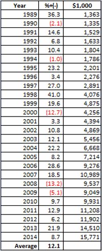
A Short Story in Gold

A week ago I wrote an article (http://tinyurl.com/prxklkh) detailing a potential bullish trade in gold using call options on the ETF ticker GLD.

Oops.

One week later, instead of breaking out to the upside of the triangle pattern it had been forming, gold (and have I mentioned lately that Murphy hates me?) broke hard to the downside.  In the article I mentioned the idea of stopping out of the trade if GLD hit 122.00.  It did.

So let’s recap and see if there is anything to learn. Let’s start with:

Jay’s Trading Maxim #14: Trading is not about right and wrong, trading is about dollars and cents.

In other words, trading should not be about ego, it should be about making a lot when when you make money and not losing a lot when you lose (Or alternatively, if your winning trades tend to be small by design, then winning a whole lot more often than you lose).   

And good thing too.  Because if trading is about ego, then this trade is a debacle.  One day I publicly put out an idea to play the long side of gold and one short week later the bottom drops out.  From an “ego” standpoint it doesn’t get much worse than that.  But here is the bottom line:

This trade lost $135. So repeating from last week:

Jay’s Trading Maxim #56: Before you put on a trade, imagine the absolute worst case scenario.  If you can live with it, go for it.  If you can’t, go away.

I can live with $135 loss.  In fact, let me be brutally candid: I you can’t lose $135 without getting your ego bruised you should not be a trader.

One other maxim that seems to fit:

Jay’s Trading Maxim #36: When entering into any speculative investment, risk a little to make a lot.


Some comments from a trader I knew early in my career led me to create the following two maxims.

Jay’s Trading Maxim #46: If you are trading right, every trade should be just as unimportant as every other trade.

This one can use a tiny bit of explanation.  What he basically meant was that if you are trading without ego then there will be no times when you “load up” on a position because you “just know” that this is going to be “the big one.”  If you “root” for every trade like you’re rooting for your horse to win the Kentucky Derby then you are not “trading right.”

“Trading right” means taking out the emotional highs and lows that are tied to “being right.”

And finally:

Jay’s Trading Maxim #47: The sole purpose of a stop-loss is to “save your sorry assets.”

This one needs no explanation.

Jay Kaeppel

A Play in Gold

In the interest of full disclosure, this one is for speculators only. And if you’re a cheapskate (“Hi, my name is Jay”) that probably works in your favor here also.

But in a nutshell we are talking about “speculating in gold.” Now the very phrase – “speculating in gold” – makes some people snap to attention and greatly piques their interest.  It makes other people run like hell.  But in reality it all depends in large part on how you define “speculating in gold”.

If you define it as “scraping together every last dollar you can to put up as margin to buy as many gold futures contracts as you possibly can”, well, that’s one thing.  If you define it as “trading call options on ticker GLD” – the ETF that tracks the price of gold, well that is something slightly different.  As inferred in:

Jay’s Trading Maxim #56: Before you put on a trade, imagine the absolute worst case scenario.  If you can live with it, go for it.  If you can’t, just go away.

So buying a lot of gold futures contracts invariably involves the assumption of a pretty fair amount of risk.  Buying a call option on GLD, maybe not so much.

So Why Gold Now?

Gold – in my humble opinion and in highly technical terms – is about to do “something.”  And I would dearly love to tell you just exactly what that “something” might be.  Alas, my crystal ball is still out of order so I must rely on whatever the best clues available that I can find.

Factor #1: Gold is “Coiling”

In Figure 1 you can see that GLD is reaching the end of a triangle formed by an extremely narrow and ever tighter trading range.  Eventually price will break out.  According to us “technical analyst types” when price breaks out of a tight triangle it tends to move strongly in one direction or another.  I am willing to risk a couple of bucks that that will be the case here.  You of course, may feel differently.jotm20140521-01Figure 1 – GLD is “coiling” and Elliott Wave is still pointing to a higher projection (Source: ProfitSource by HUBB)

One possibility is to buy an option straddle or strangle – i.e., buy a call and a put option and hope GLD moves far enough to make enough money in one of the options to offset the loss in the other.  In this case I am looking to bet on the upside.

Factor #2: Elliott Wave is still point higher         

As you can also see in Figure 1, the Elliott Wave count – as calculated by ProfitSource by HUBB is still clinging to a higher projection.  I say “clinging” because clearly the expected time window for the move is just about up.  For the record, I am not expecting GLD to rise 12 points in the next several days.  But I am willing to play the upside.

Finding a Play in GLD Options

When it comes to selecting an options trade there are always a lot of possibilities.  One straightforward choice would be to buy a near the money call option with the highest “Gamma” value (which without a long explanation essentially affords you the most “bang for the buck” in my opinion).  So a trader could consider the July 125 call trading at $2.42.  This would cost $242 for a 1-lot and could generate a profit of close to $500 if GLD popped up to $132 a share.

Another choice would be to buy an out-of-the-money butterfly spread.  For example, one could:

Buy 3 August 130 call

Sell 6 August 140 calls

Buy 3 August 150 call

And even though this trade involves August options, let’s assume that we will plan on exiting this trade by 7/18 to avoid the negative effect of time decay in the month prior to option expiration. See Figures 3 and 4 for details.jotm20140521-02Figure 2 – GLD August OTM Butterfly Details jotm2014-0521-03Figure 3 – GLD August OTM Butterfly Risk Curves

As you can see in Figure 3, the total cost and total risk for this trade is $273.  Not exactly “betting the ranch.”  In fact this trade could be exited if GLD dropped below $122.  If that happened quickly, the loss would be something less than $273.

In Figure 4 we see that if GLD rises roughly one standard deviation in price to $132 a share, this trade can generate a profit near $500.

Summary

As always, this is not a “recommendation”, only an idea.  And in the end, let’s be honest, it might not even be a very good one.   Sure, if gold pops to the upside this trade may end up looking pretty good.  But if gold breaks to the downside – especially if it does so soon – this trade is going to look darn right foolish.  Which reminds me of:

Jay’s Trading Maxim #29: At the end of the day the question to ask is not “Was I right?”, but rather “How much did I make or how little did I lose?”

For now let’s ask the most obvious questions: Will GLD in fact break out to the upside?  And will this OTM butterfly spread generate a profit?  Now these seem like pretty reasonable questions, but the reality is that no matter what you or I think, they can only be answered with certainty in hindsight.

So let’s ask a more relevant question.  Do you have $273 bucks that you can afford to risk?

If your answer is “No” then by all means you should not consider this trade.  If your answer is “Yes”, that still does not mean that you should consider this trade.  If you have never traded an option or a butterfly spread before, I personally would prefer that you don’t make your debut here.  But maybe look for opportunities on your own to do something similar in stocks or markets that you are comfortable trading.

Limited dollar risk and an almost 2-to-1 upside to risk potential is something to think about. Maybe not now on my terms.  But maybe sometime in the future, on your own terms.

Jay Kaeppel

The Fate of the Planet Hangs in the Balance….

Well, OK, maybe not.  But life here in the Good Old US of A may be affected profoundly.  Which of course, would ripple out and affect much of the rest of the world.  So maybe it’s not that outrageous.

In any event, it sure is a catchy title, no?  In truth this piece is not an immediate call to action, but rather one of those short “hey, you might want to keep your eye on this” type pieces.  I am writing about the U.S. Dollar.

There are pro’s and con’s to a strong U.S. Dollar and there are pro’s and con’s to a weak U.S. Dollar.  If you would like to know what they are please see the steps below:

Step 1) Go to your web browser.  Type www.google.com and press Enter

Step 2) Type “pros and cons of strong U.S. dollar” and press Enter.

Step 3) Browse among the approximately 308,000 or so links until you find your answer.

Step 4) Type “pros and cons of weak U.S. dollar” and press Enter.

Step 5) Repeat Step 3.

Since at least the end of the gold standard in 1971 the U.S. dollar has served as the world’s “reserve currency”.  (This basically means that if you could only hold one currency you would want to hold the dollar.)  This has become one of those things that most people take for granted and assume will go on forever.

Still, given that we are now the most indebted “We the People” in the history of the planet, perhaps we shouldn’t be surprised that there has been a lot of talk recently (granted mostly among intentionally frightening and mostly annoying infomercials) about how the days of enjoying “reserve currency” status are numbered, and how this will trigger a panic out of the dollar, which will lead to all kind of bad things like, well, see Step 4 above.

Will the Dollar Collapse?

For me to pretend that I have the slightest idea whether or not the U.S. dollar will someday collapse would be a joke, and not the  funny kind.  But as  a trader and investor my “thing” is not so much “what will happen” as it is “what could happen and what the heck do I plan to do about it if it does?”

Which leads me to the following distractions:

Jay’s Trading Maxim #235: It’s not so much how much you make when things go right, but how much you keep when thing goes wrong.

Jay’s Trading Maxim #236: If you take care of the losing trades, the winning trades will take care of themselves (OK, for the record, this is not mine, I just gave it number 236 so I could use it as a segue into…..)

Jay’s Trading Maxim #237: Successful traders worry less about “Kicked Ass” and more about “Ass Kicked”, if you get my drift.

So why am I bringing all of this up?  Take a look at Figure 1 which displays a monthly chart of continuous U.S. dollar futures.  While the history of U.S. dollar trends is all very interesting and I would love to recap it for you, I am going to opt for the “a picture is worth a thousand (likely incredibly boring) words” mantra and encourage you simply to glance at Figure 1 if you want to know where the dollar has been in the past. 

And when you do – here is the important part – note that the dollar is forming a narrowing triangle (is there another kind?) pattern.  In other words, starting with the high in 2006 the dollar has been fluctuating in an ever smaller range.  dxFigure 1 – A large triangle forming (Courtesy: AIQ TradingExpert)

We “market analyst types” refer to this as “coiling” action.  Now if you are like me chances are you just squirmed slightly when you read that last sentence.  Because we all know what happens when something stops coiling – that’s right, it “uncoils”.  And “uncoiling” is typically not a quiet affair.

So here is the bottom line.  At some point – and just for the record it might not be for several years – the U.S. dollar will break out of this triangle one way or the other.  And chances are it will move sharply in price from that point.  And whether it breaks out to the upside or the downside it will have significant implications for the quality of life here in the U.S.  If you don’t believe me, see the 308,000 links referenced in Step #3 above.

So make a note to check in on the dollar once in awhile.  Because one of these days something profoundly significant is going to happen.

Jay Kaeppel

When the Dow Breaks, the Sectors will Fall….

…and down will come, well just about everything, as far as I can tell.

OK, for the record maybe it should say “If the Dow Breaks.”  After all I am still firmly ensconced here at “Camp Bull.”  I would like to attribute this to disciplined nerves of steel, but it would be an understatement to say that that would be an overstatement.  The truth is my crystal ball broke a very long time ago (sadly I continued believing what it portended for a long time before I realized it was actually broken).  So I have long since held dual citizenship in “Camp Trend Follower”.

But I have got be honest…..I am feeling the urge to run like a sissy through the woods to “Camp Yikes”. 

The Overall Market

Defining the “overall” market is something of a crapshoot these days, as some of the “overall” market seems to be going one way and another part of the “overall” market seems to be going another way.  In Figure 1 we see the Dow, the S&P 500, the Nasdaq 100 and the Russell 2000. jotm20140514-01Figure 1 – The Four Major Averages with 200-day moving averages

In a nutshell, the “Generals” are still marching but the “Troops” are in retreat.  Now every market pundit seems to be offering up their opinion as to whether the “Generals” will ultimately lead the troops higher or the other way around.  With my crystal ball still out of order I must unfortunately go with my stock answer here of “it beats the heck out me.”  And “hey things are swell here at Camp Bull.”  But I have been around this business long enough to remember several instance where the “Troops” led the way (1984, 1987, 1990, 2000, 2008) and the “Generals” followed.  So we’ll see what we see.

OK, just in case that little segment was not foreboding enough, let’s get to the really “scary” part.

Sectors Suck in Summer (during Mid-term years)

One caveat before I even launch, the sample size of what I am about to detail is very small (6 calendar years each four years apart starting in 1990).  Also, that’s the good news.  As a “seasonalaholic” (“Hi, my name is Jay”) I am acutely aware of the following facts:

1. The market tends to perform better between the end of October and the third trading day of the following May than it does from the third trading day of May through the end of October (also known as “Where We Are Now.”)

2. This is a mid-term election year.

I also do a lot of work with sectors and sector funds as I have found that investing at the right sector at the right time is – all kidding aside – one heck of a great way to invest.

So I was curious as to which sectors tended to perform the best during the May to October period during mid-term election years.  Here is the short list:

Health Care.  Period.

Everything else.  Well on a buy in May and sell in October basis – let’s just say it isn’t pretty.  So here is the test I ran:

Tracking the growth of $1,000 invested in each Fidelity Select Sector fund only:

*Between the close of May trading day 3 and the end of September (for the record, October tends to be an OK month during mid-term election years – more on this topic in a future article) during each mid-term election year.

The results appear below in Figure 2.  If you are squimish you might want to brace yourself.

Fund

%+(-)

FBIOX

(12.1)

FBMPX

(34.5)

FBSOX

(36.9)

FCYIX

(28.8)

FDCPX

(42.4)

FDFAX

(3.7)

FDLSX

(45.9)

FIDSX

(55.9)

FNARX

(35.4)

FPHAX

(18.6)

FSAGX

(1.6)

FSAIX

(65.7)

FSAVX

(71.4)

FSCGX

(58.9)

FSCHX

(49.7)

FSCPX

(31.2)

FSCSX

(35.9)

FSDAX

(62.7)

FSDCX

(38.2)

FSDPX

(57.5)

FSELX

(71.0)

FSENX

(42.9)

FSESX

(65.3)

FSHCX

(20.1)

FSHOX

(79.1)

FSLBX

(59.1)

FSLEX

(49.6)

FSMEX

(12.0)

FSNGX

(47.5)

FSPCX

(27.2)

FSPHX

41.6

FSPTX

(42.0)

FSRBX

(59.5)

FRESX

(26.4)

FSRFX

(61.2)

FSRPX

(43.8)

FSTCX

(35.4)

FSUTX

(12.1)

FSVLX

(59.1)

FWRLX

(32.8)

FNARX

(35.4)

Figure 2 – Net %+(-) invested only between 3rd trading day of May and last trading day of September during mid-term election years (1990 , 1994, 1998, 2002, 2006, 2010, 2014)

Anyone notice a trend? To see just how bad things can be, once you are able to work yourself back up out of the fetus position, take a glance at Figure 3, which shows the three worst performers during the May-Sep mid-term year period – FSAIX (-71%), FSELX (-71%) and FSHOX (-79%).jotm20140514-03 Figure 3 – FSAIX, FSELX, FSHOX – growth of $1,000 May through Sep of mid-term election years (1988-present)

Now I have an obvious flare for the obvious (which I think should be pretty obvious – also I tend to repeat myself) but I am not even going to comment on Figures 2 and 3.

The Good News

The one mistake you should not make based on looking at these numbers and charts is to assume that it is not possible to make money in sector funds between May and September of mid-term years.  It just requires something better than a buy and hold approach.  Several momentum systems and seasonal plays that I have developed over the years have still managed to show some pretty good gains historically “among the ruins” of midterm election summer months.

But if you’re gonna play, you’d better bring your “A” game.

Summary  

Repeating now – I am still in “Camp Bullish.”  And ideally I’d like to spend the summer.  There seems to be a lot of fear and loathing among the “crowd” that I follow regarding the stock market.  Typically that’s a good thing and suggests that the stock market just might surprise everyone this time around.  And I hope that it does.

But I will be keeping a pretty close eye on my “camp mates” in the days and week ahead. Any sign of “trouble” (i.e., Dow, S&P breaking below 200-day moving averages) and they are going to have to send a search party out to find me……

Jay Kaeppel

Garbage in Gold Update

On 3/7/14, I wrote a piece called “There’s Garbage in That Thar Gold”.  That article highlighted a hypothetical trade using put options on ticker GLD.  The position was basically a low cost hedge against a decline in the price of gold that used a strategy known as “The Garbage Trade” which I learned from Gustavo Guzman, a former colleague of mine at Optionetics.

(Most recent article: JayOnTheMarkets.com: A Warning Sign to Watch http://tinyurl.com/mxr7jg7)

Well some “stuff” have happened since then.  Ticker GLD has declined from 130.16 a share to 124.17.  So had a trader assumed the risk of selling short 100 shares of ticker GLD he or she would presently be holding a trade with an open profit of 4.6% in 62 days.  Not bad, but consider the alternative.  The original Garbage Trade involved:

Buying 4 Jun 125 puts

Selling 8 Jun 119 puts

Buying 4 Jun 113 puts

The total cost to enter this trade – and the maximum, worst case loss – was $272.

As of the close on 5/7/14 this trade is showing an open profit of $304, or +111.8%, as shown in Figure 1. jotm20140508-01

Figure 1 – Updated GLD “Garbage Trade” (Courtesy: www.OptionsAnalysis.com)


So consider the following choices:

*Put up margin and assume unlimited risk to sell short 100 shares – return to date: +4.6%

*Put of $272 as your total risk to enter the garbage trade – return to date: +111.8%

This is a simple but powerful example of the potential leverage power – and risk limiting capabilities – of using options.

Adjusting the Trade

As you can see in Figure 1 this option trade still has a great deal of additional profit potential if gold continues to decline.  But it also still has the potential to end up as a losing trade.  So for arguments sake, let’s say you were pretty happy with 111.8% and didn’t want to take a chance of giving it all backing and/or possibly still end up losing money – which could happen if GLD rallies (or declines) far enough between now and June option expiration.  Options give you a lot of flexibility in terms of trade adjustments.  Let’s consider the following potential theoretical adjustment:

*Let’s simply close out half of the option position

This leaves us with the position that appears in Figure 2.  Note that the maximum profit potential is reduced significantly.  However – and more importantly, this adjusted trade has a locked in profit (before commissions).jotm20140508-02Figure 2 – Adjusted Garbage Trade that eliminates risk of loss  (Courtesy: www.OptionsAnalysis.com)

So a trader who put on the original position risking $272 and made the adjustment above, now has an open profit of $304 and no more risk of loss.

Summary

So is this the great trade of all time?  Hardly.  But the point is not really to hype the trade but simply to point out the potential for entering low cost trades using options that can take advantage of “possibilities” as well as the potential to adjust such trades to lock in a profit.

Jay Kaeppel

A Warning Sign to Watch

Last week (http://tinyurl.com/koen2lqI wrote my (obligatory) “Sell in May” related article (I’m pretty sure there is a law that all market writers must write at least one “Sell in May” related article each year – how else to explain the glut).

To sum up, there could be great trouble in the stock market in the next several months- or not – depending.  OK, granted that kernel of knowledge is not necessarily very helpful, but at least it is factually correct.    

May to November in Mid-Term Years

Figure 1 displays the performance of the Dow between the close of the third trading day of May and the end of October during mid-term election years since 1962.  jotm20140506-01

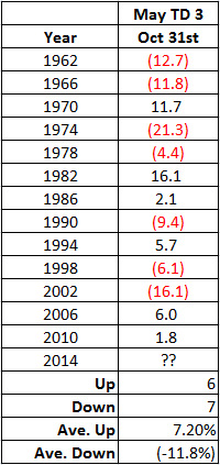
Figure 1 – Dow % +(-) from close of 3rd trading day of May through October 31st during mid-term election years

Interestingly, the net result of all of this is a loss of -37.6%.  So at first blush one might assume that selling now is the proper course of action. But things are never cut and dried when it comes to the stock market (have I mentioned lately that I hate that part).  As you can also see in Figure 1, 6 times the Dow showed a gain, 7 times a loss.  So it is not like the market declines during this time period every four years.  Not even close. It is just that when things do go wrong they tend to go really wrong.

Keep an Eye On the Weekly MACD for the Dow

So how do we know if 2014 is going to be one of the “things really gone wrong” years or not?  Well, we can’t, but we can keep an eye on certain warning signs.  One that might be useful is the MACD indicator applied to the weekly price data for the Dow Jones Industrials Average (using the standard 12/25/9 parameter values).

For our purposes we will use some relatively (OK, ridiculously) simple rules:

MACD Oscillator > 0 = GOOD

MACD Oscillator < 0 = BAD

A few caveats before we look at some previous results.  First, this does NOT constitute a trading “system”, nor would I even call it a “market timing” tool.  I would refer to it simply as a filter that can help to guide you in deciding how aggressive (or not) to be in the stock market in the months ahead.

The History

Figure 2 shows 1970.  The MACD broke down prior to early May and the Dow broke hard in May before reversing back to the upside.  In this case the MACD filter would have kept an investor out of some choppy market action.  (FYI: The charts in Figures 2 through 14 are courtesy of AIQ TradingExpert).
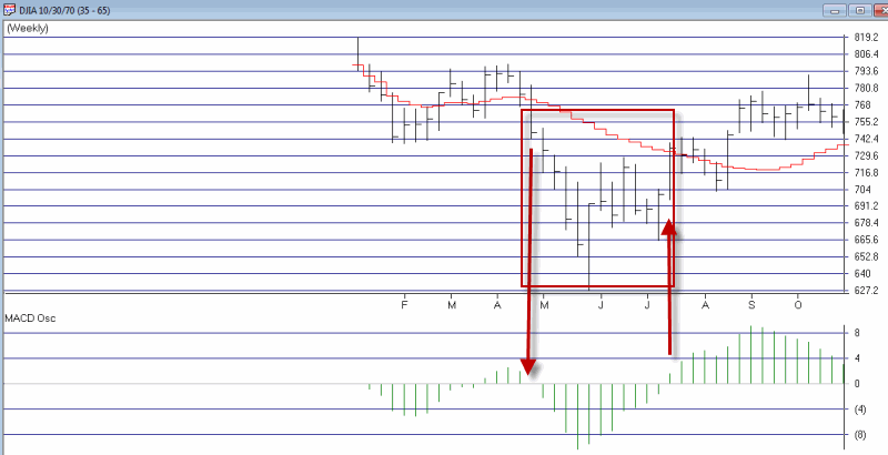
 jotm-1970Figure 2 – 1970

Figure 3 shows 1974.  The MACD broke down in early May and would have kept an investor out of the pummeling that followed in the months ahead.
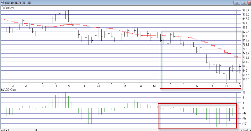
jotm-1974Figure 3 – 1974

Figure 4 shows 1978.  The MACD and the market drifted higher until September when the MACD oscillator went negative.  This would have gotten an investor out before the “mini crash” in the month of October.jotm-1978Figure 4 – 1978

Figure 5 shows 1982.  The MACD breakdown in June would have kept an investor out of some choppy action for the next two months, but they would also have been on the sidelines during the first thrust up during August.  The good news is that the MACD oscillator went positive after the first big up week in August 1982 so an investor would have gotten back in sooner than if he or she had waited until the end of October.jotm-1982Figure 5 – 1982

Figure 6 shows 1986.  Something of a mixed bag.  Technically the Dow moved higher (by +2.1%) between May and October, but the market was very volatile and choppy along the way, so some investors might have been more content to be on the sidelines earning interest.
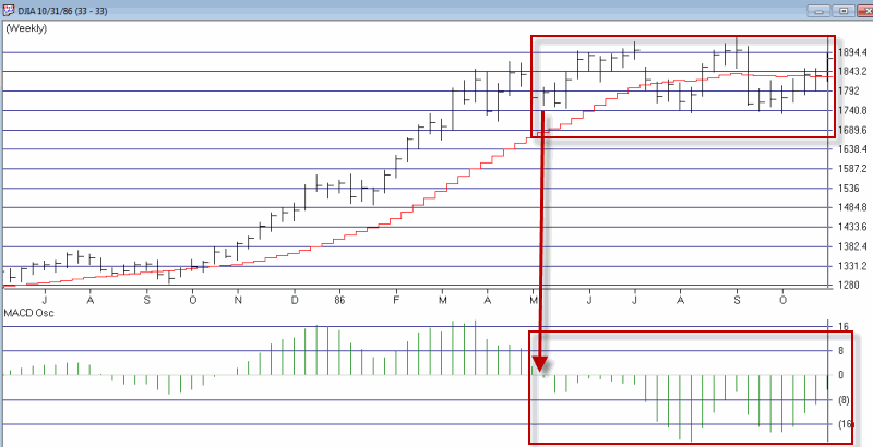
jotm-1986Figure 6 – 1986

Figure 7 shows 1990.  Once the “bow broke” so to speak in the first week of August, the “cradle was rocked” as the Dow fell hard.  Selling at the first sign of (MACD) trouble would have had an investor out during the sharp 3rd quarter 1990 break.
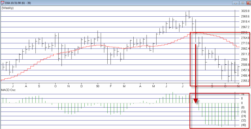
jotm-1990Figure 7 – 1990

Figure 8 shows 1994.  Not the most useful signal this time around.  The MACD oscillator was already negative by early May.  The market chopped around for a few months before the MACD oscillator went positive during late July with the Dow about 100 points higher than its level of early May.jotm1998Figure 8 – 1994

Figure 9 shows 1998.  The MACD broke down prior to late May. The Dow rallied pretty sharply from June into July but then suffered a -22% decline into September.  In this case the MACD filter would have kept an investor out during this period.
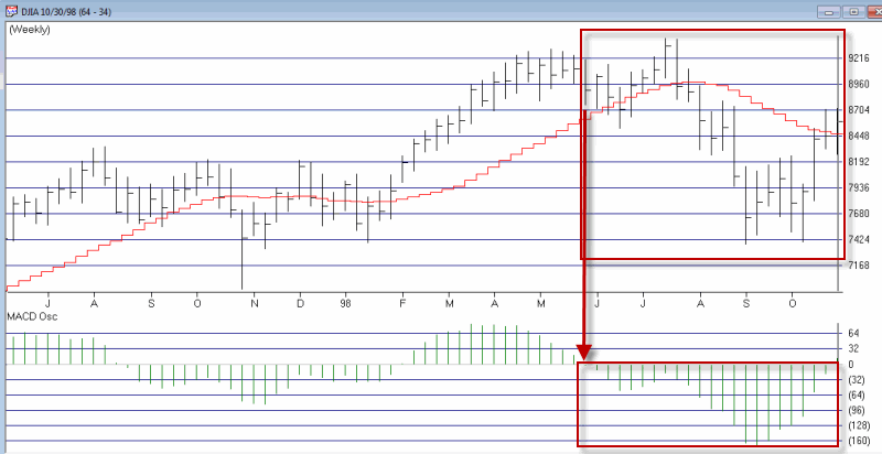
jotm1998 Figure 9 – 1998

Figure 10 shows 2002.  Not much to say here. The MACD oscillator was already negative by early May and the market suffered a severe bear market break between May and October.  In this case the MACD filter would have kept an investor out during this period.
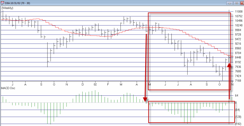
jotm-2002Figure 10 – 2002

Figure 11 shows 2006.  This one is something of a mixed bag.  The bearish MACD warning in late May would have allowed an investor to miss some pretty choppy action into mid-July but by the time the MACD went positive in August the Dow was 100 point above it level in May when the MACD flashed a warning.
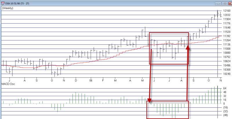
jotm-2006Figure 11 – 2006

Figure 12 shows 2010.  Another “mixed bag”.  The MACD broke down the first week in May and the Dow continued to decline in a fairly volatile manner into July.  Still, by the time the MACD went positive again in September the Dow was about 80 points above its “May MACD warning signal” level.
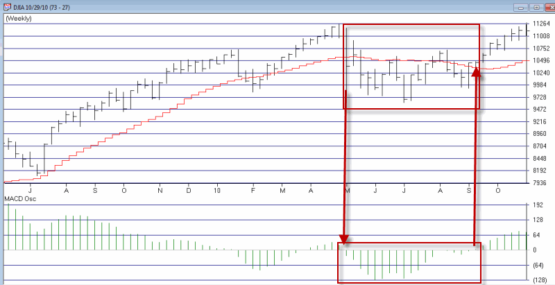
jotm-2010Figure 12 – 2010

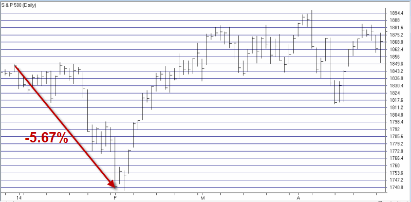
So what about 2014?  As you can see in Figure 13, the MACD broke down in January and was negative as of the close of the third trading day of May, so this is technically a “warning.”  On the flip side, if the market does not break down in the next week or so the weekly MACD will likely flip back to the positive side.
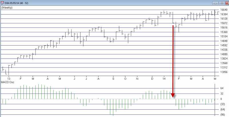
 jotm-2014Figure 13 – 2014

Summary

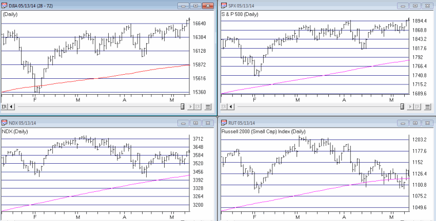
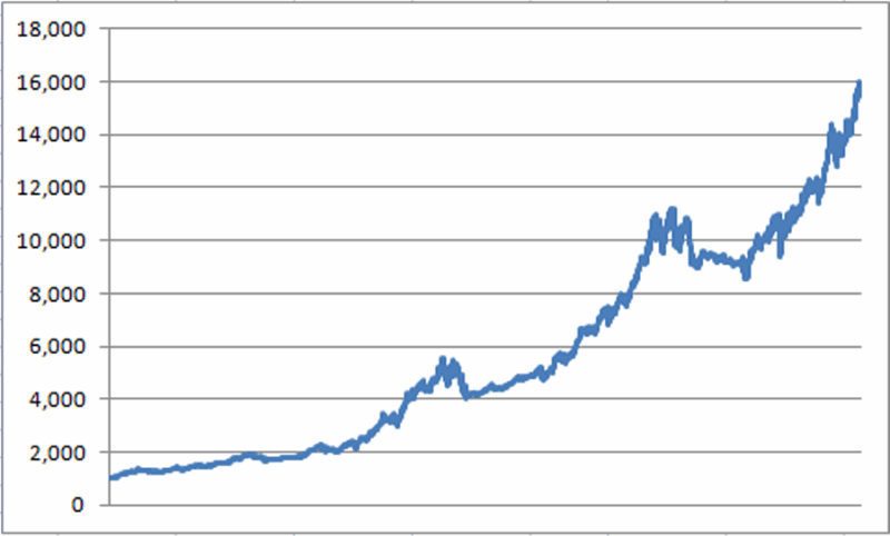
As a trend follower I still have to give the bullish case the benefit of the doubt.  That being said, the S&P 500 and Dow Industrials are at least attempting to build a multiple top formation (See Figure 14).  The Nasdaq 100 and Russell 2000 are nowhere close to their recent highs. jotm-2014 x
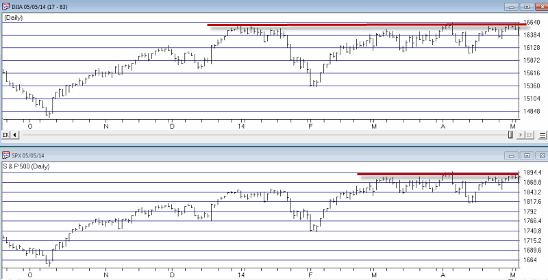
Figure 14 – Will SPX and DJIA break out or break down?

So if the market breaks down in the next week or so, given:

*The time of year

*A multiple top formation for the S&P 500 and Dow

*A negative weekly MACD

A little bit (or maybe even a lot of bit) of caution may be in order.  as always, time will tell.

Jay Kaeppel

See Darknet Channels article in May Issue of Stocks & Commodities magazine

Please see the article in May 2014 issue of Technical Analysis of Stocks & Commodities magazine, titled “Trading Signals With Darknet Channels”.

The article details a unique method for identifying buying opportunities in stocks and/or call options.  In theory this article was co-authored my John Broussard, developer of www.OptionsAnalysis.com and myself.  In reality, John is the “brains of the operation” and the developer of a very useful trading method titled “Darknet Channels.”  Me? Well, I done write good, er, sometimes, so I got to put my name in the byline too.

In any event, if you are looking for a unique trade identification method – and one that you cannot get from looking at a chart – then please check out this article in the May 2014 issue.

http://traders.com/#May

Jay Kaeppel

2014 Might Be a Good Year….to Sell in May

I have to admit I am a little surprised.  It is the last day of April and so far I have only seen a couple hundred thousand “Sell in May and Go Away” related articles, as opposed to the usual several hundred bazillion such articles that usually make their appearance about his time each year.  Still, what with May due to pop up at midnight tonight it seems like as good a time as any to chime in.

What You Probably Already Know

Historically the stock market has performed much better between the end of October and the third trading day of May that it has between the third trading day of May and the end of October. To wit, sees Figure 1 and 2.jotm20140430-01Figure 1 – $1,000 in the Dow from October 31st through 3rd trading day of May (1960-present)jotm20140430-02Figure 2 – $1,000 in the Dow from 3rd trading day of May to October 31st (1960-present)

Starting on 10/31/60:

* $1,000 invested in the Dow Industrials each year at the close of trading on the last trading day of October and held through the close of the third trading day of May grew to $47,280.

* $1,000 invested in the Dow Industrials each year at the close of trading on the third trading day of May and held through the close of the last trading day of October decreased to $599.

So to put it in blunt terms:

October to May = +4,628%

May to October = (-40%)

So clearly there is something to the “Sell in May” thing.  There is a caveat, however.  As you can see from a perusal of Figure 2 it is not as though the stock market declines each and every year during the May to October period.  So during many years selling in May and getting back in at the end of October would cause your returns to trail that of the overall market (and we can’t have that now can we?).

So that explains why roughly half of the bazillion annual “Sell in May” related articles warn against blindly selling in May.

What You Probably Don’t Know

Like they always say, sometimes it’s not what you know but who you know that counts.  Or in this case, not even someone I have personally met but do associate with.  Rob Hanna is the head of Hannah Capital Management (www.QuantifiableEdges.com) and is a colleague of mine in AAPTA (American Association of Professional Technical Analysts).  Rob revealed in some of his work the following “guide” for determining whether to “sell in May” or not:

-If the S&P 500 experiences a drawdown of 5% or more between December 31st and April 30th, then sell in May.

-If the S&P 500 DOES NOT experience a drawdown of 5% or more between December 31st and April 30th, then DO NOT sell in May.

Doesn’t get much simpler than that. Since 1960 there have been 14 years during which the S&P 500 did not experience a 5% drawdown and an investor would have simply remained in the market.  The results appear in Figures 3 and 4. jotm20140430-03Figure 3 – $1,000 in the Dow during bullish periods applying Hanna Sell in May Filter (1960-present)jotm20140430-04Figure 4 – $1,000 in the Dow during bearish periods applying Hanna Sell in May Filter (1960-present)

In cold hard numbers:

* $1,000 invested in the Dow Industrials each year durung the “bullish” periods described grew to $70,244.

* $1,000 invested in the Dow Industrials each year duirng the “beairsh” periods describeed decreased to $403.

So to put it in blunt terms, applying Rob Hanna’s Sell in May Filter:

*October to May (plus May to October when no Sell in May IS NOT triggered) = +6,924%

*May to October (only during years when Sell in May IS triggered) = (-59.7%)

Here’s The Bad News

As you can see in Figure 5, the S&P 500 experienced a drawdown of -5.76% between the end of December and the end of April.  And -5.76% is greater than -5% (OK, mathematically speaking -5.76 is technically LESS than 5%, but you get my drift – there was a drawdown in excess of 5%).jotm20140430-05 Figure 5 – S&P 500 for 2014

So by that rule, the Sell in May model that I prefer says to sell at the close on the third trading day of May and to buy back in at the end of October (although for the record, buying at the end of September is typically better in a mid-term election year, but that’s a topic for another article).

Summary

So because the S&P 500 experienced a -5.76% drawdown is the stock market absolutely, positively doomed to decline between May and the end of October? Of course not.  But the historical odds seem to suggest that caution may be in order.

Jay Kaeppel

The Middle of May is ‘Mush’

In my book (WARNING: Shameless self plug to follow) “Seasonal Stock Market Trends”, I highlighted the fact that the very beginning, very end and very middle of the month tends to be bullish for stocks, and everything in between, well, not so much.  The month of May as it turns out it a slight exception to the rule (OK, in the immortal words of Bill Murray, it’s actually more of a “guideline” than a “rule”, but I digress).

In any event, while the stock market has in fact showed a historical tendency to perform well during the beginning and end of the month of May, the entire time in between is pure “mush.”

The Beginning and End of May

 The first three days of May have followed the historically tendency for the first three days of most any month to perform reasonably well.  The growth of $1,000 invested in The Dow Industrials only during the first three days of May every year starting 1934 appears in Figure 1.jotm20140428-01 Figure 1 – Growth of $1,000 invested in Dow during 1st 3 days of May

All told, the first three days of May have showed a gain of +47.8% since 1934.  Is this “good” or “bad”?  Well, here is where a little perspective goes a long way.  In any event, in the immortal words of whoever said it first, “I’ve seen woise.”

Now let’s look at the end of May.  For this test we will look at trading days 17 and up.  In other words, we will assume that one bought the Dow Industrials Average at the close on the 16th trading day of May every year since 1934 and held through the end of the month.  The results for this test appear in Figure 2. JOTM20140428-02Figure 2 – Growth of $1,000 invested in Dow after trading day 16 during the month of May

This end of the month period for May has showed a +27.0% gain since 1934.

The Middle of May

Now let’s take a look at the historical performance during the middle of May – or as you may soon refer to them – The Bad Old Days.

Figure 3 displays the growth (or perhaps I should say “destruction” of $1,000 invested in the Dow only between the end of trading day #3 and trading day #16 every May since 1934.jotm20140428-03 Figure 3 – Growth of $1,000 invested in Dow during May trading days 4 through 16

As you can see the original $1,000 invested only during the middle of May declined -51.9% to $481. 

Figure 4 displays the growth of $1,000 during the beginning and end of May (blue line) versus the middle of May (red line). jotm20140428-04Figure 4 – The beginning and end of May versus the “Mush” in the middle

Notice any difference?

Summary

So is the beginning and end of May guaranteed to be “up” and is the middle of May guaranteed to be “down”?  Not at all.  Historically the beginning and end periods have seen the Dow gain a little over 70% of the time and the “middle” period – as I have defined it in this article has seen the Dow gain 47% of the time.  So as always, there are no “sure things” in the stock market.  Still, probabilities and historical tendencies can be useful.

In any event, do not be lulled into a false sense of security if the end of April, beginning of May time frame witnesses an advance in the stock market.

Remember, “beware the mush.”

Jay Kaeppel

A Simple Strategy for Growth & Income Investors

For better or worse, some people are just market “junkies” (Hi, my name is Jay).  Stocks, options, futures, ETFs, sure, whatever.  Bring it on.  Hey why not throw some FOREX in there too (just to make my head hurt as I try or the umpteenth time to wrap my head around currency conversions)?  Bottom line, whatever it is, as long as it relates to the financial markets, we’re interested.

But not everyone is like this (Or so I’m told).  Some people like to put their money into something and just kind of leave it there and let it grow over time.  And as I avert my eyes momentarily from a quote screen I can see that this approach has a certain simple elegance to it.  So today, let’s touch on a simple strategy “for the other half” (or as they are more commonly known outside of “market junkie” circles – “normal people”).

Growth & Income

For most “normal people” there are basically two ways to make money in the financial markets – buy something and watch it grow in value and sell it later at a profit, and/or invest in something that pays interest and or dividends along the way, thus generating a potential “stream of income.”

A lot of investors also combine the two concepts and invest in things that not only can “grow” but which can also generate “income.”  (The mutual fund industry figured this out a long time ago and sometime during the 1980’s helpfully launched approximately 12,356 mutual funds titled “[Mutual Fund Family Name Here] Growth & Income Fund.” )

So sure that’s one way to go.  Here is another.

Utilities & Intermediate-Term Government Bonds

Lots of people buy utility stocks because they tend to pay a higher dividend yield than the average stock.  Likewise, during bull markets they tend to go up in price.  Additionally, lots of people buy intermediate-term U.S. government bonds because they are considered “safe” in terms of payment of principal and interest (although since they are issued by the largest debtor in the history of this particular planet, I suppose it can be argued that, “I do not think that word means what you think if means”).  In any event, a lot of people do it.  So let’s look at a simple strategy that combines the two ideas.

Jay’s Growth & Income System

Here are the rules:

1) If Fidelity Select Utilities Growth (ticker FSUTX) closes the end of the month above its 21-month moving average (of monthly closing prices), buy and/or continue to hold utility stocks.

2) If Fidelity Select Utilities Growth (ticker FSUTX) closes below its 21-month moving average (of monthly closing prices) for two consecutive months, then sell utility stocks and buy intermediate-term government bonds.

3) Repeat.

Starting at the end of 1988, there have been 3 full round turns (buying and selling utility stocks) and the “system” is still holding long utility stocks on the 4th round turn.jotm20140421-01Figure 1 – Jay’s Growth & Income System Buy and Sell Signals (Chart courtesy of AIQ TradingExpert)

Results

For the record, the results that appear in Figures 2 and 3 reflect the gain or loss achieved by switching between Fidelity Select Utilities Growth (ticker FSUTX) and Fidelity Government Income (ticker FGOVX).  The results do not include any dividends paid by these funds along the way. jotm20140421-02Figure 2 – Growth of $1,000 (12/31/88 – 4/17/14)

 jotm20140421-03

Figure 3 – Annual Results

Note that the system is by no means without risks.  There were 5 calendar years that witnessed a loss (including a worst of -13.2% in 2008).    Still, for better or worse,  the average annual gain (not including fund dividends paid) was 12.1%.

Summary

Maybe 12.1% a year (plus dividends) floats your boat and maybe it doesn’t.  That’s for each investor to decide for themselves.  The real point of this particular article is not to convince you to utilize the method I have highlighted.  The real point is simply to illustrate the fact that there are some pretty simple methods out there that can allow “normal people” (and I think you know who you are) to generate some relatively steady rates of returns without fixating on every gyration of the stock or bond market.  

Now if you will excuse me, I think the EuroYen just moved two pips…

Jay Kaeppel