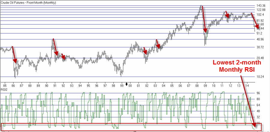
Last time out I revisited the 40-Week Cycle in the stock market. Or as I sometimes refer to it, the “Wow this sounded like a really stupid idea when I first read about it, I don’t remember where, 30 some odd years ago, but darned if it hasn’t held up reasonably well Cycle” (so you see why I typically just go with the shorter version).
In the last piece I spelled out the “numbers” and I pointed out the fact that the “bullish phase” is most certainly not always bullish and that the “bearish phase” sees the stock market advance more often than it sees it decline. But over the long-term the difference in results has been rather stark (with “stark” being defined in this case as a gain of +3,538% during the bullish phases – assuming the 12.5% stop-loss was respected – versus a loss of -31% during the bearish phases.
I also stated quite clearly that “No one should rely on the 40-week cycle as their sole method of market analysis.” Which is all perfectly logical. But it does raise a rather pesky question of “So what the heck do I actually do with this thing, anyway?” The short answer is “combine it with something else.” Let me give you an example.
A Model Incorporating the 40-Week Cycle
So let’s build a simple (with “simple” in this case being defined as “Jay thinks its simple”) model that incorporates the 40-Week Cycle as a factor. In addition to that cycle we will also incorporate the “Best Six Months” pattern and the 50-day/200-day moving averages for the Dow Industrials. So heretofore I will refer to this as the “296 Model” (40 + 6 + 50 + 200).
296 Model Tool #1 – The 40-Week Cycle:
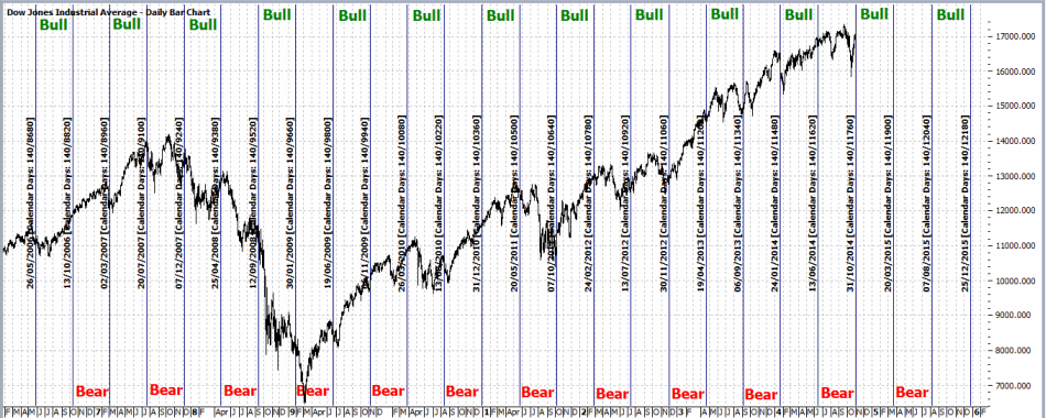
As defined last week, every 280 calendar days (the latest period started at the close on 10/31/2014) the stock market enters a “bullish phase” that lasts for 140 calendar days or until the Dow drops 12.5% from its price at the start of the current bullish phase. The rest of the time this Tool is in cash.
296 Model Tool #2 – The Best 6 Months:
This well known phenomenon from Yale Hirsch and Stock Trader’s Almanac fame turns bullish at the close on the last trading day of October and turns bearish at the close of the last trading day of the following April.
The 296 Model – Tool #3: The 50-day versus 200-day Moving Averages:
This tool turns bullish when the 50-day moving average for the Dow Industrials rises above the 200-day moving average. It stays bullish until the 50-day moving average drops back below the 200-day moving average. And so on and so forth.
296 Model Scoring:
When a “Tool” is “bullish” it adds 1 point to the model
When a “Tool” is “bearish” its adds 0 point to the model
So the score for any given day can range anywhere from 0 to +3. Intuitively, we would expect better market results when the readings are higher than when they are lower. And in this (rare, at least when it comes the stock market) case, intuition proves to be fairly spot on.
The 296 Model Results
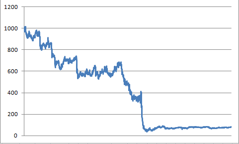
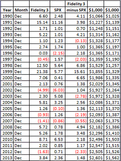
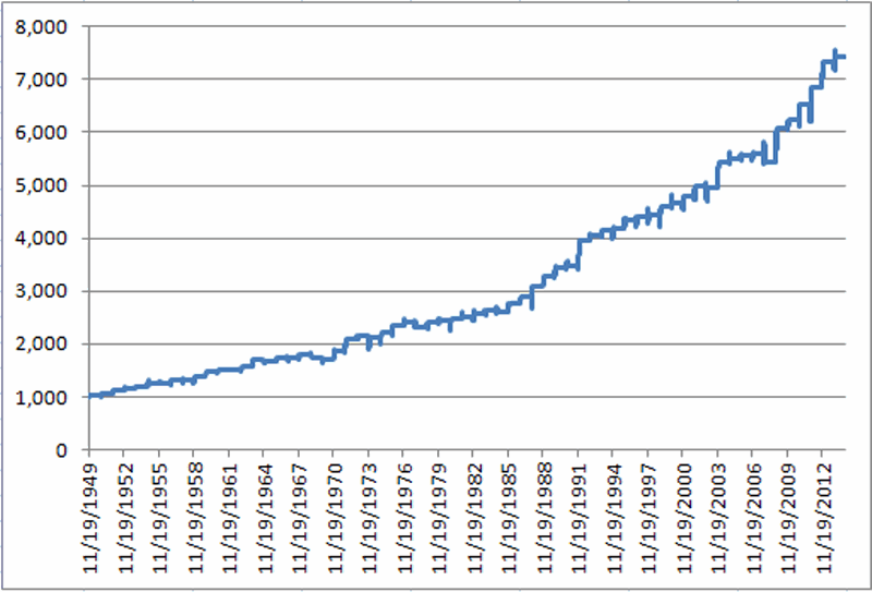
We start our test on 12/31/1967. We will refer to readings of 0 or +1 as “bearish” for reasons that become more apparent with a perusal of Figure 1. Figure 1 displays the growth (or perhaps I should say “lack thereof”) of $1,000 invested in the Dow Jones Industrials Average only on those days when the 296 Model registers a reading of 0 or +1. 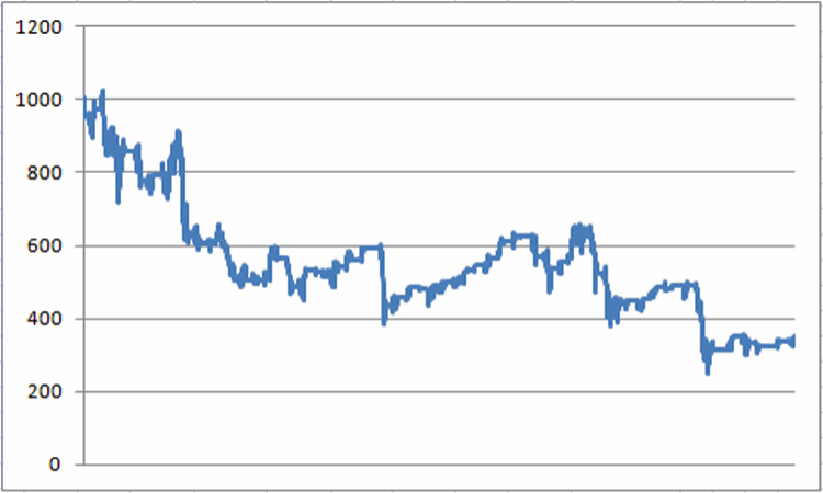 Figure 1 – Growth of $1,000 invested in the Dow Industrials only when The 296 Model is at 0 or +1 (12/31/67-present)
As with the 40-week cycle bearish phase chart last week, a close look at Figure 1 reveals that there are plenty of times when stock market advanced along the way. So just because we refer to these readings as “bearish” no one should assume that the stock market is automatically guaranteed to decline. Still, what is significant is that all told, since the end of 1967 this $1,000 would have declined in value to $349 (or -65.1%). Which is not exactly the kind of long-term growth most investors are looking for.
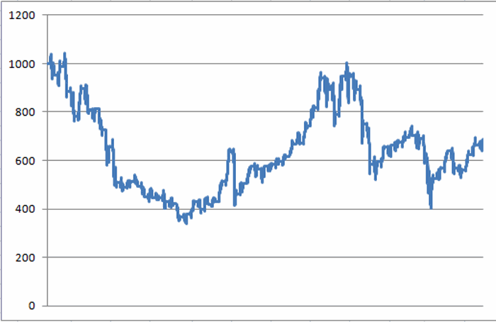
Figure 2 displays the growth of $1,000 invested in the Dow Jones Industrials Average only on those days when the model registers a reading of +2 or +3. Also, 1% of interest per year is added when out of the stock market.
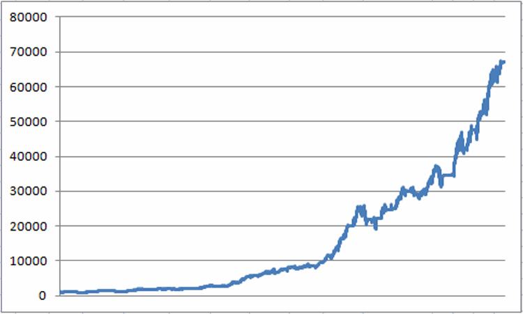 Figure 2 – Growth of $1,000 invested in the Dow Industrials only when The 296 Model is at +2 or +3 (12/31/67-present)
A simple visual observation suggests that the results depicted in Figure 2 are “better” than those that appear in Figure 1. In fact, $1,000 invested in the Dow only when the 296 Model stands at +2 or +3 (with 1% annual interest while in cash) grew to $67,012 (or +6,601%).
So a quick review:
*296 Model Bullish % +(-) = +6,601%
*296 Model Bearish % +(-) = (-65%)
These are the kinds of numbers that we “quantitative types” refer to as “statistically significant.”
Also, the maximum peak-to-valley drawdown for the 296 Model was -29% versus -54% for buy and hold.
The 296 Model turned bullish at the close on 10/31/14 when both the 40-week cycle and the Best 6 Months turned bullish raising the model reading from +1 (the 50-200 moving average was already bullish) to +3. The model will remain above +1 at least until 3/20/2015 (when the 40-week cycle returns to “bearish”). As we will see in a moment, this may or may not prove significant.
A Closer Look at the Results
Now if I were smart I would write my typical snarky Summary and hit “Publish.” But alas, well, never mind. In any event, in this case I feel compelled to go the extra step and point out the critical difference between:
A) “Building a model” (which is the easy part) and;
B) “Actually trading using said model” (which is the hard part).
Which reminds me of:
Jay’s Trading Maxim #132: Between theory and reality there can be a chasm a mile wide. So look for a sturdy bridge when attempting to cross from one to the other.
On the surface the numbers for the 296 Model look pretty darn good. But the reality is that a lot of imperfections can get glossed over during the course of 37 years (come to think of it, a lot of hair can disappear also. But I digress). So before anyone gets the bright idea that they should adopt the 296 model right away, at least consider the following “bad news”:
1) In a nutshell, the Model’s average annual gain was +10.4%, versus +7.8% for Buy/Hold (this includes no dividends in the calculation, so the total return for both the Model and buy and hold would be several percentage points higher). Not bad, but not exactly eye-popping either.
2) The Model did show a gain in 38 of 47 years versus 34 up years for buy and hold. But the bad news is that the Model actually underperformed buy and hold 26 out of 47 years.
This last piece of info is a little shocking and highlights the real fact behind how the Model outperforms buy and hold over time: It simply “doesn’t get clobbered” as often or to the same extent as buy and hold during bear markets.
So the good news is that when the market gets whacked, the 296 Model trader may well be sitting in cash and missing out on all of the “angst.” On the other hand, during a rip roaring bull market the Model trader will also find him or herself occasionally sitting on the sidelines as prices soar. This can be a very frustrating state of affairs.
In reality, a lot of traders and investors subconsciously adopt the “That Championship Season” mentality when it comes to trading. In other words, if we didn’t beat the market this year then we didn’t “win the championship” regardless of the long-term affect. For example, let’s say over a two year period that during Year One the Model made 14% and buy and hold made 20%. The next year the Model makes 1% while buy and hold loses 20%.
After two years the Model investor will see $1,000 grow to $1,151, whereas a buy and hold investor would have only $960. Still, human nature being what it is, the average Model trader will look at the Model as being 50/50 against the market, i.e., one year it beat the market, the next year it did not. All in all this highlights the never-ending need for discipline in following any trading method or model.
To put a fine point on all of this consider these two slightly incongruous facts:
1) Since the end of 1990, the 296 Model has underperformed buy and hold during 16 of those 24 calendar years (including 2014 to date). Let’s face it, the average trader would likely find this a little hard to take.
2) On the other side of the coin, despite this fairly brutal year-by-year comparison, since the end of 1990, $1,000 invested in the Dow using the 296 Model grew to $10,023 versus $6,601 using a buy and hold approach.
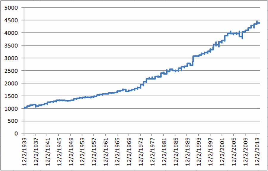
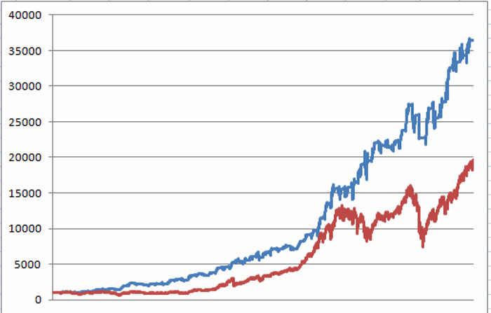
How is this possible? As mentioned above, and as seen in Figure 3, the Model “doesn’t get clobbered” as often as buy and hold.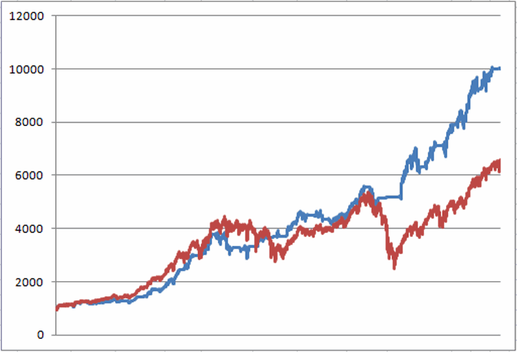 Figure 3 – Growth of $1,000 for 296 Model (red line) versus Buy and Hold (blue line) from 12/31/1989 to present
So despite the fact that the 296 Model did not have many “Championship Seasons”, it still managed to gain 1.6 times as much as buy and hold (+902% versus +560%). Go figure. [I am getting a little tired so please insert your own “Tortoise vs. Hare” type analogy here].
Summary
When it comes to trading coming up with “interesting ideas” is relatively easy. In fact, coming up with models that outperform a buy and hold approach is not as hard as many people assume.
Unfortunately, actually using those “interesting ideas” and models to trade can sometimes prove a great deal more difficult. By virtue of human nature we want to make money, we want to make money right freaking now, and we want to consistently make more money in the future. And if we are underperforming the overall market for any length of time then “something is wrong” and we will more than likely feel compelled to “do something” – which more often than not will ultimately work against us, Murphy’s Law being what it is and all (Wow, is human nature a pain in the rear or what?).
The 296 Model I’ve detailed here is a perfectly good case in point. Three useful tools – each with a good standalone track record – combined into one “weight of the evidence” model which generates results that are inarguably superior to buy and hold. Sound great, right?
But unless you understand how it manages to achieve that outperformance (by missing some of the big “downs” – but alas, also some big “ups”) and unless you have the psychological wherewithal to withstand “underperforming the market” over the course of several years and still “stay the course”, achieving those really great long-term results may be problematic.
Which leads me to conclude with:
Jay’s Trading Maxim#2: There are two keys to trading success; the first is to develop a well-though out method that has a realistic probability of generating profits in real-time trading (i.e., you must have a plan).
Jay’s Trading Maxim #3: The second key to trading success is that you must have the emotional and financial wherewithal to follow your plan.
(Ironic) Hint: While #2 can involve a lot of work and effort, for most people #3 is way harder than #2.
Jay Kaeppel
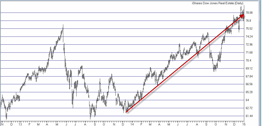 Figure 1 – Real Estate ETF Ticker IYR (Courtesy: AIQ TradingExpert)
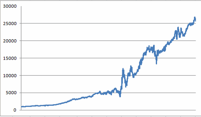 Figure 2 – Growth of $1,000 invested in REPIX during “Best Days” (Aug 2000-present)
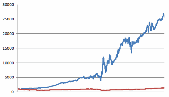 Figure 3 – Growth of $1,000 invested in REPIX only on “Best Days” (blue line) versus SPY (red line) (Aug 2000-present)