The World is an Ugly Place Right Now (Part 2)

In The World is an Ugly Place Right Now I noted that in every region of the world local stock markets look awful. In essence, the only stock market that was holding up at all was the U.S. market.  This implies the potential for one of two scenarios to play out from here.  Before we get to that let’s take a closer look at the “US vs. The World”

SPX vs. the World (Index)

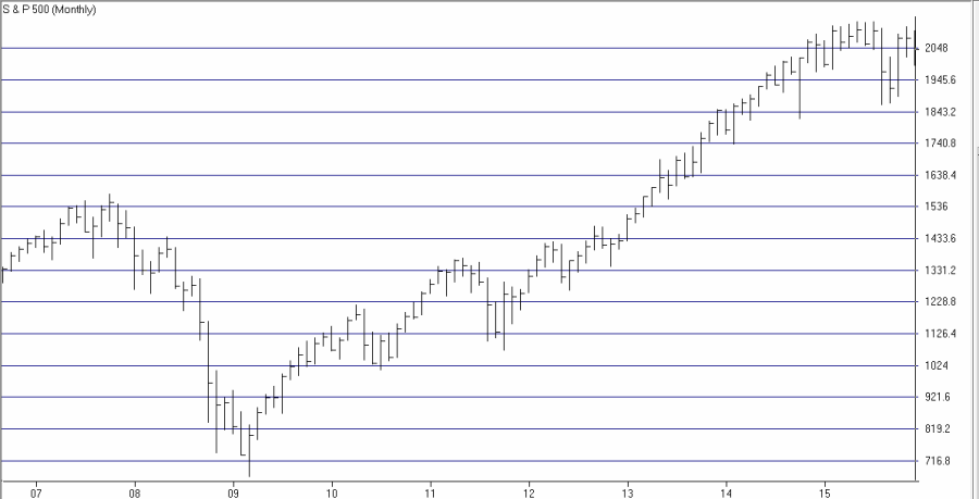
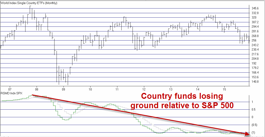
Figure 1 displays the S&P 500 Index.  Figure 2 displays a “World Index” of ETF’s that I created for my own use in AIQ TradingExpert (the 34 tickers that comprise the index are listed at the end of this article.

1Figure 1 – SPX

2Figure 2 – Jay’s World Index

The key thing to note here is at the bottom of Figure 2, which displays the relative strength for the World Index versus the S&P 500 Index.  As you can see from a close look, this line has been trending lower since the top in 2007.  This tells us that the S&P 500 Index has been outperforming the rest of the world consistently and for a long time.

Why you might ask?  A million and one reasons could be posited but for my money the key influencer was quantitative easing by the Fed (for evidence of the direct correlation between quantitative easing and SPX performance please see the two charts in this article).

Now that the Fed has signaled a willingness to be less accommodating what might happen?  Let’s get back to two possible scenarios I hinted at earlier

Two Potential Scenarios Going Forward

#1. The S&P 500 Index proves to be the “world leader”, rebounds and breaks out to a new high.  Stock markets around the globe – many already seriously oversold, also rebound and follow the lead of the S&P 500 Index and launch new bull markets.

#2. The S&P 500 Index – without the benefit of the Fed pumping billions of dollars into the financial system – falls in line with virtually every other country stock market index and heads lower.

Which scenario will it be?  At this point, I have to go with the old adage:

“Hope for the best, prepare for the worst”

Jay Kaeppel

Appendix: ETFs in Jay’s World Index

ECH – Chile; EWC – Canada; EWW – Mexico; EWZ – Brazil; IYY – USA

EPI – India; EWA – Australia; EWH – Hong Kong; EWJ – Japan; EWM – Malaysia; EWT – Taiwan; EWY – South Korea; FXI – China; IDX – Indonesia; RSX – Russia; THD – Thailand; VNM – Viet Nam

ECD – Sweden; EWG – Germany; EWI – Italy; EWK – Belgium; EWL – Switzerland; EWN – Netherlands; EWO – Austria; EWP – Spain; EWQ – France; EWU – United Kingdom; VGK – Vanguard European VIPER

EGPT – Egypt; ESI – Israel; EZA – South Africa; TUR – Turkey;


The World is an Ugly Place Right Now

Chances are you may have seen the title of this piece and shook your head side to side in knowing discouragement.  You may now be expecting me to launch into a rant about ISIS, terrorism, world economies or geopolitics in general.  Did you forget I am a financial writer?  As such I don’t do politics (in fact the only thing I hate more than politics are politicians, but I digress).

My only interest (in terms of writing) is the financial markets – stock markets primarily.  And like a said, the world is an ugly place right now.

I follow several “Regional” indexes that I created using ETFs within AIQ TradingExpert.

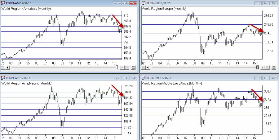
Consider Figures 1 through 4 below

Figure 1 displays my own ETF composite index for the “Americas” region.  The tickers included are: ECH – Chile; EWC – Canada; EWW – Mexico; EWZ – Brazil; IYY – USA

Figure 2 displays my own ETF composite index for the “Asia Pacific” region.  The tickers included are: EPI – India; EWA – Australia; EWH – Hong Kong; EWJ – Japan; EWM – Malaysia; EWT – Taiwan; EWY – South Korea; FXI – China; IDX – Indonesia; RSX – Russia; THD – Thailand; VNM – Viet Nam

Figure 3 displays my own ETF composite index for the “European” region.  The tickers included are: ECD – Sweden; EWG – Germany; EWI – Italy; EWK – Belgium; EWL – Switzerland; EWN – Netherlands; EWO – Austria; EWP – Spain; EWQ – France; EWU – United Kingdom; VGK – Vanguard European VIPER

Figure 4 displays my own ETF composite index for the “Middle East” region.  The tickers included are: EGPT – Egypt; ESI – Israel; EZA – South Africa; TUR – Turkey;
Now take a look at the ugliness contained in Figures 1 through 4.

(click to enlarge)1Figures 1 through 4 – Clockwise from Upper left (Americas, Europe, Middle East and Asia/Pacific (Courtesy: AIQ TradingExpert)

Notice anything these indexes ll have in common?

For the record, as of 12/31/2015:

World Region – Americas      -32.6% off of 2014 high

World Region – Asia Pacific   -23.3% off of 2014 high

World Region – Europe         -19.0% off of 2014 high

World Region – Middle East   -30.7% off of 2014 high

Like I said, the world is an ugly place right now.

(See also JayOnTheMarkets.com: The World is an Ugly Place Right Now (Part 2))

Jay Kaeppel

Two Short Articles I Think You Should Read

Not my own stuff today, but two ideas that I found particularly interesting – and potentially useful.

The first is an article by Danny that discusses what happened in the stock market the year after the S&P 500 experienced a “flat” year (defined as a year during which the S&P 500 gained or lost less than plus or minus 5%).  Spoiler alert: Fasten your seat belts on New Year’s Eve.

Article #1: Stocks in 2016: why I like what I see by Danny

The second is an article written by Sal Ciella and highlights a simple “trading tip.”  I cannot confirm or deny its effectiveness but I do intend to explore it in greater depth.  If you are an active trader you may wish to also.

Article #2: Fine Tune Your Entries and Exits Trading the 3 Day EMA

Happy New Year and a Prosperous 2016!

Jay Kaeppel

2016 – Breakout or Bust!

The Bad News is that the stock market overall looks pretty awful to me.  The Good News is that I personally possess almost no “predictive” capabilities.  So what I “think” about the markets should mean even less to you then it does to me.

Still, I do study the markets a lot (some might say “too much”) and what I see – objectively – is a U.S. stock market that is still technically in an “uptrend” (based on the current status of several trend-following methods that I follow).  What “I think I see” (subjectively) is a U.S. stock market that is forming a major “topping” formation.

The bottom line is:  You should be watching the U.S. stock market very closely NOW and in the months ahead.  This is a market that (in my opinion) absolutely, positively needs to stage an upside breakout soon (early 2016?) or things could get ugly.

For Comparison’s Sake

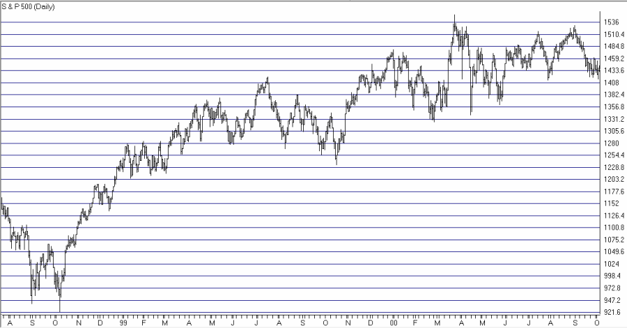
Figure 1 displays the S&P 500 as it topped out in 2000.  Note:

a) A big run up followed by

b) A long period of sideways action within a fairly large range

spx 2000 topFigure 1 – SPX October 2000

The S&P 500 subsequently declined about -45% over the next 21 months.

Figure 2 displays the S&P 500 as it topped out in 2007.  Note:

a) A big run up followed by

b) A long period of sideways action within a fairly large rangespx 2007 topFigure 2 – SPX December 2007

The S&P 500 subsequently declined about -54% over the next 15 months.

Figure 3 displays the S&P 500 in 2015.  Note:

a) A big run up followed by

b) A long period of sideways action within a fairly large range.spx1Figure 3 – SPX December 2015

Does Figure 3 resemble Figures 1 and 2 to you?  And if so, how worried should we be?

On the Plus Side

Figures 4 and 5 show two different “trend following” indicators that are both “bullish” at the moment.  Figure 4 displays the S&P 500 with the 50-day and 200-day moving averages.  The mosr recent sell signal in late August resulted in a “whipsaw” (selling lower and buying back higher).  But that is the nature of trend-following indicators.  For our purposes:

*50-day>200-day = GOOD

*50-day<200-day = BAD

Figure 4Figure 4 – SPX with 50-day and 200-day moving averages

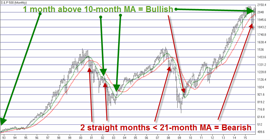
Figure 5 displays one timing method I use.  Two consecutive monthly closes below the 21-month moving average generates a “sell” signal and a close above the 10-month moving average generates a “buy” signal. The most recent sell signal at the end of September was essentially a “wrost case” event as the stock market turned and rallied hard in October.  But again, that is the natre of trend-following.  The long-term results for this timing model is far superior to buy-and-hold, but not every signal is a “winner”.  For our purposes:

*Unless and until SPX closes 2 straight months below 21-month MA = GOOD

*If and when SPX closes 2 straight months below 21-month MA = BAD

Figure 5Figure 5 – SPX with 10-month and 21-month moving averages

Summary

So here is what to watch as 2015 winds down and 2016 begins:

*If the trend-following indicators remain bullish and the major average breakout to the upside, then the bull market lives on.

*If the stock market fails to breakout to the upside and the trend-following indicators break to the bearish side you absolutely, positively should (again, in my opinion) be prepared to take some form of “defensive action” (raising some cash, hedging with options, etc.).

Um, Happy New Year (?)

Jay Kaeppel

Taking My (Gold Stock) Ball and Going Home

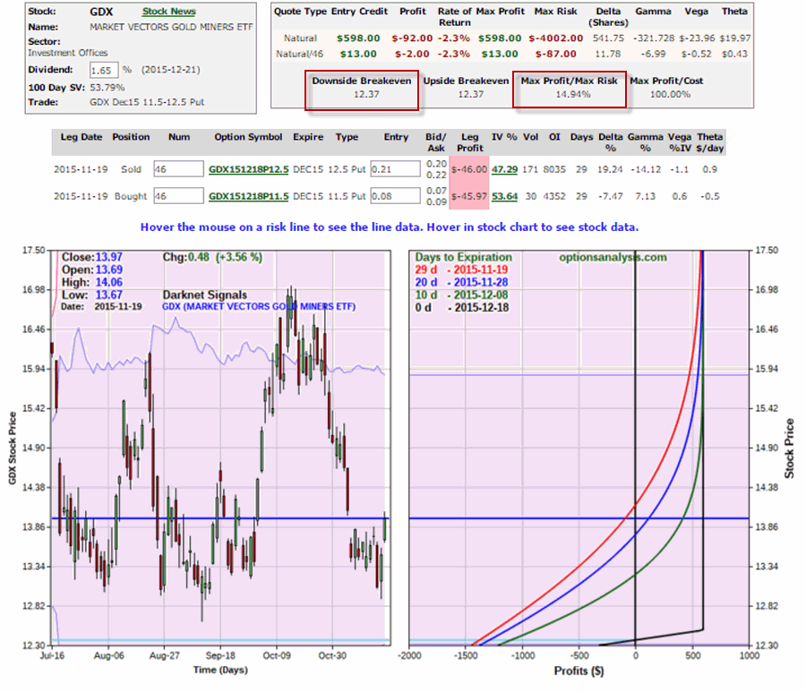
In this article I wrote about a trade idea that involved the then very questionable idea of picking a bottom in gold stocks.  So did gold stocks actually bottom out?

The reality is that it is too soon to say.  But in the context of the trade I highlighted in the linked article, the only thing that matters is that they bottomed out “for awhile”.

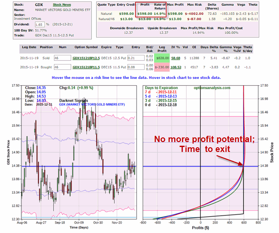
Figure 1 displays the trade on the date of inception.

(click image to enlarge)1Figure 1 – Original Position in GDX put options (Courtesy www.OptionsAnalysis.com)

Figure 2 displays the trade as I write.  Basically three things have happened since 11/19.

  1. GDX rose from $13.97 to $14.35
  2. 22 days of option time decay has worked in favor of this option position
  3. This combination of factors has resulted in both options losing virtually all of their value.

The key to note is that the maximum profit has pretty much been achieved.  As a result, there doesn’t seem to be much point in holding onto this position through expiration (1 week from now).

(click image to enlarge)2Figure 2 – Updated Position in GDX put options (Courtesy www.OptionsAnalysis.com)

The only downside to exiting now is that the bid/ask spread and commissions will knock a few bucks off of the final profit.  But this is far better than holding on for another week and – the Market Gods being who they are – gold stocks deciding to plummet.

Jay Kaeppel

A Seasonal Play in Financial Stocks

As I wrote about here,  here, here and yes, here (and, um, also here), the holiday season tends to be a good time to invest in the stock market in general and in specific sectors in particular (with that pesky fly in the ointment, monkey in the wrench, pain in the rear caveat that “there are no guarantees this time around”).  So let’s add one more to the mix.

 (Jay Kaeppel Interview at BetterSystemTrader.com)

 Favorable Seasonal Period for Financial Stocks

*A favorable seasonal period for the financial stock sector tends to start at the close of the 11th trading day of December (12/15/15 this year)

*The favorable period extends through December 31st of the current year

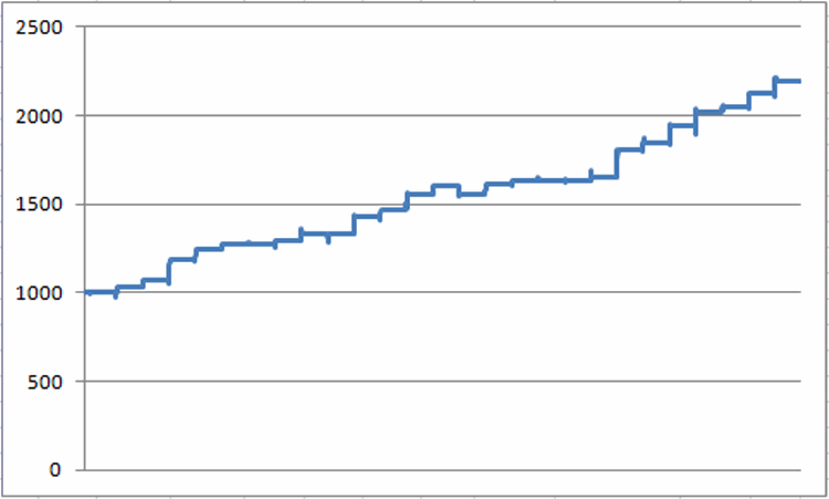
We will use Fidelity Select Finance (ticker FIDSX) as a proxy for testing results.  However, it should be noted that due to switching restrictions, FIDSX cannot actually be used to trade the method I am about to discuss.  Fortunately other funds and ETFs are available and are listed a little later.  But for now, Figure 1 displays that growth of $1,000 invested in FIDSX only during this mid-to-late December period described above since 1988.

1Figure 1 – Growth of $1,000 invested in FIDSX during Seasonally Favorable Period (1988-2015)

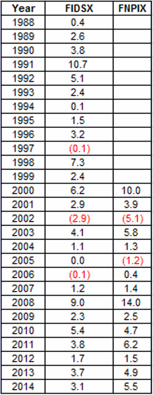
Figure 2 displays the year-by-year results for both FIDSX (which has switching restrictions that would likely result in a 2.5% deduction if you actually used FIDSX to trade this method) and ticker FNPIX (ProFunds Financial).  FNPIX started trading in 2000, has no switching restrictions and uses leverage of 1.5-to-1.

2

Figure 2 – FIDSX and FNPIX %+(-) during Seasonally Favorable Period (1988-2015)

For the record, during this period FIDSX has:

*Gained 24 times (89%)

*Lost 3 time (11%)

*Average % gain = +3.49%

*Average % loss = (-1.03%)

Since 2000 Ticker FNPIX has:

*Gained 13 times (87%)

*Lost 2 times (13%)

*Average % Gain = +4.77%

*Average % Loss = (-3.16%)

A Few Alternatives

Since FIDSX is not a viable trading alternative a trader might also consider

*ProFunds Finance fund (FNPIX)

*Rydex Real Estate fund (RYFIX)

*SPDR Financial Sector ETF (XLF)

Summary

As always I need to point out two things:

1) This is not a “recommendation”.  It is simply a presentation of information regarding a pattern that has held up reasonably well in the past (in this case “reasonably well” is defined as “89% winning trades and a 3.4-to-1 profit/loss ratio”).

2) There is never the slightest hint of a guarantee that any seasonal trend will play out “this time around” as well as it has in the past.

Still, as whoever said it first said it, Hey, 89% is 89%”

Jay Kaeppel

Looking for a Short-Term Buy Signal in eMini S&P

I’ll be honest – it always scares me a little to write headlines like this.  They create a lot of opportunity to look like an idiot.  Still, a “system/method” that I developed several years ago is poised to give a short-term buy signal or eMini futures (or SPY or DIA for ETF traders).

(See Jay Kaeppel Interview at BetterSystemTrader.com)

Two things to note:

*This article details this method in great detail so I’ll not be rehashing it here

*The most intriguing factor is that since 2004 this method has generated 44 winning trades and 0 losses.

*The 43rd and 44th winners are not included in the linked article.  The 43rd bought the March 2015 eMini S&P on 12/18/14 at 2011.5 and sold it at the close that day 2060.25.  The 44th bought the December 2015 eMini S&P at 2092.25 on 12/1/15 and sold it at the close that day at 2100.00.

*Despite the “undeafeted” record this should BY NO MEANS be considered a “low risk” trading method.  There is a very wide stop-loss built in and in essence each trade signaled amounts to a “fairly large risk for as little as a one-tick reward” trade.

In other words, examine the idea closely and understand the risks before even thinking about “jumping in.” Eventually – inevitably – this method will suffer a loss and it will hurt.

And I can’t tell you that it won’t be on the next trade.

Jay Kaeppel

Warning Signs on the Horizon

First the good news: The “trend” of the stock market is bullish (and least based on the particular trend-following indicators that I follow) and I am hoping for a standard issue “Santa Claus Rally.”  But hey, you’re not a real investor if you’re not worried about something.  So for the benefit of my fellow worrywarts, let me point out a few warning signs looming ominously on the horizon.

(Jay Kaeppel Interview at BetterSystemTrader.com)

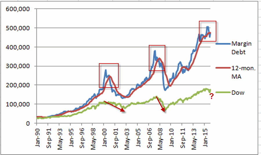
Margin Debt Declines

In this article I detailed a model for using margin debt and credit balances to help identify the trend of the stock market.  The Bad News: it just turned bearish.  Does this mean we should “sell everything”?  Not necessarily.  But it is also not something to dismiss.  As you can see in Figure 1, the last two major contractions in margin debt were followed by something “nasty” in the stock market (more specifically, the 2000-2002 bear market and the 2008-2009 bear market).1Figure 1 – A warning sign from margin debt contraction

Jay’s Margin Debt and Credit Balance in Margin Accounts Model

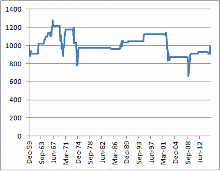
This model is described in detail here so I’ll not take the time to spell it all out again (Sorry, it’s just my nature).  But the relevant fact is this: both margin debt and credit balances in margin accounts are below their 12-month moving averages.  Figure 2 displays the growth of $1,000 invested in the Dow Jones Industrials Average only during previous such times.2Figure 2 – Growth of $1,000 invested in Dow when margin debt and credit balances in margin accounts are BOTH below their respective 12-month MA

Do twin downtrends guarantee a stock market decline is imminent?  Not at all.  But as you can see in Figure 2, the track record isn’t too impressive.

Since December 1959:

*While one of more of these two measures is bullish the Dow has gained +2,540%

*While both of the measure is bearish the Dow has lost (-1.2%)

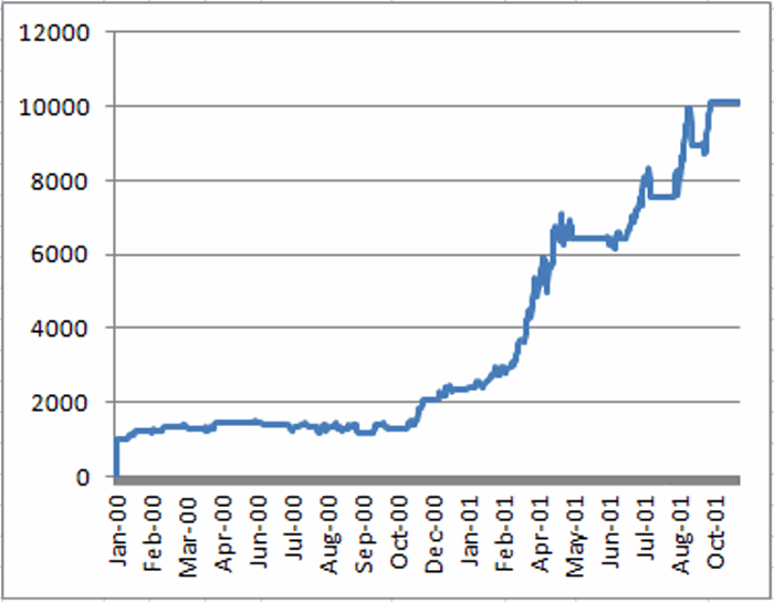
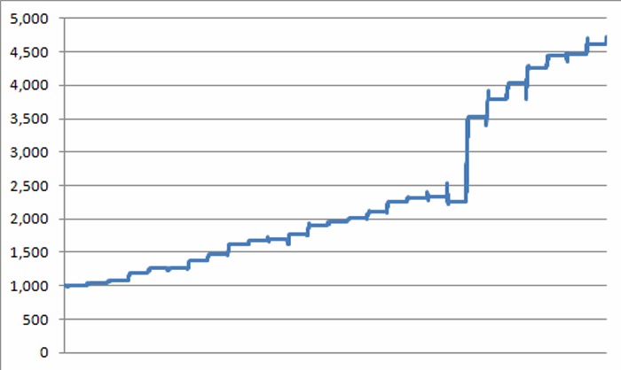
Also, for the sake of contrast (and to highlight the potential usefulness in tracking this data), Figure 3 displays the growth of $1,000 invested in the Dow only when both margin debt and credit balances are above their respective 12-month moving average.

3Figure 3 – Growth of $1,000 invested in Dow when margin debt and credit balances are BOTH ABOVE 12-month MA

A much “prettier picture” than the one in Figure 2, no?

Mutual Fund Cash

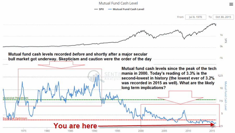
One “bonus thing to worry about”: the chart in Figure 4 is courtesy of Zerohedge.com (via http://www.acting-man.com/blog/media/2015/12/6-MuFu-Cash-long-term.png) and displays the % of cash held by stock mutual funds. Cash on hand can also be equated with “buying power”.

4Figure 4 – Mutual Fund cash as a percentage of portfolio (Courtesy: ZeroHedge.com via Acting-Man.com)

As you can see in Figure 4, the current level of cash held in mutual funds is near the all-time low end of the range.  While this in no way “guarantees” a bear market, more to the point, it is certainly in no way a “bullish” sign.

In the meantime, let’s hope Santa Claus comes through as this pre-election year wraps up.

Jay Kaeppel

Real Estate = A Real Good Time

OK, I will admit I am a bit late with this one.  I’ll go ahead and blame “The Holidays”.  Anyway, if you were wondering when it might be a good time to hold real estate stocks, the answer might well be, um, “Now”.

(Jay Kaeppel Interview at BetterSystemTrader.com)

Favorable Seasonal Period for Real Estate Stocks

*A favorable seasonal period for real estate stocks tends to occur between the close of the 14th trading day of November (back on 11/19/15 this year)

*The favorable period extends through December 31st of the current year

We will use Fidelity Select Real Estate (ticker FRESX) as a proxy.  However, other funds and ETFs are listed a little later.  Figure 1 displays that growth of $1,000 invested in FRESX only during the November-December period listed above since 1988.1Figure 1 – Growth of $1,000 invested in FRESX during Seasonally Favorable Period (1988-2015)

Figure 2 displays the year-by-year results

2

Figure 2 – FRESX +(-) during Seasonally Favorable Period (1988-2015)

For the record, this period as seen:

*A gain 26 times (96.3%)

*A loss 1 time (3.7%)

*Average %+(-) = +6.25%

*Median %+(-) = +4.16%

For the record, a 96% success  rate is what we “quantitative analyst types” refer to as  “statistically significant”.

A Few Alternatives

Beyond FRESX traders might also consider:

*ProFunds Real Estate fund (REPIX)

*Rydex Real Estate fund (RYRIX)

*iShares Dow Jones Real Estate ETF (IYR)

*Vanguard REIT ETF (VNQ)

Summary

Like I said, I am a little late with this one.  As of 11/27 FRESX was already up +2.1% from its close on 11/19.  So is it already too late to get into real estate stocks?

It beats me.

As I always say, the one “catch” with using seasonals as a stand-alone strategy is that there is never any guarantee that a particular trend with  work “this time around”.

Nevertheless,  as a wise man somewhere probably once said, “96.3% is 96.3%, what more do you want from me?”  So short-term traders might consider looking at any short-term weakness in real estate stocks as a potential buying opportunity.

(Jay Kaeppel: Portfolio Manager for New Investment Program)

Jay Kaeppel

When Santa Meets a Pre-Election Year

In this previous article I noted the fact that the Santa Claus Rally (as I define it) has seen the Dow post a gain during 55 of the previous 66 years.  Of course, in case you hadn’t noticed this is a pre-election year (also for what it’s worth, according to recent polling data results Trump is leading Clinton by 2 points among people whose last names starts with a “G” and who live in a state that has the letter “S” in it when polled on a day of the week that starts with a “T”.  But, hey, it’s a little too early to draw any conclusions) and pre-election years have by far been the best historical performer among the four years in the Election Cycle.

(Jay Kaeppel Interview at BetterSystemTrader.com)

So does this tendency hold true for the Santa Claus rally portion of the year?  Let’s take a closer look.

By the Election Cycle Year

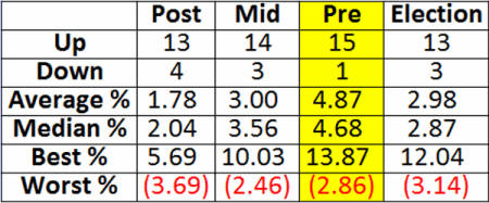
To reiterate, I define the Santa Claus Rally period as the time between the close of trading on the Friday prior to Thanksgiving (11/20/15 this year) through the close of the third trading day of the next year (1/6/16).  Figure 1 displays the summary of results broken down by each year in the election cycle starting in November 1949.

1

Figure 1 – Santa Claus Rally by Election Cycle Year

As you can see in Figure 1 the Pre-Election Year Santa Claus Rally period has seen the Dow advance 15 out of 16 times with an average and median gain just under 5%.

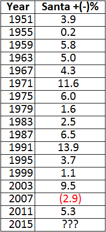
Figure 2 displays the actual % gain or loss during each of the past 16 pre-election years.2

Figure 2 – Santa Claus Rally Period % Gain/Loss (Pre-Election Years)

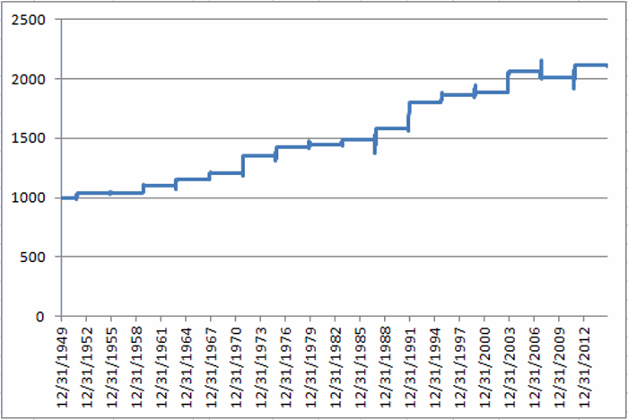
Figure 3 displays the growth of $1,000 invested in the Dow only during the Pre-Election Year Santa Claus Rally period since 1951.3Figure 3 – Growth of $1,000 during Santa Claus Rally Period (Pre-Election Years)

Summary

There are several different possible ways to interpret the information in this piece.

Improper Interpretation: There is a 94% probability that the Dow will be about 5% higher on 1/6/16 than it was on 11/20/15.  Um, no.  Unfortunately, historical results are just that.

Proper Interpretation: It might make sense to give the bullish case the benefit of the doubt for the next roughly six weeks.

Hey, Santa Claus know what we want.  Now we just have to wait and have faith that the Big Guy will deliver the goods.  For what it’s worth…he’s got a pretty good track record.

In the meantime, wishing you all a very Happy Thanksgiving – and thank you for read JayOnTheMarkets.com!

Jay Kaeppel