A Two-Fund Portfolio for the Next Three Months

We live in “interesting times.”  If you follow the financial news at all it is possible to come away thinking that financial Armageddon is just around the corner (and given the current economic turmoil occurring around the globe and the $19 trillion dollar gorilla in the room here at home, it just might be).

(See also Jay Kaeppel Interview at BetterSystemTrader.com)

But investors who plan to hang in there just a little longer before putting it all in gold (or the mattress) still have to figure out where to put their money (assuming of course that they have any to put somewhere).

A Two Fund Portfolio for February/March/April

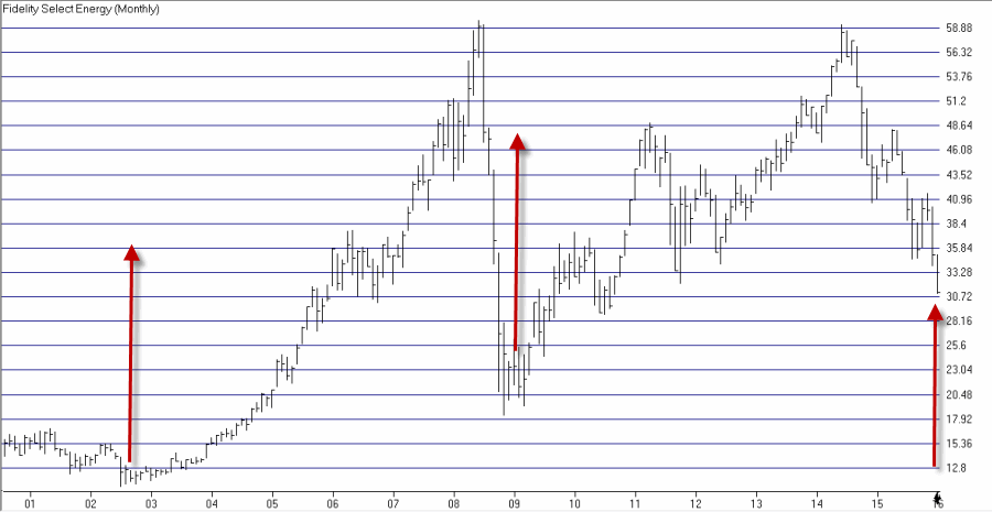
Retailing stocks and energy stocks have both demonstrated a tendency to perform well during the late winter and early spring months of February, March and April. So here is a “thought for consideration”.

*50% in retailing stocks

*50% in energy services stocks

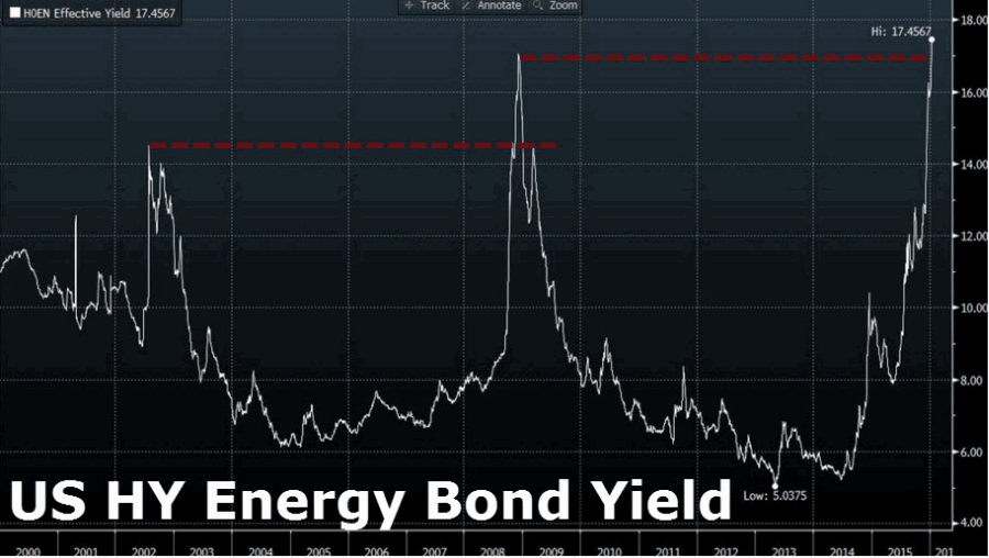
Given the iffy nature of consumer spending and the outright horrific goings on in the energy sector, it’s pretty easy to simply say, “Eh, yeah maybe wait until next year.”  And that may just be the thing to do.  But for argument’s sake let’s look at how this “portfolio” would have performed since 1989.

Rules:

*At the close on the last trading day of January each year, 50% goes into Fidelity Select Retailing (FSRPX) and 50% goes into Fidelity Select Energy Services (FSESX).

*Both funds are sold at the close of the last trading day of April.

*No interest is assumed while out of the market.

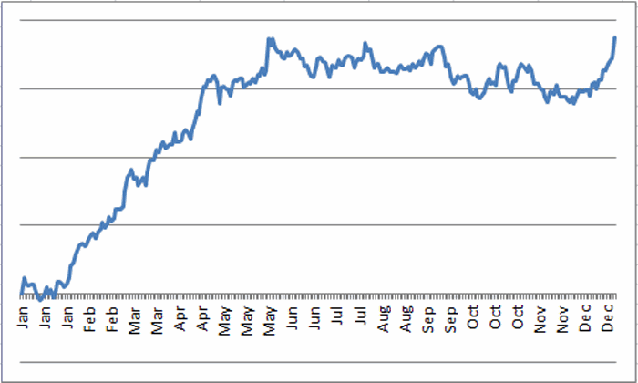
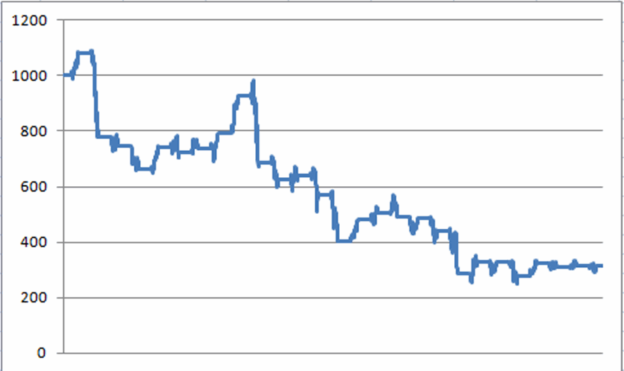
Figure 1 displays the growth of $1,000 using this strategy starting in 1989.1
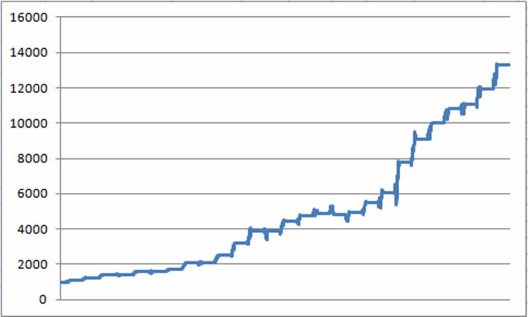
Figure 1 – Growth of $1,000 holding 50% FSRPX and 50% FSESX only during Feb/Mar/Apr each year since 1989

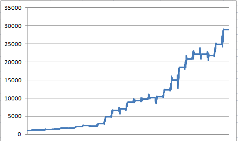
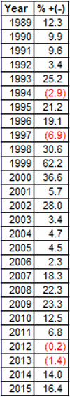
Figure 2 displays the year-by-year results.

2

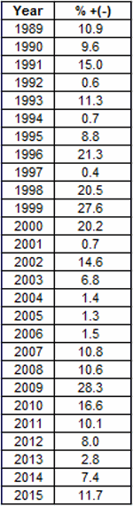
Figure 2 – Year-by-Year Results

First the OK to Pretty Good News:

The average gain during this 3-month period for our two fund portfolio was +10.3% and the median gain was +10.1%.  On the one hand, if you could earn 10+% every three months I assume you’d be pretty happy with that.  At the same time though, an average gain of +10.3% doesn’t quite qualify as “rip-roaring”.  And then there were the 8 years when the gain was less than +3%.  So “pretty good”, but maybe not “wildy fantastic.”  On the other hand…

…Now the Very Good News:

During the 27 years starting in 1989, our two fund portfolio has showed a gain during this 3-month period 100% of the time.  That’s 27-and-oh!

A few results of note for this two-fund Feb/Mar/Apr portfolio:

*# of Gains = 27% (100%)

*Average gain = +10.3%

*Median gain = +10.1%

*Maximum gain = +28.3% (2009)

# of Losses = 0 times (0%)

The Wrong Way to Interpret the Very Good News:

Now if I were a crack marketing guy I would use phrases like “low risk” and “uncanny accuracy” and words like “you” and “can’t” and “lose”.  But not only I am not a good marketing guy I am a guy who has come face-to-face with Murphy and his dreaded “Law” – and come out on the short end – more times than I care to recall.  So do not make the mistake of thinking of this method as “low risk” or even “high probability”.  2016 is a brand new roll of the dice.

Summary

The results shown here suggest that a 50/50 retailing/energy services portfolio bought and held for three months might be a pretty good idea.  The “news” of the day seems to suggest otherwise.  So what to do?

That’s up to each investor to figure out for his or her self.

Jay Kaeppel


‘White Knuckle Time’ for QQQ Bull Put Spread

As you will see in a moment – describing the current situation as “white knuckle time” may be a slight overstatement.  But then again maybe not.

(See also Blood in the Energy Streets (Part II))

In this article I highlighted an example trade using a “bull put spread” using options on QQQ (an ETF that tracks the Nasdaq 100).  The idea was that as long as QQQ did anything besides plummet for awhile the trade would make money.  The original trade on the entry date appears in Figure 1.1Figure 1 – Original QQQ Bull put spread (Courtesy www.OptionsAnalysis.com)

In 12 calendar days since entry, QQQ has advanced modestly from $100.86 to $102.68.  Figure 2 displays the trade as of mid-day Wednesday, 1/27.  The options expire at the close on Friday 1/29 so there are only two (OK, and a half) days left until expiration.2Figure 2 – QQQ Bull put spread as of 1/27 (Courtesy www.OptionsAnalysis.com)

As of the time Figure 2 was created:

*QQQ was trading at $102.68

*The breakeven price for this trade is $96.52

*The trade presently shows an open profit of $410

*The maximum profit potential is $480

So the choices are:

A) Close the trade now, take the $410 profit and not worry about what will happen between now and the close on Friday

B) Hold the trade in hopes that QQQ will not crater –6% between now and the close on Friday.  The hope here is that the options will expire worthless, no action will need to be taken and the full $480 maximum profit will be realized.

So which is the correct choice?  That is not for me to say.  The purpose of this article is simply to alert you to the possibilities and also to point out that things can get a little “squirmy” near expiration.

In this case, anything less than a decline of -5.6% (to the 97 strike price) will allow this trade to earn the full $480 profit.

How you feel about the likelihood of that happening is one thing that can guide your approach.  Another (better) idea is to plan ahead of time (like when you first enter the trade) and either:

*Set a profit target (for example, 80% or 84% or 90% of the maximum profit potential) and close the trade if and when that target is hit

*Set a “fail safe” percentage value above the breakeven price.  For example, if you choose 2%, then as long as the price of the underlying security (QQQ in this example) is that distance above your breakeven price you may simply “hold on” and try to ride it out to expiration.

Summary

One key to successfully trading credit spreads is to NOT find yourself a few days before expiration saying “Oh my God, what do I do now?”

Jay Kaeppel


Blood in the Energy Streets (Part II)

In this previous article I highlighted the fact that the news and outlook for the energy sector appeared to be reaching the “Everyone knows” stage – as in everyone knows that there is no chance that energy related assets will be advancing in price anytime soon.  The outlook has become so universally negative for “all things energy” that it is almost impossible to find anyone who is not bearish on energy.  And perhaps a bearish approach is best as forecasts for $20 or even $10 crude oil abound.

(See also Seasonality in Housing Stocks)

Still, just for the record, we are entering the time of year when energy stocks end to perform well.  Granted there are never any guarantees when it comes to seasonal trends and no way to know in advance if it will be different “this time around”. Nevertheless, the old adage states that “opportunity is where you find it.”  Is it possible that gutsy investors and traders may find it in the energy sector?  Let’s take a look.

Fidelity Select Energy Services (Ticker FSESX)

Figure 1 displays the annual seasonal trend for ticker FSESX since 9/30/1988.  Anything jump out at you?1Figure 1 – Annual Seasonal Trend for FSESX

There has been a strong tendency for energy service stocks to perform well during late winter and early spring.  How well? Figure 2 displays the growth of $1,000 invested in ticker FSESX only between the end of January and the close of the first trading day of May every year since 1989.

2

Figure 2 – Growth of $1,000 invested in FSESX during “bullish” period

Figure 3 displays the % gain or loss experienced by FSESX during the “bullish” time period each year since 1989.

3

Figure 3 – Annual Results for FSESX during “bullish” period

Key things to note – FSESX:

*Showed a gain 23 times (85% of the time)

*The average gain was +17.1%

*The median gain was +14.0%

*The largest gain was +62.2% (1999)

*Showed a loss 4 times (15%)

*The average loss was -2.9%

*The median loss was -2.1%

*The largest loss was -6.9% (1997)

Summary

So are energy service stocks sure to advance in the months ahead?  Not at all.  Still when you combine a sector entering a seasonally bullish period with sentiment regarding that sector that is universally negative – you may the ingredients for a surprisingly favorable move.

Jay Kaeppel

Seasonality in Housing Stocks

Alright, first the Bad News: A) The trend I am going to discuss is not necessarily “timely”, and B) technically, one could say that it is “not working” at this exact moment in time.  The Good News is that on a rolling five-year return basis, this trend has yet to show a loss (at least not since I started tracking Fidelity Select Construction & Housing (ticker FSHOX) in 1988.

Bullish Period versus Bearish Period

*The “bullish” period for housing stocks (using FSHOX as a proxy) begins at the close of trading on October Trading Day #7 and extends through the end of the 2nd trading day the following June.

*The “bearish” period for housing stocks (using FSHOX as a proxy) begins at the close of trading on the 2nd trading day of June and extends through the end of the 7th trading day in October.

The Periods at a Glance

Figure 1 displays the annual seasonal chart for FSHOX.  As you can see, the tendency has been to stage a strong advance during the so-called “bullish” period and to lose ground during the so-called bearish period.1Figure 1 – FSHOX Seasonal Pattern

To illustrate the difference in performance more clearly, Figure 2 displays the growth of $1,000 invested in FSHOX only during the bullish period every year since December 1988.  To date, $1,000 has grown to $60,159 (+5,916%).  That’s the good news. The bad news is that since 10/9/15 FSHOX is down -11.6%.2Figure 2 – FSHOX performance during “Bullish” periods (12/1988-present)

Figure 3 displays the growth of $1,000 invested in FSHOX only during the bearish period every year since December 1988.  To date, $1,000 has declined in value to $316 (-68%).3Figure 3 – FSHOX performance during “Bearish” periods (12/1988-present)

As you can see in Figure 3 it is not as though FSHOX declines each and every year during the “bearish” period.  Still, a gain of +5,915% for the bullish periods versus a loss of -68% for the bearish periods is what we “quantitative types” refer to as “statistically significant”.

Long-Term Perspective: 5-Year Rolling Returns

Figure 4 starts at the end of 1993 and shows the total return over the previous 5-years for both bullish and bearish seasonal periods using FSHOX.

The bullish periods appear in blue and the bearish periods in red.4

Figure 4 – 5-Yr. % return for Bullish Periods (Blue) versus Bearish Periods (Red)

There are two key things to note from Figure 4:

*The “bullish” period for FSHOX has gained ground over a 5-year period 100% of the time

*The “bullish” period for FSHOX has outperformed the “bearish” period over a 5-year period 100% of the time

Other figures to note:

*The median 5-year gain for the “bullish” period is +118.4%

*The median 5-year loss for the “bearish” period is (-19.1%)

*The “bullish” period has showed a 5-year gain 100% of the time

*The “bearish” period has show a 5-year gain only 17.4% of the time

One Precedent of Interest

The October 2008-June 2009 period is shown in Figure 5.5Figure 5 – FSHOX 2008-2009 Bullish Period (Courtesy AIQ TradingExpert)

2015-2106 so far appears in Figure 6.6

Figure 6 – FSHOX 2015-2016 Bullish Period (so far) (Courtesy AIQ TradingExpert)

Summary

The tendency for housing and construction stocks to outperform between early October and early June (in a significant way) is one of the more persistent seasonal trends ?I have seen.  That’s the Good News.

The Bad News is that this trend isn’t doing anybody any good this time around (with FSHOX down -11.6% since October 9th).  So that leads to one of two possibilities:

*Housing and construction stocks are just having not able to perform in the current market environment, or;

*Housing and construction stocks may be poised for a decent advance between now and June.

If we are in fact on the brink of a worldwide economic meltdown then there isn’t much chances that building stocks are going to look too good.  But if not – and certainly from a contrarian point of view – then these tocks may be worth a look.

Jay Kaeppel


Adjusting SLV to “Lock In” Profit

In this article I highlighted an example (please note the ruse of the word “example” and the lack of the word “recommendation”) trade that involved buying March call options on ticker SLV (an ETF that tracks the price of silver bullion) based on the idea that SLV price action had formed a “multiple bottom.”

Since that time SLV has risen from $13.17 to $13.48 a share and the March 12 call option has risen from $1.34 to $1.59.  Based on an original 18-lot and a risk of $2,412, this trade has gained $450 in value, or +19.5%.  See Figure 1.

(click to enlarge)1Figure 1 – Updated SLV March 1 call trade (Courtesy www.OptionsAnalysis.com)

Now there is absolutely nothing wrong with holding on and “letting it ride” as there is a lot of upside potential if SLV continues to rally.  But the purpose of these examples is to teach a little bit about the possibilities available to option traders.  So let’s explore one possible “adjustment” that a trader might make here.

Adjusting to Lock In Profit and Buy More Time

So here is the adjustment:

*Sell 18 SLV March 12 strike price calls @ 1.59

*Buy 4 SLV July 13.5 strike price call @ $1.02

Executing this adjustment results in the position displayed in Figure 2.

(click to enlarge)2Figure 2 – Adjusted SLV trade (Courtesy www.OptionsAnalysis.com)

There is “Good News” and “Bad News” associated with this adjustment.

The Good News:

*The trade no longer risks $2,412.  In fact the worst case is now a profit of +$42 (if SLV is at or below $13.5 as of July expiration)

*The trade can be held for 4 additional months since it now holds July calls instead of March.

The Bad News:

*Profit potential is reduced dramatically because the position now holds a 4-lot instead of an 18-lot.

So is this a “good adjustment”.  Each trader needs to answer that question on their own. Bu now at least you know that such a thing is possible.

Jay Kaeppel

A Really JNKy Update

In this article I highlighted an example (please note the ruse of the word “example” and the lack of the word “recommendation”) of a”bull put credit spread” using options on ticker JNK, an ETF that tracks a junk bond index.

At the time of the initial example, JNK was trading at $33.51. The “catalyst” was a fairly flimsy theory that JNK could be forming “double bottom”. See Figure 1.

(click to enlarge)1Figure 1 – Original JNK Bull Put Spread (Courtesy www.OptionsAnalysis.com)

The original article discussed a near stop-loss and a far stop-loss.  The near stop-loss was $32.92 which was hit after just a few days when the double bottom failed to hold. An exit there would have resulted in a loss of roughly-$430. See Figure 2.

(click to enlarge)2Figure 2 – Near stop-loss hit (Courtesy www.OptionsAnalysis.com)

The far stop-loss was the trade’s breakeven price of $32.43.  That price was hit on 1/20 and would have resulted in a loss of roughly $-730.  See Figure 3.

(click to enlarge)3Figure 3 – Far stop-loss hit (Courtesy www.OptionsAnalysis.com)

So What Have We Learned?

As you can see in Figure 1, 2 and 3, this hypothetical trade was a distaster pretty much from the get go.  So what have we learned?  A few possibilities come to mind.  We learned:

*What a bull put credit spread is and how it works.

*The importance of determining in advance at what point you will exit a trade and the importance of sticking to your trading plan.

We may also have learned that a bull put credit spread is a decent strategy for playing a “potential double bottom” if one is so inclined.  But perhaps we also learned that relying on “potential double bottoms” as a trading catalyst –particularly in the face of a sharply declining market – may not be the best trading idea in the world

Jay Kaeppel


An Interesting Strategy (Not My Own)

I don’t necessarily endorse or not endorse the timing, strategy or the specific stocks highlighted in this linked article (Scared The Market Will Go Down, But Don’t Want To Sell Everything And Miss The Recovery? Here’s What You Do! by Todd Hagopian).

But it does detail a very interesting – and very specific – approach towards using options to improve one’s odds of success in the face of a very scary market.

If you are interested in “expanding your horizons” a bit this one is worth a read.

Jay Kaeppel

Update on UNG Bear Call Spread

“You got to know when to hold ‘em, know when to fold ‘em” Kenny Rogers, The Gambler

In this article I highlighted an example trade using options on ticker UNG, an ETF that tracks the price of natural gas futures.  The trade involved a strategy known as the “bear call credit spread”.  This strategy makes money as long as the underlying security remains below the strike price of the call option sold.

Figure 1 displays the outlook for the trade on the initial date.  The initial maximum profit potential was $432.

(click to enlarge)1Figure 1 – Initial UNG Bear Call Spread (Courtesy www.OptionsAnalysis.com)

Figure 2 displays the example position as of mid-day on 1/19.  As you can see the price of ticker UNG shares has fallen from $9.21 to $7.71.

(click to enlarge)2igure 2 – Updated UNG Bear Call Spread (Courtesy www.OptionsAnalysis.com)

This trade could presently be closed with an open profit of $384, or +19.5%.  With the breakeven price of $10.18 a full 32% above the current share price of $7.71, there is no reason why a trader could not simply “let it ride” and wait for some more time decay to push the profit move toward the maximum level of +$432.

However, another alternative way to look at it is this: There is still a month left until expiration in a very volatile market.  The original profit/loss tradeoff was:

+$432 / $1968

With $384 of those $432 already earned the current profit/loss tradeoff is:

+$48 of additional profit potential / $2,352 of risk

In other words, the best case scenario from here is to gain another $48 in profit.  The worst case scenario is to give back the open profit of $384 plus $1,968.

Summary

There is no “correct” answer regarding what to do – “fold ‘em” or “let ‘em ride” – in this situation.  But a 19.5% return in 11 days and a sharply oversold market would certainly justify “moving on to greener pastures” in this example

Jay Kaeppel

Blood in the Energy Streets

One of the oldest, coldest and cruelest adages in investing states that the time to buy is when “there is blood in the streets.”  It occurred to me today that we may be getting close to that point in the energy sector.

Don’t get me wrong, I am not making any bold proclamations here.  I am as fearful of diving into the energy sector as the next guy at the moment.  I have no idea how much further crude oil may fall and I have no way of saying for certain that the predictions of $20 or $10 a barrel will not play out. So I am in no big rush to “dive in” here.

Still…absolutely everything that I read about the energy sector is now uniformly bearish. Does this or does this not qualify as “blood in the streets?”

An Interesting “Spike”

I read www.ZeroHedge.com and suggest that you do also.  It contains a lot of information without any “sugar coating” and I find it to be a valuable source of information that I don’t find in other places.  That being said, I noticed something in a recent post that struck me in a very contrarian kind of way.  In this post the author rightly points out the frightening fact that Wells Fargo presently has $17 billion (that’s billion with a “b”) in outstanding – mostly non-investment grade – energy sector loans. The frightening implications – dire straits for the banking Industry, the threat of another 2008-type financial meltdown, etc. – are not to be ignored.

But there was also a chart included, which is captured as displayed in Figure 1 below.  It displays the U.S. High Yield Energy Bond Yield. 1aFigure 1 – U.S. High Yield Energy Bond Yield (Source: www.ZeroHedge.com)

The value in the chart has spiked to a new all-time high, eclipsing the previous high from 2008, which eclipsed the previous high from 2002.  It is a fairly simple reaction to look at the chart and gasp “Whoa”.  But something popped in my head and (unlike a lot of things that pop into my head) I was right about this one.

Figure 2 displays Fidelity Select Energy (FSENX) with the dates of three spikes from Figure 1 highlighted.  Notice anything interesting?1bFigure 2 – Fidelity Select Energy(Courtesy AIQ TradingExpert)

The bottom line is that the two previous spikes marked major bear market lows for energy stocks – in mid-2002 and the end of 2008. So will it play out this way again this time around?  Or are we really headed for the financial apocalypse this time around?

I do not presume to know the answer.

But I think it may be about time to start looking at the energy sector as a potential buying opportunity (although I do think it makes sense to wait for some sign of an end to the waterfall decline in the price of all things energy).

Jay Kaeppel


QQQ Bull Put Spread Example

The trade highlighted in this piece is an “example” of a bull put credit spread using options on ticker QQQ, the ETF that tracks the Nasdaq 100 Index. It t would should NOT be construed as a recommendation.  However, it does offer a classic example of a number of elements that a trader should consider when evaluating a certain type of trade.

QQQ Snapshot

As of 1/15/16:

*Implied Volatility for options on ticker QQQ is presently near the high end of the historical range (See Figure 1). This tells us that there is presently a lot of time premium built in price of QQQ options and suggests that “selling premium” might be the best approach to trading QQQ options.1Figure 1 – Implied volatility is high for QQQ options – meaning lots of time premium in the price of QQQ options(Courtesy www.OptionsAnalysis.com)

“Spikes” in implied volatility most often – though certainly not always – accompany at least short-term bottoms in price (See Figure 2).2Figure 2 – “Spikes” in IV often highlight (at least short-term) lows (Courtesy www.OptionsAnalysis.com)

*QQQ was extremely oversold and was threatening the recent low range of $98.01-$98.75 (See Figure 3).  This area may serve as a useful “line in the sand”.  If it holds – and especially given the current oversold state of the market – a sharp reversal could occur.  However, if that price range is breached to the downside it would suggest abandoning any near-term bullish hopes.3

Figure 3 – QQQ with clear support levels (Courtesy AIQ TradingExpert)

When we put all of these factors together it may seem reasonable to believe that QQQ may hold – and possibly bounce off of its recent support level, at least for a short while. So the example trade that appears in Figures 4 and 5 below attempts to take advantage of such a scenario.

QQQ Bull Put Spread

The example trade displayed in Figures 4 and 5 is referred to as a “bull put spread” as it creates a bullish position by selling an out-of-the-money put option and buying a further out of the money put option at a lower strike price.  In this example, this trade will make money as long as QQQ – presently trading at $100.84 remains above $96.52 through January 29th.

The trade involves:

*Selling 10 Jan Week 5 97 strike price puts

*Buying 10 Jan Week 5 94 strike price puts

4Figure 4 – QQQ Jan Week 5 Bull But Spread (Courtesy www.OptionsAnalysis.com)5Figure 5 – QQQ Jan Week 5 Bull Put Spread Risk Curves (Courtesy www.OptionsAnalysis.com)

As you can see in Figures 4 and 5:

*The maximum profit potential is $480

*The maximum risk is -$2,520 (which we will attempt to minimize in a moment)

*The options expire in less than two weeks on January 29th

*The downside breakeven price is $96.52

*If QQQ is above $96.52 at the close on 1/29 this trade will show a profit

*If QQQ is above $97.00 at the close on 1/29 this trade will earn the maximum profit potential of $480

So the gist of this trade is that a trader who would enter into this type of position would have to be confident that QQQ will decline no more than another -4.3% prior to 1/29. 

Stop-Loss Considerations

If a trader entered this example position, held it until expiration and at that time QQQ was below $94 a share, this position would show a loss of -$2,520.  Allowing this to happen is simply not advisable.  A trader could decide to exit the trade if price drops below the breakeven price of $96.52 – which is below the “Line(s) in the sand” displayed in Figure 3.

Getting stopped out at this price would result in a loss of approximately $620-$680, depending on how soon this price is hit.

Summary

The example QQQ trade highlighted here combines a number of elements:

*Selling premium in the face of high implied volatility

*A clear “line in the sand” (i.e., an identifiable support level)

*A decent reward-to-risk ratio (for a short premium trade)

*And a relatively short holding period (14 or less days)

*A breakeven price that is 4.3% below the current underlying market price

Does that mean it’s a good trade?  Not necessarily. The obvious risk is that it doesn’t take much to imagine QQQ cutting through the “line in the sand” and the breakeven price like a hot knife through butter.  In other words, this trade could have already been stopped out by the time you read about.

But hey, that’s the nature of trading.  The real point is not the actual trade highlighted but the underlying principles and steps used to identify the trade.  If you consistently put the odds in your favor you stand an excellent chance for long-term success.

Jay Kaeppel