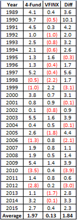
When it comes to trading and investing, knowing what strategy to use when is often half the battle.
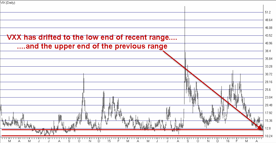
Take a look at ticker MRK in Figures 1 and 2. As you can see, following the recent rally MRK is once again “bumping its head” on a familiar resistance area between roughly $56 and $61.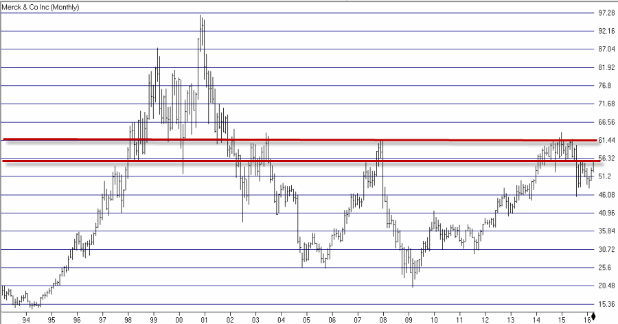 Figure 1 – MRK Weekly (Courtesy AIQ TradingExpert)
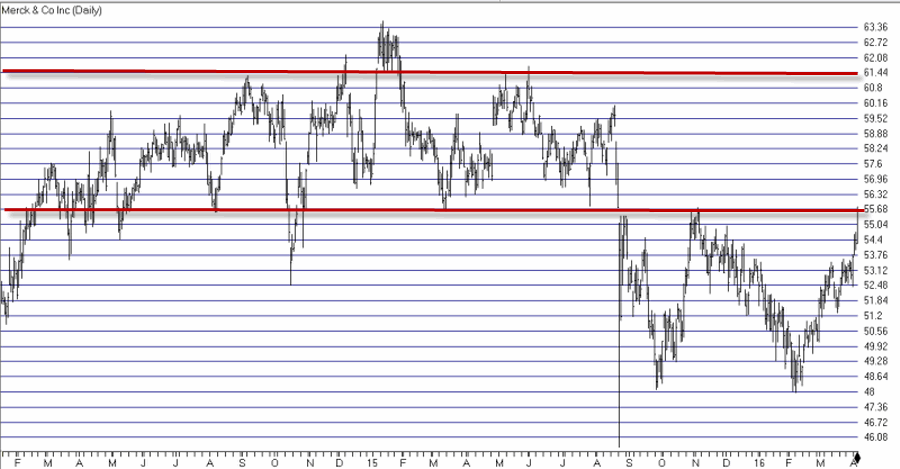 Figure 2 – MRK Daily (Courtesy AIQ TradingExpert)
Now different traders may look at these charts and have different reactions. Some might say “it’s time to sell” or possibly even say “it’s time to sell short”. On the other hand others may look at this and say “gee, if it can just break through resistance it could run to a much higher level.”
The other side of the equation involves asking how much money a trader is willing to risk in order to express that opinion. So for the sake of example (and as always, please remember that this is an example and not a recommendation) let’s say that a trader wants to establish a bullish position in case MRK does manage to breakout to the upside, but that he or she doesn’t wish to risk much money.
The Bull Call Backspread
The strategy we will use is an option strategy known most commonly as a “backspread”. This strategy involves selling a lower strike price call option and using some or all of the proceeds to buy 2 or higher strike price calls. In our example we also want to give MRK some time to work its way higher, so we will consider longer-term rather than shorter term options.
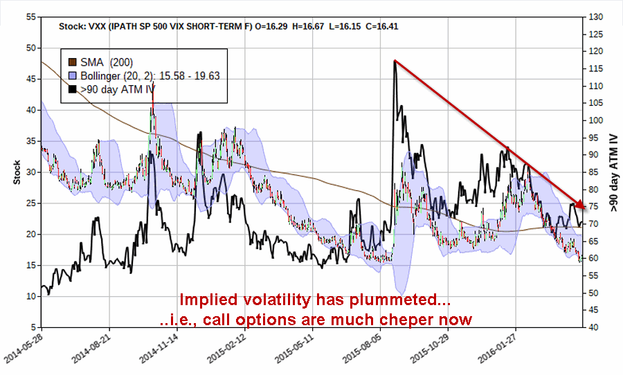
One other note regarding the backspread strategy. At the time the trade is entered, the lower the implied volatility for the options the better (after the position is entered, a rise in volatility can increase the profit potential and/or reduce the shorter-term risk, and vice versa). As you can see in Figure 3, the implied volatility for MRK options is not at “rock bottom” levels, but it has fallen back down to the low end of the historical range.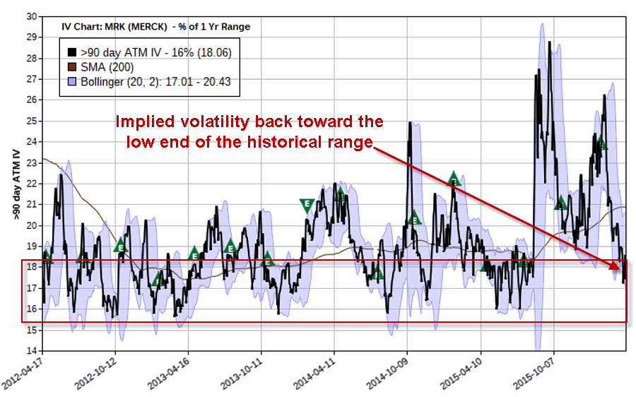 Figure 3 – Implied volatility for MRK options has fallen recently (Courtesy www.OptionsAnalysis.com)
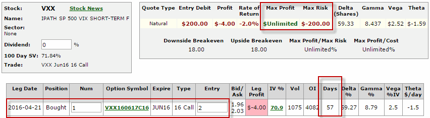
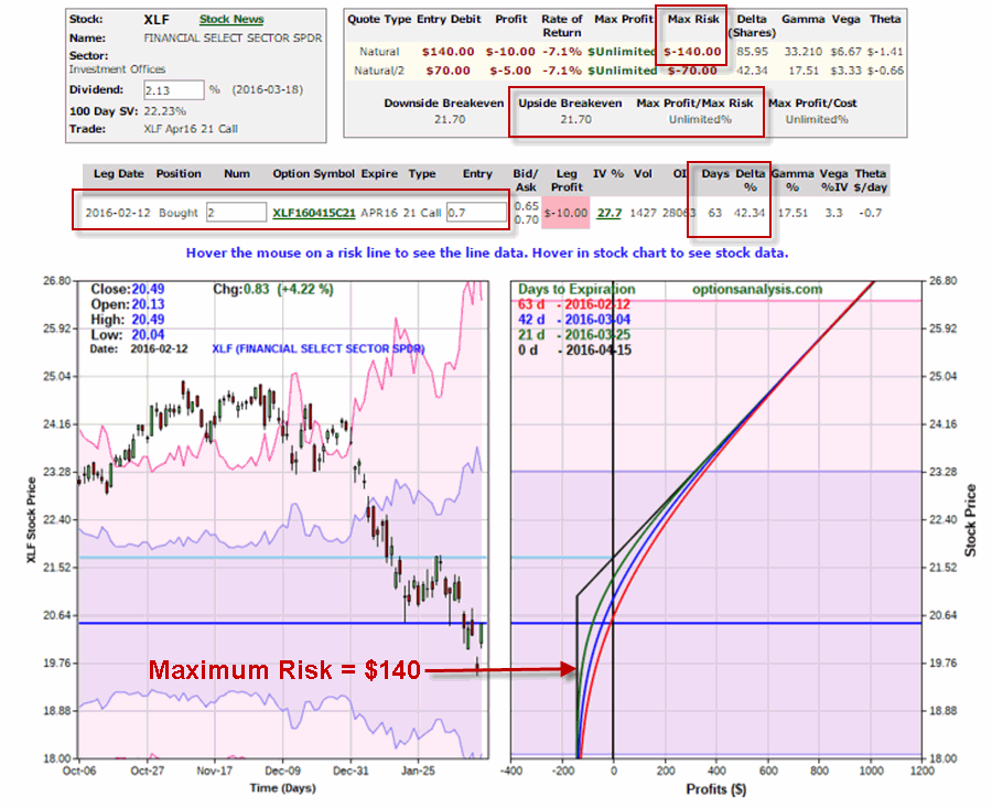
The particulars of our example trade appear in Figure 4.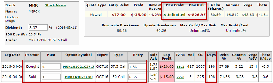 Figure 4 – MRK call backspread (Courtesy www.OptionsAnalysis.com)
Key things to note:
*There are 198 days left until option expiration
*The trade holds unlimited upside potential
*The maximum risk is -$826, however, that amount of loss would only be incurred if we are still holding this trade on October option expiration day AND MRK closes on that day at exactly $57.50. In other words, in order to negate that risk all we have to do is resolve to exit the trade prior to October expiration.
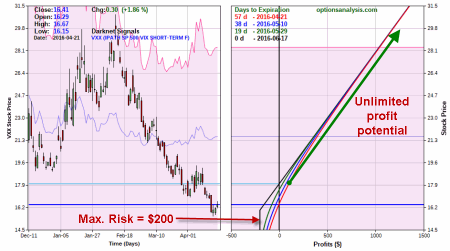
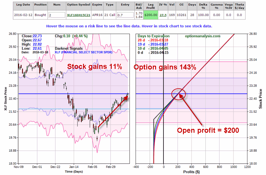
Figure 5 looks at the risk involved with this position.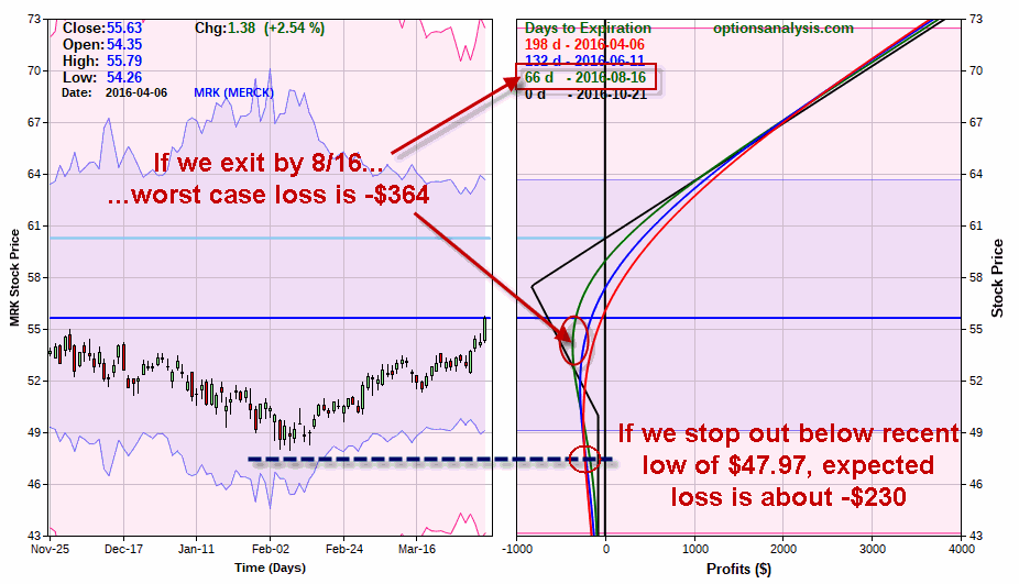 Figure 5 – Risks involved with MRK call backspread (Courtesy www.OptionsAnalysis.com)
As you can see, if we resolve to exit the trade by 8/16 for example (the risk curve for this date is represented by the green line in Figures 5 and 6):
*This gives MRK over four months to make some kind of a move to the upside AND
*The worst case loss is approximately -$364 (this is approximate because a decline in volatility could result in a slightly larger loss and a rise in volatility could result in a slightly small loss).
Also note that we can give MRK a lot of room on the downside. A close look at the risk curve lines in Figure 5 reveal that as MRK price falls lower the dollar risk actual decreases. So if we use the recent low of $47.97 as a stop-loss point, by the time MRK falls to that price our risk is only approximately -$230 (again depending somewhat on any changes in volatility).
Now let’s consider the profit potential as displayed in Figure 6.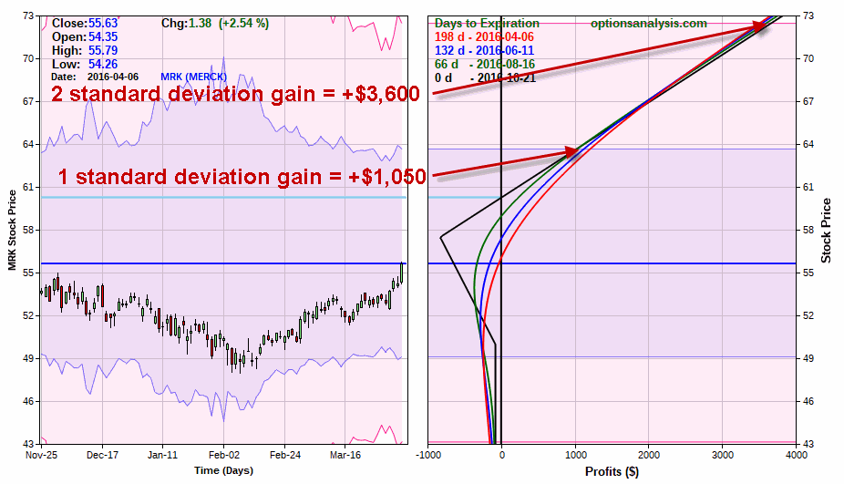 Figure 6 – MRK call backspread profit potential (Courtesy www.OptionsAnalysis.com)
As you can see in Figure 6 if MRK moves one standard deviation higher to roughly $64 a share the trade will generate a profit of approximately $1,050. And if MRK was able to break out above the 2015 high of $63.62 and rally two-standard deviations then profit potential soars to much higher levels.
Summary
The trade presented herein is an example of a call backspread with a reasonably good reward-to-risk profile – nothing more, nothing less. That being said please note that I am note “predicting” that MRK will in fact breakout to the upside. The 56 to 61 price range has been a rally killer on numerous occasions in the past and there is no reason to think it can’t be again. This is important to consider because the bottom line is that if the stock does not rally further to the upside this trade will lose money.
But not much. And that really is the point. This trade represents an example of one way to play a potential continuation for MRK while essentially only “risking a couple of bucks.” Like I said, knowing what strategy to use when is often half the battle.
Jay Kaeppel
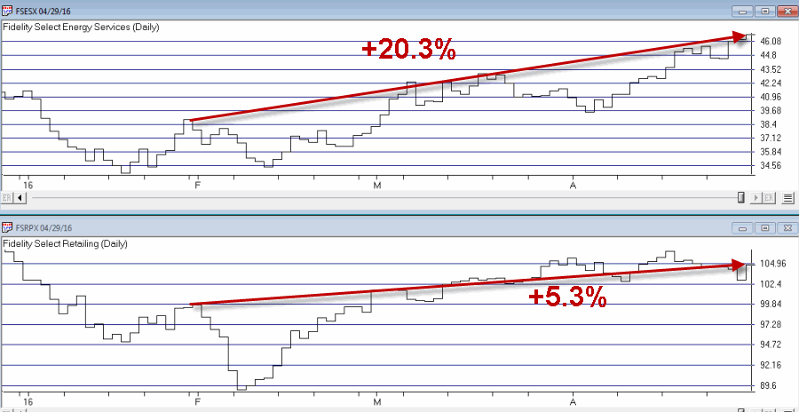 Figure 2 – Tickers FSESX and FSRPX; end of January through April (Courtesy AIQ TradingExpert)