All posts by admin

Why You Should Be Rooting for a Bullish January

Does it really matter if stock market performance is bullish during the month of January?  You bet! In fact, the more “persistently” bullish it is the better.  Let’s let the numbers tell the tale.

(See also Out With the Old, In With the, Uh-Oh)

The January Barometer and More

The January Barometer was devised by Yale Hirsch of The Stock Trader’s Almanac in the early 1970’s and is still tracked today at STA by his son Jeffrey Hirsch.  The simple theory is that “as January goes, so goes the rest of the year”, if January shows a gain then the 11 months from end of January through the end of December should also show a gain.

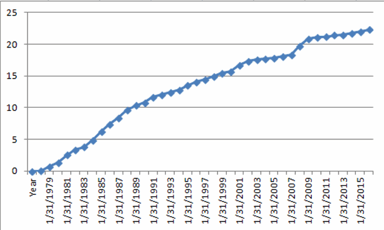
Using the Dow Jones Industrials Average, Figure 1 displays the growth of $1,000 invested in the Dow from the end of January through the end of December only during those years when the Dow Industrials showed a gain during the month of January.1
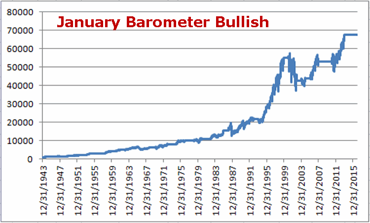
Figure 1 – Growth of $1,000 invested in Dow Industrials from end of January to end of December if January shows a gain

For the record:

*# times up = 40 (85% of the time)

*#times down = 7 (15% of the time)

*Average Gain = +13.2%

*Average Loss = (-8.4%)

This seems like a good time to invoke:

Jay’s Trading Maxim #52: In the financial markets, anything that is 85% accurate is at least worth knowing about

But there is more.  In my (WARNING: Shameless, Self-Serving Plug to follow) book “Seasonal Stock Market Trends” I wrote about something I called The JayNewary Barometer (OK, it seemed like a good idea at the time). It is a simple model that goes like this:

*If the 1st 5 trading days of January show a gain add +1 point

*If the last 5 trading days of January show a gain add +1 point

*If the month of January as a whole shows a gain add +1 point

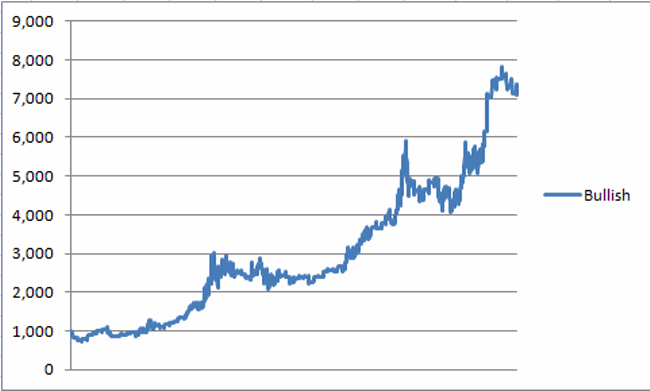
So at any point in time the JayNewary Barometer model can read 0, +1, +2, or +3.  Using the Dow Jones Industrials Average, Figure 2 displays the growth of $1,000 invested in the Dow from the end of January through the end of December only during those years when the JayNewary Barometer registered a reading of +3 (i.e., the Dow showed again during all 3 time periods listed above).2
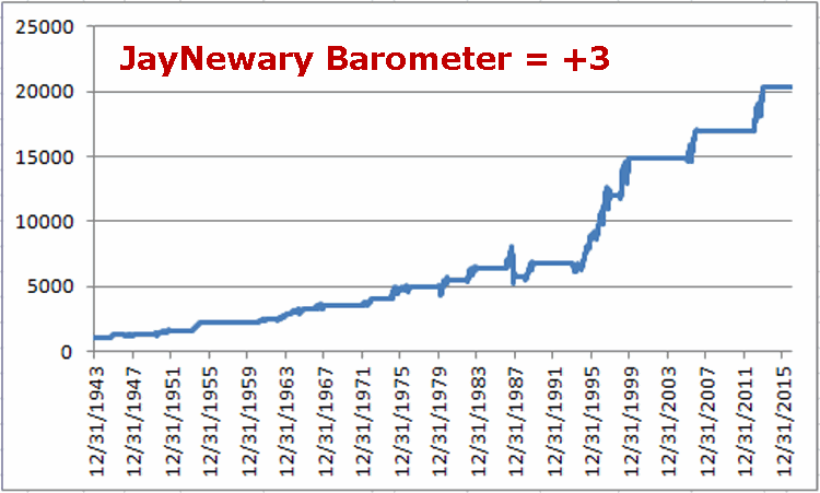
Figure 2 – $1,000 invested in Dow Industrials from end of January to  end of December if 1st 5 days of January and last 5 days of January and the month of January as a whole all register gains

For the record:

*# times up = 22 (92% of the time)

*#times down = 2 (8% of the time)

*Average Gain = +15.7%

*Average Loss = (-6.9%)

92% accurate is  pretty good.   But nothing is infallible.  A buy signal occurred on January 31st, 1987.  Which was fine.  For a while. Just ask anyone who was in the stock market  on October 19, 1987 (“Hi, my name is Jay”) when Dow lost 22% in a day.

So just remember that bad things can happen to good models.

Summary

Barring a decline of over 200 Dow points on 1/9/17, the 1st five trading days of January will register a gain.  Will the last 5 days and the month of January as a whole also register a gain?  It beats me.  But I know what I am rooting for.

To paraphrase P.D. Eastman, “Go Dow Go”.

Jay Kaeppel

Out With the Old, In With the, Uh-Oh

The only thing I loathe more than politics are actual politicians.  So whatever side of the (somehow) “debate” (doesn’t seem nearly a strong enough word) you are on, please do not get mad at me – or applaud me – for what follows ( bottom line: I don’t care about your political leanings anymore that I expect you to care about mine).

The gist of this article has nothing really to do with politics, but more to do with market history.  As a “student of market history” and as a proud graduate of “The School of  Whatever Works” (Good ole’ SWW – our school cheer: “Whatever!”)  I have seen enough “patterns repeat” that I for one find a number of uses for seasonal analysis.  So here is one (admittedly somewhat arcane – and involving an exceptionally small sample size of 3) relatively recent historical pattern that potentially bodes ill for the stock market later this year and well into next.

(See also Potentially Foolish Speculative Ideas for 2017)

New Republican Administrations and the Stock Market

A “new” Republican Administration is defined here as one that “follows an outgoing Democratic Administration.”  The last 3 were Nixon, Reagan and Bush II. Figures 1, 2 and 3 below display the % gain/loss for the Dow Jones Industrials Average from December 31st of the election year through September of the subsequent mid-term election year for each of the 3 Presidents mentioned above.1Figure 1 – Dow %+(-) during 1st 21 months of Nixon administration

2Figure 2 – Dow %+(-) during 1st 21 months of Reagan administration

3Figure 3 – Dow %+(-) during 1st 21 months of Bush II administration

Anything jump out at you? So does this imply that the first 20 or so months of the Trump Administration are doomed to witness poor stock market performance?  Not at all.  Still, before moving on let’s take a look at the “average” Dow performance during the first 21 months of the last 3 “new” Republican administrations and project it forward, which appears in Figure 4.4Figure 4 – Average performance from Figures 1, 2 and 3 above projected forward

So are stocks really going to sell off between May and September of this year and April and August of 2018?  It beats me.  No one should interpret Figure  4 as a “prediction”.  In my mind it serves as nothing more than “something to keep in mind.”

And I do think that there is a “right way” and a “wrong way” to look at these numbers.

The “Wrong Way”: “I better avoid the stock market because it is doomed to decline in the next 21 months.”

The “Right Way”: If stocks start to decline – and say, the major  indexes take out a meaningful moving average – especially if this decline starts in May or sometime after, history suggest that I might do well to take defensive action and not just attempt to “ride the storm out.”

In other words, the results depicted here are nothing to panic about.  But they are worth being aware of – and being prepared for.

Jay Kaeppel

Potentially Foolish Speculative Ideas for 2017

Alright I will grant you that the title isn’t quite as appealing as “Great Investment Ideas for 2017” – but deep down it does have a certain appeal.  Unfortunately, the truth is that I am not very good at “predicting” things.  So I don’t really know what the great investment ideas are for 2017 (although I hope to latch onto them early enough to take advantage of them anyway, whatever they may turn out to be).

In essence I don’t deal in “expectations” so much as I do in “possibilities”.  So in this and other upcoming pieces I will look at several admittedly very speculative possibilities.

Caveat: As always I need to point out that I do not “offer advice” here nor do I “recommend” trades.  I just report what I see.  Sometimes the ideas are good, sometimes not so much (the analogy would be when George Carlin used to say that his job was to think up the “goofy s%$@” and report it to his audience). You have been warned.

(See also January Showdown – Murphy vs. Munis)

Crude Oil in the Near-Term

Seasonally speaking, crude oil is in something of a “danger zone”.  Figure 1 displays the annual seasonal chart for crude oil.  You will note that the period between January Trading Day #1 and February Trading Day #11 is not terribly robust in terms of upside performance.

1Figure 1 – Crude Oil Annual Seasonal Trend

Figure 2 displays the growth of capital generated by holding a long position in crude oil futures only during this period since 1983.2Figure 2 – Equity curve from holding Long crude oil futures 2nd trading day of January through 11th trading day of February

While the long-term results are pretty bad, it should be noted that this seasonally unfavorable period witnessed a decline in 19 of the past 32 years (which is just under 60% of the time).  So it is by no means a “sure thing” that crude is headed lower in the near-term.  But it does suggest caution I in order and that there is at least a chance o lower prices for crude.

Figure 3 displays the weekly chart for Spot crude oil.  We see some meaningful resistance levels as well as a potential key reversal back to the downside on – cue the scary music – the 1st trading day of 2017.3Figure 3 – Weekly Crude Oil faces resistance (Profitsource)

So can we conclude that crude oil is headed lower and that we should sell short as many crude oil futures contracts as we can get our hands on? Well, that was not exactly where I was going with this.  Since this is just a “wildly speculative” idea I was thinking of something with a whole lot less dollar risk involved.

The position highlighted in the Figures below involves buying in-the-money put options on ticker USO – the exchange-traded fund that (purports) to track the price of crude oil. The position involved is simply:

*Buy 1 USO Feb2017 13 put @ 1.50

-Buying a 1-lot involves a cost – and maximum risk – of $150.

-As this is written, USO shares trade at $11.57 a share.  The breakeven price for this option trade is $11.48 a share for USO.  So time premium and time decay is not really much of an issue.  Either USO will decline and this position will make money or USO will not decline and this trade will lose money – but no more than $150 per option contract.

-The Feb options expire on 2/17 which is one day after February Trading Day #11 – our scheduled exit date.

Figure 4 displays the particulars and Figure 5 displays the risk curves.4Figure 45Figure 5

Summary

Is this hypothetical position a good idea?  For the record, I am not actually suggesting that it is.  What I am saying is that when you combine a negative seasonal trend with a potential downside reversal on the weekly chart you have the potential for a decline.  By buying an inexpensive put option – and by paying very little time premium – even a small decline in the price of crude could generate a decent return.

Hey, it’s not the worst way to blow $150 bucks.

Jay Kaeppel

January Showdown: Murphy vs. Munis

Murphy’s Law clearly states that “Whatever can go wrong, will go wrong.”

Jay’s Trading Maxim #206 clearly states: Murphy hates you.  Plan accordingly.

Another popular saying clearly states that: “All good things have got to come to an end”

Oh, and the 30+ year bull market in bond appears to be in some serious trouble.

Add it all up and what do we get?  A impending clash of opposing forces.

(See also The One Asset Class Per Month Strategy)

Murphy’s Law versus Short-Term Muni bonds during the month of January

Huh? Here is a little known fact.  For almost four decades short-term muni bonds have been a “sure thing” during the month of January.  Granted they don’t often make a whole lot of money, but still, let’s consider the long-term record.

For our test we will use Vanguard Short-Term Tax Emempt Fund (ticker VWSTX) as our proxy for short-term munis.  Figure 1 displays the total return for VWSTX during the month of January since January 1978.  Anything jump out at you?1Figure 1 – VWSTX Total Return during January (Souce: PEP database from Callan Associates); 1978-2016

For the record:

*#of times VWSTX showed a gain in January = 39

*# of times VWSTX showed a loss in January = 0

*Average gain = +0.52% (or 6.4% annualized)

As the old saying goes (well at least there should be an old saying that goes like this) “39 and 0 ain’t too shabby”.

Figure 2 displays the cumulative total return for VWSTX during the month of January since 1978.2Figure 2– VWSTX Total Cumulative Return during January (Souce: PEP database from Callan Associates); 1978-2016

But What About 2017?

Ah, there’s the rub.  So now the cat is out of the bag and the knowledge is out there that short-term munis “always” go up during January.  But when we combine this “sure thing” with the fact that “Murphy hates you” (alright, in the interest of full disclosure, it could just be me) with the fact that for the first time in decades bonds appear to be quite vulnerable, it sets up a “showdown” now in the month of 2017.

So will short-term munis chalk up #40 in a row?  Or will Murphy finally exact his revenge?

Grab some popcorn.

Jay Kaeppel

Out With the Old (Part 2)

This article is targeted for traders who are interested in using options to make money in ways that you cannot simply by buying and selling stocks, bonds, ETFs, commodities, etc.  If options “ain’t your cup of tea”, then hey, class dismissed early today! Still, since we are talking about a position that (hypothetically) gained +139% while the underlying security gained all of +1.6%, it may be worth your while to read on.

In this article on 12/12/16 I wrote about a hypothetical trade using options on ticker TLT – the ETF that tracks the long-term Treasury bond – designed to “pick the bottom” without “betting the ranch.”   The strategy is formally referred to as the “2-3-1 Out-of-the-money Butterfly Spread”.

This is the follow up to see how that position turned out.

The Original Trade

*Buy 14 TLT DecQ4 116.5 calls @ 1.96

*Sell 21 TLT DecQ4 118.5 calls @ 0.98

*Buy 7 TLT DecQ4 120.5 calls @ 0.43

The DecQ4 options expire at the close on 12/30/2016

This trade had a cost – and maximum risk – of $987.  The maximum profit potential was +$1,813.

With TLT trading at $117.26 a share on 12/12/16 the trade would:

a) Make money if TLT bounces higher between December 12 and the end of the year

b) Lose money if TLT continues to trend lower

Managing the Trade

As I mentioned in the original article this was not a “set it and forget it” trade. A traders actions going forward was very much dependent upon what happens to the price of TLT.  Let’s talk first about risk management.  At the time the trade was entered:

*TLT shares were trading at $117.26 per share

*The hypothetical maximum risk was -$987, which would be realized if TLT shares were trading at or below $116.50 at the end of the year (when the options expired)

*The breakeven price was $117.21 for TLT shares.  The trade would make money with TLT at any price above $117.21.

So how did things work out?

In Review

As you can see in Figure 1, TLT managed to avoid further losses and drifted higher from $117.26 to $119.13 by the close on 12/30/16. 1Figure 1 – TLT stops “plunging” for a little while (Courtesy AIQ TradingExpert)

The position as it appeared during the last day of trading appears in Figure 2 and the risk curves in Figure 3.

The trade could ultimately have been closed out near the close of trading on 12/30/16 for a profit of +$1,376, or +139% on the initial risk of $-987.2Figure 2 – Trade particulars mid-day on 12/30/16 (Courtesy www.OptionsAnalysis.com)

3Figure 3 – Risk curves mid-day on 12/30/16 (Courtesy www.OptionsAnalysis.com)

A technical note for option traders: This trade should be exited prior to the close on 12/30/16 closing all open legs.  Here’s why:

Ticker TLT was trading above $119 a share.  With a close at that price, if no action was taken by the trader holding this position:

*The 14 long 116.50 calls would automatically be exercised

*The 21 short 118.50 calls would automatically be exercised

*The 7 long 120.5 calls would expire worthless

As a result, a trader who took no action prior to the close would find on 1/3/2017 that there are short 700 shares of TLT (exercising 14 long calls and 21 short calls times 100 shares per option results in -700 shares).

So yes, you do have to know what you are doing (and getting into) when you trade option spreads.

Summary

So what we have in sum is an example of one strategy to consider if you are looking at a security that has been pounded into submission and you:

1. Have a hunch that the “beatings will subside” (at least for awhile)

2. Don’t want to take on tons of risk in hopes of being right

This is one example that just happened to work out.  It doesn’t always go that way, which is why planning out in advance what you will do if things go wrong is actually the key to long-term success.

Jay Kaeppel

Out With The Old (Part 1)

Before moving on to 2017 I want to revisit a couple of “old” ideas I wrote about recently.

One 9/23/16 I wrote this article detailing a very aggressive bond trading strategy.  The model detailed essentially combined two other models that I have used for a number of years – one a “timing” model, the other  a “seasonal” model.  If either model is bullish then ticker TMF (a triple leveraged long-term treasury bond fund) is held.

(See also U.S. Stocks Lead, World Lags (Part II))

As shown in Figure 1, the first model turns:

*Bullish for Bonds when the 5-week moving average for ticker EWJ drops below the 30-week moving average for ticker EWJ

*Bearish for Bonds when the 5-week moving average for ticker EWJ rises above the 30-week moving average for ticker EWJ

1aFigure 1 – Bond Bull and Bear signals using ticker EWJ (Courtesy AIQ TradingExpert)

The second model simply holds bonds during the last 5 trading days of each month

The rules for Jay’s Very Risky Bond Model (JVRBM) are as follows:

Bullish for TMF if:

*Ticker EWJ 5-week MA < Ticker EWJ 30-week MA, OR

*Today is one of the last 5 trading days of the month

Bearish for TMF if:

*EWJ 5-week MA > EWJ 30-week MA AND today IS NOT one of the last 5 trading days of the month

Figure 2 displays the growth of $1,000 invested in TMF if the bullish conditions above apply since 4/16/2009 (when TMF started trading).1Figure 2 – Growth  of $1,000 invested in ticker TMF when JVRBM is Bullish (4/16/2009-12/30/2016)

Figure 3 displays the growth of $1,000 invested in TMF is the bearish conditions above apply since 4/16/2009 (when TMF started trading).2Figure 3 – Growth  of $1,000 invested in ticker TMF when JVRBM is Bearish (4/16/2009-12/30/2016)

For the record:

*During the Bullish periods in 2016 ticker TMF gained +72%

*During the Bearish periods in 2016 ticker TMF lost -43%

Figure 4 displays the growth of  $1,000 invested in ticker TMF during the Bullish versus Bearish periods in 2016.

3Figure 4 – Growth of $1,000 invested in TMF during Bullish versus Bearish periods (12/31/2015-12/31/2016)

All in all not a bad year (Just don’t forget high degree of risk).

Summary

Make no mistake, this is a trading method that entails a great deal of risk.  One can reasonably ask if a long position in a triple leveraged fund of any kind is really a good idea.

But, hey, the phrase “high risk, high reward” exists for a reason.

Jay Kaeppel

U.S. Stocks Lead, World Lags (Part II)

In my last piece I note that the U.S. stock market presently stands alone in terms of recent performance.  While virtually every major U.S. stock market average has run to new highs in the last several weeks, not one other individual country has really even come close.  While this might induce spontaneous chants of “USA, USA”, the truth is that this may not necessarily be a good thing.

(Please see also The One Asset Class Per Month Strategy)

This current disconnect will likely be resolved in one of two ways:

A) The USA will drag the rest of the world screaming and kicking to enjoy in our newfound prosperity (assuming of course that we finally stumble upon that actual newfound prosperity that the stock market is telling us we should be celebrating).

B) The USA fails to pull up the rest of the world and the US stock market gets “dragged down” with the rest of the world’s bourses.

This is the part in the article where a skilled market analyst would offer up a clear and concise opinion of what will happen next and why.  And if one happens to stop by the office in the next few minutes or so I will ask him or her what they think.  All I know is that at the moment the US stock market is in an uptrend and that the majority of the rest of the world’s stock markets are fair to middling at best (with many looking much worse).

Until something changes I will stick to the US market, thank you very much.

A Little “Worldly” Perspective

What follows is essentially the world (stock markets) in pictures.  The purpose is simply to provide you with some perspective regarding the state of the markets around the globe.

The key thing to note is:

*Figure 1 shows U.S. stocks making new highs

*Figures 2 through 6 show the rest of the world’s stock markets lagging far behind

Click Figures 1 through 6 to enlarge

1Figure 1 – U.S. Stocks soaring to new highs (Courtesy AIQ TradingExpert)

2Figure 2 – My Own Index of Single Country ETFs; -17% below 2014 high (Courtesy AIQ TradingExpert)

In Figures 3 through 6 note that the overall “stock market malaise” is not limited to one portion of our earth,  but rather stretches pretty far East, West, North, South and pretty much all  points in between.

3Figure 3 – Middle East Stocks; -40% below 2007 high (Courtesy AIQ TradingExpert)

4Figure 4 – European Stocks; -36% below 2007 high (Courtesy AIQ TradingExpert)

5Figure 5 – Asia-Pacific Stocks;-17% below 2014 high (Courtesy AIQ TradingExpert)

6Figure 6 – North/South America Stocks;  -22% below 2011 high (Courtesy AIQ TradingExpert)

Wishing you (please choose any or all of the following that are applicable):

*Merry Christmas

*Happy New Year

*Happy Holidays

*Joy

*Peace on Earth

*[Some other phrase that you do not find offensive here]

Jay Kaeppel

U.S. Stocks Lead, World Lags

In this seemingly ever more divided and ever more electronic age, “perspective” is not a word (or action) that gets mentioned (or employed) with as much frequency as it used to.  The default approach for a lot of things appears to be:

a) Decide ones opinion

b) Take to the internet to shout categorically that said opinion is the only possible “correct” opinion

c) Excoriate anyone who disagrees

Well, sure that is one approach.  But when it comes to investing it is fairly important to raise one’s head and take a look around every once in awhile.

Hey, how about now?

(See also One Answer to the Large-Cap/Small-Cap Argument)

The U.S. Stock Market Post Election

Since the election in November the U.S. stock market has been on a quite a tear, with the major market averages breaking out to new all-time highs as seen in Figure 1.1Figure 1 – Major market U.S. averages breakout to new highs (Courtesy AIQ TradingExpert)

Now per a, b and c above, some will argue that this is a testament to the booming economy that #44 is leaving #45 while others will argue that it is a sign of new hope for the U.S. economy under a new adminstration.

My response: Whatever

Don’t get me wrong, I am all for a bull market.  I hung in there all year despite a lot of doubts mostly because my trend-following indicators just kept staying bullish.  And they remain thus.  But like I said before a little perspective can sometimes go a long way.

A New (Republican) Administration

The historical fact is that the last 3 Republican administrations that followed Democratic administrations (Nixon, Reagan, Bush 43) did not experience great “stock market joy” during their first two years in office.  Specifically, the first 21 months of the new four-year election cycle (i.e., starting on Dec. 31st of the election year through the end of September of the mid-term year) for each of these prior administrations witnessed a fair amount of “pain.”

Peruse Figures 2, 3 and 4 (which displays the % gain or loss for the Dow Jones Industrials Average for 21 months starting on December 31st of the election year) and see if you notice a trend.2Figure 2 – Dow % +(-); Dec-1968 thru Sep-1970 (Nixon – 1st 21 months)

3Figure 3 – Dow % +(-); Dec-1980 thru Sep-1982 (Reagan – 1st 21 months)

4Figure 4 – Dow % +(-); Dec-2000 thru Sep-2002 (Bush 43 – 1st 21 months)

The Good News is that there is no reason why this history has to repeat itself this time around.  The Bad News is….that it very well could.

The Current Euphoria

As I stated earlier, when it comes to bull markets, I vote “YES”.  I will take one anytime I can get it.  And I also try to avoid being one of those “know it all types” (in the interest of full disclosure I am actually more one of those “sneaky” types who tries to intimate that he actually does know it all by trying not to act like a know it all – which is technically probably worse.  But, hey, at least now you know) who routinely “talks down” a bull market (“Oh sure, things are great now but just you wait….” And so on).  That “just you wait” stuff gets really old after a short while.

So here we stand.  The major U.S. averages are bursting forth to new highs – so who am I to be a naysayer?  Still, there is that pesky “perceptive” thing I mentioned earlier.  Before getting too carried away with bullish euphoria please sear Figures 2, 3 and 4 above somewhere into the back of your brain – just in case.

Also note that the U.S. stock market is virtually alone in the world in terms of making new highs.  Figure 5 displays:

Ticker VTI – Vanguard Total (U.S.) Stock Market ETF

Ticker VEU – Vanguard All World ex-U.S. Stock Market ETF

To be clear, ticker VTI essentially covers the entire U.S. stock market.  Ticker VEU covers a broad array of major world stock  markets BUT does not include U.S. stocks.5bFigure 5 – U.S. Total Stock Market = New Highs; World Total Stock Market = NOT New Highs (Courtesy AIQ TradingExpert)

Note that the U.S. market has broken out strongly to new highs while the “whole world” of markets is nowhere close to doing so.  Certainly one can adopt the “What, me worry?” approach and argue that “the U.S. market will lead the other world markets to reach new highs.”  And maybe that will prove to be the case.

But as I will highlight soon – and as reflected by tickers VTI and VEU – the U.S. stock market looks great while virtually the rest of the markets around the globe look pretty not so great.  So please check back for Part II soon

In the meantime, enjoy the rally and the Holidays – I know I will.

Jay Kaeppel

Playing for a Bond ‘Bounce’ without ‘Betting the Ranch’

Disclaimer/Caveat/Warning: The idea I am going to discuss here is definitely not for everyone.  As traders and investors we are told time and again that it is “foolish” to attempt to “pick tops or bottoms” in the financial markets.

And generally speaking, that refrain is spot on.  Still, part of being a trader is developing the ability to make money in ways other than just “buying and holding for the long-term”.  So the counter argument put forth is that it is OK to “speculate” as long as you don’t “bet the ranch.”  Let’s look at one example.

See also One Answer to the Large-Cap/Small-Cap Argument

Treasury Bonds

As you can see in Figure 1, long—term treasury bonds have been (and technically still are) in a freefall (down roughly 15% since July). 1Figure 1 – TLT plunging (Courtesy AIQ TradingExpert)

Conventionally wisdom would suggest that the dumbest thing a person could do right now is to try guess when bonds are going to bottom out.  And I concur that trying to pinpoint the “exact low” with any accuracy is essentially not possible.  But I have also seen enough freefall declines in my time followed by a “bounce” to know that money can be made quickly if and when the bounce comes.

So what if a trader (preferably one who has taken speculative positions before and understands the potential psychological “kick in the head” that can accompany a speculative trade that fails quickly) thinks that jut maybe bonds will ”bounce” between now and the end of the year.

Should he, a) turn away quickly and let the notion pass?  Or b) enter a speculative, limited risk trade?

The answer to that question is not for me to say.  But choose wisely.  Let’s look at one hypothetical possibility using options on ticker TLT – an ETF that tracks the long bond.

The Trade

*Buy 14 TLT DecQ4 116.5 calls @ 1.96

*Sell 21 TLT DecQ4 118.5 calls @ 0.98

*Buy 7 TLT DecQ4 120.5 calls @ 0.43

The particulars appear in Figure 2 and the risk curves in Figure 32Figure 2 – TLT DecQ4 Option trade (Courtesy www.OptionsAnalysis.com)

3Figure 3 – TLT DecQ4 Option trade risk curves (Courtesy www.OptionsAnalysis.com)

As you can see, this trade stands to:

a) Make money if TLT bounces higher between now and the end of the year

b) Lose money if TLT continues to trend lower

Managing the Trade

This is not a “set it and forget it” trade.  A traders actions going forward is very much dependent upon what happens to the price of TLT.  Let’s talk first about risk management.

The risk on this hypothetical position is -$987.   If TLT is below $116.50 at the end of the year that would be the maximum loss. As you can see, dollar risk increases sharply with time decay as options expiration (the black line risk curve) approaches.  If TLT trends lower and does not appear likely to get back above the breakeven price, a trader might consider cutting his or her loss in the last week or so prior to expiration (although also note that the last 5 trading days of the month are often when bonds rally the most).

On the upside, this trade would make money with TLT at any price above $117.21. As long as TLT holds above that price (assuming of course that it ever even gets above that price between now and then) a trader could hold the position and exit soon before the close.

Summary

Is this a trade that everyone should rush out and put on?  Not at all.  In fact as always please not that this is not a recommendation.  The truth is that this is the kind of trade that can make you look  really stupid really fast.

Like I said at the outset, it’s not for everyone.  This piece is intended to serve simply as an example of one way to speculate with limited risk.

Jay Kaeppel


One Answer to the Large-Cap/Small-Cap Argument

One of the ongoing arguments among investors and financial pundits involves touting the benefits of large-cap stocks versus small-cap stocks, and vice versa.

At any given point in time it is possible to make a cogent argument that this short-term trend or that long-term trend favors large-cap stocks (or small cap stocks as the case may be).  Today let’s skip all the bickering and highlight one approach to choosing between one size versus the other.

See also The One Asset Class Per Month Strategy 

Jay’s Large-Cap/Small Cap Seasonal Strategy (JLCSCS)

First off let’s note that historically neither large-caps nor small-caps perform particularly well during certain months (think January and the summer months).  So we will allocate to intermediate-term treasury bonds during those “seasonally unfavorable” periods.

Or illustrative purpose we will use monthly index total return data for the large and small-cap stock allocations.  We will use monthly total return data for Fidelity Government Income Fund (ticker FGOVX) for the bond portion.  The monthly allocation appears in Figure 1 below.

1

Figure 1 – Monthly Allocations for Jay’s Large-Cap/Small Cap Seasonal Strategy

The Results

Figure 2 displays the growth of $1,000 invested using the monthly allocations shown in Figure 1 above since 12/31/19782Figure 2 – Growth of $1,000 invested using (JLCSCS) versus buying and holding both RUI and RUT; 12/31/78-10/31/16

Some key facts and figures regarding performance appear in Figure 3

3

Figure 3 – Performance Results

Summary

As always, the results displayed above are or “informational” purposes only and I am not recommending that anyone start trading using this approach without doing some serious homework of their own first.

Is this simple “system” the definitive approach to trading different stock capitalization sizes? Hardly.  But it might not be bad place to start either.

Jay Kaeppel