All posts by admin

Biotech at the Crossroads

Predictions are great. Well, at least on those rare occasions when they actually pan out. Most people who stick around long enough in the financial markets eventually figure out to ignore predictions and learn to identify “potential opportunities” (i.e., situations that might justify risking some capital on) and “risk management” (to keep from losing their shirts when they are wrong).

A current case in point: biotech stocks

(See also It’s Soon or Never for Bonds)

The Current State of XBI

Ticker XBI is the SDPR Biotech ETF that tracks an index of – well, what else – biotech stocks.  I have seen articles recently stating that XBI is “close to a breakout point”, or that it is nearing an “inflection point”. It got my interest, so I decided to look a little closer.  As always, you can see whatever you want to see.  Allow me to explain.

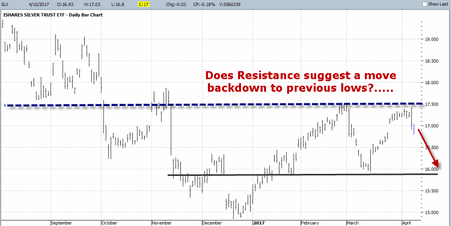
Figure 1 displays a daily chart for XBI, and sure enough there appears to be an “obvious” resistance level.  The technical analysis suggestion then is that if XBI can break out above this level then a move to higher prices may follow.1
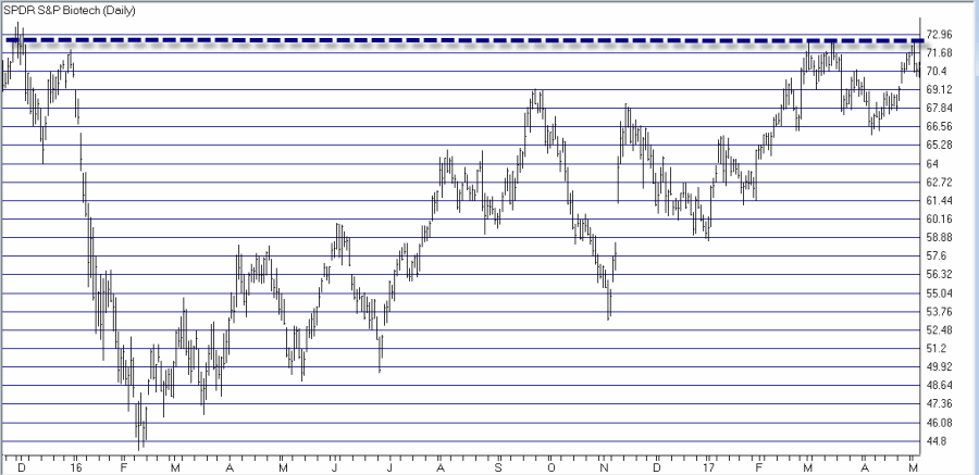
Figure 1 – Does daily XBI show a “breakout” point? (Courtesy AIQ TradingExpert)

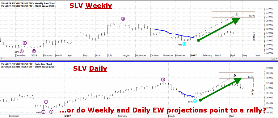
So from this one chart XBI does indeed appear to be on the cusp of a “breakout”.  However, if we “zoom out” a bit we get a potentially different perspective.  Figure 2 is a weekly chart of XBI with the same “resistance” level highlighted.  Does this line seem quite as “significant” now?  Or does it just lead to more overhead resistance level?  For the record these are rhetorical questions for which I do not claim to have a “correct” answer for.2
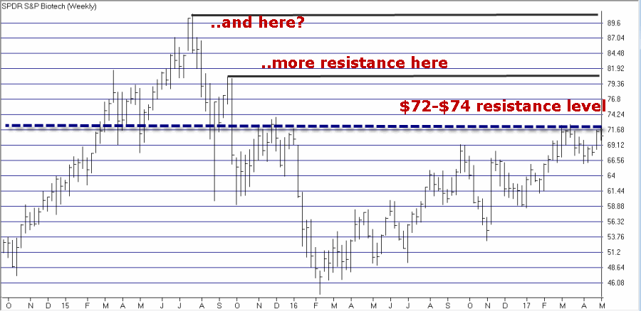
Figure 2 – Does weekly XBI shows more resistance levels? (Courtesy AIQ TradingExpert)

Finally, let’s consider one more alternative viewpoint. Figure 3 looks at the recent rally from the early 2016 low as a percentage retracement from the 2015 high.  As you can see the recent highs in the $72-$74 range are right at the 61.8% retracement level – which Fibonacci adherents consider to be “highly significant”.3
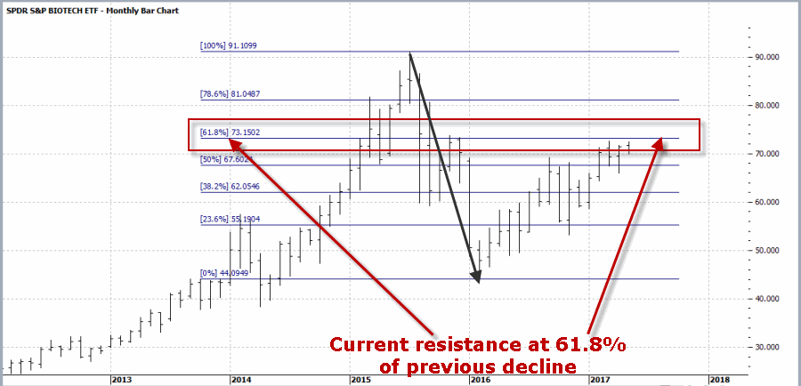
Figure 3 – Has Monthly XBI run out of steam at 61.8% retracement level? (Courtesy ProfitSource by HUBB)

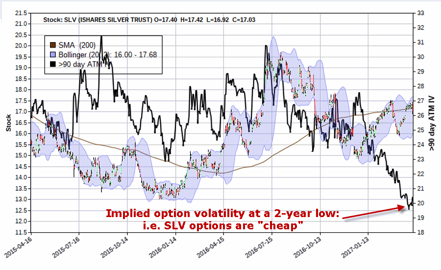
So yes, XBI is (at least in my market-addled brain) at an important inflection point?  So what to do from here?  Unfortunately, I don’t have a useful prediction to share with you.  One thing I do know though is that the implied volatility for options on ticker XBI are presently at an extremely low level, as displayed in Figure 4.4
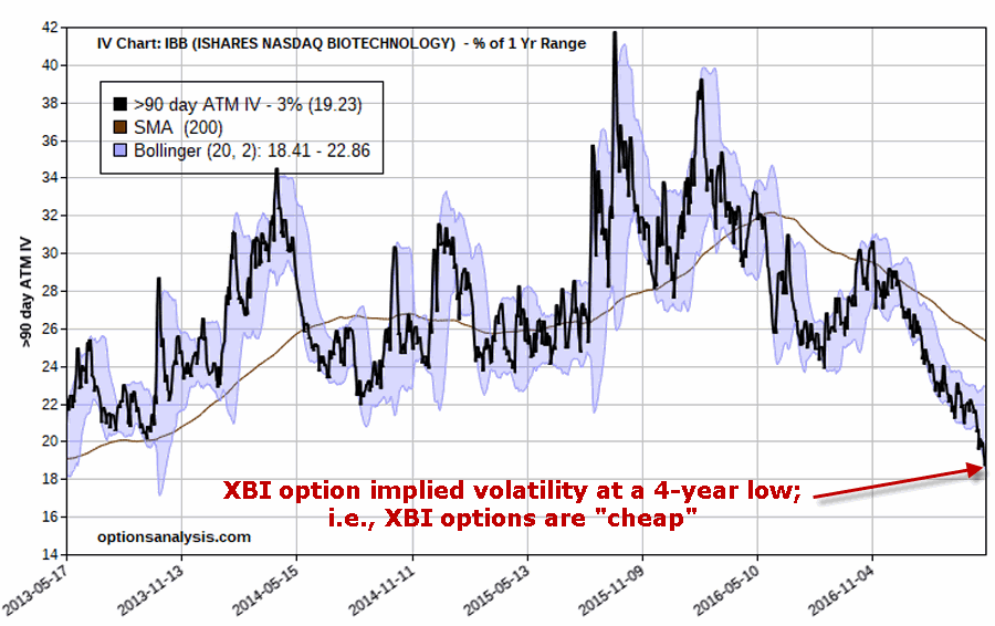
Figure 4 – XBI option implied volatility at a 4-year low (Courtesy www.OptionsAnalysis.com)

Summary

As a closet pessimist I am more inclined to think that recent resistance will hold and that biotech will decline in the not too distant future. But that is not a prediction – nor even something that I am acting on at the moment.  But regardless, all of the above suggests to me that:

A) A decent trade is brewing in the biotech stocks

B) If you decide now or sometime soon that there is action to be taken regarding ticker XBI, buying call or put options (or maybe both?) would be an excellent low dollar risk way to play versus buying or selling for shares of XBI at $70+ a share.

(See also The ‘Range Bound Consolidation Pattern’)

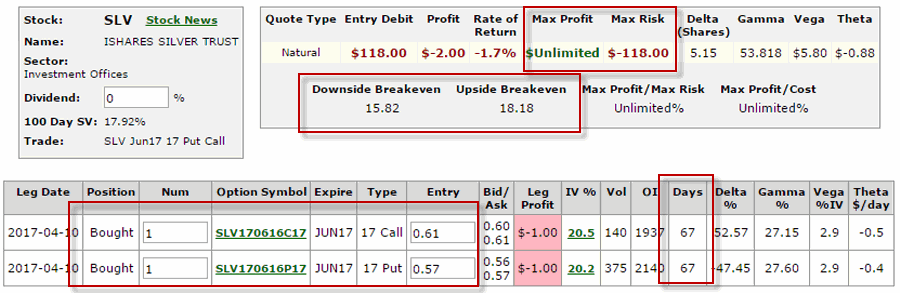
As I said I am  not making any predictions nor am I personally taking any specific actions regarding XBI at the moment.  So Figure 5 is present simply as one example for a trader who believes that XBI is headed lower in the months ahead.  This is not a suggested trade or a recommendation, just an example of one low dollar cost risk way to play.  This positon – buying 1 XBI September 70 put has four months left until expiration, involves a total dollar risk of $455 and has unlimited profit potential if XBI declines in price.5
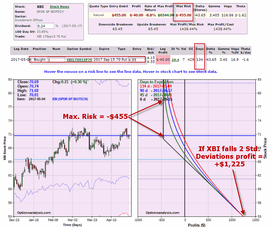
Figure 5 – Buying 1 XBI Sep 70 put option (Courtesy www.OptionsAnalysis.com)

Jay Kaeppel

Disclaimer:  The data presented herein were obtained from various third-party sources.  While I believe the data to be reliable, no representation is made as to, and no responsibility, warranty or liability is accepted for the accuracy or completeness of such information.  The information, opinions and ideas expressed herein are for informational and educational purposes only and do not constitute and should not be construed as investment advice, an advertisement or offering of investment advisory services, or an offer to sell or a solicitation to buy any security.

It’s Time to “Do Something” in Silver

On April 1 in this article I wrote about the potential for silver (using the ETF ticker SLV) to make a big move.  I also admitted that I wasn’t really sure which way that move would be.  As a result I highlight an option strategy designed to play that very situation – a long straddle.

In the original article I highlighted a position as follows:

*Buy SLV June 17 calls @ $0.61

*Buy SLV June 17 puts @ $0.57

For purposes of this update we will assume that a 20-lot was purchased at a cost of $2,360 (($61 + $57) times 20).  The original risk curves appear in Figure 1.4Figure 1 – Risk Curve for original 4/11 SLV Jun 17 straddle (Courtesy www.OptionsAnalysis.com)

(See also It’s Soon or Never for Bonds)

From there SLV advanced for two days before reversing.  As I write SLV is on its 13th (!!!) consecutive down day.  Figure 2 displays the action through yesterday’s close.2Figure 2 – Risk curves as of 5/3 (Courtesy www.OptionsAnalysis.com)

At this point the original straddle is sitting with an open profit of $560, or +23.7% of the original cost. It is time to “do something” with this position.

Choice 1: Take a Profit

An excellent choice.  13 days in a row in one direction is very rare and SLV is at a key support area.  So it makes sense to take a profit and avoid giving money back if and when silver eventually bounces.  Closing out the whole position would result in a profit of +23.7% in 22 calendar days.silv 1Figure 3 – Current SLV Jun 17 straddle (Courtesy www.OptionsAnalysis.com)

Choice 2: Continue to Play the Bearish Side

Perhaps you want to take a profit but think that SLV may break down through support and plunge much further.  One answer would be as follows:

*Sell 20 SLV Jun 17 calls

*Sell 20 SLV Jun 17 puts

*Buy 2 SLV Jun 16.5 puts

The risk curves appear in Figure 4.  This position locks in a minimum profit of $366 but still allows for additional profits to accumulate if SLV continues to plunge.silv 2igure 4 – Adjusted Bearish SLV position (Courtesy www.OptionsAnalysis.com)

Choice 3: Reverse and Play the Bullish Side

Perhaps you want to take a profit but also think that SLV may hold at support and reverse sharply to the upside from its current deeply oversold level. One answer would be as follows:

*Sell 20 SLV Jun 17 calls

*Sell 20 SLV Jun 17 puts

*Buy 2 SLV Jun 15 calls

The risk curves appear in Figure 5.  This position locks in a minimum profit of $380 and allows for unlimited profit potential if SLV reverses and rallies sharply to the upside.silv3Figure 5 – Adjusted Bullish SLV position (Courtesy www.OptionsAnalysis.com)

(See also Four Things to Watch for Warning Signs)

Summary

There are no “right” or “wrong” answers here, only choices.  The key point to remember here is that a straddle position is not meant to be held forever.  Once a solid profit presents itself it is typically time to “do something.”

Jay Kaeppel

Disclaimer:  The data presented herein were obtained from various third-party sources.  While I believe the data to be reliable, no representation is made as to, and no responsibility, warranty or liability is accepted for the accuracy or completeness of such information.  The information, opinions and ideas expressed herein are for informational and educational purposes only and do not constitute and should not be construed as investment advice, an advertisement or offering of investment advisory services, or an offer to sell or a solicitation to buy any security.

It’s Soon or Never for Bonds

There is great trepidation in the bond market these days. Most investors seem to have the “interest rates are sure to rise” mantra playing on auto loop in their head.  And this is not entirely unwarranted.  Given the historical tendency for bond yields to move in long, slow trends (20 years or more essentially in one direction is not uncommon), I for one am pretty confident in believing that interest rates will be higher 20 years from now than they are now.

But that is not the fear that is playing in people’s heads. The fear in people’s heads is that rates are rising soon (like immediately) and in a big way.  This however, may or may not prove to be the case.

(See also The Good and Bad in May)

Figure 1 displays a history of 10-year treasury yields through about 2012 (FYI 10-yr. yields are roughly in changed since that time).  Note the long-term nature of interest rate trends and that while there are “spikes” here and there, most major moves play out over time and not in “here today, sharply higher tomorrow” fashion.1Figure 1 – 10-year treasury bond yields; 1900-2012(Courtesy: ObservationsandNotes.blogspot.com)

Also, as I pointed out in this article – and as you can see in Figure 2 – one can make a compelling argument that bond yields are not “officially rising”, at least not yet.1Figure 2 – Yields still “officially” in a downtrend

Bonds are Due to Bounce – But Will They?

One way to identify important turning points in any market is when a market doesn’t do something that it would normally be expected to do.  For example, here is a simple thought process:

1) The bond market is oversold

2) In the past 30 years, pretty much anytime it would get oversold a rally ensued

3) Therefore, bonds should rally soon

But will they – that is the question.  And in my opinion, the answer is important.

*If bonds rally soon (i.e., over the course of say the next several months) then “the status may still be quo”.

*If bonds do not rally soon, then it may be a sign that “things are changing”

(See also How NOT to Hedge a Long-Term Rise in Interest Rates)

Which Way Bonds?

Figures 3 and 4 below display ticker TLT (an ETF that tracks the long-term treasury bond) with an indicator I call UpDays20.  In this case we are looking at weekly bars and not daily bars, but the concept is the same.

UpDays20 is calculated by simply adding up all of the weeks that have showed a weekly gain over the past 20 weeks and then subtracting 10 (the AIQ TradingExpert Expert Design Studio code appears at the end of this article, after the disclaimer).

If 10 of the past 20 weeks have showed a weekly gain then the upDays20 indicator will read 0 (i.e., a total of 10 weeks were up minus 10 = 0).  If only 6 weeks showed a gain in the past 20 weeks then the UpDays20 indicator will read -4, etc.

What to look for: Typically (at least in the declining rate environment of recent decades) when UpDays20 rises by a value of 2 from a low of -2 or less, a decent rally in bonds has ensued.

For example, if UpDays20 falls to -4 then a rise to -2 or higher triggers a buy signal.  If it falls only as low as -3 then a rise to -1 or higher is required.  If it falls only as low as -2 then a rise to 0 or higher is required.

Figures 3 and 4 highlight signals since roughly 2004.3Figure 3 – Ticker TLT with UpDays20 weekly buy signals (2004-2010); (Courtesy AIQ TradingExpert)4aFigure 4 – Ticker TLT with UpDays20 weekly buy signals (2010-2017); (Courtesy AIQ TradingExpert)

As you can see in Figures 3 and 4, most of the signals highlighted were followed by at least a decent short-term rally.

In 2017, buy signals from the UpDays20 indicator occurred on 1/13 and 4/14.  TLT is up +0.3% since the 1/13 signal and down -1.4% since the 4/14 signal.

Summary

Either:

1) This is an excellent time to buy the long-term bond (looking for at least a short to intermediate term rally) as a rally is overdue

OR

2) The “times they may be a changing” for bonds

So keep an eye on TLT over the next several months.

Jay Kaeppel

Disclaimer:  The data presented herein were obtained from various third-party sources.  While I believe the data to be reliable, no representation is made as to, and no responsibility, warranty or liability is accepted for the accuracy or completeness of such information.  The information, opinions and ideas expressed herein are for informational and educational purposes only and do not constitute and should not be construed as investment advice, an advertisement or offering of investment advisory services, or an offer to sell or a solicitation to buy any security.

AIQ Expert Design Studio Code for UpDays20

Up1 if [close] > val([close],1).
Up2 if val([close],1) > val([close],2).
Up3 if val([close],2) > val([close],3).
Up4 if val([close],3) > val([close],4).
Up5 if val([close],4) > val([close],5).
Up6 if val([close],5) > val([close],6).
Up7 if val([close],6) > val([close],7).
Up8 if val([close],7) > val([close],8).
Up9 if val([close],8) > val([close],9).
Up10 if val([close],9) > val([close],10).
Up11 if val([close],10) > val([close],11).
Up12 if val([close],11) > val([close],12).
Up13 if val([close],12) > val([close],13).
Up14 if val([close],13) > val([close],14).
Up15 if val([close],14) > val([close],15).
Up16 if val([close],15) > val([close],16).
Up17 if val([close],16) > val([close],17).
Up18 if val([close],17) > val([close],18).
Up19 if val([close],18) > val([close],19).
Up20 if val([close],19) > val([close],20).

UpCount is (Up1+ Up2+Up3+Up4+Up5+Up6+Up7+Up8+Up9+Up10+Up11+Up12+Up13+Up14+Up15+Up16+Up17+Up18+Up19+Up20)-10.

The Good and Bad in May

The beginning of the month of May and the end of the month of May into early June have overall been a decent time to be in the stock market.  The middle of May, typically not so much.

This article is an update from this article written almost a year ago.

(See also A Really (Really) Long-Term Perspective on Interest Rates)

The “Proper Outlook” for May

For our purposes we will split May (into June) into three segments:

*Segment 1 (Bullish): The first 3 trading days of May

*Segment (Bearish): May trading days #4 through #16

*Segment 3 (Bullish): May trading day #17 through the 5th trading day of June

For 2017:

*Segment 1 extends from the close on 4/28/17 through the close on 5/3/17

*Segment 2 extends from the close on 5/3/17 through the close on 5/22/17

*Segment 3 extends from the close on 5/22/17 through the close on 6/7/17

In 2016:

*Segments 1 and 3 combined to gain +1.8%

*Segment 2 lost (-0.9%)

From 1934 through 2016

*Segments 1 and 3 combined to gain +160.5%

*Segment 2 lost (-51.5%)

1aFigure 1 – Growth of $1,000 invested in Dow Jones Industrials Average during May/June Bullish Segments 1 and 3 (blue line) versus Bearish Segment 2 (red line); 1934-2017

Segments 1 and 3 combined:

*showed a gain 54 times (65%)

*showed a loss 29 times (35%)

*Average gain = +2.9%

*Average loss = (-2.0%)

*Median return all years = +0.88%

Segment 2:

*showed a gain 40 times (48%)

*showed a loss 43 times (52%)

*Average gain = +2.0%

*Average loss = (-3.4%)

*Median return all years = (-0.07%)

(See also Four Things to Watch for Warning Signs)

Summary

So is the beginning and end of May (plus the beginning of June) sure to see stock market gains? Not necessarily.  Likewise, is the middle of May guaranteed to be a downer?  Again, not necessarily.

But history suggests that that is the way to bet.

Jay Kaeppel

Disclaimer:  The data presented herein were obtained from various third-party sources.  While I believe the data to be reliable, no representation is made as to, and no responsibility, warranty or liability is accepted for the accuracy or completeness of such information.  The information, opinions and ideas expressed herein are for informational and educational purposes only and do not constitute and should not be construed as investment advice, an advertisement or offering of investment advisory services, or an offer to sell or a solicitation to buy any security.

A Really (Really) Long-Term Perspective on Interest Rates

The support and resistance levels and the trends (or lack thereof) that a trader sees on a chart can vary greatly depending on the time period covered in the chart. In other words, a 1-minute bar chart can be extremely useful to a very short-term trader, but will present a very different perspective than say a weekly chart for the same security.  The point is simply that there is no one best timeframe for anything.

(See also How NOT to Hedge a Long-Term Rise in Interest Rates)

That being said, sometimes when you are simply trying to gain “perspective”, a really long-term approach can be useful.  To wit, consider 10-year treasury bonds.  Using the data found at this link: (https://fred.stlouisfed.org/series/IRLTLT01USM156N)

I added a 125-month exponential moving average (calculations below) to gain a very long-term perspective regarding interest rate trends and their current state.  Remember that this is not a “timing system” but rather more of a “confirmation system” that will never pick a top or bottom but (as we will see) can be useful in identifying the overall long-term trend in 10-year treasury bond yields.

Calculations for the 125-month exponential moving average (EMA)

*Multiplier2 = 2 / (moving average length + 1)

*Multiplier 1 = (1 – Multiplier2)

*Calculation1 = (Previous Moving Average * Multiplier1)

*Calculation2 = (Current Monthly Yield * Multiplier2)

*New Moving Average = Calculation1 + Calculation2

Are we having fun yet?

For example, for data point 03-01-2017:

*Multiplier2 = 2 / (125 + 1) = 0.0159

*Multiplier 1 = (1 – Multiplier2) = 0.9841

*Calculation1 = (Previous Moving Average * Multiplier1) = (2.8424 * 0.9841) = 2.7973

*Calculation2=(Current Monthly Yield * Multiplier2)=(2.48 * 0.0159) =0.0394

*New Moving Average=Calculation1+Calculation2=2.7973 + 0.0394 = 2.8367

So the latest data point is 2.48% and the latest 125-month EMA is 2.8367%

Long-Term Trend-Following Rules:

*If the latest monthly yield value is BELOW the New Moving Average then 10-Year bond yields are considered to be in a downtrend, i.e., Bonds are BULLISH

*If the latest monthly yield value is ABOVE the New Moving Average then 10-Year bond yields are considered to be in an uptrend, i.e., Bonds are BEARISH

Figure 1 below displays the long-term chart

1Figure 1 – 10-Year Treasury Yields (blue line) with 125-month exponential moving average (red line); 1960-2017

According to this method, 10-year bonds were:

*Bullish starting on 1/1/1960 with yields at 4.72%

*Bearish starting on 9/1/1965 with yields at 4.29%

*Bullish starting on 6/1/1985 with yields at 10.16%

As of the latest data point (3-01-2017) the 10-year yield was 2.48% and the 125-month EMA was at 2.8367%.  Since the current data point is still below the moving average the trend in rates is still considered “down”, therefore there still is no bearish reversal confirmation from this particular indicator.

When the 10-year yield finally rises back above the 125-month EMA it will (likely) confirm a reversal in fortune for bonds back to the bearish side.

(See also More on Months to Beware of in 2017)

Summary

My own primary 30-year bond trend method has been bearish on 20-year bonds since 6/10/2016 (as I last highlight here).

Still, a true reversal in the trend of interest rates will not (at least in my market-addled mind) be confirmed until the 10-year yield moves back above its 125-month EMA.

Jay Kaeppel

Disclaimer:  The data presented herein were obtained from various third-party sources.  While I believe the data to be reliable, no representation is made as to, and no responsibility, warranty or liability is accepted for the accuracy or completeness of such information.  The information, opinions and ideas expressed herein are for informational and educational purposes only and do not constitute and should not be construed as investment advice, an advertisement or offering of investment advisory services, or an offer to sell or a solicitation to buy any security.

More on Months to Beware of in 2017

I am in a good mood today (don’t worry, I am sure I’ll get over it) so I am going to make it easy for the people with short attention spans: August, September and October.  That is the answer to the title above.  If you would like just a little more information please keep reading.

(See also How NOT to Hedge a Long-Term Rise in Interest Rates)

This is essentially a followup to this previous article.

First off, please note that the title says “Months to Beware of” and NOT “Months that are absolutely, positively guaranteed to witness stock market Armageddon!”  Here it is in a nutshell:

In terms of the election cycle we are in a post-election year.  Figure 1 displays the cumulative growth of $1,000 invested in the Dow since 1900 ONLY during August through October of Post-Election years.1Figure 1 – Growth of $1,000 invested in Dow Industrial August through October during Post-Election Years

In terms of the decennial pattern we are in Year 7 of the current decade.  Figure 2 displays the cumulative growth of $1,000 invested in the Dow since 1900 ONLY during August through October of Years ending in “7”.  Note that 2007 was the first “7” year to actually show a August through October gain.

2Figure 2 – Growth of $1,000 invested in Dow Industrial August through October during Years ending in “7”

Figure 3 displays the cumulative growth of $1,000 invested in the Dow since 1900 ONLY during August through October during all Post-Election and/or Years ending in “7”.3Figure 3 – Growth of $1,000 invested in Dow Industrial August through October during Post-Election Years and/or Years ending in “7”

As you can see the long-term cumulative results are pretty awful.  That’s the Bad News and the reason caution may be in order during August through October of this year.  But the Good News is that the results are not “uniformly awful.”

Figure 4 below list the year-by-year results for all relevant years.  But in sum there are have 35 years that were either Post-Election, ending in “7”, or both:

*  # times showing a gain = 15 (43% of the time)

*  # of times showing a loss = 20 (57% of the time)

*  Average gain = +5.7%

*  Average loss = (-9.9%)

In sum, while the results in Figure 3 appear to be pretty unrelentingly bad, the reality is that reality is that 43% of the years that appear in Figure 4 below actually showed a gain.

So the watchword as we get closer to August will be “Caution” and not “Fear” nor “Panic”.

Year Type Aug-Oct % +(-)
1901 Post-Election (10.0)
1905 Post-Election 2.5
1907 Year 7 (26.8)
1909 Post-Election 2.4
1913 Post-Election (0.2)
1917 Both (18.8)
1921 Post-Election 6.3
1925 Post-Election 17.0
1927 Year 7 (0.5)
1929 Post-Election (21.3)
1933 Post-Election (2.9)
1937 Both (25.6)
1941 Post-Election (8.5)
1945 Post-Election 14.6
1947 Year 7 (0.7)
1949 Post-Election 7.7
1953 Post-Election 0.2
1957 Both (13.3)
1961 Post-Election (0.2)
1965 Post-Election 9.0
1967 Year 7 (2.7)
1969 Post-Election 5.0
1973 Post-Election 3.3
1977 Both (8.1)
1981 Post-Election (10.5)
1985 Post-Election 2.0
1987 Year 7 (22.5)
1989 Post-Election (0.6)
1993 Post-Election 4.0
1997 Both (9.5)
2001 Post-Election (13.7)
2005 Post-Election (1.9)
2007 Year 7 5.4
2009 Post-Election 5.9
2013 Post-Election 0.3


Figure 4 – Year-by-Year Results for Aug/Sep/Oct during Post-Election years and Years ending in “7”

Jay Kaeppel

Disclaimer:  The data presented herein were obtained from various third-party sources.  While I believe the data to be reliable, no representation is made as to, and no responsibility, warranty or liability is accepted for the accuracy or completeness of such information.  The information, opinions and ideas expressed herein are for informational and educational purposes only and do not constitute and should not be construed as investment advice, an advertisement or offering of investment advisory services, or an offer to sell or a solicitation to buy any security.

How NOT to Hedge a Long-Term Rise in Interest Rates

The fear of rising interest rates is one of the biggest concerns among many investors at the moment.  And in light of the fact that interest rates declined for roughly 30+ years and have essentially been moving sideways for roughly 5 years these fears may not be unfounded. But what to do about the prospect for a longer-term rise in rates is an entirely different question.

(See also Post-Election April and May)

People who are expecting higher interest rates in the years ahead may be inclined to think that buying an inverse bond fund might protect them. But the short answer is this:

*Inverse bond funds are for trading purposes only, NOT for buy-and-hold.

Let me put it another way just to be clear:

1) If bond yields rise sharply over a relatively short period of time an inverse bond fund can rise sharply (and in so doing does in fact serve its purpose as a hedge against higher interest rates).

2) If bond yields rise slowly, inverse bond funds will likely lose value over time – albeit with the occasional sharp rally every once in awhile if and when the pace of the rise in yield happens to pick  up.

3) If bond yields drift sideways – especially over a longer period of time, inverse bond funds will lose a great deal of value in the process (more on this scenario in a moment).

4) If bond yield move lower over any meaningful period of time, inverse bond funds will lose a surprisingly large amount of value.

The Dangers of Inverse Bonds Funds

Figure 1 displays the 30-year treasury yield in the top clip and ticker TBF (ProShares Short 20+ Year Treasury ETF) in the bottom clip. 1Figure 1 – 30-Year Treasury Yields vs. Inverse Long-Term Treasury Bond ETF (Courtesy AIQ TradingExpert)

Note that while the yield on 30-year treasuries has essentially traded sideways since September 2011, ticker TBF has continued to lose significant ground.  Since 9/30/11:

*30-year treasury yields have moved from 2.92% to 2.86%

*Ticker TBF has moved from $32.15 to $22.77 (-29.2%)

The bottom line:

*If your timing is excellent and you buy just before a meaningful rise in rates inverse bond funds can make money.

*If rates decline or even simply move sideways, inverse bond funds will lose (likely a significant amount of money).

If you are looking to hedge against a long-term rise in interest rate – look elsewhere.

You have been warned.

Jay Kaeppel

Disclaimer:  The data presented herein were obtained from various third-party sources.  While I believe the data to be reliable, no representation is made as to, and no responsibility, warranty or liability is accepted for the accuracy or completeness of such information.  The information, opinions and ideas expressed herein are for informational and educational purposes only and do not constitute and should not be construed as investment advice, an advertisement or offering of investment advisory services, or an offer to sell or a solicitation to buy any security.

Simple Bond Strategy Soon to Switch

Please note that the title includes the word “Simple” but does NOT include the words “Best”, “Infallible”, “World”, “Beater”, nor “You”, “Can’t” or “Lose”. The strategy discussed was first written about here and the mechanics remain unchanged.

See also Uptrend/Downtrend (and Sideways Trend))

This simple system has three things going for it:

*It’s simple

*It takes advantage of some very persistent seasonal trends

*It has a pretty consistent track record

The System

In general:

*The system (attempts to) take advantage of the typical strength in the stock market from December through April and the typical strength in the bond market from May through November.

*Junk bonds have a higher correlation to the stock market than they do to treasury bonds

*GNMA bonds tend to be less volatile than longer-term treasury bonds

So, the rules are as follows:

*December through April hold VWEHX

*May through November hold VFIIX

VWEHX is the Vanguard High Yield Corporate Bond Fund

VFIIX is the Vanguard GNMA Fund

Figure 1 below displays the growth of $1,000 invested in each fund since 1980 ONLY during the months of December through April (All data in this article is generated using Monthly Total Return Data from PEP database from Callan Associates).1Figure 1 – Growth of $1,000 in VWEHX (blue) versus VFIIX (red) ONLY during December through April; 7/31/80-3/31/17

*During the months of December through April VWEHX gained +472% versus +127% for VFIIX.

Figure 2 displays the growth of $1,000 invested in each fund since 1980 ONLY during the month of May through November.2Figure 2 – Growth of $1,000 in VWEHX (blue) versus VFIIX (red) ONLY during May through November; 7/31/80-3/31/17

*Between the months of May through November VFIIX gained +508% versus +250% for VWEHX.

Figure 3 displays the growth of $1,000 invested using the switching rules detailed earlier versus “splitting” $1,000 between VWEHX and VFIIX and holding both.3Figure 3 – Growth of $1,000 invested using “Switch” Strategy versus “Splitting” the money between VWEHX and VFIIX and holding; 7/31/80-3/31/17

Since 11/30/2017:

*VWEHX is up +3.6%

*VFIIX is up +0.3%

More importantly, since July 1980:

*The Switch System has an average 12-month gain of +10.8% with a maximum drawdown of -9.3%.

*The “Split” System has an average 12-month gain of +8.5% with a maximum drawdown of -13.5%

(See also Four Things to Watch for Warning Signs)

Summary

So is this “World Beater” of all bond trading systems?  Hardly.  Additionally, with concerns of higher interest rates it is fair to wonder how GNMA bonds will perform during the “seasonally favorable” months of May through November in a rising rate environment.

But this system does meet two criteria of any decent investment or trading method:

*It takes advantage of an “edge” (seasonality in the stock and bond markets)

*It’s simple.

Jay Kaeppel

Disclaimer:  The data presented herein were obtained from various third-party sources.  While I believe the data to be reliable, no representation is made as to, and no responsibility, warranty or liability is accepted for the accuracy or completeness of such information.  The information, opinions and ideas expressed herein are for informational and educational purposes only and do not constitute and should not be construed as investment advice, an advertisement or offering of investment advisory services, or an offer to sell or a solicitation to buy any security.

Speculatively Straddling Silver

The title of this piece sounds like it should be accompanied by the standard “do not try to say this three times fast” warning.  In any event, I want to emphasize that what follows is not a “recommendation” but rather an “example” of one unique way to speculate based on a given set of circumstances.

(See also Four Things to Watch for Warning Signs)

Silver

A glance at a chart of ticker SLV (the ETF that tracks the price of silver bullion) will likely lead different traders to reach different conclusions.  In Figure 1 we see “the bearish case”, which suggests that silver has strong resistance overhead and that a decline may be in the offing.1Figure 1 – A “bearish” chart for SLV (Courtesy ProfitSource by HUBB)

Figure 2 displays an “alternative bullish case” for ticker SLV. In the top and bottom clips respectively we see that the Weekly and Daily Elliott Wave counts (generated using an objective algorithm, for better or worse) are both lined up to the bullish side.  This would suggest that a breakout to the upside and a larger rally is impending.2Figure 2 – A “bullish” chart for SLV (Courtesy ProfitSource by HUBB)

So who’s right and who’s wrong?  It beats me?  One thing I do know (and which you can see in Figure 3 below) is that the implied volatility for options on ticker SLV is extremely low.  For the long-winded technical explanations of implied volatility – all the current low reading really means is that the amount of time premium built into the prices for call and put options on SLV is extremely low, i.e., SLV options are “cheap”.3aFigure 3 – Implied Volatility for SLV options at a 2-year low  (Courtesy www.OptionsAnalysis.com)

So when we combine:

1) A market that appears poised to make a meaningful price move (but the direction is a question mark)

2) Cheap options

Then 3) we have a good setup for an option strategy known as a “straddle”.

SLV Straddle

A “straddle” simply involved buying a call option and a put option at the same strike price for the same security.  In this example we will look at:

*Buying 1 SLV June 17 call option @ $0.61

*Buying 1 SLV June 17 put option @ $0.57

Each 1-lot of this straddle will cost $118 ((0.61 + 0.57) x 100).  The particulars appear in Figures 4 and 5 below.3Figure 4 – June SLV 17 straddle (Courtesy www.OptionsAnalysis.com)

4Figure 5 – June SLV 17 straddle risk curves (Courtesy www.OptionsAnalysis.com)

(See also JayOnTheMarkets.com: Happy ‘Holiday Days’)

Key things to note:

*If this trade is held until June option expiration on 6/16 and SLV closes that day at exactly $17 a share (and wouldn’t that be just my luck?) this trade will lose the entire $118.

*If SLV closes between $15.82 and $18.18 (the breakeven prices) on 6/16 this trade will experience a loss of somewhere between $0 and -$118.

*If SLV is above $18.18 or below $15.82 then the trade will show a profit.

*As you can see by looking at the black line in Figure 4, “time decay” will accelerate in the last 23 days prior to expiration.

*The real hope for this trade is that SLV will make a significant move in either direction sooner than later – i.e., before time decay starts to eat away at the time premium bolt into the option prices – and afford an opportunity to either take a profit (a target might be15% to 20% of the initial cost) or to “adjust” an open profitable trade (see this example) and “let it ride” in hopes of a catching a larger move.

Summary

Is this trade a good idea?  I am not actually saying that it is.  The only thing I can say is that it is one relatively inexpensive way to speculate on a market that could be poised to make a move.  Nothing more, nothing less.

As always, time will tell.

Jay Kaeppel

Disclaimer:  The data presented herein were obtained from various third-party sources.  While I believe the data to be reliable, no representation is made as to, and no responsibility, warranty or liability is accepted for the accuracy or completeness of such information.  The information, opinions and ideas expressed herein are for informational and educational purposes only and do not constitute and should not be construed as investment advice, an advertisement or offering of investment advisory services, or an offer to sell or a solicitation to buy any security.

Uptrend/Downtrend (and Sideways Trend)

Definition of “experience”: Sticking around long enough to pick up a couple of things.  In the financial markets, prices go up, prices go down and prices go sideways. This is a universal truth.  The trick is figuring out which security is doing what.  Let’s take a look across the spectrum.

UP: Ticker PGAL

Now when most people think of “exciting investment opportunities” the country of Portugal is typically not one of the first things to pop into people’s heads.  On the other hand, if you say that a given security is “consolidating”, “compressing”, “coiling” and/or “trading in an ever narrower range”, then a lot of people who look at stock  charts will sit up and take notice.

In this article I noted the fact that ticker PGAL (an ETF that tracks an index of companies in, yes, Portugal) was doing all of the above on a monthly, weekly and daily bar chart.  Sure enough the shares broke out to the upside and now appear to have broken its previous long term downtrend.1Figure 1 – Ticker PGAL (Courtesy ProfitSource by HUBB)

So is it clear sailing from here?  Not necessarily.  $10.50 could prove to be a strong resistance area and PGAL could fall back lower in the $8.59 to $10.50 a share range.  But the two key takeaways are

1) This could be one to keep an eye – particularly if it can top $10.50 a share.

2) In this case experience teaches us that the “range bound consolidation” is something to always be on the lookout for.

DOWN: Sugar

In this article I highlighted the tendency for the sugar market to experience consistent weakness in the March/April time frame.  This year that period extends from the close on 3/13/2017 through the close on 4/17/2017 (NOTE: the original article stated that the end date as 4/14 but that is Good Friday and the markets are closed.  So April Trading Day #10 is 4/17).  As you can see in Figure 2, July sugar futures have so far declined from 18.21 to 16.72.  At $1,120 for each one full point in movement in the futures contract, this represents a profit of $1,669 on each futures contract sold short.

2Figure 2 – July Sugar futures (Courtesy ProfitSource by HUBB)

Still, it is important to note that this period does not end until the close on Monday 4/17, so the “jury is still out”.  In any event, experience teaches us that  persistent seasonal trends can be useful in telling  trader “where to  look” for a new opportunity.

Sideways: T-Bonds (Ticker TLT)

In this article I noted a bearish setup in t-bonds and highlighted an example option trade on the ETF ticker TLT (that tracks the long-term treasury bond) designed to take advantage of that possibility.  TLT subsequently declined from 121.29 to 117.78 a share, generating an open profit on the original option trade.

Then in this article I highlighted an “adjustment” to the original trade designed to lock in a profit while still allowing for further profit potential.  Since that time ticker TLT have advanced from 117.78 to 120.71. As you can see in Figure 3, the original trade gave up its open profit and is now sitting with a loss of -$546 with a maximum of -$973 and needs a meaningful decline to ensue between now and April 21st in order to generate a profit.3Figure 3 – Original TLT option position (Courtesy www.OptionsAnalysis.com)

In Figure 4, we see that the adjusted trade – barring a sharp decline by bonds prior to 4/21 – will settle for a profit of $269.  While this “ain’t all  the money in the world”, it’s a lot better than generating a profit of +$742 and then riding it back down to a loss of -$973.

In any event the real point is to highlight that by trading options a trader can “adjust” positions along the way – in many cases allowing them to “lock in a profit” and then “let the adjusted position ride.”4Figure 4 – Adjusted TLT option position with a “locked in” profit (Courtesy www.OptionsAnalysis.com)

In this case, experience teaches us that profits on option trades can be fleeting and that “locking in a profit” is rarely ever the “worst idea.”

Summary

In the course of three very different markets we find that:

1) Consolidation patterns and break outs from those patterns can often highlight terrific buying opportunities.

2) Persistent, long-term seasonal trends can help highlight unique trading opportunities

3) It is always important to remember that trends can reverse quickly and that by using option strategies it is possible to “adjust” a profitable position to lock in profits.

Now if you will excuse me I am going to go upstairs and lie down, um, sideways.

Jay Kaeppel

Disclaimer:  The data presented herein were obtained from various third-party sources.  While I believe the data to be reliable, no representation is made as to, and no responsibility, warranty or liability is accepted for the accuracy or completeness of such information.  The information, opinions and ideas expressed herein are for informational and educational purposes only and do not constitute and should not be construed as investment advice, an advertisement or offering of investment advisory services, or an offer to sell or a solicitation to buy any security.