The VIX Index is an index calculated by the Chicao Board Options Exchange (CBOE) and designed to measure volatility in the stock market and is presently near its all-time low. Some argue that it has “nowhere to go but up.” Like the “boy who cried wolf” some analysts have been making this argument for quite some time – to no avail, at least so far.
Ticker VXX is an Exchange-Trade Fund that is designed to track the VIX Index. Therefore, the idea of “picking a bottom in VXX” means betting on greater volatility in the stock market.
OK, before we go any further, it is important to look at Figure 1 and recognize the huge potential folly represented by the title of this article.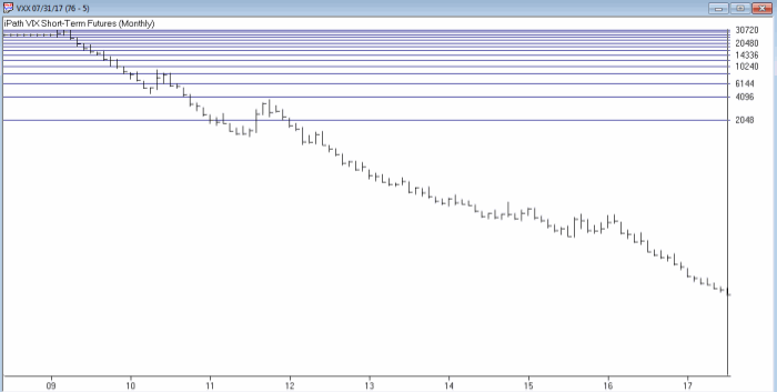 Figure 1 – Ticker VXX consistently trends lower with occasional spikes (Courtesy AIQ TradingExpert)
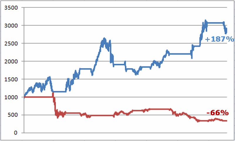
Anybody who attempts to play the long side of ticker VXX is plain and simply bucking some long odds. Understand that it wasn’t supposed to be this way. Originally the ETF ticker VXX was intended to track the VIX Index. That didn’t come anywhere close to happening as you can see in Figure 2.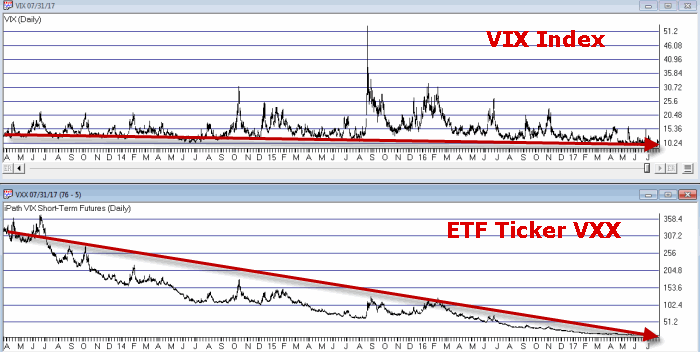 Figure 2 – VIX Index versus Ticker VXX (Courtesy AIQ TradingExpert)
This, ahem, slight difference in performance is because of something called “contango” (which involves the differences in price between futures contracts of various months and I am not gonna lie, is kind of a boring technical topic – which is why I am going to let you Google it if you so desire rather than go into a boring technical explanation).
The bottom line: Ticker VXX has trended sharply lower since inception – with an occasional sharp spike higher.
The questions at hand are:
a) Is one of those sharp spikes higher at hand?
b) Given the long term trend for VXX, is it even worth betting on a spike higher?
(See also Respect the Trend, But Beware)
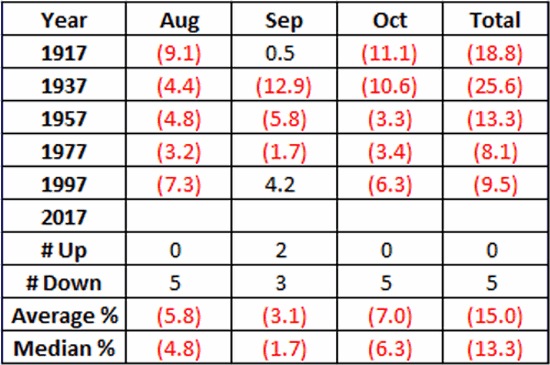
Seasonal Trends in Volatility
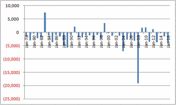
The VXO Index is similar to the VIX Index. The VXO Index is calculated using options on the S&P 100 Index while VIX is calculated using options on the S&P 500 index. While they are two different indexes and will trade at different price levels, their movements are roughly 95% correlated to each other.
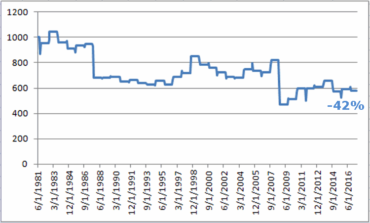
I bring up ticker VXO and its close correlation to VIX because: Figure 3 is courtesy of Larry McMillan of The Option Strategist and displays the “average” day to day movement of the VXO Index across an “average” year. Note the strong tendency for VXO to rise from July into October. Because VXO and VIX are so highly correlated we can expect similar action in the VIX Index – i.e., a tendency to rise from July to October. Figure 3 – Annual Seasonal Trend for VXO – i.e., volatility often spikes August into October (Courtesy: Options Strategist)
So with the VIX Index presently at an extremely low level and with a strong tendency for volatility to rise between July and October can we count on a spike in volatility in the months ahead? Not necessarily. But if we one were going to “buck the long odds” and attempt to play the long side of volatility ETFs, it might soon be time to take a look.
One Way to Play
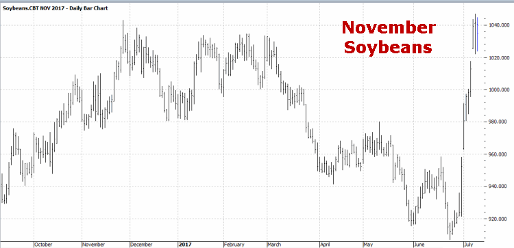
As with most opportunities there are a lot of ways to play. The simplest approach of course would be to buy shares of ticker VXX. However, not only is overall volatility in the market low – as indicated by the low readings in the VIX Index itself – but the implied volatility for the options on VXX itself is also near the low end of its historical range as you can see in Figure 4.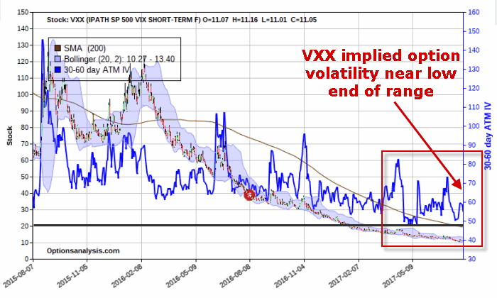 Figure 4 – Price chart for Ticker VXX with implied option volatility for VXX options (blue line); Implied volatility (blue line) for options on VXX is relatively low (Courtesy www.OptionsAnalysis.com)
So for the purposes of “crafting” a trade that can potentially profit if volatility rises in the months ahead we will assume that:
a) Overall volatility will rise (i.e., VXX will trade higher)
b) Implied option volatility on VXX options will also rise
So we want a position that can profit from a higher price for VXX and/or a rise in implied volatility. One strategy that fits this category is a “calendar spread.” The position displayed in Figure 5 and 6 involves:
*Buying 5 VXX Nov 12 calls at 1.31
*Selling 4 VXX Oct 14 calls at 0.72
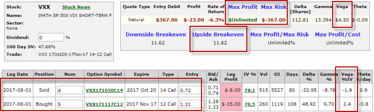 Figure 5 – VXX Calendar Spread (Courtesy www.OptionsAnalysis.com)
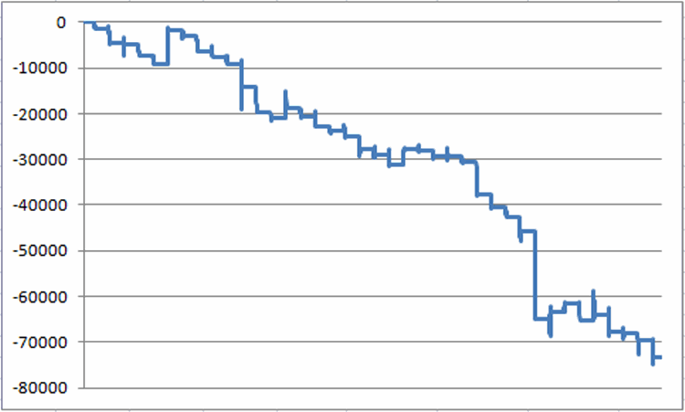
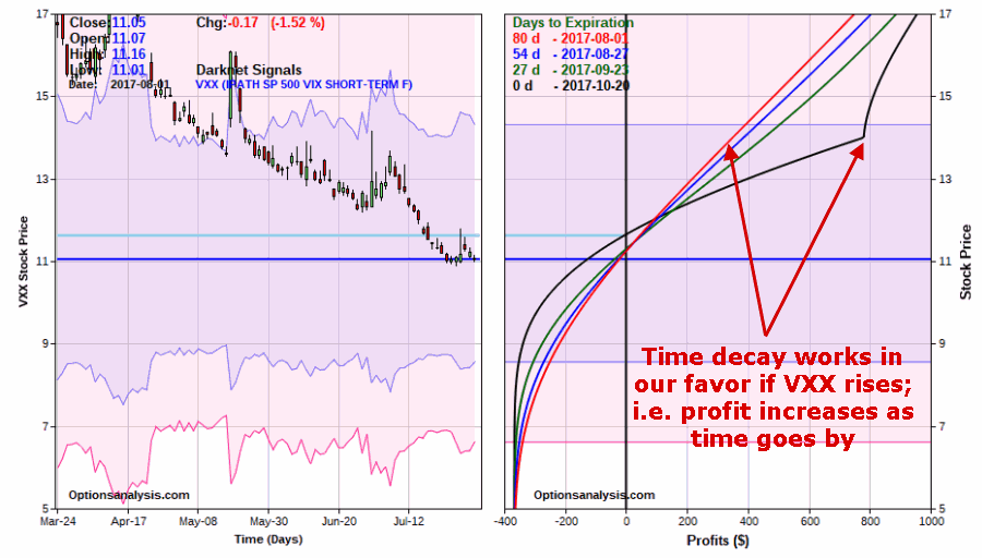 Figure 6 – VXX Calendar Spread Risk Curves (Courtesy www.OptionsAnalysis.com)
Things to note:
*The initial cost and maximum risk $367 for a 5×4 position
*If VXX is unchanged by October option expiration the loss would likely be less than $200.
*If VXX continues to trend lower this trade will lose money, so this is a speculative play on an upside reversal in VXX
*If VXX does rise then time decay will work in favor of this trade. In other words, as time goes by the October options will experience relatively more time decay than the November options. See Figure 6 to see the potential positive effect of the passage of time.
*In addition, because this trade is long one additional November call option there is unlimited upside profit potential if a “crazy spike” – ala 2008 were to unfold.
Finally, if we are correct and an increase in implied volatility accompanies a rally in VXX, the profit should grow even more.
In Figure 5 note that:
*The November 12 call has a “Vega” of 2.4 and the October 14 has a “Vega” of minus 1.9.
*This means that for every one percentage point increase in volatility then November 12 call will gain an additional $240 and the October 14 will lose -$190 (due solely to changes in volatility).
If IV levels spike say 30% higher from current levels, the overall trade profit can increase substantially on a percentage basis. See Figure 7.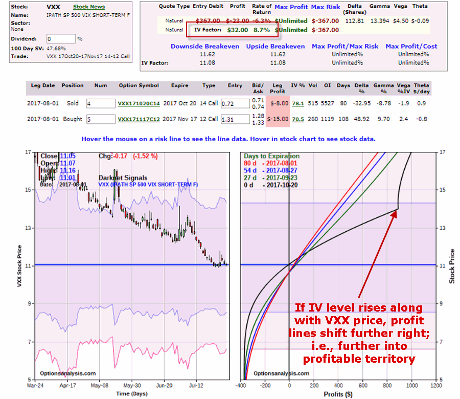 Figure 7 – A rise in implied option volatility pushes risk curves to the right (i.e., higher) (Courtesy www.OptionsAnalysis.com)
(See also Live by the FAANG, Die by the FAANG)
Summary
Let’s be brutally candid about two things:
1) People have been declaring for months that volatility in the market is “too low” and that a rise is “overdue.” And all the while the VIX Index just keeps creeping lower. There is no reason this can’t continue. And even if it doesn’t continue….
2) Ticker VXX has a serious, persistent downward bias to it – which should give a trader serious pause before entering into a bullish trade on VXX.
With those two points firmly in mind:
1) Figure 3 suggests that if volatility is ever going to pick up again the next several months are as likely as time as any for it to happen.
2) The example trade in Figures 4 through 7 (which is just that – an example” and not a “recommendation”) can take advantage of a rise in volatility that plays out over a couple of months time.
Of course, a sharp rise in stock market volatility is typically a companion of declining stock prices. So as always – be careful what you wish for…..
Jay Kaeppel
Disclaimer: The data presented herein were obtained from various third-party sources. While I believe the data to be reliable, no representation is made as to, and no responsibility, warranty or liability is accepted for the accuracy or completeness of such information. The information, opinions and ideas expressed herein are for informational and educational purposes only and do not constitute and should not be construed as investment advice, an advertisement or offering of investment advisory services, or an offer to sell or a solicitation to buy any security.
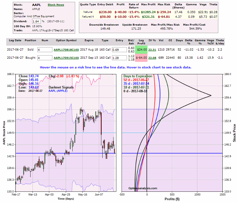
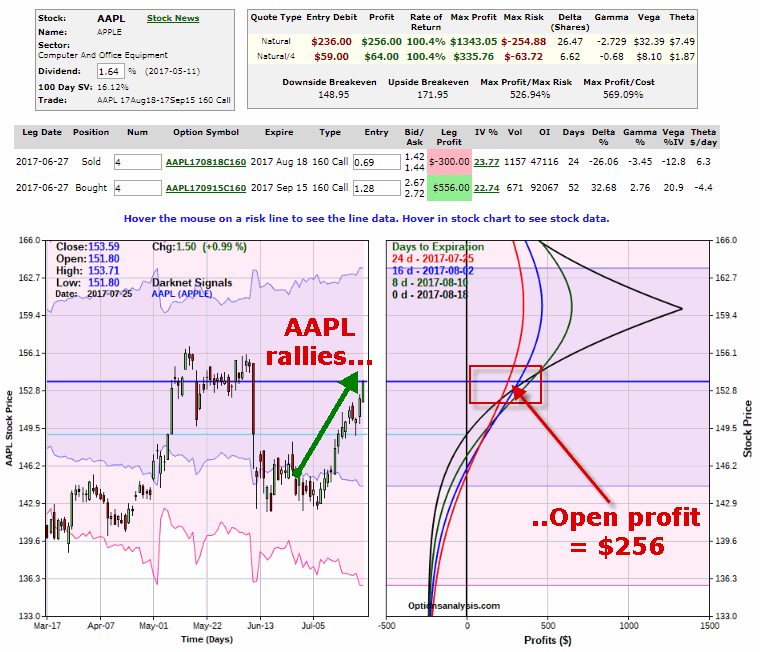
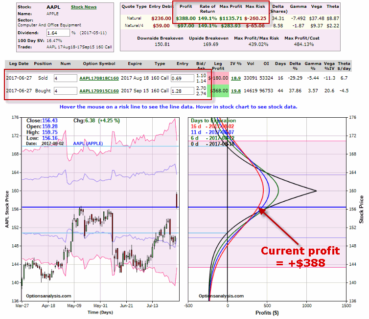 Figure 1 – AAPL Calendar Spread as of 8/2/17 (Courtesy www.OptionsAnalysis.com)