Let’s start with a simple question: Do you have $110 bucks you are willing to use to speculate in gold stocks for the next 13 months?
If you answered “No”, thanks for checking in and please come back soon. If you answered “Yes” (or at least “well, maybe”) then a brief lesson is the first order of business.
(Disclaimer: What follows is not intended to be a specific trade recommendation but rather an example of “one way to play a particular situation)
The Implications of Volatility
Figure 1 displays 1000 days of price data for ticker GDX with the “implied volatility” for 90+ day GDX options overlaid.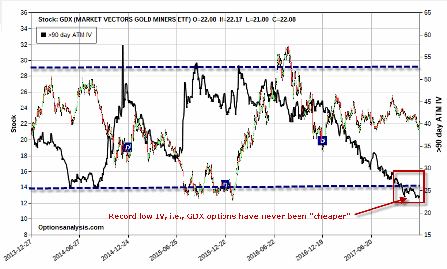 Figure 1 – GDX price with 90-day option implied volatility (Courtesy www.OptionsAnalysis.com)
If we asked 100 traders to state where they though GDX price was headed in the year ahead chances are we would get a lot of different answers. On the other hand if we asked 100 traders whether IV on GDX options is “high” or “low” my guess is that at least 99 of them would say “low”. And therein lies a potential opportunity.
Here is another rhetorical question: “Do you think there is a possibility that GDX IV will rise sometime in the next 13 months?” If you think “Yes”, or at least “well, maybe”, that’s where the $110 bucks comes into play.
But first, let’s finish the lesson:
*The price for an out-of-the-money option is comprised of “intrinsic value” and “extrinsic value” (heretofore referred to as “time premium”.
*Out-of-the-money options are comprised solely of “time premium”.
*Time premium is the amount of money an option writer demands from the option buyer in order to induce the writer to assume the risk of writing the option in the first place. Think of it as the premium an insurance company charges to induce them to write a policy.
*IMPORTANT: Low implied volatility = low time premium (i.e., options are “cheap” and strategies that buy premium and/or benefit from a subsequent rise in IV are favored).
*Longer-term options have more time premium built into their price than shorter-term options, thus changes in IV will move longer-term option prices much more than changes in IV will move shorter-term options.
*A calendar spread involves buying a longer-term option and selling a shorter-term option. It benefits from, a) the passage of time and/or, b) a subsequent increase in implied volatility
A “Far Out” Strategy
Consider the following trade:
*Buy 1 Jan2020 GDX 34 call @ $1.07
*Sell 1 Jan2019 GDX 36 call @ $0.24
*Buy 1 Jan2020 GDX 12 put @ $0.27
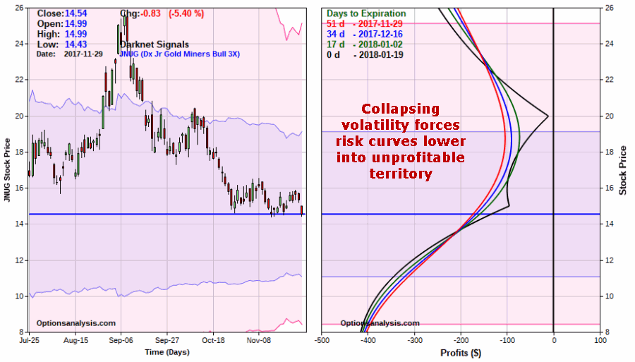
Figure 2 displays the particulars and Figure 3 the initial risk curves
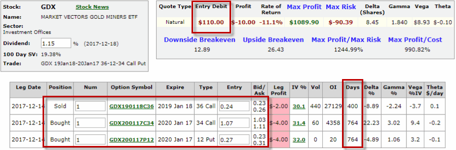 Figure 2 – GDX trade particulars (Courtesy www.OptionsAnalysis.com)
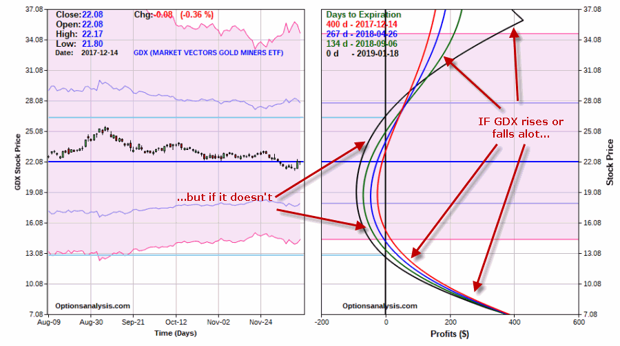 Figure 3 – GDX risk curves (Courtesy www.OptionsAnalysis.com)
At first blush it appears that this trade is simply a speculative bet that GDX will make a large price move in one direction or the other sometime between now and January 2019 (400 days from now). But what we are really betting on here is volatility. Look at Figure 4.
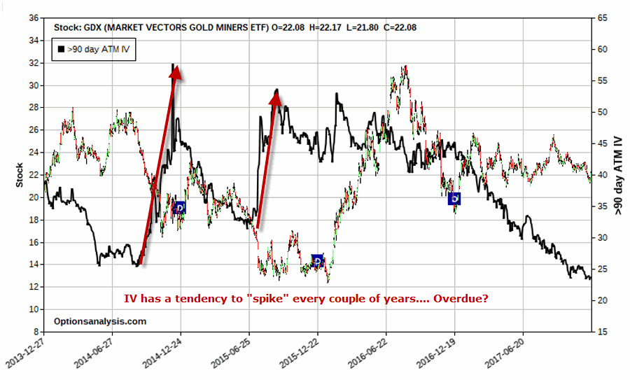 Figure 4 – GDX IV tends to”spike” (Courtesy www.OptionsAnalysis.com)
There were 2 big ”spikes” in IV in recent years – one saw IV rise 64% and the other IV rise 123%. Also, not shown in Figure 4 are two other spikes in 2012 and 2013 of 52% and 73%, respectively. So what we’re really betting on here is another spike of that variety sometime in the next 13 months. The average of these four previous “spikes” was 78%. In other words, IV on GDX options bottomed out and then increased on average by 78%.
So what would happen to our example trade if GDX IV rose 78% from current levels? In Figure 5 we are going to change the “IV Multiplier” in order to increase the IV for all GDX options by 78%.
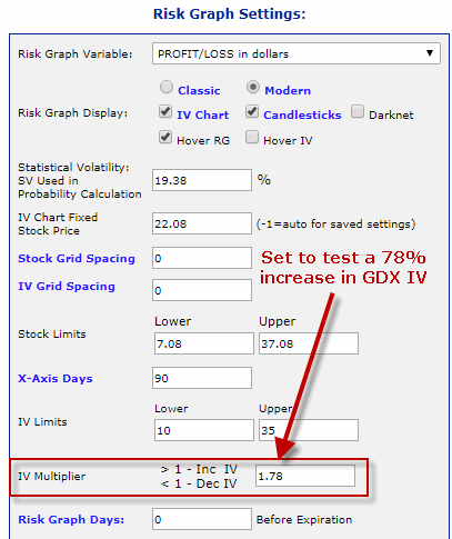
Figure 5 – Changing the IV Multiplier to see effect of higher IV (Courtesy www.OptionsAnalysis.com)
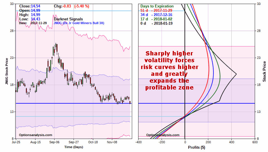
The results? See Figures 6 and 7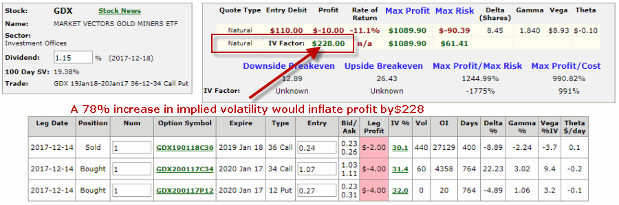 Figure 6 – GDX trade particulars if IV rises 78% (Courtesy www.OptionsAnalysis.com)
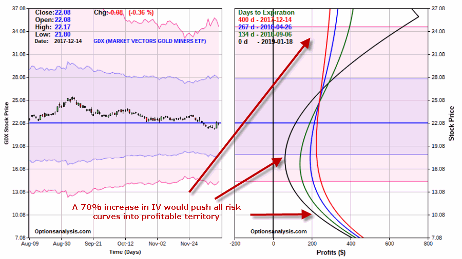 Figure 7 – GDX risk curves if IV rises 78% (Courtesy www.OptionsAnalysis.com)
As you can see, a big spike in GDX IV anytime in the next 400 days would have a very positive impact on this hypothetical trade.
Summary
Option prices can fluctuate from “cheap” to “expensive”. And vice versa. With IV on GDX currently at an all-time low, these options are “cheap.” I am in no way suggesting that the trade highlighted herein represents “a good idea.” The example trade detailed herein is simply an example of one way to set a “Volatility Time Bomb” for a very low dollar risk.
If GDX continues to meander and/or IV never picks up over the course of the next 13 months then this trade may lose $110. However, if GDX moves significantly, and/or if IV “spikes” from current levels, this trade trade can make a great deal more.
I am not suggesting that either of these things will happen,I am simply illustrating “one way to play.”
In terms of real world trading realistic expectations are in order. There is every chance that nothing much of anything will happen soon. GDX price may continue to drift sideways and IV may continue to drift lower. And this trade will lose a little due to time decay every single day. Also, if and when IV does spike it may all happen very quickly and the time window to take profit may be short.
Bottom line: This type of “oddball” trade may be little psychological gratification along the way. Prepare accordingly.
Jay Kaeppel
Disclaimer: The data presented herein were obtained from various third-party sources. While I believe the data to be reliable, no representation is made as to, and no responsibility, warranty or liability is accepted for the accuracy or completeness of such information. The information, opinions and ideas expressed herein are for informational and educational purposes only and do not constitute and should not be construed as investment advice, an advertisement or offering of investment advisory services, or an offer to sell or a solicitation to buy any security.
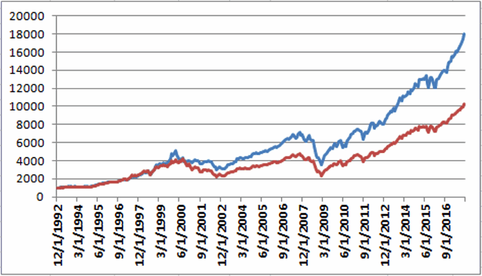
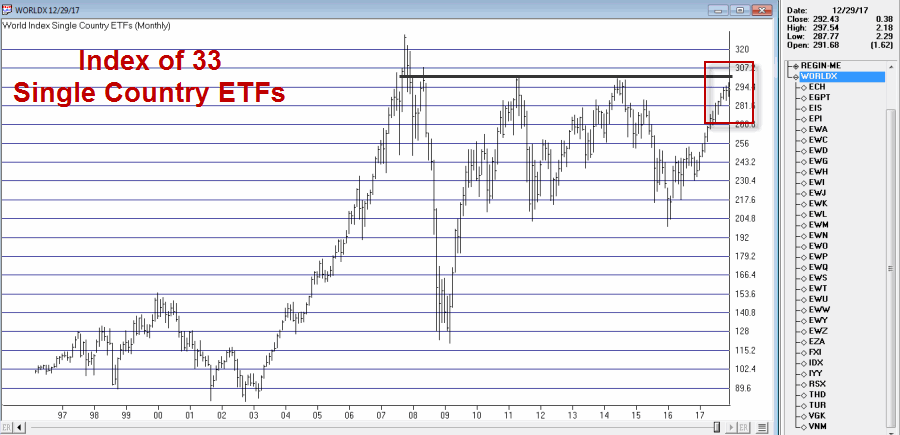 Figure 1 – Jays World Index (Courtesy AIQ TradingExpert)
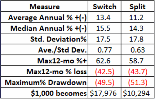
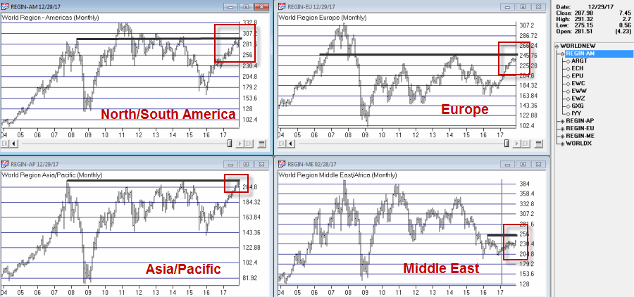 Figure 2 – Jay’s Regional Indexes (Courtesy AIQ TradingExpert)
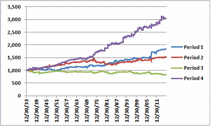
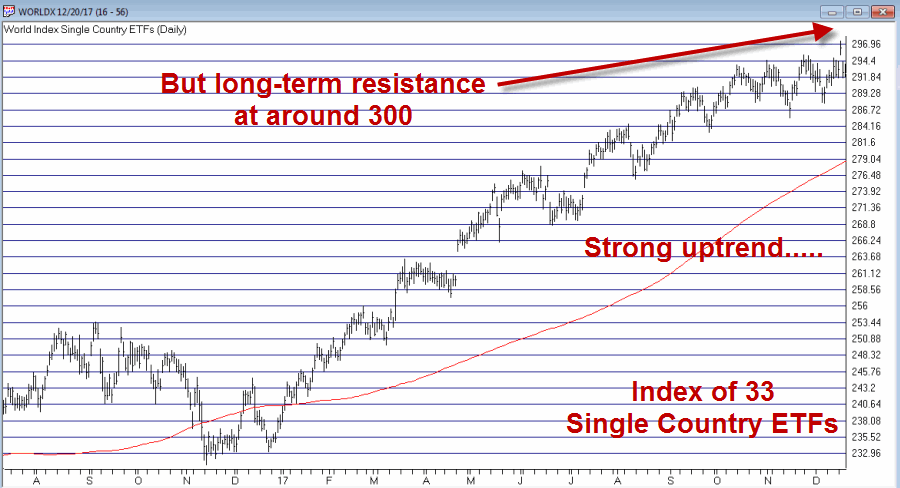 Figure 3 – Jay’s World Index daily chart; resistance at 300 (Courtesy AIQ TradingExpert)
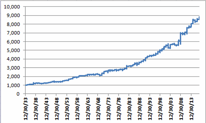