All posts by admin

The VixRSI14 Indicator – Part 1

While the bulk of the financial world focuses most of its attention on whether or not Bitcoin will turn to sh, er, something that rhymes with Bitcoin, a lot of “old timers” continue on with trying to look at markets in a more traditional way. Unfortunately, some people who try to look at markets in a more traditional way also spend an inordinate amount of time “dividing one number by another” thinking there is some purpose to it (“Hi. My name is Jay”)

The only good news is that every once in awhile something useful – or at least potentially useful (since no single calculation guarantees profitability which also involves other “minor” issues such as which securities to trade, allocation size, entry method, profit taking criteria, stop loss triggers and so on and so forth). A number of years ago I stumbled upon a calculation that I ultimately refer to as VixRSI (for reasons that will become fairly obvious soon).  More specifically I have a few different versions but one I like is call used VixRSI14.

First the Good News: In this and some future articles I will detail how I apply VixRSI14 to monthly, weekly and daily price charts.

Now the Bad News: Nothing that I will write in any of those articles will detail a “simple automated system that generates you can’t lose trading signals guaranteed to make you rich beyond the dreams of avarice.”  Sorry about that. But I thought you should know.

The truth is that the indicator generates signals – and yes, a certain percentage of the time those signals aren’t that great.  And even on occasions when the signals are decent all of the factors I mentioned above (securities traded, capital allocation, etc.) still hold the key to turning a “signal” into a “profit”.

VixRSI14

VixRSI14 is calculated by combining Larry William’s “VixFix” indicator with the standard old 14-day RSI from Welles Wilder. I’ve decided to put the calculations at the end of the article in order to avoid scaring anyone off.

For now let’s look at what to look for on a monthly price chart.

VixRSI14 on a Monthly Chart

OK, true confession time: there is (at least as far as I can tell) no “one best way” to use VixRSI14 on a monthly chart.  So I will simply show you “One way.”

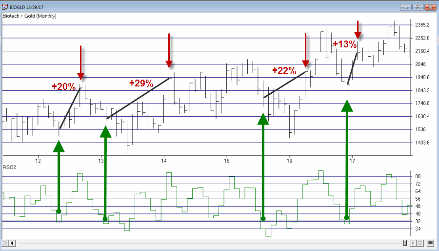
*A “buy alert” is triggered when the monthly value for VixRSI14 first rises to 3.5 or higher and then drops back to 3.0 or below

*Before going on please note that there is nothing “magic” about 3.5 or 3.  Different values can be used and will generate varying results.

*Also, some may prefer to simply look for a drop from above 3 to below 3 without requiring a move above 3.5

*Finally please note the use of the phrase “buy alert” and the lack of the phrase “BUY AS MUCH AS YOU CAN RIGHT THIS VERY MINUTE!!!!”

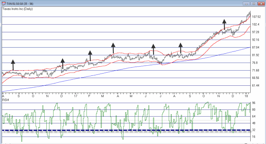
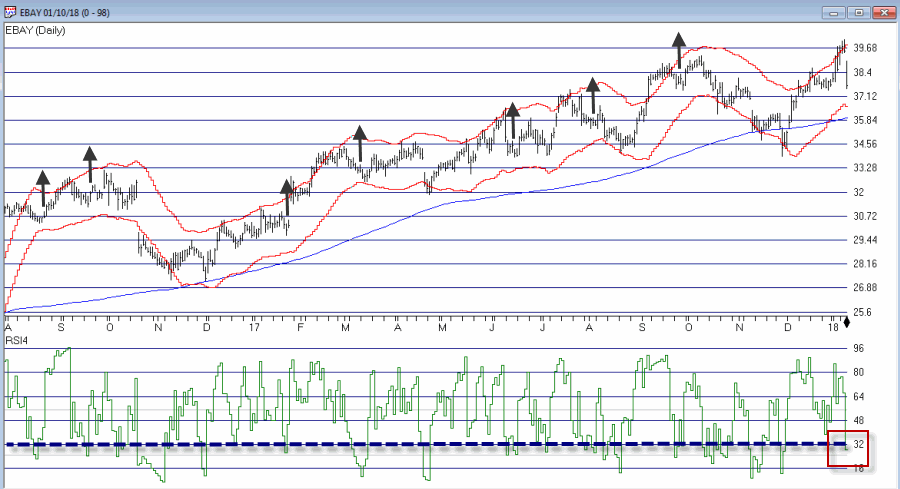
Figures 1 through 4 show several different Dow30 stocks “through the years.”1
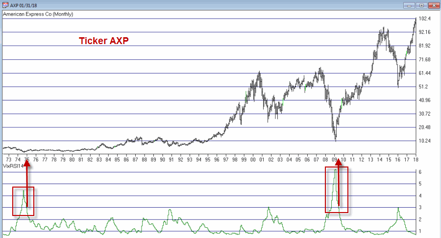
Figure 1 – Ticker AXP (Courtesy AIQ TradingExpert)

2
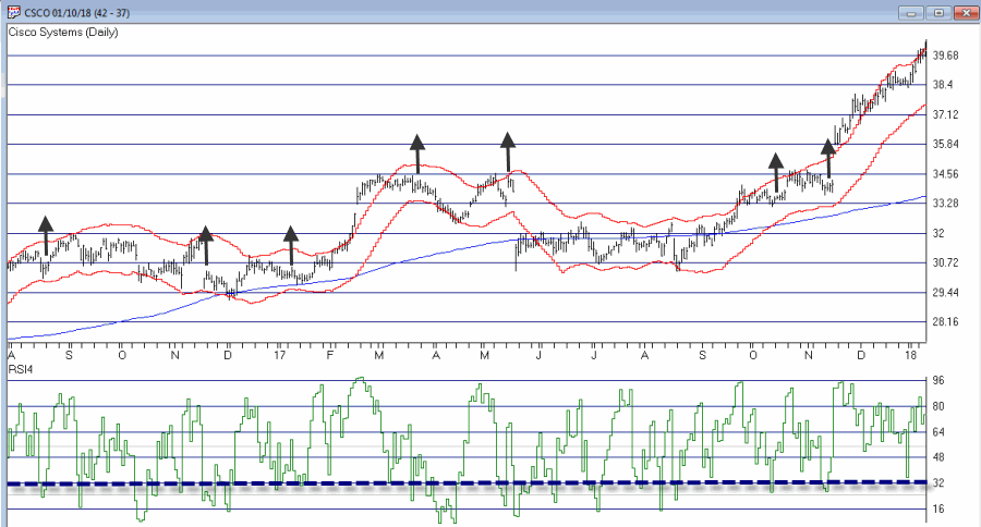
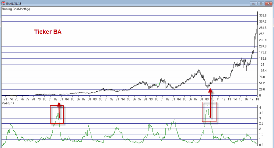
Figure 2 – Ticker BA (Courtesy AIQ TradingExpert)

3
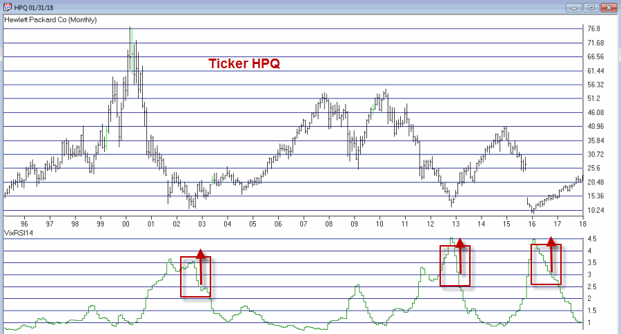
Figure 3 – Ticker HPQ (Courtesy AIQ TradingExpert)

4
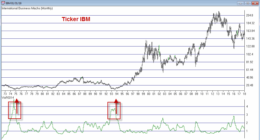
Figure 4 – Ticker IBM (Courtesy AIQ TradingExpert)

Summary

Buy alerts on monthly charts using the criteria I described are obviously very rare.  In fact many securities never see the VixRSI14 rise high enough to trigger an alert.  Likewise, not every 3.5 then 3 event for every stock will work out as well as those depicted in Figures 1 through 4.

Still, remember that I am just presenting an “idea” and not a finished product.

Code:

William’s VixFix is simply the 22-day high price minus today’s low price divided by the 22-day high price (I then multiply by 100 and then add 50).  That may sound complicated but it is not.

The code for AIQ TradingExpert appears below.

########## VixFix Code #############

hivalclose is hival([close],22).

vixfix is (((hivalclose-[low])/hivalclose)*100)+50.

###############################

####### 14-period RSI Code ###########

Define periods14 27.

U14 is [close]-val([close],1).

D14 is val([close],1)-[close].

AvgU14 is ExpAvg(iff(U14>0,U14,0),periods14).

AvgD14 is ExpAvg(iff(D14>=0,D14,0),periods14).

RSI14 is 100-(100/(1+(AvgU14/AvgD14))).

###############################

VixRSI14 is then calculated by dividing the 3-period exponential average of VixFix by the 3-period exponential average of RSI14

####### VixRSI14 Code ###########

VixRSI14 is expavg(vixfix,3)/expavg(RSI14,3).

###############################

Jay Kaeppel

Disclaimer:  The data presented herein were obtained from various third-party sources.  While I believe the data to be reliable, no representation is made as to, and no responsibility, warranty or liability is accepted for the accuracy or completeness of such information.  The information, opinions and ideas expressed herein are for informational and educational purposes only and do not constitute and should not be construed as investment advice, an advertisement or offering of investment advisory services, or an offer to sell or a solicitation to buy any security.

Happy Holidays Revisited

I know what you’re thinking –“Dude, the holiday season just ended, you can’t miss them that badly yet.”  For the record, a) Yes I can, and, b) the title is not actually referring to the Christmas/New Years time frame jut past.  It refers to stock market Holiday’s in general.

This article is essentially a follow-up to this article and this article from last January.

One Approach to Market Holidays

So here’s a question. What would the results look like if we bought and held the Dow Jones Industrials Average only during the 3 trading days before and the 3 trading days after each stock market holiday?  These include:

*Martin Luther King Day

*Presidents Day

*Easter

*Memorial Day

*Independence Day

*Labor Day

*Thanksgiving

*Christmas

*New Years

For our test we are going back to December 1933. The growth of $1,000 invested in the Dow only during the 6 trading days surrounding each stock market holiday (note that until the early 1950’s there were two holidays in February – Lincoln’s Birthday and Washington’s Birthday – which were ultimately combined into President’s Day.  Also, Martin Luther King Day was first celebrated in 1998) appears in Figure 1.

In order to capture only the market action around holidays no interest is assumed to be earned during all other days.1Figure 1 – Growth of $1,000 invested in Dow Jones Industrials Average ONLY during the 3 trading days before and 3 trading days after each stock market holiday; 12/1/1933-1/12/2018

The equity curve shown in Figure 1 is by no means a “straight line” advance.  Nevertheless, the long-term “lower left to upper right” trend is unmistakeable.

These “Holiday Days” comprise roughly 18.9% of all trading days. What makes the results fairly interesting is when we compare these “Holiday Days” to “all other trading days”.

Figure 2 displays the same line as in Figure 1.  It also plots the growth of $1,000 during “all other trading days” (red line).2Figure 2 – Growth of $1,000 invested during “Holiday Days” (blue line) versus “All Other Days” (red line)

For the record:

Measure Holiday Days All Other Days
% of All Trading Days 18.9% 81.1%
$1,000 becomes $19,168 $13,613
Total % +(-) +1,817% +1,261%
% Up Days 54.8% 51.9%
%Down/Unch Days 45.2% 48.1%
Ave. daily %+(-) +0.0755% +0.0194%
Median daily%+(-) +0.0793% +0.0353%

Figure 3 – Holiday Days versus All Other Days

The most interesting finding to me in Figure 3 is the the average daily % gain for “Holiday Days” (+0.0755%) is 3.9 times greater than the average daily % gain for “All Other Days” (+0.0194%).

Trading with a Leveraged ETF

For this test we will employ the following rules:

*If today is within 3 trading days before or 3 trading days after a stock market holiday we will hold ticker UMPIX (Profunds Ultra MidCap – which tracks the daily change for the S&P 400 MidCap Index times 2).

*For all other trading days we will hold cash and will assume we earn an annualized rate of interest of 1%.

*We will start our test on 2/7/2000, which was the first day of trading for ticker UMPIX

The growth of $1,000 invested using the rules above appear in Figure 4 along with the growth of $1,000 invested in the Dow Jones Industrials average on a buy-and-hold basis during the same time.4Figure 4 – Growth of $1,000 invested in ticker UMPIX using Holiday Days Trading Rules (blue line) versus buying and holding the Dow Jones Industrials Average (red line); 2/7/00-1/24/17

For the record:

*The system is in UMPIX only 20.7% of all trading days and in cash 79.3% of all trading days.

*The average annual return for System = +13.2%

*The average annual return for Dow Buy-and-Hold = +5.5%

*The maximum System drawdown was -34.3%

*The maximum Dow Buy/Hold drawdown was -53.8%

Summary

Despite the fact that “Holiday Days” comprised only 19% of all trading days since 1933, they generated a higher a greater cumulative returns than the “other” 81% of all trading days. Likewise, they realized a higher percentage of up days and a much higher average and median daily rate of return.

So once again I would like to launch my annual drive and implore each of you to join me in contacting our representatives and demanding more holidays!

Jay Kaeppel

Disclaimer:  The data presented herein were obtained from various third-party sources.  While I believe the data to be reliable, no representation is made as to, and no responsibility, warranty or liability is accepted for the accuracy or completeness of such information.  The information, opinions and ideas expressed herein are for informational and educational purposes only and do not constitute and should not be construed as investment advice, an advertisement or offering of investment advisory services, or an offer to sell or a solicitation to buy any security.

Trend or Countertrend? Why Not Both?

First the brutal disclaimers: What follows is NOT a trading “system.” It is merely an “idea.” Even more brutally, I can’t even claim that it “works”.  All the testing I have done so far is more anecdotal. Also to an extremely huge degree, the actual entry trigger and exit trigger that  trader might choose to use will have – as always – at least as much if not more impact on overall trading results as the actual “alert” signal detailed below.

Got that?  OK, then let’s proceed.

The Debate

The ongoing debate in trading is always – trend-following or countertrend?  Which is the way to go?  There are (conservatively) at least a bazillion and one ways to argue one way or the other.       Figure 1 displays ticker TXN with upper and lower “Acceleration Bands” (code for AIQ TradingExpert appears after disclaimer at end of article) drawn.1Figure 1 – Ticker TXN with Acceleration Bands (Courtesy AIQ TradingExpert)

Want to start a debate?  Ask this question: Is it better to buy when price hits the upper band or the lower band?  Sometimes price hits the upper band and just keeps going.  Sometimes it hits the upper band and the move peters out and reverses fairly quickly.

Going with the trend can lead to some big winning trades along the way, but typically involves a lot of whipsaws as well. Trading countertrend can lead to some great, quick profits – expect of course for when the initial trend never quite reverses and quick losses accrue instead.

What to do, what to do?

So the “idea” I mentioned at the outset generally goes like this:

*In an uptrend (which we will define in a moment)

*Wait for price to hit the Upper Band

*Then wait for a pullback

*Then wait for the uptrend to reassert itself

Got that? OK, me neither exactly.  So let’s try to define things a little more clearly.

1. As long as the closing price remains above the 200-day moving average, we will call that an “uptrend”

2. Within an uptrend wait for the high of a trading day to reach or exceed the Upper Acceleration Band.

3. Following #2, wait for the 4-day RSI to drop to 32 or lower with the following caveats:

*If price touches the Lower Acceleration Band OR closes below the 200-day moving average

*Then the setup is invalidated

This is the “Setup”.  For sake of example I will add an entry trigger as follows:

4. Following a valid #3 Alert Signal, buy when price exceeds the previous day’s high

I am going to purposely NOT add an exit trigger – just so that no one decides to “try it out” without at least giving it some thought on their own.

So Figure 2 shows the “Alerts” and “Entry Triggers” for the chart in Figure 1.2Figure 2 – Ticker TXN with Example “Entry Triggers” (Courtesy AIQ TradingExpert)

So Figure 3 shows the “Alerts” and “Entry Triggers” for ticker EBAY3Figure 3 – Ticker EBAY with Example “Entry Triggers” (Courtesy AIQ TradingExpert)

So Figure 4 shows the “Alerts” and “Entry Triggers” for ticker CSCO4Figure 4 – Ticker CSCO with Example “Entry Triggers” (Courtesy AIQ TradingExpert)

So are these signals any good? Well, like a lot of trading methods, some look pretty good and others do not.  As I also mentioned earlier, a lot depends on the method or methods you use to exit each trade.

Summary

The reality is that there is a chance that the “idea” contained herein is just no darn good.

But also remember that there are other “trend filters” (besides the 200-day moving average), there are other “bands” (besides Acceleration Bands”), there are other oversold indicators (besides 4-day RSI) and there are other entry and exit triggers.

As such, this piece is essentially for people who are willing to do a little digging on their own and, a) become comfortable (or not) with the idea, and b) develop  some position sizing, stop-loss and profit-taking criteria.

Jay Kaeppel

Disclaimer:  The data presented herein were obtained from various third-party sources.  While I believe the data to be reliable, no representation is made as to, and no responsibility, warranty or liability is accepted for the accuracy or completeness of such information.  The information, opinions and ideas expressed herein are for informational and educational purposes only and do not constitute and should not be construed as investment advice, an advertisement or offering of investment advisory services, or an offer to sell or a solicitation to buy any security.

Acceleration Bands Code

a is ([high]-[low]).

b is ([high]+[low])/2.

c is (a / b).

d is (c*2).

e is (1+d).

f is (1-d).

g is ([high]*e).

h is ([low]*f).

AccelUB is Simpleavg(g, 20).

AccelLB is Simpleavg(h, 20).


Cheap Speculation in Crude Oil

Crude oil has surprised a lot of people by rallying quite strongly through the winter months (ironically, October into December is typically a period of weakness for the gooey stuff).

As you can see in Figure 1, crude oil futures are at a key resistance level.  In Figure 2 we see that ticker USO – an ETF that purports to track the price of crude oil is also at a key price level.1Figure 1 – Crude Oil futures at a key level  (Courtesy ProfitSource by HUBB)

2Figure 2 – USO ETF at a key level  (Courtesy ProfitSource by HUBB)

Will crude break through and rally to higher new highs?  Or will it bump its head on resistance and fall back?  Here is where a skilled analyst would insert his or her spot on analysis of why crude oil is destined to do one or the other. Unfortunately, there’s no one like that here on staff. Which is OK because this blog is not intended to give advice or make specific recommendations, only “education”.  So let’s look at an “example” of one “cheap” way to trade crude oil assuming you have a particular outlook on crude oil.

Playing for an Upside Breakout

For the record I am making no “predictions” about crude oil.  However, for example’s sake let’s say that a trader wants to enter a position that will allow him or her to profit if crude oil continues to rally.  Let’s also assume that this trader does not want to risk alot of money.

For the average trader the obvious play would be to buy 100 shares of USO. At $12.57 a share you would need to put up $1,257 to enter the trade.  The risk curve for this trade is a straight line as shown in Figure 3. For each $1 in price USO rises the positions gains $100 and vice versa.3Figure 3 – Risk graph for long 100 shares of USO at $12.57  (Courtesy www.OptionsAnalysis.com)

Now let’s look at an alternative trade.  This one cost $74 to enter.  The strategy is referred to as a “Vertical Calendar Spread” and involves:

*Buying 4 USO Mar 13 calls @ $0.23

*Selling 3 USO Feb 13.5 calls @ $0.06

As you can see in Figures 4 and 5 the cost to enter – and maximum risk – is $74.  Profit potential is unlimited and the breakeven price is $12.82 a share.4Figure 4 – Vertical Calendar Spread (Courtesy www.OptionsAnalysis.com)

5Figure 5 – Risk Curves for USO Vertical Calendar Spread  (Courtesy www.OptionsAnalysis.com)

To really get the picture let’s compare the risk curves or the two trades as shown in Figures 6a, 6b and 6c.  The dark black line (the one that curves) is the option trade at the time of February option expiration (Feb 16).  The lighter line (the one that is a straight line represents simply owning 100 shares of USO).

If USO shares are above $13.10: the option trade will generate a higher profit than being long 100 shares of USO.6aFigure 6a  – Comparing risk curves for Long 100 shares of USO versus Vertical Calendar Spread (Courtesy www.OptionsAnalysis.com)

If USO shares are between $11.88 and $13.10: the option trade could lose up to $30 more than simply holding 100 shares of USO (unless volatility rises sharply, which would increase the value of the option trade).6bFigure 6b  – Comparing risk curves for Long 100 shares of USO versus Vertical Calendar Spread (Courtesy www.OptionsAnalysis.com)

If USO shares are below $11.88: The option trade worst case is a loss of -$74.  The 100 shares of USO position will lose an additional $100 for each full point that USO stock declines in price.6ca

Figure 6c  – Comparing risk curves for Long 100 shares of USO versus Vertical Calendar Spread (Courtesy www.OptionsAnalysis.com)

On the Flipside

For a trader thinking USO will not follow through, the example trade in Figures 7 and 8 might make more sense.  This trade involves:

*Buying 5 USO Mar 12.5 @ $0.41

*Selling 4 USO Feb 12.5 @ $0.06

7Figure 7 – Bearish USO Example trade (Courtesy www.OptionsAnalysis.com)8Figure 8 – Risk curves for Bearish USO Example trade  (Courtesy www.OptionsAnalysis.com)

Summary

For the record I am not suggesting that crude oil is going to rise from current levels. Nor am I suggesting it will fall, for that matter.  The trades detailed above are simply intended to serve as examples of different, inexpensive ways to speculate at a fraction of the cost of buying or selling short the underlying shares.

Jay Kaeppel

Disclaimer:  The data presented herein were obtained from various third-party sources.  While I believe the data to be reliable, no representation is made as to, and no responsibility, warranty or liability is accepted for the accuracy or completeness of such information.  The information, opinions and ideas expressed herein are for informational and educational purposes only and do not constitute and should not be construed as investment advice, an advertisement or offering of investment advisory services, or an offer to sell or a solicitation to buy any security.


It (Still) Doesn’t Have to be Rocket Science

We live in interesting times.  All the buzz these days seems to revolve around a technology (Blockchain) of which most people don’t have the slightest idea how it works, and a trading vehicle (crytocurrencies, particularly Bitcoin) that most people don’t have the slightest idea what it is.  Speaking of buzz, legal marijuana appears to be pretty popular among people with whom marijuana is pretty popular.

I myself am attempting to develop a hybrid technology (Potchain technology) to tap into these manias, er, I mean “sound investment opportunities.”  Now the truth is that I don’t really know how this new technology of mine will work or what it is supposed to do.  So there is not much point in toking, er, talking about it at length at this time.  Still, I am thinking that if I can just tap into the “stoned Bitcoin trader” market – at least while they still have some money to  spend – well, enough about all of that for now.

Also, please remember that I have still  have plenty of JCoins available for speculative purchase if anyone is interested.  You can buy all of the JCoins you’d like on JBay.com and pay for them on JayPal.com.  But (ironically) I don’t accept JCoins as a form of payment because, well, what would be the point of that?

Anyway….

Meanwhile Back in Squaresville

“Jay’s Vanguard System” below is one I have followed for many years. It is really boring. Also the returns (and rewards versus risk) are probably in the range that most would quantify as “Good, Not Great.”  But I am OK with that.

The “System” (such as it is) involves holding a particular Vanguard fund during a particular month, as shown below.

1

Figure 1 – “Jay’s (Boring) Vanguard System”

There are 3 stages:

Boring: Vanguard Equity-Income Fund Investor Shares during March, April and May

Boring”er”: Vanguard Wellesley Income Fund Investor Shares during November through February

Boring”est”: Vanguard GNMA Fund Investor Shares (June through October)

For the record, Vanguard is pretty militant about “switching” but the shortest holding period is three months so as long you’re not switching billions of dollars there are (to date) no hassles.

Figure 2 displays the growth of $1,000 invested since 1980 using the “System” versus Buy and Hold.2Figure 2 – Growth of $1,000 using “Jay’s Vanguard System” versus buying and holding the 3 funds used in the System (Data Source: Monthly Total Return data from PEP Database from Callan Associates); Jul 1980-Dec 2017

Performance data appears in Figure 3:

  System BuyHold
Average 12 mo% +12.9% +9.3%
Median12 mo% +11.9% +7.8%
Std Deviation % 8.2% 7.0%
Ave/Std Dev 1.58 1.32
Worst 12mo% (-4.2%) (-5.7%)
Max Drawdown% (-9.3%) (-6.7%)
$1,000 becomes $77,446 $23,766

Figure 3 – Performance Figures – “System” versus “Buy/Hold”; Jul 1980-Dec 2017

Summary

Is this a great, “world-beater” system?  Not at all. But for that seemingly ever smaller pool of investors of the “slow and steady” variety, it might be of interest.

Jay Kaeppel

Disclaimer:  The data presented herein were obtained from various third-party sources.  While I believe the data to be reliable, no representation is made as to, and no responsibility, warranty or liability is accepted for the accuracy or completeness of such information.  The information, opinions and ideas expressed herein are for informational and educational purposes only and do not constitute and should not be construed as investment advice, an advertisement or offering of investment advisory services, or an offer to sell or a solicitation to buy any security.


Jay Kaeppel is New “Explore Your Options” Columnist for Technical Analysis of Stocks & Commodities Magazine

Starting with the January 2018 issue, veteran trader and author Jay Kaeppel is the Editor of the monthly “Explore Your Options” column for Technical Analysis of Stocks & Commodities magazine.

Jay brings over 30 years of experience as a trader, author, systems developer and money manager to a column devoted to helping individual traders and investors more knowledgeable and more effective successful in the realm of options trading.

Jay Kaeppel is Director of Research/Vice President and a Portfolio Manager for an Ohio based investment firm and the Editor of the JayontheMarkets.com blog.  He was the Head Trader at a CTA for 9 years and a trading software developer for 15 years.  As an author, Jay has published two books on option trading – The Four Biggest Mistakes in Option Trading and The Option Trader’s Guide to Probability, Volatility and Timing.  Jay spent 9 years as an Instructor and Trading Strategist for Optionetics., Inc.  He has been a Contributing Editor for Schwab.com, has written over 25 articles for Technical Analysis of Stocks and Commodities magazine and his writings are syndicated on Investing.com, WallStreetCurrents.com and The McVerryReport.  Jay was nominated for membership in The American Association of Professional Technical Analysts (AAPTA) in 2006.

Meanwhile, Metals

Poor, poor precious metals.  Once the darlings of speculators everywhere, precious metals and stocks of companies who mine those metals are seemingly being tossed to the curb as the speculation world focuses all of its attention on Bitcoin and roughly a bazillion other “cryptocurrencies” (question of the day: If you cannot explain out loud in a sentence or two what a cryptocurrrency is then why are you trading it?).

Things have gotten so carried away I am contemplating changing the blog name to “CryptoJayontheBlockchaintechnologyMarkets.com” in an effort to increase readership.  Also, if anyone interested in speculating in some of the JCoins I just created in my basement please feel free to make me an offer.

Anyway, Figures 1athrough 1d display bar charts for GLD (gold ETF), SLV (silver ETF), GDX (gold stock ETF) and SIL (silver stock ETF).  Note the current status of implied volatility for options on each – low, lower, lowest; i.e., traders have lost a lot of interest in these ETFs as speculative vehicles.

0

Figure 1a – GLD (Gold ETF) with implied volatility (Courtesy ProfitSource by HUBB)

0b

Figure 1b – SLV (Silver ETF) with implied volatility (Courtesy ProfitSource by HUBB)0c

Figure 1c – GDX (Gold stock ETF) with implied volatility (Courtesy ProfitSource by HUBB)0d

Figure 1d – SIL (Silver stock ETF) with implied volatility (Courtesy ProfitSource by HUBB)

Let’s take a closer look at silver.

Ticker SLV

In this article dated 11/17/2017 I “predicted” that “something” was about to happen in silver.  And it did.  SLV immediately plummeted lower – then reversed course and made it all back and is roughly unchanged from where it was at the time of the original article (which explains why I don’t bother making a lot of “predictions”).  So is there any future for silver?

In Figure 2 we see that SLV appears to be “coiling” into an ever tighter range.  There is a good chance that this will continue for at least a little while.

1Figure 2 – SLV “coiling” (Courtesy ProfitSource by HUBB)

While the range in Figure 2 looks pretty wide, in reality, it is not necessarily so as we see in Figure 3 which highlights the same pattern but with much more historical data.2Figure 3 – The same SLV “coil” from a longer-term perspective (Courtesy ProfitSource by HUBB)

Where to from here?  I am probably not the guy to ask.  In the original article linked above I highlighted a bullish example trade – and SLV immediately plummeted for days on end.  Still, for what it is worth, the weekly Elliott Wave count from ProfitSource by HUBB for SLV is suggesting that a 5-wave down pattern may have been completed.  In theory anyway, this should be followed by a move higher.  We’ll see about that, but for now it at least provides a nice support area as shown in Figure 4.3Figure 4 – Weekly Elliott Wave count for SLV (Courtesy ProfitSource by HUBB)

In the original article I highlighted an example bullish trade using options on SLV and a strategy known as a “backspread”.  This trade involved selling 1 June2018 11 strike price call and buying 5 June 2018 16 strike price calls. You can see the current status (basically unchanged) and the risk curves for this trade in Figure 5.4Figure 5 – SLV backspread risk curves (Courtesy www.OptionsAnalysis.com)

As I mentioned above the current level of implied volatility for options on metals and metals miners are historically low.  This tells us two things, 1) traders have very low expectations for the likelihood that any of these securities will move significantly anytime soon, 2) options on these ETFs are “cheap” (i.e., low implied volatility means there is relatively little time premium built into the price of the options).5Figure 6 – SLV implied volatility extremely low (Courtesy www.OptionsAnalysis.com)

For a trader willing to “take a flyer” on the contrarian possibility that:

*SLV will  make a significant price move to the upside sometime in the next year and/or;

*That implied volatility will increase sometime during the next year

One inexpensive speculative play would be to buy the January 2019 16 strike price call as displayed in Figure 7. To buy 1-lot of this option with 380 days left until expiration costs $166.

6Figure 7 – SLV January 2019 call option (Courtesy www.OptionsAnalysis.com)

As always, I am not “recommending” this trade.  It serves simply as one relatively low dollar cost way to speculate on a price move higher by SLV in the coming 12 months.

Summary

It would seem that the “cryptocraze” has sucked all of the oxygen out of the other traditional “speculative” space traditionally occupied by precious metals and metals miners.  And the reality is that this may continue for some time.  But if history is a guide, at some point precious metals will break out of their respective extended trading ranges and offer some speculative trading opportunities.

Hence, alert traders should remain – well, alert.

Jay Kaeppel

Disclaimer:  The data presented herein were obtained from various third-party sources.  While I believe the data to be reliable, no representation is made as to, and no responsibility, warranty or liability is accepted for the accuracy or completeness of such information.  The information, opinions and ideas expressed herein are for informational and educational purposes only and do not constitute and should not be construed as investment advice, an advertisement or offering of investment advisory services, or an offer to sell or a solicitation to buy any security.

The Biotech-Gold Stock Connection

At first blush there might not seem to be much to connect biotech stocks and gold stocks.

One type of company hires people to engage in high tech biomedical engineering in order to develop potentially life-saving – or at least, life altering – medical breakthroughs…

…while the other hires people to (essentially) dig holes in the ground and mine stuff (granted, valuable stuff, but stuff mined out of the ground nevertheless).

But there is one other connection – stocks of both categories are quite volatile. And that alone may be enough to create a potential opportunity.

The BioGold Index

I created an “index” (such as it is) that combines Fidelity Select Biotech (FBIOX) and Fidelity Select Gold (FSAGX).  The index appears in Figure 1.  Like every other index in the world this index fluctuates up and down.1Figure 1 – Jay’s BioGold Index (Courtesy AIQ TradingExpert)

The RSI32 Index

The RSI32 Index is simply a 2-day average of the standard 3-day RSI Index.  The code for AIQ TradingExpert is below:

Define days3 5.

U3 is [close]-val([close],1).

D3 is val([close],1)-[close].

AvgU3 is ExpAvg(iff(U3>0,U3,0),days3).

AvgD3 is ExpAvg(iff(D3>=0,D3,0),days3).

RSI3 is 100-(100/(1+(AvgU3/AvgD3))).

RSI32 is simpleavg(RSI3,2).

The RSI32 Index for the BioGold Index appears on the monthly bar chart in Figure 2.2aFigure 2 – The BioGold Index with RSI32 (drop to 33 or below = BUY) (Courtesy AIQ TradingExpert)

The BioGold “System”

The BioGold System works as follows:

*When the monthly RSI32 Index drops to 33 or lower, buy BOTH FBIOX and FSAGX

*After a “Buy Signal” then when the monthly RSI32 rises to 64 or higher, sell BOTH FBIOX and FSAGX

For testing purposes we will use monthly total return data for both FBIOX and FSAGX from the PEP Database from Callan Associates.

The Results

Figure 3 displays the results of the buy signals generated using the rules above (assumes that both FBIOX and FSAGX are bought after monthly RSI32 drops to 33 or lower and are held until monthly RSI32 rises to 64 or higher.

Buy Signal Sell Signal FBIOX+FSAGX % +(-)
4/30/1992 12/31/1992 +14.4%
2/26/1993 4/30/1993 +14.7%
4/29/1994 9/30/1994 +7.2%
12/30/1994 4/28/1995 +9.8%
4/30/1997 9/30/1997 +18.4%
11/28/1997 4/30/1998 +10.4%
6/30/1998 12/31/1998 +16.1%
3/30/2001 6/29/2001 +22.7%
7/31/2002 12/31/2002 +18.1%
7/30/2004 10/29/2004 +11.2%
3/31/2005 7/29/2005 +10.2%
4/30/2008 7/31/2008 +9.4%
9/30/2008 6/30/2009 +3.8%
5/31/2012 9/28/2012 +20.0%
2/28/2013 2/28/2014 +28.6%
8/31/2015 4/29/2016 +22.2%
12/30/2016 2/28/2017 +13.2%
Average % +14.7%
Median % +14.4%
Std. Deviation % 6.4%
Max % +(-) +28.6%
Min % +(-) +3.8%

Figure 3 – Trade-by-Trade Results

For the record, the “System” has been in FBIOX and FSAGX only 28% of the time (88 months) and out of the market 72% of the time (223 months).

Figure 4 displays the trades in recent years.3Figure 4 – BioGold System trades; 2012-2017 (Courtesy AIQ TradingExpert)

*The Good News is that all 17 signals since 1992 showed a profit, with an average gain if +14.7%.

*The Bad News is that, a) 17 trades in 25 years is a pretty small number of trades and, b) there are some not insignificant drawdowns along the way (-22.8% in 1998 and -22.4% in 2008, -14.1% in 2013 and -13.6% in 2016).

Still, for what it is worth the monthly equity curve appears in Figure 5.4Figure 5 – Growth of $1,000 invested using the “BioGold System”; 12/31/1991-12/29/2017

For the record, the “System” has been in FBIOX and FSAGX only 28% of the time (88 months) and out of the market 72% of the time (223 months).

For the record, the “System” has been in FBIOX and FSAGX only 28% of the time (88 months) and out of the market 72% of the time (223 months).  No interest is assumed to be earned while out of the market in the test above.

If we invest in short-term treasuries (1-3 yr.) while not in the stock market we get the results shown in Figure 6.

In Figure 6:

*The blue line represents the growth of $1,000 achieved by holding FBIOX and FSAGX when the BioGold System is on a “buy signal” and 1-3 yr. treasuries the rest of the time.

*The red line represents the growth of $1,000 achieved by buying and holding both FBIOX and FSAGX and then rebalancing at the end of each year.

The “System” grew to $19,863 and the “split” grew to $12,844.5Figure 6 – Growth of $1,000 using BioGold System plus 1-3 yr. treasuries when out of stocks (blue) versus buying and holding FBIOX and FSAGX and rebalancing each year (red);12/31/1991-12/29/2017

Summary

So is the “BioGold System” really a viable investment idea?  That’s not for me to say.  The per trade returns are pretty good but there aren’t a whole lot of trades and if history is a guide an investor would likely have to ride some significant drawdowns in order to reap the gains.

Still, market-beating performance is market-beating performance, so who knows?

 Jay Kaeppel

Disclaimer:  The data presented herein were obtained from various third-party sources.  While I believe the data to be reliable, no representation is made as to, and no responsibility, warranty or liability is accepted for the accuracy or completeness of such information.  The information, opinions and ideas expressed herein are for informational and educational purposes only and do not constitute and should not be construed as investment advice, an advertisement or offering of investment advisory services, or an offer to sell or a solicitation to buy any security.


The ‘Boring Bond Index’ for Low-Risk Investors

OK, the truth is that I prefer to write about stuff that is at least “potentially” exciting, i.e., things that perhaps have a chance to accumulate well above average profits. But “boring” (and “consistent”) isn’t so bad for a lot of investors in a lot circumstances.

A 10-Month a Year Bond Index (Plus 2)

This “index” was developed by Dr. Jerry Minton, the President of Alpha Investment Management, Inc. It works like this:

*30% in short-term (1-3 yr.) treasuries

*40% in intermediate-term (3-7 yr.) treasuries

*30% in high-grade corporate bonds

10 Months: The original “index” of bonds is held from the close on December 31st through the close on the following October 31st (i.e., buy and hold for 10 months) and then rebalanced on December 31st.

Plus 2: For the purposes of this article we will assume that 100% of the portfolio is held in short-term (1-3 yr.) treasuries during November and December each year.  Then the money will be reallocated using the 30/40/30 split shown above.

Figure 1 displays the cumulative growth of $1,000 since 12/31/1975.1Figure 1 – Growth of $1,000 invested using “Boring Bond Index” Method; 12/31/1975-11/30/2017

The key thing to note is the consistent “lower left to upper right” slope of the equity curve in Figure 1.  Since 12/31/1975:

*The average 12-month return is +7.2%

*The worst 12-month period was -5.2% (12-mos ending 3/31/1980)

*The largest drawdown was -9.2% (month ending 2/29/1980)

*The largest maximum drawdown since 1982 was a mere -3.8% (in 1994)

*90.4% of all 12-month periods showed a gain

Other Considerations

One caveat here is that bonds have (at least until recently) been in a bull market for roughly 35 years.  Still, for the record the period from 12/31/1975 also includes:

*The 1977-1981 period that saw interest rates “spike” from roughly 6% to over 14% (the prime rate hit 15%). See Figure 2.

2a

Figure 2 – 30-Year Treasury interest rate; 1977-1982

(Source: https://fred.stlouisfed.org/series/DGS30)

Figure 3 displays the 8/31/1977 through 8/31/1982 period for Boring Bond Index (blue) versus long-term treasury bonds (red).

2Figure 3 – Cumulative % Total Return for Boring Bond Index (blue) versus Long-Term Treasuries (red); 8/31/1977-8/31/1982

In a sharply rising rate environment long-term bonds are an awful place to be as they are most susceptible to price declines as rates rise.  As you can see in Figure 2, short-to-intermediate bonds – thanks to their lower volatility and – can “weather an interest rate storm” much more favorably.

*The 2016-present period during which interest rates have essentially been sideways to higher.  Figure 4 displays the cumulative total for the Boring Bond Index versus long-term treasuries since 7/31/2016.3

Figure 4 – Cumulative % Total Return for Boring Bond Index (blue) versus Long-Term Treasuries (red); 7/31/2016-11/30/2017

As you can see in Figure 3, long-term bonds took a hit and have remained quite volatile relative to short-to-intermediate-term bonds.

Summary

What is presented above is not a “make big gobs” of money strategy. It is simply an example of a long-term approach for low risk investors to invest in the bond market through “all kinds of weather.”

Jay Kaeppel

Disclaimer:  The data presented herein were obtained from various third-party sources.  While I believe the data to be reliable, no representation is made as to, and no responsibility, warranty or liability is accepted for the accuracy or completeness of such information.  The information, opinions and ideas expressed herein are for informational and educational purposes only and do not constitute and should not be construed as investment advice, an advertisement or offering of investment advisory services, or an offer to sell or a solicitation to buy any security.

Too Soon for Energy?

Even in light of an extended bull market, and even despite the fact that the energy sector is roughly 50% above its 2016 low, overall the energy sector continues to be something of “laggard.”

Will that change? Well, of course.  Um, eventually.  But let’s take a closer look at where things stand right now.

Figure 1 displays the growth of $1,000 invested in the S&P 500 Index (SPX) versus $1,000 invested in Fidelity Select Energy (FSENX) since FSNX started trading in July 1981.1aFigure 1 – Growth of $1,000 invested in SPX (blue) versus FSENX (red); 6/30/1981-11/30/2017

As you can see, at the moment the overall market as represented by SPX has far outpaced the energy sector.  In fact the SPX has gained FSENX 3.2 times as much (+4,663% to +1,466%) over 36+ years.

Figure 2 displays the FSENX/SPX ratio.  This ratio is derived by dividing the red line in Figure 1 by the blue line Figure 1).

When the line is rising it means that FSENX is outperforming SPX and vice versa.  As you can see, FSENX has spent a lot of time underperforming.2aFigure 2 – FSENX/SPX Ratio; 6/30/1981-11/30/2017

In a nutshell:

*FSENX consistently underperformed SPX for about 17.5 years between 1981 and 1998

*FSENX vastly outperformed SPX for about 8.5 years from 1999 into mid-2008.

*FSENX has vastly underperformed SPX ever since.

Two key points:

*The trend favoring SPX over FSENX is still very much in force

*Eventually that trend will end and the line in Figure 2 will turn up again

A Way to Follow this Trend

Figure 3 displays the same line as shown in Figure 2 (i.e., the FSENX/SPX Ratio) but also adds a 7-month and a 36-month exponential moving average.3aFigure 3 – FSENX/SPX Ratio with 7-month and 36-month exponential moving averages

As with any moving average or set of moving averages, there will be whipsaws as well as lags in terms of identifying trends.  But this does give us some way of objectively declaring the FSENX/SPX ratio as “up” (i.e., favoring FSENX) or “down” (i.e., favoring SPX).  To wit:

*If the 7-month EMA is above the 36-month EMA then FSENX is favored

*If the 7-month WMA is below the 36-month EMA then SPX is favored

For the purpose of building a system we will also add a 12-month EMA to both SPX and FSENX as shown in Figures 4 and 5.4aFigure 4 – Growth of $1,000 invested in SPX with 12-month exponential moving average

5aFigure 5 – Growth of $1,000 invested in FSENX with 12-month exponential moving average

*If SPX is above its 12-month EMA it is considered to be in an “uptrend”, if it is below its 12-month EMA it is considered to be in a “downtrend”

*If FSENX is above its 12-month EMA it is considered to be in an “uptrend”, if it is below its 12-month EMA it is considered to be in a “downtrend”

*We will also add the Bloomberg Barclays Intermediate-Term Treasury Index to the mix for those times when neither index qualifies using the rules detailed in a moment.

Building a System

Here are the rules:

If:

*FSENX/SPX 7-month EMA is above the 36-month EMA

AND

*FSENX is above its 12-month EMA THEN hold FSENX

If:

*FSENX/SPX 7-month EMA is below the 36-month EMA

AND

*SPX is above its 12-month EMA THEN hold SPX

Else: hold intermediate-term (3-7 years) treasuries

As a benchmark we will split money 50/50 between SPX and FSENX and rebalance at the end of each year.

The cumulative growth of $1,000 invested using the rules above appears in Figure 6.  The blue line represents the growth of $1,000 using the rules above.  The red line represents the growth of $,1000 generated by buying and holding both SPX and FSENX and rebalancing every year.6aFigure 6 – Growth of $1,000 invested using “System” (blue) versus growth of $1,000 split between SPX and FSENX at rebalanced annually; 6/30/1981-11/30/2017

For the record:

*$1,000 invested in the “system” grew to $135,884 between 6/30/1981 and 11/30/2017

*$1,000 invested in the “buy/hold and rebalance annually” method grew to $37,395 during the same time

Summary

Also for the record I am not recommending that anyone adopt the above as an actual investment method. The purpose of everything above is simply to highlight:

*That there is an interplay between energy (or any sector for that matter) and the broader stock market

*There may be ways to take advantage of that interplay

This article simply represents one place to start looking.

Jay Kaeppel

Disclaimer:  The data presented herein were obtained from various third-party sources.  While I believe the data to be reliable, no representation is made as to, and no responsibility, warranty or liability is accepted for the accuracy or completeness of such information.  The information, opinions and ideas expressed herein are for informational and educational purposes only and do not constitute and should not be construed as investment advice, an advertisement or offering of investment advisory services, or an offer to sell or a solicitation to buy any security.