All posts by admin

4 Charts That Have My Attention

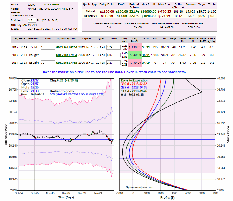
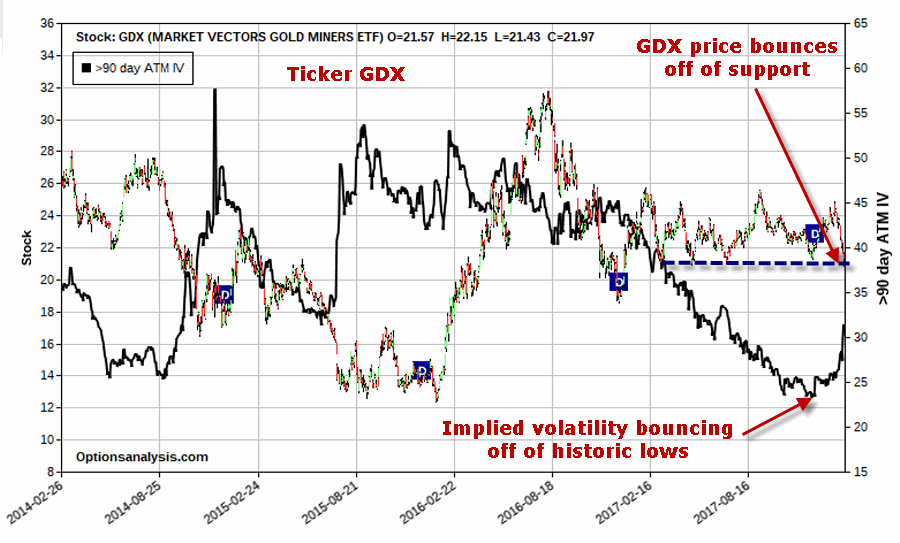
Let’s cut to the chase.  Objective reality is dead.  This is obviously true in politics as two sides will furiously spin the exact same event in two entirely different manners.  But it has already long been true in the financial markets.

Here’s the reality: if you “want” to be bullish you can find 1,001 things that will “justify” your outlook. But at that exact same moment, if someone else “wants” to be bearish they can easily trot out 1,001 other things to justify their outlook.

And then we wait around for the markets to tell us who was right.  And so on and so forth, same as it ever was.

I mention all of this because the charts I am about to show you are kind of “all over the place.”  Please note that the purpose of these charts is not to sway you into being bullish or bearish on anything.  Each Figure stands on its own and you can see whatever you “want” to see.

#1. After a Big UP January

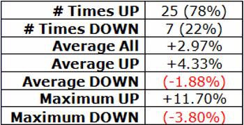
January saw the S&P 500 gain +5.6%. Things haven’t gone too well since. Still, as you can see in Figure 1 history suggest that there is good news and bad news.  The good news is that 11 of the previous 12 such years since 1951 have seen the S&P tack on additional gains between the end of January and the end of December.  The average end of Jan. to end of Dec. gain following an S&P 500 gain of 5% or more in January has been +15.8%.  The bad news is that the average intra year drawdown was -10.7%.  And of course, don’t forget that 1987 (and the October crash) is on this list.

So the message is clearly “Hope for the best, prepare for the worst.”

JanBarom
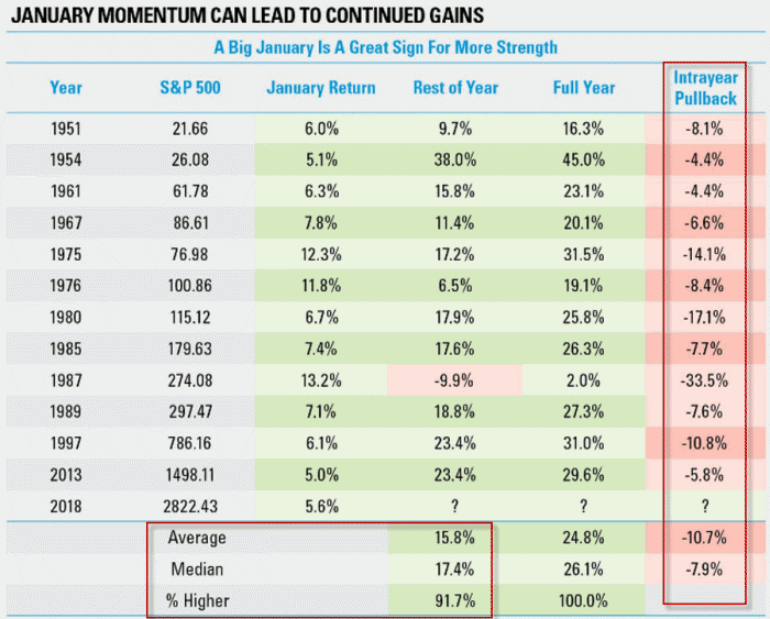
Figure 1 – February through December Performance following 5% S&P 500 gain (Source: um, I made a note somewhere regarding where I found this table.  Now if I could just find that note…..if you are reading this and you are the person who published this table please let me know and I promise I will give you full credit)

#2. Seasonally Favorable Period for Junk Bonds

Everybody hates bonds at the moment, especially junk bonds that are far more highly correlated to the S&P 500 Index than to long-term treasuries.  Is there a better time to be a contrarian?  Figure 2 from sentimentrader.com highlights the fact that we are entering the seasonally best time of year for ticker JNK (an ETF holding a portfolio of high yield bonds).  As with all things related to seasonality there is no guarantee that this year will follow the long term trend.  But if junk bonds rally in the near-term about 90% of investors would be surprised.  Again, is there a better time to be a contrarian?

JNK Seasonality
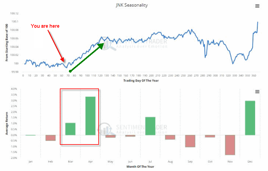
Figure 2 – Seasonality for ticker JNK (Source: www.sentimentrader.com)

#3. 10-Yr Treasury/2-Year Treasury Spread

More often than not, economic recessions in the U.S. are preceded by an “inversion” of the yield curve.  In a nutshell, 10-year yields are normally above 2-yr yields, but when that relationship inverts it signals “something not quite right” in the economy.  As you can see in Figure 3 it is by no means time to panic.  But it is time to start paying attention.10yr2yr Mar2018
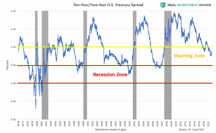
Figure 3 – 10-Yr. Treasury/2-Year Treasury Spread (Source: RealInvestmentAdvice)

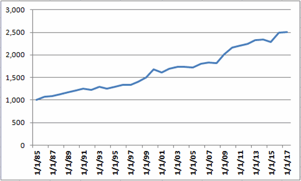
#4. Are We Drowning (in Debt) Yet?

Let’s be brutally candid. No one cares about the national debt.  Oh, I mean sure a lot of people care and are disturbed and wonder how this ends well. But the point is that no one (whether an “elected” or an “elector”) has this as a top priority or is doing anything about it.  Maybe because no one can figure out what to do about it.  Still, Figure 4 is a bit sobering.  Again, “how does this end well?”

Also, as I mentioned before about objective reality, please note that the average Republican will look at Figure 4 and say “look at all debt those $%^& Democrats created!”  And the average Democrat will look at Figure 4 and say “look at all the debt those $%^& Republicans created!”

Sorry folks, but this is truly a “bipartisan” creation.

debt
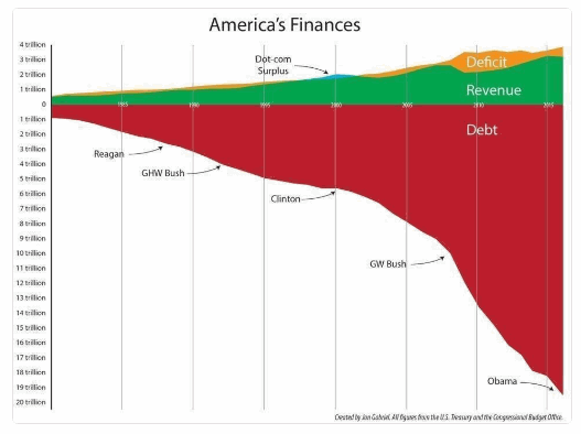
Figure 4 – Drowning in Debt Yet? (Source: Jon Gabriel)
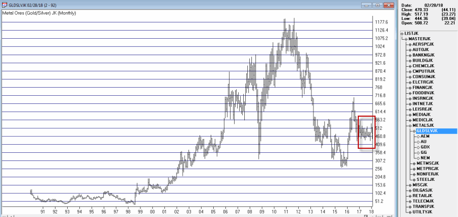
Jay Kaeppel

Disclaimer:  The data presented herein were obtained from various third-party sources.  While I believe the data to be reliable, no representation is made as to, and no responsibility, warranty or liability is accepted for the accuracy or completeness of such information.  The information, opinions and ideas expressed herein are for informational and educational purposes only and do not constitute and should not be construed as investment advice, an advertisement or offering of investment advisory services, or an offer to sell or a solicitation to buy any security.

Dollar Trend-Following 101

Keep it Simple Stupid. Ah, the KISS Method. Such valuable and absolutely timeless advice.  And so annoying too.  Maybe it’s an age thing. You reach a certain age and there are things that you have heard so many times (“Keep it Simple Stupid”, “Hard work is its own reward”, “Wow, our government sure spends a lot of money”) that even though their wisdom is obvious, you find yourself more irritated than enlightened.

So if you’re cranky like me please forgive my invocation of KISS. The U.S. Dollar is the world’s benchmark currency – the movements of its price has a lot of implications, for trade, commodity prices, and interest rates and so on. So it can be useful to have some idea of where it is headed.

The bad news is that “predicting” where the dollar (or any other tradable security for that matter, but I digress) is headed next is difficult at best.  The good news is that simply knowing the current trend is typically just as useful.  So this piece will look at a simple trend-following method for the U.S. Dollar.

The (Simple) Indicators

Our benchmark is ticker UUP (See top clip in Figure 1) – an ETF that tracks the price of the U.S. Dollar against a basket of currencies.

*Indicator #1: Ticker UDN (See middle clip in Figure 1) – Ticker UDN is an ETF that tracks the inverse of the U.S. Dollar.

*Indicator #2: Jay’s ANTIUS3 Index (See bottom clip in Figure 1) – This index is comprised is comprised of tickers FXE, FXF,IBND, IGOV and UDN – all of which trade (somewhat) inversely to the U.S. Dollar (typically).

*We will apply a simple 5-week and 30-week moving average to both indicators.

1Figure 1 – U.S. Dollar (ticker UUP); Inverse U.S. Dollar (ticker UDN); Jay’s ANTIUS3 Index

*For UDN when the 5-week average is BELOW the 30-week average that is considered BULLISH for the U.S. Dollar and vice versa.

*For ANTIUS3 when the 5-week average is BELOW the 30-week average that is considered BULLISH for the U.S. Dollar and vice versa.

Gauging the Dollar Trend

*If the 5-week average is below the 30-week average for EITHER ticker UDN or ANTIUS3 then the trend for the U.S. Dollar is designated as BULLISH.

*If the 5-week average is above the 30-week average for BOTH ticker UDN or ANTIUS3 then the trend for the U.S. Dollar is designated as BEARISH.

Figure 2 displays the growth of $1,000 invested in ticker UUP when the trend is deemed BULLISH (red line) versus when the trend is deemed BEARISH (blue line).

2Figure 2 – Growth of $1,000 invested in UUP when trend is BULLISH (red line) versus when trend is BEARISH (blue line); Feb2007-present

Figure 3 displays a closer look at the blue line in Figure 2.  As you can see, when BOTH UDN and ANTIUS3 are BULLISH (i.e., the 5-week average is above the 30-week average for both), the dollar rarely makes much headway.3Figure 3 – Not much good happens for the dollar when UDN AND ANTIUS3 are trending higher; Growth of $1,000 invested in ticker UUP when BOTH UDN and ANTIUS3 5-week average is above 30-week average (Feb2007-present)

At the moment the 5-week average for BOTH UDN and ANITUS3 are above their respective 30-week averages so by this measure the trend for the U.S. Dollar is presently “Bearish.” So does this mean the U.S. Dollar is doomed to fall precipitously from here?  Nope.  It just means that at the moment the major trend of the dollar is bearish

Summary

Please note that this “method” is not presented as a way to trade the U.S. Dollar, per se.  It is simply intended as a way to filter all of the noise.  i.e., when you hear something along the lines of, “and in today’s news the U.S. Dollar was down sharply even despite [some highly regarded analysts’ name here] insistence that the trend is due to change at any moment and rally sharply for at least 3 to 6 months before resuming the next leg down following [said analysts prediction of something that will happen in the future that is certain to impact the dollar at that time].”

Instead of trying to decipher all of that.  Just ask, “What’s the trend right now.”

Trust me – You won’t always be right, but you’ll be a lot less cranky.

Jay Kaeppel

Disclaimer:  The data presented herein were obtained from various third-party sources.  While I believe the data to be reliable, no representation is made as to, and no responsibility, warranty or liability is accepted for the accuracy or completeness of such information.  The information, opinions and ideas expressed herein are for informational and educational purposes only and do not constitute and should not be construed as investment advice, an advertisement or offering of investment advisory services, or an offer to sell or a solicitation to buy any security.

An “Easy 10% in a Week?”

Or something else?  That’s the question.  As with most things in life it’s all in the way you look at things.

First off, before diving in I will issue my standard warning – if you are not an “options person” and/or never expect to be one, this may not be your “cup of tea.”

A Bear Call Credit Spread in TGT

Right off the bat let me be clear that I am not “recommending” the trade that is discussed here. I am highlighting it because:

a) It serves as an excellent example of a potential opportunity

b) It serves as a useful example

The trade itself involves:

*Selling 1 March09 TGT 80 call @ $0.57

*Buying 1 March09 TGT 85 call @ $0.11

The particulars appear in Figure 1 and the risk curves in Figure 2.1Figure 1 – TGT Bear Call Spread particulars (Courtesy www.OptionsAnalysis.com)

2Figure 2 – TGT Bear Call Spread risk curves (Courtesy www.OptionsAnalysis.com)

For serious option trader there are several important considerations here.  In no particular order:

*These options expire on March 9, 2018, so at the time of (hypothetical) entry this trade had 8 days left until expiration

*This trade requires $454 to enter

*$454 is the maximum risk and would only be experienced if the trade is held until expiration (March 9) and TGT is at or above $85 a share at that time.

*At the time of (hypothetical) entry TGT stock was trading at $74.13.

*The breakeven price for this trade is $80.46.  So as long as TGT stock does anything besides rally 8.5% (from $74.13 to $80.46) in a week+ this trade will show a profit.

*The maximum profit on this trade is $46 (for a 1-lot), or 10.13% of the $454 required to enter the trade, and would be realized if TGT is at $80 a share or less by March 9th.

*The breakeven price – importantly – is above the upper resistance price for TGT shares ($78.70).  In other words, price has to take out a major resistance level for this trade to lose money.

So one way – the most optimistic way – to look at this trade is encapsulated as:

As long as TGT does NOT rally 8.5% in a week this trade will earn a profit of 10%

Hence the title, “An Easy 10% in a Week?”

But that is NOT the correct way to look at this trade.  The question to ask is NOT “What happens if everything goes right?”  The proper question to ask for any option trade – particularly one that has more risk than profit potential – is, “What happens if things go wrong.”

To be even more specific, let’s refer to:

Jay’s Trading Maxim #202: If you do not have an answer to “What action(s) will I take if things go wrong?”, then DO NOT make the trade.

Let’s take a closer “hard core” look at the real question associated with this trade.

As you can see in Figure 3 below:

*If TGT is at $80 a share at expiration this trade earns 10.13%, if it is t $80.46 a share this trade breaks even

*HOWEVER, if TGT rises above 80 sooner than later, this trade will accumulate a significant (in relation to the profit potential) open loss.

3Figure 3 – If TGT explodes to the upside (Courtesy www.OptionsAnalysis.com)

So the key question is not “will I make money?” the real question is “what will I do if TGT rallies sooner than later.  As the Maxim above states, if you don’t have an answer to the question then don’t make the trade.

Just to complete the example, one possibility in this instance would be to plan to exit or adjust the trade if the resistance level of $78.70 is pierced.  See Figure 4.4aFigure 4 – A possible stop-loss? (Courtesy www.OptionsAnalysis.com)

A stop-loss above resistance of $78.70 yields a worst case loss of roughly $100 (that would occur if TGT hit that price on Day 1).  The loss would be smaller with each passing day due to time decay.

Summary

Again, I am not suggesting you make this trade on TGT.  The purpose here was simply to highlight a trade that has the potential to earn10% in roughly a week

BUT

Also to point out the risks that MUST be accounted for and managed.

Jay Kaeppel

Disclaimer:  The data presented herein were obtained from various third-party sources.  While I believe the data to be reliable, no representation is made as to, and no responsibility, warranty or liability is accepted for the accuracy or completeness of such information.  The information, opinions and ideas expressed herein are for informational and educational purposes only and do not constitute and should not be construed as investment advice, an advertisement or offering of investment advisory services,

Five Sectors for March

Well thank goodness that’s over with – February that is.  Now on to March and hoping for something better.  This piece will take a look at some sectors that have a history of performing reasonably well in the month of March.

Five for March

The “chosen 5” are:

*FDLSX (Fidelity Select Leisure)

*FSCHX (Fidelity Select Chemical)

*FSNGX (Fidelity Select Natural Gas)

*FSRFX (Fidelity Select Transportation)

*FSRPX (Fidelity Select Retailing)

Our test starts in 1986 as follows:

1986: FDLSX, FSCHX, FSRPX

1987 to 1993: FDLSX, FSCHX, FSRFX, FSRPX

1994 to 2017: All 5

i.e., FSRFX started trading in 1987 and FSNGX started trading in 1994

Figure 1 displays the growth of $1,000 split evenly between these 5 funds and invested ONLY during the month of March every year since 1986.1Figure 1 – Growth of $1000 invested in funds listed above ONLY during the month of March; 1986-2017

Figure 2 displays the year-by-year results

Year March% +(-)
1986 7.4
1987 1.8
1988 3.2
1989 3.4
1990 3.7
1991 3.6
1992 (1.8)
1993 5.5
1994 (3.5)
1995 2.8
1996 3.9
1997 (0.6)
1998 5.2
1999 7.0
2000 11.7
2001 (3.8)
2002 5.2
2003 2.3
2004 0.2
2005 (0.7)
2006 4.4
2007 1.7
2008 (0.8)
2009 10.8
2010 7.2
2011 1.9
2012 2.1
2013 3.6
2014 0.5
2015 (2.0)
2016 8.6
2017 0.6

Figure 2 – Year-by-Year March Results

Figure 3 displays some of the relevant facts and figures regarding performance of this 5-fund portfolio during the month March.3

Figure 3 – Facts and Figures

Summary


As a result, and as always, I am not offering a “recommendation” here.  I am simply highlighting historical facts and figures.

So what does all of this tell us about how things will go in March 2018?  Ah, there’s the rub. Unfortunately, past performance – and stop me if you’ve heard this one before – is no guarantee of future results.

Still, investing is a game of odds.  Figure 4 displays the monthly % returns during March for this 5-fund portfolio from highest (+11.7%) to lowest (-3.8%). Clearly the odds have skewed towards positive returns.4Figure 4 – March % +(-) for 5-fund portfolio ranked from highest to lowest

Here’s hoping that history is a guide.

Jay Kaeppel

Disclaimer:  The data presented herein were obtained from various third-party sources.  While I believe the data to be reliable, no representation is made as to, and no responsibility, warranty or liability is accepted for the accuracy or completeness of such information.  The information, opinions and ideas expressed herein are for informational and educational purposes only and do not constitute and should not be construed as investment advice, an advertisement or offering of investment advisory services, or an offer to sell or a solicitation to buy any security.

Relearning Old Lessons (in Metals)

Let’s be blunt; fear and greed suck.  No matter how long you have been in the markets the “pull” of these two emotions is ever present.  Basically, instead of having an angel on one shoulder and a devil on the other, it’s more like having a different devil on each shoulder.

One devil whispers things like “buy the bottom”, “increase your position size”, “this one could be a big winner”. The other whispers things like, “this looks like the top”, “the market WILL crash”, and the quintessential ‘sell NOW” (as the market bottoms out).

The fiends.

The truth is that although I have been in this business awhile (basically since what I refer to as “The Hair Era” in my life) and am a huge proponent of systematic trading, I still fight these “demons” all the time. To wit, I keep wanting to get bullish on gold, silver, gold stocks, silver stocks, and commodities in general (and I do think ultimately that will pay off).  But the metals/commodities world has been sort of like a front-loading washer- up, down, roll over, fall down, climb back up, wash, rinse repeat.

And still I have it in my mind that they are “setting up for a big move” (I think that comes from the devil on the left shoulder).  When I look at the ever narrowing range I see for ticker SLV in Figure 1 I think it’s got to break out soon and when it does….”1Figure 1 – Ticker SLV in narrowing range (Courtesy AIQ TradingExpert)

So imagine my delight when I saw the chart displayed in Figure 2 from www.KimbleChartingSolutions.com displayed in Figure 2 on the McVerryReport.

2Figure 2 – Silver – forming a “mega” cup & handle pattern? (Courtesy www.KimbleChartingSolutions.com)

William O’Neil, founder of Investor’s Business Daily popularized the “cup and handle” formation in his classic book “How to Make Money in Stocks.”  Well, if the formation depicted in Figure 2 really is the “Mother of All Cup and Handle Formations’, then something spectacular lies ahead for silver.  But still I had certain reservations.  So I asked some professionals what they thought and got varying responses.

This reminded me once again, that a lot of things – chart formations especially – are in the eye of the beholder.

One response that sort of opened my eyes was from famed trader and Market Wizard Linda Racshke.  One of the charts she posted appears in Figure 3.

3Figure 3 – Long-Term Silver;1972-2018 (Courtesy: Moore Research Center, Inc.)

When I look at Figure 3 – i.e., the “Big Picture” with no ones interpretation added things look a little different.  When I look at the recent consolidation at the far right of Figure 3, I suddenly don’t see any reason why silver is “destined” to explode to the upside anytime soon.  A perusal of Figure 3 reveals that there were plenty of times when silver “consolidated” into a tight range – and then drifted sideways to lower for literally years at a time.

So What Now?

I see two possible courses of action:

1. Put a small amount of capital into long-term call options on GLD, SLV, GDX, etc., and settle in.

2. Wait for an actual confirmation of an uptrend in metals before taking the plunge.

The Bad News is that “actual confirmation of an uptrend” is a lot like “a consolidation setting up for a big move”, in that there is more than one way to make this designation so again it’s all in “the eye of the beholder.”

That caveat in place, one possibility for someone opting for Choice #2 above appears in Figure 4.  Gold futures have a resistance level somewhere in the range of $1,380 an ounce.

4Figure 4 – Gold futures with key “line in the sand” resistance near $1,380 (Courtesy ProfitSource by HUBB)

A breakout above $1,380 could signal that it’s time to move into metals.  As long as gold remains below that level it seems pretty ambitious to call the trend in metals “bullish.”

Some lessons we (re)learn the hard way I guess.

Now if I could just get these guys on my shoulders to shut up…..

Jay Kaeppel

Disclaimer:  The data presented herein were obtained from various third-party sources.  While I believe the data to be reliable, no representation is made as to, and no responsibility, warranty or liability is accepted for the accuracy or completeness of such information.  The information, opinions and ideas expressed herein are for informational and educational purposes only and do not constitute and should not be construed as investment advice, an advertisement or offering of investment advisory services, or an offer to sell or a solicitation to buy any security.

Biotech + Gold (Updated)

In this article I wrote about an index I follow that combines the biotech sector with the gold stock sector. I also wrote about “one way” to trade that index.  This article builds on that piece and adds a new “rule” to create more trading opportunities.

The BIOGOLD Index

Figure 1 displays the index that I created using AIQ TradingExpert.  It combines ticker FBIOX (Fidelity Select Biotech) with ticker FSAGX (Fidelity Select Gold).1Figure 1 – Jay’s BIOGOLD Index (Courtesy AIQ TradingExpert)

Also included in the lower clip is an indicator referred to as RSI32, which is the 2-day average of the standard 3-day RSI.

The Old System

In the original article I tested an approach that works as follows using monthly data:

*When the RSI32 drops to 32 or below, buy BOTH FBIOX and FSAGX

*After a buy signal, sell both funds when RSI32 rises to 64 or higher

For results, please see the original article.

The New System

The “new rules” are as follows:

A “buy signal” occurs when either:

*The RSI32 drops to 32 or below

*The RSI32 drops below 50 (but not as low as 32) and then reverses to the upside for one month

After either of the buy signals above occurs, buy BOTH FBIOX and FSAGX

*After a buy signal, sell both funds when RSI32 rises to 64 or higher

Figure 2 displays the BIOGOLD Index with various buy and sell signals marked.2Figure 2 – Jay’s BIOGOLD Index with RSI32 signals (Courtesy AIQ TradingExpert)

To test results we will:

*Assume that after a buy signal both FBIOX and FSAGX are bought in equal amounts

*We will assume that both funds are held until RSI32 reaches 64 or higher (i.e., there is no stop-loss provision in this test)

For testing purposes we will not assume any interest earned while out of the market, in order to highlight only the performance during active buy signals. Figure 3 displays the hypothetical growth of $1,000 (using monthly total return data) using the “system”.3Figure 3 – Hypothetical Growth of $1,000 using Jay’s BIOGOLD System (1986-present)

Summary

For the record, I am not “recommending” that anyone go out and initiate trading biotech and gold based on what I have written here.  Before trading using any approach it is essential for a trader to do their own homework and carefully consider all of the pro’s and con’s associated with any specific approach.  For example, while the trade-by-trade results for the above look reasonably good, it should be noted that there have been 4 separate drawdown’s in excess of -19% along the way, including a maximum drawdown of -37% in 2008.  In considering any approach to trading it is essential to first think long and hard about how well one would “weather the storms”, BEFORE focusing on potential profitability.

To put it more succinctly is the simple phrase “Don’t cross the river if you can’t swim the tide.”

Jay Kaeppel

Disclaimer:  The data presented herein were obtained from various third-party sources.  While I believe the data to be reliable, no representation is made as to, and no responsibility, warranty or liability is accepted for the accuracy or completeness of such information.  The information, opinions and ideas expressed herein are for informational and educational purposes only and do not constitute and should not be construed as investment advice, an advertisement or offering of investment advisory services, or an offer to sell or a solicitation to buy any security.

3 Charts That Have My Attention

Although I do a lot of my own analysis, I also recognize that there is a heck of a lot that I don’t know and a lot that I don’t see unless someone else points it out.  So here is a handful that caught my eye.

Stock Market Valuation

While I am primarily a trend follower and am in the “the major trend is still bullish” camp, I also recognize that over time the stock market swings from undervalued to overvalued and – much to the chagrin of everyone – back again.  At this point in time there are two things to keep in mind:

1) When the stock market gets overvalued something bad invariably follows

2) The stock market is presently near the high end of the long-term valuation range

Figure 1 is from Advisors Perspective at dshort.com and displays an index of various valuation measures at the top and the subsequent 10-yr average rate of return for stocks going forward.Valuation v returns 2-2018Figure 1 – Stock Market Valuation and subsequent 10-year average annual returns (Beware); (Source: Advisors Perspectives; www.dshort.com)

If you feel that the stock market is impervious and that there is little downside risk in the next several years I encourage you to analyze this chart closely.  The two things I mentioned above will become fairly obvious.

This chart is NOT a reason to panic, nor to “sell everything.”  But it should serve as a reminder that when the next bear market rolls around it will likely be “one of the painful kind.”

Commodities Cheap Relative to Stocks

I wrote about this in greater detail here, but in a nutshell, over time there is an interplay between hard assets (commodities, real estate) and paper assets (stocks in particular).  One vastly outperforms for awhile, and then everything reverses.

Figure 2 strongly suggests that commodities are extremely cheap compared to stocks.  History strongly suggests that this relationship is not permanent.GSCI SPXFigure 2 – GSG/SPX Ratio (i.e., commodities versus stocks) (Source: Dr. Torsten Dennin, Incrementum AG)

The upshot of Figure 2 is that investors should NOT be surprised if commodities (which can be traded as, well, a commodity, using ETFs such as GSG, DBC or RJI) vastly outperform stocks over the next 5-10 years.  I am not “ringing a bell” and shouting “sell stocks, buy commodities” – but am simply pointing out that the tide will eventually turn – likely in a significant way.

Bonds May Be Overdone on the Downside

I recently subscribed to www.sentimentrader.com and absolutely love the wealth of hard market data they provide.  The one chart I want to point out here displays the 10-day average of their “Investment Grade Bond Up Issues Ratio” (i.e., low readings mean most bonds are declining) versus ticker LQD – which is an ETF that tracks an index of investment grade corporate bonds.  As you can see in Figure 3, sentiment is getting very negative.  Likewise, previous readings down in this range have typically been followed by upside reversal in price.

This potential setup fits well with what I wrote about here and here.LQD OversoldFigure 3 – Sentiment may be suggesting that bonds are overdone on the downside and are due for a bounce (Source: www.sentimentrader.com)

Two caveats: 1) there is no guarantee that will happen this time, and 2) history suggests that bonds could sell of even more before finding a bottom.  So don’t take this as a buy signal but simply as an alert that a buying opportunity may soon be at hand.

Jay Kaeppel

Disclaimer:  The data presented herein were obtained from various third-party sources.  While I believe the data to be reliable, no representation is made as to, and no responsibility, warranty or liability is accepted for the accuracy or completeness of such information.  The information, opinions and ideas expressed herein are for informational and educational purposes only and do not constitute and should not be construed as investment advice, an advertisement or offering of investment advisory services, or an offer to sell or a solicitation to buy any security.

A Quick Lesson in Credit Spreads

OK, if you are pretty sure that you will never trade an option credit spread then “class dismissed”.  Thanks for stopping by and please come back again soon.

Alright option junkies, we have the class to ourselves so here is a quick and dirty lesson about one of the most important aspects of establishing a credit spread.

The Short Version

Your stop-loss point for a bull put credit spread should be BELOW an obvious support level to ensure that you do not get stopped out by “market noise”.

The Longer Version

OK wait, first – just in case – for the record, a “bull put” credit spread involves selling a put option with a higher strike price and buying a put option lower strike price put option.

For example, consider the example trade displayed in Figures 1 and 2 which involves:

*Selling 6 IBB March 100 puts @ $1.10

*Buying 6 IBB March 95 puts @ $0.55

For the record, I am NOT “recommending” this trade.  It simply serves as a useful example of something I consider important in establishing a credit spread.

1aFigure 1 – IBB Bull Put Credit Spread (Courtesy www.OptionsAnalysis.com)2aFigure 2 – IBB Bull Put Credit Spread risk curves (Courtesy www.OptionsAnalysis.com)

With IBB trading at $107.18 a share, this trade has:

*31 days left until expiration

*A maximum profit potential of $330 (or 12.36% of risk) which would be realized if IBB closes above $100 a share at expiration.

*A breakeven price of $99.45

*A maximum risk of -$2,670 which would be realized if this trade was held until expiration and IBB was at $95 or below at the time

Because of the lopsided reward/risk it is recommended that a trader establish an “Uncle” point, i.e., a price which, if reached, would cause the trader to exit the trade, presumably with a loss.

OK – finally – here comes “the lesson”.

1) Ideally there should be an obvious support level visible on a chart.  As you can see in Figure 3, for IBB that level is $100.67, i.e., the low of the double bottom established in November 2017.3aFigure 3 – IBB Price chart with support at $100.68

Now here comes the actual “point”

2) The “breakeven price” and/or your “Uncle” point for a credit spread you are looking do enter should be BELOW the obvious support level that appears on the price chart. (NOTE: you do not have to  use the breakeven price as your “Uncle” point.  You can choose another price level.  However, ideally both price levels should be belowthe obvious  support level on chart.)

Why?  Because any drop to the obvious support level that does not break out to the downside is nothing more than “noise”.  In fact, it could even serve to strengthen the support level if price retests and then holds above support.

3) You DO NOT want to get stopped out by market “noise”.

See Figure 4.

4aFigure 4 – IBB Bull Put Credit spread with breakeven price below support (Courtesy www.OptionsAnalysis.com)

1) The obvious support level is $100.68

2) The breakeven price (potential “Uncle” point) is $99.45

3) If market noise takes IBB back down to $100.68 but no lower, this trade will NOT get stopped out.

In Sum: Your stop-loss point for a bull put credit spread should be BELOW an obvious support level to ensure that you do not get stopped out by “market noise”.

Here ends the lesson.

Jay Kaeppel

Disclaimer:  The data presented herein were obtained from various third-party sources.  While I believe the data to be reliable, no representation is made as to, and no responsibility, warranty or liability is accepted for the accuracy or completeness of such information.  The information, opinions and ideas expressed herein are for informational and educational purposes only and do not constitute and should not be construed as investment advice, an advertisement or offering of investment advisory services, or an offer to sell or a solicitation to buy any security.

The Siren Song of Gold Stocks

Few securities hold the mystical lure that gold stocks seem to possess.  The seeming never ending allure of gold as the ultimate “store of value” (whatever that means) and the volatile nature of gold stocks themselves create a combination that draws in traders and speculators – often not unlike a moth to the flame.  “Hi, my name is Jay” (For record, I recently did a “swoon to the gold stock tune” here. An update on this example trade appears the end of this article).

(If you want to read the bullish case for the stock market, read this How to tell a bear market from a bull market blip

If you want to read the not so bullish case for the stock market, read this Valuations and Bear Markets)

The History

Figure 1 displays a 5-stock index that I created as a proxy to track the gold stock sector. Whether this is the “definitive” gold stock index or not (it’s not) is not the point. The point is that, clearly, if you get on the right side of a big move there is money to be made.1Figure 1 – Gold stocks have a history of making big moves; currently coiling in a relatively tight range (Courtesy AIQ TradingExpert)

The Here and Now

As you can also see in Figure 1 at the far right is the fact that gold stocks are mired in an exceptionally tight range. The obvious question is, “will the breakout be to the upside or the downside?”  I don’t claim to know, but based on what I wrote about here my expectations for commodity prices in the next several years, I might be willing to bet that the breakout will ultimately be to the upside.

The key item in the linked article is the chart in Figure 2 below that shows the ratio between the Goldman Sachs Commodity Index (GSCI) and the S&P 500 (SPX).  Commodity prices were recently about as low as they have ever been in relation to stock prices.  This type of extreme is typically followed by a major advance in commodity prices.GSCI SPXFigure 2 – GSCI/SPX Ratio (Source: Dr. Torsten Dennin, Incrementum AG

One Way to Play

So let’s assume someone wants to play the bullish side in the months ahead.  The most straightforward approach would be to buy 100 shares of ticker GDX (a gold stock ETF).  As I write 100 shares of GDX would cost $2,197. Let’s consider a less costly alternative.  For the record – and as always – the position highlighted below is not a “recommendation” only an “example” for educational purposes.  This example trade involves:

*Buying 2 Jun2018 22 calls @ 1.61

*Selling 3 Jun2018 25 calls @ 0.62

*Buying 2 Jun2018 28 calls @ 0.26

The particulars appear in Figure 3 and the risk curves in Figure 4.

3Figure 3 – GDX Directional Butterfly Spread (Courtesy www.OptionsAnalysis.com)

4Figure 4 – GDX Directional Butterfly Spread Risk Curves (Courtesy www.OptionsAnalysis.com)

As you can see this trade has:

*123 day left until expiration

*Unlimited profit potential

*Maximum risk of -$388.  A trader could choose to cut his or her loss if support is taken out near $20.20 a share.

*A “delta” of 96 – which means that the trade will behave roughly like a position that involves holding 96 shares of GDX.

Summary

Once again I must reiterate that this trade is not a recommendation. It is intended solely as an example of one way to:

*Play a bullish outlook (assuming you have one) for gold stocks over the next four months (so note that if no up move unfolds in the next four months this trade could lose 100%).

*While investing and risking less than it would cost to buy 100 ETF shares.

Addendum

The latest risk curve for the example trade I wrote about here appears below. This trade can benefit from either a big price move up, a big price move down and/or an increase in volatility.

5Figure 5 – GDX “Volatility Bomb” example trade

As you can see in Figure 6, implied volatility or options on GDX (black line) rose sharply in recent days (which actually pushed this example traded into profitable territory).  There is still plenty of “upside” left for volatility and GDX just reversed back to the upside at support.6Figure 6 – Ticker GDX with implied option volatility (black line)  (Courtesy www.OptionsAnalysis.com)

Jay Kaeppel

Disclaimer:  The data presented herein were obtained from various third-party sources.  While I believe the data to be reliable, no representation is made as to, and no responsibility, warranty or liability is accepted for the accuracy or completeness of such information.  The information, opinions and ideas expressed herein are for informational and educational purposes only and do not constitute and should not be construed as investment advice, an advertisement or offering of investment advisory services, or an offer to sell or a solicitation to buy any security.

One More “Ray of Hope” for Bonds

In this article titled “A Useful Inflation Indicator (and a Decent Bond Market Model)” – dated 12/14/2017 – I wrote about a simple model that, as the name implies, has a decent tracking record as a bond market indicator. For what it is worth, this model has turned “bullish” for bonds.

This signal combined with the potentially bullish signals detailed in this article last week, give me hope that the bond market – currently oversold (and seemingly universally loathed in full “interest rates are certain to go” mode) – may be due for a bounce once this latest selloff runs its course.

Rather than recreate how the whole thing works please see the original article for details. For the record though, the equity curve for $1,000 invested in ticker TLT when the model is bullish (any reading less than +2) versus bearish appears in Figure 1.

1aFigure 1 – Growth of $1,000 invested in TLT when Test Bond Model <2 (red line) versus growth of $1,000 invested in TLT when Test Bond Model =+2 (blue line) (daily, 12/5/2003-2/9/2018)

Summary

For the record I am not making any recommendations regarding bonds. I am simply highlighting the fact that several models that I follow have flipped to the bullish side.

This means two things:

1) These systematic “buy” signals – combined with the near universal fear and loathing of the bond market these days  – suggests there is a chance that the bond market will bounce sometime in the near future

2) If the bond market does NOT bounce sometime in the near future it may bode very ill for the longer-term trend

Jay Kaeppel

Disclaimer:  The data presented herein were obtained from various third-party sources.  While I believe the data to be reliable, no representation is made as to, and no responsibility, warranty or liability is accepted for the accuracy or completeness of such information.  The information, opinions and ideas expressed herein are for informational and educational purposes only and do not constitute and should not be construed as investment advice, an advertisement or offering of investment advisory services, or an offer to sell or a solicitation to buy any security.