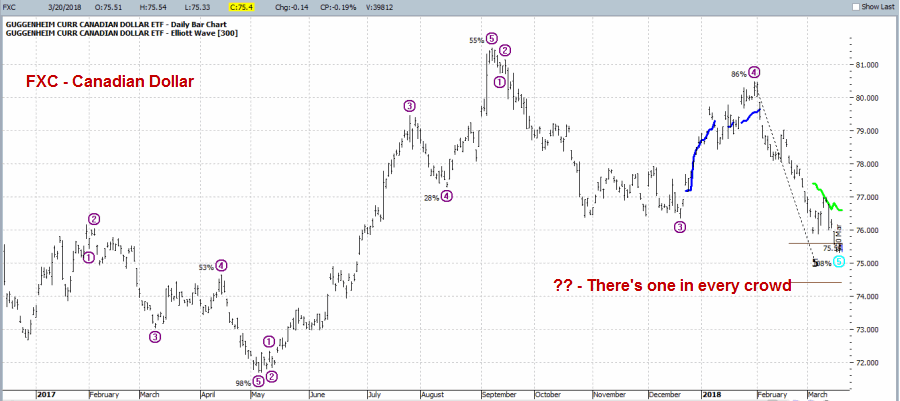
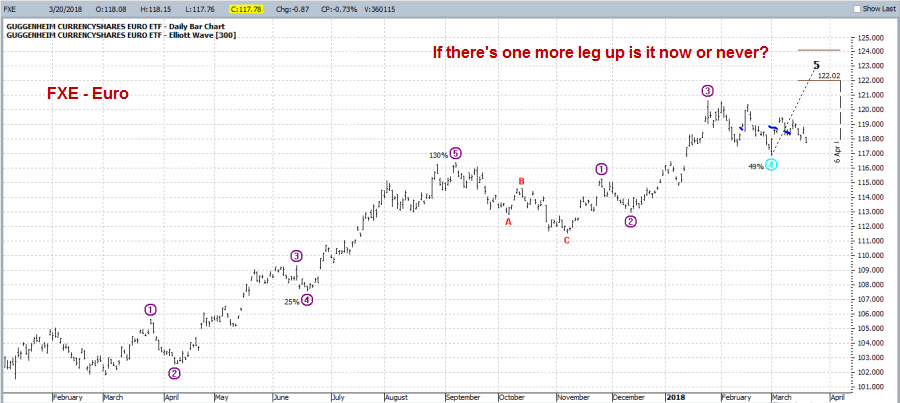
In this article on 3/20 I highlighted an example trade in the Euro. More specifically, I highlighted a hypothetical trade using options on ticker FXE that was designed to take advantage of a bullish Elliott Wave count generated by ProfitSource by HUBB (which has a built in algorithm for making such calculations – for better or worse, it is better than what I would come up with on my own).
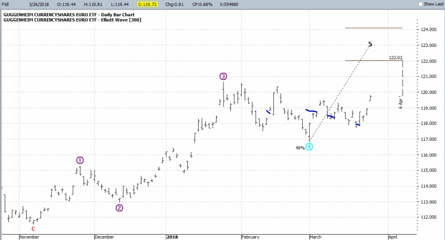 Figure 1 – FXE with Elliott Wave Count (Courtesy ProfitSource by HUBB)
If you have traded at all then you know that sometimes “ideas” work out great and sometimes they crash and burn, and then of course there is every possibility in between. The real key to long-term success is to have a plan to cover every contingency, i.e., a profit-taking plan for when things work out and a stop-loss plan for when they don’t.
When Things Go Right
The hardest part in achieving trading success is often maintaining the discipline to follow your plan. I didn’t really list out a full “plan” for the trade in the original article. The general goal was for FXE to rise to the projected price of $122 a share or higher as projected by ProfitSource.
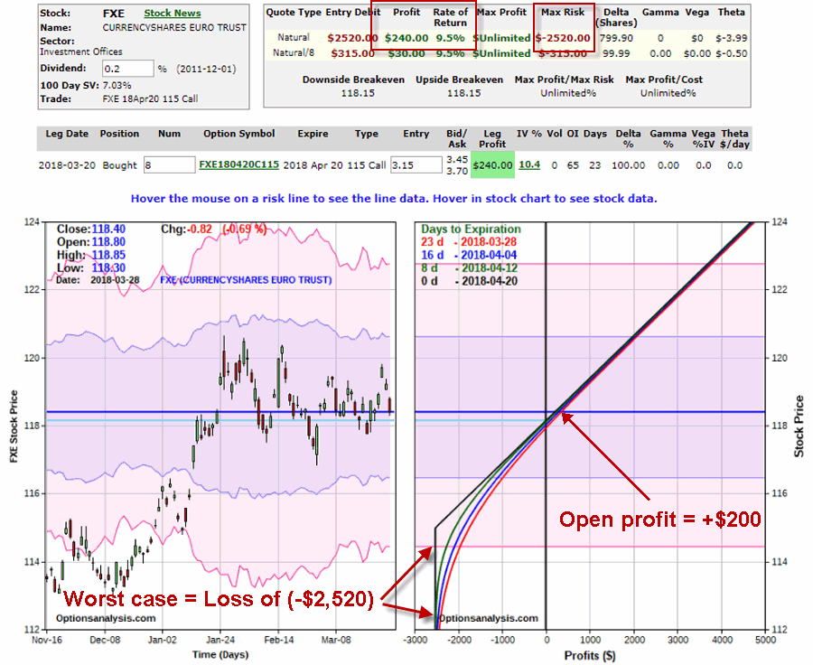
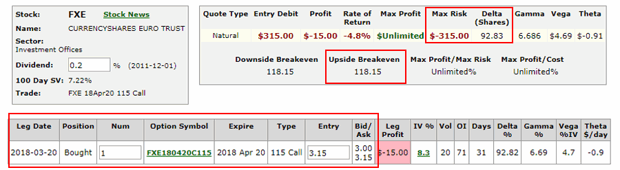
The original trade setup involved buying the FXE Apr20 115 calls at $3.15. For the purposes of this trade we will assume that we bought 8 calls for $2,520 ($315 x 8).
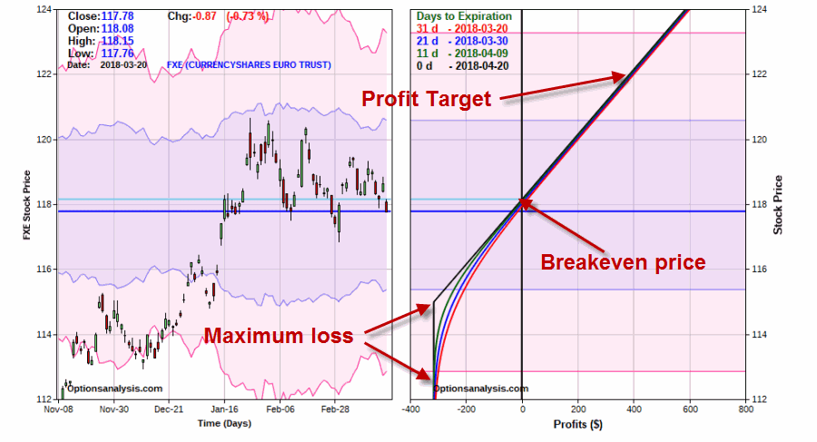
As of 3/26/18 FXE had risen from 117.78 to $119.72 and the option position had a profit of $1,320, or 52.4%. See Figure 2.
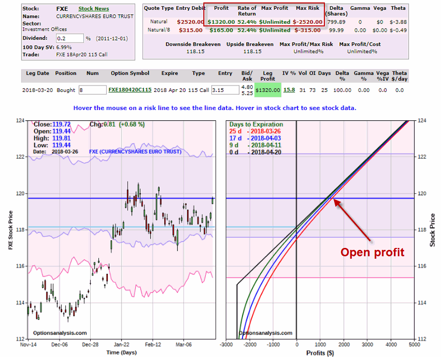 Figure 2 – FXE Apr20 115 calls w/open profit (www.OptionsAnalysis.com)
So the current situation raises the interesting question of “what to do when things go right”? There are several potential courses of action:
1) Do nothing and hope that FXE continues higher to the target price of $122
2) Take the profit and move on
3) Adjust the existing position
In a perfect world, this decision would already be spelled out in a trading plan. But since we are where we are let’s look at one possibility in terms of “adjusting” this position.
Adjusting FXE Call Position
For the purposes of this example, we will set the two following priorities:
*Locking in a profit
*Adding more time for FXE to move higher
So we will make the following adjustment:
*Sell 8 FXE Apr20 115 calls @ $4.80
*Buy 4 FXE Jun15 120 calls @ $1.81
*Sell 3 FXE Jun15 124 calls @ $0.43
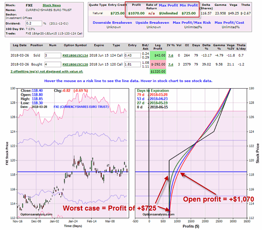
The particulars appear in Figure 3 and the adjusted risk curves appear in Figure 4.
 Figure 3 – FXE Adjusted Trade (Courtesy www.OptionsAnalysis.com)
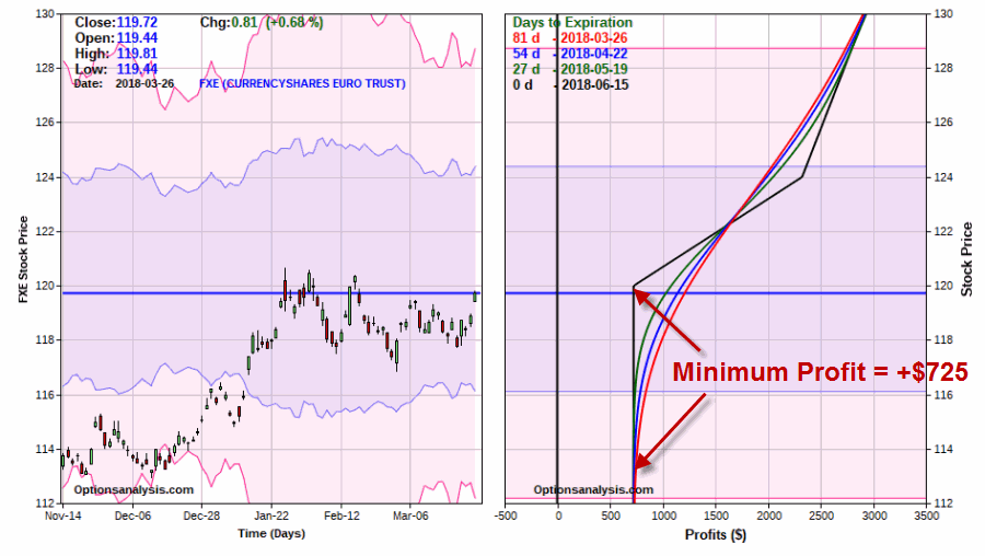 Figure 4 – FXE Adjusted Risk Curves (Courtesy www.OptionsAnalysis.com)
This adjustment:
*Gives us 56 more calendar days for FXE to move (now long June options instead of April
*Locks in a minimum profit of $725
*Retains unlimited profit potential
An important note for traders: If you entered this trade with the idea of playing for a move to $122 by FXE then the proper course of action might well be to “let it ride”, as the original trade has more profit potential. The key tradeoff in the adjustment above is giving up some upside potential in order to eliminate the risk of loss (and to extend the trade to a longer time frame).
Whether or not this is the proper move to make is in the eye of the beholder.
Jay Kaeppel
Disclaimer: The data presented herein were obtained from various third-party sources. While I believe the data to be reliable, no representation is made as to, and no responsibility, warranty or liability is accepted for the accuracy or completeness of such information. The information, opinions and ideas expressed herein are for informational and educational purposes only and do not constitute and should not be construed as investment advice, an advertisement or offering of investment advisory services, or an offer to sell or a solicitation to buy any security.
In this article I highlighted an example trade in the Euro. More specifically, I highlighted a hypothetical trade using options on ticker FXE that was designed to take advantage of a bullish Elliott Wave count generated by ProfitSource by HUBB (which has a built in algorithm for making such calculations – for better or worse, it is better than what I would come up with on my own).
Figure 1 – FXE with Elliott Wave Count (Courtesy ProfitSource by HUBB)
If you have traded at all then you know that sometimes “ideas” work out great and sometimes they crash and burn, and then of course there is every possibility in between. The real key to long-term success is to have a plan to cover every contingency, i.e., a profit-taking plan for when things work out and a stop-loss plan for when they don’t.
When Things Go Right
The hardest part in achieving trading success is often maintaining the discipline to follow your plan. I didn’t really list out a full “plan” for the trade in the original article. The general goal was for FXE to rise to the projected price of $122 a share or higher as projected by ProfitSource.
The original trade setup involved buying the FXE Apr20 115 calls at $3.15. For the purposes of this trade we will assume that we bought 8 calls for $2,520 ($315 x 8).
As of 3/26/18 FXE had risen from 117.78 to $119.72 and the option position had a profit of $1,320, or 52.4%.
So the current situation raises the interesting question of “what to do when things go right”? There are several potential courses of action:
Do nothing and hope that FXE continues higher to the target price of $122
Take the profit and move on
Adjust the existing position
In a perfect world, this decision would already be spelled out in a trading plan. But since we are where we are let’s look at one possibility in terms of “adjusting” this position.
Adjusting FXE Call Position
For the purposes of this example, we will set the two following priorities:
Locking in a profit
Adding more time for FXE to move higher
So we will make the following adjustment:
Sell 8 FXE Apr20 115 calls @ $4.80
Buy 4 FXE Jun15 120 calls @ $1.81
Sell 3 FXE Jun15 124 calls @ $0.43
The particulars appear in Figure 2 and the adjusted risk curves appear in Figure 3.
Figure 2 – FXE Adjusted Trade (Courtesy www.OptionsAnalysis.com)
Figure 3 – FXE Adjusted Risk Curves (Courtesy www.OptionsAnalysis.com)
This adjustment:
Gives us 56 more calendar days for FXE to move
Locks in a minimum profit of $725
Retains unlimited profit potential
An important note for traders: If you entered this trade with the idea of playing for a move to $122 by FXE then the proper course of action might well be to “let it rise”, as the original trade has more profit potential. The key tradeoff in the adjustment above is giving up some upside potential in order to eliminate the risk of loss (and to extend the trade to a longer time frame).
Jay Kaeppel
Disclaimer: The data presented herein were obtained from various third-party sources. While I believe the data to be reliable, no representation is made as to, and no responsibility, warranty or liability is accepted for the accuracy or completeness of such information. The information, opinions and ideas expressed herein are for informational and educational purposes only and do not constitute and should not be construed as investment advice, an advertisement or offering of investment advisory services, or an offer to sell or a solicitation to buy any security.
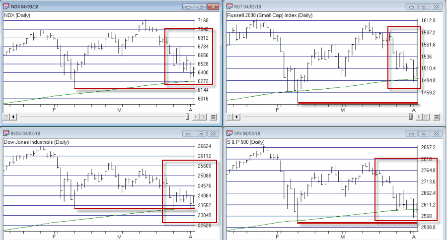
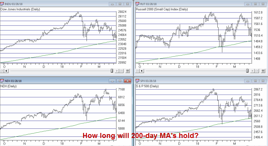
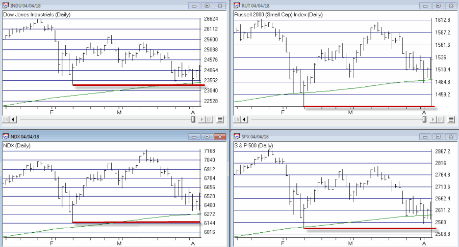 Figure 1 – Major indexes bounce (Courtesy AIQ TradingExpert)
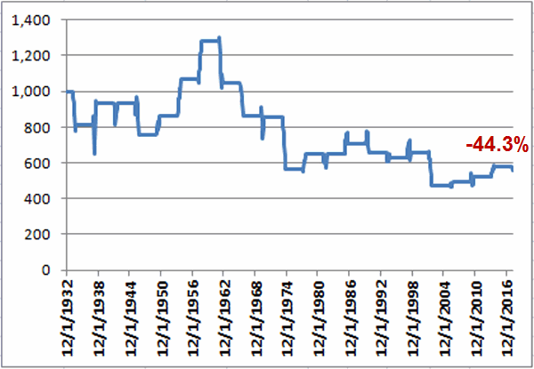
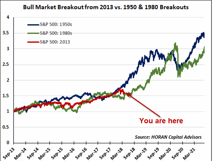 Figure 2 – 1950, 1980 and 2013 breakouts (Source: HORAN Capital Advisors)
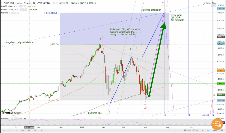 Figure 3 – The case for SPX 3070 (Source: deflationland.blogspot.com)